Modern CSS navigation patterns for better websites
Use category navigation to help readers move between related tutorials, guides, examples, and content clusters without forcing them to search manually.
Read Article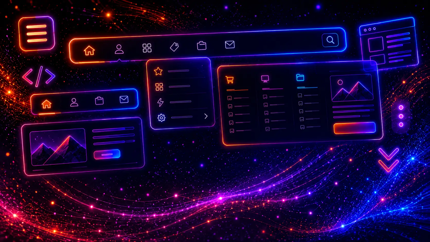
Modern CSS navigation menus are one of the most important parts of every professional website. A good navigation menu helps visitors understand where they are, where they can go next, and how quickly they can find the most important pages on your site.
In modern web design, navigation is no longer just a simple row of links at the top of a page. A strong website navigation system can include a responsive navbar, dropdown menu, mega menu, mobile hamburger menu, sticky header, sidebar navigation, footer menu, breadcrumbs, category filters, and call-to-action links.
Navigation also has a direct impact on user experience. If a menu is confusing, too crowded, hard to tap on mobile, or difficult to scan, visitors may leave the website before they even see your best content. A clean and responsive CSS navigation menu makes the website feel faster, more organized, and more trustworthy.
In 2026, modern navigation menus need to work across many different screen sizes and content types. A desktop user may expect a wide navbar with dropdowns or a mega menu, while a mobile user needs a simple touch-friendly menu that opens quickly and does not cover important actions in a confusing way.
This is why a good navigation menu should be designed as a flexible system. It should support clear labels, readable spacing, hover and focus states, mobile-friendly tap targets, accessible interaction patterns, and a structure that can scale as the website grows.
In this guide, we showcase 25 modern CSS navigation menus for websites. These examples include responsive navbars, sticky headers, animated link menus, dropdown navigation, multi-level dropdowns, mega menus, eCommerce category menus, mobile hamburger menus, fullscreen overlays, side menus, sidebar navigation, tabs, breadcrumbs, footer navigation, and a complete responsive website header.
Each example is built as a practical website navigation pattern that you can copy, customize, and reuse in real projects. Some examples use only HTML and CSS, while interactive examples include small JavaScript snippets for opening mobile menus, toggling dropdowns, or improving responsive behavior.
All examples are designed with a strong focus on clean structure, responsive behavior, modern UI design, and real-world usability.

CSS navigation menus are website menu systems styled and arranged with CSS. They help users move between pages, sections, categories, products, services, blog posts, account areas, and important calls to action.
A navigation menu usually appears in the header, but navigation can also appear in sidebars, footers, mobile bottom bars, breadcrumbs, tabs, category filters, dashboards, and landing page sections. The goal is always the same: help users find the right content faster.
A simple navigation menu may only include a logo and a few text links. A more advanced website navigation system may include dropdown menus, mega menus, icons, CTA buttons, search fields, language switchers, account links, product categories, or mobile slide-out panels.
Modern CSS makes it possible to create clean and responsive navigation layouts with tools like Flexbox, CSS Grid, position: sticky, media queries, transitions, custom properties, and modern selector patterns.
Common CSS navigation menu patterns include:
The best navigation menus are not only visually attractive. They are also clear, predictable, responsive, accessible, and easy to maintain.
Website navigation matters because it controls how users move through a website. Even if a website has beautiful visuals, strong content, and great products, visitors still need a simple way to understand the structure of the site.
A strong navigation menu helps users answer important questions quickly: What does this website offer? Where can I find pricing? Where are the services? How do I contact the company? Where are the product categories? Can I read more articles? How do I get back to the homepage?
In 2026, navigation menus also need to support different browsing habits. Many users visit websites from mobile devices, where space is limited and every tap matters. Others browse from larger desktop screens, where dropdown menus, mega menus, and sticky headers can make the experience more efficient.
Good navigation design helps with:
A navigation menu should never feel like an afterthought. It is one of the first interface elements users interact with, and it often decides whether they continue exploring the website or leave.
Some navigation menus can be built with HTML and CSS only. Others need a small amount of JavaScript to handle interaction, especially on mobile devices.
CSS-only navigation menus are useful for simple desktop menus, hover effects, basic dropdowns, tabs, breadcrumbs, footer navigation, and static link groups. They are lightweight, fast, and easy to maintain.
JavaScript navigation menus are useful when the menu needs to open and close, update ARIA attributes, toggle mobile panels, manage active states, close when clicking outside, or support more complex responsive behavior.
| Navigation type | CSS-only works well | JavaScript is useful |
|---|---|---|
| Simple navbar | Yes | Optional |
| Hover underline menu | Yes | No |
| Desktop dropdown | Yes | Optional for accessibility |
| Mobile hamburger menu | Possible | Recommended |
| Fullscreen overlay menu | Possible | Recommended |
| Mega menu | Yes for desktop | Useful for mobile behavior |
| Collapsible sidebar | Limited | Recommended |
A good rule is simple: use CSS for layout and visual styling, and use JavaScript only for behavior that needs interaction. This keeps the navigation menu fast, clean, and easier to debug.
Different websites need different navigation patterns. A small portfolio website may only need a minimal navbar, while an eCommerce store may need product categories, dropdowns, mega menus, search, account links, and mobile-friendly category navigation.
Before choosing a navigation style, think about the size of the website, the number of important pages, the type of content, and the main user journey.
Header navigation is the most common website navigation pattern. It usually includes a logo, main menu links, and one or more CTA buttons. It works well for business websites, SaaS websites, portfolios, blogs, landing pages, and online stores.
Dropdown navigation is useful when a single menu item needs to reveal related subpages. For example, a “Services” link may open a dropdown with web design, SEO, hosting, maintenance, and consulting pages.
A mega menu is a larger dropdown that can display multiple columns, categories, descriptions, featured links, icons, or promotional blocks. Mega menus are especially useful for eCommerce websites, large blogs, software websites, educational websites, and marketplaces.
Mobile navigation should be simple, easy to tap, and quick to understand. Common mobile navigation patterns include hamburger menus, slide-in side menus, fullscreen overlay menus, accordion submenus, and bottom navigation bars.
Sidebar navigation is commonly used in dashboards, admin panels, web apps, documentation websites, learning platforms, and account areas. It keeps important sections visible while giving the main content area enough space.
Secondary navigation includes breadcrumbs, footer menus, tabs, category filters, portfolio filters, and contextual links. These menus support the main navigation and help users move through deeper sections of a website.
Responsive navigation is not only about hiding links behind a hamburger icon. A good responsive menu should preserve clarity, hierarchy, and usability across screen sizes.
The same navigation system may need to behave differently on desktop, tablet, and mobile. Desktop navigation can use horizontal space, hover states, dropdowns, and mega menus. Mobile navigation needs larger tap targets, clear spacing, simple open and close behavior, and readable link groups.
Navigation labels should be short, direct, and easy to understand. Labels like “Services”, “Pricing”, “Resources”, “Products”, “Blog”, and “Contact” usually work better than vague or clever labels that require extra thinking.
Not every page needs to appear in the main navigation. The most important pages should be visible first, while secondary links can move into dropdowns, mega menus, footer navigation, or contextual sections.
Mobile navigation links should be easy to tap without accidentally pressing the wrong item. Use enough padding, readable font sizes, and clear separation between links.
Users should be able to understand which link is active, which link is being hovered, and which item is focused with the keyboard. Focus states are especially important for accessibility.
A crowded header can make the entire website feel messy. If you have too many links, group them into dropdowns, mega menus, category sections, or footer navigation instead of forcing everything into one horizontal row.
A mobile menu should have an obvious close button or toggle state. Users should never feel trapped inside a menu overlay or side panel.
JavaScript can improve mobile navigation, dropdown toggles, and menu state management, but it should not make the menu fragile. Keep scripts small, readable, and focused only on the behavior that CSS cannot handle cleanly.
The following examples show practical navigation menu patterns that can be used in real websites. Each menu is designed as a compact demo, but the structure can be expanded into a full website header, mobile menu, dashboard sidebar, eCommerce navigation system, or landing page menu.
These examples are not only visual styles. They are reusable navigation building blocks for modern websites, including business websites, WordPress themes, blogs, SaaS websites, portfolios, dashboards, landing pages, and online stores.
A responsive navbar is the foundation of modern website navigation. It gives desktop users a clean horizontal menu while providing mobile users with a compact hamburger button that opens a touch-friendly navigation panel.
This type of navigation menu is one of the most useful patterns for business websites, landing pages, portfolios, blogs, SaaS websites, and WordPress themes. The goal is simple: keep the menu easy to scan on large screens and easy to use on smaller screens.
<header class="nav-responsive-header">

  <a href="#" class="nav-responsive-logo">
    <span class="nav-responsive-logo-mark">N</span>
    <span>NavStudio</span>
  </a>

  <nav aria-label="Main navigation">
    <ul class="nav-responsive-menu">
      <li><a href="#">Home</a></li>
      <li><a href="#">Services</a></li>
      <li><a href="#">Work</a></li>
      <li><a href="#">Pricing</a></li>
      <li><a href="#">Contact</a></li>
    </ul>
  </nav>

  <div class="nav-responsive-actions">

    <a href="#" class="nav-responsive-cta">Get Started</a>

    <button class="nav-responsive-toggle" type="button" aria-label="Toggle navigation menu" aria-expanded="false">
      <span></span>
      <span></span>
      <span></span>
    </button>

  </div>

</header>
.nav-responsive-header{
position:relative;
z-index:5;
display:flex;
align-items:center;
justify-content:space-between;
gap:24px;
padding:18px 22px;
background:rgba(15,23,42,.78);
border-bottom:1px solid rgba(255,255,255,.08);
backdrop-filter:blur(16px);
}

.nav-responsive-logo{
display:inline-flex;
align-items:center;
gap:10px;
font-size:18px;
line-height:1;
font-weight:900;
letter-spacing:-.03em;
color:#ffffff;
text-decoration:none;
white-space:nowrap;
}

.nav-responsive-logo-mark{
width:38px;
height:38px;
border-radius:14px;
display:flex;
align-items:center;
justify-content:center;
background:linear-gradient(135deg,#22d3ee,#6366f1,#a855f7);
box-shadow:0 14px 34px rgba(34,211,238,.22);
font-size:17px;
font-weight:900;
color:#ffffff;
}

.nav-responsive-menu{
display:flex;
align-items:center;
justify-content:center;
gap:6px;
margin:0;
padding:0;
list-style:none;
}

.nav-responsive-menu a{
display:inline-flex;
align-items:center;
justify-content:center;
min-height:40px;
padding:0 13px;
border-radius:999px;
font-size:14px;
font-weight:800;
color:#cbd5e1;
text-decoration:none;
transition:background .22s ease,color .22s ease,transform .22s ease;
}

.nav-responsive-menu a:hover,
.nav-responsive-menu a:focus{
background:rgba(255,255,255,.08);
color:#ffffff;
outline:none;
transform:translateY(-1px);
}

.nav-responsive-actions{
display:flex;
align-items:center;
gap:10px;
}

.nav-responsive-cta{
display:inline-flex;
align-items:center;
justify-content:center;
min-height:42px;
padding:0 16px;
border-radius:999px;
background:linear-gradient(135deg,#22d3ee,#818cf8);
color:#020617;
font-size:14px;
font-weight:900;
text-decoration:none;
box-shadow:0 14px 34px rgba(34,211,238,.24);
transition:transform .22s ease,box-shadow .22s ease;
white-space:nowrap;
}

.nav-responsive-cta:hover,
.nav-responsive-cta:focus{
transform:translateY(-2px);
box-shadow:0 18px 42px rgba(34,211,238,.30);
outline:none;
}

.nav-responsive-toggle{
display:none;
width:44px;
height:44px;
border:0;
border-radius:14px;
background:rgba(255,255,255,.08);
color:#ffffff;
cursor:pointer;
position:relative;
transition:background .22s ease;
}

.nav-responsive-toggle:hover{
background:rgba(255,255,255,.12);
}

.nav-responsive-toggle span{
position:absolute;
left:12px;
right:12px;
height:2px;
border-radius:999px;
background:#ffffff;
transition:transform .25s ease,opacity .25s ease,top .25s ease;
}

.nav-responsive-toggle span:nth-child(1){
top:14px;
}

.nav-responsive-toggle span:nth-child(2){
top:21px;
}

.nav-responsive-toggle span:nth-child(3){
top:28px;
}

.nav-responsive-header.is-open .nav-responsive-toggle span:nth-child(1){
top:21px;
transform:rotate(45deg);
}

.nav-responsive-header.is-open .nav-responsive-toggle span:nth-child(2){
opacity:0;
}

.nav-responsive-header.is-open .nav-responsive-toggle span:nth-child(3){
top:21px;
transform:rotate(-45deg);
}

@media (max-width: 820px){
.nav-responsive-toggle{
display:block;
}

.nav-responsive-actions .nav-responsive-cta{
display:none;
}

.nav-responsive-menu{
position:absolute;
left:16px;
right:16px;
top:76px;
display:grid;
gap:8px;
padding:14px;
border-radius:18px;
background:rgba(15,23,42,.96);
border:1px solid rgba(255,255,255,.10);
box-shadow:0 20px 60px rgba(0,0,0,.45);
opacity:0;
visibility:hidden;
transform:translateY(-8px);
transition:opacity .22s ease,visibility .22s ease,transform .22s ease;
}

.nav-responsive-header.is-open .nav-responsive-menu{
opacity:1;
visibility:visible;
transform:translateY(0);
}

.nav-responsive-menu a{
justify-content:flex-start;
min-height:46px;
padding:0 14px;
border-radius:13px;
background:rgba(255,255,255,.045);
}
}
document.addEventListener("DOMContentLoaded", function () {
  document.querySelectorAll(".nav-responsive-header").forEach(function (header) {
    const toggle = header.querySelector(".nav-responsive-toggle");

    if (!toggle) {
      return;
    }

    toggle.addEventListener("click", function () {
      const isOpen = header.classList.toggle("is-open");
      toggle.setAttribute("aria-expanded", isOpen ? "true" : "false");
    });
  });
});
This responsive navbar is a strong starting point for modern website navigation because it keeps the desktop header clean while providing a simple mobile menu for smaller screens. Flexbox handles the desktop alignment, while a small JavaScript toggle controls the mobile menu state.
Use this navigation pattern for landing pages, business websites, portfolio websites, blogs, SaaS websites, WordPress themes, and any project where the main menu needs to stay simple, responsive, and easy to understand.
A sticky header navigation keeps the main menu visible while users scroll through a page. This is useful for long landing pages, blogs, documentation websites, SaaS pages, eCommerce stores, and service websites where visitors may need quick access to important links at any time.
This example uses position: sticky to keep the navigation bar attached to the top of its preview area. The design includes a compact logo, clean navigation links, a highlighted active item, and a strong call-to-action button.
position: sticky for a simple CSS-only sticky header<header class="nav-sticky-header">
<a href="#" class="nav-sticky-logo">
<span class="nav-sticky-logo-mark">S</span>
<span>StickyNav</span>
</a>
<nav aria-label="Main navigation">
<ul class="nav-sticky-menu">
<li><a href="#" class="is-active">Overview</a></li>
<li><a href="#">Features</a></li>
<li><a href="#">Pricing</a></li>
<li><a href="#">FAQ</a></li>
</ul>
</nav>
<a href="#" class="nav-sticky-cta">Start Free</a>
</header>
.nav-sticky-header{
position:sticky;
top:0;
z-index:10;
display:flex;
align-items:center;
justify-content:space-between;
gap:22px;
padding:16px 22px;
background:rgba(15,23,42,.82);
border-bottom:1px solid rgba(255,255,255,.09);
backdrop-filter:blur(18px);
}

.nav-sticky-logo{
display:inline-flex;
align-items:center;
gap:10px;
font-size:18px;
line-height:1;
font-weight:900;
letter-spacing:-.03em;
color:#ffffff;
text-decoration:none;
white-space:nowrap;
}

.nav-sticky-logo-mark{
width:38px;
height:38px;
border-radius:14px;
display:flex;
align-items:center;
justify-content:center;
background:linear-gradient(135deg,#22c55e,#22d3ee);
box-shadow:0 14px 34px rgba(34,197,94,.22);
font-size:16px;
font-weight:900;
color:#020617;
}

.nav-sticky-menu{
display:flex;
align-items:center;
justify-content:center;
gap:6px;
margin:0;
padding:0;
list-style:none;
}

.nav-sticky-menu a{
display:inline-flex;
align-items:center;
justify-content:center;
min-height:40px;
padding:0 13px;
border-radius:999px;
font-size:14px;
font-weight:800;
color:#cbd5e1;
text-decoration:none;
transition:background .22s ease,color .22s ease,transform .22s ease;
}

.nav-sticky-menu a:hover,
.nav-sticky-menu a:focus{
background:rgba(255,255,255,.08);
color:#ffffff;
outline:none;
transform:translateY(-1px);
}

.nav-sticky-menu a.is-active{
background:rgba(34,211,238,.13);
color:#67e8f9;
box-shadow:inset 0 0 0 1px rgba(34,211,238,.22);
}

.nav-sticky-cta{
display:inline-flex;
align-items:center;
justify-content:center;
min-height:42px;
padding:0 16px;
border-radius:999px;
background:linear-gradient(135deg,#22c55e,#22d3ee);
color:#020617;
font-size:14px;
font-weight:900;
text-decoration:none;
box-shadow:0 14px 34px rgba(34,197,94,.22);
transition:transform .22s ease,box-shadow .22s ease;
white-space:nowrap;
}

.nav-sticky-cta:hover,
.nav-sticky-cta:focus{
transform:translateY(-2px);
box-shadow:0 18px 42px rgba(34,211,238,.26);
outline:none;
}

@media (max-width: 820px){
.nav-sticky-header{
align-items:flex-start;
flex-direction:column;
padding:16px;
gap:14px;
}

.nav-sticky-menu{
width:100%;
justify-content:flex-start;
overflow-x:auto;
padding-bottom:4px;
}

.nav-sticky-menu a{
white-space:nowrap;
}

.nav-sticky-cta{
width:100%;
}
}
This sticky header navigation works well when users need quick access to important pages throughout a long page. The sticky behavior is handled with CSS only, which keeps the pattern lightweight and easy to maintain.
Use this pattern for long landing pages, product pages, SaaS websites, documentation pages, blog posts, service pages, and any layout where the main navigation should stay available while users scroll.
A minimal CSS navigation bar is a clean and lightweight menu pattern for websites that do not need complex dropdowns, large visual effects, or heavy JavaScript. It focuses on clarity, spacing, typography, and a simple structure.
This navigation style works especially well for portfolios, blogs, personal websites, creative studios, service websites, documentation pages, and small business websites. The design is intentionally simple so the content remains the main focus.
<header class="nav-minimal-header">

  <a href="#" class="nav-minimal-logo">
    <span class="nav-minimal-logo-mark">M</span>
    <span>Minimal</span>
  </a>

  <nav aria-label="Main navigation">
    <ul class="nav-minimal-menu">
      <li><a href="#" class="is-active">Home</a></li>
      <li><a href="#">About</a></li>
      <li><a href="#">Articles</a></li>
      <li><a href="#">Projects</a></li>
    </ul>
  </nav>

  <a href="#" class="nav-minimal-link">Contact</a>

</header>
.nav-minimal-header{
display:flex;
align-items:center;
justify-content:space-between;
gap:24px;
padding:20px 24px;
border-bottom:1px solid rgba(15,23,42,.08);
background:rgba(255,255,255,.88);
backdrop-filter:blur(14px);
}

.nav-minimal-logo{
display:inline-flex;
align-items:center;
gap:10px;
font-size:18px;
line-height:1;
font-weight:900;
letter-spacing:-.03em;
color:#0f172a;
text-decoration:none;
white-space:nowrap;
}

.nav-minimal-logo-mark{
width:36px;
height:36px;
border-radius:12px;
display:flex;
align-items:center;
justify-content:center;
background:#0f172a;
color:#ffffff;
font-size:15px;
font-weight:900;
}

.nav-minimal-menu{
display:flex;
align-items:center;
justify-content:center;
gap:22px;
margin:0;
padding:0;
list-style:none;
}

.nav-minimal-menu a{
position:relative;
display:inline-flex;
align-items:center;
justify-content:center;
min-height:38px;
font-size:14px;
font-weight:800;
color:#475569;
text-decoration:none;
transition:color .22s ease;
}

.nav-minimal-menu a::after{
content:"";
position:absolute;
left:0;
right:0;
bottom:2px;
height:2px;
border-radius:999px;
background:#0f172a;
transform:scaleX(0);
transform-origin:center;
transition:transform .22s ease;
}

.nav-minimal-menu a:hover,
.nav-minimal-menu a:focus,
.nav-minimal-menu a.is-active{
color:#0f172a;
outline:none;
}

.nav-minimal-menu a:hover::after,
.nav-minimal-menu a:focus::after,
.nav-minimal-menu a.is-active::after{
transform:scaleX(1);
}

.nav-minimal-link{
display:inline-flex;
align-items:center;
justify-content:center;
min-height:40px;
padding:0 15px;
border-radius:999px;
background:#0f172a;
color:#ffffff;
font-size:14px;
font-weight:900;
text-decoration:none;
transition:transform .22s ease,box-shadow .22s ease,background .22s ease;
white-space:nowrap;
}

.nav-minimal-link:hover,
.nav-minimal-link:focus{
transform:translateY(-2px);
box-shadow:0 14px 30px rgba(15,23,42,.18);
background:#111827;
outline:none;
}

@media (max-width: 820px){
.nav-minimal-header{
align-items:flex-start;
flex-direction:column;
padding:18px;
gap:16px;
}

.nav-minimal-menu{
width:100%;
justify-content:flex-start;
gap:16px;
overflow-x:auto;
padding-bottom:4px;
}

.nav-minimal-menu a{
white-space:nowrap;
}

.nav-minimal-link{
width:100%;
}
}
This minimal CSS navigation bar is useful when the website needs a clean and professional header without complex interactions. The design relies on spacing, typography, simple contrast, and subtle hover states instead of heavy visual effects.
Use this pattern for portfolios, personal websites, blogs, small business websites, documentation pages, and simple landing pages where clarity is more important than advanced menu behavior.
An animated underline navigation is a clean CSS menu style where each navigation link reveals a smooth underline effect on hover, focus, or active state. It is simple, lightweight, and works well when you want the navigation to feel modern without adding heavy visual effects.
This type of CSS navigation menu is especially useful for blogs, portfolios, agency websites, SaaS landing pages, documentation sites, and modern business websites. The underline animation gives users clear feedback while keeping the header minimal and professional.
<header class="nav-underline-header">

  <a href="#" class="nav-underline-logo">
    <span class="nav-underline-logo-mark">U</span>
    <span>Underline</span>
  </a>

  <nav aria-label="Main navigation">
    <ul class="nav-underline-menu">
      <li><a href="#" class="is-active">Home</a></li>
      <li><a href="#">Services</a></li>
      <li><a href="#">Projects</a></li>
      <li><a href="#">Resources</a></li>
    </ul>
  </nav>

  <a href="#" class="nav-underline-cta">Contact</a>

</header>
.nav-underline-header{
display:flex;
align-items:center;
justify-content:space-between;
gap:24px;
padding:20px 24px;
background:rgba(15,23,42,.72);
border-bottom:1px solid rgba(255,255,255,.08);
backdrop-filter:blur(16px);
}

.nav-underline-logo{
display:inline-flex;
align-items:center;
gap:10px;
font-size:18px;
line-height:1;
font-weight:900;
letter-spacing:-.03em;
color:#ffffff;
text-decoration:none;
white-space:nowrap;
}

.nav-underline-logo-mark{
width:38px;
height:38px;
border-radius:14px;
display:flex;
align-items:center;
justify-content:center;
background:linear-gradient(135deg,#22d3ee,#ec4899);
box-shadow:0 14px 34px rgba(236,72,153,.20);
font-size:16px;
font-weight:900;
color:#ffffff;
}

.nav-underline-menu{
display:flex;
align-items:center;
justify-content:center;
gap:30px;
margin:0;
padding:0;
list-style:none;
}

.nav-underline-menu a{
position:relative;
display:inline-flex;
align-items:center;
justify-content:center;
min-height:42px;
font-size:14px;
font-weight:850;
color:#cbd5e1;
text-decoration:none;
letter-spacing:.01em;
transition:color .22s ease;
}

.nav-underline-menu a::before{
content:"";
position:absolute;
left:0;
right:0;
bottom:4px;
height:2px;
border-radius:999px;
background:linear-gradient(90deg,#22d3ee,#ec4899,#a855f7);
transform:scaleX(0);
transform-origin:right;
transition:transform .28s ease;
}

.nav-underline-menu a:hover,
.nav-underline-menu a:focus,
.nav-underline-menu a.is-active{
color:#ffffff;
outline:none;
}

.nav-underline-menu a:hover::before,
.nav-underline-menu a:focus::before,
.nav-underline-menu a.is-active::before{
transform:scaleX(1);
transform-origin:left;
}

.nav-underline-cta{
display:inline-flex;
align-items:center;
justify-content:center;
min-height:42px;
padding:0 16px;
border-radius:999px;
background:rgba(255,255,255,.08);
border:1px solid rgba(255,255,255,.12);
color:#ffffff;
font-size:14px;
font-weight:900;
text-decoration:none;
transition:transform .22s ease,background .22s ease,border-color .22s ease;
white-space:nowrap;
}

.nav-underline-cta:hover,
.nav-underline-cta:focus{
transform:translateY(-2px);
background:rgba(255,255,255,.12);
border-color:rgba(34,211,238,.30);
outline:none;
}

@media (max-width: 820px){
.nav-underline-header{
align-items:flex-start;
flex-direction:column;
padding:18px;
gap:16px;
}

.nav-underline-menu{
width:100%;
justify-content:flex-start;
gap:22px;
overflow-x:auto;
padding-bottom:4px;
}

.nav-underline-menu a{
white-space:nowrap;
}

.nav-underline-cta{
width:100%;
}
}
This animated underline navigation is a good choice when you want a clean menu with a small interactive detail. The underline effect helps users understand which link is active or being hovered without making the header feel heavy.
Use this pattern for portfolios, agency websites, SaaS landing pages, blogs, documentation websites, and business websites that need simple but polished navigation.
A gradient navigation menu uses color transitions to create a bold and modern website header. It is a strong choice for creative websites, SaaS products, digital agencies, app landing pages, portfolios, and startup websites that need a more energetic first impression.
This example combines a dark interface with gradient accents, soft borders, rounded menu links, and a clear call-to-action button. The result is a modern CSS navigation menu that feels visual without becoming difficult to read.
<header class="nav-gradient-header">

  <a href="#" class="nav-gradient-logo">
    <span class="nav-gradient-logo-mark">G</span>
    <span>Gradient</span>
  </a>

  <nav aria-label="Main navigation">
    <ul class="nav-gradient-menu">
      <li><a href="#" class="is-active">Home</a></li>
      <li><a href="#">Features</a></li>
      <li><a href="#">Solutions</a></li>
      <li><a href="#">Pricing</a></li>
    </ul>
  </nav>

  <a href="#" class="nav-gradient-cta">Launch Now</a>

</header>
.nav-gradient-header{
display:flex;
align-items:center;
justify-content:space-between;
gap:24px;
padding:20px 24px;
background:
linear-gradient(90deg,rgba(34,211,238,.14),rgba(168,85,247,.16),rgba(251,146,60,.12)),
rgba(15,23,42,.72);
border-bottom:1px solid rgba(255,255,255,.10);
backdrop-filter:blur(18px);
}

.nav-gradient-logo{
display:inline-flex;
align-items:center;
gap:10px;
font-size:18px;
line-height:1;
font-weight:900;
letter-spacing:-.03em;
color:#ffffff;
text-decoration:none;
white-space:nowrap;
}

.nav-gradient-logo-mark{
width:40px;
height:40px;
border-radius:15px;
display:flex;
align-items:center;
justify-content:center;
background:linear-gradient(135deg,#22d3ee,#818cf8,#f97316);
box-shadow:0 14px 34px rgba(34,211,238,.24);
font-size:16px;
font-weight:900;
color:#ffffff;
}

.nav-gradient-menu{
display:flex;
align-items:center;
justify-content:center;
gap:8px;
margin:0;
padding:0;
list-style:none;
}

.nav-gradient-menu a{
display:inline-flex;
align-items:center;
justify-content:center;
min-height:40px;
padding:0 14px;
border-radius:999px;
font-size:14px;
font-weight:850;
color:#dbeafe;
text-decoration:none;
transition:background .22s ease,color .22s ease,transform .22s ease,box-shadow .22s ease;
}

.nav-gradient-menu a:hover,
.nav-gradient-menu a:focus{
background:rgba(255,255,255,.10);
color:#ffffff;
outline:none;
transform:translateY(-1px);
}

.nav-gradient-menu a.is-active{
background:linear-gradient(135deg,rgba(34,211,238,.28),rgba(168,85,247,.28));
color:#ffffff;
box-shadow:inset 0 0 0 1px rgba(255,255,255,.14);
}

.nav-gradient-cta{
display:inline-flex;
align-items:center;
justify-content:center;
min-height:42px;
padding:0 17px;
border-radius:999px;
background:linear-gradient(135deg,#22d3ee,#a78bfa,#fb923c);
color:#020617;
font-size:14px;
font-weight:950;
text-decoration:none;
box-shadow:0 16px 38px rgba(168,85,247,.26);
transition:transform .22s ease,box-shadow .22s ease;
white-space:nowrap;
}

.nav-gradient-cta:hover,
.nav-gradient-cta:focus{
transform:translateY(-2px);
box-shadow:0 20px 48px rgba(34,211,238,.28);
outline:none;
}

@media (max-width: 820px){
.nav-gradient-header{
align-items:flex-start;
flex-direction:column;
padding:18px;
gap:16px;
}

.nav-gradient-menu{
width:100%;
justify-content:flex-start;
overflow-x:auto;
padding-bottom:4px;
}

.nav-gradient-menu a{
white-space:nowrap;
}

.nav-gradient-cta{
width:100%;
}
}
This gradient navigation menu is best when the header should feel more visual and energetic. The gradient accents create a strong first impression while the rounded links and simple structure keep the navigation readable.
Use this pattern for SaaS websites, startup landing pages, creative portfolios, digital agencies, product launches, app websites, and modern business websites that need a bolder navigation style.
A glassmorphism navbar uses transparency, blur, soft borders, and layered backgrounds to create a modern floating navigation effect. This type of CSS navigation menu is popular on SaaS websites, portfolio websites, app landing pages, creative agencies, and modern product pages.
The key to a good glassmorphism navigation bar is balance. The menu should feel light and futuristic, but the text must still remain readable. This example uses a dark blurred header, subtle gradients, rounded links, and a clear call-to-action button.
backdrop-filter for the glass effect<header class="nav-glass-header">
<a href="#" class="nav-glass-logo">
<span class="nav-glass-logo-mark">G</span>
<span>GlassNav</span>
</a>
<nav aria-label="Main navigation">
<ul class="nav-glass-menu">
<li><a href="#" class="is-active">Home</a></li>
<li><a href="#">Product</a></li>
<li><a href="#">Features</a></li>
<li><a href="#">Docs</a></li>
</ul>
</nav>
<a href="#" class="nav-glass-cta">Try Demo</a>
</header>
.nav-glass-header{
display:flex;
align-items:center;
justify-content:space-between;
gap:24px;
padding:14px 16px;
border-radius:22px;
background:rgba(15,23,42,.52);
border:1px solid rgba(255,255,255,.16);
box-shadow:0 18px 60px rgba(0,0,0,.28);
backdrop-filter:blur(18px);
-webkit-backdrop-filter:blur(18px);
}

.nav-glass-logo{
display:inline-flex;
align-items:center;
gap:10px;
font-size:18px;
line-height:1;
font-weight:900;
letter-spacing:-.03em;
color:#ffffff;
text-decoration:none;
white-space:nowrap;
}

.nav-glass-logo-mark{
width:38px;
height:38px;
border-radius:15px;
display:flex;
align-items:center;
justify-content:center;
background:rgba(255,255,255,.16);
border:1px solid rgba(255,255,255,.22);
box-shadow:inset 0 1px 0 rgba(255,255,255,.18),0 14px 34px rgba(34,211,238,.18);
font-size:16px;
font-weight:900;
color:#ffffff;
backdrop-filter:blur(10px);
}

.nav-glass-menu{
display:flex;
align-items:center;
justify-content:center;
gap:6px;
margin:0;
padding:0;
list-style:none;
}

.nav-glass-menu a{
display:inline-flex;
align-items:center;
justify-content:center;
min-height:40px;
padding:0 13px;
border-radius:999px;
font-size:14px;
font-weight:850;
color:#dbeafe;
text-decoration:none;
transition:background .22s ease,color .22s ease,transform .22s ease,border-color .22s ease;
border:1px solid transparent;
}

.nav-glass-menu a:hover,
.nav-glass-menu a:focus{
background:rgba(255,255,255,.10);
border-color:rgba(255,255,255,.14);
color:#ffffff;
outline:none;
transform:translateY(-1px);
}

.nav-glass-menu a.is-active{
background:rgba(255,255,255,.13);
border-color:rgba(255,255,255,.18);
color:#ffffff;
}

.nav-glass-cta{
display:inline-flex;
align-items:center;
justify-content:center;
min-height:42px;
padding:0 16px;
border-radius:999px;
background:rgba(255,255,255,.92);
color:#020617;
font-size:14px;
font-weight:950;
text-decoration:none;
box-shadow:0 16px 38px rgba(255,255,255,.12);
transition:transform .22s ease,box-shadow .22s ease,background .22s ease;
white-space:nowrap;
}

.nav-glass-cta:hover,
.nav-glass-cta:focus{
transform:translateY(-2px);
background:#ffffff;
box-shadow:0 20px 48px rgba(255,255,255,.16);
outline:none;
}

@media (max-width: 820px){
.nav-glass-header{
align-items:flex-start;
flex-direction:column;
padding:16px;
gap:16px;
}

.nav-glass-menu{
width:100%;
justify-content:flex-start;
overflow-x:auto;
padding-bottom:4px;
}

.nav-glass-menu a{
white-space:nowrap;
}

.nav-glass-cta{
width:100%;
}
}
This glassmorphism navbar works well when a website needs a modern, layered, and premium visual style. The transparent background, blur effect, and soft borders create depth while keeping the navigation readable.
Use this pattern for SaaS websites, product landing pages, creative portfolios, app websites, startup pages, and modern agency websites where the header should feel polished and futuristic.
A dropdown navigation menu is one of the most common website navigation patterns. It allows a main menu item to reveal related links, services, categories, resources, or product pages without making the main header too crowded.
This CSS dropdown menu works well for websites that need a clean top-level navigation but still have several secondary pages. The dropdown appears on hover and focus on larger screens, while the responsive version stacks the menu items in a simple mobile-friendly layout.
<header class="nav-dropdown-header">

  <a href="#" class="nav-dropdown-logo">
    <span class="nav-dropdown-logo-mark">D</span>
    <span>DropNav</span>
  </a>

  <nav aria-label="Main navigation">

    <ul class="nav-dropdown-menu">

      <li><a href="#">Home</a></li>

      <li class="nav-dropdown-item">

        <a href="#">
          Services <span class="nav-dropdown-arrow">▾</span>
        </a>

        <div class="nav-dropdown-panel">

          <a href="#">
            <strong>Web Design</strong>
            <span>Modern websites and landing pages</span>
          </a>

          <a href="#">
            <strong>SEO Strategy</strong>
            <span>Content structure and organic growth</span>
          </a>

          <a href="#">
            <strong>Development</strong>
            <span>Clean HTML, CSS, and JavaScript</span>
          </a>

        </div>

      </li>

      <li><a href="#">Work</a></li>
      <li><a href="#">Pricing</a></li>

    </ul>

  </nav>

  <a href="#" class="nav-dropdown-cta">Get Quote</a>

</header>
.nav-dropdown-header{
position:relative;
z-index:20;
display:flex;
align-items:center;
justify-content:space-between;
gap:24px;
padding:18px 22px;
background:rgba(15,23,42,.82);
border-bottom:1px solid rgba(255,255,255,.09);
backdrop-filter:blur(16px);
}

.nav-dropdown-logo{
display:inline-flex;
align-items:center;
gap:10px;
font-size:18px;
line-height:1;
font-weight:900;
letter-spacing:-.03em;
color:#ffffff;
text-decoration:none;
white-space:nowrap;
}

.nav-dropdown-logo-mark{
width:38px;
height:38px;
border-radius:14px;
display:flex;
align-items:center;
justify-content:center;
background:linear-gradient(135deg,#22d3ee,#22c55e);
box-shadow:0 14px 34px rgba(34,211,238,.22);
font-size:16px;
font-weight:900;
color:#020617;
}

.nav-dropdown-menu{
display:flex;
align-items:center;
justify-content:center;
gap:6px;
margin:0;
padding:0;
list-style:none;
}

.nav-dropdown-item{
position:relative;
}

.nav-dropdown-menu > li > a{
display:inline-flex;
align-items:center;
justify-content:center;
gap:7px;
min-height:40px;
padding:0 13px;
border-radius:999px;
font-size:14px;
font-weight:850;
color:#cbd5e1;
text-decoration:none;
transition:background .22s ease,color .22s ease,transform .22s ease;
}

.nav-dropdown-menu > li > a:hover,
.nav-dropdown-menu > li > a:focus,
.nav-dropdown-item:hover > a,
.nav-dropdown-item:focus-within > a{
background:rgba(255,255,255,.08);
color:#ffffff;
outline:none;
transform:translateY(-1px);
}

.nav-dropdown-arrow{
font-size:12px;
line-height:1;
opacity:.75;
transform:translateY(1px);
}

.nav-dropdown-panel{
position:absolute;
left:0;
top:calc(100% + 12px);
width:260px;
padding:10px;
border-radius:18px;
background:rgba(15,23,42,.98);
border:1px solid rgba(255,255,255,.12);
box-shadow:0 24px 70px rgba(0,0,0,.46);
opacity:0;
visibility:hidden;
transform:translateY(8px);
transition:opacity .22s ease,visibility .22s ease,transform .22s ease;
backdrop-filter:blur(18px);
}

.nav-dropdown-item:hover .nav-dropdown-panel,
.nav-dropdown-item:focus-within .nav-dropdown-panel{
opacity:1;
visibility:visible;
transform:translateY(0);
}

.nav-dropdown-panel::before{
content:"";
position:absolute;
left:24px;
top:-6px;
width:12px;
height:12px;
background:rgba(15,23,42,.98);
border-left:1px solid rgba(255,255,255,.12);
border-top:1px solid rgba(255,255,255,.12);
transform:rotate(45deg);
}

.nav-dropdown-panel a{
display:grid;
gap:4px;
padding:12px 13px;
border-radius:14px;
color:#e2e8f0;
text-decoration:none;
transition:background .22s ease,transform .22s ease;
}

.nav-dropdown-panel a:hover,
.nav-dropdown-panel a:focus{
background:rgba(255,255,255,.07);
outline:none;
transform:translateX(2px);
}

.nav-dropdown-panel strong{
display:block;
font-size:14px;
line-height:1.25;
color:#ffffff;
}

.nav-dropdown-panel span{
display:block;
font-size:13px;
line-height:1.45;
color:#94a3b8;
}

.nav-dropdown-cta{
display:inline-flex;
align-items:center;
justify-content:center;
min-height:42px;
padding:0 16px;
border-radius:999px;
background:linear-gradient(135deg,#22d3ee,#22c55e);
color:#020617;
font-size:14px;
font-weight:950;
text-decoration:none;
box-shadow:0 14px 34px rgba(34,211,238,.22);
transition:transform .22s ease,box-shadow .22s ease;
white-space:nowrap;
}

.nav-dropdown-cta:hover,
.nav-dropdown-cta:focus{
transform:translateY(-2px);
box-shadow:0 18px 42px rgba(34,197,94,.24);
outline:none;
}

@media (max-width: 860px){
.nav-dropdown-header{
align-items:flex-start;
flex-direction:column;
padding:18px;
gap:16px;
}

.nav-dropdown-menu{
width:100%;
display:grid;
grid-template-columns:1fr;
gap:8px;
}

.nav-dropdown-menu > li > a{
justify-content:space-between;
width:100%;
min-height:46px;
padding:0 14px;
background:rgba(255,255,255,.045);
border-radius:13px;
}

.nav-dropdown-panel{
position:static;
width:100%;
margin-top:8px;
opacity:1;
visibility:visible;
transform:none;
display:grid;
gap:4px;
background:rgba(255,255,255,.045);
box-shadow:none;
border-radius:14px;
}

.nav-dropdown-panel::before{
display:none;
}

.nav-dropdown-cta{
width:100%;
}
}
This dropdown navigation menu is useful when a website has grouped pages but should still keep the main header clean. The parent item reveals a compact panel with related links, short descriptions, and clear spacing.
Use this pattern for service websites, agency websites, SaaS products, resource sections, category groups, and any website where one main menu item needs to reveal several related links.
A multi-level dropdown menu is useful when a website has deeper navigation groups, nested categories, or several levels of related pages. Instead of placing every link directly in the main header, a multi-level dropdown keeps the top navigation cleaner while still giving users access to detailed sections.
This example uses CSS hover and focus states to reveal a second-level dropdown on desktop. On smaller screens, the menu becomes a stacked layout so all links remain visible and easy to tap without requiring complex JavaScript.
<header class="nav-multilevel-header">

  <a href="#" class="nav-multilevel-logo">
    <span class="nav-multilevel-logo-mark">M</span>
    <span>MultiNav</span>
  </a>

  <nav aria-label="Main navigation">

    <ul class="nav-multilevel-menu">

      <li><a href="#">Home</a></li>

      <li class="nav-multilevel-item">

        <a href="#">
          Products <span class="nav-multilevel-arrow">▾</span>
        </a>

        <ul class="nav-multilevel-panel">

          <li>

            <a href="#">Website Tools <span>›</span></a>

            <ul class="nav-multilevel-subpanel">
              <li>
                <a href="#">
                  <strong>Page Builder</strong>
                  <span>Build landing pages faster</span>
                </a>
              </li>

              <li>
                <a href="#">
                  <strong>Form Builder</strong>
                  <span>Create forms and lead flows</span>
                </a>
              </li>

              <li>
                <a href="#">
                  <strong>SEO Tools</strong>
                  <span>Improve organic visibility</span>
                </a>
              </li>
            </ul>

          </li>

          <li>

            <a href="#">Commerce <span>›</span></a>

            <ul class="nav-multilevel-subpanel">
              <li>
                <a href="#">
                  <strong>Product Pages</strong>
                  <span>Showcase products clearly</span>
                </a>
              </li>

              <li>
                <a href="#">
                  <strong>Checkout UX</strong>
                  <span>Improve buying journeys</span>
                </a>
              </li>

              <li>
                <a href="#">
                  <strong>Catalog Menus</strong>
                  <span>Organize categories</span>
                </a>
              </li>
            </ul>

          </li>

          <li><a href="#">Analytics</a></li>

        </ul>

      </li>

      <li><a href="#">Resources</a></li>
      <li><a href="#">Contact</a></li>

    </ul>

  </nav>

  <a href="#" class="nav-multilevel-cta">Explore</a>

</header>
.nav-multilevel-header{
position:relative;
z-index:30;
display:flex;
align-items:center;
justify-content:space-between;
gap:24px;
padding:18px 22px;
background:rgba(15,23,42,.84);
border-bottom:1px solid rgba(255,255,255,.09);
backdrop-filter:blur(16px);
}

.nav-multilevel-menu{
display:flex;
align-items:center;
justify-content:center;
gap:6px;
margin:0;
padding:0;
list-style:none;
}

.nav-multilevel-item{
position:relative;
}

.nav-multilevel-menu > li > a{
display:inline-flex;
align-items:center;
justify-content:center;
gap:7px;
min-height:40px;
padding:0 13px;
border-radius:999px;
font-size:14px;
font-weight:850;
color:#cbd5e1;
text-decoration:none;
transition:background .22s ease,color .22s ease,transform .22s ease;
}

.nav-multilevel-menu > li > a:hover,
.nav-multilevel-menu > li > a:focus,
.nav-multilevel-item:hover > a,
.nav-multilevel-item:focus-within > a{
background:rgba(255,255,255,.08);
color:#ffffff;
outline:none;
transform:translateY(-1px);
}

.nav-multilevel-panel,
.nav-multilevel-subpanel{
position:absolute;
padding:10px;
border-radius:18px;
background:rgba(15,23,42,.98);
border:1px solid rgba(255,255,255,.12);
box-shadow:0 24px 70px rgba(0,0,0,.46);
opacity:0;
visibility:hidden;
transform:translateY(8px);
transition:opacity .22s ease,visibility .22s ease,transform .22s ease;
backdrop-filter:blur(18px);
list-style:none;
margin:0;
}

.nav-multilevel-panel{
left:0;
top:calc(100% + 12px);
width:260px;
}

.nav-multilevel-item:hover > .nav-multilevel-panel,
.nav-multilevel-item:focus-within > .nav-multilevel-panel{
opacity:1;
visibility:visible;
transform:translateY(0);
}

.nav-multilevel-panel li{
position:relative;
}

.nav-multilevel-panel a{
display:flex;
align-items:center;
justify-content:space-between;
gap:14px;
padding:12px 13px;
border-radius:14px;
color:#e2e8f0;
font-size:14px;
font-weight:850;
text-decoration:none;
transition:background .22s ease,transform .22s ease,color .22s ease;
}

.nav-multilevel-panel a:hover,
.nav-multilevel-panel a:focus,
.nav-multilevel-panel li:hover > a,
.nav-multilevel-panel li:focus-within > a{
background:rgba(255,255,255,.07);
color:#ffffff;
outline:none;
transform:translateX(2px);
}

.nav-multilevel-subpanel{
left:calc(100% + 10px);
top:0;
width:240px;
transform:translateX(-4px);
}

.nav-multilevel-panel li:hover > .nav-multilevel-subpanel,
.nav-multilevel-panel li:focus-within > .nav-multilevel-subpanel{
opacity:1;
visibility:visible;
transform:translateX(0);
}

.nav-multilevel-subpanel a{
display:grid;
gap:4px;
align-items:start;
justify-content:start;
}

.nav-multilevel-subpanel strong{
font-size:14px;
line-height:1.25;
color:#ffffff;
}

.nav-multilevel-subpanel span{
font-size:13px;
line-height:1.45;
font-weight:600;
color:#94a3b8;
}

@media (max-width: 900px){
.nav-multilevel-header{
align-items:flex-start;
flex-direction:column;
padding:18px;
gap:16px;
}

.nav-multilevel-menu{
width:100%;
display:grid;
grid-template-columns:1fr;
gap:8px;
}

.nav-multilevel-menu > li > a{
justify-content:space-between;
width:100%;
min-height:46px;
padding:0 14px;
background:rgba(255,255,255,.045);
border-radius:13px;
}

.nav-multilevel-panel,
.nav-multilevel-subpanel{
position:static;
width:100%;
margin-top:8px;
opacity:1;
visibility:visible;
transform:none;
display:grid;
gap:4px;
background:rgba(255,255,255,.045);
box-shadow:none;
border-radius:14px;
}

.nav-multilevel-subpanel{
margin:6px 0 4px 14px;
width:calc(100% - 14px);
}
}
This multi-level dropdown menu is useful when a website has deeper navigation groups that need to stay organized. It keeps the header clean while allowing users to discover nested pages, tools, services, or product categories.
Use this pattern for larger business websites, documentation websites, directories, SaaS platforms, eCommerce category structures, and any project where top-level menu items need several layers of related links.
A mega menu navigation is a large dropdown menu that displays multiple columns of links, descriptions, categories, and featured calls to action. It is especially useful for websites with many important pages that need to be grouped clearly without forcing users through several smaller dropdowns.
This mega menu example uses a wide dropdown panel with columns for product links, resources, company pages, and a featured promotional card. The design is useful for SaaS websites, large blogs, marketplaces, online stores, agencies, and product websites.
<header class="nav-mega-header">

  <a href="#" class="nav-mega-logo">
    <span class="nav-mega-logo-mark">M</span>
    <span>MegaNav</span>
  </a>

  <nav aria-label="Main navigation">

    <ul class="nav-mega-menu">

      <li><a href="#">Home</a></li>

      <li class="nav-mega-item">

        <a href="#">Platform ▾</a>

        <div class="nav-mega-panel">

          <div class="nav-mega-grid">

            <div class="nav-mega-column">
              <h3 class="nav-mega-heading">Products</h3>
              <ul class="nav-mega-list">
                <li><a href="#"><strong>Website Builder</strong><span>Create responsive pages</span></a></li>
                <li><a href="#"><strong>Commerce Tools</strong><span>Sell products online</span></a></li>
                <li><a href="#"><strong>Analytics</strong><span>Track visitor behavior</span></a></li>
              </ul>
            </div>

            <div class="nav-mega-column">
              <h3 class="nav-mega-heading">Resources</h3>
              <ul class="nav-mega-list">
                <li><a href="#"><strong>Blog</strong><span>Guides and tutorials</span></a></li>
                <li><a href="#"><strong>Docs</strong><span>Developer documentation</span></a></li>
                <li><a href="#"><strong>Templates</strong><span>Reusable layouts</span></a></li>
              </ul>
            </div>

            <div class="nav-mega-column">
              <h3 class="nav-mega-heading">Company</h3>
              <ul class="nav-mega-list">
                <li><a href="#"><strong>About</strong><span>Meet the team</span></a></li>
                <li><a href="#"><strong>Customers</strong><span>Success stories</span></a></li>
                <li><a href="#"><strong>Contact</strong><span>Talk to sales</span></a></li>
              </ul>
            </div>

            <div class="nav-mega-feature">
              <h3>Build faster websites</h3>
              <p>Explore reusable navigation, layout, and UI patterns for modern web projects.</p>
              <a href="#">View Examples</a>
            </div>

          </div>

        </div>

      </li>

      <li><a href="#">Pricing</a></li>
      <li><a href="#">Support</a></li>

    </ul>

  </nav>

  <a href="#" class="nav-mega-cta">Start Free</a>

</header>
.nav-mega-header{
position:relative;
z-index:40;
display:flex;
align-items:center;
justify-content:space-between;
gap:24px;
padding:18px 22px;
background:rgba(15,23,42,.84);
border-bottom:1px solid rgba(255,255,255,.09);
backdrop-filter:blur(16px);
}

.nav-mega-menu{
display:flex;
align-items:center;
justify-content:center;
gap:6px;
margin:0;
padding:0;
list-style:none;
}

.nav-mega-item{
position:static;
}

.nav-mega-menu > li > a{
display:inline-flex;
align-items:center;
justify-content:center;
gap:7px;
min-height:40px;
padding:0 13px;
border-radius:999px;
font-size:14px;
font-weight:850;
color:#cbd5e1;
text-decoration:none;
transition:background .22s ease,color .22s ease,transform .22s ease;
}

.nav-mega-menu > li > a:hover,
.nav-mega-menu > li > a:focus,
.nav-mega-item:hover > a,
.nav-mega-item:focus-within > a{
background:rgba(255,255,255,.08);
color:#ffffff;
outline:none;
transform:translateY(-1px);
}

.nav-mega-panel{
position:absolute;
left:22px;
right:22px;
top:calc(100% + 12px);
padding:18px;
border-radius:24px;
background:rgba(15,23,42,.98);
border:1px solid rgba(255,255,255,.12);
box-shadow:0 28px 90px rgba(0,0,0,.52);
opacity:0;
visibility:hidden;
transform:translateY(10px);
transition:opacity .22s ease,visibility .22s ease,transform .22s ease;
backdrop-filter:blur(18px);
}

.nav-mega-item:hover .nav-mega-panel,
.nav-mega-item:focus-within .nav-mega-panel{
opacity:1;
visibility:visible;
transform:translateY(0);
}

.nav-mega-grid{
display:grid;
grid-template-columns:1fr 1fr 1fr 1.15fr;
gap:16px;
}

.nav-mega-column{
padding:8px;
}

.nav-mega-heading{
margin:0 0 10px;
font-size:13px;
font-weight:950;
letter-spacing:.08em;
text-transform:uppercase;
color:#67e8f9;
}

.nav-mega-list{
display:grid;
gap:5px;
margin:0;
padding:0;
list-style:none;
}

.nav-mega-list a{
display:grid;
gap:4px;
padding:10px 11px;
border-radius:14px;
text-decoration:none;
transition:background .22s ease,transform .22s ease;
}

.nav-mega-list a:hover,
.nav-mega-list a:focus{
background:rgba(255,255,255,.07);
outline:none;
transform:translateX(2px);
}

.nav-mega-list strong{
font-size:14px;
line-height:1.25;
color:#ffffff;
}

.nav-mega-list span{
font-size:13px;
line-height:1.45;
color:#94a3b8;
}

.nav-mega-feature{
position:relative;
overflow:hidden;
min-height:100%;
padding:18px;
border-radius:20px;
background:
linear-gradient(135deg,rgba(34,211,238,.18),rgba(168,85,247,.18)),
rgba(255,255,255,.06);
border:1px solid rgba(255,255,255,.12);
}

@media (max-width: 980px){
.nav-mega-header{
align-items:flex-start;
flex-direction:column;
padding:18px;
gap:16px;
}

.nav-mega-menu{
width:100%;
display:grid;
grid-template-columns:1fr;
gap:8px;
}

.nav-mega-menu > li > a{
justify-content:space-between;
width:100%;
min-height:46px;
padding:0 14px;
background:rgba(255,255,255,.045);
border-radius:13px;
}

.nav-mega-panel{
position:static;
margin-top:8px;
opacity:1;
visibility:visible;
transform:none;
box-shadow:none;
background:rgba(255,255,255,.045);
}

.nav-mega-grid{
grid-template-columns:1fr;
gap:10px;
}
}
This mega menu navigation is ideal when a website has many important pages, tools, categories, or resources that need to be organized clearly. Instead of hiding everything inside small dropdowns, the mega menu gives users a larger, more scannable navigation panel.
Use this pattern for SaaS websites, marketplaces, eCommerce websites, large blogs, educational websites, agencies, product platforms, and any website where users need to compare several navigation groups at once.
An ecommerce category mega menu helps online stores organize product categories, featured collections, seasonal offers, and shopping shortcuts inside one large navigation panel. It is especially useful when a store has many product groups that need to be easy to scan.
This example uses a wide category mega menu with multiple product columns, small category descriptions, a highlighted sale card, and a strong shopping call-to-action. It is designed for online stores, WooCommerce websites, marketplaces, product catalogs, and brand shops.
<header class="nav-ecommerce-header">

  <a href="#" class="nav-ecommerce-logo">
    <span class="nav-ecommerce-logo-mark">E</span>
    <span>ShopNav</span>
  </a>

  <nav aria-label="Ecommerce category navigation">

    <ul class="nav-ecommerce-menu">

      <li><a href="#">Home</a></li>

      <li class="nav-ecommerce-item">

        <a href="#">Categories ▾</a>

        <div class="nav-ecommerce-panel">

          <div class="nav-ecommerce-grid">

            <div class="nav-ecommerce-column">
              <h3 class="nav-ecommerce-heading">Garden</h3>
              <ul class="nav-ecommerce-list">
                <li><a href="#"><span class="nav-ecommerce-icon">🌿</span><span><strong>Greenhouses</strong><span>Grow plants all year</span></span></a></li>
                <li><a href="#"><span class="nav-ecommerce-icon">🪴</span><span><strong>Planters</strong><span>Raised beds and pots</span></span></a></li>
                <li><a href="#"><span class="nav-ecommerce-icon">💧</span><span><strong>Irrigation</strong><span>Watering accessories</span></span></a></li>
              </ul>
            </div>

            <div class="nav-ecommerce-column">
              <h3 class="nav-ecommerce-heading">Outdoor</h3>
              <ul class="nav-ecommerce-list">
                <li><a href="#"><span class="nav-ecommerce-icon">🏡</span><span><strong>Shelters</strong><span>Outdoor storage</span></span></a></li>
                <li><a href="#"><span class="nav-ecommerce-icon">☀️</span><span><strong>Shade</strong><span>Patio covers</span></span></a></li>
                <li><a href="#"><span class="nav-ecommerce-icon">🪑</span><span><strong>Furniture</strong><span>Garden comfort</span></span></a></li>
              </ul>
            </div>

            <div class="nav-ecommerce-column">
              <h3 class="nav-ecommerce-heading">Shop</h3>
              <ul class="nav-ecommerce-list">
                <li><a href="#"><span class="nav-ecommerce-icon">⭐</span><span><strong>Best Sellers</strong><span>Popular products</span></span></a></li>
                <li><a href="#"><span class="nav-ecommerce-icon">🆕</span><span><strong>New Arrivals</strong><span>Fresh collections</span></span></a></li>
                <li><a href="#"><span class="nav-ecommerce-icon">🏷️</span><span><strong>Sale</strong><span>Limited deals</span></span></a></li>
              </ul>
            </div>

            <div class="nav-ecommerce-sale">
              <div class="nav-ecommerce-sale-badge">Seasonal Sale</div>
              <h3>Save on garden essentials</h3>
              <p>Highlight a product collection, discount campaign, or featured category inside the ecommerce mega menu.</p>
              <a href="#">Shop Deals</a>
            </div>

          </div>

        </div>

      </li>

      <li><a href="#">Brands</a></li>
      <li><a href="#">Guides</a></li>

    </ul>

  </nav>

  <div class="nav-ecommerce-actions">
    <a href="#" class="nav-ecommerce-search">⌕</a>
    <a href="#" class="nav-ecommerce-cart">Cart</a>
  </div>

</header>
.nav-ecommerce-header{
position:relative;
z-index:50;
display:flex;
align-items:center;
justify-content:space-between;
gap:22px;
padding:18px 22px;
background:rgba(15,23,42,.84);
border-bottom:1px solid rgba(255,255,255,.09);
backdrop-filter:blur(16px);
}

.nav-ecommerce-menu{
display:flex;
align-items:center;
justify-content:center;
gap:6px;
margin:0;
padding:0;
list-style:none;
}

.nav-ecommerce-item{
position:static;
}

.nav-ecommerce-menu > li > a{
display:inline-flex;
align-items:center;
justify-content:center;
gap:7px;
min-height:40px;
padding:0 13px;
border-radius:999px;
font-size:14px;
font-weight:850;
color:#cbd5e1;
text-decoration:none;
transition:background .22s ease,color .22s ease,transform .22s ease;
}

.nav-ecommerce-menu > li > a:hover,
.nav-ecommerce-menu > li > a:focus,
.nav-ecommerce-item:hover > a,
.nav-ecommerce-item:focus-within > a{
background:rgba(255,255,255,.08);
color:#ffffff;
outline:none;
transform:translateY(-1px);
}

.nav-ecommerce-panel{
position:absolute;
left:22px;
right:22px;
top:calc(100% + 12px);
padding:18px;
border-radius:24px;
background:rgba(15,23,42,.98);
border:1px solid rgba(255,255,255,.12);
box-shadow:0 28px 90px rgba(0,0,0,.52);
opacity:0;
visibility:hidden;
transform:translateY(10px);
transition:opacity .22s ease,visibility .22s ease,transform .22s ease;
backdrop-filter:blur(18px);
}

.nav-ecommerce-item:hover .nav-ecommerce-panel,
.nav-ecommerce-item:focus-within .nav-ecommerce-panel{
opacity:1;
visibility:visible;
transform:translateY(0);
}

.nav-ecommerce-grid{
display:grid;
grid-template-columns:1fr 1fr 1fr 1.2fr;
gap:16px;
}

.nav-ecommerce-heading{
margin:0 0 10px;
font-size:13px;
font-weight:950;
letter-spacing:.08em;
text-transform:uppercase;
color:#86efac;
}

.nav-ecommerce-list{
display:grid;
gap:5px;
margin:0;
padding:0;
list-style:none;
}

.nav-ecommerce-list a{
display:grid;
grid-template-columns:auto 1fr;
align-items:start;
gap:10px;
padding:10px 11px;
border-radius:14px;
text-decoration:none;
transition:background .22s ease,transform .22s ease;
}

.nav-ecommerce-list a:hover,
.nav-ecommerce-list a:focus{
background:rgba(255,255,255,.07);
outline:none;
transform:translateX(2px);
}

.nav-ecommerce-icon{
width:34px;
height:34px;
border-radius:12px;
display:flex;
align-items:center;
justify-content:center;
background:rgba(255,255,255,.08);
border:1px solid rgba(255,255,255,.10);
font-size:16px;
}

.nav-ecommerce-sale{
position:relative;
overflow:hidden;
min-height:100%;
padding:20px;
border-radius:22px;
background:
linear-gradient(135deg,rgba(34,197,94,.20),rgba(251,146,60,.18)),
rgba(255,255,255,.06);
border:1px solid rgba(255,255,255,.12);
}

@media (max-width: 980px){
.nav-ecommerce-header{
align-items:flex-start;
flex-direction:column;
padding:18px;
gap:16px;
}

.nav-ecommerce-menu{
width:100%;
display:grid;
grid-template-columns:1fr;
gap:8px;
}

.nav-ecommerce-menu > li > a{
justify-content:space-between;
width:100%;
min-height:46px;
padding:0 14px;
background:rgba(255,255,255,.045);
border-radius:13px;
}

.nav-ecommerce-panel{
position:static;
margin-top:8px;
opacity:1;
visibility:visible;
transform:none;
box-shadow:none;
background:rgba(255,255,255,.045);
}

.nav-ecommerce-grid{
grid-template-columns:1fr;
gap:10px;
}
}
This ecommerce category mega menu is useful when an online store has many categories, product groups, featured collections, and promotional links. It helps shoppers understand the store structure faster and reduces the need to search manually.
Use this pattern for WooCommerce stores, marketplaces, product catalogs, fashion stores, garden stores, electronics stores, furniture shops, and any ecommerce website where category discovery is important.
A mobile hamburger menu is one of the most common responsive navigation patterns. It hides the navigation links behind a compact button on smaller screens and opens a mobile-friendly menu panel when the user taps the button.
This example uses a simple JavaScript toggle to open and close the menu, update the aria-expanded value, and animate the hamburger icon into a close icon. The desktop layout stays clean, while the mobile version becomes easy to tap and scan.
aria-expanded behavior<header class="nav-hamburger-header">
<a href="#" class="nav-hamburger-logo">
<span class="nav-hamburger-logo-mark">H</span>
<span>Hamburger</span>
</a>
<nav aria-label="Mobile navigation">
<ul class="nav-hamburger-menu">
<li><a href="#">Home</a></li>
<li><a href="#">Services</a></li>
<li><a href="#">Portfolio</a></li>
<li><a href="#">Pricing</a></li>
<li><a href="#">Contact</a></li>
</ul>
</nav>
<a href="#" class="nav-hamburger-cta">Book Call</a>
<button class="nav-hamburger-toggle" type="button" aria-label="Toggle mobile menu" aria-expanded="false">
<span></span>
<span></span>
<span></span>
</button>
</header>
.nav-hamburger-header{
position:relative;
z-index:10;
display:flex;
align-items:center;
justify-content:space-between;
gap:24px;
padding:18px 22px;
background:rgba(15,23,42,.84);
border-bottom:1px solid rgba(255,255,255,.09);
backdrop-filter:blur(16px);
}

.nav-hamburger-menu{
display:flex;
align-items:center;
justify-content:center;
gap:6px;
margin:0;
padding:0;
list-style:none;
}

.nav-hamburger-menu a{
display:inline-flex;
align-items:center;
justify-content:center;
min-height:40px;
padding:0 13px;
border-radius:999px;
font-size:14px;
font-weight:850;
color:#cbd5e1;
text-decoration:none;
transition:background .22s ease,color .22s ease,transform .22s ease;
}

.nav-hamburger-toggle{
display:none;
width:44px;
height:44px;
border:0;
border-radius:14px;
background:rgba(255,255,255,.08);
color:#ffffff;
cursor:pointer;
position:relative;
transition:background .22s ease;
}

.nav-hamburger-toggle span{
position:absolute;
left:12px;
right:12px;
height:2px;
border-radius:999px;
background:#ffffff;
transition:transform .25s ease,opacity .25s ease,top .25s ease;
}

.nav-hamburger-toggle span:nth-child(1){top:14px;}
.nav-hamburger-toggle span:nth-child(2){top:21px;}
.nav-hamburger-toggle span:nth-child(3){top:28px;}

.nav-hamburger-header.is-open .nav-hamburger-toggle span:nth-child(1){
top:21px;
transform:rotate(45deg);
}

.nav-hamburger-header.is-open .nav-hamburger-toggle span:nth-child(2){
opacity:0;
}

.nav-hamburger-header.is-open .nav-hamburger-toggle span:nth-child(3){
top:21px;
transform:rotate(-45deg);
}

@media (max-width: 860px){
.nav-hamburger-toggle{
display:block;
}

.nav-hamburger-menu{
position:absolute;
left:16px;
right:16px;
top:76px;
display:grid;
gap:8px;
padding:14px;
border-radius:18px;
background:rgba(15,23,42,.96);
border:1px solid rgba(255,255,255,.10);
box-shadow:0 20px 60px rgba(0,0,0,.45);
opacity:0;
visibility:hidden;
transform:translateY(-8px);
transition:opacity .22s ease,visibility .22s ease,transform .22s ease;
}

.nav-hamburger-header.is-open .nav-hamburger-menu{
opacity:1;
visibility:visible;
transform:translateY(0);
}

.nav-hamburger-menu a{
justify-content:flex-start;
min-height:46px;
padding:0 14px;
border-radius:13px;
background:rgba(255,255,255,.045);
}
}
document.addEventListener("DOMContentLoaded", function () {
  document.querySelectorAll(".nav-hamburger-header").forEach(function (header) {
    const toggle = header.querySelector(".nav-hamburger-toggle");

    if (!toggle) {
      return;
    }

    toggle.addEventListener("click", function () {
      const isOpen = header.classList.toggle("is-open");
      toggle.setAttribute("aria-expanded", isOpen ? "true" : "false");
    });
  });
});
This mobile hamburger menu is useful when a desktop navigation bar needs to become compact on smaller screens. The hamburger button saves space, while the opened panel keeps links large enough to tap comfortably.
Use this pattern for responsive websites, WordPress themes, landing pages, blogs, portfolios, SaaS websites, and business websites where mobile navigation needs to stay simple and easy to use.
A fullscreen overlay menu opens a large navigation layer over the entire page or preview area. It is a bold mobile-friendly navigation pattern that works especially well for creative websites, portfolios, agencies, landing pages, app websites, and modern brand experiences.
This example uses JavaScript to toggle the overlay menu, update the aria-expanded value, and animate the menu into view. The fullscreen layout gives each navigation link more space, making it easy to tap on mobile devices and visually impressive on larger screens.
<div class="nav-overlay-preview">

  <header class="nav-overlay-header">

    <a href="#" class="nav-overlay-logo">
      <span class="nav-overlay-logo-mark">O</span>
      <span>Overlay</span>
    </a>

    <button class="nav-overlay-toggle" type="button" aria-label="Toggle fullscreen menu" aria-expanded="false">
      <span></span>
      <span></span>
      <span></span>
    </button>

  </header>

  <nav class="nav-overlay-panel" aria-label="Fullscreen overlay navigation">

    <ul class="nav-overlay-menu">
      <li><a href="#">Home <span>01</span></a></li>
      <li><a href="#">Services <span>02</span></a></li>
      <li><a href="#">Projects <span>03</span></a></li>
      <li><a href="#">Journal <span>04</span></a></li>
      <li><a href="#">Contact <span>05</span></a></li>
    </ul>

  </nav>

</div>
.nav-overlay-preview{
position:relative;
overflow:hidden;
}

.nav-overlay-header{
position:relative;
z-index:20;
display:flex;
align-items:center;
justify-content:space-between;
gap:24px;
padding:18px 22px;
background:rgba(15,23,42,.78);
border-bottom:1px solid rgba(255,255,255,.09);
backdrop-filter:blur(16px);
}

.nav-overlay-toggle{
width:46px;
height:46px;
border:0;
border-radius:15px;
background:rgba(255,255,255,.08);
color:#ffffff;
cursor:pointer;
position:relative;
transition:background .22s ease,transform .22s ease;
}

.nav-overlay-toggle span{
position:absolute;
left:12px;
right:12px;
height:2px;
border-radius:999px;
background:#ffffff;
transition:transform .25s ease,opacity .25s ease,top .25s ease;
}

.nav-overlay-toggle span:nth-child(1){top:15px;}
.nav-overlay-toggle span:nth-child(2){top:22px;}
.nav-overlay-toggle span:nth-child(3){top:29px;}

.nav-overlay-preview.is-open .nav-overlay-toggle span:nth-child(1){
top:22px;
transform:rotate(45deg);
}

.nav-overlay-preview.is-open .nav-overlay-toggle span:nth-child(2){
opacity:0;
}

.nav-overlay-preview.is-open .nav-overlay-toggle span:nth-child(3){
top:22px;
transform:rotate(-45deg);
}

.nav-overlay-panel{
position:absolute;
inset:0;
z-index:15;
display:grid;
place-items:center;
padding:86px 28px 28px;
background:
radial-gradient(circle at 20% 20%,rgba(236,72,153,.24),transparent 36%),
radial-gradient(circle at 80% 28%,rgba(34,211,238,.22),transparent 34%),
linear-gradient(135deg,rgba(2,6,23,.98),rgba(15,23,42,.96));
opacity:0;
visibility:hidden;
transform:scale(.98);
transition:opacity .25s ease,visibility .25s ease,transform .25s ease;
}

.nav-overlay-preview.is-open .nav-overlay-panel{
opacity:1;
visibility:visible;
transform:scale(1);
}

.nav-overlay-menu{
width:min(100%,760px);
margin:0;
padding:0;
list-style:none;
display:grid;
gap:12px;
}

.nav-overlay-menu a{
display:flex;
align-items:center;
justify-content:space-between;
gap:20px;
padding:18px 20px;
border-radius:22px;
background:rgba(255,255,255,.06);
border:1px solid rgba(255,255,255,.10);
color:#ffffff;
font-size:clamp(26px,5vw,48px);
line-height:1;
font-weight:950;
letter-spacing:-.05em;
text-decoration:none;
transition:background .22s ease,transform .22s ease,border-color .22s ease;
}

.nav-overlay-menu a:hover,
.nav-overlay-menu a:focus{
background:rgba(255,255,255,.10);
border-color:rgba(34,211,238,.26);
outline:none;
transform:translateX(4px);
}

.nav-overlay-menu span{
font-size:14px;
font-weight:900;
letter-spacing:.08em;
text-transform:uppercase;
color:#67e8f9;
}
document.addEventListener("DOMContentLoaded", function () {
  document.querySelectorAll(".nav-overlay-preview").forEach(function (preview) {
    const toggle = preview.querySelector(".nav-overlay-toggle");

    if (!toggle) {
      return;
    }

    toggle.addEventListener("click", function () {
      const isOpen = preview.classList.toggle("is-open");
      toggle.setAttribute("aria-expanded", isOpen ? "true" : "false");
    });
  });
});
This fullscreen overlay menu works well when navigation should feel bold, immersive, and easy to tap. It gives each link more breathing room and creates a strong visual transition between the page and the navigation state.
Use this pattern for creative portfolios, digital agencies, brand websites, app landing pages, modern service websites, and campaign pages where the navigation can become part of the visual experience.
A slide-in side menu opens a navigation panel from the left or right side of the screen. This pattern is also called an off-canvas menu and is commonly used on mobile websites, dashboards, web apps, content-heavy sites, and responsive layouts.
This example uses JavaScript to toggle the side panel, update the aria-expanded attribute, and add a soft overlay behind the menu. The slide-in animation keeps the navigation compact while still giving users a clear menu area when they need it.
<div class="nav-slide-preview">

  <header class="nav-slide-header">

    <a href="#" class="nav-slide-logo">
      <span class="nav-slide-logo-mark">S</span>
      <span>SideMenu</span>
    </a>

    <button class="nav-slide-open" type="button" aria-label="Open side menu" aria-expanded="false">
      <span class="nav-slide-open-lines">
        <span></span>
        <span></span>
        <span></span>
      </span>
      <strong>Menu</strong>
    </button>

  </header>

  <div class="nav-slide-backdrop"></div>

  <aside class="nav-slide-panel" aria-label="Slide-in side navigation">

    <div class="nav-slide-panel-top">
      <h3 class="nav-slide-panel-title">Navigation</h3>
      <button class="nav-slide-close" type="button" aria-label="Close side menu">×</button>
    </div>

    <ul class="nav-slide-menu">
      <li><a href="#">Home <span>01</span></a></li>
      <li><a href="#">Services <span>02</span></a></li>
      <li><a href="#">Case Studies <span>03</span></a></li>
      <li><a href="#">Pricing <span>04</span></a></li>
      <li><a href="#">Contact <span>05</span></a></li>
    </ul>

    <div class="nav-slide-panel-card">
      <strong>Need a modern website?</strong>
      <p>Add a small CTA block inside the side menu to guide users toward the next action.</p>
      <a href="#">Book a Call</a>
    </div>

  </aside>

</div>
.nav-slide-preview{
position:relative;
overflow:hidden;
}

.nav-slide-header{
position:relative;
z-index:20;
display:flex;
align-items:center;
justify-content:space-between;
gap:24px;
padding:18px 22px;
background:rgba(15,23,42,.82);
border-bottom:1px solid rgba(255,255,255,.09);
backdrop-filter:blur(16px);
}

.nav-slide-open{
display:inline-flex;
align-items:center;
justify-content:center;
gap:9px;
min-height:44px;
padding:0 15px;
border:0;
border-radius:999px;
background:rgba(255,255,255,.08);
border:1px solid rgba(255,255,255,.12);
color:#ffffff;
font-size:14px;
font-weight:900;
cursor:pointer;
transition:transform .22s ease,background .22s ease;
}

.nav-slide-backdrop{
position:absolute;
inset:0;
z-index:25;
background:rgba(2,6,23,.68);
opacity:0;
visibility:hidden;
transition:opacity .24s ease,visibility .24s ease;
}

.nav-slide-preview.is-open .nav-slide-backdrop{
opacity:1;
visibility:visible;
}

.nav-slide-panel{
position:absolute;
top:0;
right:0;
bottom:0;
z-index:30;
width:min(86%,360px);
padding:18px;
background:rgba(15,23,42,.98);
border-left:1px solid rgba(255,255,255,.12);
box-shadow:-24px 0 80px rgba(0,0,0,.50);
transform:translateX(100%);
transition:transform .28s ease;
backdrop-filter:blur(18px);
display:flex;
flex-direction:column;
}

.nav-slide-preview.is-open .nav-slide-panel{
transform:translateX(0);
}

.nav-slide-menu{
display:grid;
gap:9px;
margin:18px 0 0;
padding:0;
list-style:none;
}

.nav-slide-menu a{
display:flex;
align-items:center;
justify-content:space-between;
gap:14px;
min-height:50px;
padding:0 14px;
border-radius:16px;
background:rgba(255,255,255,.055);
border:1px solid rgba(255,255,255,.09);
color:#e2e8f0;
font-size:15px;
font-weight:900;
text-decoration:none;
transition:background .22s ease,transform .22s ease,border-color .22s ease;
}

.nav-slide-menu a:hover,
.nav-slide-menu a:focus{
background:rgba(255,255,255,.09);
border-color:rgba(34,211,238,.24);
transform:translateX(2px);
outline:none;
}
document.addEventListener("DOMContentLoaded", function () {
  document.querySelectorAll(".nav-slide-preview").forEach(function (preview) {
    const openButton = preview.querySelector(".nav-slide-open");
    const closeElements = preview.querySelectorAll(".nav-slide-backdrop, .nav-slide-close");

    if (!openButton) {
      return;
    }

    function setOpenState(isOpen) {
      preview.classList.toggle("is-open", isOpen);
      openButton.setAttribute("aria-expanded", isOpen ? "true" : "false");
    }

    openButton.addEventListener("click", function () {
      setOpenState(!preview.classList.contains("is-open"));
    });

    closeElements.forEach(function (item) {
      item.addEventListener("click", function () {
        setOpenState(false);
      });
    });
  });
});
This slide-in side menu is useful when you want navigation to stay compact until the user needs it. The side panel gives the menu its own space while the overlay helps focus attention on the navigation layer.
Use this pattern for mobile websites, web apps, dashboards, blogs, documentation layouts, ecommerce filters, account areas, and any responsive website where an off-canvas menu improves usability.
A sidebar navigation menu is a vertical navigation pattern commonly used in dashboards, admin panels, documentation websites, learning platforms, account areas, SaaS apps, and web applications. Instead of placing all links across the top of the page, the main sections stay visible in a side column.
This example uses a clean sidebar layout with grouped navigation links, icons, an active state, and a compact content preview. It is useful when users need to move between many sections without losing context.
<div class="nav-sidebar-layout">

  <aside class="nav-sidebar-aside" aria-label="Sidebar navigation">

    <a href="#" class="nav-sidebar-logo">
      <span class="nav-sidebar-logo-mark">S</span>
      <span>SideDash</span>
    </a>

    <div class="nav-sidebar-section">

      <p class="nav-sidebar-label">Main</p>

      <ul class="nav-sidebar-menu">
        <li><a href="#" class="is-active"><span class="nav-sidebar-icon">⌂</span> Dashboard</a></li>
        <li><a href="#"><span class="nav-sidebar-icon">◫</span> Projects</a></li>
        <li><a href="#"><span class="nav-sidebar-icon">◉</span> Analytics</a></li>
        <li><a href="#"><span class="nav-sidebar-icon">✉</span> Messages</a></li>
      </ul>

    </div>

    <div class="nav-sidebar-section">

      <p class="nav-sidebar-label">Settings</p>

      <ul class="nav-sidebar-menu">
        <li><a href="#"><span class="nav-sidebar-icon">⚙</span> Settings</a></li>
        <li><a href="#"><span class="nav-sidebar-icon">?</span> Help Center</a></li>
      </ul>

    </div>

  </aside>

  <main class="nav-sidebar-main">
    <h1>Dashboard content</h1>
  </main>

</div>
.nav-sidebar-layout{
display:grid;
grid-template-columns:270px minmax(0,1fr);
min-height:460px;
}

.nav-sidebar-aside{
background:rgba(15,23,42,.86);
border-right:1px solid rgba(255,255,255,.09);
padding:20px;
display:flex;
flex-direction:column;
gap:22px;
}

.nav-sidebar-logo{
display:inline-flex;
align-items:center;
gap:10px;
font-size:18px;
line-height:1;
font-weight:900;
letter-spacing:-.03em;
color:#ffffff;
text-decoration:none;
}

.nav-sidebar-menu{
display:grid;
gap:7px;
margin:0;
padding:0;
list-style:none;
}

.nav-sidebar-menu a{
display:flex;
align-items:center;
gap:11px;
min-height:44px;
padding:0 12px;
border-radius:15px;
color:#cbd5e1;
font-size:14px;
font-weight:850;
text-decoration:none;
border:1px solid transparent;
transition:background .22s ease,color .22s ease,transform .22s ease,border-color .22s ease;
}

.nav-sidebar-menu a:hover,
.nav-sidebar-menu a:focus{
background:rgba(255,255,255,.07);
border-color:rgba(255,255,255,.10);
color:#ffffff;
outline:none;
transform:translateX(2px);
}

.nav-sidebar-menu a.is-active{
background:linear-gradient(135deg,rgba(34,211,238,.18),rgba(99,102,241,.16));
border-color:rgba(34,211,238,.24);
color:#ffffff;
box-shadow:0 14px 34px rgba(34,211,238,.10);
}

.nav-sidebar-icon{
width:30px;
height:30px;
border-radius:11px;
display:flex;
align-items:center;
justify-content:center;
background:rgba(255,255,255,.07);
border:1px solid rgba(255,255,255,.09);
font-size:14px;
}

@media (max-width: 900px){
.nav-sidebar-layout{
grid-template-columns:1fr;
}

.nav-sidebar-aside{
border-right:0;
border-bottom:1px solid rgba(255,255,255,.09);
}

.nav-sidebar-menu{
grid-template-columns:repeat(2,minmax(0,1fr));
}
}

@media (max-width: 560px){
.nav-sidebar-menu{
grid-template-columns:1fr;
}
}
This sidebar navigation pattern is useful when users need regular access to many sections while working inside a website or app. The vertical structure gives more room for labels, icons, grouped sections, and active states than a traditional horizontal navbar.
Use this pattern for dashboards, admin panels, SaaS apps, account areas, documentation websites, online courses, web apps, and internal tools where navigation should stay visible and organized.
A collapsible sidebar menu gives users more control over the interface. The sidebar can stay expanded when users need full labels and collapse into a narrow icon rail when they want more screen space for content.
This example uses a small JavaScript toggle to switch the sidebar between expanded and collapsed states. The collapsed version keeps icons visible while hiding text labels, making it useful for dashboards, admin panels, SaaS tools, and productivity apps.
<div class="nav-collapse-layout">

  <aside class="nav-collapse-aside" aria-label="Collapsible sidebar navigation">

    <div class="nav-collapse-top">

      <a href="#" class="nav-collapse-logo">
        <span class="nav-collapse-logo-mark">C</span>
        <span class="nav-collapse-logo-text">CollapseUI</span>
      </a>

      <button class="nav-collapse-toggle" type="button" aria-label="Toggle sidebar width" aria-expanded="true">‹</button>

    </div>

    <ul class="nav-collapse-menu">
      <li><a href="#" class="is-active"><span class="nav-collapse-icon">⌂</span><span class="nav-collapse-label">Dashboard</span></a></li>
      <li><a href="#"><span class="nav-collapse-icon">◫</span><span class="nav-collapse-label">Projects</span></a></li>
      <li><a href="#"><span class="nav-collapse-icon">◉</span><span class="nav-collapse-label">Analytics</span></a></li>
      <li><a href="#"><span class="nav-collapse-icon">✉</span><span class="nav-collapse-label">Messages</span></a></li>
      <li><a href="#"><span class="nav-collapse-icon">⚙</span><span class="nav-collapse-label">Settings</span></a></li>
    </ul>

  </aside>

  <main class="nav-collapse-main">
    <h1>Dashboard content</h1>
  </main>

</div>
.nav-collapse-layout{
display:grid;
grid-template-columns:280px minmax(0,1fr);
min-height:460px;
transition:grid-template-columns .28s ease;
}

.nav-collapse-layout.is-collapsed{
grid-template-columns:92px minmax(0,1fr);
}

.nav-collapse-aside{
background:rgba(15,23,42,.88);
border-right:1px solid rgba(255,255,255,.09);
padding:18px;
display:flex;
flex-direction:column;
gap:20px;
min-width:0;
}

.nav-collapse-menu{
display:grid;
gap:7px;
margin:0;
padding:0;
list-style:none;
}

.nav-collapse-menu a{
display:flex;
align-items:center;
gap:11px;
min-height:46px;
padding:0 12px;
border-radius:15px;
color:#cbd5e1;
font-size:14px;
font-weight:850;
text-decoration:none;
border:1px solid transparent;
transition:background .22s ease,color .22s ease,transform .22s ease,border-color .22s ease;
white-space:nowrap;
overflow:hidden;
}

.nav-collapse-icon{
width:30px;
height:30px;
flex:0 0 30px;
border-radius:11px;
display:flex;
align-items:center;
justify-content:center;
background:rgba(255,255,255,.07);
border:1px solid rgba(255,255,255,.09);
font-size:14px;
}

.nav-collapse-label{
overflow:hidden;
text-overflow:ellipsis;
transition:opacity .22s ease,width .22s ease;
}

.nav-collapse-layout.is-collapsed .nav-collapse-label{
opacity:0;
width:0;
}

.nav-collapse-layout.is-collapsed .nav-collapse-menu a{
justify-content:center;
padding:0;
}
document.addEventListener("DOMContentLoaded", function () {
  document.querySelectorAll(".nav-collapse-layout").forEach(function (layout) {
    const toggle = layout.querySelector(".nav-collapse-toggle");

    if (!toggle) {
      return;
    }

    toggle.addEventListener("click", function () {
      const isCollapsed = layout.classList.toggle("is-collapsed");
      toggle.setAttribute("aria-expanded", isCollapsed ? "false" : "true");
    });
  });
});
This collapsible sidebar menu is useful when a dashboard or app needs both navigation clarity and flexible screen space. The expanded state shows full labels, while the collapsed state keeps the most important icons available.
Use this pattern for SaaS dashboards, admin panels, analytics tools, account areas, productivity apps, CRM interfaces, project management tools, and web applications with many navigation sections.
A bottom mobile navigation places the most important links at the bottom of a mobile screen, where they are easy to reach with one hand. This pattern is common in mobile apps, ecommerce websites, dashboards, booking platforms, social apps, and modern responsive web interfaces.
This example creates a mobile-style phone preview with a fixed bottom navigation bar, icons, labels, an active state, and a floating action button. It is useful when mobile users need fast access to a few primary sections without opening a hamburger menu.
<div class="nav-bottom-preview">

  <div class="nav-bottom-content">

    <div class="nav-bottom-kicker">Bottom Mobile Navigation</div>

    <h3 class="nav-bottom-title">
      Put key actions within <span>easy thumb reach</span>
    </h3>

    <p class="nav-bottom-text">
      This bottom mobile navigation keeps the most important sections visible at the bottom of the screen,
      making the interface feel more like a modern mobile app.
    </p>

  </div>

  <div class="nav-bottom-phone">

    <div class="nav-bottom-screen">

      <div class="nav-bottom-app-header">
        <h3 class="nav-bottom-app-title">Mobile App</h3>
        <div class="nav-bottom-avatar"></div>
      </div>

      <div class="nav-bottom-card-wrap">

        <div class="nav-bottom-card">
          <strong>Today’s Overview</strong>
          <div class="nav-bottom-line"></div>
          <div class="nav-bottom-line"></div>
        </div>

        <div class="nav-bottom-card">
          <strong>Recent Activity</strong>
          <div class="nav-bottom-line"></div>
          <div class="nav-bottom-line"></div>
        </div>

        <div class="nav-bottom-card">
          <strong>Saved Items</strong>
          <div class="nav-bottom-line"></div>
          <div class="nav-bottom-line"></div>
        </div>

      </div>

      <nav class="nav-bottom-nav" aria-label="Bottom mobile navigation">

        <a href="#" class="nav-bottom-link is-active">
          <span class="nav-bottom-icon">⌂</span>
          <span>Home</span>
        </a>

        <a href="#" class="nav-bottom-link">
          <span class="nav-bottom-icon">⌕</span>
          <span>Search</span>
        </a>

        <a href="#" class="nav-bottom-link" aria-label="Create new item">
          <span class="nav-bottom-fab">+</span>
        </a>

        <a href="#" class="nav-bottom-link">
          <span class="nav-bottom-icon">♡</span>
          <span>Saved</span>
        </a>

        <a href="#" class="nav-bottom-link">
          <span class="nav-bottom-icon">☻</span>
          <span>Profile</span>
        </a>

      </nav>

    </div>

  </div>

</div>
.nav-bottom-demo{
background:#020617;
border-radius:18px;
padding:28px;
overflow:hidden;
position:relative;
border:1px solid rgba(255,255,255,.08);
box-shadow:0 24px 70px rgba(15,23,42,.45);
}

.nav-bottom-demo::before{
content:"";
position:absolute;
inset:-120px;
background:
radial-gradient(circle at 18% 20%,rgba(34,211,238,.20),transparent 34%),
radial-gradient(circle at 82% 18%,rgba(236,72,153,.18),transparent 34%),
radial-gradient(circle at 50% 100%,rgba(168,85,247,.18),transparent 40%);
pointer-events:none;
}

.nav-bottom-preview{
position:relative;
z-index:2;
display:grid;
grid-template-columns:minmax(0,1fr) minmax(270px,340px);
gap:34px;
align-items:center;
min-height:470px;
border-radius:24px;
overflow:hidden;
background:
linear-gradient(180deg,rgba(15,23,42,.96),rgba(2,6,23,.98));
border:1px solid rgba(255,255,255,.10);
box-shadow:0 24px 70px rgba(0,0,0,.36);
padding:34px;
}

.nav-bottom-content{
max-width:590px;
}

.nav-bottom-kicker{
display:inline-flex;
align-items:center;
gap:8px;
padding:8px 12px;
border-radius:999px;
background:rgba(34,211,238,.10);
border:1px solid rgba(34,211,238,.24);
color:#67e8f9;
font-size:13px;
font-weight:850;
letter-spacing:.04em;
text-transform:uppercase;
margin-bottom:18px;
}

.nav-bottom-title{
margin:0 0 16px;
font-size:clamp(32px,5vw,56px);
line-height:1.04;
font-weight:950;
letter-spacing:-.045em;
color:#ffffff !important;
-webkit-text-fill-color:#ffffff !important;
}

.nav-bottom-title span{
background:linear-gradient(90deg,#22d3ee,#ec4899,#a78bfa) !important;
-webkit-background-clip:text !important;
background-clip:text !important;
color:transparent !important;
-webkit-text-fill-color:transparent !important;
}

.nav-bottom-text{
margin:0;
font-size:16px;
line-height:1.75;
color:#cbd5e1;
max-width:540px;
}

.nav-bottom-phone{
width:min(100%,320px);
justify-self:center;
padding:16px;
border-radius:38px;
background:linear-gradient(180deg,rgba(255,255,255,.14),rgba(255,255,255,.05));
border:1px solid rgba(255,255,255,.14);
box-shadow:0 32px 90px rgba(0,0,0,.46);
}

.nav-bottom-screen{
position:relative;
min-height:430px;
border-radius:28px;
overflow:hidden;
background:
radial-gradient(circle at 50% 0%,rgba(34,211,238,.18),transparent 34%),
linear-gradient(180deg,#0f172a,#020617);
border:1px solid rgba(255,255,255,.10);
}

.nav-bottom-app-header{
padding:22px 18px 12px;
display:flex;
align-items:center;
justify-content:space-between;
gap:14px;
}

.nav-bottom-app-title{
margin:0;
font-size:18px;
line-height:1;
font-weight:950;
letter-spacing:-.03em;
color:#ffffff !important;
-webkit-text-fill-color:#ffffff !important;
}

.nav-bottom-avatar{
width:38px;
height:38px;
border-radius:14px;
background:linear-gradient(135deg,#22d3ee,#ec4899);
box-shadow:0 12px 28px rgba(236,72,153,.22);
}

.nav-bottom-card-wrap{
display:grid;
gap:12px;
padding:10px 18px 96px;
}

.nav-bottom-card{
min-height:92px;
padding:16px;
border-radius:20px;
background:rgba(255,255,255,.07);
border:1px solid rgba(255,255,255,.10);
position:relative;
overflow:hidden;
}

.nav-bottom-card:nth-child(1){
background:
linear-gradient(135deg,rgba(34,211,238,.18),rgba(168,85,247,.14)),
rgba(255,255,255,.07);
}

.nav-bottom-card strong{
display:block;
margin-bottom:10px;
font-size:14px;
line-height:1.2;
color:#ffffff;
}

.nav-bottom-line{
height:9px;
border-radius:999px;
background:rgba(255,255,255,.22);
margin-bottom:8px;
}

.nav-bottom-line:nth-child(2){
width:84%;
}

.nav-bottom-line:nth-child(3){
width:58%;
}

.nav-bottom-nav{
position:absolute;
left:12px;
right:12px;
bottom:12px;
height:72px;
display:grid;
grid-template-columns:repeat(5,1fr);
align-items:center;
gap:6px;
padding:8px;
border-radius:24px;
background:rgba(15,23,42,.92);
border:1px solid rgba(255,255,255,.12);
box-shadow:0 -18px 50px rgba(0,0,0,.35);
backdrop-filter:blur(18px);
-webkit-backdrop-filter:blur(18px);
}

.nav-bottom-link{
position:relative;
display:flex;
flex-direction:column;
align-items:center;
justify-content:center;
gap:5px;
min-width:0;
height:56px;
border-radius:18px;
color:#94a3b8;
text-decoration:none;
font-size:11px;
font-weight:850;
transition:background .22s ease,color .22s ease,transform .22s ease;
}

.nav-bottom-link:hover,
.nav-bottom-link:focus{
background:rgba(255,255,255,.07);
color:#ffffff;
outline:none;
transform:translateY(-1px);
}

.nav-bottom-link.is-active{
background:linear-gradient(135deg,rgba(34,211,238,.20),rgba(236,72,153,.16));
color:#ffffff;
}

.nav-bottom-icon{
font-size:18px;
line-height:1;
}

.nav-bottom-fab{
display:flex;
align-items:center;
justify-content:center;
width:48px;
height:48px;
margin:-20px auto 0;
border-radius:18px;
background:linear-gradient(135deg,#22d3ee,#ec4899);
color:#ffffff;
font-size:22px;
font-weight:950;
box-shadow:0 16px 38px rgba(236,72,153,.28);
transform:translateY(-6px);
}

@media (max-width: 860px){
.nav-bottom-demo{
padding:20px;
}

.nav-bottom-preview{
grid-template-columns:1fr;
padding:28px 22px;
gap:30px;
}

.nav-bottom-title{
font-size:34px;
}

.nav-bottom-phone{
width:min(100%,310px);
}
}

@media (max-width: 520px){
.nav-bottom-preview{
padding:24px 18px;
}

.nav-bottom-title{
font-size:31px;
}

.nav-bottom-phone{
padding:12px;
border-radius:32px;
}
}
This bottom mobile navigation pattern is best when a website or app has a small number of primary sections that users need often. Instead of hiding everything behind a menu button, the most important actions stay visible and easy to reach.
Use this pattern for mobile-first websites, ecommerce stores, dashboards, booking apps, account areas, social platforms, and responsive web apps where fast mobile navigation matters.
A tabs navigation menu lets users switch between related content panels without leaving the page. Tabs are useful for pricing sections, product details, feature comparisons, dashboards, account settings, documentation pages, and landing page content blocks.
This example uses a small JavaScript snippet to switch active tabs, update the selected state, and show the matching content panel. The design includes rounded tab buttons, clear active styling, and responsive stacking for smaller screens.
<div class="nav-tabs-preview" data-nav-tabs>

  <div class="nav-tabs-header">

    <div class="nav-tabs-kicker">Tabs Navigation Menu</div>

    <h3 class="nav-tabs-title">
      Switch content with a <span>clean tab menu</span>
    </h3>

    <p class="nav-tabs-text">
      This tabs navigation menu lets users move between related content panels without loading a new page.
    </p>

  </div>

  <div class="nav-tabs-box">

    <div class="nav-tabs-list" role="tablist" aria-label="Feature tabs">

      <button class="nav-tabs-button is-active" type="button" role="tab" aria-selected="true" data-tab-target="design">Design</button>

      <button class="nav-tabs-button" type="button" role="tab" aria-selected="false" data-tab-target="code">Code</button>

      <button class="nav-tabs-button" type="button" role="tab" aria-selected="false" data-tab-target="mobile">Mobile</button>

      <button class="nav-tabs-button" type="button" role="tab" aria-selected="false" data-tab-target="seo">SEO</button>

    </div>

    <div class="nav-tabs-panel is-active" data-tab-panel="design">

      <div class="nav-tabs-panel-content">
        <h3>Design-focused navigation</h3>
        <p>Use tabs to separate related content into smaller sections while keeping the layout clean and easy to scan.</p>

        <ul class="nav-tabs-feature-list">
          <li><span class="nav-tabs-check">✓</span> Clear active tab state</li>
          <li><span class="nav-tabs-check">✓</span> Better content grouping</li>
          <li><span class="nav-tabs-check">✓</span> Modern rounded UI</li>
        </ul>
      </div>

      <div class="nav-tabs-visual">
        <div class="nav-tabs-visual-card"></div>
        <div class="nav-tabs-visual-card"></div>
        <div class="nav-tabs-visual-card"></div>
      </div>

    </div>

    <div class="nav-tabs-panel" data-tab-panel="code">

      <div class="nav-tabs-panel-content">
        <h3>Code-friendly structure</h3>
        <p>The markup stays simple: tab buttons control matching content panels using small JavaScript and clear data attributes.</p>

        <ul class="nav-tabs-feature-list">
          <li><span class="nav-tabs-check">✓</span> Simple HTML structure</li>
          <li><span class="nav-tabs-check">✓</span> Small JavaScript toggle</li>
          <li><span class="nav-tabs-check">✓</span> Reusable CSS classes</li>
        </ul>
      </div>

      <div class="nav-tabs-visual">
        <div class="nav-tabs-visual-card"></div>
        <div class="nav-tabs-visual-card"></div>
        <div class="nav-tabs-visual-card"></div>
      </div>

    </div>

    <div class="nav-tabs-panel" data-tab-panel="mobile">

      <div class="nav-tabs-panel-content">
        <h3>Responsive tab layout</h3>
        <p>The tab buttons wrap into a two-column or single-column layout on smaller screens so the menu remains easy to tap.</p>

        <ul class="nav-tabs-feature-list">
          <li><span class="nav-tabs-check">✓</span> Touch-friendly buttons</li>
          <li><span class="nav-tabs-check">✓</span> Responsive grid</li>
          <li><span class="nav-tabs-check">✓</span> Clean mobile stacking</li>
        </ul>
      </div>

      <div class="nav-tabs-visual">
        <div class="nav-tabs-visual-card"></div>
        <div class="nav-tabs-visual-card"></div>
        <div class="nav-tabs-visual-card"></div>
      </div>

    </div>

    <div class="nav-tabs-panel" data-tab-panel="seo">

      <div class="nav-tabs-panel-content">
        <h3>Useful for structured pages</h3>
        <p>Tabs can help organize product details, feature groups, pricing information, documentation sections, and comparison content.</p>

        <ul class="nav-tabs-feature-list">
          <li><span class="nav-tabs-check">✓</span> Better content organization</li>
          <li><span class="nav-tabs-check">✓</span> Cleaner page sections</li>
          <li><span class="nav-tabs-check">✓</span> Faster user scanning</li>
        </ul>
      </div>

      <div class="nav-tabs-visual">
        <div class="nav-tabs-visual-card"></div>
        <div class="nav-tabs-visual-card"></div>
        <div class="nav-tabs-visual-card"></div>
      </div>

    </div>

  </div>

</div>
.nav-tabs-demo{
background:#020617;
border-radius:18px;
padding:28px;
overflow:hidden;
position:relative;
border:1px solid rgba(255,255,255,.08);
box-shadow:0 24px 70px rgba(15,23,42,.45);
}

.nav-tabs-demo::before{
content:"";
position:absolute;
inset:-120px;
background:
radial-gradient(circle at 18% 20%,rgba(99,102,241,.22),transparent 34%),
radial-gradient(circle at 82% 18%,rgba(34,211,238,.18),transparent 34%),
radial-gradient(circle at 50% 100%,rgba(34,197,94,.14),transparent 40%);
pointer-events:none;
}

.nav-tabs-preview{
position:relative;
z-index:2;
min-height:470px;
border-radius:24px;
overflow:hidden;
background:
linear-gradient(180deg,rgba(15,23,42,.96),rgba(2,6,23,.98));
border:1px solid rgba(255,255,255,.10);
box-shadow:0 24px 70px rgba(0,0,0,.36);
padding:34px;
}

.nav-tabs-header{
max-width:760px;
margin:0 auto 26px;
text-align:center;
}

.nav-tabs-kicker{
display:inline-flex;
align-items:center;
gap:8px;
padding:8px 12px;
border-radius:999px;
background:rgba(99,102,241,.12);
border:1px solid rgba(99,102,241,.26);
color:#c4b5fd;
font-size:13px;
font-weight:850;
letter-spacing:.04em;
text-transform:uppercase;
margin-bottom:18px;
}

.nav-tabs-title{
margin:0 0 16px;
font-size:clamp(32px,5vw,56px);
line-height:1.04;
font-weight:950;
letter-spacing:-.045em;
color:#ffffff !important;
-webkit-text-fill-color:#ffffff !important;
}

.nav-tabs-title span{
background:linear-gradient(90deg,#818cf8,#22d3ee,#86efac) !important;
-webkit-background-clip:text !important;
background-clip:text !important;
color:transparent !important;
-webkit-text-fill-color:transparent !important;
}

.nav-tabs-text{
margin:0 auto;
font-size:16px;
line-height:1.75;
color:#cbd5e1;
max-width:620px;
}

.nav-tabs-box{
max-width:900px;
margin:0 auto;
padding:18px;
border-radius:26px;
background:linear-gradient(180deg,rgba(255,255,255,.10),rgba(255,255,255,.04));
border:1px solid rgba(255,255,255,.11);
box-shadow:0 26px 80px rgba(0,0,0,.38);
}

.nav-tabs-list{
display:grid;
grid-template-columns:repeat(4,1fr);
gap:8px;
padding:8px;
border-radius:20px;
background:rgba(2,6,23,.54);
border:1px solid rgba(255,255,255,.08);
margin-bottom:18px;
}

.nav-tabs-button{
min-height:46px;
border:0;
border-radius:15px;
background:transparent;
color:#94a3b8;
font-size:14px;
font-weight:900;
cursor:pointer;
transition:background .22s ease,color .22s ease,transform .22s ease,box-shadow .22s ease;
}

.nav-tabs-button:hover,
.nav-tabs-button:focus{
background:rgba(255,255,255,.07);
color:#ffffff;
outline:none;
}

.nav-tabs-button.is-active{
background:linear-gradient(135deg,#6366f1,#22d3ee);
color:#ffffff;
box-shadow:0 14px 34px rgba(34,211,238,.20);
}

.nav-tabs-panel{
display:none;
grid-template-columns:minmax(0,1fr) minmax(240px,.8fr);
gap:22px;
align-items:center;
padding:24px;
border-radius:22px;
background:rgba(255,255,255,.055);
border:1px solid rgba(255,255,255,.09);
}

.nav-tabs-panel.is-active{
display:grid;
}

.nav-tabs-panel-content h3{
margin:0 0 12px;
font-size:30px;
line-height:1.12;
font-weight:950;
letter-spacing:-.035em;
color:#ffffff !important;
-webkit-text-fill-color:#ffffff !important;
}

.nav-tabs-panel-content p{
margin:0 0 18px;
font-size:15px;
line-height:1.75;
color:#cbd5e1;
}

.nav-tabs-feature-list{
display:grid;
gap:10px;
margin:0;
padding:0;
list-style:none;
}

.nav-tabs-feature-list li{
display:flex;
align-items:center;
gap:10px;
font-size:14px;
font-weight:800;
color:#e2e8f0;
}

.nav-tabs-check{
width:24px;
height:24px;
border-radius:9px;
display:flex;
align-items:center;
justify-content:center;
background:rgba(34,211,238,.14);
border:1px solid rgba(34,211,238,.24);
color:#67e8f9;
font-size:13px;
font-weight:950;
}

.nav-tabs-visual{
display:grid;
gap:12px;
padding:16px;
border-radius:22px;
background:rgba(2,6,23,.46);
border:1px solid rgba(255,255,255,.08);
}

.nav-tabs-visual-card{
min-height:78px;
border-radius:17px;
background:rgba(255,255,255,.07);
border:1px solid rgba(255,255,255,.09);
position:relative;
overflow:hidden;
}

.nav-tabs-visual-card:nth-child(1){
background:rgba(99,102,241,.12);
border-color:rgba(99,102,241,.20);
}

.nav-tabs-visual-card:nth-child(2){
background:rgba(34,211,238,.10);
border-color:rgba(34,211,238,.18);
}

.nav-tabs-visual-card:nth-child(3){
background:rgba(34,197,94,.09);
border-color:rgba(34,197,94,.16);
}

.nav-tabs-visual-card::before{
content:"";
position:absolute;
left:16px;
top:18px;
width:52%;
height:9px;
border-radius:999px;
background:rgba(255,255,255,.30);
}

.nav-tabs-visual-card::after{
content:"";
position:absolute;
left:16px;
top:40px;
width:76%;
height:7px;
border-radius:999px;
background:rgba(148,163,184,.28);
}

@media (max-width: 820px){
.nav-tabs-demo{
padding:20px;
}

.nav-tabs-preview{
padding:28px 22px;
}

.nav-tabs-header{
text-align:left;
}

.nav-tabs-title{
font-size:34px;
}

.nav-tabs-list{
grid-template-columns:1fr 1fr;
}

.nav-tabs-panel{
grid-template-columns:1fr;
padding:20px;
}
}

@media (max-width: 520px){
.nav-tabs-preview{
padding:24px 18px;
}

.nav-tabs-title{
font-size:31px;
}

.nav-tabs-list{
grid-template-columns:1fr;
}

.nav-tabs-panel-content h3{
font-size:25px;
}
}
document.addEventListener("DOMContentLoaded", function () {
  document.querySelectorAll("[data-nav-tabs]").forEach(function (tabs) {
    const buttons = tabs.querySelectorAll("[data-tab-target]");
    const panels = tabs.querySelectorAll("[data-tab-panel]");

    buttons.forEach(function (button) {
      button.addEventListener("click", function () {
        const target = button.getAttribute("data-tab-target");

        buttons.forEach(function (item) {
          item.classList.remove("is-active");
          item.setAttribute("aria-selected", "false");
        });

        panels.forEach(function (panel) {
          panel.classList.remove("is-active");
        });

        button.classList.add("is-active");
        button.setAttribute("aria-selected", "true");

        const activePanel = tabs.querySelector('[data-tab-panel="' + target + '"]');

        if (activePanel) {
          activePanel.classList.add("is-active");
        }
      });
    });
  });
});
This tabs navigation menu is useful when related content should stay on the same page but not appear all at once. Tabs reduce clutter and let users choose the section they want to view.
Use this pattern for pricing tables, product information, feature comparisons, dashboards, account settings, documentation pages, service pages, landing pages, and FAQ-style content blocks.
A pill navigation menu uses rounded link buttons to create a soft, modern, and highly readable navigation style. It works well for SaaS websites, pricing sections, category filters, landing pages, dashboards, and content-heavy pages where navigation should feel clear but not too heavy.
This example uses a rounded pill container, individual pill links, an active state, subtle gradients, and responsive wrapping. It is a CSS-only navigation pattern that can be used as a main menu, category navigation, section menu, or filter-style navigation block.
<div class="nav-pill-preview">

  <div class="nav-pill-header">

    <div class="nav-pill-kicker">Pill Navigation Menu</div>

    <h3 class="nav-pill-title">
      Organize sections with <span>rounded pill links</span>
    </h3>

    <p class="nav-pill-text">
      This pill navigation menu uses rounded link buttons to create a soft and modern navigation style for categories, sections, dashboards, and landing page content.
    </p>

  </div>

  <nav class="nav-pill-menu-wrap" aria-label="Pill navigation example">

    <ul class="nav-pill-menu">
      <li><a href="#" class="is-active">All <span class="nav-pill-count">24</span></a></li>
      <li><a href="#">Design <span class="nav-pill-count">8</span></a></li>
      <li><a href="#">Code <span class="nav-pill-count">6</span></a></li>
      <li><a href="#">UI Kits <span class="nav-pill-count">5</span></a></li>
      <li><a href="#">Tools <span class="nav-pill-count">5</span></a></li>
    </ul>

  </nav>

  <div class="nav-pill-content">

    <div class="nav-pill-card">
      <h3>Soft navigation for modern interfaces</h3>
      <p>Pill navigation is useful when links should look like selectable categories instead of traditional text links. It works especially well for filters, landing page sections, pricing groups, and content categories.</p>
    </div>

    <div class="nav-pill-list">
      <div class="nav-pill-list-item"></div>
      <div class="nav-pill-list-item"></div>
      <div class="nav-pill-list-item"></div>
    </div>

  </div>

</div>
.nav-pill-demo{
background:#020617;
border-radius:18px;
padding:28px;
overflow:hidden;
position:relative;
border:1px solid rgba(255,255,255,.08);
box-shadow:0 24px 70px rgba(15,23,42,.45);
}

.nav-pill-demo::before{
content:"";
position:absolute;
inset:-120px;
background:
radial-gradient(circle at 18% 20%,rgba(34,211,238,.20),transparent 34%),
radial-gradient(circle at 82% 18%,rgba(34,197,94,.16),transparent 34%),
radial-gradient(circle at 50% 100%,rgba(168,85,247,.18),transparent 40%);
pointer-events:none;
}

.nav-pill-preview{
position:relative;
z-index:2;
min-height:430px;
border-radius:24px;
overflow:hidden;
background:
linear-gradient(180deg,rgba(15,23,42,.96),rgba(2,6,23,.98));
border:1px solid rgba(255,255,255,.10);
box-shadow:0 24px 70px rgba(0,0,0,.36);
padding:34px;
}

.nav-pill-header{
max-width:780px;
margin:0 auto 28px;
text-align:center;
}

.nav-pill-kicker{
display:inline-flex;
align-items:center;
gap:8px;
padding:8px 12px;
border-radius:999px;
background:rgba(34,197,94,.10);
border:1px solid rgba(34,197,94,.24);
color:#86efac;
font-size:13px;
font-weight:850;
letter-spacing:.04em;
text-transform:uppercase;
margin-bottom:18px;
}

.nav-pill-title{
margin:0 0 16px;
font-size:clamp(32px,5vw,56px);
line-height:1.04;
font-weight:950;
letter-spacing:-.045em;
color:#ffffff !important;
-webkit-text-fill-color:#ffffff !important;
}

.nav-pill-title span{
background:linear-gradient(90deg,#22c55e,#22d3ee,#a78bfa) !important;
-webkit-background-clip:text !important;
background-clip:text !important;
color:transparent !important;
-webkit-text-fill-color:transparent !important;
}

.nav-pill-text{
margin:0 auto;
font-size:16px;
line-height:1.75;
color:#cbd5e1;
max-width:620px;
}

.nav-pill-menu-wrap{
max-width:920px;
margin:0 auto;
padding:14px;
border-radius:999px;
background:rgba(255,255,255,.06);
border:1px solid rgba(255,255,255,.10);
box-shadow:0 22px 70px rgba(0,0,0,.30);
}

.nav-pill-menu{
display:flex;
align-items:center;
justify-content:center;
flex-wrap:wrap;
gap:8px;
margin:0;
padding:0;
list-style:none;
}

.nav-pill-menu a{
display:inline-flex;
align-items:center;
justify-content:center;
gap:8px;
min-height:44px;
padding:0 17px;
border-radius:999px;
color:#cbd5e1;
font-size:14px;
font-weight:900;
text-decoration:none;
border:1px solid transparent;
transition:background .22s ease,color .22s ease,transform .22s ease,border-color .22s ease,box-shadow .22s ease;
}

.nav-pill-menu a:hover,
.nav-pill-menu a:focus{
background:rgba(255,255,255,.08);
border-color:rgba(255,255,255,.12);
color:#ffffff;
outline:none;
transform:translateY(-1px);
}

.nav-pill-menu a.is-active{
background:linear-gradient(135deg,#22c55e,#22d3ee);
color:#020617;
box-shadow:0 14px 34px rgba(34,211,238,.20);
}

.nav-pill-count{
display:inline-flex;
align-items:center;
justify-content:center;
min-width:24px;
height:24px;
padding:0 7px;
border-radius:999px;
background:rgba(255,255,255,.10);
font-size:12px;
font-weight:950;
}

.nav-pill-menu a.is-active .nav-pill-count{
background:rgba(2,6,23,.18);
}

.nav-pill-content{
max-width:920px;
margin:24px auto 0;
display:grid;
grid-template-columns:1.1fr .9fr;
gap:18px;
}

.nav-pill-card{
padding:24px;
border-radius:24px;
background:linear-gradient(180deg,rgba(255,255,255,.10),rgba(255,255,255,.04));
border:1px solid rgba(255,255,255,.10);
box-shadow:0 24px 70px rgba(0,0,0,.30);
}

.nav-pill-card h3{
margin:0 0 12px;
font-size:28px;
line-height:1.14;
font-weight:950;
letter-spacing:-.035em;
color:#ffffff !important;
-webkit-text-fill-color:#ffffff !important;
}

.nav-pill-card p{
margin:0;
font-size:15px;
line-height:1.7;
color:#cbd5e1;
}

.nav-pill-list{
display:grid;
gap:12px;
}

.nav-pill-list-item{
min-height:58px;
border-radius:18px;
background:rgba(255,255,255,.07);
border:1px solid rgba(255,255,255,.09);
position:relative;
overflow:hidden;
}

.nav-pill-list-item::before{
content:"";
position:absolute;
left:16px;
top:16px;
width:48%;
height:9px;
border-radius:999px;
background:rgba(255,255,255,.30);
}

.nav-pill-list-item::after{
content:"";
position:absolute;
left:16px;
top:36px;
width:72%;
height:7px;
border-radius:999px;
background:rgba(148,163,184,.28);
}

.nav-pill-list-item:nth-child(1){
background:rgba(34,197,94,.10);
border-color:rgba(34,197,94,.18);
}

.nav-pill-list-item:nth-child(3){
background:rgba(34,211,238,.10);
border-color:rgba(34,211,238,.18);
}

@media (max-width: 820px){
.nav-pill-demo{
padding:20px;
}

.nav-pill-preview{
padding:28px 22px;
}

.nav-pill-header{
text-align:left;
}

.nav-pill-title{
font-size:34px;
}

.nav-pill-menu-wrap{
border-radius:24px;
}

.nav-pill-menu{
justify-content:flex-start;
}

.nav-pill-menu a{
width:calc(50% - 4px);
}

.nav-pill-content{
grid-template-columns:1fr;
}
}

@media (max-width: 520px){
.nav-pill-preview{
padding:24px 18px;
}

.nav-pill-title{
font-size:31px;
}

.nav-pill-menu a{
width:100%;
}

.nav-pill-card h3{
font-size:24px;
}
}
This pill navigation menu is useful when links should behave like selectable categories or section filters. The rounded design feels friendly, modern, and easy to scan without overwhelming the page.
Use this pattern for SaaS pages, dashboards, blogs, category filters, pricing sections, landing pages, resource libraries, portfolio filters, and modern content navigation blocks.
An icon navigation menu combines simple icons with short labels to make navigation faster to recognize. This pattern works well for dashboards, mobile apps, product interfaces, admin panels, portfolio websites, SaaS tools, and compact website headers.
This example uses a horizontal icon navigation card with a clear active state, compact labels, hover effects, and a responsive layout. Icons should support the text labels, not replace them completely, because labels make the navigation easier to understand and more accessible.
<div class="nav-icon-preview">

  <div class="nav-icon-header">

    <div class="nav-icon-kicker">Icon Navigation Menu</div>

    <h3 class="nav-icon-title">
      Make navigation faster with <span>icons and labels</span>
    </h3>

    <p class="nav-icon-text">
      This icon navigation menu combines visual symbols with short text labels, making each section easier to recognize while keeping the interface compact.
    </p>

  </div>

  <div class="nav-icon-shell">

    <nav aria-label="Icon navigation example">

      <ul class="nav-icon-menu">

        <li>
          <a href="#" class="is-active">
            <span class="nav-icon-symbol">⌂</span>
            <span class="nav-icon-label">Home</span>
          </a>
        </li>

        <li>
          <a href="#">
            <span class="nav-icon-symbol">◫</span>
            <span class="nav-icon-label">Projects</span>
          </a>
        </li>

        <li>
          <a href="#">
            <span class="nav-icon-symbol">◉</span>
            <span class="nav-icon-label">Analytics</span>
          </a>
        </li>

        <li>
          <a href="#">
            <span class="nav-icon-symbol">✉</span>
            <span class="nav-icon-label">Messages</span>
          </a>
        </li>

        <li>
          <a href="#">
            <span class="nav-icon-symbol">★</span>
            <span class="nav-icon-label">Favorites</span>
          </a>
        </li>

        <li>
          <a href="#">
            <span class="nav-icon-symbol">⚙</span>
            <span class="nav-icon-label">Settings</span>
          </a>
        </li>

      </ul>

    </nav>

    <div class="nav-icon-panel">

      <div class="nav-icon-card">
        <strong>Visual recognition</strong>
        <p>Icons help users recognize important sections faster, especially in dashboards and app-style interfaces.</p>
      </div>

      <div class="nav-icon-card">
        <strong>Labels still matter</strong>
        <p>Short text labels keep the navigation clear, accessible, and easier to understand than icon-only menus.</p>
      </div>

    </div>

  </div>

</div>
.nav-icon-demo{
background:#020617;
border-radius:18px;
padding:28px;
overflow:hidden;
position:relative;
border:1px solid rgba(255,255,255,.08);
box-shadow:0 24px 70px rgba(15,23,42,.45);
}

.nav-icon-demo::before{
content:"";
position:absolute;
inset:-120px;
background:
radial-gradient(circle at 18% 20%,rgba(168,85,247,.20),transparent 34%),
radial-gradient(circle at 82% 18%,rgba(34,211,238,.18),transparent 34%),
radial-gradient(circle at 50% 100%,rgba(236,72,153,.16),transparent 40%);
pointer-events:none;
}

.nav-icon-preview{
position:relative;
z-index:2;
min-height:430px;
border-radius:24px;
overflow:hidden;
background:
linear-gradient(180deg,rgba(15,23,42,.96),rgba(2,6,23,.98));
border:1px solid rgba(255,255,255,.10);
box-shadow:0 24px 70px rgba(0,0,0,.36);
padding:34px;
}

.nav-icon-header{
max-width:780px;
margin:0 auto 28px;
text-align:center;
}

.nav-icon-kicker{
display:inline-flex;
align-items:center;
gap:8px;
padding:8px 12px;
border-radius:999px;
background:rgba(168,85,247,.12);
border:1px solid rgba(168,85,247,.26);
color:#d8b4fe;
font-size:13px;
font-weight:850;
letter-spacing:.04em;
text-transform:uppercase;
margin-bottom:18px;
}

.nav-icon-title{
margin:0 0 16px;
font-size:clamp(32px,5vw,56px);
line-height:1.04;
font-weight:950;
letter-spacing:-.045em;
color:#ffffff !important;
-webkit-text-fill-color:#ffffff !important;
}

.nav-icon-title span{
background:linear-gradient(90deg,#c084fc,#22d3ee,#f0abfc) !important;
-webkit-background-clip:text !important;
background-clip:text !important;
color:transparent !important;
-webkit-text-fill-color:transparent !important;
}

.nav-icon-text{
margin:0 auto;
font-size:16px;
line-height:1.75;
color:#cbd5e1;
max-width:620px;
}

.nav-icon-shell{
max-width:940px;
margin:0 auto;
padding:18px;
border-radius:28px;
background:linear-gradient(180deg,rgba(255,255,255,.10),rgba(255,255,255,.04));
border:1px solid rgba(255,255,255,.11);
box-shadow:0 26px 80px rgba(0,0,0,.38);
}

.nav-icon-menu{
display:grid;
grid-template-columns:repeat(6,1fr);
gap:10px;
margin:0;
padding:0;
list-style:none;
}

.nav-icon-menu a{
position:relative;
min-height:116px;
display:flex;
flex-direction:column;
align-items:center;
justify-content:center;
gap:10px;
padding:14px 10px;
border-radius:22px;
background:rgba(255,255,255,.055);
border:1px solid rgba(255,255,255,.09);
color:#cbd5e1;
text-decoration:none;
transition:background .22s ease,color .22s ease,transform .22s ease,border-color .22s ease,box-shadow .22s ease;
overflow:hidden;
}

.nav-icon-menu a::before{
content:"";
position:absolute;
inset:auto auto -40px -40px;
width:90px;
height:90px;
border-radius:999px;
background:rgba(34,211,238,.10);
opacity:0;
transition:opacity .22s ease;
}

.nav-icon-menu a:hover,
.nav-icon-menu a:focus{
background:rgba(255,255,255,.08);
border-color:rgba(255,255,255,.14);
color:#ffffff;
outline:none;
transform:translateY(-3px);
}

.nav-icon-menu a:hover::before,
.nav-icon-menu a:focus::before{
opacity:1;
}

.nav-icon-menu a.is-active{
background:linear-gradient(135deg,rgba(168,85,247,.22),rgba(34,211,238,.18));
border-color:rgba(168,85,247,.30);
color:#ffffff;
box-shadow:0 18px 45px rgba(168,85,247,.16);
}

.nav-icon-symbol{
position:relative;
z-index:2;
width:46px;
height:46px;
border-radius:17px;
display:flex;
align-items:center;
justify-content:center;
background:rgba(255,255,255,.08);
border:1px solid rgba(255,255,255,.11);
font-size:22px;
line-height:1;
}

.nav-icon-menu a.is-active .nav-icon-symbol{
background:linear-gradient(135deg,#a855f7,#22d3ee);
border-color:transparent;
box-shadow:0 14px 34px rgba(34,211,238,.22);
}

.nav-icon-label{
position:relative;
z-index:2;
font-size:13px;
font-weight:900;
line-height:1.2;
text-align:center;
}

.nav-icon-panel{
margin-top:18px;
display:grid;
grid-template-columns:1fr 1fr;
gap:14px;
}

.nav-icon-card{
min-height:120px;
padding:18px;
border-radius:22px;
background:rgba(255,255,255,.055);
border:1px solid rgba(255,255,255,.09);
position:relative;
overflow:hidden;
}

.nav-icon-card strong{
display:block;
margin-bottom:8px;
font-size:15px;
line-height:1.2;
color:#ffffff;
}

.nav-icon-card p{
margin:0;
font-size:14px;
line-height:1.65;
color:#94a3b8;
}

.nav-icon-card:nth-child(1){
background:rgba(168,85,247,.10);
border-color:rgba(168,85,247,.18);
}

.nav-icon-card:nth-child(2){
background:rgba(34,211,238,.09);
border-color:rgba(34,211,238,.17);
}

@media (max-width: 900px){
.nav-icon-demo{
padding:20px;
}

.nav-icon-preview{
padding:28px 22px;
}

.nav-icon-header{
text-align:left;
}

.nav-icon-title{
font-size:34px;
}

.nav-icon-menu{
grid-template-columns:repeat(3,1fr);
}

.nav-icon-panel{
grid-template-columns:1fr;
}
}

@media (max-width: 560px){
.nav-icon-preview{
padding:24px 18px;
}

.nav-icon-title{
font-size:31px;
}

.nav-icon-menu{
grid-template-columns:repeat(2,1fr);
}

.nav-icon-menu a{
min-height:104px;
}

.nav-icon-symbol{
width:42px;
height:42px;
border-radius:15px;
font-size:20px;
}
}
This icon navigation menu is useful when users need to recognize sections quickly. The icons make the interface easier to scan, while the text labels keep the menu clear and accessible.
Use this pattern for dashboards, mobile apps, SaaS interfaces, admin panels, portfolio sections, account areas, compact website headers, and app-style navigation blocks.
Breadcrumb navigation shows users where they are inside a website structure. It is especially useful for blogs, documentation websites, product pages, ecommerce categories, large websites, and WordPress sites with many nested pages.
This example creates a modern breadcrumb navigation bar with a homepage link, separators, category links, and the current page. Breadcrumbs improve orientation, make deeper pages easier to understand, and can support a stronger internal linking structure.
<div class="nav-breadcrumb-preview">

  <div class="nav-breadcrumb-page">

    <nav class="nav-breadcrumb-bar" aria-label="Breadcrumb navigation">

      <a href="#">
        <span class="nav-breadcrumb-home">⌂</span>
        Home
      </a>

      <span class="nav-breadcrumb-separator">›</span>

      <a href="#">Blog</a>

      <span class="nav-breadcrumb-separator">›</span>

      <a href="#">CSS</a>

      <span class="nav-breadcrumb-separator">›</span>

      <span class="nav-breadcrumb-current" aria-current="page">Navigation Menus</span>

    </nav>

    <div class="nav-breadcrumb-kicker">Breadcrumb Navigation</div>

    <h3 class="nav-breadcrumb-title">
      Show users where they are in the <span>website structure</span>
    </h3>

    <p class="nav-breadcrumb-text">
      Breadcrumb navigation helps users understand the page hierarchy and move back to broader sections like the homepage, blog, category page, or parent product category.
    </p>

    <div class="nav-breadcrumb-content-grid">

      <div class="nav-breadcrumb-article-card">
        <h3>Clear page hierarchy</h3>
        <p>Breadcrumbs are especially useful for deeper content structures. They help users understand the relationship between the current page, its category, and the main website sections.</p>
      </div>

      <div class="nav-breadcrumb-structure">
        <div class="nav-breadcrumb-structure-row"></div>
        <div class="nav-breadcrumb-structure-row"></div>
        <div class="nav-breadcrumb-structure-row"></div>
      </div>

    </div>

  </div>

</div>
.nav-breadcrumb-demo{
background:#020617;
border-radius:18px;
padding:28px;
overflow:hidden;
position:relative;
border:1px solid rgba(255,255,255,.08);
box-shadow:0 24px 70px rgba(15,23,42,.45);
}

.nav-breadcrumb-demo::before{
content:"";
position:absolute;
inset:-120px;
background:
radial-gradient(circle at 18% 20%,rgba(34,211,238,.20),transparent 34%),
radial-gradient(circle at 82% 18%,rgba(34,197,94,.16),transparent 34%),
radial-gradient(circle at 50% 100%,rgba(168,85,247,.18),transparent 40%);
pointer-events:none;
}

.nav-breadcrumb-preview{
position:relative;
z-index:2;
min-height:420px;
border-radius:24px;
overflow:hidden;
background:
linear-gradient(180deg,rgba(15,23,42,.96),rgba(2,6,23,.98));
border:1px solid rgba(255,255,255,.10);
box-shadow:0 24px 70px rgba(0,0,0,.36);
padding:34px;
}

.nav-breadcrumb-page{
max-width:920px;
margin:0 auto;
}

.nav-breadcrumb-bar{
display:flex;
align-items:center;
flex-wrap:wrap;
gap:9px;
margin:0 0 30px;
padding:12px 14px;
border-radius:999px;
background:rgba(255,255,255,.06);
border:1px solid rgba(255,255,255,.10);
box-shadow:0 18px 50px rgba(0,0,0,.25);
width:max-content;
max-width:100%;
}

.nav-breadcrumb-bar a,
.nav-breadcrumb-current{
display:inline-flex;
align-items:center;
gap:7px;
min-height:34px;
padding:0 10px;
border-radius:999px;
font-size:13px;
font-weight:850;
line-height:1;
text-decoration:none;
white-space:nowrap;
}

.nav-breadcrumb-bar a{
color:#cbd5e1;
transition:background .22s ease,color .22s ease,transform .22s ease;
}

.nav-breadcrumb-bar a:hover,
.nav-breadcrumb-bar a:focus{
background:rgba(255,255,255,.08);
color:#ffffff;
outline:none;
transform:translateY(-1px);
}

.nav-breadcrumb-current{
color:#67e8f9;
background:rgba(34,211,238,.10);
border:1px solid rgba(34,211,238,.20);
}

.nav-breadcrumb-home{
width:24px;
height:24px;
display:inline-flex;
align-items:center;
justify-content:center;
border-radius:9px;
background:rgba(34,211,238,.12);
color:#67e8f9;
font-size:13px;
}

.nav-breadcrumb-separator{
display:inline-flex;
align-items:center;
justify-content:center;
color:#64748b;
font-size:14px;
font-weight:900;
}

.nav-breadcrumb-kicker{
display:inline-flex;
align-items:center;
gap:8px;
padding:8px 12px;
border-radius:999px;
background:rgba(34,197,94,.10);
border:1px solid rgba(34,197,94,.24);
color:#86efac;
font-size:13px;
font-weight:850;
letter-spacing:.04em;
text-transform:uppercase;
margin-bottom:18px;
}

.nav-breadcrumb-title{
margin:0 0 16px;
font-size:clamp(32px,5vw,56px);
line-height:1.04;
font-weight:950;
letter-spacing:-.045em;
color:#ffffff !important;
-webkit-text-fill-color:#ffffff !important;
}

.nav-breadcrumb-title span{
background:linear-gradient(90deg,#22d3ee,#22c55e,#a78bfa) !important;
-webkit-background-clip:text !important;
background-clip:text !important;
color:transparent !important;
-webkit-text-fill-color:transparent !important;
}

.nav-breadcrumb-text{
margin:0 0 26px;
font-size:16px;
line-height:1.75;
color:#cbd5e1;
max-width:650px;
}

.nav-breadcrumb-content-grid{
display:grid;
grid-template-columns:1.1fr .9fr;
gap:18px;
align-items:start;
}

.nav-breadcrumb-article-card{
padding:24px;
border-radius:24px;
background:linear-gradient(180deg,rgba(255,255,255,.10),rgba(255,255,255,.04));
border:1px solid rgba(255,255,255,.10);
box-shadow:0 24px 70px rgba(0,0,0,.30);
}

.nav-breadcrumb-article-card h3{
margin:0 0 12px;
font-size:26px;
line-height:1.16;
font-weight:950;
letter-spacing:-.035em;
color:#ffffff !important;
-webkit-text-fill-color:#ffffff !important;
}

.nav-breadcrumb-article-card p{
margin:0;
font-size:15px;
line-height:1.7;
color:#cbd5e1;
}

.nav-breadcrumb-structure{
display:grid;
gap:12px;
}

.nav-breadcrumb-structure-row{
min-height:58px;
border-radius:18px;
background:rgba(255,255,255,.07);
border:1px solid rgba(255,255,255,.09);
position:relative;
overflow:hidden;
}

.nav-breadcrumb-structure-row::before{
content:"";
position:absolute;
left:16px;
top:16px;
width:48%;
height:9px;
border-radius:999px;
background:rgba(255,255,255,.30);
}

.nav-breadcrumb-structure-row::after{
content:"";
position:absolute;
left:16px;
top:36px;
width:72%;
height:7px;
border-radius:999px;
background:rgba(148,163,184,.28);
}

.nav-breadcrumb-structure-row:nth-child(1){
background:rgba(34,211,238,.10);
border-color:rgba(34,211,238,.18);
}

.nav-breadcrumb-structure-row:nth-child(2){
margin-left:18px;
background:rgba(34,197,94,.09);
border-color:rgba(34,197,94,.16);
}

.nav-breadcrumb-structure-row:nth-child(3){
margin-left:36px;
background:rgba(168,85,247,.10);
border-color:rgba(168,85,247,.18);
}

@media (max-width: 820px){
.nav-breadcrumb-demo{
padding:20px;
}

.nav-breadcrumb-preview{
padding:28px 22px;
}

.nav-breadcrumb-title{
font-size:34px;
}

.nav-breadcrumb-bar{
width:100%;
border-radius:22px;
}

.nav-breadcrumb-content-grid{
grid-template-columns:1fr;
}
}

@media (max-width: 520px){
.nav-breadcrumb-preview{
padding:24px 18px;
}

.nav-breadcrumb-title{
font-size:31px;
}

.nav-breadcrumb-bar{
gap:6px;
padding:10px;
}

.nav-breadcrumb-bar a,
.nav-breadcrumb-current{
font-size:12px;
padding:0 8px;
}
}
This breadcrumb navigation pattern is useful when users land on deeper pages from search engines, social links, or internal links. It gives them a quick way to understand the page hierarchy and move back to broader sections.
Use this pattern for WordPress blogs, WooCommerce product pages, category archives, documentation websites, learning platforms, resource libraries, and any large website with nested page structures.
A footer navigation menu helps users find important links after they reach the bottom of a page. It usually includes company pages, product links, resources, legal pages, contact details, social links, and newsletter signup options.
This example creates a modern multi-column footer navigation with brand content, grouped link columns, a newsletter field, and a clean bottom bar. It is useful for business websites, blogs, SaaS websites, agencies, ecommerce stores, and WordPress themes.
<div class="nav-footer-preview">

  <div class="nav-footer-top-content">

    <div class="nav-footer-kicker">Footer Navigation Menu</div>

    <h3 class="nav-footer-title">
      Guide users at the bottom with <span>organized footer links</span>
    </h3>

    <p class="nav-footer-text">
      This footer navigation menu groups important secondary links, resources, legal pages, newsletter signup, and social links into a clean multi-column layout.
    </p>

  </div>

  <footer class="nav-footer" aria-label="Website footer navigation">

    <div class="nav-footer-grid">

      <div class="nav-footer-brand">

        <a href="#" class="nav-footer-logo">
          <span class="nav-footer-logo-mark">F</span>
          <span>FooterNav</span>
        </a>

        <p>Build cleaner website navigation systems with reusable HTML, CSS, and JavaScript patterns for modern web projects.</p>

        <div class="nav-footer-social" aria-label="Social navigation">
          <a href="#">X</a>
          <a href="#">in</a>
          <a href="#">Y</a>
        </div>

      </div>

      <div class="nav-footer-column">

        <h3>Product</h3>

        <ul class="nav-footer-list">
          <li><a href="#">Features</a></li>
          <li><a href="#">Templates</a></li>
          <li><a href="#">Pricing</a></li>
          <li><a href="#">Integrations</a></li>
        </ul>

      </div>

      <div class="nav-footer-column">

        <h3>Resources</h3>

        <ul class="nav-footer-list">
          <li><a href="#">Blog</a></li>
          <li><a href="#">Documentation</a></li>
          <li><a href="#">CSS Guides</a></li>
          <li><a href="#">Examples</a></li>
        </ul>

      </div>

      <div class="nav-footer-column">

        <h3>Company</h3>

        <ul class="nav-footer-list">
          <li><a href="#">About</a></li>
          <li><a href="#">Contact</a></li>
          <li><a href="#">Careers</a></li>
          <li><a href="#">Support</a></li>
        </ul>

      </div>

      <div class="nav-footer-newsletter">

        <h3>Newsletter</h3>

        <p>Get new UI examples and CSS navigation patterns directly in your inbox.</p>

        <form class="nav-footer-form">
          <input class="nav-footer-input" type="email" placeholder="Email address" aria-label="Email address">
          <button class="nav-footer-button" type="submit">Join</button>
        </form>

      </div>

    </div>

    <div class="nav-footer-bottom">

      <p class="nav-footer-copy">© 2026 FooterNav. All rights reserved.</p>

      <div class="nav-footer-bottom-links">
        <a href="#">Privacy Policy</a>
        <a href="#">Terms</a>
        <a href="#">Cookies</a>
      </div>

    </div>

  </footer>

</div>
.nav-footer-demo{
background:#020617;
border-radius:18px;
padding:28px;
overflow:hidden;
position:relative;
border:1px solid rgba(255,255,255,.08);
box-shadow:0 24px 70px rgba(15,23,42,.45);
}

.nav-footer-demo::before{
content:"";
position:absolute;
inset:-120px;
background:
radial-gradient(circle at 18% 20%,rgba(34,211,238,.18),transparent 34%),
radial-gradient(circle at 82% 18%,rgba(168,85,247,.20),transparent 34%),
radial-gradient(circle at 50% 100%,rgba(34,197,94,.14),transparent 40%);
pointer-events:none;
}

.nav-footer-preview{
position:relative;
z-index:2;
min-height:460px;
border-radius:24px;
overflow:hidden;
background:
linear-gradient(180deg,rgba(15,23,42,.96),rgba(2,6,23,.98));
border:1px solid rgba(255,255,255,.10);
box-shadow:0 24px 70px rgba(0,0,0,.36);
display:flex;
flex-direction:column;
justify-content:flex-end;
}

.nav-footer-top-content{
padding:40px 34px 28px;
}

.nav-footer-kicker{
display:inline-flex;
align-items:center;
gap:8px;
padding:8px 12px;
border-radius:999px;
background:rgba(168,85,247,.12);
border:1px solid rgba(168,85,247,.26);
color:#d8b4fe;
font-size:13px;
font-weight:850;
letter-spacing:.04em;
text-transform:uppercase;
margin-bottom:18px;
}

.nav-footer-title{
margin:0 0 16px;
font-size:clamp(32px,5vw,56px);
line-height:1.04;
font-weight:950;
letter-spacing:-.045em;
color:#ffffff !important;
-webkit-text-fill-color:#ffffff !important;
max-width:760px;
}

.nav-footer-title span{
background:linear-gradient(90deg,#22d3ee,#a78bfa,#86efac) !important;
-webkit-background-clip:text !important;
background-clip:text !important;
color:transparent !important;
-webkit-text-fill-color:transparent !important;
}

.nav-footer-text{
margin:0;
font-size:16px;
line-height:1.75;
color:#cbd5e1;
max-width:650px;
}

.nav-footer{
margin:0 18px 18px;
padding:28px;
border-radius:28px;
background:linear-gradient(180deg,rgba(255,255,255,.10),rgba(255,255,255,.04));
border:1px solid rgba(255,255,255,.11);
box-shadow:0 26px 80px rgba(0,0,0,.38);
}

.nav-footer-grid{
display:grid;
grid-template-columns:1.4fr .8fr .8fr .8fr 1.2fr;
gap:24px;
align-items:start;
}

.nav-footer-brand{
display:grid;
gap:14px;
}

.nav-footer-logo{
display:inline-flex;
align-items:center;
gap:10px;
font-size:19px;
line-height:1;
font-weight:950;
letter-spacing:-.035em;
color:#ffffff;
text-decoration:none;
}

.nav-footer-logo-mark{
width:42px;
height:42px;
border-radius:16px;
display:flex;
align-items:center;
justify-content:center;
background:linear-gradient(135deg,#22d3ee,#a855f7);
box-shadow:0 14px 34px rgba(34,211,238,.22);
font-size:17px;
font-weight:950;
color:#ffffff;
}

.nav-footer-brand p{
margin:0;
font-size:14px;
line-height:1.7;
color:#cbd5e1;
max-width:310px;
}

.nav-footer-social{
display:flex;
align-items:center;
gap:8px;
}

.nav-footer-social a{
width:38px;
height:38px;
display:inline-flex;
align-items:center;
justify-content:center;
border-radius:14px;
background:rgba(255,255,255,.07);
border:1px solid rgba(255,255,255,.10);
color:#ffffff;
font-size:14px;
font-weight:900;
text-decoration:none;
transition:background .22s ease,transform .22s ease,border-color .22s ease;
}

.nav-footer-social a:hover,
.nav-footer-social a:focus{
background:rgba(255,255,255,.11);
border-color:rgba(34,211,238,.24);
outline:none;
transform:translateY(-2px);
}

.nav-footer-column h3,
.nav-footer-newsletter h3{
margin:0 0 14px;
font-size:13px;
font-weight:950;
letter-spacing:.08em;
text-transform:uppercase;
color:#67e8f9 !important;
-webkit-text-fill-color:#67e8f9 !important;
}

.nav-footer-list{
display:grid;
gap:9px;
margin:0;
padding:0;
list-style:none;
}

.nav-footer-list a{
display:inline-flex;
align-items:center;
width:max-content;
max-width:100%;
font-size:14px;
font-weight:800;
line-height:1.4;
color:#cbd5e1;
text-decoration:none;
transition:color .22s ease,transform .22s ease;
}

.nav-footer-list a:hover,
.nav-footer-list a:focus{
color:#ffffff;
outline:none;
transform:translateX(2px);
}

.nav-footer-newsletter p{
margin:0 0 14px;
font-size:14px;
line-height:1.65;
color:#cbd5e1;
}

.nav-footer-form{
display:flex;
gap:8px;
padding:6px;
border-radius:18px;
background:rgba(2,6,23,.48);
border:1px solid rgba(255,255,255,.10);
}

.nav-footer-input{
min-width:0;
flex:1;
height:42px;
border:0;
outline:none;
background:transparent;
color:#ffffff;
font-size:14px;
padding:0 10px;
}

.nav-footer-input::placeholder{
color:#64748b;
}

.nav-footer-button{
height:42px;
border:0;
border-radius:14px;
padding:0 14px;
background:linear-gradient(135deg,#22d3ee,#a78bfa);
color:#020617;
font-size:14px;
font-weight:950;
cursor:pointer;
white-space:nowrap;
}

.nav-footer-bottom{
display:flex;
align-items:center;
justify-content:space-between;
gap:18px;
margin-top:26px;
padding-top:18px;
border-top:1px solid rgba(255,255,255,.09);
}

.nav-footer-copy{
margin:0;
font-size:13px;
line-height:1.5;
color:#94a3b8;
}

.nav-footer-bottom-links{
display:flex;
align-items:center;
flex-wrap:wrap;
gap:14px;
}

.nav-footer-bottom-links a{
font-size:13px;
font-weight:800;
color:#94a3b8;
text-decoration:none;
transition:color .22s ease;
}

.nav-footer-bottom-links a:hover,
.nav-footer-bottom-links a:focus{
color:#ffffff;
outline:none;
}

@media (max-width: 980px){
.nav-footer-demo{
padding:20px;
}

.nav-footer-top-content{
padding:34px 22px 24px;
}

.nav-footer-title{
font-size:34px;
}

.nav-footer{
margin:0 14px 14px;
padding:22px;
}

.nav-footer-grid{
grid-template-columns:1fr 1fr;
}

.nav-footer-brand,
.nav-footer-newsletter{
grid-column:1 / -1;
}
}

@media (max-width: 620px){
.nav-footer-top-content{
padding:28px 18px 22px;
}

.nav-footer-title{
font-size:31px;
}

.nav-footer{
padding:18px;
}

.nav-footer-grid{
grid-template-columns:1fr;
gap:22px;
}

.nav-footer-form{
flex-direction:column;
}

.nav-footer-button{
width:100%;
}

.nav-footer-bottom{
align-items:flex-start;
flex-direction:column;
}
}
This footer navigation menu is useful because many users scroll to the bottom of a page when they cannot find a link in the main header. A structured footer gives them another clear path to important pages, resources, and contact options.
Use this pattern for business websites, blogs, SaaS websites, agencies, ecommerce stores, WordPress themes, product websites, and any site that needs organized secondary navigation at the bottom of the page.
A blog category navigation menu helps readers browse articles by topic, content type, or interest area. It is useful for blogs, magazines, tutorial websites, resource libraries, news websites, and SEO content hubs with many posts.
This example creates a modern blog category navigation block with rounded category buttons, post counts, an active state, and featured article cards. It works without JavaScript and can be used above a blog archive, inside a resources page, or before a list of related articles.
<div class="nav-blogcat-preview">

  <div class="nav-blogcat-header">

    <div class="nav-blogcat-kicker">Blog Category Navigation</div>

    <h3 class="nav-blogcat-title">
      Help readers explore posts by <span>topic and category</span>
    </h3>

    <p class="nav-blogcat-text">
      This blog category navigation menu makes content archives easier to scan by grouping posts into clear topic areas with active states and post counts.
    </p>

  </div>

  <nav class="nav-blogcat-nav" aria-label="Blog category navigation">

    <ul class="nav-blogcat-list">
      <li><a href="#" class="is-active">All Posts <span class="nav-blogcat-count">42</span></a></li>
      <li><a href="#">CSS <span class="nav-blogcat-count">16</span></a></li>
      <li><a href="#">JavaScript <span class="nav-blogcat-count">9</span></a></li>
      <li><a href="#">UI Design <span class="nav-blogcat-count">11</span></a></li>
      <li><a href="#">WordPress <span class="nav-blogcat-count">6</span></a></li>
    </ul>

  </nav>

  <div class="nav-blogcat-grid">

    <article class="nav-blogcat-feature">

      <div class="nav-blogcat-feature-badge">Featured Guide</div>

      <h3>Modern CSS navigation patterns for better websites</h3>

      <p>Use category navigation to help readers move between related tutorials, guides, examples, and content clusters without forcing them to search manually.</p>

      <a href="#" class="nav-blogcat-read">Read Article</a>

    </article>

    <div class="nav-blogcat-sidebar">

      <article class="nav-blogcat-post">
        <strong>CSS menu examples</strong>
        <span>Explore practical navigation snippets for modern websites.</span>
      </article>

      <article class="nav-blogcat-post">
        <strong>JavaScript UI patterns</strong>
        <span>Build interactive components with clean, reusable code.</span>
      </article>

      <article class="nav-blogcat-post">
        <strong>WordPress theme sections</strong>
        <span>Organize reusable blocks, menus, and frontend layouts.</span>
      </article>

    </div>

  </div>

</div>
.nav-blogcat-demo{
background:#020617;
border-radius:18px;
padding:28px;
overflow:hidden;
position:relative;
border:1px solid rgba(255,255,255,.08);
box-shadow:0 24px 70px rgba(15,23,42,.45);
}

.nav-blogcat-demo::before{
content:"";
position:absolute;
inset:-120px;
background:
radial-gradient(circle at 18% 20%,rgba(34,211,238,.20),transparent 34%),
radial-gradient(circle at 82% 18%,rgba(168,85,247,.18),transparent 34%),
radial-gradient(circle at 50% 100%,rgba(34,197,94,.14),transparent 40%);
pointer-events:none;
}

.nav-blogcat-preview{
position:relative;
z-index:2;
min-height:470px;
border-radius:24px;
overflow:hidden;
background:
linear-gradient(180deg,rgba(15,23,42,.96),rgba(2,6,23,.98));
border:1px solid rgba(255,255,255,.10);
box-shadow:0 24px 70px rgba(0,0,0,.36);
padding:34px;
}

.nav-blogcat-header{
max-width:820px;
margin:0 auto 26px;
text-align:center;
}

.nav-blogcat-kicker{
display:inline-flex;
align-items:center;
gap:8px;
padding:8px 12px;
border-radius:999px;
background:rgba(34,211,238,.10);
border:1px solid rgba(34,211,238,.24);
color:#67e8f9;
font-size:13px;
font-weight:850;
letter-spacing:.04em;
text-transform:uppercase;
margin-bottom:18px;
}

.nav-blogcat-title{
margin:0 0 16px;
font-size:clamp(32px,5vw,56px);
line-height:1.04;
font-weight:950;
letter-spacing:-.045em;
color:#ffffff !important;
-webkit-text-fill-color:#ffffff !important;
}

.nav-blogcat-title span{
background:linear-gradient(90deg,#22d3ee,#a78bfa,#86efac) !important;
-webkit-background-clip:text !important;
background-clip:text !important;
color:transparent !important;
-webkit-text-fill-color:transparent !important;
}

.nav-blogcat-text{
margin:0 auto;
font-size:16px;
line-height:1.75;
color:#cbd5e1;
max-width:650px;
}

.nav-blogcat-nav{
max-width:980px;
margin:0 auto 24px;
padding:14px;
border-radius:26px;
background:rgba(255,255,255,.06);
border:1px solid rgba(255,255,255,.10);
box-shadow:0 22px 70px rgba(0,0,0,.30);
}

.nav-blogcat-list{
display:flex;
align-items:center;
justify-content:center;
flex-wrap:wrap;
gap:9px;
margin:0;
padding:0;
list-style:none;
}

.nav-blogcat-list a{
display:inline-flex;
align-items:center;
justify-content:center;
gap:8px;
min-height:44px;
padding:0 16px;
border-radius:999px;
color:#cbd5e1;
font-size:14px;
font-weight:900;
text-decoration:none;
border:1px solid transparent;
transition:background .22s ease,color .22s ease,transform .22s ease,border-color .22s ease,box-shadow .22s ease;
}

.nav-blogcat-list a:hover,
.nav-blogcat-list a:focus{
background:rgba(255,255,255,.08);
border-color:rgba(255,255,255,.12);
color:#ffffff;
outline:none;
transform:translateY(-1px);
}

.nav-blogcat-list a.is-active{
background:linear-gradient(135deg,#22d3ee,#a78bfa);
color:#020617;
box-shadow:0 14px 34px rgba(34,211,238,.20);
}

.nav-blogcat-count{
display:inline-flex;
align-items:center;
justify-content:center;
min-width:24px;
height:24px;
padding:0 7px;
border-radius:999px;
background:rgba(255,255,255,.10);
font-size:12px;
font-weight:950;
}

.nav-blogcat-list a.is-active .nav-blogcat-count{
background:rgba(2,6,23,.16);
}

.nav-blogcat-grid{
max-width:980px;
margin:0 auto;
display:grid;
grid-template-columns:1.15fr .85fr;
gap:18px;
}

.nav-blogcat-feature{
padding:24px;
border-radius:26px;
background:
linear-gradient(135deg,rgba(34,211,238,.14),rgba(168,85,247,.12)),
rgba(255,255,255,.06);
border:1px solid rgba(255,255,255,.11);
box-shadow:0 24px 70px rgba(0,0,0,.30);
position:relative;
overflow:hidden;
}

.nav-blogcat-feature::before{
content:"";
position:absolute;
right:-60px;
top:-60px;
width:180px;
height:180px;
border-radius:999px;
background:rgba(34,211,238,.14);
}

.nav-blogcat-feature-badge{
position:relative;
z-index:2;
display:inline-flex;
padding:7px 10px;
border-radius:999px;
background:rgba(34,211,238,.12);
border:1px solid rgba(34,211,238,.22);
color:#67e8f9;
font-size:12px;
font-weight:950;
letter-spacing:.06em;
text-transform:uppercase;
margin-bottom:16px;
}

.nav-blogcat-feature h3{
position:relative;
z-index:2;
margin:0 0 12px;
font-size:30px;
line-height:1.12;
font-weight:950;
letter-spacing:-.04em;
color:#ffffff !important;
-webkit-text-fill-color:#ffffff !important;
}

.nav-blogcat-feature p{
position:relative;
z-index:2;
margin:0 0 18px;
font-size:15px;
line-height:1.75;
color:#cbd5e1;
max-width:560px;
}

.nav-blogcat-read{
position:relative;
z-index:2;
display:inline-flex;
align-items:center;
justify-content:center;
min-height:42px;
padding:0 15px;
border-radius:999px;
background:linear-gradient(135deg,#22d3ee,#a78bfa);
color:#020617;
font-size:14px;
font-weight:950;
text-decoration:none;
}

.nav-blogcat-sidebar{
display:grid;
gap:12px;
}

.nav-blogcat-post{
min-height:100px;
padding:18px;
border-radius:22px;
background:rgba(255,255,255,.055);
border:1px solid rgba(255,255,255,.09);
position:relative;
overflow:hidden;
}

.nav-blogcat-post:nth-child(1){
background:rgba(168,85,247,.10);
border-color:rgba(168,85,247,.18);
}

.nav-blogcat-post:nth-child(2){
background:rgba(34,197,94,.09);
border-color:rgba(34,197,94,.16);
}

.nav-blogcat-post strong{
display:block;
margin-bottom:8px;
font-size:15px;
line-height:1.25;
color:#ffffff;
}

.nav-blogcat-post span{
display:block;
font-size:14px;
line-height:1.6;
color:#94a3b8;
}

@media (max-width: 860px){
.nav-blogcat-demo{
padding:20px;
}

.nav-blogcat-preview{
padding:28px 22px;
}

.nav-blogcat-header{
text-align:left;
}

.nav-blogcat-title{
font-size:34px;
}

.nav-blogcat-list{
justify-content:flex-start;
}

.nav-blogcat-list a{
width:calc(50% - 5px);
}

.nav-blogcat-grid{
grid-template-columns:1fr;
}
}

@media (max-width: 520px){
.nav-blogcat-preview{
padding:24px 18px;
}

.nav-blogcat-title{
font-size:31px;
}

.nav-blogcat-list a{
width:100%;
}

.nav-blogcat-feature h3{
font-size:25px;
}
}
This blog category navigation pattern is useful when a website has many articles and readers need a faster way to explore topics. It also supports content hubs by making related categories more visible.
Use this pattern for WordPress blogs, tutorial websites, SEO content hubs, online magazines, documentation libraries, resource pages, and any website where articles are grouped by topic.
A portfolio filter navigation menu helps users browse projects by type, industry, service, style, or technology. It is commonly used on agency websites, designer portfolios, developer portfolios, photography websites, case study pages, and creative studio websites.
This example uses JavaScript to filter portfolio cards based on the selected navigation button. The filter buttons include active states, category labels, and a responsive project grid. It is a practical interactive navigation pattern for showcasing work in a clean and scannable way.
<div class="nav-portfolio-preview" data-nav-portfolio>

  <div class="nav-portfolio-header">

    <div class="nav-portfolio-kicker">Portfolio Filter Navigation</div>

    <h3 class="nav-portfolio-title">
      Filter projects with a <span>portfolio navigation menu</span>
    </h3>

    <p class="nav-portfolio-text">
      This portfolio filter navigation lets users browse work examples by category, making case studies and project galleries easier to explore.
    </p>

  </div>

  <div class="nav-portfolio-filter" role="group" aria-label="Portfolio filter navigation">

    <button class="nav-portfolio-button is-active" type="button" data-filter="all">All Projects</button>
    <button class="nav-portfolio-button" type="button" data-filter="web">Web Design</button>
    <button class="nav-portfolio-button" type="button" data-filter="branding">Branding</button>
    <button class="nav-portfolio-button" type="button" data-filter="app">App UI</button>

  </div>

  <div class="nav-portfolio-grid">

    <article class="nav-portfolio-card" data-category="web">
      <span class="nav-portfolio-tag">Web Design</span>
      <h3>Agency Landing Page</h3>
      <p>A clean landing page layout for a modern digital agency.</p>
      <div class="nav-portfolio-card-line"></div>
    </article>

    <article class="nav-portfolio-card" data-category="branding">
      <span class="nav-portfolio-tag">Branding</span>
      <h3>Visual Identity System</h3>
      <p>A flexible brand style system for a startup website.</p>
      <div class="nav-portfolio-card-line"></div>
    </article>

    <article class="nav-portfolio-card" data-category="app">
      <span class="nav-portfolio-tag">App UI</span>
      <h3>Mobile Dashboard</h3>
      <p>A compact app interface with navigation and analytics cards.</p>
      <div class="nav-portfolio-card-line"></div>
    </article>

    <article class="nav-portfolio-card" data-category="web">
      <span class="nav-portfolio-tag">Web Design</span>
      <h3>Portfolio Website</h3>
      <p>A responsive showcase for creative work and case studies.</p>
      <div class="nav-portfolio-card-line"></div>
    </article>

    <article class="nav-portfolio-card" data-category="app">
      <span class="nav-portfolio-tag">App UI</span>
      <h3>SaaS Product Panel</h3>
      <p>A dashboard-style interface for product teams and reports.</p>
      <div class="nav-portfolio-card-line"></div>
    </article>

    <article class="nav-portfolio-card" data-category="branding">
      <span class="nav-portfolio-tag">Branding</span>
      <h3>Campaign Design</h3>
      <p>A visual campaign concept for a product launch page.</p>
      <div class="nav-portfolio-card-line"></div>
    </article>

  </div>

</div>
.nav-portfolio-demo{
background:#020617;
border-radius:18px;
padding:28px;
overflow:hidden;
position:relative;
border:1px solid rgba(255,255,255,.08);
box-shadow:0 24px 70px rgba(15,23,42,.45);
}

.nav-portfolio-demo::before{
content:"";
position:absolute;
inset:-120px;
background:
radial-gradient(circle at 18% 20%,rgba(236,72,153,.20),transparent 34%),
radial-gradient(circle at 82% 18%,rgba(34,211,238,.20),transparent 34%),
radial-gradient(circle at 50% 100%,rgba(168,85,247,.18),transparent 40%);
pointer-events:none;
}

.nav-portfolio-preview{
position:relative;
z-index:2;
min-height:520px;
border-radius:24px;
overflow:hidden;
background:
linear-gradient(180deg,rgba(15,23,42,.96),rgba(2,6,23,.98));
border:1px solid rgba(255,255,255,.10);
box-shadow:0 24px 70px rgba(0,0,0,.36);
padding:34px;
}

.nav-portfolio-header{
max-width:820px;
margin:0 auto 26px;
text-align:center;
}

.nav-portfolio-kicker{
display:inline-flex;
align-items:center;
gap:8px;
padding:8px 12px;
border-radius:999px;
background:rgba(236,72,153,.10);
border:1px solid rgba(236,72,153,.24);
color:#f9a8d4;
font-size:13px;
font-weight:850;
letter-spacing:.04em;
text-transform:uppercase;
margin-bottom:18px;
}

.nav-portfolio-title{
margin:0 0 16px;
font-size:clamp(32px,5vw,56px);
line-height:1.04;
font-weight:950;
letter-spacing:-.045em;
color:#ffffff !important;
-webkit-text-fill-color:#ffffff !important;
}

.nav-portfolio-title span{
background:linear-gradient(90deg,#ec4899,#22d3ee,#a78bfa) !important;
-webkit-background-clip:text !important;
background-clip:text !important;
color:transparent !important;
-webkit-text-fill-color:transparent !important;
}

.nav-portfolio-text{
margin:0 auto;
font-size:16px;
line-height:1.75;
color:#cbd5e1;
max-width:650px;
}

.nav-portfolio-filter{
max-width:980px;
margin:0 auto 24px;
display:flex;
align-items:center;
justify-content:center;
flex-wrap:wrap;
gap:9px;
padding:14px;
border-radius:26px;
background:rgba(255,255,255,.06);
border:1px solid rgba(255,255,255,.10);
box-shadow:0 22px 70px rgba(0,0,0,.30);
}

.nav-portfolio-button{
display:inline-flex;
align-items:center;
justify-content:center;
gap:8px;
min-height:44px;
padding:0 16px;
border-radius:999px;
border:1px solid transparent;
background:transparent;
color:#cbd5e1;
font-size:14px;
font-weight:900;
cursor:pointer;
transition:background .22s ease,color .22s ease,transform .22s ease,border-color .22s ease,box-shadow .22s ease;
}

.nav-portfolio-button:hover,
.nav-portfolio-button:focus{
background:rgba(255,255,255,.08);
border-color:rgba(255,255,255,.12);
color:#ffffff;
outline:none;
transform:translateY(-1px);
}

.nav-portfolio-button.is-active{
background:linear-gradient(135deg,#ec4899,#22d3ee);
color:#020617;
box-shadow:0 14px 34px rgba(236,72,153,.20);
}

.nav-portfolio-grid{
max-width:980px;
margin:0 auto;
display:grid;
grid-template-columns:repeat(3,minmax(0,1fr));
gap:14px;
}

.nav-portfolio-card{
min-height:185px;
padding:18px;
border-radius:24px;
background:rgba(255,255,255,.055);
border:1px solid rgba(255,255,255,.09);
box-shadow:0 20px 60px rgba(0,0,0,.26);
position:relative;
overflow:hidden;
transition:opacity .22s ease,transform .22s ease,border-color .22s ease;
}

.nav-portfolio-card.is-hidden{
display:none;
}

.nav-portfolio-card:hover{
transform:translateY(-4px);
border-color:rgba(34,211,238,.22);
}

.nav-portfolio-card::before{
content:"";
position:absolute;
right:-44px;
top:-44px;
width:130px;
height:130px;
border-radius:999px;
background:rgba(34,211,238,.12);
}

.nav-portfolio-card[data-category="web"]{
background:rgba(34,211,238,.08);
border-color:rgba(34,211,238,.14);
}

.nav-portfolio-card[data-category="branding"]{
background:rgba(236,72,153,.08);
border-color:rgba(236,72,153,.14);
}

.nav-portfolio-card[data-category="app"]{
background:rgba(168,85,247,.09);
border-color:rgba(168,85,247,.16);
}

.nav-portfolio-tag{
position:relative;
z-index:2;
display:inline-flex;
margin-bottom:28px;
padding:7px 10px;
border-radius:999px;
background:rgba(255,255,255,.09);
border:1px solid rgba(255,255,255,.12);
color:#e2e8f0;
font-size:12px;
font-weight:950;
letter-spacing:.06em;
text-transform:uppercase;
}

.nav-portfolio-card h3{
position:relative;
z-index:2;
margin:0 0 10px;
font-size:20px;
line-height:1.18;
font-weight:950;
letter-spacing:-.03em;
color:#ffffff !important;
-webkit-text-fill-color:#ffffff !important;
}

.nav-portfolio-card p{
position:relative;
z-index:2;
margin:0;
font-size:14px;
line-height:1.65;
color:#cbd5e1;
}

.nav-portfolio-card-line{
position:absolute;
left:18px;
right:18px;
bottom:18px;
height:9px;
border-radius:999px;
background:linear-gradient(90deg,#ec4899,#22d3ee,#a78bfa);
opacity:.72;
}

@media (max-width: 860px){
.nav-portfolio-demo{
padding:20px;
}

.nav-portfolio-preview{
padding:28px 22px;
}

.nav-portfolio-header{
text-align:left;
}

.nav-portfolio-title{
font-size:34px;
}

.nav-portfolio-filter{
justify-content:flex-start;
}

.nav-portfolio-button{
width:calc(50% - 5px);
}

.nav-portfolio-grid{
grid-template-columns:1fr 1fr;
}
}

@media (max-width: 560px){
.nav-portfolio-preview{
padding:24px 18px;
}

.nav-portfolio-title{
font-size:31px;
}

.nav-portfolio-button{
width:100%;
}

.nav-portfolio-grid{
grid-template-columns:1fr;
}

.nav-portfolio-card{
min-height:160px;
}
}
document.addEventListener("DOMContentLoaded", function () {
  document.querySelectorAll("[data-nav-portfolio]").forEach(function (portfolio) {
    const buttons = portfolio.querySelectorAll("[data-filter]");
    const cards = portfolio.querySelectorAll(".nav-portfolio-card");

    buttons.forEach(function (button) {
      button.addEventListener("click", function () {
        const filter = button.getAttribute("data-filter");

        buttons.forEach(function (item) {
          item.classList.remove("is-active");
        });

        button.classList.add("is-active");

        cards.forEach(function (card) {
          const category = card.getAttribute("data-category");
          const shouldShow = filter === "all" || category === filter;

          card.classList.toggle("is-hidden", !shouldShow);
        });
      });
    });
  });
});
This portfolio filter navigation pattern is useful when users want to browse work examples by category instead of viewing every project at once. It improves scanning and helps visitors find the most relevant case studies faster.
Use this pattern for agency portfolios, designer websites, developer portfolios, photography galleries, case study pages, creative studios, and project showcase sections.
A CTA navigation bar is designed to guide users toward one clear action, such as starting a free trial, booking a call, viewing pricing, downloading a resource, or contacting sales. It works especially well for landing pages, SaaS websites, service websites, startup pages, and conversion-focused homepages.
This example uses a clean horizontal navigation layout with a strong call-to-action button, secondary text link, active menu state, and a conversion-focused hero section. The CTA button is visually stronger than the regular menu links so users can quickly understand the main next step.
<div class="nav-cta-preview">

  <header class="nav-cta-header">

    <a href="#" class="nav-cta-logo">
      <span class="nav-cta-logo-mark">C</span>
      <span>ConvertNav</span>
    </a>

    <nav aria-label="CTA navigation example">

      <ul class="nav-cta-menu">
        <li><a href="#" class="is-active">Home</a></li>
        <li><a href="#">Features</a></li>
        <li><a href="#">Pricing</a></li>
        <li><a href="#">Resources</a></li>
      </ul>

    </nav>

    <div class="nav-cta-actions">
      <a href="#" class="nav-cta-secondary">Sign In</a>
      <a href="#" class="nav-cta-button">Start Free</a>
    </div>

  </header>

  <section class="nav-cta-hero">

    <div class="nav-cta-content">

      <div class="nav-cta-kicker">CTA Navigation Bar</div>

      <h3 class="nav-cta-title">
        Guide visitors toward one <span>clear next step</span>
      </h3>

      <p class="nav-cta-text">
        This CTA navigation bar balances standard page links with a strong conversion button, making the main action easy to notice without overwhelming the header.
      </p>

      <div class="nav-cta-hero-actions">
        <a href="#" class="nav-cta-hero-primary">Start Free Trial</a>
        <a href="#" class="nav-cta-hero-secondary">View Demo</a>
      </div>

    </div>

    <div class="nav-cta-visual">

      <div class="nav-cta-card">

        <div class="nav-cta-card-top">
          <div class="nav-cta-card-dots">
            <span class="nav-cta-card-dot"></span>
            <span class="nav-cta-card-dot"></span>
            <span class="nav-cta-card-dot"></span>
          </div>
          <div class="nav-cta-card-pill"></div>
        </div>

        <div class="nav-cta-ui">
          <div class="nav-cta-ui-main"></div>
          <div class="nav-cta-ui-grid">
            <div class="nav-cta-ui-box"></div>
            <div class="nav-cta-ui-box"></div>
          </div>
        </div>

      </div>

    </div>

  </section>

</div>
.nav-cta-demo{
background:#020617;
border-radius:18px;
padding:28px;
overflow:hidden;
position:relative;
border:1px solid rgba(255,255,255,.08);
box-shadow:0 24px 70px rgba(15,23,42,.45);
}

.nav-cta-demo::before{
content:"";
position:absolute;
inset:-120px;
background:
radial-gradient(circle at 18% 20%,rgba(34,211,238,.20),transparent 34%),
radial-gradient(circle at 82% 18%,rgba(34,197,94,.17),transparent 34%),
radial-gradient(circle at 50% 100%,rgba(168,85,247,.18),transparent 40%);
pointer-events:none;
}

.nav-cta-preview{
position:relative;
z-index:2;
min-height:460px;
border-radius:24px;
overflow:hidden;
background:
linear-gradient(180deg,rgba(15,23,42,.96),rgba(2,6,23,.98));
border:1px solid rgba(255,255,255,.10);
box-shadow:0 24px 70px rgba(0,0,0,.36);
}

.nav-cta-header{
position:relative;
z-index:5;
display:flex;
align-items:center;
justify-content:space-between;
gap:24px;
padding:18px 22px;
background:rgba(15,23,42,.82);
border-bottom:1px solid rgba(255,255,255,.09);
backdrop-filter:blur(16px);
}

.nav-cta-logo{
display:inline-flex;
align-items:center;
gap:10px;
font-size:18px;
line-height:1;
font-weight:950;
letter-spacing:-.035em;
color:#ffffff;
text-decoration:none;
white-space:nowrap;
}

.nav-cta-logo-mark{
width:38px;
height:38px;
border-radius:14px;
display:flex;
align-items:center;
justify-content:center;
background:linear-gradient(135deg,#22d3ee,#22c55e);
box-shadow:0 14px 34px rgba(34,211,238,.22);
font-size:16px;
font-weight:950;
color:#020617;
}

.nav-cta-menu{
display:flex;
align-items:center;
justify-content:center;
gap:6px;
margin:0;
padding:0;
list-style:none;
}

.nav-cta-menu a{
display:inline-flex;
align-items:center;
justify-content:center;
min-height:40px;
padding:0 13px;
border-radius:999px;
font-size:14px;
font-weight:850;
color:#cbd5e1;
text-decoration:none;
transition:background .22s ease,color .22s ease,transform .22s ease;
}

.nav-cta-menu a:hover,
.nav-cta-menu a:focus{
background:rgba(255,255,255,.08);
color:#ffffff;
outline:none;
transform:translateY(-1px);
}

.nav-cta-menu a.is-active{
background:rgba(34,211,238,.12);
color:#67e8f9;
}

.nav-cta-actions{
display:flex;
align-items:center;
gap:10px;
}

.nav-cta-secondary{
display:inline-flex;
align-items:center;
justify-content:center;
min-height:42px;
padding:0 14px;
border-radius:999px;
color:#cbd5e1;
font-size:14px;
font-weight:900;
text-decoration:none;
transition:background .22s ease,color .22s ease,transform .22s ease;
white-space:nowrap;
}

.nav-cta-secondary:hover,
.nav-cta-secondary:focus{
background:rgba(255,255,255,.08);
color:#ffffff;
outline:none;
transform:translateY(-1px);
}

.nav-cta-button{
display:inline-flex;
align-items:center;
justify-content:center;
min-height:44px;
padding:0 18px;
border-radius:999px;
background:linear-gradient(135deg,#22c55e,#22d3ee);
color:#020617;
font-size:14px;
font-weight:950;
text-decoration:none;
box-shadow:0 16px 38px rgba(34,211,238,.24);
transition:transform .22s ease,box-shadow .22s ease;
white-space:nowrap;
}

.nav-cta-button:hover,
.nav-cta-button:focus{
transform:translateY(-2px);
box-shadow:0 22px 48px rgba(34,197,94,.26);
outline:none;
}

.nav-cta-hero{
position:relative;
z-index:1;
display:grid;
grid-template-columns:minmax(0,1.05fr) minmax(260px,.95fr);
gap:34px;
align-items:center;
padding:58px 34px 44px;
}

.nav-cta-content{
max-width:600px;
}

.nav-cta-kicker{
display:inline-flex;
align-items:center;
gap:8px;
padding:8px 12px;
border-radius:999px;
background:rgba(34,197,94,.10);
border:1px solid rgba(34,197,94,.24);
color:#86efac;
font-size:13px;
font-weight:850;
letter-spacing:.04em;
text-transform:uppercase;
margin-bottom:18px;
}

.nav-cta-title{
margin:0 0 16px;
font-size:clamp(32px,5vw,58px);
line-height:1.04;
font-weight:950;
letter-spacing:-.045em;
color:#ffffff !important;
-webkit-text-fill-color:#ffffff !important;
}

.nav-cta-title span{
background:linear-gradient(90deg,#22c55e,#22d3ee,#a78bfa) !important;
-webkit-background-clip:text !important;
background-clip:text !important;
color:transparent !important;
-webkit-text-fill-color:transparent !important;
}

.nav-cta-text{
margin:0 0 24px;
font-size:16px;
line-height:1.75;
color:#cbd5e1;
max-width:540px;
}

.nav-cta-hero-actions{
display:flex;
align-items:center;
flex-wrap:wrap;
gap:12px;
}

.nav-cta-hero-primary{
display:inline-flex;
align-items:center;
justify-content:center;
min-height:48px;
padding:0 20px;
border-radius:999px;
background:linear-gradient(135deg,#22c55e,#22d3ee);
color:#020617;
font-size:15px;
font-weight:950;
text-decoration:none;
box-shadow:0 18px 44px rgba(34,211,238,.24);
}

.nav-cta-hero-secondary{
display:inline-flex;
align-items:center;
justify-content:center;
min-height:48px;
padding:0 18px;
border-radius:999px;
background:rgba(255,255,255,.07);
border:1px solid rgba(255,255,255,.11);
color:#ffffff;
font-size:15px;
font-weight:900;
text-decoration:none;
}

.nav-cta-visual{
display:flex;
align-items:center;
justify-content:center;
min-height:260px;
}

.nav-cta-card{
width:min(100%,390px);
padding:18px;
border-radius:28px;
background:linear-gradient(180deg,rgba(255,255,255,.12),rgba(255,255,255,.05));
border:1px solid rgba(255,255,255,.13);
box-shadow:0 28px 80px rgba(0,0,0,.42);
backdrop-filter:blur(14px);
}

.nav-cta-card-top{
display:flex;
align-items:center;
justify-content:space-between;
gap:14px;
margin-bottom:16px;
}

.nav-cta-card-dots{
display:flex;
gap:7px;
}

.nav-cta-card-dot{
width:10px;
height:10px;
border-radius:999px;
background:#64748b;
}

.nav-cta-card-dot:nth-child(1){background:#ef4444;}
.nav-cta-card-dot:nth-child(2){background:#f59e0b;}
.nav-cta-card-dot:nth-child(3){background:#22c55e;}

.nav-cta-card-pill{
width:42%;
height:10px;
border-radius:999px;
background:rgba(255,255,255,.24);
}

.nav-cta-ui{
display:grid;
gap:12px;
}

.nav-cta-ui-main{
height:118px;
border-radius:22px;
background:
linear-gradient(135deg,rgba(34,197,94,.18),rgba(34,211,238,.18)),
rgba(255,255,255,.06);
border:1px solid rgba(255,255,255,.11);
position:relative;
overflow:hidden;
}

.nav-cta-ui-main::before{
content:"";
position:absolute;
left:18px;
top:18px;
width:52%;
height:12px;
border-radius:999px;
background:rgba(255,255,255,.32);
}

.nav-cta-ui-main::after{
content:"";
position:absolute;
left:18px;
bottom:18px;
width:120px;
height:34px;
border-radius:999px;
background:linear-gradient(135deg,#22c55e,#22d3ee);
box-shadow:0 14px 34px rgba(34,211,238,.20);
}

.nav-cta-ui-grid{
display:grid;
grid-template-columns:1fr 1fr;
gap:12px;
}

.nav-cta-ui-box{
height:78px;
border-radius:18px;
background:rgba(255,255,255,.07);
border:1px solid rgba(255,255,255,.09);
position:relative;
overflow:hidden;
}

.nav-cta-ui-box::before{
content:"";
position:absolute;
left:14px;
top:16px;
width:54%;
height:9px;
border-radius:999px;
background:rgba(255,255,255,.30);
}

.nav-cta-ui-box::after{
content:"";
position:absolute;
left:14px;
top:38px;
width:76%;
height:7px;
border-radius:999px;
background:rgba(148,163,184,.28);
}

@media (max-width: 880px){
.nav-cta-demo{
padding:20px;
}

.nav-cta-header{
align-items:flex-start;
flex-direction:column;
padding:18px;
gap:16px;
}

.nav-cta-menu{
width:100%;
justify-content:flex-start;
overflow-x:auto;
padding-bottom:4px;
}

.nav-cta-menu a{
white-space:nowrap;
}

.nav-cta-actions{
width:100%;
}

.nav-cta-secondary,
.nav-cta-button{
flex:1;
}

.nav-cta-hero{
grid-template-columns:1fr;
padding:42px 22px 30px;
gap:30px;
}

.nav-cta-title{
font-size:34px;
}

.nav-cta-visual{
min-height:240px;
}
}

@media (max-width: 520px){
.nav-cta-title{
font-size:31px;
}

.nav-cta-hero{
padding:34px 18px 24px;
}

.nav-cta-actions,
.nav-cta-hero-actions{
flex-direction:column;
align-items:stretch;
}

.nav-cta-secondary,
.nav-cta-button,
.nav-cta-hero-primary,
.nav-cta-hero-secondary{
width:100%;
}
}
This CTA navigation bar is useful when the header needs to support conversions. The regular menu links help users explore the website, while the highlighted CTA button clearly shows the main action.
Use this pattern for SaaS websites, startup landing pages, service websites, pricing pages, lead generation pages, product websites, and conversion-focused homepages.
A complete responsive website header combines the most important navigation features into one practical layout: logo, desktop navigation links, dropdown menu, call-to-action button, mobile hamburger toggle, and a responsive mobile menu.
This final example brings together several patterns from this guide. It uses JavaScript to toggle the mobile menu, CSS for the desktop dropdown, responsive media queries for smaller screens, and clear active, hover, and focus states for better usability.
<div class="nav-complete-preview">

  <div class="nav-complete-topbar">

    <span>Modern responsive website header example</span>

    <div class="nav-complete-toplinks">
      <a href="#">Docs</a>
      <a href="#">Support</a>
      <a href="#">Contact</a>
    </div>

  </div>

  <header class="nav-complete-header" data-nav-complete-header>

    <a href="#" class="nav-complete-logo">
      <span class="nav-complete-logo-mark">R</span>
      <span>ResponsivePro</span>
    </a>

    <nav aria-label="Complete responsive navigation">

      <ul class="nav-complete-menu">

        <li><a href="#" class="is-active">Home</a></li>

        <li class="nav-complete-item">

          <a href="#">Services ▾</a>

          <div class="nav-complete-dropdown">
            <a href="#">
              <strong>Web Design</strong>
              <span>Modern landing pages and websites</span>
            </a>

            <a href="#">
              <strong>Development</strong>
              <span>Clean frontend code and components</span>
            </a>

            <a href="#">
              <strong>SEO Content</strong>
              <span>Better structure for organic traffic</span>
            </a>
          </div>

        </li>

        <li><a href="#">Work</a></li>
        <li><a href="#">Pricing</a></li>
        <li><a href="#">Blog</a></li>

      </ul>

    </nav>

    <div class="nav-complete-actions">

      <a href="#" class="nav-complete-login">Login</a>

      <a href="#" class="nav-complete-cta">Get Started</a>

      <button class="nav-complete-toggle" type="button" aria-label="Toggle navigation menu" aria-expanded="false" data-nav-complete-toggle>
        <span></span>
        <span></span>
        <span></span>
      </button>

    </div>

  </header>

  <section class="nav-complete-hero">

    <div class="nav-complete-content">

      <div class="nav-complete-kicker">Complete Responsive Header</div>

      <h3 class="nav-complete-title">
        Build a full website header with <span>navigation, dropdowns and mobile menu</span>
      </h3>

      <p class="nav-complete-text">
        This complete responsive website header combines a desktop navbar, dropdown menu, CTA button, mobile hamburger menu, and responsive layout into one reusable pattern.
      </p>

      <div class="nav-complete-hero-actions">
        <a href="#" class="nav-complete-primary">Start Building</a>
        <a href="#" class="nav-complete-secondary">View Components</a>
      </div>

    </div>

    <div class="nav-complete-visual">

      <div class="nav-complete-browser">

        <div class="nav-complete-browser-top">
          <div class="nav-complete-dots">
            <span class="nav-complete-dot"></span>
            <span class="nav-complete-dot"></span>
            <span class="nav-complete-dot"></span>
          </div>
          <div class="nav-complete-url"></div>
        </div>

        <div class="nav-complete-ui">
          <div class="nav-complete-ui-hero"></div>
          <div class="nav-complete-ui-card"></div>
          <div class="nav-complete-ui-card"></div>
        </div>

      </div>

    </div>

  </section>

</div>
.nav-complete-demo{
background:#020617;
border-radius:18px;
padding:28px;
overflow:hidden;
position:relative;
border:1px solid rgba(255,255,255,.08);
box-shadow:0 24px 70px rgba(15,23,42,.45);
}

.nav-complete-demo::before{
content:"";
position:absolute;
inset:-120px;
background:
radial-gradient(circle at 18% 20%,rgba(34,211,238,.22),transparent 34%),
radial-gradient(circle at 82% 18%,rgba(168,85,247,.20),transparent 34%),
radial-gradient(circle at 50% 100%,rgba(34,197,94,.14),transparent 40%);
pointer-events:none;
}

.nav-complete-preview{
position:relative;
z-index:2;
min-height:500px;
border-radius:24px;
overflow:visible;
background:
linear-gradient(180deg,rgba(15,23,42,.96),rgba(2,6,23,.98));
border:1px solid rgba(255,255,255,.10);
box-shadow:0 24px 70px rgba(0,0,0,.36);
}

.nav-complete-topbar{
position:relative;
z-index:40;
display:flex;
align-items:center;
justify-content:space-between;
gap:18px;
padding:10px 22px;
background:rgba(2,6,23,.66);
border-bottom:1px solid rgba(255,255,255,.07);
font-size:13px;
font-weight:800;
color:#94a3b8;
}

.nav-complete-topbar a{
color:#cbd5e1;
text-decoration:none;
transition:color .22s ease;
}

.nav-complete-topbar a:hover,
.nav-complete-topbar a:focus{
color:#ffffff;
outline:none;
}

.nav-complete-toplinks{
display:flex;
align-items:center;
gap:14px;
}

.nav-complete-header{
position:relative;
z-index:45;
display:flex;
align-items:center;
justify-content:space-between;
gap:24px;
padding:18px 22px;
background:rgba(15,23,42,.84);
border-bottom:1px solid rgba(255,255,255,.09);
backdrop-filter:blur(16px);
}

.nav-complete-logo{
display:inline-flex;
align-items:center;
gap:10px;
font-size:18px;
line-height:1;
font-weight:950;
letter-spacing:-.035em;
color:#ffffff;
text-decoration:none;
white-space:nowrap;
}

.nav-complete-logo-mark{
width:40px;
height:40px;
border-radius:15px;
display:flex;
align-items:center;
justify-content:center;
background:linear-gradient(135deg,#22d3ee,#a855f7);
box-shadow:0 14px 34px rgba(34,211,238,.22);
font-size:16px;
font-weight:950;
color:#ffffff;
}

.nav-complete-menu{
display:flex;
align-items:center;
justify-content:center;
gap:6px;
margin:0;
padding:0;
list-style:none;
}

.nav-complete-item{
position:relative;
}

.nav-complete-menu > li > a{
display:inline-flex;
align-items:center;
justify-content:center;
gap:7px;
min-height:40px;
padding:0 13px;
border-radius:999px;
font-size:14px;
font-weight:850;
color:#cbd5e1;
text-decoration:none;
transition:background .22s ease,color .22s ease,transform .22s ease;
}

.nav-complete-menu > li > a:hover,
.nav-complete-menu > li > a:focus,
.nav-complete-item:hover > a,
.nav-complete-item:focus-within > a{
background:rgba(255,255,255,.08);
color:#ffffff;
outline:none;
transform:translateY(-1px);
}

.nav-complete-menu > li > a.is-active{
background:rgba(34,211,238,.12);
color:#67e8f9;
}

.nav-complete-dropdown{
position:absolute;
left:0;
top:calc(100% + 12px);
width:280px;
padding:10px;
border-radius:18px;
background:rgba(15,23,42,.98);
border:1px solid rgba(255,255,255,.12);
box-shadow:0 24px 70px rgba(0,0,0,.46);
opacity:0;
visibility:hidden;
transform:translateY(8px);
transition:opacity .22s ease,visibility .22s ease,transform .22s ease;
backdrop-filter:blur(18px);
}

.nav-complete-item:hover .nav-complete-dropdown,
.nav-complete-item:focus-within .nav-complete-dropdown{
opacity:1;
visibility:visible;
transform:translateY(0);
}

.nav-complete-dropdown a{
display:grid;
gap:4px;
padding:12px 13px;
border-radius:14px;
color:#e2e8f0;
text-decoration:none;
transition:background .22s ease,transform .22s ease;
}

.nav-complete-dropdown a:hover,
.nav-complete-dropdown a:focus{
background:rgba(255,255,255,.07);
outline:none;
transform:translateX(2px);
}

.nav-complete-dropdown strong{
font-size:14px;
line-height:1.25;
color:#ffffff;
}

.nav-complete-dropdown span{
font-size:13px;
line-height:1.45;
color:#94a3b8;
}

.nav-complete-actions{
display:flex;
align-items:center;
gap:10px;
}

.nav-complete-login{
display:inline-flex;
align-items:center;
justify-content:center;
min-height:42px;
padding:0 14px;
border-radius:999px;
color:#cbd5e1;
font-size:14px;
font-weight:900;
text-decoration:none;
transition:background .22s ease,color .22s ease;
white-space:nowrap;
}

.nav-complete-login:hover,
.nav-complete-login:focus{
background:rgba(255,255,255,.08);
color:#ffffff;
outline:none;
}

.nav-complete-cta{
display:inline-flex;
align-items:center;
justify-content:center;
min-height:44px;
padding:0 18px;
border-radius:999px;
background:linear-gradient(135deg,#22d3ee,#a78bfa);
color:#020617;
font-size:14px;
font-weight:950;
text-decoration:none;
box-shadow:0 16px 38px rgba(34,211,238,.24);
transition:transform .22s ease,box-shadow .22s ease;
white-space:nowrap;
}

.nav-complete-cta:hover,
.nav-complete-cta:focus{
transform:translateY(-2px);
box-shadow:0 22px 48px rgba(168,85,247,.26);
outline:none;
}

.nav-complete-toggle{
display:none;
width:44px;
height:44px;
border:0;
border-radius:14px;
background:rgba(255,255,255,.08);
color:#ffffff;
cursor:pointer;
position:relative;
transition:background .22s ease;
}

.nav-complete-toggle:hover,
.nav-complete-toggle:focus{
background:rgba(255,255,255,.12);
outline:none;
}

.nav-complete-toggle span{
position:absolute;
left:12px;
right:12px;
height:2px;
border-radius:999px;
background:#ffffff;
transition:transform .25s ease,opacity .25s ease,top .25s ease;
}

.nav-complete-toggle span:nth-child(1){top:14px;}
.nav-complete-toggle span:nth-child(2){top:21px;}
.nav-complete-toggle span:nth-child(3){top:28px;}

.nav-complete-header.is-open .nav-complete-toggle span:nth-child(1){
top:21px;
transform:rotate(45deg);
}

.nav-complete-header.is-open .nav-complete-toggle span:nth-child(2){
opacity:0;
}

.nav-complete-header.is-open .nav-complete-toggle span:nth-child(3){
top:21px;
transform:rotate(-45deg);
}

.nav-complete-hero{
position:relative;
z-index:1;
display:grid;
grid-template-columns:minmax(0,1.05fr) minmax(260px,.95fr);
gap:34px;
align-items:center;
padding:62px 34px 44px;
}

.nav-complete-content{
max-width:610px;
}

.nav-complete-kicker{
display:inline-flex;
align-items:center;
gap:8px;
padding:8px 12px;
border-radius:999px;
background:rgba(34,211,238,.10);
border:1px solid rgba(34,211,238,.24);
color:#67e8f9;
font-size:13px;
font-weight:850;
letter-spacing:.04em;
text-transform:uppercase;
margin-bottom:18px;
}

.nav-complete-title{
margin:0 0 16px;
font-size:clamp(32px,5vw,58px);
line-height:1.04;
font-weight:950;
letter-spacing:-.045em;
color:#ffffff !important;
-webkit-text-fill-color:#ffffff !important;
}

.nav-complete-title span{
background:linear-gradient(90deg,#22d3ee,#a78bfa,#86efac) !important;
-webkit-background-clip:text !important;
background-clip:text !important;
color:transparent !important;
-webkit-text-fill-color:transparent !important;
}

.nav-complete-text{
margin:0 0 24px;
font-size:16px;
line-height:1.75;
color:#cbd5e1;
max-width:550px;
}

.nav-complete-hero-actions{
display:flex;
align-items:center;
flex-wrap:wrap;
gap:12px;
}

.nav-complete-primary{
display:inline-flex;
align-items:center;
justify-content:center;
min-height:48px;
padding:0 20px;
border-radius:999px;
background:linear-gradient(135deg,#22d3ee,#a78bfa);
color:#020617;
font-size:15px;
font-weight:950;
text-decoration:none;
box-shadow:0 18px 44px rgba(34,211,238,.24);
}

.nav-complete-secondary{
display:inline-flex;
align-items:center;
justify-content:center;
min-height:48px;
padding:0 18px;
border-radius:999px;
background:rgba(255,255,255,.07);
border:1px solid rgba(255,255,255,.11);
color:#ffffff;
font-size:15px;
font-weight:900;
text-decoration:none;
}

.nav-complete-visual{
display:flex;
align-items:center;
justify-content:center;
min-height:280px;
}

.nav-complete-browser{
width:min(100%,410px);
padding:18px;
border-radius:28px;
background:linear-gradient(180deg,rgba(255,255,255,.12),rgba(255,255,255,.05));
border:1px solid rgba(255,255,255,.13);
box-shadow:0 28px 80px rgba(0,0,0,.42);
backdrop-filter:blur(14px);
}

.nav-complete-browser-top{
display:flex;
align-items:center;
justify-content:space-between;
gap:14px;
margin-bottom:16px;
}

.nav-complete-dots{
display:flex;
gap:7px;
}

.nav-complete-dot{
width:10px;
height:10px;
border-radius:999px;
background:#64748b;
}

.nav-complete-dot:nth-child(1){background:#ef4444;}
.nav-complete-dot:nth-child(2){background:#f59e0b;}
.nav-complete-dot:nth-child(3){background:#22c55e;}

.nav-complete-url{
height:10px;
width:52%;
border-radius:999px;
background:rgba(255,255,255,.24);
}

.nav-complete-ui{
display:grid;
grid-template-columns:1fr 1fr;
gap:12px;
}

.nav-complete-ui-hero{
grid-column:1 / -1;
height:126px;
border-radius:22px;
background:
linear-gradient(135deg,rgba(34,211,238,.20),rgba(168,85,247,.18)),
rgba(255,255,255,.06);
border:1px solid rgba(255,255,255,.11);
position:relative;
overflow:hidden;
}

.nav-complete-ui-hero::before{
content:"";
position:absolute;
left:18px;
top:20px;
width:58%;
height:12px;
border-radius:999px;
background:rgba(255,255,255,.32);
}

.nav-complete-ui-hero::after{
content:"";
position:absolute;
left:18px;
bottom:20px;
width:128px;
height:34px;
border-radius:999px;
background:linear-gradient(135deg,#22d3ee,#a78bfa);
box-shadow:0 14px 34px rgba(34,211,238,.20);
}

.nav-complete-ui-card{
height:86px;
border-radius:18px;
background:rgba(255,255,255,.07);
border:1px solid rgba(255,255,255,.09);
position:relative;
overflow:hidden;
}

.nav-complete-ui-card::before{
content:"";
position:absolute;
left:14px;
top:16px;
width:54%;
height:9px;
border-radius:999px;
background:rgba(255,255,255,.30);
}

.nav-complete-ui-card::after{
content:"";
position:absolute;
left:14px;
top:38px;
width:76%;
height:7px;
border-radius:999px;
background:rgba(148,163,184,.28);
}

@media (max-width: 960px){
.nav-complete-demo{
padding:20px;
}

.nav-complete-topbar{
display:none;
}

.nav-complete-header{
padding:16px;
}

.nav-complete-toggle{
display:block;
}

.nav-complete-actions .nav-complete-login,
.nav-complete-actions .nav-complete-cta{
display:none;
}

.nav-complete-menu{
position:absolute;
left:16px;
right:16px;
top:76px;
display:grid;
grid-template-columns:1fr;
gap:8px;
padding:14px;
border-radius:18px;
background:rgba(15,23,42,.98);
border:1px solid rgba(255,255,255,.10);
box-shadow:0 22px 70px rgba(0,0,0,.50);
opacity:0;
visibility:hidden;
transform:translateY(-8px);
transition:opacity .22s ease,visibility .22s ease,transform .22s ease;
}

.nav-complete-header.is-open .nav-complete-menu{
opacity:1;
visibility:visible;
transform:translateY(0);
}

.nav-complete-menu > li > a{
justify-content:space-between;
width:100%;
min-height:46px;
padding:0 14px;
border-radius:13px;
background:rgba(255,255,255,.045);
}

.nav-complete-dropdown{
position:static;
width:100%;
margin-top:8px;
opacity:1;
visibility:visible;
transform:none;
box-shadow:none;
background:rgba(255,255,255,.045);
border-radius:14px;
}

.nav-complete-hero{
grid-template-columns:1fr;
padding:42px 22px 30px;
gap:30px;
}

.nav-complete-title{
font-size:34px;
}

.nav-complete-visual{
min-height:250px;
}
}

@media (max-width: 520px){
.nav-complete-title{
font-size:31px;
}

.nav-complete-hero{
padding:34px 18px 24px;
}

.nav-complete-hero-actions{
flex-direction:column;
align-items:stretch;
}

.nav-complete-primary,
.nav-complete-secondary{
width:100%;
}

.nav-complete-browser{
border-radius:22px;
}
}
document.addEventListener("DOMContentLoaded", function () {
  document.querySelectorAll("[data-nav-complete-header]").forEach(function (header) {
    const toggle = header.querySelector("[data-nav-complete-toggle]");

    if (!toggle) {
      return;
    }

    toggle.addEventListener("click", function () {
      const isOpen = header.classList.toggle("is-open");
      toggle.setAttribute("aria-expanded", isOpen ? "true" : "false");
    });
  });
});
This complete responsive website header is the most practical full navigation pattern in this guide. It combines the features that many real websites need: desktop links, dropdown navigation, a clear CTA, and a mobile hamburger menu.
Use this pattern as a starting point for business websites, WordPress themes, SaaS websites, agency pages, landing pages, product websites, and any modern website that needs a complete responsive navigation system.
If you want to continue learning modern CSS after these navigation menu examples, it is useful to explore related UI patterns as well. Navigation is one of the most important parts of a website, but real projects also need buttons, cards, layouts, animations, hamburger icons, content sections, and responsive interface components.
The following guides can help you build more complete website sections using HTML, CSS, and JavaScript:
If you want to implement modern CSS navigation menus, responsive headers, dropdown menus, mega menus, mobile hamburger menus, sticky navigation, sidebar menus, or custom WordPress navigation layouts using HTML, CSS, JavaScript, Flexbox, and CSS Grid, we can design, build, and integrate them for your website.
View our website update serviceModern CSS navigation menus can make a website feel polished, professional, and easier to use, but they should always be built with clarity, responsiveness, accessibility, performance, and maintainability in mind. The goal is not to create a complicated menu only because CSS and JavaScript allow it. The goal is to help visitors understand the website structure and find the right page faster.
When building navigation with HTML, CSS, Flexbox, CSS Grid, media queries, and small JavaScript interactions, the best approach is to choose the simplest pattern that solves the real user problem. A small business website may only need a clean responsive navbar, while a large eCommerce store may need product category navigation, breadcrumbs, mega menus, search, and a stronger mobile menu system.
When implementing modern CSS navigation menus, follow these best practices:
<nav>, lists, links, and real buttonsaria-expanded when JavaScript opens or closes a mobile menuIn professional web design, the best navigation menus are usually not the most complex ones. A clean structure, strong spacing, readable labels, visible states, and responsive behavior matter more than decorative complexity.
A good navigation menu should also support the content strategy of the website. Important pages should be easy to reach, related pages should be grouped logically, and secondary links should still be available through footer navigation, breadcrumbs, category menus, or contextual links.
Even small navigation problems can make a website harder to use. A menu may look visually modern, but if users cannot understand it quickly, the design is not doing its job.
Here are the most common mistakes to avoid when building CSS navigation menus for modern websites.
A crowded header is one of the most common navigation problems. Too many links make the menu harder to scan, especially on laptops, tablets, and smaller desktop screens. If every page is treated as equally important, users may struggle to find the pages that actually matter.
Use the main navbar for primary pages only. Move secondary content into dropdowns, mega menus, footer navigation, category navigation, resource pages, or internal page sections.
A desktop navbar cannot simply be squeezed into a mobile screen. Mobile navigation needs larger tap targets, stacked links, clear spacing, and a predictable open and close interaction.
Always test the menu on real mobile widths. A menu that looks good in a desktop browser preview may still feel uncomfortable on a real phone.
Multi-level dropdown menus can be useful, but too many nested levels can quickly become difficult to use. Deep menus are especially problematic on mobile devices and for users who rely on keyboard navigation.
If a website needs many levels of navigation, consider using a mega menu, sidebar navigation, category landing pages, search, or a better content structure instead of forcing users through several hover levels.
Icons can make navigation easier to recognize, but icons alone are often unclear. A home icon may be obvious, but icons for services, resources, account pages, filters, dashboards, or settings can be interpreted differently by different users.
When possible, combine icons with short text labels. This improves clarity, accessibility, and overall usability.
Navigation should not only work with a mouse. Keyboard users need visible focus states so they can understand which link or button is currently selected.
Do not remove outlines without replacing them with a visible custom focus style. A good focus state can use a border, background, underline, shadow, or another clear visual indicator.
Hover behavior is useful on desktop, but mobile users do not have a true hover state. If a dropdown or mega menu depends only on hover, it may be difficult to access on phones and tablets.
For responsive navigation, provide a mobile version that works with tapping. This can be a hamburger menu, slide-in panel, fullscreen overlay, stacked menu, visible category list, or click-based dropdown.
Important pages should not be buried. If users need pricing, contact information, product categories, booking options, checkout access, or account links, those links should be easy to find.
Use visual hierarchy to make key actions stand out. A CTA button, cart link, account link, search button, or category menu can help users move faster through the website.
Navigation can break when labels become longer. This often happens on multilingual websites, eCommerce sites, documentation menus, and WordPress themes where menu text may be edited later.
Test menus with longer labels, different languages, and realistic content before publishing. Flexible layouts with wrapping, horizontal scrolling, or stacked mobile states are usually safer than fixed-width menu structures.
To properly test responsive navigation menus, dropdowns, mega menus, mobile hamburger menus, JavaScript interactions, sticky headers, and WordPress frontend changes, you need fast hosting, staging environments, and reliable performance tools. This is especially important for modern WordPress websites, WooCommerce stores, and custom frontend projects.
Explore Kinsta HostingA CSS navigation menu is a website menu styled and arranged with CSS. It helps users move between pages, sections, categories, resources, products, services, account areas, or important actions. Common examples include navbars, dropdown menus, mega menus, mobile hamburger menus, breadcrumbs, sidebar menus, tabs, and footer navigation.
Yes. Many navigation menus can be built with only HTML and CSS, including simple navbars, animated underline menus, sticky headers, breadcrumbs, footer menus, pill navigation, icon menus, and some desktop dropdown menus. JavaScript is mainly needed when the menu must open, close, toggle, filter content, or update active states dynamically.
Use JavaScript when the navigation needs interactive behavior that CSS cannot handle cleanly. Examples include mobile hamburger menus, fullscreen overlay menus, slide-in side menus, collapsible sidebars, tab navigation, portfolio filters, and complete responsive headers with toggle buttons.
The best mobile navigation pattern depends on the website. A hamburger menu works well for most websites with several pages. A bottom mobile navigation works well for app-like interfaces with a few primary actions. A slide-in side menu is useful for dashboards and content-heavy sites. A fullscreen overlay menu works well for creative websites and landing pages.
Dropdown menus can support SEO when they create useful internal links to important pages. However, they should not be used to hide messy site structure. Important pages should still be easy for users to discover, and the navigation should be logical, readable, and accessible.
A dropdown menu usually shows a small list of related links under one menu item. A mega menu is larger and can include multiple columns, categories, descriptions, icons, featured links, product groups, or promotional cards. Mega menus are better for large websites, marketplaces, eCommerce stores, and content-heavy platforms.
Most websites work best with a small number of main navigation links, usually around four to seven primary items. Larger websites can use dropdowns, mega menus, footer navigation, category pages, breadcrumbs, and search to support deeper structures without overcrowding the header.
A sticky navigation bar can be helpful when users need quick access to menu links while scrolling. It works well for long landing pages, blogs, documentation, SaaS websites, and eCommerce stores. However, it should not take up too much screen space on mobile devices.
An accessible navigation menu uses semantic HTML, readable labels, visible focus states, proper button elements for toggles, helpful ARIA attributes when needed, enough color contrast, and keyboard-friendly interaction. Mobile menus should also update states such as aria-expanded when they open or close.
Flexbox is usually the best choice for horizontal navbars, button groups, and simple menu alignment. CSS Grid is useful for mega menus, sidebar dashboards, footer navigation columns, and larger structured navigation layouts. Many modern menus use both: Grid for the larger structure and Flexbox for alignment inside smaller elements.
Modern CSS navigation menus are much more than a row of links. They shape how users understand a website, how quickly they find important pages, and how easily they move from one section to another.
A strong navigation system can include a responsive navbar, sticky header, dropdown menu, mega menu, eCommerce category menu, mobile hamburger menu, fullscreen overlay, slide-in side menu, sidebar navigation, bottom mobile navigation, breadcrumbs, tabs, footer links, category filters, and CTA buttons.
The right pattern depends on the website. A small portfolio may only need a minimal navbar and footer menu. A SaaS website may need a CTA navbar, dropdowns, documentation links, and a mobile hamburger menu. An online store may need search, product category navigation, a mega menu, breadcrumbs, and a strong mobile shopping experience.
The most important rule is simple: navigation should help users, not confuse them. Keep labels clear, group links logically, make mobile menus easy to use, add visible hover and focus states, and avoid hiding important pages too deeply.
The 25 examples in this guide give you practical starting points for building better website navigation. You can copy the HTML, CSS, and JavaScript, customize the colors and spacing, replace the demo labels with real links, and adapt each pattern to your own website, WordPress theme, landing page, SaaS interface, portfolio, blog, or eCommerce store.
When navigation is clear, responsive, and well structured, the whole website feels more professional. Users can move faster, content becomes easier to discover, and important actions become easier to complete.