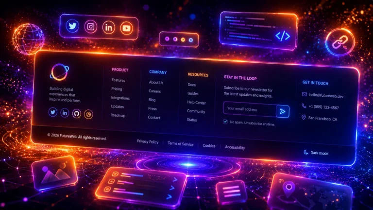
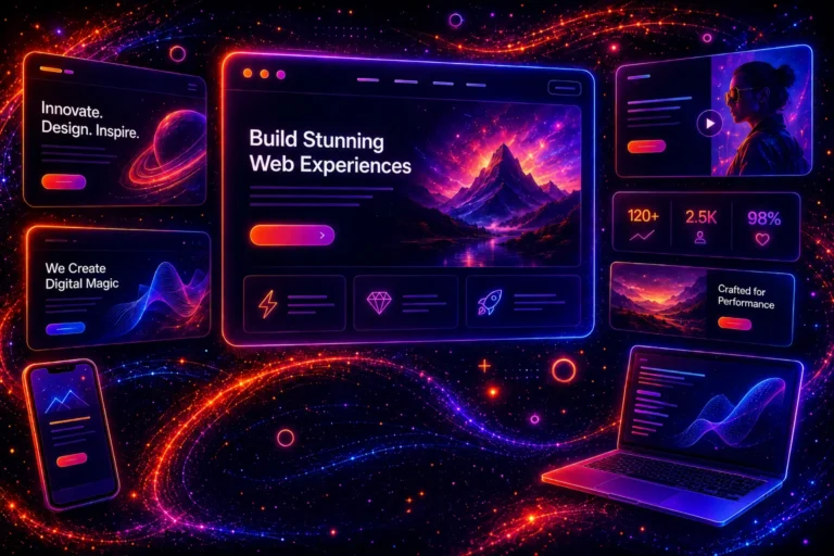
CSS cards are one of the most important user interface elements in modern web design. A well-designed card helps structure content, guides user attention, and makes a website look visually more professional.
In 2026 web design, hover effects, gradient borders, glassmorphism style, shadow animations, and minimalist UI components are increasingly used, making cards more interactive and attractive.
In this article, we present 25 modern CSS cards that can be used in blogs, online stores, portfolios, service pages, and many other projects. All examples use only pure HTML and CSS and do not require JavaScript, which makes them fast and easy to customize.
If you are looking for inspiration for modern card UI design or need ready-made code examples, below you will find practical demo solutions with HTML and CSS code.
Article Contents

What is a CSS card component?
A card is a visual user interface block that groups together a small amount of information. A card usually includes a title, description, image, icon, or action button. This kind of structure helps users quickly scan content and find the necessary information more easily.
Card-based design is popular because it works well on both desktop and mobile. Cards allow complex content to be divided into smaller readable parts and help create a clear and modern layout.
They are used in many places: blog previews, product listings, pricing packages, team member profiles, customer testimonials, and even analytics dashboards.
Why use card-based design?
Modern web design is no longer based only on long text blocks. Today’s users want fast, visual, and well-structured content. Card UI helps achieve this.
- better user experience
- clearer visual hierarchy
- easier responsive layout
- more modern and cleaner design
- better readability on mobile
- higher clickability
A properly designed CSS card can improve both user behavior and conversions because a visually strong component attracts attention and helps users find an important action more quickly.
Which CSS techniques are used to create modern cards?
In 2026 web design, several CSS techniques are used to create cards, allowing a very clean and professional result without JavaScript.
- CSS transitions
- CSS transforms
- box-shadow and glow effects
- gradient backgrounds and borders
- border-radius animations
- pseudo-elements ::before and ::after
- glassmorphism and blur effects
- image zoom hover animations
All the cards in this article use these techniques and can easily be customized to match the design of your project.
Testing CSS effects on a live WordPress site?
Kinsta is a managed WordPress hosting platform built for performance, staging workflows, and developer-friendly site management. It can be a strong fit for designers, developers, and agencies working on modern WordPress projects.
25 modern CSS cards – examples
Below you will find 25 modern CSS cards with a demo, HTML code, and CSS styling. All examples are in a Gutenberg-friendly format and can be used immediately or customized further.
1. Basic Content Card
A basic content card is one of the most common UI components in modern web design. It is widely used for displaying blog posts, services, products or project previews.
Modern Card Design
A modern card UI with hover animation, gradient border and a clean contemporary layout.
Read more<div class="card-basic">
<div class="card-basic__image">
<img src="image.jpg" alt="">
</div>
<div class="card-basic__content">
<h3>Card Title</h3>
<p>Short description of the card content.</p>
<a class="card-basic__btn" href="#">Read More</a>
</div>
</div>
.card-basic{
width:320px;
background:#fff;
border-radius:16px;
overflow:hidden;
box-shadow:0 10px 30px rgba(0,0,0,.08);
transition:.3s;
}

.card-basic:hover{
transform:translateY(-8px);
box-shadow:0 18px 40px rgba(0,0,0,.15);
}

.card-basic__image{
height:180px;
overflow:hidden;
}

.card-basic__image img{
width:100%;
height:100%;
object-fit:cover;
display:block;
}

.card-basic__content{
padding:24px;
}

.card-basic__btn{
display:inline-block;
padding:10px 18px;
border-radius:30px;
background:linear-gradient(135deg,#7a5cff,#00c2ff);
color:#fff;
text-decoration:none;
}
2. Hover Lift Card
A hover lift card slightly rises when the user moves the mouse over it. At the same time the shadow becomes stronger. This micro-animation is one of the most popular effects in modern UI design.
Hover Card
This card lifts when hovered and adds a subtle modern UI animation.
<div class="card-hover">
  <h3>Hover Card</h3>
  <p>This card lifts on hover.</p>
</div>
.card-hover{
width:260px;
padding:34px;
background:#fff;
border-radius:14px;
box-shadow:0 10px 24px rgba(0,0,0,.08);
transition:.35s;
}

.card-hover:hover{
transform:translateY(-12px);
box-shadow:0 20px 50px rgba(0,0,0,.18);
}
3. Glassmorphism Card
A glassmorphism card uses a transparent background, blur effect and subtle light reflections to create a modern glass-like interface. This design style is commonly used in premium UI design and SaaS dashboards.
Glass Card
Modern glass effect card with blur and light reflections.
<div class="card-glass">
  <h3>Glass Card</h3>
  <p>Modern glass effect card.</p>
</div>
.card-glass{
width:260px;
padding:34px;
background:rgba(255,255,255,.25);
backdrop-filter:blur(18px);
border:1px solid rgba(255,255,255,.45);
border-radius:18px;
box-shadow:0 10px 30px rgba(0,0,0,.08);
}
4. Gradient Border Card
A gradient border card is a trendy design pattern often used on SaaS and startup websites. A colorful gradient border adds energy and a modern feel to the interface.
Gradient Border
A clean modern UI card with a colorful gradient border.
<div class="card-gradient">
  <h3>Gradient Border</h3>
  <p>Clean modern UI card.</p>
</div>
.card-gradient{
width:260px;
padding:34px;
border-radius:16px;
border:3px solid transparent;

background:
linear-gradient(#fff,#fff) padding-box,
linear-gradient(130deg,#ff7a18,#ff3d77,#7a5cff,#00c2ff) border-box;

box-shadow:0 12px 30px rgba(0,0,0,.06);
}
5. Image Overlay Card
An image overlay card places text directly on top of an image. This design pattern is commonly used in portfolios, real estate websites, and project showcases where visual presentation is important.
<div class="card-overlay">
  <img src="image.jpg" alt="">
  <div class="card-overlay__text">
    <h3>Overlay Title</h3>
    <p>Project preview</p>
  </div>
</div>
.card-overlay{
position:relative;
width:300px;
border-radius:16px;
overflow:hidden;
}

.card-overlay img{
width:100%;
height:200px;
object-fit:cover;
}

.card-overlay__text{
position:absolute;
left:0;
right:0;
bottom:0;
padding:20px;
background:linear-gradient(transparent,rgba(0,0,0,.75));
color:#fff;
}
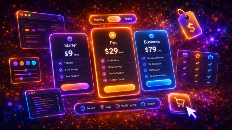
6. Pricing Card
A pricing card is ideal for displaying packages and pricing plans. A clear structure helps users quickly compare options and choose the best plan.
<div class="card-price">
  <div class="card-price__badge">POPULAR</div>
  <h3>Basic</h3>
  <p class="card-price__value">$19</p>
  <ul>
    <li>Feature one</li>
    <li>Feature two</li>
    <li>Email support</li>
  </ul>
  <a href="#" class="card-price__btn">Choose plan</a>
</div>
.card-price{
width:280px;
padding:36px;
background:#fff;
border-radius:18px;
text-align:center;
position:relative;
border:2px solid transparent;
background:
linear-gradient(#fff,#fff) padding-box,
linear-gradient(140deg,#00c2ff,#7a5cff,#ff3d77) border-box;
box-shadow:0 12px 35px rgba(0,0,0,.08);
transition:.35s;
overflow:hidden;
}

.card-price:hover{
transform:translateY(-12px) scale(1.03);
box-shadow:0 25px 65px rgba(0,0,0,.18);
}

.card-price__badge{
position:absolute;
top:16px;
right:16px;
font-size:11px;
font-weight:600;
background:linear-gradient(135deg,#7a5cff,#00c2ff);
color:#fff;
padding:5px 10px;
border-radius:20px;
}

.card-price__value{
font-size:42px;
font-weight:700;
margin:0 0 20px;
color:#2563eb;
}

.card-price__btn{
display:inline-block;
padding:12px 22px;
border-radius:30px;
background:linear-gradient(135deg,#7a5cff,#00c2ff);
color:#fff;
text-decoration:none;
}
7. Feature Card
A feature card highlights a specific feature or service using an icon, title and short description. It is commonly used on service pages, SaaS platforms and product landing pages.
Fast
Lightning fast performance and optimized speed.
<div class="card-feature">
  <div class="card-feature__icon">⚡</div>
  <h3>Fast</h3>
  <p>Lightning fast performance and optimized speed.</p>
</div>
.card-feature{
width:260px;
padding:34px;
text-align:center;
background:#fff;
border-radius:16px;
position:relative;
border:2px solid transparent;
background:
linear-gradient(#fff,#fff) padding-box,
linear-gradient(135deg,#00c2ff,#7a5cff,#00e0a4) border-box;
box-shadow:0 12px 35px rgba(0,0,0,.08);
transition:.35s;
overflow:hidden;
}

.card-feature:hover{
transform:translateY(-10px) scale(1.03);
box-shadow:0 25px 60px rgba(0,0,0,.18);
}

.card-feature__icon{
width:70px;
height:70px;
display:flex;
align-items:center;
justify-content:center;
margin:0 auto 16px;
font-size:30px;
border-radius:16px;
background:linear-gradient(135deg,#7a5cff,#00c2ff);
color:#fff;
box-shadow:0 10px 25px rgba(0,0,0,.15);
}
8. Flip Card
Flip card rotates on hover and shows additional information on the back side. It is a good solution when you want to display more content in a smaller space.
<div class="flip-card">
  <div class="flip-card__inner">
    <div class="flip-card__front">Front</div>
    <div class="flip-card__back">Back</div>
  </div>
</div>
.flip-card{
  width:200px;
  height:200px;
  perspective:1000px;
}
.flip-card__inner{
  position:relative;
  width:100%;
  height:100%;
  transition:transform .6s;
  transform-style:preserve-3d;
}
.flip-card:hover .flip-card__inner{
  transform:rotateY(180deg);
}
9. Icon Card
Icon card is a minimalist card where the main focus is on the icon. It works well for highlighting features, benefits, or services.
<div class="card-icon">
  <div class="card-icon__icon">⭐</div>
  <h3>Premium</h3>
  <p>Elegant feature block.</p>
</div>
.card-icon{
  width:220px;
  padding:30px;
  text-align:center;
  background:#fff;
  border-radius:12px;
  box-shadow:0 6px 18px rgba(0,0,0,.1);
}
.card-icon__icon{
  font-size:40px;
  margin-bottom:10px;
}
10. Blog Post Card
Blog post card is one of the most important components in blog design. It helps highlight the article title, image, and short preview.
Blog Title
Short preview text for the post.
<div class="card-blog">
  <img src="image.jpg" alt="">
  <div class="card-blog__body">
    <h3>Blog Title</h3>
    <p>Short preview text for the post.</p>
  </div>
</div>
.card-blog{
  width:300px;
  background:#fff;
  border-radius:10px;
  overflow:hidden;
  box-shadow:0 6px 20px rgba(0,0,0,.12);
}
.card-blog img{
  width:100%;
  display:block;
}
.card-blog__body{
  padding:18px;
}
11. Product Card
Product card is the most frequently used card type in online stores. It usually includes a product image, name, price, and action button.
Product Name
$29
<div class="card-product">
  <img src="image.jpg" alt="">
  <h3>Product Name</h3>
  <p class="card-product__price">$29</p>
  <button>Add to cart</button>
</div>
.card-product{
  width:260px;
  background:#fff;
  padding:20px;
  border-radius:10px;
  text-align:center;
  box-shadow:0 6px 20px rgba(0,0,0,.1);
}
.card-product img{
  width:100%;
  border-radius:8px;
}
.card-product__price{
  font-size:24px;
  font-weight:700;
  color:#2563eb;
}
12. Testimonial Card
Testimonial card is perfect for displaying customer feedback. It adds social proof and helps strengthen trust.
“Great service and amazing results.”
John Smith
<div class="card-testimonial">
  <p>“Great service and amazing results.”</p>
  <h4>John Smith</h4>
</div>
.card-testimonial{
  width:260px;
  padding:30px;
  background:#fff;
  border-radius:12px;
  box-shadow:0 8px 20px rgba(0,0,0,.12);
  font-style:italic;
}
13. Profile Card
Profile card is a good choice for presenting team members, authors, or experts. A profile picture and job title create a quick overview.
Jane Doe
Designer
<div class="card-profile">
  <img src="avatar.jpg" alt="">
  <h3>Jane Doe</h3>
  <p>Designer</p>
</div>
.card-profile{
  width:220px;
  text-align:center;
  background:#fff;
  padding:25px;
  border-radius:12px;
  box-shadow:0 8px 22px rgba(0,0,0,.12);
}
.card-profile img{
  border-radius:50%;
}
14. Statistics Card
Statistics card works well for displaying numbers and KPIs. A simple large number with short text works very well on dashboards and service pages.
120+
Projects completed
<div class="card-stats">
  <h2>120+</h2>
  <p>Projects completed</p>
</div>
.card-stats{
  width:200px;
  padding:30px;
  text-align:center;
  background:#fff;
  border-radius:12px;
  box-shadow:0 6px 18px rgba(0,0,0,.1);
}
.card-stats h2{
  font-size:36px;
  color:#2563eb;
}
15. Badge Card
Badge card adds a label like NEW, SALE, or POPULAR to the corner of the card. It draws attention and helps emphasize important content.
New Feature
Highlighted content block.
<div class="card-badge">
  <span class="card-badge__label">NEW</span>
  <h3>New Feature</h3>
  <p>Highlighted content block.</p>
</div>
.card-badge{
  position:relative;
  width:220px;
  padding:30px;
  background:#fff;
  border-radius:10px;
  box-shadow:0 6px 20px rgba(0,0,0,.1);
}
.card-badge__label{
  position:absolute;
  top:10px;
  right:10px;
  background:#ef4444;
  color:#fff;
}
16. Horizontal Card
Horizontal card displays the image on the left and text on the right. It works well for article previews, product highlights, and compact content blocks.
Horizontal Card
Description text
<div class="card-horizontal">
  <img src="image.jpg" alt="">
  <div>
    <h3>Horizontal Card</h3>
    <p>Description text</p>
  </div>
</div>
.card-horizontal{
  display:flex;
  gap:15px;
  align-items:center;
  width:320px;
  padding:15px;
  background:#fff;
  border-radius:10px;
  box-shadow:0 6px 18px rgba(0,0,0,.1);
}
17. Image Zoom Card
Image zoom card uses a slight image enlargement on hover. It adds visual dynamics and helps the card stand out more.
<div class="card-zoom">
  <img src="image.jpg" alt="">
</div>
.card-zoom{
  width:300px;
  overflow:hidden;
  border-radius:12px;
}
.card-zoom img{
  width:100%;
  transition:transform .3s ease;
}
.card-zoom:hover img{
  transform:scale(1.1);
}
18. Border Animation Card
Border animation card changes the border color or feel on hover. It is a simple but effective solution for designs that love minimalism.
Animated Border
Simple UI motion.
<div class="card-border">
  <h3>Animated Border</h3>
  <p>Simple UI motion.</p>
</div>
.card-border{
  width:240px;
  padding:30px;
  border:2px solid #2563eb;
  border-radius:12px;
  background:#fff;
  transition:border-color .3s ease, transform .3s ease;
}
.card-border:hover{
  border-color:#7c3aed;
}
19. Shadow Depth Card
Shadow depth card uses a layered or stronger shadow to give the card depth. This is very common in premium UI designs.
Depth Card
Hover for more depth.
<div class="card-shadow">
  <h3>Depth Card</h3>
  <p>Hover for more depth.</p>
</div>
.card-shadow{
  width:240px;
  padding:30px;
  background:#fff;
  border-radius:10px;
  box-shadow:0 4px 10px rgba(0,0,0,.1);
  transition:box-shadow .3s ease, transform .3s ease;
}
.card-shadow:hover{
  box-shadow:0 20px 40px rgba(0,0,0,.2);
}
20. Minimal Card
Minimal card focuses on a clean line, good spacing, and a subtle border. It works well for elegant and content-focused websites.
Minimal UI
Less noise, more clarity.
<div class="card-minimal">
  <h3>Minimal UI</h3>
  <p>Less noise, more clarity.</p>
</div>
.card-minimal{
  width:220px;
  padding:30px;
  border:1px solid #e5e7eb;
  border-radius:8px;
  background:#fff;
}
21. Background Image Card
Background image card uses a background image across the entire card. This solution is often used for travel, real estate, and inspirational portfolios.
Background Card
<div class="card-bg">
  <h3>Background Card</h3>
</div>
.card-bg{
  width:300px;
  height:200px;
  display:flex;
  align-items:end;
  padding:20px;
  color:#fff;
  border-radius:12px;
  background:url('image.jpg') center/cover;
}
22. Expand Card
Expand card slightly enlarges on hover. This makes the element feel more active and helps highlight important content.
<div class="card-expand">
  <h3>Hover me</h3>
  <p>Expandable interaction</p>
</div>
.card-expand{
  width:220px;
  padding:30px;
  background:#fff;
  border-radius:10px;
  transition:transform .3s ease;
}
.card-expand:hover{
  transform:scale(1.05);
}
23. Stack Card
Stack card creates a visual effect as if multiple cards were stacked on top of each other. This kind of solution works well for creative and bold web designs.
<div class="stack-card">
  <div class="stack-card__item stack-card__item--one"></div>
  <div class="stack-card__item stack-card__item--two"></div>
</div>
.stack-card{
  position:relative;
  width:220px;
  height:140px;
}
.stack-card__item{
  position:absolute;
  width:200px;
  height:120px;
  border-radius:10px;
}
.stack-card__item--one{top:0;left:0;}
.stack-card__item--two{top:10px;left:12px;}
24. Neon Glow Card
Neon glow card works well on a dark background and in futuristic designs. The glow effect highlights the card edges and creates an eye-catching result.
Neon Card
Futuristic UI block.
<div class="card-neon">
  <h3>Neon Card</h3>
  <p>Futuristic UI block.</p>
</div>
.card-neon{
  width:220px;
  padding:30px;
  background:#111827;
  color:#fff;
  border-radius:10px;
  box-shadow:0 0 15px #22d3ee;
}
25. CTA Card
CTA card is a call-to-action block whose goal is to guide the user to the next action. It works well for landing pages and service pages.
Start your project
Build a clean and modern website.
<div class="card-cta">
  <h3>Start your project</h3>
  <p>Build a clean and modern website.</p>
  <button>Contact Us</button>
</div>
.card-cta{
  width:260px;
  padding:30px;
  background:#2563eb;
  color:#fff;
  text-align:center;
  border-radius:12px;
}
.card-cta button{
  margin-top:15px;
  padding:10px 20px;
  border:none;
  background:#fff;
  color:#2563eb;
}
If you’re interested in more CSS animations and UI effects, also check out:
- 30 CSS Loading Animations
- 20 Modern CSS Buttons
- 30 CSS Image Hover Effects
- 10 Modern CSS Hamburger Menu Buttons
- 20 Modern CSS Link Effects
Want these kinds of website updates on your site?
If you would like to add modern effects, animations, and new functionality to your website, we can implement all the necessary updates for you professionally.
View our website update servicesBest practices in CSS card design
Card-based design is one of the most popular UI solutions in modern web development. A well-designed card helps users quickly understand which content is important and which elements are clickable.
When designing a card, several important principles should be followed that improve both user experience and visual quality.
- Clear visual hierarchy – the card should have a clearly distinguishable title, content, and action button.
- Sufficient contrast – text and background must be easy to read.
- Consistent spacing – padding and margin create a clean design.
- Hover effect – small animations provide visual feedback to the user.
- Responsive design – cards must work well on mobile.
- Optimized images – use WebP images to improve page loading speed.
It is also important to avoid overly complex animations. Excessive motion can distract users and make the website slower. The best CSS cards are simple, clear, and visually balanced.
FAQ – CSS Cards
What is a CSS card component?
A CSS card is a user interface element that displays a small unit of information in a visual block. A card usually includes an image, title, description, and sometimes an action button.
Can CSS cards be created without JavaScript?
Yes. Most modern cards can be created using only HTML and CSS. Hover animations, shadow effects, and even flip effects are possible with pure CSS.
Does CSS card design work on mobile devices?
Yes, but it is important to use a responsive design. Cards should stack into a single column on mobile, and their size must be large enough for elements to be easy to tap.
Which CSS card designs are popular in 2026?
Popular 2026 trends include glassmorphism cards, hover lift effects, gradient borders, image zoom animations, and minimalist card UI solutions.
Where is card UI design used?
Card UI design is used in blogs, online stores, portfolio pages, SaaS applications, and dashboards. Cards are especially useful when there is a need to display a lot of content in a structured format.
Summary
CSS cards are an important part of modern web design. They help divide content into smaller visual elements that users can quickly scan and understand.
In this article, we looked at 25 different CSS cards that can be used in blogs, online stores, portfolio pages, and many other projects.
Because all examples use pure HTML and CSS, they are easy to customize to match your own design. With small changes, you can adjust colors, animations, and layout so they fit the style of any website.
Card-based design remains one of the most important UI patterns and will likely continue to be popular in the future.
Developer note
Need a faster WordPress setup for design and development work?
For agencies, freelancers, and developers working on performance-focused WordPress projects, Kinsta is worth a look.
View Kinsta Hosting