New
30 Modern CSS Tabs for Websites – Responsive Tab UI, Product Tabs & Content Sections
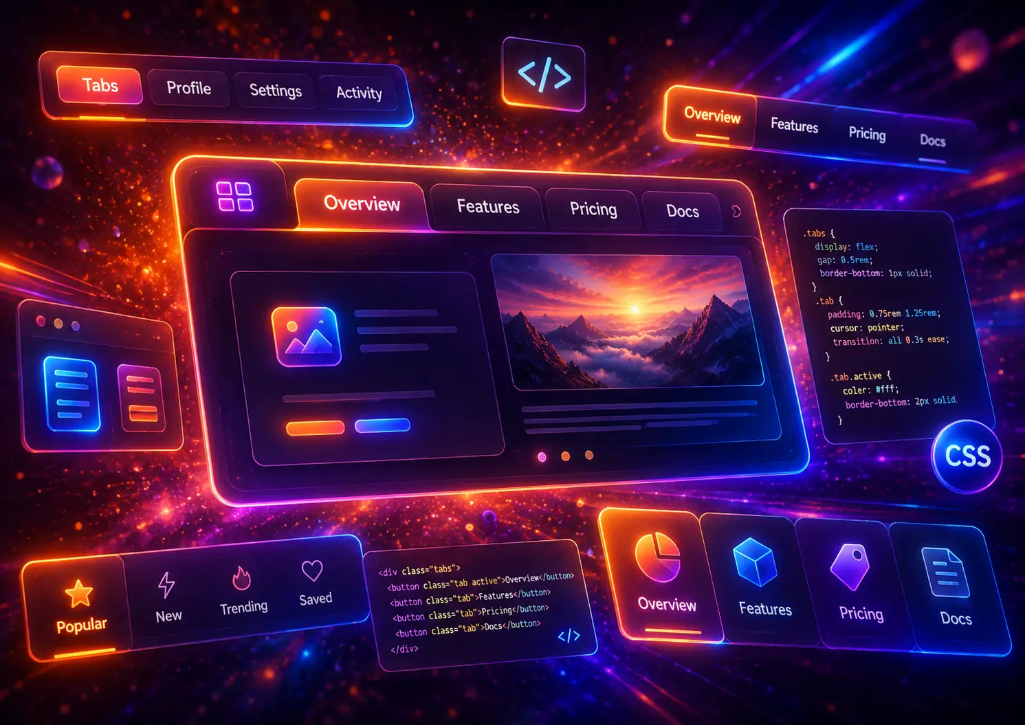
Tabs are one of the most useful UI patterns for organizing related content without making a page feel too long or overloaded. A well-designed tab section can help users switch between product details, pricing options, dashboard panels, documentation sections, feature comparisons, FAQs, and other grouped content without leaving the current page.
In this guide, you will find 30 modern CSS tabs examples for websites, including responsive tab UI layouts, CSS-only tabs, product tabs, dashboard tabs, animated tabs, vertical tabs, mobile-friendly tabs, and accessible JavaScript tab examples. Each example includes a live preview and visible HTML and CSS code so you can copy, customize, and use the layout in your own projects.
On this page
Table of Contents

What Are CSS Tabs?
CSS tabs are interface sections that divide related content into separate panels. Instead of showing every detail at once, a tab layout lets users choose which section they want to view. This makes tabs useful for pages where several pieces of information belong together but do not need to be visible at the same time.
A typical tab interface has two main parts: a row or column of tab buttons and a content area that changes when a different tab is selected. For example, a product page may use tabs for description, specifications, shipping, and reviews. A dashboard may use tabs for overview, analytics, settings, and billing.
Tabs are not only a visual design element. They also help create a clearer content structure when they are used correctly. The best tab sections group closely related information, keep the active state obvious, and work well on both desktop and mobile screens.
Why Use Tabs in Modern Website Design?
Tabs are useful when a page needs to present several related sections without forcing users to scroll through a long block of content. They are especially helpful for modern websites, SaaS landing pages, ecommerce stores, documentation pages, dashboards, pricing sections, and settings interfaces.
- They reduce visual clutter by showing one content panel at a time.
- They improve scanning because users can quickly see the available content categories.
- They keep related content together without sending users to another page.
- They work well in UI-heavy layouts such as dashboards, product pages, and feature sections.
- They can improve mobile usability when the tab layout becomes scrollable, stacked, or accordion-like on smaller screens.
For SEO and usability, tabs should not be used just to hide large amounts of unrelated content. They work best when each panel supports the same user task or topic. If the content is completely different, a normal page section or navigation menu may be a better choice.
CSS Tabs vs Accordions vs Navigation Menus
Tabs, accordions, and navigation menus can look similar, but they solve different design problems. Choosing the right pattern helps users understand how to move through your content and prevents the page from feeling confusing.
Tabs
Best for switching between related content panels inside the same section, such as product details, dashboard views, pricing options, or documentation topics.
Accordions
Best for vertically stacked content where users may open one or several items, such as FAQs, support answers, product details, or mobile filters.
Navigation Menus
Best for moving users to different pages, larger site areas, categories, or important sections across the website.
If you need collapsible FAQ sections, you may also like our guide to modern CSS accordions. If you are building a header, dropdown, mobile menu, or mega menu, see our collection of modern CSS navigation menus. For larger page structures, our modern CSS layouts guide is a better starting point.
Should CSS Tabs Use JavaScript?
You can create simple tabs with CSS only, usually by using radio inputs, labels, and sibling selectors. CSS-only tabs are useful for demos, lightweight sections, and simple static content where you do not need advanced interaction logic.
For real websites, JavaScript is often the better option when tabs need stronger accessibility, keyboard navigation, ARIA states, analytics events, deep linking, or more flexible behavior. A JavaScript tab component can update the active tab, control which panel is visible, and make the interface easier to use with a keyboard or screen reader.
In this post, you will see both approaches. Some examples are CSS-only, while more advanced examples use small JavaScript snippets where it makes the tab interface more practical, accessible, or realistic for production websites.
30 Modern CSS Tabs Examples
The examples below include different types of tab layouts for modern websites: product tabs, responsive tabs, dashboard tabs, vertical tabs, animated tabs, pricing tabs, documentation tabs, mobile-friendly tabs, and accessible JavaScript tabs. Each demo includes a live preview and visible code blocks so you can understand how the layout works and adapt it to your own design.
1. Basic CSS Tabs
Basic CSS tabs are a simple and practical way to organize related content into separate panels. They work well for landing pages, service sections, product details, support content, and small feature blocks.
This example uses a clean card layout, rounded tab buttons, clear active states, and a compact content panel. The live preview is placed inside a fixed-height preview box, so the example area stays controlled instead of stretching the full page.
- Perfect for simple content sections, landing pages, and product information
- Uses clear active states for better usability
- Includes a small JavaScript snippet for switching tabs
- Responsive and easy to customize
- Preview area stays inside a controlled demo box
Simple tab layout
This basic tab section keeps related content in one clean interface. It is useful for short landing page sections, service descriptions, product highlights, and small documentation blocks.
Organized feature content
Use tabs to separate feature content without making the page longer. Visitors can quickly switch between panels and focus only on the information they need.
Helpful support panel
A tabbed support area can show quick answers, contact details, help resources, or onboarding notes in the same compact section.
HTML
<section class="basic-css-tabs">

  <div class="basic-css-tabs-nav" role="tablist" aria-label="Basic CSS tabs">
    <button class="basic-css-tabs-btn is-active" type="button" data-tab="overview">Overview</button>
    <button class="basic-css-tabs-btn" type="button" data-tab="features">Features</button>
    <button class="basic-css-tabs-btn" type="button" data-tab="support">Support</button>
  </div>

  <div class="basic-css-tabs-panel is-active" data-panel="overview">
    <h3>Simple tab layout</h3>
    <p>This basic tab section keeps related content in one clean interface. It is useful for short landing page sections, service descriptions, product highlights, and small documentation blocks.</p>
    <div class="basic-css-tabs-tags">
      <span>Clean UI</span>
      <span>Responsive</span>
      <span>Easy to edit</span>
    </div>
  </div>

  <div class="basic-css-tabs-panel" data-panel="features">
    <h3>Organized feature content</h3>
    <p>Use tabs to separate feature content without making the page longer. Visitors can quickly switch between panels and focus only on the information they need.</p>
    <div class="basic-css-tabs-tags">
      <span>Feature sections</span>
      <span>Landing pages</span>
      <span>Modern layout</span>
    </div>
  </div>

  <div class="basic-css-tabs-panel" data-panel="support">
    <h3>Helpful support panel</h3>
    <p>A tabbed support area can show quick answers, contact details, help resources, or onboarding notes in the same compact section.</p>
    <div class="basic-css-tabs-tags">
      <span>Support content</span>
      <span>Help center</span>
      <span>User friendly</span>
    </div>
  </div>

</section>
CSS
.basic-css-tabs{
width:min(100%,820px);
border-radius:28px;
background:#ffffff;
border:1px solid rgba(15,23,42,.08);
box-shadow:0 24px 70px rgba(15,23,42,.12);
overflow:hidden;
}

.basic-css-tabs-nav{
display:flex;
gap:8px;
padding:14px;
background:#f8fafc;
border-bottom:1px solid rgba(15,23,42,.08);
}

.basic-css-tabs-btn{
flex:1;
cursor:pointer;
border:0;
border-radius:16px;
padding:14px 16px;
background:transparent;
color:#475569;
font-size:15px;
font-weight:900;
line-height:1.25;
transition:background .22s ease,color .22s ease,box-shadow .22s ease,transform .22s ease;
}

.basic-css-tabs-btn:hover{
background:#eef2ff;
color:#3730a3;
transform:translateY(-1px);
}

.basic-css-tabs-btn.is-active{
background:linear-gradient(135deg,#4f46e5,#7c3aed);
color:#ffffff;
box-shadow:0 14px 32px rgba(79,70,229,.28);
}

.basic-css-tabs-panel{
display:none;
padding:34px;
}

.basic-css-tabs-panel.is-active{
display:block;
}

.basic-css-tabs-panel h3{
margin:0 0 12px;
font-size:clamp(28px,4vw,42px);
line-height:1.08;
font-weight:950;
letter-spacing:-.045em;
color:#0f172a;
}

.basic-css-tabs-panel p{
max-width:660px;
margin:0;
font-size:16px;
line-height:1.75;
color:#475569;
}

.basic-css-tabs-tags{
display:flex;
flex-wrap:wrap;
gap:10px;
margin-top:24px;
}

.basic-css-tabs-tags span{
display:inline-flex;
align-items:center;
border-radius:999px;
padding:8px 12px;
background:#eef2ff;
color:#4338ca;
font-size:13px;
font-weight:900;
}

@media (max-width:640px){
.basic-css-tabs-nav{
flex-direction:column;
}

.basic-css-tabs-btn{
text-align:left;
}

.basic-css-tabs-panel{
padding:24px;
}

.basic-css-tabs-panel h3{
font-size:30px;
}
}
JavaScript
document.querySelectorAll(".basic-css-tabs-demo").forEach(function(tabBlock){
const buttons=tabBlock.querySelectorAll(".basic-css-tabs-btn");
const panels=tabBlock.querySelectorAll(".basic-css-tabs-panel");

buttons.forEach(function(button){
button.addEventListener("click",function(){
const target=button.getAttribute("data-tab");

buttons.forEach(function(btn){
btn.classList.remove("is-active");
});

panels.forEach(function(panel){
panel.classList.remove("is-active");
});

button.classList.add("is-active");
tabBlock.querySelector('[data-panel="'+target+'"]').classList.add("is-active");
});
});
});
This basic CSS tabs example is a flexible starting point for many website sections. You can keep the same structure and change the tab labels, colors, spacing, and panel content to match your own design system.
2. Responsive CSS Tabs
Responsive CSS tabs are designed to stay usable on desktop, tablet, and mobile screens. Instead of forcing every tab into one tight row, this layout uses a flexible grid that adapts as the screen becomes smaller.
This example is useful when tab labels are longer or when the tab section needs to support more content. The preview is inside a controlled scrollable demo box, so the design stays easy to review inside a blog post.
- Perfect for service pages, SaaS sections, feature blocks, and content-heavy websites
- Uses a responsive tab grid that adapts on smaller screens
- Includes a modern dark preview style with strong contrast
- Uses a small JavaScript snippet for active tab switching
- Preview area stays inside a fixed-height demo box
Responsive Tabs
Switch content without breaking mobile layouts
Use this responsive tab design when your tab labels need more space and the layout must stay clean on different screen sizes.
Design system friendly
This responsive tab layout uses reusable spacing, consistent button states, and a flexible panel area. It can fit into landing pages, dashboards, or content-heavy website sections.
4
Flexible tab buttons
100%
Responsive width
Mobile-friendly structure
The tab buttons move from four columns to two columns and then to one column on smaller screens, making each tab easier to read and tap.
2x
Tablet tab columns
1x
Mobile tab column
Fast to customize
You can replace the labels, text, and statistics with your own content. The structure stays simple, while the visual style feels polished and modern.
CSS
Scoped styles
JS
Small switcher
Built for content growth
This type of tab section works well when your website grows and you need to organize more information without overwhelming the first screen.
UX
Cleaner sections
SEO
Better structure
HTML
<section class="responsive-css-tabs">

  <div class="responsive-css-tabs-header">
    <div class="responsive-css-tabs-label">Responsive Tabs</div>
    <h3 class="responsive-css-tabs-title">Switch content without <span>breaking mobile layouts</span></h3>
    <p class="responsive-css-tabs-text">Use this responsive tab design when your tab labels need more space and the layout must stay clean on different screen sizes.</p>
  </div>

  <div class="responsive-css-tabs-nav" role="tablist" aria-label="Responsive CSS tabs">
    <button class="responsive-css-tabs-btn is-active" type="button" data-tab="design">Design System</button>
    <button class="responsive-css-tabs-btn" type="button" data-tab="mobile">Mobile Layout</button>
    <button class="responsive-css-tabs-btn" type="button" data-tab="speed">Fast Setup</button>
    <button class="responsive-css-tabs-btn" type="button" data-tab="growth">Growth Ready</button>
  </div>

  <div class="responsive-css-tabs-content">

    <div class="responsive-css-tabs-panel is-active" data-panel="design">
      <div>
        <h3>Design system friendly</h3>
        <p>This responsive tab layout uses reusable spacing, consistent button states, and a flexible panel area.</p>
      </div>
      <div class="responsive-css-tabs-stats">
        <div class="responsive-css-tabs-stat">
          <strong>4</strong>
          <span>Flexible tab buttons</span>
        </div>
        <div class="responsive-css-tabs-stat">
          <strong>100%</strong>
          <span>Responsive width</span>
        </div>
      </div>
    </div>

    <div class="responsive-css-tabs-panel" data-panel="mobile">
      <div>
        <h3>Mobile-friendly structure</h3>
        <p>The tab buttons move from four columns to two columns and then to one column on smaller screens.</p>
      </div>
      <div class="responsive-css-tabs-stats">
        <div class="responsive-css-tabs-stat">
          <strong>2x</strong>
          <span>Tablet tab columns</span>
        </div>
        <div class="responsive-css-tabs-stat">
          <strong>1x</strong>
          <span>Mobile tab column</span>
        </div>
      </div>
    </div>

    <div class="responsive-css-tabs-panel" data-panel="speed">
      <div>
        <h3>Fast to customize</h3>
        <p>You can replace the labels, text, and statistics with your own content.</p>
      </div>
      <div class="responsive-css-tabs-stats">
        <div class="responsive-css-tabs-stat">
          <strong>CSS</strong>
          <span>Scoped styles</span>
        </div>
        <div class="responsive-css-tabs-stat">
          <strong>JS</strong>
          <span>Small switcher</span>
        </div>
      </div>
    </div>

    <div class="responsive-css-tabs-panel" data-panel="growth">
      <div>
        <h3>Built for content growth</h3>
        <p>This type of tab section works well when your website grows and you need to organize more information.</p>
      </div>
      <div class="responsive-css-tabs-stats">
        <div class="responsive-css-tabs-stat">
          <strong>UX</strong>
          <span>Cleaner sections</span>
        </div>
        <div class="responsive-css-tabs-stat">
          <strong>SEO</strong>
          <span>Better structure</span>
        </div>
      </div>
    </div>

  </div>

</section>
CSS
.responsive-css-tabs{
width:min(100%,920px);
}

.responsive-css-tabs-header{
margin-bottom:24px;
text-align:center;
}

.responsive-css-tabs-label{
display:inline-flex;
align-items:center;
justify-content:center;
margin-bottom:14px;
padding:8px 12px;
border-radius:999px;
background:rgba(96,165,250,.14);
border:1px solid rgba(147,197,253,.20);
color:#bfdbfe;
font-size:13px;
font-weight:900;
letter-spacing:.06em;
text-transform:uppercase;
}

.responsive-css-tabs-title{
margin:0 0 12px;
font-size:clamp(32px,5vw,54px);
line-height:1.02;
font-weight:950;
letter-spacing:-.055em;
color:#ffffff;
}

.responsive-css-tabs-title span{
background:linear-gradient(90deg,#60a5fa,#c084fc,#34d399);
-webkit-background-clip:text;
background-clip:text;
color:transparent;
-webkit-text-fill-color:transparent;
}

.responsive-css-tabs-text{
max-width:660px;
margin:0 auto;
font-size:16px;
line-height:1.75;
color:#cbd5e1;
}

.responsive-css-tabs-nav{
display:grid;
grid-template-columns:repeat(4,minmax(0,1fr));
gap:10px;
margin-bottom:14px;
}

.responsive-css-tabs-btn{
cursor:pointer;
min-height:58px;
border:1px solid rgba(148,163,184,.22);
border-radius:18px;
padding:13px 14px;
background:rgba(255,255,255,.07);
color:#dbeafe;
font-size:14px;
font-weight:850;
line-height:1.25;
text-align:left;
transition:background .22s ease,border-color .22s ease,transform .22s ease;
}

.responsive-css-tabs-btn:hover{
transform:translateY(-2px);
border-color:rgba(147,197,253,.48);
background:rgba(255,255,255,.11);
}

.responsive-css-tabs-btn.is-active{
border-color:rgba(96,165,250,.9);
background:linear-gradient(135deg,#2563eb,#7c3aed);
color:#ffffff;
box-shadow:0 18px 36px rgba(37,99,235,.22);
}

.responsive-css-tabs-content{
border:1px solid rgba(148,163,184,.24);
border-radius:24px;
background:rgba(255,255,255,.08);
backdrop-filter:blur(18px);
overflow:hidden;
}

.responsive-css-tabs-panel{
display:none;
padding:30px;
}

.responsive-css-tabs-panel.is-active{
display:grid;
grid-template-columns:1.1fr .9fr;
gap:26px;
align-items:center;
}

.responsive-css-tabs-panel h3{
margin:0 0 12px;
color:#ffffff;
font-size:28px;
line-height:1.2;
font-weight:950;
}

.responsive-css-tabs-panel p{
margin:0;
color:#cbd5e1;
font-size:16px;
line-height:1.75;
}

.responsive-css-tabs-stats{
display:grid;
gap:12px;
}

.responsive-css-tabs-stat{
padding:16px;
border:1px solid rgba(148,163,184,.22);
border-radius:18px;
background:rgba(15,23,42,.32);
}

.responsive-css-tabs-stat strong{
display:block;
margin-bottom:4px;
color:#ffffff;
font-size:26px;
line-height:1;
font-weight:950;
}

.responsive-css-tabs-stat span{
color:#bfdbfe;
font-size:13px;
font-weight:800;
}

@media (max-width:820px){
.responsive-css-tabs-nav{
grid-template-columns:repeat(2,minmax(0,1fr));
}

.responsive-css-tabs-panel.is-active{
grid-template-columns:1fr;
}
}

@media (max-width:640px){
.responsive-css-tabs-header{
text-align:left;
}

.responsive-css-tabs-title{
font-size:34px;
}

.responsive-css-tabs-nav{
grid-template-columns:1fr;
}

.responsive-css-tabs-btn{
min-height:50px;
}

.responsive-css-tabs-panel{
padding:22px;
}

.responsive-css-tabs-panel h3{
font-size:24px;
}
}
JavaScript
document.querySelectorAll(".responsive-css-tabs-demo").forEach(function(tabBlock){
const buttons=tabBlock.querySelectorAll(".responsive-css-tabs-btn");
const panels=tabBlock.querySelectorAll(".responsive-css-tabs-panel");

buttons.forEach(function(button){
button.addEventListener("click",function(){
const target=button.getAttribute("data-tab");

buttons.forEach(function(btn){
btn.classList.remove("is-active");
});

panels.forEach(function(panel){
panel.classList.remove("is-active");
});

button.classList.add("is-active");
tabBlock.querySelector('[data-panel="'+target+'"]').classList.add("is-active");
});
});
});
This responsive CSS tabs example is useful when you want the tab navigation to stay clean on different screen sizes. The layout keeps the desktop version polished while making the mobile version easier to tap and read.
3. CSS Only Radio Tabs
CSS only radio tabs are useful when you want a tab interface without JavaScript. This technique uses hidden radio inputs, labels as tab buttons, and CSS selectors to show the active content panel.
This example has a soft editorial style with a clean content card, rounded tabs, and a calm background. It is a good choice for simple content sections, blog layouts, lightweight landing pages, and static website components.
- Perfect for simple static tab sections without JavaScript
- Uses radio inputs and labels to control the active panel
- Clean light design with soft spacing and readable content
- Good for blogs, landing pages, documentation notes, and service sections
- Preview area stays inside a fixed-height scrollable demo box
CSS Only Tabs
Tabs without JavaScript
Use this radio-based tab pattern when you want a lightweight tab section that works with HTML and CSS only.
Plan the content first
CSS only tabs work best when the content is simple and predictable. Use them for grouped information where each panel supports the same topic or user goal.
Step 01
Group related content before designing the tabs.
Step 02
Keep tab labels short and easy to scan.
Step 03
Make the active tab visually obvious.
Create a calm interface
This design uses soft colors, rounded corners, and clear spacing. The result feels modern without needing animations or complex interaction logic.
Readable
Use enough contrast between text and background.
Flexible
The layout adapts well to different content lengths.
Lightweight
No JavaScript is required for the tab switching.
Publish a simple section
You can place this pattern inside a landing page, documentation block, blog article, or product information area. It is easy to copy and customize.
Static sites
Useful for simple HTML and CSS projects.
WordPress
Can be placed inside a custom HTML block.
Reusable
Change colors, labels, and content as needed.
HTML
<section class="css-only-radio-tabs">

  <div class="css-only-radio-tabs-header">
    <div class="css-only-radio-tabs-kicker">CSS Only Tabs</div>
    <h3 class="css-only-radio-tabs-title">Tabs without <span>JavaScript</span></h3>
    <p class="css-only-radio-tabs-text">Use this radio-based tab pattern when you want a lightweight tab section that works with HTML and CSS only.</p>
  </div>

  <input type="radio" name="css-only-radio-tabs" id="css-only-radio-tab-1" checked>
  <input type="radio" name="css-only-radio-tabs" id="css-only-radio-tab-2">
  <input type="radio" name="css-only-radio-tabs" id="css-only-radio-tab-3">

  <div class="css-only-radio-tabs-nav" role="tablist" aria-label="CSS only radio tabs">
    <label for="css-only-radio-tab-1">Strategy</label>
    <label for="css-only-radio-tab-2">Design</label>
    <label for="css-only-radio-tab-3">Publishing</label>
  </div>

  <div class="css-only-radio-tabs-panels">

    <div class="css-only-radio-tabs-panel css-only-radio-tabs-panel-1">
      <h3>Plan the content first</h3>
      <p>CSS only tabs work best when the content is simple and predictable. Use them for grouped information where each panel supports the same topic or user goal.</p>
      <div class="css-only-radio-tabs-notes">
        <div class="css-only-radio-tabs-note">
          <strong>Step 01</strong>
          <span>Group related content before designing the tabs.</span>
        </div>
        <div class="css-only-radio-tabs-note">
          <strong>Step 02</strong>
          <span>Keep tab labels short and easy to scan.</span>
        </div>
        <div class="css-only-radio-tabs-note">
          <strong>Step 03</strong>
          <span>Make the active tab visually obvious.</span>
        </div>
      </div>
    </div>

    <div class="css-only-radio-tabs-panel css-only-radio-tabs-panel-2">
      <h3>Create a calm interface</h3>
      <p>This design uses soft colors, rounded corners, and clear spacing. The result feels modern without needing animations or complex interaction logic.</p>
      <div class="css-only-radio-tabs-notes">
        <div class="css-only-radio-tabs-note">
          <strong>Readable</strong>
          <span>Use enough contrast between text and background.</span>
        </div>
        <div class="css-only-radio-tabs-note">
          <strong>Flexible</strong>
          <span>The layout adapts well to different content lengths.</span>
        </div>
        <div class="css-only-radio-tabs-note">
          <strong>Lightweight</strong>
          <span>No JavaScript is required for the tab switching.</span>
        </div>
      </div>
    </div>

    <div class="css-only-radio-tabs-panel css-only-radio-tabs-panel-3">
      <h3>Publish a simple section</h3>
      <p>You can place this pattern inside a landing page, documentation block, blog article, or product information area. It is easy to copy and customize.</p>
      <div class="css-only-radio-tabs-notes">
        <div class="css-only-radio-tabs-note">
          <strong>Static sites</strong>
          <span>Useful for simple HTML and CSS projects.</span>
        </div>
        <div class="css-only-radio-tabs-note">
          <strong>WordPress</strong>
          <span>Can be placed inside a custom HTML block.</span>
        </div>
        <div class="css-only-radio-tabs-note">
          <strong>Reusable</strong>
          <span>Change colors, labels, and content as needed.</span>
        </div>
      </div>
    </div>

  </div>

</section>
CSS
.css-only-radio-tabs{
width:min(100%,860px);
padding:28px;
border-radius:30px;
background:rgba(255,255,255,.88);
border:1px solid rgba(15,23,42,.08);
box-shadow:0 26px 80px rgba(120,53,15,.13);
backdrop-filter:blur(16px);
}

.css-only-radio-tabs-header{
margin-bottom:24px;
}

.css-only-radio-tabs-kicker{
display:inline-flex;
align-items:center;
margin-bottom:12px;
padding:8px 12px;
border-radius:999px;
background:#ffedd5;
color:#c2410c;
font-size:13px;
font-weight:900;
letter-spacing:.06em;
text-transform:uppercase;
}

.css-only-radio-tabs-title{
margin:0 0 10px;
font-size:clamp(32px,5vw,52px);
line-height:1.04;
font-weight:950;
letter-spacing:-.055em;
color:#111827;
}

.css-only-radio-tabs-title span{
color:#ea580c;
}

.css-only-radio-tabs-text{
max-width:650px;
margin:0;
font-size:16px;
line-height:1.75;
color:#57534e;
}

.css-only-radio-tabs input[type="radio"]{
position:absolute;
opacity:0;
pointer-events:none;
}

.css-only-radio-tabs-nav{
display:flex;
flex-wrap:wrap;
gap:10px;
margin-bottom:18px;
padding:8px;
border-radius:22px;
background:#fff7ed;
border:1px solid rgba(249,115,22,.14);
}

.css-only-radio-tabs-nav label{
cursor:pointer;
display:inline-flex;
align-items:center;
justify-content:center;
flex:1 1 150px;
min-height:48px;
border-radius:16px;
padding:12px 14px;
color:#7c2d12;
font-size:14px;
font-weight:900;
line-height:1.2;
transition:background .22s ease,color .22s ease,box-shadow .22s ease,transform .22s ease;
}

.css-only-radio-tabs-nav label:hover{
background:#fed7aa;
transform:translateY(-1px);
}

.css-only-radio-tabs-panels{
position:relative;
border-radius:24px;
background:#ffffff;
border:1px solid rgba(15,23,42,.08);
box-shadow:0 18px 46px rgba(15,23,42,.07);
overflow:hidden;
}

.css-only-radio-tabs-panel{
display:none;
padding:30px;
}

.css-only-radio-tabs-panel h3{
margin:0 0 10px;
font-size:28px;
line-height:1.15;
font-weight:950;
letter-spacing:-.035em;
color:#111827;
}

.css-only-radio-tabs-panel p{
margin:0;
max-width:660px;
font-size:16px;
line-height:1.75;
color:#57534e;
}

.css-only-radio-tabs-notes{
display:grid;
grid-template-columns:repeat(3,minmax(0,1fr));
gap:12px;
margin-top:24px;
}

.css-only-radio-tabs-note{
padding:16px;
border-radius:18px;
background:#fff7ed;
border:1px solid rgba(249,115,22,.16);
}

.css-only-radio-tabs-note strong{
display:block;
margin-bottom:5px;
font-size:15px;
font-weight:950;
color:#9a3412;
}

.css-only-radio-tabs-note span{
display:block;
font-size:13px;
line-height:1.5;
font-weight:700;
color:#78716c;
}

#css-only-radio-tab-1:checked ~ .css-only-radio-tabs-nav label[for="css-only-radio-tab-1"],
#css-only-radio-tab-2:checked ~ .css-only-radio-tabs-nav label[for="css-only-radio-tab-2"],
#css-only-radio-tab-3:checked ~ .css-only-radio-tabs-nav label[for="css-only-radio-tab-3"]{
background:linear-gradient(135deg,#f97316,#f43f5e);
color:#ffffff;
box-shadow:0 14px 34px rgba(249,115,22,.24);
}

#css-only-radio-tab-1:checked ~ .css-only-radio-tabs-panels .css-only-radio-tabs-panel-1,
#css-only-radio-tab-2:checked ~ .css-only-radio-tabs-panels .css-only-radio-tabs-panel-2,
#css-only-radio-tab-3:checked ~ .css-only-radio-tabs-panels .css-only-radio-tabs-panel-3{
display:block;
}

@media (max-width:720px){
.css-only-radio-tabs{
padding:22px;
border-radius:24px;
}

.css-only-radio-tabs-nav{
display:grid;
grid-template-columns:1fr;
}

.css-only-radio-tabs-nav label{
justify-content:flex-start;
}

.css-only-radio-tabs-panel{
padding:24px;
}

.css-only-radio-tabs-panel h3{
font-size:24px;
}

.css-only-radio-tabs-notes{
grid-template-columns:1fr;
}
}
This CSS only radio tabs example is useful when you want a lightweight tab component without extra scripts. It is best for simple, static content where the tab structure does not need advanced keyboard logic or dynamic behavior.
4. Product Details Tabs
Product details tabs are commonly used on ecommerce product pages to organize important buying information. Instead of showing description, specifications, shipping, and returns in one long block, tabs let customers choose the information they need.
This example uses a product-style layout with a visual product card, trust badges, feature highlights, and tabbed product information. It is designed to feel very different from the previous examples and works well for ecommerce stores, WooCommerce pages, product landing pages, and comparison sections.
- Perfect for ecommerce product pages and WooCommerce product sections
- Organizes description, specifications, delivery, and warranty content
- Includes product image area, price card, trust badges, and tabbed details
- Uses a small JavaScript snippet for switching panels
- Preview area stays inside a fixed-height scrollable demo box
Premium UI Kit
Responsive layout
Clean components
Fast setup
Product Details
Modern Website UI Component Pack
A polished UI component section for product pages, digital products, SaaS websites, and ecommerce landing pages.
$49
one-time license
Built for modern websites
This product details tab section keeps buying information organized and easy to scan. Use it for product pages, landing pages, digital downloads, templates, and UI kits.
- Clean layout for high-converting product pages
- Useful for physical and digital products
- Easy to adapt for WooCommerce-style sections
Technical specifications
Specification tabs are useful when customers need detailed product information but should not see everything at once.
- Includes responsive HTML and CSS structure
- Scoped class names for easier customization
- Works well inside product detail sections
Delivery and access
Delivery tabs can explain shipping, digital access, download instructions, setup steps, or fulfillment details in a compact format.
- Instant access for digital products
- Clear delivery details for ecommerce customers
- Helpful for reducing repeated support questions
Warranty and support
Use this panel for refund details, support conditions, warranty notes, update policies, or customer service information.
- Organized support and warranty information
- Easy to scan before purchase
- Builds more confidence on product pages
HTML
<section class="product-details-tabs">

  <div class="product-details-tabs-media">
    <div class="product-details-tabs-badge">Premium UI Kit</div>

    <div class="product-details-tabs-product">
      <div class="product-details-tabs-product-visual"></div>
    </div>

    <div class="product-details-tabs-mini">
      <span>Responsive layout</span>
      <span>Clean components</span>
      <span>Fast setup</span>
    </div>
  </div>

  <div class="product-details-tabs-card">

    <div class="product-details-tabs-head">
      <div class="product-details-tabs-category">Product Details</div>
      <h3 class="product-details-tabs-title">Modern Website UI Component Pack</h3>
      <p class="product-details-tabs-summary">A polished UI component section for product pages, digital products, SaaS websites, and ecommerce landing pages.</p>

      <div class="product-details-tabs-price-row">
        <div class="product-details-tabs-price">
          <strong>$49</strong>
          <span>one-time license</span>
        </div>
        <button class="product-details-tabs-cta" type="button">Add to Cart</button>
      </div>
    </div>

    <div class="product-details-tabs-nav" role="tablist" aria-label="Product details tabs">
      <button class="product-details-tabs-btn is-active" type="button" data-tab="description">Description</button>
      <button class="product-details-tabs-btn" type="button" data-tab="specs">Specs</button>
      <button class="product-details-tabs-btn" type="button" data-tab="delivery">Delivery</button>
      <button class="product-details-tabs-btn" type="button" data-tab="warranty">Warranty</button>
    </div>

    <div class="product-details-tabs-panel is-active" data-panel="description">
      <h3>Built for modern websites</h3>
      <p>This product details tab section keeps buying information organized and easy to scan. Use it for product pages, landing pages, digital downloads, templates, and UI kits.</p>
      <ul class="product-details-tabs-list">
        <li>Clean layout for high-converting product pages</li>
        <li>Useful for physical and digital products</li>
        <li>Easy to adapt for WooCommerce-style sections</li>
      </ul>
    </div>

    <div class="product-details-tabs-panel" data-panel="specs">
      <h3>Technical specifications</h3>
      <p>Specification tabs are useful when customers need detailed product information but should not see everything at once.</p>
      <ul class="product-details-tabs-list">
        <li>Includes responsive HTML and CSS structure</li>
        <li>Scoped class names for easier customization</li>
        <li>Works well inside product detail sections</li>
      </ul>
    </div>

    <div class="product-details-tabs-panel" data-panel="delivery">
      <h3>Delivery and access</h3>
      <p>Delivery tabs can explain shipping, digital access, download instructions, setup steps, or fulfillment details in a compact format.</p>
      <ul class="product-details-tabs-list">
        <li>Instant access for digital products</li>
        <li>Clear delivery details for ecommerce customers</li>
        <li>Helpful for reducing repeated support questions</li>
      </ul>
    </div>

    <div class="product-details-tabs-panel" data-panel="warranty">
      <h3>Warranty and support</h3>
      <p>Use this panel for refund details, support conditions, warranty notes, update policies, or customer service information.</p>
      <ul class="product-details-tabs-list">
        <li>Organized support and warranty information</li>
        <li>Easy to scan before purchase</li>
        <li>Builds more confidence on product pages</li>
      </ul>
    </div>

  </div>

</section>
CSS
.product-details-tabs{
width:min(100%,980px);
display:grid;
grid-template-columns:.86fr 1.14fr;
gap:22px;
align-items:stretch;
}

.product-details-tabs-media{
position:relative;
overflow:hidden;
border-radius:30px;
background:
linear-gradient(135deg,#064e3b,#10b981);
box-shadow:0 28px 80px rgba(6,78,59,.22);
min-height:520px;
padding:24px;
display:flex;
flex-direction:column;
justify-content:space-between;
}

.product-details-tabs-media::before{
content:"";
position:absolute;
inset:-80px;
background:
radial-gradient(circle at 20% 20%,rgba(255,255,255,.24),transparent 30%),
radial-gradient(circle at 85% 20%,rgba(167,243,208,.28),transparent 34%);
pointer-events:none;
}

.product-details-tabs-badge{
position:relative;
z-index:2;
width:max-content;
display:inline-flex;
align-items:center;
gap:8px;
padding:8px 12px;
border-radius:999px;
background:rgba(255,255,255,.16);
border:1px solid rgba(255,255,255,.20);
color:#ffffff;
font-size:13px;
font-weight:900;
letter-spacing:.04em;
text-transform:uppercase;
}

.product-details-tabs-product{
position:relative;
z-index:2;
display:grid;
place-items:center;
flex:1;
padding:30px 0;
}

.product-details-tabs-product-visual{
width:min(100%,300px);
aspect-ratio:1/1.08;
border-radius:34px;
background:
linear-gradient(135deg,rgba(255,255,255,.92),rgba(236,253,245,.78));
border:1px solid rgba(255,255,255,.36);
box-shadow:
0 30px 80px rgba(0,0,0,.18),
inset 0 1px 0 rgba(255,255,255,.48);
display:grid;
place-items:center;
position:relative;
overflow:hidden;
}

.product-details-tabs-product-visual::before{
content:"";
position:absolute;
width:60%;
height:72%;
border-radius:28px 28px 18px 18px;
background:linear-gradient(180deg,#bbf7d0,#22c55e);
box-shadow:0 20px 50px rgba(22,163,74,.24);
}

.product-details-tabs-product-visual::after{
content:"CSS";
position:relative;
z-index:2;
display:grid;
place-items:center;
width:84px;
height:84px;
border-radius:28px;
background:#064e3b;
color:#ffffff;
font-size:26px;
font-weight:950;
letter-spacing:-.04em;
box-shadow:0 18px 44px rgba(6,78,59,.28);
}

.product-details-tabs-mini{
position:relative;
z-index:2;
display:grid;
grid-template-columns:repeat(3,minmax(0,1fr));
gap:10px;
}

.product-details-tabs-mini span{
display:block;
padding:12px;
border-radius:16px;
background:rgba(255,255,255,.14);
border:1px solid rgba(255,255,255,.18);
color:#ffffff;
font-size:12px;
font-weight:850;
line-height:1.35;
text-align:center;
}

.product-details-tabs-card{
border-radius:30px;
background:#ffffff;
border:1px solid rgba(15,23,42,.08);
box-shadow:0 28px 80px rgba(15,23,42,.12);
overflow:hidden;
}

.product-details-tabs-head{
padding:28px 28px 20px;
border-bottom:1px solid rgba(15,23,42,.08);
}

.product-details-tabs-category{
display:inline-flex;
margin-bottom:12px;
padding:7px 11px;
border-radius:999px;
background:#dcfce7;
color:#15803d;
font-size:12px;
font-weight:900;
letter-spacing:.06em;
text-transform:uppercase;
}

.product-details-tabs-title{
margin:0 0 10px;
font-size:clamp(30px,4vw,46px);
line-height:1.03;
font-weight:950;
letter-spacing:-.055em;
color:#0f172a;
}

.product-details-tabs-summary{
margin:0 0 20px;
font-size:16px;
line-height:1.72;
color:#475569;
}

.product-details-tabs-price-row{
display:flex;
flex-wrap:wrap;
align-items:center;
justify-content:space-between;
gap:14px;
}

.product-details-tabs-price{
display:flex;
align-items:end;
gap:8px;
}

.product-details-tabs-price strong{
color:#0f172a;
font-size:32px;
line-height:1;
font-weight:950;
}

.product-details-tabs-price span{
color:#64748b;
font-size:14px;
font-weight:800;
}

.product-details-tabs-cta{
display:inline-flex;
align-items:center;
justify-content:center;
border:0;
border-radius:999px;
padding:13px 18px;
background:linear-gradient(135deg,#059669,#14b8a6);
color:#ffffff;
font-size:14px;
font-weight:950;
box-shadow:0 16px 34px rgba(5,150,105,.24);
}

.product-details-tabs-nav{
display:grid;
grid-template-columns:repeat(4,minmax(0,1fr));
gap:0;
border-bottom:1px solid rgba(15,23,42,.08);
background:#f8fafc;
}

.product-details-tabs-btn{
cursor:pointer;
border:0;
border-right:1px solid rgba(15,23,42,.08);
padding:15px 10px;
background:transparent;
color:#475569;
font-size:13px;
font-weight:900;
line-height:1.25;
transition:background .22s ease,color .22s ease;
}

.product-details-tabs-btn:last-child{
border-right:0;
}

.product-details-tabs-btn:hover{
background:#ecfdf5;
color:#047857;
}

.product-details-tabs-btn.is-active{
background:#ffffff;
color:#047857;
box-shadow:inset 0 -3px 0 #10b981;
}

.product-details-tabs-panel{
display:none;
padding:28px;
}

.product-details-tabs-panel.is-active{
display:block;
}

.product-details-tabs-panel h3{
margin:0 0 12px;
font-size:25px;
line-height:1.15;
font-weight:950;
letter-spacing:-.035em;
color:#0f172a;
}

.product-details-tabs-panel p{
margin:0;
font-size:15px;
line-height:1.75;
color:#475569;
}

.product-details-tabs-list{
display:grid;
gap:10px;
margin:18px 0 0;
padding:0;
list-style:none;
}

.product-details-tabs-list li{
display:flex;
gap:10px;
align-items:flex-start;
padding:12px 14px;
border-radius:16px;
background:#f8fafc;
color:#334155;
font-size:14px;
font-weight:750;
line-height:1.45;
}

.product-details-tabs-list li::before{
content:"✓";
display:grid;
place-items:center;
flex:0 0 auto;
width:22px;
height:22px;
border-radius:999px;
background:#dcfce7;
color:#15803d;
font-size:13px;
font-weight:950;
}

@media (max-width:900px){
.product-details-tabs{
grid-template-columns:1fr;
}

.product-details-tabs-media{
min-height:420px;
}

.product-details-tabs-nav{
grid-template-columns:repeat(2,minmax(0,1fr));
}
}

@media (max-width:640px){
.product-details-tabs-head{
padding:24px 22px 18px;
}

.product-details-tabs-title{
font-size:32px;
}

.product-details-tabs-nav{
grid-template-columns:1fr;
}

.product-details-tabs-btn{
border-right:0;
border-bottom:1px solid rgba(15,23,42,.08);
text-align:left;
padding:14px 18px;
}

.product-details-tabs-panel{
padding:22px;
}

.product-details-tabs-mini{
grid-template-columns:1fr;
}

.product-details-tabs-media{
min-height:360px;
}
}
JavaScript
document.querySelectorAll(".product-details-tabs-demo").forEach(function(tabBlock){
const buttons=tabBlock.querySelectorAll(".product-details-tabs-btn");
const panels=tabBlock.querySelectorAll(".product-details-tabs-panel");

buttons.forEach(function(button){
button.addEventListener("click",function(){
const target=button.getAttribute("data-tab");

buttons.forEach(function(btn){
btn.classList.remove("is-active");
});

panels.forEach(function(panel){
panel.classList.remove("is-active");
});

button.classList.add("is-active");
tabBlock.querySelector('[data-panel="'+target+'"]').classList.add("is-active");
});
});
});
This product details tabs example is useful when you want to make an ecommerce product page easier to scan. It keeps important buying information close to the product while avoiding a long, overwhelming description area.
5. Ecommerce Product Tabs
Ecommerce product tabs are useful when a store needs to show different buying details without making the product page too long. They can organize product highlights, size options, materials, shipping information, customer notes, and care instructions.
This example uses a marketplace-style layout with category tabs, product cards, rating badges, and compact buying information. It is designed for ecommerce stores, product grids, featured collections, and WooCommerce-style sections.
- Perfect for ecommerce stores, product collections, and WooCommerce sections
- Uses tabs to switch between featured product categories
- Includes product cards, ratings, prices, and call-to-action buttons
- Uses a small JavaScript snippet for tab switching
- Preview area stays inside a fixed-height scrollable demo box
Shop Tabs
Featured ecommerce collections
Use category tabs to help shoppers browse selected products without leaving the section.
Fresh
New
Top
Hot
Best
HTML
<section class="ecommerce-product-tabs">

  <div class="ecommerce-product-tabs-header">
    <div>
      <div class="ecommerce-product-tabs-kicker">Shop Tabs</div>
      <h3 class="ecommerce-product-tabs-title">Featured ecommerce collections</h3>
    </div>
    <p class="ecommerce-product-tabs-intro">Use category tabs to help shoppers browse selected products without leaving the section.</p>
  </div>

  <div class="ecommerce-product-tabs-nav" role="tablist" aria-label="Ecommerce product tabs">
    <button class="ecommerce-product-tabs-btn is-active" type="button" data-tab="new">New Arrivals</button>
    <button class="ecommerce-product-tabs-btn" type="button" data-tab="popular">Best Sellers</button>
    <button class="ecommerce-product-tabs-btn" type="button" data-tab="sale">On Sale</button>
  </div>

  <div class="ecommerce-product-tabs-panel is-active" data-panel="new">

    <article class="ecommerce-product-card">
      <div class="ecommerce-product-card-media">
        <span class="ecommerce-product-badge">New</span>
        <div class="ecommerce-product-card-shape"></div>
      </div>
      <div class="ecommerce-product-card-body">
        <div class="ecommerce-product-rating"><span>★★★★★</span><small>4.9</small></div>
        <h3>UI Starter Kit</h3>
        <p>A clean product card layout for modern ecommerce and digital stores.</p>
        <div class="ecommerce-product-bottom">
          <strong class="ecommerce-product-price">$39</strong>
          <a class="ecommerce-product-link" href="#">View</a>
        </div>
      </div>
    </article>

  </div>

</section>
CSS
.ecommerce-product-tabs{
width:min(100%,1040px);
}

.ecommerce-product-tabs-header{
display:grid;
grid-template-columns:minmax(0,1fr) auto;
gap:24px;
align-items:end;
margin-bottom:24px;
}

.ecommerce-product-tabs-kicker{
display:inline-flex;
align-items:center;
width:max-content;
margin-bottom:12px;
padding:8px 12px;
border-radius:999px;
background:#fce7f3;
color:#be185d;
font-size:13px;
font-weight:900;
letter-spacing:.06em;
text-transform:uppercase;
}

.ecommerce-product-tabs-title{
margin:0;
font-size:clamp(32px,5vw,56px);
line-height:1.02;
font-weight:950;
letter-spacing:-.06em;
color:#0f172a;
}

.ecommerce-product-tabs-intro{
max-width:330px;
margin:0;
font-size:15px;
line-height:1.7;
color:#64748b;
}

.ecommerce-product-tabs-nav{
display:flex;
flex-wrap:wrap;
gap:10px;
margin-bottom:18px;
padding:8px;
border-radius:999px;
background:rgba(255,255,255,.72);
border:1px solid rgba(15,23,42,.08);
box-shadow:0 18px 46px rgba(15,23,42,.08);
}

.ecommerce-product-tabs-btn{
cursor:pointer;
border:0;
border-radius:999px;
padding:12px 16px;
background:transparent;
color:#475569;
font-size:14px;
font-weight:900;
line-height:1.2;
transition:background .22s ease,color .22s ease,box-shadow .22s ease,transform .22s ease;
}

.ecommerce-product-tabs-btn:hover{
background:#fce7f3;
color:#be185d;
transform:translateY(-1px);
}

.ecommerce-product-tabs-btn.is-active{
background:linear-gradient(135deg,#db2777,#7c3aed);
color:#ffffff;
box-shadow:0 14px 34px rgba(219,39,119,.24);
}

.ecommerce-product-tabs-panel{
display:none;
}

.ecommerce-product-tabs-panel.is-active{
display:grid;
grid-template-columns:repeat(3,minmax(0,1fr));
gap:16px;
}

.ecommerce-product-card{
overflow:hidden;
border-radius:28px;
background:#ffffff;
border:1px solid rgba(15,23,42,.08);
box-shadow:0 22px 58px rgba(15,23,42,.10);
}

.ecommerce-product-card-media{
position:relative;
min-height:210px;
display:grid;
place-items:center;
background:
radial-gradient(circle at 30% 20%,rgba(255,255,255,.45),transparent 34%),
linear-gradient(135deg,#f9a8d4,#a78bfa);
}

.ecommerce-product-card-media.is-blue{
background:
radial-gradient(circle at 30% 20%,rgba(255,255,255,.45),transparent 34%),
linear-gradient(135deg,#93c5fd,#6366f1);
}

.ecommerce-product-card-media.is-green{
background:
radial-gradient(circle at 30% 20%,rgba(255,255,255,.45),transparent 34%),
linear-gradient(135deg,#86efac,#14b8a6);
}

.ecommerce-product-card-shape{
width:108px;
height:128px;
border-radius:34px;
background:rgba(255,255,255,.86);
box-shadow:0 24px 56px rgba(15,23,42,.18);
position:relative;
}

.ecommerce-product-card-shape::before{
content:"";
position:absolute;
left:50%;
top:18px;
width:48px;
height:48px;
border-radius:18px;
background:rgba(15,23,42,.86);
transform:translateX(-50%);
}

.ecommerce-product-badge{
position:absolute;
top:16px;
left:16px;
display:inline-flex;
padding:7px 10px;
border-radius:999px;
background:rgba(255,255,255,.88);
color:#be185d;
font-size:12px;
font-weight:950;
}

.ecommerce-product-card-body{
padding:20px;
}

.ecommerce-product-rating{
display:flex;
align-items:center;
justify-content:space-between;
gap:10px;
margin-bottom:10px;
}

.ecommerce-product-rating span{
color:#f59e0b;
font-size:13px;
font-weight:950;
}

.ecommerce-product-rating small{
color:#64748b;
font-size:12px;
font-weight:800;
}

.ecommerce-product-card h3{
margin:0 0 8px;
color:#0f172a;
font-size:20px;
line-height:1.2;
font-weight:950;
letter-spacing:-.03em;
}

.ecommerce-product-card p{
margin:0 0 16px;
color:#64748b;
font-size:14px;
line-height:1.6;
}

.ecommerce-product-bottom{
display:flex;
align-items:center;
justify-content:space-between;
gap:12px;
}

.ecommerce-product-price{
color:#0f172a;
font-size:22px;
font-weight:950;
letter-spacing:-.04em;
}

.ecommerce-product-link{
display:inline-flex;
align-items:center;
justify-content:center;
border-radius:999px;
padding:10px 13px;
background:#0f172a;
color:#ffffff;
font-size:13px;
font-weight:900;
text-decoration:none;
}

@media (max-width:900px){
.ecommerce-product-tabs-header{
grid-template-columns:1fr;
gap:12px;
}

.ecommerce-product-tabs-intro{
max-width:none;
}

.ecommerce-product-tabs-panel.is-active{
grid-template-columns:1fr 1fr;
}
}

@media (max-width:640px){
.ecommerce-product-tabs-title{
font-size:34px;
}

.ecommerce-product-tabs-nav{
border-radius:22px;
}

.ecommerce-product-tabs-btn{
width:100%;
text-align:left;
}

.ecommerce-product-tabs-panel.is-active{
grid-template-columns:1fr;
}

.ecommerce-product-card-media{
min-height:190px;
}
}
JavaScript
document.querySelectorAll(".ecommerce-product-tabs-demo").forEach(function(tabBlock){
const buttons=tabBlock.querySelectorAll(".ecommerce-product-tabs-btn");
const panels=tabBlock.querySelectorAll(".ecommerce-product-tabs-panel");

buttons.forEach(function(button){
button.addEventListener("click",function(){
const target=button.getAttribute("data-tab");

buttons.forEach(function(btn){
btn.classList.remove("is-active");
});

panels.forEach(function(panel){
panel.classList.remove("is-active");
});

button.classList.add("is-active");
tabBlock.querySelector('[data-panel="'+target+'"]').classList.add("is-active");
});
});
});
This ecommerce product tabs example is useful when you want to show multiple product groups in one compact section. It gives shoppers a faster way to browse featured products, best sellers, and sale items without loading another page.
6. Pricing Plan Tabs
Pricing plan tabs are useful when a website needs to compare different pricing views, billing cycles, or customer types. A common use case is switching between monthly and yearly pricing, but the same pattern also works for personal, business, and enterprise plans.
This example uses a SaaS-style pricing layout with a dark background, glowing active tabs, pricing cards, feature lists, and highlighted recommended plan. It is intentionally different from the ecommerce product tabs example and works well for software, memberships, subscriptions, hosting, and service packages.
- Perfect for SaaS websites, subscriptions, memberships, and service packages
- Switches between monthly and yearly pricing views
- Includes pricing cards, feature lists, and a highlighted recommended plan
- Uses a small JavaScript snippet for changing active pricing panels
- Preview area stays inside a fixed-height scrollable demo box
Pricing Tabs
Flexible plans for growing teams
Switch between monthly and yearly billing to compare pricing options without making the pricing section too long.
Starter
For small projects and simple websites.
$19/mo
- 5 active projects
- Basic components
- Email support
Pro
For growing websites and client projects.
$49/mo
- Unlimited projects
- Advanced components
- Priority support
Studio
For agencies and larger design systems.
$99/mo
- Team workspace
- Reusable templates
- Premium support
Starter
For small projects with yearly savings.
$15/mo
- Billed yearly
- 5 active projects
- Basic components
Pro
For consistent website and client work.
$39/mo
- Billed yearly
- Unlimited projects
- Priority support
Studio
For agencies that need a full toolkit.
$79/mo
- Billed yearly
- Team workspace
- Premium support
HTML
<section class="pricing-plan-tabs">

  <div class="pricing-plan-tabs-header">
    <div class="pricing-plan-tabs-label">Pricing Tabs</div>
    <h3 class="pricing-plan-tabs-title">Flexible plans for <span>growing teams</span></h3>
    <p class="pricing-plan-tabs-text">Switch between monthly and yearly billing to compare pricing options without making the pricing section too long.</p>
  </div>

  <div class="pricing-plan-tabs-toggle" role="tablist" aria-label="Pricing plan tabs">
    <button class="pricing-plan-tabs-btn is-active" type="button" data-tab="monthly">Monthly</button>
    <button class="pricing-plan-tabs-btn" type="button" data-tab="yearly">Yearly - Save 20%</button>
  </div>

  <div class="pricing-plan-tabs-panel is-active" data-panel="monthly">

    <article class="pricing-plan-card">
      <h3>Starter</h3>
      <p>For small projects and simple websites.</p>
      <div class="pricing-plan-price"><strong>$19</strong><span>/mo</span></div>
      <ul class="pricing-plan-list">
        <li>5 active projects</li>
        <li>Basic components</li>
        <li>Email support</li>
      </ul>
      <a class="pricing-plan-cta" href="#">Start Plan</a>
    </article>

    <article class="pricing-plan-card is-featured">
      <span class="pricing-plan-badge">Popular</span>
      <h3>Pro</h3>
      <p>For growing websites and client projects.</p>
      <div class="pricing-plan-price"><strong>$49</strong><span>/mo</span></div>
      <ul class="pricing-plan-list">
        <li>Unlimited projects</li>
        <li>Advanced components</li>
        <li>Priority support</li>
      </ul>
      <a class="pricing-plan-cta" href="#">Choose Pro</a>
    </article>

  </div>

</section>
CSS
.pricing-plan-tabs{
width:min(100%,1040px);
}

.pricing-plan-tabs-header{
text-align:center;
margin-bottom:26px;
}

.pricing-plan-tabs-label{
display:inline-flex;
align-items:center;
justify-content:center;
gap:8px;
margin-bottom:14px;
padding:8px 12px;
border-radius:999px;
background:rgba(99,102,241,.14);
border:1px solid rgba(165,180,252,.20);
color:#c7d2fe;
font-size:13px;
font-weight:900;
letter-spacing:.06em;
text-transform:uppercase;
}

.pricing-plan-tabs-label::before{
content:"";
width:8px;
height:8px;
border-radius:999px;
background:#22c55e;
box-shadow:0 0 0 4px rgba(34,197,94,.12),0 0 24px rgba(34,197,94,.55);
}

.pricing-plan-tabs-title{
margin:0 0 12px;
font-size:clamp(34px,5vw,58px);
line-height:1.02;
font-weight:950;
letter-spacing:-.06em;
color:#ffffff;
}

.pricing-plan-tabs-title span{
background:linear-gradient(90deg,#60a5fa,#c084fc,#34d399);
-webkit-background-clip:text;
background-clip:text;
color:transparent;
-webkit-text-fill-color:transparent;
}

.pricing-plan-tabs-text{
max-width:670px;
margin:0 auto;
color:#cbd5e1;
font-size:16px;
line-height:1.75;
}

.pricing-plan-tabs-toggle{
width:max-content;
max-width:100%;
display:flex;
gap:8px;
margin:0 auto 22px;
padding:8px;
border-radius:999px;
background:rgba(255,255,255,.08);
border:1px solid rgba(255,255,255,.12);
}

.pricing-plan-tabs-btn{
cursor:pointer;
border:0;
border-radius:999px;
padding:12px 18px;
background:transparent;
color:#cbd5e1;
font-size:14px;
font-weight:950;
line-height:1.2;
transition:background .22s ease,color .22s ease,box-shadow .22s ease;
}

.pricing-plan-tabs-btn.is-active{
background:linear-gradient(135deg,#2563eb,#8b5cf6);
color:#ffffff;
box-shadow:0 14px 34px rgba(37,99,235,.26);
}

.pricing-plan-tabs-panel{
display:none;
}

.pricing-plan-tabs-panel.is-active{
display:grid;
grid-template-columns:repeat(3,minmax(0,1fr));
gap:16px;
}

.pricing-plan-card{
position:relative;
overflow:hidden;
padding:24px;
border-radius:28px;
background:rgba(15,23,42,.86);
border:1px solid rgba(148,163,184,.22);
box-shadow:0 24px 70px rgba(0,0,0,.26);
}

.pricing-plan-card.is-featured{
background:
radial-gradient(circle at 50% 0%,rgba(139,92,246,.28),transparent 36%),
rgba(15,23,42,.94);
border-color:rgba(168,85,247,.52);
box-shadow:
0 26px 80px rgba(0,0,0,.32),
0 0 0 1px rgba(168,85,247,.18),
0 0 48px rgba(139,92,246,.18);
}

.pricing-plan-badge{
position:absolute;
top:18px;
right:18px;
display:inline-flex;
padding:7px 10px;
border-radius:999px;
background:rgba(34,197,94,.14);
border:1px solid rgba(74,222,128,.22);
color:#bbf7d0;
font-size:12px;
font-weight:950;
}

.pricing-plan-card h3{
margin:0 0 10px;
color:#ffffff;
font-size:23px;
line-height:1.2;
font-weight:950;
}

.pricing-plan-card p{
margin:0 0 20px;
color:#94a3b8;
font-size:14px;
line-height:1.65;
}

.pricing-plan-price{
display:flex;
align-items:flex-end;
gap:7px;
margin-bottom:20px;
}

.pricing-plan-price strong{
color:#ffffff;
font-size:44px;
line-height:1;
font-weight:950;
letter-spacing:-.06em;
}

.pricing-plan-price span{
padding-bottom:5px;
color:#94a3b8;
font-size:14px;
font-weight:800;
}

.pricing-plan-list{
display:grid;
gap:11px;
margin:0 0 22px;
padding:0;
list-style:none;
}

.pricing-plan-list li{
display:flex;
gap:10px;
align-items:flex-start;
color:#cbd5e1;
font-size:14px;
line-height:1.45;
font-weight:750;
}

.pricing-plan-list li::before{
content:"✓";
display:grid;
place-items:center;
flex:0 0 auto;
width:21px;
height:21px;
border-radius:999px;
background:rgba(34,197,94,.14);
color:#86efac;
font-size:12px;
font-weight:950;
}

.pricing-plan-cta{
display:inline-flex;
align-items:center;
justify-content:center;
width:100%;
border-radius:999px;
padding:13px 16px;
background:rgba(255,255,255,.08);
border:1px solid rgba(255,255,255,.12);
color:#ffffff;
font-size:14px;
font-weight:950;
text-decoration:none;
transition:background .22s ease,transform .22s ease;
}

.pricing-plan-cta:hover{
background:rgba(255,255,255,.14);
transform:translateY(-1px);
}

.pricing-plan-card.is-featured .pricing-plan-cta{
background:linear-gradient(135deg,#2563eb,#8b5cf6);
border-color:transparent;
box-shadow:0 16px 36px rgba(37,99,235,.24);
}

@media (max-width:900px){
.pricing-plan-tabs-panel.is-active{
grid-template-columns:1fr;
}
}

@media (max-width:640px){
.pricing-plan-tabs-title{
font-size:34px;
}

.pricing-plan-tabs-toggle{
width:100%;
display:grid;
grid-template-columns:1fr;
border-radius:22px;
}

.pricing-plan-card{
padding:22px;
}

.pricing-plan-price strong{
font-size:38px;
}
}
JavaScript
document.querySelectorAll(".pricing-plan-tabs-demo").forEach(function(tabBlock){
const buttons=tabBlock.querySelectorAll(".pricing-plan-tabs-btn");
const panels=tabBlock.querySelectorAll(".pricing-plan-tabs-panel");

buttons.forEach(function(button){
button.addEventListener("click",function(){
const target=button.getAttribute("data-tab");

buttons.forEach(function(btn){
btn.classList.remove("is-active");
});

panels.forEach(function(panel){
panel.classList.remove("is-active");
});

button.classList.add("is-active");
tabBlock.querySelector('[data-panel="'+target+'"]').classList.add("is-active");
});
});
});
This pricing plan tabs example is useful when you need to compare billing options without duplicating a long pricing section. It keeps monthly and yearly plans organized while still making the recommended plan stand out visually.
7. FAQ Tabs
FAQ tabs are useful when a website has many questions across different categories. Instead of showing one long FAQ list, you can group questions into topics such as general questions, pricing, account setup, support, shipping, or product details.
This example uses a help center style with category tabs on top and FAQ cards below. It is different from a normal accordion because the tabs first filter the topic, while the FAQ cards keep the answers short and easy to scan.
- Perfect for FAQ pages, help centers, SaaS websites, ecommerce stores, and support sections
- Groups questions by topic instead of showing one long FAQ list
- Uses a calm help center design with soft cards and clear category buttons
- Uses a small JavaScript snippet for switching FAQ categories
- Preview area stays inside a fixed-height scrollable demo box
FAQ Tabs
Find answers by category
Use FAQ tabs when your help section has many questions and visitors need a faster way to browse common topics.
What are CSS tabs used for?
CSS tabs are used to organize related content into separate panels so users can switch between topics without leaving the current section.
Are tab sections good for long content?
Tabs work best for related content groups. If the content is very long or unrelated, normal page sections may be easier to read.
Can I use tabs on mobile?
Yes. Mobile tabs should be easy to tap, readable, and either stacked, scrollable, or converted into a compact layout.
Can tabs compare pricing options?
Yes. Pricing tabs are useful for monthly and yearly plans, personal and business plans, or different service packages.
Should yearly savings be shown in tabs?
Yearly savings can be shown in a tab label or highlighted inside the pricing panel to make the difference easy to understand.
Can tabs organize account settings?
Yes. Account pages often use tabs for profile details, billing, password settings, notifications, and privacy options.
Do account tabs need JavaScript?
For production dashboards, JavaScript is usually better because it can manage state, keyboard navigation, and accessibility attributes.
Are FAQ tabs better than FAQ accordions?
FAQ tabs and accordions solve different problems. Tabs group topics first, while accordions expand individual questions inside a topic.
Where should support tabs be used?
Use support tabs in help centers, onboarding areas, product support pages, and documentation pages with several content categories.
Tip for FAQ tab design
Use tabs for categories and accordions for individual questions if your FAQ section has many answers. This keeps the section structured and easier to scan.
HTML
<section class="faq-tabs">

  <div class="faq-tabs-header">
    <div class="faq-tabs-kicker">FAQ Tabs</div>
    <h3 class="faq-tabs-title">Find answers by <span>category</span></h3>
    <p class="faq-tabs-text">Use FAQ tabs when your help section has many questions and visitors need a faster way to browse common topics.</p>
  </div>

  <div class="faq-tabs-nav" role="tablist" aria-label="FAQ tabs">
    <button class="faq-tabs-btn is-active" type="button" data-tab="general">General</button>
    <button class="faq-tabs-btn" type="button" data-tab="pricing">Pricing</button>
    <button class="faq-tabs-btn" type="button" data-tab="account">Account</button>
    <button class="faq-tabs-btn" type="button" data-tab="support">Support</button>
  </div>

  <div class="faq-tabs-panel is-active" data-panel="general">

    <div class="faq-tabs-item">
      <div class="faq-tabs-icon">01</div>
      <div>
        <h3>What are CSS tabs used for?</h3>
        <p>CSS tabs are used to organize related content into separate panels so users can switch between topics without leaving the current section.</p>
      </div>
    </div>

    <div class="faq-tabs-item">
      <div class="faq-tabs-icon">02</div>
      <div>
        <h3>Are tab sections good for long content?</h3>
        <p>Tabs work best for related content groups. If the content is very long or unrelated, normal page sections may be easier to read.</p>
      </div>
    </div>

  </div>

</section>
CSS
.faq-tabs{
width:min(100%,960px);
}

.faq-tabs-header{
text-align:center;
margin-bottom:26px;
}

.faq-tabs-kicker{
display:inline-flex;
align-items:center;
justify-content:center;
margin-bottom:12px;
padding:8px 12px;
border-radius:999px;
background:#e0f2fe;
color:#0369a1;
font-size:13px;
font-weight:900;
letter-spacing:.06em;
text-transform:uppercase;
}

.faq-tabs-title{
margin:0 0 12px;
font-size:clamp(32px,5vw,56px);
line-height:1.02;
font-weight:950;
letter-spacing:-.06em;
color:#0f172a;
}

.faq-tabs-title span{
color:#0284c7;
}

.faq-tabs-text{
max-width:680px;
margin:0 auto;
font-size:16px;
line-height:1.75;
color:#475569;
}

.faq-tabs-nav{
display:grid;
grid-template-columns:repeat(4,minmax(0,1fr));
gap:10px;
margin-bottom:18px;
}

.faq-tabs-btn{
cursor:pointer;
border:1px solid rgba(15,23,42,.08);
border-radius:18px;
padding:16px 14px;
background:rgba(255,255,255,.78);
color:#475569;
font-size:14px;
font-weight:900;
line-height:1.25;
box-shadow:0 16px 40px rgba(15,23,42,.06);
transition:transform .22s ease,background .22s ease,color .22s ease,border-color .22s ease;
}

.faq-tabs-btn:hover{
transform:translateY(-2px);
background:#f0f9ff;
color:#0369a1;
border-color:rgba(14,165,233,.25);
}

.faq-tabs-btn.is-active{
background:linear-gradient(135deg,#0284c7,#0ea5e9);
color:#ffffff;
border-color:transparent;
box-shadow:0 18px 40px rgba(2,132,199,.22);
}

.faq-tabs-panel{
display:none;
}

.faq-tabs-panel.is-active{
display:grid;
gap:14px;
}

.faq-tabs-item{
display:grid;
grid-template-columns:auto minmax(0,1fr);
gap:16px;
padding:20px;
border-radius:24px;
background:rgba(255,255,255,.88);
border:1px solid rgba(15,23,42,.08);
box-shadow:0 18px 48px rgba(15,23,42,.08);
}

.faq-tabs-icon{
display:grid;
place-items:center;
width:46px;
height:46px;
border-radius:17px;
background:#e0f2fe;
color:#0284c7;
font-size:18px;
font-weight:950;
}

.faq-tabs-item h3{
margin:0 0 8px;
color:#0f172a;
font-size:19px;
line-height:1.25;
font-weight:950;
letter-spacing:-.02em;
}

.faq-tabs-item p{
margin:0;
color:#475569;
font-size:15px;
line-height:1.7;
}

.faq-tabs-note{
margin-top:18px;
padding:18px;
border-radius:22px;
background:#0f172a;
color:#e5e7eb;
box-shadow:0 22px 58px rgba(15,23,42,.16);
}

.faq-tabs-note strong{
display:block;
margin-bottom:5px;
color:#ffffff;
font-size:16px;
font-weight:950;
}

.faq-tabs-note span{
display:block;
font-size:14px;
line-height:1.65;
color:#cbd5e1;
}

@media (max-width:820px){
.faq-tabs-nav{
grid-template-columns:repeat(2,minmax(0,1fr));
}
}

@media (max-width:640px){
.faq-tabs-header{
text-align:left;
}

.faq-tabs-title{
font-size:34px;
}

.faq-tabs-nav{
grid-template-columns:1fr;
}

.faq-tabs-btn{
text-align:left;
}

.faq-tabs-item{
grid-template-columns:1fr;
}

.faq-tabs-icon{
width:42px;
height:42px;
}
}
JavaScript
document.querySelectorAll(".faq-tabs-demo").forEach(function(tabBlock){
const buttons=tabBlock.querySelectorAll(".faq-tabs-btn");
const panels=tabBlock.querySelectorAll(".faq-tabs-panel");

buttons.forEach(function(button){
button.addEventListener("click",function(){
const target=button.getAttribute("data-tab");

buttons.forEach(function(btn){
btn.classList.remove("is-active");
});

panels.forEach(function(panel){
panel.classList.remove("is-active");
});

button.classList.add("is-active");
tabBlock.querySelector('[data-panel="'+target+'"]').classList.add("is-active");
});
});
});
This FAQ tabs example is useful when a normal FAQ accordion would become too long. Tabs let you organize questions by category first, which makes the support section easier to browse and more user-friendly.
8. Dashboard Tabs
Dashboard tabs help organize analytics, reports, activity, users, settings, and other admin content inside a compact app-style interface. They are common in SaaS dashboards, admin panels, customer portals, analytics tools, and internal business platforms.
This example uses a dark dashboard layout with a sidebar-style header, statistic cards, activity rows, and tabbed panels. It is intentionally more app-like than the previous examples so the post includes a wider range of tab UI styles.
- Perfect for dashboards, admin panels, analytics tools, SaaS apps, and customer portals
- Uses tabs to switch between overview, analytics, activity, and settings panels
- Includes stat cards, chart-style blocks, and dashboard rows
- Uses a small JavaScript snippet for tab switching
- Preview area stays inside a fixed-height scrollable demo box
DB
Analytics Dashboard
Live project overviewOnline
Visitors48.2K
Revenue$12.8K
Orders934
Growth18%
Weekly performance
Quick status
Conversion+12%
Page speedGood
Tasks7 open
Traffic sources
Top channels
Organic42%
Direct28%
Social19%
Recent activity
New order received2 min ago
Landing page updated18 min ago
New subscriber joined42 min ago
Report generated1 hour ago
Email notifications
Send weekly reports and important alerts to the admin email.
Public analytics
Allow selected team members to view simplified analytics data.
Performance alerts
Notify the team when conversion rate or speed metrics change.
HTML
<section class="dashboard-tabs">

  <div class="dashboard-tabs-top">
    <div class="dashboard-tabs-brand">
      <div class="dashboard-tabs-logo">DB</div>
      <div>
        <h3>Analytics Dashboard</h3>
        <span>Live project overview</span>
      </div>
    </div>
    <div class="dashboard-tabs-profile">Online</div>
  </div>

  <div class="dashboard-tabs-nav" role="tablist" aria-label="Dashboard tabs">
    <button class="dashboard-tabs-btn is-active" type="button" data-tab="overview">Overview</button>
    <button class="dashboard-tabs-btn" type="button" data-tab="analytics">Analytics</button>
    <button class="dashboard-tabs-btn" type="button" data-tab="activity">Activity</button>
    <button class="dashboard-tabs-btn" type="button" data-tab="settings">Settings</button>
  </div>

  <div class="dashboard-tabs-body">

    <div class="dashboard-tabs-panel is-active" data-panel="overview">
      <div class="dashboard-tabs-grid">
        <div class="dashboard-tabs-stat"><span>Visitors</span><strong>48.2K</strong></div>
        <div class="dashboard-tabs-stat"><span>Revenue</span><strong>$12.8K</strong></div>
        <div class="dashboard-tabs-stat"><span>Orders</span><strong>934</strong></div>
        <div class="dashboard-tabs-stat"><span>Growth</span><strong>18%</strong></div>
      </div>
    </div>

  </div>

</section>
CSS
.dashboard-tabs{
width:min(100%,1050px);
border-radius:32px;
overflow:hidden;
background:rgba(15,23,42,.88);
border:1px solid rgba(148,163,184,.22);
box-shadow:0 30px 90px rgba(0,0,0,.34);
}

.dashboard-tabs-top{
display:flex;
align-items:center;
justify-content:space-between;
gap:18px;
padding:22px;
border-bottom:1px solid rgba(148,163,184,.18);
background:rgba(2,6,23,.42);
}

.dashboard-tabs-brand{
display:flex;
align-items:center;
gap:13px;
}

.dashboard-tabs-logo{
display:grid;
place-items:center;
width:46px;
height:46px;
border-radius:16px;
background:linear-gradient(135deg,#0ea5e9,#8b5cf6);
color:#ffffff;
font-weight:950;
box-shadow:0 16px 36px rgba(14,165,233,.22);
}

.dashboard-tabs-brand h3{
margin:0;
color:#ffffff;
font-size:20px;
line-height:1.2;
font-weight:950;
}

.dashboard-tabs-brand span{
display:block;
margin-top:3px;
color:#94a3b8;
font-size:13px;
font-weight:750;
}

.dashboard-tabs-profile{
display:flex;
align-items:center;
gap:10px;
padding:8px 12px;
border-radius:999px;
background:rgba(255,255,255,.07);
border:1px solid rgba(255,255,255,.10);
color:#e5e7eb;
font-size:13px;
font-weight:850;
}

.dashboard-tabs-profile::before{
content:"";
width:10px;
height:10px;
border-radius:999px;
background:#22c55e;
box-shadow:0 0 0 4px rgba(34,197,94,.12);
}

.dashboard-tabs-nav{
display:flex;
gap:10px;
padding:16px 22px;
border-bottom:1px solid rgba(148,163,184,.18);
overflow-x:auto;
background:rgba(15,23,42,.72);
}

.dashboard-tabs-btn{
cursor:pointer;
flex:0 0 auto;
border:1px solid rgba(148,163,184,.18);
border-radius:999px;
padding:11px 15px;
background:rgba(255,255,255,.06);
color:#cbd5e1;
font-size:14px;
font-weight:900;
line-height:1.2;
transition:background .22s ease,border-color .22s ease,color .22s ease,transform .22s ease;
}

.dashboard-tabs-btn:hover{
transform:translateY(-1px);
background:rgba(255,255,255,.10);
border-color:rgba(125,211,252,.36);
color:#ffffff;
}

.dashboard-tabs-btn.is-active{
background:linear-gradient(135deg,#0284c7,#7c3aed);
border-color:transparent;
color:#ffffff;
box-shadow:0 16px 36px rgba(2,132,199,.22);
}

.dashboard-tabs-body{
padding:22px;
}

.dashboard-tabs-panel{
display:none;
}

.dashboard-tabs-panel.is-active{
display:block;
}

.dashboard-tabs-grid{
display:grid;
grid-template-columns:repeat(4,minmax(0,1fr));
gap:14px;
margin-bottom:16px;
}

.dashboard-tabs-stat{
padding:18px;
border-radius:22px;
background:rgba(255,255,255,.07);
border:1px solid rgba(148,163,184,.18);
}

.dashboard-tabs-stat span{
display:block;
margin-bottom:8px;
color:#94a3b8;
font-size:12px;
font-weight:900;
letter-spacing:.06em;
text-transform:uppercase;
}

.dashboard-tabs-stat strong{
display:block;
color:#ffffff;
font-size:28px;
line-height:1;
font-weight:950;
letter-spacing:-.045em;
}

.dashboard-tabs-main{
display:grid;
grid-template-columns:1.4fr .8fr;
gap:16px;
}

.dashboard-tabs-card{
padding:20px;
border-radius:24px;
background:rgba(255,255,255,.07);
border:1px solid rgba(148,163,184,.18);
}

.dashboard-tabs-card h4{
margin:0 0 14px;
color:#ffffff;
font-size:18px;
font-weight:950;
}

.dashboard-tabs-chart{
height:190px;
display:flex;
align-items:end;
gap:10px;
padding:14px;
border-radius:18px;
background:rgba(2,6,23,.35);
}

.dashboard-tabs-bar{
flex:1;
border-radius:999px 999px 8px 8px;
background:linear-gradient(180deg,#38bdf8,#8b5cf6);
min-height:34px;
box-shadow:0 12px 30px rgba(56,189,248,.15);
}

.dashboard-tabs-row-list{
display:grid;
gap:10px;
}

.dashboard-tabs-row{
display:flex;
align-items:center;
justify-content:space-between;
gap:12px;
padding:12px;
border-radius:16px;
background:rgba(2,6,23,.35);
}

.dashboard-tabs-row strong{
color:#e5e7eb;
font-size:14px;
font-weight:900;
}

.dashboard-tabs-row span{
color:#94a3b8;
font-size:13px;
font-weight:750;
}

.dashboard-tabs-row em{
font-style:normal;
color:#86efac;
font-size:13px;
font-weight:900;
}

.dashboard-tabs-settings{
display:grid;
gap:12px;
}

.dashboard-tabs-setting{
display:flex;
align-items:center;
justify-content:space-between;
gap:16px;
padding:16px;
border-radius:18px;
background:rgba(255,255,255,.07);
border:1px solid rgba(148,163,184,.18);
}

.dashboard-tabs-setting strong{
display:block;
margin-bottom:4px;
color:#ffffff;
font-size:15px;
font-weight:950;
}

.dashboard-tabs-setting span{
display:block;
color:#94a3b8;
font-size:13px;
line-height:1.45;
}

.dashboard-tabs-switch{
width:48px;
height:28px;
padding:4px;
border-radius:999px;
background:linear-gradient(135deg,#0284c7,#7c3aed);
flex:0 0 auto;
}

.dashboard-tabs-switch::before{
content:"";
display:block;
width:20px;
height:20px;
border-radius:999px;
background:#ffffff;
margin-left:auto;
}

@media (max-width:900px){
.dashboard-tabs-grid{
grid-template-columns:repeat(2,minmax(0,1fr));
}

.dashboard-tabs-main{
grid-template-columns:1fr;
}
}

@media (max-width:640px){
.dashboard-tabs-top{
align-items:flex-start;
flex-direction:column;
}

.dashboard-tabs-grid{
grid-template-columns:1fr;
}

.dashboard-tabs-body{
padding:16px;
}

.dashboard-tabs-chart{
height:160px;
}

.dashboard-tabs-setting{
align-items:flex-start;
flex-direction:column;
}
}
JavaScript
document.querySelectorAll(".dashboard-tabs-demo").forEach(function(tabBlock){
const buttons=tabBlock.querySelectorAll(".dashboard-tabs-btn");
const panels=tabBlock.querySelectorAll(".dashboard-tabs-panel");

buttons.forEach(function(button){
button.addEventListener("click",function(){
const target=button.getAttribute("data-tab");

buttons.forEach(function(btn){
btn.classList.remove("is-active");
});

panels.forEach(function(panel){
panel.classList.remove("is-active");
});

button.classList.add("is-active");
tabBlock.querySelector('[data-panel="'+target+'"]').classList.add("is-active");
});
});
});
This dashboard tabs example is useful for app-style interfaces where many views need to live inside the same layout. The tabs keep the dashboard compact while still giving users quick access to overview, analytics, activity, and settings content.
9. Settings Panel Tabs
Settings panel tabs are useful for account pages, dashboard settings, user profiles, admin panels, SaaS apps, membership portals, and customer areas. They help divide settings into clear groups such as profile, security, billing, notifications, and privacy.
This example uses a clean application-style layout with a left tab menu and a detailed settings panel on the right. It feels different from the previous dashboard example because it focuses on forms, toggles, profile details, and user account options.
- Perfect for account settings, SaaS dashboards, user portals, and admin pages
- Uses vertical tabs for profile, security, billing, and notifications
- Includes form fields, toggle rows, billing card, and clean app styling
- Uses a small JavaScript snippet for switching settings panels
- Preview area stays inside a fixed-height scrollable demo box
Settings Panel
Manage your account
Use vertical settings tabs to organize account details, security preferences, billing information, and notification options in one clean interface.
Two-factor authentication
Add an extra layer of security to your account login.
Login alerts
Receive an email when a new device signs in.
Password updated
Your password was last changed 24 days ago. Use regular updates to keep the account safer.
Pro Plan
Active subscription · Next invoice on June 14
$49 / month
Billing details
Use this panel for invoices, payment methods, tax information, plan upgrades, and subscription settings.
Weekly reports
Send a summary of account activity every Monday.
Product updates
Notify me when new features and UI components are released.
Security messages
Always send important account and security notifications.
HTML
<section class="settings-panel-tabs">

  <aside class="settings-panel-tabs-sidebar">
    <div class="settings-panel-tabs-user">
      <div class="settings-panel-tabs-avatar">MH</div>
      <div>
        <strong>John Doe</strong>
        <span>Account settings</span>
      </div>
    </div>

    <div class="settings-panel-tabs-nav" role="tablist" aria-label="Settings panel tabs">
      <button class="settings-panel-tabs-btn is-active" type="button" data-tab="profile">Profile</button>
      <button class="settings-panel-tabs-btn" type="button" data-tab="security">Security</button>
      <button class="settings-panel-tabs-btn" type="button" data-tab="billing">Billing</button>
      <button class="settings-panel-tabs-btn" type="button" data-tab="notifications">Notifications</button>
    </div>
  </aside>

  <div class="settings-panel-tabs-content">

    <div class="settings-panel-tabs-head">
      <div class="settings-panel-tabs-label">Settings Panel</div>
      <h3>Manage your account</h3>
      <p>Use vertical settings tabs to organize account details, security preferences, billing information, and notification options in one clean interface.</p>
    </div>

    <div class="settings-panel-tabs-panel is-active" data-panel="profile">
      <div class="settings-panel-tabs-form-grid">
        <div class="settings-panel-tabs-field">
          <label>First name</label>
          <input type="text" value="John">
        </div>
        <div class="settings-panel-tabs-field">
          <label>Last name</label>
          <input type="text" value="Doe">
        </div>
      </div>
    </div>

  </div>

</section>
CSS
.settings-panel-tabs{
width:min(100%,1040px);
display:grid;
grid-template-columns:280px minmax(0,1fr);
gap:18px;
align-items:stretch;
}

.settings-panel-tabs-sidebar{
padding:22px;
border-radius:30px;
background:#0f172a;
box-shadow:0 26px 78px rgba(15,23,42,.22);
color:#ffffff;
}

.settings-panel-tabs-user{
display:flex;
align-items:center;
gap:12px;
padding-bottom:20px;
margin-bottom:18px;
border-bottom:1px solid rgba(255,255,255,.10);
}

.settings-panel-tabs-avatar{
display:grid;
place-items:center;
width:52px;
height:52px;
border-radius:18px;
background:linear-gradient(135deg,#6366f1,#14b8a6);
color:#ffffff;
font-size:18px;
font-weight:950;
}

.settings-panel-tabs-nav{
display:grid;
gap:10px;
}

.settings-panel-tabs-btn{
cursor:pointer;
display:flex;
align-items:center;
gap:11px;
width:100%;
border:1px solid rgba(255,255,255,.10);
border-radius:18px;
padding:13px 14px;
background:rgba(255,255,255,.05);
color:#cbd5e1;
font-size:14px;
font-weight:900;
line-height:1.2;
text-align:left;
}

.settings-panel-tabs-btn.is-active{
background:linear-gradient(135deg,#4f46e5,#14b8a6);
border-color:transparent;
color:#ffffff;
box-shadow:0 16px 34px rgba(79,70,229,.20);
}

.settings-panel-tabs-content{
border-radius:30px;
background:#ffffff;
border:1px solid rgba(15,23,42,.08);
box-shadow:0 26px 78px rgba(15,23,42,.12);
overflow:hidden;
}

.settings-panel-tabs-head{
padding:26px 28px;
border-bottom:1px solid rgba(15,23,42,.08);
}

.settings-panel-tabs-panel{
display:none;
padding:28px;
}

.settings-panel-tabs-panel.is-active{
display:block;
}

.settings-panel-tabs-form-grid{
display:grid;
grid-template-columns:repeat(2,minmax(0,1fr));
gap:16px;
}

.settings-panel-tabs-field{
display:grid;
gap:8px;
}

.settings-panel-tabs-field label{
color:#334155;
font-size:13px;
font-weight:950;
}

.settings-panel-tabs-field input{
width:100%;
border:1px solid #dbe3ef;
border-radius:16px;
padding:13px 14px;
background:#f8fafc;
color:#0f172a;
font-size:14px;
font-weight:750;
outline:none;
}

.settings-panel-tabs-row-list{
display:grid;
gap:12px;
}

.settings-panel-tabs-row{
display:flex;
align-items:center;
justify-content:space-between;
gap:16px;
padding:16px;
border-radius:20px;
background:#f8fafc;
border:1px solid rgba(15,23,42,.08);
}

.settings-panel-tabs-toggle{
width:50px;
height:30px;
padding:4px;
border-radius:999px;
background:linear-gradient(135deg,#4f46e5,#14b8a6);
flex:0 0 auto;
}

.settings-panel-tabs-toggle::before{
content:"";
display:block;
width:22px;
height:22px;
border-radius:999px;
background:#ffffff;
margin-left:auto;
box-shadow:0 3px 10px rgba(15,23,42,.18);
}

@media (max-width:860px){
.settings-panel-tabs{
grid-template-columns:1fr;
}

.settings-panel-tabs-nav{
grid-template-columns:repeat(2,minmax(0,1fr));
}
}

@media (max-width:640px){
.settings-panel-tabs-sidebar,
.settings-panel-tabs-content{
border-radius:24px;
}

.settings-panel-tabs-nav{
grid-template-columns:1fr;
}

.settings-panel-tabs-form-grid{
grid-template-columns:1fr;
}
}
JavaScript
document.querySelectorAll(".settings-panel-tabs-demo").forEach(function(tabBlock){
const buttons=tabBlock.querySelectorAll(".settings-panel-tabs-btn");
const panels=tabBlock.querySelectorAll(".settings-panel-tabs-panel");

buttons.forEach(function(button){
button.addEventListener("click",function(){
const target=button.getAttribute("data-tab");

buttons.forEach(function(btn){
btn.classList.remove("is-active");
});

panels.forEach(function(panel){
panel.classList.remove("is-active");
});

button.classList.add("is-active");
tabBlock.querySelector('[data-panel="'+target+'"]').classList.add("is-active");
});
});
});
This settings panel tabs example is useful when you need to organize many account controls without creating a long settings page. Vertical tabs make the structure feel more like a real application interface.
10. Animated Underline Tabs
Animated underline tabs are a clean and minimal tab style where the active state is shown with a moving underline instead of a filled button. This works well for modern landing pages, editorial websites, feature sections, case studies, product pages, and documentation blocks.
This example uses a soft white layout, large typography, image-style content cards, and an animated underline effect. It is intentionally lighter and more elegant than the app-style settings panel example.
- Perfect for landing pages, feature sections, case studies, and editorial layouts
- Uses a minimal animated underline active state
- Includes large content cards and soft visual placeholders
- Uses a small JavaScript snippet for switching tabs and moving the underline
- Preview area stays inside a fixed-height scrollable demo box
Underline Tabs
Elegant tabs with a moving line
Use animated underline tabs when you want a minimal interface that still feels interactive and polished.
Start with the structure
Before designing tab styles, decide how the content should be grouped. A clean tab layout works best when each tab supports the same user goal.
- Group related content into clear categories
- Keep tab labels short and readable
- Make sure the active state is easy to see
Use a calm active state
An underline animation is subtle, so it works well in clean editorial sections, product feature blocks, case studies, and landing page content.
- Use spacing to make the tabs easy to tap
- Keep the underline motion quick and smooth
- Avoid using too many tab labels in one row
Test across screen sizes
Minimal tabs should still work on mobile. Let the tab row scroll horizontally or stack the tabs when the available width becomes too small.
- Check the tab row on small screens
- Use enough contrast for text and active states
- Keep the content panels readable and focused
HTML
<section class="animated-underline-tabs">

  <div class="animated-underline-tabs-header">
    <div>
      <div class="animated-underline-tabs-kicker">Underline Tabs</div>
      <h3 class="animated-underline-tabs-title">Elegant tabs with a <span>moving line</span></h3>
    </div>
    <p class="animated-underline-tabs-text">Use animated underline tabs when you want a minimal interface that still feels interactive and polished.</p>
  </div>

  <div class="animated-underline-tabs-nav" role="tablist" aria-label="Animated underline tabs">
    <button class="animated-underline-tabs-btn is-active" type="button" data-tab="strategy">Strategy</button>
    <button class="animated-underline-tabs-btn" type="button" data-tab="design">Design</button>
    <button class="animated-underline-tabs-btn" type="button" data-tab="launch">Launch</button>
    <span class="animated-underline-tabs-line"></span>
  </div>

  <div class="animated-underline-tabs-panel is-active" data-panel="strategy">
    <div class="animated-underline-tabs-visual"></div>
    <div class="animated-underline-tabs-copy">
      <h3>Start with the structure</h3>
      <p>Before designing tab styles, decide how the content should be grouped. A clean tab layout works best when each tab supports the same user goal.</p>
      <ul class="animated-underline-tabs-list">
        <li>Group related content into clear categories</li>
        <li>Keep tab labels short and readable</li>
        <li>Make sure the active state is easy to see</li>
      </ul>
    </div>
  </div>

</section>
CSS
.animated-underline-tabs{
width:min(100%,980px);
padding:34px;
border-radius:34px;
background:rgba(255,255,255,.88);
border:1px solid rgba(15,23,42,.08);
box-shadow:0 28px 80px rgba(15,23,42,.10);
}

.animated-underline-tabs-header{
display:grid;
grid-template-columns:minmax(0,1fr) minmax(260px,.55fr);
gap:30px;
align-items:end;
margin-bottom:28px;
}

.animated-underline-tabs-kicker{
display:inline-flex;
margin-bottom:12px;
padding:8px 12px;
border-radius:999px;
background:#f1f5f9;
color:#475569;
font-size:13px;
font-weight:950;
letter-spacing:.06em;
text-transform:uppercase;
}

.animated-underline-tabs-title{
margin:0;
font-size:clamp(34px,5vw,60px);
line-height:.98;
font-weight:950;
letter-spacing:-.07em;
color:#0f172a;
}

.animated-underline-tabs-title span{
color:#4f46e5;
}

.animated-underline-tabs-text{
margin:0;
font-size:16px;
line-height:1.75;
color:#64748b;
}

.animated-underline-tabs-nav{
position:relative;
display:flex;
gap:26px;
border-bottom:1px solid rgba(15,23,42,.12);
margin-bottom:26px;
overflow-x:auto;
}

.animated-underline-tabs-btn{
cursor:pointer;
position:relative;
flex:0 0 auto;
border:0;
padding:0 0 16px;
background:transparent;
color:#64748b;
font-size:15px;
font-weight:950;
line-height:1.2;
transition:color .22s ease;
}

.animated-underline-tabs-btn:hover,
.animated-underline-tabs-btn.is-active{
color:#0f172a;
}

.animated-underline-tabs-line{
position:absolute;
left:0;
bottom:-1px;
width:76px;
height:3px;
border-radius:999px;
background:linear-gradient(90deg,#4f46e5,#14b8a6);
transition:transform .28s ease,width .28s ease;
}

.animated-underline-tabs-panel{
display:none;
}

.animated-underline-tabs-panel.is-active{
display:grid;
grid-template-columns:.95fr 1.05fr;
gap:24px;
align-items:stretch;
}

.animated-underline-tabs-visual{
min-height:320px;
border-radius:30px;
background:
radial-gradient(circle at 30% 20%,rgba(255,255,255,.55),transparent 34%),
linear-gradient(135deg,#c7d2fe,#a7f3d0);
position:relative;
overflow:hidden;
box-shadow:0 24px 60px rgba(79,70,229,.16);
}

.animated-underline-tabs-copy{
padding:28px;
border-radius:30px;
background:#f8fafc;
border:1px solid rgba(15,23,42,.08);
}

@media (max-width:820px){
.animated-underline-tabs-header{
grid-template-columns:1fr;
gap:14px;
}

.animated-underline-tabs-panel.is-active{
grid-template-columns:1fr;
}
}

@media (max-width:640px){
.animated-underline-tabs{
padding:22px;
border-radius:26px;
}

.animated-underline-tabs-title{
font-size:36px;
}

.animated-underline-tabs-copy{
padding:22px;
}
}
JavaScript
document.querySelectorAll(".animated-underline-tabs-demo").forEach(function(tabBlock){
const buttons=tabBlock.querySelectorAll(".animated-underline-tabs-btn");
const panels=tabBlock.querySelectorAll(".animated-underline-tabs-panel");
const line=tabBlock.querySelector(".animated-underline-tabs-line");

function moveLine(button){
line.style.width=button.offsetWidth+"px";
line.style.transform="translateX("+button.offsetLeft+"px)";
}

buttons.forEach(function(button){
button.addEventListener("click",function(){
const target=button.getAttribute("data-tab");

buttons.forEach(function(btn){
btn.classList.remove("is-active");
});

panels.forEach(function(panel){
panel.classList.remove("is-active");
});

button.classList.add("is-active");
tabBlock.querySelector('[data-panel="'+target+'"]').classList.add("is-active");
moveLine(button);
});
});

moveLine(tabBlock.querySelector(".animated-underline-tabs-btn.is-active"));

window.addEventListener("resize",function(){
const activeButton=tabBlock.querySelector(".animated-underline-tabs-btn.is-active");
moveLine(activeButton);
});
});
This animated underline tabs example is useful when you want the tab interface to feel lightweight and elegant. The moving underline gives users a clear active state without making the tab buttons visually heavy.
11. Pill Style Tabs
Pill style tabs use rounded tab buttons that look like selectable pills. This style is popular in modern landing pages, SaaS websites, product sections, portfolio filters, and feature comparison areas because it feels soft, friendly, and easy to click.
This example uses a clean light layout, a centered pill navigation, soft gradients, rounded content cards, and a feature-focused content area. It is intentionally different from the animated underline tabs because the active state is shown as a filled pill button instead of a thin line.
- Perfect for landing pages, SaaS sections, feature blocks, and product pages
- Uses rounded pill buttons with a clear active state
- Includes feature cards, soft gradients, and clean spacing
- Uses a small JavaScript snippet for switching tab panels
- Preview area stays inside a fixed-height scrollable demo box
Pill Style Tabs
Soft tabs for modern sections
Use pill tabs when you want the tab navigation to feel friendly, rounded, and easy to interact with.
Plan the section first
Pill style tabs work best when each tab represents a clear step, feature group, or content category. Keep the labels short and the panels focused.
Clear labels
Use short tab text that users can scan quickly.
Related content
Keep every panel connected to the same main topic.
Soft style
Rounded tabs feel friendly and modern.
Mobile ready
Stack buttons when space becomes limited.
Build a reusable component
This tab style is easy to reuse across landing pages, service sections, feature blocks, and product pages because the layout stays clean and flexible.
Reusable CSS
Scoped class names make editing easier.
Balanced spacing
Padding and gaps keep the interface readable.
Clear active state
The filled pill shows the selected tab clearly.
Flexible content
Use text, cards, images, or short feature lists.
Launch with better UX
Before publishing, test the tab section on mobile screens, make sure the active state is visible, and keep hidden panels easy to access.
Check contrast
Make sure text and buttons are easy to read.
Test taps
Tab buttons should be large enough for mobile users.
Avoid clutter
Do not add too many tabs in one row.
Review content
Each panel should answer a clear user need.
HTML
<section class="pill-style-tabs">

  <div class="pill-style-tabs-header">
    <div class="pill-style-tabs-kicker">Pill Style Tabs</div>
    <h3 class="pill-style-tabs-title">Soft tabs for <span>modern sections</span></h3>
    <p class="pill-style-tabs-text">Use pill tabs when you want the tab navigation to feel friendly, rounded, and easy to interact with.</p>
  </div>

  <div class="pill-style-tabs-nav" role="tablist" aria-label="Pill style tabs">
    <button class="pill-style-tabs-btn is-active" type="button" data-tab="planning">Planning</button>
    <button class="pill-style-tabs-btn" type="button" data-tab="building">Building</button>
    <button class="pill-style-tabs-btn" type="button" data-tab="launching">Launching</button>
  </div>

  <div class="pill-style-tabs-panel is-active" data-panel="planning">
    <div class="pill-style-tabs-visual"></div>
    <div class="pill-style-tabs-content">
      <h3>Plan the section first</h3>
      <p>Pill style tabs work best when each tab represents a clear step, feature group, or content category.</p>
      <div class="pill-style-tabs-grid">
        <div class="pill-style-tabs-card">
          <strong>Clear labels</strong>
          <span>Use short tab text that users can scan quickly.</span>
        </div>
        <div class="pill-style-tabs-card">
          <strong>Related content</strong>
          <span>Keep every panel connected to the same main topic.</span>
        </div>
      </div>
    </div>
  </div>

</section>
CSS
.pill-style-tabs{
width:min(100%,980px);
padding:34px;
border-radius:34px;
background:rgba(255,255,255,.88);
border:1px solid rgba(15,23,42,.08);
box-shadow:0 28px 80px rgba(15,23,42,.10);
}

.pill-style-tabs-header{
max-width:760px;
margin:0 auto 24px;
text-align:center;
}

.pill-style-tabs-kicker{
display:inline-flex;
align-items:center;
justify-content:center;
margin-bottom:12px;
padding:8px 12px;
border-radius:999px;
background:#ccfbf1;
color:#0f766e;
font-size:13px;
font-weight:950;
letter-spacing:.06em;
text-transform:uppercase;
}

.pill-style-tabs-title{
margin:0 0 12px;
font-size:clamp(34px,5vw,58px);
line-height:1.02;
font-weight:950;
letter-spacing:-.065em;
color:#0f172a;
}

.pill-style-tabs-title span{
color:#0d9488;
}

.pill-style-tabs-nav{
width:max-content;
max-width:100%;
display:flex;
flex-wrap:wrap;
justify-content:center;
gap:8px;
margin:0 auto 24px;
padding:8px;
border-radius:999px;
background:#f1f5f9;
border:1px solid rgba(15,23,42,.08);
}

.pill-style-tabs-btn{
cursor:pointer;
border:0;
border-radius:999px;
padding:12px 17px;
background:transparent;
color:#475569;
font-size:14px;
font-weight:950;
line-height:1.2;
}

.pill-style-tabs-btn.is-active{
background:linear-gradient(135deg,#0d9488,#2563eb);
color:#ffffff;
box-shadow:0 16px 34px rgba(13,148,136,.24);
}

.pill-style-tabs-panel{
display:none;
}

.pill-style-tabs-panel.is-active{
display:grid;
grid-template-columns:.95fr 1.05fr;
gap:24px;
align-items:stretch;
}

.pill-style-tabs-visual{
position:relative;
min-height:330px;
border-radius:30px;
overflow:hidden;
background:
radial-gradient(circle at 28% 24%,rgba(255,255,255,.58),transparent 34%),
linear-gradient(135deg,#5eead4,#93c5fd);
box-shadow:0 24px 64px rgba(13,148,136,.18);
}

.pill-style-tabs-content{
padding:28px;
border-radius:30px;
background:#ffffff;
border:1px solid rgba(15,23,42,.08);
box-shadow:0 20px 54px rgba(15,23,42,.08);
}

.pill-style-tabs-grid{
display:grid;
grid-template-columns:repeat(2,minmax(0,1fr));
gap:12px;
}

@media (max-width:820px){
.pill-style-tabs-panel.is-active{
grid-template-columns:1fr;
}
}

@media (max-width:640px){
.pill-style-tabs{
padding:22px;
border-radius:26px;
}

.pill-style-tabs-header{
text-align:left;
}

.pill-style-tabs-title{
font-size:36px;
}

.pill-style-tabs-nav{
width:100%;
border-radius:24px;
}

.pill-style-tabs-btn{
width:100%;
text-align:left;
}

.pill-style-tabs-grid{
grid-template-columns:1fr;
}
}
JavaScript
document.querySelectorAll(".pill-style-tabs-demo").forEach(function(tabBlock){
const buttons=tabBlock.querySelectorAll(".pill-style-tabs-btn");
const panels=tabBlock.querySelectorAll(".pill-style-tabs-panel");

buttons.forEach(function(button){
button.addEventListener("click",function(){
const target=button.getAttribute("data-tab");

buttons.forEach(function(btn){
btn.classList.remove("is-active");
});

panels.forEach(function(panel){
panel.classList.remove("is-active");
});

button.classList.add("is-active");
tabBlock.querySelector('[data-panel="'+target+'"]').classList.add("is-active");
});
});
});
This pill style tabs example is useful when you want a soft and modern tab navigation that feels more like a UI control than a traditional menu. The rounded buttons make the section feel approachable and easy to interact with.
12. Icon Tabs
Icon tabs combine short labels with visual symbols, making the tab navigation easier to scan. They work especially well for SaaS features, service categories, dashboards, app sections, product benefits, and process steps.
This example uses large icon cards as the tab buttons and a dark content panel underneath. The style is more visual and bolder than simple pill tabs, making it useful for modern product pages and app landing pages.
- Perfect for SaaS pages, feature sections, app landing pages, dashboards, and service blocks
- Uses icon-based tab buttons for faster scanning
- Includes bold active states, feature cards, and a dark content panel
- Uses a small JavaScript snippet for switching panels
- Preview area stays inside a fixed-height scrollable demo box
Icon Tabs
Feature tabs with visual shortcuts
Use icon tabs when users need to understand the available sections quickly before reading the full content.
Build faster website sections
Icon tabs help users scan content quickly. They are especially useful when each tab represents a clear feature, benefit, or product category.
- Use short labels with clear icons
- Keep the content panel focused
- Make the selected tab visually stronger
Create a stronger visual system
The icon row gives the section a more visual identity. This works well for SaaS landing pages, service blocks, and app feature sections.
- Match icons with the meaning of each tab
- Use consistent colors and spacing
- Avoid decorative icons that confuse users
Reuse the same tab structure
You can reuse this layout for process steps, onboarding flows, service packages, feature comparisons, or content categories.
- Works with many content types
- Easy to expand with more panels
- Good for app-style landing pages
Guide users to the right content
Icon tabs can make support sections easier to scan by giving each topic a clear visual cue before the user opens the full panel.
- Useful for help centers and onboarding
- Good for customer education sections
- Works with FAQ and documentation content
HTML
<section class="icon-tabs">

  <div class="icon-tabs-header">
    <div class="icon-tabs-kicker">Icon Tabs</div>
    <h3 class="icon-tabs-title">Feature tabs with <span>visual shortcuts</span></h3>
    <p class="icon-tabs-text">Use icon tabs when users need to understand the available sections quickly before reading the full content.</p>
  </div>

  <div class="icon-tabs-nav" role="tablist" aria-label="Icon tabs">
    <button class="icon-tabs-btn is-active" type="button" data-tab="speed">
      <span class="icon-tabs-symbol">⚡</span>
      <strong>Speed</strong>
      <span>Fast loading layouts and lightweight components.</span>
    </button>

    <button class="icon-tabs-btn" type="button" data-tab="design">
      <span class="icon-tabs-symbol">◇</span>
      <strong>Design</strong>
      <span>Modern visual systems with polished UI patterns.</span>
    </button>
  </div>

  <div class="icon-tabs-panel is-active" data-panel="speed">
    <div class="icon-tabs-copy">
      <h3>Build faster website sections</h3>
      <p>Icon tabs help users scan content quickly. They are especially useful when each tab represents a clear feature, benefit, or product category.</p>
      <ul class="icon-tabs-list">
        <li>Use short labels with clear icons</li>
        <li>Keep the content panel focused</li>
        <li>Make the selected tab visually stronger</li>
      </ul>
    </div>
    <div class="icon-tabs-preview-card"></div>
  </div>

</section>
CSS
.icon-tabs{
width:min(100%,1040px);
}

.icon-tabs-header{
text-align:center;
margin-bottom:26px;
}

.icon-tabs-kicker{
display:inline-flex;
align-items:center;
justify-content:center;
margin-bottom:14px;
padding:8px 12px;
border-radius:999px;
background:rgba(251,191,36,.12);
border:1px solid rgba(251,191,36,.22);
color:#fde68a;
font-size:13px;
font-weight:950;
letter-spacing:.06em;
text-transform:uppercase;
}

.icon-tabs-title{
margin:0 0 12px;
font-size:clamp(34px,5vw,58px);
line-height:1.02;
font-weight:950;
letter-spacing:-.06em;
color:#ffffff;
}

.icon-tabs-title span{
background:linear-gradient(90deg,#fbbf24,#60a5fa,#c084fc);
-webkit-background-clip:text;
background-clip:text;
color:transparent;
-webkit-text-fill-color:transparent;
}

.icon-tabs-nav{
display:grid;
grid-template-columns:repeat(4,minmax(0,1fr));
gap:14px;
margin-bottom:18px;
}

.icon-tabs-btn{
cursor:pointer;
min-height:150px;
border:1px solid rgba(148,163,184,.18);
border-radius:26px;
padding:18px;
background:rgba(255,255,255,.06);
color:#e5e7eb;
text-align:left;
box-shadow:0 24px 70px rgba(0,0,0,.18);
}

.icon-tabs-btn.is-active{
border-color:rgba(251,191,36,.70);
background:
radial-gradient(circle at 20% 0%,rgba(251,191,36,.20),transparent 36%),
rgba(255,255,255,.10);
}

.icon-tabs-symbol{
display:grid;
place-items:center;
width:52px;
height:52px;
margin-bottom:16px;
border-radius:18px;
background:linear-gradient(135deg,#fbbf24,#f97316);
color:#111827;
font-size:24px;
font-weight:950;
}

.icon-tabs-panel{
display:none;
}

.icon-tabs-panel.is-active{
display:grid;
grid-template-columns:1fr .8fr;
gap:18px;
align-items:stretch;
padding:24px;
border-radius:30px;
background:rgba(255,255,255,.07);
border:1px solid rgba(148,163,184,.18);
box-shadow:0 24px 70px rgba(0,0,0,.24);
}

.icon-tabs-copy h3{
margin:0 0 12px;
font-size:34px;
line-height:1.08;
font-weight:950;
letter-spacing:-.045em;
color:#ffffff;
}

.icon-tabs-preview-card{
position:relative;
overflow:hidden;
min-height:290px;
border-radius:26px;
background:
radial-gradient(circle at 28% 20%,rgba(255,255,255,.18),transparent 34%),
linear-gradient(135deg,#111827,#334155);
border:1px solid rgba(255,255,255,.10);
}

@media (max-width:900px){
.icon-tabs-nav{
grid-template-columns:repeat(2,minmax(0,1fr));
}

.icon-tabs-panel.is-active{
grid-template-columns:1fr;
}
}

@media (max-width:640px){
.icon-tabs-header{
text-align:left;
}

.icon-tabs-title{
font-size:34px;
}

.icon-tabs-nav{
grid-template-columns:1fr;
}

.icon-tabs-btn{
min-height:auto;
}

.icon-tabs-panel.is-active{
padding:20px;
}
}
JavaScript
document.querySelectorAll(".icon-tabs-demo").forEach(function(tabBlock){
const buttons=tabBlock.querySelectorAll(".icon-tabs-btn");
const panels=tabBlock.querySelectorAll(".icon-tabs-panel");

buttons.forEach(function(button){
button.addEventListener("click",function(){
const target=button.getAttribute("data-tab");

buttons.forEach(function(btn){
btn.classList.remove("is-active");
});

panels.forEach(function(panel){
panel.classList.remove("is-active");
});

button.classList.add("is-active");
tabBlock.querySelector('[data-panel="'+target+'"]').classList.add("is-active");
});
});
});
This icon tabs example is useful when you want the tab navigation to feel more visual and easier to scan. Icons can make each tab more recognizable, but they should always support the label instead of replacing it completely.
13. Vertical Tabs
Vertical tabs place the tab navigation on the side instead of the top. This makes them useful when tab labels are longer, when the section has more categories, or when the layout needs to feel more like a product feature panel or documentation interface.
This example uses a bright split layout with vertical tab buttons on the left and a large content panel on the right. It works well for SaaS features, service pages, documentation sections, onboarding flows, and comparison content.
- Perfect for SaaS feature sections, service pages, documentation, and onboarding content
- Uses vertical tab buttons for longer labels and clearer scanning
- Includes large content panels, feature bullets, and visual highlight cards
- Uses a small JavaScript snippet for switching panels
- Preview area stays inside a fixed-height scrollable demo box
Vertical Tabs
Organize deeper content
Use vertical tabs when the section has longer labels, more structure, or content that benefits from a side navigation layout.
Start with user intent
Before building vertical tabs, decide why users need to switch between panels. The best tab sections help people compare or explore related content faster.
- Identify the main user task
- Keep each panel connected to the same topic
- Use tab labels that are easy to understand
Build a clear content map
Vertical tabs work well when each panel has a clear role. Use the side navigation to show the full structure before the user opens each panel.
- Keep the number of tabs manageable
- Use short subtitles for extra context
- Place the most important tab first
Create a strong active state
The selected vertical tab should be obvious. Use color, shadow, contrast, or a stronger background to show which panel is currently open.
- Use enough contrast for active tabs
- Keep inactive tabs readable
- Make the content area visually connected
Test the mobile layout
On smaller screens, vertical tabs should stack above the content or become a compact grid. Avoid forcing a narrow side menu on mobile.
- Stack the layout on mobile
- Use large tap targets
- Check long labels before publishing
HTML
<section class="vertical-tabs">

  <div class="vertical-tabs-nav-card">
    <div class="vertical-tabs-kicker">Vertical Tabs</div>
    <h3>Organize deeper content</h3>
    <p>Use vertical tabs when the section has longer labels, more structure, or content that benefits from a side navigation layout.</p>

    <div class="vertical-tabs-nav" role="tablist" aria-label="Vertical tabs">
      <button class="vertical-tabs-btn is-active" type="button" data-tab="research">
        <span class="vertical-tabs-number">01</span>
        <span><strong>Research</strong><span>Understand the content and user needs.</span></span>
      </button>

      <button class="vertical-tabs-btn" type="button" data-tab="structure">
        <span class="vertical-tabs-number">02</span>
        <span><strong>Structure</strong><span>Group related information clearly.</span></span>
      </button>
    </div>
  </div>

  <div class="vertical-tabs-content">

    <div class="vertical-tabs-panel is-active" data-panel="research">
      <div class="vertical-tabs-copy">
        <h3>Start with <span>user intent</span></h3>
        <p>Before building vertical tabs, decide why users need to switch between panels.</p>
        <ul class="vertical-tabs-list">
          <li>Identify the main user task</li>
          <li>Keep each panel connected to the same topic</li>
          <li>Use tab labels that are easy to understand</li>
        </ul>
      </div>
      <div class="vertical-tabs-visual"></div>
    </div>

  </div>

</section>
CSS
.vertical-tabs{
width:min(100%,1040px);
display:grid;
grid-template-columns:300px minmax(0,1fr);
gap:18px;
align-items:stretch;
}

.vertical-tabs-nav-card{
padding:24px;
border-radius:30px;
background:#ffffff;
border:1px solid rgba(15,23,42,.08);
box-shadow:0 24px 70px rgba(15,23,42,.10);
}

.vertical-tabs-kicker{
display:inline-flex;
align-items:center;
margin-bottom:12px;
padding:8px 12px;
border-radius:999px;
background:#dbeafe;
color:#1d4ed8;
font-size:13px;
font-weight:950;
letter-spacing:.06em;
text-transform:uppercase;
}

.vertical-tabs-nav{
display:grid;
gap:10px;
}

.vertical-tabs-btn{
cursor:pointer;
position:relative;
display:grid;
grid-template-columns:auto minmax(0,1fr);
gap:12px;
align-items:center;
width:100%;
border:1px solid rgba(15,23,42,.08);
border-radius:18px;
padding:14px;
background:#f8fafc;
color:#334155;
text-align:left;
}

.vertical-tabs-btn.is-active{
background:linear-gradient(135deg,#2563eb,#14b8a6);
border-color:transparent;
color:#ffffff;
box-shadow:0 16px 38px rgba(37,99,235,.22);
}

.vertical-tabs-number{
display:grid;
place-items:center;
width:38px;
height:38px;
border-radius:14px;
background:#ffffff;
color:#2563eb;
font-size:13px;
font-weight:950;
}

.vertical-tabs-content{
position:relative;
overflow:hidden;
border-radius:30px;
background:#0f172a;
border:1px solid rgba(15,23,42,.12);
box-shadow:0 28px 80px rgba(15,23,42,.18);
}

.vertical-tabs-panel{
position:relative;
z-index:2;
display:none;
min-height:520px;
padding:34px;
}

.vertical-tabs-panel.is-active{
display:grid;
grid-template-columns:1fr .72fr;
gap:26px;
align-items:center;
}

.vertical-tabs-copy h3{
margin:0 0 14px;
font-size:clamp(34px,5vw,58px);
line-height:1.02;
font-weight:950;
letter-spacing:-.065em;
color:#ffffff;
}

.vertical-tabs-copy p{
margin:0 0 24px;
font-size:16px;
line-height:1.75;
color:#cbd5e1;
}

.vertical-tabs-list{
display:grid;
gap:12px;
margin:0;
padding:0;
list-style:none;
}

.vertical-tabs-visual{
min-height:360px;
border-radius:28px;
background:
radial-gradient(circle at 30% 20%,rgba(255,255,255,.20),transparent 34%),
linear-gradient(135deg,#1e293b,#334155);
border:1px solid rgba(255,255,255,.12);
}

@media (max-width:900px){
.vertical-tabs{
grid-template-columns:1fr;
}

.vertical-tabs-nav{
grid-template-columns:repeat(2,minmax(0,1fr));
}

.vertical-tabs-panel.is-active{
grid-template-columns:1fr;
}
}

@media (max-width:640px){
.vertical-tabs-nav{
grid-template-columns:1fr;
}

.vertical-tabs-panel{
padding:24px;
}

.vertical-tabs-copy h3{
font-size:34px;
}

.vertical-tabs-visual{
min-height:260px;
}
}
JavaScript
document.querySelectorAll(".vertical-tabs-demo").forEach(function(tabBlock){
const buttons=tabBlock.querySelectorAll(".vertical-tabs-btn");
const panels=tabBlock.querySelectorAll(".vertical-tabs-panel");

buttons.forEach(function(button){
button.addEventListener("click",function(){
const target=button.getAttribute("data-tab");

buttons.forEach(function(btn){
btn.classList.remove("is-active");
});

panels.forEach(function(panel){
panel.classList.remove("is-active");
});

button.classList.add("is-active");
tabBlock.querySelector('[data-panel="'+target+'"]').classList.add("is-active");
});
});
});
This vertical tabs example is useful when a horizontal tab row would become too crowded. The side navigation gives each tab more room and makes the section feel structured, especially for documentation, feature explanations, and onboarding content.
14. Sidebar Tabs
Sidebar tabs combine a navigation sidebar with tabbed content panels. This pattern is common in dashboards, documentation layouts, admin screens, project management tools, customer portals, and internal web applications.
This example uses a full app-style sidebar with navigation items, a top content header, project cards, status rows, and tabbed panels. It feels more like a mini web app than a normal content section, which makes it visually different from the previous vertical tabs example.
- Perfect for dashboards, documentation layouts, admin areas, and customer portals
- Uses a sidebar navigation pattern with tabbed content panels
- Includes project cards, status rows, and a clean app-style layout
- Uses a small JavaScript snippet for switching panels
- Preview area stays inside a fixed-height scrollable demo box
HTML
<section class="sidebar-tabs">

  <aside class="sidebar-tabs-side">
    <div class="sidebar-tabs-logo-row">
      <div class="sidebar-tabs-logo">A</div>
      <div>
        <strong>Acme App</strong>
        <span>Project workspace</span>
      </div>
    </div>

    <div class="sidebar-tabs-nav" role="tablist" aria-label="Sidebar tabs">
      <button class="sidebar-tabs-btn is-active" type="button" data-tab="projects">
        <span class="sidebar-tabs-icon">P</span>
        Projects
      </button>
      <button class="sidebar-tabs-btn" type="button" data-tab="reports">
        <span class="sidebar-tabs-icon">R</span>
        Reports
      </button>
    </div>
  </aside>

  <div class="sidebar-tabs-content">

    <div class="sidebar-tabs-top">
      <div>
        <h3>Workspace overview</h3>
        <p>Use sidebar tabs when your interface needs app-style navigation inside one larger content area.</p>
      </div>
      <div class="sidebar-tabs-status">Live workspace</div>
    </div>

    <div class="sidebar-tabs-panel is-active" data-panel="projects">
      <div class="sidebar-tabs-grid">
        <div class="sidebar-tabs-card"><span>Active</span><strong>12</strong></div>
        <div class="sidebar-tabs-card"><span>Completed</span><strong>48</strong></div>
        <div class="sidebar-tabs-card"><span>In review</span><strong>6</strong></div>
      </div>
    </div>

  </div>

</section>
CSS
.sidebar-tabs{
width:min(100%,1080px);
min-height:600px;
display:grid;
grid-template-columns:260px minmax(0,1fr);
border-radius:34px;
overflow:hidden;
background:rgba(15,23,42,.92);
border:1px solid rgba(148,163,184,.22);
box-shadow:0 34px 100px rgba(0,0,0,.36);
}

.sidebar-tabs-side{
padding:22px;
background:
radial-gradient(circle at 20% 0%,rgba(168,85,247,.18),transparent 34%),
rgba(2,6,23,.55);
border-right:1px solid rgba(148,163,184,.18);
}

.sidebar-tabs-logo-row{
display:flex;
align-items:center;
gap:12px;
margin-bottom:24px;
}

.sidebar-tabs-logo{
display:grid;
place-items:center;
width:46px;
height:46px;
border-radius:17px;
background:linear-gradient(135deg,#a855f7,#0ea5e9);
color:#ffffff;
font-weight:950;
box-shadow:0 18px 44px rgba(168,85,247,.22);
}

.sidebar-tabs-nav{
display:grid;
gap:9px;
}

.sidebar-tabs-btn{
cursor:pointer;
display:flex;
align-items:center;
gap:11px;
width:100%;
border:1px solid rgba(255,255,255,.08);
border-radius:17px;
padding:13px;
background:rgba(255,255,255,.045);
color:#cbd5e1;
font-size:14px;
font-weight:900;
text-align:left;
}

.sidebar-tabs-btn.is-active{
background:linear-gradient(135deg,#7c3aed,#0284c7);
border-color:transparent;
color:#ffffff;
box-shadow:0 16px 36px rgba(124,58,237,.22);
}

.sidebar-tabs-icon{
display:grid;
place-items:center;
width:30px;
height:30px;
border-radius:11px;
background:rgba(255,255,255,.10);
font-size:14px;
font-weight:950;
}

.sidebar-tabs-content{
padding:24px;
}

.sidebar-tabs-top{
display:flex;
align-items:flex-start;
justify-content:space-between;
gap:18px;
margin-bottom:20px;
}

.sidebar-tabs-top h3{
margin:0 0 6px;
color:#ffffff;
font-size:32px;
line-height:1.08;
font-weight:950;
letter-spacing:-.05em;
}

.sidebar-tabs-grid{
display:grid;
grid-template-columns:repeat(3,minmax(0,1fr));
gap:14px;
margin-bottom:16px;
}

.sidebar-tabs-card{
padding:18px;
border-radius:22px;
background:rgba(255,255,255,.07);
border:1px solid rgba(148,163,184,.18);
box-shadow:0 20px 60px rgba(0,0,0,.18);
}

.sidebar-tabs-panel{
display:none;
}

.sidebar-tabs-panel.is-active{
display:block;
}

@media (max-width:900px){
.sidebar-tabs{
grid-template-columns:1fr;
}

.sidebar-tabs-side{
border-right:0;
border-bottom:1px solid rgba(148,163,184,.18);
}

.sidebar-tabs-nav{
grid-template-columns:repeat(2,minmax(0,1fr));
}

.sidebar-tabs-grid{
grid-template-columns:1fr 1fr;
}
}

@media (max-width:640px){
.sidebar-tabs{
border-radius:26px;
}

.sidebar-tabs-nav{
grid-template-columns:1fr;
}

.sidebar-tabs-top{
flex-direction:column;
}

.sidebar-tabs-grid{
grid-template-columns:1fr;
}

.sidebar-tabs-content{
padding:18px;
}
}
JavaScript
document.querySelectorAll(".sidebar-tabs-demo").forEach(function(tabBlock){
const buttons=tabBlock.querySelectorAll(".sidebar-tabs-btn");
const panels=tabBlock.querySelectorAll(".sidebar-tabs-panel");

buttons.forEach(function(button){
button.addEventListener("click",function(){
const target=button.getAttribute("data-tab");

buttons.forEach(function(btn){
btn.classList.remove("is-active");
});

panels.forEach(function(panel){
panel.classList.remove("is-active");
});

button.classList.add("is-active");
tabBlock.querySelector('[data-panel="'+target+'"]').classList.add("is-active");
});
});
});
This sidebar tabs example is useful when your design needs to feel more like an app interface. It keeps navigation and content connected in one layout, making it practical for dashboards, project workspaces, documentation sections, and customer portals.
15. Scrollable Mobile Tabs
Scrollable mobile tabs are useful when a tab section has several categories but there is not enough space to show every tab at once on small screens. Instead of stacking all tabs vertically, the tab row can scroll horizontally while the content stays below it.
This example uses a mobile-first tab bar with a horizontal scroll area, compact pill tabs, and clean content cards. It works well for mobile product filters, blog categories, app sections, ecommerce categories, documentation topics, and compact dashboard views.
- Perfect for mobile category tabs, product filters, blog topics, and app sections
- Uses a horizontally scrollable tab row on smaller screens
- Includes compact content cards and a mobile-friendly layout
- Uses a small JavaScript snippet for switching panels
- Preview area stays inside a fixed-height scrollable demo box
Mobile Tabs
Swipe-friendly tab navigation
Use scrollable tabs when mobile users need quick access to several categories without a crowded layout.
Featured itemHighlight the most important content first.
Quick actionGive mobile users a clear next step.
Clean layoutKeep cards short and easy to scan.
Designed for small screens
Scrollable mobile tabs keep the tab row compact while still allowing several categories. Users can swipe or scroll the tab row horizontally.
- Works well with many short tab labels
- Keeps the content area below the tab row
- Reduces vertical clutter on mobile screens
Popular topicShow content that users visit most often.
High engagementUseful for category-based browsing.
Show popular categories
This pattern is useful for blog categories, ecommerce collections, app sections, and dashboard filters where the user needs quick switching.
- Good for content discovery
- Simple active state for selected tabs
- Easy to use with touch scrolling
Recent updatePlace new content inside a compact panel.
Fresh contentHelp users return to the latest items.
Keep new content accessible
A recent tab can show new posts, product updates, release notes, messages, or recently viewed items inside the same interface.
- Useful for apps and content sites
- Can support quick updates
- Keeps the page structure compact
Saved itemLet users return to important content.
Personal listUseful for dashboards and member areas.
Support personalized sections
Saved tabs are common in apps, customer portals, ecommerce wishlists, learning platforms, and project dashboards.
- Good for user-specific content
- Works with lists and cards
- Easy to combine with filters
System updateShow short announcements or product news.
Release noteKeep updates grouped by topic.
Share updates cleanly
Update tabs can organize release notes, announcements, changelog items, and product improvements without making the page too long.
- Useful for SaaS and app websites
- Keeps updates easy to scan
- Works well with short content cards
HTML
<section class="scrollable-mobile-tabs">

  <div class="scrollable-mobile-tabs-header">
    <div>
      <div class="scrollable-mobile-tabs-kicker">Mobile Tabs</div>
      <h3 class="scrollable-mobile-tabs-title">Swipe-friendly <span>tab navigation</span></h3>
    </div>
    <p class="scrollable-mobile-tabs-text">Use scrollable tabs when mobile users need quick access to several categories without a crowded layout.</p>
  </div>

  <div class="scrollable-mobile-tabs-scroll">
    <div class="scrollable-mobile-tabs-nav" role="tablist" aria-label="Scrollable mobile tabs">
      <button class="scrollable-mobile-tabs-btn is-active" type="button" data-tab="featured">Featured</button>
      <button class="scrollable-mobile-tabs-btn" type="button" data-tab="popular">Popular</button>
      <button class="scrollable-mobile-tabs-btn" type="button" data-tab="recent">Recent</button>
      <button class="scrollable-mobile-tabs-btn" type="button" data-tab="saved">Saved</button>
      <button class="scrollable-mobile-tabs-btn" type="button" data-tab="updates">Updates</button>
    </div>
  </div>

  <div class="scrollable-mobile-tabs-panel is-active" data-panel="featured">
    <div class="scrollable-mobile-tabs-phone">
      <div class="scrollable-mobile-tabs-screen">
        <div class="scrollable-mobile-tabs-mini-card"><strong>Featured item</strong><span>Highlight the most important content first.</span></div>
        <div class="scrollable-mobile-tabs-mini-card"><strong>Quick action</strong><span>Give mobile users a clear next step.</span></div>
      </div>
    </div>
    <div class="scrollable-mobile-tabs-content">
      <h3>Designed for small screens</h3>
      <p>Scrollable mobile tabs keep the tab row compact while still allowing several categories.</p>
    </div>
  </div>

</section>
CSS
.scrollable-mobile-tabs{
width:min(100%,960px);
padding:34px;
border-radius:34px;
background:#ffffff;
border:1px solid rgba(15,23,42,.08);
box-shadow:0 28px 80px rgba(15,23,42,.10);
}

.scrollable-mobile-tabs-header{
display:grid;
grid-template-columns:minmax(0,1fr) minmax(240px,.45fr);
gap:24px;
align-items:end;
margin-bottom:24px;
}

.scrollable-mobile-tabs-kicker{
display:inline-flex;
width:max-content;
margin-bottom:12px;
padding:8px 12px;
border-radius:999px;
background:#ffe4e6;
color:#be123c;
font-size:13px;
font-weight:950;
letter-spacing:.06em;
text-transform:uppercase;
}

.scrollable-mobile-tabs-title{
margin:0;
font-size:clamp(34px,5vw,58px);
line-height:1.02;
font-weight:950;
letter-spacing:-.065em;
color:#0f172a;
}

.scrollable-mobile-tabs-scroll{
position:relative;
margin:0 -6px 22px;
overflow-x:auto;
overflow-y:hidden;
padding:6px;
scrollbar-width:thin;
}

.scrollable-mobile-tabs-nav{
display:flex;
gap:10px;
min-width:max-content;
}

.scrollable-mobile-tabs-btn{
cursor:pointer;
flex:0 0 auto;
border:1px solid rgba(15,23,42,.08);
border-radius:999px;
padding:12px 16px;
background:#f8fafc;
color:#475569;
font-size:14px;
font-weight:950;
line-height:1.2;
}

.scrollable-mobile-tabs-btn.is-active{
background:linear-gradient(135deg,#e11d48,#2563eb);
color:#ffffff;
border-color:transparent;
box-shadow:0 16px 36px rgba(225,29,72,.22);
}

.scrollable-mobile-tabs-panel{
display:none;
}

.scrollable-mobile-tabs-panel.is-active{
display:grid;
grid-template-columns:.9fr 1.1fr;
gap:20px;
align-items:stretch;
}

.scrollable-mobile-tabs-phone{
position:relative;
min-height:390px;
border-radius:38px;
background:#0f172a;
box-shadow:0 30px 80px rgba(15,23,42,.22);
padding:18px;
overflow:hidden;
}

.scrollable-mobile-tabs-content{
padding:28px;
border-radius:30px;
background:#f8fafc;
border:1px solid rgba(15,23,42,.08);
}

@media (max-width:820px){
.scrollable-mobile-tabs-header{
grid-template-columns:1fr;
gap:12px;
}

.scrollable-mobile-tabs-panel.is-active{
grid-template-columns:1fr;
}
}

@media (max-width:640px){
.scrollable-mobile-tabs{
padding:22px;
border-radius:26px;
}

.scrollable-mobile-tabs-title{
font-size:36px;
}

.scrollable-mobile-tabs-phone{
min-height:330px;
}

.scrollable-mobile-tabs-content{
padding:22px;
}
}
JavaScript
document.querySelectorAll(".scrollable-mobile-tabs-demo").forEach(function(tabBlock){
const buttons=tabBlock.querySelectorAll(".scrollable-mobile-tabs-btn");
const panels=tabBlock.querySelectorAll(".scrollable-mobile-tabs-panel");

buttons.forEach(function(button){
button.addEventListener("click",function(){
const target=button.getAttribute("data-tab");

buttons.forEach(function(btn){
btn.classList.remove("is-active");
});

panels.forEach(function(panel){
panel.classList.remove("is-active");
});

button.classList.add("is-active");
tabBlock.querySelector('[data-panel="'+target+'"]').classList.add("is-active");
});
});
});
This scrollable mobile tabs example is useful when a section has more tabs than can comfortably fit on a small screen. The horizontal tab row keeps the interface compact while still making every category available.
16. Gradient Tabs
Gradient tabs use colorful backgrounds, glowing active states, and strong visual contrast to make a tab section feel more energetic. They work well for SaaS websites, app landing pages, creative portfolios, AI tools, digital products, and modern service pages.
This example uses a bold gradient background, glass-style panels, animated-looking active buttons, and colorful content cards. It is more visual than a minimal tab pattern, so it works best when the tab section should become a clear design feature on the page.
- Perfect for SaaS landing pages, AI tools, digital products, and creative websites
- Uses colorful gradient backgrounds and strong active tab states
- Includes glass-style cards, feature rows, and glowing UI details
- Uses a small JavaScript snippet for switching panels
- Preview area stays inside a fixed-height scrollable demo box
Gradient Tabs
Colorful tabs for modern websites
Use gradient tabs when the tab section should feel bold, energetic, and visually connected to a modern brand system.
Make the section memorable
Gradient tabs can become a strong visual feature on a landing page. Use them when the design should feel premium, creative, or product-focused.
Strong identityUse colors that match the brand style.
Clear statesMake the active tab easy to see.
Premium lookGlass panels and shadows add depth.
Focused contentKeep each panel short and readable.
Add energy without clutter
Gradients already create visual movement. Keep animations subtle and avoid adding too many effects that compete with the content.
Soft hoverUse gentle transitions for interaction.
Light glowAdd depth without hurting readability.
Fast responseTabs should switch quickly.
No overloadUse motion only where it helps.
Keep text highly readable
Bright tabs need strong contrast. Use simple body text, enough spacing, and calm content panels so users can read without distraction.
ContrastUse white text on dark panels.
SpacingGive each block enough breathing room.
HierarchyUse clear headings and short cards.
BalanceLet the gradient support the content.
Test before publishing
Gradient tabs should be tested on mobile screens, dark mode contexts, and different display sizes to make sure the design stays usable.
Mobile checkStack tabs if needed on small screens.
Color reviewCheck readability against all backgrounds.
PerformanceAvoid heavy assets inside the tab section.
AccessibilityKeep focus states visible and clear.
HTML
<section class="gradient-tabs">

  <div class="gradient-tabs-header">
    <div>
      <div class="gradient-tabs-badge">Gradient Tabs</div>
      <h3 class="gradient-tabs-title">Colorful tabs for <span>modern websites</span></h3>
    </div>
    <p class="gradient-tabs-text">Use gradient tabs when the tab section should feel bold, energetic, and visually connected to a modern brand system.</p>
  </div>

  <div class="gradient-tabs-nav" role="tablist" aria-label="Gradient tabs">
    <button class="gradient-tabs-btn is-active" type="button" data-tab="brand">Brand</button>
    <button class="gradient-tabs-btn" type="button" data-tab="motion">Motion</button>
    <button class="gradient-tabs-btn" type="button" data-tab="content">Content</button>
    <button class="gradient-tabs-btn" type="button" data-tab="launch">Launch</button>
  </div>

  <div class="gradient-tabs-panel is-active" data-panel="brand">
    <div class="gradient-tabs-copy">
      <h3>Make the section memorable</h3>
      <p>Gradient tabs can become a strong visual feature on a landing page.</p>
      <div class="gradient-tabs-feature-grid">
        <div class="gradient-tabs-feature"><strong>Strong identity</strong><span>Use colors that match the brand style.</span></div>
        <div class="gradient-tabs-feature"><strong>Clear states</strong><span>Make the active tab easy to see.</span></div>
      </div>
    </div>
    <div class="gradient-tabs-visual"></div>
  </div>

</section>
CSS
.gradient-tabs{
width:min(100%,1040px);
position:relative;
overflow:hidden;
border-radius:36px;
padding:34px;
background:
radial-gradient(circle at 16% 16%,rgba(236,72,153,.28),transparent 32%),
radial-gradient(circle at 84% 18%,rgba(59,130,246,.28),transparent 34%),
linear-gradient(135deg,rgba(30,41,59,.92),rgba(15,23,42,.96));
border:1px solid rgba(255,255,255,.12);
box-shadow:0 34px 100px rgba(0,0,0,.38);
}

.gradient-tabs-header{
display:grid;
grid-template-columns:minmax(0,1fr) minmax(240px,.5fr);
gap:26px;
align-items:end;
margin-bottom:26px;
}

.gradient-tabs-badge{
display:inline-flex;
width:max-content;
align-items:center;
gap:8px;
margin-bottom:14px;
padding:8px 12px;
border-radius:999px;
background:rgba(255,255,255,.08);
border:1px solid rgba(255,255,255,.12);
color:#fbcfe8;
font-size:13px;
font-weight:950;
letter-spacing:.06em;
text-transform:uppercase;
}

.gradient-tabs-title{
margin:0;
font-size:clamp(34px,5vw,60px);
line-height:1.02;
font-weight:950;
letter-spacing:-.065em;
color:#ffffff;
}

.gradient-tabs-title span{
background:linear-gradient(90deg,#fb7185,#c084fc,#60a5fa,#facc15);
-webkit-background-clip:text;
background-clip:text;
color:transparent;
-webkit-text-fill-color:transparent;
}

.gradient-tabs-nav{
display:grid;
grid-template-columns:repeat(4,minmax(0,1fr));
gap:10px;
margin-bottom:18px;
padding:10px;
border-radius:24px;
background:rgba(255,255,255,.07);
border:1px solid rgba(255,255,255,.10);
backdrop-filter:blur(18px);
}

.gradient-tabs-btn{
cursor:pointer;
border:1px solid rgba(255,255,255,.10);
border-radius:18px;
padding:14px 12px;
background:rgba(255,255,255,.06);
color:#cbd5e1;
font-size:14px;
font-weight:950;
line-height:1.2;
}

.gradient-tabs-btn.is-active{
background:linear-gradient(135deg,#ec4899,#8b5cf6,#2563eb);
border-color:transparent;
color:#ffffff;
box-shadow:0 18px 44px rgba(236,72,153,.24);
}

.gradient-tabs-panel{
display:none;
}

.gradient-tabs-panel.is-active{
display:grid;
grid-template-columns:1fr .85fr;
gap:18px;
align-items:stretch;
}

.gradient-tabs-copy{
padding:26px;
border-radius:28px;
background:rgba(255,255,255,.08);
border:1px solid rgba(255,255,255,.12);
backdrop-filter:blur(18px);
}

.gradient-tabs-feature-grid{
display:grid;
grid-template-columns:repeat(2,minmax(0,1fr));
gap:12px;
}

.gradient-tabs-visual{
position:relative;
min-height:360px;
border-radius:28px;
overflow:hidden;
background:
radial-gradient(circle at 30% 20%,rgba(255,255,255,.22),transparent 34%),
linear-gradient(135deg,#ec4899,#8b5cf6,#2563eb);
box-shadow:0 26px 80px rgba(236,72,153,.24);
}

@media (max-width:900px){
.gradient-tabs-header{
grid-template-columns:1fr;
gap:14px;
}

.gradient-tabs-nav{
grid-template-columns:repeat(2,minmax(0,1fr));
}

.gradient-tabs-panel.is-active{
grid-template-columns:1fr;
}
}

@media (max-width:640px){
.gradient-tabs{
padding:22px;
border-radius:28px;
}

.gradient-tabs-title{
font-size:36px;
}

.gradient-tabs-nav{
grid-template-columns:1fr;
}

.gradient-tabs-btn{
text-align:left;
}

.gradient-tabs-feature-grid{
grid-template-columns:1fr;
}

.gradient-tabs-visual{
min-height:280px;
}
}
JavaScript
document.querySelectorAll(".gradient-tabs-demo").forEach(function(tabBlock){
const buttons=tabBlock.querySelectorAll(".gradient-tabs-btn");
const panels=tabBlock.querySelectorAll(".gradient-tabs-panel");

buttons.forEach(function(button){
button.addEventListener("click",function(){
const target=button.getAttribute("data-tab");

buttons.forEach(function(btn){
btn.classList.remove("is-active");
});

panels.forEach(function(panel){
panel.classList.remove("is-active");
});

button.classList.add("is-active");
tabBlock.querySelector('[data-panel="'+target+'"]').classList.add("is-active");
});
});
});
This gradient tabs example is useful when the tab component should be a strong visual part of the page. It works best for modern landing pages where color, brand identity, and visual impact matter.
17. Glassmorphism Tabs
Glassmorphism tabs use translucent panels, blurred backgrounds, soft borders, and layered depth to create a modern glass-like interface. This style works well for SaaS websites, AI tools, dashboard previews, portfolio sections, and futuristic landing pages.
This example uses a colorful background, frosted glass tab buttons, translucent content panels, and glowing accent cards. It is visually different from the gradient tabs because the main focus is transparency, blur, and layered glass surfaces.
- Perfect for SaaS pages, AI tools, dashboards, and futuristic landing pages
- Uses translucent glass panels with blur and soft borders
- Includes glass-style tab buttons, feature cards, and layered depth
- Uses a small JavaScript snippet for switching panels
- Preview area stays inside a fixed-height scrollable demo box
Glass Tabs
Frosted tab UI with layered depth
Use glassmorphism tabs when your section needs a modern, translucent, and futuristic interface style.
Create translucent surfaces
Glassmorphism tabs rely on semi-transparent backgrounds, subtle borders, and backdrop blur. The effect works best when the background has enough color and depth.
BlurUse backdrop-filter to soften the background.
BorderAdd light borders for visible glass edges.
TransparencyKeep panels translucent but readable.
SpacingUse padding to prevent visual clutter.
Layer the interface carefully
Glass UI looks better when the section has multiple visible layers. Use a colored background, glass panels, and soft shadows to create depth.
BackgroundUse gradients or blurred shapes behind panels.
ShadowSoft shadows separate each layer.
CardsUse small inner cards for content groups.
HierarchyMake headings stronger than body text.
Keep the text readable
The biggest glassmorphism mistake is weak contrast. Use clear text colors, stronger headings, and a darker overlay when the background is too bright.
Readable textUse high contrast for all important content.
Active stateMake the selected tab obvious.
Simple copyKeep each panel short and focused.
TestingCheck the component on different screens.
Make glass tabs mobile friendly
On smaller screens, glass tabs should stack or use a two-column layout. Avoid tiny text and keep the active state easy to tap.
Tap sizeUse large buttons for touch screens.
StackingStack tabs when space is limited.
PerformanceUse blur effects carefully.
FallbackKeep the layout readable without blur.
HTML
<section class="glassmorphism-tabs">

  <div class="glassmorphism-tabs-inner">

    <div class="glassmorphism-tabs-header">
      <div>
        <div class="glassmorphism-tabs-badge">Glass Tabs</div>
        <h3 class="glassmorphism-tabs-title">Frosted tab UI with <span>layered depth</span></h3>
      </div>
      <p class="glassmorphism-tabs-text">Use glassmorphism tabs when your section needs a modern, translucent, and futuristic interface style.</p>
    </div>

    <div class="glassmorphism-tabs-nav" role="tablist" aria-label="Glassmorphism tabs">
      <button class="glassmorphism-tabs-btn is-active" type="button" data-tab="surface">Surface</button>
      <button class="glassmorphism-tabs-btn" type="button" data-tab="depth">Depth</button>
      <button class="glassmorphism-tabs-btn" type="button" data-tab="contrast">Contrast</button>
      <button class="glassmorphism-tabs-btn" type="button" data-tab="mobile">Mobile</button>
    </div>

    <div class="glassmorphism-tabs-panel is-active" data-panel="surface">
      <div class="glassmorphism-tabs-copy">
        <h3>Create translucent surfaces</h3>
        <p>Glassmorphism tabs rely on semi-transparent backgrounds, subtle borders, and backdrop blur.</p>
        <div class="glassmorphism-tabs-grid">
          <div class="glassmorphism-tabs-card"><strong>Blur</strong><span>Use backdrop-filter to soften the background.</span></div>
          <div class="glassmorphism-tabs-card"><strong>Border</strong><span>Add light borders for visible glass edges.</span></div>
        </div>
      </div>
      <div class="glassmorphism-tabs-visual"></div>
    </div>

  </div>

</section>
CSS
.glassmorphism-tabs{
width:min(100%,1040px);
position:relative;
overflow:hidden;
padding:34px;
border-radius:36px;
background:rgba(255,255,255,.08);
border:1px solid rgba(255,255,255,.16);
box-shadow:0 34px 100px rgba(0,0,0,.36);
backdrop-filter:blur(22px);
}

.glassmorphism-tabs-inner{
position:relative;
z-index:2;
}

.glassmorphism-tabs-header{
display:grid;
grid-template-columns:minmax(0,1fr) minmax(240px,.45fr);
gap:26px;
align-items:end;
margin-bottom:26px;
}

.glassmorphism-tabs-badge{
display:inline-flex;
width:max-content;
align-items:center;
gap:8px;
margin-bottom:14px;
padding:8px 12px;
border-radius:999px;
background:rgba(255,255,255,.10);
border:1px solid rgba(255,255,255,.18);
color:#bae6fd;
font-size:13px;
font-weight:950;
letter-spacing:.06em;
text-transform:uppercase;
}

.glassmorphism-tabs-title{
margin:0;
font-size:clamp(34px,5vw,60px);
line-height:1.02;
font-weight:950;
letter-spacing:-.065em;
color:#ffffff;
}

.glassmorphism-tabs-title span{
background:linear-gradient(90deg,#67e8f9,#c084fc,#f9a8d4);
-webkit-background-clip:text;
background-clip:text;
color:transparent;
-webkit-text-fill-color:transparent;
}

.glassmorphism-tabs-nav{
display:grid;
grid-template-columns:repeat(4,minmax(0,1fr));
gap:10px;
margin-bottom:18px;
padding:10px;
border-radius:24px;
background:rgba(255,255,255,.08);
border:1px solid rgba(255,255,255,.12);
backdrop-filter:blur(18px);
}

.glassmorphism-tabs-btn{
cursor:pointer;
border:1px solid rgba(255,255,255,.12);
border-radius:18px;
padding:14px 12px;
background:rgba(255,255,255,.06);
color:#dbeafe;
font-size:14px;
font-weight:950;
line-height:1.2;
}

.glassmorphism-tabs-btn.is-active{
background:rgba(255,255,255,.20);
border-color:rgba(186,230,253,.50);
color:#ffffff;
box-shadow:
0 18px 44px rgba(14,165,233,.18),
inset 0 1px 0 rgba(255,255,255,.20);
}

.glassmorphism-tabs-panel{
display:none;
}

.glassmorphism-tabs-panel.is-active{
display:grid;
grid-template-columns:1fr .85fr;
gap:18px;
align-items:stretch;
}

.glassmorphism-tabs-copy{
padding:26px;
border-radius:28px;
background:rgba(255,255,255,.10);
border:1px solid rgba(255,255,255,.16);
box-shadow:0 24px 70px rgba(0,0,0,.18);
backdrop-filter:blur(18px);
}

.glassmorphism-tabs-grid{
display:grid;
grid-template-columns:repeat(2,minmax(0,1fr));
gap:12px;
}

.glassmorphism-tabs-card{
padding:16px;
border-radius:20px;
background:rgba(255,255,255,.08);
border:1px solid rgba(255,255,255,.13);
}

.glassmorphism-tabs-visual{
position:relative;
min-height:360px;
border-radius:28px;
overflow:hidden;
background:rgba(255,255,255,.09);
border:1px solid rgba(255,255,255,.16);
box-shadow:
0 26px 80px rgba(0,0,0,.24),
inset 0 1px 0 rgba(255,255,255,.16);
backdrop-filter:blur(18px);
}

@media (max-width:900px){
.glassmorphism-tabs-header{
grid-template-columns:1fr;
gap:14px;
}

.glassmorphism-tabs-nav{
grid-template-columns:repeat(2,minmax(0,1fr));
}

.glassmorphism-tabs-panel.is-active{
grid-template-columns:1fr;
}
}

@media (max-width:640px){
.glassmorphism-tabs{
padding:22px;
border-radius:28px;
}

.glassmorphism-tabs-title{
font-size:36px;
}

.glassmorphism-tabs-nav{
grid-template-columns:1fr;
}

.glassmorphism-tabs-grid{
grid-template-columns:1fr;
}

.glassmorphism-tabs-visual{
min-height:280px;
}
}
JavaScript
document.querySelectorAll(".glassmorphism-tabs-demo").forEach(function(tabBlock){
const buttons=tabBlock.querySelectorAll(".glassmorphism-tabs-btn");
const panels=tabBlock.querySelectorAll(".glassmorphism-tabs-panel");

buttons.forEach(function(button){
button.addEventListener("click",function(){
const target=button.getAttribute("data-tab");

buttons.forEach(function(btn){
btn.classList.remove("is-active");
});

panels.forEach(function(panel){
panel.classList.remove("is-active");
});

button.classList.add("is-active");
tabBlock.querySelector('[data-panel="'+target+'"]').classList.add("is-active");
});
});
});
This glassmorphism tabs example is useful when a website section needs a premium, futuristic, or app-like visual style. Use glass effects carefully and always check that the content remains readable on every background.
18. Dark Mode Tabs
Dark mode tabs are useful for modern dashboards, SaaS pages, developer tools, AI products, portfolio websites, and dark landing pages. They keep the interface compact while matching a darker visual system.
This example uses a clean dark layout, high-contrast typography, simple tab buttons, metric cards, and a focused content panel. It is less decorative than the glassmorphism tabs and works better when readability is the main priority.
- Perfect for dark websites, dashboards, SaaS pages, AI tools, and developer documentation
- Uses strong contrast and clean dark UI styling
- Includes metric cards, content blocks, and clear active states
- Uses a small JavaScript snippet for switching panels
- Preview area stays inside a fixed-height scrollable demo box
Dark Mode Tabs
Clean tabs for dark interfaces
Use dark mode tabs when your website, dashboard, or app section needs strong contrast and a focused visual style.
System active
Views42K
Clicks9.8K
Leads812
Growth21%
Focused overview panel
Dark mode tabs work best when each panel has strong contrast, clear headings, and simple content blocks that are easy to scan.
- Use bright active states on dark backgrounds
- Keep text readable with enough contrast
- Avoid placing too many effects behind body text
Fast scanStat cards make the overview easier to understand.
Clear stateThe active tab uses a strong blue highlight.
Feature-focused content
Use this panel to explain product features, technical details, or benefits inside a dark UI section.
- Reusable layout for SaaS pages
- Works well for developer tools
- Good for feature comparisons
ComponentsShow reusable UI blocks.
WorkflowExplain how the feature helps users.
Reports and analytics
Dark tab sections are useful for reporting screens because the contrast helps metrics, charts, and summaries stand out.
- Show important report summaries
- Use compact stat cards
- Keep data labels readable
MonthlySummarize performance over time.
ExportInclude actions for reports.
Security settings
Use a dark mode tab panel for security checks, account controls, access information, and important status messages.
- Highlight critical account settings
- Separate security topics into panels
- Use clear status labels and warnings
2FAShow authentication status.
AccessExplain permission controls.
HTML
<section class="dark-mode-tabs">

  <div class="dark-mode-tabs-top">
    <div>
      <div class="dark-mode-tabs-kicker">Dark Mode Tabs</div>
      <h3 class="dark-mode-tabs-title">Clean tabs for <span>dark interfaces</span></h3>
      <p class="dark-mode-tabs-text">Use dark mode tabs when your website, dashboard, or app section needs strong contrast and a focused visual style.</p>
    </div>
    <div class="dark-mode-tabs-status">System active</div>
  </div>

  <div class="dark-mode-tabs-nav" role="tablist" aria-label="Dark mode tabs">
    <button class="dark-mode-tabs-btn is-active" type="button" data-tab="overview">Overview</button>
    <button class="dark-mode-tabs-btn" type="button" data-tab="features">Features</button>
    <button class="dark-mode-tabs-btn" type="button" data-tab="reports">Reports</button>
    <button class="dark-mode-tabs-btn" type="button" data-tab="security">Security</button>
  </div>

  <div class="dark-mode-tabs-body">

    <div class="dark-mode-tabs-panel is-active" data-panel="overview">
      <div class="dark-mode-tabs-grid">
        <div class="dark-mode-tabs-stat"><span>Views</span><strong>42K</strong></div>
        <div class="dark-mode-tabs-stat"><span>Clicks</span><strong>9.8K</strong></div>
        <div class="dark-mode-tabs-stat"><span>Leads</span><strong>812</strong></div>
        <div class="dark-mode-tabs-stat"><span>Growth</span><strong>21%</strong></div>
      </div>
    </div>

  </div>

</section>
CSS
.dark-mode-tabs{
width:min(100%,1040px);
border-radius:34px;
background:#0f172a;
border:1px solid rgba(148,163,184,.22);
box-shadow:0 34px 100px rgba(0,0,0,.36);
overflow:hidden;
}

.dark-mode-tabs-top{
display:grid;
grid-template-columns:minmax(0,1fr) auto;
gap:18px;
align-items:center;
padding:28px;
border-bottom:1px solid rgba(148,163,184,.18);
background:#111827;
}

.dark-mode-tabs-kicker{
display:inline-flex;
width:max-content;
margin-bottom:12px;
padding:8px 12px;
border-radius:999px;
background:rgba(59,130,246,.13);
border:1px solid rgba(96,165,250,.20);
color:#bfdbfe;
font-size:13px;
font-weight:950;
letter-spacing:.06em;
text-transform:uppercase;
}

.dark-mode-tabs-title{
margin:0 0 8px;
font-size:clamp(32px,5vw,54px);
line-height:1.02;
font-weight:950;
letter-spacing:-.06em;
color:#ffffff;
}

.dark-mode-tabs-title span{
color:#60a5fa;
}

.dark-mode-tabs-nav{
display:flex;
gap:10px;
padding:16px 28px;
border-bottom:1px solid rgba(148,163,184,.18);
background:#0b1120;
overflow-x:auto;
}

.dark-mode-tabs-btn{
cursor:pointer;
flex:0 0 auto;
border:1px solid rgba(148,163,184,.18);
border-radius:999px;
padding:11px 15px;
background:rgba(255,255,255,.04);
color:#cbd5e1;
font-size:14px;
font-weight:950;
line-height:1.2;
}

.dark-mode-tabs-btn.is-active{
background:#2563eb;
border-color:#2563eb;
color:#ffffff;
box-shadow:0 16px 36px rgba(37,99,235,.24);
}

.dark-mode-tabs-body{
padding:28px;
}

.dark-mode-tabs-panel{
display:none;
}

.dark-mode-tabs-panel.is-active{
display:block;
}

.dark-mode-tabs-grid{
display:grid;
grid-template-columns:repeat(4,minmax(0,1fr));
gap:14px;
margin-bottom:16px;
}

.dark-mode-tabs-stat{
padding:18px;
border-radius:22px;
background:#111827;
border:1px solid rgba(148,163,184,.18);
}

.dark-mode-tabs-stat span{
display:block;
margin-bottom:8px;
color:#94a3b8;
font-size:12px;
font-weight:950;
letter-spacing:.06em;
text-transform:uppercase;
}

.dark-mode-tabs-stat strong{
display:block;
color:#ffffff;
font-size:28px;
line-height:1;
font-weight:950;
letter-spacing:-.045em;
}

.dark-mode-tabs-main{
display:grid;
grid-template-columns:1.25fr .75fr;
gap:16px;
}

.dark-mode-tabs-card{
padding:22px;
border-radius:24px;
background:#111827;
border:1px solid rgba(148,163,184,.18);
}

@media (max-width:900px){
.dark-mode-tabs-top{
grid-template-columns:1fr;
}

.dark-mode-tabs-grid{
grid-template-columns:repeat(2,minmax(0,1fr));
}

.dark-mode-tabs-main{
grid-template-columns:1fr;
}
}

@media (max-width:640px){
.dark-mode-tabs{
border-radius:26px;
}

.dark-mode-tabs-top,
.dark-mode-tabs-body{
padding:22px;
}

.dark-mode-tabs-title{
font-size:34px;
}

.dark-mode-tabs-nav{
padding:14px 22px;
}

.dark-mode-tabs-grid{
grid-template-columns:1fr;
}
}
JavaScript
document.querySelectorAll(".dark-mode-tabs-demo").forEach(function(tabBlock){
const buttons=tabBlock.querySelectorAll(".dark-mode-tabs-btn");
const panels=tabBlock.querySelectorAll(".dark-mode-tabs-panel");

buttons.forEach(function(button){
button.addEventListener("click",function(){
const target=button.getAttribute("data-tab");

buttons.forEach(function(btn){
btn.classList.remove("is-active");
});

panels.forEach(function(panel){
panel.classList.remove("is-active");
});

button.classList.add("is-active");
tabBlock.querySelector('[data-panel="'+target+'"]').classList.add("is-active");
});
});
});
This dark mode tabs example is useful when readability and structure matter more than heavy decoration. It keeps the interface clean, compact, and suitable for dashboards, product sections, technical pages, and modern dark websites.
19. Neumorphism Tabs
Neumorphism tabs use soft shadows, subtle highlights, rounded surfaces, and low-contrast backgrounds to create a smooth “pressed” interface effect. This style works best for clean UI sections, app screens, profile panels, dashboards, and modern content cards.
This example uses a soft gray background, raised tab buttons, inset active states, and rounded content cards. It is visually different from dark, gradient, and glass styles because the design depends on subtle depth instead of strong color contrast.
- Perfect for soft UI sections, app interfaces, profile panels, and clean dashboards
- Uses subtle light and shadow to create a neumorphic effect
- Includes raised tab buttons, inset active states, and soft content cards
- Uses a small JavaScript snippet for switching panels
- Preview area stays inside a fixed-height scrollable demo box
Neumorphism Tabs
Soft UI tabs with subtle depth
Use neumorphism tabs when you want a smooth, calm, and rounded interface with gentle shadows.
Create a calm interface
Neumorphism works best when the background, cards, and buttons share a similar color palette. The design relies on shadows instead of strong borders.
- Use a soft background color
- Keep shadows consistent across the component
- Use strong text contrast for readability
Use shadows carefully
The raised and inset effects should feel subtle. Too much shadow can make the interface look heavy or reduce readability.
- Balance light and dark shadows
- Use inset shadows for selected tabs
- Avoid low contrast body text
Make active tabs clear
Because neumorphism can be low contrast, the active tab needs an obvious visual difference through color, inset depth, or stronger text.
- Add color to the active tab text
- Use inset shadow for pressed states
- Keep hover feedback simple
Keep mobile layouts readable
On small screens, stack the tab buttons and keep the panels simple. Neumorphic shadows need enough spacing to avoid visual clutter.
- Stack tabs vertically on mobile
- Increase tap target size
- Use enough spacing between cards
HTML
<section class="neumorphism-tabs">

  <div class="neumorphism-tabs-header">
    <div class="neumorphism-tabs-kicker">Neumorphism Tabs</div>
    <h3 class="neumorphism-tabs-title">Soft UI tabs with <span>subtle depth</span></h3>
    <p class="neumorphism-tabs-text">Use neumorphism tabs when you want a smooth, calm, and rounded interface with gentle shadows.</p>
  </div>

  <div class="neumorphism-tabs-nav" role="tablist" aria-label="Neumorphism tabs">
    <button class="neumorphism-tabs-btn is-active" type="button" data-tab="soft">Soft UI</button>
    <button class="neumorphism-tabs-btn" type="button" data-tab="depth">Depth</button>
    <button class="neumorphism-tabs-btn" type="button" data-tab="states">States</button>
    <button class="neumorphism-tabs-btn" type="button" data-tab="mobile">Mobile</button>
  </div>

  <div class="neumorphism-tabs-panel is-active" data-panel="soft">
    <div class="neumorphism-tabs-copy">
      <h3>Create a calm interface</h3>
      <p>Neumorphism works best when the background, cards, and buttons share a similar color palette.</p>
      <ul class="neumorphism-tabs-list">
        <li>Use a soft background color</li>
        <li>Keep shadows consistent across the component</li>
        <li>Use strong text contrast for readability</li>
      </ul>
    </div>
    <div class="neumorphism-tabs-visual"></div>
  </div>

</section>
CSS
.neumorphism-tabs{
width:min(100%,980px);
padding:34px;
border-radius:36px;
background:#e9edf4;
box-shadow:
18px 18px 44px rgba(148,163,184,.46),
-18px -18px 44px rgba(255,255,255,.92);
}

.neumorphism-tabs-header{
max-width:760px;
margin:0 auto 26px;
text-align:center;
}

.neumorphism-tabs-kicker{
display:inline-flex;
align-items:center;
justify-content:center;
margin-bottom:14px;
padding:9px 14px;
border-radius:999px;
background:#e9edf4;
color:#475569;
font-size:13px;
font-weight:950;
letter-spacing:.06em;
text-transform:uppercase;
box-shadow:
8px 8px 18px rgba(148,163,184,.34),
-8px -8px 18px rgba(255,255,255,.88);
}

.neumorphism-tabs-title{
margin:0 0 12px;
font-size:clamp(34px,5vw,58px);
line-height:1.02;
font-weight:950;
letter-spacing:-.065em;
color:#1e293b;
}

.neumorphism-tabs-nav{
display:grid;
grid-template-columns:repeat(4,minmax(0,1fr));
gap:14px;
margin-bottom:24px;
}

.neumorphism-tabs-btn{
cursor:pointer;
border:0;
border-radius:22px;
padding:16px 14px;
background:#e9edf4;
color:#475569;
font-size:14px;
font-weight:950;
line-height:1.25;
box-shadow:
10px 10px 22px rgba(148,163,184,.36),
-10px -10px 22px rgba(255,255,255,.86);
}

.neumorphism-tabs-btn.is-active{
color:#2563eb;
box-shadow:
inset 7px 7px 16px rgba(148,163,184,.38),
inset -7px -7px 16px rgba(255,255,255,.92);
}

.neumorphism-tabs-panel{
display:none;
}

.neumorphism-tabs-panel.is-active{
display:grid;
grid-template-columns:1fr .85fr;
gap:22px;
align-items:stretch;
}

.neumorphism-tabs-copy{
padding:28px;
border-radius:30px;
background:#e9edf4;
box-shadow:
inset 8px 8px 20px rgba(148,163,184,.28),
inset -8px -8px 20px rgba(255,255,255,.82);
}

.neumorphism-tabs-visual{
position:relative;
min-height:350px;
border-radius:30px;
background:#e9edf4;
box-shadow:
14px 14px 34px rgba(148,163,184,.38),
-14px -14px 34px rgba(255,255,255,.88);
overflow:hidden;
}

@media (max-width:900px){
.neumorphism-tabs-nav{
grid-template-columns:repeat(2,minmax(0,1fr));
}

.neumorphism-tabs-panel.is-active{
grid-template-columns:1fr;
}
}

@media (max-width:640px){
.neumorphism-tabs{
padding:22px;
border-radius:28px;
}

.neumorphism-tabs-header{
text-align:left;
}

.neumorphism-tabs-title{
font-size:36px;
}

.neumorphism-tabs-nav{
grid-template-columns:1fr;
}

.neumorphism-tabs-btn{
text-align:left;
}
}
JavaScript
document.querySelectorAll(".neumorphism-tabs-demo").forEach(function(tabBlock){
const buttons=tabBlock.querySelectorAll(".neumorphism-tabs-btn");
const panels=tabBlock.querySelectorAll(".neumorphism-tabs-panel");

buttons.forEach(function(button){
button.addEventListener("click",function(){
const target=button.getAttribute("data-tab");

buttons.forEach(function(btn){
btn.classList.remove("is-active");
});

panels.forEach(function(panel){
panel.classList.remove("is-active");
});

button.classList.add("is-active");
tabBlock.querySelector('[data-panel="'+target+'"]').classList.add("is-active");
});
});
});
This neumorphism tabs example is useful when you want a soft and calm UI style. Because neumorphism can easily become low contrast, always make sure the text, active state, and clickable areas remain clear.
20. Card Style Tabs
Card style tabs turn each tab into a larger clickable card instead of a small button. This pattern works well when each tab needs a title, short explanation, icon, number, or visual preview before the user opens the full content panel.
This example uses selectable tab cards at the top and a large content card below. It works well for service sections, SaaS features, process steps, homepage sections, and comparison blocks.
- Perfect for service sections, SaaS features, process steps, and homepage content
- Uses large clickable cards as tab controls
- Includes card descriptions, feature lists, and a strong content panel
- Uses a small JavaScript snippet for switching panels
- Preview area stays inside a fixed-height scrollable demo box
Card Style Tabs
Clickable cards as tab controls
Use card tabs when each option needs more context than a short tab label can provide.
Give every tab a clear purpose
Card style tabs work best when each option needs a short explanation before the user opens the panel. This makes the tab controls feel more informative.
- Use a short title and supporting description
- Keep each card visually balanced
- Make the selected card obvious
Turn the tab row into a design element
Large tab cards can become a key visual part of the section. Use them for services, features, process steps, or comparison groups.
- Use icons or numbers to improve scanning
- Keep descriptions short and useful
- Match the content panel to the selected card
Guide users through related options
Card tabs can help users understand choices before they click. This makes them useful for conversion-focused landing pages and service sections.
- Use cards for meaningful choices
- Avoid too many cards in one row
- Keep the next action easy to find
HTML
<section class="card-style-tabs">

  <div class="card-style-tabs-header">
    <div>
      <div class="card-style-tabs-kicker">Card Style Tabs</div>
      <h3 class="card-style-tabs-title">Clickable cards as <span>tab controls</span></h3>
    </div>
    <p class="card-style-tabs-text">Use card tabs when each option needs more context than a short tab label can provide.</p>
  </div>

  <div class="card-style-tabs-nav" role="tablist" aria-label="Card style tabs">
    <button class="card-style-tabs-btn is-active" type="button" data-tab="strategy">
      <span class="card-style-tabs-number">01</span>
      <h3>Strategy</h3>
      <p>Plan the structure and decide how each panel supports the user goal.</p>
    </button>

    <button class="card-style-tabs-btn" type="button" data-tab="creative">
      <span class="card-style-tabs-number">02</span>
      <h3>Creative</h3>
      <p>Design the visual system, active states, spacing, and content hierarchy.</p>
    </button>
  </div>

  <div class="card-style-tabs-panel is-active" data-panel="strategy">
    <div class="card-style-tabs-copy">
      <h3>Give every tab a clear purpose</h3>
      <p>Card style tabs work best when each option needs a short explanation before the user opens the panel.</p>
      <ul class="card-style-tabs-list">
        <li>Use a short title and supporting description</li>
        <li>Keep each card visually balanced</li>
        <li>Make the selected card obvious</li>
      </ul>
    </div>
    <div class="card-style-tabs-visual"></div>
  </div>

</section>
CSS
.card-style-tabs{
width:min(100%,1060px);
}

.card-style-tabs-header{
display:grid;
grid-template-columns:minmax(0,1fr) minmax(240px,.45fr);
gap:24px;
align-items:end;
margin-bottom:24px;
}

.card-style-tabs-kicker{
display:inline-flex;
width:max-content;
margin-bottom:12px;
padding:8px 12px;
border-radius:999px;
background:#fef3c7;
color:#b45309;
font-size:13px;
font-weight:950;
letter-spacing:.06em;
text-transform:uppercase;
}

.card-style-tabs-title{
margin:0;
font-size:clamp(34px,5vw,58px);
line-height:1.02;
font-weight:950;
letter-spacing:-.065em;
color:#0f172a;
}

.card-style-tabs-nav{
display:grid;
grid-template-columns:repeat(3,minmax(0,1fr));
gap:14px;
margin-bottom:18px;
}

.card-style-tabs-btn{
cursor:pointer;
position:relative;
overflow:hidden;
border:1px solid rgba(15,23,42,.08);
border-radius:26px;
padding:20px;
background:#ffffff;
text-align:left;
box-shadow:0 20px 54px rgba(15,23,42,.08);
}

.card-style-tabs-btn.is-active{
border-color:rgba(245,158,11,.62);
box-shadow:
0 28px 70px rgba(15,23,42,.14),
0 0 0 4px rgba(245,158,11,.12);
}

.card-style-tabs-number{
display:grid;
place-items:center;
width:44px;
height:44px;
border-radius:16px;
margin-bottom:16px;
background:#fffbeb;
color:#b45309;
font-size:14px;
font-weight:950;
}

.card-style-tabs-panel{
display:none;
}

.card-style-tabs-panel.is-active{
display:grid;
grid-template-columns:1.05fr .95fr;
gap:18px;
align-items:stretch;
padding:28px;
border-radius:30px;
background:#ffffff;
border:1px solid rgba(15,23,42,.08);
box-shadow:0 28px 80px rgba(15,23,42,.12);
}

.card-style-tabs-copy h3{
margin:0 0 12px;
font-size:36px;
line-height:1.08;
font-weight:950;
letter-spacing:-.05em;
color:#0f172a;
}

.card-style-tabs-visual{
position:relative;
min-height:360px;
border-radius:28px;
overflow:hidden;
background:
radial-gradient(circle at 30% 20%,rgba(255,255,255,.48),transparent 34%),
linear-gradient(135deg,#fbbf24,#60a5fa);
box-shadow:0 24px 70px rgba(245,158,11,.22);
}

@media (max-width:900px){
.card-style-tabs-header{
grid-template-columns:1fr;
gap:12px;
}

.card-style-tabs-nav{
grid-template-columns:1fr;
}

.card-style-tabs-panel.is-active{
grid-template-columns:1fr;
}
}

@media (max-width:640px){
.card-style-tabs-title{
font-size:36px;
}

.card-style-tabs-panel.is-active{
padding:22px;
border-radius:26px;
}

.card-style-tabs-copy h3{
font-size:28px;
}

.card-style-tabs-visual{
min-height:280px;
}
}
JavaScript
document.querySelectorAll(".card-style-tabs-demo").forEach(function(tabBlock){
const buttons=tabBlock.querySelectorAll(".card-style-tabs-btn");
const panels=tabBlock.querySelectorAll(".card-style-tabs-panel");

buttons.forEach(function(button){
button.addEventListener("click",function(){
const target=button.getAttribute("data-tab");

buttons.forEach(function(btn){
btn.classList.remove("is-active");
});

panels.forEach(function(panel){
panel.classList.remove("is-active");
});

button.classList.add("is-active");
tabBlock.querySelector('[data-panel="'+target+'"]').classList.add("is-active");
});
});
});
This card style tabs example is useful when normal tab buttons do not provide enough context. Large tab cards make each choice clearer and can turn the tab navigation itself into a strong visual part of the section.
21. Tabs with Image Content
Tabs with image content are useful when each tab needs to show a strong visual preview together with text. This pattern works well for portfolios, product showcases, case studies, service pages, travel sections, real estate layouts, and landing pages where images help explain the content.
This example uses large visual panels, clean tab buttons, image-style placeholders, and a content area that changes with each tab. It feels more editorial and visual than card-only tabs.
- Perfect for portfolios, product showcases, case studies, and landing pages
- Combines tabbed text with large image-style visual areas
- Uses different visual gradients for each content panel
- Uses a small JavaScript snippet for switching panels
- Preview area stays inside a fixed-height scrollable demo box
Image Content Tabs
Visual tabs for stronger storytelling
Use image-based tabs when the content is easier to understand with a large visual preview.
Show the main idea visually
Image content tabs work well when each tab needs a visual preview. This layout can highlight product features, project categories, travel locations, or portfolio sections.
- Use a strong visual area for each tab
- Keep the copy short and connected to the image
- Make the active tab easy to identify
Organize portfolio categories
Use tabbed images to separate website projects, branding work, UI designs, product launches, or creative campaigns inside one section.
- Good for agency and portfolio websites
- Works with screenshots or abstract visuals
- Helps visitors browse without leaving the page
Turn case studies into tabs
Case study tabs can show different project phases such as challenge, solution, result, and testimonial without creating a very long layout.
- Useful for service businesses and SaaS pages
- Can explain processes step by step
- Supports visual proof and focused copy
HTML
<section class="image-content-tabs">

  <div class="image-content-tabs-header">
    <div>
      <div class="image-content-tabs-kicker">Image Content Tabs</div>
      <h3 class="image-content-tabs-title">Visual tabs for <span>stronger storytelling</span></h3>
    </div>
    <p class="image-content-tabs-text">Use image-based tabs when the content is easier to understand with a large visual preview.</p>
  </div>

  <div class="image-content-tabs-nav" role="tablist" aria-label="Tabs with image content">
    <button class="image-content-tabs-btn is-active" type="button" data-tab="showcase">Showcase</button>
    <button class="image-content-tabs-btn" type="button" data-tab="portfolio">Portfolio</button>
    <button class="image-content-tabs-btn" type="button" data-tab="case">Case Study</button>
  </div>

  <div class="image-content-tabs-panel is-active" data-panel="showcase">
    <div class="image-content-tabs-image"></div>
    <div class="image-content-tabs-copy">
      <h3>Show the main idea visually</h3>
      <p>Image content tabs work well when each tab needs a visual preview.</p>
      <ul class="image-content-tabs-list">
        <li>Use a strong visual area for each tab</li>
        <li>Keep the copy short and connected to the image</li>
        <li>Make the active tab easy to identify</li>
      </ul>
    </div>
  </div>

</section>
CSS
.image-content-tabs{
width:min(100%,1060px);
padding:34px;
border-radius:36px;
background:#ffffff;
border:1px solid rgba(15,23,42,.08);
box-shadow:0 28px 80px rgba(15,23,42,.10);
}

.image-content-tabs-header{
display:grid;
grid-template-columns:minmax(0,1fr) minmax(260px,.45fr);
gap:24px;
align-items:end;
margin-bottom:24px;
}

.image-content-tabs-title{
margin:0;
font-size:clamp(34px,5vw,60px);
line-height:1.02;
font-weight:950;
letter-spacing:-.065em;
color:#0f172a;
}

.image-content-tabs-nav{
display:flex;
flex-wrap:wrap;
gap:10px;
margin-bottom:20px;
padding:8px;
border-radius:24px;
background:#f8fafc;
border:1px solid rgba(15,23,42,.08);
}

.image-content-tabs-btn{
cursor:pointer;
border:0;
border-radius:18px;
padding:13px 16px;
background:transparent;
color:#475569;
font-size:14px;
font-weight:950;
line-height:1.2;
}

.image-content-tabs-btn.is-active{
background:linear-gradient(135deg,#0284c7,#7c3aed);
color:#ffffff;
box-shadow:0 16px 36px rgba(2,132,199,.22);
}

.image-content-tabs-panel{
display:none;
}

.image-content-tabs-panel.is-active{
display:grid;
grid-template-columns:1.05fr .95fr;
gap:22px;
align-items:stretch;
}

.image-content-tabs-image{
position:relative;
min-height:430px;
border-radius:32px;
overflow:hidden;
background:
radial-gradient(circle at 30% 20%,rgba(255,255,255,.52),transparent 34%),
linear-gradient(135deg,#38bdf8,#8b5cf6);
box-shadow:0 26px 76px rgba(14,165,233,.20);
}

.image-content-tabs-copy{
display:flex;
flex-direction:column;
justify-content:center;
padding:30px;
border-radius:32px;
background:#f8fafc;
border:1px solid rgba(15,23,42,.08);
}

@media (max-width:900px){
.image-content-tabs-header{
grid-template-columns:1fr;
}

.image-content-tabs-panel.is-active{
grid-template-columns:1fr;
}
}

@media (max-width:640px){
.image-content-tabs{
padding:22px;
border-radius:28px;
}

.image-content-tabs-title{
font-size:36px;
}

.image-content-tabs-btn{
width:100%;
text-align:left;
}

.image-content-tabs-image{
min-height:300px;
}
}
JavaScript
document.querySelectorAll(".image-content-tabs-demo").forEach(function(tabBlock){
const buttons=tabBlock.querySelectorAll(".image-content-tabs-btn");
const panels=tabBlock.querySelectorAll(".image-content-tabs-panel");

buttons.forEach(function(button){
button.addEventListener("click",function(){
const target=button.getAttribute("data-tab");

buttons.forEach(function(btn){
btn.classList.remove("is-active");
});

panels.forEach(function(panel){
panel.classList.remove("is-active");
});

button.classList.add("is-active");
tabBlock.querySelector('[data-panel="'+target+'"]').classList.add("is-active");
});
});
});
This tabs with image content example is useful when visual context matters as much as the text. It helps turn a normal tab section into a stronger storytelling block for portfolios, product pages, and case studies.
22. Feature Tabs
Feature tabs are one of the most common tab patterns on SaaS websites and modern landing pages. They let visitors compare different product benefits, feature groups, workflows, or use cases without scrolling through many repeated sections.
This example uses a modern product feature layout with a clean heading, compact tab navigation, feature cards, and a large interface preview. It is designed for SaaS, apps, AI tools, software products, plugins, and service websites.
- Perfect for SaaS websites, app landing pages, plugins, and service pages
- Uses tabs to organize product benefits and feature groups
- Includes feature cards, interface preview, and strong active states
- Uses a small JavaScript snippet for switching panels
- Preview area stays inside a fixed-height scrollable demo box
Feature Tabs
Show product benefits in one focused section
Use feature tabs when you want to explain multiple product benefits without repeating the same layout again and again.
Automate repetitive work
Feature tabs are useful for showing different product benefits inside one compact section. Each panel can focus on a specific use case or workflow.
Smart actionsTrigger common tasks automatically.
Less manual workReduce repeated steps in daily workflows.
Fast setupExplain key benefits quickly.
Reusable UIKeep the same structure for every feature.
Explain data clearly
Use a feature tab for analytics, reports, dashboards, or tracking tools. The panel can show what the user gains from each feature.
Live metricsShow the most important numbers.
Better decisionsTurn raw data into clear insights.
Simple reportsKeep reporting easy to understand.
Visual contextSupport the text with a UI preview.
Help teams work together
Collaboration tabs can explain shared workspaces, team comments, project boards, notifications, and approval workflows.
Team workspaceKeep people aligned in one place.
Shared notesCollect feedback without losing context.
Better handoffMake tasks clearer for every role.
Organized flowGroup collaboration benefits into panels.
Build more trust
Security tabs are useful when a product needs to explain access control, privacy, protection, backups, and account safety in a compact way.
Access controlExplain permissions clearly.
Data protectionMake privacy benefits easier to understand.
Backup optionsShow reliability and recovery features.
User confidenceUse clear content to reduce doubt.
HTML
<section class="feature-tabs">

  <div class="feature-tabs-header">
    <div class="feature-tabs-badge">Feature Tabs</div>
    <h3 class="feature-tabs-title">Show product benefits in <span>one focused section</span></h3>
    <p class="feature-tabs-text">Use feature tabs when you want to explain multiple product benefits without repeating the same layout again and again.</p>
  </div>

  <div class="feature-tabs-nav" role="tablist" aria-label="Feature tabs">
    <button class="feature-tabs-btn is-active" type="button" data-tab="automation">Automation</button>
    <button class="feature-tabs-btn" type="button" data-tab="analytics">Analytics</button>
    <button class="feature-tabs-btn" type="button" data-tab="collaboration">Collaboration</button>
    <button class="feature-tabs-btn" type="button" data-tab="security">Security</button>
  </div>

  <div class="feature-tabs-panel is-active" data-panel="automation">
    <div class="feature-tabs-copy">
      <h3>Automate repetitive work</h3>
      <p>Feature tabs are useful for showing different product benefits inside one compact section.</p>
      <div class="feature-tabs-grid">
        <div class="feature-tabs-card"><strong>Smart actions</strong><span>Trigger common tasks automatically.</span></div>
        <div class="feature-tabs-card"><strong>Less manual work</strong><span>Reduce repeated steps in daily workflows.</span></div>
      </div>
    </div>
    <div class="feature-tabs-ui"></div>
  </div>

</section>
CSS
.feature-tabs{
width:min(100%,1060px);
}

.feature-tabs-header{
max-width:760px;
margin:0 auto 26px;
text-align:center;
}

.feature-tabs-title{
margin:0 0 12px;
font-size:clamp(34px,5vw,60px);
line-height:1.02;
font-weight:950;
letter-spacing:-.065em;
color:#ffffff;
}

.feature-tabs-nav{
display:grid;
grid-template-columns:repeat(4,minmax(0,1fr));
gap:10px;
margin-bottom:18px;
padding:10px;
border-radius:24px;
background:rgba(255,255,255,.07);
border:1px solid rgba(255,255,255,.10);
}

.feature-tabs-btn{
cursor:pointer;
border:1px solid rgba(255,255,255,.10);
border-radius:18px;
padding:15px 12px;
background:rgba(255,255,255,.055);
color:#cbd5e1;
font-size:14px;
font-weight:950;
line-height:1.2;
}

.feature-tabs-btn.is-active{
background:linear-gradient(135deg,#2563eb,#14b8a6);
border-color:transparent;
color:#ffffff;
box-shadow:0 18px 44px rgba(37,99,235,.22);
}

.feature-tabs-panel{
display:none;
}

.feature-tabs-panel.is-active{
display:grid;
grid-template-columns:.9fr 1.1fr;
gap:18px;
align-items:stretch;
padding:24px;
border-radius:32px;
background:rgba(255,255,255,.07);
border:1px solid rgba(148,163,184,.18);
box-shadow:0 28px 90px rgba(0,0,0,.28);
}

.feature-tabs-copy h3{
margin:0 0 12px;
font-size:34px;
line-height:1.08;
font-weight:950;
letter-spacing:-.045em;
color:#ffffff;
}

.feature-tabs-grid{
display:grid;
grid-template-columns:repeat(2,minmax(0,1fr));
gap:12px;
}

.feature-tabs-ui{
position:relative;
min-height:380px;
border-radius:28px;
overflow:hidden;
background:#0f172a;
border:1px solid rgba(148,163,184,.18);
box-shadow:0 26px 80px rgba(0,0,0,.30);
}

@media (max-width:900px){
.feature-tabs-nav{
grid-template-columns:repeat(2,minmax(0,1fr));
}

.feature-tabs-panel.is-active{
grid-template-columns:1fr;
}
}

@media (max-width:640px){
.feature-tabs-header{
text-align:left;
}

.feature-tabs-title{
font-size:36px;
}

.feature-tabs-nav{
grid-template-columns:1fr;
}

.feature-tabs-grid{
grid-template-columns:1fr;
}

.feature-tabs-ui{
min-height:320px;
}
}
JavaScript
document.querySelectorAll(".feature-tabs-demo").forEach(function(tabBlock){
const buttons=tabBlock.querySelectorAll(".feature-tabs-btn");
const panels=tabBlock.querySelectorAll(".feature-tabs-panel");

buttons.forEach(function(button){
button.addEventListener("click",function(){
const target=button.getAttribute("data-tab");

buttons.forEach(function(btn){
btn.classList.remove("is-active");
});

panels.forEach(function(panel){
panel.classList.remove("is-active");
});

button.classList.add("is-active");
tabBlock.querySelector('[data-panel="'+target+'"]').classList.add("is-active");
});
});
});
This feature tabs example is useful when a product or service has several important benefits but the page should stay compact. It gives each feature enough space while keeping the whole section organized inside one tabbed interface.
23. Blog Category Tabs
Blog category tabs are useful when a blog homepage, resource center, tutorial library, or magazine layout needs to show posts from different topics in one compact section. Instead of sending visitors to separate category pages immediately, tabs let them browse featured posts by topic.
This example uses a modern editorial layout with category tabs, featured article cards, post meta, tags, and a highlighted main story. It works well for blogs, tutorials, resource pages, content hubs, and SEO-focused websites.
- Perfect for blogs, tutorial libraries, content hubs, and resource pages
- Uses tabs to switch between blog categories
- Includes featured post cards, tags, post dates, and reading-time labels
- Uses a small JavaScript snippet for switching category panels
- Preview area stays inside a fixed-height scrollable demo box
Blog Category Tabs
Browse posts by popular topics
Use category tabs to help visitors discover different types of blog content without leaving the page.
How to build cleaner website sections with modern UI patterns
Use tabs, cards, spacing, and visual hierarchy to make content easier to scan and more useful for visitors.
Layout
Better content cards for landing pages
Create card sections that feel balanced, readable, and easy to reuse.
UX
How tab sections improve scanning
Use tabs only when content groups are related and easy to compare.
Style
Design systems for small websites
Build a consistent look with reusable colors, spacing, and components.
Reusable front-end components for faster website building
Use scoped HTML, CSS, and JavaScript patterns to create components that are easier to copy, edit, and maintain.
CSS
When to use Grid instead of Flexbox
Choose the right layout tool for cards, dashboards, and content sections.
JavaScript
Small scripts for interactive UI
Add useful interaction without making the page heavy or complicated.
Performance
Keep demo components lightweight
Use simple markup and scoped CSS to avoid unnecessary page weight.
Turn helpful content sections into stronger conversion paths
Use organized sections, clear CTAs, and readable content blocks to help visitors move from learning to action.
SEO
Structure articles for better search intent
Match headings, examples, and internal links with what users want to find.
Conversion
Where to place CTAs in long guides
Use useful CTAs without interrupting the reader too often.
Content
Make examples easier to browse
Use visible code, previews, and clear section titles to improve usability.
HTML
<section class="blog-category-tabs">

  <div class="blog-category-tabs-header">
    <div>
      <div class="blog-category-tabs-kicker">Blog Category Tabs</div>
      <h3 class="blog-category-tabs-title">Browse posts by <span>popular topics</span></h3>
    </div>
    <p class="blog-category-tabs-text">Use category tabs to help visitors discover different types of blog content without leaving the page.</p>
  </div>

  <div class="blog-category-tabs-nav" role="tablist" aria-label="Blog category tabs">
    <button class="blog-category-tabs-btn is-active" type="button" data-tab="design">Design</button>
    <button class="blog-category-tabs-btn" type="button" data-tab="development">Development</button>
    <button class="blog-category-tabs-btn" type="button" data-tab="marketing">Marketing</button>
  </div>

  <div class="blog-category-tabs-panel is-active" data-panel="design">

    <article class="blog-category-tabs-featured">
      <span class="blog-category-tabs-tag">Featured Design Guide</span>
      <h3>How to build cleaner website sections with modern UI patterns</h3>
      <p>Use tabs, cards, spacing, and visual hierarchy to make content easier to scan and more useful for visitors.</p>
      <div class="blog-category-tabs-meta">
        <span>UI Design</span>
        <span>8 min read</span>
        <span>2026 Guide</span>
      </div>
    </article>

    <div class="blog-category-tabs-side">
      <article class="blog-category-tabs-post">
        <div class="blog-category-tabs-thumb"></div>
        <div>
          <small>Layout</small>
          <h4>Better content cards for landing pages</h4>
          <p>Create card sections that feel balanced, readable, and easy to reuse.</p>
        </div>
      </article>

      <article class="blog-category-tabs-post">
        <div class="blog-category-tabs-thumb is-blue"></div>
        <div>
          <small>UX</small>
          <h4>How tab sections improve scanning</h4>
          <p>Use tabs only when content groups are related and easy to compare.</p>
        </div>
      </article>

      <article class="blog-category-tabs-post">
        <div class="blog-category-tabs-thumb is-green"></div>
        <div>
          <small>Style</small>
          <h4>Design systems for small websites</h4>
          <p>Build a consistent look with reusable colors, spacing, and components.</p>
        </div>
      </article>
    </div>

  </div>

  <div class="blog-category-tabs-panel" data-panel="development">

    <article class="blog-category-tabs-featured is-blue">
      <span class="blog-category-tabs-tag">Featured Development Guide</span>
      <h3>Reusable front-end components for faster website building</h3>
      <p>Use scoped HTML, CSS, and JavaScript patterns to create components that are easier to copy, edit, and maintain.</p>
      <div class="blog-category-tabs-meta">
        <span>Frontend</span>
        <span>10 min read</span>
        <span>Code Examples</span>
      </div>
    </article>

    <div class="blog-category-tabs-side">
      <article class="blog-category-tabs-post">
        <div class="blog-category-tabs-thumb is-blue"></div>
        <div>
          <small>CSS</small>
          <h4>When to use Grid instead of Flexbox</h4>
          <p>Choose the right layout tool for cards, dashboards, and content sections.</p>
        </div>
      </article>

      <article class="blog-category-tabs-post">
        <div class="blog-category-tabs-thumb"></div>
        <div>
          <small>JavaScript</small>
          <h4>Small scripts for interactive UI</h4>
          <p>Add useful interaction without making the page heavy or complicated.</p>
        </div>
      </article>

      <article class="blog-category-tabs-post">
        <div class="blog-category-tabs-thumb is-green"></div>
        <div>
          <small>Performance</small>
          <h4>Keep demo components lightweight</h4>
          <p>Use simple markup and scoped CSS to avoid unnecessary page weight.</p>
        </div>
      </article>
    </div>

  </div>

  <div class="blog-category-tabs-panel" data-panel="marketing">

    <article class="blog-category-tabs-featured is-green">
      <span class="blog-category-tabs-tag">Featured Marketing Guide</span>
      <h3>Turn helpful content sections into stronger conversion paths</h3>
      <p>Use organized sections, clear CTAs, and readable content blocks to help visitors move from learning to action.</p>
      <div class="blog-category-tabs-meta">
        <span>SEO</span>
        <span>7 min read</span>
        <span>Content Strategy</span>
      </div>
    </article>

    <div class="blog-category-tabs-side">
      <article class="blog-category-tabs-post">
        <div class="blog-category-tabs-thumb is-green"></div>
        <div>
          <small>SEO</small>
          <h4>Structure articles for better search intent</h4>
          <p>Match headings, examples, and internal links with what users want to find.</p>
        </div>
      </article>

      <article class="blog-category-tabs-post">
        <div class="blog-category-tabs-thumb is-blue"></div>
        <div>
          <small>Conversion</small>
          <h4>Where to place CTAs in long guides</h4>
          <p>Use useful CTAs without interrupting the reader too often.</p>
        </div>
      </article>

      <article class="blog-category-tabs-post">
        <div class="blog-category-tabs-thumb"></div>
        <div>
          <small>Content</small>
          <h4>Make examples easier to browse</h4>
          <p>Use visible code, previews, and clear section titles to improve usability.</p>
        </div>
      </article>
    </div>

  </div>

</section>
CSS
.blog-category-tabs{
width:min(100%,1080px);
padding:34px;
border-radius:36px;
background:#ffffff;
border:1px solid rgba(15,23,42,.08);
box-shadow:0 28px 80px rgba(15,23,42,.10);
}

.blog-category-tabs-header{
display:grid;
grid-template-columns:minmax(0,1fr) minmax(260px,.42fr);
gap:24px;
align-items:end;
margin-bottom:24px;
}

.blog-category-tabs-kicker{
display:inline-flex;
width:max-content;
margin-bottom:12px;
padding:8px 12px;
border-radius:999px;
background:#ede9fe;
color:#6d28d9;
font-size:13px;
font-weight:950;
letter-spacing:.06em;
text-transform:uppercase;
}

.blog-category-tabs-title{
margin:0;
font-size:clamp(34px,5vw,60px);
line-height:1.02;
font-weight:950;
letter-spacing:-.065em;
color:#0f172a;
}

.blog-category-tabs-title span{
color:#7c3aed;
}

.blog-category-tabs-text{
margin:0;
font-size:16px;
line-height:1.75;
color:#64748b;
}

.blog-category-tabs-nav{
display:flex;
flex-wrap:wrap;
gap:10px;
margin-bottom:20px;
padding:8px;
border-radius:24px;
background:#f8fafc;
border:1px solid rgba(15,23,42,.08);
}

.blog-category-tabs-btn{
cursor:pointer;
border:0;
border-radius:18px;
padding:13px 16px;
background:transparent;
color:#475569;
font-size:14px;
font-weight:950;
line-height:1.2;
transition:background .22s ease,color .22s ease,box-shadow .22s ease,transform .22s ease;
}

.blog-category-tabs-btn:hover{
background:#ede9fe;
color:#6d28d9;
transform:translateY(-1px);
}

.blog-category-tabs-btn.is-active{
background:linear-gradient(135deg,#7c3aed,#db2777);
color:#ffffff;
box-shadow:0 16px 36px rgba(124,58,237,.22);
}

.blog-category-tabs-panel{
display:none;
}

.blog-category-tabs-panel.is-active{
display:grid;
grid-template-columns:1.08fr .92fr;
gap:18px;
align-items:stretch;
}

.blog-category-tabs-featured{
position:relative;
overflow:hidden;
min-height:460px;
border-radius:32px;
padding:28px;
display:flex;
flex-direction:column;
justify-content:flex-end;
background:
linear-gradient(180deg,rgba(15,23,42,.05),rgba(15,23,42,.78)),
radial-gradient(circle at 24% 20%,rgba(255,255,255,.38),transparent 34%),
linear-gradient(135deg,#818cf8,#f472b6);
box-shadow:0 26px 76px rgba(124,58,237,.18);
}

.blog-category-tabs-featured.is-blue{
background:
linear-gradient(180deg,rgba(15,23,42,.05),rgba(15,23,42,.78)),
radial-gradient(circle at 24% 20%,rgba(255,255,255,.38),transparent 34%),
linear-gradient(135deg,#38bdf8,#2563eb);
}

.blog-category-tabs-featured.is-green{
background:
linear-gradient(180deg,rgba(15,23,42,.05),rgba(15,23,42,.78)),
radial-gradient(circle at 24% 20%,rgba(255,255,255,.38),transparent 34%),
linear-gradient(135deg,#34d399,#0f766e);
}

.blog-category-tabs-tag{
display:inline-flex;
width:max-content;
margin-bottom:14px;
padding:8px 12px;
border-radius:999px;
background:rgba(255,255,255,.18);
border:1px solid rgba(255,255,255,.22);
color:#ffffff;
font-size:13px;
font-weight:950;
letter-spacing:.04em;
text-transform:uppercase;
}

.blog-category-tabs-featured h3{
max-width:620px;
margin:0 0 12px;
color:#ffffff;
font-size:clamp(30px,4vw,48px);
line-height:1.04;
font-weight:950;
letter-spacing:-.055em;
}

.blog-category-tabs-featured p{
max-width:560px;
margin:0 0 18px;
color:#e5e7eb;
font-size:16px;
line-height:1.7;
}

.blog-category-tabs-meta{
display:flex;
flex-wrap:wrap;
gap:10px;
}

.blog-category-tabs-meta span{
display:inline-flex;
align-items:center;
padding:8px 10px;
border-radius:999px;
background:rgba(255,255,255,.14);
border:1px solid rgba(255,255,255,.18);
color:#ffffff;
font-size:12px;
font-weight:850;
}

.blog-category-tabs-side{
display:grid;
gap:14px;
}

.blog-category-tabs-post{
display:grid;
grid-template-columns:112px minmax(0,1fr);
gap:14px;
align-items:center;
padding:14px;
border-radius:24px;
background:#f8fafc;
border:1px solid rgba(15,23,42,.08);
transition:transform .22s ease,box-shadow .22s ease,background .22s ease;
}

.blog-category-tabs-post:hover{
transform:translateY(-2px);
background:#ffffff;
box-shadow:0 18px 46px rgba(15,23,42,.10);
}

.blog-category-tabs-thumb{
min-height:104px;
border-radius:18px;
background:
radial-gradient(circle at 30% 20%,rgba(255,255,255,.44),transparent 34%),
linear-gradient(135deg,#a78bfa,#f472b6);
}

.blog-category-tabs-thumb.is-blue{
background:
radial-gradient(circle at 30% 20%,rgba(255,255,255,.44),transparent 34%),
linear-gradient(135deg,#60a5fa,#2563eb);
}

.blog-category-tabs-thumb.is-green{
background:
radial-gradient(circle at 30% 20%,rgba(255,255,255,.44),transparent 34%),
linear-gradient(135deg,#34d399,#0f766e);
}

.blog-category-tabs-post small{
display:inline-flex;
margin-bottom:7px;
color:#7c3aed;
font-size:12px;
font-weight:950;
letter-spacing:.04em;
text-transform:uppercase;
}

.blog-category-tabs-post h4{
margin:0 0 7px;
color:#0f172a;
font-size:18px;
line-height:1.22;
font-weight:950;
letter-spacing:-.025em;
}

.blog-category-tabs-post p{
margin:0;
color:#64748b;
font-size:13px;
line-height:1.55;
font-weight:700;
}

@media (max-width:900px){
.blog-category-tabs-header{
grid-template-columns:1fr;
gap:12px;
}

.blog-category-tabs-panel.is-active{
grid-template-columns:1fr;
}
}

@media (max-width:640px){
.blog-category-tabs{
padding:22px;
border-radius:28px;
}

.blog-category-tabs-title{
font-size:36px;
}

.blog-category-tabs-btn{
width:100%;
text-align:left;
}

.blog-category-tabs-featured{
min-height:380px;
padding:22px;
}

.blog-category-tabs-post{
grid-template-columns:1fr;
}

.blog-category-tabs-thumb{
min-height:160px;
}
}
JavaScript
document.querySelectorAll(".blog-category-tabs-demo").forEach(function(tabBlock){
const buttons=tabBlock.querySelectorAll(".blog-category-tabs-btn");
const panels=tabBlock.querySelectorAll(".blog-category-tabs-panel");

buttons.forEach(function(button){
button.addEventListener("click",function(){
const target=button.getAttribute("data-tab");

buttons.forEach(function(btn){
btn.classList.remove("is-active");
});

panels.forEach(function(panel){
panel.classList.remove("is-active");
});

button.classList.add("is-active");
tabBlock.querySelector('[data-panel="'+target+'"]').classList.add("is-active");
});
});
});
This blog category tabs example is useful when a content-heavy website needs to show multiple topics without creating a long homepage section. It helps readers browse categories faster and keeps featured content visually organized.
24. Portfolio Tabs
Portfolio tabs help designers, agencies, freelancers, developers, photographers, and creative studios organize project examples by type. Instead of showing every project in one large gallery, tabs can separate websites, branding, UI design, case studies, and selected work.
This example uses a bold portfolio layout with filter-style tabs, large project cards, gradient thumbnails, project categories, and short descriptions. It works well for portfolio websites, agency homepages, creative galleries, and project showcases.
- Perfect for portfolios, agency websites, creative studios, and project galleries
- Uses tabs to filter different project categories
- Includes large project cards, labels, descriptions, and visual thumbnails
- Uses a small JavaScript snippet for switching portfolio panels
- Preview area stays inside a fixed-height scrollable demo box
Portfolio Tabs
Showcase projects by creative category
Use portfolio tabs when visitors need to browse selected work by project type, service category, or creative direction.
Featured Website
Conversion-focused landing page system
A modern website concept with strong hero sections, reusable content blocks, product cards, and clear calls to action.
Website
SaaS homepage concept
A clean landing page with feature sections, pricing blocks, and tabbed content.
Website
Service business layout
A structured service page with trust sections, process cards, and quote prompts.
Website
Product showcase page
A visual product page with cards, highlights, feature tabs, and comparison sections.
Featured Branding
Bold identity system for a digital product
A brand direction with energetic colors, strong typography, reusable visual shapes, and modern web-ready components.
Branding
Color system concept
A flexible palette for landing pages, product UI, and marketing graphics.
Branding
Typography direction
A clean type system with strong headings, readable body text, and clear hierarchy.
Branding
Visual asset set
Reusable abstract visuals, gradient cards, icon blocks, and section backgrounds.
Featured UI Design
Dashboard interface with reusable components
An app-style interface with cards, tabs, charts, activity rows, and responsive dashboard panels.
UI Design
Analytics dashboard
A dark dashboard concept with stat cards, charts, and tabbed reports.
UI Design
Settings panel
A clean app settings layout with forms, toggles, billing blocks, and vertical tabs.
UI Design
Product detail interface
A product page UI with tabbed details, product visuals, trust badges, and feature lists.
HTML
<section class="portfolio-tabs">

  <div class="portfolio-tabs-header">
    <div>
      <div class="portfolio-tabs-kicker">Portfolio Tabs</div>
      <h3 class="portfolio-tabs-title">Showcase projects by <span>creative category</span></h3>
    </div>
    <p class="portfolio-tabs-text">Use portfolio tabs when visitors need to browse selected work by project type, service category, or creative direction.</p>
  </div>

  <div class="portfolio-tabs-nav" role="tablist" aria-label="Portfolio tabs">
    <button class="portfolio-tabs-btn is-active" type="button" data-tab="websites">Websites</button>
    <button class="portfolio-tabs-btn" type="button" data-tab="branding">Branding</button>
    <button class="portfolio-tabs-btn" type="button" data-tab="ui">UI Design</button>
  </div>

  <div class="portfolio-tabs-panel is-active" data-panel="websites">

    <article class="portfolio-tabs-main-card">
      <div class="portfolio-tabs-main-card-content">
        <span class="portfolio-tabs-label">Featured Website</span>
        <h3>Conversion-focused landing page system</h3>
        <p>A modern website concept with strong hero sections, reusable content blocks, product cards, and clear calls to action.</p>
      </div>
    </article>

    <div class="portfolio-tabs-grid">
      <article class="portfolio-tabs-project">
        <div class="portfolio-tabs-thumb"></div>
        <div>
          <small>Website</small>
          <h4>SaaS homepage concept</h4>
          <p>A clean landing page with feature sections, pricing blocks, and tabbed content.</p>
        </div>
      </article>

      <article class="portfolio-tabs-project">
        <div class="portfolio-tabs-thumb is-orange"></div>
        <div>
          <small>Website</small>
          <h4>Service business layout</h4>
          <p>A structured service page with trust sections, process cards, and quote prompts.</p>
        </div>
      </article>

      <article class="portfolio-tabs-project">
        <div class="portfolio-tabs-thumb is-green"></div>
        <div>
          <small>Website</small>
          <h4>Product showcase page</h4>
          <p>A visual product page with cards, highlights, feature tabs, and comparison sections.</p>
        </div>
      </article>
    </div>

  </div>

  <div class="portfolio-tabs-panel" data-panel="branding">

    <article class="portfolio-tabs-main-card is-orange">
      <div class="portfolio-tabs-main-card-content">
        <span class="portfolio-tabs-label">Featured Branding</span>
        <h3>Bold identity system for a digital product</h3>
        <p>A brand direction with energetic colors, strong typography, reusable visual shapes, and modern web-ready components.</p>
      </div>
    </article>

    <div class="portfolio-tabs-grid">
      <article class="portfolio-tabs-project">
        <div class="portfolio-tabs-thumb is-orange"></div>
        <div>
          <small>Branding</small>
          <h4>Color system concept</h4>
          <p>A flexible palette for landing pages, product UI, and marketing graphics.</p>
        </div>
      </article>

      <article class="portfolio-tabs-project">
        <div class="portfolio-tabs-thumb"></div>
        <div>
          <small>Branding</small>
          <h4>Typography direction</h4>
          <p>A clean type system with strong headings, readable body text, and clear hierarchy.</p>
        </div>
      </article>

      <article class="portfolio-tabs-project">
        <div class="portfolio-tabs-thumb is-green"></div>
        <div>
          <small>Branding</small>
          <h4>Visual asset set</h4>
          <p>Reusable abstract visuals, gradient cards, icon blocks, and section backgrounds.</p>
        </div>
      </article>
    </div>

  </div>

  <div class="portfolio-tabs-panel" data-panel="ui">

    <article class="portfolio-tabs-main-card is-green">
      <div class="portfolio-tabs-main-card-content">
        <span class="portfolio-tabs-label">Featured UI Design</span>
        <h3>Dashboard interface with reusable components</h3>
        <p>An app-style interface with cards, tabs, charts, activity rows, and responsive dashboard panels.</p>
      </div>
    </article>

    <div class="portfolio-tabs-grid">
      <article class="portfolio-tabs-project">
        <div class="portfolio-tabs-thumb is-green"></div>
        <div>
          <small>UI Design</small>
          <h4>Analytics dashboard</h4>
          <p>A dark dashboard concept with stat cards, charts, and tabbed reports.</p>
        </div>
      </article>

      <article class="portfolio-tabs-project">
        <div class="portfolio-tabs-thumb"></div>
        <div>
          <small>UI Design</small>
          <h4>Settings panel</h4>
          <p>A clean app settings layout with forms, toggles, billing blocks, and vertical tabs.</p>
        </div>
      </article>

      <article class="portfolio-tabs-project">
        <div class="portfolio-tabs-thumb is-orange"></div>
        <div>
          <small>UI Design</small>
          <h4>Product detail interface</h4>
          <p>A product page UI with tabbed details, product visuals, trust badges, and feature lists.</p>
        </div>
      </article>
    </div>

  </div>

</section>
CSS
.portfolio-tabs{
width:min(100%,1080px);
}

.portfolio-tabs-header{
display:grid;
grid-template-columns:minmax(0,1fr) minmax(260px,.42fr);
gap:26px;
align-items:end;
margin-bottom:26px;
}

.portfolio-tabs-kicker{
display:inline-flex;
width:max-content;
align-items:center;
gap:8px;
margin-bottom:14px;
padding:8px 12px;
border-radius:999px;
background:rgba(236,72,153,.12);
border:1px solid rgba(244,114,182,.20);
color:#fbcfe8;
font-size:13px;
font-weight:950;
letter-spacing:.06em;
text-transform:uppercase;
}

.portfolio-tabs-kicker::before{
content:"";
width:8px;
height:8px;
border-radius:999px;
background:#f472b6;
box-shadow:0 0 0 4px rgba(244,114,182,.12);
}

.portfolio-tabs-title{
margin:0;
font-size:clamp(34px,5vw,62px);
line-height:1.02;
font-weight:950;
letter-spacing:-.07em;
color:#ffffff;
}

.portfolio-tabs-title span{
background:linear-gradient(90deg,#f472b6,#38bdf8,#fbbf24);
-webkit-background-clip:text;
background-clip:text;
color:transparent;
-webkit-text-fill-color:transparent;
}

.portfolio-tabs-text{
margin:0;
font-size:16px;
line-height:1.75;
color:#cbd5e1;
}

.portfolio-tabs-nav{
display:flex;
flex-wrap:wrap;
gap:10px;
margin-bottom:20px;
padding:8px;
border-radius:999px;
background:rgba(255,255,255,.07);
border:1px solid rgba(255,255,255,.10);
}

.portfolio-tabs-btn{
cursor:pointer;
border:1px solid rgba(255,255,255,.10);
border-radius:999px;
padding:12px 16px;
background:rgba(255,255,255,.05);
color:#cbd5e1;
font-size:14px;
font-weight:950;
line-height:1.2;
transition:background .22s ease,color .22s ease,border-color .22s ease,transform .22s ease,box-shadow .22s ease;
}

.portfolio-tabs-btn:hover{
transform:translateY(-1px);
background:rgba(255,255,255,.10);
color:#ffffff;
}

.portfolio-tabs-btn.is-active{
background:linear-gradient(135deg,#ec4899,#0ea5e9);
border-color:transparent;
color:#ffffff;
box-shadow:0 16px 38px rgba(236,72,153,.22);
}

.portfolio-tabs-panel{
display:none;
}

.portfolio-tabs-panel.is-active{
display:grid;
grid-template-columns:1.1fr .9fr;
gap:16px;
align-items:stretch;
}

.portfolio-tabs-main-card{
position:relative;
overflow:hidden;
min-height:480px;
padding:28px;
border-radius:34px;
display:flex;
flex-direction:column;
justify-content:flex-end;
background:
linear-gradient(180deg,rgba(2,6,23,.05),rgba(2,6,23,.82)),
radial-gradient(circle at 26% 20%,rgba(255,255,255,.22),transparent 34%),
linear-gradient(135deg,#ec4899,#0ea5e9);
box-shadow:0 28px 86px rgba(0,0,0,.26);
}

.portfolio-tabs-main-card.is-orange{
background:
linear-gradient(180deg,rgba(2,6,23,.05),rgba(2,6,23,.82)),
radial-gradient(circle at 26% 20%,rgba(255,255,255,.22),transparent 34%),
linear-gradient(135deg,#f97316,#8b5cf6);
}

.portfolio-tabs-main-card.is-green{
background:
linear-gradient(180deg,rgba(2,6,23,.05),rgba(2,6,23,.82)),
radial-gradient(circle at 26% 20%,rgba(255,255,255,.22),transparent 34%),
linear-gradient(135deg,#14b8a6,#2563eb);
}

.portfolio-tabs-main-card::before{
content:"";
position:absolute;
left:34px;
right:34px;
top:34px;
height:42%;
border-radius:30px;
background:rgba(255,255,255,.18);
border:1px solid rgba(255,255,255,.18);
box-shadow:0 24px 70px rgba(0,0,0,.18);
}

.portfolio-tabs-main-card-content{
position:relative;
z-index:2;
}

.portfolio-tabs-label{
display:inline-flex;
width:max-content;
margin-bottom:14px;
padding:8px 12px;
border-radius:999px;
background:rgba(255,255,255,.16);
border:1px solid rgba(255,255,255,.20);
color:#ffffff;
font-size:13px;
font-weight:950;
letter-spacing:.04em;
text-transform:uppercase;
}

.portfolio-tabs-main-card h3{
max-width:600px;
margin:0 0 12px;
color:#ffffff;
font-size:clamp(30px,4vw,50px);
line-height:1.02;
font-weight:950;
letter-spacing:-.06em;
}

.portfolio-tabs-main-card p{
max-width:560px;
margin:0;
color:#e5e7eb;
font-size:16px;
line-height:1.7;
}

.portfolio-tabs-grid{
display:grid;
grid-template-columns:1fr;
gap:14px;
}

.portfolio-tabs-project{
display:grid;
grid-template-columns:130px minmax(0,1fr);
gap:14px;
padding:14px;
border-radius:26px;
background:rgba(255,255,255,.07);
border:1px solid rgba(148,163,184,.18);
box-shadow:0 20px 60px rgba(0,0,0,.20);
}

.portfolio-tabs-thumb{
min-height:116px;
border-radius:20px;
background:
radial-gradient(circle at 30% 20%,rgba(255,255,255,.32),transparent 34%),
linear-gradient(135deg,#ec4899,#0ea5e9);
}

.portfolio-tabs-thumb.is-orange{
background:
radial-gradient(circle at 30% 20%,rgba(255,255,255,.32),transparent 34%),
linear-gradient(135deg,#f97316,#8b5cf6);
}

.portfolio-tabs-thumb.is-green{
background:
radial-gradient(circle at 30% 20%,rgba(255,255,255,.32),transparent 34%),
linear-gradient(135deg,#14b8a6,#2563eb);
}

.portfolio-tabs-project small{
display:inline-flex;
margin-bottom:7px;
color:#f9a8d4;
font-size:12px;
font-weight:950;
letter-spacing:.04em;
text-transform:uppercase;
}

.portfolio-tabs-project h4{
margin:0 0 7px;
color:#ffffff;
font-size:18px;
line-height:1.22;
font-weight:950;
letter-spacing:-.025em;
}

.portfolio-tabs-project p{
margin:0;
color:#94a3b8;
font-size:13px;
line-height:1.55;
font-weight:700;
}

@media (max-width:900px){
.portfolio-tabs-header{
grid-template-columns:1fr;
gap:12px;
}

.portfolio-tabs-panel.is-active{
grid-template-columns:1fr;
}
}

@media (max-width:640px){
.portfolio-tabs-title{
font-size:36px;
}

.portfolio-tabs-nav{
border-radius:24px;
}

.portfolio-tabs-btn{
width:100%;
text-align:left;
}

.portfolio-tabs-main-card{
min-height:400px;
padding:22px;
}

.portfolio-tabs-project{
grid-template-columns:1fr;
}

.portfolio-tabs-thumb{
min-height:180px;
}
}
JavaScript
document.querySelectorAll(".portfolio-tabs-demo").forEach(function(tabBlock){
const buttons=tabBlock.querySelectorAll(".portfolio-tabs-btn");
const panels=tabBlock.querySelectorAll(".portfolio-tabs-panel");

buttons.forEach(function(button){
button.addEventListener("click",function(){
const target=button.getAttribute("data-tab");

buttons.forEach(function(btn){
btn.classList.remove("is-active");
});

panels.forEach(function(panel){
panel.classList.remove("is-active");
});

button.classList.add("is-active");
tabBlock.querySelector('[data-panel="'+target+'"]').classList.add("is-active");
});
});
});
This portfolio tabs example is useful when a creative website needs to show different types of work without overwhelming the visitor. Tabs keep the portfolio organized while the larger project cards make the section feel visual and premium.
25. Documentation Tabs
Documentation tabs are useful for technical pages, API guides, plugin documentation, onboarding guides, and product help centers. They help separate installation steps, usage examples, code snippets, settings, and troubleshooting information without forcing everything into one long page section.
This example uses a developer documentation layout with a left content area, tabbed sections, code-style cards, checklist rows, and a clean dark preview panel. It works well for docs pages, developer tools, SaaS products, WordPress plugins, and technical tutorials.
- Perfect for documentation pages, API guides, plugin docs, and onboarding content
- Uses tabs to separate installation, usage, settings, and troubleshooting
- Includes code-style panels, checklist rows, and developer-friendly UI
- Uses a small JavaScript snippet for switching documentation panels
- Preview area stays inside a fixed-height scrollable demo box
docs/component-tabs.html
Install the component
Start with a simple HTML structure, scoped CSS classes, and a small JavaScript snippet that controls the active tab and visible panel.
- Create the tab buttons with matching data attributes
- Add content panels with matching panel values
- Load the JavaScript after the HTML appears on the page
Install example
HTML
<div class="docs-tabs">
  <button data-tab="install">Install</button>
  <div data-panel="install">
    Installation content
  </div>
</div>
Use clear examples
Documentation tabs work best when every tab answers a specific user question. Keep examples short and separate setup from advanced usage.
- Use one tab for basic usage
- Use another tab for advanced patterns
- Keep code snippets readable and complete
Usage example
JavaScript
document.querySelectorAll(".docs-tabs").forEach(function(block){
  const buttons = block.querySelectorAll("[data-tab]");
  const panels = block.querySelectorAll("[data-panel]");
});
Explain configuration
Settings tabs are useful when a component has multiple options, layout variations, responsive rules, or theme values that need documentation.
- Show default values clearly
- Explain which settings are optional
- Add examples for common configurations
Settings example
CSS
.docs-tabs{
  --tab-radius: 18px;
  --tab-gap: 10px;
  --active-color: #2563eb;
}
Add troubleshooting notes
Troubleshooting tabs help users solve common problems without searching the whole page. Keep fixes direct and easy to scan.
- Check that data-tab and data-panel values match
- Make sure JavaScript loads after the markup
- Use unique class names when multiple demos appear on one page
Common fix
Checklist
✓ Match tab and panel names
✓ Use unique wrapper classes
✓ Avoid duplicate IDs
✓ Test each tab after publishing
HTML
<section class="documentation-tabs">
<aside class="documentation-tabs-sidebar">
<div class="documentation-tabs-badge">Docs Tabs</div>
<h3>Developer documentation</h3>
<p>Use documentation tabs to organize technical setup steps, usage examples, settings, and common fixes.</p>
<div class="documentation-tabs-nav" role="tablist" aria-label="Documentation tabs">
<button class="documentation-tabs-btn is-active" type="button" data-tab="install">
<span class="documentation-tabs-icon">01</span>
<span><strong>Install</strong><span>Setup and first steps</span></span>
</button>
<button class="documentation-tabs-btn" type="button" data-tab="usage">
<span class="documentation-tabs-icon">02</span>
<span><strong>Usage</strong><span>Basic component examples</span></span>
</button>
<button class="documentation-tabs-btn" type="button" data-tab="settings">
<span class="documentation-tabs-icon">03</span>
<span><strong>Settings</strong><span>Options and configuration</span></span>
</button>
<button class="documentation-tabs-btn" type="button" data-tab="fixes">
<span class="documentation-tabs-icon">04</span>
<span><strong>Fixes</strong><span>Troubleshooting notes</span></span>
</button>
</div>
</aside>
<div class="documentation-tabs-content">
<div class="documentation-tabs-top">
<div class="documentation-tabs-window">
<span class="documentation-tabs-dot"></span>
<span class="documentation-tabs-dot"></span>
<span class="documentation-tabs-dot"></span>
</div>
<div class="documentation-tabs-file">docs/component-tabs.html</div>
</div>
<div class="documentation-tabs-panel is-active" data-panel="install">
<div class="documentation-tabs-copy">
<h3>Install the component</h3>
<p>Start with a simple HTML structure, scoped CSS classes, and a small JavaScript snippet that controls the active tab and visible panel.</p>
<ul class="documentation-tabs-steps">
<li>Create the tab buttons with matching data attributes</li>
<li>Add content panels with matching panel values</li>
<li>Load the JavaScript after the HTML appears on the page</li>
</ul>
</div>
<div class="documentation-tabs-code">
<div class="documentation-tabs-code-head">
<strong>Install example</strong>
<span>HTML</span>
</div>
<pre><span class="blue"><div</span> class="docs-tabs"<span class="blue">></span>
<span class="blue"><button</span> data-tab="install"<span class="blue">></span>Install<span class="blue"></button></span>
<span class="blue"><div</span> data-panel="install"<span class="blue">></span>
Installation content
<span class="blue"></div></span>
<span class="blue"></div></span></pre>
</div>
</div>
<div class="documentation-tabs-panel" data-panel="usage">
<div class="documentation-tabs-copy">
<h3>Use clear examples</h3>
<p>Documentation tabs work best when every tab answers a specific user question. Keep examples short and separate setup from advanced usage.</p>
<ul class="documentation-tabs-steps">
<li>Use one tab for basic usage</li>
<li>Use another tab for advanced patterns</li>
<li>Keep code snippets readable and complete</li>
</ul>
</div>
<div class="documentation-tabs-code">
<div class="documentation-tabs-code-head">
<strong>Usage example</strong>
<span>JavaScript</span>
</div>
<pre><span class="pink">document</span>.querySelectorAll(".docs-tabs").forEach(function(block){
const buttons = block.querySelectorAll("[data-tab]");
const panels = block.querySelectorAll("[data-panel]");
});</pre>
</div>
</div>
<div class="documentation-tabs-panel" data-panel="settings">
<div class="documentation-tabs-copy">
<h3>Explain configuration</h3>
<p>Settings tabs are useful when a component has multiple options, layout variations, responsive rules, or theme values that need documentation.</p>
<ul class="documentation-tabs-steps">
<li>Show default values clearly</li>
<li>Explain which settings are optional</li>
<li>Add examples for common configurations</li>
</ul>
</div>
<div class="documentation-tabs-code">
<div class="documentation-tabs-code-head">
<strong>Settings example</strong>
<span>CSS</span>
</div>
<pre><span class="green">.docs-tabs</span>{
--tab-radius: 18px;
--tab-gap: 10px;
--active-color: #2563eb;
}</pre>
</div>
</div>
<div class="documentation-tabs-panel" data-panel="fixes">
<div class="documentation-tabs-copy">
<h3>Add troubleshooting notes</h3>
<p>Troubleshooting tabs help users solve common problems without searching the whole page. Keep fixes direct and easy to scan.</p>
<ul class="documentation-tabs-steps">
<li>Check that data-tab and data-panel values match</li>
<li>Make sure JavaScript loads after the markup</li>
<li>Use unique class names when multiple demos appear on one page</li>
</ul>
</div>
<div class="documentation-tabs-code">
<div class="documentation-tabs-code-head">
<strong>Common fix</strong>
<span>Checklist</span>
</div>
<pre>✓ Match tab and panel names
✓ Use unique wrapper classes
✓ Avoid duplicate IDs
✓ Test each tab after publishing</pre>
</div>
</div>
</div>
</section>
CSS
.documentation-tabs{
width:min(100%,1080px);
display:grid;
grid-template-columns:320px minmax(0,1fr);
gap:18px;
align-items:stretch;
}

.documentation-tabs-sidebar{
padding:24px;
border-radius:32px;
background:#0f172a;
border:1px solid rgba(148,163,184,.20);
box-shadow:0 30px 90px rgba(0,0,0,.28);
}

.documentation-tabs-badge{
display:inline-flex;
align-items:center;
gap:8px;
margin-bottom:16px;
padding:8px 12px;
border-radius:999px;
background:rgba(34,197,94,.12);
border:1px solid rgba(74,222,128,.20);
color:#bbf7d0;
font-size:13px;
font-weight:950;
letter-spacing:.06em;
text-transform:uppercase;
}

.documentation-tabs-badge::before{
content:"";
width:8px;
height:8px;
border-radius:999px;
background:#22c55e;
box-shadow:0 0 0 4px rgba(34,197,94,.12);
}

.documentation-tabs-sidebar h3{
margin:0 0 10px;
font-size:32px;
line-height:1.05;
font-weight:950;
letter-spacing:-.055em;
color:#ffffff;
}

.documentation-tabs-sidebar p{
margin:0 0 22px;
font-size:15px;
line-height:1.7;
color:#94a3b8;
}

.documentation-tabs-nav{
display:grid;
gap:10px;
}

.documentation-tabs-btn{
cursor:pointer;
display:grid;
grid-template-columns:auto minmax(0,1fr);
gap:12px;
align-items:center;
width:100%;
border:1px solid rgba(148,163,184,.16);
border-radius:18px;
padding:14px;
background:rgba(255,255,255,.05);
color:#cbd5e1;
text-align:left;
transition:background .22s ease,border-color .22s ease,color .22s ease,transform .22s ease,box-shadow .22s ease;
}

.documentation-tabs-btn:hover{
transform:translateX(2px);
background:rgba(255,255,255,.08);
color:#ffffff;
border-color:rgba(74,222,128,.28);
}

.documentation-tabs-btn.is-active{
background:linear-gradient(135deg,#16a34a,#2563eb);
border-color:transparent;
color:#ffffff;
box-shadow:0 16px 38px rgba(22,163,74,.20);
}

.documentation-tabs-icon{
display:grid;
place-items:center;
width:38px;
height:38px;
border-radius:14px;
background:rgba(255,255,255,.10);
font-size:14px;
font-weight:950;
}

.documentation-tabs-btn strong{
display:block;
margin-bottom:3px;
font-size:15px;
font-weight:950;
line-height:1.25;
}

.documentation-tabs-btn span span{
display:block;
font-size:12px;
font-weight:750;
line-height:1.45;
opacity:.78;
}

.documentation-tabs-content{
overflow:hidden;
border-radius:32px;
background:#111827;
border:1px solid rgba(148,163,184,.20);
box-shadow:0 30px 90px rgba(0,0,0,.30);
}

.documentation-tabs-top{
display:flex;
align-items:center;
justify-content:space-between;
gap:16px;
padding:18px 22px;
border-bottom:1px solid rgba(148,163,184,.16);
background:#0b1120;
}

.documentation-tabs-window{
display:flex;
align-items:center;
gap:8px;
}

.documentation-tabs-dot{
width:10px;
height:10px;
border-radius:999px;
background:#ef4444;
}

.documentation-tabs-dot:nth-child(2){
background:#f59e0b;
}

.documentation-tabs-dot:nth-child(3){
background:#22c55e;
}

.documentation-tabs-file{
color:#94a3b8;
font-size:13px;
font-weight:850;
}

.documentation-tabs-panel{
display:none;
padding:28px;
}

.documentation-tabs-panel.is-active{
display:grid;
grid-template-columns:1fr .86fr;
gap:18px;
align-items:stretch;
}

.documentation-tabs-copy{
display:flex;
flex-direction:column;
justify-content:center;
}

.documentation-tabs-copy h3{
margin:0 0 12px;
font-size:36px;
line-height:1.08;
font-weight:950;
letter-spacing:-.05em;
color:#ffffff;
}

.documentation-tabs-copy p{
margin:0 0 22px;
font-size:16px;
line-height:1.75;
color:#cbd5e1;
}

.documentation-tabs-steps{
display:grid;
gap:10px;
margin:0;
padding:0;
list-style:none;
}

.documentation-tabs-steps li{
display:flex;
align-items:flex-start;
gap:10px;
padding:13px 14px;
border-radius:16px;
background:rgba(255,255,255,.06);
border:1px solid rgba(148,163,184,.14);
color:#e5e7eb;
font-size:14px;
font-weight:800;
line-height:1.45;
}

.documentation-tabs-steps li::before{
content:"";
width:9px;
height:9px;
margin-top:5px;
border-radius:999px;
background:#22c55e;
box-shadow:0 0 0 4px rgba(34,197,94,.12);
flex:0 0 auto;
}

.documentation-tabs-code{
overflow:hidden;
border-radius:24px;
background:#020617;
border:1px solid rgba(148,163,184,.18);
box-shadow:0 24px 70px rgba(0,0,0,.32);
}

.documentation-tabs-code-head{
display:flex;
align-items:center;
justify-content:space-between;
gap:12px;
padding:14px 16px;
border-bottom:1px solid rgba(148,163,184,.14);
background:#0f172a;
}

.documentation-tabs-code-head strong{
color:#ffffff;
font-size:14px;
font-weight:950;
}

.documentation-tabs-code-head span{
color:#94a3b8;
font-size:12px;
font-weight:850;
}

.documentation-tabs-code pre{
margin:0;
padding:20px;
white-space:pre-wrap;
font-size:13px;
line-height:1.7;
color:#cbd5e1;
font-family:ui-monospace,SFMono-Regular,Menlo,Monaco,Consolas,"Liberation Mono","Courier New",monospace;
}

.documentation-tabs-code .green{
color:#86efac;
}

.documentation-tabs-code .blue{
color:#93c5fd;
}

.documentation-tabs-code .pink{
color:#f9a8d4;
}

@media (max-width:920px){
.documentation-tabs{
grid-template-columns:1fr;
}

.documentation-tabs-nav{
grid-template-columns:repeat(2,minmax(0,1fr));
}

.documentation-tabs-panel.is-active{
grid-template-columns:1fr;
}
}

@media (max-width:640px){
.documentation-tabs-sidebar,
.documentation-tabs-content{
border-radius:26px;
}

.documentation-tabs-nav{
grid-template-columns:1fr;
}

.documentation-tabs-panel{
padding:22px;
}

.documentation-tabs-copy h3{
font-size:28px;
}

.documentation-tabs-top{
align-items:flex-start;
flex-direction:column;
}
}
JavaScript
document.querySelectorAll(".documentation-tabs-demo").forEach(function(tabBlock){
const buttons=tabBlock.querySelectorAll(".documentation-tabs-btn");
const panels=tabBlock.querySelectorAll(".documentation-tabs-panel");

buttons.forEach(function(button){
button.addEventListener("click",function(){
const target=button.getAttribute("data-tab");

buttons.forEach(function(btn){
btn.classList.remove("is-active");
});

panels.forEach(function(panel){
panel.classList.remove("is-active");
});

button.classList.add("is-active");
tabBlock.querySelector('[data-panel="'+target+'"]').classList.add("is-active");
});
});
});
This documentation tabs example is useful when technical content needs structure. Tabs let readers jump between setup, usage, configuration, and troubleshooting without scrolling through a long documentation block.
26. Comparison Tabs
Comparison tabs are useful when visitors need to compare plans, products, services, platforms, workflows, or feature groups. Instead of showing one huge comparison table, tabs can separate the comparison by audience, use case, price level, or feature category.
This example uses a clean comparison layout with tab buttons, two comparison columns, score badges, feature rows, and a recommendation block. It works well for SaaS pages, product comparison posts, pricing pages, service pages, and buying guides.
- Perfect for SaaS comparisons, pricing pages, service pages, and buying guides
- Uses tabs to compare different use cases or customer groups
- Includes feature rows, score badges, recommendation blocks, and clear columns
- Uses a small JavaScript snippet for switching comparison panels
- Preview area stays inside a fixed-height scrollable demo box
Comparison Tabs
Compare options by real use case
Use comparison tabs to help visitors understand which option fits their situation without showing one overwhelming table.
Basic Plan
Simple setup
Good for early-stage websites that need a clean starting point.
7.8/ 10 score
- Quick launch for small pages
- Basic support and simple features
- Lower cost for early testing
- Limited advanced customization
Recommended
Growth Plan
Better for startups that need more flexibility and stronger conversion sections.
9.2/ 10 score
- More flexible landing page sections
- Better analytics and content blocks
- Good balance of price and features
- Room to grow without rebuilding
Best choice for startups
The Growth Plan is better when the website needs to support marketing, testing, and future expansion.
Standard
Client Projects
Useful for smaller client websites and repeatable service packages.
8.1/ 10 score
- Reusable layout patterns
- Good for smaller client sites
- Simple project structure
- Limited team collaboration features
Recommended
Agency System
Better for agencies that need repeatable workflows, templates, and scalable sections.
9.4/ 10 score
- Reusable components for many projects
- Stronger workflow and handoff structure
- Better consistency between client websites
- More useful for long-term growth
Best choice for agencies
The Agency System is stronger when the goal is to reuse sections, speed up delivery, and keep design quality consistent.
Team Plan
Shared workspace
Useful for teams that need shared access and a predictable content structure.
8.5/ 10 score
- Better team organization
- Shared components and assets
- Clearer content structure
- May need extra governance tools
Recommended
Enterprise Suite
Best for larger teams that need stronger controls, documentation, and scalable systems.
9.6/ 10 score
- Scalable design and content system
- Advanced documentation structure
- Better governance and consistency
- More suitable for complex websites
Best choice for enterprise teams
The Enterprise Suite is stronger when multiple teams need consistent patterns, reusable documentation, and long-term scalability.
HTML
<section class="comparison-tabs">

  <div class="comparison-tabs-header">
    <div>
      <div class="comparison-tabs-kicker">Comparison Tabs</div>
      <h3 class="comparison-tabs-title">Compare options by <span>real use case</span></h3>
    </div>
    <p class="comparison-tabs-text">Use comparison tabs to help visitors understand which option fits their situation without showing one overwhelming table.</p>
  </div>

  <div class="comparison-tabs-nav" role="tablist" aria-label="Comparison tabs">
    <button class="comparison-tabs-btn is-active" type="button" data-tab="startup">Startup</button>
    <button class="comparison-tabs-btn" type="button" data-tab="agency">Agency</button>
    <button class="comparison-tabs-btn" type="button" data-tab="enterprise">Enterprise</button>
  </div>

  <div class="comparison-tabs-panel is-active" data-panel="startup">

    <div class="comparison-tabs-grid">
      <article class="comparison-tabs-card">
        <div class="comparison-tabs-card-head">
          <span class="comparison-tabs-label">Basic Plan</span>
          <h3>Simple setup</h3>
          <p>Good for early-stage websites that need a clean starting point.</p>
          <div class="comparison-tabs-score"><strong>7.8</strong><span>/ 10 score</span></div>
        </div>
        <ul class="comparison-tabs-list">
          <li>Quick launch for small pages</li>
          <li>Basic support and simple features</li>
          <li>Lower cost for early testing</li>
          <li>Limited advanced customization</li>
        </ul>
      </article>

      <article class="comparison-tabs-card is-highlighted">
        <div class="comparison-tabs-card-head">
          <span class="comparison-tabs-label">Recommended</span>
          <h3>Growth Plan</h3>
          <p>Better for startups that need more flexibility and stronger conversion sections.</p>
          <div class="comparison-tabs-score"><strong>9.2</strong><span>/ 10 score</span></div>
        </div>
        <ul class="comparison-tabs-list">
          <li>More flexible landing page sections</li>
          <li>Better analytics and content blocks</li>
          <li>Good balance of price and features</li>
          <li>Room to grow without rebuilding</li>
        </ul>
      </article>
    </div>

    <div class="comparison-tabs-recommendation">
      <div class="comparison-tabs-recommendation-icon">★</div>
      <div>
        <strong>Best choice for startups</strong>
        <span>The Growth Plan is better when the website needs to support marketing, testing, and future expansion.</span>
      </div>
    </div>

  </div>

  <div class="comparison-tabs-panel" data-panel="agency">

    <div class="comparison-tabs-grid">
      <article class="comparison-tabs-card">
        <div class="comparison-tabs-card-head">
          <span class="comparison-tabs-label">Standard</span>
          <h3>Client Projects</h3>
          <p>Useful for smaller client websites and repeatable service packages.</p>
          <div class="comparison-tabs-score"><strong>8.1</strong><span>/ 10 score</span></div>
        </div>
        <ul class="comparison-tabs-list">
          <li>Reusable layout patterns</li>
          <li>Good for smaller client sites</li>
          <li>Simple project structure</li>
          <li>Limited team collaboration features</li>
        </ul>
      </article>

      <article class="comparison-tabs-card is-highlighted">
        <div class="comparison-tabs-card-head">
          <span class="comparison-tabs-label">Recommended</span>
          <h3>Agency System</h3>
          <p>Better for agencies that need repeatable workflows, templates, and scalable sections.</p>
          <div class="comparison-tabs-score"><strong>9.4</strong><span>/ 10 score</span></div>
        </div>
        <ul class="comparison-tabs-list">
          <li>Reusable components for many projects</li>
          <li>Stronger workflow and handoff structure</li>
          <li>Better consistency between client websites</li>
          <li>More useful for long-term growth</li>
        </ul>
      </article>
    </div>

    <div class="comparison-tabs-recommendation">
      <div class="comparison-tabs-recommendation-icon">★</div>
      <div>
        <strong>Best choice for agencies</strong>
        <span>The Agency System is stronger when the goal is to reuse sections, speed up delivery, and keep design quality consistent.</span>
      </div>
    </div>

  </div>

  <div class="comparison-tabs-panel" data-panel="enterprise">

    <div class="comparison-tabs-grid">
      <article class="comparison-tabs-card">
        <div class="comparison-tabs-card-head">
          <span class="comparison-tabs-label">Team Plan</span>
          <h3>Shared workspace</h3>
          <p>Useful for teams that need shared access and a predictable content structure.</p>
          <div class="comparison-tabs-score"><strong>8.5</strong><span>/ 10 score</span></div>
        </div>
        <ul class="comparison-tabs-list">
          <li>Better team organization</li>
          <li>Shared components and assets</li>
          <li>Clearer content structure</li>
          <li>May need extra governance tools</li>
        </ul>
      </article>

      <article class="comparison-tabs-card is-highlighted">
        <div class="comparison-tabs-card-head">
          <span class="comparison-tabs-label">Recommended</span>
          <h3>Enterprise Suite</h3>
          <p>Best for larger teams that need stronger controls, documentation, and scalable systems.</p>
          <div class="comparison-tabs-score"><strong>9.6</strong><span>/ 10 score</span></div>
        </div>
        <ul class="comparison-tabs-list">
          <li>Scalable design and content system</li>
          <li>Advanced documentation structure</li>
          <li>Better governance and consistency</li>
          <li>More suitable for complex websites</li>
        </ul>
      </article>
    </div>

    <div class="comparison-tabs-recommendation">
      <div class="comparison-tabs-recommendation-icon">★</div>
      <div>
        <strong>Best choice for enterprise teams</strong>
        <span>The Enterprise Suite is stronger when multiple teams need consistent patterns, reusable documentation, and long-term scalability.</span>
      </div>
    </div>

  </div>

</section>
CSS
.comparison-tabs{
width:min(100%,1080px);
padding:34px;
border-radius:36px;
background:#ffffff;
border:1px solid rgba(15,23,42,.08);
box-shadow:0 28px 80px rgba(15,23,42,.10);
}

.comparison-tabs-header{
display:grid;
grid-template-columns:minmax(0,1fr) minmax(260px,.42fr);
gap:24px;
align-items:end;
margin-bottom:24px;
}

.comparison-tabs-kicker{
display:inline-flex;
width:max-content;
margin-bottom:12px;
padding:8px 12px;
border-radius:999px;
background:#fef3c7;
color:#b45309;
font-size:13px;
font-weight:950;
letter-spacing:.06em;
text-transform:uppercase;
}

.comparison-tabs-title{
margin:0;
font-size:clamp(34px,5vw,60px);
line-height:1.02;
font-weight:950;
letter-spacing:-.065em;
color:#0f172a;
}

.comparison-tabs-title span{
color:#d97706;
}

.comparison-tabs-text{
margin:0;
font-size:16px;
line-height:1.75;
color:#64748b;
}

.comparison-tabs-nav{
display:flex;
flex-wrap:wrap;
gap:10px;
margin-bottom:20px;
padding:8px;
border-radius:24px;
background:#f8fafc;
border:1px solid rgba(15,23,42,.08);
}

.comparison-tabs-btn{
cursor:pointer;
border:0;
border-radius:18px;
padding:13px 16px;
background:transparent;
color:#475569;
font-size:14px;
font-weight:950;
line-height:1.2;
transition:background .22s ease,color .22s ease,box-shadow .22s ease,transform .22s ease;
}

.comparison-tabs-btn:hover{
background:#fef3c7;
color:#b45309;
transform:translateY(-1px);
}

.comparison-tabs-btn.is-active{
background:linear-gradient(135deg,#f59e0b,#2563eb);
color:#ffffff;
box-shadow:0 16px 36px rgba(245,158,11,.22);
}

.comparison-tabs-panel{
display:none;
}

.comparison-tabs-panel.is-active{
display:block;
}

.comparison-tabs-grid{
display:grid;
grid-template-columns:1fr 1fr;
gap:16px;
margin-bottom:16px;
}

.comparison-tabs-card{
overflow:hidden;
border-radius:30px;
background:#f8fafc;
border:1px solid rgba(15,23,42,.08);
box-shadow:0 20px 56px rgba(15,23,42,.08);
}

.comparison-tabs-card.is-highlighted{
background:#0f172a;
border-color:rgba(15,23,42,.20);
box-shadow:0 26px 80px rgba(15,23,42,.18);
}

.comparison-tabs-card-head{
padding:22px;
border-bottom:1px solid rgba(15,23,42,.08);
}

.comparison-tabs-card.is-highlighted .comparison-tabs-card-head{
border-bottom-color:rgba(255,255,255,.12);
}

.comparison-tabs-label{
display:inline-flex;
margin-bottom:12px;
padding:7px 10px;
border-radius:999px;
background:#ffffff;
color:#b45309;
font-size:12px;
font-weight:950;
letter-spacing:.05em;
text-transform:uppercase;
}

.comparison-tabs-card.is-highlighted .comparison-tabs-label{
background:rgba(255,255,255,.10);
border:1px solid rgba(255,255,255,.14);
color:#fde68a;
}

.comparison-tabs-card h3{
margin:0 0 8px;
font-size:26px;
line-height:1.1;
font-weight:950;
letter-spacing:-.04em;
color:#0f172a;
}

.comparison-tabs-card.is-highlighted h3{
color:#ffffff;
}

.comparison-tabs-card p{
margin:0;
font-size:15px;
line-height:1.65;
color:#64748b;
}

.comparison-tabs-card.is-highlighted p{
color:#cbd5e1;
}

.comparison-tabs-score{
display:flex;
align-items:end;
gap:8px;
margin-top:18px;
}

.comparison-tabs-score strong{
font-size:42px;
line-height:1;
font-weight:950;
letter-spacing:-.06em;
color:#0f172a;
}

.comparison-tabs-card.is-highlighted .comparison-tabs-score strong{
color:#ffffff;
}

.comparison-tabs-score span{
padding-bottom:5px;
color:#64748b;
font-size:13px;
font-weight:850;
}

.comparison-tabs-card.is-highlighted .comparison-tabs-score span{
color:#94a3b8;
}

.comparison-tabs-list{
display:grid;
gap:0;
margin:0;
padding:0;
list-style:none;
}

.comparison-tabs-list li{
display:flex;
align-items:flex-start;
gap:10px;
padding:14px 22px;
border-bottom:1px solid rgba(15,23,42,.07);
color:#334155;
font-size:14px;
font-weight:800;
line-height:1.45;
}

.comparison-tabs-card.is-highlighted .comparison-tabs-list li{
border-bottom-color:rgba(255,255,255,.10);
color:#e5e7eb;
}

.comparison-tabs-list li:last-child{
border-bottom:0;
}

.comparison-tabs-list li::before{
content:"✓";
display:grid;
place-items:center;
width:22px;
height:22px;
border-radius:999px;
background:#dcfce7;
color:#15803d;
font-size:12px;
font-weight:950;
flex:0 0 auto;
}

.comparison-tabs-card.is-highlighted .comparison-tabs-list li::before{
background:rgba(34,197,94,.14);
color:#86efac;
}

.comparison-tabs-recommendation{
display:grid;
grid-template-columns:auto minmax(0,1fr);
gap:16px;
align-items:center;
padding:20px;
border-radius:26px;
background:#fffbeb;
border:1px solid rgba(245,158,11,.22);
}

.comparison-tabs-recommendation-icon{
display:grid;
place-items:center;
width:54px;
height:54px;
border-radius:18px;
background:linear-gradient(135deg,#f59e0b,#2563eb);
color:#ffffff;
font-size:20px;
font-weight:950;
box-shadow:0 16px 34px rgba(245,158,11,.20);
}

.comparison-tabs-recommendation strong{
display:block;
margin-bottom:5px;
color:#0f172a;
font-size:17px;
font-weight:950;
}

.comparison-tabs-recommendation span{
display:block;
color:#64748b;
font-size:14px;
line-height:1.6;
font-weight:750;
}

@media (max-width:900px){
.comparison-tabs-header{
grid-template-columns:1fr;
gap:12px;
}

.comparison-tabs-grid{
grid-template-columns:1fr;
}
}

@media (max-width:640px){
.comparison-tabs{
padding:22px;
border-radius:28px;
}

.comparison-tabs-title{
font-size:36px;
}

.comparison-tabs-btn{
width:100%;
text-align:left;
}

.comparison-tabs-recommendation{
grid-template-columns:1fr;
}
}
JavaScript
document.querySelectorAll(".comparison-tabs-demo").forEach(function(tabBlock){
const buttons=tabBlock.querySelectorAll(".comparison-tabs-btn");
const panels=tabBlock.querySelectorAll(".comparison-tabs-panel");

buttons.forEach(function(button){
button.addEventListener("click",function(){
const target=button.getAttribute("data-tab");

buttons.forEach(function(btn){
btn.classList.remove("is-active");
});

panels.forEach(function(panel){
panel.classList.remove("is-active");
});

button.classList.add("is-active");
tabBlock.querySelector('[data-panel="'+target+'"]').classList.add("is-active");
});
});
});
This comparison tabs example is useful when visitors need help choosing between options. Instead of creating one large comparison table, tabs can focus the comparison around a specific audience, use case, or decision path.
27. Multi-Step Form Tabs
Multi-step form tabs are useful when a form has several logical stages, such as account details, project information, preferences, and confirmation. Instead of showing one long form, tabs can make the process feel more organized and less overwhelming.
This example uses a step-style tab navigation, form panels, progress indicators, input fields, selectable cards, and next/back buttons. It works well for quote forms, onboarding flows, checkout steps, signup forms, booking forms, and project request forms.
- Perfect for quote forms, onboarding flows, checkout steps, and signup forms
- Uses tab-style steps to organize form sections
- Includes form fields, selectable cards, progress labels, and navigation buttons
- Uses JavaScript for step switching and next/back controls
- Preview area stays inside a fixed-height scrollable demo box
Tell us about your project
Each step keeps the form focused. Users can move forward, go back, or jump between sections using the tab-style steps.
Contact details
Ready to review
Project scope
Website design
Selected package
Growth
Next step
Submit request
HTML
<section class="multi-step-form-tabs">

  <aside class="multi-step-form-tabs-sidebar">
    <div class="multi-step-form-tabs-badge">Form Tabs</div>
    <h3>Project request flow</h3>
    <p>Use step tabs to divide a longer form into smaller, easier sections that feel more manageable.</p>

    <div class="multi-step-form-tabs-steps" role="tablist" aria-label="Multi-step form tabs">
      <button class="multi-step-form-tabs-step is-active" type="button" data-tab="contact">
        <span class="multi-step-form-tabs-number">01</span>
        <span><strong>Contact</strong><span>Basic details</span></span>
      </button>

      <button class="multi-step-form-tabs-step" type="button" data-tab="project">
        <span class="multi-step-form-tabs-number">02</span>
        <span><strong>Project</strong><span>Scope and message</span></span>
      </button>

      <button class="multi-step-form-tabs-step" type="button" data-tab="budget">
        <span class="multi-step-form-tabs-number">03</span>
        <span><strong>Budget</strong><span>Preferred package</span></span>
      </button>

      <button class="multi-step-form-tabs-step" type="button" data-tab="review">
        <span class="multi-step-form-tabs-number">04</span>
        <span><strong>Review</strong><span>Confirm request</span></span>
      </button>
    </div>
  </aside>

  <div class="multi-step-form-tabs-card">

    <div class="multi-step-form-tabs-head">
      <div class="multi-step-form-tabs-progress">
        <div class="multi-step-form-tabs-progress-bar"></div>
      </div>
      <h3>Tell us about your project</h3>
      <p>Each step keeps the form focused. Users can move forward, go back, or jump between sections using the tab-style steps.</p>
    </div>

    <div class="multi-step-form-tabs-panel is-active" data-panel="contact">
      <div class="multi-step-form-tabs-grid">
        <div class="multi-step-form-tabs-field">
          <label>First name</label>
          <input type="text" placeholder="Enter first name">
        </div>

        <div class="multi-step-form-tabs-field">
          <label>Last name</label>
          <input type="text" placeholder="Enter last name">
        </div>

        <div class="multi-step-form-tabs-field">
          <label>Email address</label>
          <input type="email" placeholder="hello@example.com">
        </div>

        <div class="multi-step-form-tabs-field">
          <label>Company</label>
          <input type="text" placeholder="Company name">
        </div>
      </div>
    </div>

    <div class="multi-step-form-tabs-panel" data-panel="project">
      <div class="multi-step-form-tabs-grid">
        <div class="multi-step-form-tabs-field">
          <label>Project type</label>
          <select>
            <option>Website design</option>
            <option>Landing page</option>
            <option>Online store</option>
            <option>Custom UI section</option>
          </select>
        </div>

        <div class="multi-step-form-tabs-field">
          <label>Timeline</label>
          <select>
            <option>As soon as possible</option>
            <option>2-4 weeks</option>
            <option>1-2 months</option>
            <option>Flexible</option>
          </select>
        </div>

        <div class="multi-step-form-tabs-field full">
          <label>Project message</label>
          <textarea placeholder="Describe the project, goals, pages, features, and important details."></textarea>
        </div>
      </div>
    </div>

    <div class="multi-step-form-tabs-panel" data-panel="budget">
      <div class="multi-step-form-tabs-options">
        <div class="multi-step-form-tabs-option is-selected">
          <strong>Starter</strong>
          <span>Best for simple pages and small improvements.</span>
        </div>

        <div class="multi-step-form-tabs-option">
          <strong>Growth</strong>
          <span>Best for complete sections and conversion-focused layouts.</span>
        </div>

        <div class="multi-step-form-tabs-option">
          <strong>Custom</strong>
          <span>Best for larger projects with custom requirements.</span>
        </div>
      </div>
    </div>

    <div class="multi-step-form-tabs-panel" data-panel="review">
      <div class="multi-step-form-tabs-summary">
        <div class="multi-step-form-tabs-summary-row">
          <strong>Contact details</strong>
          <span>Ready to review</span>
        </div>

        <div class="multi-step-form-tabs-summary-row">
          <strong>Project scope</strong>
          <span>Website design</span>
        </div>

        <div class="multi-step-form-tabs-summary-row">
          <strong>Selected package</strong>
          <span>Growth</span>
        </div>

        <div class="multi-step-form-tabs-summary-row">
          <strong>Next step</strong>
          <span>Submit request</span>
        </div>
      </div>
    </div>

    <div class="multi-step-form-tabs-actions">
      <button class="multi-step-form-tabs-action multi-step-form-tabs-back" type="button">Back</button>
      <button class="multi-step-form-tabs-action multi-step-form-tabs-next" type="button">Next Step</button>
    </div>

  </div>

</section>
CSS
.multi-step-form-tabs{
width:min(100%,1060px);
display:grid;
grid-template-columns:340px minmax(0,1fr);
gap:18px;
align-items:stretch;
}

.multi-step-form-tabs-sidebar{
padding:26px;
border-radius:34px;
background:#0f172a;
border:1px solid rgba(15,23,42,.12);
box-shadow:0 28px 80px rgba(15,23,42,.18);
color:#ffffff;
}

.multi-step-form-tabs-badge{
display:inline-flex;
align-items:center;
gap:8px;
margin-bottom:16px;
padding:8px 12px;
border-radius:999px;
background:rgba(20,184,166,.14);
border:1px solid rgba(45,212,191,.22);
color:#ccfbf1;
font-size:13px;
font-weight:950;
letter-spacing:.06em;
text-transform:uppercase;
}

.multi-step-form-tabs-badge::before{
content:"";
width:8px;
height:8px;
border-radius:999px;
background:#2dd4bf;
box-shadow:0 0 0 4px rgba(45,212,191,.12);
}

.multi-step-form-tabs-sidebar h3{
margin:0 0 10px;
font-size:34px;
line-height:1.04;
font-weight:950;
letter-spacing:-.06em;
}

.multi-step-form-tabs-sidebar p{
margin:0 0 24px;
font-size:15px;
line-height:1.7;
color:#cbd5e1;
}

.multi-step-form-tabs-steps{
display:grid;
gap:12px;
}

.multi-step-form-tabs-step{
cursor:pointer;
display:grid;
grid-template-columns:auto minmax(0,1fr);
gap:12px;
align-items:center;
width:100%;
border:1px solid rgba(255,255,255,.10);
border-radius:20px;
padding:14px;
background:rgba(255,255,255,.055);
color:#cbd5e1;
text-align:left;
transition:background .22s ease,color .22s ease,border-color .22s ease,transform .22s ease,box-shadow .22s ease;
}

.multi-step-form-tabs-step:hover{
transform:translateX(2px);
background:rgba(255,255,255,.09);
color:#ffffff;
}

.multi-step-form-tabs-step.is-active{
background:linear-gradient(135deg,#14b8a6,#6366f1);
border-color:transparent;
color:#ffffff;
box-shadow:0 16px 38px rgba(20,184,166,.22);
}

.multi-step-form-tabs-number{
display:grid;
place-items:center;
width:42px;
height:42px;
border-radius:16px;
background:rgba(255,255,255,.10);
font-size:14px;
font-weight:950;
}

.multi-step-form-tabs-step.is-active .multi-step-form-tabs-number{
background:rgba(255,255,255,.20);
border:1px solid rgba(255,255,255,.24);
}

.multi-step-form-tabs-step strong{
display:block;
margin-bottom:3px;
font-size:15px;
font-weight:950;
line-height:1.25;
}

.multi-step-form-tabs-step span span{
display:block;
font-size:12px;
font-weight:750;
line-height:1.45;
opacity:.78;
}

.multi-step-form-tabs-card{
overflow:hidden;
border-radius:34px;
background:#ffffff;
border:1px solid rgba(15,23,42,.08);
box-shadow:0 28px 80px rgba(15,23,42,.12);
}

.multi-step-form-tabs-head{
padding:26px 28px;
border-bottom:1px solid rgba(15,23,42,.08);
background:#ffffff;
}

.multi-step-form-tabs-progress{
height:10px;
border-radius:999px;
background:#e2e8f0;
overflow:hidden;
margin-bottom:18px;
}

.multi-step-form-tabs-progress-bar{
height:100%;
width:25%;
border-radius:999px;
background:linear-gradient(90deg,#14b8a6,#6366f1);
transition:width .26s ease;
}

.multi-step-form-tabs-head h3{
margin:0 0 8px;
font-size:clamp(28px,4vw,42px);
line-height:1.06;
font-weight:950;
letter-spacing:-.055em;
color:#0f172a;
}

.multi-step-form-tabs-head p{
max-width:650px;
margin:0;
font-size:15px;
line-height:1.7;
color:#64748b;
}

.multi-step-form-tabs-panel{
display:none;
padding:28px;
}

.multi-step-form-tabs-panel.is-active{
display:block;
}

.multi-step-form-tabs-grid{
display:grid;
grid-template-columns:repeat(2,minmax(0,1fr));
gap:16px;
}

.multi-step-form-tabs-field{
display:grid;
gap:8px;
}

.multi-step-form-tabs-field.full{
grid-column:1/-1;
}

.multi-step-form-tabs-field label{
color:#334155;
font-size:13px;
font-weight:950;
}

.multi-step-form-tabs-field input,
.multi-step-form-tabs-field textarea,
.multi-step-form-tabs-field select{
width:100%;
border:1px solid #dbe3ef;
border-radius:16px;
padding:13px 14px;
background:#f8fafc;
color:#0f172a;
font-size:14px;
font-weight:750;
outline:none;
}

.multi-step-form-tabs-field textarea{
min-height:118px;
resize:vertical;
}

.multi-step-form-tabs-field input:focus,
.multi-step-form-tabs-field textarea:focus,
.multi-step-form-tabs-field select:focus{
border-color:#14b8a6;
box-shadow:0 0 0 4px rgba(20,184,166,.12);
background:#ffffff;
}

.multi-step-form-tabs-options{
display:grid;
grid-template-columns:repeat(3,minmax(0,1fr));
gap:12px;
}

.multi-step-form-tabs-option{
cursor:pointer;
position:relative;
padding:18px;
border-radius:22px;
background:#f8fafc;
border:1px solid rgba(15,23,42,.08);
transition:transform .22s ease,border-color .22s ease,box-shadow .22s ease,background .22s ease;
}

.multi-step-form-tabs-option:hover{
transform:translateY(-2px);
background:#ffffff;
border-color:rgba(20,184,166,.24);
box-shadow:0 18px 46px rgba(15,23,42,.08);
}

.multi-step-form-tabs-option.is-selected{
background:#f0fdfa;
border-color:rgba(20,184,166,.50);
box-shadow:0 0 0 4px rgba(20,184,166,.10);
}

.multi-step-form-tabs-option strong{
display:block;
margin-bottom:6px;
color:#0f172a;
font-size:16px;
font-weight:950;
}

.multi-step-form-tabs-option span{
display:block;
color:#64748b;
font-size:13px;
line-height:1.5;
font-weight:750;
}

.multi-step-form-tabs-summary{
display:grid;
gap:12px;
}

.multi-step-form-tabs-summary-row{
display:flex;
align-items:center;
justify-content:space-between;
gap:16px;
padding:16px;
border-radius:18px;
background:#f8fafc;
border:1px solid rgba(15,23,42,.08);
}

.multi-step-form-tabs-summary-row strong{
color:#0f172a;
font-size:15px;
font-weight:950;
}

.multi-step-form-tabs-summary-row span{
color:#64748b;
font-size:14px;
font-weight:800;
}

.multi-step-form-tabs-actions{
display:flex;
align-items:center;
justify-content:space-between;
gap:12px;
padding:22px 28px;
border-top:1px solid rgba(15,23,42,.08);
background:#f8fafc;
}

.multi-step-form-tabs-action{
cursor:pointer;
border:0;
border-radius:999px;
padding:13px 18px;
font-size:14px;
font-weight:950;
line-height:1.2;
transition:transform .22s ease,box-shadow .22s ease,background .22s ease;
}

.multi-step-form-tabs-action:hover{
transform:translateY(-1px);
}

.multi-step-form-tabs-back{
background:#ffffff;
color:#334155;
border:1px solid rgba(15,23,42,.10);
}

.multi-step-form-tabs-next{
background:linear-gradient(135deg,#14b8a6,#6366f1);
color:#ffffff;
box-shadow:0 16px 34px rgba(20,184,166,.22);
}

@media (max-width:920px){
.multi-step-form-tabs{
grid-template-columns:1fr;
}

.multi-step-form-tabs-steps{
grid-template-columns:repeat(2,minmax(0,1fr));
}
}

@media (max-width:640px){
.multi-step-form-tabs-sidebar,
.multi-step-form-tabs-card{
border-radius:26px;
}

.multi-step-form-tabs-steps,
.multi-step-form-tabs-grid,
.multi-step-form-tabs-options{
grid-template-columns:1fr;
}

.multi-step-form-tabs-head,
.multi-step-form-tabs-panel,
.multi-step-form-tabs-actions{
padding:22px;
}

.multi-step-form-tabs-actions{
flex-direction:column;
align-items:stretch;
}

.multi-step-form-tabs-action{
width:100%;
}
}
JavaScript
document.querySelectorAll(".multi-step-form-tabs-demo").forEach(function(tabBlock){
const buttons=Array.from(tabBlock.querySelectorAll(".multi-step-form-tabs-step"));
const panels=Array.from(tabBlock.querySelectorAll(".multi-step-form-tabs-panel"));
const progress=tabBlock.querySelector(".multi-step-form-tabs-progress-bar");
const nextButton=tabBlock.querySelector(".multi-step-form-tabs-next");
const backButton=tabBlock.querySelector(".multi-step-form-tabs-back");
let currentIndex=0;

function updateStep(index){
currentIndex=Math.max(0,Math.min(index,buttons.length-1));
const target=buttons[currentIndex].getAttribute("data-tab");

buttons.forEach(function(button){
button.classList.remove("is-active");
});

panels.forEach(function(panel){
panel.classList.remove("is-active");
});

buttons[currentIndex].classList.add("is-active");
tabBlock.querySelector('[data-panel="'+target+'"]').classList.add("is-active");
progress.style.width=((currentIndex+1)/buttons.length*100)+"%";
backButton.disabled=currentIndex===0;
nextButton.textContent=currentIndex===buttons.length-1?"Submit Request":"Next Step";
}

buttons.forEach(function(button,index){
button.addEventListener("click",function(){
updateStep(index);
});
});

nextButton.addEventListener("click",function(){
if(currentIndex0){
updateStep(currentIndex-1);
}
});

tabBlock.querySelectorAll(".multi-step-form-tabs-option").forEach(function(option){
option.addEventListener("click",function(){
tabBlock.querySelectorAll(".multi-step-form-tabs-option").forEach(function(item){
item.classList.remove("is-selected");
});
option.classList.add("is-selected");
});
});

updateStep(0);
});
This multi-step form tabs example is useful when a long form needs to feel easier and more structured. The step tabs, progress bar, and next/back buttons help users understand where they are in the process.
28. Nested Tabs
Nested tabs are tabs inside another tab panel. They are useful when a section has two levels of organization, such as product categories and product details, documentation topics and examples, dashboard areas and subviews, or service groups and package options.
This example uses primary tabs at the top and smaller secondary tabs inside the active panel. It is more advanced than a normal tab section, so it works best when the content genuinely needs two levels of navigation.
- Perfect for documentation, dashboards, product pages, and complex content sections
- Uses primary tabs and secondary nested tabs
- Includes nested content cards, feature lists, and subview panels
- Uses JavaScript for both outer and inner tab switching
- Preview area stays inside a fixed-height scrollable demo box
Nested Tabs
Two-level tabs for complex content
Use nested tabs when the content needs a main category and a second layer of detail inside that category.
Product overview
The first nested level can describe the main product category. The second level can separate overview, features, pricing, and technical details.
- Use primary tabs for large categories
- Use nested tabs for details inside that category
- Keep the structure easy to understand
Product features
Feature sub-tabs can organize automation, analytics, collaboration, and security without creating separate repeated sections.
- Show related feature groups
- Keep each sub-panel focused
- Use clear active states for both tab levels
Product pricing
Pricing sub-tabs can explain plans, billing cycles, included features, and upgrade paths inside the product category.
- Separate price details from feature details
- Use simple labels for each subview
- Avoid hiding critical pricing information
Service design
Nested tabs can separate service phases such as planning, design, development, and support inside one service block.
- Explain the design process
- Show what the client receives
- Keep the service page compact
Service build
The build sub-tab can explain implementation, responsive layouts, component setup, and testing before launch.
- Show implementation details
- Explain technical deliverables
- Keep the content easy to scan
Service support
Support sub-tabs can describe maintenance, documentation, performance checks, and future improvements.
- Explain ongoing support clearly
- Show what happens after launch
- Help users understand the next steps
Resource guides
Resource tabs can organize guides, tutorials, documentation, examples, and support content inside one learning section.
- Group learning content by type
- Make long resources easier to browse
- Use nested tabs only when the structure helps
Technical docs
Docs sub-tabs can separate setup, usage, examples, configuration, and troubleshooting inside the resource category.
- Useful for technical documentation
- Works with code examples and checklists
- Helps users find the right section faster
FAQ content
FAQ sub-tabs can group common questions by topic, product, audience, or support stage.
- Use FAQ groups for large help sections
- Keep answers short and useful
- Combine tabs with accordions when needed
HTML
<section class="nested-tabs">

  <div class="nested-tabs-header">
    <div>
      <div class="nested-tabs-kicker">Nested Tabs</div>
      <h3 class="nested-tabs-title">Two-level tabs for <span>complex content</span></h3>
    </div>
    <p class="nested-tabs-text">Use nested tabs when the content needs a main category and a second layer of detail inside that category.</p>
  </div>

  <div class="nested-tabs-primary-nav" role="tablist" aria-label="Primary nested tabs">
    <button class="nested-tabs-primary-btn is-active" type="button" data-tab="products">Products</button>
    <button class="nested-tabs-primary-btn" type="button" data-tab="services">Services</button>
    <button class="nested-tabs-primary-btn" type="button" data-tab="resources">Resources</button>
  </div>

  <div class="nested-tabs-primary-panel is-active" data-panel="products">
    <div class="nested-tabs-panel-shell">

      <div class="nested-tabs-secondary-nav" role="tablist" aria-label="Product nested tabs">
        <button class="nested-tabs-secondary-btn is-active" type="button" data-tab="product-overview">Overview</button>
        <button class="nested-tabs-secondary-btn" type="button" data-tab="product-features">Features</button>
        <button class="nested-tabs-secondary-btn" type="button" data-tab="product-pricing">Pricing</button>
      </div>

      <div class="nested-tabs-secondary-panel is-active" data-panel="product-overview">
        <div class="nested-tabs-copy">
          <h3>Product overview</h3>
          <p>The first nested level can describe the main product category. The second level can separate overview, features, pricing, and technical details.</p>
          <ul class="nested-tabs-list">
            <li>Use primary tabs for large categories</li>
            <li>Use nested tabs for details inside that category</li>
            <li>Keep the structure easy to understand</li>
          </ul>
        </div>
        <div class="nested-tabs-visual"></div>
      </div>

      <div class="nested-tabs-secondary-panel" data-panel="product-features">
        <div class="nested-tabs-copy">
          <h3>Product features</h3>
          <p>Feature sub-tabs can organize automation, analytics, collaboration, and security without creating separate repeated sections.</p>
          <ul class="nested-tabs-list">
            <li>Show related feature groups</li>
            <li>Keep each sub-panel focused</li>
            <li>Use clear active states for both tab levels</li>
          </ul>
        </div>
        <div class="nested-tabs-visual is-green"></div>
      </div>

      <div class="nested-tabs-secondary-panel" data-panel="product-pricing">
        <div class="nested-tabs-copy">
          <h3>Product pricing</h3>
          <p>Pricing sub-tabs can explain plans, billing cycles, included features, and upgrade paths inside the product category.</p>
          <ul class="nested-tabs-list">
            <li>Separate price details from feature details</li>
            <li>Use simple labels for each subview</li>
            <li>Avoid hiding critical pricing information</li>
          </ul>
        </div>
        <div class="nested-tabs-visual is-pink"></div>
      </div>

    </div>
  </div>

  <div class="nested-tabs-primary-panel" data-panel="services">
    <div class="nested-tabs-panel-shell">

      <div class="nested-tabs-secondary-nav" role="tablist" aria-label="Service nested tabs">
        <button class="nested-tabs-secondary-btn is-active" type="button" data-tab="service-design">Design</button>
        <button class="nested-tabs-secondary-btn" type="button" data-tab="service-build">Build</button>
        <button class="nested-tabs-secondary-btn" type="button" data-tab="service-support">Support</button>
      </div>

      <div class="nested-tabs-secondary-panel is-active" data-panel="service-design">
        <div class="nested-tabs-copy">
          <h3>Service design</h3>
          <p>Nested tabs can separate service phases such as planning, design, development, and support inside one service block.</p>
          <ul class="nested-tabs-list">
            <li>Explain the design process</li>
            <li>Show what the client receives</li>
            <li>Keep the service page compact</li>
          </ul>
        </div>
        <div class="nested-tabs-visual is-pink"></div>
      </div>

      <div class="nested-tabs-secondary-panel" data-panel="service-build">
        <div class="nested-tabs-copy">
          <h3>Service build</h3>
          <p>The build sub-tab can explain implementation, responsive layouts, component setup, and testing before launch.</p>
          <ul class="nested-tabs-list">
            <li>Show implementation details</li>
            <li>Explain technical deliverables</li>
            <li>Keep the content easy to scan</li>
          </ul>
        </div>
        <div class="nested-tabs-visual"></div>
      </div>

      <div class="nested-tabs-secondary-panel" data-panel="service-support">
        <div class="nested-tabs-copy">
          <h3>Service support</h3>
          <p>Support sub-tabs can describe maintenance, documentation, performance checks, and future improvements.</p>
          <ul class="nested-tabs-list">
            <li>Explain ongoing support clearly</li>
            <li>Show what happens after launch</li>
            <li>Help users understand the next steps</li>
          </ul>
        </div>
        <div class="nested-tabs-visual is-green"></div>
      </div>

    </div>
  </div>

  <div class="nested-tabs-primary-panel" data-panel="resources">
    <div class="nested-tabs-panel-shell">

      <div class="nested-tabs-secondary-nav" role="tablist" aria-label="Resource nested tabs">
        <button class="nested-tabs-secondary-btn is-active" type="button" data-tab="resource-guides">Guides</button>
        <button class="nested-tabs-secondary-btn" type="button" data-tab="resource-docs">Docs</button>
        <button class="nested-tabs-secondary-btn" type="button" data-tab="resource-faq">FAQ</button>
      </div>

      <div class="nested-tabs-secondary-panel is-active" data-panel="resource-guides">
        <div class="nested-tabs-copy">
          <h3>Resource guides</h3>
          <p>Resource tabs can organize guides, tutorials, documentation, examples, and support content inside one learning section.</p>
          <ul class="nested-tabs-list">
            <li>Group learning content by type</li>
            <li>Make long resources easier to browse</li>
            <li>Use nested tabs only when the structure helps</li>
          </ul>
        </div>
        <div class="nested-tabs-visual is-green"></div>
      </div>

      <div class="nested-tabs-secondary-panel" data-panel="resource-docs">
        <div class="nested-tabs-copy">
          <h3>Technical docs</h3>
          <p>Docs sub-tabs can separate setup, usage, examples, configuration, and troubleshooting inside the resource category.</p>
          <ul class="nested-tabs-list">
            <li>Useful for technical documentation</li>
            <li>Works with code examples and checklists</li>
            <li>Helps users find the right section faster</li>
          </ul>
        </div>
        <div class="nested-tabs-visual"></div>
      </div>

      <div class="nested-tabs-secondary-panel" data-panel="resource-faq">
        <div class="nested-tabs-copy">
          <h3>FAQ content</h3>
          <p>FAQ sub-tabs can group common questions by topic, product, audience, or support stage.</p>
          <ul class="nested-tabs-list">
            <li>Use FAQ groups for large help sections</li>
            <li>Keep answers short and useful</li>
            <li>Combine tabs with accordions when needed</li>
          </ul>
        </div>
        <div class="nested-tabs-visual is-pink"></div>
      </div>

    </div>
  </div>

</section>
CSS
.nested-tabs{
width:min(100%,1080px);
padding:34px;
border-radius:36px;
background:rgba(15,23,42,.92);
border:1px solid rgba(148,163,184,.20);
box-shadow:0 34px 100px rgba(0,0,0,.36);
}

.nested-tabs-header{
display:grid;
grid-template-columns:minmax(0,1fr) minmax(260px,.42fr);
gap:26px;
align-items:end;
margin-bottom:26px;
}

.nested-tabs-kicker{
display:inline-flex;
width:max-content;
align-items:center;
gap:8px;
margin-bottom:14px;
padding:8px 12px;
border-radius:999px;
background:rgba(168,85,247,.13);
border:1px solid rgba(196,181,253,.20);
color:#ddd6fe;
font-size:13px;
font-weight:950;
letter-spacing:.06em;
text-transform:uppercase;
}

.nested-tabs-kicker::before{
content:"";
width:8px;
height:8px;
border-radius:999px;
background:#a855f7;
box-shadow:0 0 0 4px rgba(168,85,247,.13);
}

.nested-tabs-title{
margin:0;
font-size:clamp(34px,5vw,62px);
line-height:1.02;
font-weight:950;
letter-spacing:-.07em;
color:#ffffff;
}

.nested-tabs-title span{
background:linear-gradient(90deg,#c084fc,#38bdf8,#34d399);
-webkit-background-clip:text;
background-clip:text;
color:transparent;
-webkit-text-fill-color:transparent;
}

.nested-tabs-text{
margin:0;
font-size:16px;
line-height:1.75;
color:#cbd5e1;
}

.nested-tabs-primary-nav{
display:grid;
grid-template-columns:repeat(3,minmax(0,1fr));
gap:10px;
margin-bottom:18px;
padding:10px;
border-radius:24px;
background:rgba(255,255,255,.07);
border:1px solid rgba(255,255,255,.10);
}

.nested-tabs-primary-btn{
cursor:pointer;
border:1px solid rgba(255,255,255,.10);
border-radius:18px;
padding:15px 14px;
background:rgba(255,255,255,.055);
color:#cbd5e1;
font-size:14px;
font-weight:950;
line-height:1.2;
transition:background .22s ease,color .22s ease,border-color .22s ease,transform .22s ease,box-shadow .22s ease;
}

.nested-tabs-primary-btn:hover{
transform:translateY(-2px);
background:rgba(255,255,255,.10);
color:#ffffff;
}

.nested-tabs-primary-btn.is-active{
background:linear-gradient(135deg,#7c3aed,#0284c7);
border-color:transparent;
color:#ffffff;
box-shadow:0 18px 44px rgba(124,58,237,.24);
}

.nested-tabs-primary-panel{
display:none;
}

.nested-tabs-primary-panel.is-active{
display:block;
}

.nested-tabs-panel-shell{
padding:22px;
border-radius:30px;
background:rgba(255,255,255,.07);
border:1px solid rgba(148,163,184,.18);
box-shadow:0 26px 80px rgba(0,0,0,.24);
}

.nested-tabs-secondary-nav{
display:flex;
flex-wrap:wrap;
gap:10px;
margin-bottom:18px;
padding:8px;
border-radius:999px;
background:rgba(2,6,23,.35);
border:1px solid rgba(148,163,184,.14);
}

.nested-tabs-secondary-btn{
cursor:pointer;
border:1px solid rgba(148,163,184,.14);
border-radius:999px;
padding:11px 15px;
background:rgba(255,255,255,.04);
color:#cbd5e1;
font-size:13px;
font-weight:950;
line-height:1.2;
transition:background .22s ease,color .22s ease,border-color .22s ease,transform .22s ease;
}

.nested-tabs-secondary-btn:hover{
transform:translateY(-1px);
background:rgba(255,255,255,.08);
color:#ffffff;
}

.nested-tabs-secondary-btn.is-active{
background:#ffffff;
border-color:#ffffff;
color:#0f172a;
}

.nested-tabs-secondary-panel{
display:none;
}

.nested-tabs-secondary-panel.is-active{
display:grid;
grid-template-columns:.95fr 1.05fr;
gap:18px;
align-items:stretch;
}

.nested-tabs-copy{
padding:8px;
}

.nested-tabs-copy h3{
margin:0 0 12px;
font-size:34px;
line-height:1.08;
font-weight:950;
letter-spacing:-.05em;
color:#ffffff;
}

.nested-tabs-copy p{
margin:0 0 22px;
font-size:16px;
line-height:1.75;
color:#cbd5e1;
}

.nested-tabs-list{
display:grid;
gap:10px;
margin:0;
padding:0;
list-style:none;
}

.nested-tabs-list li{
display:flex;
align-items:flex-start;
gap:10px;
padding:13px 14px;
border-radius:16px;
background:rgba(2,6,23,.34);
border:1px solid rgba(148,163,184,.14);
color:#e5e7eb;
font-size:14px;
font-weight:800;
line-height:1.45;
}

.nested-tabs-list li::before{
content:"";
width:9px;
height:9px;
margin-top:5px;
border-radius:999px;
background:#38bdf8;
box-shadow:0 0 0 4px rgba(56,189,248,.12);
flex:0 0 auto;
}

.nested-tabs-visual{
position:relative;
min-height:360px;
border-radius:28px;
overflow:hidden;
background:
radial-gradient(circle at 30% 20%,rgba(255,255,255,.18),transparent 34%),
linear-gradient(135deg,#7c3aed,#0284c7);
border:1px solid rgba(255,255,255,.12);
box-shadow:0 26px 80px rgba(2,132,199,.22);
}

.nested-tabs-visual.is-green{
background:
radial-gradient(circle at 30% 20%,rgba(255,255,255,.18),transparent 34%),
linear-gradient(135deg,#14b8a6,#2563eb);
}

.nested-tabs-visual.is-pink{
background:
radial-gradient(circle at 30% 20%,rgba(255,255,255,.18),transparent 34%),
linear-gradient(135deg,#ec4899,#8b5cf6);
}

.nested-tabs-visual::before{
content:"";
position:absolute;
left:32px;
right:32px;
top:32px;
height:94px;
border-radius:26px;
background:rgba(255,255,255,.20);
border:1px solid rgba(255,255,255,.18);
box-shadow:0 22px 60px rgba(0,0,0,.18);
}

.nested-tabs-visual::after{
content:"";
position:absolute;
left:32px;
right:32px;
bottom:32px;
height:42%;
border-radius:28px;
background:rgba(2,6,23,.36);
border:1px solid rgba(255,255,255,.12);
}

@media (max-width:920px){
.nested-tabs-header{
grid-template-columns:1fr;
gap:14px;
}

.nested-tabs-primary-nav{
grid-template-columns:1fr;
}

.nested-tabs-secondary-panel.is-active{
grid-template-columns:1fr;
}
}

@media (max-width:640px){
.nested-tabs{
padding:22px;
border-radius:28px;
}

.nested-tabs-title{
font-size:36px;
}

.nested-tabs-secondary-nav{
border-radius:22px;
}

.nested-tabs-secondary-btn{
width:100%;
text-align:left;
}

.nested-tabs-copy h3{
font-size:28px;
}

.nested-tabs-visual{
min-height:280px;
}
}
JavaScript
document.querySelectorAll(".nested-tabs-demo").forEach(function(tabBlock){

function initTabs(buttonSelector,panelSelector){
const buttons=tabBlock.querySelectorAll(buttonSelector);
const panels=tabBlock.querySelectorAll(panelSelector);

buttons.forEach(function(button){
button.addEventListener("click",function(){
const target=button.getAttribute("data-tab");

buttons.forEach(function(btn){
btn.classList.remove("is-active");
});

panels.forEach(function(panel){
panel.classList.remove("is-active");
});

button.classList.add("is-active");
tabBlock.querySelector('[data-panel="'+target+'"]').classList.add("is-active");
});
});
}

initTabs(".nested-tabs-primary-btn",".nested-tabs-primary-panel");

tabBlock.querySelectorAll(".nested-tabs-primary-panel").forEach(function(primaryPanel){
const secondaryButtons=primaryPanel.querySelectorAll(".nested-tabs-secondary-btn");
const secondaryPanels=primaryPanel.querySelectorAll(".nested-tabs-secondary-panel");

secondaryButtons.forEach(function(button){
button.addEventListener("click",function(){
const target=button.getAttribute("data-tab");

secondaryButtons.forEach(function(btn){
btn.classList.remove("is-active");
});

secondaryPanels.forEach(function(panel){
panel.classList.remove("is-active");
});

button.classList.add("is-active");
primaryPanel.querySelector('[data-panel="'+target+'"]').classList.add("is-active");
});
});
});

});
This nested tabs example is useful when one level of tabs is not enough to organize the content. Use it carefully, because nested navigation can become confusing if the labels are unclear or the structure is too deep.
29. Accessible JavaScript Tabs
Accessible JavaScript tabs are built with better keyboard support, ARIA attributes, visible focus states, and semantic tab roles. This makes the tab interface easier to use for keyboard users, screen readers, and visitors who rely on assistive technology.
This example uses proper role="tablist", role="tab", role="tabpanel", aria-selected, aria-controls, keyboard arrow navigation, Home and End key support, and visible focus styles. It is more practical than many visual-only tab examples because accessibility is part of the component behavior.
- Perfect for production websites, documentation pages, SaaS sections, and UI components
- Uses ARIA roles and attributes for better assistive technology support
- Includes keyboard navigation with arrow keys, Home, and End
- Uses visible focus states and clear active tab styling
- Preview area stays inside a fixed-height scrollable demo box
Accessible Tabs
Tabs with keyboard support
Use accessible JavaScript tabs when the component needs to work well for keyboard users and assistive technologies.
Use the correct tab structure
Accessible tabs need a clear relationship between each tab button and its content panel. ARIA attributes help assistive technology understand that relationship.
- Use role=”tablist” on the tab wrapper
- Use role=”tab” on every tab button
- Use role=”tabpanel” on each content panel
ARIA structure
role=”tablist” defines the tab group.
aria-controls connects a tab to a panel.
aria-selected shows which tab is active.
Support keyboard navigation
Keyboard support makes tabs easier to use without a mouse. Arrow keys should move between tabs, while Home and End should jump to the first or last tab.
- Use ArrowRight and ArrowLeft for tab movement
- Use Home to focus the first tab
- Use End to focus the last tab
Keyboard behavior
ArrowRight moves to the next tab.
ArrowLeft moves to the previous tab.
Home / End jump to first or last tab.
Make focus clearly visible
Visible focus styles help keyboard users understand where they are on the page. Focus indicators should be easy to see and not removed by custom CSS.
- Use a strong focus outline
- Keep focus and active states visually different
- Do not remove outlines without replacing them
Focus styling
:focus should be visible.
outline-offset creates breathing room.
Focus styles improve real usability.
Test the component before publishing
Accessible tabs should be tested with keyboard navigation, mobile layout, visible focus states, and screen reader structure before they are used in production.
- Tab through the component without a mouse
- Check arrow key navigation
- Verify that hidden panels are not shown visually
Testing checklist
✓ Keyboard navigation works.
✓ Focus state is visible.
✓ Active tab state is clear.
HTML
<section class="accessible-js-tabs">

  <div class="accessible-js-tabs-header">
    <div>
      <div class="accessible-js-tabs-kicker">Accessible Tabs</div>
      <h3 class="accessible-js-tabs-title">Tabs with <span>keyboard support</span></h3>
    </div>
    <p class="accessible-js-tabs-text">Use accessible JavaScript tabs when the component needs to work well for keyboard users and assistive technologies.</p>
  </div>

  <div class="accessible-js-tabs-tablist" role="tablist" aria-label="Accessible JavaScript tabs">
    <button class="accessible-js-tabs-tab" id="accessible-tab-structure" type="button" role="tab" aria-selected="true" aria-controls="accessible-panel-structure" tabindex="0" data-tab="structure">Structure</button>
    <button class="accessible-js-tabs-tab" id="accessible-tab-keyboard" type="button" role="tab" aria-selected="false" aria-controls="accessible-panel-keyboard" tabindex="-1" data-tab="keyboard">Keyboard</button>
    <button class="accessible-js-tabs-tab" id="accessible-tab-focus" type="button" role="tab" aria-selected="false" aria-controls="accessible-panel-focus" tabindex="-1" data-tab="focus">Focus States</button>
    <button class="accessible-js-tabs-tab" id="accessible-tab-testing" type="button" role="tab" aria-selected="false" aria-controls="accessible-panel-testing" tabindex="-1" data-tab="testing">Testing</button>
  </div>

  <div class="accessible-js-tabs-panel is-active" id="accessible-panel-structure" role="tabpanel" aria-labelledby="accessible-tab-structure" data-panel="structure">
    <div class="accessible-js-tabs-info">
      <h3>Use the correct tab structure</h3>
      <p>Accessible tabs need a clear relationship between each tab button and its content panel. ARIA attributes help assistive technology understand that relationship.</p>
      <ul class="accessible-js-tabs-checklist">
        <li>Use role="tablist" on the tab wrapper</li>
        <li>Use role="tab" on every tab button</li>
        <li>Use role="tabpanel" on each content panel</li>
      </ul>
    </div>
    <div class="accessible-js-tabs-code-card">
      <div class="accessible-js-tabs-code-head">
        <div class="accessible-js-tabs-code-dots"><span></span><span></span><span></span></div>
        <strong>ARIA structure</strong>
      </div>
      <div class="accessible-js-tabs-code-body">
        <div class="accessible-js-tabs-code-row"><strong>role="tablist"</strong> defines the tab group.</div>
        <div class="accessible-js-tabs-code-row"><strong>aria-controls</strong> connects a tab to a panel.</div>
        <div class="accessible-js-tabs-code-row"><strong>aria-selected</strong> shows which tab is active.</div>
      </div>
    </div>
  </div>

  <div class="accessible-js-tabs-panel" id="accessible-panel-keyboard" role="tabpanel" aria-labelledby="accessible-tab-keyboard" data-panel="keyboard">
    <div class="accessible-js-tabs-info">
      <h3>Support keyboard navigation</h3>
      <p>Keyboard support makes tabs easier to use without a mouse. Arrow keys should move between tabs, while Home and End should jump to the first or last tab.</p>
      <ul class="accessible-js-tabs-checklist">
        <li>Use ArrowRight and ArrowLeft for tab movement</li>
        <li>Use Home to focus the first tab</li>
        <li>Use End to focus the last tab</li>
      </ul>
    </div>
    <div class="accessible-js-tabs-code-card">
      <div class="accessible-js-tabs-code-head">
        <div class="accessible-js-tabs-code-dots"><span></span><span></span><span></span></div>
        <strong>Keyboard behavior</strong>
      </div>
      <div class="accessible-js-tabs-code-body">
        <div class="accessible-js-tabs-code-row"><strong>ArrowRight</strong> moves to the next tab.</div>
        <div class="accessible-js-tabs-code-row"><strong>ArrowLeft</strong> moves to the previous tab.</div>
        <div class="accessible-js-tabs-code-row"><strong>Home / End</strong> jump to first or last tab.</div>
      </div>
    </div>
  </div>

  <div class="accessible-js-tabs-panel" id="accessible-panel-focus" role="tabpanel" aria-labelledby="accessible-tab-focus" data-panel="focus">
    <div class="accessible-js-tabs-info">
      <h3>Make focus clearly visible</h3>
      <p>Visible focus styles help keyboard users understand where they are on the page. Focus indicators should be easy to see and not removed by custom CSS.</p>
      <ul class="accessible-js-tabs-checklist">
        <li>Use a strong focus outline</li>
        <li>Keep focus and active states visually different</li>
        <li>Do not remove outlines without replacing them</li>
      </ul>
    </div>
    <div class="accessible-js-tabs-code-card">
      <div class="accessible-js-tabs-code-head">
        <div class="accessible-js-tabs-code-dots"><span></span><span></span><span></span></div>
        <strong>Focus styling</strong>
      </div>
      <div class="accessible-js-tabs-code-body">
        <div class="accessible-js-tabs-code-row"><strong>:focus</strong> should be visible.</div>
        <div class="accessible-js-tabs-code-row"><span>outline-offset</span> creates breathing room.</div>
        <div class="accessible-js-tabs-code-row">Focus styles improve real usability.</div>
      </div>
    </div>
  </div>

  <div class="accessible-js-tabs-panel" id="accessible-panel-testing" role="tabpanel" aria-labelledby="accessible-tab-testing" data-panel="testing">
    <div class="accessible-js-tabs-info">
      <h3>Test the component before publishing</h3>
      <p>Accessible tabs should be tested with keyboard navigation, mobile layout, visible focus states, and screen reader structure before they are used in production.</p>
      <ul class="accessible-js-tabs-checklist">
        <li>Tab through the component without a mouse</li>
        <li>Check arrow key navigation</li>
        <li>Verify that hidden panels are not shown visually</li>
      </ul>
    </div>
    <div class="accessible-js-tabs-code-card">
      <div class="accessible-js-tabs-code-head">
        <div class="accessible-js-tabs-code-dots"><span></span><span></span><span></span></div>
        <strong>Testing checklist</strong>
      </div>
      <div class="accessible-js-tabs-code-body">
        <div class="accessible-js-tabs-code-row">✓ Keyboard navigation works.</div>
        <div class="accessible-js-tabs-code-row">✓ Focus state is visible.</div>
        <div class="accessible-js-tabs-code-row">✓ Active tab state is clear.</div>
      </div>
    </div>
  </div>

</section>
CSS
.accessible-js-tabs{
width:min(100%,1060px);
padding:34px;
border-radius:36px;
background:#ffffff;
border:1px solid rgba(15,23,42,.08);
box-shadow:0 28px 80px rgba(15,23,42,.10);
}

.accessible-js-tabs-header{
display:grid;
grid-template-columns:minmax(0,1fr) minmax(260px,.42fr);
gap:24px;
align-items:end;
margin-bottom:24px;
}

.accessible-js-tabs-kicker{
display:inline-flex;
width:max-content;
margin-bottom:12px;
padding:8px 12px;
border-radius:999px;
background:#dbeafe;
color:#1d4ed8;
font-size:13px;
font-weight:950;
letter-spacing:.06em;
text-transform:uppercase;
}

.accessible-js-tabs-title{
margin:0;
font-size:clamp(34px,5vw,60px);
line-height:1.02;
font-weight:950;
letter-spacing:-.065em;
color:#0f172a;
}

.accessible-js-tabs-title span{
color:#2563eb;
}

.accessible-js-tabs-text{
margin:0;
font-size:16px;
line-height:1.75;
color:#64748b;
}

.accessible-js-tabs-tablist{
display:grid;
grid-template-columns:repeat(4,minmax(0,1fr));
gap:10px;
margin-bottom:20px;
padding:10px;
border-radius:24px;
background:#f8fafc;
border:1px solid rgba(15,23,42,.08);
}

.accessible-js-tabs-tab{
cursor:pointer;
border:1px solid rgba(15,23,42,.08);
border-radius:18px;
padding:15px 14px;
background:#ffffff;
color:#475569;
font-size:14px;
font-weight:950;
line-height:1.2;
text-align:left;
transition:background .22s ease,color .22s ease,border-color .22s ease,transform .22s ease,box-shadow .22s ease;
}

.accessible-js-tabs-tab:hover{
transform:translateY(-2px);
background:#eff6ff;
color:#1d4ed8;
border-color:rgba(37,99,235,.22);
}

.accessible-js-tabs-tab:focus{
outline:3px solid rgba(37,99,235,.30);
outline-offset:3px;
}

.accessible-js-tabs-tab[aria-selected="true"]{
background:linear-gradient(135deg,#2563eb,#16a34a);
border-color:transparent;
color:#ffffff;
box-shadow:0 16px 36px rgba(37,99,235,.22);
}

.accessible-js-tabs-panel{
display:none;
}

.accessible-js-tabs-panel.is-active{
display:grid;
grid-template-columns:.92fr 1.08fr;
gap:20px;
align-items:stretch;
}

.accessible-js-tabs-info{
display:flex;
flex-direction:column;
justify-content:center;
padding:28px;
border-radius:30px;
background:#f8fafc;
border:1px solid rgba(15,23,42,.08);
}

.accessible-js-tabs-info h3{
margin:0 0 12px;
font-size:34px;
line-height:1.08;
font-weight:950;
letter-spacing:-.05em;
color:#0f172a;
}

.accessible-js-tabs-info p{
margin:0 0 22px;
font-size:16px;
line-height:1.75;
color:#64748b;
}

.accessible-js-tabs-checklist{
display:grid;
gap:10px;
margin:0;
padding:0;
list-style:none;
}

.accessible-js-tabs-checklist li{
display:flex;
align-items:flex-start;
gap:10px;
padding:12px 14px;
border-radius:16px;
background:#ffffff;
border:1px solid rgba(15,23,42,.07);
color:#334155;
font-size:14px;
font-weight:800;
line-height:1.45;
}

.accessible-js-tabs-checklist li::before{
content:"✓";
display:grid;
place-items:center;
width:22px;
height:22px;
border-radius:999px;
background:#dcfce7;
color:#15803d;
font-size:12px;
font-weight:950;
flex:0 0 auto;
}

.accessible-js-tabs-code-card{
overflow:hidden;
border-radius:30px;
background:#0f172a;
border:1px solid rgba(15,23,42,.14);
box-shadow:0 26px 76px rgba(15,23,42,.18);
}

.accessible-js-tabs-code-head{
display:flex;
align-items:center;
justify-content:space-between;
gap:12px;
padding:16px 18px;
border-bottom:1px solid rgba(148,163,184,.18);
background:#111827;
}

.accessible-js-tabs-code-dots{
display:flex;
gap:8px;
}

.accessible-js-tabs-code-dots span{
width:10px;
height:10px;
border-radius:999px;
background:#ef4444;
}

.accessible-js-tabs-code-dots span:nth-child(2){
background:#f59e0b;
}

.accessible-js-tabs-code-dots span:nth-child(3){
background:#22c55e;
}

.accessible-js-tabs-code-head strong{
color:#e5e7eb;
font-size:13px;
font-weight:950;
}

.accessible-js-tabs-code-body{
display:grid;
gap:12px;
padding:20px;
}

.accessible-js-tabs-code-row{
padding:14px;
border-radius:16px;
background:rgba(255,255,255,.06);
border:1px solid rgba(148,163,184,.14);
color:#cbd5e1;
font-size:13px;
line-height:1.65;
font-family:ui-monospace,SFMono-Regular,Menlo,Monaco,Consolas,"Liberation Mono","Courier New",monospace;
}

.accessible-js-tabs-code-row strong{
color:#93c5fd;
font-weight:950;
}

.accessible-js-tabs-code-row span{
color:#86efac;
}

@media (max-width:900px){
.accessible-js-tabs-header{
grid-template-columns:1fr;
gap:12px;
}

.accessible-js-tabs-tablist{
grid-template-columns:repeat(2,minmax(0,1fr));
}

.accessible-js-tabs-panel.is-active{
grid-template-columns:1fr;
}
}

@media (max-width:640px){
.accessible-js-tabs{
padding:22px;
border-radius:28px;
}

.accessible-js-tabs-title{
font-size:36px;
}

.accessible-js-tabs-tablist{
grid-template-columns:1fr;
}

.accessible-js-tabs-info{
padding:22px;
}

.accessible-js-tabs-info h3{
font-size:28px;
}
}
JavaScript
document.querySelectorAll(".accessible-js-tabs-demo").forEach(function(tabBlock){
const tabs=Array.from(tabBlock.querySelectorAll(".accessible-js-tabs-tab"));
const panels=Array.from(tabBlock.querySelectorAll(".accessible-js-tabs-panel"));

function activateTab(tab,focusTab){
tabs.forEach(function(item){
item.setAttribute("aria-selected","false");
item.setAttribute("tabindex","-1");
item.classList.remove("is-active");
});

panels.forEach(function(panel){
panel.classList.remove("is-active");
});

tab.setAttribute("aria-selected","true");
tab.setAttribute("tabindex","0");
tab.classList.add("is-active");

const targetPanel=tabBlock.querySelector("#"+tab.getAttribute("aria-controls"));
targetPanel.classList.add("is-active");

if(focusTab){
tab.focus();
}
}

tabs.forEach(function(tab,index){
tab.addEventListener("click",function(){
activateTab(tab,false);
});

tab.addEventListener("keydown",function(event){
let newIndex=index;

if(event.key==="ArrowRight"){
newIndex=index+1;
if(newIndex>=tabs.length){
newIndex=0;
}
event.preventDefault();
activateTab(tabs[newIndex],true);
}

if(event.key==="ArrowLeft"){
newIndex=index-1;
if(newIndex<0){
newIndex=tabs.length-1;
}
event.preventDefault();
activateTab(tabs[newIndex],true);
}

if(event.key==="Home"){
event.preventDefault();
activateTab(tabs[0],true);
}

if(event.key==="End"){
event.preventDefault();
activateTab(tabs[tabs.length-1],true);
}
});
});

activateTab(tabs[0],false);
});
This accessible JavaScript tabs example is useful when a tab component needs to be more than just visually attractive. It gives users better keyboard control, clearer structure, and stronger usability across different browsing methods.
30. Complete Responsive Tabs Section
A complete responsive tabs section combines many of the patterns from this guide into one polished layout. It includes a strong heading, responsive tab navigation, feature panels, content cards, a visual preview, mobile-friendly stacking, and JavaScript tab switching.
This final example is designed as a full website section that could be used on a SaaS landing page, product page, service page, plugin website, or digital product homepage. It is a complete responsive tab UI that works as a practical starting point for real projects.
- Perfect for landing pages, SaaS products, plugin websites, and service pages
- Combines responsive layout, strong content hierarchy, and tabbed feature panels
- Includes CTA buttons, feature cards, trust metrics, and a large UI preview
- Uses JavaScript for clean tab switching
- Preview area stays inside a fixed-height scrollable demo box
Complete Tabs Section
Responsive tabs for real website sections
Use this complete tab section as a starting point for landing pages, SaaS websites, product pages, and service pages.
Overview
Explain the main value in one focused tab panel
A complete responsive tabs section should combine strong copy, useful feature cards, clear actions, and a visual preview that supports the message.
Clear structureTabs keep related content grouped.
Responsive layoutThe section stacks cleanly on mobile.
Visual proofThe preview supports the main message.
Useful CTAsButtons guide users to the next action.
Speed98
Leads42%
UXA+
Workflow
Show how the process works step by step
Workflow tabs are useful when visitors need to understand how your product, service, or system helps them move from problem to result.
PlanStart with goals and content structure.
DesignCreate a visual system with reusable blocks.
BuildTurn the structure into responsive sections.
ImproveRefine the section based on user behavior.
Steps04
Time-35%
FlowClean
Performance
Keep the component useful and lightweight
A good tab section should look polished without becoming heavy. Use CSS for visuals, keep JavaScript small, and avoid loading unnecessary assets.
Scoped CSSUnique classes reduce style conflicts.
Small JSOnly switch panels and active states.
No heavy assetsUse gradients and CSS shapes when possible.
Fast interactionTabs should switch instantly.
CSSLight
JSSmall
LoadFast
Support
Use tabs to guide users to helpful information
Support tabs can organize FAQs, documentation, onboarding notes, troubleshooting content, and customer education inside one compact interface.
Help topicsGroup common support questions.
Docs linksPoint users to detailed resources.
OnboardingExplain what to do next.
ClarityReduce confusion with clear labels.
Docs24
FAQ18
HelpLive
HTML
<section class="complete-responsive-tabs">

  <div class="complete-responsive-tabs-header">
    <div>
      <div class="complete-responsive-tabs-kicker">Complete Tabs Section</div>
      <h3 class="complete-responsive-tabs-title">Responsive tabs for <span>real website sections</span></h3>
    </div>
    <p class="complete-responsive-tabs-text">Use this complete tab section as a starting point for landing pages, SaaS websites, product pages, and service pages.</p>
  </div>

  <div class="complete-responsive-tabs-nav" role="tablist" aria-label="Complete responsive tabs">
    <button class="complete-responsive-tabs-btn is-active" type="button" data-tab="overview">Overview</button>
    <button class="complete-responsive-tabs-btn" type="button" data-tab="workflow">Workflow</button>
    <button class="complete-responsive-tabs-btn" type="button" data-tab="performance">Performance</button>
    <button class="complete-responsive-tabs-btn" type="button" data-tab="support">Support</button>
  </div>

  <div class="complete-responsive-tabs-panel is-active" data-panel="overview">
    <div class="complete-responsive-tabs-content">
      <span class="complete-responsive-tabs-label">Overview</span>
      <h3>Explain the main value in one focused tab panel</h3>
      <p>A complete responsive tabs section should combine strong copy, useful feature cards, clear actions, and a visual preview that supports the message.</p>
      <div class="complete-responsive-tabs-feature-grid">
        <div class="complete-responsive-tabs-feature"><strong>Clear structure</strong><span>Tabs keep related content grouped.</span></div>
        <div class="complete-responsive-tabs-feature"><strong>Responsive layout</strong><span>The section stacks cleanly on mobile.</span></div>
        <div class="complete-responsive-tabs-feature"><strong>Visual proof</strong><span>The preview supports the main message.</span></div>
        <div class="complete-responsive-tabs-feature"><strong>Useful CTAs</strong><span>Buttons guide users to the next action.</span></div>
      </div>
      <div class="complete-responsive-tabs-actions">
        <a class="complete-responsive-tabs-cta primary" href="#">Start Building</a>
        <a class="complete-responsive-tabs-cta secondary" href="#">View Details</a>
      </div>
    </div>

    <div class="complete-responsive-tabs-visual">
      <div class="complete-responsive-tabs-browser">
        <div class="complete-responsive-tabs-dots"><span></span><span></span><span></span></div>
        <div class="complete-responsive-tabs-url"></div>
      </div>
      <div class="complete-responsive-tabs-ui">
        <div class="complete-responsive-tabs-hero-card"></div>
        <div class="complete-responsive-tabs-side-stack">
          <div class="complete-responsive-tabs-side-card"></div>
          <div class="complete-responsive-tabs-side-card"></div>
        </div>
        <div class="complete-responsive-tabs-wide-card"></div>
      </div>
      <div class="complete-responsive-tabs-metrics">
        <div class="complete-responsive-tabs-metric"><span>Speed</span><strong>98</strong></div>
        <div class="complete-responsive-tabs-metric"><span>Leads</span><strong>42%</strong></div>
        <div class="complete-responsive-tabs-metric"><span>UX</span><strong>A+</strong></div>
      </div>
    </div>
  </div>

  <div class="complete-responsive-tabs-panel" data-panel="workflow">
    <div class="complete-responsive-tabs-content">
      <span class="complete-responsive-tabs-label">Workflow</span>
      <h3>Show how the process works step by step</h3>
      <p>Workflow tabs are useful when visitors need to understand how your product, service, or system helps them move from problem to result.</p>
      <div class="complete-responsive-tabs-feature-grid">
        <div class="complete-responsive-tabs-feature"><strong>Plan</strong><span>Start with goals and content structure.</span></div>
        <div class="complete-responsive-tabs-feature"><strong>Design</strong><span>Create a visual system with reusable blocks.</span></div>
        <div class="complete-responsive-tabs-feature"><strong>Build</strong><span>Turn the structure into responsive sections.</span></div>
        <div class="complete-responsive-tabs-feature"><strong>Improve</strong><span>Refine the section based on user behavior.</span></div>
      </div>
      <div class="complete-responsive-tabs-actions">
        <a class="complete-responsive-tabs-cta primary" href="#">See Workflow</a>
        <a class="complete-responsive-tabs-cta secondary" href="#">Learn More</a>
      </div>
    </div>

    <div class="complete-responsive-tabs-visual">
      <div class="complete-responsive-tabs-browser">
        <div class="complete-responsive-tabs-dots"><span></span><span></span><span></span></div>
        <div class="complete-responsive-tabs-url"></div>
      </div>
      <div class="complete-responsive-tabs-ui">
        <div class="complete-responsive-tabs-hero-card"></div>
        <div class="complete-responsive-tabs-side-stack">
          <div class="complete-responsive-tabs-side-card"></div>
          <div class="complete-responsive-tabs-side-card"></div>
        </div>
        <div class="complete-responsive-tabs-wide-card"></div>
      </div>
      <div class="complete-responsive-tabs-metrics">
        <div class="complete-responsive-tabs-metric"><span>Steps</span><strong>04</strong></div>
        <div class="complete-responsive-tabs-metric"><span>Time</span><strong>-35%</strong></div>
        <div class="complete-responsive-tabs-metric"><span>Flow</span><strong>Clean</strong></div>
      </div>
    </div>
  </div>

  <div class="complete-responsive-tabs-panel" data-panel="performance">
    <div class="complete-responsive-tabs-content">
      <span class="complete-responsive-tabs-label">Performance</span>
      <h3>Keep the component useful and lightweight</h3>
      <p>A good tab section should look polished without becoming heavy. Use CSS for visuals, keep JavaScript small, and avoid loading unnecessary assets.</p>
      <div class="complete-responsive-tabs-feature-grid">
        <div class="complete-responsive-tabs-feature"><strong>Scoped CSS</strong><span>Unique classes reduce style conflicts.</span></div>
        <div class="complete-responsive-tabs-feature"><strong>Small JS</strong><span>Only switch panels and active states.</span></div>
        <div class="complete-responsive-tabs-feature"><strong>No heavy assets</strong><span>Use gradients and CSS shapes when possible.</span></div>
        <div class="complete-responsive-tabs-feature"><strong>Fast interaction</strong><span>Tabs should switch instantly.</span></div>
      </div>
      <div class="complete-responsive-tabs-actions">
        <a class="complete-responsive-tabs-cta primary" href="#">Optimize Section</a>
        <a class="complete-responsive-tabs-cta secondary" href="#">Read Tips</a>
      </div>
    </div>

    <div class="complete-responsive-tabs-visual">
      <div class="complete-responsive-tabs-browser">
        <div class="complete-responsive-tabs-dots"><span></span><span></span><span></span></div>
        <div class="complete-responsive-tabs-url"></div>
      </div>
      <div class="complete-responsive-tabs-ui">
        <div class="complete-responsive-tabs-hero-card"></div>
        <div class="complete-responsive-tabs-side-stack">
          <div class="complete-responsive-tabs-side-card"></div>
          <div class="complete-responsive-tabs-side-card"></div>
        </div>
        <div class="complete-responsive-tabs-wide-card"></div>
      </div>
      <div class="complete-responsive-tabs-metrics">
        <div class="complete-responsive-tabs-metric"><span>CSS</span><strong>Light</strong></div>
        <div class="complete-responsive-tabs-metric"><span>JS</span><strong>Small</strong></div>
        <div class="complete-responsive-tabs-metric"><span>Load</span><strong>Fast</strong></div>
      </div>
    </div>
  </div>

  <div class="complete-responsive-tabs-panel" data-panel="support">
    <div class="complete-responsive-tabs-content">
      <span class="complete-responsive-tabs-label">Support</span>
      <h3>Use tabs to guide users to helpful information</h3>
      <p>Support tabs can organize FAQs, documentation, onboarding notes, troubleshooting content, and customer education inside one compact interface.</p>
      <div class="complete-responsive-tabs-feature-grid">
        <div class="complete-responsive-tabs-feature"><strong>Help topics</strong><span>Group common support questions.</span></div>
        <div class="complete-responsive-tabs-feature"><strong>Docs links</strong><span>Point users to detailed resources.</span></div>
        <div class="complete-responsive-tabs-feature"><strong>Onboarding</strong><span>Explain what to do next.</span></div>
        <div class="complete-responsive-tabs-feature"><strong>Clarity</strong><span>Reduce confusion with clear labels.</span></div>
      </div>
      <div class="complete-responsive-tabs-actions">
        <a class="complete-responsive-tabs-cta primary" href="#">Open Help</a>
        <a class="complete-responsive-tabs-cta secondary" href="#">Contact Support</a>
      </div>
    </div>

    <div class="complete-responsive-tabs-visual">
      <div class="complete-responsive-tabs-browser">
        <div class="complete-responsive-tabs-dots"><span></span><span></span><span></span></div>
        <div class="complete-responsive-tabs-url"></div>
      </div>
      <div class="complete-responsive-tabs-ui">
        <div class="complete-responsive-tabs-hero-card"></div>
        <div class="complete-responsive-tabs-side-stack">
          <div class="complete-responsive-tabs-side-card"></div>
          <div class="complete-responsive-tabs-side-card"></div>
        </div>
        <div class="complete-responsive-tabs-wide-card"></div>
      </div>
      <div class="complete-responsive-tabs-metrics">
        <div class="complete-responsive-tabs-metric"><span>Docs</span><strong>24</strong></div>
        <div class="complete-responsive-tabs-metric"><span>FAQ</span><strong>18</strong></div>
        <div class="complete-responsive-tabs-metric"><span>Help</span><strong>Live</strong></div>
      </div>
    </div>
  </div>

</section>
CSS
.complete-responsive-tabs{
width:min(100%,1120px);
position:relative;
overflow:hidden;
padding:38px;
border-radius:38px;
background:
radial-gradient(circle at 16% 12%,rgba(14,165,233,.18),transparent 32%),
radial-gradient(circle at 88% 18%,rgba(168,85,247,.18),transparent 34%),
rgba(15,23,42,.92);
border:1px solid rgba(148,163,184,.20);
box-shadow:0 34px 100px rgba(0,0,0,.38);
}

.complete-responsive-tabs-header{
display:grid;
grid-template-columns:minmax(0,1fr) minmax(260px,.42fr);
gap:28px;
align-items:end;
margin-bottom:28px;
}

.complete-responsive-tabs-kicker{
display:inline-flex;
align-items:center;
gap:8px;
width:max-content;
margin-bottom:14px;
padding:8px 12px;
border-radius:999px;
background:rgba(14,165,233,.12);
border:1px solid rgba(125,211,252,.22);
color:#bae6fd;
font-size:13px;
font-weight:950;
letter-spacing:.06em;
text-transform:uppercase;
}

.complete-responsive-tabs-kicker::before{
content:"";
width:8px;
height:8px;
border-radius:999px;
background:#38bdf8;
box-shadow:0 0 0 4px rgba(56,189,248,.12),0 0 24px rgba(56,189,248,.48);
}

.complete-responsive-tabs-title{
margin:0;
font-size:clamp(36px,5vw,68px);
line-height:.98;
font-weight:950;
letter-spacing:-.075em;
color:#ffffff;
}

.complete-responsive-tabs-title span{
background:linear-gradient(90deg,#38bdf8,#34d399,#c084fc);
-webkit-background-clip:text;
background-clip:text;
color:transparent;
-webkit-text-fill-color:transparent;
}

.complete-responsive-tabs-text{
margin:0;
font-size:16px;
line-height:1.75;
color:#cbd5e1;
}

.complete-responsive-tabs-nav{
display:grid;
grid-template-columns:repeat(4,minmax(0,1fr));
gap:10px;
margin-bottom:20px;
padding:10px;
border-radius:26px;
background:rgba(255,255,255,.07);
border:1px solid rgba(255,255,255,.10);
}

.complete-responsive-tabs-btn{
cursor:pointer;
border:1px solid rgba(255,255,255,.10);
border-radius:20px;
padding:16px 14px;
background:rgba(255,255,255,.055);
color:#cbd5e1;
font-size:14px;
font-weight:950;
line-height:1.2;
text-align:left;
transition:background .22s ease,color .22s ease,border-color .22s ease,transform .22s ease,box-shadow .22s ease;
}

.complete-responsive-tabs-btn:hover{
transform:translateY(-2px);
background:rgba(255,255,255,.10);
color:#ffffff;
}

.complete-responsive-tabs-btn.is-active{
background:linear-gradient(135deg,#0284c7,#16a34a,#7c3aed);
border-color:transparent;
color:#ffffff;
box-shadow:0 18px 44px rgba(14,165,233,.22);
}

.complete-responsive-tabs-panel{
display:none;
}

.complete-responsive-tabs-panel.is-active{
display:grid;
grid-template-columns:.88fr 1.12fr;
gap:20px;
align-items:stretch;
}

.complete-responsive-tabs-content{
display:flex;
flex-direction:column;
justify-content:center;
padding:28px;
border-radius:30px;
background:rgba(255,255,255,.08);
border:1px solid rgba(148,163,184,.18);
box-shadow:0 26px 80px rgba(0,0,0,.22);
}

.complete-responsive-tabs-label{
display:inline-flex;
width:max-content;
margin-bottom:14px;
padding:8px 12px;
border-radius:999px;
background:rgba(255,255,255,.10);
border:1px solid rgba(255,255,255,.14);
color:#bae6fd;
font-size:13px;
font-weight:950;
letter-spacing:.05em;
text-transform:uppercase;
}

.complete-responsive-tabs-content h3{
margin:0 0 12px;
font-size:clamp(30px,4vw,46px);
line-height:1.05;
font-weight:950;
letter-spacing:-.06em;
color:#ffffff;
}

.complete-responsive-tabs-content p{
margin:0 0 22px;
font-size:16px;
line-height:1.75;
color:#cbd5e1;
}

.complete-responsive-tabs-feature-grid{
display:grid;
grid-template-columns:repeat(2,minmax(0,1fr));
gap:12px;
margin-bottom:22px;
}

.complete-responsive-tabs-feature{
padding:16px;
border-radius:20px;
background:rgba(2,6,23,.34);
border:1px solid rgba(148,163,184,.14);
}

.complete-responsive-tabs-feature strong{
display:block;
margin-bottom:6px;
color:#ffffff;
font-size:15px;
font-weight:950;
}

.complete-responsive-tabs-feature span{
display:block;
color:#94a3b8;
font-size:13px;
line-height:1.5;
font-weight:750;
}

.complete-responsive-tabs-actions{
display:flex;
flex-wrap:wrap;
gap:10px;
}

.complete-responsive-tabs-cta{
display:inline-flex;
align-items:center;
justify-content:center;
min-height:46px;
padding:12px 17px;
border-radius:999px;
font-size:14px;
font-weight:950;
line-height:1.2;
text-decoration:none;
}

.complete-responsive-tabs-cta.primary{
background:linear-gradient(135deg,#38bdf8,#34d399);
color:#04111f;
box-shadow:0 18px 38px rgba(56,189,248,.20);
}

.complete-responsive-tabs-cta.secondary{
background:rgba(255,255,255,.08);
border:1px solid rgba(255,255,255,.14);
color:#ffffff;
}

.complete-responsive-tabs-visual{
position:relative;
overflow:hidden;
min-height:520px;
border-radius:32px;
background:#0f172a;
border:1px solid rgba(148,163,184,.18);
box-shadow:0 30px 90px rgba(0,0,0,.32);
}

.complete-responsive-tabs-browser{
height:58px;
display:flex;
align-items:center;
justify-content:space-between;
gap:16px;
padding:0 20px;
border-bottom:1px solid rgba(148,163,184,.16);
background:#111827;
}

.complete-responsive-tabs-dots{
display:flex;
gap:8px;
}

.complete-responsive-tabs-dots span{
width:10px;
height:10px;
border-radius:999px;
background:#ef4444;
}

.complete-responsive-tabs-dots span:nth-child(2){
background:#f59e0b;
}

.complete-responsive-tabs-dots span:nth-child(3){
background:#22c55e;
}

.complete-responsive-tabs-url{
flex:1;
max-width:360px;
height:32px;
border-radius:999px;
background:#020617;
border:1px solid rgba(148,163,184,.14);
}

.complete-responsive-tabs-ui{
display:grid;
grid-template-columns:1fr .72fr;
gap:16px;
padding:20px;
}

.complete-responsive-tabs-hero-card{
min-height:210px;
border-radius:28px;
background:
radial-gradient(circle at 28% 20%,rgba(255,255,255,.18),transparent 34%),
linear-gradient(135deg,#0284c7,#7c3aed);
box-shadow:0 26px 70px rgba(2,132,199,.22);
}

.complete-responsive-tabs-side-stack{
display:grid;
gap:14px;
}

.complete-responsive-tabs-side-card{
min-height:98px;
border-radius:22px;
background:rgba(255,255,255,.08);
border:1px solid rgba(148,163,184,.14);
}

.complete-responsive-tabs-wide-card{
grid-column:1/-1;
min-height:150px;
border-radius:28px;
background:
radial-gradient(circle at 20% 20%,rgba(255,255,255,.12),transparent 30%),
rgba(255,255,255,.08);
border:1px solid rgba(148,163,184,.14);
}

.complete-responsive-tabs-metrics{
display:grid;
grid-template-columns:repeat(3,minmax(0,1fr));
gap:14px;
padding:0 20px 20px;
}

.complete-responsive-tabs-metric{
padding:16px;
border-radius:20px;
background:rgba(255,255,255,.07);
border:1px solid rgba(148,163,184,.14);
}

.complete-responsive-tabs-metric span{
display:block;
margin-bottom:6px;
color:#94a3b8;
font-size:12px;
font-weight:950;
letter-spacing:.05em;
text-transform:uppercase;
}

.complete-responsive-tabs-metric strong{
display:block;
color:#ffffff;
font-size:24px;
line-height:1;
font-weight:950;
letter-spacing:-.045em;
}

@media (max-width:960px){
.complete-responsive-tabs-header{
grid-template-columns:1fr;
gap:14px;
}

.complete-responsive-tabs-nav{
grid-template-columns:repeat(2,minmax(0,1fr));
}

.complete-responsive-tabs-panel.is-active{
grid-template-columns:1fr;
}

.complete-responsive-tabs-visual{
min-height:460px;
}
}

@media (max-width:640px){
.complete-responsive-tabs{
padding:22px;
border-radius:28px;
}

.complete-responsive-tabs-title{
font-size:38px;
}

.complete-responsive-tabs-nav{
grid-template-columns:1fr;
}

.complete-responsive-tabs-feature-grid,
.complete-responsive-tabs-ui,
.complete-responsive-tabs-metrics{
grid-template-columns:1fr;
}

.complete-responsive-tabs-content{
padding:22px;
}

.complete-responsive-tabs-visual{
min-height:520px;
}

.complete-responsive-tabs-actions{
flex-direction:column;
}

.complete-responsive-tabs-cta{
width:100%;
}
}
JavaScript
document.querySelectorAll(".complete-responsive-tabs-demo").forEach(function(tabBlock){
const buttons=tabBlock.querySelectorAll(".complete-responsive-tabs-btn");
const panels=tabBlock.querySelectorAll(".complete-responsive-tabs-panel");

buttons.forEach(function(button){
button.addEventListener("click",function(){
const target=button.getAttribute("data-tab");

buttons.forEach(function(btn){
btn.classList.remove("is-active");
});

panels.forEach(function(panel){
panel.classList.remove("is-active");
});

button.classList.add("is-active");
tabBlock.querySelector('[data-panel="'+target+'"]').classList.add("is-active");
});
});
});
This complete responsive tabs section is a practical final example because it combines structure, design, content, responsiveness, and interaction in one reusable block. It can be adapted for product features, services, workflows, support sections, and landing page content.
Recommended hosting for WordPress websites
Build faster WordPress websites with managed hosting
If you are creating modern CSS tabs, UI components, landing pages, and code-heavy blog content, fast hosting can make a real difference for performance, user experience, and SEO.
Visit Kinsta
CSS Tabs Best Practices
Modern CSS tabs can make a website cleaner, faster to scan, and easier to use, but only when the content structure makes sense. A tab section should help the visitor compare or switch between related information. If the panels are unrelated, a normal page section, card grid, accordion, or navigation menu may be easier to understand.
The best tab interfaces usually have short labels, obvious active states, readable content panels, responsive behavior, and a clear purpose. When tabs are used for product details, feature groups, dashboard panels, documentation topics, or pricing information, they should reduce confusion instead of hiding important details.
01
Use tabs for related content only
Tabs work best when every panel belongs to the same topic, product, feature group, or user task. Do not use tabs to hide random sections that should be visible on the page.
02
Keep tab labels short
Short labels like Overview, Features, Pricing, Reviews, Specs, or Support are easier to scan. Long labels can make the tab row crowded, especially on mobile screens.
03
Make the active tab obvious
The selected tab should look clearly different from inactive tabs. Use stronger color, contrast, background, border, or shadow so users always know which panel is open.
04
Design for mobile first
On small screens, tabs may need to stack vertically, become horizontally scrollable, or turn into an accordion-like layout. Never force many tiny tabs into one narrow row.
For larger website structures, tabs should also match the rest of your design system. Use similar spacing, border radius, typography, button styles, and color logic across your components. If your site already uses modern CSS cards, CSS buttons, and CSS layouts, your tab UI should feel like part of the same visual language.
Accessibility Tips for Tab Interfaces
Accessibility is one of the most important parts of a real tab interface. A tab section should not only look good with CSS. It should also be understandable for keyboard users, screen readers, and people who use assistive technology. This is especially important for product tabs, documentation tabs, dashboard tabs, pricing tabs, and settings tabs where important content may be hidden inside panels.
For simple visual sections, a lightweight JavaScript solution can be enough. For production UI components, it is better to include proper roles, ARIA attributes, keyboard behavior, visible focus styles, and readable fallback content.
- Use semantic structure where possible, especially when tabs behave like a real application component.
- Add clear active states so the selected tab is visually obvious.
- Keep focus styles visible for keyboard users. Do not remove outlines without replacing them.
- Support keyboard navigation for advanced JavaScript tabs, especially arrow keys, Home, and End.
- Use ARIA carefully with
role="tablist",role="tab",role="tabpanel",aria-selected, andaria-controlswhen building a production tab component. - Do not hide critical information in a tab panel if users must see it before making a decision.
The accessible JavaScript tabs example in this guide shows how a tab interface can include better keyboard support and clearer ARIA relationships. If accessibility is a priority, use that example as a stronger starting point than a purely visual tab design.
Common CSS Tabs Mistakes
Many tab sections look attractive in a screenshot but become confusing on a real website. The most common problems are weak active states, too many tab buttons, hidden SEO-critical content, poor mobile behavior, and tab labels that do not clearly explain what the user will find inside each panel.
Too many tabs in one row
If a tab row has eight, ten, or more items, it can become difficult to scan. Use fewer tabs, grouped categories, scrollable mobile tabs, or a different layout pattern.
Weak active state
Users should never need to guess which tab is open. The active tab should have clear contrast, especially on dark mode, glassmorphism, gradient, and minimal tab designs.
Bad mobile layout
A desktop tab row can break on mobile if it is not responsive. Stack the buttons, use horizontal scrolling, or simplify the tab structure for smaller screens.
Hiding important content
Tabs should organize content, not bury important information. If users must know something before buying, signing up, or contacting you, make it easy to find.
Another mistake is using tabs when accordions would be better. Tabs are good for switching between parallel content panels, while accordions are often better for FAQ sections, long mobile content, and vertically stacked answers. For more examples, see our guide to modern CSS accordions for FAQ, product, and content toggle sections.
CSS Tabs FAQ
What are CSS tabs?
CSS tabs are UI sections that organize related content into separate panels. Users click or tap a tab button to view a different panel without leaving the current page.
Can tabs be made with CSS only?
Yes. Simple tabs can be created with hidden radio inputs, labels, and CSS selectors. CSS-only tabs are useful for lightweight demos and simple static sections, but JavaScript is often better for accessibility and advanced behavior.
Are CSS tabs good for SEO?
Tabs can be fine for SEO when the content is useful, accessible, and included in the page HTML. Avoid using tabs to hide thin, unrelated, or keyword-stuffed content. The tab content should help users understand the topic better.
Should product pages use tabs?
Product tabs can work very well for descriptions, specifications, shipping information, reviews, size guides, and FAQs. Just make sure the most important buying information is easy to see and not buried too deeply.
Are tabs better than accordions?
Tabs and accordions solve different problems. Tabs are better for switching between related panels at the same level. Accordions are better for stacked questions, long lists, and content where users may open several items.
How many tabs should a section have?
Most website sections work best with three to six tabs. If you need many more, consider grouping the content differently, using a scrollable mobile tab row, or choosing a card grid, sidebar layout, or accordion instead.
Conclusion: Build Better CSS Tabs for Modern Websites
CSS tabs are a practical UI pattern for modern websites because they help organize related content without making the page feel too long. They are useful for product pages, SaaS features, pricing sections, documentation, dashboards, blog categories, portfolio sections, settings panels, and many other website components.
The best tab designs are not only visually modern. They are also clear, responsive, accessible, and easy to understand. Before using tabs, make sure the content belongs together, the labels are short, the active state is obvious, and the mobile version remains comfortable to use.
Use the examples in this guide as starting points. You can copy the HTML, CSS, and JavaScript, then adjust the colors, spacing, typography, tab labels, and content panels to match your own website design system.
Related CSS Guides
Image SEO Texts
Featured image title: Modern CSS Tabs UI Examples for Websites
Featured image alt text: Futuristic website interface showing modern CSS tabs, responsive tab panels, UI cards, and glowing web design components.
Featured image description: A modern futuristic UI illustration for a CSS tabs tutorial, featuring responsive tab navigation, content panels, interface cards, and web design elements for a 2026 website design guide.
SEO Title and Meta Description
SEO title: 30 Modern CSS Tabs for Websites – Responsive Tab UI Examples
Meta description: Explore 30 modern CSS tabs for websites with responsive tab UI, product tabs, dashboard tabs, CSS-only tabs, accessible JavaScript tabs, and full HTML/CSS examples.