Get better website ideas before your next build
Use this modal for newsletters, launch lists, resource downloads, and content subscriptions.
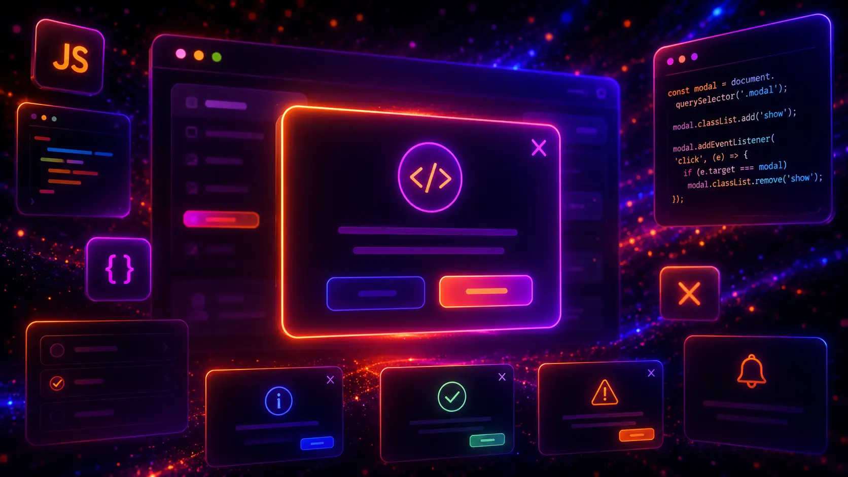
JavaScript modals are one of the most practical interactive components you can add to a modern website. A modal can open a popup message, show a confirmation dialog, display a lead capture form, preview an image, show product details, confirm a delete action, present login or signup forms, or guide visitors toward one focused action without sending them to another page.
In this guide, you will find 30 JavaScript modal examples for websites, including popup modals, dialog boxes, overlay modals, confirmation modals, login modals, newsletter popups, product quick view modals, image preview modals, video popup modals, contact form modals, cookie notice popups, fullscreen modals, slide-in modals, animated modals, and responsive HTML, CSS, and JavaScript modal components you can customize for your own projects.

A JavaScript modal is an interactive popup window that appears above the current page content. It usually includes an overlay background, a modal box, a close button, and a focused piece of content such as a message, form, image, video, product preview, confirmation question, or call-to-action. JavaScript controls when the modal opens, when it closes, and how the user interacts with it.
Unlike a normal page section, a modal temporarily brings one action or message into focus. This makes JavaScript modals useful for login forms, signup forms, newsletter popups, contact forms, cookie notices, product quick views, cart messages, image previews, video popups, delete confirmations, onboarding prompts, upgrade messages, and important website dialogs.
A good modal should feel helpful, not annoying. It should open only when it supports the user journey, explain one clear message, provide an obvious next step, and include a simple way to close it. The best JavaScript modal examples combine clean HTML, polished CSS, and lightweight JavaScript so the component is responsive, accessible, easy to customize, and simple to reuse across different website projects.
JavaScript modals matter because they help websites show important interactive content without forcing users to leave the current page. A modal can reduce friction when someone needs to confirm an action, fill out a short form, preview a product, watch a video, subscribe to a newsletter, or view additional information while staying in the same context.
If you are building a complete interactive website, JavaScript modals work especially well together with modern CSS forms, modern CSS buttons, modern CSS cards, modern CSS navigation menus, and modern CSS banners.
You should use a modal when the user needs to focus on a short, specific task without leaving the current page. A modal is a good choice for lightweight interactions, temporary messages, quick forms, confirmation steps, media previews, and contextual actions. It is not the right choice for long content, complex multi-page workflows, or anything that should be easy to bookmark, share, or revisit later as a normal page.
For example, a product quick view modal can help ecommerce visitors inspect a product without leaving the category page. A confirmation modal can prevent accidental deletion or form submission. A newsletter popup can capture leads when timed carefully. A login modal can let users sign in without interrupting the page flow. A video modal can keep the landing page clean while still giving visitors access to a product demo or tutorial.
A good JavaScript modal should include only the elements needed for one focused interaction. The modal should have a clear title, short supporting text, useful content, a visible close button, and one main action when a conversion or decision is required. The overlay should make the modal feel separate from the page, but it should not make the experience confusing or difficult to exit.
Use the modal for one focused task such as a form, confirmation, preview, alert, message, or call-to-action.
Add an obvious close button and allow users to exit the modal without feeling trapped inside the popup.
Make the modal work on desktop and mobile screens with readable text, tappable buttons, and clean spacing.
Use simple JavaScript for opening, closing, overlay clicks, keyboard handling, and active modal states.
Before building a modal, decide what the modal should help the visitor do. A newsletter modal should explain why subscribing is useful. A confirmation modal should make the decision clear. A product quick view modal should show the most important product details. A login modal should keep the form simple. A video modal should open quickly and close cleanly. A contact modal should make the next step easy.
You can combine JavaScript modals with many existing UI components. A lead popup can reuse ideas from modern CSS forms, a confirmation dialog can use ideas from modern CSS buttons, a product quick view modal can work well with modern CSS cards, and a campaign popup can be styled together with modern CSS banners.
Now let’s look at 30 JavaScript modal examples for real website projects. Each example uses a different layout, animation, interaction pattern, or use case, so you can build popup modals, dialog boxes, confirmation windows, lead forms, login popups, product previews, media overlays, alerts, slide-in modals, fullscreen modals, and responsive website modal components with complete HTML, CSS, and JavaScript code.
A modern center modal is the most common JavaScript modal pattern for websites. It works well for announcements, signup prompts, feature previews, download offers, lead capture messages, and simple call-to-action popups where the visitor should focus on one clear message.
This example uses a centered modal card with a soft overlay, gradient accent header, close button, CTA buttons, overlay click close, and Escape key support. The structure is simple enough to reuse, but the visual design still feels polished and modern.
(function () {
  const demos = document.querySelectorAll("[data-js-center-modal-demo]");

  demos.forEach(function (demo) {
    const openButton = demo.querySelector("[data-js-center-modal-open]");
    const overlay = demo.querySelector("[data-js-center-modal-overlay]");
    const closeButton = demo.querySelector("[data-js-center-modal-close]");

    function openModal() {
      overlay.classList.add("is-open");
    }

    function closeModal() {
      overlay.classList.remove("is-open");
    }

    openButton.addEventListener("click", openModal);
    closeButton.addEventListener("click", closeModal);

    overlay.addEventListener("click", function (event) {
      if (event.target === overlay) {
        closeModal();
      }
    });

    document.addEventListener("keydown", function (event) {
      if (event.key === "Escape" && overlay.classList.contains("is-open")) {
        closeModal();
      }
    });
  });
})();
<div class="js-center-modal-preview" data-js-center-modal-demo>

  <div class="js-center-modal-page">
    <div class="js-center-modal-content">
      <div class="js-center-modal-kicker">JavaScript Modal</div>

      <h3 class="js-center-modal-title">Open a focused <span>center popup</span> with vanilla JavaScript</h3>

      <p class="js-center-modal-text">This modal pattern is useful for short messages, signup prompts, lead capture offers, product notices, and focused website actions.</p>

      <button class="js-center-modal-open" type="button" data-js-center-modal-open>
        Open Modal
      </button>
    </div>

    <div class="js-center-modal-visual" aria-hidden="true">
      <div class="js-center-modal-mini-card">
        <strong>Focused popup UI</strong>
        <span>Overlay, close button, CTA actions, and keyboard-friendly JavaScript behavior.</span>
      </div>
    </div>
  </div>

  <div class="js-center-modal-overlay" data-js-center-modal-overlay>
    <div class="js-center-modal-box" role="dialog" aria-modal="true" aria-labelledby="js-center-modal-title">
      <div class="js-center-modal-head">
        <button class="js-center-modal-close" type="button" data-js-center-modal-close aria-label="Close modal">×</button>
        <div class="js-center-modal-icon">✦</div>
        <h3 id="js-center-modal-title">Build cleaner website interactions</h3>
      </div>

      <div class="js-center-modal-body">
        <p>Use this centered JavaScript modal when you want to highlight one message, action, offer, or form without sending visitors to another page.</p>

        <div class="js-center-modal-actions">
          <a class="js-center-modal-primary" href="#">Start Project</a>
          <a class="js-center-modal-secondary" href="#">View Details</a>
        </div>
      </div>
    </div>
  </div>

</div>
.js-center-modal-page {
  width: min(100%, 980px);
  min-height: 480px;
  display: grid;
  grid-template-columns: minmax(0, 1.05fr) minmax(260px, 0.95fr);
  align-items: center;
  gap: 28px;
  padding: 36px;
  border-radius: 32px;
  background: #ffffff;
  border: 1px solid rgba(15, 23, 42, 0.08);
  box-shadow: 0 28px 80px rgba(15, 23, 42, 0.14);
}

.js-center-modal-content {
  display: flex;
  flex-direction: column;
  align-items: flex-start;
  gap: 18px;
}

.js-center-modal-kicker {
  display: inline-flex;
  align-items: center;
  gap: 8px;
  padding: 8px 12px;
  border-radius: 999px;
  background: #fff7ed;
  border: 1px solid rgba(245, 158, 11, 0.22);
  color: #c2410c;
  font-size: 13px;
  font-weight: 950;
  letter-spacing: 0.08em;
  text-transform: uppercase;
}

.js-center-modal-kicker::before {
  content: "";
  width: 9px;
  height: 9px;
  border-radius: 999px;
  background: #f97316;
  box-shadow: 0 0 0 5px rgba(249, 115, 22, 0.14);
}

.js-center-modal-title {
  margin: 0;
  color: #111827;
  font-size: clamp(36px, 5vw, 62px);
  line-height: 1.02;
  font-weight: 950;
  letter-spacing: -0.065em;
}

.js-center-modal-title span {
  background: linear-gradient(135deg, #f97316, #ef4444, #7c3aed);
  -webkit-background-clip: text;
  background-clip: text;
  color: transparent;
  -webkit-text-fill-color: transparent;
}

.js-center-modal-text {
  max-width: 560px;
  margin: 0;
  color: #4b5563;
  font-size: 17px;
  line-height: 1.75;
  font-weight: 600;
}

.js-center-modal-open {
  display: inline-flex;
  align-items: center;
  justify-content: center;
  min-height: 50px;
  padding: 15px 20px;
  border: 0;
  border-radius: 999px;
  background: linear-gradient(135deg, #f97316, #ef4444, #7c3aed);
  color: #ffffff;
  font-size: 15px;
  line-height: 1;
  font-weight: 900;
  cursor: pointer;
  box-shadow: 0 18px 40px rgba(239, 68, 68, 0.28);
  transition: transform 0.22s ease, box-shadow 0.22s ease, filter 0.22s ease;
}

.js-center-modal-open:hover {
  transform: translateY(-2px);
  filter: saturate(1.08);
  box-shadow: 0 22px 50px rgba(239, 68, 68, 0.36);
}

.js-center-modal-visual {
  position: relative;
  min-height: 320px;
  border-radius: 30px;
  overflow: hidden;
  background:
    radial-gradient(circle at 24% 24%, rgba(255, 255, 255, 0.18), transparent 28%),
    linear-gradient(135deg, #111827, #312e81);
  border: 1px solid rgba(255, 255, 255, 0.12);
  box-shadow: 0 24px 70px rgba(17, 24, 39, 0.24);
}

.js-center-modal-visual::before {
  content: "";
  position: absolute;
  inset: 26px;
  border-radius: 26px;
  border: 1px solid rgba(255, 255, 255, 0.14);
  background: rgba(255, 255, 255, 0.07);
}

.js-center-modal-mini-card {
  position: absolute;
  left: 34px;
  right: 34px;
  bottom: 34px;
  padding: 20px;
  border-radius: 24px;
  background: rgba(255, 255, 255, 0.13);
  border: 1px solid rgba(255, 255, 255, 0.16);
  backdrop-filter: blur(14px);
}

.js-center-modal-mini-card strong {
  display: block;
  margin-bottom: 8px;
  color: #ffffff;
  font-size: 21px;
  line-height: 1.2;
  font-weight: 950;
  letter-spacing: -0.04em;
}

.js-center-modal-mini-card span {
  display: block;
  color: #d1d5db;
  font-size: 14px;
  line-height: 1.6;
  font-weight: 650;
}

.js-center-modal-overlay {
  position: absolute;
  inset: 0;
  z-index: 20;
  display: none;
  align-items: center;
  justify-content: center;
  padding: 24px;
  background: rgba(15, 23, 42, 0.68);
  backdrop-filter: blur(12px);
}

.js-center-modal-overlay.is-open {
  display: flex;
}

.js-center-modal-box {
  width: min(100%, 520px);
  overflow: hidden;
  border-radius: 30px;
  background: #ffffff;
  border: 1px solid rgba(255, 255, 255, 0.22);
  box-shadow: 0 34px 90px rgba(0, 0, 0, 0.34);
  animation: jsCenterModalIn 0.28s ease both;
}

@keyframes jsCenterModalIn {
  from {
    opacity: 0;
    transform: translateY(16px) scale(0.96);
  }

  to {
    opacity: 1;
    transform: translateY(0) scale(1);
  }
}

.js-center-modal-head {
  position: relative;
  padding: 26px 26px 22px;
  background:
    radial-gradient(circle at 20% 20%, rgba(255, 255, 255, 0.22), transparent 30%),
    linear-gradient(135deg, #f97316, #ef4444, #7c3aed);
}

.js-center-modal-close {
  position: absolute;
  top: 18px;
  right: 18px;
  display: inline-flex;
  align-items: center;
  justify-content: center;
  width: 38px;
  height: 38px;
  border: 0;
  border-radius: 999px;
  background: rgba(255, 255, 255, 0.16);
  color: #ffffff;
  font-size: 24px;
  line-height: 1;
  cursor: pointer;
  transition: transform 0.2s ease, background 0.2s ease;
}

.js-center-modal-close:hover {
  transform: rotate(90deg);
  background: rgba(255, 255, 255, 0.24);
}

.js-center-modal-icon {
  display: inline-flex;
  align-items: center;
  justify-content: center;
  width: 58px;
  height: 58px;
  margin-bottom: 18px;
  border-radius: 20px;
  background: rgba(255, 255, 255, 0.18);
  color: #ffffff;
  font-size: 28px;
  font-weight: 950;
}

.js-center-modal-head h3 {
  max-width: 360px;
  margin: 0;
  color: #ffffff !important;
  -webkit-text-fill-color: #ffffff !important;
  font-size: 34px;
  line-height: 1.05;
  font-weight: 950;
  letter-spacing: -0.055em;
}

.js-center-modal-body {
  padding: 26px;
}

.js-center-modal-body p {
  margin: 0 0 22px;
  color: #4b5563;
  font-size: 16px;
  line-height: 1.75;
  font-weight: 600;
}

.js-center-modal-actions {
  display: flex;
  flex-wrap: wrap;
  gap: 12px;
}

.js-center-modal-primary,
.js-center-modal-secondary {
  display: inline-flex;
  align-items: center;
  justify-content: center;
  min-height: 46px;
  padding: 13px 16px;
  border-radius: 999px;
  font-size: 14px;
  line-height: 1;
  font-weight: 900;
  text-decoration: none !important;
}

.js-center-modal-primary {
  background: #111827;
  color: #ffffff !important;
  -webkit-text-fill-color: #ffffff !important;
}

.js-center-modal-secondary {
  background: #f3f4f6;
  color: #374151 !important;
  -webkit-text-fill-color: #374151 !important;
}

@media (max-width: 820px) {
  .js-center-modal-page {
    grid-template-columns: 1fr;
  }

  .js-center-modal-visual {
    min-height: 260px;
  }
}

@media (max-width: 640px) {
  .js-center-modal-page {
    padding: 26px;
    border-radius: 26px;
  }

  .js-center-modal-title {
    font-size: 36px;
  }

  .js-center-modal-text {
    font-size: 16px;
  }

  .js-center-modal-open {
    width: 100%;
  }

  .js-center-modal-actions {
    flex-direction: column;
  }

  .js-center-modal-primary,
  .js-center-modal-secondary {
    width: 100%;
  }

  .js-center-modal-head h3 {
    font-size: 29px;
  }
}
This modern center modal is a flexible base for many JavaScript popup patterns. You can replace the message, icon, CTA buttons, and modal content with a signup form, lead capture offer, announcement, product notice, or confirmation message.
A slide-in contact modal is useful when you want a popup experience that feels lighter than a centered dialog. Instead of covering the whole screen with a large modal card, this pattern slides in from the side and works well for contact forms, quote requests, callback forms, support messages, booking prompts, and quick lead capture panels.
The example below uses a right-side drawer modal with a contact-style layout, form fields, contact highlights, overlay click close, close button support, and Escape key support. It looks and behaves differently from the first modal because the modal panel enters from the side instead of appearing in the center.
(function () {
  const demos = document.querySelectorAll("[data-js-slide-contact-demo]");

  demos.forEach(function (demo) {
    const openButton = demo.querySelector("[data-js-slide-contact-open]");
    const overlay = demo.querySelector("[data-js-slide-contact-overlay]");
    const closeButton = demo.querySelector("[data-js-slide-contact-close]");

    function openModal() {
      overlay.classList.add("is-open");
    }

    function closeModal() {
      overlay.classList.remove("is-open");
    }

    openButton.addEventListener("click", openModal);
    closeButton.addEventListener("click", closeModal);

    overlay.addEventListener("click", function (event) {
      if (event.target === overlay) {
        closeModal();
      }
    });

    document.addEventListener("keydown", function (event) {
      if (event.key === "Escape" && overlay.classList.contains("is-open")) {
        closeModal();
      }
    });
  });
})();
<div class="js-slide-contact-preview" data-js-slide-contact-demo>

  <div class="js-slide-contact-page">
    <div class="js-slide-contact-info">
      <div class="js-slide-contact-info-content">
        <div class="js-slide-contact-label">Contact Drawer</div>
        <h3>Open a slide-in modal for quick contact requests</h3>
        <p>This drawer-style modal is useful when you want visitors to contact you without leaving the current page.</p>
      </div>

      <ul class="js-slide-contact-points">
        <li>Quote request form</li>
        <li>Support message panel</li>
        <li>Callback or booking prompt</li>
      </ul>
    </div>

    <div class="js-slide-contact-action-card">
      <h3>Need a faster way to collect leads?</h3>
      <p>Use a slide-in modal for lightweight forms, contact requests, consultation prompts, and quick service questions.</p>

      <button class="js-slide-contact-open" type="button" data-js-slide-contact-open>
        Open Contact Modal
      </button>
    </div>
  </div>

  <div class="js-slide-contact-overlay" data-js-slide-contact-overlay>
    <aside class="js-slide-contact-drawer" role="dialog" aria-modal="true" aria-labelledby="js-slide-contact-title">
      <div class="js-slide-contact-drawer-head">
        <div>
          <h3 id="js-slide-contact-title">Send a quick request</h3>
          <p>Fill in the short form and we will get back to you.</p>
        </div>

        <button class="js-slide-contact-close" type="button" data-js-slide-contact-close aria-label="Close contact modal">×</button>
      </div>

      <form class="js-slide-contact-form">
        <div class="js-slide-contact-field">
          <label for="slide-contact-name">Name</label>
          <input id="slide-contact-name" type="text" placeholder="Your name">
        </div>

        <div class="js-slide-contact-field">
          <label for="slide-contact-email">Email</label>
          <input id="slide-contact-email" type="email" placeholder="you@example.com">
        </div>

        <div class="js-slide-contact-field">
          <label for="slide-contact-topic">Request type</label>
          <select id="slide-contact-topic">
            <option>Website project</option>
            <option>Support request</option>
            <option>Quote request</option>
            <option>General question</option>
          </select>
        </div>

        <div class="js-slide-contact-field">
          <label for="slide-contact-message">Message</label>
          <textarea id="slide-contact-message" placeholder="Tell us what you need..."></textarea>
        </div>

        <button class="js-slide-contact-submit" type="button">Send Request</button>

        <p class="js-slide-contact-note">This is a front-end demo form. Connect it to your real form handler, CRM, or email system when using it in production.</p>
      </form>
    </aside>
  </div>

</div>
.js-slide-contact-page {
  width: min(100%, 1020px);
  min-height: 500px;
  display: grid;
  grid-template-columns: minmax(0, 0.95fr) minmax(280px, 1.05fr);
  gap: 30px;
  align-items: stretch;
  padding: 28px;
  border-radius: 34px;
  background: #ffffff;
  border: 1px solid rgba(15, 23, 42, 0.08);
  box-shadow: 0 28px 80px rgba(15, 23, 42, 0.14);
}

.js-slide-contact-info {
  position: relative;
  overflow: hidden;
  display: flex;
  flex-direction: column;
  justify-content: space-between;
  gap: 28px;
  padding: 32px;
  border-radius: 28px;
  background:
    radial-gradient(circle at 20% 18%, rgba(255, 255, 255, 0.18), transparent 28%),
    linear-gradient(135deg, #0f766e, #1d4ed8);
  color: #ffffff;
}

.js-slide-contact-info::before {
  content: "";
  position: absolute;
  inset: auto -80px -120px auto;
  width: 260px;
  height: 260px;
  border-radius: 999px;
  background: rgba(255, 255, 255, 0.13);
}

.js-slide-contact-info-content {
  position: relative;
  z-index: 2;
}

.js-slide-contact-label {
  display: inline-flex;
  align-items: center;
  justify-content: center;
  margin-bottom: 18px;
  padding: 8px 12px;
  border-radius: 999px;
  background: rgba(255, 255, 255, 0.14);
  border: 1px solid rgba(255, 255, 255, 0.18);
  color: #ccfbf1;
  font-size: 13px;
  font-weight: 950;
  letter-spacing: 0.08em;
  text-transform: uppercase;
}

.js-slide-contact-info h3 {
  max-width: 420px;
  margin: 0 0 14px;
  color: #ffffff !important;
  -webkit-text-fill-color: #ffffff !important;
  font-size: clamp(34px, 5vw, 56px);
  line-height: 1.03;
  font-weight: 950;
  letter-spacing: -0.065em;
}

.js-slide-contact-info p {
  max-width: 420px;
  margin: 0;
  color: #dbeafe;
  font-size: 16px;
  line-height: 1.75;
  font-weight: 650;
}

.js-slide-contact-points {
  position: relative;
  z-index: 2;
  display: grid;
  gap: 12px;
  margin: 0;
  padding: 0;
  list-style: none;
}

.js-slide-contact-points li {
  display: flex;
  align-items: center;
  gap: 10px;
  margin: 0;
  padding: 0;
  color: #f8fafc;
  font-size: 14px;
  line-height: 1.4;
  font-weight: 800;
}

.js-slide-contact-points li::before {
  content: "✓";
  display: inline-flex;
  align-items: center;
  justify-content: center;
  width: 22px;
  height: 22px;
  border-radius: 999px;
  background: rgba(255, 255, 255, 0.16);
  color: #ccfbf1;
  font-size: 13px;
  font-weight: 950;
}

.js-slide-contact-action-card {
  display: flex;
  flex-direction: column;
  justify-content: center;
  gap: 18px;
  padding: 34px;
  border-radius: 28px;
  background: #f8fafc;
  border: 1px solid rgba(15, 23, 42, 0.08);
}

.js-slide-contact-action-card h3 {
  margin: 0;
  color: #111827;
  font-size: 32px;
  line-height: 1.12;
  font-weight: 950;
  letter-spacing: -0.045em;
}

.js-slide-contact-action-card p {
  margin: 0;
  color: #4b5563;
  font-size: 16px;
  line-height: 1.7;
  font-weight: 600;
}

.js-slide-contact-open {
  display: inline-flex;
  align-items: center;
  justify-content: center;
  width: fit-content;
  min-height: 50px;
  padding: 15px 20px;
  border: 0;
  border-radius: 999px;
  background: linear-gradient(135deg, #14b8a6, #2563eb);
  color: #ffffff;
  font-size: 15px;
  line-height: 1;
  font-weight: 900;
  cursor: pointer;
  box-shadow: 0 18px 40px rgba(37, 99, 235, 0.26);
  transition: transform 0.22s ease, box-shadow 0.22s ease, filter 0.22s ease;
}

.js-slide-contact-open:hover {
  transform: translateY(-2px);
  filter: saturate(1.08);
  box-shadow: 0 22px 50px rgba(37, 99, 235, 0.34);
}

.js-slide-contact-overlay {
  position: absolute;
  inset: 0;
  z-index: 30;
  display: none;
  justify-content: flex-end;
  background: rgba(15, 23, 42, 0.62);
  backdrop-filter: blur(10px);
}

.js-slide-contact-overlay.is-open {
  display: flex;
}

.js-slide-contact-drawer {
  width: min(100%, 460px);
  height: 100%;
  overflow-y: auto;
  background: #ffffff;
  box-shadow: -28px 0 70px rgba(0, 0, 0, 0.28);
  animation: jsSlideContactIn 0.3s ease both;
}

@keyframes jsSlideContactIn {
  from {
    opacity: 0;
    transform: translateX(42px);
  }

  to {
    opacity: 1;
    transform: translateX(0);
  }
}

.js-slide-contact-drawer-head {
  position: sticky;
  top: 0;
  z-index: 3;
  display: flex;
  align-items: flex-start;
  justify-content: space-between;
  gap: 18px;
  padding: 26px;
  background: #ffffff;
  border-bottom: 1px solid rgba(15, 23, 42, 0.08);
}

.js-slide-contact-drawer-head h3 {
  margin: 0 0 6px;
  color: #111827;
  font-size: 28px;
  line-height: 1.1;
  font-weight: 950;
  letter-spacing: -0.045em;
}

.js-slide-contact-drawer-head p {
  margin: 0;
  color: #64748b;
  font-size: 14px;
  line-height: 1.6;
  font-weight: 650;
}

.js-slide-contact-close {
  flex: 0 0 auto;
  display: inline-flex;
  align-items: center;
  justify-content: center;
  width: 38px;
  height: 38px;
  border: 0;
  border-radius: 999px;
  background: #f1f5f9;
  color: #0f172a;
  font-size: 24px;
  line-height: 1;
  cursor: pointer;
  transition: transform 0.2s ease, background 0.2s ease;
}

.js-slide-contact-close:hover {
  transform: rotate(90deg);
  background: #e2e8f0;
}

.js-slide-contact-form {
  display: grid;
  gap: 16px;
  padding: 26px;
}

.js-slide-contact-field {
  display: grid;
  gap: 7px;
}

.js-slide-contact-field label {
  color: #111827;
  font-size: 13px;
  font-weight: 900;
  letter-spacing: 0.02em;
}

.js-slide-contact-field input,
.js-slide-contact-field textarea,
.js-slide-contact-field select {
  width: 100%;
  box-sizing: border-box;
  border: 1px solid rgba(15, 23, 42, 0.12);
  border-radius: 16px;
  background: #f8fafc;
  color: #111827;
  font-size: 15px;
  line-height: 1.4;
  padding: 13px 14px;
  outline: none;
  transition: border-color 0.2s ease, box-shadow 0.2s ease, background 0.2s ease;
}

.js-slide-contact-field textarea {
  min-height: 110px;
  resize: vertical;
}

.js-slide-contact-field input:focus,
.js-slide-contact-field textarea:focus,
.js-slide-contact-field select:focus {
  border-color: rgba(20, 184, 166, 0.64);
  background: #ffffff;
  box-shadow: 0 0 0 4px rgba(20, 184, 166, 0.12);
}

.js-slide-contact-submit {
  display: inline-flex;
  align-items: center;
  justify-content: center;
  min-height: 50px;
  padding: 15px 18px;
  border: 0;
  border-radius: 999px;
  background: linear-gradient(135deg, #14b8a6, #2563eb);
  color: #ffffff;
  font-size: 15px;
  line-height: 1;
  font-weight: 900;
  cursor: pointer;
  box-shadow: 0 18px 40px rgba(37, 99, 235, 0.22);
}

.js-slide-contact-note {
  margin: 0;
  color: #64748b;
  font-size: 13px;
  line-height: 1.6;
  font-weight: 650;
}

@media (max-width: 860px) {
  .js-slide-contact-page {
    grid-template-columns: 1fr;
  }
}

@media (max-width: 640px) {
  .js-slide-contact-page {
    padding: 22px;
    border-radius: 26px;
  }

  .js-slide-contact-info {
    padding: 26px;
    border-radius: 24px;
  }

  .js-slide-contact-info h3 {
    font-size: 34px;
  }

  .js-slide-contact-action-card {
    padding: 26px;
    border-radius: 24px;
  }

  .js-slide-contact-open {
    width: 100%;
  }

  .js-slide-contact-overlay {
    justify-content: center;
  }

  .js-slide-contact-drawer {
    width: 100%;
  }
}
This slide-in contact modal is a strong alternative to a centered popup. It is especially useful for quick forms, support panels, quote requests, booking prompts, and service websites where the visitor should be able to contact you without leaving the current page.
A fullscreen newsletter modal is useful when you want to create a stronger subscription moment than a small popup. It works well for blogs, SaaS websites, creator websites, digital product pages, course websites, and content-heavy websites where the newsletter offer is an important conversion goal.
This example uses a full-screen overlay modal with a split layout, large headline, benefit cards, email input, close button, overlay click close, and Escape key support. The layout feels more like a focused landing section than a small dialog, making it visually different from a standard center modal.
(function () {
  const demos = document.querySelectorAll("[data-js-full-newsletter-demo]");

  demos.forEach(function (demo) {
    const openButton = demo.querySelector("[data-js-full-newsletter-open]");
    const overlay = demo.querySelector("[data-js-full-newsletter-overlay]");
    const closeButton = demo.querySelector("[data-js-full-newsletter-close]");

    function openModal() {
      overlay.classList.add("is-open");
    }

    function closeModal() {
      overlay.classList.remove("is-open");
    }

    openButton.addEventListener("click", openModal);
    closeButton.addEventListener("click", closeModal);

    overlay.addEventListener("click", function (event) {
      if (event.target === overlay) {
        closeModal();
      }
    });

    document.addEventListener("keydown", function (event) {
      if (event.key === "Escape" && overlay.classList.contains("is-open")) {
        closeModal();
      }
    });
  });
})();
<div class="js-full-newsletter-preview" data-js-full-newsletter-demo>

  <div class="js-full-newsletter-page">
    <section class="js-full-newsletter-hero">
      <div class="js-full-newsletter-main">
        <div class="js-full-newsletter-kicker">Newsletter Modal</div>

        <h3>Invite visitors into a <span>focused signup experience</span></h3>

        <p>This fullscreen modal pattern gives your newsletter offer more visual weight while keeping the interaction simple and easy to close.</p>

        <button class="js-full-newsletter-open" type="button" data-js-full-newsletter-open>
          Open Newsletter Modal
        </button>
      </div>

      <div class="js-full-newsletter-side" aria-hidden="true">
        <div class="js-full-newsletter-stack">
          <div class="js-full-newsletter-stat">
            <strong>Weekly</strong>
            <span>Useful design and coding ideas</span>
          </div>

          <div class="js-full-newsletter-stat">
            <strong>30+</strong>
            <span>Reusable UI examples and patterns</span>
          </div>

          <div class="js-full-newsletter-stat">
            <strong>No spam</strong>
            <span>Only practical website tips</span>
          </div>
        </div>
      </div>
    </section>
  </div>

  <div class="js-full-newsletter-overlay" data-js-full-newsletter-overlay>
    <div class="js-full-newsletter-modal" role="dialog" aria-modal="true" aria-labelledby="js-full-newsletter-title">

      <div class="js-full-newsletter-art">
        <div class="js-full-newsletter-art-content">
          <div>
            <div class="js-full-newsletter-art-label">Design Digest</div>
            <h3>Get better website ideas before your next build</h3>
            <p>Use this modal for newsletters, launch lists, resource downloads, and content subscriptions.</p>
          </div>

          <ul class="js-full-newsletter-benefits">
            <li>Weekly UI inspiration</li>
            <li>HTML, CSS, and JavaScript examples</li>
            <li>Practical conversion ideas</li>
          </ul>
        </div>
      </div>

      <div class="js-full-newsletter-form-area">
        <button class="js-full-newsletter-close" type="button" data-js-full-newsletter-close aria-label="Close newsletter modal">×</button>

        <h3 id="js-full-newsletter-title">Join the website UI newsletter</h3>
        <p>Get practical front-end examples, UI ideas, and reusable website components sent to your inbox.</p>

        <form class="js-full-newsletter-form">
          <div class="js-full-newsletter-input-wrap">
            <input type="email" placeholder="Enter your email address">
            <button type="button">Subscribe</button>
          </div>

          <p class="js-full-newsletter-privacy">Demo form only. Connect this layout to your email marketing tool before using it in production.</p>
        </form>
      </div>

    </div>
  </div>

</div>
.js-full-newsletter-page {
  width: min(100%, 1040px);
  min-height: 520px;
  overflow: hidden;
  border-radius: 34px;
  background: #ffffff;
  border: 1px solid rgba(15, 23, 42, 0.08);
  box-shadow: 0 28px 80px rgba(15, 23, 42, 0.14);
}

.js-full-newsletter-hero {
  display: grid;
  grid-template-columns: minmax(0, 1fr) 320px;
  min-height: 520px;
}

.js-full-newsletter-main {
  display: flex;
  flex-direction: column;
  justify-content: center;
  gap: 18px;
  padding: 44px;
}

.js-full-newsletter-kicker {
  display: inline-flex;
  align-items: center;
  width: fit-content;
  gap: 8px;
  padding: 8px 12px;
  border-radius: 999px;
  background: #faf5ff;
  border: 1px solid rgba(168, 85, 247, 0.22);
  color: #7e22ce;
  font-size: 13px;
  font-weight: 950;
  letter-spacing: 0.08em;
  text-transform: uppercase;
}

.js-full-newsletter-kicker::before {
  content: "";
  width: 9px;
  height: 9px;
  border-radius: 999px;
  background: #a855f7;
  box-shadow: 0 0 0 5px rgba(168, 85, 247, 0.14);
}

.js-full-newsletter-main h3 {
  max-width: 660px;
  margin: 0;
  color: #111827;
  font-size: clamp(38px, 5vw, 66px);
  line-height: 1.02;
  font-weight: 950;
  letter-spacing: -0.07em;
}

.js-full-newsletter-main h3 span {
  background: linear-gradient(135deg, #a855f7, #ec4899, #f97316);
  -webkit-background-clip: text;
  background-clip: text;
  color: transparent;
  -webkit-text-fill-color: transparent;
}

.js-full-newsletter-main p {
  max-width: 600px;
  margin: 0;
  color: #4b5563;
  font-size: 17px;
  line-height: 1.75;
  font-weight: 600;
}

.js-full-newsletter-open {
  display: inline-flex;
  align-items: center;
  justify-content: center;
  width: fit-content;
  min-height: 50px;
  padding: 15px 20px;
  border: 0;
  border-radius: 999px;
  background: linear-gradient(135deg, #a855f7, #ec4899);
  color: #ffffff;
  font-size: 15px;
  line-height: 1;
  font-weight: 900;
  cursor: pointer;
  box-shadow: 0 18px 40px rgba(236, 72, 153, 0.26);
  transition: transform 0.22s ease, box-shadow 0.22s ease, filter 0.22s ease;
}

.js-full-newsletter-open:hover {
  transform: translateY(-2px);
  filter: saturate(1.08);
  box-shadow: 0 22px 50px rgba(236, 72, 153, 0.34);
}

.js-full-newsletter-side {
  position: relative;
  overflow: hidden;
  display: grid;
  place-items: center;
  padding: 26px;
  background:
    radial-gradient(circle at 30% 24%, rgba(255, 255, 255, 0.20), transparent 30%),
    linear-gradient(135deg, #581c87, #be185d);
}

.js-full-newsletter-stack {
  position: relative;
  z-index: 2;
  display: grid;
  gap: 14px;
  width: 100%;
}

.js-full-newsletter-stat {
  padding: 18px;
  border-radius: 22px;
  background: rgba(255, 255, 255, 0.13);
  border: 1px solid rgba(255, 255, 255, 0.17);
  backdrop-filter: blur(14px);
}

.js-full-newsletter-stat strong {
  display: block;
  margin-bottom: 6px;
  color: #ffffff;
  font-size: 28px;
  line-height: 1;
  font-weight: 950;
  letter-spacing: -0.04em;
}

.js-full-newsletter-stat span {
  display: block;
  color: #fce7f3;
  font-size: 13px;
  line-height: 1.5;
  font-weight: 750;
}

.js-full-newsletter-overlay {
  position: absolute;
  inset: 0;
  z-index: 40;
  display: none;
  padding: 24px;
  background: rgba(17, 24, 39, 0.78);
  backdrop-filter: blur(14px);
}

.js-full-newsletter-overlay.is-open {
  display: grid;
  place-items: center;
}

.js-full-newsletter-modal {
  position: relative;
  width: min(100%, 980px);
  min-height: 520px;
  overflow: hidden;
  display: grid;
  grid-template-columns: minmax(0, 0.95fr) minmax(320px, 1.05fr);
  border-radius: 34px;
  background: #ffffff;
  box-shadow: 0 34px 100px rgba(0, 0, 0, 0.38);
  animation: jsFullNewsletterIn 0.32s ease both;
}

@keyframes jsFullNewsletterIn {
  from {
    opacity: 0;
    transform: scale(0.96) translateY(18px);
  }

  to {
    opacity: 1;
    transform: scale(1) translateY(0);
  }
}

.js-full-newsletter-art {
  position: relative;
  overflow: hidden;
  padding: 34px;
  background:
    radial-gradient(circle at 24% 20%, rgba(255, 255, 255, 0.22), transparent 28%),
    linear-gradient(135deg, #4c1d95, #be185d, #f97316);
}

.js-full-newsletter-art::before {
  content: "";
  position: absolute;
  inset: 34px;
  border-radius: 30px;
  border: 1px solid rgba(255, 255, 255, 0.18);
  background: rgba(255, 255, 255, 0.08);
}

.js-full-newsletter-art-content {
  position: relative;
  z-index: 2;
  display: flex;
  min-height: 100%;
  flex-direction: column;
  justify-content: space-between;
  gap: 28px;
}

.js-full-newsletter-art-label {
  display: inline-flex;
  align-items: center;
  width: fit-content;
  padding: 8px 12px;
  border-radius: 999px;
  background: rgba(255, 255, 255, 0.14);
  border: 1px solid rgba(255, 255, 255, 0.18);
  color: #fce7f3;
  font-size: 13px;
  font-weight: 950;
  letter-spacing: 0.08em;
  text-transform: uppercase;
}

.js-full-newsletter-art h3 {
  margin: 0;
  color: #ffffff !important;
  -webkit-text-fill-color: #ffffff !important;
  font-size: clamp(34px, 4vw, 54px);
  line-height: 1.03;
  font-weight: 950;
  letter-spacing: -0.065em;
}

.js-full-newsletter-art p {
  margin: 12px 0 0;
  color: #fce7f3;
  font-size: 15px;
  line-height: 1.7;
  font-weight: 650;
}

.js-full-newsletter-benefits {
  display: grid;
  gap: 10px;
  margin: 0;
  padding: 0;
  list-style: none;
}

.js-full-newsletter-benefits li {
  display: flex;
  align-items: center;
  gap: 10px;
  margin: 0;
  padding: 0;
  color: #ffffff;
  font-size: 14px;
  line-height: 1.4;
  font-weight: 800;
}

.js-full-newsletter-benefits li::before {
  content: "✓";
  display: inline-flex;
  align-items: center;
  justify-content: center;
  width: 22px;
  height: 22px;
  border-radius: 999px;
  background: rgba(255, 255, 255, 0.18);
  color: #ffffff;
  font-size: 13px;
  font-weight: 950;
}

.js-full-newsletter-form-area {
  position: relative;
  display: flex;
  flex-direction: column;
  justify-content: center;
  padding: 42px;
}

.js-full-newsletter-close {
  position: absolute;
  top: 22px;
  right: 22px;
  display: inline-flex;
  align-items: center;
  justify-content: center;
  width: 40px;
  height: 40px;
  border: 0;
  border-radius: 999px;
  background: #f1f5f9;
  color: #0f172a;
  font-size: 24px;
  line-height: 1;
  cursor: pointer;
  transition: transform 0.2s ease, background 0.2s ease;
}

.js-full-newsletter-close:hover {
  transform: rotate(90deg);
  background: #e2e8f0;
}

.js-full-newsletter-form-area h3 {
  max-width: 460px;
  margin: 0 0 12px;
  color: #111827;
  font-size: 36px;
  line-height: 1.08;
  font-weight: 950;
  letter-spacing: -0.055em;
}

.js-full-newsletter-form-area p {
  max-width: 470px;
  margin: 0 0 24px;
  color: #4b5563;
  font-size: 16px;
  line-height: 1.75;
  font-weight: 600;
}

.js-full-newsletter-form {
  display: grid;
  gap: 12px;
}

.js-full-newsletter-input-wrap {
  display: flex;
  gap: 10px;
  padding: 8px;
  border-radius: 999px;
  background: #f8fafc;
  border: 1px solid rgba(15, 23, 42, 0.10);
}

.js-full-newsletter-input-wrap input {
  flex: 1;
  min-width: 0;
  border: 0;
  background: transparent;
  color: #111827;
  font-size: 15px;
  padding: 0 12px;
  outline: none;
}

.js-full-newsletter-input-wrap button {
  flex: 0 0 auto;
  min-height: 44px;
  padding: 13px 16px;
  border: 0;
  border-radius: 999px;
  background: linear-gradient(135deg, #a855f7, #ec4899);
  color: #ffffff;
  font-size: 14px;
  line-height: 1;
  font-weight: 900;
  cursor: pointer;
}

.js-full-newsletter-privacy {
  margin: 0;
  color: #64748b;
  font-size: 13px;
  line-height: 1.6;
  font-weight: 650;
}

@media (max-width: 860px) {
  .js-full-newsletter-hero,
  .js-full-newsletter-modal {
    grid-template-columns: 1fr;
  }

  .js-full-newsletter-side {
    min-height: 260px;
  }
}

@media (max-width: 640px) {
  .js-full-newsletter-main {
    padding: 28px;
  }

  .js-full-newsletter-main h3 {
    font-size: 36px;
  }

  .js-full-newsletter-open {
    width: 100%;
  }

  .js-full-newsletter-overlay {
    padding: 14px;
  }

  .js-full-newsletter-modal {
    max-height: 92vh;
    overflow-y: auto;
    border-radius: 26px;
  }

  .js-full-newsletter-art {
    padding: 28px;
  }

  .js-full-newsletter-form-area {
    padding: 70px 24px 28px;
  }

  .js-full-newsletter-form-area h3 {
    font-size: 30px;
  }

  .js-full-newsletter-input-wrap {
    align-items: stretch;
    flex-direction: column;
    border-radius: 22px;
  }

  .js-full-newsletter-input-wrap input {
    min-height: 44px;
  }
}
This fullscreen newsletter modal gives a subscription offer more visual importance than a small popup. You can use the same JavaScript modal structure for launch lists, downloadable resources, gated content, email signup forms, and content marketing campaigns.
A product quick view modal is useful for ecommerce websites because it lets shoppers preview a product without leaving the category page or product grid. It can show the product image, price, rating, short description, selected features, and an add-to-cart style call-to-action inside a focused popup.
This example uses a product card preview with a JavaScript quick view modal. The modal includes a product image panel, rating, price, product details, color options, CTA buttons, close button, overlay click close, and Escape key support. It is visually different from the previous examples because it is designed around ecommerce product information.
Use this modal pattern for ecommerce quick views, product grids, featured items, and category pages.
A polished product card that opens a detailed quick view modal.
Use the same modal for products, bundles, or featured ecommerce items.
Quick view modals can reduce friction on category and collection pages.
(function () {
  const demos = document.querySelectorAll("[data-js-product-quick-demo]");

  demos.forEach(function (demo) {
    const openButtons = demo.querySelectorAll("[data-js-product-quick-open]");
    const overlay = demo.querySelector("[data-js-product-quick-overlay]");
    const closeButton = demo.querySelector("[data-js-product-quick-close]");

    function openModal() {
      overlay.classList.add("is-open");
    }

    function closeModal() {
      overlay.classList.remove("is-open");
    }

    openButtons.forEach(function (button) {
      button.addEventListener("click", openModal);
    });

    closeButton.addEventListener("click", closeModal);

    overlay.addEventListener("click", function (event) {
      if (event.target === overlay) {
        closeModal();
      }
    });

    document.addEventListener("keydown", function (event) {
      if (event.key === "Escape" && overlay.classList.contains("is-open")) {
        closeModal();
      }
    });
  });
})();
<div class="js-product-quick-preview" data-js-product-quick-demo>

  <div class="js-product-quick-store">
    <div class="js-product-quick-store-head">
      <div>
        <div class="js-product-quick-badge">Featured Products</div>
        <h3>Preview products without leaving the shop page</h3>
        <p>Use this modal pattern for ecommerce quick views, product grids, featured items, and category pages.</p>
      </div>
    </div>

    <div class="js-product-quick-grid">
      <article class="js-product-quick-card">
        <div class="js-product-quick-image">
          <span class="js-product-quick-sale">New</span>
          <div class="js-product-quick-product-shape"></div>
        </div>

        <div class="js-product-quick-card-body">
          <div class="js-product-quick-rating">★★★★★ <span>4.9</span></div>
          <h3>Modern Garden Kit</h3>
          <p>A polished product card that opens a detailed quick view modal.</p>

          <div class="js-product-quick-card-foot">
            <div class="js-product-quick-price">$129</div>
            <button class="js-product-quick-open" type="button" data-js-product-quick-open>Quick View</button>
          </div>
        </div>
      </article>

      <article class="js-product-quick-card">
        <div class="js-product-quick-image">
          <span class="js-product-quick-sale">Sale</span>
          <div class="js-product-quick-product-shape"></div>
        </div>

        <div class="js-product-quick-card-body">
          <div class="js-product-quick-rating">★★★★★ <span>4.8</span></div>
          <h3>Compact Grow Set</h3>
          <p>Use the same modal for products, bundles, or featured ecommerce items.</p>

          <div class="js-product-quick-card-foot">
            <div class="js-product-quick-price">$89</div>
            <button class="js-product-quick-open" type="button" data-js-product-quick-open>Quick View</button>
          </div>
        </div>
      </article>

      <article class="js-product-quick-card">
        <div class="js-product-quick-image">
          <span class="js-product-quick-sale">Top</span>
          <div class="js-product-quick-product-shape"></div>
        </div>

        <div class="js-product-quick-card-body">
          <div class="js-product-quick-rating">★★★★★ <span>5.0</span></div>
          <h3>Premium Starter Box</h3>
          <p>Quick view modals can reduce friction on category and collection pages.</p>

          <div class="js-product-quick-card-foot">
            <div class="js-product-quick-price">$159</div>
            <button class="js-product-quick-open" type="button" data-js-product-quick-open>Quick View</button>
          </div>
        </div>
      </article>
    </div>
  </div>

  <div class="js-product-quick-overlay" data-js-product-quick-overlay>
    <div class="js-product-quick-modal" role="dialog" aria-modal="true" aria-labelledby="js-product-quick-title">

      <div class="js-product-quick-modal-media">
        <span class="js-product-quick-floating-label">Quick View</span>
        <div class="js-product-quick-modal-shape"></div>
      </div>

      <div class="js-product-quick-modal-content">
        <button class="js-product-quick-close" type="button" data-js-product-quick-close aria-label="Close product modal">×</button>

        <div class="js-product-quick-modal-rating">★★★★★ <span>4.9 customer rating</span></div>

        <h3 id="js-product-quick-title">Modern Garden Kit</h3>

        <p>This product quick view modal gives shoppers a focused preview with product details, pricing, options, and CTA buttons without leaving the current page.</p>

        <div class="js-product-quick-modal-price">
          <strong>$129</strong>
          <span>$179</span>
        </div>

        <div class="js-product-quick-options">
          <div class="js-product-quick-options-label">Choose option</div>

          <div class="js-product-quick-swatches">
            <span class="js-product-quick-swatch is-active">Standard</span>
            <span class="js-product-quick-swatch">Premium</span>
            <span class="js-product-quick-swatch">Bundle</span>
          </div>
        </div>

        <div class="js-product-quick-actions">
          <a class="js-product-quick-cart" href="#">Add to Cart</a>
          <a class="js-product-quick-wishlist" href="#">Save for Later</a>
        </div>
      </div>

    </div>
  </div>

</div>
.js-product-quick-store {
  width: min(100%, 1040px);
  padding: 34px;
  border-radius: 34px;
  background: #ffffff;
  border: 1px solid rgba(15, 23, 42, 0.08);
  box-shadow: 0 28px 80px rgba(15, 23, 42, 0.14);
}

.js-product-quick-store-head {
  display: flex;
  align-items: flex-end;
  justify-content: space-between;
  gap: 20px;
  margin-bottom: 24px;
}

.js-product-quick-store-head h3 {
  margin: 0;
  color: #111827;
  font-size: clamp(32px, 4vw, 48px);
  line-height: 1.06;
  font-weight: 950;
  letter-spacing: -0.06em;
}

.js-product-quick-store-head p {
  max-width: 360px;
  margin: 8px 0 0;
  color: #4b5563;
  font-size: 15px;
  line-height: 1.65;
  font-weight: 600;
}

.js-product-quick-badge {
  display: inline-flex;
  align-items: center;
  justify-content: center;
  padding: 8px 12px;
  border-radius: 999px;
  background: #f0fdf4;
  border: 1px solid rgba(34, 197, 94, 0.20);
  color: #15803d;
  font-size: 13px;
  font-weight: 950;
  letter-spacing: 0.08em;
  text-transform: uppercase;
}

.js-product-quick-grid {
  display: grid;
  grid-template-columns: repeat(3, minmax(0, 1fr));
  gap: 18px;
}

.js-product-quick-card {
  overflow: hidden;
  border-radius: 26px;
  background: #f8fafc;
  border: 1px solid rgba(15, 23, 42, 0.08);
}

.js-product-quick-image {
  position: relative;
  display: grid;
  place-items: center;
  min-height: 230px;
  background:
    radial-gradient(circle at 50% 35%, rgba(255, 255, 255, 0.85), transparent 34%),
    linear-gradient(135deg, #dcfce7, #fef3c7);
}

.js-product-quick-product-shape {
  width: 142px;
  height: 142px;
  border-radius: 42px;
  background:
    linear-gradient(135deg, rgba(255, 255, 255, 0.45), transparent 42%),
    linear-gradient(135deg, #22c55e, #f59e0b);
  box-shadow: 0 26px 60px rgba(34, 197, 94, 0.28);
  transform: rotate(-8deg);
}

.js-product-quick-sale {
  position: absolute;
  top: 16px;
  left: 16px;
  display: inline-flex;
  padding: 7px 10px;
  border-radius: 999px;
  background: #111827;
  color: #ffffff;
  font-size: 12px;
  line-height: 1;
  font-weight: 950;
  letter-spacing: 0.06em;
  text-transform: uppercase;
}

.js-product-quick-card-body {
  padding: 20px;
}

.js-product-quick-rating {
  display: flex;
  align-items: center;
  gap: 8px;
  margin-bottom: 10px;
  color: #f59e0b;
  font-size: 13px;
  font-weight: 900;
}

.js-product-quick-card-body h3 {
  margin: 0 0 8px;
  color: #111827;
  font-size: 21px;
  line-height: 1.18;
  font-weight: 950;
  letter-spacing: -0.04em;
}

.js-product-quick-card-body p {
  margin: 0 0 16px;
  color: #64748b;
  font-size: 14px;
  line-height: 1.6;
  font-weight: 600;
}

.js-product-quick-card-foot {
  display: flex;
  align-items: center;
  justify-content: space-between;
  gap: 14px;
}

.js-product-quick-price {
  color: #111827;
  font-size: 22px;
  line-height: 1;
  font-weight: 950;
  letter-spacing: -0.045em;
}

.js-product-quick-open {
  display: inline-flex;
  align-items: center;
  justify-content: center;
  min-height: 42px;
  padding: 12px 14px;
  border: 0;
  border-radius: 999px;
  background: linear-gradient(135deg, #22c55e, #f59e0b);
  color: #ffffff;
  font-size: 13px;
  line-height: 1;
  font-weight: 900;
  cursor: pointer;
  box-shadow: 0 16px 34px rgba(34, 197, 94, 0.22);
}

.js-product-quick-overlay {
  position: absolute;
  inset: 0;
  z-index: 50;
  display: none;
  padding: 24px;
  background: rgba(15, 23, 42, 0.70);
  backdrop-filter: blur(12px);
}

.js-product-quick-overlay.is-open {
  display: grid;
  place-items: center;
}

.js-product-quick-modal {
  position: relative;
  width: min(100%, 920px);
  overflow: hidden;
  display: grid;
  grid-template-columns: minmax(280px, 0.9fr) minmax(0, 1.1fr);
  border-radius: 34px;
  background: #ffffff;
  box-shadow: 0 34px 100px rgba(0, 0, 0, 0.38);
  animation: jsProductQuickIn 0.3s ease both;
}

@keyframes jsProductQuickIn {
  from {
    opacity: 0;
    transform: translateY(18px) scale(0.96);
  }

  to {
    opacity: 1;
    transform: translateY(0) scale(1);
  }
}

.js-product-quick-modal-media {
  position: relative;
  display: grid;
  place-items: center;
  min-height: 520px;
  background:
    radial-gradient(circle at 50% 36%, rgba(255, 255, 255, 0.85), transparent 35%),
    linear-gradient(135deg, #dcfce7, #fef3c7);
}

.js-product-quick-modal-shape {
  width: 230px;
  height: 230px;
  border-radius: 62px;
  background:
    linear-gradient(135deg, rgba(255, 255, 255, 0.45), transparent 42%),
    linear-gradient(135deg, #22c55e, #f59e0b);
  box-shadow: 0 34px 90px rgba(34, 197, 94, 0.28);
  transform: rotate(-8deg);
}

.js-product-quick-floating-label {
  position: absolute;
  left: 24px;
  top: 24px;
  display: inline-flex;
  padding: 8px 12px;
  border-radius: 999px;
  background: #111827;
  color: #ffffff;
  font-size: 12px;
  line-height: 1;
  font-weight: 950;
  letter-spacing: 0.06em;
  text-transform: uppercase;
}

.js-product-quick-modal-content {
  position: relative;
  padding: 42px;
}

.js-product-quick-close {
  position: absolute;
  top: 20px;
  right: 20px;
  display: inline-flex;
  align-items: center;
  justify-content: center;
  width: 40px;
  height: 40px;
  border: 0;
  border-radius: 999px;
  background: #f1f5f9;
  color: #0f172a;
  font-size: 24px;
  line-height: 1;
  cursor: pointer;
  transition: transform 0.2s ease, background 0.2s ease;
}

.js-product-quick-close:hover {
  transform: rotate(90deg);
  background: #e2e8f0;
}

.js-product-quick-modal-rating {
  display: flex;
  align-items: center;
  gap: 8px;
  margin: 34px 0 12px;
  color: #f59e0b;
  font-size: 14px;
  font-weight: 900;
}

.js-product-quick-modal-content h3 {
  margin: 0 0 12px;
  color: #111827;
  font-size: clamp(34px, 4vw, 52px);
  line-height: 1.04;
  font-weight: 950;
  letter-spacing: -0.065em;
}

.js-product-quick-modal-content p {
  margin: 0 0 22px;
  color: #4b5563;
  font-size: 16px;
  line-height: 1.75;
  font-weight: 600;
}

.js-product-quick-modal-price {
  display: flex;
  align-items: baseline;
  gap: 10px;
  margin-bottom: 24px;
}

.js-product-quick-modal-price strong {
  color: #111827;
  font-size: 36px;
  line-height: 1;
  font-weight: 950;
  letter-spacing: -0.055em;
}

.js-product-quick-modal-price span {
  color: #94a3b8;
  font-size: 18px;
  font-weight: 800;
  text-decoration: line-through;
}

.js-product-quick-options {
  display: grid;
  gap: 10px;
  margin-bottom: 26px;
}

.js-product-quick-options-label {
  color: #111827;
  font-size: 13px;
  font-weight: 950;
  letter-spacing: 0.05em;
  text-transform: uppercase;
}

.js-product-quick-swatches {
  display: flex;
  flex-wrap: wrap;
  gap: 10px;
}

.js-product-quick-swatch {
  display: inline-flex;
  align-items: center;
  justify-content: center;
  min-height: 38px;
  padding: 10px 13px;
  border-radius: 999px;
  background: #f8fafc;
  border: 1px solid rgba(15, 23, 42, 0.10);
  color: #334155;
  font-size: 13px;
  line-height: 1;
  font-weight: 850;
}

.js-product-quick-swatch.is-active {
  background: #111827;
  border-color: #111827;
  color: #ffffff;
}

.js-product-quick-actions {
  display: flex;
  flex-wrap: wrap;
  gap: 12px;
}

.js-product-quick-cart,
.js-product-quick-wishlist {
  display: inline-flex;
  align-items: center;
  justify-content: center;
  min-height: 48px;
  padding: 14px 18px;
  border-radius: 999px;
  font-size: 14px;
  line-height: 1;
  font-weight: 900;
  text-decoration: none !important;
}

.js-product-quick-cart {
  background: linear-gradient(135deg, #22c55e, #f59e0b);
  color: #ffffff !important;
  -webkit-text-fill-color: #ffffff !important;
  box-shadow: 0 18px 40px rgba(34, 197, 94, 0.22);
}

.js-product-quick-wishlist {
  background: #f1f5f9;
  color: #0f172a !important;
  -webkit-text-fill-color: #0f172a !important;
}

@media (max-width: 900px) {
  .js-product-quick-grid {
    grid-template-columns: 1fr;
  }

  .js-product-quick-store-head {
    align-items: flex-start;
    flex-direction: column;
  }

  .js-product-quick-modal {
    grid-template-columns: 1fr;
    max-height: 92vh;
    overflow-y: auto;
  }

  .js-product-quick-modal-media {
    min-height: 320px;
  }
}

@media (max-width: 640px) {
  .js-product-quick-store {
    padding: 24px;
    border-radius: 26px;
  }

  .js-product-quick-overlay {
    padding: 14px;
  }

  .js-product-quick-modal {
    border-radius: 26px;
  }

  .js-product-quick-modal-content {
    padding: 32px 24px 26px;
  }

  .js-product-quick-modal-rating {
    margin-top: 44px;
  }

  .js-product-quick-actions {
    flex-direction: column;
  }

  .js-product-quick-cart,
  .js-product-quick-wishlist {
    width: 100%;
  }
}
This product quick view modal is useful for ecommerce websites that want to keep shoppers inside the product grid while still showing more detail. You can replace the demo product shape with a real product image, connect the CTA button to your cart system, and reuse the same modal pattern across category pages, product collections, and featured product sections.
A confirmation dialog modal is useful when a website needs the user to confirm an important action before it happens. This modal pattern works well for delete confirmations, account changes, checkout steps, file removals, subscription cancellations, form resets, and other actions where a simple button click could have a serious result.
This example uses a compact decision-focused dialog with a warning icon, clear title, short explanation, cancel button, confirm button, overlay click close, and Escape key support. The layout is intentionally smaller and more direct than a marketing popup because confirmation modals should help users make a fast and confident choice.
(function () {
  const demos = document.querySelectorAll("[data-js-confirm-modal-demo]");

  demos.forEach(function (demo) {
    const openButton = demo.querySelector("[data-js-confirm-modal-open]");
    const overlay = demo.querySelector("[data-js-confirm-modal-overlay]");
    const closeButton = demo.querySelector("[data-js-confirm-modal-close]");
    const confirmButton = demo.querySelector("[data-js-confirm-modal-confirm]");
    const statusBox = demo.querySelector("[data-js-confirm-modal-status]");

    function openModal() {
      overlay.classList.add("is-open");
      statusBox.classList.remove("is-visible");
    }

    function closeModal() {
      overlay.classList.remove("is-open");
    }

    function confirmAction() {
      statusBox.classList.add("is-visible");

      setTimeout(function () {
        closeModal();
      }, 1200);
    }

    openButton.addEventListener("click", openModal);
    closeButton.addEventListener("click", closeModal);
    confirmButton.addEventListener("click", confirmAction);

    overlay.addEventListener("click", function (event) {
      if (event.target === overlay) {
        closeModal();
      }
    });

    document.addEventListener("keydown", function (event) {
      if (event.key === "Escape" && overlay.classList.contains("is-open")) {
        closeModal();
      }
    });
  });
})();
<div class="js-confirm-modal-preview" data-js-confirm-modal-demo>

  <div class="js-confirm-modal-panel">
    <div class="js-confirm-modal-content">
      <div class="js-confirm-modal-kicker">Confirmation Dialog</div>

      <h3>Ask users to confirm a <span>critical action</span></h3>

      <p>This JavaScript confirmation modal is designed for moments where the user needs to review a decision before continuing.</p>

      <button class="js-confirm-modal-open" type="button" data-js-confirm-modal-open>
        Open Confirmation Modal
      </button>
    </div>

    <div class="js-confirm-modal-side" aria-hidden="true">
      <div class="js-confirm-modal-side-item">
        <strong>Delete action</strong>
        <span>Confirm before removing important data.</span>
      </div>

      <div class="js-confirm-modal-side-item">
        <strong>Checkout step</strong>
        <span>Ask users to confirm sensitive choices.</span>
      </div>

      <div class="js-confirm-modal-side-item">
        <strong>Account change</strong>
        <span>Reduce mistakes with a focused decision dialog.</span>
      </div>
    </div>
  </div>

  <div class="js-confirm-modal-overlay" data-js-confirm-modal-overlay>
    <div class="js-confirm-modal-dialog" role="dialog" aria-modal="true" aria-labelledby="js-confirm-modal-title">
      <div class="js-confirm-modal-top">
        <div class="js-confirm-modal-icon">!</div>

        <h3 id="js-confirm-modal-title">Delete this item?</h3>
        <p>This action cannot be undone. Please confirm that you want to remove this item from the current list.</p>
      </div>

      <div class="js-confirm-modal-actions">
        <button class="js-confirm-modal-cancel" type="button" data-js-confirm-modal-close>Cancel</button>
        <button class="js-confirm-modal-delete" type="button" data-js-confirm-modal-confirm>Yes, Delete</button>
      </div>

      <div class="js-confirm-modal-status" data-js-confirm-modal-status>
        Demo action confirmed. Connect this button to your real delete logic in production.
      </div>
    </div>
  </div>

</div>
.js-confirm-modal-panel {
  width: min(100%, 940px);
  display: grid;
  grid-template-columns: minmax(0, 1fr) 320px;
  gap: 24px;
  padding: 30px;
  border-radius: 34px;
  background: #ffffff;
  border: 1px solid rgba(15, 23, 42, 0.08);
  box-shadow: 0 28px 80px rgba(15, 23, 42, 0.14);
}

.js-confirm-modal-content {
  display: flex;
  flex-direction: column;
  justify-content: center;
  gap: 18px;
  padding: 18px;
}

.js-confirm-modal-kicker {
  display: inline-flex;
  align-items: center;
  width: fit-content;
  gap: 8px;
  padding: 8px 12px;
  border-radius: 999px;
  background: #fff1f2;
  border: 1px solid rgba(239, 68, 68, 0.20);
  color: #be123c;
  font-size: 13px;
  font-weight: 950;
  letter-spacing: 0.08em;
  text-transform: uppercase;
}

.js-confirm-modal-kicker::before {
  content: "";
  width: 9px;
  height: 9px;
  border-radius: 999px;
  background: #ef4444;
  box-shadow: 0 0 0 5px rgba(239, 68, 68, 0.13);
}

.js-confirm-modal-content h3 {
  margin: 0;
  color: #111827;
  font-size: clamp(34px, 5vw, 58px);
  line-height: 1.03;
  font-weight: 950;
  letter-spacing: -0.065em;
}

.js-confirm-modal-content h3 span {
  background: linear-gradient(135deg, #ef4444, #f97316);
  -webkit-background-clip: text;
  background-clip: text;
  color: transparent;
  -webkit-text-fill-color: transparent;
}

.js-confirm-modal-content p {
  max-width: 560px;
  margin: 0;
  color: #4b5563;
  font-size: 17px;
  line-height: 1.75;
  font-weight: 600;
}

.js-confirm-modal-open {
  display: inline-flex;
  align-items: center;
  justify-content: center;
  width: fit-content;
  min-height: 50px;
  padding: 15px 20px;
  border: 0;
  border-radius: 999px;
  background: linear-gradient(135deg, #ef4444, #f97316);
  color: #ffffff;
  font-size: 15px;
  line-height: 1;
  font-weight: 900;
  cursor: pointer;
  box-shadow: 0 18px 40px rgba(239, 68, 68, 0.25);
  transition: transform 0.22s ease, box-shadow 0.22s ease, filter 0.22s ease;
}

.js-confirm-modal-open:hover {
  transform: translateY(-2px);
  filter: saturate(1.08);
  box-shadow: 0 22px 50px rgba(239, 68, 68, 0.34);
}

.js-confirm-modal-side {
  display: grid;
  gap: 14px;
  align-content: center;
  padding: 24px;
  border-radius: 28px;
  background: #111827;
  overflow: hidden;
  position: relative;
}

.js-confirm-modal-side::before {
  content: "";
  position: absolute;
  inset: -120px;
  background:
    radial-gradient(circle at 20% 20%, rgba(239, 68, 68, 0.30), transparent 30%),
    radial-gradient(circle at 80% 80%, rgba(245, 158, 11, 0.24), transparent 32%);
}

.js-confirm-modal-side-item {
  position: relative;
  z-index: 2;
  padding: 16px;
  border-radius: 20px;
  background: rgba(255, 255, 255, 0.10);
  border: 1px solid rgba(255, 255, 255, 0.14);
}

.js-confirm-modal-side-item strong {
  display: block;
  margin-bottom: 6px;
  color: #ffffff;
  font-size: 17px;
  line-height: 1.2;
  font-weight: 950;
}

.js-confirm-modal-side-item span {
  display: block;
  color: #d1d5db;
  font-size: 13px;
  line-height: 1.55;
  font-weight: 650;
}

.js-confirm-modal-overlay {
  position: absolute;
  inset: 0;
  z-index: 50;
  display: none;
  place-items: center;
  padding: 24px;
  background: rgba(15, 23, 42, 0.70);
  backdrop-filter: blur(12px);
}

.js-confirm-modal-overlay.is-open {
  display: grid;
}

.js-confirm-modal-dialog {
  width: min(100%, 470px);
  overflow: hidden;
  border-radius: 30px;
  background: #ffffff;
  box-shadow: 0 34px 100px rgba(0, 0, 0, 0.36);
  animation: jsConfirmModalIn 0.28s ease both;
}

@keyframes jsConfirmModalIn {
  from {
    opacity: 0;
    transform: translateY(14px) scale(0.95);
  }

  to {
    opacity: 1;
    transform: translateY(0) scale(1);
  }
}

.js-confirm-modal-top {
  position: relative;
  padding: 30px 30px 22px;
  text-align: center;
  background:
    radial-gradient(circle at 50% 0%, rgba(239, 68, 68, 0.16), transparent 38%),
    #ffffff;
}

.js-confirm-modal-icon {
  display: inline-flex;
  align-items: center;
  justify-content: center;
  width: 76px;
  height: 76px;
  margin-bottom: 18px;
  border-radius: 28px;
  background: #fff1f2;
  color: #ef4444;
  font-size: 36px;
  font-weight: 950;
  box-shadow: inset 0 0 0 1px rgba(239, 68, 68, 0.12);
}

.js-confirm-modal-top h3 {
  margin: 0 0 10px;
  color: #111827;
  font-size: 30px;
  line-height: 1.12;
  font-weight: 950;
  letter-spacing: -0.05em;
}

.js-confirm-modal-top p {
  margin: 0;
  color: #64748b;
  font-size: 15px;
  line-height: 1.7;
  font-weight: 650;
}

.js-confirm-modal-actions {
  display: grid;
  grid-template-columns: 1fr 1fr;
  gap: 12px;
  padding: 0 30px 30px;
}

.js-confirm-modal-cancel,
.js-confirm-modal-delete {
  display: inline-flex;
  align-items: center;
  justify-content: center;
  min-height: 48px;
  padding: 14px 16px;
  border: 0;
  border-radius: 999px;
  font-size: 14px;
  line-height: 1;
  font-weight: 900;
  cursor: pointer;
}

.js-confirm-modal-cancel {
  background: #f1f5f9;
  color: #0f172a;
}

.js-confirm-modal-delete {
  background: linear-gradient(135deg, #ef4444, #f97316);
  color: #ffffff;
  box-shadow: 0 16px 34px rgba(239, 68, 68, 0.24);
}

.js-confirm-modal-status {
  display: none;
  margin: -8px 30px 30px;
  padding: 14px;
  border-radius: 18px;
  background: #f0fdf4;
  border: 1px solid rgba(34, 197, 94, 0.18);
  color: #15803d;
  font-size: 14px;
  line-height: 1.5;
  font-weight: 800;
  text-align: center;
}

.js-confirm-modal-status.is-visible {
  display: block;
}

@media (max-width: 820px) {
  .js-confirm-modal-panel {
    grid-template-columns: 1fr;
  }
}

@media (max-width: 640px) {
  .js-confirm-modal-panel {
    padding: 22px;
    border-radius: 26px;
  }

  .js-confirm-modal-content {
    padding: 4px;
  }

  .js-confirm-modal-content h3 {
    font-size: 34px;
  }

  .js-confirm-modal-open {
    width: 100%;
  }

  .js-confirm-modal-actions {
    grid-template-columns: 1fr;
  }
}
This confirmation dialog modal is best for short and important decisions. You can reuse it for delete confirmations, subscription cancellations, checkout warnings, account changes, file removals, and other actions where users should clearly understand what will happen next.
A video popup modal is useful when you want to show a video, demo, tutorial, product walkthrough, course preview, or promotional clip without placing a large video player directly inside the page layout. This keeps the page clean while still giving visitors access to rich media content.
This example uses a cinematic video modal layout with a large preview card, play button, dark overlay, fake video player area, close button, overlay click close, and Escape key support. The modal does not use a real video file, so you can replace the placeholder player area with your own YouTube embed, Vimeo embed, HTML5 video, or product demo video.
This modal pattern is useful for product demos, tutorials, course previews, launch videos, SaaS walkthroughs, and media-focused landing pages.
(function () {
  const demos = document.querySelectorAll("[data-js-video-modal-demo]");

  demos.forEach(function (demo) {
    const openButton = demo.querySelector("[data-js-video-modal-open]");
    const overlay = demo.querySelector("[data-js-video-modal-overlay]");
    const closeButton = demo.querySelector("[data-js-video-modal-close]");

    function openModal() {
      overlay.classList.add("is-open");
    }

    function closeModal() {
      overlay.classList.remove("is-open");
    }

    openButton.addEventListener("click", openModal);
    closeButton.addEventListener("click", closeModal);

    overlay.addEventListener("click", function (event) {
      if (event.target === overlay) {
        closeModal();
      }
    });

    document.addEventListener("keydown", function (event) {
      if (event.key === "Escape" && overlay.classList.contains("is-open")) {
        closeModal();
      }
    });
  });
})();
<div class="js-video-modal-preview" data-js-video-modal-demo>

  <section class="js-video-modal-section">
    <div class="js-video-modal-hero">
      <div class="js-video-modal-copy">
        <div class="js-video-modal-label">Video Modal</div>

        <h3>Open a cinematic <span>video popup</span> with JavaScript</h3>

        <p>This modal pattern is useful for product demos, tutorials, course previews, launch videos, SaaS walkthroughs, and media-focused landing pages.</p>

        <div class="js-video-modal-metrics">
          <span>Product demo</span>
          <span>Video popup</span>
          <span>Responsive modal</span>
        </div>
      </div>

      <div class="js-video-modal-preview-card">
        <div class="js-video-modal-thumb">
          <button class="js-video-modal-play" type="button" data-js-video-modal-open aria-label="Open video modal">▶</button>
        </div>

        <div class="js-video-modal-thumb-info">
          <strong>Watch the product walkthrough</strong>
          <span>Open the modal to preview a video-style popup layout.</span>
        </div>
      </div>
    </div>
  </section>

  <div class="js-video-modal-overlay" data-js-video-modal-overlay>
    <div class="js-video-modal-player" role="dialog" aria-modal="true" aria-labelledby="js-video-modal-title">
      <button class="js-video-modal-close" type="button" data-js-video-modal-close aria-label="Close video modal">×</button>

      <div class="js-video-modal-screen">
        <div class="js-video-modal-screen-content">
          <div class="js-video-modal-screen-icon">▶</div>
          <h3 id="js-video-modal-title">Video Placeholder</h3>
          <p>Replace this placeholder with a YouTube iframe, Vimeo iframe, HTML5 video element, or your own product demo embed.</p>
        </div>
      </div>

      <div class="js-video-modal-caption">
        <strong>Product walkthrough modal</strong>
        <span>16:9 responsive video popup layout</span>
      </div>
    </div>
  </div>

</div>
.js-video-modal-section {
  width: min(100%, 1040px);
  overflow: hidden;
  border-radius: 36px;
  background: #0f172a;
  border: 1px solid rgba(255, 255, 255, 0.12);
  box-shadow: 0 30px 90px rgba(15, 23, 42, 0.24);
}

.js-video-modal-hero {
  position: relative;
  display: grid;
  grid-template-columns: minmax(0, 0.9fr) minmax(320px, 1.1fr);
  gap: 30px;
  align-items: center;
  padding: 42px;
  overflow: hidden;
}

.js-video-modal-hero::before {
  content: "";
  position: absolute;
  inset: -160px;
  background:
    radial-gradient(circle at 20% 18%, rgba(59, 130, 246, 0.32), transparent 32%),
    radial-gradient(circle at 86% 72%, rgba(14, 165, 233, 0.24), transparent 34%),
    radial-gradient(circle at 58% 40%, rgba(255, 255, 255, 0.08), transparent 30%);
  pointer-events: none;
}

.js-video-modal-copy,
.js-video-modal-preview-card {
  position: relative;
  z-index: 2;
}

.js-video-modal-label {
  display: inline-flex;
  align-items: center;
  gap: 8px;
  margin-bottom: 18px;
  padding: 8px 12px;
  border-radius: 999px;
  background: rgba(255, 255, 255, 0.10);
  border: 1px solid rgba(255, 255, 255, 0.14);
  color: #bfdbfe;
  font-size: 13px;
  font-weight: 950;
  letter-spacing: 0.08em;
  text-transform: uppercase;
}

.js-video-modal-label::before {
  content: "";
  width: 9px;
  height: 9px;
  border-radius: 999px;
  background: #38bdf8;
  box-shadow: 0 0 0 5px rgba(56, 189, 248, 0.15);
}

.js-video-modal-copy h3 {
  max-width: 520px;
  margin: 0 0 16px;
  color: #ffffff !important;
  -webkit-text-fill-color: #ffffff !important;
  font-size: clamp(38px, 5vw, 64px);
  line-height: 1.02;
  font-weight: 950;
  letter-spacing: -0.07em;
}

.js-video-modal-copy h3 span {
  background: linear-gradient(135deg, #93c5fd, #67e8f9);
  -webkit-background-clip: text;
  background-clip: text;
  color: transparent;
  -webkit-text-fill-color: transparent;
}

.js-video-modal-copy p {
  max-width: 540px;
  margin: 0 0 24px;
  color: #cbd5e1;
  font-size: 17px;
  line-height: 1.75;
  font-weight: 600;
}

.js-video-modal-metrics {
  display: flex;
  flex-wrap: wrap;
  gap: 10px;
}

.js-video-modal-metrics span {
  display: inline-flex;
  align-items: center;
  justify-content: center;
  padding: 9px 11px;
  border-radius: 999px;
  background: rgba(255, 255, 255, 0.09);
  border: 1px solid rgba(255, 255, 255, 0.13);
  color: #dbeafe;
  font-size: 13px;
  line-height: 1;
  font-weight: 800;
}

.js-video-modal-preview-card {
  overflow: hidden;
  border-radius: 30px;
  background: rgba(255, 255, 255, 0.10);
  border: 1px solid rgba(255, 255, 255, 0.14);
  box-shadow: 0 28px 80px rgba(0, 0, 0, 0.25);
}

.js-video-modal-thumb {
  position: relative;
  display: grid;
  place-items: center;
  min-height: 360px;
  background:
    radial-gradient(circle at 50% 34%, rgba(255, 255, 255, 0.18), transparent 32%),
    linear-gradient(135deg, #1e3a8a, #0f766e);
  overflow: hidden;
}

.js-video-modal-thumb::before {
  content: "";
  position: absolute;
  inset: 24px;
  border-radius: 26px;
  border: 1px solid rgba(255, 255, 255, 0.16);
  background:
    linear-gradient(135deg, rgba(255, 255, 255, 0.13), transparent 45%),
    rgba(255, 255, 255, 0.04);
}

.js-video-modal-play {
  position: relative;
  z-index: 3;
  display: inline-flex;
  align-items: center;
  justify-content: center;
  width: 94px;
  height: 94px;
  border: 0;
  border-radius: 999px;
  background: #ffffff;
  color: #0f172a;
  font-size: 34px;
  line-height: 1;
  cursor: pointer;
  box-shadow: 0 24px 70px rgba(0, 0, 0, 0.30);
  transition: transform 0.22s ease, box-shadow 0.22s ease;
}

.js-video-modal-play::before {
  content: "";
  position: absolute;
  inset: -12px;
  border-radius: 999px;
  border: 1px solid rgba(255, 255, 255, 0.36);
}

.js-video-modal-play:hover {
  transform: scale(1.06);
  box-shadow: 0 30px 82px rgba(0, 0, 0, 0.38);
}

.js-video-modal-thumb-info {
  padding: 20px;
}

.js-video-modal-thumb-info strong {
  display: block;
  margin-bottom: 7px;
  color: #ffffff;
  font-size: 20px;
  line-height: 1.2;
  font-weight: 950;
  letter-spacing: -0.04em;
}

.js-video-modal-thumb-info span {
  display: block;
  color: #cbd5e1;
  font-size: 14px;
  line-height: 1.6;
  font-weight: 650;
}

.js-video-modal-overlay {
  position: absolute;
  inset: 0;
  z-index: 60;
  display: none;
  place-items: center;
  padding: 24px;
  background: rgba(2, 6, 23, 0.82);
  backdrop-filter: blur(14px);
}

.js-video-modal-overlay.is-open {
  display: grid;
}

.js-video-modal-player {
  position: relative;
  width: min(100%, 960px);
  overflow: hidden;
  border-radius: 32px;
  background: #020617;
  border: 1px solid rgba(255, 255, 255, 0.14);
  box-shadow: 0 34px 110px rgba(0, 0, 0, 0.44);
  animation: jsVideoModalIn 0.3s ease both;
}

@keyframes jsVideoModalIn {
  from {
    opacity: 0;
    transform: translateY(18px) scale(0.96);
  }

  to {
    opacity: 1;
    transform: translateY(0) scale(1);
  }
}

.js-video-modal-close {
  position: absolute;
  top: 18px;
  right: 18px;
  z-index: 4;
  display: inline-flex;
  align-items: center;
  justify-content: center;
  width: 42px;
  height: 42px;
  border: 0;
  border-radius: 999px;
  background: rgba(255, 255, 255, 0.12);
  color: #ffffff;
  font-size: 25px;
  line-height: 1;
  cursor: pointer;
  transition: transform 0.2s ease, background 0.2s ease;
}

.js-video-modal-close:hover {
  transform: rotate(90deg);
  background: rgba(255, 255, 255, 0.20);
}

.js-video-modal-screen {
  position: relative;
  aspect-ratio: 16 / 9;
  display: grid;
  place-items: center;
  background:
    radial-gradient(circle at 50% 45%, rgba(59, 130, 246, 0.28), transparent 34%),
    linear-gradient(135deg, #020617, #0f172a 55%, #164e63);
}

.js-video-modal-screen::before {
  content: "";
  position: absolute;
  inset: 28px;
  border-radius: 24px;
  border: 1px solid rgba(255, 255, 255, 0.11);
  background:
    linear-gradient(135deg, rgba(255, 255, 255, 0.08), transparent 40%),
    rgba(255, 255, 255, 0.03);
}

.js-video-modal-screen-content {
  position: relative;
  z-index: 2;
  text-align: center;
  padding: 28px;
}

.js-video-modal-screen-icon {
  display: inline-flex;
  align-items: center;
  justify-content: center;
  width: 86px;
  height: 86px;
  margin-bottom: 18px;
  border-radius: 999px;
  background: #ffffff;
  color: #0f172a;
  font-size: 32px;
  font-weight: 950;
}

.js-video-modal-screen-content h3 {
  margin: 0 0 10px;
  color: #ffffff !important;
  -webkit-text-fill-color: #ffffff !important;
  font-size: clamp(28px, 4vw, 44px);
  line-height: 1.08;
  font-weight: 950;
  letter-spacing: -0.055em;
}

.js-video-modal-screen-content p {
  max-width: 560px;
  margin: 0 auto;
  color: #cbd5e1;
  font-size: 15px;
  line-height: 1.7;
  font-weight: 650;
}

.js-video-modal-caption {
  display: flex;
  align-items: center;
  justify-content: space-between;
  gap: 16px;
  padding: 18px 20px;
  background: #020617;
  border-top: 1px solid rgba(255, 255, 255, 0.10);
}

.js-video-modal-caption strong {
  color: #ffffff;
  font-size: 15px;
  font-weight: 900;
}

.js-video-modal-caption span {
  color: #94a3b8;
  font-size: 13px;
  font-weight: 750;
}

@media (max-width: 860px) {
  .js-video-modal-hero {
    grid-template-columns: 1fr;
  }
}

@media (max-width: 640px) {
  .js-video-modal-section {
    border-radius: 28px;
  }

  .js-video-modal-hero {
    padding: 28px;
  }

  .js-video-modal-copy h3 {
    font-size: 36px;
  }

  .js-video-modal-thumb {
    min-height: 280px;
  }

  .js-video-modal-play {
    width: 78px;
    height: 78px;
    font-size: 28px;
  }

  .js-video-modal-overlay {
    padding: 14px;
  }

  .js-video-modal-player {
    border-radius: 24px;
  }

  .js-video-modal-caption {
    align-items: flex-start;
    flex-direction: column;
  }
}
This video popup modal is a useful pattern for landing pages, SaaS websites, online courses, ecommerce product demos, and portfolio pages. Replace the placeholder screen with a real video embed and use the same JavaScript logic to open and close the modal cleanly.
A login modal is useful when you want users to sign in without leaving the current page. This pattern works well for membership websites, SaaS dashboards, ecommerce accounts, booking platforms, online courses, client portals, and apps where users may need quick access to their account.
This example uses a clean login popup with email and password fields, social login buttons, remember-me option, forgot password link, close button, overlay click close, and Escape key support. The design is focused on authentication, so it looks and behaves differently from marketing, product, and video modals.
(function () {
  const demos = document.querySelectorAll("[data-js-login-modal-demo]");

  demos.forEach(function (demo) {
    const openButton = demo.querySelector("[data-js-login-modal-open]");
    const overlay = demo.querySelector("[data-js-login-modal-overlay]");
    const closeButton = demo.querySelector("[data-js-login-modal-close]");

    function openModal() {
      overlay.classList.add("is-open");
    }

    function closeModal() {
      overlay.classList.remove("is-open");
    }

    openButton.addEventListener("click", openModal);
    closeButton.addEventListener("click", closeModal);

    overlay.addEventListener("click", function (event) {
      if (event.target === overlay) {
        closeModal();
      }
    });

    document.addEventListener("keydown", function (event) {
      if (event.key === "Escape" && overlay.classList.contains("is-open")) {
        closeModal();
      }
    });
  });
})();
<div class="js-login-modal-preview" data-js-login-modal-demo>

  <div class="js-login-modal-page">
    <div class="js-login-modal-content">
      <div class="js-login-modal-kicker">Login Popup</div>

      <h3>Let users sign in with a <span>clean modal flow</span></h3>

      <p>This JavaScript login modal is useful for websites that need quick account access without sending users away from the current page.</p>

      <button class="js-login-modal-open" type="button" data-js-login-modal-open>
        Open Login Modal
      </button>
    </div>

    <div class="js-login-modal-profile-card" aria-hidden="true">
      <strong>Account access without page reloads</strong>
      <span>Use a focused modal for login, signup, membership, SaaS, and ecommerce account flows.</span>
    </div>
  </div>

  <div class="js-login-modal-overlay" data-js-login-modal-overlay>
    <div class="js-login-modal-box" role="dialog" aria-modal="true" aria-labelledby="js-login-modal-title">
      <div class="js-login-modal-head">
        <button class="js-login-modal-close" type="button" data-js-login-modal-close aria-label="Close login modal">×</button>

        <div class="js-login-modal-avatar">U</div>

        <h3 id="js-login-modal-title">Welcome back</h3>
        <p>Sign in to continue to your account dashboard.</p>
      </div>

      <form class="js-login-modal-form">
        <div class="js-login-modal-socials">
          <button type="button">Google</button>
          <button type="button">GitHub</button>
        </div>

        <div class="js-login-modal-divider">or sign in with email</div>

        <div class="js-login-modal-field">
          <label for="js-login-email">Email address</label>
          <input id="js-login-email" type="email" placeholder="you@example.com">
        </div>

        <div class="js-login-modal-field">
          <label for="js-login-password">Password</label>
          <input id="js-login-password" type="password" placeholder="Enter your password">
        </div>

        <div class="js-login-modal-row">
          <label class="js-login-modal-check">
            <input type="checkbox">
            Remember me
          </label>

          <a href="#">Forgot password?</a>
        </div>

        <button class="js-login-modal-submit" type="button">Sign In</button>

        <p class="js-login-modal-signup">Do not have an account? <a href="#">Create one</a></p>
      </form>
    </div>
  </div>

</div>
.js-login-modal-page {
  width: min(100%, 1000px);
  display: grid;
  grid-template-columns: minmax(0, 1fr) 340px;
  gap: 28px;
  padding: 30px;
  border-radius: 34px;
  background: #ffffff;
  border: 1px solid rgba(15, 23, 42, 0.08);
  box-shadow: 0 28px 80px rgba(15, 23, 42, 0.14);
}

.js-login-modal-content {
  display: flex;
  flex-direction: column;
  justify-content: center;
  gap: 18px;
  padding: 24px;
}

.js-login-modal-kicker {
  display: inline-flex;
  align-items: center;
  width: fit-content;
  gap: 8px;
  padding: 8px 12px;
  border-radius: 999px;
  background: #eef2ff;
  border: 1px solid rgba(99, 102, 241, 0.22);
  color: #4338ca;
  font-size: 13px;
  font-weight: 950;
  letter-spacing: 0.08em;
  text-transform: uppercase;
}

.js-login-modal-kicker::before {
  content: "";
  width: 9px;
  height: 9px;
  border-radius: 999px;
  background: #6366f1;
  box-shadow: 0 0 0 5px rgba(99, 102, 241, 0.14);
}

.js-login-modal-content h3 {
  margin: 0;
  max-width: 600px;
  color: #111827;
  font-size: clamp(36px, 5vw, 62px);
  line-height: 1.03;
  font-weight: 950;
  letter-spacing: -0.065em;
}

.js-login-modal-content h3 span {
  background: linear-gradient(135deg, #6366f1, #0ea5e9);
  -webkit-background-clip: text;
  background-clip: text;
  color: transparent;
  -webkit-text-fill-color: transparent;
}

.js-login-modal-content p {
  max-width: 560px;
  margin: 0;
  color: #4b5563;
  font-size: 17px;
  line-height: 1.75;
  font-weight: 600;
}

.js-login-modal-open {
  display: inline-flex;
  align-items: center;
  justify-content: center;
  width: fit-content;
  min-height: 50px;
  padding: 15px 20px;
  border: 0;
  border-radius: 999px;
  background: linear-gradient(135deg, #6366f1, #0ea5e9);
  color: #ffffff;
  font-size: 15px;
  line-height: 1;
  font-weight: 900;
  cursor: pointer;
  box-shadow: 0 18px 40px rgba(99, 102, 241, 0.25);
  transition: transform 0.22s ease, box-shadow 0.22s ease, filter 0.22s ease;
}

.js-login-modal-open:hover {
  transform: translateY(-2px);
  filter: saturate(1.08);
  box-shadow: 0 22px 50px rgba(99, 102, 241, 0.34);
}

.js-login-modal-profile-card {
  position: relative;
  overflow: hidden;
  min-height: 360px;
  display: flex;
  flex-direction: column;
  justify-content: flex-end;
  padding: 24px;
  border-radius: 28px;
  background:
    radial-gradient(circle at 30% 20%, rgba(255, 255, 255, 0.20), transparent 30%),
    linear-gradient(135deg, #312e81, #0369a1);
  color: #ffffff;
}

.js-login-modal-profile-card::before {
  content: "";
  position: absolute;
  top: 28px;
  left: 28px;
  width: 86px;
  height: 86px;
  border-radius: 28px;
  background:
    linear-gradient(135deg, rgba(255, 255, 255, 0.45), transparent 44%),
    rgba(255, 255, 255, 0.16);
  border: 1px solid rgba(255, 255, 255, 0.18);
}

.js-login-modal-profile-card strong {
  position: relative;
  z-index: 2;
  display: block;
  margin-bottom: 8px;
  color: #ffffff;
  font-size: 26px;
  line-height: 1.12;
  font-weight: 950;
  letter-spacing: -0.05em;
}

.js-login-modal-profile-card span {
  position: relative;
  z-index: 2;
  display: block;
  color: #dbeafe;
  font-size: 14px;
  line-height: 1.6;
  font-weight: 650;
}

.js-login-modal-overlay {
  position: absolute;
  inset: 0;
  z-index: 50;
  display: none;
  place-items: center;
  padding: 24px;
  background: rgba(15, 23, 42, 0.70);
  backdrop-filter: blur(12px);
}

.js-login-modal-overlay.is-open {
  display: grid;
}

.js-login-modal-box {
  position: relative;
  width: min(100%, 460px);
  overflow: hidden;
  border-radius: 32px;
  background: #ffffff;
  box-shadow: 0 34px 100px rgba(0, 0, 0, 0.36);
  animation: jsLoginModalIn 0.3s ease both;
}

@keyframes jsLoginModalIn {
  from {
    opacity: 0;
    transform: translateY(18px) scale(0.96);
  }

  to {
    opacity: 1;
    transform: translateY(0) scale(1);
  }
}

.js-login-modal-head {
  position: relative;
  padding: 34px 34px 22px;
  text-align: center;
}

.js-login-modal-close {
  position: absolute;
  top: 18px;
  right: 18px;
  display: inline-flex;
  align-items: center;
  justify-content: center;
  width: 38px;
  height: 38px;
  border: 0;
  border-radius: 999px;
  background: #f1f5f9;
  color: #0f172a;
  font-size: 24px;
  line-height: 1;
  cursor: pointer;
  transition: transform 0.2s ease, background 0.2s ease;
}

.js-login-modal-close:hover {
  transform: rotate(90deg);
  background: #e2e8f0;
}

.js-login-modal-avatar {
  display: inline-flex;
  align-items: center;
  justify-content: center;
  width: 72px;
  height: 72px;
  margin-bottom: 18px;
  border-radius: 26px;
  background: linear-gradient(135deg, #6366f1, #0ea5e9);
  color: #ffffff;
  font-size: 26px;
  font-weight: 950;
  box-shadow: 0 18px 42px rgba(99, 102, 241, 0.24);
}

.js-login-modal-head h3 {
  margin: 0 0 8px;
  color: #111827;
  font-size: 32px;
  line-height: 1.1;
  font-weight: 950;
  letter-spacing: -0.05em;
}

.js-login-modal-head p {
  margin: 0;
  color: #64748b;
  font-size: 14px;
  line-height: 1.6;
  font-weight: 650;
}

.js-login-modal-form {
  display: grid;
  gap: 14px;
  padding: 0 34px 34px;
}

.js-login-modal-socials {
  display: grid;
  grid-template-columns: 1fr 1fr;
  gap: 10px;
}

.js-login-modal-socials button {
  min-height: 44px;
  border: 1px solid rgba(15, 23, 42, 0.10);
  border-radius: 999px;
  background: #ffffff;
  color: #111827;
  font-size: 13px;
  line-height: 1;
  font-weight: 900;
  cursor: pointer;
}

.js-login-modal-divider {
  display: flex;
  align-items: center;
  gap: 12px;
  color: #94a3b8;
  font-size: 12px;
  line-height: 1;
  font-weight: 850;
  text-transform: uppercase;
  letter-spacing: 0.08em;
}

.js-login-modal-divider::before,
.js-login-modal-divider::after {
  content: "";
  flex: 1;
  height: 1px;
  background: rgba(148, 163, 184, 0.28);
}

.js-login-modal-field {
  display: grid;
  gap: 7px;
}

.js-login-modal-field label {
  color: #111827;
  font-size: 13px;
  font-weight: 900;
}

.js-login-modal-field input {
  width: 100%;
  box-sizing: border-box;
  min-height: 48px;
  border: 1px solid rgba(15, 23, 42, 0.12);
  border-radius: 16px;
  background: #f8fafc;
  color: #111827;
  font-size: 15px;
  padding: 13px 14px;
  outline: none;
  transition: border-color 0.2s ease, box-shadow 0.2s ease, background 0.2s ease;
}

.js-login-modal-field input:focus {
  border-color: rgba(99, 102, 241, 0.62);
  background: #ffffff;
  box-shadow: 0 0 0 4px rgba(99, 102, 241, 0.12);
}

.js-login-modal-row {
  display: flex;
  align-items: center;
  justify-content: space-between;
  gap: 12px;
  margin: 2px 0;
}

.js-login-modal-check {
  display: inline-flex;
  align-items: center;
  gap: 8px;
  color: #475569;
  font-size: 13px;
  font-weight: 750;
}

.js-login-modal-check input {
  width: 16px;
  height: 16px;
  accent-color: #6366f1;
}

.js-login-modal-row a {
  color: #4f46e5 !important;
  -webkit-text-fill-color: #4f46e5 !important;
  font-size: 13px;
  font-weight: 850;
  text-decoration: none !important;
}

.js-login-modal-submit {
  min-height: 50px;
  border: 0;
  border-radius: 999px;
  background: linear-gradient(135deg, #6366f1, #0ea5e9);
  color: #ffffff;
  font-size: 15px;
  line-height: 1;
  font-weight: 900;
  cursor: pointer;
  box-shadow: 0 18px 40px rgba(99, 102, 241, 0.22);
}

.js-login-modal-signup {
  margin: 0;
  color: #64748b;
  font-size: 13px;
  line-height: 1.6;
  font-weight: 650;
  text-align: center;
}

.js-login-modal-signup a {
  color: #4f46e5 !important;
  -webkit-text-fill-color: #4f46e5 !important;
  font-weight: 900;
  text-decoration: none !important;
}

@media (max-width: 820px) {
  .js-login-modal-page {
    grid-template-columns: 1fr;
  }
}

@media (max-width: 640px) {
  .js-login-modal-page {
    padding: 22px;
    border-radius: 26px;
  }

  .js-login-modal-content {
    padding: 4px;
  }

  .js-login-modal-content h3 {
    font-size: 34px;
  }

  .js-login-modal-open {
    width: 100%;
  }

  .js-login-modal-overlay {
    padding: 14px;
  }

  .js-login-modal-box {
    border-radius: 26px;
  }

  .js-login-modal-head {
    padding: 30px 24px 20px;
  }

  .js-login-modal-form {
    padding: 0 24px 28px;
  }

  .js-login-modal-socials {
    grid-template-columns: 1fr;
  }

  .js-login-modal-row {
    align-items: flex-start;
    flex-direction: column;
  }
}
This login modal is useful for websites where users need fast account access without losing their place on the page. You can adapt it for signup forms, member login, ecommerce accounts, course dashboards, client portals, and SaaS applications.
An image preview modal is useful when you want visitors to open a larger version of an image without loading a new page. This JavaScript modal pattern works well for portfolios, galleries, ecommerce product images, case studies, photography websites, design showcases, and visual project pages.
This example uses a gallery-style image preview modal with thumbnail cards, a large image area, title text, category label, previous and next buttons, close button, overlay click close, and Escape key support. The JavaScript changes the modal content based on which image card the visitor clicks.
Click any gallery card to update the modal title, category, color theme, and active preview.
(function () {
  const demos = document.querySelectorAll("[data-js-image-preview-demo]");

  demos.forEach(function (demo) {
    const cards = Array.from(demo.querySelectorAll("[data-js-image-card]"));
    const overlay = demo.querySelector("[data-js-image-preview-overlay]");
    const closeButton = demo.querySelector("[data-js-image-preview-close]");
    const prevButton = demo.querySelector("[data-js-image-preview-prev]");
    const nextButton = demo.querySelector("[data-js-image-preview-next]");
    const largePreview = demo.querySelector("[data-js-image-preview-large]");
    const titleOutput = demo.querySelector("[data-js-image-preview-title]");
    const categoryOutput = demo.querySelector("[data-js-image-preview-category]");
    const countOutput = demo.querySelector("[data-js-image-preview-count]");

    let currentIndex = 0;

    function updateModal(index) {
      const card = cards[index];
      const title = card.getAttribute("data-title");
      const category = card.getAttribute("data-category");
      const theme = card.getAttribute("data-theme");

      currentIndex = index;
      titleOutput.textContent = title;
      categoryOutput.textContent = category;
      countOutput.textContent = (currentIndex + 1) + " / " + cards.length;
      largePreview.style.background = "radial-gradient(circle at 50% 35%, rgba(255, 255, 255, 0.75), transparent 34%), " + theme;
    }

    function openModal(index) {
      updateModal(index);
      overlay.classList.add("is-open");
    }

    function closeModal() {
      overlay.classList.remove("is-open");
    }

    function showPrevious() {
      const nextIndex = currentIndex === 0 ? cards.length - 1 : currentIndex - 1;
      updateModal(nextIndex);
    }

    function showNext() {
      const nextIndex = currentIndex === cards.length - 1 ? 0 : currentIndex + 1;
      updateModal(nextIndex);
    }

    cards.forEach(function (card, index) {
      card.addEventListener("click", function () {
        openModal(index);
      });
    });

    closeButton.addEventListener("click", closeModal);
    prevButton.addEventListener("click", showPrevious);
    nextButton.addEventListener("click", showNext);

    overlay.addEventListener("click", function (event) {
      if (event.target === overlay) {
        closeModal();
      }
    });

    document.addEventListener("keydown", function (event) {
      if (!overlay.classList.contains("is-open")) {
        return;
      }

      if (event.key === "Escape") {
        closeModal();
      }

      if (event.key === "ArrowLeft") {
        showPrevious();
      }

      if (event.key === "ArrowRight") {
        showNext();
      }
    });
  });
})();
<div class="js-image-preview-area" data-js-image-preview-demo>

  <div class="js-image-preview-gallery">
    <div class="js-image-preview-head">
      <div>
        <h3>Open visual projects in a <span>dynamic image modal</span></h3>
      </div>

      <p>Click any gallery card to update the modal title, category, color theme, and active preview.</p>
    </div>

    <div class="js-image-preview-grid">
      <button class="js-image-preview-card" type="button" data-js-image-card data-title="Gradient Landing Page" data-category="Website Design" data-theme="linear-gradient(135deg, #ec4899, #f97316)">
        <div class="js-image-preview-thumb">
          <div class="js-image-preview-shape"></div>
        </div>
        <div class="js-image-preview-card-body">
          <span>Website Design</span>
          <strong>Gradient Landing Page</strong>
        </div>
      </button>

      <button class="js-image-preview-card" type="button" data-js-image-card data-title="SaaS Dashboard Screen" data-category="Dashboard UI" data-theme="linear-gradient(135deg, #0ea5e9, #6366f1)">
        <div class="js-image-preview-thumb">
          <div class="js-image-preview-shape"></div>
        </div>
        <div class="js-image-preview-card-body">
          <span>Dashboard UI</span>
          <strong>SaaS Dashboard Screen</strong>
        </div>
      </button>

      <button class="js-image-preview-card" type="button" data-js-image-card data-title="Eco Product Showcase" data-category="Ecommerce" data-theme="linear-gradient(135deg, #22c55e, #14b8a6)">
        <div class="js-image-preview-thumb">
          <div class="js-image-preview-shape"></div>
        </div>
        <div class="js-image-preview-card-body">
          <span>Ecommerce</span>
          <strong>Eco Product Showcase</strong>
        </div>
      </button>

      <button class="js-image-preview-card" type="button" data-js-image-card data-title="Creative Portfolio Cover" data-category="Portfolio" data-theme="linear-gradient(135deg, #8b5cf6, #ec4899)">
        <div class="js-image-preview-thumb">
          <div class="js-image-preview-shape"></div>
        </div>
        <div class="js-image-preview-card-body">
          <span>Portfolio</span>
          <strong>Creative Portfolio Cover</strong>
        </div>
      </button>
    </div>
  </div>

  <div class="js-image-preview-overlay" data-js-image-preview-overlay>
    <div class="js-image-preview-modal" role="dialog" aria-modal="true" aria-labelledby="js-image-preview-title">
      <button class="js-image-preview-close" type="button" data-js-image-preview-close aria-label="Close image preview">×</button>
      <button class="js-image-preview-nav js-image-preview-prev" type="button" data-js-image-preview-prev aria-label="Previous image">‹</button>
      <button class="js-image-preview-nav js-image-preview-next" type="button" data-js-image-preview-next aria-label="Next image">›</button>

      <div class="js-image-preview-large" data-js-image-preview-large>
        <div class="js-image-preview-large-shape"></div>
      </div>

      <div class="js-image-preview-caption">
        <div>
          <span data-js-image-preview-category>Website Design</span>
          <h3 id="js-image-preview-title" data-js-image-preview-title>Gradient Landing Page</h3>
        </div>

        <div class="js-image-preview-count" data-js-image-preview-count>1 / 4</div>
      </div>
    </div>
  </div>

</div>
.js-image-preview-gallery {
  width: min(100%, 1040px);
  padding: 34px;
  border-radius: 34px;
  background: #ffffff;
  border: 1px solid rgba(15, 23, 42, 0.08);
  box-shadow: 0 28px 80px rgba(15, 23, 42, 0.14);
}

.js-image-preview-head {
  display: flex;
  align-items: flex-end;
  justify-content: space-between;
  gap: 22px;
  margin-bottom: 24px;
}

.js-image-preview-head h3 {
  margin: 0;
  max-width: 620px;
  color: #111827;
  font-size: clamp(34px, 5vw, 56px);
  line-height: 1.04;
  font-weight: 950;
  letter-spacing: -0.065em;
}

.js-image-preview-head h3 span {
  background: linear-gradient(135deg, #ec4899, #f97316);
  -webkit-background-clip: text;
  background-clip: text;
  color: transparent;
  -webkit-text-fill-color: transparent;
}

.js-image-preview-head p {
  max-width: 360px;
  margin: 0;
  color: #64748b;
  font-size: 15px;
  line-height: 1.65;
  font-weight: 600;
}

.js-image-preview-grid {
  display: grid;
  grid-template-columns: repeat(4, minmax(0, 1fr));
  gap: 16px;
}

.js-image-preview-card {
  overflow: hidden;
  display: grid;
  border: 0;
  padding: 0;
  border-radius: 26px;
  background: #f8fafc;
  text-align: left;
  cursor: pointer;
  border: 1px solid rgba(15, 23, 42, 0.08);
  transition: transform 0.22s ease, box-shadow 0.22s ease;
}

.js-image-preview-card:hover {
  transform: translateY(-4px);
  box-shadow: 0 22px 54px rgba(15, 23, 42, 0.14);
}

.js-image-preview-thumb {
  min-height: 210px;
  display: grid;
  place-items: center;
}

.js-image-preview-card:nth-child(1) .js-image-preview-thumb {
  background:
    radial-gradient(circle at 40% 30%, rgba(255, 255, 255, 0.72), transparent 34%),
    linear-gradient(135deg, #ec4899, #f97316);
}

.js-image-preview-card:nth-child(2) .js-image-preview-thumb {
  background:
    radial-gradient(circle at 40% 30%, rgba(255, 255, 255, 0.72), transparent 34%),
    linear-gradient(135deg, #0ea5e9, #6366f1);
}

.js-image-preview-card:nth-child(3) .js-image-preview-thumb {
  background:
    radial-gradient(circle at 40% 30%, rgba(255, 255, 255, 0.72), transparent 34%),
    linear-gradient(135deg, #22c55e, #14b8a6);
}

.js-image-preview-card:nth-child(4) .js-image-preview-thumb {
  background:
    radial-gradient(circle at 40% 30%, rgba(255, 255, 255, 0.72), transparent 34%),
    linear-gradient(135deg, #8b5cf6, #ec4899);
}

.js-image-preview-shape {
  width: 96px;
  height: 96px;
  border-radius: 30px;
  background:
    linear-gradient(135deg, rgba(255, 255, 255, 0.42), transparent 44%),
    rgba(255, 255, 255, 0.18);
  border: 1px solid rgba(255, 255, 255, 0.22);
  transform: rotate(-8deg);
  box-shadow: 0 22px 54px rgba(0, 0, 0, 0.16);
}

.js-image-preview-card-body {
  padding: 18px;
}

.js-image-preview-card-body span {
  display: inline-flex;
  margin-bottom: 8px;
  color: #ec4899;
  font-size: 12px;
  line-height: 1;
  font-weight: 950;
  letter-spacing: 0.08em;
  text-transform: uppercase;
}

.js-image-preview-card-body strong {
  display: block;
  color: #111827;
  font-size: 18px;
  line-height: 1.2;
  font-weight: 950;
  letter-spacing: -0.035em;
}

.js-image-preview-overlay {
  position: absolute;
  inset: 0;
  z-index: 60;
  display: none;
  place-items: center;
  padding: 24px;
  background: rgba(15, 23, 42, 0.76);
  backdrop-filter: blur(14px);
}

.js-image-preview-overlay.is-open {
  display: grid;
}

.js-image-preview-modal {
  position: relative;
  width: min(100%, 940px);
  overflow: hidden;
  border-radius: 34px;
  background: #ffffff;
  box-shadow: 0 34px 110px rgba(0, 0, 0, 0.38);
  animation: jsImagePreviewIn 0.3s ease both;
}

@keyframes jsImagePreviewIn {
  from {
    opacity: 0;
    transform: translateY(18px) scale(0.96);
  }

  to {
    opacity: 1;
    transform: translateY(0) scale(1);
  }
}

.js-image-preview-large {
  position: relative;
  min-height: 520px;
  display: grid;
  place-items: center;
  overflow: hidden;
  background:
    radial-gradient(circle at 50% 35%, rgba(255, 255, 255, 0.75), transparent 34%),
    linear-gradient(135deg, #ec4899, #f97316);
}

.js-image-preview-large::before {
  content: "";
  position: absolute;
  inset: 34px;
  border-radius: 30px;
  border: 1px solid rgba(255, 255, 255, 0.20);
  background:
    linear-gradient(135deg, rgba(255, 255, 255, 0.14), transparent 44%),
    rgba(255, 255, 255, 0.05);
}

.js-image-preview-large-shape {
  position: relative;
  z-index: 2;
  width: 220px;
  height: 220px;
  border-radius: 62px;
  background:
    linear-gradient(135deg, rgba(255, 255, 255, 0.45), transparent 44%),
    rgba(255, 255, 255, 0.18);
  border: 1px solid rgba(255, 255, 255, 0.24);
  transform: rotate(-8deg);
  box-shadow: 0 34px 90px rgba(0, 0, 0, 0.18);
}

.js-image-preview-close {
  position: absolute;
  top: 20px;
  right: 20px;
  z-index: 5;
  display: inline-flex;
  align-items: center;
  justify-content: center;
  width: 42px;
  height: 42px;
  border: 0;
  border-radius: 999px;
  background: rgba(255, 255, 255, 0.18);
  color: #ffffff;
  font-size: 25px;
  line-height: 1;
  cursor: pointer;
  transition: transform 0.2s ease, background 0.2s ease;
}

.js-image-preview-close:hover {
  transform: rotate(90deg);
  background: rgba(255, 255, 255, 0.28);
}

.js-image-preview-nav {
  position: absolute;
  z-index: 5;
  top: 50%;
  transform: translateY(-50%);
  display: inline-flex;
  align-items: center;
  justify-content: center;
  width: 46px;
  height: 46px;
  border: 0;
  border-radius: 999px;
  background: rgba(255, 255, 255, 0.20);
  color: #ffffff;
  font-size: 26px;
  line-height: 1;
  cursor: pointer;
  backdrop-filter: blur(10px);
}

.js-image-preview-prev {
  left: 20px;
}

.js-image-preview-next {
  right: 20px;
}

.js-image-preview-caption {
  display: flex;
  align-items: center;
  justify-content: space-between;
  gap: 18px;
  padding: 22px 24px;
  background: #ffffff;
}

.js-image-preview-caption span {
  display: inline-flex;
  margin-bottom: 7px;
  color: #ec4899;
  font-size: 12px;
  line-height: 1;
  font-weight: 950;
  letter-spacing: 0.08em;
  text-transform: uppercase;
}

.js-image-preview-caption h3 {
  margin: 0;
  color: #111827;
  font-size: 25px;
  line-height: 1.15;
  font-weight: 950;
  letter-spacing: -0.045em;
}

.js-image-preview-count {
  flex: 0 0 auto;
  display: inline-flex;
  align-items: center;
  justify-content: center;
  min-width: 64px;
  padding: 10px 12px;
  border-radius: 999px;
  background: #f8fafc;
  color: #475569;
  font-size: 13px;
  line-height: 1;
  font-weight: 900;
}

@media (max-width: 920px) {
  .js-image-preview-head {
    align-items: flex-start;
    flex-direction: column;
  }

  .js-image-preview-grid {
    grid-template-columns: repeat(2, minmax(0, 1fr));
  }
}

@media (max-width: 640px) {
  .js-image-preview-gallery {
    padding: 24px;
    border-radius: 26px;
  }

  .js-image-preview-head h3 {
    font-size: 34px;
  }

  .js-image-preview-grid {
    grid-template-columns: 1fr;
  }

  .js-image-preview-overlay {
    padding: 14px;
  }

  .js-image-preview-modal {
    border-radius: 26px;
  }

  .js-image-preview-large {
    min-height: 380px;
  }

  .js-image-preview-large-shape {
    width: 150px;
    height: 150px;
    border-radius: 44px;
  }

  .js-image-preview-caption {
    align-items: flex-start;
    flex-direction: column;
  }
}
This image preview modal is useful for visual websites that need a simple gallery interaction. You can replace the gradient placeholders with real images, keep the dynamic title and category logic, and use the same JavaScript structure for portfolios, product galleries, case studies, or photography grids.
A cookie consent modal is useful when a website needs to ask visitors about cookie preferences, analytics tracking, marketing cookies, or privacy settings. This type of JavaScript modal should be clear, compact, easy to understand, and simple to close or accept.
This example uses a privacy-focused cookie modal with preference toggles, accept button, reject button, save settings button, close button, overlay click close, and Escape key support. It is designed differently from promotional modals because the main goal is user choice and clarity, not marketing.
(function () {
  const demos = document.querySelectorAll("[data-js-cookie-modal-demo]");

  demos.forEach(function (demo) {
    const openButton = demo.querySelector("[data-js-cookie-modal-open]");
    const overlay = demo.querySelector("[data-js-cookie-modal-overlay]");
    const closeButton = demo.querySelector("[data-js-cookie-modal-close]");
    const rejectButton = demo.querySelector("[data-js-cookie-reject]");
    const saveButton = demo.querySelector("[data-js-cookie-save]");
    const acceptButton = demo.querySelector("[data-js-cookie-accept]");
    const toggles = demo.querySelectorAll("[data-js-cookie-toggle]");
    const status = demo.querySelector("[data-js-cookie-status]");

    function openModal() {
      overlay.classList.add("is-open");
      status.classList.remove("is-visible");
    }

    function closeModal() {
      overlay.classList.remove("is-open");
    }

    function showStatusAndClose() {
      status.classList.add("is-visible");

      setTimeout(function () {
        closeModal();
      }, 1200);
    }

    function rejectOptionalCookies() {
      toggles.forEach(function (toggle) {
        toggle.checked = false;
      });

      showStatusAndClose();
    }

    function acceptAllCookies() {
      toggles.forEach(function (toggle) {
        toggle.checked = true;
      });

      showStatusAndClose();
    }

    openButton.addEventListener("click", openModal);
    closeButton.addEventListener("click", closeModal);
    rejectButton.addEventListener("click", rejectOptionalCookies);
    saveButton.addEventListener("click", showStatusAndClose);
    acceptButton.addEventListener("click", acceptAllCookies);

    overlay.addEventListener("click", function (event) {
      if (event.target === overlay) {
        closeModal();
      }
    });

    document.addEventListener("keydown", function (event) {
      if (event.key === "Escape" && overlay.classList.contains("is-open")) {
        closeModal();
      }
    });
  });
})();
<div class="js-cookie-modal-preview" data-js-cookie-modal-demo>

  <div class="js-cookie-modal-page">
    <div class="js-cookie-modal-content">
      <div class="js-cookie-modal-kicker">Privacy Modal</div>

      <h3>Give visitors clear <span>cookie choices</span></h3>

      <p>This JavaScript modal pattern is useful for cookie consent messages, privacy preferences, analytics choices, and marketing tracking options.</p>

      <button class="js-cookie-modal-open" type="button" data-js-cookie-modal-open>
        Open Cookie Settings
      </button>
    </div>

    <div class="js-cookie-modal-side" aria-hidden="true">
      <div class="js-cookie-modal-side-icon">⚙</div>
      <strong>Privacy-friendly settings panel</strong>
      <span>Use a modal to explain cookie categories and let users save simple preferences.</span>
    </div>
  </div>

  <div class="js-cookie-modal-overlay" data-js-cookie-modal-overlay>
    <div class="js-cookie-modal-box" role="dialog" aria-modal="true" aria-labelledby="js-cookie-modal-title">
      <button class="js-cookie-modal-close" type="button" data-js-cookie-modal-close aria-label="Close cookie modal">×</button>

      <div class="js-cookie-modal-head">
        <div class="js-cookie-modal-symbol">🍪</div>

        <div>
          <h3 id="js-cookie-modal-title">Cookie preferences</h3>
          <p>Choose which cookies you want to allow. Essential cookies are always enabled because they keep the website working.</p>
        </div>
      </div>

      <div class="js-cookie-modal-settings">
        <div class="js-cookie-modal-option">
          <div class="js-cookie-modal-option-text">
            <strong>Essential cookies</strong>
            <span>Required for security, checkout, login, and core website functions.</span>
          </div>

          <label class="js-cookie-modal-switch">
            <input type="checkbox" checked disabled>
            <span class="js-cookie-modal-slider"></span>
          </label>
        </div>

        <div class="js-cookie-modal-option">
          <div class="js-cookie-modal-option-text">
            <strong>Analytics cookies</strong>
            <span>Help us understand which pages and examples are most useful.</span>
          </div>

          <label class="js-cookie-modal-switch">
            <input type="checkbox" data-js-cookie-toggle>
            <span class="js-cookie-modal-slider"></span>
          </label>
        </div>

        <div class="js-cookie-modal-option">
          <div class="js-cookie-modal-option-text">
            <strong>Marketing cookies</strong>
            <span>Used for campaign tracking, retargeting, and personalized offers.</span>
          </div>

          <label class="js-cookie-modal-switch">
            <input type="checkbox" data-js-cookie-toggle>
            <span class="js-cookie-modal-slider"></span>
          </label>
        </div>
      </div>

      <div class="js-cookie-modal-actions">
        <button class="js-cookie-modal-reject" type="button" data-js-cookie-reject>Reject</button>
        <button class="js-cookie-modal-save" type="button" data-js-cookie-save>Save Settings</button>
        <button class="js-cookie-modal-accept" type="button" data-js-cookie-accept>Accept All</button>
      </div>

      <div class="js-cookie-modal-status" data-js-cookie-status>
        Demo preferences saved. Connect this modal to your real consent system before production use.
      </div>
    </div>
  </div>

</div>
.js-cookie-modal-page {
  width: min(100%, 980px);
  min-height: 500px;
  overflow: hidden;
  display: grid;
  grid-template-columns: minmax(0, 1fr) 330px;
  gap: 26px;
  padding: 30px;
  border-radius: 34px;
  background: #ffffff;
  border: 1px solid rgba(15, 23, 42, 0.08);
  box-shadow: 0 28px 80px rgba(15, 23, 42, 0.14);
}

.js-cookie-modal-content {
  display: flex;
  flex-direction: column;
  justify-content: center;
  gap: 18px;
  padding: 22px;
}

.js-cookie-modal-kicker {
  display: inline-flex;
  align-items: center;
  width: fit-content;
  gap: 8px;
  padding: 8px 12px;
  border-radius: 999px;
  background: #eff6ff;
  border: 1px solid rgba(37, 99, 235, 0.18);
  color: #1d4ed8;
  font-size: 13px;
  font-weight: 950;
  letter-spacing: 0.08em;
  text-transform: uppercase;
}

.js-cookie-modal-kicker::before {
  content: "";
  width: 9px;
  height: 9px;
  border-radius: 999px;
  background: #2563eb;
  box-shadow: 0 0 0 5px rgba(37, 99, 235, 0.13);
}

.js-cookie-modal-content h3 {
  margin: 0;
  max-width: 620px;
  color: #111827;
  font-size: clamp(36px, 5vw, 62px);
  line-height: 1.03;
  font-weight: 950;
  letter-spacing: -0.065em;
}

.js-cookie-modal-content h3 span {
  background: linear-gradient(135deg, #111827, #2563eb);
  -webkit-background-clip: text;
  background-clip: text;
  color: transparent;
  -webkit-text-fill-color: transparent;
}

.js-cookie-modal-content p {
  max-width: 560px;
  margin: 0;
  color: #4b5563;
  font-size: 17px;
  line-height: 1.75;
  font-weight: 600;
}

.js-cookie-modal-open {
  display: inline-flex;
  align-items: center;
  justify-content: center;
  width: fit-content;
  min-height: 50px;
  padding: 15px 20px;
  border: 0;
  border-radius: 999px;
  background: linear-gradient(135deg, #111827, #2563eb);
  color: #ffffff;
  font-size: 15px;
  line-height: 1;
  font-weight: 900;
  cursor: pointer;
  box-shadow: 0 18px 40px rgba(37, 99, 235, 0.24);
  transition: transform 0.22s ease, box-shadow 0.22s ease, filter 0.22s ease;
}

.js-cookie-modal-open:hover {
  transform: translateY(-2px);
  filter: saturate(1.08);
  box-shadow: 0 22px 50px rgba(37, 99, 235, 0.32);
}

.js-cookie-modal-side {
  position: relative;
  overflow: hidden;
  padding: 26px;
  border-radius: 28px;
  background:
    radial-gradient(circle at 30% 20%, rgba(255, 255, 255, 0.18), transparent 30%),
    linear-gradient(135deg, #0f172a, #1d4ed8);
  color: #ffffff;
}

.js-cookie-modal-side-icon {
  display: inline-flex;
  align-items: center;
  justify-content: center;
  width: 76px;
  height: 76px;
  margin-bottom: 24px;
  border-radius: 26px;
  background: rgba(255, 255, 255, 0.13);
  border: 1px solid rgba(255, 255, 255, 0.18);
  color: #ffffff;
  font-size: 34px;
  font-weight: 950;
}

.js-cookie-modal-side strong {
  display: block;
  margin-bottom: 10px;
  color: #ffffff;
  font-size: 26px;
  line-height: 1.15;
  font-weight: 950;
  letter-spacing: -0.045em;
}

.js-cookie-modal-side span {
  display: block;
  color: #dbeafe;
  font-size: 14px;
  line-height: 1.65;
  font-weight: 650;
}

.js-cookie-modal-overlay {
  position: absolute;
  inset: 0;
  z-index: 60;
  display: none;
  place-items: center;
  padding: 24px;
  background: rgba(15, 23, 42, 0.70);
  backdrop-filter: blur(12px);
}

.js-cookie-modal-overlay.is-open {
  display: grid;
}

.js-cookie-modal-box {
  position: relative;
  width: min(100%, 560px);
  overflow: hidden;
  border-radius: 30px;
  background: #ffffff;
  box-shadow: 0 34px 100px rgba(0, 0, 0, 0.36);
  animation: jsCookieModalIn 0.3s ease both;
}

@keyframes jsCookieModalIn {
  from {
    opacity: 0;
    transform: translateY(18px) scale(0.96);
  }

  to {
    opacity: 1;
    transform: translateY(0) scale(1);
  }
}

.js-cookie-modal-head {
  position: relative;
  display: grid;
  grid-template-columns: 58px minmax(0, 1fr);
  gap: 16px;
  align-items: start;
  padding: 28px 28px 20px;
  background:
    radial-gradient(circle at 20% 0%, rgba(37, 99, 235, 0.12), transparent 34%),
    #ffffff;
}

.js-cookie-modal-symbol {
  display: inline-flex;
  align-items: center;
  justify-content: center;
  width: 58px;
  height: 58px;
  border-radius: 20px;
  background: #eff6ff;
  color: #2563eb;
  font-size: 27px;
  font-weight: 950;
}

.js-cookie-modal-head h3 {
  margin: 0 44px 8px 0;
  color: #111827;
  font-size: 30px;
  line-height: 1.12;
  font-weight: 950;
  letter-spacing: -0.05em;
}

.js-cookie-modal-head p {
  margin: 0;
  color: #64748b;
  font-size: 14px;
  line-height: 1.65;
  font-weight: 650;
}

.js-cookie-modal-close {
  position: absolute;
  top: 18px;
  right: 18px;
  display: inline-flex;
  align-items: center;
  justify-content: center;
  width: 38px;
  height: 38px;
  border: 0;
  border-radius: 999px;
  background: #f1f5f9;
  color: #0f172a;
  font-size: 24px;
  line-height: 1;
  cursor: pointer;
  transition: transform 0.2s ease, background 0.2s ease;
}

.js-cookie-modal-close:hover {
  transform: rotate(90deg);
  background: #e2e8f0;
}

.js-cookie-modal-settings {
  display: grid;
  gap: 12px;
  padding: 0 28px 24px;
}

.js-cookie-modal-option {
  display: flex;
  align-items: center;
  justify-content: space-between;
  gap: 18px;
  padding: 16px;
  border-radius: 20px;
  background: #f8fafc;
  border: 1px solid rgba(15, 23, 42, 0.08);
}

.js-cookie-modal-option-text strong {
  display: block;
  margin-bottom: 5px;
  color: #111827;
  font-size: 15px;
  font-weight: 950;
}

.js-cookie-modal-option-text span {
  display: block;
  color: #64748b;
  font-size: 13px;
  line-height: 1.5;
  font-weight: 650;
}

.js-cookie-modal-switch {
  flex: 0 0 auto;
  position: relative;
  display: inline-flex;
  width: 54px;
  height: 30px;
}

.js-cookie-modal-switch input {
  opacity: 0;
  width: 0;
  height: 0;
}

.js-cookie-modal-slider {
  position: absolute;
  cursor: pointer;
  inset: 0;
  border-radius: 999px;
  background: #cbd5e1;
  transition: background 0.2s ease;
}

.js-cookie-modal-slider::before {
  content: "";
  position: absolute;
  width: 24px;
  height: 24px;
  left: 3px;
  top: 3px;
  border-radius: 999px;
  background: #ffffff;
  transition: transform 0.2s ease;
  box-shadow: 0 6px 18px rgba(15, 23, 42, 0.18);
}

.js-cookie-modal-switch input:checked + .js-cookie-modal-slider {
  background: #2563eb;
}

.js-cookie-modal-switch input:checked + .js-cookie-modal-slider::before {
  transform: translateX(24px);
}

.js-cookie-modal-switch input:disabled + .js-cookie-modal-slider {
  background: #111827;
  opacity: 0.75;
  cursor: not-allowed;
}

.js-cookie-modal-actions {
  display: grid;
  grid-template-columns: 1fr 1fr 1fr;
  gap: 10px;
  padding: 0 28px 28px;
}

.js-cookie-modal-reject,
.js-cookie-modal-save,
.js-cookie-modal-accept {
  min-height: 46px;
  border: 0;
  border-radius: 999px;
  font-size: 13px;
  line-height: 1;
  font-weight: 900;
  cursor: pointer;
}

.js-cookie-modal-reject {
  background: #f1f5f9;
  color: #0f172a;
}

.js-cookie-modal-save {
  background: #e0f2fe;
  color: #075985;
}

.js-cookie-modal-accept {
  background: linear-gradient(135deg, #111827, #2563eb);
  color: #ffffff;
  box-shadow: 0 16px 34px rgba(37, 99, 235, 0.22);
}

.js-cookie-modal-status {
  display: none;
  margin: -8px 28px 28px;
  padding: 13px;
  border-radius: 16px;
  background: #f0fdf4;
  border: 1px solid rgba(34, 197, 94, 0.18);
  color: #15803d;
  font-size: 13px;
  line-height: 1.5;
  font-weight: 850;
  text-align: center;
}

.js-cookie-modal-status.is-visible {
  display: block;
}

@media (max-width: 820px) {
  .js-cookie-modal-page {
    grid-template-columns: 1fr;
  }
}

@media (max-width: 640px) {
  .js-cookie-modal-page {
    padding: 22px;
    border-radius: 26px;
  }

  .js-cookie-modal-content {
    padding: 4px;
  }

  .js-cookie-modal-content h3 {
    font-size: 34px;
  }

  .js-cookie-modal-open {
    width: 100%;
  }

  .js-cookie-modal-overlay {
    padding: 14px;
  }

  .js-cookie-modal-head {
    grid-template-columns: 1fr;
    padding: 28px 22px 20px;
  }

  .js-cookie-modal-settings,
  .js-cookie-modal-actions {
    padding-left: 22px;
    padding-right: 22px;
  }

  .js-cookie-modal-actions {
    grid-template-columns: 1fr;
  }

  .js-cookie-modal-option {
    align-items: flex-start;
    flex-direction: column;
  }
}
This cookie consent modal is a practical starting point for privacy-related UI. Before using it on a real website, connect the buttons to a proper consent management system, update the text for your privacy policy, and make sure the final implementation follows the legal requirements for your location and audience.
A multi-step signup modal is useful when a website needs to collect more than one piece of information without showing a long form all at once. This JavaScript modal pattern works well for onboarding flows, SaaS signup forms, account setup, booking requests, lead qualification, and product recommendation steps.
This example uses a modal with three steps, progress indicators, next and previous buttons, animated content changes, close button, overlay click close, and Escape key support. The JavaScript tracks the active step, updates the progress UI, and changes the visible modal panel as the user moves through the form.
(function () {
  const demos = document.querySelectorAll("[data-js-step-modal-demo]");

  demos.forEach(function (demo) {
    const openButton = demo.querySelector("[data-js-step-modal-open]");
    const overlay = demo.querySelector("[data-js-step-modal-overlay]");
    const closeButton = demo.querySelector("[data-js-step-modal-close]");
    const panels = demo.querySelectorAll("[data-js-step-panel]");
    const progressItems = demo.querySelectorAll("[data-js-step-progress]");
    const prevButton = demo.querySelector("[data-js-step-prev]");
    const nextButton = demo.querySelector("[data-js-step-next]");

    let currentStep = 0;

    function updateSteps() {
      panels.forEach(function (panel, index) {
        panel.classList.toggle("is-active", index === currentStep);
      });

      progressItems.forEach(function (item, index) {
        item.classList.toggle("is-active", index <= currentStep);
      });

      prevButton.disabled = currentStep === 0;
      nextButton.textContent = currentStep === panels.length - 1 ? "Finish" : "Next Step";
    }

    function openModal() {
      currentStep = 0;
      overlay.classList.add("is-open");
      updateSteps();
    }

    function closeModal() {
      overlay.classList.remove("is-open");
    }

    function nextStep() {
      if (currentStep < panels.length - 1) {
        currentStep += 1;
        updateSteps();
      } else {
        closeModal();
      }
    }

    function previousStep() {
      if (currentStep > 0) {
        currentStep -= 1;
        updateSteps();
      }
    }

    openButton.addEventListener("click", openModal);
    closeButton.addEventListener("click", closeModal);
    nextButton.addEventListener("click", nextStep);
    prevButton.addEventListener("click", previousStep);

    overlay.addEventListener("click", function (event) {
      if (event.target === overlay) {
        closeModal();
      }
    });

    document.addEventListener("keydown", function (event) {
      if (event.key === "Escape" && overlay.classList.contains("is-open")) {
        closeModal();
      }
    });

    updateSteps();
  });
})();
<div class="js-step-modal-preview" data-js-step-modal-demo>

  <div class="js-step-modal-page">
    <div class="js-step-modal-content">
      <div class="js-step-modal-kicker">Multi-Step Modal</div>

      <h3>Guide users through a <span>short signup flow</span></h3>

      <p>This JavaScript modal is useful when you need more than one input, but you do not want to show a long form all at once.</p>

      <button class="js-step-modal-open" type="button" data-js-step-modal-open>
        Open Signup Modal
      </button>
    </div>

    <div class="js-step-modal-side" aria-hidden="true">
      <h3>Three simple steps</h3>

      <ul class="js-step-modal-side-list">
        <li>Step 1: Account details</li>
        <li>Step 2: Project type</li>
        <li>Step 3: Final review</li>
      </ul>
    </div>
  </div>

  <div class="js-step-modal-overlay" data-js-step-modal-overlay>
    <div class="js-step-modal-box" role="dialog" aria-modal="true" aria-labelledby="js-step-modal-title">
      <button class="js-step-modal-close" type="button" data-js-step-modal-close aria-label="Close signup modal">×</button>

      <div class="js-step-modal-head">
        <h3 id="js-step-modal-title">Create your project account</h3>
        <p>Complete three short steps to show how a multi-step modal can work.</p>
      </div>

      <div class="js-step-modal-progress">
        <span data-js-step-progress></span>
        <span data-js-step-progress></span>
        <span data-js-step-progress></span>
      </div>

      <div class="js-step-modal-panels">
        <div class="js-step-modal-panel" data-js-step-panel>
          <div class="js-step-modal-panel-title">Step 1: Account details</div>

          <div class="js-step-modal-field">
            <label for="step-modal-name">Name</label>
            <input id="step-modal-name" type="text" placeholder="Your name">
          </div>

          <div class="js-step-modal-field">
            <label for="step-modal-email">Email</label>
            <input id="step-modal-email" type="email" placeholder="you@example.com">
          </div>
        </div>

        <div class="js-step-modal-panel" data-js-step-panel>
          <div class="js-step-modal-panel-title">Step 2: Choose a project type</div>

          <div class="js-step-modal-choice-grid">
            <div class="js-step-modal-choice">
              <strong>Website</strong>
              <span>Landing pages, blogs, business websites, and portfolios.</span>
            </div>

            <div class="js-step-modal-choice">
              <strong>Ecommerce</strong>
              <span>Product pages, checkout flows, and online store UI.</span>
            </div>
          </div>

          <div class="js-step-modal-field">
            <label for="step-modal-budget">Estimated budget</label>
            <select id="step-modal-budget">
              <option>Under $1,000</option>
              <option>$1,000 - $5,000</option>
              <option>$5,000+</option>
            </select>
          </div>
        </div>

        <div class="js-step-modal-panel" data-js-step-panel>
          <div class="js-step-modal-panel-title">Step 3: Review and finish</div>

          <div class="js-step-modal-summary">
            <strong>Ready to continue</strong>
            <span>This final step can show a summary, confirmation text, terms checkbox, or a final submit button for a real project.</span>
          </div>
        </div>
      </div>

      <div class="js-step-modal-actions">
        <button class="js-step-modal-prev" type="button" data-js-step-prev>Previous</button>
        <button class="js-step-modal-next" type="button" data-js-step-next>Next Step</button>
      </div>
    </div>
  </div>

</div>
.js-step-modal-page {
  width: min(100%, 1000px);
  min-height: 500px;
  display: grid;
  grid-template-columns: minmax(0, 1fr) 340px;
  gap: 28px;
  padding: 30px;
  border-radius: 34px;
  background: #ffffff;
  border: 1px solid rgba(15, 23, 42, 0.08);
  box-shadow: 0 28px 80px rgba(15, 23, 42, 0.14);
}

.js-step-modal-content {
  display: flex;
  flex-direction: column;
  justify-content: center;
  gap: 18px;
  padding: 24px;
}

.js-step-modal-kicker {
  display: inline-flex;
  align-items: center;
  width: fit-content;
  gap: 8px;
  padding: 8px 12px;
  border-radius: 999px;
  background: #ecfdf5;
  border: 1px solid rgba(20, 184, 166, 0.20);
  color: #0f766e;
  font-size: 13px;
  font-weight: 950;
  letter-spacing: 0.08em;
  text-transform: uppercase;
}

.js-step-modal-kicker::before {
  content: "";
  width: 9px;
  height: 9px;
  border-radius: 999px;
  background: #14b8a6;
  box-shadow: 0 0 0 5px rgba(20, 184, 166, 0.13);
}

.js-step-modal-content h3 {
  margin: 0;
  max-width: 620px;
  color: #111827;
  font-size: clamp(36px, 5vw, 62px);
  line-height: 1.03;
  font-weight: 950;
  letter-spacing: -0.065em;
}

.js-step-modal-content h3 span {
  background: linear-gradient(135deg, #14b8a6, #7c3aed);
  -webkit-background-clip: text;
  background-clip: text;
  color: transparent;
  -webkit-text-fill-color: transparent;
}

.js-step-modal-content p {
  max-width: 560px;
  margin: 0;
  color: #4b5563;
  font-size: 17px;
  line-height: 1.75;
  font-weight: 600;
}

.js-step-modal-open {
  display: inline-flex;
  align-items: center;
  justify-content: center;
  width: fit-content;
  min-height: 50px;
  padding: 15px 20px;
  border: 0;
  border-radius: 999px;
  background: linear-gradient(135deg, #14b8a6, #7c3aed);
  color: #ffffff;
  font-size: 15px;
  line-height: 1;
  font-weight: 900;
  cursor: pointer;
  box-shadow: 0 18px 40px rgba(124, 58, 237, 0.24);
  transition: transform 0.22s ease, box-shadow 0.22s ease, filter 0.22s ease;
}

.js-step-modal-open:hover {
  transform: translateY(-2px);
  filter: saturate(1.08);
  box-shadow: 0 22px 50px rgba(124, 58, 237, 0.32);
}

.js-step-modal-side {
  position: relative;
  overflow: hidden;
  padding: 26px;
  border-radius: 28px;
  background:
    radial-gradient(circle at 32% 20%, rgba(255, 255, 255, 0.18), transparent 30%),
    linear-gradient(135deg, #0f766e, #581c87);
  color: #ffffff;
}

.js-step-modal-side h3 {
  margin: 0 0 16px;
  color: #ffffff !important;
  -webkit-text-fill-color: #ffffff !important;
  font-size: 30px;
  line-height: 1.1;
  font-weight: 950;
  letter-spacing: -0.055em;
}

.js-step-modal-side-list {
  display: grid;
  gap: 12px;
  margin: 0;
  padding: 0;
  list-style: none;
}

.js-step-modal-side-list li {
  margin: 0;
  padding: 14px;
  border-radius: 18px;
  background: rgba(255, 255, 255, 0.11);
  border: 1px solid rgba(255, 255, 255, 0.14);
  color: #f8fafc;
  font-size: 14px;
  line-height: 1.5;
  font-weight: 750;
}

.js-step-modal-overlay {
  position: absolute;
  inset: 0;
  z-index: 70;
  display: none;
  place-items: center;
  padding: 24px;
  background: rgba(15, 23, 42, 0.72);
  backdrop-filter: blur(12px);
}

.js-step-modal-overlay.is-open {
  display: grid;
}

.js-step-modal-box {
  position: relative;
  width: min(100%, 560px);
  overflow: hidden;
  border-radius: 32px;
  background: #ffffff;
  box-shadow: 0 34px 100px rgba(0, 0, 0, 0.36);
  animation: jsStepModalIn 0.3s ease both;
}

@keyframes jsStepModalIn {
  from {
    opacity: 0;
    transform: translateY(18px) scale(0.96);
  }

  to {
    opacity: 1;
    transform: translateY(0) scale(1);
  }
}

.js-step-modal-head {
  position: relative;
  padding: 30px 30px 20px;
  background:
    radial-gradient(circle at 20% 0%, rgba(20, 184, 166, 0.13), transparent 34%),
    #ffffff;
}

.js-step-modal-close {
  position: absolute;
  top: 18px;
  right: 18px;
  display: inline-flex;
  align-items: center;
  justify-content: center;
  width: 38px;
  height: 38px;
  border: 0;
  border-radius: 999px;
  background: #f1f5f9;
  color: #0f172a;
  font-size: 24px;
  line-height: 1;
  cursor: pointer;
  transition: transform 0.2s ease, background 0.2s ease;
}

.js-step-modal-close:hover {
  transform: rotate(90deg);
  background: #e2e8f0;
}

.js-step-modal-head h3 {
  margin: 0 48px 10px 0;
  color: #111827;
  font-size: 31px;
  line-height: 1.1;
  font-weight: 950;
  letter-spacing: -0.055em;
}

.js-step-modal-head p {
  margin: 0;
  color: #64748b;
  font-size: 14px;
  line-height: 1.65;
  font-weight: 650;
}

.js-step-modal-progress {
  display: grid;
  grid-template-columns: repeat(3, 1fr);
  gap: 8px;
  padding: 0 30px 22px;
}

.js-step-modal-progress span {
  height: 8px;
  border-radius: 999px;
  background: #e2e8f0;
  transition: background 0.2s ease;
}

.js-step-modal-progress span.is-active {
  background: linear-gradient(135deg, #14b8a6, #7c3aed);
}

.js-step-modal-panels {
  position: relative;
  padding: 0 30px 24px;
}

.js-step-modal-panel {
  display: none;
  animation: jsStepPanelIn 0.24s ease both;
}

.js-step-modal-panel.is-active {
  display: grid;
  gap: 16px;
}

@keyframes jsStepPanelIn {
  from {
    opacity: 0;
    transform: translateX(10px);
  }

  to {
    opacity: 1;
    transform: translateX(0);
  }
}

.js-step-modal-panel-title {
  color: #111827;
  font-size: 18px;
  line-height: 1.25;
  font-weight: 950;
  letter-spacing: -0.03em;
}

.js-step-modal-field {
  display: grid;
  gap: 7px;
}

.js-step-modal-field label {
  color: #111827;
  font-size: 13px;
  font-weight: 900;
}

.js-step-modal-field input,
.js-step-modal-field select {
  width: 100%;
  box-sizing: border-box;
  min-height: 48px;
  border: 1px solid rgba(15, 23, 42, 0.12);
  border-radius: 16px;
  background: #f8fafc;
  color: #111827;
  font-size: 15px;
  padding: 13px 14px;
  outline: none;
  transition: border-color 0.2s ease, box-shadow 0.2s ease, background 0.2s ease;
}

.js-step-modal-field input:focus,
.js-step-modal-field select:focus {
  border-color: rgba(20, 184, 166, 0.62);
  background: #ffffff;
  box-shadow: 0 0 0 4px rgba(20, 184, 166, 0.12);
}

.js-step-modal-choice-grid {
  display: grid;
  grid-template-columns: 1fr 1fr;
  gap: 10px;
}

.js-step-modal-choice {
  display: grid;
  gap: 6px;
  padding: 15px;
  border-radius: 18px;
  background: #f8fafc;
  border: 1px solid rgba(15, 23, 42, 0.10);
}

.js-step-modal-choice strong {
  color: #111827;
  font-size: 14px;
  font-weight: 950;
}

.js-step-modal-choice span {
  color: #64748b;
  font-size: 13px;
  line-height: 1.5;
  font-weight: 650;
}

.js-step-modal-summary {
  padding: 18px;
  border-radius: 20px;
  background: #f8fafc;
  border: 1px solid rgba(15, 23, 42, 0.08);
}

.js-step-modal-summary strong {
  display: block;
  margin-bottom: 8px;
  color: #111827;
  font-size: 18px;
  font-weight: 950;
}

.js-step-modal-summary span {
  display: block;
  color: #64748b;
  font-size: 14px;
  line-height: 1.65;
  font-weight: 650;
}

.js-step-modal-actions {
  display: grid;
  grid-template-columns: 120px 1fr;
  gap: 12px;
  padding: 0 30px 30px;
}

.js-step-modal-prev,
.js-step-modal-next {
  min-height: 48px;
  border: 0;
  border-radius: 999px;
  font-size: 14px;
  line-height: 1;
  font-weight: 900;
  cursor: pointer;
}

.js-step-modal-prev {
  background: #f1f5f9;
  color: #0f172a;
}

.js-step-modal-next {
  background: linear-gradient(135deg, #14b8a6, #7c3aed);
  color: #ffffff;
  box-shadow: 0 16px 34px rgba(124, 58, 237, 0.22);
}

.js-step-modal-prev:disabled {
  opacity: 0.45;
  cursor: not-allowed;
}

@media (max-width: 820px) {
  .js-step-modal-page {
    grid-template-columns: 1fr;
  }
}

@media (max-width: 640px) {
  .js-step-modal-page {
    padding: 22px;
    border-radius: 26px;
  }

  .js-step-modal-content {
    padding: 4px;
  }

  .js-step-modal-content h3 {
    font-size: 34px;
  }

  .js-step-modal-open {
    width: 100%;
  }

  .js-step-modal-overlay {
    padding: 14px;
  }

  .js-step-modal-head,
  .js-step-modal-panels,
  .js-step-modal-actions,
  .js-step-modal-progress {
    padding-left: 22px;
    padding-right: 22px;
  }

  .js-step-modal-choice-grid {
    grid-template-columns: 1fr;
  }

  .js-step-modal-actions {
    grid-template-columns: 1fr;
  }
}
This multi-step signup modal is useful when a single popup needs to collect several details without overwhelming the visitor. You can adapt it for onboarding, quote forms, account setup, SaaS signup, booking steps, product finders, and lead qualification flows.
An exit intent offer modal is useful when you want to show a final offer, discount, lead magnet, free trial, or newsletter prompt before a visitor leaves the page. In real projects, exit intent is often triggered when the cursor moves toward the top of the browser window, but this demo uses a button so the behavior is easy to test inside the example.
This JavaScript modal example uses a bold ecommerce-style offer layout with a coupon card, countdown-style urgency labels, email input, copy code button, close button, overlay click close, and Escape key support. It is designed as a conversion-focused popup, so it looks different from login, video, cookie, and confirmation modals.
This JavaScript modal is useful for ecommerce discounts, free downloads, lead magnets, trial offers, and last-chance campaign popups.
(function () {
  const demos = document.querySelectorAll("[data-js-exit-offer-demo]");

  demos.forEach(function (demo) {
    const openButton = demo.querySelector("[data-js-exit-offer-open]");
    const overlay = demo.querySelector("[data-js-exit-offer-overlay]");
    const closeButton = demo.querySelector("[data-js-exit-offer-close]");
    const copyButton = demo.querySelector("[data-js-exit-offer-copy]");
    const codeOutput = demo.querySelector("[data-js-exit-offer-code]");
    const note = demo.querySelector("[data-js-exit-offer-note]");

    function openModal() {
      overlay.classList.add("is-open");
      note.textContent = "No code copied yet.";
    }

    function closeModal() {
      overlay.classList.remove("is-open");
    }

    function copyCode() {
      const code = codeOutput.textContent.trim();

      if (navigator.clipboard) {
        navigator.clipboard.writeText(code);
      }

      note.textContent = "Coupon code " + code + " copied in this demo.";
    }

    openButton.addEventListener("click", openModal);
    closeButton.addEventListener("click", closeModal);
    copyButton.addEventListener("click", copyCode);

    overlay.addEventListener("click", function (event) {
      if (event.target === overlay) {
        closeModal();
      }
    });

    document.addEventListener("keydown", function (event) {
      if (event.key === "Escape" && overlay.classList.contains("is-open")) {
        closeModal();
      }
    });
  });
})();
<div class="js-exit-offer-preview" data-js-exit-offer-demo>

  <div class="js-exit-offer-page">
    <div class="js-exit-offer-content">
      <div class="js-exit-offer-kicker">Exit Intent Popup</div>

      <h3>Show a final <span>offer modal</span> before visitors leave</h3>

      <p>This JavaScript modal is useful for ecommerce discounts, free downloads, lead magnets, trial offers, and last-chance campaign popups.</p>

      <button class="js-exit-offer-open" type="button" data-js-exit-offer-open>
        Open Offer Modal
      </button>
    </div>

    <div class="js-exit-offer-side" aria-hidden="true">
      <div class="js-exit-offer-ticket">
        <span>Limited Offer</span>
        <strong>20% OFF</strong>
        <p>Use this side card to make the campaign feel more visual and urgent.</p>
      </div>
    </div>
  </div>

  <div class="js-exit-offer-overlay" data-js-exit-offer-overlay>
    <div class="js-exit-offer-modal" role="dialog" aria-modal="true" aria-labelledby="js-exit-offer-title">

      <div class="js-exit-offer-art">
        <div class="js-exit-offer-art-box">
          <span>Before you go</span>
          <strong>20%</strong>
          <em>Use code before checkout</em>
        </div>
      </div>

      <div class="js-exit-offer-body">
        <button class="js-exit-offer-close" type="button" data-js-exit-offer-close aria-label="Close offer modal">×</button>

        <h3 id="js-exit-offer-title">Wait — grab your special discount</h3>
        <p>Enter your email to save this offer and use the coupon code on your next order or project.</p>

        <form class="js-exit-offer-form">
          <input class="js-exit-offer-input" type="email" placeholder="Enter your email address">
          <button class="js-exit-offer-submit" type="button">Send My Discount</button>
        </form>

        <div class="js-exit-offer-code-row">
          <div class="js-exit-offer-code" data-js-exit-offer-code>SAVE20</div>
          <button class="js-exit-offer-copy" type="button" data-js-exit-offer-copy>Copy</button>
        </div>

        <p class="js-exit-offer-note" data-js-exit-offer-note>No code copied yet.</p>
      </div>

    </div>
  </div>

</div>
.js-exit-offer-page {
  width: min(100%, 1040px);
  display: grid;
  grid-template-columns: minmax(0, 1fr) 340px;
  gap: 28px;
  align-items: stretch;
  padding: 30px;
  border-radius: 34px;
  background: #ffffff;
  border: 1px solid rgba(15, 23, 42, 0.08);
  box-shadow: 0 28px 80px rgba(15, 23, 42, 0.14);
}

.js-exit-offer-content {
  display: flex;
  flex-direction: column;
  justify-content: center;
  gap: 18px;
  padding: 24px;
}

.js-exit-offer-kicker {
  display: inline-flex;
  align-items: center;
  width: fit-content;
  gap: 8px;
  padding: 8px 12px;
  border-radius: 999px;
  background: #fff7ed;
  border: 1px solid rgba(249, 115, 22, 0.22);
  color: #c2410c;
  font-size: 13px;
  font-weight: 950;
  letter-spacing: 0.08em;
  text-transform: uppercase;
}

.js-exit-offer-kicker::before {
  content: "";
  width: 9px;
  height: 9px;
  border-radius: 999px;
  background: #f97316;
  box-shadow: 0 0 0 5px rgba(249, 115, 22, 0.14);
}

.js-exit-offer-content h3 {
  margin: 0;
  max-width: 620px;
  color: #111827;
  font-size: clamp(36px, 5vw, 62px);
  line-height: 1.03;
  font-weight: 950;
  letter-spacing: -0.065em;
}

.js-exit-offer-content h3 span {
  background: linear-gradient(135deg, #f97316, #ef4444);
  -webkit-background-clip: text;
  background-clip: text;
  color: transparent;
  -webkit-text-fill-color: transparent;
}

.js-exit-offer-content p {
  max-width: 560px;
  margin: 0;
  color: #4b5563;
  font-size: 17px;
  line-height: 1.75;
  font-weight: 600;
}

.js-exit-offer-open {
  display: inline-flex;
  align-items: center;
  justify-content: center;
  width: fit-content;
  min-height: 50px;
  padding: 15px 20px;
  border: 0;
  border-radius: 999px;
  background: linear-gradient(135deg, #f97316, #ef4444);
  color: #ffffff;
  font-size: 15px;
  line-height: 1;
  font-weight: 900;
  cursor: pointer;
  box-shadow: 0 18px 40px rgba(239, 68, 68, 0.24);
  transition: transform 0.22s ease, box-shadow 0.22s ease, filter 0.22s ease;
}

.js-exit-offer-open:hover {
  transform: translateY(-2px);
  filter: saturate(1.08);
  box-shadow: 0 22px 50px rgba(239, 68, 68, 0.34);
}

.js-exit-offer-side {
  position: relative;
  overflow: hidden;
  padding: 28px;
  border-radius: 28px;
  background:
    radial-gradient(circle at 24% 20%, rgba(255, 255, 255, 0.18), transparent 28%),
    linear-gradient(135deg, #7f1d1d, #ea580c);
  color: #ffffff;
}

.js-exit-offer-side::before {
  content: "";
  position: absolute;
  right: -70px;
  bottom: -90px;
  width: 220px;
  height: 220px;
  border-radius: 999px;
  background: rgba(255, 255, 255, 0.13);
}

.js-exit-offer-ticket {
  position: relative;
  z-index: 2;
  padding: 22px;
  border-radius: 26px;
  background: rgba(255, 255, 255, 0.14);
  border: 1px dashed rgba(255, 255, 255, 0.34);
  backdrop-filter: blur(14px);
}

.js-exit-offer-ticket span {
  display: inline-flex;
  margin-bottom: 14px;
  color: #ffedd5;
  font-size: 12px;
  line-height: 1;
  font-weight: 950;
  letter-spacing: 0.08em;
  text-transform: uppercase;
}

.js-exit-offer-ticket strong {
  display: block;
  color: #ffffff;
  font-size: 46px;
  line-height: 0.95;
  font-weight: 950;
  letter-spacing: -0.07em;
}

.js-exit-offer-ticket p {
  margin: 14px 0 0;
  color: #ffedd5;
  font-size: 14px;
  line-height: 1.6;
  font-weight: 700;
}

.js-exit-offer-overlay {
  position: absolute;
  inset: 0;
  z-index: 70;
  display: none;
  place-items: center;
  padding: 24px;
  background: rgba(15, 23, 42, 0.74);
  backdrop-filter: blur(12px);
}

.js-exit-offer-overlay.is-open {
  display: grid;
}

.js-exit-offer-modal {
  position: relative;
  width: min(100%, 760px);
  overflow: hidden;
  display: grid;
  grid-template-columns: 280px minmax(0, 1fr);
  border-radius: 34px;
  background: #ffffff;
  box-shadow: 0 34px 110px rgba(0, 0, 0, 0.38);
  animation: jsExitOfferIn 0.3s ease both;
}

@keyframes jsExitOfferIn {
  from {
    opacity: 0;
    transform: translateY(18px) scale(0.96);
  }

  to {
    opacity: 1;
    transform: translateY(0) scale(1);
  }
}

.js-exit-offer-art {
  position: relative;
  overflow: hidden;
  display: grid;
  place-items: center;
  padding: 28px;
  background:
    radial-gradient(circle at 28% 20%, rgba(255, 255, 255, 0.22), transparent 28%),
    linear-gradient(135deg, #f97316, #ef4444);
}

.js-exit-offer-art::before {
  content: "";
  position: absolute;
  inset: 28px;
  border-radius: 28px;
  border: 1px dashed rgba(255, 255, 255, 0.34);
  background: rgba(255, 255, 255, 0.08);
}

.js-exit-offer-art-box {
  position: relative;
  z-index: 2;
  text-align: center;
}

.js-exit-offer-art-box span {
  display: inline-flex;
  margin-bottom: 14px;
  padding: 8px 11px;
  border-radius: 999px;
  background: rgba(255, 255, 255, 0.16);
  color: #ffffff;
  font-size: 12px;
  line-height: 1;
  font-weight: 950;
  letter-spacing: 0.08em;
  text-transform: uppercase;
}

.js-exit-offer-art-box strong {
  display: block;
  color: #ffffff;
  font-size: 64px;
  line-height: 0.9;
  font-weight: 950;
  letter-spacing: -0.08em;
}

.js-exit-offer-art-box em {
  display: block;
  margin-top: 12px;
  color: #ffedd5;
  font-style: normal;
  font-size: 14px;
  line-height: 1.5;
  font-weight: 800;
}

.js-exit-offer-body {
  position: relative;
  padding: 40px;
}

.js-exit-offer-close {
  position: absolute;
  top: 18px;
  right: 18px;
  display: inline-flex;
  align-items: center;
  justify-content: center;
  width: 38px;
  height: 38px;
  border: 0;
  border-radius: 999px;
  background: #f1f5f9;
  color: #0f172a;
  font-size: 24px;
  line-height: 1;
  cursor: pointer;
  transition: transform 0.2s ease, background 0.2s ease;
}

.js-exit-offer-close:hover {
  transform: rotate(90deg);
  background: #e2e8f0;
}

.js-exit-offer-body h3 {
  margin: 16px 44px 12px 0;
  color: #111827;
  font-size: clamp(32px, 4vw, 46px);
  line-height: 1.04;
  font-weight: 950;
  letter-spacing: -0.065em;
}

.js-exit-offer-body p {
  margin: 0 0 22px;
  color: #4b5563;
  font-size: 15px;
  line-height: 1.75;
  font-weight: 650;
}

.js-exit-offer-form {
  display: grid;
  gap: 12px;
}

.js-exit-offer-input {
  width: 100%;
  box-sizing: border-box;
  min-height: 50px;
  border: 1px solid rgba(15, 23, 42, 0.12);
  border-radius: 16px;
  background: #f8fafc;
  color: #111827;
  font-size: 15px;
  padding: 13px 14px;
  outline: none;
}

.js-exit-offer-input:focus {
  border-color: rgba(249, 115, 22, 0.62);
  background: #ffffff;
  box-shadow: 0 0 0 4px rgba(249, 115, 22, 0.12);
}

.js-exit-offer-submit {
  min-height: 50px;
  border: 0;
  border-radius: 999px;
  background: linear-gradient(135deg, #f97316, #ef4444);
  color: #ffffff;
  font-size: 15px;
  line-height: 1;
  font-weight: 900;
  cursor: pointer;
  box-shadow: 0 18px 40px rgba(239, 68, 68, 0.22);
}

.js-exit-offer-code-row {
  display: flex;
  gap: 10px;
  align-items: center;
  margin-top: 16px;
  padding: 10px;
  border-radius: 18px;
  background: #fff7ed;
  border: 1px dashed rgba(249, 115, 22, 0.32);
}

.js-exit-offer-code {
  flex: 1;
  color: #9a3412;
  font-size: 15px;
  line-height: 1;
  font-weight: 950;
  letter-spacing: 0.08em;
}

.js-exit-offer-copy {
  flex: 0 0 auto;
  min-height: 38px;
  padding: 10px 12px;
  border: 0;
  border-radius: 999px;
  background: #111827;
  color: #ffffff;
  font-size: 12px;
  line-height: 1;
  font-weight: 900;
  cursor: pointer;
}

.js-exit-offer-note {
  margin: 14px 0 0 !important;
  color: #64748b !important;
  font-size: 13px !important;
  line-height: 1.6 !important;
}

@media (max-width: 820px) {
  .js-exit-offer-page,
  .js-exit-offer-modal {
    grid-template-columns: 1fr;
  }

  .js-exit-offer-art {
    min-height: 240px;
  }
}

@media (max-width: 640px) {
  .js-exit-offer-page {
    padding: 22px;
    border-radius: 26px;
  }

  .js-exit-offer-content {
    padding: 4px;
  }

  .js-exit-offer-content h3 {
    font-size: 34px;
  }

  .js-exit-offer-open {
    width: 100%;
  }

  .js-exit-offer-overlay {
    padding: 14px;
  }

  .js-exit-offer-modal {
    border-radius: 26px;
  }

  .js-exit-offer-body {
    padding: 34px 24px 26px;
  }

  .js-exit-offer-code-row {
    align-items: stretch;
    flex-direction: column;
  }
}
This exit intent offer modal is a strong conversion-focused popup pattern for ecommerce, SaaS, newsletters, free downloads, discount campaigns, and last-chance offers. In production, you can replace the demo trigger button with real exit intent logic, scroll behavior, time delay, or campaign targeting rules.
A floating help modal is useful when visitors need quick support, answers, contact options, or guidance without leaving the current page. This type of modal works well for documentation pages, SaaS dashboards, ecommerce support, booking websites, service pages, and help center layouts.
This example uses a floating help button that opens a compact support modal. The modal includes a search field, help cards, quick contact buttons, close button, outside click close, and Escape key support. It feels more like a help widget than a traditional centered popup, making it visually and functionally different from the other modal examples.
Search the help center or choose a quick support option below.
(function () {
  const demos = document.querySelectorAll("[data-js-help-modal-demo]");

  demos.forEach(function (demo) {
    const openButton = demo.querySelector("[data-js-help-modal-open]");
    const popover = demo.querySelector("[data-js-help-modal-popover]");
    const closeButton = demo.querySelector("[data-js-help-modal-close]");
    const searchInput = demo.querySelector("[data-js-help-modal-search]");

    function openModal() {
      popover.classList.add("is-open");
      searchInput.focus();
    }

    function closeModal() {
      popover.classList.remove("is-open");
    }

    function toggleModal() {
      if (popover.classList.contains("is-open")) {
        closeModal();
      } else {
        openModal();
      }
    }

    openButton.addEventListener("click", toggleModal);
    closeButton.addEventListener("click", closeModal);

    document.addEventListener("click", function (event) {
      const clickedInside = popover.contains(event.target) || openButton.contains(event.target);

      if (!clickedInside) {
        closeModal();
      }
    });

    document.addEventListener("keydown", function (event) {
      if (event.key === "Escape" && popover.classList.contains("is-open")) {
        closeModal();
      }
    });
  });
})();
<div class="js-help-modal-preview" data-js-help-modal-demo>

  <div class="js-help-modal-page">
    <div class="js-help-modal-content">
      <div class="js-help-modal-kicker">Help Widget Modal</div>

      <h3>Open support from a <span>floating help button</span></h3>

      <p>This JavaScript modal pattern works well when visitors need help, documentation links, contact options, or quick answers while staying on the same page.</p>
    </div>

    <div class="js-help-modal-doc-card" aria-hidden="true">
      <div class="js-help-modal-doc-item">
        <strong>Documentation</strong>
        <span>Link to setup guides and troubleshooting articles.</span>
      </div>

      <div class="js-help-modal-doc-item">
        <strong>Live support</strong>
        <span>Give visitors a quick way to contact your team.</span>
      </div>

      <div class="js-help-modal-doc-item">
        <strong>Quick answers</strong>
        <span>Surface the most common questions inside a modal.</span>
      </div>
    </div>
  </div>

  <button class="js-help-modal-button" type="button" data-js-help-modal-open>
    Need help?
  </button>

  <div class="js-help-modal-popover" data-js-help-modal-popover role="dialog" aria-modal="false" aria-labelledby="js-help-modal-title">
    <div class="js-help-modal-head">
      <button class="js-help-modal-close" type="button" data-js-help-modal-close aria-label="Close help modal">×</button>
      <h3 id="js-help-modal-title">How can we help?</h3>
      <p>Search the help center or choose a quick support option below.</p>
    </div>

    <div class="js-help-modal-search">
      <input type="search" placeholder="Search help articles..." data-js-help-modal-search>
    </div>

    <div class="js-help-modal-list">
      <a class="js-help-modal-card" href="#">
        <strong>Getting started guide</strong>
        <span>Learn the first steps and recommended setup flow.</span>
      </a>

      <a class="js-help-modal-card" href="#">
        <strong>Billing and account help</strong>
        <span>Find answers about plans, invoices, and account settings.</span>
      </a>

      <a class="js-help-modal-card" href="#">
        <strong>Technical troubleshooting</strong>
        <span>Fix common issues with forms, scripts, layouts, and embeds.</span>
      </a>
    </div>

    <div class="js-help-modal-actions">
      <a class="js-help-modal-action js-help-modal-action-primary" href="#">Contact Support</a>
      <a class="js-help-modal-action js-help-modal-action-secondary" href="#">View Docs</a>
    </div>
  </div>

</div>
.js-help-modal-page {
  width: min(100%, 1040px);
  min-height: 590px;
  margin: 0 auto;
  display: grid;
  grid-template-columns: minmax(0, 1fr) 330px;
  gap: 28px;
  padding: 30px;
  border-radius: 34px;
  background: #ffffff;
  border: 1px solid rgba(15, 23, 42, 0.08);
  box-shadow: 0 28px 80px rgba(15, 23, 42, 0.14);
}

.js-help-modal-content {
  display: flex;
  flex-direction: column;
  justify-content: center;
  gap: 18px;
  padding: 24px;
}

.js-help-modal-kicker {
  display: inline-flex;
  align-items: center;
  width: fit-content;
  gap: 8px;
  padding: 8px 12px;
  border-radius: 999px;
  background: #ecfeff;
  border: 1px solid rgba(14, 165, 233, 0.20);
  color: #0369a1;
  font-size: 13px;
  font-weight: 950;
  letter-spacing: 0.08em;
  text-transform: uppercase;
}

.js-help-modal-kicker::before {
  content: "";
  width: 9px;
  height: 9px;
  border-radius: 999px;
  background: #0ea5e9;
  box-shadow: 0 0 0 5px rgba(14, 165, 233, 0.13);
}

.js-help-modal-content h3 {
  margin: 0;
  max-width: 620px;
  color: #111827;
  font-size: clamp(36px, 5vw, 62px);
  line-height: 1.03;
  font-weight: 950;
  letter-spacing: -0.065em;
}

.js-help-modal-content h3 span {
  background: linear-gradient(135deg, #0ea5e9, #22c55e);
  -webkit-background-clip: text;
  background-clip: text;
  color: transparent;
  -webkit-text-fill-color: transparent;
}

.js-help-modal-content p {
  max-width: 560px;
  margin: 0;
  color: #4b5563;
  font-size: 17px;
  line-height: 1.75;
  font-weight: 600;
}

.js-help-modal-doc-card {
  display: grid;
  gap: 12px;
  align-content: center;
  padding: 26px;
  border-radius: 28px;
  background: #0f172a;
  overflow: hidden;
  position: relative;
}

.js-help-modal-doc-card::before {
  content: "";
  position: absolute;
  inset: -120px;
  background:
    radial-gradient(circle at 20% 20%, rgba(14, 165, 233, 0.32), transparent 30%),
    radial-gradient(circle at 80% 80%, rgba(34, 197, 94, 0.24), transparent 32%);
}

.js-help-modal-doc-item {
  position: relative;
  z-index: 2;
  padding: 16px;
  border-radius: 20px;
  background: rgba(255, 255, 255, 0.10);
  border: 1px solid rgba(255, 255, 255, 0.14);
}

.js-help-modal-doc-item strong {
  display: block;
  margin-bottom: 6px;
  color: #ffffff;
  font-size: 17px;
  line-height: 1.2;
  font-weight: 950;
}

.js-help-modal-doc-item span {
  display: block;
  color: #d1d5db;
  font-size: 13px;
  line-height: 1.55;
  font-weight: 650;
}

.js-help-modal-button {
  position: absolute;
  right: 34px;
  bottom: 34px;
  z-index: 20;
  display: inline-flex;
  align-items: center;
  justify-content: center;
  gap: 10px;
  min-height: 58px;
  padding: 16px 20px;
  border: 0;
  border-radius: 999px;
  background: linear-gradient(135deg, #0ea5e9, #22c55e);
  color: #ffffff;
  font-size: 15px;
  line-height: 1;
  font-weight: 950;
  cursor: pointer;
  box-shadow: 0 22px 54px rgba(14, 165, 233, 0.30);
  transition: transform 0.22s ease, box-shadow 0.22s ease;
}

.js-help-modal-button::before {
  content: "?";
  display: inline-flex;
  align-items: center;
  justify-content: center;
  width: 28px;
  height: 28px;
  border-radius: 999px;
  background: rgba(255, 255, 255, 0.18);
  font-size: 17px;
  font-weight: 950;
}

.js-help-modal-button:hover {
  transform: translateY(-3px);
  box-shadow: 0 28px 64px rgba(14, 165, 233, 0.38);
}

.js-help-modal-popover {
  position: absolute;
  right: 34px;
  bottom: 104px;
  z-index: 30;
  display: none;
  width: min(410px, calc(100% - 68px));
  overflow: hidden;
  border-radius: 30px;
  background: #ffffff;
  border: 1px solid rgba(15, 23, 42, 0.10);
  box-shadow: 0 34px 100px rgba(15, 23, 42, 0.28);
  animation: jsHelpModalIn 0.26s ease both;
}

.js-help-modal-popover.is-open {
  display: block;
}

@keyframes jsHelpModalIn {
  from {
    opacity: 0;
    transform: translateY(12px) scale(0.96);
  }

  to {
    opacity: 1;
    transform: translateY(0) scale(1);
  }
}

.js-help-modal-head {
  position: relative;
  padding: 24px;
  background:
    radial-gradient(circle at 20% 0%, rgba(14, 165, 233, 0.14), transparent 34%),
    linear-gradient(135deg, #f8fafc, #ffffff);
  border-bottom: 1px solid rgba(15, 23, 42, 0.08);
}

.js-help-modal-close {
  position: absolute;
  top: 16px;
  right: 16px;
  display: inline-flex;
  align-items: center;
  justify-content: center;
  width: 34px;
  height: 34px;
  border: 0;
  border-radius: 999px;
  background: #f1f5f9;
  color: #0f172a;
  font-size: 22px;
  line-height: 1;
  cursor: pointer;
  transition: transform 0.2s ease, background 0.2s ease;
}

.js-help-modal-close:hover {
  transform: rotate(90deg);
  background: #e2e8f0;
}

.js-help-modal-head h3 {
  margin: 0 42px 8px 0;
  color: #111827;
  font-size: 26px;
  line-height: 1.1;
  font-weight: 950;
  letter-spacing: -0.045em;
}

.js-help-modal-head p {
  margin: 0;
  color: #64748b;
  font-size: 14px;
  line-height: 1.6;
  font-weight: 650;
}

.js-help-modal-search {
  padding: 16px 20px 0;
}

.js-help-modal-search input {
  width: 100%;
  box-sizing: border-box;
  min-height: 46px;
  border: 1px solid rgba(15, 23, 42, 0.12);
  border-radius: 999px;
  background: #f8fafc;
  color: #111827;
  font-size: 14px;
  padding: 12px 16px;
  outline: none;
}

.js-help-modal-search input:focus {
  border-color: rgba(14, 165, 233, 0.62);
  background: #ffffff;
  box-shadow: 0 0 0 4px rgba(14, 165, 233, 0.12);
}

.js-help-modal-list {
  display: grid;
  gap: 10px;
  padding: 16px 20px 20px;
}

.js-help-modal-card {
  display: grid;
  gap: 5px;
  padding: 15px;
  border-radius: 18px;
  background: #f8fafc;
  border: 1px solid rgba(15, 23, 42, 0.08);
  text-decoration: none !important;
}

.js-help-modal-card strong {
  color: #111827;
  font-size: 14px;
  line-height: 1.2;
  font-weight: 950;
}

.js-help-modal-card span {
  color: #64748b;
  font-size: 13px;
  line-height: 1.5;
  font-weight: 650;
}

.js-help-modal-actions {
  display: grid;
  grid-template-columns: 1fr 1fr;
  gap: 10px;
  padding: 0 20px 22px;
}

.js-help-modal-action {
  display: inline-flex;
  align-items: center;
  justify-content: center;
  min-height: 44px;
  border-radius: 999px;
  font-size: 13px;
  line-height: 1;
  font-weight: 900;
  text-decoration: none !important;
}

.js-help-modal-action-primary {
  background: linear-gradient(135deg, #0ea5e9, #22c55e);
  color: #ffffff !important;
  -webkit-text-fill-color: #ffffff !important;
}

.js-help-modal-action-secondary {
  background: #f1f5f9;
  color: #0f172a !important;
  -webkit-text-fill-color: #0f172a !important;
}

@media (max-width: 820px) {
  .js-help-modal-page {
    grid-template-columns: 1fr;
  }
}

@media (max-width: 640px) {
  .js-help-modal-page {
    padding: 22px;
    border-radius: 26px;
  }

  .js-help-modal-content {
    padding: 4px;
  }

  .js-help-modal-content h3 {
    font-size: 34px;
  }

  .js-help-modal-button {
    right: 20px;
    bottom: 20px;
    width: calc(100% - 40px);
  }

  .js-help-modal-popover {
    right: 20px;
    bottom: 92px;
    width: calc(100% - 40px);
    border-radius: 24px;
  }

  .js-help-modal-actions {
    grid-template-columns: 1fr;
  }
}
This floating help modal works well when you want support to feel available without interrupting the whole page. You can adapt it for FAQ links, documentation search, live chat prompts, contact options, onboarding help, or ecommerce support shortcuts.
A pricing upgrade modal is useful when a SaaS website, app, membership platform, or digital product needs to show users a premium plan offer without sending them to a separate pricing page. This modal pattern works well for upgrade prompts, feature locks, plan comparison popups, subscription offers, and account limit messages.
This example uses a pricing-focused JavaScript modal with a feature comparison layout, monthly price, highlighted benefits, upgrade button, close button, overlay click close, and Escape key support. It is designed for conversion and product education, so it feels different from newsletter, login, support, and confirmation modals.
(function () {
  const demos = document.querySelectorAll("[data-js-upgrade-modal-demo]");

  demos.forEach(function (demo) {
    const openButton = demo.querySelector("[data-js-upgrade-modal-open]");
    const overlay = demo.querySelector("[data-js-upgrade-modal-overlay]");
    const closeButton = demo.querySelector("[data-js-upgrade-modal-close]");

    function openModal() {
      overlay.classList.add("is-open");
    }

    function closeModal() {
      overlay.classList.remove("is-open");
    }

    openButton.addEventListener("click", openModal);
    closeButton.addEventListener("click", closeModal);

    overlay.addEventListener("click", function (event) {
      if (event.target === overlay) {
        closeModal();
      }
    });

    document.addEventListener("keydown", function (event) {
      if (event.key === "Escape" && overlay.classList.contains("is-open")) {
        closeModal();
      }
    });
  });
})();
<div class="js-upgrade-modal-preview" data-js-upgrade-modal-demo>

  <div class="js-upgrade-modal-page">
    <div class="js-upgrade-modal-content">
      <div class="js-upgrade-modal-kicker">Upgrade Modal</div>

      <h3>Show a premium plan inside a <span>pricing modal</span></h3>

      <p>This JavaScript modal is useful for SaaS upgrades, premium feature prompts, account limits, subscription offers, and membership plan comparisons.</p>

      <button class="js-upgrade-modal-open" type="button" data-js-upgrade-modal-open>
        Open Upgrade Modal
      </button>
    </div>

    <div class="js-upgrade-modal-plan-card" aria-hidden="true">
      <span>Pro Plan</span>
      <strong>$29/mo</strong>
      <p>Highlight premium features without forcing users to leave the current page.</p>
    </div>
  </div>

  <div class="js-upgrade-modal-overlay" data-js-upgrade-modal-overlay>
    <div class="js-upgrade-modal-box" role="dialog" aria-modal="true" aria-labelledby="js-upgrade-modal-title">

      <div class="js-upgrade-modal-feature-panel">
        <div class="js-upgrade-modal-feature-inner">
          <div>
            <span>Recommended</span>
            <h3>Upgrade to Pro</h3>
          </div>

          <ul class="js-upgrade-modal-feature-list">
            <li>Unlimited projects</li>
            <li>Advanced analytics</li>
            <li>Priority support</li>
            <li>Team collaboration</li>
          </ul>
        </div>
      </div>

      <div class="js-upgrade-modal-body">
        <button class="js-upgrade-modal-close" type="button" data-js-upgrade-modal-close aria-label="Close upgrade modal">×</button>

        <h3 id="js-upgrade-modal-title">Unlock all premium features</h3>
        <p>Use this modal when a user reaches a plan limit or clicks a locked feature inside your product UI.</p>

        <div class="js-upgrade-modal-price">
          <strong>$29</strong>
          <span>per month</span>
        </div>

        <div class="js-upgrade-modal-compare">
          <div class="js-upgrade-modal-row">
            <span>Projects</span>
            <strong>Unlimited</strong>
          </div>

          <div class="js-upgrade-modal-row">
            <span>Storage</span>
            <strong>100 GB</strong>
          </div>

          <div class="js-upgrade-modal-row">
            <span>Support</span>
            <strong>Priority</strong>
          </div>
        </div>

        <div class="js-upgrade-modal-actions">
          <a class="js-upgrade-modal-primary" href="#">Upgrade Now</a>
          <a class="js-upgrade-modal-secondary" href="#">Compare Plans</a>
        </div>
      </div>

    </div>
  </div>

</div>
.js-upgrade-modal-page {
  width: min(100%, 1040px);
  display: grid;
  grid-template-columns: minmax(0, 1fr) 350px;
  gap: 28px;
  align-items: stretch;
  padding: 30px;
  border-radius: 34px;
  background: #ffffff;
  border: 1px solid rgba(15, 23, 42, 0.08);
  box-shadow: 0 28px 80px rgba(15, 23, 42, 0.14);
}

.js-upgrade-modal-content {
  display: flex;
  flex-direction: column;
  justify-content: center;
  gap: 18px;
  padding: 24px;
}

.js-upgrade-modal-kicker {
  display: inline-flex;
  align-items: center;
  width: fit-content;
  gap: 8px;
  padding: 8px 12px;
  border-radius: 999px;
  background: #f5f3ff;
  border: 1px solid rgba(124, 58, 237, 0.22);
  color: #6d28d9;
  font-size: 13px;
  font-weight: 950;
  letter-spacing: 0.08em;
  text-transform: uppercase;
}

.js-upgrade-modal-kicker::before {
  content: "";
  width: 9px;
  height: 9px;
  border-radius: 999px;
  background: #7c3aed;
  box-shadow: 0 0 0 5px rgba(124, 58, 237, 0.14);
}

.js-upgrade-modal-content h3 {
  margin: 0;
  max-width: 620px;
  color: #111827;
  font-size: clamp(36px, 5vw, 62px);
  line-height: 1.03;
  font-weight: 950;
  letter-spacing: -0.065em;
}

.js-upgrade-modal-content h3 span {
  background: linear-gradient(135deg, #7c3aed, #2563eb);
  -webkit-background-clip: text;
  background-clip: text;
  color: transparent;
  -webkit-text-fill-color: transparent;
}

.js-upgrade-modal-content p {
  max-width: 560px;
  margin: 0;
  color: #4b5563;
  font-size: 17px;
  line-height: 1.75;
  font-weight: 600;
}

.js-upgrade-modal-open {
  display: inline-flex;
  align-items: center;
  justify-content: center;
  width: fit-content;
  min-height: 50px;
  padding: 15px 20px;
  border: 0;
  border-radius: 999px;
  background: linear-gradient(135deg, #7c3aed, #2563eb);
  color: #ffffff;
  font-size: 15px;
  line-height: 1;
  font-weight: 900;
  cursor: pointer;
  box-shadow: 0 18px 40px rgba(124, 58, 237, 0.24);
  transition: transform 0.22s ease, box-shadow 0.22s ease, filter 0.22s ease;
}

.js-upgrade-modal-open:hover {
  transform: translateY(-2px);
  filter: saturate(1.08);
  box-shadow: 0 22px 50px rgba(124, 58, 237, 0.34);
}

.js-upgrade-modal-plan-card {
  position: relative;
  overflow: hidden;
  padding: 28px;
  border-radius: 28px;
  background:
    radial-gradient(circle at 30% 20%, rgba(255, 255, 255, 0.18), transparent 30%),
    linear-gradient(135deg, #312e81, #1d4ed8);
  color: #ffffff;
}

.js-upgrade-modal-plan-card::before {
  content: "";
  position: absolute;
  right: -70px;
  bottom: -90px;
  width: 220px;
  height: 220px;
  border-radius: 999px;
  background: rgba(255, 255, 255, 0.13);
}

.js-upgrade-modal-plan-card span {
  position: relative;
  z-index: 2;
  display: inline-flex;
  margin-bottom: 18px;
  padding: 8px 11px;
  border-radius: 999px;
  background: rgba(255, 255, 255, 0.14);
  color: #dbeafe;
  font-size: 12px;
  line-height: 1;
  font-weight: 950;
  letter-spacing: 0.08em;
  text-transform: uppercase;
}

.js-upgrade-modal-plan-card strong {
  position: relative;
  z-index: 2;
  display: block;
  margin-bottom: 12px;
  color: #ffffff;
  font-size: 52px;
  line-height: 0.95;
  font-weight: 950;
  letter-spacing: -0.075em;
}

.js-upgrade-modal-plan-card p {
  position: relative;
  z-index: 2;
  margin: 0;
  color: #dbeafe;
  font-size: 14px;
  line-height: 1.65;
  font-weight: 700;
}

.js-upgrade-modal-overlay {
  position: absolute;
  inset: 0;
  z-index: 80;
  display: none;
  place-items: center;
  padding: 24px;
  background: rgba(15, 23, 42, 0.74);
  backdrop-filter: blur(12px);
}

.js-upgrade-modal-overlay.is-open {
  display: grid;
}

.js-upgrade-modal-box {
  position: relative;
  width: min(100%, 860px);
  overflow: hidden;
  display: grid;
  grid-template-columns: 320px minmax(0, 1fr);
  border-radius: 34px;
  background: #ffffff;
  box-shadow: 0 34px 110px rgba(0, 0, 0, 0.38);
  animation: jsUpgradeModalIn 0.3s ease both;
}

@keyframes jsUpgradeModalIn {
  from {
    opacity: 0;
    transform: translateY(18px) scale(0.96);
  }

  to {
    opacity: 1;
    transform: translateY(0) scale(1);
  }
}

.js-upgrade-modal-feature-panel {
  position: relative;
  overflow: hidden;
  padding: 34px;
  background:
    radial-gradient(circle at 28% 20%, rgba(255, 255, 255, 0.22), transparent 28%),
    linear-gradient(135deg, #4c1d95, #1d4ed8);
}

.js-upgrade-modal-feature-panel::before {
  content: "";
  position: absolute;
  inset: 30px;
  border-radius: 30px;
  border: 1px solid rgba(255, 255, 255, 0.18);
  background: rgba(255, 255, 255, 0.07);
}

.js-upgrade-modal-feature-inner {
  position: relative;
  z-index: 2;
  display: flex;
  min-height: 100%;
  flex-direction: column;
  justify-content: space-between;
  gap: 30px;
}

.js-upgrade-modal-feature-inner span {
  display: inline-flex;
  width: fit-content;
  padding: 8px 11px;
  border-radius: 999px;
  background: rgba(255, 255, 255, 0.14);
  color: #dbeafe;
  font-size: 12px;
  line-height: 1;
  font-weight: 950;
  letter-spacing: 0.08em;
  text-transform: uppercase;
}

.js-upgrade-modal-feature-inner h3 {
  margin: 0;
  color: #ffffff !important;
  -webkit-text-fill-color: #ffffff !important;
  font-size: 42px;
  line-height: 1.04;
  font-weight: 950;
  letter-spacing: -0.065em;
}

.js-upgrade-modal-feature-list {
  display: grid;
  gap: 11px;
  margin: 0;
  padding: 0;
  list-style: none;
}

.js-upgrade-modal-feature-list li {
  display: flex;
  align-items: center;
  gap: 10px;
  margin: 0;
  color: #ffffff;
  font-size: 14px;
  line-height: 1.4;
  font-weight: 800;
}

.js-upgrade-modal-feature-list li::before {
  content: "✓";
  display: inline-flex;
  align-items: center;
  justify-content: center;
  width: 22px;
  height: 22px;
  border-radius: 999px;
  background: rgba(255, 255, 255, 0.18);
  color: #ffffff;
  font-size: 13px;
  font-weight: 950;
}

.js-upgrade-modal-body {
  position: relative;
  padding: 42px;
}

.js-upgrade-modal-close {
  position: absolute;
  top: 18px;
  right: 18px;
  display: inline-flex;
  align-items: center;
  justify-content: center;
  width: 38px;
  height: 38px;
  border: 0;
  border-radius: 999px;
  background: #f1f5f9;
  color: #0f172a;
  font-size: 24px;
  line-height: 1;
  cursor: pointer;
  transition: transform 0.2s ease, background 0.2s ease;
}

.js-upgrade-modal-close:hover {
  transform: rotate(90deg);
  background: #e2e8f0;
}

.js-upgrade-modal-body h3 {
  margin: 14px 44px 10px 0;
  color: #111827;
  font-size: clamp(32px, 4vw, 46px);
  line-height: 1.04;
  font-weight: 950;
  letter-spacing: -0.065em;
}

.js-upgrade-modal-body p {
  margin: 0 0 22px;
  color: #4b5563;
  font-size: 15px;
  line-height: 1.75;
  font-weight: 650;
}

.js-upgrade-modal-price {
  display: flex;
  align-items: baseline;
  gap: 8px;
  margin-bottom: 22px;
}

.js-upgrade-modal-price strong {
  color: #111827;
  font-size: 46px;
  line-height: 1;
  font-weight: 950;
  letter-spacing: -0.07em;
}

.js-upgrade-modal-price span {
  color: #64748b;
  font-size: 15px;
  font-weight: 800;
}

.js-upgrade-modal-compare {
  display: grid;
  gap: 10px;
  margin-bottom: 24px;
}

.js-upgrade-modal-row {
  display: flex;
  align-items: center;
  justify-content: space-between;
  gap: 14px;
  padding: 13px 14px;
  border-radius: 16px;
  background: #f8fafc;
  border: 1px solid rgba(15, 23, 42, 0.08);
}

.js-upgrade-modal-row span {
  color: #334155;
  font-size: 13px;
  font-weight: 800;
}

.js-upgrade-modal-row strong {
  color: #111827;
  font-size: 13px;
  font-weight: 950;
}

.js-upgrade-modal-actions {
  display: flex;
  flex-wrap: wrap;
  gap: 12px;
}

.js-upgrade-modal-primary,
.js-upgrade-modal-secondary {
  display: inline-flex;
  align-items: center;
  justify-content: center;
  min-height: 48px;
  padding: 14px 18px;
  border-radius: 999px;
  font-size: 14px;
  line-height: 1;
  font-weight: 900;
  text-decoration: none !important;
}

.js-upgrade-modal-primary {
  background: linear-gradient(135deg, #7c3aed, #2563eb);
  color: #ffffff !important;
  -webkit-text-fill-color: #ffffff !important;
  box-shadow: 0 18px 40px rgba(124, 58, 237, 0.22);
}

.js-upgrade-modal-secondary {
  background: #f1f5f9;
  color: #0f172a !important;
  -webkit-text-fill-color: #0f172a !important;
}

@media (max-width: 860px) {
  .js-upgrade-modal-page,
  .js-upgrade-modal-box {
    grid-template-columns: 1fr;
  }

  .js-upgrade-modal-feature-panel {
    min-height: 310px;
  }
}

@media (max-width: 640px) {
  .js-upgrade-modal-page {
    padding: 22px;
    border-radius: 26px;
  }

  .js-upgrade-modal-content {
    padding: 4px;
  }

  .js-upgrade-modal-content h3 {
    font-size: 34px;
  }

  .js-upgrade-modal-open {
    width: 100%;
  }

  .js-upgrade-modal-overlay {
    padding: 14px;
  }

  .js-upgrade-modal-box {
    max-height: 92vh;
    overflow-y: auto;
    border-radius: 26px;
  }

  .js-upgrade-modal-body {
    padding: 34px 24px 26px;
  }

  .js-upgrade-modal-actions {
    flex-direction: column;
  }

  .js-upgrade-modal-primary,
  .js-upgrade-modal-secondary {
    width: 100%;
  }
}
This pricing upgrade modal is useful for SaaS dashboards, app interfaces, membership websites, premium feature prompts, and subscription products. You can connect the upgrade button to your checkout flow, pricing page, payment provider, or account billing screen.
An appointment booking modal is useful when a service website needs visitors to choose a date, select a time, and send a booking request without opening a separate booking page. This JavaScript modal pattern works well for consultations, salons, clinics, agencies, coaching, repairs, demos, calls, and local service websites.
This example uses a booking-style modal with a service card, date input, time slot buttons, contact fields, selected time state, close button, overlay click close, and Escape key support. The JavaScript lets users choose one active time slot before submitting the demo request.
(function () {
  const demos = document.querySelectorAll("[data-js-booking-modal-demo]");

  demos.forEach(function (demo) {
    const openButton = demo.querySelector("[data-js-booking-modal-open]");
    const overlay = demo.querySelector("[data-js-booking-modal-overlay]");
    const closeButton = demo.querySelector("[data-js-booking-modal-close]");
    const slots = demo.querySelectorAll("[data-js-booking-slot]");
    const status = demo.querySelector("[data-js-booking-status]");

    function openModal() {
      overlay.classList.add("is-open");
    }

    function closeModal() {
      overlay.classList.remove("is-open");
    }

    function selectSlot(selectedSlot) {
      slots.forEach(function (slot) {
        slot.classList.remove("is-active");
      });

      selectedSlot.classList.add("is-active");
      status.textContent = "Selected time: " + selectedSlot.textContent;
    }

    openButton.addEventListener("click", openModal);
    closeButton.addEventListener("click", closeModal);

    slots.forEach(function (slot) {
      slot.addEventListener("click", function () {
        selectSlot(slot);
      });
    });

    overlay.addEventListener("click", function (event) {
      if (event.target === overlay) {
        closeModal();
      }
    });

    document.addEventListener("keydown", function (event) {
      if (event.key === "Escape" && overlay.classList.contains("is-open")) {
        closeModal();
      }
    });
  });
})();
<div class="js-booking-modal-preview" data-js-booking-modal-demo>

  <div class="js-booking-modal-page">
    <div class="js-booking-modal-content">
      <div class="js-booking-modal-kicker">Booking Modal</div>

      <h3>Let visitors book a <span>quick appointment</span></h3>

      <p>This JavaScript modal is useful for consultation calls, demo requests, service bookings, local appointments, and contact-based sales flows.</p>

      <button class="js-booking-modal-open" type="button" data-js-booking-modal-open>
        Open Booking Modal
      </button>
    </div>

    <div class="js-booking-modal-service-card" aria-hidden="true">
      <span>30 minute call</span>
      <strong>Free consultation</strong>
      <p>Use a booking modal to keep visitors on the page while they choose a date and time.</p>
    </div>
  </div>

  <div class="js-booking-modal-overlay" data-js-booking-modal-overlay>
    <div class="js-booking-modal-box" role="dialog" aria-modal="true" aria-labelledby="js-booking-modal-title">

      <div class="js-booking-modal-info">
        <div class="js-booking-modal-info-inner">
          <div>
            <span>Appointment</span>
            <h3>Book your free consultation</h3>
          </div>

          <ul class="js-booking-modal-info-list">
            <li>30 minute call</li>
            <li>No payment required</li>
            <li>Choose your preferred time</li>
          </ul>
        </div>
      </div>

      <div class="js-booking-modal-body">
        <button class="js-booking-modal-close" type="button" data-js-booking-modal-close aria-label="Close booking modal">×</button>

        <h3 id="js-booking-modal-title">Choose a time</h3>
        <p>Select a date and preferred time slot. This front-end demo does not send real booking data.</p>

        <form class="js-booking-modal-form">
          <div class="js-booking-modal-field">
            <label for="booking-date">Preferred date</label>
            <input id="booking-date" type="date">
          </div>

          <div class="js-booking-modal-field">
            <label>Available time slots</label>

            <div class="js-booking-modal-slots">
              <button class="js-booking-modal-slot" type="button" data-js-booking-slot>09:00</button>
              <button class="js-booking-modal-slot" type="button" data-js-booking-slot>10:30</button>
              <button class="js-booking-modal-slot" type="button" data-js-booking-slot>12:00</button>
              <button class="js-booking-modal-slot" type="button" data-js-booking-slot>14:00</button>
              <button class="js-booking-modal-slot" type="button" data-js-booking-slot>15:30</button>
              <button class="js-booking-modal-slot" type="button" data-js-booking-slot>17:00</button>
            </div>
          </div>

          <div class="js-booking-modal-field">
            <label for="booking-name">Name</label>
            <input id="booking-name" type="text" placeholder="Your name">
          </div>

          <div class="js-booking-modal-field">
            <label for="booking-email">Email</label>
            <input id="booking-email" type="email" placeholder="you@example.com">
          </div>

          <button class="js-booking-modal-submit" type="button">Request Appointment</button>

          <p class="js-booking-modal-status" data-js-booking-status>Select a time slot to continue.</p>
        </form>
      </div>

    </div>
  </div>

</div>
.js-booking-modal-page {
  width: min(100%, 1040px);
  display: grid;
  grid-template-columns: minmax(0, 1fr) 350px;
  gap: 28px;
  align-items: stretch;
  padding: 30px;
  border-radius: 34px;
  background: #ffffff;
  border: 1px solid rgba(15, 23, 42, 0.08);
  box-shadow: 0 28px 80px rgba(15, 23, 42, 0.14);
}

.js-booking-modal-content {
  display: flex;
  flex-direction: column;
  justify-content: center;
  gap: 18px;
  padding: 24px;
}

.js-booking-modal-kicker {
  display: inline-flex;
  align-items: center;
  width: fit-content;
  gap: 8px;
  padding: 8px 12px;
  border-radius: 999px;
  background: #fffbeb;
  border: 1px solid rgba(245, 158, 11, 0.22);
  color: #b45309;
  font-size: 13px;
  font-weight: 950;
  letter-spacing: 0.08em;
  text-transform: uppercase;
}

.js-booking-modal-kicker::before {
  content: "";
  width: 9px;
  height: 9px;
  border-radius: 999px;
  background: #f59e0b;
  box-shadow: 0 0 0 5px rgba(245, 158, 11, 0.14);
}

.js-booking-modal-content h3 {
  margin: 0;
  max-width: 620px;
  color: #111827;
  font-size: clamp(36px, 5vw, 62px);
  line-height: 1.03;
  font-weight: 950;
  letter-spacing: -0.065em;
}

.js-booking-modal-content h3 span {
  background: linear-gradient(135deg, #f59e0b, #14b8a6);
  -webkit-background-clip: text;
  background-clip: text;
  color: transparent;
  -webkit-text-fill-color: transparent;
}

.js-booking-modal-content p {
  max-width: 560px;
  margin: 0;
  color: #4b5563;
  font-size: 17px;
  line-height: 1.75;
  font-weight: 600;
}

.js-booking-modal-open {
  display: inline-flex;
  align-items: center;
  justify-content: center;
  width: fit-content;
  min-height: 50px;
  padding: 15px 20px;
  border: 0;
  border-radius: 999px;
  background: linear-gradient(135deg, #f59e0b, #14b8a6);
  color: #ffffff;
  font-size: 15px;
  line-height: 1;
  font-weight: 900;
  cursor: pointer;
  box-shadow: 0 18px 40px rgba(20, 184, 166, 0.24);
  transition: transform 0.22s ease, box-shadow 0.22s ease, filter 0.22s ease;
}

.js-booking-modal-open:hover {
  transform: translateY(-2px);
  filter: saturate(1.08);
  box-shadow: 0 22px 50px rgba(20, 184, 166, 0.34);
}

.js-booking-modal-service-card {
  position: relative;
  overflow: hidden;
  padding: 28px;
  border-radius: 28px;
  background:
    radial-gradient(circle at 30% 20%, rgba(255, 255, 255, 0.18), transparent 30%),
    linear-gradient(135deg, #92400e, #0f766e);
  color: #ffffff;
}

.js-booking-modal-service-card span {
  display: inline-flex;
  margin-bottom: 18px;
  padding: 8px 11px;
  border-radius: 999px;
  background: rgba(255, 255, 255, 0.14);
  color: #fef3c7;
  font-size: 12px;
  line-height: 1;
  font-weight: 950;
  letter-spacing: 0.08em;
  text-transform: uppercase;
}

.js-booking-modal-service-card strong {
  display: block;
  margin-bottom: 12px;
  color: #ffffff;
  font-size: 34px;
  line-height: 1.05;
  font-weight: 950;
  letter-spacing: -0.06em;
}

.js-booking-modal-service-card p {
  margin: 0;
  color: #ecfdf5;
  font-size: 14px;
  line-height: 1.65;
  font-weight: 700;
}

.js-booking-modal-overlay {
  position: absolute;
  inset: 0;
  z-index: 90;
  display: none;
  place-items: center;
  padding: 24px;
  background: rgba(15, 23, 42, 0.74);
  backdrop-filter: blur(12px);
}

.js-booking-modal-overlay.is-open {
  display: grid;
}

.js-booking-modal-box {
  position: relative;
  width: min(100%, 820px);
  overflow: hidden;
  display: grid;
  grid-template-columns: 300px minmax(0, 1fr);
  border-radius: 34px;
  background: #ffffff;
  box-shadow: 0 34px 110px rgba(0, 0, 0, 0.38);
  animation: jsBookingModalIn 0.3s ease both;
}

@keyframes jsBookingModalIn {
  from {
    opacity: 0;
    transform: translateY(18px) scale(0.96);
  }

  to {
    opacity: 1;
    transform: translateY(0) scale(1);
  }
}

.js-booking-modal-info {
  position: relative;
  overflow: hidden;
  padding: 34px;
  background:
    radial-gradient(circle at 28% 20%, rgba(255, 255, 255, 0.22), transparent 28%),
    linear-gradient(135deg, #92400e, #0f766e);
}

.js-booking-modal-info::before {
  content: "";
  position: absolute;
  inset: 30px;
  border-radius: 30px;
  border: 1px solid rgba(255, 255, 255, 0.18);
  background: rgba(255, 255, 255, 0.07);
}

.js-booking-modal-info-inner {
  position: relative;
  z-index: 2;
  display: flex;
  min-height: 100%;
  flex-direction: column;
  justify-content: space-between;
  gap: 30px;
}

.js-booking-modal-info-inner span {
  display: inline-flex;
  width: fit-content;
  padding: 8px 11px;
  border-radius: 999px;
  background: rgba(255, 255, 255, 0.14);
  color: #fef3c7;
  font-size: 12px;
  line-height: 1;
  font-weight: 950;
  letter-spacing: 0.08em;
  text-transform: uppercase;
}

.js-booking-modal-info-inner h3 {
  margin: 0;
  color: #ffffff !important;
  -webkit-text-fill-color: #ffffff !important;
  font-size: 38px;
  line-height: 1.04;
  font-weight: 950;
  letter-spacing: -0.065em;
}

.js-booking-modal-info-list {
  display: grid;
  gap: 11px;
  margin: 0;
  padding: 0;
  list-style: none;
}

.js-booking-modal-info-list li {
  margin: 0;
  color: #ecfdf5;
  font-size: 14px;
  line-height: 1.5;
  font-weight: 800;
}

.js-booking-modal-body {
  position: relative;
  padding: 40px;
}

.js-booking-modal-close {
  position: absolute;
  top: 18px;
  right: 18px;
  display: inline-flex;
  align-items: center;
  justify-content: center;
  width: 38px;
  height: 38px;
  border: 0;
  border-radius: 999px;
  background: #f1f5f9;
  color: #0f172a;
  font-size: 24px;
  line-height: 1;
  cursor: pointer;
  transition: transform 0.2s ease, background 0.2s ease;
}

.js-booking-modal-close:hover {
  transform: rotate(90deg);
  background: #e2e8f0;
}

.js-booking-modal-body h3 {
  margin: 14px 44px 10px 0;
  color: #111827;
  font-size: clamp(30px, 4vw, 42px);
  line-height: 1.06;
  font-weight: 950;
  letter-spacing: -0.06em;
}

.js-booking-modal-body p {
  margin: 0 0 20px;
  color: #4b5563;
  font-size: 15px;
  line-height: 1.7;
  font-weight: 650;
}

.js-booking-modal-form {
  display: grid;
  gap: 14px;
}

.js-booking-modal-field {
  display: grid;
  gap: 7px;
}

.js-booking-modal-field label {
  color: #111827;
  font-size: 13px;
  font-weight: 900;
}

.js-booking-modal-field input {
  width: 100%;
  box-sizing: border-box;
  min-height: 48px;
  border: 1px solid rgba(15, 23, 42, 0.12);
  border-radius: 16px;
  background: #f8fafc;
  color: #111827;
  font-size: 15px;
  padding: 13px 14px;
  outline: none;
}

.js-booking-modal-field input:focus {
  border-color: rgba(20, 184, 166, 0.62);
  background: #ffffff;
  box-shadow: 0 0 0 4px rgba(20, 184, 166, 0.12);
}

.js-booking-modal-slots {
  display: grid;
  grid-template-columns: repeat(3, 1fr);
  gap: 9px;
}

.js-booking-modal-slot {
  min-height: 42px;
  border: 1px solid rgba(15, 23, 42, 0.10);
  border-radius: 999px;
  background: #f8fafc;
  color: #334155;
  font-size: 13px;
  font-weight: 900;
  cursor: pointer;
  transition: background 0.2s ease, color 0.2s ease, border-color 0.2s ease;
}

.js-booking-modal-slot.is-active {
  border-color: #14b8a6;
  background: linear-gradient(135deg, #f59e0b, #14b8a6);
  color: #ffffff;
}

.js-booking-modal-submit {
  min-height: 50px;
  border: 0;
  border-radius: 999px;
  background: linear-gradient(135deg, #f59e0b, #14b8a6);
  color: #ffffff;
  font-size: 15px;
  line-height: 1;
  font-weight: 900;
  cursor: pointer;
  box-shadow: 0 18px 40px rgba(20, 184, 166, 0.22);
}

.js-booking-modal-status {
  margin: 0;
  color: #64748b;
  font-size: 13px;
  line-height: 1.6;
  font-weight: 700;
}

@media (max-width: 860px) {
  .js-booking-modal-page,
  .js-booking-modal-box {
    grid-template-columns: 1fr;
  }

  .js-booking-modal-info {
    min-height: 280px;
  }
}

@media (max-width: 640px) {
  .js-booking-modal-page {
    padding: 22px;
    border-radius: 26px;
  }

  .js-booking-modal-content {
    padding: 4px;
  }

  .js-booking-modal-content h3 {
    font-size: 34px;
  }

  .js-booking-modal-open {
    width: 100%;
  }

  .js-booking-modal-overlay {
    padding: 14px;
  }

  .js-booking-modal-box {
    max-height: 92vh;
    overflow-y: auto;
    border-radius: 26px;
  }

  .js-booking-modal-body {
    padding: 34px 24px 26px;
  }

  .js-booking-modal-slots {
    grid-template-columns: 1fr 1fr;
  }
}
This appointment booking modal is a useful front-end pattern for service websites. You can connect it to a real booking system, calendar API, form handler, CRM, or email notification workflow when using it in production.
A feedback survey modal is useful when you want to collect quick user opinions without sending visitors to a separate survey page. This JavaScript modal pattern works well for product feedback, customer satisfaction surveys, website experience ratings, support follow-ups, SaaS onboarding, and post-purchase questions.
This example uses a compact feedback modal with rating buttons, a comment field, selected rating state, thank-you message, close button, overlay click close, and Escape key support. The JavaScript updates the active rating button and displays a confirmation message after the demo submit action.
(function () {
  const demos = document.querySelectorAll("[data-js-feedback-modal-demo]");

  demos.forEach(function (demo) {
    const openButton = demo.querySelector("[data-js-feedback-modal-open]");
    const overlay = demo.querySelector("[data-js-feedback-modal-overlay]");
    const closeButton = demo.querySelector("[data-js-feedback-modal-close]");
    const ratingButtons = demo.querySelectorAll("[data-js-feedback-rate]");
    const submitButton = demo.querySelector("[data-js-feedback-submit]");
    const status = demo.querySelector("[data-js-feedback-status]");

    let selectedRating = "";

    function openModal() {
      overlay.classList.add("is-open");
      status.classList.remove("is-visible");
    }

    function closeModal() {
      overlay.classList.remove("is-open");
    }

    function selectRating(button) {
      ratingButtons.forEach(function (ratingButton) {
        ratingButton.classList.remove("is-active");
      });

      button.classList.add("is-active");
      selectedRating = button.getAttribute("data-js-feedback-rate");
      status.classList.remove("is-visible");
    }

    function submitFeedback() {
      if (!selectedRating) {
        status.textContent = "Please select a rating before submitting.";
      } else {
        status.textContent = "Thank you! You selected " + selectedRating + " out of 5 in this demo.";
      }

      status.classList.add("is-visible");
    }

    openButton.addEventListener("click", openModal);
    closeButton.addEventListener("click", closeModal);
    submitButton.addEventListener("click", submitFeedback);

    ratingButtons.forEach(function (button) {
      button.addEventListener("click", function () {
        selectRating(button);
      });
    });

    overlay.addEventListener("click", function (event) {
      if (event.target === overlay) {
        closeModal();
      }
    });

    document.addEventListener("keydown", function (event) {
      if (event.key === "Escape" && overlay.classList.contains("is-open")) {
        closeModal();
      }
    });
  });
})();
<div class="js-feedback-modal-preview" data-js-feedback-modal-demo>

  <div class="js-feedback-modal-page">
    <div class="js-feedback-modal-content">
      <div class="js-feedback-modal-kicker">Feedback Modal</div>

      <h3>Collect quick feedback with a <span>survey popup</span></h3>

      <p>This JavaScript modal is useful for customer satisfaction, product feedback, website ratings, post-purchase surveys, and support follow-ups.</p>

      <button class="js-feedback-modal-open" type="button" data-js-feedback-modal-open>
        Open Feedback Modal
      </button>
    </div>

    <div class="js-feedback-modal-score-card" aria-hidden="true">
      <span>Customer score</span>
      <strong>4.8/5</strong>
      <p>Use a modal survey when you want fast answers without interrupting the whole page experience.</p>
    </div>
  </div>

  <div class="js-feedback-modal-overlay" data-js-feedback-modal-overlay>
    <div class="js-feedback-modal-box" role="dialog" aria-modal="true" aria-labelledby="js-feedback-modal-title">
      <button class="js-feedback-modal-close" type="button" data-js-feedback-modal-close aria-label="Close feedback modal">×</button>

      <div class="js-feedback-modal-head">
        <div class="js-feedback-modal-icon">★</div>
        <h3 id="js-feedback-modal-title">How was your experience?</h3>
        <p>Choose a rating and leave a short note. This demo does not send real survey data.</p>
      </div>

      <div class="js-feedback-modal-body">
        <div class="js-feedback-modal-rating" aria-label="Rating">
          <button class="js-feedback-modal-rate" type="button" data-js-feedback-rate="1">1</button>
          <button class="js-feedback-modal-rate" type="button" data-js-feedback-rate="2">2</button>
          <button class="js-feedback-modal-rate" type="button" data-js-feedback-rate="3">3</button>
          <button class="js-feedback-modal-rate" type="button" data-js-feedback-rate="4">4</button>
          <button class="js-feedback-modal-rate" type="button" data-js-feedback-rate="5">5</button>
        </div>

        <div class="js-feedback-modal-field">
          <label for="feedback-message">What could we improve?</label>
          <textarea id="feedback-message" placeholder="Write a short comment..."></textarea>
        </div>

        <button class="js-feedback-modal-submit" type="button" data-js-feedback-submit>
          Send Feedback
        </button>

        <div class="js-feedback-modal-status" data-js-feedback-status>
          Thank you! Your demo feedback has been selected.
        </div>
      </div>
    </div>
  </div>

</div>
.js-feedback-modal-page {
  width: min(100%, 1040px);
  display: grid;
  grid-template-columns: minmax(0, 1fr) 350px;
  gap: 28px;
  align-items: stretch;
  padding: 30px;
  border-radius: 34px;
  background: #ffffff;
  border: 1px solid rgba(15, 23, 42, 0.08);
  box-shadow: 0 28px 80px rgba(15, 23, 42, 0.14);
}

.js-feedback-modal-content {
  display: flex;
  flex-direction: column;
  justify-content: center;
  gap: 18px;
  padding: 24px;
}

.js-feedback-modal-kicker {
  display: inline-flex;
  align-items: center;
  width: fit-content;
  gap: 8px;
  padding: 8px 12px;
  border-radius: 999px;
  background: #fefce8;
  border: 1px solid rgba(234, 179, 8, 0.24);
  color: #a16207;
  font-size: 13px;
  font-weight: 950;
  letter-spacing: 0.08em;
  text-transform: uppercase;
}

.js-feedback-modal-kicker::before {
  content: "";
  width: 9px;
  height: 9px;
  border-radius: 999px;
  background: #eab308;
  box-shadow: 0 0 0 5px rgba(234, 179, 8, 0.14);
}

.js-feedback-modal-content h3 {
  margin: 0;
  max-width: 620px;
  color: #111827;
  font-size: clamp(36px, 5vw, 62px);
  line-height: 1.03;
  font-weight: 950;
  letter-spacing: -0.065em;
}

.js-feedback-modal-content h3 span {
  background: linear-gradient(135deg, #eab308, #ec4899);
  -webkit-background-clip: text;
  background-clip: text;
  color: transparent;
  -webkit-text-fill-color: transparent;
}

.js-feedback-modal-content p {
  max-width: 560px;
  margin: 0;
  color: #4b5563;
  font-size: 17px;
  line-height: 1.75;
  font-weight: 600;
}

.js-feedback-modal-open {
  display: inline-flex;
  align-items: center;
  justify-content: center;
  width: fit-content;
  min-height: 50px;
  padding: 15px 20px;
  border: 0;
  border-radius: 999px;
  background: linear-gradient(135deg, #eab308, #ec4899);
  color: #ffffff;
  font-size: 15px;
  line-height: 1;
  font-weight: 900;
  cursor: pointer;
  box-shadow: 0 18px 40px rgba(236, 72, 153, 0.22);
  transition: transform 0.22s ease, box-shadow 0.22s ease, filter 0.22s ease;
}

.js-feedback-modal-open:hover {
  transform: translateY(-2px);
  filter: saturate(1.08);
  box-shadow: 0 22px 50px rgba(236, 72, 153, 0.32);
}

.js-feedback-modal-score-card {
  position: relative;
  overflow: hidden;
  padding: 28px;
  border-radius: 28px;
  background:
    radial-gradient(circle at 30% 20%, rgba(255, 255, 255, 0.20), transparent 30%),
    linear-gradient(135deg, #854d0e, #be185d);
  color: #ffffff;
}

.js-feedback-modal-score-card span {
  display: inline-flex;
  margin-bottom: 18px;
  padding: 8px 11px;
  border-radius: 999px;
  background: rgba(255, 255, 255, 0.14);
  color: #fef9c3;
  font-size: 12px;
  line-height: 1;
  font-weight: 950;
  letter-spacing: 0.08em;
  text-transform: uppercase;
}

.js-feedback-modal-score-card strong {
  display: block;
  margin-bottom: 12px;
  color: #ffffff;
  font-size: 48px;
  line-height: 0.95;
  font-weight: 950;
  letter-spacing: -0.07em;
}

.js-feedback-modal-score-card p {
  margin: 0;
  color: #fce7f3;
  font-size: 14px;
  line-height: 1.65;
  font-weight: 700;
}

.js-feedback-modal-overlay {
  position: absolute;
  inset: 0;
  z-index: 100;
  display: none;
  place-items: center;
  padding: 24px;
  background: rgba(15, 23, 42, 0.74);
  backdrop-filter: blur(12px);
}

.js-feedback-modal-overlay.is-open {
  display: grid;
}

.js-feedback-modal-box {
  position: relative;
  width: min(100%, 540px);
  overflow: hidden;
  border-radius: 32px;
  background: #ffffff;
  box-shadow: 0 34px 110px rgba(0, 0, 0, 0.38);
  animation: jsFeedbackModalIn 0.3s ease both;
}

@keyframes jsFeedbackModalIn {
  from {
    opacity: 0;
    transform: translateY(18px) scale(0.96);
  }

  to {
    opacity: 1;
    transform: translateY(0) scale(1);
  }
}

.js-feedback-modal-head {
  position: relative;
  padding: 32px 32px 20px;
  text-align: center;
  background:
    radial-gradient(circle at 50% 0%, rgba(234, 179, 8, 0.16), transparent 38%),
    #ffffff;
}

.js-feedback-modal-close {
  position: absolute;
  top: 18px;
  right: 18px;
  display: inline-flex;
  align-items: center;
  justify-content: center;
  width: 38px;
  height: 38px;
  border: 0;
  border-radius: 999px;
  background: #f1f5f9;
  color: #0f172a;
  font-size: 24px;
  line-height: 1;
  cursor: pointer;
  transition: transform 0.2s ease, background 0.2s ease;
}

.js-feedback-modal-close:hover {
  transform: rotate(90deg);
  background: #e2e8f0;
}

.js-feedback-modal-icon {
  display: inline-flex;
  align-items: center;
  justify-content: center;
  width: 76px;
  height: 76px;
  margin-bottom: 18px;
  border-radius: 28px;
  background: #fefce8;
  color: #ca8a04;
  font-size: 34px;
  font-weight: 950;
  box-shadow: inset 0 0 0 1px rgba(234, 179, 8, 0.16);
}

.js-feedback-modal-head h3 {
  margin: 0 36px 10px;
  color: #111827;
  font-size: 31px;
  line-height: 1.1;
  font-weight: 950;
  letter-spacing: -0.055em;
}

.js-feedback-modal-head p {
  margin: 0;
  color: #64748b;
  font-size: 14px;
  line-height: 1.65;
  font-weight: 650;
}

.js-feedback-modal-body {
  display: grid;
  gap: 16px;
  padding: 0 32px 32px;
}

.js-feedback-modal-rating {
  display: grid;
  grid-template-columns: repeat(5, 1fr);
  gap: 9px;
}

.js-feedback-modal-rate {
  min-height: 50px;
  border: 1px solid rgba(15, 23, 42, 0.10);
  border-radius: 16px;
  background: #f8fafc;
  color: #475569;
  font-size: 20px;
  font-weight: 950;
  cursor: pointer;
  transition: transform 0.2s ease, background 0.2s ease, color 0.2s ease;
}

.js-feedback-modal-rate:hover {
  transform: translateY(-2px);
}

.js-feedback-modal-rate.is-active {
  background: linear-gradient(135deg, #eab308, #ec4899);
  color: #ffffff;
  border-color: transparent;
}

.js-feedback-modal-field {
  display: grid;
  gap: 7px;
}

.js-feedback-modal-field label {
  color: #111827;
  font-size: 13px;
  font-weight: 900;
}

.js-feedback-modal-field textarea {
  width: 100%;
  box-sizing: border-box;
  min-height: 110px;
  resize: vertical;
  border: 1px solid rgba(15, 23, 42, 0.12);
  border-radius: 18px;
  background: #f8fafc;
  color: #111827;
  font-size: 15px;
  line-height: 1.55;
  padding: 14px;
  outline: none;
}

.js-feedback-modal-field textarea:focus {
  border-color: rgba(236, 72, 153, 0.62);
  background: #ffffff;
  box-shadow: 0 0 0 4px rgba(236, 72, 153, 0.12);
}

.js-feedback-modal-submit {
  min-height: 50px;
  border: 0;
  border-radius: 999px;
  background: linear-gradient(135deg, #eab308, #ec4899);
  color: #ffffff;
  font-size: 15px;
  line-height: 1;
  font-weight: 900;
  cursor: pointer;
  box-shadow: 0 18px 40px rgba(236, 72, 153, 0.22);
}

.js-feedback-modal-status {
  display: none;
  padding: 14px;
  border-radius: 18px;
  background: #f0fdf4;
  border: 1px solid rgba(34, 197, 94, 0.18);
  color: #15803d;
  font-size: 14px;
  line-height: 1.5;
  font-weight: 850;
  text-align: center;
}

.js-feedback-modal-status.is-visible {
  display: block;
}

@media (max-width: 860px) {
  .js-feedback-modal-page {
    grid-template-columns: 1fr;
  }
}

@media (max-width: 640px) {
  .js-feedback-modal-page {
    padding: 22px;
    border-radius: 26px;
  }

  .js-feedback-modal-content {
    padding: 4px;
  }

  .js-feedback-modal-content h3 {
    font-size: 34px;
  }

  .js-feedback-modal-open {
    width: 100%;
  }

  .js-feedback-modal-overlay {
    padding: 14px;
  }

  .js-feedback-modal-head {
    padding: 30px 22px 20px;
  }

  .js-feedback-modal-body {
    padding: 0 22px 26px;
  }

  .js-feedback-modal-rating {
    grid-template-columns: repeat(5, minmax(0, 1fr));
    gap: 6px;
  }

  .js-feedback-modal-rate {
    min-height: 44px;
    font-size: 17px;
  }
}
This feedback survey modal is a practical front-end pattern for collecting quick user opinions. Connect it to your real form handler, analytics system, CRM, support platform, or feedback database when using it in production.
A team member bio modal is useful when you want to show more information about a person without making the team section too long. This JavaScript modal pattern works well for agency websites, company pages, startup teams, speaker pages, event websites, portfolios, and consultant profiles.
This example uses a team grid where each profile button opens a detailed bio modal. The JavaScript updates the name, role, description, skills, and visual theme based on the selected team member. This makes the modal more dynamic than a static popup.
Click any team card to update the modal content, role, skills, bio text, and visual theme.
(function () {
  const demos = document.querySelectorAll("[data-js-team-modal-demo]");

  demos.forEach(function (demo) {
    const cards = demo.querySelectorAll("[data-js-team-card]");
    const overlay = demo.querySelector("[data-js-team-modal-overlay]");
    const closeButton = demo.querySelector("[data-js-team-modal-close]");
    const photo = demo.querySelector("[data-js-team-modal-photo]");
    const nameOutput = demo.querySelector("[data-js-team-modal-name]");
    const roleOutput = demo.querySelector("[data-js-team-modal-role]");
    const bioOutput = demo.querySelector("[data-js-team-modal-bio]");
    const skillsOutput = demo.querySelector("[data-js-team-modal-skills]");

    function openModal(card) {
      const name = card.getAttribute("data-name");
      const role = card.getAttribute("data-role");
      const bio = card.getAttribute("data-bio");
      const skills = card.getAttribute("data-skills").split(",");
      const theme = card.getAttribute("data-theme");

      nameOutput.textContent = name;
      roleOutput.textContent = role;
      bioOutput.textContent = bio;
      photo.style.background = "radial-gradient(circle at 50% 34%, rgba(255, 255, 255, 0.70), transparent 34%), " + theme;

      skillsOutput.innerHTML = "";

      skills.forEach(function (skill) {
        const skillTag = document.createElement("span");
        skillTag.textContent = skill.trim();
        skillsOutput.appendChild(skillTag);
      });

      overlay.classList.add("is-open");
    }

    function closeModal() {
      overlay.classList.remove("is-open");
    }

    cards.forEach(function (card) {
      card.addEventListener("click", function () {
        openModal(card);
      });
    });

    closeButton.addEventListener("click", closeModal);

    overlay.addEventListener("click", function (event) {
      if (event.target === overlay) {
        closeModal();
      }
    });

    document.addEventListener("keydown", function (event) {
      if (event.key === "Escape" && overlay.classList.contains("is-open")) {
        closeModal();
      }
    });
  });
})();
<div class="js-team-modal-preview" data-js-team-modal-demo>

  <div class="js-team-modal-section">
    <div class="js-team-modal-head">
      <div>
        <h3>Open detailed profiles in a <span>team bio modal</span></h3>
      </div>

      <p>Click any team card to update the modal content, role, skills, bio text, and visual theme.</p>
    </div>

    <div class="js-team-modal-grid">
      <button class="js-team-modal-card" type="button" data-js-team-card data-name="Alex Morgan" data-role="UI Designer" data-bio="Alex designs clean interfaces, landing pages, dashboards, and conversion-focused website sections for modern digital products." data-skills="UI Design,Design Systems,Landing Pages" data-theme="linear-gradient(135deg, #6366f1, #0ea5e9)">
        <div class="js-team-modal-photo">
          <div class="js-team-modal-avatar"></div>
        </div>
        <div class="js-team-modal-card-body">
          <span>UI Designer</span>
          <strong>Alex Morgan</strong>
          <p>Design systems, landing pages, and modern product interfaces.</p>
        </div>
      </button>

      <button class="js-team-modal-card" type="button" data-js-team-card data-name="Maya Chen" data-role="Frontend Developer" data-bio="Maya builds responsive HTML, CSS, and JavaScript components with a strong focus on performance, accessibility, and clean interaction design." data-skills="JavaScript,Responsive CSS,Accessibility" data-theme="linear-gradient(135deg, #14b8a6, #22c55e)">
        <div class="js-team-modal-photo">
          <div class="js-team-modal-avatar"></div>
        </div>
        <div class="js-team-modal-card-body">
          <span>Frontend Developer</span>
          <strong>Maya Chen</strong>
          <p>Responsive components, JavaScript interactions, and clean UI code.</p>
        </div>
      </button>

      <button class="js-team-modal-card" type="button" data-js-team-card data-name="Noah Rivera" data-role="Growth Strategist" data-bio="Noah helps teams improve website messaging, landing page structure, lead generation flows, and conversion-focused content strategy." data-skills="SEO,Conversion Strategy,Content" data-theme="linear-gradient(135deg, #f97316, #ec4899)">
        <div class="js-team-modal-photo">
          <div class="js-team-modal-avatar"></div>
        </div>
        <div class="js-team-modal-card-body">
          <span>Growth Strategist</span>
          <strong>Noah Rivera</strong>
          <p>SEO content, conversion strategy, and lead generation planning.</p>
        </div>
      </button>
    </div>
  </div>

  <div class="js-team-modal-overlay" data-js-team-modal-overlay>
    <div class="js-team-modal-box" role="dialog" aria-modal="true" aria-labelledby="js-team-modal-name">

      <div class="js-team-modal-large-photo" data-js-team-modal-photo>
        <div class="js-team-modal-large-avatar"></div>
      </div>

      <div class="js-team-modal-body">
        <button class="js-team-modal-close" type="button" data-js-team-modal-close aria-label="Close team modal">×</button>

        <div class="js-team-modal-role" data-js-team-modal-role>UI Designer</div>

        <h3 id="js-team-modal-name" data-js-team-modal-name>Alex Morgan</h3>

        <p data-js-team-modal-bio>Alex designs clean interfaces, landing pages, dashboards, and conversion-focused website sections for modern digital products.</p>

        <div class="js-team-modal-skills" data-js-team-modal-skills>
          <span>UI Design</span>
          <span>Design Systems</span>
          <span>Landing Pages</span>
        </div>

        <div class="js-team-modal-actions">
          <a class="js-team-modal-primary" href="#">View Profile</a>
          <a class="js-team-modal-secondary" href="#">Contact</a>
        </div>
      </div>

    </div>
  </div>

</div>
.js-team-modal-section {
  width: min(100%, 1040px);
  padding: 34px;
  border-radius: 34px;
  background: #ffffff;
  border: 1px solid rgba(15, 23, 42, 0.08);
  box-shadow: 0 28px 80px rgba(15, 23, 42, 0.14);
}

.js-team-modal-head {
  display: flex;
  align-items: flex-end;
  justify-content: space-between;
  gap: 22px;
  margin-bottom: 24px;
}

.js-team-modal-head h3 {
  margin: 0;
  max-width: 640px;
  color: #111827;
  font-size: clamp(34px, 5vw, 56px);
  line-height: 1.04;
  font-weight: 950;
  letter-spacing: -0.065em;
}

.js-team-modal-head h3 span {
  background: linear-gradient(135deg, #6366f1, #14b8a6);
  -webkit-background-clip: text;
  background-clip: text;
  color: transparent;
  -webkit-text-fill-color: transparent;
}

.js-team-modal-head p {
  max-width: 360px;
  margin: 0;
  color: #64748b;
  font-size: 15px;
  line-height: 1.65;
  font-weight: 600;
}

.js-team-modal-grid {
  display: grid;
  grid-template-columns: repeat(3, minmax(0, 1fr));
  gap: 18px;
}

.js-team-modal-card {
  overflow: hidden;
  border: 0;
  padding: 0;
  border-radius: 28px;
  background: #f8fafc;
  text-align: left;
  cursor: pointer;
  border: 1px solid rgba(15, 23, 42, 0.08);
  transition: transform 0.22s ease, box-shadow 0.22s ease;
}

.js-team-modal-card:hover {
  transform: translateY(-4px);
  box-shadow: 0 22px 54px rgba(15, 23, 42, 0.14);
}

.js-team-modal-photo {
  min-height: 250px;
  display: grid;
  place-items: center;
}

.js-team-modal-card:nth-child(1) .js-team-modal-photo {
  background:
    radial-gradient(circle at 50% 34%, rgba(255, 255, 255, 0.70), transparent 34%),
    linear-gradient(135deg, #6366f1, #0ea5e9);
}

.js-team-modal-card:nth-child(2) .js-team-modal-photo {
  background:
    radial-gradient(circle at 50% 34%, rgba(255, 255, 255, 0.70), transparent 34%),
    linear-gradient(135deg, #14b8a6, #22c55e);
}

.js-team-modal-card:nth-child(3) .js-team-modal-photo {
  background:
    radial-gradient(circle at 50% 34%, rgba(255, 255, 255, 0.70), transparent 34%),
    linear-gradient(135deg, #f97316, #ec4899);
}

.js-team-modal-avatar {
  width: 112px;
  height: 112px;
  border-radius: 36px;
  background:
    linear-gradient(135deg, rgba(255, 255, 255, 0.44), transparent 44%),
    rgba(255, 255, 255, 0.18);
  border: 1px solid rgba(255, 255, 255, 0.22);
  box-shadow: 0 24px 60px rgba(0, 0, 0, 0.16);
}

.js-team-modal-card-body {
  padding: 20px;
}

.js-team-modal-card-body span {
  display: inline-flex;
  margin-bottom: 8px;
  color: #4f46e5;
  font-size: 12px;
  line-height: 1;
  font-weight: 950;
  letter-spacing: 0.08em;
  text-transform: uppercase;
}

.js-team-modal-card-body strong {
  display: block;
  margin-bottom: 8px;
  color: #111827;
  font-size: 22px;
  line-height: 1.15;
  font-weight: 950;
  letter-spacing: -0.04em;
}

.js-team-modal-card-body p {
  margin: 0;
  color: #64748b;
  font-size: 14px;
  line-height: 1.6;
  font-weight: 650;
}

.js-team-modal-overlay {
  position: absolute;
  inset: 0;
  z-index: 110;
  display: none;
  place-items: center;
  padding: 24px;
  background: rgba(15, 23, 42, 0.76);
  backdrop-filter: blur(14px);
}

.js-team-modal-overlay.is-open {
  display: grid;
}

.js-team-modal-box {
  position: relative;
  width: min(100%, 840px);
  overflow: hidden;
  display: grid;
  grid-template-columns: 310px minmax(0, 1fr);
  border-radius: 34px;
  background: #ffffff;
  box-shadow: 0 34px 110px rgba(0, 0, 0, 0.38);
  animation: jsTeamModalIn 0.3s ease both;
}

@keyframes jsTeamModalIn {
  from {
    opacity: 0;
    transform: translateY(18px) scale(0.96);
  }

  to {
    opacity: 1;
    transform: translateY(0) scale(1);
  }
}

.js-team-modal-large-photo {
  position: relative;
  display: grid;
  place-items: center;
  min-height: 520px;
  background:
    radial-gradient(circle at 50% 34%, rgba(255, 255, 255, 0.70), transparent 34%),
    linear-gradient(135deg, #6366f1, #0ea5e9);
}

.js-team-modal-large-photo::before {
  content: "";
  position: absolute;
  inset: 34px;
  border-radius: 30px;
  border: 1px solid rgba(255, 255, 255, 0.20);
  background:
    linear-gradient(135deg, rgba(255, 255, 255, 0.14), transparent 44%),
    rgba(255, 255, 255, 0.05);
}

.js-team-modal-large-avatar {
  position: relative;
  z-index: 2;
  width: 190px;
  height: 190px;
  border-radius: 62px;
  background:
    linear-gradient(135deg, rgba(255, 255, 255, 0.45), transparent 44%),
    rgba(255, 255, 255, 0.18);
  border: 1px solid rgba(255, 255, 255, 0.24);
  box-shadow: 0 34px 90px rgba(0, 0, 0, 0.18);
}

.js-team-modal-body {
  position: relative;
  padding: 42px;
}

.js-team-modal-close {
  position: absolute;
  top: 18px;
  right: 18px;
  display: inline-flex;
  align-items: center;
  justify-content: center;
  width: 38px;
  height: 38px;
  border: 0;
  border-radius: 999px;
  background: #f1f5f9;
  color: #0f172a;
  font-size: 24px;
  line-height: 1;
  cursor: pointer;
  transition: transform 0.2s ease, background 0.2s ease;
}

.js-team-modal-close:hover {
  transform: rotate(90deg);
  background: #e2e8f0;
}

.js-team-modal-role {
  display: inline-flex;
  margin: 18px 44px 12px 0;
  padding: 8px 11px;
  border-radius: 999px;
  background: #eef2ff;
  color: #4f46e5;
  font-size: 12px;
  line-height: 1;
  font-weight: 950;
  letter-spacing: 0.08em;
  text-transform: uppercase;
}

.js-team-modal-body h3 {
  margin: 0 44px 14px 0;
  color: #111827;
  font-size: clamp(34px, 4vw, 48px);
  line-height: 1.04;
  font-weight: 950;
  letter-spacing: -0.065em;
}

.js-team-modal-body p {
  margin: 0 0 24px;
  color: #4b5563;
  font-size: 15px;
  line-height: 1.75;
  font-weight: 650;
}

.js-team-modal-skills {
  display: flex;
  flex-wrap: wrap;
  gap: 10px;
  margin-bottom: 26px;
}

.js-team-modal-skills span {
  display: inline-flex;
  padding: 9px 11px;
  border-radius: 999px;
  background: #f8fafc;
  border: 1px solid rgba(15, 23, 42, 0.08);
  color: #334155;
  font-size: 13px;
  line-height: 1;
  font-weight: 850;
}

.js-team-modal-actions {
  display: flex;
  flex-wrap: wrap;
  gap: 12px;
}

.js-team-modal-primary,
.js-team-modal-secondary {
  display: inline-flex;
  align-items: center;
  justify-content: center;
  min-height: 48px;
  padding: 14px 18px;
  border-radius: 999px;
  font-size: 14px;
  line-height: 1;
  font-weight: 900;
  text-decoration: none !important;
}

.js-team-modal-primary {
  background: linear-gradient(135deg, #6366f1, #14b8a6);
  color: #ffffff !important;
  -webkit-text-fill-color: #ffffff !important;
  box-shadow: 0 18px 40px rgba(99, 102, 241, 0.22);
}

.js-team-modal-secondary {
  background: #f1f5f9;
  color: #0f172a !important;
  -webkit-text-fill-color: #0f172a !important;
}

@media (max-width: 920px) {
  .js-team-modal-head {
    align-items: flex-start;
    flex-direction: column;
  }

  .js-team-modal-grid {
    grid-template-columns: 1fr;
  }

  .js-team-modal-box {
    grid-template-columns: 1fr;
    max-height: 92vh;
    overflow-y: auto;
  }

  .js-team-modal-large-photo {
    min-height: 320px;
  }
}

@media (max-width: 640px) {
  .js-team-modal-section {
    padding: 24px;
    border-radius: 26px;
  }

  .js-team-modal-head h3 {
    font-size: 34px;
  }

  .js-team-modal-overlay {
    padding: 14px;
  }

  .js-team-modal-box {
    border-radius: 26px;
  }

  .js-team-modal-body {
    padding: 34px 24px 26px;
  }

  .js-team-modal-actions {
    flex-direction: column;
  }

  .js-team-modal-primary,
  .js-team-modal-secondary {
    width: 100%;
  }
}
This team member bio modal is a flexible pattern for company pages, about pages, speaker sections, consultant profiles, and portfolio websites. Replace the placeholder avatar blocks with real profile photos and keep the JavaScript data attribute structure to update each bio dynamically.
A file upload modal is useful when a website needs users to upload documents, images, resumes, project files, invoices, screenshots, or support attachments without leaving the current page. This JavaScript modal pattern works well for contact forms, job applications, quote requests, support tickets, dashboards, and client portals.
This example uses a modern upload popup with a drag-and-drop style area, selected file name preview, upload status message, close button, overlay click close, and Escape key support. The JavaScript reads the selected file name and updates the modal interface, making the interaction feel more realistic than a static upload form.
(function () {
  const demos = document.querySelectorAll("[data-js-upload-modal-demo]");

  demos.forEach(function (demo) {
    const openButton = demo.querySelector("[data-js-upload-modal-open]");
    const overlay = demo.querySelector("[data-js-upload-modal-overlay]");
    const closeButton = demo.querySelector("[data-js-upload-modal-close]");
    const fileInput = demo.querySelector("[data-js-upload-input]");
    const filePreview = demo.querySelector("[data-js-upload-file-preview]");
    const fileName = demo.querySelector("[data-js-upload-file-name]");
    const clearButton = demo.querySelector("[data-js-upload-clear]");
    const submitButton = demo.querySelector("[data-js-upload-submit]");
    const status = demo.querySelector("[data-js-upload-status]");

    function openModal() {
      overlay.classList.add("is-open");
      status.classList.remove("is-visible");
    }

    function closeModal() {
      overlay.classList.remove("is-open");
    }

    function updateFilePreview() {
      const file = fileInput.files[0];

      if (!file) {
        filePreview.classList.remove("is-visible");
        fileName.textContent = "No file selected";
        return;
      }

      fileName.textContent = file.name;
      filePreview.classList.add("is-visible");
      status.classList.remove("is-visible");
    }

    function clearFile() {
      fileInput.value = "";
      updateFilePreview();
      status.classList.remove("is-visible");
    }

    function submitFile() {
      if (!fileInput.files[0]) {
        status.textContent = "Please choose a file before uploading.";
      } else {
        status.textContent = "Demo file selected: " + fileInput.files[0].name;
      }

      status.classList.add("is-visible");
    }

    openButton.addEventListener("click", openModal);
    closeButton.addEventListener("click", closeModal);
    fileInput.addEventListener("change", updateFilePreview);
    clearButton.addEventListener("click", clearFile);
    submitButton.addEventListener("click", submitFile);

    overlay.addEventListener("click", function (event) {
      if (event.target === overlay) {
        closeModal();
      }
    });

    document.addEventListener("keydown", function (event) {
      if (event.key === "Escape" && overlay.classList.contains("is-open")) {
        closeModal();
      }
    });
  });
})();
<div class="js-upload-modal-preview" data-js-upload-modal-demo>

  <div class="js-upload-modal-page">
    <div class="js-upload-modal-content">
      <div class="js-upload-modal-kicker">Upload Modal</div>

      <h3>Let users upload files in a <span>focused modal</span></h3>

      <p>This JavaScript modal is useful for quote requests, job applications, support tickets, client portals, dashboards, and document upload flows.</p>

      <button class="js-upload-modal-open" type="button" data-js-upload-modal-open>
        Open Upload Modal
      </button>
    </div>

    <div class="js-upload-modal-side" aria-hidden="true">
      <div class="js-upload-modal-side-card">
        <strong>Project files</strong>
        <span>Collect briefs, screenshots, documents, and design references.</span>
      </div>

      <div class="js-upload-modal-side-card">
        <strong>Support tickets</strong>
        <span>Let users attach proof, screenshots, invoices, or error logs.</span>
      </div>

      <div class="js-upload-modal-side-card">
        <strong>Applications</strong>
        <span>Use the same modal for resumes, portfolios, and certificates.</span>
      </div>
    </div>
  </div>

  <div class="js-upload-modal-overlay" data-js-upload-modal-overlay>
    <div class="js-upload-modal-box" role="dialog" aria-modal="true" aria-labelledby="js-upload-modal-title">
      <button class="js-upload-modal-close" type="button" data-js-upload-modal-close aria-label="Close upload modal">×</button>

      <div class="js-upload-modal-head">
        <div class="js-upload-modal-icon">↑</div>

        <div>
          <h3 id="js-upload-modal-title">Upload your project file</h3>
          <p>Select a file from your device. This demo only shows the selected file name and does not upload data.</p>
        </div>
      </div>

      <div class="js-upload-modal-body">
        <label class="js-upload-modal-drop">
          <input type="file" data-js-upload-input>
          <span class="js-upload-modal-drop-content">
            <span class="js-upload-modal-drop-symbol">+</span>
            <strong>Choose a file or drop it here</strong>
            <span>PDF, PNG, JPG, DOCX or ZIP file example</span>
          </span>
        </label>

        <div class="js-upload-modal-file" data-js-upload-file-preview>
          <strong data-js-upload-file-name>No file selected</strong>
          <span>Ready</span>
        </div>

        <div class="js-upload-modal-actions">
          <button class="js-upload-modal-secondary" type="button" data-js-upload-clear>Clear</button>
          <button class="js-upload-modal-primary" type="button" data-js-upload-submit>Upload File</button>
        </div>

        <div class="js-upload-modal-status" data-js-upload-status>
          Demo upload ready.
        </div>
      </div>
    </div>
  </div>

</div>
.js-upload-modal-page {
  width: min(100%, 1040px);
  display: grid;
  grid-template-columns: minmax(0, 1fr) 360px;
  gap: 28px;
  align-items: stretch;
  padding: 30px;
  border-radius: 34px;
  background: #ffffff;
  border: 1px solid rgba(15, 23, 42, 0.08);
  box-shadow: 0 28px 80px rgba(15, 23, 42, 0.14);
}

.js-upload-modal-content {
  display: flex;
  flex-direction: column;
  justify-content: center;
  gap: 18px;
  padding: 24px;
}

.js-upload-modal-kicker {
  display: inline-flex;
  align-items: center;
  width: fit-content;
  gap: 8px;
  padding: 8px 12px;
  border-radius: 999px;
  background: #ecfeff;
  border: 1px solid rgba(6, 182, 212, 0.20);
  color: #0e7490;
  font-size: 13px;
  font-weight: 950;
  letter-spacing: 0.08em;
  text-transform: uppercase;
}

.js-upload-modal-kicker::before {
  content: "";
  width: 9px;
  height: 9px;
  border-radius: 999px;
  background: #06b6d4;
  box-shadow: 0 0 0 5px rgba(6, 182, 212, 0.13);
}

.js-upload-modal-content h3 {
  margin: 0;
  max-width: 620px;
  color: #111827;
  font-size: clamp(36px, 5vw, 62px);
  line-height: 1.03;
  font-weight: 950;
  letter-spacing: -0.065em;
}

.js-upload-modal-content h3 span {
  background: linear-gradient(135deg, #06b6d4, #6366f1);
  -webkit-background-clip: text;
  background-clip: text;
  color: transparent;
  -webkit-text-fill-color: transparent;
}

.js-upload-modal-content p {
  max-width: 560px;
  margin: 0;
  color: #4b5563;
  font-size: 17px;
  line-height: 1.75;
  font-weight: 600;
}

.js-upload-modal-open {
  display: inline-flex;
  align-items: center;
  justify-content: center;
  width: fit-content;
  min-height: 50px;
  padding: 15px 20px;
  border: 0;
  border-radius: 999px;
  background: linear-gradient(135deg, #06b6d4, #6366f1);
  color: #ffffff;
  font-size: 15px;
  line-height: 1;
  font-weight: 900;
  cursor: pointer;
  box-shadow: 0 18px 40px rgba(99, 102, 241, 0.22);
  transition: transform 0.22s ease, box-shadow 0.22s ease, filter 0.22s ease;
}

.js-upload-modal-side {
  position: relative;
  overflow: hidden;
  display: grid;
  align-content: center;
  gap: 14px;
  padding: 28px;
  border-radius: 28px;
  background:
    radial-gradient(circle at 30% 20%, rgba(255, 255, 255, 0.18), transparent 30%),
    linear-gradient(135deg, #155e75, #4338ca);
}

.js-upload-modal-side-card {
  position: relative;
  z-index: 2;
  padding: 18px;
  border-radius: 22px;
  background: rgba(255, 255, 255, 0.12);
  border: 1px solid rgba(255, 255, 255, 0.16);
  backdrop-filter: blur(12px);
}

.js-upload-modal-side-card strong {
  display: block;
  margin-bottom: 7px;
  color: #ffffff;
  font-size: 18px;
  line-height: 1.2;
  font-weight: 950;
}

.js-upload-modal-side-card span {
  display: block;
  color: #cffafe;
  font-size: 13px;
  line-height: 1.55;
  font-weight: 650;
}

.js-upload-modal-overlay {
  position: absolute;
  inset: 0;
  z-index: 120;
  display: none;
  place-items: center;
  padding: 24px;
  background: rgba(15, 23, 42, 0.74);
  backdrop-filter: blur(12px);
}

.js-upload-modal-overlay.is-open {
  display: grid;
}

.js-upload-modal-box {
  position: relative;
  width: min(100%, 620px);
  overflow: hidden;
  border-radius: 32px;
  background: #ffffff;
  box-shadow: 0 34px 110px rgba(0, 0, 0, 0.38);
  animation: jsUploadModalIn 0.3s ease both;
}

@keyframes jsUploadModalIn {
  from {
    opacity: 0;
    transform: translateY(18px) scale(0.96);
  }

  to {
    opacity: 1;
    transform: translateY(0) scale(1);
  }
}

.js-upload-modal-head {
  position: relative;
  display: grid;
  grid-template-columns: 62px minmax(0, 1fr);
  gap: 16px;
  padding: 30px 30px 22px;
  background:
    radial-gradient(circle at 20% 0%, rgba(6, 182, 212, 0.13), transparent 34%),
    #ffffff;
}

.js-upload-modal-icon {
  display: inline-flex;
  align-items: center;
  justify-content: center;
  width: 62px;
  height: 62px;
  border-radius: 22px;
  background: #ecfeff;
  color: #0891b2;
  font-size: 30px;
  font-weight: 950;
}

.js-upload-modal-head h3 {
  margin: 0 44px 8px 0;
  color: #111827;
  font-size: 31px;
  line-height: 1.1;
  font-weight: 950;
  letter-spacing: -0.055em;
}

.js-upload-modal-head p {
  margin: 0;
  color: #64748b;
  font-size: 14px;
  line-height: 1.65;
  font-weight: 650;
}

.js-upload-modal-close {
  position: absolute;
  top: 18px;
  right: 18px;
  display: inline-flex;
  align-items: center;
  justify-content: center;
  width: 38px;
  height: 38px;
  border: 0;
  border-radius: 999px;
  background: #f1f5f9;
  color: #0f172a;
  font-size: 24px;
  line-height: 1;
  cursor: pointer;
  transition: transform 0.2s ease, background 0.2s ease;
}

.js-upload-modal-body {
  display: grid;
  gap: 16px;
  padding: 0 30px 30px;
}

.js-upload-modal-drop {
  position: relative;
  display: grid;
  place-items: center;
  min-height: 220px;
  padding: 24px;
  border-radius: 26px;
  background:
    radial-gradient(circle at 50% 0%, rgba(99, 102, 241, 0.10), transparent 38%),
    #f8fafc;
  border: 2px dashed rgba(6, 182, 212, 0.36);
  text-align: center;
}

.js-upload-modal-drop input {
  position: absolute;
  inset: 0;
  opacity: 0;
  cursor: pointer;
}

.js-upload-modal-drop-symbol {
  display: inline-flex;
  align-items: center;
  justify-content: center;
  width: 74px;
  height: 74px;
  margin-bottom: 16px;
  border-radius: 26px;
  background: linear-gradient(135deg, #06b6d4, #6366f1);
  color: #ffffff;
  font-size: 34px;
  font-weight: 950;
  box-shadow: 0 18px 40px rgba(99, 102, 241, 0.22);
}

.js-upload-modal-drop strong {
  display: block;
  margin-bottom: 8px;
  color: #111827;
  font-size: 21px;
  line-height: 1.2;
  font-weight: 950;
  letter-spacing: -0.04em;
}

.js-upload-modal-drop span {
  display: block;
  color: #64748b;
  font-size: 14px;
  line-height: 1.6;
  font-weight: 650;
}

.js-upload-modal-file {
  display: none;
  align-items: center;
  justify-content: space-between;
  gap: 14px;
  padding: 14px 16px;
  border-radius: 18px;
  background: #ecfeff;
  border: 1px solid rgba(6, 182, 212, 0.18);
}

.js-upload-modal-file.is-visible {
  display: flex;
}

.js-upload-modal-file strong {
  min-width: 0;
  color: #0e7490;
  font-size: 14px;
  line-height: 1.3;
  font-weight: 900;
  overflow: hidden;
  text-overflow: ellipsis;
  white-space: nowrap;
}

.js-upload-modal-file span {
  flex: 0 0 auto;
  color: #64748b;
  font-size: 12px;
  line-height: 1;
  font-weight: 850;
}

.js-upload-modal-actions {
  display: grid;
  grid-template-columns: 1fr 1fr;
  gap: 12px;
}

.js-upload-modal-secondary,
.js-upload-modal-primary {
  min-height: 48px;
  border: 0;
  border-radius: 999px;
  font-size: 14px;
  line-height: 1;
  font-weight: 900;
  cursor: pointer;
}

.js-upload-modal-secondary {
  background: #f1f5f9;
  color: #0f172a;
}

.js-upload-modal-primary {
  background: linear-gradient(135deg, #06b6d4, #6366f1);
  color: #ffffff;
  box-shadow: 0 18px 40px rgba(99, 102, 241, 0.22);
}

.js-upload-modal-status {
  display: none;
  padding: 14px;
  border-radius: 18px;
  background: #f0fdf4;
  border: 1px solid rgba(34, 197, 94, 0.18);
  color: #15803d;
  font-size: 14px;
  line-height: 1.5;
  font-weight: 850;
  text-align: center;
}

.js-upload-modal-status.is-visible {
  display: block;
}

@media (max-width: 860px) {
  .js-upload-modal-page {
    grid-template-columns: 1fr;
  }
}

@media (max-width: 640px) {
  .js-upload-modal-page {
    padding: 22px;
    border-radius: 26px;
  }

  .js-upload-modal-content {
    padding: 4px;
  }

  .js-upload-modal-content h3 {
    font-size: 34px;
  }

  .js-upload-modal-open {
    width: 100%;
  }

  .js-upload-modal-overlay {
    padding: 14px;
  }

  .js-upload-modal-head {
    grid-template-columns: 1fr;
    padding: 30px 22px 20px;
  }

  .js-upload-modal-body {
    padding: 0 22px 26px;
  }

  .js-upload-modal-actions {
    grid-template-columns: 1fr;
  }
}
This file upload modal is a practical front-end pattern for websites that need file collection without a full page redirect. Connect the file input to a real form handler, upload endpoint, CRM, support ticket system, or secure storage workflow before using it in production.
A newsletter preference modal is useful when a website wants subscribers to choose the topics they care about instead of forcing everyone into one generic email list. This JavaScript modal pattern works well for blogs, SaaS newsletters, ecommerce updates, creator websites, product announcements, and content hubs.
This example uses a preference-center style modal with selectable topic cards, email frequency options, active selection states, save button, close button, overlay click close, and Escape key support. The JavaScript toggles topic cards and updates the saved preference message based on user choices.
(function () {
  const demos = document.querySelectorAll("[data-js-pref-modal-demo]");

  demos.forEach(function (demo) {
    const openButton = demo.querySelector("[data-js-pref-modal-open]");
    const overlay = demo.querySelector("[data-js-pref-modal-overlay]");
    const closeButton = demo.querySelector("[data-js-pref-modal-close]");
    const topicButtons = demo.querySelectorAll("[data-js-pref-topic]");
    const frequencyButtons = demo.querySelectorAll("[data-js-pref-frequency]");
    const clearButton = demo.querySelector("[data-js-pref-clear]");
    const saveButton = demo.querySelector("[data-js-pref-save]");
    const status = demo.querySelector("[data-js-pref-status]");

    function openModal() {
      overlay.classList.add("is-open");
      status.classList.remove("is-visible");
    }

    function closeModal() {
      overlay.classList.remove("is-open");
    }

    function toggleTopic(button) {
      button.classList.toggle("is-active");
      status.classList.remove("is-visible");
    }

    function setFrequency(button) {
      frequencyButtons.forEach(function (item) {
        item.classList.remove("is-active");
      });

      button.classList.add("is-active");
      status.classList.remove("is-visible");
    }

    function clearTopics() {
      topicButtons.forEach(function (button) {
        button.classList.remove("is-active");
      });

      status.textContent = "All newsletter topics cleared in this demo.";
      status.classList.add("is-visible");
    }

    function savePreferences() {
      const selectedTopics = demo.querySelectorAll("[data-js-pref-topic].is-active").length;
      const activeFrequency = demo.querySelector("[data-js-pref-frequency].is-active").textContent;

      status.textContent = "Saved " + selectedTopics + " topic preferences with " + activeFrequency + " frequency.";
      status.classList.add("is-visible");
    }

    openButton.addEventListener("click", openModal);
    closeButton.addEventListener("click", closeModal);
    clearButton.addEventListener("click", clearTopics);
    saveButton.addEventListener("click", savePreferences);

    topicButtons.forEach(function (button) {
      button.addEventListener("click", function () {
        toggleTopic(button);
      });
    });

    frequencyButtons.forEach(function (button) {
      button.addEventListener("click", function () {
        setFrequency(button);
      });
    });

    overlay.addEventListener("click", function (event) {
      if (event.target === overlay) {
        closeModal();
      }
    });

    document.addEventListener("keydown", function (event) {
      if (event.key === "Escape" && overlay.classList.contains("is-open")) {
        closeModal();
      }
    });
  });
})();
<div class="js-pref-modal-preview" data-js-pref-modal-demo>

  <div class="js-pref-modal-page">
    <div class="js-pref-modal-content">
      <div class="js-pref-modal-kicker">Preference Modal</div>

      <h3>Let subscribers choose <span>what they receive</span></h3>

      <p>This JavaScript modal is useful for newsletter settings, topic preferences, product updates, content alerts, and email personalization flows.</p>

      <button class="js-pref-modal-open" type="button" data-js-pref-modal-open>
        Open Preference Modal
      </button>
    </div>

    <div class="js-pref-modal-side" aria-hidden="true">
      <h3>Smarter email preferences</h3>
      <p>Give users control over topics and frequency so your newsletter feels more relevant.</p>

      <div class="js-pref-modal-tags">
        <span>Design</span>
        <span>JavaScript</span>
        <span>SEO</span>
        <span>Product Updates</span>
      </div>
    </div>
  </div>

  <div class="js-pref-modal-overlay" data-js-pref-modal-overlay>
    <div class="js-pref-modal-box" role="dialog" aria-modal="true" aria-labelledby="js-pref-modal-title">
      <button class="js-pref-modal-close" type="button" data-js-pref-modal-close aria-label="Close preference modal">×</button>

      <div class="js-pref-modal-head">
        <h3 id="js-pref-modal-title">Choose your newsletter preferences</h3>
        <p>Select the topics and email frequency that fit your interests. This demo stores the choices only in the interface.</p>
      </div>

      <div class="js-pref-modal-body">
        <div class="js-pref-modal-section-title">Topics</div>

        <div class="js-pref-modal-topic-grid">
          <button class="js-pref-modal-topic is-active" type="button" data-js-pref-topic>
            <strong>JavaScript examples</strong>
            <span>Modals, sliders, tabs, validation, filters, and UI components.</span>
          </button>

          <button class="js-pref-modal-topic" type="button" data-js-pref-topic>
            <strong>CSS design ideas</strong>
            <span>Layouts, effects, cards, forms, animations, and sections.</span>
          </button>

          <button class="js-pref-modal-topic" type="button" data-js-pref-topic>
            <strong>SEO content tips</strong>
            <span>Search-friendly structure, internal links, snippets, and content planning.</span>
          </button>

          <button class="js-pref-modal-topic" type="button" data-js-pref-topic>
            <strong>Product updates</strong>
            <span>New tools, templates, downloads, and feature announcements.</span>
          </button>
        </div>

        <div class="js-pref-modal-section-title">Email frequency</div>

        <div class="js-pref-modal-frequency">
          <button class="is-active" type="button" data-js-pref-frequency>Weekly</button>
          <button type="button" data-js-pref-frequency>Monthly</button>
          <button type="button" data-js-pref-frequency>Important only</button>
        </div>

        <div class="js-pref-modal-actions">
          <button class="js-pref-modal-secondary" type="button" data-js-pref-clear>Clear Topics</button>
          <button class="js-pref-modal-primary" type="button" data-js-pref-save>Save Preferences</button>
        </div>

        <div class="js-pref-modal-status" data-js-pref-status>
          Preferences saved in this demo.
        </div>
      </div>
    </div>
  </div>

</div>
.js-pref-modal-page {
  width: min(100%, 1040px);
  display: grid;
  grid-template-columns: minmax(0, 1fr) 360px;
  gap: 28px;
  align-items: stretch;
  padding: 30px;
  border-radius: 34px;
  background: #ffffff;
  border: 1px solid rgba(15, 23, 42, 0.08);
  box-shadow: 0 28px 80px rgba(15, 23, 42, 0.14);
}

.js-pref-modal-content {
  display: flex;
  flex-direction: column;
  justify-content: center;
  gap: 18px;
  padding: 24px;
}

.js-pref-modal-kicker {
  display: inline-flex;
  align-items: center;
  width: fit-content;
  gap: 8px;
  padding: 8px 12px;
  border-radius: 999px;
  background: #faf5ff;
  border: 1px solid rgba(168, 85, 247, 0.20);
  color: #7e22ce;
  font-size: 13px;
  font-weight: 950;
  letter-spacing: 0.08em;
  text-transform: uppercase;
}

.js-pref-modal-kicker::before {
  content: "";
  width: 9px;
  height: 9px;
  border-radius: 999px;
  background: #a855f7;
  box-shadow: 0 0 0 5px rgba(168, 85, 247, 0.13);
}

.js-pref-modal-content h3 {
  margin: 0;
  max-width: 620px;
  color: #111827;
  font-size: clamp(36px, 5vw, 62px);
  line-height: 1.03;
  font-weight: 950;
  letter-spacing: -0.065em;
}

.js-pref-modal-content h3 span {
  background: linear-gradient(135deg, #a855f7, #0ea5e9);
  -webkit-background-clip: text;
  background-clip: text;
  color: transparent;
  -webkit-text-fill-color: transparent;
}

.js-pref-modal-content p {
  max-width: 560px;
  margin: 0;
  color: #4b5563;
  font-size: 17px;
  line-height: 1.75;
  font-weight: 600;
}

.js-pref-modal-open {
  display: inline-flex;
  align-items: center;
  justify-content: center;
  width: fit-content;
  min-height: 50px;
  padding: 15px 20px;
  border: 0;
  border-radius: 999px;
  background: linear-gradient(135deg, #a855f7, #0ea5e9);
  color: #ffffff;
  font-size: 15px;
  line-height: 1;
  font-weight: 900;
  cursor: pointer;
  box-shadow: 0 18px 40px rgba(168, 85, 247, 0.22);
  transition: transform 0.22s ease, box-shadow 0.22s ease, filter 0.22s ease;
}

.js-pref-modal-side {
  position: relative;
  overflow: hidden;
  display: grid;
  align-content: center;
  gap: 14px;
  padding: 28px;
  border-radius: 28px;
  background:
    radial-gradient(circle at 30% 20%, rgba(255, 255, 255, 0.18), transparent 30%),
    linear-gradient(135deg, #581c87, #0369a1);
}

.js-pref-modal-side h3 {
  position: relative;
  z-index: 2;
  margin: 0 0 6px;
  color: #ffffff !important;
  -webkit-text-fill-color: #ffffff !important;
  font-size: 32px;
  line-height: 1.06;
  font-weight: 950;
  letter-spacing: -0.06em;
}

.js-pref-modal-side p {
  position: relative;
  z-index: 2;
  margin: 0;
  color: #e0f2fe;
  font-size: 14px;
  line-height: 1.65;
  font-weight: 700;
}

.js-pref-modal-tags {
  position: relative;
  z-index: 2;
  display: flex;
  flex-wrap: wrap;
  gap: 9px;
  margin-top: 14px;
}

.js-pref-modal-tags span {
  display: inline-flex;
  padding: 8px 10px;
  border-radius: 999px;
  background: rgba(255, 255, 255, 0.13);
  border: 1px solid rgba(255, 255, 255, 0.15);
  color: #ffffff;
  font-size: 12px;
  line-height: 1;
  font-weight: 850;
}

.js-pref-modal-overlay {
  position: absolute;
  inset: 0;
  z-index: 130;
  display: none;
  place-items: center;
  padding: 24px;
  background: rgba(15, 23, 42, 0.74);
  backdrop-filter: blur(12px);
}

.js-pref-modal-overlay.is-open {
  display: grid;
}

.js-pref-modal-box {
  position: relative;
  width: min(100%, 760px);
  overflow: hidden;
  border-radius: 32px;
  background: #ffffff;
  box-shadow: 0 34px 110px rgba(0, 0, 0, 0.38);
  animation: jsPrefModalIn 0.3s ease both;
}

@keyframes jsPrefModalIn {
  from {
    opacity: 0;
    transform: translateY(18px) scale(0.96);
  }

  to {
    opacity: 1;
    transform: translateY(0) scale(1);
  }
}

.js-pref-modal-head {
  position: relative;
  padding: 32px 32px 22px;
  background:
    radial-gradient(circle at 20% 0%, rgba(168, 85, 247, 0.13), transparent 34%),
    #ffffff;
}

.js-pref-modal-close {
  position: absolute;
  top: 18px;
  right: 18px;
  display: inline-flex;
  align-items: center;
  justify-content: center;
  width: 38px;
  height: 38px;
  border: 0;
  border-radius: 999px;
  background: #f1f5f9;
  color: #0f172a;
  font-size: 24px;
  line-height: 1;
  cursor: pointer;
  transition: transform 0.2s ease, background 0.2s ease;
}

.js-pref-modal-head h3 {
  margin: 0 44px 10px 0;
  color: #111827;
  font-size: 32px;
  line-height: 1.1;
  font-weight: 950;
  letter-spacing: -0.055em;
}

.js-pref-modal-head p {
  margin: 0;
  max-width: 560px;
  color: #64748b;
  font-size: 14px;
  line-height: 1.65;
  font-weight: 650;
}

.js-pref-modal-body {
  display: grid;
  gap: 20px;
  padding: 0 32px 32px;
}

.js-pref-modal-section-title {
  color: #111827;
  font-size: 15px;
  line-height: 1.2;
  font-weight: 950;
  letter-spacing: -0.02em;
}

.js-pref-modal-topic-grid {
  display: grid;
  grid-template-columns: repeat(2, minmax(0, 1fr));
  gap: 12px;
}

.js-pref-modal-topic {
  display: grid;
  gap: 7px;
  padding: 16px;
  border-radius: 20px;
  background: #f8fafc;
  border: 1px solid rgba(15, 23, 42, 0.08);
  text-align: left;
  cursor: pointer;
  transition: transform 0.2s ease, border-color 0.2s ease, background 0.2s ease;
}

.js-pref-modal-topic.is-active {
  background: #faf5ff;
  border-color: rgba(168, 85, 247, 0.35);
  box-shadow: 0 0 0 4px rgba(168, 85, 247, 0.08);
}

.js-pref-modal-topic strong {
  color: #111827;
  font-size: 15px;
  line-height: 1.2;
  font-weight: 950;
}

.js-pref-modal-topic span {
  color: #64748b;
  font-size: 13px;
  line-height: 1.5;
  font-weight: 650;
}

.js-pref-modal-frequency {
  display: flex;
  flex-wrap: wrap;
  gap: 10px;
}

.js-pref-modal-frequency button {
  min-height: 42px;
  padding: 12px 14px;
  border: 1px solid rgba(15, 23, 42, 0.10);
  border-radius: 999px;
  background: #f8fafc;
  color: #334155;
  font-size: 13px;
  line-height: 1;
  font-weight: 900;
  cursor: pointer;
}

.js-pref-modal-frequency button.is-active {
  border-color: transparent;
  background: linear-gradient(135deg, #a855f7, #0ea5e9);
  color: #ffffff;
}

.js-pref-modal-actions {
  display: grid;
  grid-template-columns: 1fr 1fr;
  gap: 12px;
}

.js-pref-modal-secondary,
.js-pref-modal-primary {
  min-height: 48px;
  border: 0;
  border-radius: 999px;
  font-size: 14px;
  line-height: 1;
  font-weight: 900;
  cursor: pointer;
}

.js-pref-modal-secondary {
  background: #f1f5f9;
  color: #0f172a;
}

.js-pref-modal-primary {
  background: linear-gradient(135deg, #a855f7, #0ea5e9);
  color: #ffffff;
  box-shadow: 0 18px 40px rgba(168, 85, 247, 0.22);
}

.js-pref-modal-status {
  display: none;
  padding: 14px;
  border-radius: 18px;
  background: #f0fdf4;
  border: 1px solid rgba(34, 197, 94, 0.18);
  color: #15803d;
  font-size: 14px;
  line-height: 1.5;
  font-weight: 850;
  text-align: center;
}

.js-pref-modal-status.is-visible {
  display: block;
}

@media (max-width: 860px) {
  .js-pref-modal-page {
    grid-template-columns: 1fr;
  }
}

@media (max-width: 640px) {
  .js-pref-modal-page {
    padding: 22px;
    border-radius: 26px;
  }

  .js-pref-modal-content {
    padding: 4px;
  }

  .js-pref-modal-content h3 {
    font-size: 34px;
  }

  .js-pref-modal-open {
    width: 100%;
  }

  .js-pref-modal-overlay {
    padding: 14px;
  }

  .js-pref-modal-box {
    max-height: 92vh;
    overflow-y: auto;
    border-radius: 26px;
  }

  .js-pref-modal-head {
    padding: 30px 22px 20px;
  }

  .js-pref-modal-body {
    padding: 0 22px 26px;
  }

  .js-pref-modal-topic-grid {
    grid-template-columns: 1fr;
  }

  .js-pref-modal-actions {
    grid-template-columns: 1fr;
  }
}
This newsletter preference modal is useful when you want a more personalized subscription experience. Connect the selected topics and frequency to your email marketing platform, user profile settings, CRM, or newsletter preferences endpoint in a real project.
A product quick view modal is useful when an ecommerce website wants shoppers to preview product details without opening a separate product page. This JavaScript modal pattern works well for online stores, product grids, fashion shops, digital product marketplaces, furniture stores, and WooCommerce-style layouts.
This example uses product cards that open a dynamic quick view modal. The JavaScript updates the product name, category, price, description, color theme, and active size options based on the selected product. This creates a more useful shopping interaction than a static popup.
Click a product card to update the modal title, category, price, description, and theme.
(function () {
  const demos = document.querySelectorAll("[data-js-product-modal-demo]");

  demos.forEach(function (demo) {
    const cards = demo.querySelectorAll("[data-js-product-card]");
    const overlay = demo.querySelector("[data-js-product-modal-overlay]");
    const closeButton = demo.querySelector("[data-js-product-modal-close]");
    const image = demo.querySelector("[data-js-product-modal-image]");
    const nameOutput = demo.querySelector("[data-js-product-modal-name]");
    const categoryOutput = demo.querySelector("[data-js-product-modal-category]");
    const priceOutput = demo.querySelector("[data-js-product-modal-price]");
    const descriptionOutput = demo.querySelector("[data-js-product-modal-description]");
    const sizeButtons = demo.querySelectorAll("[data-js-product-size]");

    function openModal(card) {
      const name = card.getAttribute("data-name");
      const category = card.getAttribute("data-category");
      const price = card.getAttribute("data-price");
      const description = card.getAttribute("data-description");
      const theme = card.getAttribute("data-theme");

      nameOutput.textContent = name;
      categoryOutput.textContent = category;
      priceOutput.textContent = price;
      descriptionOutput.textContent = description;
      image.style.background = "radial-gradient(circle at 50% 34%, rgba(255, 255, 255, 0.72), transparent 34%), " + theme;

      sizeButtons.forEach(function (button, index) {
        button.classList.toggle("is-active", index === 0);
      });

      overlay.classList.add("is-open");
    }

    function closeModal() {
      overlay.classList.remove("is-open");
    }

    cards.forEach(function (card) {
      card.addEventListener("click", function () {
        openModal(card);
      });
    });

    sizeButtons.forEach(function (button) {
      button.addEventListener("click", function () {
        sizeButtons.forEach(function (item) {
          item.classList.remove("is-active");
        });

        button.classList.add("is-active");
      });
    });

    closeButton.addEventListener("click", closeModal);

    overlay.addEventListener("click", function (event) {
      if (event.target === overlay) {
        closeModal();
      }
    });

    document.addEventListener("keydown", function (event) {
      if (event.key === "Escape" && overlay.classList.contains("is-open")) {
        closeModal();
      }
    });
  });
})();
<div class="js-product-modal-preview" data-js-product-modal-demo>

  <div class="js-product-modal-shop">
    <div class="js-product-modal-head">
      <div>
        <h3>Preview products with a <span>quick view modal</span></h3>
      </div>

      <p>Click a product card to update the modal title, category, price, description, and theme.</p>
    </div>

    <div class="js-product-modal-grid">
      <button class="js-product-modal-card" type="button" data-js-product-card data-name="Eco Travel Bottle" data-category="Accessories" data-price="$24" data-description="A reusable travel bottle with a clean product layout, strong visual style, and quick ecommerce preview interaction." data-theme="linear-gradient(135deg, #22c55e, #14b8a6)">
        <div class="js-product-modal-image">
          <div class="js-product-modal-shape"></div>
        </div>
        <div class="js-product-modal-card-body">
          <span>Accessories</span>
          <strong>Eco Travel Bottle</strong>
          <p>Reusable bottle with quick view shopping preview.</p>
        </div>
      </button>

      <button class="js-product-modal-card" type="button" data-js-product-card data-name="Smart Desk Lamp" data-category="Home Office" data-price="$79" data-description="A modern desk lamp product card for ecommerce grids, furniture shops, home office stores, and product landing pages." data-theme="linear-gradient(135deg, #0ea5e9, #6366f1)">
        <div class="js-product-modal-image">
          <div class="js-product-modal-shape"></div>
        </div>
        <div class="js-product-modal-card-body">
          <span>Home Office</span>
          <strong>Smart Desk Lamp</strong>
          <p>Modern lighting product with dynamic modal details.</p>
        </div>
      </button>

      <button class="js-product-modal-card" type="button" data-js-product-card data-name="Gradient Hoodie" data-category="Fashion" data-price="$59" data-description="A stylish ecommerce quick view example for apparel stores, fashion brands, product catalogs, and lifestyle shops." data-theme="linear-gradient(135deg, #f97316, #ec4899)">
        <div class="js-product-modal-image">
          <div class="js-product-modal-shape"></div>
        </div>
        <div class="js-product-modal-card-body">
          <span>Fashion</span>
          <strong>Gradient Hoodie</strong>
          <p>Fashion product card with size choices and CTA buttons.</p>
        </div>
      </button>
    </div>
  </div>

  <div class="js-product-modal-overlay" data-js-product-modal-overlay>
    <div class="js-product-modal-box" role="dialog" aria-modal="true" aria-labelledby="js-product-modal-title">

      <div class="js-product-modal-large-image" data-js-product-modal-image>
        <div class="js-product-modal-large-shape"></div>
      </div>

      <div class="js-product-modal-body">
        <button class="js-product-modal-close" type="button" data-js-product-modal-close aria-label="Close product quick view modal">×</button>

        <div class="js-product-modal-category" data-js-product-modal-category>Accessories</div>

        <h3 id="js-product-modal-title" data-js-product-modal-name>Eco Travel Bottle</h3>

        <div class="js-product-modal-price" data-js-product-modal-price>$24</div>

        <p data-js-product-modal-description>A reusable travel bottle with a clean product layout, strong visual style, and quick ecommerce preview interaction.</p>

        <div class="js-product-modal-options">
          <strong>Choose size</strong>
          <div class="js-product-modal-size-list">
            <button class="is-active" type="button" data-js-product-size>S</button>
            <button type="button" data-js-product-size>M</button>
            <button type="button" data-js-product-size>L</button>
            <button type="button" data-js-product-size>XL</button>
          </div>
        </div>

        <div class="js-product-modal-actions">
          <a class="js-product-modal-primary" href="#">Add to Cart</a>
          <a class="js-product-modal-secondary" href="#">View Product</a>
        </div>
      </div>

    </div>
  </div>

</div>
.js-product-modal-shop {
  width: min(100%, 1040px);
  padding: 34px;
  border-radius: 34px;
  background: #ffffff;
  border: 1px solid rgba(15, 23, 42, 0.08);
  box-shadow: 0 28px 80px rgba(15, 23, 42, 0.14);
}

.js-product-modal-head {
  display: flex;
  align-items: flex-end;
  justify-content: space-between;
  gap: 22px;
  margin-bottom: 24px;
}

.js-product-modal-head h3 {
  margin: 0;
  max-width: 640px;
  color: #111827;
  font-size: clamp(34px, 5vw, 56px);
  line-height: 1.04;
  font-weight: 950;
  letter-spacing: -0.065em;
}

.js-product-modal-head h3 span {
  background: linear-gradient(135deg, #22c55e, #0ea5e9);
  -webkit-background-clip: text;
  background-clip: text;
  color: transparent;
  -webkit-text-fill-color: transparent;
}

.js-product-modal-head p {
  max-width: 360px;
  margin: 0;
  color: #64748b;
  font-size: 15px;
  line-height: 1.65;
  font-weight: 600;
}

.js-product-modal-grid {
  display: grid;
  grid-template-columns: repeat(3, minmax(0, 1fr));
  gap: 18px;
}

.js-product-modal-card {
  overflow: hidden;
  padding: 0;
  border: 0;
  border-radius: 28px;
  background: #f8fafc;
  text-align: left;
  cursor: pointer;
  border: 1px solid rgba(15, 23, 42, 0.08);
  transition: transform 0.22s ease, box-shadow 0.22s ease;
}

.js-product-modal-card:hover {
  transform: translateY(-4px);
  box-shadow: 0 22px 54px rgba(15, 23, 42, 0.14);
}

.js-product-modal-image {
  min-height: 250px;
  display: grid;
  place-items: center;
}

.js-product-modal-shape {
  width: 120px;
  height: 120px;
  border-radius: 36px;
  background:
    linear-gradient(135deg, rgba(255, 255, 255, 0.46), transparent 44%),
    rgba(255, 255, 255, 0.18);
  border: 1px solid rgba(255, 255, 255, 0.22);
  box-shadow: 0 24px 60px rgba(0, 0, 0, 0.16);
  transform: rotate(-8deg);
}

.js-product-modal-card-body {
  padding: 20px;
}

.js-product-modal-card-body span {
  display: inline-flex;
  margin-bottom: 8px;
  color: #16a34a;
  font-size: 12px;
  line-height: 1;
  font-weight: 950;
  letter-spacing: 0.08em;
  text-transform: uppercase;
}

.js-product-modal-card-body strong {
  display: block;
  margin-bottom: 8px;
  color: #111827;
  font-size: 22px;
  line-height: 1.15;
  font-weight: 950;
  letter-spacing: -0.04em;
}

.js-product-modal-card-body p {
  margin: 0;
  color: #64748b;
  font-size: 14px;
  line-height: 1.6;
  font-weight: 650;
}

.js-product-modal-overlay {
  position: absolute;
  inset: 0;
  z-index: 140;
  display: none;
  place-items: center;
  padding: 24px;
  background: rgba(15, 23, 42, 0.76);
  backdrop-filter: blur(14px);
}

.js-product-modal-overlay.is-open {
  display: grid;
}

.js-product-modal-box {
  position: relative;
  width: min(100%, 900px);
  overflow: hidden;
  display: grid;
  grid-template-columns: 380px minmax(0, 1fr);
  border-radius: 34px;
  background: #ffffff;
  box-shadow: 0 34px 110px rgba(0, 0, 0, 0.38);
  animation: jsProductModalIn 0.3s ease both;
}

@keyframes jsProductModalIn {
  from {
    opacity: 0;
    transform: translateY(18px) scale(0.96);
  }

  to {
    opacity: 1;
    transform: translateY(0) scale(1);
  }
}

.js-product-modal-large-image {
  position: relative;
  display: grid;
  place-items: center;
  min-height: 560px;
  background:
    radial-gradient(circle at 50% 34%, rgba(255, 255, 255, 0.72), transparent 34%),
    linear-gradient(135deg, #22c55e, #14b8a6);
}

.js-product-modal-large-shape {
  position: relative;
  z-index: 2;
  width: 210px;
  height: 210px;
  border-radius: 62px;
  background:
    linear-gradient(135deg, rgba(255, 255, 255, 0.46), transparent 44%),
    rgba(255, 255, 255, 0.18);
  border: 1px solid rgba(255, 255, 255, 0.24);
  box-shadow: 0 34px 90px rgba(0, 0, 0, 0.18);
  transform: rotate(-8deg);
}

.js-product-modal-body {
  position: relative;
  padding: 42px;
}

.js-product-modal-close {
  position: absolute;
  top: 18px;
  right: 18px;
  display: inline-flex;
  align-items: center;
  justify-content: center;
  width: 38px;
  height: 38px;
  border: 0;
  border-radius: 999px;
  background: #f1f5f9;
  color: #0f172a;
  font-size: 24px;
  line-height: 1;
  cursor: pointer;
}

.js-product-modal-category {
  display: inline-flex;
  margin: 18px 44px 12px 0;
  padding: 8px 11px;
  border-radius: 999px;
  background: #f0fdf4;
  color: #16a34a;
  font-size: 12px;
  line-height: 1;
  font-weight: 950;
  letter-spacing: 0.08em;
  text-transform: uppercase;
}

.js-product-modal-body h3 {
  margin: 0 44px 12px 0;
  color: #111827;
  font-size: clamp(34px, 4vw, 50px);
  line-height: 1.04;
  font-weight: 950;
  letter-spacing: -0.065em;
}

.js-product-modal-price {
  margin-bottom: 16px;
  color: #0f172a;
  font-size: 30px;
  line-height: 1;
  font-weight: 950;
  letter-spacing: -0.045em;
}

.js-product-modal-body p {
  margin: 0 0 24px;
  color: #4b5563;
  font-size: 15px;
  line-height: 1.75;
  font-weight: 650;
}

.js-product-modal-size-list {
  display: flex;
  flex-wrap: wrap;
  gap: 9px;
}

.js-product-modal-size-list button {
  min-width: 46px;
  min-height: 42px;
  border: 1px solid rgba(15, 23, 42, 0.10);
  border-radius: 999px;
  background: #f8fafc;
  color: #334155;
  font-size: 13px;
  font-weight: 900;
  cursor: pointer;
}

.js-product-modal-size-list button.is-active {
  border-color: transparent;
  background: linear-gradient(135deg, #22c55e, #0ea5e9);
  color: #ffffff;
}

.js-product-modal-actions {
  display: flex;
  flex-wrap: wrap;
  gap: 12px;
}

.js-product-modal-primary,
.js-product-modal-secondary {
  display: inline-flex;
  align-items: center;
  justify-content: center;
  min-height: 48px;
  padding: 14px 18px;
  border-radius: 999px;
  font-size: 14px;
  line-height: 1;
  font-weight: 900;
  text-decoration: none !important;
}

.js-product-modal-primary {
  background: linear-gradient(135deg, #22c55e, #0ea5e9);
  color: #ffffff !important;
  -webkit-text-fill-color: #ffffff !important;
  box-shadow: 0 18px 40px rgba(34, 197, 94, 0.22);
}

.js-product-modal-secondary {
  background: #f1f5f9;
  color: #0f172a !important;
  -webkit-text-fill-color: #0f172a !important;
}

@media (max-width: 920px) {
  .js-product-modal-head {
    align-items: flex-start;
    flex-direction: column;
  }

  .js-product-modal-grid {
    grid-template-columns: 1fr;
  }

  .js-product-modal-box {
    grid-template-columns: 1fr;
    max-height: 92vh;
    overflow-y: auto;
  }

  .js-product-modal-large-image {
    min-height: 340px;
  }
}

@media (max-width: 640px) {
  .js-product-modal-shop {
    padding: 24px;
    border-radius: 26px;
  }

  .js-product-modal-head h3 {
    font-size: 34px;
  }

  .js-product-modal-overlay {
    padding: 14px;
  }

  .js-product-modal-box {
    border-radius: 26px;
  }

  .js-product-modal-body {
    padding: 34px 24px 26px;
  }

  .js-product-modal-actions {
    flex-direction: column;
  }

  .js-product-modal-primary,
  .js-product-modal-secondary {
    width: 100%;
  }
}
This product quick view modal is useful for ecommerce websites where visitors need fast product details without leaving the catalog. Replace the placeholder visuals with real product images and connect the add-to-cart button to your ecommerce platform or custom cart logic.
A shopping cart modal is useful when an ecommerce website wants to show cart items, quantities, totals, and checkout actions without forcing visitors to open a full cart page. This JavaScript modal pattern works well for online stores, WooCommerce-style shops, product landing pages, SaaS checkout flows, and digital product stores.
This example uses a slide-in cart modal with cart item rows, quantity controls, subtotal calculation, remove buttons, checkout button, close button, outside click close, and Escape key support. The JavaScript updates quantities, removes items, and recalculates the cart subtotal in the demo interface.
(function () {
  const demos = document.querySelectorAll("[data-js-cart-modal-demo]");

  demos.forEach(function (demo) {
    const openButton = demo.querySelector("[data-js-cart-modal-open]");
    const overlay = demo.querySelector("[data-js-cart-modal-overlay]");
    const closeButton = demo.querySelector("[data-js-cart-modal-close]");
    const totalOutput = demo.querySelector("[data-js-cart-total]");
    const emptyMessage = demo.querySelector("[data-js-cart-empty]");

    function openModal() {
      overlay.classList.add("is-open");
      updateCart();
    }

    function closeModal() {
      overlay.classList.remove("is-open");
    }

    function updateCart() {
      const items = demo.querySelectorAll("[data-js-cart-item]");
      let total = 0;

      items.forEach(function (item) {
        const price = Number(item.getAttribute("data-price"));
        const quantity = Number(item.querySelector("[data-js-cart-qty]").textContent);
        const linePrice = item.querySelector("[data-js-cart-line-price]");

        linePrice.textContent = "$" + (price * quantity);
        total += price * quantity;
      });

      totalOutput.textContent = "$" + total;
      emptyMessage.classList.toggle("is-visible", items.length === 0);
    }

    function changeQuantity(item, direction) {
      const quantityOutput = item.querySelector("[data-js-cart-qty]");
      let quantity = Number(quantityOutput.textContent);

      quantity += direction;

      if (quantity < 1) {
        quantity = 1;
      }

      quantityOutput.textContent = quantity;
      updateCart();
    }

    function removeItem(item) {
      item.remove();
      updateCart();
    }

    demo.addEventListener("click", function (event) {
      const item = event.target.closest("[data-js-cart-item]");

      if (event.target.matches("[data-js-cart-plus]") && item) {
        changeQuantity(item, 1);
      }

      if (event.target.matches("[data-js-cart-minus]") && item) {
        changeQuantity(item, -1);
      }

      if (event.target.matches("[data-js-cart-remove]") && item) {
        removeItem(item);
      }
    });

    openButton.addEventListener("click", openModal);
    closeButton.addEventListener("click", closeModal);

    overlay.addEventListener("click", function (event) {
      if (event.target === overlay) {
        closeModal();
      }
    });

    document.addEventListener("keydown", function (event) {
      if (event.key === "Escape" && overlay.classList.contains("is-open")) {
        closeModal();
      }
    });

    updateCart();
  });
})();
<div class="js-cart-modal-preview" data-js-cart-modal-demo>

  <div class="js-cart-modal-page">
    <div class="js-cart-modal-content">
      <div class="js-cart-modal-kicker">Cart Modal</div>

      <h3>Show cart items inside a <span>slide-in modal</span></h3>

      <p>This JavaScript modal is useful for ecommerce shops where visitors need to review products, update quantities, remove items, and continue to checkout without leaving the current page.</p>

      <button class="js-cart-modal-open" type="button" data-js-cart-modal-open>
        Open Cart Modal
      </button>
    </div>

    <div class="js-cart-modal-summary-card" aria-hidden="true">
      <strong>3 items</strong>
      <span>Use a cart drawer to keep checkout actions close while the shopper stays inside the same browsing flow.</span>
    </div>
  </div>

  <div class="js-cart-modal-overlay" data-js-cart-modal-overlay>
    <aside class="js-cart-modal-drawer" role="dialog" aria-modal="true" aria-labelledby="js-cart-modal-title">
      <div class="js-cart-modal-head">
        <button class="js-cart-modal-close" type="button" data-js-cart-modal-close aria-label="Close cart modal">×</button>
        <h3 id="js-cart-modal-title">Your cart</h3>
        <p>Update quantities or remove items before checkout.</p>
      </div>

      <div class="js-cart-modal-items" data-js-cart-modal-items>
        <div class="js-cart-modal-item" data-js-cart-item data-price="24">
          <div class="js-cart-modal-thumb"></div>
          <div class="js-cart-modal-item-main">
            <div class="js-cart-modal-item-top">
              <strong>Eco Travel Bottle</strong>
              <span data-js-cart-line-price>$24</span>
            </div>
            <p class="js-cart-modal-item-meta">Reusable bottle · Green</p>
            <div class="js-cart-modal-item-actions">
              <div class="js-cart-modal-qty">
                <button type="button" data-js-cart-minus>-</button>
                <span data-js-cart-qty>1</span>
                <button type="button" data-js-cart-plus>+</button>
              </div>
              <button class="js-cart-modal-remove" type="button" data-js-cart-remove>Remove</button>
            </div>
          </div>
        </div>

        <div class="js-cart-modal-item" data-js-cart-item data-price="79">
          <div class="js-cart-modal-thumb"></div>
          <div class="js-cart-modal-item-main">
            <div class="js-cart-modal-item-top">
              <strong>Smart Desk Lamp</strong>
              <span data-js-cart-line-price>$79</span>
            </div>
            <p class="js-cart-modal-item-meta">Home office · Black</p>
            <div class="js-cart-modal-item-actions">
              <div class="js-cart-modal-qty">
                <button type="button" data-js-cart-minus>-</button>
                <span data-js-cart-qty>1</span>
                <button type="button" data-js-cart-plus>+</button>
              </div>
              <button class="js-cart-modal-remove" type="button" data-js-cart-remove>Remove</button>
            </div>
          </div>
        </div>

        <div class="js-cart-modal-item" data-js-cart-item data-price="59">
          <div class="js-cart-modal-thumb"></div>
          <div class="js-cart-modal-item-main">
            <div class="js-cart-modal-item-top">
              <strong>Gradient Hoodie</strong>
              <span data-js-cart-line-price>$59</span>
            </div>
            <p class="js-cart-modal-item-meta">Fashion · Size M</p>
            <div class="js-cart-modal-item-actions">
              <div class="js-cart-modal-qty">
                <button type="button" data-js-cart-minus>-</button>
                <span data-js-cart-qty>1</span>
                <button type="button" data-js-cart-plus>+</button>
              </div>
              <button class="js-cart-modal-remove" type="button" data-js-cart-remove>Remove</button>
            </div>
          </div>
        </div>
      </div>

      <div class="js-cart-modal-empty" data-js-cart-empty>
        Your cart is empty in this demo.
      </div>

      <div class="js-cart-modal-footer">
        <div class="js-cart-modal-total-row">
          <span>Subtotal</span>
          <strong data-js-cart-total>$162</strong>
        </div>

        <a class="js-cart-modal-checkout" href="#">Continue to Checkout</a>
      </div>
    </aside>
  </div>

</div>
.js-cart-modal-page {
  width: min(100%, 1040px);
  display: grid;
  grid-template-columns: minmax(0, 1fr) 360px;
  gap: 28px;
  align-items: stretch;
  padding: 30px;
  border-radius: 34px;
  background: #ffffff;
  border: 1px solid rgba(15, 23, 42, 0.08);
  box-shadow: 0 28px 80px rgba(15, 23, 42, 0.14);
}

.js-cart-modal-content {
  display: flex;
  flex-direction: column;
  justify-content: center;
  gap: 18px;
  padding: 24px;
}

.js-cart-modal-kicker {
  display: inline-flex;
  align-items: center;
  width: fit-content;
  gap: 8px;
  padding: 8px 12px;
  border-radius: 999px;
  background: #fff7ed;
  border: 1px solid rgba(249, 115, 22, 0.22);
  color: #c2410c;
  font-size: 13px;
  font-weight: 950;
  letter-spacing: 0.08em;
  text-transform: uppercase;
}

.js-cart-modal-kicker::before {
  content: "";
  width: 9px;
  height: 9px;
  border-radius: 999px;
  background: #f97316;
  box-shadow: 0 0 0 5px rgba(249, 115, 22, 0.14);
}

.js-cart-modal-content h3 {
  margin: 0;
  max-width: 620px;
  color: #111827;
  font-size: clamp(36px, 5vw, 62px);
  line-height: 1.03;
  font-weight: 950;
  letter-spacing: -0.065em;
}

.js-cart-modal-content h3 span {
  background: linear-gradient(135deg, #111827, #f97316);
  -webkit-background-clip: text;
  background-clip: text;
  color: transparent;
  -webkit-text-fill-color: transparent;
}

.js-cart-modal-content p {
  max-width: 560px;
  margin: 0;
  color: #4b5563;
  font-size: 17px;
  line-height: 1.75;
  font-weight: 600;
}

.js-cart-modal-open {
  display: inline-flex;
  align-items: center;
  justify-content: center;
  width: fit-content;
  min-height: 50px;
  padding: 15px 20px;
  border: 0;
  border-radius: 999px;
  background: linear-gradient(135deg, #111827, #f97316);
  color: #ffffff;
  font-size: 15px;
  line-height: 1;
  font-weight: 900;
  cursor: pointer;
  box-shadow: 0 18px 40px rgba(249, 115, 22, 0.24);
}

.js-cart-modal-summary-card {
  position: relative;
  overflow: hidden;
  display: grid;
  align-content: center;
  gap: 14px;
  padding: 28px;
  border-radius: 28px;
  background:
    radial-gradient(circle at 30% 20%, rgba(255, 255, 255, 0.18), transparent 30%),
    linear-gradient(135deg, #111827, #c2410c);
}

.js-cart-modal-summary-card strong {
  color: #ffffff;
  font-size: 42px;
  line-height: 1;
  font-weight: 950;
  letter-spacing: -0.07em;
}

.js-cart-modal-summary-card span {
  color: #ffedd5;
  font-size: 14px;
  line-height: 1.6;
  font-weight: 750;
}

.js-cart-modal-overlay {
  position: absolute;
  inset: 0;
  z-index: 150;
  display: none;
  background: rgba(15, 23, 42, 0.68);
  backdrop-filter: blur(10px);
}

.js-cart-modal-overlay.is-open {
  display: block;
}

.js-cart-modal-drawer {
  position: absolute;
  top: 0;
  right: 0;
  width: min(100%, 430px);
  height: 100%;
  display: flex;
  flex-direction: column;
  background: #ffffff;
  box-shadow: -30px 0 90px rgba(0, 0, 0, 0.26);
  animation: jsCartDrawerIn 0.3s ease both;
}

@keyframes jsCartDrawerIn {
  from {
    opacity: 0;
    transform: translateX(28px);
  }

  to {
    opacity: 1;
    transform: translateX(0);
  }
}

.js-cart-modal-head {
  position: relative;
  padding: 26px 26px 20px;
  border-bottom: 1px solid rgba(15, 23, 42, 0.08);
  background:
    radial-gradient(circle at 20% 0%, rgba(249, 115, 22, 0.12), transparent 34%),
    #ffffff;
}

.js-cart-modal-close {
  position: absolute;
  top: 18px;
  right: 18px;
  display: inline-flex;
  align-items: center;
  justify-content: center;
  width: 38px;
  height: 38px;
  border: 0;
  border-radius: 999px;
  background: #f1f5f9;
  color: #0f172a;
  font-size: 24px;
  line-height: 1;
  cursor: pointer;
}

.js-cart-modal-head h3 {
  margin: 0 44px 8px 0;
  color: #111827;
  font-size: 30px;
  line-height: 1.1;
  font-weight: 950;
  letter-spacing: -0.055em;
}

.js-cart-modal-head p {
  margin: 0;
  color: #64748b;
  font-size: 14px;
  line-height: 1.6;
  font-weight: 650;
}

.js-cart-modal-items {
  flex: 1;
  display: grid;
  align-content: start;
  gap: 12px;
  padding: 18px;
  overflow-y: auto;
}

.js-cart-modal-item {
  display: grid;
  grid-template-columns: 72px minmax(0, 1fr);
  gap: 14px;
  padding: 14px;
  border-radius: 22px;
  background: #f8fafc;
  border: 1px solid rgba(15, 23, 42, 0.08);
}

.js-cart-modal-thumb {
  border-radius: 18px;
  background:
    radial-gradient(circle at 50% 35%, rgba(255, 255, 255, 0.70), transparent 34%),
    linear-gradient(135deg, #f97316, #111827);
}

.js-cart-modal-item-top {
  display: flex;
  justify-content: space-between;
  gap: 12px;
  margin-bottom: 9px;
}

.js-cart-modal-item-top strong {
  color: #111827;
  font-size: 15px;
  line-height: 1.25;
  font-weight: 950;
}

.js-cart-modal-item-top span {
  color: #0f172a;
  font-size: 14px;
  line-height: 1;
  font-weight: 950;
}

.js-cart-modal-item-meta {
  margin: 0 0 12px;
  color: #64748b;
  font-size: 13px;
  line-height: 1.45;
  font-weight: 650;
}

.js-cart-modal-item-actions {
  display: flex;
  align-items: center;
  justify-content: space-between;
  gap: 12px;
}

.js-cart-modal-qty {
  display: inline-flex;
  align-items: center;
  gap: 8px;
  padding: 5px;
  border-radius: 999px;
  background: #ffffff;
  border: 1px solid rgba(15, 23, 42, 0.08);
}

.js-cart-modal-qty button {
  width: 28px;
  height: 28px;
  border: 0;
  border-radius: 999px;
  background: #f1f5f9;
  color: #0f172a;
  font-size: 15px;
  font-weight: 950;
  cursor: pointer;
}

.js-cart-modal-qty span {
  min-width: 18px;
  text-align: center;
  color: #111827;
  font-size: 13px;
  font-weight: 950;
}

.js-cart-modal-remove {
  border: 0;
  background: transparent;
  color: #ef4444;
  font-size: 13px;
  line-height: 1;
  font-weight: 900;
  cursor: pointer;
}

.js-cart-modal-footer {
  padding: 18px;
  border-top: 1px solid rgba(15, 23, 42, 0.08);
  background: #ffffff;
}

.js-cart-modal-total-row {
  display: flex;
  justify-content: space-between;
  gap: 14px;
  margin-bottom: 14px;
}

.js-cart-modal-total-row span {
  color: #64748b;
  font-size: 14px;
  font-weight: 850;
}

.js-cart-modal-total-row strong {
  color: #111827;
  font-size: 24px;
  line-height: 1;
  font-weight: 950;
  letter-spacing: -0.045em;
}

.js-cart-modal-checkout {
  display: inline-flex;
  align-items: center;
  justify-content: center;
  width: 100%;
  min-height: 50px;
  border-radius: 999px;
  background: linear-gradient(135deg, #111827, #f97316);
  color: #ffffff !important;
  -webkit-text-fill-color: #ffffff !important;
  font-size: 15px;
  line-height: 1;
  font-weight: 900;
  text-decoration: none !important;
  box-shadow: 0 18px 40px rgba(249, 115, 22, 0.22);
}

.js-cart-modal-empty {
  display: none;
  padding: 30px 18px;
  text-align: center;
  color: #64748b;
  font-size: 14px;
  line-height: 1.7;
  font-weight: 750;
}

.js-cart-modal-empty.is-visible {
  display: block;
}

@media (max-width: 860px) {
  .js-cart-modal-page {
    grid-template-columns: 1fr;
  }
}

@media (max-width: 640px) {
  .js-cart-modal-page {
    padding: 22px;
    border-radius: 26px;
  }

  .js-cart-modal-content {
    padding: 4px;
  }

  .js-cart-modal-content h3 {
    font-size: 34px;
  }

  .js-cart-modal-open {
    width: 100%;
  }

  .js-cart-modal-drawer {
    width: 100%;
  }
}
This shopping cart modal is a useful ecommerce pattern for keeping buyers inside the shopping flow. In production, connect the quantity controls, remove actions, subtotal, and checkout button to your real cart system, WooCommerce fragments, Shopify cart API, or custom ecommerce backend.
An event registration modal is useful when a website wants visitors to sign up for a webinar, workshop, conference, live demo, local event, online class, or product launch without opening a separate registration page. This JavaScript modal pattern keeps the event CTA close to the content and makes the signup process feel fast.
This example uses an event landing section with a registration popup, ticket type buttons, attendee fields, selected ticket state, confirmation message, close button, overlay click close, and Escape key support. The JavaScript updates the selected ticket and displays a demo registration confirmation.
(function () {
  const demos = document.querySelectorAll("[data-js-event-modal-demo]");

  demos.forEach(function (demo) {
    const openButton = demo.querySelector("[data-js-event-modal-open]");
    const overlay = demo.querySelector("[data-js-event-modal-overlay]");
    const closeButton = demo.querySelector("[data-js-event-modal-close]");
    const ticketButtons = demo.querySelectorAll("[data-js-event-ticket]");
    const submitButton = demo.querySelector("[data-js-event-submit]");
    const status = demo.querySelector("[data-js-event-status]");

    let selectedTicket = "Free Ticket";

    function openModal() {
      overlay.classList.add("is-open");
      status.classList.remove("is-visible");
    }

    function closeModal() {
      overlay.classList.remove("is-open");
    }

    function selectTicket(button) {
      ticketButtons.forEach(function (ticketButton) {
        ticketButton.classList.remove("is-active");
      });

      button.classList.add("is-active");
      selectedTicket = button.getAttribute("data-js-event-ticket");
      status.classList.remove("is-visible");
    }

    function submitRegistration() {
      status.textContent = selectedTicket + " registration selected in this demo.";
      status.classList.add("is-visible");
    }

    openButton.addEventListener("click", openModal);
    closeButton.addEventListener("click", closeModal);
    submitButton.addEventListener("click", submitRegistration);

    ticketButtons.forEach(function (button) {
      button.addEventListener("click", function () {
        selectTicket(button);
      });
    });

    overlay.addEventListener("click", function (event) {
      if (event.target === overlay) {
        closeModal();
      }
    });

    document.addEventListener("keydown", function (event) {
      if (event.key === "Escape" && overlay.classList.contains("is-open")) {
        closeModal();
      }
    });
  });
})();
<div class="js-event-modal-preview" data-js-event-modal-demo>
<div class="js-event-modal-page">
<div class="js-event-modal-content">
<div class="js-event-modal-kicker">Event Modal</div>
<h3>Register visitors with a <span>focused event popup</span></h3>
<p>This JavaScript modal is useful for webinars, online workshops, product launches, conferences, live demos, and local events.</p>
<div class="js-event-modal-meta">
<span>June 24</span>
<span>60 minutes</span>
<span>Online event</span>
</div>
<button class="js-event-modal-open" type="button" data-js-event-modal-open>
Open Registration Modal
</button>
</div>
<div class="js-event-modal-card" aria-hidden="true">
<strong>Modern UI Workshop</strong>
<span>Use a registration modal to collect signups while keeping visitors on the event landing page.</span>
</div>
</div>
<div class="js-event-modal-overlay" data-js-event-modal-overlay>
<div class="js-event-modal-box" role="dialog" aria-modal="true" aria-labelledby="js-event-modal-title">
<div class="js-event-modal-panel">
<div class="js-event-modal-panel-inner">
<div>
<span>Live Session</span>
<h3>Modern UI Workshop</h3>
</div>
<ul class="js-event-modal-panel-list">
<li>Design better popup flows</li>
<li>Build reusable UI components</li>
<li>Learn practical JavaScript patterns</li>
</ul>
</div>
</div>
<div class="js-event-modal-body">
<button class="js-event-modal-close" type="button" data-js-event-modal-close aria-label="Close event modal">×</button>
<h3 id="js-event-modal-title">Reserve your seat</h3>
<p>Select a ticket type and enter your details. This demo does not send real registration data.</p>
<form class="js-event-modal-form">
<div class="js-event-modal-ticket-grid">
<button class="js-event-modal-ticket is-active" type="button" data-js-event-ticket="Free Ticket">
<strong>Free Ticket</strong>
<span>Join the live session and Q&A.</span>
</button>
<button class="js-event-modal-ticket" type="button" data-js-event-ticket="VIP Ticket">
<strong>VIP Ticket</strong>
<span>Includes replay, files, and bonus notes.</span>
</button>
</div>
<div class="js-event-modal-field">
<label for="event-name">Full name</label>
<input id="event-name" type="text" placeholder="Your name">
</div>
<div class="js-event-modal-field">
<label for="event-email">Email address</label>
<input id="event-email" type="email" placeholder="you@example.com">
</div>
<button class="js-event-modal-submit" type="button" data-js-event-submit>
Register Now
</button>
<div class="js-event-modal-status" data-js-event-status>
Registration selected in this demo.
</div>
</form>
</div>
</div>
</div>
</div>
.js-event-modal-page {
  width: min(100%, 1060px);
  display: grid;
  grid-template-columns: minmax(0, 1fr) 380px;
  gap: 28px;
  align-items: stretch;
  padding: 30px;
  border-radius: 34px;
  background: #ffffff;
  border: 1px solid rgba(15, 23, 42, 0.08);
  box-shadow: 0 28px 80px rgba(15, 23, 42, 0.14);
}

.js-event-modal-content {
  display: flex;
  flex-direction: column;
  justify-content: center;
  gap: 18px;
  padding: 24px;
}

.js-event-modal-kicker {
  display: inline-flex;
  align-items: center;
  width: fit-content;
  gap: 8px;
  padding: 8px 12px;
  border-radius: 999px;
  background: #eef2ff;
  border: 1px solid rgba(79, 70, 229, 0.22);
  color: #4338ca;
  font-size: 13px;
  font-weight: 950;
  letter-spacing: 0.08em;
  text-transform: uppercase;
}

.js-event-modal-content h3 {
  margin: 0;
  max-width: 660px;
  color: #111827;
  font-size: clamp(36px, 5vw, 64px);
  line-height: 1.03;
  font-weight: 950;
  letter-spacing: -0.07em;
}

.js-event-modal-content h3 span {
  background: linear-gradient(135deg, #4f46e5, #ec4899);
  -webkit-background-clip: text;
  background-clip: text;
  color: transparent;
  -webkit-text-fill-color: transparent;
}

.js-event-modal-content p {
  max-width: 580px;
  margin: 0;
  color: #4b5563;
  font-size: 17px;
  line-height: 1.75;
  font-weight: 600;
}

.js-event-modal-meta {
  display: flex;
  flex-wrap: wrap;
  gap: 10px;
}

.js-event-modal-meta span {
  display: inline-flex;
  padding: 9px 12px;
  border-radius: 999px;
  background: #f8fafc;
  border: 1px solid rgba(15, 23, 42, 0.08);
  color: #334155;
  font-size: 13px;
  line-height: 1;
  font-weight: 850;
}

.js-event-modal-open {
  display: inline-flex;
  align-items: center;
  justify-content: center;
  width: fit-content;
  min-height: 50px;
  padding: 15px 20px;
  border: 0;
  border-radius: 999px;
  background: linear-gradient(135deg, #4f46e5, #ec4899);
  color: #ffffff;
  font-size: 15px;
  line-height: 1;
  font-weight: 900;
  cursor: pointer;
  box-shadow: 0 18px 40px rgba(79, 70, 229, 0.24);
}

.js-event-modal-card {
  position: relative;
  overflow: hidden;
  display: grid;
  align-content: end;
  min-height: 460px;
  padding: 28px;
  border-radius: 28px;
  background:
    radial-gradient(circle at 24% 20%, rgba(255, 255, 255, 0.20), transparent 28%),
    linear-gradient(135deg, #312e81, #be185d);
  color: #ffffff;
}

.js-event-modal-card strong {
  position: relative;
  z-index: 2;
  display: block;
  margin-bottom: 10px;
  color: #ffffff;
  font-size: 34px;
  line-height: 1.05;
  font-weight: 950;
  letter-spacing: -0.06em;
}

.js-event-modal-card span {
  position: relative;
  z-index: 2;
  color: #fce7f3;
  font-size: 14px;
  line-height: 1.65;
  font-weight: 750;
}

.js-event-modal-overlay {
  position: absolute;
  inset: 0;
  z-index: 160;
  display: none;
  place-items: center;
  padding: 24px;
  background: rgba(15, 23, 42, 0.76);
  backdrop-filter: blur(14px);
}

.js-event-modal-overlay.is-open {
  display: grid;
}

.js-event-modal-box {
  position: relative;
  width: min(100%, 820px);
  overflow: hidden;
  display: grid;
  grid-template-columns: 300px minmax(0, 1fr);
  border-radius: 34px;
  background: #ffffff;
  box-shadow: 0 34px 110px rgba(0, 0, 0, 0.38);
  animation: jsEventModalIn 0.3s ease both;
}

@keyframes jsEventModalIn {
  from {
    opacity: 0;
    transform: translateY(18px) scale(0.96);
  }

  to {
    opacity: 1;
    transform: translateY(0) scale(1);
  }
}

.js-event-modal-panel {
  position: relative;
  overflow: hidden;
  padding: 34px;
  background:
    radial-gradient(circle at 28% 20%, rgba(255, 255, 255, 0.22), transparent 28%),
    linear-gradient(135deg, #312e81, #be185d);
}

.js-event-modal-panel-inner {
  position: relative;
  z-index: 2;
  display: flex;
  min-height: 100%;
  flex-direction: column;
  justify-content: space-between;
  gap: 30px;
}

.js-event-modal-panel-inner span {
  display: inline-flex;
  width: fit-content;
  padding: 8px 11px;
  border-radius: 999px;
  background: rgba(255, 255, 255, 0.14);
  color: #fce7f3;
  font-size: 12px;
  line-height: 1;
  font-weight: 950;
  letter-spacing: 0.08em;
  text-transform: uppercase;
}

.js-event-modal-panel-inner h3 {
  margin: 0;
  color: #ffffff !important;
  -webkit-text-fill-color: #ffffff !important;
  font-size: 38px;
  line-height: 1.04;
  font-weight: 950;
  letter-spacing: -0.065em;
}

.js-event-modal-panel-list {
  display: grid;
  gap: 11px;
  margin: 0;
  padding: 0;
  list-style: none;
}

.js-event-modal-panel-list li {
  margin: 0;
  color: #fdf2f8;
  font-size: 14px;
  line-height: 1.5;
  font-weight: 800;
}

.js-event-modal-body {
  position: relative;
  padding: 40px;
}

.js-event-modal-close {
  position: absolute;
  top: 18px;
  right: 18px;
  display: inline-flex;
  align-items: center;
  justify-content: center;
  width: 38px;
  height: 38px;
  border: 0;
  border-radius: 999px;
  background: #f1f5f9;
  color: #0f172a;
  font-size: 24px;
  line-height: 1;
  cursor: pointer;
}

.js-event-modal-body h3 {
  margin: 14px 44px 10px 0;
  color: #111827;
  font-size: clamp(30px, 4vw, 42px);
  line-height: 1.06;
  font-weight: 950;
  letter-spacing: -0.06em;
}

.js-event-modal-body p {
  margin: 0 0 20px;
  color: #4b5563;
  font-size: 15px;
  line-height: 1.7;
  font-weight: 650;
}

.js-event-modal-form {
  display: grid;
  gap: 14px;
}

.js-event-modal-ticket-grid {
  display: grid;
  grid-template-columns: 1fr 1fr;
  gap: 10px;
}

.js-event-modal-ticket {
  padding: 15px;
  border: 1px solid rgba(15, 23, 42, 0.10);
  border-radius: 18px;
  background: #f8fafc;
  text-align: left;
  cursor: pointer;
}

.js-event-modal-ticket.is-active {
  border-color: rgba(236, 72, 153, 0.42);
  background: #fdf2f8;
  box-shadow: 0 0 0 4px rgba(236, 72, 153, 0.08);
}

.js-event-modal-ticket strong {
  display: block;
  margin-bottom: 5px;
  color: #111827;
  font-size: 14px;
  font-weight: 950;
}

.js-event-modal-ticket span {
  display: block;
  color: #64748b;
  font-size: 13px;
  line-height: 1.45;
  font-weight: 650;
}

.js-event-modal-field {
  display: grid;
  gap: 7px;
}

.js-event-modal-field label {
  color: #111827;
  font-size: 13px;
  font-weight: 900;
}

.js-event-modal-field input {
  width: 100%;
  box-sizing: border-box;
  min-height: 48px;
  border: 1px solid rgba(15, 23, 42, 0.12);
  border-radius: 16px;
  background: #f8fafc;
  color: #111827;
  font-size: 15px;
  padding: 13px 14px;
  outline: none;
}

.js-event-modal-submit {
  min-height: 50px;
  border: 0;
  border-radius: 999px;
  background: linear-gradient(135deg, #4f46e5, #ec4899);
  color: #ffffff;
  font-size: 15px;
  line-height: 1;
  font-weight: 900;
  cursor: pointer;
  box-shadow: 0 18px 40px rgba(79, 70, 229, 0.22);
}

.js-event-modal-status {
  display: none;
  padding: 14px;
  border-radius: 18px;
  background: #f0fdf4;
  border: 1px solid rgba(34, 197, 94, 0.18);
  color: #15803d;
  font-size: 14px;
  line-height: 1.5;
  font-weight: 850;
  text-align: center;
}

.js-event-modal-status.is-visible {
  display: block;
}

@media (max-width: 880px) {
  .js-event-modal-page,
  .js-event-modal-box {
    grid-template-columns: 1fr;
  }

  .js-event-modal-panel {
    min-height: 280px;
  }
}

@media (max-width: 640px) {
  .js-event-modal-page {
    padding: 22px;
    border-radius: 26px;
  }

  .js-event-modal-content {
    padding: 4px;
  }

  .js-event-modal-content h3 {
    font-size: 34px;
  }

  .js-event-modal-open {
    width: 100%;
  }

  .js-event-modal-overlay {
    padding: 14px;
  }

  .js-event-modal-box {
    max-height: 92vh;
    overflow-y: auto;
    border-radius: 26px;
  }

  .js-event-modal-body {
    padding: 34px 24px 26px;
  }

  .js-event-modal-ticket-grid {
    grid-template-columns: 1fr;
  }
}
This event registration modal is a useful front-end pattern for webinars, live classes, workshops, launches, and event landing pages. Connect the form fields and ticket selection to your registration platform, email marketing tool, CRM, calendar system, or custom backend before using it in production.
An age verification modal is useful when a website needs visitors to confirm their age before entering restricted or sensitive content. This JavaScript modal pattern can be used for age gates, content warnings, compliance screens, mature content notices, event access checks, and product category restrictions.
This example uses a full-screen age verification modal with confirm and leave buttons, a date-of-birth field, selected state, status message, and a locked preview layout behind it. The JavaScript checks the entered year in the demo interface and unlocks the content only when the visitor is old enough.
(function () {
  const demos = document.querySelectorAll("[data-js-age-modal-demo]");

  demos.forEach(function (demo) {
    const openButton = demo.querySelector("[data-js-age-modal-open]");
    const overlay = demo.querySelector("[data-js-age-modal-overlay]");
    const birthdateInput = demo.querySelector("[data-js-age-birthdate]");
    const confirmButton = demo.querySelector("[data-js-age-confirm]");
    const leaveButton = demo.querySelector("[data-js-age-leave]");
    const status = demo.querySelector("[data-js-age-status]");

    function openModal() {
      overlay.classList.remove("is-hidden");
      demo.classList.remove("is-unlocked");
      status.classList.remove("is-visible");
    }

    function unlockContent() {
      overlay.classList.add("is-hidden");
      demo.classList.add("is-unlocked");
    }

    function showStatus(message) {
      status.textContent = message;
      status.classList.add("is-visible");
    }

    function calculateAge(dateString) {
      const today = new Date();
      const birthdate = new Date(dateString);
      let age = today.getFullYear() - birthdate.getFullYear();
      const monthDifference = today.getMonth() - birthdate.getMonth();

      if (monthDifference < 0 || (monthDifference === 0 && today.getDate() < birthdate.getDate())) {
        age -= 1;
      }

      return age;
    }

    function confirmAge() {
      if (!birthdateInput.value) {
        showStatus("Please enter your date of birth.");
        return;
      }

      const age = calculateAge(birthdateInput.value);

      if (age >= 18) {
        unlockContent();
      } else {
        showStatus("You must be at least 18 to enter this demo.");
      }
    }

    function leaveDemo() {
      showStatus("Demo leave action selected. Replace this with a real redirect URL.");
    }

    openButton.addEventListener("click", openModal);
    confirmButton.addEventListener("click", confirmAge);
    leaveButton.addEventListener("click", leaveDemo);

    document.addEventListener("keydown", function (event) {
      if (event.key === "Escape" && !overlay.classList.contains("is-hidden")) {
        showStatus("Please confirm your age to continue.");
      }
    });
  });
})();
<div class="js-age-modal-preview" data-js-age-modal-demo>

  <div class="js-age-modal-page">
    <div class="js-age-modal-content">
      <div class="js-age-modal-kicker">Age Gate Modal</div>

      <h3>Protect restricted content with an <span>age verification popup</span></h3>

      <p>This JavaScript modal can be used for age gates, mature content warnings, restricted category pages, and compliance-style entry screens.</p>

      <button class="js-age-modal-open" type="button" data-js-age-modal-open>
        Reopen Age Verification
      </button>
    </div>

    <div class="js-age-modal-side" aria-hidden="true">
      <strong>18+</strong>
      <span>Use a strong verification screen before visitors access restricted or age-sensitive content.</span>
    </div>
  </div>

  <div class="js-age-modal-overlay" data-js-age-modal-overlay>
    <div class="js-age-modal-box" role="dialog" aria-modal="true" aria-labelledby="js-age-modal-title">
      <div class="js-age-modal-head">
        <div class="js-age-modal-symbol">18+</div>
        <h3 id="js-age-modal-title">Age verification required</h3>
        <p>Please confirm your date of birth before entering this demo content.</p>
      </div>

      <div class="js-age-modal-body">
        <div class="js-age-modal-field">
          <label for="age-birthdate">Date of birth</label>
          <input id="age-birthdate" type="date" data-js-age-birthdate>
        </div>

        <div class="js-age-modal-actions">
          <button class="js-age-modal-leave" type="button" data-js-age-leave>Leave</button>
          <button class="js-age-modal-confirm" type="button" data-js-age-confirm>Confirm Age</button>
        </div>

        <div class="js-age-modal-status" data-js-age-status>
          Please enter a valid date.
        </div>

        <p class="js-age-modal-note">This is a front-end demo only. Use proper legal and compliance checks for real restricted content.</p>
      </div>
    </div>
  </div>

</div>
.js-age-modal-page {
  width: min(100%, 1040px);
  display: grid;
  grid-template-columns: minmax(0, 1fr) 360px;
  gap: 28px;
  align-items: stretch;
  padding: 30px;
  border-radius: 34px;
  background: #ffffff;
  border: 1px solid rgba(15, 23, 42, 0.08);
  box-shadow: 0 28px 80px rgba(15, 23, 42, 0.14);
  filter: blur(0);
  transition: filter 0.25s ease;
}

.js-age-modal-preview:not(.is-unlocked) .js-age-modal-page {
  filter: blur(4px);
}

.js-age-modal-content {
  display: flex;
  flex-direction: column;
  justify-content: center;
  gap: 18px;
  padding: 24px;
}

.js-age-modal-kicker {
  display: inline-flex;
  align-items: center;
  width: fit-content;
  gap: 8px;
  padding: 8px 12px;
  border-radius: 999px;
  background: #fef2f2;
  border: 1px solid rgba(220, 38, 38, 0.22);
  color: #b91c1c;
  font-size: 13px;
  font-weight: 950;
  letter-spacing: 0.08em;
  text-transform: uppercase;
}

.js-age-modal-content h3 {
  margin: 0;
  max-width: 660px;
  color: #111827;
  font-size: clamp(36px, 5vw, 64px);
  line-height: 1.03;
  font-weight: 950;
  letter-spacing: -0.07em;
}

.js-age-modal-content h3 span {
  background: linear-gradient(135deg, #111827, #dc2626);
  -webkit-background-clip: text;
  background-clip: text;
  color: transparent;
  -webkit-text-fill-color: transparent;
}

.js-age-modal-content p {
  max-width: 580px;
  margin: 0;
  color: #4b5563;
  font-size: 17px;
  line-height: 1.75;
  font-weight: 600;
}

.js-age-modal-open {
  display: inline-flex;
  align-items: center;
  justify-content: center;
  width: fit-content;
  min-height: 50px;
  padding: 15px 20px;
  border: 0;
  border-radius: 999px;
  background: linear-gradient(135deg, #111827, #dc2626);
  color: #ffffff;
  font-size: 15px;
  line-height: 1;
  font-weight: 900;
  cursor: pointer;
  box-shadow: 0 18px 40px rgba(220, 38, 38, 0.22);
}

.js-age-modal-side {
  position: relative;
  overflow: hidden;
  display: grid;
  align-content: center;
  gap: 14px;
  padding: 28px;
  border-radius: 28px;
  background:
    radial-gradient(circle at 30% 20%, rgba(255, 255, 255, 0.16), transparent 30%),
    linear-gradient(135deg, #111827, #7f1d1d);
}

.js-age-modal-side strong {
  position: relative;
  z-index: 2;
  color: #ffffff;
  font-size: 42px;
  line-height: 1;
  font-weight: 950;
  letter-spacing: -0.07em;
}

.js-age-modal-side span {
  position: relative;
  z-index: 2;
  color: #fee2e2;
  font-size: 14px;
  line-height: 1.65;
  font-weight: 750;
}

.js-age-modal-overlay {
  position: absolute;
  inset: 0;
  z-index: 170;
  display: grid;
  place-items: center;
  padding: 24px;
  background: rgba(15, 23, 42, 0.76);
  backdrop-filter: blur(12px);
}

.js-age-modal-overlay.is-hidden {
  display: none;
}

.js-age-modal-box {
  position: relative;
  width: min(100%, 560px);
  overflow: hidden;
  border-radius: 34px;
  background: #ffffff;
  box-shadow: 0 34px 110px rgba(0, 0, 0, 0.38);
  animation: jsAgeModalIn 0.3s ease both;
}

@keyframes jsAgeModalIn {
  from {
    opacity: 0;
    transform: translateY(18px) scale(0.96);
  }

  to {
    opacity: 1;
    transform: translateY(0) scale(1);
  }
}

.js-age-modal-head {
  position: relative;
  padding: 34px 34px 20px;
  text-align: center;
  background:
    radial-gradient(circle at 50% 0%, rgba(220, 38, 38, 0.14), transparent 38%),
    #ffffff;
}

.js-age-modal-symbol {
  display: inline-flex;
  align-items: center;
  justify-content: center;
  width: 78px;
  height: 78px;
  margin-bottom: 18px;
  border-radius: 28px;
  background: linear-gradient(135deg, #111827, #dc2626);
  color: #ffffff;
  font-size: 34px;
  font-weight: 950;
  box-shadow: 0 18px 40px rgba(220, 38, 38, 0.22);
}

.js-age-modal-head h3 {
  margin: 0 0 10px;
  color: #111827;
  font-size: 34px;
  line-height: 1.08;
  font-weight: 950;
  letter-spacing: -0.06em;
}

.js-age-modal-head p {
  margin: 0;
  color: #64748b;
  font-size: 14px;
  line-height: 1.65;
  font-weight: 650;
}

.js-age-modal-body {
  display: grid;
  gap: 16px;
  padding: 0 34px 34px;
}

.js-age-modal-field {
  display: grid;
  gap: 7px;
}

.js-age-modal-field label {
  color: #111827;
  font-size: 13px;
  font-weight: 900;
}

.js-age-modal-field input {
  width: 100%;
  box-sizing: border-box;
  min-height: 50px;
  border: 1px solid rgba(15, 23, 42, 0.12);
  border-radius: 16px;
  background: #f8fafc;
  color: #111827;
  font-size: 15px;
  padding: 13px 14px;
  outline: none;
}

.js-age-modal-actions {
  display: grid;
  grid-template-columns: 1fr 1fr;
  gap: 12px;
}

.js-age-modal-leave,
.js-age-modal-confirm {
  min-height: 50px;
  border: 0;
  border-radius: 999px;
  font-size: 14px;
  line-height: 1;
  font-weight: 900;
  cursor: pointer;
}

.js-age-modal-leave {
  background: #f1f5f9;
  color: #0f172a;
}

.js-age-modal-confirm {
  background: linear-gradient(135deg, #111827, #dc2626);
  color: #ffffff;
  box-shadow: 0 18px 40px rgba(220, 38, 38, 0.22);
}

.js-age-modal-status {
  display: none;
  padding: 14px;
  border-radius: 18px;
  background: #fef2f2;
  border: 1px solid rgba(220, 38, 38, 0.16);
  color: #b91c1c;
  font-size: 14px;
  line-height: 1.5;
  font-weight: 850;
  text-align: center;
}

.js-age-modal-status.is-visible {
  display: block;
}

.js-age-modal-note {
  margin: 0;
  color: #94a3b8;
  font-size: 12px;
  line-height: 1.6;
  font-weight: 650;
  text-align: center;
}

@media (max-width: 860px) {
  .js-age-modal-page {
    grid-template-columns: 1fr;
  }
}

@media (max-width: 640px) {
  .js-age-modal-page {
    padding: 22px;
    border-radius: 26px;
  }

  .js-age-modal-content {
    padding: 4px;
  }

  .js-age-modal-content h3 {
    font-size: 34px;
  }

  .js-age-modal-open {
    width: 100%;
  }

  .js-age-modal-overlay {
    padding: 14px;
  }

  .js-age-modal-box {
    border-radius: 26px;
  }

  .js-age-modal-head {
    padding: 30px 22px 20px;
  }

  .js-age-modal-body {
    padding: 0 22px 26px;
  }

  .js-age-modal-actions {
    grid-template-columns: 1fr;
  }
}
This age verification modal is a front-end demo pattern for restricted content. In production, use proper legal text, store verification state carefully, handle redirects, and follow the laws and platform rules that apply to your website, location, and audience.
A location picker modal is useful when a website or app needs visitors to choose a delivery location, store pickup branch, service area, region, country, or city without leaving the current page. This JavaScript modal pattern works well for ecommerce stores, food delivery websites, booking platforms, real estate search, local service pages, and marketplace interfaces.
This example uses a location selection popup with search filtering, selectable city cards, active location state, save button, close button, overlay click close, and Escape key support. The JavaScript filters locations as the user types and updates the selected city in the demo interface.
(function () {
  const demos = document.querySelectorAll("[data-js-location-modal-demo]");

  demos.forEach(function (demo) {
    const openButton = demo.querySelector("[data-js-location-modal-open]");
    const overlay = demo.querySelector("[data-js-location-modal-overlay]");
    const closeButton = demo.querySelector("[data-js-location-modal-close]");
    const searchInput = demo.querySelector("[data-js-location-search]");
    const cityButtons = demo.querySelectorAll("[data-js-location-city]");
    const currentLocation = demo.querySelector("[data-js-location-current]");
    const saveButton = demo.querySelector("[data-js-location-save]");
    const resetButton = demo.querySelector("[data-js-location-reset]");
    const status = demo.querySelector("[data-js-location-status]");

    let selectedCity = "Tallinn";

    function openModal() {
      overlay.classList.add("is-open");
      status.classList.remove("is-visible");
      searchInput.focus();
    }

    function closeModal() {
      overlay.classList.remove("is-open");
    }

    function selectCity(button) {
      cityButtons.forEach(function (cityButton) {
        cityButton.classList.remove("is-active");
      });

      button.classList.add("is-active");
      selectedCity = button.getAttribute("data-js-location-city");
      status.classList.remove("is-visible");
    }

    function filterCities() {
      const query = searchInput.value.toLowerCase();

      cityButtons.forEach(function (button) {
        const city = button.getAttribute("data-js-location-city").toLowerCase();
        button.classList.toggle("is-hidden", !city.includes(query));
      });
    }

    function saveLocation() {
      currentLocation.textContent = "Current location: " + selectedCity;
      status.textContent = selectedCity + " saved as the active demo location.";
      status.classList.add("is-visible");
    }

    function resetLocation() {
      searchInput.value = "";
      filterCities();

      cityButtons.forEach(function (button) {
        const isDefault = button.getAttribute("data-js-location-city") === "Tallinn";
        button.classList.toggle("is-active", isDefault);
      });

      selectedCity = "Tallinn";
      status.textContent = "Location reset to Tallinn in this demo.";
      status.classList.add("is-visible");
    }

    openButton.addEventListener("click", openModal);
    closeButton.addEventListener("click", closeModal);
    searchInput.addEventListener("input", filterCities);
    saveButton.addEventListener("click", saveLocation);
    resetButton.addEventListener("click", resetLocation);

    cityButtons.forEach(function (button) {
      button.addEventListener("click", function () {
        selectCity(button);
      });
    });

    overlay.addEventListener("click", function (event) {
      if (event.target === overlay) {
        closeModal();
      }
    });

    document.addEventListener("keydown", function (event) {
      if (event.key === "Escape" && overlay.classList.contains("is-open")) {
        closeModal();
      }
    });
  });
})();
<div class="js-location-modal-preview" data-js-location-modal-demo>

  <div class="js-location-modal-page">
    <div class="js-location-modal-content">
      <div class="js-location-modal-kicker">Location Modal</div>

      <h3>Let users choose a <span>delivery location</span></h3>

      <p>This JavaScript modal is useful for delivery areas, store pickup, service regions, city selection, and local marketplace search.</p>

      <div class="js-location-modal-selected" data-js-location-current>
        Current location: Tallinn
      </div>

      <button class="js-location-modal-open" type="button" data-js-location-modal-open>
        Change Location
      </button>
    </div>

    <div class="js-location-modal-map-card" aria-hidden="true">
      <div class="js-location-modal-pin"></div>
      <div class="js-location-modal-pin"></div>
      <div class="js-location-modal-pin"></div>

      <div class="js-location-modal-map-text">
        <strong>Service area selector</strong>
        <span>Use a modal to keep users inside the same page while they choose a location.</span>
      </div>
    </div>
  </div>

  <div class="js-location-modal-overlay" data-js-location-modal-overlay>
    <div class="js-location-modal-box" role="dialog" aria-modal="true" aria-labelledby="js-location-modal-title">
      <button class="js-location-modal-close" type="button" data-js-location-modal-close aria-label="Close location modal">×</button>

      <div class="js-location-modal-head">
        <h3 id="js-location-modal-title">Choose your location</h3>
        <p>Search or select a city to update the active location in this front-end demo.</p>
      </div>

      <div class="js-location-modal-body">
        <div class="js-location-modal-search">
          <input type="search" placeholder="Search city..." data-js-location-search>
        </div>

        <div class="js-location-modal-grid">
          <button class="js-location-modal-city is-active" type="button" data-js-location-city="Tallinn">
            <strong>Tallinn</strong>
            <span>Delivery, pickup, and local services available.</span>
          </button>

          <button class="js-location-modal-city" type="button" data-js-location-city="Tartu">
            <strong>Tartu</strong>
            <span>Delivery and local pickup options available.</span>
          </button>

          <button class="js-location-modal-city" type="button" data-js-location-city="Pärnu">
            <strong>Pärnu</strong>
            <span>Seasonal delivery and local service options.</span>
          </button>

          <button class="js-location-modal-city" type="button" data-js-location-city="Narva">
            <strong>Narva</strong>
            <span>Service coverage and pickup availability.</span>
          </button>

          <button class="js-location-modal-city" type="button" data-js-location-city="Viljandi">
            <strong>Viljandi</strong>
            <span>Regional delivery and support area.</span>
          </button>

          <button class="js-location-modal-city" type="button" data-js-location-city="Rakvere">
            <strong>Rakvere</strong>
            <span>Local service area with delivery options.</span>
          </button>
        </div>

        <div class="js-location-modal-actions">
          <button class="js-location-modal-secondary" type="button" data-js-location-reset>Reset</button>
          <button class="js-location-modal-primary" type="button" data-js-location-save>Save Location</button>
        </div>

        <div class="js-location-modal-status" data-js-location-status>
          Location saved in this demo.
        </div>
      </div>
    </div>
  </div>

</div>
.js-location-modal-page {
  width: min(100%, 1060px);
  display: grid;
  grid-template-columns: minmax(0, 1fr) 370px;
  gap: 28px;
  align-items: stretch;
  padding: 30px;
  border-radius: 34px;
  background: #ffffff;
  border: 1px solid rgba(15, 23, 42, 0.08);
  box-shadow: 0 28px 80px rgba(15, 23, 42, 0.14);
}

.js-location-modal-content {
  display: flex;
  flex-direction: column;
  justify-content: center;
  gap: 18px;
  padding: 24px;
}

.js-location-modal-kicker {
  display: inline-flex;
  align-items: center;
  width: fit-content;
  gap: 8px;
  padding: 8px 12px;
  border-radius: 999px;
  background: #ecfdf5;
  border: 1px solid rgba(16, 185, 129, 0.22);
  color: #047857;
  font-size: 13px;
  font-weight: 950;
  letter-spacing: 0.08em;
  text-transform: uppercase;
}

.js-location-modal-content h3 {
  margin: 0;
  max-width: 660px;
  color: #111827;
  font-size: clamp(36px, 5vw, 64px);
  line-height: 1.03;
  font-weight: 950;
  letter-spacing: -0.07em;
}

.js-location-modal-content h3 span {
  background: linear-gradient(135deg, #10b981, #0ea5e9);
  -webkit-background-clip: text;
  background-clip: text;
  color: transparent;
  -webkit-text-fill-color: transparent;
}

.js-location-modal-content p {
  max-width: 580px;
  margin: 0;
  color: #4b5563;
  font-size: 17px;
  line-height: 1.75;
  font-weight: 600;
}

.js-location-modal-selected {
  display: inline-flex;
  width: fit-content;
  padding: 12px 15px;
  border-radius: 999px;
  background: #f8fafc;
  border: 1px solid rgba(15, 23, 42, 0.08);
  color: #334155;
  font-size: 14px;
  line-height: 1;
  font-weight: 850;
}

.js-location-modal-open {
  display: inline-flex;
  align-items: center;
  justify-content: center;
  width: fit-content;
  min-height: 50px;
  padding: 15px 20px;
  border: 0;
  border-radius: 999px;
  background: linear-gradient(135deg, #10b981, #0ea5e9);
  color: #ffffff;
  font-size: 15px;
  line-height: 1;
  font-weight: 900;
  cursor: pointer;
  box-shadow: 0 18px 40px rgba(16, 185, 129, 0.24);
}

.js-location-modal-map-card {
  position: relative;
  overflow: hidden;
  min-height: 430px;
  padding: 28px;
  border-radius: 28px;
  background:
    linear-gradient(90deg, rgba(255, 255, 255, 0.10) 1px, transparent 1px),
    linear-gradient(rgba(255, 255, 255, 0.10) 1px, transparent 1px),
    linear-gradient(135deg, #064e3b, #0369a1);
  background-size: 38px 38px, 38px 38px, auto;
  color: #ffffff;
}

.js-location-modal-pin {
  position: absolute;
  width: 22px;
  height: 22px;
  border-radius: 999px 999px 999px 0;
  background: #ffffff;
  transform: rotate(-45deg);
  box-shadow: 0 18px 40px rgba(0, 0, 0, 0.20);
}

.js-location-modal-pin::before {
  content: "";
  position: absolute;
  inset: 6px;
  border-radius: 999px;
  background: #10b981;
}

.js-location-modal-map-text {
  position: absolute;
  left: 28px;
  right: 28px;
  bottom: 28px;
  padding: 20px;
  border-radius: 22px;
  background: rgba(255, 255, 255, 0.13);
  border: 1px solid rgba(255, 255, 255, 0.16);
  backdrop-filter: blur(12px);
}

.js-location-modal-map-text strong {
  display: block;
  margin-bottom: 8px;
  color: #ffffff;
  font-size: 26px;
  line-height: 1.1;
  font-weight: 950;
  letter-spacing: -0.05em;
}

.js-location-modal-map-text span {
  display: block;
  color: #d1fae5;
  font-size: 14px;
  line-height: 1.6;
  font-weight: 700;
}

.js-location-modal-overlay {
  position: absolute;
  inset: 0;
  z-index: 180;
  display: none;
  place-items: center;
  padding: 24px;
  background: rgba(15, 23, 42, 0.76);
  backdrop-filter: blur(14px);
}

.js-location-modal-overlay.is-open {
  display: grid;
}

.js-location-modal-box {
  position: relative;
  width: min(100%, 720px);
  overflow: hidden;
  border-radius: 34px;
  background: #ffffff;
  box-shadow: 0 34px 110px rgba(0, 0, 0, 0.38);
  animation: jsLocationModalIn 0.3s ease both;
}

@keyframes jsLocationModalIn {
  from {
    opacity: 0;
    transform: translateY(18px) scale(0.96);
  }

  to {
    opacity: 1;
    transform: translateY(0) scale(1);
  }
}

.js-location-modal-head {
  position: relative;
  padding: 32px 32px 22px;
  background:
    radial-gradient(circle at 20% 0%, rgba(16, 185, 129, 0.14), transparent 34%),
    #ffffff;
}

.js-location-modal-close {
  position: absolute;
  top: 18px;
  right: 18px;
  display: inline-flex;
  align-items: center;
  justify-content: center;
  width: 38px;
  height: 38px;
  border: 0;
  border-radius: 999px;
  background: #f1f5f9;
  color: #0f172a;
  font-size: 24px;
  line-height: 1;
  cursor: pointer;
}

.js-location-modal-head h3 {
  margin: 0 44px 10px 0;
  color: #111827;
  font-size: 32px;
  line-height: 1.1;
  font-weight: 950;
  letter-spacing: -0.055em;
}

.js-location-modal-head p {
  margin: 0;
  max-width: 560px;
  color: #64748b;
  font-size: 14px;
  line-height: 1.65;
  font-weight: 650;
}

.js-location-modal-body {
  display: grid;
  gap: 16px;
  padding: 0 32px 32px;
}

.js-location-modal-search input {
  width: 100%;
  box-sizing: border-box;
  min-height: 50px;
  border: 1px solid rgba(15, 23, 42, 0.12);
  border-radius: 999px;
  background: #f8fafc;
  color: #111827;
  font-size: 15px;
  padding: 13px 16px;
  outline: none;
}

.js-location-modal-grid {
  display: grid;
  grid-template-columns: repeat(2, minmax(0, 1fr));
  gap: 12px;
  max-height: 340px;
  overflow-y: auto;
  padding-right: 4px;
}

.js-location-modal-city {
  display: grid;
  gap: 6px;
  padding: 16px;
  border: 1px solid rgba(15, 23, 42, 0.10);
  border-radius: 20px;
  background: #f8fafc;
  text-align: left;
  cursor: pointer;
}

.js-location-modal-city.is-active {
  border-color: rgba(16, 185, 129, 0.42);
  background: #ecfdf5;
  box-shadow: 0 0 0 4px rgba(16, 185, 129, 0.08);
}

.js-location-modal-city.is-hidden {
  display: none;
}

.js-location-modal-city strong {
  color: #111827;
  font-size: 15px;
  line-height: 1.2;
  font-weight: 950;
}

.js-location-modal-city span {
  color: #64748b;
  font-size: 13px;
  line-height: 1.45;
  font-weight: 650;
}

.js-location-modal-actions {
  display: grid;
  grid-template-columns: 1fr 1fr;
  gap: 12px;
}

.js-location-modal-secondary,
.js-location-modal-primary {
  min-height: 48px;
  border: 0;
  border-radius: 999px;
  font-size: 14px;
  line-height: 1;
  font-weight: 900;
  cursor: pointer;
}

.js-location-modal-secondary {
  background: #f1f5f9;
  color: #0f172a;
}

.js-location-modal-primary {
  background: linear-gradient(135deg, #10b981, #0ea5e9);
  color: #ffffff;
  box-shadow: 0 18px 40px rgba(16, 185, 129, 0.22);
}

.js-location-modal-status {
  display: none;
  padding: 14px;
  border-radius: 18px;
  background: #f0fdf4;
  border: 1px solid rgba(34, 197, 94, 0.18);
  color: #15803d;
  font-size: 14px;
  line-height: 1.5;
  font-weight: 850;
  text-align: center;
}

.js-location-modal-status.is-visible {
  display: block;
}

@media (max-width: 880px) {
  .js-location-modal-page {
    grid-template-columns: 1fr;
  }
}

@media (max-width: 640px) {
  .js-location-modal-page {
    padding: 22px;
    border-radius: 26px;
  }

  .js-location-modal-content {
    padding: 4px;
  }

  .js-location-modal-content h3 {
    font-size: 34px;
  }

  .js-location-modal-open {
    width: 100%;
  }

  .js-location-modal-overlay {
    padding: 14px;
  }

  .js-location-modal-box {
    max-height: 92vh;
    overflow-y: auto;
    border-radius: 26px;
  }

  .js-location-modal-head {
    padding: 30px 22px 20px;
  }

  .js-location-modal-body {
    padding: 0 22px 26px;
  }

  .js-location-modal-grid,
  .js-location-modal-actions {
    grid-template-columns: 1fr;
  }
}
This location picker modal is a practical pattern for ecommerce, delivery, service-area websites, booking platforms, and marketplace search interfaces. In production, connect the saved location to shipping rules, store pickup data, region filters, user profile settings, or a real location API.
A notification settings modal is useful when an app, dashboard, SaaS product, community website, or ecommerce account area needs users to control alerts without opening a full settings page. This JavaScript modal pattern works well for account preferences, email alerts, push notifications, security notices, product updates, and activity reminders.
This example uses a dashboard-style settings popup with toggle switches, notification channels, alert categories, save confirmation, close button, overlay click close, and Escape key support. The JavaScript counts enabled settings and displays a saved state message.
(function () {
  const demos = document.querySelectorAll("[data-js-notify-modal-demo]");

  demos.forEach(function (demo) {
    const openButton = demo.querySelector("[data-js-notify-modal-open]");
    const overlay = demo.querySelector("[data-js-notify-modal-overlay]");
    const closeButton = demo.querySelector("[data-js-notify-modal-close]");
    const toggles = demo.querySelectorAll("[data-js-notify-toggle]");
    const channelButtons = demo.querySelectorAll("[data-js-notify-channel]");
    const disableButton = demo.querySelector("[data-js-notify-disable]");
    const saveButton = demo.querySelector("[data-js-notify-save]");
    const status = demo.querySelector("[data-js-notify-status]");

    function openModal() {
      overlay.classList.add("is-open");
      status.classList.remove("is-visible");
    }

    function closeModal() {
      overlay.classList.remove("is-open");
    }

    function toggleChannel(button) {
      button.classList.toggle("is-active");
      status.classList.remove("is-visible");
    }

    function disableAll() {
      toggles.forEach(function (toggle) {
        toggle.checked = false;
      });

      channelButtons.forEach(function (button) {
        button.classList.remove("is-active");
      });

      status.textContent = "All notification preferences disabled in this demo.";
      status.classList.add("is-visible");
    }

    function saveSettings() {
      const enabledToggles = demo.querySelectorAll("[data-js-notify-toggle]:checked").length;
      const enabledChannels = demo.querySelectorAll("[data-js-notify-channel].is-active").length;

      status.textContent = "Saved " + enabledToggles + " alert categories and " + enabledChannels + " channels.";
      status.classList.add("is-visible");
    }

    openButton.addEventListener("click", openModal);
    closeButton.addEventListener("click", closeModal);
    disableButton.addEventListener("click", disableAll);
    saveButton.addEventListener("click", saveSettings);

    toggles.forEach(function (toggle) {
      toggle.addEventListener("change", function () {
        status.classList.remove("is-visible");
      });
    });

    channelButtons.forEach(function (button) {
      button.addEventListener("click", function () {
        toggleChannel(button);
      });
    });

    overlay.addEventListener("click", function (event) {
      if (event.target === overlay) {
        closeModal();
      }
    });

    document.addEventListener("keydown", function (event) {
      if (event.key === "Escape" && overlay.classList.contains("is-open")) {
        closeModal();
      }
    });
  });
})();
<div class="js-notify-modal-preview" data-js-notify-modal-demo>

  <div class="js-notify-modal-dashboard">
    <div class="js-notify-modal-content">
      <div class="js-notify-modal-kicker">Settings Modal</div>

      <h3>Manage alerts in a <span>notification modal</span></h3>

      <p>This JavaScript modal is useful for account preferences, SaaS dashboards, app settings, email alerts, push notifications, and user profile areas.</p>

      <button class="js-notify-modal-open" type="button" data-js-notify-modal-open>
        Open Notification Settings
      </button>
    </div>

    <div class="js-notify-modal-stats" aria-hidden="true">
      <div class="js-notify-modal-stat">
        <strong>8 alerts</strong>
        <span>Let users control which messages they receive.</span>
      </div>

      <div class="js-notify-modal-stat">
        <strong>3 channels</strong>
        <span>Email, push, and SMS notification options.</span>
      </div>
    </div>
  </div>

  <div class="js-notify-modal-overlay" data-js-notify-modal-overlay>
    <div class="js-notify-modal-box" role="dialog" aria-modal="true" aria-labelledby="js-notify-modal-title">
      <button class="js-notify-modal-close" type="button" data-js-notify-modal-close aria-label="Close notification modal">×</button>

      <div class="js-notify-modal-head">
        <h3 id="js-notify-modal-title">Notification settings</h3>
        <p>Choose what kind of alerts you want to receive and which channels should stay active.</p>
      </div>

      <div class="js-notify-modal-body">
        <div class="js-notify-modal-section-title">Alert categories</div>

        <div class="js-notify-modal-list">
          <div class="js-notify-modal-row">
            <div class="js-notify-modal-row-text">
              <strong>Product updates</strong>
              <span>New features, releases, and product announcements.</span>
            </div>

            <label class="js-notify-modal-switch">
              <input type="checkbox" checked data-js-notify-toggle>
              <span class="js-notify-modal-slider"></span>
            </label>
          </div>

          <div class="js-notify-modal-row">
            <div class="js-notify-modal-row-text">
              <strong>Security alerts</strong>
              <span>Login notices, account protection, and important warnings.</span>
            </div>

            <label class="js-notify-modal-switch">
              <input type="checkbox" checked data-js-notify-toggle>
              <span class="js-notify-modal-slider"></span>
            </label>
          </div>

          <div class="js-notify-modal-row">
            <div class="js-notify-modal-row-text">
              <strong>Marketing messages</strong>
              <span>Campaigns, special offers, and content recommendations.</span>
            </div>

            <label class="js-notify-modal-switch">
              <input type="checkbox" data-js-notify-toggle>
              <span class="js-notify-modal-slider"></span>
            </label>
          </div>
        </div>

        <div class="js-notify-modal-section-title">Preferred channels</div>

        <div class="js-notify-modal-channel-grid">
          <button class="js-notify-modal-channel is-active" type="button" data-js-notify-channel>Email</button>
          <button class="js-notify-modal-channel is-active" type="button" data-js-notify-channel>Push</button>
          <button class="js-notify-modal-channel" type="button" data-js-notify-channel>SMS</button>
        </div>

        <div class="js-notify-modal-actions">
          <button class="js-notify-modal-secondary" type="button" data-js-notify-disable>Disable All</button>
          <button class="js-notify-modal-primary" type="button" data-js-notify-save>Save Settings</button>
        </div>

        <div class="js-notify-modal-status" data-js-notify-status>
          Notification settings saved in this demo.
        </div>
      </div>
    </div>
  </div>

</div>
.js-notify-modal-dashboard {
  width: min(100%, 1060px);
  display: grid;
  grid-template-columns: minmax(0, 1fr) 370px;
  gap: 28px;
  align-items: stretch;
  padding: 30px;
  border-radius: 34px;
  background: #ffffff;
  border: 1px solid rgba(15, 23, 42, 0.08);
  box-shadow: 0 28px 80px rgba(15, 23, 42, 0.14);
}

.js-notify-modal-content {
  display: flex;
  flex-direction: column;
  justify-content: center;
  gap: 18px;
  padding: 24px;
}

.js-notify-modal-kicker {
  display: inline-flex;
  align-items: center;
  width: fit-content;
  gap: 8px;
  padding: 8px 12px;
  border-radius: 999px;
  background: #fffbeb;
  border: 1px solid rgba(245, 158, 11, 0.22);
  color: #b45309;
  font-size: 13px;
  font-weight: 950;
  letter-spacing: 0.08em;
  text-transform: uppercase;
}

.js-notify-modal-content h3 {
  margin: 0;
  max-width: 660px;
  color: #111827;
  font-size: clamp(36px, 5vw, 64px);
  line-height: 1.03;
  font-weight: 950;
  letter-spacing: -0.07em;
}

.js-notify-modal-content h3 span {
  background: linear-gradient(135deg, #f59e0b, #6366f1);
  -webkit-background-clip: text;
  background-clip: text;
  color: transparent;
  -webkit-text-fill-color: transparent;
}

.js-notify-modal-content p {
  max-width: 580px;
  margin: 0;
  color: #4b5563;
  font-size: 17px;
  line-height: 1.75;
  font-weight: 600;
}

.js-notify-modal-open {
  display: inline-flex;
  align-items: center;
  justify-content: center;
  width: fit-content;
  min-height: 50px;
  padding: 15px 20px;
  border: 0;
  border-radius: 999px;
  background: linear-gradient(135deg, #f59e0b, #6366f1);
  color: #ffffff;
  font-size: 15px;
  line-height: 1;
  font-weight: 900;
  cursor: pointer;
  box-shadow: 0 18px 40px rgba(99, 102, 241, 0.22);
}

.js-notify-modal-stats {
  position: relative;
  overflow: hidden;
  display: grid;
  align-content: center;
  gap: 14px;
  padding: 28px;
  border-radius: 28px;
  background:
    radial-gradient(circle at 30% 20%, rgba(255, 255, 255, 0.18), transparent 30%),
    linear-gradient(135deg, #92400e, #3730a3);
}

.js-notify-modal-stat {
  position: relative;
  z-index: 2;
  padding: 18px;
  border-radius: 22px;
  background: rgba(255, 255, 255, 0.12);
  border: 1px solid rgba(255, 255, 255, 0.16);
  backdrop-filter: blur(12px);
}

.js-notify-modal-stat strong {
  display: block;
  margin-bottom: 6px;
  color: #ffffff;
  font-size: 24px;
  line-height: 1;
  font-weight: 950;
  letter-spacing: -0.04em;
}

.js-notify-modal-stat span {
  display: block;
  color: #fef3c7;
  font-size: 13px;
  line-height: 1.55;
  font-weight: 700;
}

.js-notify-modal-overlay {
  position: absolute;
  inset: 0;
  z-index: 190;
  display: none;
  place-items: center;
  padding: 24px;
  background: rgba(15, 23, 42, 0.76);
  backdrop-filter: blur(14px);
}

.js-notify-modal-overlay.is-open {
  display: grid;
}

.js-notify-modal-box {
  position: relative;
  width: min(100%, 740px);
  overflow: hidden;
  border-radius: 34px;
  background: #ffffff;
  box-shadow: 0 34px 110px rgba(0, 0, 0, 0.38);
  animation: jsNotifyModalIn 0.3s ease both;
}

@keyframes jsNotifyModalIn {
  from {
    opacity: 0;
    transform: translateY(18px) scale(0.96);
  }

  to {
    opacity: 1;
    transform: translateY(0) scale(1);
  }
}

.js-notify-modal-head {
  position: relative;
  padding: 32px 32px 22px;
  background:
    radial-gradient(circle at 20% 0%, rgba(245, 158, 11, 0.14), transparent 34%),
    #ffffff;
}

.js-notify-modal-close {
  position: absolute;
  top: 18px;
  right: 18px;
  display: inline-flex;
  align-items: center;
  justify-content: center;
  width: 38px;
  height: 38px;
  border: 0;
  border-radius: 999px;
  background: #f1f5f9;
  color: #0f172a;
  font-size: 24px;
  line-height: 1;
  cursor: pointer;
}

.js-notify-modal-head h3 {
  margin: 0 44px 10px 0;
  color: #111827;
  font-size: 32px;
  line-height: 1.1;
  font-weight: 950;
  letter-spacing: -0.055em;
}

.js-notify-modal-head p {
  margin: 0;
  max-width: 560px;
  color: #64748b;
  font-size: 14px;
  line-height: 1.65;
  font-weight: 650;
}

.js-notify-modal-body {
  display: grid;
  gap: 18px;
  padding: 0 32px 32px;
}

.js-notify-modal-section-title {
  color: #111827;
  font-size: 15px;
  line-height: 1.2;
  font-weight: 950;
  letter-spacing: -0.02em;
}

.js-notify-modal-list {
  display: grid;
  gap: 12px;
}

.js-notify-modal-row {
  display: flex;
  align-items: center;
  justify-content: space-between;
  gap: 18px;
  padding: 16px;
  border-radius: 20px;
  background: #f8fafc;
  border: 1px solid rgba(15, 23, 42, 0.08);
}

.js-notify-modal-row-text strong {
  display: block;
  margin-bottom: 5px;
  color: #111827;
  font-size: 15px;
  line-height: 1.2;
  font-weight: 950;
}

.js-notify-modal-row-text span {
  display: block;
  color: #64748b;
  font-size: 13px;
  line-height: 1.5;
  font-weight: 650;
}

.js-notify-modal-switch {
  flex: 0 0 auto;
  position: relative;
  display: inline-flex;
  width: 56px;
  height: 32px;
}

.js-notify-modal-switch input {
  opacity: 0;
  width: 0;
  height: 0;
}

.js-notify-modal-slider {
  position: absolute;
  cursor: pointer;
  inset: 0;
  border-radius: 999px;
  background: #cbd5e1;
  transition: background 0.2s ease;
}

.js-notify-modal-slider::before {
  content: "";
  position: absolute;
  width: 26px;
  height: 26px;
  left: 3px;
  top: 3px;
  border-radius: 999px;
  background: #ffffff;
  transition: transform 0.2s ease;
  box-shadow: 0 6px 18px rgba(15, 23, 42, 0.18);
}

.js-notify-modal-switch input:checked + .js-notify-modal-slider {
  background: linear-gradient(135deg, #f59e0b, #6366f1);
}

.js-notify-modal-switch input:checked + .js-notify-modal-slider::before {
  transform: translateX(24px);
}

.js-notify-modal-channel-grid {
  display: grid;
  grid-template-columns: repeat(3, 1fr);
  gap: 11px;
}

.js-notify-modal-channel {
  padding: 15px;
  border: 1px solid rgba(15, 23, 42, 0.10);
  border-radius: 18px;
  background: #f8fafc;
  color: #334155;
  text-align: center;
  font-size: 13px;
  line-height: 1;
  font-weight: 900;
  cursor: pointer;
}

.js-notify-modal-channel.is-active {
  border-color: transparent;
  background: linear-gradient(135deg, #f59e0b, #6366f1);
  color: #ffffff;
  box-shadow: 0 14px 30px rgba(99, 102, 241, 0.16);
}

.js-notify-modal-actions {
  display: grid;
  grid-template-columns: 1fr 1fr;
  gap: 12px;
}

.js-notify-modal-secondary,
.js-notify-modal-primary {
  min-height: 48px;
  border: 0;
  border-radius: 999px;
  font-size: 14px;
  line-height: 1;
  font-weight: 900;
  cursor: pointer;
}

.js-notify-modal-secondary {
  background: #f1f5f9;
  color: #0f172a;
}

.js-notify-modal-primary {
  background: linear-gradient(135deg, #f59e0b, #6366f1);
  color: #ffffff;
  box-shadow: 0 18px 40px rgba(99, 102, 241, 0.22);
}

.js-notify-modal-status {
  display: none;
  padding: 14px;
  border-radius: 18px;
  background: #f0fdf4;
  border: 1px solid rgba(34, 197, 94, 0.18);
  color: #15803d;
  font-size: 14px;
  line-height: 1.5;
  font-weight: 850;
  text-align: center;
}

.js-notify-modal-status.is-visible {
  display: block;
}

@media (max-width: 880px) {
  .js-notify-modal-dashboard {
    grid-template-columns: 1fr;
  }
}

@media (max-width: 640px) {
  .js-notify-modal-dashboard {
    padding: 22px;
    border-radius: 26px;
  }

  .js-notify-modal-content {
    padding: 4px;
  }

  .js-notify-modal-content h3 {
    font-size: 34px;
  }

  .js-notify-modal-open {
    width: 100%;
  }

  .js-notify-modal-overlay {
    padding: 14px;
  }

  .js-notify-modal-box {
    max-height: 92vh;
    overflow-y: auto;
    border-radius: 26px;
  }

  .js-notify-modal-head {
    padding: 30px 22px 20px;
  }

  .js-notify-modal-body {
    padding: 0 22px 26px;
  }

  .js-notify-modal-row {
    align-items: flex-start;
    flex-direction: column;
  }

  .js-notify-modal-channel-grid,
  .js-notify-modal-actions {
    grid-template-columns: 1fr;
  }
}
This notification settings modal is a strong pattern for dashboards, SaaS apps, ecommerce accounts, community platforms, and user profile pages. In production, connect the toggle states and channel preferences to your user settings API, database, account area, or notification service.
A delete confirmation modal is useful when a website or app needs users to confirm a destructive action before removing important content. This JavaScript modal pattern works well for dashboards, admin panels, SaaS apps, ecommerce accounts, file managers, user settings, and project management tools.
This example uses a danger-style confirmation popup with a typed confirmation field, disabled delete button state, cancel action, status message, overlay click close, and Escape key support. The JavaScript only enables the delete button when the user types the required confirmation word.
(function () {
  const demos = document.querySelectorAll("[data-js-delete-modal-demo]");

  demos.forEach(function (demo) {
    const openButton = demo.querySelector("[data-js-delete-modal-open]");
    const overlay = demo.querySelector("[data-js-delete-modal-overlay]");
    const closeButton = demo.querySelector("[data-js-delete-modal-close]");
    const cancelButton = demo.querySelector("[data-js-delete-cancel]");
    const confirmButton = demo.querySelector("[data-js-delete-confirm]");
    const input = demo.querySelector("[data-js-delete-input]");
    const status = demo.querySelector("[data-js-delete-status]");

    function openModal() {
      overlay.classList.add("is-open");
      input.value = "";
      confirmButton.disabled = true;
      status.classList.remove("is-visible");
      input.focus();
    }

    function closeModal() {
      overlay.classList.remove("is-open");
    }

    function checkConfirmation() {
      confirmButton.disabled = input.value.trim() !== "DELETE";
      status.classList.remove("is-visible");
    }

    function confirmDelete() {
      status.textContent = "Project delete action confirmed in this demo.";
      status.classList.add("is-visible");
    }

    openButton.addEventListener("click", openModal);
    closeButton.addEventListener("click", closeModal);
    cancelButton.addEventListener("click", closeModal);
    input.addEventListener("input", checkConfirmation);
    confirmButton.addEventListener("click", confirmDelete);

    overlay.addEventListener("click", function (event) {
      if (event.target === overlay) {
        closeModal();
      }
    });

    document.addEventListener("keydown", function (event) {
      if (event.key === "Escape" && overlay.classList.contains("is-open")) {
        closeModal();
      }
    });
  });
})();
<div class="js-delete-modal-preview" data-js-delete-modal-demo>

  <div class="js-delete-modal-page">
    <div class="js-delete-modal-content">
      <div class="js-delete-modal-kicker">Danger Modal</div>

      <h3>Confirm destructive actions with a <span>delete modal</span></h3>

      <p>This JavaScript modal is useful when users need to delete projects, files, accounts, records, orders, or other important data.</p>

      <button class="js-delete-modal-open" type="button" data-js-delete-modal-open>
        Open Delete Modal
      </button>
    </div>

    <div class="js-delete-modal-risk-card" aria-hidden="true">
      <strong>Delete project</strong>
      <span>Use a typed confirmation pattern for actions that cannot be easily undone.</span>

      <div class="js-delete-modal-risk-list">
        <div>Project files removed</div>
        <div>Team access revoked</div>
        <div>Reports deleted</div>
      </div>
    </div>
  </div>

  <div class="js-delete-modal-overlay" data-js-delete-modal-overlay>
    <div class="js-delete-modal-box" role="dialog" aria-modal="true" aria-labelledby="js-delete-modal-title">
      <button class="js-delete-modal-close" type="button" data-js-delete-modal-close aria-label="Close delete modal">×</button>

      <div class="js-delete-modal-head">
        <div class="js-delete-modal-icon">!</div>

        <div>
          <h3 id="js-delete-modal-title">Delete this project?</h3>
          <p>This action is permanent in the demo interface. Type DELETE to enable the final button.</p>
        </div>
      </div>

      <div class="js-delete-modal-body">
        <div class="js-delete-modal-warning">
          <strong>Warning</strong>
          <span>Deleting this item may remove files, settings, reports, and team access. This example does not delete real data.</span>
        </div>

        <div class="js-delete-modal-field">
          <label for="delete-confirm-word">Type DELETE to confirm</label>
          <input id="delete-confirm-word" type="text" placeholder="DELETE" data-js-delete-input>
        </div>

        <div class="js-delete-modal-actions">
          <button class="js-delete-modal-cancel" type="button" data-js-delete-cancel>Cancel</button>
          <button class="js-delete-modal-confirm" type="button" disabled data-js-delete-confirm>Delete Project</button>
        </div>

        <div class="js-delete-modal-status" data-js-delete-status>
          Demo delete action selected.
        </div>
      </div>
    </div>
  </div>

</div>
.js-delete-modal-page {
  width: min(100%, 1060px);
  display: grid;
  grid-template-columns: minmax(0, 1fr) 370px;
  gap: 28px;
  align-items: stretch;
  padding: 30px;
  border-radius: 34px;
  background: #ffffff;
  border: 1px solid rgba(15, 23, 42, 0.08);
  box-shadow: 0 28px 80px rgba(15, 23, 42, 0.14);
}

.js-delete-modal-content {
  display: flex;
  flex-direction: column;
  justify-content: center;
  gap: 18px;
  padding: 24px;
}

.js-delete-modal-kicker {
  display: inline-flex;
  align-items: center;
  width: fit-content;
  gap: 8px;
  padding: 8px 12px;
  border-radius: 999px;
  background: #fef2f2;
  border: 1px solid rgba(239, 68, 68, 0.22);
  color: #b91c1c;
  font-size: 13px;
  font-weight: 950;
  letter-spacing: 0.08em;
  text-transform: uppercase;
}

.js-delete-modal-content h3 {
  margin: 0;
  max-width: 660px;
  color: #111827;
  font-size: clamp(36px, 5vw, 64px);
  line-height: 1.03;
  font-weight: 950;
  letter-spacing: -0.07em;
}

.js-delete-modal-content h3 span {
  background: linear-gradient(135deg, #111827, #ef4444);
  -webkit-background-clip: text;
  background-clip: text;
  color: transparent;
  -webkit-text-fill-color: transparent;
}

.js-delete-modal-content p {
  max-width: 580px;
  margin: 0;
  color: #4b5563;
  font-size: 17px;
  line-height: 1.75;
  font-weight: 600;
}

.js-delete-modal-open {
  display: inline-flex;
  align-items: center;
  justify-content: center;
  width: fit-content;
  min-height: 50px;
  padding: 15px 20px;
  border: 0;
  border-radius: 999px;
  background: linear-gradient(135deg, #111827, #ef4444);
  color: #ffffff;
  font-size: 15px;
  line-height: 1;
  font-weight: 900;
  cursor: pointer;
  box-shadow: 0 18px 40px rgba(239, 68, 68, 0.22);
}

.js-delete-modal-risk-card {
  position: relative;
  overflow: hidden;
  display: grid;
  align-content: center;
  gap: 16px;
  padding: 28px;
  border-radius: 28px;
  background:
    radial-gradient(circle at 30% 20%, rgba(255, 255, 255, 0.16), transparent 30%),
    linear-gradient(135deg, #111827, #991b1b);
}

.js-delete-modal-risk-card strong {
  display: block;
  color: #ffffff;
  font-size: 42px;
  line-height: 1;
  font-weight: 950;
  letter-spacing: -0.07em;
}

.js-delete-modal-risk-card span {
  display: block;
  color: #fee2e2;
  font-size: 14px;
  line-height: 1.65;
  font-weight: 750;
}

.js-delete-modal-risk-list {
  display: grid;
  gap: 10px;
  margin-top: 8px;
}

.js-delete-modal-risk-list div {
  padding: 13px 14px;
  border-radius: 16px;
  background: rgba(255, 255, 255, 0.12);
  border: 1px solid rgba(255, 255, 255, 0.14);
  color: #ffffff;
  font-size: 13px;
  font-weight: 850;
}

.js-delete-modal-overlay {
  position: absolute;
  inset: 0;
  z-index: 200;
  display: none;
  place-items: center;
  padding: 24px;
  background: rgba(15, 23, 42, 0.78);
  backdrop-filter: blur(14px);
}

.js-delete-modal-overlay.is-open {
  display: grid;
}

.js-delete-modal-box {
  position: relative;
  width: min(100%, 610px);
  overflow: hidden;
  border-radius: 34px;
  background: #ffffff;
  box-shadow: 0 34px 110px rgba(0, 0, 0, 0.38);
  animation: jsDeleteModalIn 0.3s ease both;
}

@keyframes jsDeleteModalIn {
  from {
    opacity: 0;
    transform: translateY(18px) scale(0.96);
  }

  to {
    opacity: 1;
    transform: translateY(0) scale(1);
  }
}

.js-delete-modal-head {
  position: relative;
  display: grid;
  grid-template-columns: 74px minmax(0, 1fr);
  gap: 18px;
  padding: 32px 32px 22px;
  background:
    radial-gradient(circle at 20% 0%, rgba(239, 68, 68, 0.14), transparent 34%),
    #ffffff;
}

.js-delete-modal-icon {
  display: inline-flex;
  align-items: center;
  justify-content: center;
  width: 74px;
  height: 74px;
  border-radius: 26px;
  background: #fef2f2;
  color: #dc2626;
  font-size: 34px;
  font-weight: 950;
  box-shadow: inset 0 0 0 1px rgba(239, 68, 68, 0.14);
}

.js-delete-modal-close {
  position: absolute;
  top: 18px;
  right: 18px;
  display: inline-flex;
  align-items: center;
  justify-content: center;
  width: 38px;
  height: 38px;
  border: 0;
  border-radius: 999px;
  background: #f1f5f9;
  color: #0f172a;
  font-size: 24px;
  line-height: 1;
  cursor: pointer;
}

.js-delete-modal-head h3 {
  margin: 0 44px 10px 0;
  color: #111827;
  font-size: 32px;
  line-height: 1.1;
  font-weight: 950;
  letter-spacing: -0.055em;
}

.js-delete-modal-head p {
  margin: 0;
  color: #64748b;
  font-size: 14px;
  line-height: 1.65;
  font-weight: 650;
}

.js-delete-modal-body {
  display: grid;
  gap: 16px;
  padding: 0 32px 32px;
}

.js-delete-modal-warning {
  padding: 16px;
  border-radius: 20px;
  background: #fff7ed;
  border: 1px solid rgba(249, 115, 22, 0.20);
}

.js-delete-modal-warning strong {
  display: block;
  margin-bottom: 6px;
  color: #9a3412;
  font-size: 14px;
  font-weight: 950;
}

.js-delete-modal-warning span {
  display: block;
  color: #9a3412;
  font-size: 13px;
  line-height: 1.55;
  font-weight: 700;
}

.js-delete-modal-field {
  display: grid;
  gap: 7px;
}

.js-delete-modal-field label {
  color: #111827;
  font-size: 13px;
  font-weight: 900;
}

.js-delete-modal-field input {
  width: 100%;
  box-sizing: border-box;
  min-height: 50px;
  border: 1px solid rgba(15, 23, 42, 0.12);
  border-radius: 16px;
  background: #f8fafc;
  color: #111827;
  font-size: 15px;
  padding: 13px 14px;
  outline: none;
}

.js-delete-modal-actions {
  display: grid;
  grid-template-columns: 1fr 1fr;
  gap: 12px;
}

.js-delete-modal-cancel,
.js-delete-modal-confirm {
  min-height: 50px;
  border: 0;
  border-radius: 999px;
  font-size: 14px;
  line-height: 1;
  font-weight: 900;
  cursor: pointer;
}

.js-delete-modal-cancel {
  background: #f1f5f9;
  color: #0f172a;
}

.js-delete-modal-confirm {
  background: linear-gradient(135deg, #111827, #ef4444);
  color: #ffffff;
  box-shadow: 0 18px 40px rgba(239, 68, 68, 0.22);
}

.js-delete-modal-confirm:disabled {
  cursor: not-allowed;
  opacity: 0.42;
  box-shadow: none;
}

.js-delete-modal-status {
  display: none;
  padding: 14px;
  border-radius: 18px;
  background: #fef2f2;
  border: 1px solid rgba(239, 68, 68, 0.16);
  color: #b91c1c;
  font-size: 14px;
  line-height: 1.5;
  font-weight: 850;
  text-align: center;
}

.js-delete-modal-status.is-visible {
  display: block;
}

@media (max-width: 880px) {
  .js-delete-modal-page {
    grid-template-columns: 1fr;
  }
}

@media (max-width: 640px) {
  .js-delete-modal-page {
    padding: 22px;
    border-radius: 26px;
  }

  .js-delete-modal-content {
    padding: 4px;
  }

  .js-delete-modal-content h3 {
    font-size: 34px;
  }

  .js-delete-modal-open {
    width: 100%;
  }

  .js-delete-modal-overlay {
    padding: 14px;
  }

  .js-delete-modal-box {
    border-radius: 26px;
  }

  .js-delete-modal-head {
    grid-template-columns: 1fr;
    padding: 30px 22px 20px;
  }

  .js-delete-modal-body {
    padding: 0 22px 26px;
  }

  .js-delete-modal-actions {
    grid-template-columns: 1fr;
  }
}
This delete confirmation modal is a useful pattern for reducing accidental destructive actions. In production, connect the final delete button to your real API only after the confirmation step passes, and always provide clear warnings for irreversible actions.
A command palette modal is useful when a website or web app needs fast navigation, searchable actions, keyboard-friendly shortcuts, and quick access to important pages. This JavaScript modal pattern works well for dashboards, documentation websites, SaaS apps, admin panels, developer tools, and productivity interfaces.
This example uses a modern command palette popup with a search input, filtered commands, keyboard shortcut labels, active result styling, empty state, close button, overlay click close, and Escape key support. The JavaScript filters command rows as the user types and displays a selected command message.
This JavaScript modal is useful for fast navigation, keyboard-friendly actions, admin tools, documentation websites, dashboards, and SaaS app interfaces.
(function () {
  const demos = document.querySelectorAll("[data-js-command-modal-demo]");

  demos.forEach(function (demo) {
    const openButton = demo.querySelector("[data-js-command-modal-open]");
    const overlay = demo.querySelector("[data-js-command-modal-overlay]");
    const closeButton = demo.querySelector("[data-js-command-modal-close]");
    const searchInput = demo.querySelector("[data-js-command-search]");
    const commandItems = demo.querySelectorAll("[data-js-command-item]");
    const emptyMessage = demo.querySelector("[data-js-command-empty]");
    const status = demo.querySelector("[data-js-command-status]");

    function openModal() {
      overlay.classList.add("is-open");
      searchInput.value = "";
      filterCommands();
      searchInput.focus();
    }

    function closeModal() {
      overlay.classList.remove("is-open");
    }

    function filterCommands() {
      const query = searchInput.value.toLowerCase();
      let visibleCount = 0;

      commandItems.forEach(function (item) {
        const text = item.textContent.toLowerCase();
        const isMatch = text.includes(query);

        item.classList.toggle("is-hidden", !isMatch);

        if (isMatch) {
          visibleCount += 1;
        }
      });

      emptyMessage.classList.toggle("is-visible", visibleCount === 0);
    }

    function selectCommand(item) {
      commandItems.forEach(function (commandItem) {
        commandItem.classList.remove("is-active");
      });

      item.classList.add("is-active");
      status.textContent = "Selected command: " + item.getAttribute("data-command");
    }

    openButton.addEventListener("click", openModal);
    closeButton.addEventListener("click", closeModal);
    searchInput.addEventListener("input", filterCommands);

    commandItems.forEach(function (item) {
      item.addEventListener("click", function () {
        selectCommand(item);
      });
    });

    overlay.addEventListener("click", function (event) {
      if (event.target === overlay) {
        closeModal();
      }
    });

    document.addEventListener("keydown", function (event) {
      const isShortcut = (event.ctrlKey || event.metaKey) && event.key.toLowerCase() === "k";

      if (isShortcut) {
        event.preventDefault();
        openModal();
      }

      if (event.key === "Escape" && overlay.classList.contains("is-open")) {
        closeModal();
      }
    });
  });
})();
<div class="js-command-modal-preview" data-js-command-modal-demo>

  <div class="js-command-modal-app">
    <aside class="js-command-modal-sidebar" aria-hidden="true">
      <div class="js-command-modal-logo">
        <span></span>
        Command UI
      </div>

      <nav class="js-command-modal-nav">
        <a href="#">Dashboard</a>
        <a href="#">Projects</a>
        <a href="#">Reports</a>
        <a href="#">Settings</a>
      </nav>
    </aside>

    <div class="js-command-modal-main">
      <div class="js-command-modal-kicker">Command Palette</div>

      <h3>Search actions with a <span>command palette modal</span></h3>

      <p>This JavaScript modal is useful for fast navigation, keyboard-friendly actions, admin tools, documentation websites, dashboards, and SaaS app interfaces.</p>

      <button class="js-command-modal-open" type="button" data-js-command-modal-open>
        Open Command Palette
      </button>

      <div class="js-command-modal-shortcut">
        Shortcut example:
        <kbd>Ctrl</kbd>
        <kbd>K</kbd>
      </div>
    </div>
  </div>

  <div class="js-command-modal-overlay" data-js-command-modal-overlay>
    <div class="js-command-modal-box" role="dialog" aria-modal="true" aria-labelledby="js-command-modal-title">

      <div class="js-command-modal-search">
        <input id="js-command-modal-title" type="search" placeholder="Search commands..." data-js-command-search>
        <button class="js-command-modal-close" type="button" data-js-command-modal-close aria-label="Close command palette">×</button>
      </div>

      <div class="js-command-modal-list" data-js-command-list>
        <div class="js-command-modal-group-title">Navigation</div>

        <button class="js-command-modal-item is-active" type="button" data-js-command-item data-command="Open dashboard">
          <span class="js-command-modal-item-icon">D</span>
          <span class="js-command-modal-item-text">
            <strong>Open dashboard</strong>
            <span>Go to the main analytics overview.</span>
          </span>
          <kbd>D</kbd>
        </button>

        <button class="js-command-modal-item" type="button" data-js-command-item data-command="View projects">
          <span class="js-command-modal-item-icon">P</span>
          <span class="js-command-modal-item-text">
            <strong>View projects</strong>
            <span>Open project list and active workspaces.</span>
          </span>
          <kbd>P</kbd>
        </button>

        <button class="js-command-modal-item" type="button" data-js-command-item data-command="Open reports">
          <span class="js-command-modal-item-icon">R</span>
          <span class="js-command-modal-item-text">
            <strong>Open reports</strong>
            <span>Check performance and activity reports.</span>
          </span>
          <kbd>R</kbd>
        </button>

        <div class="js-command-modal-group-title">Actions</div>

        <button class="js-command-modal-item" type="button" data-js-command-item data-command="Create new task">
          <span class="js-command-modal-item-icon">+</span>
          <span class="js-command-modal-item-text">
            <strong>Create new task</strong>
            <span>Add a new task to the current workspace.</span>
          </span>
          <kbd>N</kbd>
        </button>

        <button class="js-command-modal-item" type="button" data-js-command-item data-command="Invite team member">
          <span class="js-command-modal-item-icon">I</span>
          <span class="js-command-modal-item-text">
            <strong>Invite team member</strong>
            <span>Send an invitation to a collaborator.</span>
          </span>
          <kbd>I</kbd>
        </button>

        <button class="js-command-modal-item" type="button" data-js-command-item data-command="Open settings">
          <span class="js-command-modal-item-icon">S</span>
          <span class="js-command-modal-item-text">
            <strong>Open settings</strong>
            <span>Manage account and app preferences.</span>
          </span>
          <kbd>S</kbd>
        </button>
      </div>

      <div class="js-command-modal-empty" data-js-command-empty>
        No commands found for this search.
      </div>

      <div class="js-command-modal-footer">
        <div class="js-command-modal-status" data-js-command-status>Select a command in this demo.</div>
        <div class="js-command-modal-help">Esc to close · Click to select</div>
      </div>

    </div>
  </div>

</div>
.js-command-modal-app {
  width: min(100%, 1060px);
  display: grid;
  grid-template-columns: 270px minmax(0, 1fr);
  gap: 24px;
  padding: 30px;
  border-radius: 34px;
  background: #ffffff;
  border: 1px solid rgba(15, 23, 42, 0.08);
  box-shadow: 0 28px 80px rgba(15, 23, 42, 0.14);
}

.js-command-modal-sidebar {
  display: grid;
  gap: 12px;
  align-content: start;
  padding: 20px;
  border-radius: 28px;
  background: #0f172a;
}

.js-command-modal-logo {
  display: flex;
  align-items: center;
  gap: 10px;
  margin-bottom: 16px;
  color: #ffffff;
  font-size: 17px;
  font-weight: 950;
}

.js-command-modal-logo span {
  display: inline-flex;
  width: 34px;
  height: 34px;
  border-radius: 12px;
  background: linear-gradient(135deg, #6366f1, #0ea5e9);
}

.js-command-modal-nav {
  display: grid;
  gap: 9px;
}

.js-command-modal-nav a {
  display: flex;
  align-items: center;
  min-height: 42px;
  padding: 10px 12px;
  border-radius: 14px;
  color: #cbd5e1 !important;
  -webkit-text-fill-color: #cbd5e1 !important;
  font-size: 13px;
  font-weight: 800;
  text-decoration: none !important;
  background: rgba(255, 255, 255, 0.06);
}

.js-command-modal-main {
  display: flex;
  flex-direction: column;
  justify-content: center;
  gap: 18px;
  padding: 24px;
}

.js-command-modal-kicker {
  display: inline-flex;
  align-items: center;
  width: fit-content;
  gap: 8px;
  padding: 8px 12px;
  border-radius: 999px;
  background: #eef2ff;
  border: 1px solid rgba(99, 102, 241, 0.22);
  color: #4f46e5;
  font-size: 13px;
  font-weight: 950;
  letter-spacing: 0.08em;
  text-transform: uppercase;
}

.js-command-modal-main h3 {
  margin: 0;
  max-width: 680px;
  color: #111827;
  font-size: clamp(36px, 5vw, 64px);
  line-height: 1.03;
  font-weight: 950;
  letter-spacing: -0.07em;
}

.js-command-modal-main h3 span {
  background: linear-gradient(135deg, #6366f1, #0ea5e9);
  -webkit-background-clip: text;
  background-clip: text;
  color: transparent;
  -webkit-text-fill-color: transparent;
}

.js-command-modal-main p {
  max-width: 600px;
  margin: 0;
  color: #4b5563;
  font-size: 17px;
  line-height: 1.75;
  font-weight: 600;
}

.js-command-modal-open {
  display: inline-flex;
  align-items: center;
  justify-content: center;
  width: fit-content;
  min-height: 50px;
  padding: 15px 20px;
  border: 0;
  border-radius: 999px;
  background: linear-gradient(135deg, #6366f1, #0ea5e9);
  color: #ffffff;
  font-size: 15px;
  line-height: 1;
  font-weight: 900;
  cursor: pointer;
  box-shadow: 0 18px 40px rgba(99, 102, 241, 0.22);
}

.js-command-modal-shortcut {
  display: inline-flex;
  width: fit-content;
  gap: 6px;
  color: #64748b;
  font-size: 13px;
  font-weight: 800;
}

.js-command-modal-shortcut kbd {
  display: inline-flex;
  min-width: 30px;
  justify-content: center;
  padding: 5px 8px;
  border-radius: 8px;
  background: #f1f5f9;
  color: #334155;
  font-size: 12px;
  font-family: inherit;
  font-weight: 950;
  box-shadow: inset 0 -1px 0 rgba(15, 23, 42, 0.12);
}

.js-command-modal-overlay {
  position: absolute;
  inset: 0;
  z-index: 210;
  display: none;
  place-items: start center;
  padding: 70px 24px 24px;
  background: rgba(15, 23, 42, 0.72);
  backdrop-filter: blur(14px);
}

.js-command-modal-overlay.is-open {
  display: grid;
}

.js-command-modal-box {
  position: relative;
  width: min(100%, 720px);
  overflow: hidden;
  border-radius: 30px;
  background: #ffffff;
  box-shadow: 0 34px 110px rgba(0, 0, 0, 0.38);
  animation: jsCommandModalIn 0.26s ease both;
}

@keyframes jsCommandModalIn {
  from {
    opacity: 0;
    transform: translateY(-10px) scale(0.97);
  }

  to {
    opacity: 1;
    transform: translateY(0) scale(1);
  }
}

.js-command-modal-search {
  position: relative;
  padding: 18px;
  border-bottom: 1px solid rgba(15, 23, 42, 0.08);
}

.js-command-modal-search input {
  width: 100%;
  box-sizing: border-box;
  min-height: 58px;
  border: 1px solid rgba(15, 23, 42, 0.10);
  border-radius: 20px;
  background: #f8fafc;
  color: #111827;
  font-size: 16px;
  padding: 15px 48px 15px 18px;
  outline: none;
}

.js-command-modal-close {
  position: absolute;
  top: 28px;
  right: 28px;
  display: inline-flex;
  align-items: center;
  justify-content: center;
  width: 38px;
  height: 38px;
  border: 0;
  border-radius: 999px;
  background: #e2e8f0;
  color: #0f172a;
  font-size: 22px;
  line-height: 1;
  cursor: pointer;
}

.js-command-modal-list {
  display: grid;
  gap: 8px;
  max-height: 390px;
  overflow-y: auto;
  padding: 14px;
}

.js-command-modal-group-title {
  padding: 8px 8px 4px;
  color: #94a3b8;
  font-size: 12px;
  line-height: 1;
  font-weight: 950;
  letter-spacing: 0.08em;
  text-transform: uppercase;
}

.js-command-modal-item {
  display: grid;
  grid-template-columns: 42px minmax(0, 1fr) auto;
  align-items: center;
  gap: 12px;
  width: 100%;
  padding: 12px;
  border: 0;
  border-radius: 18px;
  background: transparent;
  text-align: left;
  cursor: pointer;
}

.js-command-modal-item:hover,
.js-command-modal-item.is-active {
  background: #eef2ff;
}

.js-command-modal-item.is-hidden {
  display: none;
}

.js-command-modal-item-icon {
  display: inline-flex;
  align-items: center;
  justify-content: center;
  width: 42px;
  height: 42px;
  border-radius: 15px;
  background: linear-gradient(135deg, #6366f1, #0ea5e9);
  color: #ffffff;
  font-size: 16px;
  font-weight: 950;
}

.js-command-modal-item-text strong {
  display: block;
  margin-bottom: 4px;
  color: #111827;
  font-size: 14px;
  line-height: 1.2;
  font-weight: 950;
}

.js-command-modal-item-text span {
  display: block;
  color: #64748b;
  font-size: 13px;
  line-height: 1.35;
  font-weight: 650;
}

.js-command-modal-item kbd {
  display: inline-flex;
  min-width: 38px;
  justify-content: center;
  padding: 7px 9px;
  border-radius: 10px;
  background: #f1f5f9;
  color: #334155;
  font-size: 12px;
  font-family: inherit;
  font-weight: 950;
  box-shadow: inset 0 -1px 0 rgba(15, 23, 42, 0.12);
}

.js-command-modal-empty {
  display: none;
  padding: 34px 20px;
  color: #64748b;
  font-size: 14px;
  line-height: 1.6;
  font-weight: 750;
  text-align: center;
}

.js-command-modal-empty.is-visible {
  display: block;
}

.js-command-modal-footer {
  display: flex;
  justify-content: space-between;
  gap: 12px;
  padding: 14px 18px;
  border-top: 1px solid rgba(15, 23, 42, 0.08);
  background: #f8fafc;
}

.js-command-modal-status {
  color: #475569;
  font-size: 13px;
  line-height: 1.45;
  font-weight: 750;
}

.js-command-modal-help {
  color: #94a3b8;
  font-size: 12px;
  line-height: 1.45;
  font-weight: 750;
}

@media (max-width: 860px) {
  .js-command-modal-app {
    grid-template-columns: 1fr;
  }

  .js-command-modal-sidebar {
    display: none;
  }
}

@media (max-width: 640px) {
  .js-command-modal-app {
    padding: 22px;
    border-radius: 26px;
  }

  .js-command-modal-main {
    padding: 4px;
  }

  .js-command-modal-main h3 {
    font-size: 34px;
  }

  .js-command-modal-open {
    width: 100%;
  }

  .js-command-modal-overlay {
    padding: 34px 14px 14px;
  }

  .js-command-modal-box {
    border-radius: 24px;
  }

  .js-command-modal-item {
    grid-template-columns: 38px minmax(0, 1fr);
  }

  .js-command-modal-item kbd {
    display: none;
  }

  .js-command-modal-footer {
    flex-direction: column;
  }
}
This command palette modal is a powerful pattern for modern web apps, dashboards, docs, and admin interfaces. In production, connect each command row to real routes, actions, workspace tools, or keyboard navigation logic.
A video preview modal is useful when a website wants visitors to watch a product demo, portfolio reel, course preview, trailer, case study, or landing page video without leaving the current page. This JavaScript modal pattern works well for SaaS websites, agencies, online courses, product pages, creator websites, and marketing landing pages.
This example uses a video-style preview card that opens a focused modal with a mock video player, play/pause state, progress bar, close button, overlay click close, and Escape key support. The JavaScript toggles the player state and resets the modal when it closes.
(function () {
  const demos = document.querySelectorAll("[data-js-video-modal-demo]");

  demos.forEach(function (demo) {
    const openButtons = demo.querySelectorAll("[data-js-video-modal-open]");
    const overlay = demo.querySelector("[data-js-video-modal-overlay]");
    const closeButton = demo.querySelector("[data-js-video-modal-close]");
    const modalBox = demo.querySelector("[data-js-video-modal-box]");
    const playButton = demo.querySelector("[data-js-video-toggle]");
    const state = demo.querySelector("[data-js-video-state]");

    function openModal() {
      overlay.classList.add("is-open");
    }

    function closeModal() {
      overlay.classList.remove("is-open");
      modalBox.classList.remove("is-playing");
      playButton.classList.remove("is-playing");
      playButton.textContent = "▶";
      state.textContent = "Paused · 0:24";
    }

    function toggleVideo() {
      const isPlaying = modalBox.classList.toggle("is-playing");

      playButton.classList.toggle("is-playing", isPlaying);
      playButton.textContent = isPlaying ? "Ⅱ" : "▶";
      state.textContent = isPlaying ? "Playing · 1:12" : "Paused · 0:24";
    }

    openButtons.forEach(function (button) {
      button.addEventListener("click", openModal);
    });

    closeButton.addEventListener("click", closeModal);
    playButton.addEventListener("click", toggleVideo);

    overlay.addEventListener("click", function (event) {
      if (event.target === overlay) {
        closeModal();
      }
    });

    document.addEventListener("keydown", function (event) {
      if (event.key === "Escape" && overlay.classList.contains("is-open")) {
        closeModal();
      }
    });
  });
})();
<div class="js-video-modal-preview" data-js-video-modal-demo>

  <div class="js-video-modal-hero">
    <div class="js-video-modal-content">
      <div class="js-video-modal-kicker">Video Modal</div>

      <h3>Show product demos in a <span>video preview popup</span></h3>

      <p>This JavaScript modal is useful for SaaS demos, agency showreels, online course previews, product walkthroughs, portfolio videos, and marketing landing pages.</p>

      <button class="js-video-modal-open" type="button" data-js-video-modal-open>
        Open Video Modal
      </button>
    </div>

    <div class="js-video-modal-card">
      <button class="js-video-modal-play" type="button" data-js-video-modal-open aria-label="Open video preview">▶</button>

      <div class="js-video-modal-card-caption">
        <strong>Product walkthrough</strong>
        <span>Preview a video without sending visitors away from the page.</span>
      </div>
    </div>
  </div>

  <div class="js-video-modal-overlay" data-js-video-modal-overlay>
    <div class="js-video-modal-box" role="dialog" aria-modal="true" aria-labelledby="js-video-modal-title" data-js-video-modal-box>
      <button class="js-video-modal-close" type="button" data-js-video-modal-close aria-label="Close video modal">×</button>

      <div class="js-video-modal-player">
        <button class="js-video-modal-player-button" type="button" data-js-video-toggle aria-label="Play or pause video">▶</button>

        <div class="js-video-modal-bar">
          <div class="js-video-modal-title-row">
            <strong id="js-video-modal-title">Modern product demo</strong>
            <span data-js-video-state>Paused · 0:24</span>
          </div>

          <div class="js-video-modal-progress">
            <span></span>
          </div>
        </div>
      </div>

      <div class="js-video-modal-info">
        <div>
          <strong>Watch the full walkthrough</strong>
          <span>This demo uses a mock player UI. Replace it with a real video iframe, HTML5 video, or media embed in production.</span>
        </div>

        <a href="#">View Case Study</a>
      </div>
    </div>
  </div>

</div>
.js-video-modal-hero {
  width: min(100%, 1060px);
  display: grid;
  grid-template-columns: minmax(0, 1fr) 420px;
  gap: 28px;
  align-items: stretch;
  padding: 30px;
  border-radius: 34px;
  background: #ffffff;
  border: 1px solid rgba(15, 23, 42, 0.08);
  box-shadow: 0 28px 80px rgba(15, 23, 42, 0.14);
}

.js-video-modal-content {
  display: flex;
  flex-direction: column;
  justify-content: center;
  gap: 18px;
  padding: 24px;
}

.js-video-modal-kicker {
  display: inline-flex;
  align-items: center;
  width: fit-content;
  gap: 8px;
  padding: 8px 12px;
  border-radius: 999px;
  background: #fdf2f8;
  border: 1px solid rgba(236, 72, 153, 0.22);
  color: #be185d;
  font-size: 13px;
  font-weight: 950;
  letter-spacing: 0.08em;
  text-transform: uppercase;
}

.js-video-modal-content h3 {
  margin: 0;
  max-width: 680px;
  color: #111827;
  font-size: clamp(36px, 5vw, 64px);
  line-height: 1.03;
  font-weight: 950;
  letter-spacing: -0.07em;
}

.js-video-modal-content h3 span {
  background: linear-gradient(135deg, #ec4899, #6366f1);
  -webkit-background-clip: text;
  background-clip: text;
  color: transparent;
  -webkit-text-fill-color: transparent;
}

.js-video-modal-content p {
  max-width: 580px;
  margin: 0;
  color: #4b5563;
  font-size: 17px;
  line-height: 1.75;
  font-weight: 600;
}

.js-video-modal-open {
  display: inline-flex;
  align-items: center;
  justify-content: center;
  width: fit-content;
  min-height: 50px;
  padding: 15px 20px;
  border: 0;
  border-radius: 999px;
  background: linear-gradient(135deg, #ec4899, #6366f1);
  color: #ffffff;
  font-size: 15px;
  line-height: 1;
  font-weight: 900;
  cursor: pointer;
  box-shadow: 0 18px 40px rgba(236, 72, 153, 0.22);
}

.js-video-modal-card {
  position: relative;
  overflow: hidden;
  min-height: 430px;
  display: grid;
  place-items: center;
  padding: 28px;
  border-radius: 28px;
  background:
    radial-gradient(circle at 50% 24%, rgba(255, 255, 255, 0.18), transparent 30%),
    linear-gradient(135deg, #831843, #3730a3);
}

.js-video-modal-card::before {
  content: "";
  position: absolute;
  inset: 26px;
  border-radius: 24px;
  background:
    linear-gradient(135deg, rgba(255, 255, 255, 0.14), transparent 42%),
    rgba(255, 255, 255, 0.06);
  border: 1px solid rgba(255, 255, 255, 0.16);
}

.js-video-modal-play {
  position: relative;
  z-index: 2;
  display: inline-flex;
  align-items: center;
  justify-content: center;
  width: 96px;
  height: 96px;
  border: 0;
  border-radius: 999px;
  background: #ffffff;
  color: #ec4899;
  font-size: 34px;
  font-weight: 950;
  cursor: pointer;
  box-shadow: 0 28px 70px rgba(0, 0, 0, 0.24);
}

.js-video-modal-card-caption {
  position: absolute;
  left: 28px;
  right: 28px;
  bottom: 28px;
  z-index: 2;
  padding: 18px;
  border-radius: 22px;
  background: rgba(255, 255, 255, 0.13);
  border: 1px solid rgba(255, 255, 255, 0.16);
  backdrop-filter: blur(12px);
}

.js-video-modal-card-caption strong {
  display: block;
  margin-bottom: 7px;
  color: #ffffff;
  font-size: 22px;
  line-height: 1.15;
  font-weight: 950;
  letter-spacing: -0.04em;
}

.js-video-modal-card-caption span {
  display: block;
  color: #fce7f3;
  font-size: 13px;
  line-height: 1.55;
  font-weight: 700;
}

.js-video-modal-overlay {
  position: absolute;
  inset: 0;
  z-index: 220;
  display: none;
  place-items: center;
  padding: 24px;
  background: rgba(15, 23, 42, 0.78);
  backdrop-filter: blur(14px);
}

.js-video-modal-overlay.is-open {
  display: grid;
}

.js-video-modal-box {
  position: relative;
  width: min(100%, 920px);
  overflow: hidden;
  border-radius: 34px;
  background: #0f172a;
  box-shadow: 0 34px 110px rgba(0, 0, 0, 0.44);
  animation: jsVideoModalIn 0.3s ease both;
}

@keyframes jsVideoModalIn {
  from {
    opacity: 0;
    transform: translateY(18px) scale(0.96);
  }

  to {
    opacity: 1;
    transform: translateY(0) scale(1);
  }
}

.js-video-modal-player {
  position: relative;
  min-height: 500px;
  display: grid;
  place-items: center;
  background:
    radial-gradient(circle at 20% 12%, rgba(236, 72, 153, 0.24), transparent 28%),
    radial-gradient(circle at 82% 18%, rgba(99, 102, 241, 0.26), transparent 30%),
    linear-gradient(135deg, #111827, #312e81);
}

.js-video-modal-close {
  position: absolute;
  top: 18px;
  right: 18px;
  z-index: 5;
  display: inline-flex;
  align-items: center;
  justify-content: center;
  width: 40px;
  height: 40px;
  border: 0;
  border-radius: 999px;
  background: rgba(255, 255, 255, 0.14);
  color: #ffffff;
  font-size: 24px;
  line-height: 1;
  cursor: pointer;
  backdrop-filter: blur(12px);
}

.js-video-modal-player-button {
  position: relative;
  z-index: 3;
  display: inline-flex;
  align-items: center;
  justify-content: center;
  width: 104px;
  height: 104px;
  border: 0;
  border-radius: 999px;
  background: #ffffff;
  color: #ec4899;
  font-size: 36px;
  font-weight: 950;
  cursor: pointer;
  box-shadow: 0 30px 80px rgba(0, 0, 0, 0.28);
}

.js-video-modal-player-button.is-playing {
  color: #6366f1;
}

.js-video-modal-bar {
  position: absolute;
  left: 34px;
  right: 34px;
  bottom: 34px;
  z-index: 4;
  display: grid;
  gap: 12px;
  padding: 18px;
  border-radius: 22px;
  background: rgba(15, 23, 42, 0.58);
  border: 1px solid rgba(255, 255, 255, 0.10);
  backdrop-filter: blur(14px);
}

.js-video-modal-title-row {
  display: flex;
  align-items: center;
  justify-content: space-between;
  gap: 16px;
}

.js-video-modal-title-row strong {
  color: #ffffff;
  font-size: 15px;
  line-height: 1.2;
  font-weight: 950;
}

.js-video-modal-title-row span {
  color: #cbd5e1;
  font-size: 13px;
  line-height: 1;
  font-weight: 800;
}

.js-video-modal-progress {
  height: 8px;
  overflow: hidden;
  border-radius: 999px;
  background: rgba(255, 255, 255, 0.16);
}

.js-video-modal-progress span {
  display: block;
  width: 24%;
  height: 100%;
  border-radius: inherit;
  background: linear-gradient(135deg, #ec4899, #6366f1);
  transition: width 0.25s ease;
}

.js-video-modal-box.is-playing .js-video-modal-progress span {
  width: 68%;
}

.js-video-modal-info {
  display: flex;
  align-items: center;
  justify-content: space-between;
  gap: 16px;
  padding: 22px 26px;
  background: #ffffff;
}

.js-video-modal-info strong {
  display: block;
  margin-bottom: 6px;
  color: #111827;
  font-size: 22px;
  line-height: 1.15;
  font-weight: 950;
  letter-spacing: -0.04em;
}

.js-video-modal-info span {
  display: block;
  color: #64748b;
  font-size: 14px;
  line-height: 1.55;
  font-weight: 650;
}

.js-video-modal-info a {
  display: inline-flex;
  flex: 0 0 auto;
  align-items: center;
  justify-content: center;
  min-height: 46px;
  padding: 14px 18px;
  border-radius: 999px;
  background: linear-gradient(135deg, #ec4899, #6366f1);
  color: #ffffff !important;
  -webkit-text-fill-color: #ffffff !important;
  font-size: 14px;
  line-height: 1;
  font-weight: 900;
  text-decoration: none !important;
}

@media (max-width: 900px) {
  .js-video-modal-hero {
    grid-template-columns: 1fr;
  }

  .js-video-modal-player {
    min-height: 420px;
  }

  .js-video-modal-info {
    align-items: flex-start;
    flex-direction: column;
  }
}

@media (max-width: 640px) {
  .js-video-modal-hero {
    padding: 22px;
    border-radius: 26px;
  }

  .js-video-modal-content {
    padding: 4px;
  }

  .js-video-modal-content h3 {
    font-size: 34px;
  }

  .js-video-modal-open {
    width: 100%;
  }

  .js-video-modal-overlay {
    padding: 14px;
  }

  .js-video-modal-box {
    border-radius: 26px;
  }

  .js-video-modal-player {
    min-height: 420px;
  }

  .js-video-modal-bar {
    left: 18px;
    right: 18px;
    bottom: 18px;
  }

  .js-video-modal-title-row {
    align-items: flex-start;
    flex-direction: column;
  }

  .js-video-modal-info a {
    width: 100%;
  }
}
This video preview modal is a strong pattern for product demos, landing pages, course previews, and portfolio websites. In production, replace the mock player with an HTML5 video, YouTube embed, Vimeo embed, or custom video player and pause the media when the modal closes.
A cookie consent modal is useful when a website needs to explain cookie categories and let visitors choose their privacy preferences. This JavaScript modal pattern works well for cookie banners, privacy settings, GDPR-style preference centers, analytics opt-ins, marketing tracking controls, and website compliance interfaces.
This example uses a privacy preference modal with cookie category toggles, required cookies, accept all button, reject optional button, save preferences action, close button, overlay click close, and Escape key support. The JavaScript updates the selected cookie preferences and shows a saved state message.
(function () {
  const demos = document.querySelectorAll("[data-js-cookie-modal-demo]");

  demos.forEach(function (demo) {
    const openButton = demo.querySelector("[data-js-cookie-modal-open]");
    const overlay = demo.querySelector("[data-js-cookie-modal-overlay]");
    const closeButton = demo.querySelector("[data-js-cookie-modal-close]");
    const toggles = demo.querySelectorAll("[data-js-cookie-toggle]");
    const rejectButton = demo.querySelector("[data-js-cookie-reject]");
    const saveButton = demo.querySelector("[data-js-cookie-save]");
    const acceptButton = demo.querySelector("[data-js-cookie-accept]");
    const status = demo.querySelector("[data-js-cookie-status]");

    function openModal() {
      overlay.classList.add("is-open");
      status.classList.remove("is-visible");
    }

    function closeModal() {
      overlay.classList.remove("is-open");
    }

    function setAllOptional(value) {
      toggles.forEach(function (toggle) {
        toggle.checked = value;
      });
    }

    function showSavedMessage(message) {
      status.textContent = message;
      status.classList.add("is-visible");
    }

    function rejectOptional() {
      setAllOptional(false);
      showSavedMessage("Optional cookies rejected in this demo.");
    }

    function acceptAll() {
      setAllOptional(true);
      showSavedMessage("All cookie categories accepted in this demo.");
    }

    function saveChoices() {
      const enabledCount = demo.querySelectorAll("[data-js-cookie-toggle]:checked").length;
      showSavedMessage("Saved " + enabledCount + " optional cookie categories in this demo.");
    }

    openButton.addEventListener("click", openModal);
    closeButton.addEventListener("click", closeModal);
    rejectButton.addEventListener("click", rejectOptional);
    saveButton.addEventListener("click", saveChoices);
    acceptButton.addEventListener("click", acceptAll);

    toggles.forEach(function (toggle) {
      toggle.addEventListener("change", function () {
        status.classList.remove("is-visible");
      });
    });

    overlay.addEventListener("click", function (event) {
      if (event.target === overlay) {
        closeModal();
      }
    });

    document.addEventListener("keydown", function (event) {
      if (event.key === "Escape" && overlay.classList.contains("is-open")) {
        closeModal();
      }
    });
  });
})();
<div class="js-cookie-modal-preview" data-js-cookie-modal-demo>

  <div class="js-cookie-modal-page">
    <div class="js-cookie-modal-content">
      <div class="js-cookie-modal-kicker">Cookie Modal</div>

      <h3>Let visitors manage <span>cookie preferences</span></h3>

      <p>This JavaScript modal is useful for privacy settings, consent preferences, analytics opt-ins, marketing cookies, and website compliance interfaces.</p>

      <button class="js-cookie-modal-open" type="button" data-js-cookie-modal-open>
        Open Cookie Settings
      </button>
    </div>

    <div class="js-cookie-modal-side" aria-hidden="true">
      <strong>Privacy controls</strong>
      <span>Use a clear modal layout to explain cookie categories and let users save their choices.</span>

      <div class="js-cookie-modal-chip-list">
        <span>Required</span>
        <span>Analytics</span>
        <span>Marketing</span>
        <span>Personalization</span>
      </div>
    </div>
  </div>

  <div class="js-cookie-modal-overlay" data-js-cookie-modal-overlay>
    <div class="js-cookie-modal-box" role="dialog" aria-modal="true" aria-labelledby="js-cookie-modal-title">
      <button class="js-cookie-modal-close" type="button" data-js-cookie-modal-close aria-label="Close cookie modal">×</button>

      <div class="js-cookie-modal-head">
        <div class="js-cookie-modal-icon">✓</div>

        <div>
          <h3 id="js-cookie-modal-title">Cookie preferences</h3>
          <p>Choose which optional cookie categories can be used in this front-end demo interface.</p>
        </div>
      </div>

      <div class="js-cookie-modal-body">
        <div class="js-cookie-modal-list">
          <div class="js-cookie-modal-row">
            <div class="js-cookie-modal-row-text">
              <strong>Required cookies</strong>
              <span>Needed for security, core features, and basic site functionality.</span>
            </div>

            <span class="js-cookie-modal-required">Always active</span>
          </div>

          <div class="js-cookie-modal-row">
            <div class="js-cookie-modal-row-text">
              <strong>Analytics cookies</strong>
              <span>Help understand page performance and visitor behavior.</span>
            </div>

            <label class="js-cookie-modal-switch">
              <input type="checkbox" checked data-js-cookie-toggle>
              <span class="js-cookie-modal-slider"></span>
            </label>
          </div>

          <div class="js-cookie-modal-row">
            <div class="js-cookie-modal-row-text">
              <strong>Marketing cookies</strong>
              <span>Used for campaigns, retargeting, and advertising measurement.</span>
            </div>

            <label class="js-cookie-modal-switch">
              <input type="checkbox" data-js-cookie-toggle>
              <span class="js-cookie-modal-slider"></span>
            </label>
          </div>

          <div class="js-cookie-modal-row">
            <div class="js-cookie-modal-row-text">
              <strong>Personalization cookies</strong>
              <span>Remember layout, region, content, and experience preferences.</span>
            </div>

            <label class="js-cookie-modal-switch">
              <input type="checkbox" checked data-js-cookie-toggle>
              <span class="js-cookie-modal-slider"></span>
            </label>
          </div>
        </div>

        <div class="js-cookie-modal-actions">
          <button class="js-cookie-modal-secondary" type="button" data-js-cookie-reject>Reject Optional</button>
          <button class="js-cookie-modal-neutral" type="button" data-js-cookie-save>Save Choices</button>
          <button class="js-cookie-modal-primary" type="button" data-js-cookie-accept>Accept All</button>
        </div>

        <div class="js-cookie-modal-status" data-js-cookie-status>
          Cookie preferences saved in this demo.
        </div>

        <p class="js-cookie-modal-small">This is a front-end example only. Real cookie consent should be connected to your consent platform, privacy policy, and legal requirements.</p>
      </div>
    </div>
  </div>

</div>
.js-cookie-modal-page {
  width: min(100%, 1060px);
  display: grid;
  grid-template-columns: minmax(0, 1fr) 370px;
  gap: 28px;
  align-items: stretch;
  padding: 30px;
  border-radius: 34px;
  background: #ffffff;
  border: 1px solid rgba(15, 23, 42, 0.08);
  box-shadow: 0 28px 80px rgba(15, 23, 42, 0.14);
}

.js-cookie-modal-content {
  display: flex;
  flex-direction: column;
  justify-content: center;
  gap: 18px;
  padding: 24px;
}

.js-cookie-modal-kicker {
  display: inline-flex;
  align-items: center;
  width: fit-content;
  gap: 8px;
  padding: 8px 12px;
  border-radius: 999px;
  background: #f0fdfa;
  border: 1px solid rgba(20, 184, 166, 0.22);
  color: #0f766e;
  font-size: 13px;
  font-weight: 950;
  letter-spacing: 0.08em;
  text-transform: uppercase;
}

.js-cookie-modal-content h3 {
  margin: 0;
  max-width: 660px;
  color: #111827;
  font-size: clamp(36px, 5vw, 64px);
  line-height: 1.03;
  font-weight: 950;
  letter-spacing: -0.07em;
}

.js-cookie-modal-content h3 span {
  background: linear-gradient(135deg, #14b8a6, #1d4ed8);
  -webkit-background-clip: text;
  background-clip: text;
  color: transparent;
  -webkit-text-fill-color: transparent;
}

.js-cookie-modal-content p {
  max-width: 580px;
  margin: 0;
  color: #4b5563;
  font-size: 17px;
  line-height: 1.75;
  font-weight: 600;
}

.js-cookie-modal-open {
  display: inline-flex;
  align-items: center;
  justify-content: center;
  width: fit-content;
  min-height: 50px;
  padding: 15px 20px;
  border: 0;
  border-radius: 999px;
  background: linear-gradient(135deg, #14b8a6, #1d4ed8);
  color: #ffffff;
  font-size: 15px;
  line-height: 1;
  font-weight: 900;
  cursor: pointer;
  box-shadow: 0 18px 40px rgba(20, 184, 166, 0.22);
}

.js-cookie-modal-side {
  position: relative;
  overflow: hidden;
  display: grid;
  align-content: center;
  gap: 16px;
  padding: 28px;
  border-radius: 28px;
  background:
    radial-gradient(circle at 30% 20%, rgba(255, 255, 255, 0.18), transparent 30%),
    linear-gradient(135deg, #115e59, #1e3a8a);
}

.js-cookie-modal-side strong {
  display: block;
  color: #ffffff;
  font-size: 38px;
  line-height: 1.05;
  font-weight: 950;
  letter-spacing: -0.065em;
}

.js-cookie-modal-side span {
  display: block;
  color: #ccfbf1;
  font-size: 14px;
  line-height: 1.65;
  font-weight: 750;
}

.js-cookie-modal-chip-list {
  display: flex;
  flex-wrap: wrap;
  gap: 9px;
}

.js-cookie-modal-chip-list span {
  display: inline-flex;
  padding: 8px 10px;
  border-radius: 999px;
  background: rgba(255, 255, 255, 0.13);
  border: 1px solid rgba(255, 255, 255, 0.15);
  color: #ffffff;
  font-size: 12px;
  line-height: 1;
  font-weight: 850;
}

.js-cookie-modal-overlay {
  position: absolute;
  inset: 0;
  z-index: 230;
  display: none;
  place-items: center;
  padding: 24px;
  background: rgba(15, 23, 42, 0.76);
  backdrop-filter: blur(14px);
}

.js-cookie-modal-overlay.is-open {
  display: grid;
}

.js-cookie-modal-box {
  position: relative;
  width: min(100%, 760px);
  overflow: hidden;
  border-radius: 34px;
  background: #ffffff;
  box-shadow: 0 34px 110px rgba(0, 0, 0, 0.38);
  animation: jsCookieModalIn 0.3s ease both;
}

@keyframes jsCookieModalIn {
  from {
    opacity: 0;
    transform: translateY(18px) scale(0.96);
  }

  to {
    opacity: 1;
    transform: translateY(0) scale(1);
  }
}

.js-cookie-modal-head {
  position: relative;
  display: grid;
  grid-template-columns: 68px minmax(0, 1fr);
  gap: 16px;
  padding: 32px 32px 22px;
  background:
    radial-gradient(circle at 20% 0%, rgba(20, 184, 166, 0.14), transparent 34%),
    #ffffff;
}

.js-cookie-modal-icon {
  display: inline-flex;
  align-items: center;
  justify-content: center;
  width: 68px;
  height: 68px;
  border-radius: 24px;
  background: #f0fdfa;
  color: #0f766e;
  font-size: 30px;
  font-weight: 950;
  box-shadow: inset 0 0 0 1px rgba(20, 184, 166, 0.14);
}

.js-cookie-modal-close {
  position: absolute;
  top: 18px;
  right: 18px;
  display: inline-flex;
  align-items: center;
  justify-content: center;
  width: 38px;
  height: 38px;
  border: 0;
  border-radius: 999px;
  background: #f1f5f9;
  color: #0f172a;
  font-size: 24px;
  line-height: 1;
  cursor: pointer;
}

.js-cookie-modal-head h3 {
  margin: 0 44px 10px 0;
  color: #111827;
  font-size: 32px;
  line-height: 1.1;
  font-weight: 950;
  letter-spacing: -0.055em;
}

.js-cookie-modal-head p {
  margin: 0;
  color: #64748b;
  font-size: 14px;
  line-height: 1.65;
  font-weight: 650;
}

.js-cookie-modal-body {
  display: grid;
  gap: 16px;
  padding: 0 32px 32px;
}

.js-cookie-modal-list {
  display: grid;
  gap: 12px;
}

.js-cookie-modal-row {
  display: flex;
  align-items: center;
  justify-content: space-between;
  gap: 18px;
  padding: 16px;
  border-radius: 20px;
  background: #f8fafc;
  border: 1px solid rgba(15, 23, 42, 0.08);
}

.js-cookie-modal-row-text strong {
  display: block;
  margin-bottom: 5px;
  color: #111827;
  font-size: 15px;
  line-height: 1.2;
  font-weight: 950;
}

.js-cookie-modal-row-text span {
  display: block;
  color: #64748b;
  font-size: 13px;
  line-height: 1.5;
  font-weight: 650;
}

.js-cookie-modal-required {
  display: inline-flex;
  padding: 8px 10px;
  border-radius: 999px;
  background: #e2e8f0;
  color: #334155;
  font-size: 12px;
  line-height: 1;
  font-weight: 900;
}

.js-cookie-modal-switch {
  flex: 0 0 auto;
  position: relative;
  display: inline-flex;
  width: 56px;
  height: 32px;
}

.js-cookie-modal-switch input {
  opacity: 0;
  width: 0;
  height: 0;
}

.js-cookie-modal-slider {
  position: absolute;
  cursor: pointer;
  inset: 0;
  border-radius: 999px;
  background: #cbd5e1;
  transition: background 0.2s ease;
}

.js-cookie-modal-slider::before {
  content: "";
  position: absolute;
  width: 26px;
  height: 26px;
  left: 3px;
  top: 3px;
  border-radius: 999px;
  background: #ffffff;
  transition: transform 0.2s ease;
  box-shadow: 0 6px 18px rgba(15, 23, 42, 0.18);
}

.js-cookie-modal-switch input:checked + .js-cookie-modal-slider {
  background: linear-gradient(135deg, #14b8a6, #1d4ed8);
}

.js-cookie-modal-switch input:checked + .js-cookie-modal-slider::before {
  transform: translateX(24px);
}

.js-cookie-modal-actions {
  display: grid;
  grid-template-columns: 1fr 1fr 1fr;
  gap: 12px;
}

.js-cookie-modal-secondary,
.js-cookie-modal-neutral,
.js-cookie-modal-primary {
  min-height: 48px;
  border: 0;
  border-radius: 999px;
  font-size: 14px;
  line-height: 1;
  font-weight: 900;
  cursor: pointer;
}

.js-cookie-modal-secondary {
  background: #f1f5f9;
  color: #0f172a;
}

.js-cookie-modal-neutral {
  background: #e0f2fe;
  color: #075985;
}

.js-cookie-modal-primary {
  background: linear-gradient(135deg, #14b8a6, #1d4ed8);
  color: #ffffff;
  box-shadow: 0 18px 40px rgba(20, 184, 166, 0.22);
}

.js-cookie-modal-status {
  display: none;
  padding: 14px;
  border-radius: 18px;
  background: #f0fdf4;
  border: 1px solid rgba(34, 197, 94, 0.18);
  color: #15803d;
  font-size: 14px;
  line-height: 1.5;
  font-weight: 850;
  text-align: center;
}

.js-cookie-modal-status.is-visible {
  display: block;
}

.js-cookie-modal-small {
  margin: 0;
  color: #94a3b8;
  font-size: 12px;
  line-height: 1.6;
  font-weight: 650;
}

@media (max-width: 880px) {
  .js-cookie-modal-page {
    grid-template-columns: 1fr;
  }
}

@media (max-width: 640px) {
  .js-cookie-modal-page {
    padding: 22px;
    border-radius: 26px;
  }

  .js-cookie-modal-content {
    padding: 4px;
  }

  .js-cookie-modal-content h3 {
    font-size: 34px;
  }

  .js-cookie-modal-open {
    width: 100%;
  }

  .js-cookie-modal-overlay {
    padding: 14px;
  }

  .js-cookie-modal-box {
    max-height: 92vh;
    overflow-y: auto;
    border-radius: 26px;
  }

  .js-cookie-modal-head {
    grid-template-columns: 1fr;
    padding: 30px 22px 20px;
  }

  .js-cookie-modal-body {
    padding: 0 22px 26px;
  }

  .js-cookie-modal-row {
    align-items: flex-start;
    flex-direction: column;
  }

  .js-cookie-modal-actions {
    grid-template-columns: 1fr;
  }
}
This cookie consent modal is a useful front-end pattern for privacy preference centers. In production, connect the saved choices to your consent management platform, cookie scripts, analytics tags, privacy policy, and the legal requirements that apply to your website.
A multi-step onboarding modal is useful when a website or app wants to guide new users through setup, preferences, account configuration, or first-time product education. This JavaScript modal pattern works well for SaaS dashboards, apps, client portals, membership websites, productivity tools, and onboarding flows.
This example uses a three-step onboarding popup with progress indicators, next and back buttons, selected plan cards, preference chips, completion state, close button, overlay click close, and Escape key support. The JavaScript controls the active step, updates progress, and shows a final success message.
(function () {
  const demos = document.querySelectorAll("[data-js-onboard-modal-demo]");

  demos.forEach(function (demo) {
    const openButton = demo.querySelector("[data-js-onboard-modal-open]");
    const overlay = demo.querySelector("[data-js-onboard-modal-overlay]");
    const closeButton = demo.querySelector("[data-js-onboard-modal-close]");
    const steps = demo.querySelectorAll("[data-js-onboard-step]");
    const progressBars = demo.querySelectorAll("[data-js-onboard-progress]");
    const backButton = demo.querySelector("[data-js-onboard-back]");
    const nextButton = demo.querySelector("[data-js-onboard-next]");
    const choices = demo.querySelectorAll("[data-js-onboard-choice]");
    const chips = demo.querySelectorAll("[data-js-onboard-chip]");

    let currentStep = 0;

    function openModal() {
      overlay.classList.add("is-open");
      currentStep = 0;
      updateStep();
    }

    function closeModal() {
      overlay.classList.remove("is-open");
    }

    function updateStep() {
      steps.forEach(function (step, index) {
        step.classList.toggle("is-active", index === currentStep);
      });

      progressBars.forEach(function (bar, index) {
        bar.classList.toggle("is-active", index <= currentStep);
      });

      backButton.disabled = currentStep === 0;
      nextButton.textContent = currentStep === steps.length - 1 ? "Finish Setup" : "Next Step";
    }

    function goNext() {
      if (currentStep < steps.length - 1) {
        currentStep += 1;
        updateStep();
      } else {
        nextButton.textContent = "Setup Complete";
      }
    }

    function goBack() {
      if (currentStep > 0) {
        currentStep -= 1;
        updateStep();
      }
    }

    choices.forEach(function (choice) {
      choice.addEventListener("click", function () {
        choices.forEach(function (item) {
          item.classList.remove("is-active");
        });

        choice.classList.add("is-active");
      });
    });

    chips.forEach(function (chip) {
      chip.addEventListener("click", function () {
        chip.classList.toggle("is-active");
      });
    });

    openButton.addEventListener("click", openModal);
    closeButton.addEventListener("click", closeModal);
    nextButton.addEventListener("click", goNext);
    backButton.addEventListener("click", goBack);

    overlay.addEventListener("click", function (event) {
      if (event.target === overlay) {
        closeModal();
      }
    });

    document.addEventListener("keydown", function (event) {
      if (event.key === "Escape" && overlay.classList.contains("is-open")) {
        closeModal();
      }
    });
  });
})();
<div class="js-onboard-modal-preview" data-js-onboard-modal-demo>

  <div class="js-onboard-modal-page">
    <div class="js-onboard-modal-content">
      <div class="js-onboard-modal-kicker">Onboarding Modal</div>

      <h3>Guide users through a <span>multi-step setup flow</span></h3>

      <p>This JavaScript modal is useful for onboarding new users, collecting preferences, choosing plans, and setting up accounts without sending visitors to a separate page.</p>

      <button class="js-onboard-modal-open" type="button" data-js-onboard-modal-open>
        Open Onboarding Modal
      </button>
    </div>

    <div class="js-onboard-modal-side" aria-hidden="true">
      <strong>3-step setup</strong>
      <span>Use a wizard-style modal to make onboarding feel simple and focused.</span>

      <div class="js-onboard-modal-side-steps">
        <div>1. Choose goal</div>
        <div>2. Select preferences</div>
        <div>3. Complete setup</div>
      </div>
    </div>
  </div>

  <div class="js-onboard-modal-overlay" data-js-onboard-modal-overlay>
    <div class="js-onboard-modal-box" role="dialog" aria-modal="true" aria-labelledby="js-onboard-modal-title">
      <button class="js-onboard-modal-close" type="button" data-js-onboard-modal-close aria-label="Close onboarding modal">×</button>

      <div class="js-onboard-modal-head">
        <h3 id="js-onboard-modal-title">Set up your workspace</h3>
        <p>Complete a short onboarding flow. This demo keeps the selected values only in the interface.</p>
      </div>

      <div class="js-onboard-modal-progress">
        <span class="is-active" data-js-onboard-progress></span>
        <span data-js-onboard-progress></span>
        <span data-js-onboard-progress></span>
      </div>

      <div class="js-onboard-modal-body">
        <div class="js-onboard-modal-step is-active" data-js-onboard-step>
          <h4>What do you want to build?</h4>
          <p>Choose the main goal for this demo workspace.</p>

          <div class="js-onboard-modal-choice-grid">
            <button class="js-onboard-modal-choice is-active" type="button" data-js-onboard-choice>
              <strong>Website project</strong>
              <span>Landing pages, content sections, UI components, and SEO pages.</span>
            </button>

            <button class="js-onboard-modal-choice" type="button" data-js-onboard-choice>
              <strong>Web app dashboard</strong>
              <span>Settings screens, modals, tables, filters, and interactive UI.</span>
            </button>
          </div>
        </div>

        <div class="js-onboard-modal-step" data-js-onboard-step>
          <h4>Pick your preferences</h4>
          <p>Select the topics that should be included in the starter setup.</p>

          <div class="js-onboard-modal-chip-grid">
            <button class="js-onboard-modal-chip is-active" type="button" data-js-onboard-chip>JavaScript</button>
            <button class="js-onboard-modal-chip" type="button" data-js-onboard-chip>CSS UI</button>
            <button class="js-onboard-modal-chip is-active" type="button" data-js-onboard-chip>Accessibility</button>
            <button class="js-onboard-modal-chip" type="button" data-js-onboard-chip>SEO</button>
            <button class="js-onboard-modal-chip" type="button" data-js-onboard-chip>Performance</button>
          </div>
        </div>

        <div class="js-onboard-modal-step" data-js-onboard-step>
          <h4>Finish setup</h4>
          <p>Add basic workspace details or finish the demo onboarding flow.</p>

          <div class="js-onboard-modal-field-grid">
            <div class="js-onboard-modal-field">
              <label for="onboard-name">Workspace name</label>
              <input id="onboard-name" type="text" placeholder="Example workspace">
            </div>

            <div class="js-onboard-modal-field">
              <label for="onboard-role">Your role</label>
              <input id="onboard-role" type="text" placeholder="Designer, developer, founder...">
            </div>
          </div>

          <div class="js-onboard-modal-success" data-js-onboard-success>
            <strong>Ready to start</strong>
            <span>Click Finish Setup to complete this front-end demo flow.</span>
          </div>
        </div>

        <div class="js-onboard-modal-actions">
          <button class="js-onboard-modal-back" type="button" data-js-onboard-back disabled>Back</button>
          <button class="js-onboard-modal-next" type="button" data-js-onboard-next>Next Step</button>
        </div>
      </div>
    </div>
  </div>

</div>
.js-onboard-modal-page {
  width: min(100%, 1060px);
  display: grid;
  grid-template-columns: minmax(0, 1fr) 380px;
  gap: 28px;
  align-items: stretch;
  padding: 30px;
  border-radius: 34px;
  background: #ffffff;
  border: 1px solid rgba(15, 23, 42, 0.08);
  box-shadow: 0 28px 80px rgba(15, 23, 42, 0.14);
}

.js-onboard-modal-content {
  display: flex;
  flex-direction: column;
  justify-content: center;
  gap: 18px;
  padding: 24px;
}

.js-onboard-modal-kicker {
  display: inline-flex;
  align-items: center;
  width: fit-content;
  gap: 8px;
  padding: 8px 12px;
  border-radius: 999px;
  background: #f5f3ff;
  border: 1px solid rgba(124, 58, 237, 0.22);
  color: #6d28d9;
  font-size: 13px;
  font-weight: 950;
  letter-spacing: 0.08em;
  text-transform: uppercase;
}

.js-onboard-modal-content h3 {
  margin: 0;
  max-width: 660px;
  color: #111827;
  font-size: clamp(36px, 5vw, 64px);
  line-height: 1.03;
  font-weight: 950;
  letter-spacing: -0.07em;
}

.js-onboard-modal-content h3 span {
  background: linear-gradient(135deg, #7c3aed, #22c55e);
  -webkit-background-clip: text;
  background-clip: text;
  color: transparent;
  -webkit-text-fill-color: transparent;
}

.js-onboard-modal-content p {
  max-width: 580px;
  margin: 0;
  color: #4b5563;
  font-size: 17px;
  line-height: 1.75;
  font-weight: 600;
}

.js-onboard-modal-open {
  display: inline-flex;
  align-items: center;
  justify-content: center;
  width: fit-content;
  min-height: 50px;
  padding: 15px 20px;
  border: 0;
  border-radius: 999px;
  background: linear-gradient(135deg, #7c3aed, #22c55e);
  color: #ffffff;
  font-size: 15px;
  line-height: 1;
  font-weight: 900;
  cursor: pointer;
  box-shadow: 0 18px 40px rgba(124, 58, 237, 0.22);
}

.js-onboard-modal-side {
  position: relative;
  overflow: hidden;
  display: grid;
  align-content: center;
  gap: 14px;
  padding: 28px;
  border-radius: 28px;
  background:
    radial-gradient(circle at 30% 20%, rgba(255, 255, 255, 0.18), transparent 30%),
    linear-gradient(135deg, #4c1d95, #15803d);
}

.js-onboard-modal-side strong {
  display: block;
  color: #ffffff;
  font-size: 38px;
  line-height: 1.05;
  font-weight: 950;
  letter-spacing: -0.065em;
}

.js-onboard-modal-side span {
  display: block;
  color: #dcfce7;
  font-size: 14px;
  line-height: 1.65;
  font-weight: 750;
}

.js-onboard-modal-side-steps {
  display: grid;
  gap: 10px;
  margin-top: 12px;
}

.js-onboard-modal-side-steps div {
  padding: 13px 14px;
  border-radius: 16px;
  background: rgba(255, 255, 255, 0.12);
  border: 1px solid rgba(255, 255, 255, 0.14);
  color: #ffffff;
  font-size: 13px;
  font-weight: 850;
}

.js-onboard-modal-overlay {
  position: absolute;
  inset: 0;
  z-index: 240;
  display: none;
  place-items: center;
  padding: 24px;
  background: rgba(15, 23, 42, 0.76);
  backdrop-filter: blur(14px);
}

.js-onboard-modal-overlay.is-open {
  display: grid;
}

.js-onboard-modal-box {
  position: relative;
  width: min(100%, 780px);
  overflow: hidden;
  border-radius: 34px;
  background: #ffffff;
  box-shadow: 0 34px 110px rgba(0, 0, 0, 0.38);
  animation: jsOnboardModalIn 0.3s ease both;
}

@keyframes jsOnboardModalIn {
  from {
    opacity: 0;
    transform: translateY(18px) scale(0.96);
  }

  to {
    opacity: 1;
    transform: translateY(0) scale(1);
  }
}

.js-onboard-modal-head {
  position: relative;
  padding: 32px 32px 22px;
  background:
    radial-gradient(circle at 20% 0%, rgba(124, 58, 237, 0.14), transparent 34%),
    #ffffff;
}

.js-onboard-modal-close {
  position: absolute;
  top: 18px;
  right: 18px;
  display: inline-flex;
  align-items: center;
  justify-content: center;
  width: 38px;
  height: 38px;
  border: 0;
  border-radius: 999px;
  background: #f1f5f9;
  color: #0f172a;
  font-size: 24px;
  line-height: 1;
  cursor: pointer;
}

.js-onboard-modal-head h3 {
  margin: 0 44px 10px 0;
  color: #111827;
  font-size: 32px;
  line-height: 1.1;
  font-weight: 950;
  letter-spacing: -0.055em;
}

.js-onboard-modal-head p {
  margin: 0;
  max-width: 560px;
  color: #64748b;
  font-size: 14px;
  line-height: 1.65;
  font-weight: 650;
}

.js-onboard-modal-progress {
  display: grid;
  grid-template-columns: repeat(3, 1fr);
  gap: 9px;
  padding: 0 32px 20px;
}

.js-onboard-modal-progress span {
  height: 8px;
  border-radius: 999px;
  background: #e2e8f0;
}

.js-onboard-modal-progress span.is-active {
  background: linear-gradient(135deg, #7c3aed, #22c55e);
}

.js-onboard-modal-body {
  padding: 0 32px 32px;
}

.js-onboard-modal-step {
  display: none;
  gap: 16px;
}

.js-onboard-modal-step.is-active {
  display: grid;
}

.js-onboard-modal-step h4 {
  margin: 0;
  color: #111827;
  font-size: 25px;
  line-height: 1.15;
  font-weight: 950;
  letter-spacing: -0.04em;
}

.js-onboard-modal-step p {
  margin: 0;
  color: #64748b;
  font-size: 14px;
  line-height: 1.65;
  font-weight: 650;
}

.js-onboard-modal-choice-grid {
  display: grid;
  grid-template-columns: repeat(2, minmax(0, 1fr));
  gap: 12px;
}

.js-onboard-modal-choice {
  display: grid;
  gap: 7px;
  padding: 16px;
  border: 1px solid rgba(15, 23, 42, 0.10);
  border-radius: 20px;
  background: #f8fafc;
  text-align: left;
  cursor: pointer;
}

.js-onboard-modal-choice.is-active {
  border-color: rgba(124, 58, 237, 0.42);
  background: #f5f3ff;
  box-shadow: 0 0 0 4px rgba(124, 58, 237, 0.08);
}

.js-onboard-modal-choice strong {
  color: #111827;
  font-size: 15px;
  line-height: 1.2;
  font-weight: 950;
}

.js-onboard-modal-choice span {
  color: #64748b;
  font-size: 13px;
  line-height: 1.45;
  font-weight: 650;
}

.js-onboard-modal-chip-grid {
  display: flex;
  flex-wrap: wrap;
  gap: 10px;
}

.js-onboard-modal-chip {
  min-height: 42px;
  padding: 12px 14px;
  border: 1px solid rgba(15, 23, 42, 0.10);
  border-radius: 999px;
  background: #f8fafc;
  color: #334155;
  font-size: 13px;
  line-height: 1;
  font-weight: 900;
  cursor: pointer;
}

.js-onboard-modal-chip.is-active {
  border-color: transparent;
  background: linear-gradient(135deg, #7c3aed, #22c55e);
  color: #ffffff;
}

.js-onboard-modal-field-grid {
  display: grid;
  grid-template-columns: 1fr 1fr;
  gap: 12px;
}

.js-onboard-modal-field {
  display: grid;
  gap: 7px;
}

.js-onboard-modal-field label {
  color: #111827;
  font-size: 13px;
  font-weight: 900;
}

.js-onboard-modal-field input {
  width: 100%;
  box-sizing: border-box;
  min-height: 48px;
  border: 1px solid rgba(15, 23, 42, 0.12);
  border-radius: 16px;
  background: #f8fafc;
  color: #111827;
  font-size: 15px;
  padding: 13px 14px;
  outline: none;
}

.js-onboard-modal-success {
  padding: 24px;
  border-radius: 24px;
  background:
    radial-gradient(circle at 20% 0%, rgba(34, 197, 94, 0.13), transparent 34%),
    #f0fdf4;
  border: 1px solid rgba(34, 197, 94, 0.18);
  text-align: center;
}

.js-onboard-modal-success strong {
  display: block;
  margin-bottom: 8px;
  color: #15803d;
  font-size: 26px;
  line-height: 1.15;
  font-weight: 950;
  letter-spacing: -0.04em;
}

.js-onboard-modal-success span {
  display: block;
  color: #166534;
  font-size: 14px;
  line-height: 1.6;
  font-weight: 700;
}

.js-onboard-modal-actions {
  display: flex;
  justify-content: space-between;
  gap: 12px;
  margin-top: 22px;
}

.js-onboard-modal-back,
.js-onboard-modal-next {
  min-height: 48px;
  padding: 14px 18px;
  border: 0;
  border-radius: 999px;
  font-size: 14px;
  line-height: 1;
  font-weight: 900;
  cursor: pointer;
}

.js-onboard-modal-back {
  background: #f1f5f9;
  color: #0f172a;
}

.js-onboard-modal-next {
  background: linear-gradient(135deg, #7c3aed, #22c55e);
  color: #ffffff;
  box-shadow: 0 18px 40px rgba(124, 58, 237, 0.20);
}

.js-onboard-modal-back:disabled {
  opacity: 0.45;
  cursor: not-allowed;
}

@media (max-width: 880px) {
  .js-onboard-modal-page {
    grid-template-columns: 1fr;
  }
}

@media (max-width: 640px) {
  .js-onboard-modal-page {
    padding: 22px;
    border-radius: 26px;
  }

  .js-onboard-modal-content {
    padding: 4px;
  }

  .js-onboard-modal-content h3 {
    font-size: 34px;
  }

  .js-onboard-modal-open {
    width: 100%;
  }

  .js-onboard-modal-overlay {
    padding: 14px;
  }

  .js-onboard-modal-box {
    max-height: 92vh;
    overflow-y: auto;
    border-radius: 26px;
  }

  .js-onboard-modal-head {
    padding: 30px 22px 20px;
  }

  .js-onboard-modal-progress,
  .js-onboard-modal-body {
    padding-left: 22px;
    padding-right: 22px;
  }

  .js-onboard-modal-choice-grid,
  .js-onboard-modal-field-grid {
    grid-template-columns: 1fr;
  }

  .js-onboard-modal-actions {
    flex-direction: column;
  }

  .js-onboard-modal-back,
  .js-onboard-modal-next {
    width: 100%;
  }
}
This multi-step onboarding modal is a useful pattern for account setup, SaaS onboarding, onboarding checklists, preference collection, and guided product introductions. In production, connect each selected step value to your user profile, onboarding API, account settings, or database.
A complete responsive modal layout is a reusable modal pattern that combines a modern landing section, accessible dialog structure, overlay, close controls, content area, call-to-action buttons, and mobile-friendly spacing. This JavaScript modal example can be adapted for contact forms, product previews, notices, account actions, onboarding, and promotional popups.
This final example uses a clean all-purpose modal with feature cards, responsive layout, clear visual hierarchy, two CTA buttons, overlay click close, Escape key support, and a status message. The structure is intentionally reusable so it can become a base modal template for many real website components.
(function () {
  const demos = document.querySelectorAll("[data-js-complete-modal-demo]");

  demos.forEach(function (demo) {
    const openButton = demo.querySelector("[data-js-complete-modal-open]");
    const overlay = demo.querySelector("[data-js-complete-modal-overlay]");
    const closeButton = demo.querySelector("[data-js-complete-modal-close]");
    const cancelButton = demo.querySelector("[data-js-complete-cancel]");
    const actionButton = demo.querySelector("[data-js-complete-action]");
    const status = demo.querySelector("[data-js-complete-status]");

    function openModal() {
      overlay.classList.add("is-open");
      status.classList.remove("is-visible");
    }

    function closeModal() {
      overlay.classList.remove("is-open");
    }

    function runDemoAction() {
      status.textContent = "Demo action completed inside the responsive modal.";
      status.classList.add("is-visible");
    }

    openButton.addEventListener("click", openModal);
    closeButton.addEventListener("click", closeModal);
    cancelButton.addEventListener("click", closeModal);
    actionButton.addEventListener("click", runDemoAction);

    overlay.addEventListener("click", function (event) {
      if (event.target === overlay) {
        closeModal();
      }
    });

    document.addEventListener("keydown", function (event) {
      if (event.key === "Escape" && overlay.classList.contains("is-open")) {
        closeModal();
      }
    });
  });
})();
<div class="js-complete-modal-preview" data-js-complete-modal-demo>

  <div class="js-complete-modal-section">
    <div class="js-complete-modal-content">
      <div class="js-complete-modal-kicker">Complete Modal</div>

      <h3>Use one reusable <span>responsive modal layout</span></h3>

      <p>This JavaScript modal layout can be adapted for contact forms, offers, product previews, notices, onboarding flows, content cards, account actions, and website UI components.</p>

      <button class="js-complete-modal-open" type="button" data-js-complete-modal-open>
        Open Complete Modal
      </button>
    </div>

    <div class="js-complete-modal-panel" aria-hidden="true">
      <div class="js-complete-modal-card">
        <strong>Accessible structure</strong>
        <span>Dialog role, clear title, close controls, and keyboard-friendly behavior.</span>
      </div>

      <div class="js-complete-modal-card">
        <strong>Responsive layout</strong>
        <span>Desktop grid, mobile stacking, and flexible action buttons.</span>
      </div>

      <div class="js-complete-modal-card">
        <strong>Reusable design</strong>
        <span>Use this as a base pattern for many modal types.</span>
      </div>
    </div>
  </div>

  <div class="js-complete-modal-overlay" data-js-complete-modal-overlay>
    <div class="js-complete-modal-dialog" role="dialog" aria-modal="true" aria-labelledby="js-complete-modal-title">
      <button class="js-complete-modal-close" type="button" data-js-complete-modal-close aria-label="Close complete modal">×</button>

      <div class="js-complete-modal-top">
        <div class="js-complete-modal-icon">★</div>

        <div>
          <h3 id="js-complete-modal-title">Complete responsive modal</h3>
          <p>This reusable JavaScript modal combines a polished layout, flexible content blocks, clear actions, and mobile-friendly behavior.</p>
        </div>
      </div>

      <div class="js-complete-modal-body">
        <div class="js-complete-modal-grid">
          <div class="js-complete-modal-feature">
            <strong>Overlay</strong>
            <span>Dim the page and keep attention on the modal content.</span>
          </div>

          <div class="js-complete-modal-feature">
            <strong>Actions</strong>
            <span>Add primary and secondary buttons for clear decisions.</span>
          </div>

          <div class="js-complete-modal-feature">
            <strong>Mobile</strong>
            <span>Stack content and keep the dialog scrollable on small screens.</span>
          </div>
        </div>

        <div class="js-complete-modal-highlight">
          <strong>Reusable modal template</strong>
          <span>Replace this content with a form, product details, newsletter offer, onboarding step, cookie settings, warning message, or any other modal content your project needs.</span>
        </div>

        <div class="js-complete-modal-actions">
          <button class="js-complete-modal-secondary" type="button" data-js-complete-cancel>Cancel</button>
          <button class="js-complete-modal-primary" type="button" data-js-complete-action>Run Demo Action</button>
        </div>

        <div class="js-complete-modal-status" data-js-complete-status>
          Demo action completed.
        </div>
      </div>
    </div>
  </div>

</div>
.js-complete-modal-section {
  width: min(100%, 1060px);
  display: grid;
  grid-template-columns: minmax(0, 1fr) 390px;
  gap: 28px;
  align-items: stretch;
  padding: 30px;
  border-radius: 34px;
  background: #ffffff;
  border: 1px solid rgba(15, 23, 42, 0.08);
  box-shadow: 0 28px 80px rgba(15, 23, 42, 0.14);
}

.js-complete-modal-content {
  display: flex;
  flex-direction: column;
  justify-content: center;
  gap: 18px;
  padding: 24px;
}

.js-complete-modal-kicker {
  display: inline-flex;
  align-items: center;
  width: fit-content;
  gap: 8px;
  padding: 8px 12px;
  border-radius: 999px;
  background: #ecfeff;
  border: 1px solid rgba(14, 165, 233, 0.22);
  color: #0369a1;
  font-size: 13px;
  font-weight: 950;
  letter-spacing: 0.08em;
  text-transform: uppercase;
}

.js-complete-modal-content h3 {
  margin: 0;
  max-width: 680px;
  color: #111827;
  font-size: clamp(36px, 5vw, 64px);
  line-height: 1.03;
  font-weight: 950;
  letter-spacing: -0.07em;
}

.js-complete-modal-content h3 span {
  background: linear-gradient(135deg, #0ea5e9, #a855f7);
  -webkit-background-clip: text;
  background-clip: text;
  color: transparent;
  -webkit-text-fill-color: transparent;
}

.js-complete-modal-content p {
  max-width: 580px;
  margin: 0;
  color: #4b5563;
  font-size: 17px;
  line-height: 1.75;
  font-weight: 600;
}

.js-complete-modal-open {
  display: inline-flex;
  align-items: center;
  justify-content: center;
  width: fit-content;
  min-height: 50px;
  padding: 15px 20px;
  border: 0;
  border-radius: 999px;
  background: linear-gradient(135deg, #0ea5e9, #a855f7);
  color: #ffffff;
  font-size: 15px;
  line-height: 1;
  font-weight: 900;
  cursor: pointer;
  box-shadow: 0 18px 40px rgba(14, 165, 233, 0.22);
}

.js-complete-modal-panel {
  display: grid;
  gap: 14px;
  align-content: center;
  padding: 26px;
  border-radius: 28px;
  background:
    radial-gradient(circle at 30% 20%, rgba(255, 255, 255, 0.16), transparent 30%),
    linear-gradient(135deg, #075985, #6b21a8);
}

.js-complete-modal-card {
  padding: 18px;
  border-radius: 22px;
  background: rgba(255, 255, 255, 0.13);
  border: 1px solid rgba(255, 255, 255, 0.16);
  backdrop-filter: blur(12px);
}

.js-complete-modal-card strong {
  display: block;
  margin-bottom: 7px;
  color: #ffffff;
  font-size: 18px;
  line-height: 1.2;
  font-weight: 950;
}

.js-complete-modal-card span {
  display: block;
  color: #e0f2fe;
  font-size: 13px;
  line-height: 1.55;
  font-weight: 700;
}

.js-complete-modal-overlay {
  position: absolute;
  inset: 0;
  z-index: 250;
  display: none;
  place-items: center;
  padding: 24px;
  background: rgba(15, 23, 42, 0.76);
  backdrop-filter: blur(14px);
}

.js-complete-modal-overlay.is-open {
  display: grid;
}

.js-complete-modal-dialog {
  position: relative;
  width: min(100%, 760px);
  overflow: hidden;
  border-radius: 34px;
  background: #ffffff;
  box-shadow: 0 34px 110px rgba(0, 0, 0, 0.38);
  animation: jsCompleteModalIn 0.3s ease both;
}

@keyframes jsCompleteModalIn {
  from {
    opacity: 0;
    transform: translateY(18px) scale(0.96);
  }

  to {
    opacity: 1;
    transform: translateY(0) scale(1);
  }
}

.js-complete-modal-top {
  position: relative;
  display: grid;
  grid-template-columns: 76px minmax(0, 1fr);
  gap: 18px;
  padding: 34px 34px 24px;
  background:
    radial-gradient(circle at 20% 0%, rgba(14, 165, 233, 0.14), transparent 34%),
    #ffffff;
}

.js-complete-modal-icon {
  display: inline-flex;
  align-items: center;
  justify-content: center;
  width: 76px;
  height: 76px;
  border-radius: 28px;
  background: linear-gradient(135deg, #0ea5e9, #a855f7);
  color: #ffffff;
  font-size: 34px;
  font-weight: 950;
  box-shadow: 0 18px 40px rgba(14, 165, 233, 0.22);
}

.js-complete-modal-close {
  position: absolute;
  top: 18px;
  right: 18px;
  display: inline-flex;
  align-items: center;
  justify-content: center;
  width: 38px;
  height: 38px;
  border: 0;
  border-radius: 999px;
  background: #f1f5f9;
  color: #0f172a;
  font-size: 24px;
  line-height: 1;
  cursor: pointer;
}

.js-complete-modal-top h3 {
  margin: 0 44px 10px 0;
  color: #111827;
  font-size: 34px;
  line-height: 1.08;
  font-weight: 950;
  letter-spacing: -0.06em;
}

.js-complete-modal-top p {
  margin: 0;
  color: #64748b;
  font-size: 14px;
  line-height: 1.65;
  font-weight: 650;
}

.js-complete-modal-body {
  display: grid;
  gap: 18px;
  padding: 0 34px 34px;
}

.js-complete-modal-grid {
  display: grid;
  grid-template-columns: repeat(3, minmax(0, 1fr));
  gap: 12px;
}

.js-complete-modal-feature {
  padding: 16px;
  border-radius: 20px;
  background: #f8fafc;
  border: 1px solid rgba(15, 23, 42, 0.08);
}

.js-complete-modal-feature strong {
  display: block;
  margin-bottom: 6px;
  color: #111827;
  font-size: 14px;
  line-height: 1.2;
  font-weight: 950;
}

.js-complete-modal-feature span {
  display: block;
  color: #64748b;
  font-size: 13px;
  line-height: 1.5;
  font-weight: 650;
}

.js-complete-modal-highlight {
  padding: 18px;
  border-radius: 22px;
  background:
    radial-gradient(circle at 20% 0%, rgba(168, 85, 247, 0.13), transparent 34%),
    #faf5ff;
  border: 1px solid rgba(168, 85, 247, 0.18);
}

.js-complete-modal-highlight strong {
  display: block;
  margin-bottom: 7px;
  color: #6b21a8;
  font-size: 16px;
  line-height: 1.2;
  font-weight: 950;
}

.js-complete-modal-highlight span {
  display: block;
  color: #7e22ce;
  font-size: 14px;
  line-height: 1.6;
  font-weight: 700;
}

.js-complete-modal-actions {
  display: flex;
  flex-wrap: wrap;
  gap: 12px;
}

.js-complete-modal-secondary,
.js-complete-modal-primary {
  display: inline-flex;
  align-items: center;
  justify-content: center;
  min-height: 48px;
  padding: 14px 18px;
  border: 0;
  border-radius: 999px;
  font-size: 14px;
  line-height: 1;
  font-weight: 900;
  cursor: pointer;
}

.js-complete-modal-secondary {
  background: #f1f5f9;
  color: #0f172a;
}

.js-complete-modal-primary {
  background: linear-gradient(135deg, #0ea5e9, #a855f7);
  color: #ffffff;
  box-shadow: 0 18px 40px rgba(14, 165, 233, 0.22);
}

.js-complete-modal-status {
  display: none;
  padding: 14px;
  border-radius: 18px;
  background: #f0fdf4;
  border: 1px solid rgba(34, 197, 94, 0.18);
  color: #15803d;
  font-size: 14px;
  line-height: 1.5;
  font-weight: 850;
  text-align: center;
}

.js-complete-modal-status.is-visible {
  display: block;
}

@media (max-width: 900px) {
  .js-complete-modal-section {
    grid-template-columns: 1fr;
  }

  .js-complete-modal-grid {
    grid-template-columns: 1fr;
  }
}

@media (max-width: 640px) {
  .js-complete-modal-section {
    padding: 22px;
    border-radius: 26px;
  }

  .js-complete-modal-content {
    padding: 4px;
  }

  .js-complete-modal-content h3 {
    font-size: 34px;
  }

  .js-complete-modal-open {
    width: 100%;
  }

  .js-complete-modal-overlay {
    padding: 14px;
  }

  .js-complete-modal-dialog {
    max-height: 92vh;
    overflow-y: auto;
    border-radius: 26px;
  }

  .js-complete-modal-top {
    grid-template-columns: 1fr;
    padding: 30px 22px 20px;
  }

  .js-complete-modal-body {
    padding: 0 22px 26px;
  }

  .js-complete-modal-actions {
    flex-direction: column;
  }

  .js-complete-modal-secondary,
  .js-complete-modal-primary {
    width: 100%;
  }
}
This complete responsive modal layout is a reusable base pattern for many JavaScript popup components. You can adapt the same structure for forms, product previews, announcements, onboarding, account actions, cookie settings, newsletter offers, or dashboard tools while keeping the modal responsive and easy to maintain.
JavaScript modals work best when they are focused, lightweight, easy to close, and clearly connected to the user journey. A modal should not feel like a random interruption. It should help the visitor complete one useful action, understand one important message, preview one piece of content, or confirm one decision without losing the page context.
The best modal examples in this guide use the same basic logic: a trigger button opens the modal, an overlay separates it from the page, a visible close button lets users exit, and JavaScript controls the active state. You can reuse this pattern for popup forms, login dialogs, image previews, product quick views, newsletter offers, cart drawers, confirmation windows, cookie settings, and onboarding flows.
A modal should focus on one action such as signing up, confirming, previewing, selecting, watching, or saving preferences.
Visitors should never feel trapped. Add a visible close button and support overlay click or Escape key closing when appropriate.
Use a strong heading, short supporting text, and a clear action. Long articles, complex forms, and large workflows usually need normal pages.
Buttons should be easy to tap, modal content should scroll when needed, and the layout should never overflow the viewport.
When you build your own JavaScript modal, start with the simplest version first. Add one button, one overlay, one dialog box, one close button, and one class that controls the open state. After the basic modal works, you can add animation, form validation, selectable options, image galleries, video embeds, product data, or multi-step behavior.
role="dialog" and aria-modal="true" when the modal behaves like a focused dialog.aria-labelledby so screen readers can identify the dialog.Good modal design is also connected to the surrounding website UI. A modal trigger should look like it belongs with your modern CSS buttons. A form modal should match your modern CSS forms. A product preview modal can use card layouts from modern CSS cards. A promotional popup can work together with modern CSS banners.
Responsive modal design is important because popups can easily break on small screens. A wide desktop dialog may look clean on a large monitor but become cramped, cut off, or impossible to close on mobile. The safest approach is to design the modal as a flexible component that can shrink, stack, scroll, and keep important actions visible.
For desktop screens, a modal can use centered layouts, side panels, image columns, product previews, or split content. For mobile screens, the same modal should usually become a single-column card with enough padding, full-width buttons, readable text, and a maximum height so visitors can scroll inside the dialog if the content is longer than the viewport.
Use centered cards, split layouts, product previews, side panels, gallery layouts, or slide-in drawers when there is enough horizontal space.
Stack modal content into one column, use full-width buttons, keep the close button visible, and make the modal scrollable when content is tall.
Keep the modal focused. If the content becomes too long or too complex, turn it into a normal page instead of forcing it into a popup.
width: min(100%, ...) so the modal can fit smaller screens.max-height and overflow-y: auto for long mobile modals.Responsive JavaScript modals often work best when the CSS handles layout changes and the JavaScript only controls behavior. Use JavaScript to open, close, update states, filter content, validate form fields, or switch steps. Use CSS media queries to make the modal layout adapt across desktop, tablet, and mobile screens.
The most common JavaScript modal mistakes happen when the popup becomes too aggressive, too difficult to close, too large for mobile, or too disconnected from the page experience. A modal should support the visitor, not block the website for no reason. If a popup appears too early, covers important content, or asks for too much information, users may close it immediately or leave the page.
Showing a popup immediately can interrupt visitors before they understand the page. Use timing, scroll position, click intent, or clear user actions instead.
Small, low-contrast, or missing close buttons create frustration. Make exiting the modal obvious and simple.
A modal is not the best place for long copy, large forms, complete articles, or complex settings pages.
Dialogs should have a clear title, semantic controls, keyboard support, and screen-reader-friendly structure.
Modal boxes that overflow the viewport, hide buttons, or prevent scrolling can break the mobile experience.
Video modals should pause on close, forms may need reset logic, and interactive modals should return to a predictable state.
Another common mistake is using a modal for content that should be part of the page. If users need to read, compare, search, filter, or share content, a normal page section may be better. Modals are strongest for short actions, previews, confirmations, quick forms, temporary settings, and focused decisions.
Here are common questions about JavaScript modals, popup dialogs, overlay windows, and responsive modal UI components.
A JavaScript modal is a popup dialog that appears above the current page. It usually includes an overlay, a modal box, a close button, and focused content such as a form, message, image, video, confirmation, product preview, or settings panel. JavaScript controls when the modal opens and closes.
A popup is a broad term for any window or message that appears above content. A modal is a more specific type of popup that usually blocks interaction with the page until the user closes it or completes an action. In modern web design, many people use the terms together when discussing popup modal windows.
Use a modal for short and focused interactions such as login forms, signup forms, newsletter popups, contact forms, product quick views, image previews, video popups, cookie settings, delete confirmations, cart drawers, and onboarding prompts. Avoid modals for long content or complex workflows.
JavaScript modals can be fine for user interaction, but important SEO content should not be hidden only inside a popup. Search-focused explanations, main headings, product descriptions, and article content should usually exist in normal page content. Use modals for supporting interactions, not as the only place for important indexable text.
Use flexible widths, viewport-safe padding, mobile media queries, full-width buttons on small screens, and a scrollable modal body for longer content. A common approach is to use width: min(100%, 700px), add padding to the overlay, and set max-height: 90vh with overflow-y: auto on mobile.
For simple modals, image previews, video previews, and newsletter popups, overlay click close is often useful. For destructive actions, payment steps, age verification, or important confirmations, it may be better to require a clear button action so users do not close the modal accidentally.
In most normal dialog patterns, yes. Escape key support makes the modal easier to use with a keyboard. However, some special flows such as strict age gates, legal confirmations, or critical warning dialogs may need different behavior depending on the website requirements.
Yes. These examples use HTML, CSS, and vanilla JavaScript, so they can be adapted for WordPress posts, Gutenberg HTML blocks, custom templates, landing pages, and theme files. For production websites, it is usually better to move repeated CSS and JavaScript into theme or plugin files instead of placing everything inline.
Yes. Login forms, signup forms, newsletter forms, contact forms, quote forms, booking forms, and feedback forms are common modal use cases. Keep the form short, use clear labels, show validation messages, and make sure the form is easy to complete on mobile devices.
The best beginner pattern is a simple modal with one open button, one overlay, one modal box, one close button, and one CSS class such as is-open. After that works, you can add Escape key support, overlay click close, form validation, animations, tabs, steps, galleries, or dynamic content.
JavaScript modals are one of the most reusable interactive components for modern websites. They can help users log in, sign up, subscribe, preview products, view images, watch videos, confirm important actions, manage settings, choose preferences, complete onboarding, and interact with page content without leaving the current screen.
The key is to use modals carefully. A good modal is focused, helpful, responsive, easy to close, and connected to a real user need. A bad modal appears too early, blocks the page unnecessarily, hides the close button, overloads the visitor with too much content, or breaks on mobile screens.
Use the examples in this guide as starting points for your own components. You can combine the modal logic with forms, buttons, cards, banners, tabs, accordions, product grids, image galleries, and dashboard layouts. Keep the JavaScript simple, keep the CSS responsive, and always test the final modal in the context of the real website where it will be used.
The strongest modal patterns are not the most complicated ones. They are the ones that make the next step clearer, faster, and easier for the visitor.
If you are building interactive website components, these related guides work well together with JavaScript modals. They help you design better forms, buttons, cards, banners, tabs, accordions, navigation sections, and complete responsive layouts.