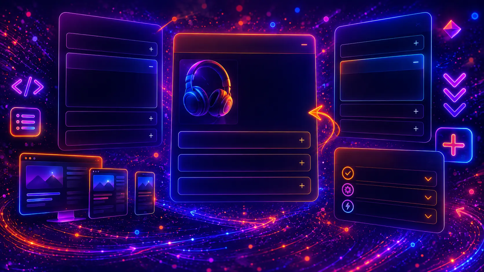
Modern CSS accordions are one of the most useful UI components for organizing website content without making a page feel too long or crowded. They let visitors open the information they need, while keeping FAQ sections, product details, pricing questions, documentation notes, and mobile content blocks clean and easy to scan.
In this guide, you will find 30 modern CSS accordion examples built with HTML and CSS. Most examples use simple, accessible markup with <details> and <summary>, while a few advanced accordion patterns include a small JavaScript snippet when it improves the interaction.
Each example includes a live preview, visible HTML code, visible CSS code, and a short explanation, so you can copy, customize, and reuse the accordion design in your own website, WordPress theme, landing page, product page, support center, or client project.
Table of Contents

What Is a CSS Accordion?
A CSS accordion is a content toggle component where a user clicks or taps a title to open hidden content. The closed state keeps the page compact, while the open state reveals more details only when the visitor wants to read them.
Accordions are commonly used for FAQ answers, product information, specifications, pricing questions, documentation sections, mobile filters, support pages, and dashboard settings. They are especially useful when a page has many related pieces of content that do not all need to be visible at the same time.
Many modern CSS accordions can be built with native HTML using <details> and <summary>. This keeps the content inside the HTML, makes the component easier to understand, and allows the basic open-and-close behavior to work without a large JavaScript library.
Why Use CSS Accordions?
CSS accordions are useful because they make long content easier to scan. Instead of showing every answer, detail, or setting at once, an accordion lets users choose the section they want to open.
- They save vertical space on long pages and mobile layouts.
- They make FAQ sections easier to read by showing questions first.
- They organize product information such as descriptions, specifications, shipping, warranty, and returns.
- They work well for documentation where users may only need one answer at a time.
- They help mobile users navigate filters, settings, and grouped content more comfortably.
The best accordion designs do not hide important conversion content. They are most useful for supporting details, optional explanations, repeated questions, and grouped information.
Where to Use Accordions
Accordions can be used in many parts of a modern website, but they work best when the user expects expandable information. A good accordion should make content easier to understand, not harder to find.
- FAQ sections: answer common customer questions in a compact layout.
- Product pages: organize descriptions, specifications, shipping, warranty, and returns.
- Pricing pages: explain billing, cancellation, invoices, upgrades, and plan limits.
- Documentation pages: group setup steps, troubleshooting notes, and technical explanations.
- Support centers: create clean help sections for common topics.
- Mobile filters: keep category, price, size, color, and brand filters compact.
- Dashboard settings: separate account, notifications, privacy, billing, and security options.
- Landing pages: show extra feature details without making the main layout too heavy.
Below you will find 30 accordion patterns for different website sections and UI needs, from simple FAQ accordions to product accordions, mobile filters, sidebar menus, dashboard settings, animated accordions, and complete responsive accordion sections.
30 Modern CSS Accordion Examples
The following examples show practical accordion patterns for modern websites. Each example includes a live preview and visible HTML/CSS code, so you can copy the structure, adjust the styling, and reuse the pattern in your own website, WordPress theme, landing page, product page, documentation page, support center, or client project.
Most accordion examples use only HTML and CSS. If an example needs extra behavior, such as allowing only one item to stay open at a time or animating dynamic height more smoothly, it may include a small JavaScript snippet.
1. Modern FAQ Accordion
A modern FAQ accordion is one of the most common ways to display questions and answers on a website. It helps visitors scan the most important questions quickly and open only the answers they need.
This example uses native <details> and <summary> elements, which makes the accordion simple, lightweight, and easy to reuse. The design includes rounded cards, soft shadows, clear spacing, and a clean open state.
- Perfect for FAQ sections, service pages, landing pages, and support pages
- Uses native HTML accordion behavior with
<details>and<summary> - Includes modern card styling, hover states, and open-state styling
- Works without JavaScript
- Responsive and easy to customize
Frequently asked questions
Use this modern FAQ accordion to keep important answers organized, readable, and easy to scan on every screen size.
Can I use this accordion without JavaScript?
Yes. This example uses native details and summary elements, so the open and close behavior works without any JavaScript.
Is this accordion responsive?
Yes. The layout uses flexible widths, readable spacing, and mobile-friendly padding, so it adapts well to smaller screens.
Can I change the colors and spacing?
You can customize the background, border, shadow, text colors, icon style, spacing, and border radius to match your website design.
Where should I use this FAQ accordion?
This pattern works well on landing pages, service pages, support pages, product pages, pricing pages, and blog posts with common questions.
HTML
<section class="modern-faq-accordion">

  <div class="modern-faq-header">
    <div class="modern-faq-kicker">FAQ Accordion</div>
    <h3 class="modern-faq-title">Frequently asked questions</h3>
    <p class="modern-faq-text">Use this modern FAQ accordion to keep important answers organized, readable, and easy to scan on every screen size.</p>
  </div>

  <div class="modern-faq-list">

    <details class="modern-faq-item" open>
      <summary>Can I use this accordion without JavaScript?</summary>
      <div class="modern-faq-answer">
        <p>Yes. This example uses native details and summary elements, so the open and close behavior works without any JavaScript.</p>
      </div>
    </details>

    <details class="modern-faq-item">
      <summary>Is this accordion responsive?</summary>
      <div class="modern-faq-answer">
        <p>Yes. The layout uses flexible widths, readable spacing, and mobile-friendly padding, so it adapts well to smaller screens.</p>
      </div>
    </details>

    <details class="modern-faq-item">
      <summary>Can I change the colors and spacing?</summary>
      <div class="modern-faq-answer">
        <p>You can customize the background, border, shadow, text colors, icon style, spacing, and border radius to match your website design.</p>
      </div>
    </details>

    <details class="modern-faq-item">
      <summary>Where should I use this FAQ accordion?</summary>
      <div class="modern-faq-answer">
        <p>This pattern works well on landing pages, service pages, support pages, product pages, pricing pages, and blog posts with common questions.</p>
      </div>
    </details>

  </div>

</section>
CSS
.modern-faq-accordion{
width:min(100%,780px);
}

.modern-faq-header{
margin-bottom:24px;
text-align:center;
}

.modern-faq-kicker{
display:inline-flex;
align-items:center;
justify-content:center;
margin-bottom:12px;
padding:8px 12px;
border-radius:999px;
background:#dbeafe;
color:#1d4ed8;
font-size:13px;
font-weight:900;
letter-spacing:.05em;
text-transform:uppercase;
}

.modern-faq-title{
margin:0 0 12px;
font-size:clamp(32px,5vw,52px);
line-height:1.02;
font-weight:950;
letter-spacing:-.05em;
color:#0f172a;
}

.modern-faq-text{
max-width:620px;
margin:0 auto;
font-size:16px;
line-height:1.75;
color:#475569;
}

.modern-faq-list{
display:grid;
gap:14px;
}

.modern-faq-item{
border-radius:20px;
background:rgba(255,255,255,.92);
border:1px solid rgba(15,23,42,.08);
box-shadow:0 18px 44px rgba(15,23,42,.08);
overflow:hidden;
transition:transform .22s ease, box-shadow .22s ease, border-color .22s ease;
}

.modern-faq-item:hover{
transform:translateY(-2px);
box-shadow:0 24px 56px rgba(15,23,42,.12);
border-color:rgba(37,99,235,.22);
}

.modern-faq-item[open]{
border-color:rgba(37,99,235,.32);
box-shadow:0 24px 60px rgba(37,99,235,.13);
}

.modern-faq-item summary{
position:relative;
display:flex;
align-items:center;
justify-content:space-between;
gap:18px;
padding:20px 22px;
cursor:pointer;
font-size:17px;
font-weight:900;
line-height:1.35;
color:#0f172a;
list-style:none;
}

.modern-faq-item summary::-webkit-details-marker{
display:none;
}

.modern-faq-item summary::after{
content:"+";
display:grid;
place-items:center;
flex:0 0 auto;
width:34px;
height:34px;
border-radius:999px;
background:#eff6ff;
color:#2563eb;
font-size:24px;
font-weight:800;
line-height:1;
transition:transform .22s ease, background .22s ease, color .22s ease;
}

.modern-faq-item[open] summary::after{
content:"−";
background:#2563eb;
color:#ffffff;
transform:rotate(180deg);
}

.modern-faq-answer{
padding:0 22px 22px;
}

.modern-faq-answer p{
margin:0;
font-size:15px;
line-height:1.75;
color:#475569;
}

@media (max-width: 640px){
.modern-faq-title{
font-size:34px;
}

.modern-faq-item summary{
padding:18px;
font-size:16px;
}

.modern-faq-answer{
padding:0 18px 18px;
}
}
This modern FAQ accordion is a strong starting point for most websites because it is simple, readable, and lightweight. Since the content stays in the HTML, it is also practical for real FAQ pages, support sections, and SEO-friendly content blocks.
2. Minimal CSS Accordion
A minimal CSS accordion is useful when you want expandable content without heavy visual effects. It keeps the design clean and lets the text remain the main focus.
This example uses thin borders, simple typography, subtle spacing, and a lightweight open state. It is a good choice for documentation pages, clean blogs, help articles, and minimalist website sections.
- Perfect for clean websites, documentation pages, help pages, and simple content sections
- Uses native
<details>and<summary>elements - Minimal visual style with thin borders and calm spacing
- No JavaScript required
- Easy to adapt to light or dark website designs
Minimal Accordion
Simple answers, clean layout
Use this minimal accordion when the design should feel calm, readable, and focused on the content.
What makes this accordion minimal?
It uses simple borders, clear typography, calm spacing, and a small icon indicator instead of heavy shadows, gradients, or decorative effects.
Does this accordion need JavaScript?
No. The example uses native HTML details and summary elements, so the basic accordion behavior works automatically.
Where does this style work best?
This style works well for documentation pages, help articles, clean blog layouts, product notes, and simple FAQ sections.
Can I use this on a WordPress page?
Yes. You can place the HTML and CSS inside a custom HTML block, theme template, reusable block, or custom WordPress component.
HTML
<section class="minimal-css-accordion">

  <div class="minimal-css-accordion-header">
    <p class="minimal-css-accordion-label">Minimal Accordion</p>
    <h3 class="minimal-css-accordion-title">Simple answers, clean layout</h3>
    <p class="minimal-css-accordion-intro">Use this minimal accordion when the design should feel calm, readable, and focused on the content.</p>
  </div>

  <div class="minimal-css-accordion-list">

    <details class="minimal-css-accordion-item" open>
      <summary>What makes this accordion minimal?</summary>
      <div class="minimal-css-accordion-content">
        <p>It uses simple borders, clear typography, calm spacing, and a small icon indicator instead of heavy shadows, gradients, or decorative effects.</p>
      </div>
    </details>

    <details class="minimal-css-accordion-item">
      <summary>Does this accordion need JavaScript?</summary>
      <div class="minimal-css-accordion-content">
        <p>No. The example uses native HTML details and summary elements, so the basic accordion behavior works automatically.</p>
      </div>
    </details>

    <details class="minimal-css-accordion-item">
      <summary>Where does this style work best?</summary>
      <div class="minimal-css-accordion-content">
        <p>This style works well for documentation pages, help articles, clean blog layouts, product notes, and simple FAQ sections.</p>
      </div>
    </details>

    <details class="minimal-css-accordion-item">
      <summary>Can I use this on a WordPress page?</summary>
      <div class="minimal-css-accordion-content">
        <p>Yes. You can place the HTML and CSS inside a custom HTML block, theme template, reusable block, or custom WordPress component.</p>
      </div>
    </details>

  </div>

</section>
CSS
.minimal-css-accordion{
width:min(100%,760px);
padding:34px;
border-radius:28px;
background:#ffffff;
border:1px solid #e5e7eb;
box-shadow:0 20px 60px rgba(15,23,42,.08);
}

.minimal-css-accordion-header{
margin-bottom:22px;
}

.minimal-css-accordion-label{
margin:0 0 10px;
font-size:13px;
font-weight:900;
letter-spacing:.08em;
text-transform:uppercase;
color:#64748b;
}

.minimal-css-accordion-title{
margin:0 0 10px;
font-size:clamp(30px,4.5vw,46px);
line-height:1.08;
font-weight:950;
letter-spacing:-.05em;
color:#111827;
}

.minimal-css-accordion-intro{
margin:0;
max-width:620px;
font-size:16px;
line-height:1.75;
color:#4b5563;
}

.minimal-css-accordion-list{
border-top:1px solid #e5e7eb;
}

.minimal-css-accordion-item{
border-bottom:1px solid #e5e7eb;
}

.minimal-css-accordion-item summary{
display:flex;
align-items:center;
justify-content:space-between;
gap:18px;
padding:20px 0;
cursor:pointer;
list-style:none;
font-size:17px;
font-weight:850;
line-height:1.4;
color:#111827;
transition:color .2s ease;
}

.minimal-css-accordion-item summary::-webkit-details-marker{
display:none;
}

.minimal-css-accordion-item summary:hover{
color:#2563eb;
}

.minimal-css-accordion-item summary::after{
content:"+";
display:grid;
place-items:center;
flex:0 0 auto;
width:28px;
height:28px;
border-radius:999px;
border:1px solid #d1d5db;
color:#111827;
font-size:20px;
font-weight:700;
line-height:1;
transition:transform .2s ease, border-color .2s ease, color .2s ease;
}

.minimal-css-accordion-item[open] summary{
color:#2563eb;
}

.minimal-css-accordion-item[open] summary::after{
content:"−";
border-color:#2563eb;
color:#2563eb;
transform:rotate(180deg);
}

.minimal-css-accordion-content{
padding:0 0 20px;
}

.minimal-css-accordion-content p{
margin:0;
max-width:620px;
font-size:15px;
line-height:1.75;
color:#4b5563;
}

@media (max-width: 640px){
.minimal-css-accordion{
padding:24px;
border-radius:22px;
}

.minimal-css-accordion-title{
font-size:32px;
}

.minimal-css-accordion-item summary{
padding:18px 0;
font-size:16px;
}
}
This minimal CSS accordion works best when the surrounding website design is already clean and you do not want the accordion to dominate the page. It keeps the content accessible and easy to read while still giving users a clear open-and-close interaction.
3. Card Style Accordion
A card style accordion gives each expandable item its own visual container. This makes the accordion feel more like a set of modern content cards instead of a simple list.
This example uses rounded cards, soft shadows, subtle gradients, and clear spacing. It works well for service details, feature explanations, FAQ blocks, product information, and homepage content sections.
- Perfect for feature sections, service pages, product pages, and modern FAQ blocks
- Each accordion item is styled as a separate card
- Includes soft shadows, rounded corners, and clear open states
- Uses native
<details>and<summary> - Works without JavaScript
Organized content cards
Use this style when each accordion item should feel like a separate content block.
Plan the content structure Group related information before designing the UI.
A card style accordion works best when every item has a clear topic. Use short titles, helpful subtitles, and concise content inside each open panel.
Keep the layout easy to scan Use spacing, shadows, and hierarchy carefully.
Separate cards help visitors understand where one topic ends and the next begins. This is useful for service details, feature lists, and FAQ blocks.
Make the open state obvious Use a stronger border, icon change, or background shift.
The open state should feel visually different from the closed state. This helps users understand which accordion item they are currently reading.
HTML
<section class="card-style-accordion">

  <div class="card-style-accordion-head">

    <div>
      <div class="card-style-accordion-label">Card Accordion</div>
      <h3 class="card-style-accordion-title">Organized content cards</h3>
    </div>

    <p class="card-style-accordion-intro">Use this style when each accordion item should feel like a separate content block.</p>

  </div>

  <div class="card-style-accordion-grid">

    <details class="card-style-accordion-item" open>
      <summary>
        <span class="card-style-accordion-icon">01</span>
        <span class="card-style-accordion-summary-text">
          <strong>Plan the content structure</strong>
          <span>Group related information before designing the UI.</span>
        </span>
        <span class="card-style-accordion-toggle"></span>
      </summary>
      <div class="card-style-accordion-content">
        <p>A card style accordion works best when every item has a clear topic. Use short titles, helpful subtitles, and concise content inside each open panel.</p>
      </div>
    </details>

    <details class="card-style-accordion-item">
      <summary>
        <span class="card-style-accordion-icon">02</span>
        <span class="card-style-accordion-summary-text">
          <strong>Keep the layout easy to scan</strong>
          <span>Use spacing, shadows, and hierarchy carefully.</span>
        </span>
        <span class="card-style-accordion-toggle"></span>
      </summary>
      <div class="card-style-accordion-content">
        <p>Separate cards help visitors understand where one topic ends and the next begins. This is useful for service details, feature lists, and FAQ blocks.</p>
      </div>
    </details>

    <details class="card-style-accordion-item">
      <summary>
        <span class="card-style-accordion-icon">03</span>
        <span class="card-style-accordion-summary-text">
          <strong>Make the open state obvious</strong>
          <span>Use a stronger border, icon change, or background shift.</span>
        </span>
        <span class="card-style-accordion-toggle"></span>
      </summary>
      <div class="card-style-accordion-content">
        <p>The open state should feel visually different from the closed state. This helps users understand which accordion item they are currently reading.</p>
      </div>
    </details>

  </div>

</section>
CSS
.card-style-accordion{
width:min(100%,820px);
}

.card-style-accordion-head{
display:grid;
grid-template-columns:minmax(0,1fr) auto;
gap:24px;
align-items:end;
margin-bottom:24px;
}

.card-style-accordion-label{
display:inline-flex;
align-items:center;
width:max-content;
margin-bottom:12px;
padding:8px 12px;
border-radius:999px;
background:#e0f2fe;
color:#0369a1;
font-size:13px;
font-weight:900;
letter-spacing:.06em;
text-transform:uppercase;
}

.card-style-accordion-title{
margin:0;
font-size:clamp(32px,5vw,54px);
line-height:1.02;
font-weight:950;
letter-spacing:-.055em;
color:#0f172a;
}

.card-style-accordion-intro{
margin:0;
max-width:300px;
font-size:15px;
line-height:1.7;
color:#64748b;
}

.card-style-accordion-grid{
display:grid;
gap:16px;
}

.card-style-accordion-item{
position:relative;
overflow:hidden;
border-radius:24px;
background:rgba(255,255,255,.92);
border:1px solid rgba(15,23,42,.08);
box-shadow:0 20px 54px rgba(15,23,42,.09);
transition:transform .24s ease, box-shadow .24s ease, border-color .24s ease;
}

.card-style-accordion-item::before{
content:"";
position:absolute;
left:0;
top:0;
bottom:0;
width:5px;
background:linear-gradient(180deg,#0ea5e9,#8b5cf6);
opacity:.55;
transition:opacity .24s ease;
}

.card-style-accordion-item:hover{
transform:translateY(-3px);
box-shadow:0 28px 70px rgba(15,23,42,.14);
border-color:rgba(14,165,233,.24);
}

.card-style-accordion-item[open]{
box-shadow:0 30px 76px rgba(14,165,233,.16);
border-color:rgba(14,165,233,.32);
}

.card-style-accordion-item[open]::before{
opacity:1;
}

.card-style-accordion-item summary{
position:relative;
display:grid;
grid-template-columns:auto minmax(0,1fr) auto;
gap:16px;
align-items:center;
padding:22px 24px 22px 26px;
cursor:pointer;
list-style:none;
}

.card-style-accordion-item summary::-webkit-details-marker{
display:none;
}

.card-style-accordion-icon{
display:grid;
place-items:center;
width:48px;
height:48px;
border-radius:18px;
background:linear-gradient(135deg,#0ea5e9,#8b5cf6);
color:#ffffff;
font-size:22px;
font-weight:900;
box-shadow:0 14px 34px rgba(14,165,233,.20);
}

.card-style-accordion-summary-text strong{
display:block;
margin-bottom:4px;
font-size:18px;
line-height:1.3;
font-weight:950;
color:#0f172a;
}

.card-style-accordion-summary-text span{
display:block;
font-size:14px;
line-height:1.5;
font-weight:700;
color:#64748b;
}

.card-style-accordion-toggle{
display:grid;
place-items:center;
width:34px;
height:34px;
border-radius:999px;
background:#f1f5f9;
color:#0f172a;
font-size:22px;
font-weight:800;
transition:transform .24s ease, background .24s ease, color .24s ease;
}

.card-style-accordion-toggle::before{
content:"+";
}

.card-style-accordion-item[open] .card-style-accordion-toggle{
background:#0ea5e9;
color:#ffffff;
transform:rotate(180deg);
}

.card-style-accordion-item[open] .card-style-accordion-toggle::before{
content:"−";
}

.card-style-accordion-content{
padding:0 24px 24px 90px;
}

.card-style-accordion-content p{
margin:0;
font-size:15px;
line-height:1.75;
color:#475569;
}

@media (max-width: 720px){
.card-style-accordion-head{
grid-template-columns:1fr;
gap:12px;
}

.card-style-accordion-intro{
max-width:none;
}

.card-style-accordion-item summary{
grid-template-columns:auto minmax(0,1fr);
padding:20px;
}

.card-style-accordion-toggle{
grid-column:2;
justify-self:start;
margin-top:4px;
}

.card-style-accordion-content{
padding:0 20px 20px;
}

.card-style-accordion-icon{
width:44px;
height:44px;
border-radius:16px;
}
}
This card style accordion is useful when the accordion should feel like part of a premium content section rather than a simple FAQ list. The separate card structure makes each item easier to scan and gives the component a polished, modern look.
4. Gradient Header Accordion
A gradient header accordion uses colorful header areas to make expandable content feel more visual and energetic. It is a good choice for modern landing pages, SaaS websites, creative portfolios, and feature sections.
This example uses bold gradient summary bars, dark content panels, and strong contrast. The style is more expressive than a minimal accordion, so it works best when you want the accordion to become a visible design element.
- Perfect for SaaS pages, app landing pages, creative websites, and feature sections
- Uses gradient accordion headers with dark content panels
- Clear open state with icon rotation and brighter color treatment
- Built with native
<details>and<summary> - No JavaScript required
Colorful content toggles
Use gradient headers when your accordion should feel bold, visual, and closely connected to a modern landing page design.
01 Design with stronger visual hierarchy Use color to make key sections stand out.
Gradient headers can help users separate content groups quickly. This is useful for landing pages, feature breakdowns, and modern product sections.
- Strong visual separation
- Clear open and closed states
- Good for colorful brand systems
02 Keep the content panel readable Balance bright headers with calm body content.
When the accordion header is colorful, the open content area should usually be calmer. This keeps the section readable and prevents the design from feeling too busy.
- Use strong contrast
- Keep body text simple
- Avoid too many competing colors
03 Match the gradient to your brand Use colors that fit the page identity.
You can replace the gradient colors with your own brand palette. Try to keep the text color readable and test the component on both desktop and mobile screens.
- Customize gradient stops
- Adjust border radius and shadows
- Test readability before publishing
HTML
<section class="gradient-header-accordion">

  <div class="gradient-header-accordion-top">
    <div class="gradient-header-accordion-badge">Gradient Accordion</div>
    <h3 class="gradient-header-accordion-title">Colorful content <span>toggles</span></h3>
    <p class="gradient-header-accordion-text">Use gradient headers when your accordion should feel bold, visual, and closely connected to a modern landing page design.</p>
  </div>

  <div class="gradient-header-accordion-list">

    <details class="gradient-header-accordion-item" open>
      <summary>
        <span class="gradient-header-accordion-summary-inner">
          <span class="gradient-header-accordion-number">01</span>
          <span class="gradient-header-accordion-summary-copy">
            <strong>Design with stronger visual hierarchy</strong>
            <span>Use color to make key sections stand out.</span>
          </span>
        </span>
        <span class="gradient-header-accordion-arrow"></span>
      </summary>
      <div class="gradient-header-accordion-content">
        <p>Gradient headers can help users separate content groups quickly. This is useful for landing pages, feature breakdowns, and modern product sections.</p>
        <ul>
          <li>Strong visual separation</li>
          <li>Clear open and closed states</li>
          <li>Good for colorful brand systems</li>
        </ul>
      </div>
    </details>

    <details class="gradient-header-accordion-item">
      <summary>
        <span class="gradient-header-accordion-summary-inner">
          <span class="gradient-header-accordion-number">02</span>
          <span class="gradient-header-accordion-summary-copy">
            <strong>Keep the content panel readable</strong>
            <span>Balance bright headers with calm body content.</span>
          </span>
        </span>
        <span class="gradient-header-accordion-arrow"></span>
      </summary>
      <div class="gradient-header-accordion-content">
        <p>When the accordion header is colorful, the open content area should usually be calmer. This keeps the section readable and prevents the design from feeling too busy.</p>
        <ul>
          <li>Use strong contrast</li>
          <li>Keep body text simple</li>
          <li>Avoid too many competing colors</li>
        </ul>
      </div>
    </details>

    <details class="gradient-header-accordion-item">
      <summary>
        <span class="gradient-header-accordion-summary-inner">
          <span class="gradient-header-accordion-number">03</span>
          <span class="gradient-header-accordion-summary-copy">
            <strong>Match the gradient to your brand</strong>
            <span>Use colors that fit the page identity.</span>
          </span>
        </span>
        <span class="gradient-header-accordion-arrow"></span>
      </summary>
      <div class="gradient-header-accordion-content">
        <p>You can replace the gradient colors with your own brand palette. Try to keep the text color readable and test the component on both desktop and mobile screens.</p>
        <ul>
          <li>Customize gradient stops</li>
          <li>Adjust border radius and shadows</li>
          <li>Test readability before publishing</li>
        </ul>
      </div>
    </details>

  </div>

</section>
CSS
.gradient-header-accordion{
width:min(100%,820px);
}

.gradient-header-accordion-top{
margin-bottom:26px;
text-align:center;
}

.gradient-header-accordion-badge{
display:inline-flex;
align-items:center;
justify-content:center;
margin-bottom:14px;
padding:8px 12px;
border-radius:999px;
background:rgba(255,255,255,.08);
border:1px solid rgba(255,255,255,.12);
color:#fbcfe8;
font-size:13px;
font-weight:900;
letter-spacing:.06em;
text-transform:uppercase;
}

.gradient-header-accordion-title{
margin:0 0 12px;
font-size:clamp(32px,5vw,54px);
line-height:1.02;
font-weight:950;
letter-spacing:-.055em;
color:#ffffff;
}

.gradient-header-accordion-title span{
background:linear-gradient(90deg,#fb7185,#c084fc,#60a5fa);
-webkit-background-clip:text;
background-clip:text;
color:transparent;
-webkit-text-fill-color:transparent;
}

.gradient-header-accordion-text{
max-width:640px;
margin:0 auto;
font-size:16px;
line-height:1.75;
color:#cbd5e1;
}

.gradient-header-accordion-list{
display:grid;
gap:16px;
}

.gradient-header-accordion-item{
overflow:hidden;
border-radius:24px;
background:rgba(15,23,42,.84);
border:1px solid rgba(255,255,255,.10);
box-shadow:0 24px 70px rgba(0,0,0,.26);
}

.gradient-header-accordion-item summary{
display:grid;
grid-template-columns:minmax(0,1fr) auto;
gap:18px;
align-items:center;
padding:0;
cursor:pointer;
list-style:none;
}

.gradient-header-accordion-item summary::-webkit-details-marker{
display:none;
}

.gradient-header-accordion-summary-inner{
display:flex;
align-items:center;
gap:14px;
padding:20px 22px;
background:linear-gradient(135deg,rgba(244,63,94,.95),rgba(168,85,247,.92),rgba(37,99,235,.95));
color:#ffffff;
}

.gradient-header-accordion-number{
display:grid;
place-items:center;
width:38px;
height:38px;
border-radius:14px;
background:rgba(255,255,255,.16);
border:1px solid rgba(255,255,255,.18);
font-size:14px;
font-weight:950;
}

.gradient-header-accordion-summary-copy strong{
display:block;
margin-bottom:3px;
font-size:18px;
line-height:1.3;
font-weight:950;
}

.gradient-header-accordion-summary-copy span{
display:block;
font-size:14px;
line-height:1.45;
font-weight:700;
color:rgba(255,255,255,.78);
}

.gradient-header-accordion-arrow{
display:grid;
place-items:center;
width:46px;
height:46px;
margin-right:18px;
border-radius:999px;
background:rgba(255,255,255,.08);
border:1px solid rgba(255,255,255,.12);
color:#ffffff;
font-size:24px;
font-weight:900;
transition:transform .24s ease, background .24s ease;
}

.gradient-header-accordion-arrow::before{
content:"+";
}

.gradient-header-accordion-item[open] .gradient-header-accordion-arrow{
transform:rotate(180deg);
background:rgba(255,255,255,.14);
}

.gradient-header-accordion-item[open] .gradient-header-accordion-arrow::before{
content:"−";
}

.gradient-header-accordion-content{
padding:22px;
border-top:1px solid rgba(255,255,255,.10);
background:
radial-gradient(circle at 18% 10%,rgba(168,85,247,.16),transparent 34%),
rgba(2,6,23,.45);
}

.gradient-header-accordion-content p{
margin:0;
font-size:15px;
line-height:1.8;
color:#cbd5e1;
}

.gradient-header-accordion-content ul{
display:grid;
gap:8px;
margin:16px 0 0;
padding-left:20px;
color:#cbd5e1;
font-size:14px;
line-height:1.6;
}

@media (max-width: 640px){
.gradient-header-accordion-title{
font-size:34px;
}

.gradient-header-accordion-item summary{
grid-template-columns:1fr;
}

.gradient-header-accordion-summary-inner{
padding:18px;
align-items:flex-start;
}

.gradient-header-accordion-arrow{
margin:0 0 18px 18px;
width:40px;
height:40px;
}

.gradient-header-accordion-content{
padding:18px;
}
}
This gradient header accordion works best when the accordion is part of a bold visual section. It is more decorative than a minimal FAQ accordion, so use it where color, branding, and visual impact are important.
5. Dark Mode Accordion
A dark mode accordion is useful for modern dashboards, developer tools, SaaS pages, AI tools, portfolio websites, and dark landing pages. It keeps the content compact while matching a darker visual system.
This example uses a deep background, glowing borders, high-contrast text, and a subtle neon accent. The design feels modern without making the accordion difficult to read.
- Perfect for dark websites, dashboards, SaaS pages, AI tools, and developer documentation
- Uses strong contrast for better readability
- Includes neon-style accents and a clear open state
- Built with native
<details>and<summary> - Works without JavaScript
Clean content for dark interfaces
Use this dark accordion for dashboards, software pages, developer docs, AI tools, and modern dark mode layouts.
Use high contrast for readable text
Dark mode accordions need strong contrast between the text and background. Use light text colors, visible borders, and clear spacing between sections.
Keep the glow effect subtle
Neon effects can look modern, but too much glow can reduce readability. Use glow mainly for borders, icons, focus states, and open states.
Use native HTML when possible
This example uses <details> and <summary>, so the basic accordion interaction works without a JavaScript library.
HTML
<section class="dark-mode-accordion">
<div class="dark-mode-accordion-header">
<div class="dark-mode-accordion-label">Dark Mode Accordion</div>
<h3 class="dark-mode-accordion-title">Clean content for <span>dark interfaces</span></h3>
<p class="dark-mode-accordion-text">Use this dark accordion for dashboards, software pages, developer docs, AI tools, and modern dark mode layouts.</p>
</div>
<div class="dark-mode-accordion-list">
<details class="dark-mode-accordion-item" open>
<summary>
<span class="dark-mode-accordion-question">
<span class="dark-mode-accordion-icon">01</span>
<strong>Use high contrast for readable text</strong>
</span>
<span class="dark-mode-accordion-toggle"></span>
</summary>
<div class="dark-mode-accordion-content">
<p>Dark mode accordions need strong contrast between the text and background. Use light text colors, visible borders, and clear spacing between sections.</p>
</div>
</details>
<details class="dark-mode-accordion-item">
<summary>
<span class="dark-mode-accordion-question">
<span class="dark-mode-accordion-icon">02</span>
<strong>Keep the glow effect subtle</strong>
</span>
<span class="dark-mode-accordion-toggle"></span>
</summary>
<div class="dark-mode-accordion-content">
<p>Neon effects can look modern, but too much glow can reduce readability. Use glow mainly for borders, icons, focus states, and open states.</p>
</div>
</details>
<details class="dark-mode-accordion-item">
<summary>
<span class="dark-mode-accordion-question">
<span class="dark-mode-accordion-icon">03</span>
<strong>Use native HTML when possible</strong>
</span>
<span class="dark-mode-accordion-toggle"></span>
</summary>
<div class="dark-mode-accordion-content">
<p>This example uses <code><details></code> and <code><summary></code>, so the basic accordion interaction works without a JavaScript library.</p>
</div>
</details>
</div>
</section>
CSS
.dark-mode-accordion{
width:min(100%,820px);
}

.dark-mode-accordion-header{
margin-bottom:26px;
text-align:center;
}

.dark-mode-accordion-label{
display:inline-flex;
align-items:center;
justify-content:center;
gap:8px;
margin-bottom:14px;
padding:8px 12px;
border-radius:999px;
background:rgba(59,130,246,.14);
border:1px solid rgba(147,197,253,.20);
color:#bfdbfe;
font-size:13px;
font-weight:900;
letter-spacing:.06em;
text-transform:uppercase;
}

.dark-mode-accordion-label::before{
content:"";
width:8px;
height:8px;
border-radius:999px;
background:#22c55e;
box-shadow:0 0 0 4px rgba(34,197,94,.13),0 0 24px rgba(34,197,94,.55);
}

.dark-mode-accordion-title{
margin:0 0 12px;
font-size:clamp(32px,5vw,54px);
line-height:1.02;
font-weight:950;
letter-spacing:-.055em;
color:#ffffff;
}

.dark-mode-accordion-title span{
background:linear-gradient(90deg,#60a5fa,#c084fc,#fb7185);
-webkit-background-clip:text;
background-clip:text;
color:transparent;
-webkit-text-fill-color:transparent;
}

.dark-mode-accordion-text{
max-width:640px;
margin:0 auto;
font-size:16px;
line-height:1.75;
color:#cbd5e1;
}

.dark-mode-accordion-list{
display:grid;
gap:14px;
}

.dark-mode-accordion-item{
overflow:hidden;
border-radius:22px;
background:rgba(15,23,42,.78);
border:1px solid rgba(148,163,184,.18);
box-shadow:0 24px 70px rgba(0,0,0,.28);
transition:border-color .24s ease, box-shadow .24s ease, transform .24s ease;
}

.dark-mode-accordion-item:hover{
transform:translateY(-2px);
border-color:rgba(96,165,250,.42);
box-shadow:0 30px 82px rgba(0,0,0,.36);
}

.dark-mode-accordion-item[open]{
border-color:rgba(96,165,250,.60);
box-shadow:
0 26px 80px rgba(0,0,0,.34),
0 0 0 1px rgba(96,165,250,.18),
0 0 42px rgba(59,130,246,.16);
}

.dark-mode-accordion-item summary{
display:flex;
align-items:center;
justify-content:space-between;
gap:18px;
padding:22px;
cursor:pointer;
list-style:none;
}

.dark-mode-accordion-item summary::-webkit-details-marker{
display:none;
}

.dark-mode-accordion-question{
display:flex;
align-items:center;
gap:14px;
min-width:0;
}

.dark-mode-accordion-icon{
display:grid;
place-items:center;
flex:0 0 auto;
width:42px;
height:42px;
border-radius:16px;
background:rgba(59,130,246,.14);
border:1px solid rgba(147,197,253,.20);
color:#93c5fd;
font-size:18px;
font-weight:950;
}

.dark-mode-accordion-question strong{
display:block;
font-size:18px;
line-height:1.35;
font-weight:950;
color:#ffffff;
}

.dark-mode-accordion-toggle{
display:grid;
place-items:center;
flex:0 0 auto;
width:34px;
height:34px;
border-radius:999px;
background:rgba(255,255,255,.07);
border:1px solid rgba(255,255,255,.10);
color:#e2e8f0;
font-size:22px;
font-weight:800;
transition:transform .24s ease, background .24s ease, color .24s ease;
}

.dark-mode-accordion-toggle::before{
content:"+";
}

.dark-mode-accordion-item[open] .dark-mode-accordion-toggle{
background:#2563eb;
border-color:#60a5fa;
color:#ffffff;
transform:rotate(180deg);
}

.dark-mode-accordion-item[open] .dark-mode-accordion-toggle::before{
content:"−";
}

.dark-mode-accordion-content{
padding:0 22px 22px 78px;
}

.dark-mode-accordion-content p{
margin:0;
font-size:15px;
line-height:1.8;
color:#cbd5e1;
}

.dark-mode-accordion-content code{
padding:3px 6px;
border-radius:8px;
background:rgba(255,255,255,.08);
color:#bfdbfe;
}

@media (max-width: 640px){
.dark-mode-accordion-title{
font-size:34px;
}

.dark-mode-accordion-item summary{
padding:18px;
align-items:flex-start;
}

.dark-mode-accordion-question{
align-items:flex-start;
}

.dark-mode-accordion-content{
padding:0 18px 18px;
}

.dark-mode-accordion-toggle{
width:32px;
height:32px;
}
}
This dark mode accordion is useful when your website already uses a dark interface or when you want a more technical, futuristic visual style. The most important detail is contrast: the accordion should look modern, but the content still needs to be easy to read.
6. Glassmorphism Accordion
A glassmorphism accordion uses translucent panels, soft blur, light borders, and layered backgrounds to create a modern frosted-glass effect. It works well in creative, SaaS, portfolio, and futuristic landing page designs.
This example places accordion cards on top of a colorful gradient background. The frosted panels help the content stay readable while still allowing the background to feel rich and visual.
- Perfect for modern landing pages, portfolios, SaaS websites, and creative sections
- Uses translucent surfaces, blur, gradients, and soft borders
- Creates a premium frosted-glass accordion style
- Built with native
<details>and<summary> - Works without JavaScript
Soft glass panels for modern UI
Use this frosted-glass accordion when you want a layered, premium, and futuristic content toggle design.
Use translucent panels carefully
Glassmorphism works best when the background has color and depth, but the content panel still has enough contrast for readable text.
Add blur and borders for separation
Backdrop blur, soft borders, and subtle shadows help the accordion cards stand out from the background without looking too heavy.
Keep the text simple and readable
Because the visual style is already decorative, the content inside the accordion should stay concise, direct, and easy to scan.
HTML
<section class="glassmorphism-accordion">

  <div class="glassmorphism-accordion-header">
    <div class="glassmorphism-accordion-label">Glassmorphism Accordion</div>
    <h3 class="glassmorphism-accordion-title">Soft glass panels for modern UI</h3>
    <p class="glassmorphism-accordion-text">Use this frosted-glass accordion when you want a layered, premium, and futuristic content toggle design.</p>
  </div>

  <div class="glassmorphism-accordion-list">

    <details class="glassmorphism-accordion-item" open>
      <summary>
        <span class="glassmorphism-accordion-question">
          <span class="glassmorphism-accordion-icon">01</span>
          <strong>Use translucent panels carefully</strong>
        </span>
        <span class="glassmorphism-accordion-toggle"></span>
      </summary>
      <div class="glassmorphism-accordion-content">
        <p>Glassmorphism works best when the background has color and depth, but the content panel still has enough contrast for readable text.</p>
      </div>
    </details>

    <details class="glassmorphism-accordion-item">
      <summary>
        <span class="glassmorphism-accordion-question">
          <span class="glassmorphism-accordion-icon">02</span>
          <strong>Add blur and borders for separation</strong>
        </span>
        <span class="glassmorphism-accordion-toggle"></span>
      </summary>
      <div class="glassmorphism-accordion-content">
        <p>Backdrop blur, soft borders, and subtle shadows help the accordion cards stand out from the background without looking too heavy.</p>
      </div>
    </details>

    <details class="glassmorphism-accordion-item">
      <summary>
        <span class="glassmorphism-accordion-question">
          <span class="glassmorphism-accordion-icon">03</span>
          <strong>Keep the text simple and readable</strong>
        </span>
        <span class="glassmorphism-accordion-toggle"></span>
      </summary>
      <div class="glassmorphism-accordion-content">
        <p>Because the visual style is already decorative, the content inside the accordion should stay concise, direct, and easy to scan.</p>
      </div>
    </details>

  </div>

</section>
CSS
.glassmorphism-accordion{
position:relative;
z-index:2;
width:min(100%,820px);
padding:28px;
border-radius:34px;
background:rgba(255,255,255,.10);
border:1px solid rgba(255,255,255,.22);
box-shadow:0 34px 110px rgba(0,0,0,.28);
backdrop-filter:blur(22px);
}

.glassmorphism-accordion-header{
margin-bottom:24px;
text-align:center;
}

.glassmorphism-accordion-label{
display:inline-flex;
align-items:center;
justify-content:center;
margin-bottom:14px;
padding:8px 12px;
border-radius:999px;
background:rgba(255,255,255,.16);
border:1px solid rgba(255,255,255,.24);
color:#ffffff;
font-size:13px;
font-weight:900;
letter-spacing:.06em;
text-transform:uppercase;
}

.glassmorphism-accordion-title{
margin:0 0 12px;
font-size:clamp(32px,5vw,54px);
line-height:1.02;
font-weight:950;
letter-spacing:-.055em;
color:#ffffff;
text-shadow:0 10px 32px rgba(0,0,0,.24);
}

.glassmorphism-accordion-text{
max-width:640px;
margin:0 auto;
font-size:16px;
line-height:1.75;
color:rgba(255,255,255,.82);
}

.glassmorphism-accordion-list{
display:grid;
gap:14px;
}

.glassmorphism-accordion-item{
overflow:hidden;
border-radius:24px;
background:rgba(255,255,255,.14);
border:1px solid rgba(255,255,255,.22);
box-shadow:0 20px 60px rgba(0,0,0,.18);
backdrop-filter:blur(18px);
transition:transform .24s ease, background .24s ease, border-color .24s ease;
}

.glassmorphism-accordion-item:hover{
transform:translateY(-2px);
background:rgba(255,255,255,.18);
border-color:rgba(255,255,255,.34);
}

.glassmorphism-accordion-item[open]{
background:rgba(255,255,255,.20);
border-color:rgba(255,255,255,.42);
}

.glassmorphism-accordion-item summary{
display:flex;
align-items:center;
justify-content:space-between;
gap:18px;
padding:22px;
cursor:pointer;
list-style:none;
}

.glassmorphism-accordion-item summary::-webkit-details-marker{
display:none;
}

.glassmorphism-accordion-question{
display:flex;
align-items:center;
gap:14px;
min-width:0;
}

.glassmorphism-accordion-icon{
display:grid;
place-items:center;
flex:0 0 auto;
width:44px;
height:44px;
border-radius:16px;
background:rgba(255,255,255,.18);
border:1px solid rgba(255,255,255,.25);
color:#ffffff;
font-size:18px;
font-weight:950;
}

.glassmorphism-accordion-question strong{
display:block;
font-size:18px;
line-height:1.35;
font-weight:950;
color:#ffffff;
}

.glassmorphism-accordion-toggle{
display:grid;
place-items:center;
flex:0 0 auto;
width:34px;
height:34px;
border-radius:999px;
background:rgba(255,255,255,.18);
border:1px solid rgba(255,255,255,.24);
color:#ffffff;
font-size:22px;
font-weight:800;
transition:transform .24s ease, background .24s ease;
}

.glassmorphism-accordion-toggle::before{
content:"+";
}

.glassmorphism-accordion-item[open] .glassmorphism-accordion-toggle{
transform:rotate(180deg);
background:rgba(255,255,255,.28);
}

.glassmorphism-accordion-item[open] .glassmorphism-accordion-toggle::before{
content:"−";
}

.glassmorphism-accordion-content{
padding:0 22px 22px 80px;
}

.glassmorphism-accordion-content p{
margin:0;
font-size:15px;
line-height:1.8;
color:rgba(255,255,255,.82);
}

@media (max-width: 640px){
.glassmorphism-accordion{
padding:20px;
border-radius:26px;
}

.glassmorphism-accordion-title{
font-size:34px;
}

.glassmorphism-accordion-item summary{
padding:18px;
align-items:flex-start;
}

.glassmorphism-accordion-question{
align-items:flex-start;
}

.glassmorphism-accordion-content{
padding:0 18px 18px;
}
}
This glassmorphism accordion is best for pages where the design should feel premium, layered, and visual. Keep the background colorful but controlled, and always test the text contrast before using this style in production.
7. Neumorphism Accordion
A neumorphism accordion uses soft shadows, rounded shapes, and subtle depth to create a smooth interface style. It works best on light backgrounds where the shadows can create a gentle raised or pressed effect.
This example uses a soft gray surface, rounded accordion rows, inset-style open content, and calm spacing. It is useful for app-like interfaces, settings panels, profile pages, and clean product sections.
- Perfect for app UI, profile settings, soft landing pages, and dashboard sections
- Uses soft shadows and rounded surfaces
- Creates a calm raised-card effect
- Built with native
<details>and<summary> - Works without JavaScript
Soft depth for calm interfaces
Use this accordion style when you want a gentle app-like interface with soft shadows and smooth rounded surfaces.
Use soft shadows for depth Raised surfaces make the accordion feel tactile.
Neumorphism depends on subtle light and dark shadows. Keep the background close to the card color so the raised effect feels smooth.
Keep contrast readable Soft UI still needs clear text hierarchy.
Because neumorphism uses low-contrast surfaces, the text should be darker and easier to read than the surrounding interface.
Use it for smaller UI sections This style works best in focused components.
Neumorphism can feel heavy if used everywhere. Use it for cards, settings panels, profile blocks, or selected content sections.
HTML
<section class="neumorphism-accordion">

  <div class="neumorphism-accordion-header">
    <div class="neumorphism-accordion-label">Neumorphism Accordion</div>
    <h3 class="neumorphism-accordion-title">Soft depth for calm interfaces</h3>
    <p class="neumorphism-accordion-text">Use this accordion style when you want a gentle app-like interface with soft shadows and smooth rounded surfaces.</p>
  </div>

  <div class="neumorphism-accordion-list">

    <details class="neumorphism-accordion-item" open>
      <summary>
        <span class="neumorphism-accordion-question">
          <span class="neumorphism-accordion-icon">01</span>
          <span>
            <strong>Use soft shadows for depth</strong>
            <span>Raised surfaces make the accordion feel tactile.</span>
          </span>
        </span>
        <span class="neumorphism-accordion-toggle"></span>
      </summary>
      <div class="neumorphism-accordion-content">
        <p>Neumorphism depends on subtle light and dark shadows. Keep the background close to the card color so the raised effect feels smooth.</p>
      </div>
    </details>

    <details class="neumorphism-accordion-item">
      <summary>
        <span class="neumorphism-accordion-question">
          <span class="neumorphism-accordion-icon">02</span>
          <span>
            <strong>Keep contrast readable</strong>
            <span>Soft UI still needs clear text hierarchy.</span>
          </span>
        </span>
        <span class="neumorphism-accordion-toggle"></span>
      </summary>
      <div class="neumorphism-accordion-content">
        <p>Because neumorphism uses low-contrast surfaces, the text should be darker and easier to read than the surrounding interface.</p>
      </div>
    </details>

    <details class="neumorphism-accordion-item">
      <summary>
        <span class="neumorphism-accordion-question">
          <span class="neumorphism-accordion-icon">03</span>
          <span>
            <strong>Use it for smaller UI sections</strong>
            <span>This style works best in focused components.</span>
          </span>
        </span>
        <span class="neumorphism-accordion-toggle"></span>
      </summary>
      <div class="neumorphism-accordion-content">
        <p>Neumorphism can feel heavy if used everywhere. Use it for cards, settings panels, profile blocks, or selected content sections.</p>
      </div>
    </details>

  </div>

</section>
CSS
.neumorphism-accordion{
width:min(100%,800px);
padding:30px;
border-radius:34px;
background:#eef2f7;
box-shadow:
18px 18px 44px rgba(148,163,184,.45),
-18px -18px 44px rgba(255,255,255,.86);
}

.neumorphism-accordion-header{
margin-bottom:26px;
text-align:center;
}

.neumorphism-accordion-label{
display:inline-flex;
align-items:center;
justify-content:center;
margin-bottom:14px;
padding:8px 13px;
border-radius:999px;
background:#eef2f7;
box-shadow:
7px 7px 16px rgba(148,163,184,.34),
-7px -7px 16px rgba(255,255,255,.86);
color:#475569;
font-size:13px;
font-weight:900;
letter-spacing:.07em;
text-transform:uppercase;
}

.neumorphism-accordion-title{
margin:0 0 12px;
font-size:clamp(32px,5vw,52px);
line-height:1.04;
font-weight:950;
letter-spacing:-.055em;
color:#172033;
}

.neumorphism-accordion-text{
max-width:620px;
margin:0 auto;
font-size:16px;
line-height:1.75;
color:#64748b;
}

.neumorphism-accordion-list{
display:grid;
gap:18px;
}

.neumorphism-accordion-item{
border-radius:24px;
background:#eef2f7;
box-shadow:
10px 10px 24px rgba(148,163,184,.35),
-10px -10px 24px rgba(255,255,255,.88);
overflow:hidden;
transition:box-shadow .24s ease, transform .24s ease;
}

.neumorphism-accordion-item:hover{
transform:translateY(-2px);
box-shadow:
14px 14px 32px rgba(148,163,184,.40),
-14px -14px 32px rgba(255,255,255,.90);
}

.neumorphism-accordion-item[open]{
box-shadow:
inset 8px 8px 18px rgba(148,163,184,.30),
inset -8px -8px 18px rgba(255,255,255,.78);
}

.neumorphism-accordion-item summary{
display:flex;
align-items:center;
justify-content:space-between;
gap:18px;
padding:22px;
cursor:pointer;
list-style:none;
}

.neumorphism-accordion-item summary::-webkit-details-marker{
display:none;
}

.neumorphism-accordion-question{
display:flex;
align-items:center;
gap:14px;
min-width:0;
}

.neumorphism-accordion-icon{
display:grid;
place-items:center;
flex:0 0 auto;
width:46px;
height:46px;
border-radius:18px;
background:#eef2f7;
box-shadow:
6px 6px 14px rgba(148,163,184,.34),
-6px -6px 14px rgba(255,255,255,.86);
color:#2563eb;
font-size:18px;
font-weight:950;
}

.neumorphism-accordion-question strong{
display:block;
font-size:18px;
line-height:1.35;
font-weight:950;
color:#172033;
}

.neumorphism-accordion-question span{
display:block;
margin-top:3px;
font-size:14px;
line-height:1.5;
font-weight:700;
color:#64748b;
}

.neumorphism-accordion-toggle{
display:grid;
place-items:center;
flex:0 0 auto;
width:34px;
height:34px;
border-radius:999px;
background:#eef2f7;
box-shadow:
5px 5px 12px rgba(148,163,184,.34),
-5px -5px 12px rgba(255,255,255,.88);
color:#172033;
font-size:22px;
font-weight:800;
transition:transform .24s ease, color .24s ease, box-shadow .24s ease;
}

.neumorphism-accordion-toggle::before{
content:"+";
}

.neumorphism-accordion-item[open] .neumorphism-accordion-toggle{
transform:rotate(180deg);
color:#2563eb;
box-shadow:
inset 4px 4px 9px rgba(148,163,184,.34),
inset -4px -4px 9px rgba(255,255,255,.82);
}

.neumorphism-accordion-item[open] .neumorphism-accordion-toggle::before{
content:"−";
}

.neumorphism-accordion-content{
padding:0 22px 22px 82px;
}

.neumorphism-accordion-content p{
margin:0;
font-size:15px;
line-height:1.75;
color:#64748b;
}

@media (max-width: 640px){
.neumorphism-accordion{
padding:22px;
border-radius:26px;
}

.neumorphism-accordion-title{
font-size:34px;
}

.neumorphism-accordion-item summary{
padding:18px;
align-items:flex-start;
}

.neumorphism-accordion-question{
align-items:flex-start;
}

.neumorphism-accordion-content{
padding:0 18px 18px;
}
}
This neumorphism accordion is best for soft, app-like interfaces where the visual style should feel calm and tactile. Use it carefully, because neumorphism needs enough contrast to remain readable and accessible.
8. Icon Accordion
An icon accordion uses small visual symbols to help users understand each expandable item faster. Icons can make feature lists, onboarding sections, service benefits, and product explanations easier to scan.
This example uses colorful icon blocks, clean accordion cards, and a clear open state. The icons are simple text symbols, so the demo does not need external icon libraries or image files.
- Perfect for feature lists, service benefits, onboarding sections, and product explanations
- Uses simple built-in icon symbols without external libraries
- Includes colorful icon blocks and a clean open state
- Built with native
<details>and<summary> - Works without JavaScript
Visual answers with clear icons
Use icons to make each accordion item easier to recognize and more engaging for visitors.
✓ Clear structure Organize related information into readable groups.
Icons help users recognize the topic quickly. This can make feature sections, benefits, and onboarding content easier to scan.
⚡ Fast interaction Show details only when users need them.
The native details and summary elements make the accordion lightweight and easy to use without adding a JavaScript dependency.
★ Better visual hierarchy Highlight important sections with simple symbols.
Colorful icons can guide attention, but they should not replace clear text labels. Use both together for the best result.
? Helpful explanations Answer common questions in a compact layout.
This pattern is useful for FAQs, service notes, product highlights, comparison blocks, and short support sections.
HTML
<section class="icon-accordion">

  <div class="icon-accordion-intro">
    <div class="icon-accordion-label">Icon Accordion</div>
    <h3 class="icon-accordion-title">Visual answers with clear icons</h3>
    <p class="icon-accordion-text">Use icons to make each accordion item easier to recognize and more engaging for visitors.</p>
    <div class="icon-accordion-badges">
      <span class="icon-accordion-badge">Feature lists</span>
      <span class="icon-accordion-badge">Service pages</span>
      <span class="icon-accordion-badge">Product details</span>
    </div>
  </div>

  <div class="icon-accordion-list">

    <details class="icon-accordion-item" open>
      <summary>
        <span class="icon-accordion-question">
          <span class="icon-accordion-symbol">✓</span>
          <span>
            <strong>Clear structure</strong>
            <span>Organize related information into readable groups.</span>
          </span>
        </span>
        <span class="icon-accordion-toggle"></span>
      </summary>
      <div class="icon-accordion-content">
        <p>Icons help users recognize the topic quickly. This can make feature sections, benefits, and onboarding content easier to scan.</p>
      </div>
    </details>

    <details class="icon-accordion-item">
      <summary>
        <span class="icon-accordion-question">
          <span class="icon-accordion-symbol">⚡</span>
          <span>
            <strong>Fast interaction</strong>
            <span>Show details only when users need them.</span>
          </span>
        </span>
        <span class="icon-accordion-toggle"></span>
      </summary>
      <div class="icon-accordion-content">
        <p>The native details and summary elements make the accordion lightweight and easy to use without adding a JavaScript dependency.</p>
      </div>
    </details>

    <details class="icon-accordion-item">
      <summary>
        <span class="icon-accordion-question">
          <span class="icon-accordion-symbol">★</span>
          <span>
            <strong>Better visual hierarchy</strong>
            <span>Highlight important sections with simple symbols.</span>
          </span>
        </span>
        <span class="icon-accordion-toggle"></span>
      </summary>
      <div class="icon-accordion-content">
        <p>Colorful icons can guide attention, but they should not replace clear text labels. Use both together for the best result.</p>
      </div>
    </details>

    <details class="icon-accordion-item">
      <summary>
        <span class="icon-accordion-question">
          <span class="icon-accordion-symbol">?</span>
          <span>
            <strong>Helpful explanations</strong>
            <span>Answer common questions in a compact layout.</span>
          </span>
        </span>
        <span class="icon-accordion-toggle"></span>
      </summary>
      <div class="icon-accordion-content">
        <p>This pattern is useful for FAQs, service notes, product highlights, comparison blocks, and short support sections.</p>
      </div>
    </details>

  </div>

</section>
CSS
.icon-accordion{
width:min(100%,820px);
display:grid;
grid-template-columns:minmax(0,.9fr) minmax(0,1.1fr);
gap:30px;
align-items:center;
}

.icon-accordion-intro{
min-width:0;
}

.icon-accordion-label{
display:inline-flex;
align-items:center;
justify-content:center;
margin-bottom:14px;
padding:8px 12px;
border-radius:999px;
background:#dcfce7;
color:#15803d;
font-size:13px;
font-weight:900;
letter-spacing:.06em;
text-transform:uppercase;
}

.icon-accordion-title{
margin:0 0 14px;
font-size:clamp(34px,5vw,56px);
line-height:1.02;
font-weight:950;
letter-spacing:-.06em;
color:#0f172a;
}

.icon-accordion-text{
margin:0 0 22px;
font-size:16px;
line-height:1.75;
color:#475569;
}

.icon-accordion-badges{
display:flex;
flex-wrap:wrap;
gap:10px;
}

.icon-accordion-badge{
display:inline-flex;
align-items:center;
min-height:36px;
padding:0 12px;
border-radius:999px;
background:#ffffff;
border:1px solid #e2e8f0;
box-shadow:0 12px 28px rgba(15,23,42,.06);
color:#475569;
font-size:13px;
font-weight:850;
}

.icon-accordion-list{
display:grid;
gap:14px;
}

.icon-accordion-item{
overflow:hidden;
border-radius:24px;
background:rgba(255,255,255,.94);
border:1px solid rgba(15,23,42,.08);
box-shadow:0 20px 54px rgba(15,23,42,.09);
transition:transform .24s ease, border-color .24s ease, box-shadow .24s ease;
}

.icon-accordion-item:hover{
transform:translateY(-2px);
border-color:rgba(34,197,94,.28);
box-shadow:0 28px 70px rgba(15,23,42,.13);
}

.icon-accordion-item[open]{
border-color:rgba(34,197,94,.40);
box-shadow:0 30px 76px rgba(34,197,94,.14);
}

.icon-accordion-item summary{
display:flex;
align-items:center;
justify-content:space-between;
gap:18px;
padding:20px;
cursor:pointer;
list-style:none;
}

.icon-accordion-item summary::-webkit-details-marker{
display:none;
}

.icon-accordion-question{
display:flex;
align-items:center;
gap:14px;
min-width:0;
}

.icon-accordion-symbol{
display:grid;
place-items:center;
flex:0 0 auto;
width:48px;
height:48px;
border-radius:18px;
font-size:23px;
box-shadow:0 14px 34px rgba(15,23,42,.10);
}

.icon-accordion-item:nth-child(1) .icon-accordion-symbol{
background:#dcfce7;
color:#15803d;
}

.icon-accordion-item:nth-child(2) .icon-accordion-symbol{
background:#dbeafe;
color:#1d4ed8;
}

.icon-accordion-item:nth-child(3) .icon-accordion-symbol{
background:#fef3c7;
color:#b45309;
}

.icon-accordion-item:nth-child(4) .icon-accordion-symbol{
background:#fce7f3;
color:#be185d;
}

.icon-accordion-question strong{
display:block;
margin-bottom:3px;
font-size:18px;
line-height:1.3;
font-weight:950;
color:#0f172a;
}

.icon-accordion-question span{
display:block;
font-size:14px;
line-height:1.45;
font-weight:700;
color:#64748b;
}

.icon-accordion-toggle{
display:grid;
place-items:center;
flex:0 0 auto;
width:32px;
height:32px;
border-radius:999px;
background:#f1f5f9;
color:#0f172a;
font-size:22px;
font-weight:800;
transition:transform .24s ease, background .24s ease, color .24s ease;
}

.icon-accordion-toggle::before{
content:"+";
}

.icon-accordion-item[open] .icon-accordion-toggle{
background:#16a34a;
color:#ffffff;
transform:rotate(180deg);
}

.icon-accordion-item[open] .icon-accordion-toggle::before{
content:"−";
}

.icon-accordion-content{
padding:0 20px 20px 82px;
}

.icon-accordion-content p{
margin:0;
font-size:15px;
line-height:1.75;
color:#475569;
}

@media (max-width: 820px){
.icon-accordion{
grid-template-columns:1fr;
}

.icon-accordion-title{
font-size:36px;
}

.icon-accordion-item summary{
padding:18px;
align-items:flex-start;
}

.icon-accordion-question{
align-items:flex-start;
}

.icon-accordion-content{
padding:0 18px 18px;
}
}
This icon accordion makes expandable content more visual while staying lightweight. It is especially useful when each accordion item represents a benefit, feature, step, service, or product detail that can be recognized with a simple symbol.
9. Animated Chevron Accordion
An animated chevron accordion uses a rotating arrow indicator to show whether each item is open or closed. This is one of the most familiar accordion patterns because users immediately understand the interaction.
This example uses a clean card layout with a chevron icon created in CSS. When the accordion opens, the chevron rotates smoothly to create a simple but polished interaction.
- Perfect for FAQ sections, mobile content blocks, product details, and help pages
- Uses a CSS-created chevron icon
- Includes smooth rotation when the item opens
- Built with native
<details>and<summary> - Works without JavaScript
Smooth arrow interaction
Use this accordion when you want a familiar open-and-close indicator with a clean animated chevron.
Why use a chevron icon? It gives users a familiar visual clue.
A chevron is easy to understand because users often associate it with expanding, collapsing, moving forward, or revealing more content.
Can the chevron be made with CSS? No image or icon library is required.
Yes. This demo creates the chevron with borders on a pseudo-element, then rotates the icon when the accordion item is open.
Where does this pattern work best? Use it for clean, familiar content toggles.
This pattern works well for FAQ sections, support centers, mobile content blocks, checkout help, and product information panels.
HTML
<section class="chevron-accordion">

  <div class="chevron-accordion-header">
    <div class="chevron-accordion-label">Chevron Accordion</div>
    <h3 class="chevron-accordion-title">Smooth arrow interaction</h3>
    <p class="chevron-accordion-text">Use this accordion when you want a familiar open-and-close indicator with a clean animated chevron.</p>
  </div>

  <div class="chevron-accordion-list">

    <details class="chevron-accordion-item" open>
      <summary>
        <span class="chevron-accordion-copy">
          <strong>Why use a chevron icon?</strong>
          <span>It gives users a familiar visual clue.</span>
        </span>
        <span class="chevron-accordion-arrow"></span>
      </summary>
      <div class="chevron-accordion-content">
        <p>A chevron is easy to understand because users often associate it with expanding, collapsing, moving forward, or revealing more content.</p>
      </div>
    </details>

    <details class="chevron-accordion-item">
      <summary>
        <span class="chevron-accordion-copy">
          <strong>Can the chevron be made with CSS?</strong>
          <span>No image or icon library is required.</span>
        </span>
        <span class="chevron-accordion-arrow"></span>
      </summary>
      <div class="chevron-accordion-content">
        <p>Yes. This demo creates the chevron with borders on a pseudo-element, then rotates the icon when the accordion item is open.</p>
      </div>
    </details>

    <details class="chevron-accordion-item">
      <summary>
        <span class="chevron-accordion-copy">
          <strong>Where does this pattern work best?</strong>
          <span>Use it for clean, familiar content toggles.</span>
        </span>
        <span class="chevron-accordion-arrow"></span>
      </summary>
      <div class="chevron-accordion-content">
        <p>This pattern works well for FAQ sections, support centers, mobile content blocks, checkout help, and product information panels.</p>
      </div>
    </details>

  </div>

</section>
CSS
.chevron-accordion{
width:min(100%,780px);
}

.chevron-accordion-header{
margin-bottom:24px;
text-align:center;
}

.chevron-accordion-label{
display:inline-flex;
align-items:center;
justify-content:center;
margin-bottom:14px;
padding:8px 12px;
border-radius:999px;
background:#e0e7ff;
color:#4338ca;
font-size:13px;
font-weight:900;
letter-spacing:.06em;
text-transform:uppercase;
}

.chevron-accordion-title{
margin:0 0 12px;
font-size:clamp(32px,5vw,52px);
line-height:1.04;
font-weight:950;
letter-spacing:-.055em;
color:#0f172a;
}

.chevron-accordion-text{
max-width:620px;
margin:0 auto;
font-size:16px;
line-height:1.75;
color:#475569;
}

.chevron-accordion-list{
display:grid;
gap:14px;
}

.chevron-accordion-item{
overflow:hidden;
border-radius:22px;
background:#ffffff;
border:1px solid rgba(15,23,42,.08);
box-shadow:0 18px 48px rgba(15,23,42,.08);
transition:transform .22s ease, box-shadow .22s ease, border-color .22s ease;
}

.chevron-accordion-item:hover{
transform:translateY(-2px);
box-shadow:0 24px 62px rgba(15,23,42,.12);
border-color:rgba(99,102,241,.28);
}

.chevron-accordion-item[open]{
border-color:rgba(99,102,241,.38);
box-shadow:0 28px 72px rgba(99,102,241,.14);
}

.chevron-accordion-item summary{
display:flex;
align-items:center;
justify-content:space-between;
gap:18px;
padding:22px;
cursor:pointer;
list-style:none;
}

.chevron-accordion-item summary::-webkit-details-marker{
display:none;
}

.chevron-accordion-copy{
min-width:0;
}

.chevron-accordion-copy strong{
display:block;
margin-bottom:4px;
font-size:18px;
line-height:1.3;
font-weight:950;
color:#0f172a;
}

.chevron-accordion-copy span{
display:block;
font-size:14px;
line-height:1.5;
font-weight:700;
color:#64748b;
}

.chevron-accordion-arrow{
position:relative;
display:grid;
place-items:center;
flex:0 0 auto;
width:40px;
height:40px;
border-radius:999px;
background:#f1f5f9;
transition:background .24s ease, transform .24s ease;
}

.chevron-accordion-arrow::before{
content:"";
width:10px;
height:10px;
border-right:3px solid #4338ca;
border-bottom:3px solid #4338ca;
transform:rotate(45deg) translateY(-2px);
transition:transform .24s ease, border-color .24s ease;
}

.chevron-accordion-item[open] .chevron-accordion-arrow{
background:#4338ca;
transform:rotate(180deg);
}

.chevron-accordion-item[open] .chevron-accordion-arrow::before{
border-color:#ffffff;
}

.chevron-accordion-content{
padding:0 22px 22px;
}

.chevron-accordion-content p{
margin:0;
font-size:15px;
line-height:1.75;
color:#475569;
}

@media (max-width: 640px){
.chevron-accordion-title{
font-size:34px;
}

.chevron-accordion-item summary{
padding:18px;
align-items:flex-start;
}

.chevron-accordion-arrow{
width:36px;
height:36px;
}

.chevron-accordion-content{
padding:0 18px 18px;
}
}
This animated chevron accordion is a safe and familiar pattern for most websites. It is simple enough for FAQ sections but polished enough for product pages, landing pages, and support content.
10. Numbered Accordion
A numbered accordion is useful when the content has a sequence, process, checklist, or step-by-step structure. The numbers help users understand order and make the section easier to scan.
This example uses large numbers, compact summaries, and clean expandable content. It works well for process sections, onboarding steps, tutorial blocks, service workflows, and “how it works” sections.
- Perfect for process sections, onboarding steps, tutorials, and service workflows
- Uses large visible numbers for easier scanning
- Good alternative to long timeline sections
- Built with native
<details>and<summary> - Works without JavaScript
Step-by-step content toggles
Use this accordion when your content follows a process, order, workflow, or guided sequence.
Start with the main goal Explain what the user should understand first.
Numbered accordions work best when every item represents a step. Keep the title short and use the open content area for extra explanation.
Break the process into clear parts Each step should cover one focused idea.
Use a numbered accordion instead of a long block of text when users may want to scan the process before reading the details.
Reveal details only when needed Keep the default page layout clean and compact.
This pattern is useful for onboarding, tutorials, service workflows, quote request steps, and how-it-works sections.
HTML
<section class="numbered-accordion">

  <div class="numbered-accordion-header">

    <div>
      <div class="numbered-accordion-label">Numbered Accordion</div>
      <h3 class="numbered-accordion-title">Step-by-step content toggles</h3>
    </div>

    <p class="numbered-accordion-text">Use this accordion when your content follows a process, order, workflow, or guided sequence.</p>

  </div>

  <div class="numbered-accordion-list">

    <details class="numbered-accordion-item" open>
      <summary>
        <span class="numbered-accordion-number"></span>
        <span class="numbered-accordion-copy">
          <strong>Start with the main goal</strong>
          <span>Explain what the user should understand first.</span>
        </span>
        <span class="numbered-accordion-toggle"></span>
      </summary>
      <div class="numbered-accordion-content">
        <p>Numbered accordions work best when every item represents a step. Keep the title short and use the open content area for extra explanation.</p>
      </div>
    </details>

    <details class="numbered-accordion-item">
      <summary>
        <span class="numbered-accordion-number"></span>
        <span class="numbered-accordion-copy">
          <strong>Break the process into clear parts</strong>
          <span>Each step should cover one focused idea.</span>
        </span>
        <span class="numbered-accordion-toggle"></span>
      </summary>
      <div class="numbered-accordion-content">
        <p>Use a numbered accordion instead of a long block of text when users may want to scan the process before reading the details.</p>
      </div>
    </details>

    <details class="numbered-accordion-item">
      <summary>
        <span class="numbered-accordion-number"></span>
        <span class="numbered-accordion-copy">
          <strong>Reveal details only when needed</strong>
          <span>Keep the default page layout clean and compact.</span>
        </span>
        <span class="numbered-accordion-toggle"></span>
      </summary>
      <div class="numbered-accordion-content">
        <p>This pattern is useful for onboarding, tutorials, service workflows, quote request steps, and how-it-works sections.</p>
      </div>
    </details>

  </div>

</section>
CSS
.numbered-accordion{
width:min(100%,860px);
}

.numbered-accordion-header{
display:grid;
grid-template-columns:minmax(0,1fr) minmax(260px,.72fr);
gap:28px;
align-items:end;
margin-bottom:26px;
}

.numbered-accordion-label{
display:inline-flex;
align-items:center;
justify-content:center;
width:max-content;
margin-bottom:14px;
padding:8px 12px;
border-radius:999px;
background:#ffedd5;
color:#c2410c;
font-size:13px;
font-weight:900;
letter-spacing:.06em;
text-transform:uppercase;
}

.numbered-accordion-title{
margin:0;
font-size:clamp(34px,5vw,56px);
line-height:1.02;
font-weight:950;
letter-spacing:-.06em;
color:#0f172a;
}

.numbered-accordion-text{
margin:0;
font-size:16px;
line-height:1.75;
color:#64748b;
}

.numbered-accordion-list{
display:grid;
gap:16px;
counter-reset:numberedAccordion;
}

.numbered-accordion-item{
counter-increment:numberedAccordion;
overflow:hidden;
border-radius:24px;
background:rgba(255,255,255,.94);
border:1px solid rgba(15,23,42,.08);
box-shadow:0 20px 54px rgba(15,23,42,.08);
transition:transform .24s ease, border-color .24s ease, box-shadow .24s ease;
}

.numbered-accordion-item:hover{
transform:translateY(-2px);
border-color:rgba(249,115,22,.30);
box-shadow:0 28px 70px rgba(15,23,42,.12);
}

.numbered-accordion-item[open]{
border-color:rgba(249,115,22,.42);
box-shadow:0 30px 76px rgba(249,115,22,.13);
}

.numbered-accordion-item summary{
display:grid;
grid-template-columns:auto minmax(0,1fr) auto;
gap:18px;
align-items:center;
padding:22px;
cursor:pointer;
list-style:none;
}

.numbered-accordion-item summary::-webkit-details-marker{
display:none;
}

.numbered-accordion-number{
display:grid;
place-items:center;
width:58px;
height:58px;
border-radius:20px;
background:linear-gradient(135deg,#f97316,#eab308);
color:#ffffff;
font-size:21px;
font-weight:950;
letter-spacing:-.04em;
box-shadow:0 16px 38px rgba(249,115,22,.22);
}

.numbered-accordion-number::before{
content:counter(numberedAccordion, decimal-leading-zero);
}

.numbered-accordion-copy strong{
display:block;
margin-bottom:4px;
font-size:19px;
line-height:1.3;
font-weight:950;
color:#0f172a;
}

.numbered-accordion-copy span{
display:block;
font-size:14px;
line-height:1.5;
font-weight:700;
color:#64748b;
}

.numbered-accordion-toggle{
display:grid;
place-items:center;
width:34px;
height:34px;
border-radius:999px;
background:#fff7ed;
color:#c2410c;
font-size:22px;
font-weight:800;
transition:transform .24s ease, background .24s ease, color .24s ease;
}

.numbered-accordion-toggle::before{
content:"+";
}

.numbered-accordion-item[open] .numbered-accordion-toggle{
background:#f97316;
color:#ffffff;
transform:rotate(180deg);
}

.numbered-accordion-item[open] .numbered-accordion-toggle::before{
content:"−";
}

.numbered-accordion-content{
padding:0 22px 22px 98px;
}

.numbered-accordion-content p{
margin:0;
font-size:15px;
line-height:1.75;
color:#475569;
}

@media (max-width: 760px){
.numbered-accordion-header{
grid-template-columns:1fr;
gap:12px;
}

.numbered-accordion-title{
font-size:36px;
}

.numbered-accordion-item summary{
grid-template-columns:auto minmax(0,1fr);
padding:18px;
align-items:flex-start;
}

.numbered-accordion-number{
width:50px;
height:50px;
border-radius:18px;
font-size:18px;
}

.numbered-accordion-toggle{
grid-column:2;
justify-self:start;
margin-top:4px;
}

.numbered-accordion-content{
padding:0 18px 18px;
}
}
This numbered accordion is a strong choice when content needs order and hierarchy. It gives users a clear sequence while keeping the page shorter than a traditional step-by-step section.
11. Product Details Accordion
A product details accordion is useful for eCommerce product pages where customers need extra information but do not need to see everything at once. It keeps the product page cleaner while still making important details easy to access.
This example organizes product information into expandable sections such as description, shipping, warranty, and returns. It works well for WooCommerce stores, product landing pages, catalog websites, and online shops with detailed product information.
- Perfect for WooCommerce product pages, eCommerce stores, and product landing pages
- Organizes product description, shipping, warranty, and returns
- Keeps long product pages cleaner and easier to scan
- Built with native
<details>and<summary> - Works without JavaScript
Everything customers need to know
Use product accordions to organize long product information without overwhelming the page layout.
Description
This product is designed for customers who want a clean, durable, and easy-to-use solution. The description section can explain the main benefits, use cases, and product value.
Shipping information
Use this section to explain delivery times, shipping regions, packaging details, and any special delivery notes customers should know before ordering.
- Estimated delivery time: 3–7 business days
- Tracked shipping available
- Secure packaging included
Warranty and support
This section can explain warranty length, support options, replacement parts, and how customers can contact your team if they need help.
Returns
Use this section to describe your return policy clearly. Keep the language simple so customers understand what is possible before they purchase.
HTML
<section class="product-details-layout">

  <div class="product-details-card">
    <div class="product-details-image"></div>
    <div class="product-details-info">
      <span class="product-details-category">Featured Product</span>
      <h3 class="product-details-name">Modern Garden Kit</h3>
      <div class="product-details-price">
        <strong>$249</strong>
        <span>$319</span>
      </div>
      <a class="product-details-button" href="#">View Product</a>
    </div>
  </div>

  <div class="product-details-accordion">

    <div class="product-details-accordion-header">
      <div class="product-details-accordion-label">Product Details</div>
      <h3 class="product-details-accordion-title">Everything customers need to know</h3>
      <p class="product-details-accordion-text">Use product accordions to organize long product information without overwhelming the page layout.</p>
    </div>

    <div class="product-details-list">

      <details class="product-details-item" open>
        <summary>Description</summary>
        <div class="product-details-content">
          <p>This product is designed for customers who want a clean, durable, and easy-to-use solution. The description section can explain the main benefits, use cases, and product value.</p>
        </div>
      </details>

      <details class="product-details-item">
        <summary>Shipping information</summary>
        <div class="product-details-content">
          <p>Use this section to explain delivery times, shipping regions, packaging details, and any special delivery notes customers should know before ordering.</p>
          <ul>
            <li>Estimated delivery time: 3–7 business days</li>
            <li>Tracked shipping available</li>
            <li>Secure packaging included</li>
          </ul>
        </div>
      </details>

      <details class="product-details-item">
        <summary>Warranty and support</summary>
        <div class="product-details-content">
          <p>This section can explain warranty length, support options, replacement parts, and how customers can contact your team if they need help.</p>
        </div>
      </details>

      <details class="product-details-item">
        <summary>Returns</summary>
        <div class="product-details-content">
          <p>Use this section to describe your return policy clearly. Keep the language simple so customers understand what is possible before they purchase.</p>
        </div>
      </details>

    </div>

  </div>

</section>
CSS
.product-details-layout{
width:min(100%,1080px);
display:grid;
grid-template-columns:minmax(280px,.88fr) minmax(0,1.12fr);
gap:32px;
align-items:start;
}

.product-details-card{
position:sticky;
top:24px;
overflow:hidden;
border-radius:30px;
background:#ffffff;
border:1px solid rgba(15,23,42,.08);
box-shadow:0 24px 70px rgba(15,23,42,.12);
}

.product-details-image{
min-height:320px;
position:relative;
background:
radial-gradient(circle at 32% 24%,rgba(255,255,255,.70),transparent 30%),
linear-gradient(135deg,#16a34a,#0f766e 52%,#0f172a);
}

.product-details-image::before{
content:"";
position:absolute;
left:50%;
top:50%;
width:190px;
height:190px;
border-radius:38px;
transform:translate(-50%,-50%) rotate(10deg);
background:rgba(255,255,255,.16);
border:1px solid rgba(255,255,255,.22);
box-shadow:0 30px 70px rgba(0,0,0,.18);
}

.product-details-image::after{
content:"Product";
position:absolute;
left:50%;
top:50%;
transform:translate(-50%,-50%);
color:#ffffff;
font-size:34px;
font-weight:950;
letter-spacing:-.05em;
}

.product-details-info{
padding:22px;
}

.product-details-category{
display:inline-flex;
margin-bottom:10px;
padding:7px 10px;
border-radius:999px;
background:#dcfce7;
color:#15803d;
font-size:12px;
font-weight:900;
letter-spacing:.06em;
text-transform:uppercase;
}

.product-details-name{
margin:0 0 10px;
font-size:28px;
line-height:1.1;
font-weight:950;
letter-spacing:-.04em;
color:#0f172a;
}

.product-details-price{
display:flex;
align-items:center;
gap:10px;
margin-bottom:18px;
}

.product-details-price strong{
font-size:24px;
font-weight:950;
color:#0f172a;
}

.product-details-price span{
font-size:14px;
font-weight:800;
color:#64748b;
text-decoration:line-through;
}

.product-details-button{
display:flex;
align-items:center;
justify-content:center;
min-height:48px;
border-radius:999px;
background:linear-gradient(135deg,#16a34a,#2563eb);
color:#ffffff;
text-decoration:none;
font-size:15px;
font-weight:950;
box-shadow:0 18px 42px rgba(22,163,74,.20);
}

.product-details-accordion{
background:#ffffff;
border-radius:30px;
border:1px solid rgba(15,23,42,.08);
box-shadow:0 24px 70px rgba(15,23,42,.10);
padding:26px;
}

.product-details-accordion-header{
margin-bottom:22px;
}

.product-details-accordion-label{
display:inline-flex;
margin-bottom:12px;
padding:8px 12px;
border-radius:999px;
background:#dbeafe;
color:#1d4ed8;
font-size:13px;
font-weight:900;
letter-spacing:.06em;
text-transform:uppercase;
}

.product-details-accordion-title{
margin:0 0 10px;
font-size:clamp(30px,4.6vw,48px);
line-height:1.05;
font-weight:950;
letter-spacing:-.055em;
color:#0f172a;
}

.product-details-accordion-text{
margin:0;
font-size:16px;
line-height:1.75;
color:#64748b;
}

.product-details-list{
display:grid;
gap:12px;
}

.product-details-item{
overflow:hidden;
border-radius:20px;
background:#f8fafc;
border:1px solid rgba(15,23,42,.08);
transition:background .22s ease,border-color .22s ease,box-shadow .22s ease;
}

.product-details-item[open]{
background:#ffffff;
border-color:rgba(37,99,235,.28);
box-shadow:0 18px 46px rgba(37,99,235,.10);
}

.product-details-item summary{
display:flex;
align-items:center;
justify-content:space-between;
gap:16px;
padding:18px 20px;
cursor:pointer;
list-style:none;
font-size:17px;
line-height:1.35;
font-weight:950;
color:#0f172a;
}

.product-details-item summary::-webkit-details-marker{
display:none;
}

.product-details-item summary::after{
content:"+";
display:grid;
place-items:center;
flex:0 0 auto;
width:32px;
height:32px;
border-radius:999px;
background:#e0f2fe;
color:#0369a1;
font-size:22px;
font-weight:800;
transition:transform .22s ease,background .22s ease,color .22s ease;
}

.product-details-item[open] summary::after{
content:"−";
background:#2563eb;
color:#ffffff;
transform:rotate(180deg);
}

.product-details-content{
padding:0 20px 20px;
}

.product-details-content p{
margin:0;
font-size:15px;
line-height:1.75;
color:#475569;
}

.product-details-content ul{
display:grid;
gap:8px;
margin:14px 0 0;
padding-left:20px;
font-size:15px;
line-height:1.65;
color:#475569;
}

@media (max-width: 900px){
.product-details-layout{
grid-template-columns:1fr;
}

.product-details-card{
position:relative;
top:auto;
}

.product-details-image{
min-height:260px;
}
}

@media (max-width: 640px){
.product-details-accordion{
padding:20px;
border-radius:24px;
}

.product-details-accordion-title{
font-size:34px;
}

.product-details-item summary{
padding:17px;
font-size:16px;
}

.product-details-content{
padding:0 17px 17px;
}
}
This product details accordion is a practical pattern for online stores because it keeps the product page organized without removing important information. Customers can quickly open the sections they care about, such as shipping, warranty, or return details.
12. Product Specifications Accordion
A product specifications accordion is useful when a product has technical details, measurements, materials, compatibility notes, or comparison data. Instead of showing a long table directly on the page, the accordion keeps specifications compact and easier to browse.
This example includes a clean specifications table inside an accordion panel. It is useful for electronics, furniture, tools, greenhouse products, software plans, equipment, and any product page where detailed specs matter.
- Perfect for technical products, WooCommerce product pages, and catalog websites
- Includes a clean responsive specification table
- Useful for dimensions, materials, compatibility, warranty, and included items
- Built with native
<details>and<summary> - Works without JavaScript
Technical details in a clean layout
Product specifications
| Width | 8 ft |
|---|---|
| Length | 12 ft |
| Frame material | Powder-coated aluminum |
| Panel type | Clear polycarbonate panels |
| Door style | Sliding double door |
| Warranty | Limited manufacturer warranty |
What is included?
Use this section to list included components, accessories, installation parts, manuals, and optional items that come with the product.
Compatibility notes
This section can explain which accessories, foundations, replacement parts, or add-ons work with the product.
HTML
<section class="product-specs-accordion">

  <div class="product-specs-top">

    <div>
      <div class="product-specs-label">Specifications Accordion</div>
      <h3 class="product-specs-title">Technical details in a clean layout</h3>
    </div>

    <div class="product-specs-summary-card">
      <span>Product size</span>
      <strong>8 × 12 ft</strong>
    </div>

  </div>

  <div class="product-specs-list">

    <details class="product-specs-item" open>
      <summary>Product specifications</summary>
      <div class="product-specs-content">

        <div class="product-specs-table-wrap">
          <table class="product-specs-table">
            <tbody>
              <tr>
                <th>Width</th>
                <td>8 ft</td>
              </tr>
              <tr>
                <th>Length</th>
                <td>12 ft</td>
              </tr>
              <tr>
                <th>Frame material</th>
                <td>Powder-coated aluminum</td>
              </tr>
              <tr>
                <th>Panel type</th>
                <td>Clear polycarbonate panels</td>
              </tr>
              <tr>
                <th>Door style</th>
                <td>Sliding double door</td>
              </tr>
              <tr>
                <th>Warranty</th>
                <td>Limited manufacturer warranty</td>
              </tr>
            </tbody>
          </table>
        </div>

        <div class="product-specs-notes">
          <div class="product-specs-note">
            <strong>Durable frame</strong>
            <span>Made for long-term outdoor use.</span>
          </div>
          <div class="product-specs-note">
            <strong>Lightweight panels</strong>
            <span>Easy to handle during setup.</span>
          </div>
          <div class="product-specs-note">
            <strong>Expandable layout</strong>
            <span>More specs can be added anytime.</span>
          </div>
        </div>

      </div>
    </details>

    <details class="product-specs-item">
      <summary>What is included?</summary>
      <div class="product-specs-content">
        <p>Use this section to list included components, accessories, installation parts, manuals, and optional items that come with the product.</p>
      </div>
    </details>

    <details class="product-specs-item">
      <summary>Compatibility notes</summary>
      <div class="product-specs-content">
        <p>This section can explain which accessories, foundations, replacement parts, or add-ons work with the product.</p>
      </div>
    </details>

  </div>

</section>
CSS
.product-specs-accordion{
width:min(100%,900px);
background:#ffffff;
border-radius:30px;
border:1px solid rgba(15,23,42,.08);
box-shadow:0 28px 80px rgba(15,23,42,.12);
overflow:hidden;
}

.product-specs-top{
display:grid;
grid-template-columns:minmax(0,1fr) auto;
gap:22px;
align-items:end;
padding:28px;
background:
radial-gradient(circle at 12% 18%,rgba(14,165,233,.12),transparent 34%),
linear-gradient(135deg,#ffffff,#f8fafc);
border-bottom:1px solid #e2e8f0;
}

.product-specs-label{
display:inline-flex;
width:max-content;
margin-bottom:12px;
padding:8px 12px;
border-radius:999px;
background:#e0f2fe;
color:#0369a1;
font-size:13px;
font-weight:900;
letter-spacing:.06em;
text-transform:uppercase;
}

.product-specs-title{
margin:0;
font-size:clamp(30px,4.8vw,50px);
line-height:1.04;
font-weight:950;
letter-spacing:-.055em;
color:#0f172a;
}

.product-specs-summary-card{
min-width:210px;
padding:18px;
border-radius:22px;
background:#0f172a;
color:#ffffff;
box-shadow:0 20px 52px rgba(15,23,42,.18);
}

.product-specs-summary-card span{
display:block;
margin-bottom:7px;
font-size:12px;
font-weight:900;
letter-spacing:.08em;
text-transform:uppercase;
color:#93c5fd;
}

.product-specs-summary-card strong{
display:block;
font-size:28px;
line-height:1;
font-weight:950;
}

.product-specs-list{
padding:22px;
display:grid;
gap:14px;
}

.product-specs-item{
overflow:hidden;
border-radius:22px;
background:#f8fafc;
border:1px solid rgba(15,23,42,.08);
transition:background .22s ease,border-color .22s ease,box-shadow .22s ease;
}

.product-specs-item[open]{
background:#ffffff;
border-color:rgba(14,165,233,.34);
box-shadow:0 20px 54px rgba(14,165,233,.11);
}

.product-specs-item summary{
display:flex;
align-items:center;
justify-content:space-between;
gap:16px;
padding:20px 22px;
cursor:pointer;
list-style:none;
font-size:18px;
line-height:1.35;
font-weight:950;
color:#0f172a;
}

.product-specs-item summary::-webkit-details-marker{
display:none;
}

.product-specs-item summary::after{
content:"+";
display:grid;
place-items:center;
flex:0 0 auto;
width:34px;
height:34px;
border-radius:999px;
background:#e0f2fe;
color:#0369a1;
font-size:22px;
font-weight:800;
transition:transform .22s ease,background .22s ease,color .22s ease;
}

.product-specs-item[open] summary::after{
content:"−";
background:#0ea5e9;
color:#ffffff;
transform:rotate(180deg);
}

.product-specs-content{
padding:0 22px 22px;
}

.product-specs-table-wrap{
width:100%;
overflow-x:auto;
border-radius:18px;
border:1px solid #e2e8f0;
background:#ffffff;
}

.product-specs-table{
width:100%;
border-collapse:collapse;
min-width:520px;
}

.product-specs-table th,
.product-specs-table td{
padding:14px 16px;
text-align:left;
border-bottom:1px solid #e2e8f0;
font-size:14px;
line-height:1.5;
}

.product-specs-table tr:last-child th,
.product-specs-table tr:last-child td{
border-bottom:0;
}

.product-specs-table th{
width:38%;
background:#f8fafc;
color:#0f172a;
font-weight:950;
}

.product-specs-table td{
color:#475569;
font-weight:650;
}

.product-specs-notes{
display:grid;
grid-template-columns:repeat(3,minmax(0,1fr));
gap:12px;
margin-top:14px;
}

.product-specs-note{
padding:14px;
border-radius:18px;
background:#f8fafc;
border:1px solid #e2e8f0;
}

.product-specs-note strong{
display:block;
margin-bottom:4px;
font-size:14px;
font-weight:950;
color:#0f172a;
}

.product-specs-note span{
display:block;
font-size:13px;
line-height:1.45;
font-weight:700;
color:#64748b;
}

@media (max-width: 760px){
.product-specs-top{
grid-template-columns:1fr;
padding:22px;
}

.product-specs-summary-card{
min-width:0;
}

.product-specs-title{
font-size:34px;
}

.product-specs-list{
padding:18px;
}

.product-specs-item summary{
padding:18px;
font-size:16px;
}

.product-specs-content{
padding:0 18px 18px;
}

.product-specs-notes{
grid-template-columns:1fr;
}
}
This product specifications accordion is useful when technical details are important but should not dominate the full product page. The scrollable table wrapper also helps prevent wide specification tables from breaking the layout on smaller screens.
13. Pricing FAQ Accordion
A pricing FAQ accordion is useful on pricing pages, SaaS landing pages, subscription pages, membership websites, and service package pages. It helps answer common buying questions without making the pricing section too long.
This example uses a pricing-focused layout with a small plan summary card and FAQ accordion items for billing, cancellation, invoices, upgrades, and support. It is designed to support conversion while keeping the content compact.
- Perfect for SaaS pricing pages, subscription plans, service packages, and membership websites
- Answers billing, cancellation, upgrade, invoice, and support questions
- Combines a pricing summary card with expandable FAQ content
- Built with native
<details>and<summary> - Works without JavaScript
Pro Website Kit
A simple pricing card can sit next to the FAQ accordion to keep plan questions close to the buying decision.
- Unlimited projects
- Premium components
- Email support included
Questions before you choose a plan
Use this accordion to answer billing, cancellation, invoice, and upgrade questions directly on a pricing page.
Can I cancel anytime?
Yes. A pricing FAQ should explain cancellation clearly so customers understand whether they can stop, pause, or change their plan later.
Do you offer invoices?
This section can explain whether invoices are generated automatically, where customers can download them, and which billing details they include.
Can I upgrade my plan later?
Use this answer to explain upgrades, downgrades, prorated billing, plan limits, and how changes affect the current subscription period.
Is support included?
Pricing pages should clearly explain what kind of support is included, how fast customers can expect a reply, and whether premium support is available.
HTML
<section class="pricing-faq-layout">

  <div class="pricing-faq-plan">
    <div class="pricing-faq-plan-inner">
      <span class="pricing-faq-badge">Popular Plan</span>
      <h3>Pro Website Kit</h3>
      <div class="pricing-faq-price">
        <strong>$29</strong>
        <span>/ month</span>
      </div>
      <p>A simple pricing card can sit next to the FAQ accordion to keep plan questions close to the buying decision.</p>
      <ul class="pricing-faq-features">
        <li>Unlimited projects</li>
        <li>Premium components</li>
        <li>Email support included</li>
      </ul>
      <a class="pricing-faq-button" href="#">Start Free Trial</a>
    </div>
  </div>

  <div class="pricing-faq-accordion">

    <div class="pricing-faq-header">
      <div class="pricing-faq-label">Pricing FAQ</div>
      <h3 class="pricing-faq-title">Questions before you choose a plan</h3>
      <p class="pricing-faq-text">Use this accordion to answer billing, cancellation, invoice, and upgrade questions directly on a pricing page.</p>
    </div>

    <div class="pricing-faq-list">

      <details class="pricing-faq-item" open>
        <summary>Can I cancel anytime?</summary>
        <div class="pricing-faq-content">
          <p>Yes. A pricing FAQ should explain cancellation clearly so customers understand whether they can stop, pause, or change their plan later.</p>
        </div>
      </details>

      <details class="pricing-faq-item">
        <summary>Do you offer invoices?</summary>
        <div class="pricing-faq-content">
          <p>This section can explain whether invoices are generated automatically, where customers can download them, and which billing details they include.</p>
        </div>
      </details>

      <details class="pricing-faq-item">
        <summary>Can I upgrade my plan later?</summary>
        <div class="pricing-faq-content">
          <p>Use this answer to explain upgrades, downgrades, prorated billing, plan limits, and how changes affect the current subscription period.</p>
        </div>
      </details>

      <details class="pricing-faq-item">
        <summary>Is support included?</summary>
        <div class="pricing-faq-content">
          <p>Pricing pages should clearly explain what kind of support is included, how fast customers can expect a reply, and whether premium support is available.</p>
        </div>
      </details>

    </div>

  </div>

</section>
CSS
.pricing-faq-layout{
width:min(100%,1080px);
display:grid;
grid-template-columns:minmax(280px,.86fr) minmax(0,1.14fr);
gap:30px;
align-items:start;
}

.pricing-faq-plan{
position:sticky;
top:24px;
padding:26px;
border-radius:30px;
background:#0f172a;
color:#ffffff;
box-shadow:0 28px 80px rgba(15,23,42,.24);
overflow:hidden;
}

.pricing-faq-plan::before{
content:"";
position:absolute;
inset:-120px;
background:
radial-gradient(circle at 20% 20%,rgba(168,85,247,.36),transparent 32%),
radial-gradient(circle at 80% 28%,rgba(236,72,153,.28),transparent 34%);
pointer-events:none;
}

.pricing-faq-plan-inner{
position:relative;
z-index:2;
}

.pricing-faq-badge{
display:inline-flex;
margin-bottom:18px;
padding:8px 12px;
border-radius:999px;
background:rgba(255,255,255,.10);
border:1px solid rgba(255,255,255,.16);
color:#fbcfe8;
font-size:12px;
font-weight:900;
letter-spacing:.07em;
text-transform:uppercase;
}

.pricing-faq-plan h3{
margin:0 0 12px;
font-size:32px;
line-height:1.05;
font-weight:950;
letter-spacing:-.05em;
color:#ffffff;
}

.pricing-faq-price{
display:flex;
align-items:flex-end;
gap:6px;
margin-bottom:16px;
}

.pricing-faq-price strong{
font-size:54px;
line-height:.95;
font-weight:950;
letter-spacing:-.07em;
}

.pricing-faq-price span{
padding-bottom:7px;
font-size:15px;
font-weight:800;
color:#cbd5e1;
}

.pricing-faq-plan p{
margin:0 0 20px;
font-size:15px;
line-height:1.7;
color:#cbd5e1;
}

.pricing-faq-features{
display:grid;
gap:10px;
margin:0 0 22px;
padding:0;
list-style:none;
}

.pricing-faq-features li{
display:flex;
gap:10px;
align-items:flex-start;
font-size:14px;
line-height:1.55;
font-weight:750;
color:#e2e8f0;
}

.pricing-faq-features li::before{
content:"✓";
display:grid;
place-items:center;
flex:0 0 auto;
width:20px;
height:20px;
border-radius:999px;
background:#22c55e;
color:#ffffff;
font-size:12px;
font-weight:950;
}

.pricing-faq-button{
display:flex;
align-items:center;
justify-content:center;
min-height:48px;
border-radius:999px;
background:linear-gradient(135deg,#a855f7,#ec4899);
color:#ffffff;
text-decoration:none;
font-size:15px;
font-weight:950;
box-shadow:0 18px 42px rgba(236,72,153,.24);
}

.pricing-faq-accordion{
padding:26px;
border-radius:30px;
background:#ffffff;
border:1px solid rgba(15,23,42,.08);
box-shadow:0 24px 70px rgba(15,23,42,.10);
}

.pricing-faq-header{
margin-bottom:22px;
}

.pricing-faq-label{
display:inline-flex;
margin-bottom:12px;
padding:8px 12px;
border-radius:999px;
background:#f3e8ff;
color:#7e22ce;
font-size:13px;
font-weight:900;
letter-spacing:.06em;
text-transform:uppercase;
}

.pricing-faq-title{
margin:0 0 10px;
font-size:clamp(30px,4.8vw,50px);
line-height:1.04;
font-weight:950;
letter-spacing:-.055em;
color:#0f172a;
}

.pricing-faq-text{
margin:0;
font-size:16px;
line-height:1.75;
color:#64748b;
}

.pricing-faq-list{
display:grid;
gap:12px;
}

.pricing-faq-item{
overflow:hidden;
border-radius:20px;
background:#f8fafc;
border:1px solid rgba(15,23,42,.08);
transition:background .22s ease,border-color .22s ease,box-shadow .22s ease;
}

.pricing-faq-item[open]{
background:#ffffff;
border-color:rgba(168,85,247,.32);
box-shadow:0 18px 48px rgba(168,85,247,.12);
}

.pricing-faq-item summary{
display:flex;
align-items:center;
justify-content:space-between;
gap:16px;
padding:18px 20px;
cursor:pointer;
list-style:none;
font-size:17px;
line-height:1.35;
font-weight:950;
color:#0f172a;
}

.pricing-faq-item summary::-webkit-details-marker{
display:none;
}

.pricing-faq-item summary::after{
content:"+";
display:grid;
place-items:center;
flex:0 0 auto;
width:32px;
height:32px;
border-radius:999px;
background:#f3e8ff;
color:#7e22ce;
font-size:22px;
font-weight:800;
transition:transform .22s ease,background .22s ease,color .22s ease;
}

.pricing-faq-item[open] summary::after{
content:"−";
background:#9333ea;
color:#ffffff;
transform:rotate(180deg);
}

.pricing-faq-content{
padding:0 20px 20px;
}

.pricing-faq-content p{
margin:0;
font-size:15px;
line-height:1.75;
color:#475569;
}

@media (max-width: 900px){
.pricing-faq-layout{
grid-template-columns:1fr;
}

.pricing-faq-plan{
position:relative;
top:auto;
}
}

@media (max-width: 640px){
.pricing-faq-accordion{
padding:20px;
border-radius:24px;
}

.pricing-faq-title{
font-size:34px;
}

.pricing-faq-item summary{
padding:17px;
font-size:16px;
}

.pricing-faq-content{
padding:0 17px 17px;
}
}
This pricing FAQ accordion is useful because it keeps important purchase questions close to the pricing offer. It can reduce uncertainty and help visitors understand cancellation, support, invoices, and plan changes before they take action.
14. Mobile Filter Accordion
A mobile filter accordion helps eCommerce stores, directories, catalog pages, and listing pages keep filter options compact on small screens. Instead of showing every filter group at once, users can open only the category they need.
This example uses filter groups for category, price, color, and size. It is designed like a mobile-friendly sidebar filter, but it can also work inside a product archive page, shop page, directory page, or search results layout.
- Perfect for eCommerce filters, product category pages, directory pages, and search results
- Groups filters into expandable sections
- Includes checkbox options, color swatches, and price choices
- Built with native
<details>and<summary> - Works without JavaScript for the accordion behavior
Find the right product
Use accordion filters to keep product category pages clean and easy to use on mobile screens.
Category
Price
Color
Size
HTML
<section class="mobile-filter-layout">

  <div class="mobile-filter-panel">

    <div class="mobile-filter-header">
      <span class="mobile-filter-label">Mobile Filters</span>
      <h3 class="mobile-filter-title">Find the right product</h3>
      <p class="mobile-filter-text">Use accordion filters to keep product category pages clean and easy to use on mobile screens.</p>
    </div>

    <div class="mobile-filter-list">

      <details class="mobile-filter-item" open>
        <summary>Category</summary>
        <div class="mobile-filter-options">
          <label class="mobile-filter-check"><input type="checkbox" checked> Greenhouses</label>
          <label class="mobile-filter-check"><input type="checkbox"> Accessories</label>
          <label class="mobile-filter-check"><input type="checkbox"> Garden tools</label>
        </div>
      </details>

      <details class="mobile-filter-item">
        <summary>Price</summary>
        <div class="mobile-filter-options">
          <label class="mobile-filter-check"><input type="checkbox"> Under $100</label>
          <label class="mobile-filter-check"><input type="checkbox" checked> $100 – $500</label>
          <label class="mobile-filter-check"><input type="checkbox"> Over $500</label>
        </div>
      </details>

      <details class="mobile-filter-item">
        <summary>Color</summary>
        <div class="mobile-filter-colors">
          <span class="mobile-filter-swatch mobile-filter-swatch-green"></span>
          <span class="mobile-filter-swatch mobile-filter-swatch-blue"></span>
          <span class="mobile-filter-swatch mobile-filter-swatch-orange"></span>
          <span class="mobile-filter-swatch mobile-filter-swatch-pink"></span>
        </div>
      </details>

      <details class="mobile-filter-item">
        <summary>Size</summary>
        <div class="mobile-filter-options">
          <label class="mobile-filter-check"><input type="checkbox"> Small</label>
          <label class="mobile-filter-check"><input type="checkbox"> Medium</label>
          <label class="mobile-filter-check"><input type="checkbox"> Large</label>
        </div>
      </details>

    </div>

  </div>

  <div class="mobile-filter-products">

    <div class="mobile-filter-product-card">
      <strong>Compact Greenhouse</strong>
      <span>$299</span>
    </div>

    <div class="mobile-filter-product-card">
      <strong>Premium Garden Kit</strong>
      <span>$449</span>
    </div>

    <div class="mobile-filter-product-card">
      <strong>Starter Accessories</strong>
      <span>$89</span>
    </div>

    <div class="mobile-filter-product-card">
      <strong>Large Grow Tunnel</strong>
      <span>$599</span>
    </div>

  </div>

</section>
CSS
.mobile-filter-layout{
width:min(100%,1040px);
display:grid;
grid-template-columns:340px minmax(0,1fr);
gap:28px;
align-items:start;
}

.mobile-filter-panel{
border-radius:30px;
background:#ffffff;
border:1px solid rgba(15,23,42,.08);
box-shadow:0 24px 70px rgba(15,23,42,.12);
overflow:hidden;
}

.mobile-filter-header{
padding:24px;
background:
radial-gradient(circle at 15% 10%,rgba(34,197,94,.12),transparent 35%),
linear-gradient(135deg,#ffffff,#f8fafc);
border-bottom:1px solid #e2e8f0;
}

.mobile-filter-label{
display:inline-flex;
margin-bottom:10px;
padding:7px 10px;
border-radius:999px;
background:#dcfce7;
color:#15803d;
font-size:12px;
font-weight:900;
letter-spacing:.06em;
text-transform:uppercase;
}

.mobile-filter-title{
margin:0 0 8px;
font-size:30px;
line-height:1.08;
font-weight:950;
letter-spacing:-.05em;
color:#0f172a;
}

.mobile-filter-text{
margin:0;
font-size:14px;
line-height:1.65;
color:#64748b;
}

.mobile-filter-list{
padding:16px;
display:grid;
gap:12px;
}

.mobile-filter-item{
overflow:hidden;
border-radius:20px;
background:#f8fafc;
border:1px solid rgba(15,23,42,.08);
}

.mobile-filter-item[open]{
background:#ffffff;
border-color:rgba(34,197,94,.28);
box-shadow:0 16px 40px rgba(34,197,94,.10);
}

.mobile-filter-item summary{
display:flex;
align-items:center;
justify-content:space-between;
gap:14px;
padding:16px;
cursor:pointer;
list-style:none;
font-size:16px;
line-height:1.35;
font-weight:950;
color:#0f172a;
}

.mobile-filter-item summary::-webkit-details-marker{
display:none;
}

.mobile-filter-item summary::after{
content:"+";
display:grid;
place-items:center;
flex:0 0 auto;
width:30px;
height:30px;
border-radius:999px;
background:#dcfce7;
color:#15803d;
font-size:20px;
font-weight:800;
transition:transform .22s ease,background .22s ease,color .22s ease;
}

.mobile-filter-item[open] summary::after{
content:"−";
background:#16a34a;
color:#ffffff;
transform:rotate(180deg);
}

.mobile-filter-options{
display:grid;
gap:10px;
padding:0 16px 16px;
}

.mobile-filter-check{
display:flex;
align-items:center;
gap:10px;
font-size:14px;
font-weight:750;
line-height:1.4;
color:#475569;
cursor:pointer;
}

.mobile-filter-check input{
width:17px;
height:17px;
accent-color:#16a34a;
}

.mobile-filter-colors{
display:flex;
flex-wrap:wrap;
gap:10px;
padding:0 16px 16px;
}

.mobile-filter-swatch{
width:34px;
height:34px;
border-radius:999px;
border:3px solid #ffffff;
box-shadow:0 0 0 1px #cbd5e1,0 10px 22px rgba(15,23,42,.10);
cursor:pointer;
}

.mobile-filter-swatch-green{
background:#16a34a;
}

.mobile-filter-swatch-blue{
background:#2563eb;
}

.mobile-filter-swatch-orange{
background:#f97316;
}

.mobile-filter-swatch-pink{
background:#ec4899;
}

.mobile-filter-products{
display:grid;
grid-template-columns:repeat(2,minmax(0,1fr));
gap:16px;
}

.mobile-filter-product-card{
min-height:210px;
border-radius:26px;
background:#ffffff;
border:1px solid rgba(15,23,42,.08);
box-shadow:0 20px 54px rgba(15,23,42,.08);
padding:16px;
display:grid;
align-content:end;
position:relative;
overflow:hidden;
}

.mobile-filter-product-card::before{
content:"";
position:absolute;
left:16px;
right:16px;
top:16px;
height:108px;
border-radius:20px;
background:linear-gradient(135deg,#dcfce7,#dbeafe);
}

.mobile-filter-product-card strong{
position:relative;
z-index:2;
display:block;
margin-bottom:6px;
font-size:16px;
font-weight:950;
color:#0f172a;
}

.mobile-filter-product-card span{
position:relative;
z-index:2;
display:block;
font-size:14px;
font-weight:800;
color:#64748b;
}

@media (max-width: 820px){
.mobile-filter-layout{
grid-template-columns:1fr;
}

.mobile-filter-products{
grid-template-columns:1fr 1fr;
}
}

@media (max-width: 560px){
.mobile-filter-products{
grid-template-columns:1fr;
}

.mobile-filter-title{
font-size:28px;
}
}
This mobile filter accordion is especially useful for eCommerce and catalog pages where filter options can quickly take too much space. Grouping filters into expandable sections keeps the interface easier to use on small screens.
15. Sidebar Accordion Menu
A sidebar accordion menu is useful for dashboards, documentation websites, admin panels, course platforms, and help centers where navigation has multiple groups. It keeps the sidebar compact while still allowing users to explore nested links.
This example uses expandable sidebar groups for dashboard, content, settings, and support links. It works well when you need a vertical navigation menu that can handle more links without becoming overwhelming.
- Perfect for dashboards, documentation, admin panels, and help centers
- Groups sidebar links into expandable sections
- Uses a clean active state and compact navigation rows
- Built with native
<details>and<summary> - Works without JavaScript
HTML
<aside class="sidebar-accordion-menu">

  <div class="sidebar-accordion-brand">
    <div class="sidebar-accordion-logo">UI</div>
    <div>
      <strong>Admin Panel</strong>
      <span>Sidebar navigation</span>
    </div>
  </div>

  <nav class="sidebar-accordion-nav">

    <details class="sidebar-accordion-group" open>
      <summary>Dashboard</summary>
      <div class="sidebar-accordion-links">
        <a class="is-active" href="#">Overview</a>
        <a href="#">Analytics</a>
        <a href="#">Reports</a>
      </div>
    </details>

    <details class="sidebar-accordion-group">
      <summary>Content</summary>
      <div class="sidebar-accordion-links">
        <a href="#">Pages</a>
        <a href="#">Posts</a>
        <a href="#">Media Library</a>
      </div>
    </details>

    <details class="sidebar-accordion-group">
      <summary>Settings</summary>
      <div class="sidebar-accordion-links">
        <a href="#">Profile</a>
        <a href="#">Notifications</a>
        <a href="#">Billing</a>
      </div>
    </details>

    <details class="sidebar-accordion-group">
      <summary>Support</summary>
      <div class="sidebar-accordion-links">
        <a href="#">Documentation</a>
        <a href="#">Help Center</a>
        <a href="#">Contact Support</a>
      </div>
    </details>

  </nav>

</aside>
CSS
.sidebar-accordion-menu{
border-radius:30px;
background:#0f172a;
border:1px solid rgba(255,255,255,.10);
box-shadow:0 28px 80px rgba(15,23,42,.26);
overflow:hidden;
}

.sidebar-accordion-brand{
display:flex;
align-items:center;
gap:12px;
padding:22px;
border-bottom:1px solid rgba(255,255,255,.10);
}

.sidebar-accordion-logo{
display:grid;
place-items:center;
width:44px;
height:44px;
border-radius:16px;
background:linear-gradient(135deg,#2563eb,#7c3aed);
color:#ffffff;
font-size:18px;
font-weight:950;
}

.sidebar-accordion-brand strong{
display:block;
font-size:17px;
line-height:1.2;
font-weight:950;
color:#ffffff;
}

.sidebar-accordion-brand span{
display:block;
margin-top:3px;
font-size:13px;
font-weight:700;
color:#94a3b8;
}

.sidebar-accordion-nav{
display:grid;
gap:10px;
padding:16px;
}

.sidebar-accordion-group{
overflow:hidden;
border-radius:18px;
background:rgba(255,255,255,.05);
border:1px solid rgba(255,255,255,.08);
}

.sidebar-accordion-group[open]{
background:rgba(255,255,255,.07);
border-color:rgba(147,197,253,.20);
}

.sidebar-accordion-group summary{
display:flex;
align-items:center;
justify-content:space-between;
gap:14px;
padding:15px 16px;
cursor:pointer;
list-style:none;
font-size:15px;
line-height:1.35;
font-weight:900;
color:#e2e8f0;
}

.sidebar-accordion-group summary::-webkit-details-marker{
display:none;
}

.sidebar-accordion-group summary::after{
content:"";
width:9px;
height:9px;
border-right:2px solid #93c5fd;
border-bottom:2px solid #93c5fd;
transform:rotate(45deg) translateY(-2px);
transition:transform .22s ease;
}

.sidebar-accordion-group[open] summary::after{
transform:rotate(225deg) translateY(-1px);
}

.sidebar-accordion-links{
display:grid;
gap:6px;
padding:0 10px 12px;
}

.sidebar-accordion-links a{
display:flex;
align-items:center;
gap:10px;
min-height:38px;
padding:8px 10px;
border-radius:13px;
color:#cbd5e1;
text-decoration:none;
font-size:14px;
font-weight:750;
transition:background .2s ease,color .2s ease,transform .2s ease;
}

.sidebar-accordion-links a:hover,
.sidebar-accordion-links a.is-active{
background:rgba(37,99,235,.22);
color:#ffffff;
transform:translateX(2px);
}

.sidebar-accordion-links a::before{
content:"";
width:7px;
height:7px;
border-radius:999px;
background:#64748b;
}

.sidebar-accordion-links a.is-active::before{
background:#60a5fa;
box-shadow:0 0 0 4px rgba(96,165,250,.14);
}
This sidebar accordion menu is useful when a website or app has many navigation links but still needs a clean vertical structure. It keeps the sidebar readable and helps users find grouped links faster.
16. Documentation Accordion
A documentation accordion is useful for setup guides, plugin documentation, technical tutorials, API notes, and help articles. It lets readers scan topics quickly and open the exact explanation they need.
This example uses a documentation-style layout with version labels, code snippets, notes, and structured expandable sections. It is designed for developer-friendly content while keeping the page easy to read.
- Perfect for documentation pages, plugin guides, technical tutorials, and setup instructions
- Includes code-style blocks and clear note sections
- Useful for installation steps, troubleshooting, and configuration notes
- Built with native
<details>and<summary> - Works without JavaScript
Setup guide accordion
Use documentation accordions to group installation steps, configuration notes, code snippets, and troubleshooting answers.
01 Install the component files Add the HTML structure and CSS styles to your project.
Place the accordion markup inside your page template and move the CSS into your stylesheet when using it in production.
<section class="docs-accordion">
<details open>
<summary>Install files</summary>
</details>
</section>
02 Customize the theme Change colors, spacing, borders, and typography.
You can customize the background color, open state, border radius, icon style, and code block design to match your documentation website.
.docs-accordion-item[open]{
border-color:rgba(14,165,233,.34);
}
03 Test keyboard navigation Make sure users can open sections without a mouse.
Native details and summary elements are keyboard accessible by default in modern browsers, but you should still test focus styles and mobile behavior.
HTML
<section class="docs-accordion">
<div class="docs-accordion-top">
<div class="docs-accordion-meta">
<span class="docs-accordion-pill docs-accordion-pill-blue">Documentation</span>
<span class="docs-accordion-pill docs-accordion-pill-dark">v2.0</span>
</div>
<h3 class="docs-accordion-title">Setup guide accordion</h3>
<p class="docs-accordion-text">Use documentation accordions to group installation steps, configuration notes, code snippets, and troubleshooting answers.</p>
</div>
<div class="docs-accordion-list">
<details class="docs-accordion-item" open>
<summary>
<span class="docs-accordion-step">01</span>
<span class="docs-accordion-summary-copy">
<strong>Install the component files</strong>
<span>Add the HTML structure and CSS styles to your project.</span>
</span>
<span class="docs-accordion-toggle"></span>
</summary>
<div class="docs-accordion-content">
<p>Place the accordion markup inside your page template and move the CSS into your stylesheet when using it in production.</p>
<code class="docs-accordion-code"><section class="docs-accordion">
<details open>
<summary>Install files</summary>
</details>
</section></code>
<div class="docs-accordion-note">Tip: Keep class names unique when adding multiple accordion demos to the same page.</div>
</div>
</details>
<details class="docs-accordion-item">
<summary>
<span class="docs-accordion-step">02</span>
<span class="docs-accordion-summary-copy">
<strong>Customize the theme</strong>
<span>Change colors, spacing, borders, and typography.</span>
</span>
<span class="docs-accordion-toggle"></span>
</summary>
<div class="docs-accordion-content">
<p>You can customize the background color, open state, border radius, icon style, and code block design to match your documentation website.</p>
<code class="docs-accordion-code">.docs-accordion-item[open]{
border-color:rgba(14,165,233,.34);
}</code>
</div>
</details>
<details class="docs-accordion-item">
<summary>
<span class="docs-accordion-step">03</span>
<span class="docs-accordion-summary-copy">
<strong>Test keyboard navigation</strong>
<span>Make sure users can open sections without a mouse.</span>
</span>
<span class="docs-accordion-toggle"></span>
</summary>
<div class="docs-accordion-content">
<p>Native details and summary elements are keyboard accessible by default in modern browsers, but you should still test focus styles and mobile behavior.</p>
<div class="docs-accordion-note">Accessibility note: Do not remove visible focus styles from interactive accordion headings.</div>
</div>
</details>
</div>
</section>
CSS
.docs-accordion{
width:min(100%,900px);
border-radius:30px;
background:#ffffff;
border:1px solid rgba(15,23,42,.08);
box-shadow:0 28px 80px rgba(15,23,42,.12);
overflow:hidden;
}

.docs-accordion-top{
padding:28px;
background:
radial-gradient(circle at 12% 10%,rgba(14,165,233,.12),transparent 34%),
linear-gradient(135deg,#ffffff,#f8fafc);
border-bottom:1px solid #e2e8f0;
}

.docs-accordion-meta{
display:flex;
align-items:center;
flex-wrap:wrap;
gap:10px;
margin-bottom:14px;
}

.docs-accordion-pill{
display:inline-flex;
align-items:center;
min-height:32px;
padding:0 11px;
border-radius:999px;
font-size:12px;
font-weight:900;
letter-spacing:.06em;
text-transform:uppercase;
}

.docs-accordion-pill-blue{
background:#e0f2fe;
color:#0369a1;
}

.docs-accordion-pill-dark{
background:#0f172a;
color:#ffffff;
}

.docs-accordion-title{
margin:0 0 10px;
font-size:clamp(32px,5vw,54px);
line-height:1.03;
font-weight:950;
letter-spacing:-.06em;
color:#0f172a;
}

.docs-accordion-text{
max-width:700px;
margin:0;
font-size:16px;
line-height:1.75;
color:#64748b;
}

.docs-accordion-list{
display:grid;
gap:14px;
padding:22px;
}

.docs-accordion-item{
overflow:hidden;
border-radius:22px;
background:#f8fafc;
border:1px solid rgba(15,23,42,.08);
transition:background .22s ease,border-color .22s ease,box-shadow .22s ease;
}

.docs-accordion-item[open]{
background:#ffffff;
border-color:rgba(14,165,233,.34);
box-shadow:0 20px 54px rgba(14,165,233,.11);
}

.docs-accordion-item summary{
display:grid;
grid-template-columns:auto minmax(0,1fr) auto;
gap:14px;
align-items:center;
padding:18px 20px;
cursor:pointer;
list-style:none;
}

.docs-accordion-item summary::-webkit-details-marker{
display:none;
}

.docs-accordion-step{
display:grid;
place-items:center;
width:38px;
height:38px;
border-radius:14px;
background:#e0f2fe;
color:#0369a1;
font-size:13px;
font-weight:950;
}

.docs-accordion-summary-copy strong{
display:block;
margin-bottom:3px;
font-size:17px;
line-height:1.35;
font-weight:950;
color:#0f172a;
}

.docs-accordion-summary-copy span{
display:block;
font-size:14px;
line-height:1.45;
font-weight:750;
color:#64748b;
}

.docs-accordion-toggle{
display:grid;
place-items:center;
width:32px;
height:32px;
border-radius:999px;
background:#e0f2fe;
color:#0369a1;
font-size:21px;
font-weight:800;
transition:transform .22s ease,background .22s ease,color .22s ease;
}

.docs-accordion-toggle::before{
content:"+";
}

.docs-accordion-item[open] .docs-accordion-toggle{
background:#0ea5e9;
color:#ffffff;
transform:rotate(180deg);
}

.docs-accordion-item[open] .docs-accordion-toggle::before{
content:"−";
}

.docs-accordion-content{
padding:0 20px 20px 72px;
}

.docs-accordion-content p{
margin:0 0 14px;
font-size:15px;
line-height:1.75;
color:#475569;
}

.docs-accordion-code{
display:block;
margin:0 0 14px;
padding:14px 16px;
border-radius:16px;
background:#0f172a;
color:#e2e8f0;
font-size:13px;
line-height:1.65;
overflow-x:auto;
white-space:pre;
}

.docs-accordion-note{
padding:14px 16px;
border-radius:16px;
background:#f0f9ff;
border:1px solid #bae6fd;
color:#0369a1;
font-size:14px;
line-height:1.65;
font-weight:750;
}

@media (max-width: 640px){
.docs-accordion-top{
padding:22px;
}

.docs-accordion-title{
font-size:34px;
}

.docs-accordion-list{
padding:18px;
}

.docs-accordion-item summary{
grid-template-columns:auto minmax(0,1fr);
padding:18px;
align-items:flex-start;
}

.docs-accordion-toggle{
grid-column:2;
justify-self:start;
margin-top:4px;
}

.docs-accordion-content{
padding:0 18px 18px;
}
}
This documentation accordion is useful for technical content because it can combine readable explanations, code examples, and important notes in one compact component. It helps readers scan the guide first and then open the exact section they need.
17. Support Center Accordion
A support center accordion is useful for help pages, knowledge bases, customer support portals, and service websites. It helps visitors find answers by topic without scrolling through a very long support page.
This example uses category labels, helpful answer cards, and clear support-style content. It is designed for customer questions, troubleshooting, account help, billing help, and product support pages.
- Perfect for support centers, help pages, knowledge bases, and customer service pages
- Groups support questions into clear expandable cards
- Includes category tags and helpful answer content
- Built with native
<details>and<summary> - Works without JavaScript
How can we help?
Use support center accordions to organize common questions, troubleshooting steps, and customer help topics in one readable section.
Account How do I update my account information?
You can use this accordion answer to explain profile settings, password updates, email changes, and account preferences in a simple way.
Billing Where can I find my invoices?
Use this answer to explain billing history, invoice downloads, tax details, and how customers can update payment methods.
Troubleshooting What should I do if something is not working?
A troubleshooting accordion can include first steps, links to documentation, and instructions for sending useful details to support.
HTML
<section class="support-center-accordion">

  <div class="support-center-header">
    <div class="support-center-label">Support Center</div>
    <h3 class="support-center-title">How can we help?</h3>
    <p class="support-center-text">Use support center accordions to organize common questions, troubleshooting steps, and customer help topics in one readable section.</p>
  </div>

  <div class="support-center-search">Search help articles or browse topics below</div>

  <div class="support-center-list">

    <details class="support-center-item" open>
      <summary>
        <span class="support-center-question">
          <span class="support-center-tag">Account</span>
          <strong>How do I update my account information?</strong>
        </span>
        <span class="support-center-toggle"></span>
      </summary>
      <div class="support-center-answer">
        <p>You can use this accordion answer to explain profile settings, password updates, email changes, and account preferences in a simple way.</p>
        <div class="support-center-actions">
          <a class="support-center-action" href="#">View account guide</a>
          <a class="support-center-action" href="#">Contact support</a>
        </div>
      </div>
    </details>

    <details class="support-center-item">
      <summary>
        <span class="support-center-question">
          <span class="support-center-tag">Billing</span>
          <strong>Where can I find my invoices?</strong>
        </span>
        <span class="support-center-toggle"></span>
      </summary>
      <div class="support-center-answer">
        <p>Use this answer to explain billing history, invoice downloads, tax details, and how customers can update payment methods.</p>
        <div class="support-center-actions">
          <a class="support-center-action" href="#">Billing settings</a>
        </div>
      </div>
    </details>

    <details class="support-center-item">
      <summary>
        <span class="support-center-question">
          <span class="support-center-tag">Troubleshooting</span>
          <strong>What should I do if something is not working?</strong>
        </span>
        <span class="support-center-toggle"></span>
      </summary>
      <div class="support-center-answer">
        <p>A troubleshooting accordion can include first steps, links to documentation, and instructions for sending useful details to support.</p>
        <div class="support-center-actions">
          <a class="support-center-action" href="#">Troubleshooting guide</a>
          <a class="support-center-action" href="#">Open ticket</a>
        </div>
      </div>
    </details>

  </div>

</section>
CSS
.support-center-accordion{
width:min(100%,920px);
}

.support-center-header{
text-align:center;
margin-bottom:26px;
}

.support-center-label{
display:inline-flex;
align-items:center;
justify-content:center;
gap:8px;
margin-bottom:14px;
padding:8px 12px;
border-radius:999px;
background:#dbeafe;
color:#1d4ed8;
font-size:13px;
font-weight:900;
letter-spacing:.06em;
text-transform:uppercase;
}

.support-center-label::before{
content:"?";
display:grid;
place-items:center;
width:20px;
height:20px;
border-radius:999px;
background:#2563eb;
color:#ffffff;
font-size:12px;
font-weight:950;
}

.support-center-title{
margin:0 0 12px;
font-size:clamp(34px,5vw,56px);
line-height:1.02;
font-weight:950;
letter-spacing:-.06em;
color:#0f172a;
}

.support-center-text{
max-width:680px;
margin:0 auto;
font-size:16px;
line-height:1.75;
color:#64748b;
}

.support-center-search{
display:flex;
align-items:center;
gap:12px;
margin:0 auto 22px;
width:min(100%,680px);
min-height:56px;
padding:0 18px;
border-radius:999px;
background:#ffffff;
border:1px solid rgba(15,23,42,.08);
box-shadow:0 18px 46px rgba(15,23,42,.08);
color:#64748b;
font-size:15px;
font-weight:750;
}

.support-center-search::before{
content:"⌕";
font-size:24px;
font-weight:900;
color:#2563eb;
}

.support-center-list{
display:grid;
gap:14px;
}

.support-center-item{
overflow:hidden;
border-radius:24px;
background:#ffffff;
border:1px solid rgba(15,23,42,.08);
box-shadow:0 20px 54px rgba(15,23,42,.08);
transition:transform .22s ease,border-color .22s ease,box-shadow .22s ease;
}

.support-center-item:hover{
transform:translateY(-2px);
border-color:rgba(37,99,235,.26);
box-shadow:0 28px 70px rgba(15,23,42,.12);
}

.support-center-item[open]{
border-color:rgba(37,99,235,.38);
box-shadow:0 30px 76px rgba(37,99,235,.13);
}

.support-center-item summary{
display:grid;
grid-template-columns:minmax(0,1fr) auto;
gap:18px;
align-items:center;
padding:22px;
cursor:pointer;
list-style:none;
}

.support-center-item summary::-webkit-details-marker{
display:none;
}

.support-center-question{
min-width:0;
}

.support-center-tag{
display:inline-flex;
margin-bottom:8px;
padding:5px 9px;
border-radius:999px;
background:#eff6ff;
color:#1d4ed8;
font-size:11px;
font-weight:900;
letter-spacing:.06em;
text-transform:uppercase;
}

.support-center-question strong{
display:block;
font-size:18px;
line-height:1.35;
font-weight:950;
color:#0f172a;
}

.support-center-toggle{
display:grid;
place-items:center;
width:36px;
height:36px;
border-radius:999px;
background:#eff6ff;
color:#2563eb;
font-size:22px;
font-weight:800;
transition:transform .22s ease,background .22s ease,color .22s ease;
}

.support-center-toggle::before{
content:"+";
}

.support-center-item[open] .support-center-toggle{
background:#2563eb;
color:#ffffff;
transform:rotate(180deg);
}

.support-center-item[open] .support-center-toggle::before{
content:"−";
}

.support-center-answer{
padding:0 22px 22px;
}

.support-center-answer p{
margin:0 0 14px;
font-size:15px;
line-height:1.75;
color:#475569;
}

.support-center-actions{
display:flex;
flex-wrap:wrap;
gap:10px;
}

.support-center-action{
display:inline-flex;
align-items:center;
justify-content:center;
min-height:38px;
padding:0 13px;
border-radius:999px;
background:#f8fafc;
border:1px solid #e2e8f0;
color:#0f172a;
text-decoration:none;
font-size:13px;
font-weight:850;
}

@media (max-width: 640px){
.support-center-title{
font-size:36px;
}

.support-center-search{
border-radius:22px;
min-height:52px;
}

.support-center-item summary{
padding:18px;
align-items:flex-start;
}

.support-center-answer{
padding:0 18px 18px;
}
}
This support center accordion is a practical pattern for customer-facing help content. Category tags, clear questions, and optional action buttons help users find the next step faster.
18. Split Layout Accordion
A split layout accordion combines a visual content block on one side and expandable information on the other. This makes the section feel more like a complete landing page block instead of a simple accordion list.
This example uses a left-side visual panel with feature cards and a right-side accordion for explaining services, features, or benefits. It works well for SaaS pages, agency websites, service pages, and homepage sections.
- Perfect for landing pages, SaaS sections, service pages, and agency websites
- Combines a visual card area with expandable content
- Good for explaining benefits, processes, and feature groups
- Built with native
<details>and<summary> - Works without JavaScript
Explain features without a long page
Use this split layout when you want the accordion to feel like a designed website section with visual balance and strong content hierarchy.
Why use a split accordion section?
A split layout gives the accordion more context. The visual side can show a product, feature summary, statistics, image, or brand element while the accordion explains details.
Where does this layout work best?
This pattern works well on service pages, SaaS landing pages, agency homepages, product pages, and sections that explain multiple benefits.
How should the content be written?
Keep each accordion title short and make the open text focused. The goal is to support scanning, not to hide a full article inside each item.
HTML
<section class="split-layout-accordion">

  <div class="split-layout-visual">

    <div class="split-layout-visual-inner">

      <div class="split-layout-visual-card">
        <strong>Modern website section</strong>
        <span>Combine strong visuals with expandable content to create a complete landing page block.</span>
      </div>

      <div class="split-layout-visual-stats">
        <div class="split-layout-stat">
          <strong>3x</strong>
          <span>Cleaner content</span>
        </div>
        <div class="split-layout-stat">
          <strong>100%</strong>
          <span>Responsive</span>
        </div>
        <div class="split-layout-stat">
          <strong>CSS</strong>
          <span>Only UI</span>
        </div>
      </div>

    </div>

  </div>

  <div class="split-layout-content">

    <div class="split-layout-label">Split Accordion</div>
    <h3 class="split-layout-title">Explain features without a long page</h3>
    <p class="split-layout-text">Use this split layout when you want the accordion to feel like a designed website section with visual balance and strong content hierarchy.</p>

    <div class="split-layout-list">

      <details class="split-layout-item" open>
        <summary>Why use a split accordion section?</summary>
        <div class="split-layout-answer">
          <p>A split layout gives the accordion more context. The visual side can show a product, feature summary, statistics, image, or brand element while the accordion explains details.</p>
        </div>
      </details>

      <details class="split-layout-item">
        <summary>Where does this layout work best?</summary>
        <div class="split-layout-answer">
          <p>This pattern works well on service pages, SaaS landing pages, agency homepages, product pages, and sections that explain multiple benefits.</p>
        </div>
      </details>

      <details class="split-layout-item">
        <summary>How should the content be written?</summary>
        <div class="split-layout-answer">
          <p>Keep each accordion title short and make the open text focused. The goal is to support scanning, not to hide a full article inside each item.</p>
        </div>
      </details>

    </div>

  </div>

</section>
CSS
.split-layout-accordion{
width:min(100%,1080px);
display:grid;
grid-template-columns:minmax(0,.95fr) minmax(0,1.05fr);
gap:34px;
align-items:center;
}

.split-layout-visual{
position:relative;
min-height:560px;
border-radius:34px;
background:
radial-gradient(circle at 18% 18%,rgba(255,255,255,.32),transparent 32%),
linear-gradient(135deg,#312e81,#2563eb 48%,#ec4899);
box-shadow:0 32px 90px rgba(37,99,235,.22);
overflow:hidden;
padding:26px;
display:grid;
align-content:end;
}

.split-layout-visual::before{
content:"";
position:absolute;
width:260px;
height:260px;
right:-70px;
top:-70px;
border-radius:999px;
background:rgba(255,255,255,.18);
}

.split-layout-visual::after{
content:"";
position:absolute;
width:210px;
height:210px;
left:-54px;
bottom:70px;
border-radius:999px;
background:rgba(255,255,255,.13);
}

.split-layout-visual-inner{
position:relative;
z-index:2;
display:grid;
gap:14px;
}

.split-layout-visual-card{
padding:18px;
border-radius:24px;
background:rgba(255,255,255,.16);
border:1px solid rgba(255,255,255,.22);
backdrop-filter:blur(16px);
box-shadow:0 22px 54px rgba(0,0,0,.16);
}

.split-layout-visual-card strong{
display:block;
margin-bottom:5px;
font-size:18px;
font-weight:950;
color:#ffffff;
}

.split-layout-visual-card span{
display:block;
font-size:14px;
line-height:1.55;
font-weight:700;
color:rgba(255,255,255,.78);
}

.split-layout-visual-stats{
display:grid;
grid-template-columns:repeat(3,minmax(0,1fr));
gap:12px;
}

.split-layout-stat{
padding:15px;
border-radius:20px;
background:rgba(255,255,255,.14);
border:1px solid rgba(255,255,255,.20);
backdrop-filter:blur(14px);
}

.split-layout-stat strong{
display:block;
font-size:24px;
line-height:1;
font-weight:950;
color:#ffffff;
}

.split-layout-stat span{
display:block;
margin-top:5px;
font-size:12px;
line-height:1.35;
font-weight:750;
color:rgba(255,255,255,.75);
}

.split-layout-content{
min-width:0;
}

.split-layout-label{
display:inline-flex;
margin-bottom:14px;
padding:8px 12px;
border-radius:999px;
background:#ede9fe;
color:#6d28d9;
font-size:13px;
font-weight:900;
letter-spacing:.06em;
text-transform:uppercase;
}

.split-layout-title{
margin:0 0 14px;
font-size:clamp(34px,5vw,58px);
line-height:1.02;
font-weight:950;
letter-spacing:-.065em;
color:#0f172a;
}

.split-layout-text{
margin:0 0 24px;
font-size:16px;
line-height:1.75;
color:#64748b;
}

.split-layout-list{
display:grid;
gap:14px;
}

.split-layout-item{
overflow:hidden;
border-radius:22px;
background:#ffffff;
border:1px solid rgba(15,23,42,.08);
box-shadow:0 18px 48px rgba(15,23,42,.08);
transition:transform .22s ease,border-color .22s ease,box-shadow .22s ease;
}

.split-layout-item:hover{
transform:translateY(-2px);
border-color:rgba(124,58,237,.26);
box-shadow:0 26px 64px rgba(15,23,42,.12);
}

.split-layout-item[open]{
border-color:rgba(124,58,237,.40);
box-shadow:0 30px 76px rgba(124,58,237,.14);
}

.split-layout-item summary{
display:flex;
align-items:center;
justify-content:space-between;
gap:16px;
padding:20px;
cursor:pointer;
list-style:none;
font-size:18px;
line-height:1.35;
font-weight:950;
color:#0f172a;
}

.split-layout-item summary::-webkit-details-marker{
display:none;
}

.split-layout-item summary::after{
content:"+";
display:grid;
place-items:center;
flex:0 0 auto;
width:34px;
height:34px;
border-radius:999px;
background:#ede9fe;
color:#6d28d9;
font-size:22px;
font-weight:800;
transition:transform .22s ease,background .22s ease,color .22s ease;
}

.split-layout-item[open] summary::after{
content:"−";
background:#7c3aed;
color:#ffffff;
transform:rotate(180deg);
}

.split-layout-answer{
padding:0 20px 20px;
}

.split-layout-answer p{
margin:0;
font-size:15px;
line-height:1.75;
color:#475569;
}

@media (max-width: 900px){
.split-layout-accordion{
grid-template-columns:1fr;
}

.split-layout-visual{
min-height:420px;
}
}

@media (max-width: 640px){
.split-layout-title{
font-size:36px;
}

.split-layout-visual{
padding:20px;
border-radius:26px;
}

.split-layout-visual-stats{
grid-template-columns:1fr;
}

.split-layout-item summary{
padding:18px;
font-size:16px;
}

.split-layout-answer{
padding:0 18px 18px;
}
}
This split layout accordion is useful when you want the accordion to be part of a stronger visual section. It works especially well when the left side can show a product, illustration, statistics, or feature summary while the right side explains the details.
19. Two Column Accordion
A two column accordion is useful when you have many FAQ items or grouped content blocks and want to reduce vertical length on desktop screens. It keeps the section compact while still stacking cleanly on mobile.
This example uses a responsive CSS grid with two accordion columns on wider screens and one column on smaller screens. It works well for large FAQ pages, service pages, pricing help sections, and support content.
- Perfect for large FAQ sections, service pages, pricing pages, and support pages
- Uses a two-column CSS grid on desktop
- Stacks into one column on mobile screens
- Built with native
<details>and<summary> - Works without JavaScript
More answers in less space
Use a two-column accordion when you have many questions or content groups and want the section to stay compact on desktop screens.
Can accordions be used for long FAQ pages?
Yes. A two-column accordion can make long FAQ sections easier to scan on desktop while still stacking neatly on mobile.
Should both columns have equal content?
They do not need to be perfectly equal, but balanced content helps the section look more organized and visually stable.
Is this layout mobile-friendly?
Yes. The grid changes to one column on smaller screens so each accordion item has enough horizontal space.
Where does this pattern work best?
Use it for FAQ pages, pricing help sections, service questions, support content, and long landing page answer blocks.
Can I add more than six questions?
Yes. You can add as many items as needed, but keep the questions grouped logically so users do not feel overwhelmed.
Does this need JavaScript?
No. The accordion behavior is handled by native details and summary elements, while CSS controls the layout and style.
HTML
<section class="two-column-accordion">

  <div class="two-column-accordion-header">
    <div class="two-column-accordion-label">Two Column Accordion</div>
    <h3 class="two-column-accordion-title">More answers in less space</h3>
    <p class="two-column-accordion-text">Use a two-column accordion when you have many questions or content groups and want the section to stay compact on desktop screens.</p>
  </div>

  <div class="two-column-accordion-grid">

    <details class="two-column-accordion-item" open>
      <summary>Can accordions be used for long FAQ pages?</summary>
      <div class="two-column-accordion-answer">
        <p>Yes. A two-column accordion can make long FAQ sections easier to scan on desktop while still stacking neatly on mobile.</p>
      </div>
    </details>

    <details class="two-column-accordion-item">
      <summary>Should both columns have equal content?</summary>
      <div class="two-column-accordion-answer">
        <p>They do not need to be perfectly equal, but balanced content helps the section look more organized and visually stable.</p>
      </div>
    </details>

    <details class="two-column-accordion-item">
      <summary>Is this layout mobile-friendly?</summary>
      <div class="two-column-accordion-answer">
        <p>Yes. The grid changes to one column on smaller screens so each accordion item has enough horizontal space.</p>
      </div>
    </details>

    <details class="two-column-accordion-item">
      <summary>Where does this pattern work best?</summary>
      <div class="two-column-accordion-answer">
        <p>Use it for FAQ pages, pricing help sections, service questions, support content, and long landing page answer blocks.</p>
      </div>
    </details>

    <details class="two-column-accordion-item">
      <summary>Can I add more than six questions?</summary>
      <div class="two-column-accordion-answer">
        <p>Yes. You can add as many items as needed, but keep the questions grouped logically so users do not feel overwhelmed.</p>
      </div>
    </details>

    <details class="two-column-accordion-item">
      <summary>Does this need JavaScript?</summary>
      <div class="two-column-accordion-answer">
        <p>No. The accordion behavior is handled by native details and summary elements, while CSS controls the layout and style.</p>
      </div>
    </details>

  </div>

</section>
CSS
.two-column-accordion{
width:min(100%,1040px);
}

.two-column-accordion-header{
max-width:760px;
margin:0 auto 28px;
text-align:center;
}

.two-column-accordion-label{
display:inline-flex;
align-items:center;
justify-content:center;
margin-bottom:14px;
padding:8px 12px;
border-radius:999px;
background:#e0f2fe;
color:#0369a1;
font-size:13px;
font-weight:900;
letter-spacing:.06em;
text-transform:uppercase;
}

.two-column-accordion-title{
margin:0 0 12px;
font-size:clamp(34px,5vw,58px);
line-height:1.02;
font-weight:950;
letter-spacing:-.065em;
color:#0f172a;
}

.two-column-accordion-text{
margin:0;
font-size:16px;
line-height:1.75;
color:#64748b;
}

.two-column-accordion-grid{
display:grid;
grid-template-columns:repeat(2,minmax(0,1fr));
gap:16px;
align-items:start;
}

.two-column-accordion-item{
overflow:hidden;
border-radius:22px;
background:#ffffff;
border:1px solid rgba(15,23,42,.08);
box-shadow:0 18px 48px rgba(15,23,42,.08);
transition:transform .22s ease,border-color .22s ease,box-shadow .22s ease;
}

.two-column-accordion-item:hover{
transform:translateY(-2px);
border-color:rgba(14,165,233,.28);
box-shadow:0 26px 64px rgba(15,23,42,.12);
}

.two-column-accordion-item[open]{
border-color:rgba(14,165,233,.42);
box-shadow:0 30px 76px rgba(14,165,233,.14);
}

.two-column-accordion-item summary{
display:flex;
align-items:center;
justify-content:space-between;
gap:16px;
padding:20px;
cursor:pointer;
list-style:none;
font-size:17px;
line-height:1.35;
font-weight:950;
color:#0f172a;
}

.two-column-accordion-item summary::-webkit-details-marker{
display:none;
}

.two-column-accordion-item summary::after{
content:"+";
display:grid;
place-items:center;
flex:0 0 auto;
width:32px;
height:32px;
border-radius:999px;
background:#e0f2fe;
color:#0369a1;
font-size:22px;
font-weight:800;
transition:transform .22s ease,background .22s ease,color .22s ease;
}

.two-column-accordion-item[open] summary::after{
content:"−";
background:#0ea5e9;
color:#ffffff;
transform:rotate(180deg);
}

.two-column-accordion-answer{
padding:0 20px 20px;
}

.two-column-accordion-answer p{
margin:0;
font-size:15px;
line-height:1.75;
color:#475569;
}

@media (max-width: 760px){
.two-column-accordion-grid{
grid-template-columns:1fr;
}

.two-column-accordion-title{
font-size:36px;
}

.two-column-accordion-item summary{
padding:18px;
font-size:16px;
}

.two-column-accordion-answer{
padding:0 18px 18px;
}
}
This two column accordion is a useful pattern when you need to show many questions without making the page feel too long. It works well on desktop, but still becomes a simple single-column accordion on mobile.
20. Image Accordion
An image accordion adds a visual preview to expandable content. This can make the accordion more engaging for product categories, portfolio services, travel sections, feature guides, and visual comparison blocks.
This example uses image-style gradient cards inside the accordion content. The demo does not require external images, but you can replace the visual blocks with real product photos, service images, screenshots, or portfolio thumbnails.
- Perfect for product categories, visual guides, portfolio services, and landing page feature sections
- Includes visual preview cards inside accordion panels
- Can be adapted to real images or screenshots
- Built with native
<details>and<summary> - Works without JavaScript
Expandable content with visual previews
Use image accordions when each item needs extra context, such as a product category, service type, screenshot, or portfolio preview.
Product category preview
Show a visual preview next to category details so users can understand the content faster before clicking through.
View categoryPortfolio service preview
Use image accordions to introduce service types, project styles, case study groups, or creative work categories.
View serviceFeature screenshot preview
Replace the gradient block with a real screenshot when you want to explain app features or software interface sections.
View featureHTML
<section class="image-accordion">

  <div class="image-accordion-intro">
    <div class="image-accordion-label">Image Accordion</div>
    <h3 class="image-accordion-title">Expandable content with visual previews</h3>
    <p class="image-accordion-text">Use image accordions when each item needs extra context, such as a product category, service type, screenshot, or portfolio preview.</p>
  </div>

  <div class="image-accordion-list">

    <details class="image-accordion-item" open>
      <summary>Product category preview</summary>
      <div class="image-accordion-content">
        <div class="image-accordion-visual"></div>
        <div class="image-accordion-copy">
          <p>Show a visual preview next to category details so users can understand the content faster before clicking through.</p>
          <a class="image-accordion-link" href="#">View category</a>
        </div>
      </div>
    </details>

    <details class="image-accordion-item">
      <summary>Portfolio service preview</summary>
      <div class="image-accordion-content">
        <div class="image-accordion-visual"></div>
        <div class="image-accordion-copy">
          <p>Use image accordions to introduce service types, project styles, case study groups, or creative work categories.</p>
          <a class="image-accordion-link" href="#">View service</a>
        </div>
      </div>
    </details>

    <details class="image-accordion-item">
      <summary>Feature screenshot preview</summary>
      <div class="image-accordion-content">
        <div class="image-accordion-visual"></div>
        <div class="image-accordion-copy">
          <p>Replace the gradient block with a real screenshot when you want to explain app features or software interface sections.</p>
          <a class="image-accordion-link" href="#">View feature</a>
        </div>
      </div>
    </details>

  </div>

</section>
CSS
.image-accordion{
width:min(100%,920px);
display:grid;
grid-template-columns:minmax(0,.78fr) minmax(0,1.22fr);
gap:30px;
align-items:center;
}

.image-accordion-intro{
min-width:0;
}

.image-accordion-label{
display:inline-flex;
margin-bottom:14px;
padding:8px 12px;
border-radius:999px;
background:#ffedd5;
color:#c2410c;
font-size:13px;
font-weight:900;
letter-spacing:.06em;
text-transform:uppercase;
}

.image-accordion-title{
margin:0 0 14px;
font-size:clamp(34px,5vw,58px);
line-height:1.02;
font-weight:950;
letter-spacing:-.065em;
color:#0f172a;
}

.image-accordion-text{
margin:0;
font-size:16px;
line-height:1.75;
color:#64748b;
}

.image-accordion-list{
display:grid;
gap:14px;
}

.image-accordion-item{
overflow:hidden;
border-radius:24px;
background:#ffffff;
border:1px solid rgba(15,23,42,.08);
box-shadow:0 20px 54px rgba(15,23,42,.08);
transition:transform .22s ease,border-color .22s ease,box-shadow .22s ease;
}

.image-accordion-item:hover{
transform:translateY(-2px);
border-color:rgba(249,115,22,.30);
box-shadow:0 28px 70px rgba(15,23,42,.12);
}

.image-accordion-item[open]{
border-color:rgba(249,115,22,.42);
box-shadow:0 30px 76px rgba(249,115,22,.14);
}

.image-accordion-item summary{
display:flex;
align-items:center;
justify-content:space-between;
gap:16px;
padding:20px;
cursor:pointer;
list-style:none;
font-size:18px;
line-height:1.35;
font-weight:950;
color:#0f172a;
}

.image-accordion-item summary::-webkit-details-marker{
display:none;
}

.image-accordion-item summary::after{
content:"+";
display:grid;
place-items:center;
flex:0 0 auto;
width:34px;
height:34px;
border-radius:999px;
background:#ffedd5;
color:#c2410c;
font-size:22px;
font-weight:800;
transition:transform .22s ease,background .22s ease,color .22s ease;
}

.image-accordion-item[open] summary::after{
content:"−";
background:#f97316;
color:#ffffff;
transform:rotate(180deg);
}

.image-accordion-content{
display:grid;
grid-template-columns:150px minmax(0,1fr);
gap:16px;
padding:0 20px 20px;
align-items:center;
}

.image-accordion-visual{
min-height:118px;
border-radius:20px;
position:relative;
overflow:hidden;
box-shadow:0 18px 42px rgba(15,23,42,.12);
}

.image-accordion-item:nth-child(1) .image-accordion-visual{
background:
radial-gradient(circle at 28% 24%,rgba(255,255,255,.60),transparent 28%),
linear-gradient(135deg,#f97316,#ec4899);
}

.image-accordion-item:nth-child(2) .image-accordion-visual{
background:
radial-gradient(circle at 28% 24%,rgba(255,255,255,.60),transparent 28%),
linear-gradient(135deg,#2563eb,#7c3aed);
}

.image-accordion-item:nth-child(3) .image-accordion-visual{
background:
radial-gradient(circle at 28% 24%,rgba(255,255,255,.60),transparent 28%),
linear-gradient(135deg,#16a34a,#0ea5e9);
}

.image-accordion-visual::before{
content:"";
position:absolute;
left:18px;
right:18px;
bottom:18px;
height:32px;
border-radius:999px;
background:rgba(255,255,255,.22);
border:1px solid rgba(255,255,255,.24);
}

.image-accordion-copy p{
margin:0 0 12px;
font-size:15px;
line-height:1.75;
color:#475569;
}

.image-accordion-link{
display:inline-flex;
align-items:center;
justify-content:center;
min-height:38px;
padding:0 13px;
border-radius:999px;
background:#0f172a;
color:#ffffff;
text-decoration:none;
font-size:13px;
font-weight:850;
}

@media (max-width: 820px){
.image-accordion{
grid-template-columns:1fr;
}

.image-accordion-title{
font-size:36px;
}
}

@media (max-width: 600px){
.image-accordion-item summary{
padding:18px;
font-size:16px;
}

.image-accordion-content{
grid-template-columns:1fr;
padding:0 18px 18px;
}

.image-accordion-visual{
min-height:150px;
}
}
This image accordion makes expandable content more visual and easier to understand. It works best when each accordion item has a strong visual connection, such as a product category, screenshot, service type, or portfolio preview.
21. Comparison Accordion
A comparison accordion is useful when visitors need to compare two or more options without reading a long comparison table. It can help explain plan differences, product choices, service packages, or feature alternatives in a compact format.
This example compares Basic and Pro options inside expandable accordion panels. It works well for pricing pages, product comparison sections, service package pages, SaaS landing pages, and decision-focused content blocks.
- Perfect for pricing pages, product comparisons, plan differences, and service packages
- Uses side-by-side comparison cards inside accordion panels
- Helps users understand differences without a large table
- Built with native
<details>and<summary> - Works without JavaScript
Compare options without a huge table
Use comparison accordions when users need to understand differences between plans, products, services, or feature sets.
Basic vs Pro plan
- Essential components
- Standard support
- Basic customization
- Advanced components
- Priority support
- More customization options
CSS-only vs JavaScript accordion
- Great for FAQ sections
- No extra script needed
- Fast to reuse
- Single-open behavior
- Custom animations
- Advanced state control
Product A vs Product B
- Lower starting price
- Compact feature set
- Easy setup
- More capacity
- Premium materials
- Long-term flexibility
HTML
<section class="comparison-accordion">

  <div class="comparison-accordion-header">
    <div class="comparison-accordion-label">Comparison Accordion</div>
    <h3 class="comparison-accordion-title">Compare options without a huge table</h3>
    <p class="comparison-accordion-text">Use comparison accordions when users need to understand differences between plans, products, services, or feature sets.</p>
  </div>

  <div class="comparison-accordion-list">

    <details class="comparison-accordion-item" open>
      <summary>Basic vs Pro plan</summary>
      <div class="comparison-accordion-content">

        <div class="comparison-accordion-grid">

          <div class="comparison-accordion-card">
            <span>Basic</span>
            <strong>Good for simple websites</strong>
            <ul>
              <li>Essential components</li>
              <li>Standard support</li>
              <li>Basic customization</li>
            </ul>
          </div>

          <div class="comparison-accordion-card comparison-accordion-card-pro">
            <span>Pro</span>
            <strong>Better for growing websites</strong>
            <ul>
              <li>Advanced components</li>
              <li>Priority support</li>
              <li>More customization options</li>
            </ul>
          </div>

        </div>

      </div>
    </details>

    <details class="comparison-accordion-item">
      <summary>CSS-only vs JavaScript accordion</summary>
      <div class="comparison-accordion-content">

        <div class="comparison-accordion-grid">

          <div class="comparison-accordion-card">
            <span>CSS / HTML</span>
            <strong>Simple and lightweight</strong>
            <ul>
              <li>Great for FAQ sections</li>
              <li>No extra script needed</li>
              <li>Fast to reuse</li>
            </ul>
          </div>

          <div class="comparison-accordion-card comparison-accordion-card-pro">
            <span>JavaScript</span>
            <strong>More control</strong>
            <ul>
              <li>Single-open behavior</li>
              <li>Custom animations</li>
              <li>Advanced state control</li>
            </ul>
          </div>

        </div>

      </div>
    </details>

    <details class="comparison-accordion-item">
      <summary>Product A vs Product B</summary>
      <div class="comparison-accordion-content">

        <div class="comparison-accordion-grid">

          <div class="comparison-accordion-card">
            <span>Product A</span>
            <strong>Best for small projects</strong>
            <ul>
              <li>Lower starting price</li>
              <li>Compact feature set</li>
              <li>Easy setup</li>
            </ul>
          </div>

          <div class="comparison-accordion-card comparison-accordion-card-pro">
            <span>Product B</span>
            <strong>Best for advanced needs</strong>
            <ul>
              <li>More capacity</li>
              <li>Premium materials</li>
              <li>Long-term flexibility</li>
            </ul>
          </div>

        </div>

      </div>
    </details>

  </div>

</section>
CSS
.comparison-accordion{
width:min(100%,920px);
}

.comparison-accordion-header{
max-width:760px;
margin:0 auto 28px;
text-align:center;
}

.comparison-accordion-label{
display:inline-flex;
align-items:center;
justify-content:center;
margin-bottom:14px;
padding:8px 12px;
border-radius:999px;
background:#dbeafe;
color:#1d4ed8;
font-size:13px;
font-weight:900;
letter-spacing:.06em;
text-transform:uppercase;
}

.comparison-accordion-title{
margin:0 0 12px;
font-size:clamp(34px,5vw,58px);
line-height:1.02;
font-weight:950;
letter-spacing:-.065em;
color:#0f172a;
}

.comparison-accordion-text{
margin:0;
font-size:16px;
line-height:1.75;
color:#64748b;
}

.comparison-accordion-list{
display:grid;
gap:14px;
}

.comparison-accordion-item{
overflow:hidden;
border-radius:24px;
background:#ffffff;
border:1px solid rgba(15,23,42,.08);
box-shadow:0 20px 54px rgba(15,23,42,.08);
transition:transform .22s ease,border-color .22s ease,box-shadow .22s ease;
}

.comparison-accordion-item:hover{
transform:translateY(-2px);
border-color:rgba(37,99,235,.28);
box-shadow:0 28px 70px rgba(15,23,42,.12);
}

.comparison-accordion-item[open]{
border-color:rgba(37,99,235,.42);
box-shadow:0 30px 76px rgba(37,99,235,.14);
}

.comparison-accordion-item summary{
display:flex;
align-items:center;
justify-content:space-between;
gap:16px;
padding:20px 22px;
cursor:pointer;
list-style:none;
font-size:18px;
line-height:1.35;
font-weight:950;
color:#0f172a;
}

.comparison-accordion-item summary::-webkit-details-marker{
display:none;
}

.comparison-accordion-item summary::after{
content:"+";
display:grid;
place-items:center;
flex:0 0 auto;
width:34px;
height:34px;
border-radius:999px;
background:#dbeafe;
color:#1d4ed8;
font-size:22px;
font-weight:800;
transition:transform .22s ease,background .22s ease,color .22s ease;
}

.comparison-accordion-item[open] summary::after{
content:"−";
background:#2563eb;
color:#ffffff;
transform:rotate(180deg);
}

.comparison-accordion-content{
padding:0 22px 22px;
}

.comparison-accordion-grid{
display:grid;
grid-template-columns:repeat(2,minmax(0,1fr));
gap:14px;
}

.comparison-accordion-card{
padding:18px;
border-radius:22px;
background:#f8fafc;
border:1px solid #e2e8f0;
}

.comparison-accordion-card-pro{
background:
radial-gradient(circle at 18% 18%,rgba(37,99,235,.10),transparent 34%),
#eff6ff;
border-color:#bfdbfe;
}

.comparison-accordion-card span{
display:inline-flex;
margin-bottom:10px;
padding:6px 9px;
border-radius:999px;
background:#ffffff;
border:1px solid #e2e8f0;
color:#64748b;
font-size:11px;
font-weight:900;
letter-spacing:.06em;
text-transform:uppercase;
}

.comparison-accordion-card-pro span{
background:#2563eb;
border-color:#2563eb;
color:#ffffff;
}

.comparison-accordion-card strong{
display:block;
margin-bottom:10px;
font-size:20px;
font-weight:950;
color:#0f172a;
}

.comparison-accordion-card ul{
display:grid;
gap:8px;
margin:0;
padding:0;
list-style:none;
}

.comparison-accordion-card li{
display:flex;
gap:8px;
font-size:14px;
line-height:1.55;
font-weight:750;
color:#475569;
}

.comparison-accordion-card li::before{
content:"✓";
display:grid;
place-items:center;
flex:0 0 auto;
width:19px;
height:19px;
border-radius:999px;
background:#dcfce7;
color:#15803d;
font-size:11px;
font-weight:950;
}

@media (max-width: 720px){
.comparison-accordion-title{
font-size:36px;
}

.comparison-accordion-grid{
grid-template-columns:1fr;
}

.comparison-accordion-item summary{
padding:18px;
font-size:16px;
}

.comparison-accordion-content{
padding:0 18px 18px;
}
}
This comparison accordion is useful when users need structured decision-making content but a full comparison table would feel too large. It keeps the page compact while still showing meaningful differences between options.
22. Timeline Accordion
A timeline accordion is useful for project processes, onboarding flows, company history, roadmap sections, service workflows, and step-by-step guides. It combines chronological structure with expandable detail.
This example uses a vertical timeline line, numbered milestones, and expandable content panels. It works well when you want to show progress or order without making every explanation visible at once.
- Perfect for project timelines, onboarding flows, roadmaps, service workflows, and process sections
- Combines timeline visuals with expandable accordion content
- Uses numbered milestones and a vertical line
- Built with native
<details>and<summary> - Works without JavaScript
Show progress with expandable milestones
Use a timeline accordion when your content has a sequence, roadmap, service process, or project history.
Discovery and planning Start with goals, requirements, and the main project direction.
The first accordion item can explain the planning stage, what information is collected, and what decisions are made before design or development begins.
Design and structure Create the layout, visual direction, and content hierarchy.
This stage can explain wireframes, UI direction, content structure, prototypes, and design approval steps.
Build and launch Develop, test, optimize, and publish the final result.
The final stage can include implementation, responsive testing, performance optimization, launch preparation, and post-launch support.
HTML
<section class="timeline-accordion">

  <div class="timeline-accordion-header">

    <div>
      <div class="timeline-accordion-label">Timeline Accordion</div>
      <h3 class="timeline-accordion-title">Show progress with expandable milestones</h3>
    </div>

    <p class="timeline-accordion-text">Use a timeline accordion when your content has a sequence, roadmap, service process, or project history.</p>

  </div>

  <div class="timeline-accordion-list">

    <details class="timeline-accordion-item" open>
      <summary>
        <span class="timeline-accordion-summary">
          <strong>Discovery and planning</strong>
          <span>Start with goals, requirements, and the main project direction.</span>
        </span>
        <span class="timeline-accordion-toggle"></span>
      </summary>
      <div class="timeline-accordion-content">
        <p>The first accordion item can explain the planning stage, what information is collected, and what decisions are made before design or development begins.</p>
        <div class="timeline-accordion-meta">
          <span>Research</span>
          <span>Strategy</span>
          <span>Requirements</span>
        </div>
      </div>
    </details>

    <details class="timeline-accordion-item">
      <summary>
        <span class="timeline-accordion-summary">
          <strong>Design and structure</strong>
          <span>Create the layout, visual direction, and content hierarchy.</span>
        </span>
        <span class="timeline-accordion-toggle"></span>
      </summary>
      <div class="timeline-accordion-content">
        <p>This stage can explain wireframes, UI direction, content structure, prototypes, and design approval steps.</p>
        <div class="timeline-accordion-meta">
          <span>Wireframes</span>
          <span>UI Design</span>
          <span>Review</span>
        </div>
      </div>
    </details>

    <details class="timeline-accordion-item">
      <summary>
        <span class="timeline-accordion-summary">
          <strong>Build and launch</strong>
          <span>Develop, test, optimize, and publish the final result.</span>
        </span>
        <span class="timeline-accordion-toggle"></span>
      </summary>
      <div class="timeline-accordion-content">
        <p>The final stage can include implementation, responsive testing, performance optimization, launch preparation, and post-launch support.</p>
        <div class="timeline-accordion-meta">
          <span>Development</span>
          <span>Testing</span>
          <span>Launch</span>
        </div>
      </div>
    </details>

  </div>

</section>
CSS
.timeline-accordion{
width:min(100%,900px);
}

.timeline-accordion-header{
display:grid;
grid-template-columns:minmax(0,1fr) minmax(260px,.72fr);
gap:28px;
align-items:end;
margin-bottom:30px;
}

.timeline-accordion-label{
display:inline-flex;
width:max-content;
margin-bottom:14px;
padding:8px 12px;
border-radius:999px;
background:#dcfce7;
color:#15803d;
font-size:13px;
font-weight:900;
letter-spacing:.06em;
text-transform:uppercase;
}

.timeline-accordion-title{
margin:0;
font-size:clamp(34px,5vw,58px);
line-height:1.02;
font-weight:950;
letter-spacing:-.065em;
color:#0f172a;
}

.timeline-accordion-text{
margin:0;
font-size:16px;
line-height:1.75;
color:#64748b;
}

.timeline-accordion-list{
position:relative;
display:grid;
gap:18px;
padding-left:36px;
counter-reset:timelineAccordion;
}

.timeline-accordion-list::before{
content:"";
position:absolute;
left:17px;
top:8px;
bottom:8px;
width:3px;
border-radius:999px;
background:linear-gradient(180deg,#22c55e,#f97316);
}

.timeline-accordion-item{
position:relative;
counter-increment:timelineAccordion;
overflow:hidden;
border-radius:24px;
background:#ffffff;
border:1px solid rgba(15,23,42,.08);
box-shadow:0 20px 54px rgba(15,23,42,.08);
transition:transform .22s ease,border-color .22s ease,box-shadow .22s ease;
}

.timeline-accordion-item::before{
content:counter(timelineAccordion);
position:absolute;
left:-36px;
top:20px;
z-index:2;
display:grid;
place-items:center;
width:36px;
height:36px;
border-radius:999px;
background:#ffffff;
border:3px solid #22c55e;
color:#15803d;
font-size:14px;
font-weight:950;
box-shadow:0 12px 30px rgba(15,23,42,.12);
}

.timeline-accordion-item:hover{
transform:translateY(-2px);
border-color:rgba(34,197,94,.30);
box-shadow:0 28px 70px rgba(15,23,42,.12);
}

.timeline-accordion-item[open]{
border-color:rgba(34,197,94,.42);
box-shadow:0 30px 76px rgba(34,197,94,.14);
}

.timeline-accordion-item summary{
display:grid;
grid-template-columns:minmax(0,1fr) auto;
gap:16px;
align-items:center;
padding:20px 22px;
cursor:pointer;
list-style:none;
}

.timeline-accordion-item summary::-webkit-details-marker{
display:none;
}

.timeline-accordion-summary strong{
display:block;
margin-bottom:4px;
font-size:18px;
line-height:1.35;
font-weight:950;
color:#0f172a;
}

.timeline-accordion-summary span{
display:block;
font-size:14px;
line-height:1.5;
font-weight:750;
color:#64748b;
}

.timeline-accordion-toggle{
display:grid;
place-items:center;
width:34px;
height:34px;
border-radius:999px;
background:#dcfce7;
color:#15803d;
font-size:22px;
font-weight:800;
transition:transform .22s ease,background .22s ease,color .22s ease;
}

.timeline-accordion-toggle::before{
content:"+";
}

.timeline-accordion-item[open] .timeline-accordion-toggle{
background:#16a34a;
color:#ffffff;
transform:rotate(180deg);
}

.timeline-accordion-item[open] .timeline-accordion-toggle::before{
content:"−";
}

.timeline-accordion-content{
padding:0 22px 22px;
}

.timeline-accordion-content p{
margin:0 0 14px;
font-size:15px;
line-height:1.75;
color:#475569;
}

.timeline-accordion-meta{
display:flex;
flex-wrap:wrap;
gap:8px;
}

.timeline-accordion-meta span{
display:inline-flex;
align-items:center;
min-height:32px;
padding:0 10px;
border-radius:999px;
background:#f8fafc;
border:1px solid #e2e8f0;
color:#475569;
font-size:12px;
font-weight:850;
}

@media (max-width: 760px){
.timeline-accordion-header{
grid-template-columns:1fr;
gap:12px;
}

.timeline-accordion-title{
font-size:36px;
}

.timeline-accordion-list{
padding-left:28px;
}

.timeline-accordion-list::before{
left:13px;
}

.timeline-accordion-item::before{
left:-28px;
width:30px;
height:30px;
font-size:12px;
}

.timeline-accordion-item summary{
padding:18px;
align-items:flex-start;
}

.timeline-accordion-content{
padding:0 18px 18px;
}
}
This timeline accordion is useful when the content should feel sequential but still compact. It gives users the main steps first and lets them open more detail only when they need it.
23. Checklist Accordion
A checklist accordion is useful for launch checklists, setup guides, onboarding steps, project planning, SEO tasks, and quality control sections. It lets users open each checklist group and quickly see what needs to be completed.
This example uses expandable checklist cards with custom checkbox rows. It is useful for tutorials, dashboards, admin panels, onboarding flows, and practical guide pages where users need a clear action list.
- Perfect for setup guides, launch checklists, onboarding flows, and tutorial pages
- Includes clean checkbox rows inside accordion panels
- Useful for SEO, QA, project planning, and admin workflows
- Built with native
<details>and<summary> - Works without JavaScript
Organize tasks into clear groups
Use checklist accordions when users need to follow a process, complete setup tasks, or review important items before publishing.
Content checklist Review the text, headings, and page structure.
Design checklist Review spacing, typography, contrast, and responsive behavior.
SEO checklist Review page title, meta description, links, and image text.
HTML
<section class="checklist-accordion">

  <div class="checklist-accordion-intro">
    <div class="checklist-accordion-label">Checklist Accordion</div>
    <h3 class="checklist-accordion-title">Organize tasks into clear groups</h3>
    <p class="checklist-accordion-text">Use checklist accordions when users need to follow a process, complete setup tasks, or review important items before publishing.</p>

    <div class="checklist-accordion-progress">
      <div class="checklist-accordion-progress-top">
        <strong>Launch readiness</strong>
        <span>68% complete</span>
      </div>
      <div class="checklist-accordion-bar"><span></span></div>
    </div>
  </div>

  <div class="checklist-accordion-list">

    <details class="checklist-accordion-item" open>
      <summary>
        <span class="checklist-accordion-summary">
          <strong>Content checklist</strong>
          <span>Review the text, headings, and page structure.</span>
        </span>
        <span class="checklist-accordion-toggle"></span>
      </summary>
      <div class="checklist-accordion-content">
        <div class="checklist-accordion-checks">
          <label class="checklist-accordion-check"><input type="checkbox" checked> <span>Check that the main headline clearly explains the page topic.</span></label>
          <label class="checklist-accordion-check"><input type="checkbox" checked> <span>Make sure each section has a useful heading.</span></label>
          <label class="checklist-accordion-check"><input type="checkbox"> <span>Remove duplicate or unnecessary content before publishing.</span></label>
        </div>
      </div>
    </details>

    <details class="checklist-accordion-item">
      <summary>
        <span class="checklist-accordion-summary">
          <strong>Design checklist</strong>
          <span>Review spacing, typography, contrast, and responsive behavior.</span>
        </span>
        <span class="checklist-accordion-toggle"></span>
      </summary>
      <div class="checklist-accordion-content">
        <div class="checklist-accordion-checks">
          <label class="checklist-accordion-check"><input type="checkbox"> <span>Test the layout on desktop, tablet, and mobile screens.</span></label>
          <label class="checklist-accordion-check"><input type="checkbox"> <span>Check that text contrast is strong enough on every background.</span></label>
          <label class="checklist-accordion-check"><input type="checkbox"> <span>Make buttons and links easy to tap on mobile.</span></label>
        </div>
      </div>
    </details>

    <details class="checklist-accordion-item">
      <summary>
        <span class="checklist-accordion-summary">
          <strong>SEO checklist</strong>
          <span>Review page title, meta description, links, and image text.</span>
        </span>
        <span class="checklist-accordion-toggle"></span>
      </summary>
      <div class="checklist-accordion-content">
        <div class="checklist-accordion-checks">
          <label class="checklist-accordion-check"><input type="checkbox"> <span>Write a clear SEO title and meta description.</span></label>
          <label class="checklist-accordion-check"><input type="checkbox"> <span>Add useful internal links to related pages.</span></label>
          <label class="checklist-accordion-check"><input type="checkbox"> <span>Use descriptive alt text for important images.</span></label>
        </div>
      </div>
    </details>

  </div>

</section>
CSS
.checklist-accordion{
width:min(100%,900px);
display:grid;
grid-template-columns:minmax(0,.82fr) minmax(0,1.18fr);
gap:30px;
align-items:center;
}

.checklist-accordion-intro{
min-width:0;
}

.checklist-accordion-label{
display:inline-flex;
align-items:center;
justify-content:center;
gap:8px;
margin-bottom:14px;
padding:8px 12px;
border-radius:999px;
background:#dcfce7;
color:#15803d;
font-size:13px;
font-weight:900;
letter-spacing:.06em;
text-transform:uppercase;
}

.checklist-accordion-label::before{
content:"✓";
display:grid;
place-items:center;
width:20px;
height:20px;
border-radius:999px;
background:#16a34a;
color:#ffffff;
font-size:12px;
font-weight:950;
}

.checklist-accordion-title{
margin:0 0 14px;
font-size:clamp(34px,5vw,58px);
line-height:1.02;
font-weight:950;
letter-spacing:-.065em;
color:#0f172a;
}

.checklist-accordion-text{
margin:0 0 22px;
font-size:16px;
line-height:1.75;
color:#64748b;
}

.checklist-accordion-progress{
padding:18px;
border-radius:24px;
background:#ffffff;
border:1px solid rgba(15,23,42,.08);
box-shadow:0 18px 48px rgba(15,23,42,.08);
}

.checklist-accordion-progress-top{
display:flex;
align-items:center;
justify-content:space-between;
gap:16px;
margin-bottom:12px;
}

.checklist-accordion-progress-top strong{
font-size:16px;
font-weight:950;
color:#0f172a;
}

.checklist-accordion-progress-top span{
font-size:13px;
font-weight:850;
color:#16a34a;
}

.checklist-accordion-bar{
height:10px;
border-radius:999px;
background:#e2e8f0;
overflow:hidden;
}

.checklist-accordion-bar span{
display:block;
width:68%;
height:100%;
border-radius:999px;
background:linear-gradient(90deg,#16a34a,#2563eb);
}

.checklist-accordion-list{
display:grid;
gap:14px;
}

.checklist-accordion-item{
overflow:hidden;
border-radius:24px;
background:#ffffff;
border:1px solid rgba(15,23,42,.08);
box-shadow:0 20px 54px rgba(15,23,42,.08);
transition:transform .22s ease,border-color .22s ease,box-shadow .22s ease;
}

.checklist-accordion-item:hover{
transform:translateY(-2px);
border-color:rgba(34,197,94,.28);
box-shadow:0 28px 70px rgba(15,23,42,.12);
}

.checklist-accordion-item[open]{
border-color:rgba(34,197,94,.42);
box-shadow:0 30px 76px rgba(34,197,94,.14);
}

.checklist-accordion-item summary{
display:flex;
align-items:center;
justify-content:space-between;
gap:16px;
padding:20px 22px;
cursor:pointer;
list-style:none;
}

.checklist-accordion-item summary::-webkit-details-marker{
display:none;
}

.checklist-accordion-summary strong{
display:block;
margin-bottom:4px;
font-size:18px;
line-height:1.35;
font-weight:950;
color:#0f172a;
}

.checklist-accordion-summary span{
display:block;
font-size:14px;
line-height:1.5;
font-weight:750;
color:#64748b;
}

.checklist-accordion-toggle{
display:grid;
place-items:center;
flex:0 0 auto;
width:34px;
height:34px;
border-radius:999px;
background:#dcfce7;
color:#15803d;
font-size:22px;
font-weight:800;
transition:transform .22s ease,background .22s ease,color .22s ease;
}

.checklist-accordion-toggle::before{
content:"+";
}

.checklist-accordion-item[open] .checklist-accordion-toggle{
background:#16a34a;
color:#ffffff;
transform:rotate(180deg);
}

.checklist-accordion-item[open] .checklist-accordion-toggle::before{
content:"−";
}

.checklist-accordion-content{
padding:0 22px 22px;
}

.checklist-accordion-checks{
display:grid;
gap:10px;
}

.checklist-accordion-check{
display:flex;
align-items:flex-start;
gap:10px;
padding:12px;
border-radius:16px;
background:#f8fafc;
border:1px solid #e2e8f0;
cursor:pointer;
}

.checklist-accordion-check input{
width:18px;
height:18px;
margin-top:2px;
accent-color:#16a34a;
}

.checklist-accordion-check span{
font-size:14px;
line-height:1.55;
font-weight:750;
color:#475569;
}

@media (max-width: 860px){
.checklist-accordion{
grid-template-columns:1fr;
}

.checklist-accordion-title{
font-size:36px;
}
}

@media (max-width: 600px){
.checklist-accordion-item summary{
padding:18px;
align-items:flex-start;
}

.checklist-accordion-content{
padding:0 18px 18px;
}
}
This checklist accordion is useful when users need to complete or review several related tasks. It keeps the checklist organized and makes long task lists feel easier to manage.
24. Dashboard Settings Accordion
A dashboard settings accordion is useful for account pages, SaaS dashboards, admin panels, user profiles, and settings screens. It groups related settings into expandable panels so the interface stays clean and easier to navigate.
This example includes account, notifications, privacy, and billing sections. It uses form-like rows inside the accordion panels to demonstrate how settings can be organized without overwhelming the user.
- Perfect for SaaS dashboards, profile pages, admin panels, and account settings
- Groups settings into expandable sections
- Includes form rows, toggles, and action buttons
- Built with native
<details>and<summary> - Works without JavaScript for the accordion behavior
Manage account preferences
Account settings Update name, email, password, and profile details.
Notifications Control email alerts, reports, and product updates.
Billing and invoices Manage plan, payment method, and invoice history.
HTML
<section class="dashboard-settings-accordion">

  <div class="dashboard-settings-top">

    <div class="dashboard-settings-heading">
      <div class="dashboard-settings-label">Dashboard Settings</div>
      <h3 class="dashboard-settings-title">Manage account preferences</h3>
    </div>

    <div class="dashboard-settings-profile">
      <div class="dashboard-settings-avatar">MH</div>
      <div>
        <strong>Mart Herodes</strong>
        <span>Admin account</span>
      </div>
    </div>

  </div>

  <div class="dashboard-settings-list">

    <details class="dashboard-settings-item" open>
      <summary>
        <span class="dashboard-settings-icon">01</span>
        <span class="dashboard-settings-summary">
          <strong>Account settings</strong>
          <span>Update name, email, password, and profile details.</span>
        </span>
        <span class="dashboard-settings-toggle"></span>
      </summary>
      <div class="dashboard-settings-content">
        <div class="dashboard-settings-form">
          <div class="dashboard-settings-row">
            <span><strong>Profile information</strong><span>Name, email address, and display settings.</span></span>
            <a class="dashboard-settings-button" href="#">Edit profile</a>
          </div>
          <div class="dashboard-settings-row">
            <span><strong>Two-factor authentication</strong><span>Add an extra layer of account security.</span></span>
            <span class="dashboard-settings-switch is-on"></span>
          </div>
        </div>
      </div>
    </details>

    <details class="dashboard-settings-item">
      <summary>
        <span class="dashboard-settings-icon">02</span>
        <span class="dashboard-settings-summary">
          <strong>Notifications</strong>
          <span>Control email alerts, reports, and product updates.</span>
        </span>
        <span class="dashboard-settings-toggle"></span>
      </summary>
      <div class="dashboard-settings-content">
        <div class="dashboard-settings-form">
          <div class="dashboard-settings-row">
            <span><strong>Email reports</strong><span>Receive weekly activity reports.</span></span>
            <span class="dashboard-settings-switch is-on"></span>
          </div>
          <div class="dashboard-settings-row">
            <span><strong>Product updates</strong><span>Get notified about new features.</span></span>
            <span class="dashboard-settings-switch"></span>
          </div>
        </div>
      </div>
    </details>

    <details class="dashboard-settings-item">
      <summary>
        <span class="dashboard-settings-icon">03</span>
        <span class="dashboard-settings-summary">
          <strong>Billing and invoices</strong>
          <span>Manage plan, payment method, and invoice history.</span>
        </span>
        <span class="dashboard-settings-toggle"></span>
      </summary>
      <div class="dashboard-settings-content">
        <div class="dashboard-settings-form">
          <div class="dashboard-settings-row">
            <span><strong>Current plan</strong><span>Pro plan billed monthly.</span></span>
            <a class="dashboard-settings-button" href="#">Manage plan</a>
          </div>
          <div class="dashboard-settings-row">
            <span><strong>Invoice history</strong><span>Download previous invoices.</span></span>
            <a class="dashboard-settings-button" href="#">View invoices</a>
          </div>
        </div>
      </div>
    </details>

  </div>

</section>
CSS
.dashboard-settings-accordion{
width:min(100%,940px);
border-radius:32px;
background:rgba(15,23,42,.82);
border:1px solid rgba(255,255,255,.10);
box-shadow:0 34px 100px rgba(0,0,0,.38);
overflow:hidden;
}

.dashboard-settings-top{
display:flex;
align-items:center;
justify-content:space-between;
gap:20px;
padding:26px;
border-bottom:1px solid rgba(255,255,255,.10);
background:
radial-gradient(circle at 14% 18%,rgba(37,99,235,.18),transparent 34%),
rgba(255,255,255,.03);
}

.dashboard-settings-heading{
min-width:0;
}

.dashboard-settings-label{
display:inline-flex;
margin-bottom:10px;
padding:7px 10px;
border-radius:999px;
background:rgba(37,99,235,.18);
border:1px solid rgba(147,197,253,.20);
color:#bfdbfe;
font-size:12px;
font-weight:900;
letter-spacing:.07em;
text-transform:uppercase;
}

.dashboard-settings-title{
margin:0;
font-size:clamp(30px,4.8vw,52px);
line-height:1.04;
font-weight:950;
letter-spacing:-.06em;
color:#ffffff;
}

.dashboard-settings-profile{
display:flex;
align-items:center;
gap:12px;
padding:12px;
border-radius:20px;
background:rgba(255,255,255,.07);
border:1px solid rgba(255,255,255,.10);
}

.dashboard-settings-avatar{
display:grid;
place-items:center;
width:44px;
height:44px;
border-radius:16px;
background:linear-gradient(135deg,#2563eb,#a855f7);
color:#ffffff;
font-weight:950;
}

.dashboard-settings-profile strong{
display:block;
font-size:14px;
font-weight:950;
color:#ffffff;
}

.dashboard-settings-profile span{
display:block;
margin-top:3px;
font-size:12px;
font-weight:700;
color:#94a3b8;
}

.dashboard-settings-list{
display:grid;
gap:14px;
padding:22px;
}

.dashboard-settings-item{
overflow:hidden;
border-radius:24px;
background:rgba(255,255,255,.06);
border:1px solid rgba(255,255,255,.10);
transition:background .22s ease,border-color .22s ease,box-shadow .22s ease;
}

.dashboard-settings-item[open]{
background:rgba(255,255,255,.08);
border-color:rgba(96,165,250,.36);
box-shadow:0 24px 70px rgba(37,99,235,.14);
}

.dashboard-settings-item summary{
display:grid;
grid-template-columns:auto minmax(0,1fr) auto;
gap:14px;
align-items:center;
padding:20px 22px;
cursor:pointer;
list-style:none;
}

.dashboard-settings-item summary::-webkit-details-marker{
display:none;
}

.dashboard-settings-icon{
display:grid;
place-items:center;
width:44px;
height:44px;
border-radius:16px;
background:rgba(37,99,235,.16);
border:1px solid rgba(147,197,253,.20);
color:#93c5fd;
font-size:18px;
font-weight:950;
}

.dashboard-settings-summary strong{
display:block;
margin-bottom:4px;
font-size:18px;
line-height:1.35;
font-weight:950;
color:#ffffff;
}

.dashboard-settings-summary span{
display:block;
font-size:14px;
line-height:1.5;
font-weight:700;
color:#94a3b8;
}

.dashboard-settings-toggle{
display:grid;
place-items:center;
width:34px;
height:34px;
border-radius:999px;
background:rgba(255,255,255,.08);
border:1px solid rgba(255,255,255,.10);
color:#e2e8f0;
font-size:22px;
font-weight:800;
transition:transform .22s ease,background .22s ease,color .22s ease;
}

.dashboard-settings-toggle::before{
content:"+";
}

.dashboard-settings-item[open] .dashboard-settings-toggle{
background:#2563eb;
color:#ffffff;
transform:rotate(180deg);
}

.dashboard-settings-item[open] .dashboard-settings-toggle::before{
content:"−";
}

.dashboard-settings-content{
padding:0 22px 22px 80px;
}

.dashboard-settings-form{
display:grid;
gap:12px;
}

.dashboard-settings-row{
display:grid;
grid-template-columns:minmax(0,1fr) auto;
gap:16px;
align-items:center;
padding:14px;
border-radius:18px;
background:rgba(255,255,255,.06);
border:1px solid rgba(255,255,255,.08);
}

.dashboard-settings-row strong{
display:block;
margin-bottom:4px;
font-size:14px;
font-weight:950;
color:#ffffff;
}

.dashboard-settings-row span{
display:block;
font-size:13px;
line-height:1.45;
font-weight:700;
color:#94a3b8;
}

.dashboard-settings-switch{
position:relative;
width:48px;
height:28px;
border-radius:999px;
background:#334155;
box-shadow:inset 0 0 0 1px rgba(255,255,255,.08);
}

.dashboard-settings-switch::before{
content:"";
position:absolute;
width:22px;
height:22px;
left:3px;
top:3px;
border-radius:999px;
background:#ffffff;
transition:transform .22s ease;
}

.dashboard-settings-switch.is-on{
background:#2563eb;
}

.dashboard-settings-switch.is-on::before{
transform:translateX(20px);
}

.dashboard-settings-button{
display:inline-flex;
align-items:center;
justify-content:center;
width:max-content;
min-height:40px;
padding:0 14px;
border-radius:999px;
background:linear-gradient(135deg,#2563eb,#a855f7);
color:#ffffff;
text-decoration:none;
font-size:13px;
font-weight:900;
}

@media (max-width: 700px){
.dashboard-settings-top{
align-items:flex-start;
flex-direction:column;
padding:22px;
}

.dashboard-settings-title{
font-size:34px;
}

.dashboard-settings-list{
padding:18px;
}

.dashboard-settings-item summary{
grid-template-columns:auto minmax(0,1fr);
padding:18px;
align-items:flex-start;
}

.dashboard-settings-toggle{
grid-column:2;
justify-self:start;
margin-top:4px;
}

.dashboard-settings-content{
padding:0 18px 18px;
}

.dashboard-settings-row{
grid-template-columns:1fr;
}
}
This dashboard settings accordion is useful when a settings page has many related options. Grouping account, notification, privacy, and billing controls into expandable sections keeps the interface cleaner and easier to manage.
25. Multi Open Accordion
A multi open accordion allows several accordion items to stay open at the same time. This is useful when users may want to compare answers, keep multiple notes visible, or read several related sections without closing the previous one.
This example uses native <details> and <summary>, which naturally allows multiple panels to remain open. It is a simple, flexible pattern for FAQ pages, documentation sections, product information, and support content.
- Perfect for FAQ pages, product details, documentation, and support sections
- Allows multiple accordion items to stay open at once
- Good when users may compare several answers
- Built with native
<details>and<summary> - Works without JavaScript
Keep several answers open
Use this accordion when users may want to compare multiple answers or keep several content panels visible.
Multiple panels can stay open Users can open more than one section at the same time.
This is the default behavior of native details elements. It works well when users may need to compare information across multiple accordion items.
Good for documentation and support Readers can keep useful instructions visible.
Multi open accordions are helpful in guides, help centers, product instructions, and technical documentation where users may need several references at once.
Best for flexible reading Do not force users to close one answer before opening another.
This pattern gives users more control. It is less strict than a single open accordion and often feels better for long-form educational content.
HTML
<section class="multi-open-accordion">

  <div class="multi-open-header">

    <div>
      <div class="multi-open-label">Multi Open Accordion</div>
      <h3 class="multi-open-title">Keep several answers open</h3>
    </div>

    <p class="multi-open-text">Use this accordion when users may want to compare multiple answers or keep several content panels visible.</p>

  </div>

  <div class="multi-open-list">

    <details class="multi-open-item" open>
      <summary>
        <span class="multi-open-icon">01</span>
        <span class="multi-open-copy">
          <strong>Multiple panels can stay open</strong>
          <span>Users can open more than one section at the same time.</span>
        </span>
        <span class="multi-open-toggle"></span>
      </summary>
      <div class="multi-open-content">
        <p>This is the default behavior of native details elements. It works well when users may need to compare information across multiple accordion items.</p>
      </div>
    </details>

    <details class="multi-open-item" open>
      <summary>
        <span class="multi-open-icon">02</span>
        <span class="multi-open-copy">
          <strong>Good for documentation and support</strong>
          <span>Readers can keep useful instructions visible.</span>
        </span>
        <span class="multi-open-toggle"></span>
      </summary>
      <div class="multi-open-content">
        <p>Multi open accordions are helpful in guides, help centers, product instructions, and technical documentation where users may need several references at once.</p>
      </div>
    </details>

    <details class="multi-open-item">
      <summary>
        <span class="multi-open-icon">03</span>
        <span class="multi-open-copy">
          <strong>Best for flexible reading</strong>
          <span>Do not force users to close one answer before opening another.</span>
        </span>
        <span class="multi-open-toggle"></span>
      </summary>
      <div class="multi-open-content">
        <p>This pattern gives users more control. It is less strict than a single open accordion and often feels better for long-form educational content.</p>
      </div>
    </details>

  </div>

</section>
CSS
.multi-open-accordion{
width:min(100%,860px);
}

.multi-open-header{
display:grid;
grid-template-columns:minmax(0,1fr) minmax(240px,.72fr);
gap:28px;
align-items:end;
margin-bottom:26px;
}

.multi-open-label{
display:inline-flex;
width:max-content;
margin-bottom:14px;
padding:8px 12px;
border-radius:999px;
background:#dcfce7;
color:#15803d;
font-size:13px;
font-weight:900;
letter-spacing:.06em;
text-transform:uppercase;
}

.multi-open-title{
margin:0;
font-size:clamp(34px,5vw,58px);
line-height:1.02;
font-weight:950;
letter-spacing:-.065em;
color:#0f172a;
}

.multi-open-text{
margin:0;
font-size:16px;
line-height:1.75;
color:#64748b;
}

.multi-open-list{
display:grid;
gap:14px;
}

.multi-open-item{
overflow:hidden;
border-radius:24px;
background:#ffffff;
border:1px solid rgba(15,23,42,.08);
box-shadow:0 20px 54px rgba(15,23,42,.08);
transition:transform .22s ease,border-color .22s ease,box-shadow .22s ease;
}

.multi-open-item:hover{
transform:translateY(-2px);
border-color:rgba(34,197,94,.28);
box-shadow:0 28px 70px rgba(15,23,42,.12);
}

.multi-open-item[open]{
border-color:rgba(34,197,94,.42);
box-shadow:0 30px 76px rgba(34,197,94,.14);
}

.multi-open-item summary{
display:grid;
grid-template-columns:auto minmax(0,1fr) auto;
gap:16px;
align-items:center;
padding:20px 22px;
cursor:pointer;
list-style:none;
}

.multi-open-item summary::-webkit-details-marker{
display:none;
}

.multi-open-icon{
display:grid;
place-items:center;
width:44px;
height:44px;
border-radius:16px;
background:#dcfce7;
color:#15803d;
font-size:18px;
font-weight:950;
}

.multi-open-copy strong{
display:block;
margin-bottom:4px;
font-size:18px;
line-height:1.35;
font-weight:950;
color:#0f172a;
}

.multi-open-copy span{
display:block;
font-size:14px;
line-height:1.5;
font-weight:750;
color:#64748b;
}

.multi-open-toggle{
display:grid;
place-items:center;
width:34px;
height:34px;
border-radius:999px;
background:#dcfce7;
color:#15803d;
font-size:22px;
font-weight:800;
transition:transform .22s ease,background .22s ease,color .22s ease;
}

.multi-open-toggle::before{
content:"+";
}

.multi-open-item[open] .multi-open-toggle{
background:#16a34a;
color:#ffffff;
transform:rotate(180deg);
}

.multi-open-item[open] .multi-open-toggle::before{
content:"−";
}

.multi-open-content{
padding:0 22px 22px 82px;
}

.multi-open-content p{
margin:0;
font-size:15px;
line-height:1.75;
color:#475569;
}

@media (max-width: 760px){
.multi-open-header{
grid-template-columns:1fr;
gap:12px;
}

.multi-open-title{
font-size:36px;
}

.multi-open-item summary{
grid-template-columns:auto minmax(0,1fr);
padding:18px;
align-items:flex-start;
}

.multi-open-toggle{
grid-column:2;
justify-self:start;
margin-top:4px;
}

.multi-open-content{
padding:0 18px 18px;
}
}
This multi open accordion is the simplest and most flexible accordion pattern because users can keep several panels open at once. It is a good choice for FAQ pages, guides, support articles, and documentation where comparison or repeated reading is useful.
26. Single Open Accordion
A single open accordion only allows one accordion item to stay open at a time. When the user opens a new item, the previously open item closes automatically. This keeps the interface compact and controlled.
This example uses a small JavaScript snippet to manage the open state. It is useful for mobile pages, compact FAQ sections, pricing questions, and situations where too many open panels would make the page feel messy.
- Perfect for compact FAQ sections, mobile pages, pricing pages, and landing pages
- Only one accordion item stays open at a time
- Uses a small JavaScript snippet for state control
- Keeps the layout cleaner when answers are longer
- Responsive and easy to customize
One answer open at a time
Use this accordion when you want a cleaner experience and do not want multiple panels to stay open at once.
Why use single-open behavior?
Single-open behavior keeps the page shorter and easier to control, especially when accordion answers are long or the component appears on mobile screens.
Does this require JavaScript?
Yes. Native details elements allow multiple panels to stay open by default, so this example uses a small script to close other panels when one opens.
Where does this pattern work best?
Use it for compact FAQ sections, pricing pages, landing pages, checkout help, and mobile layouts where too many open panels would create too much scrolling.
Can I still use native HTML?
Yes. The markup still uses details and summary elements. JavaScript only adds the single-open behavior on top of the native accordion structure.
HTML
<section class="single-open-accordion" data-single-open-accordion>

  <div class="single-open-header">
    <div class="single-open-label">Single Open Accordion</div>
    <h3 class="single-open-title">One answer open at a time</h3>
    <p class="single-open-text">Use this accordion when you want a cleaner experience and do not want multiple panels to stay open at once.</p>
  </div>

  <div class="single-open-list">

    <details class="single-open-item" open>
      <summary>Why use single-open behavior?</summary>
      <div class="single-open-answer">
        <p>Single-open behavior keeps the page shorter and easier to control, especially when accordion answers are long or the component appears on mobile screens.</p>
      </div>
    </details>

    <details class="single-open-item">
      <summary>Does this require JavaScript?</summary>
      <div class="single-open-answer">
        <p>Yes. Native details elements allow multiple panels to stay open by default, so this example uses a small script to close other panels when one opens.</p>
      </div>
    </details>

    <details class="single-open-item">
      <summary>Where does this pattern work best?</summary>
      <div class="single-open-answer">
        <p>Use it for compact FAQ sections, pricing pages, landing pages, checkout help, and mobile layouts where too many open panels would create too much scrolling.</p>
      </div>
    </details>

    <details class="single-open-item">
      <summary>Can I still use native HTML?</summary>
      <div class="single-open-answer">
        <p>Yes. The markup still uses details and summary elements. JavaScript only adds the single-open behavior on top of the native accordion structure.</p>
      </div>
    </details>

  </div>

</section>
CSS
.single-open-accordion{
width:min(100%,820px);
}

.single-open-header{
max-width:720px;
margin:0 auto 26px;
text-align:center;
}

.single-open-label{
display:inline-flex;
margin-bottom:14px;
padding:8px 12px;
border-radius:999px;
background:#e0e7ff;
color:#4338ca;
font-size:13px;
font-weight:900;
letter-spacing:.06em;
text-transform:uppercase;
}

.single-open-title{
margin:0 0 12px;
font-size:clamp(34px,5vw,58px);
line-height:1.02;
font-weight:950;
letter-spacing:-.065em;
color:#0f172a;
}

.single-open-text{
margin:0;
font-size:16px;
line-height:1.75;
color:#64748b;
}

.single-open-list{
display:grid;
gap:14px;
}

.single-open-item{
overflow:hidden;
border-radius:24px;
background:#ffffff;
border:1px solid rgba(15,23,42,.08);
box-shadow:0 20px 54px rgba(15,23,42,.08);
transition:transform .22s ease,border-color .22s ease,box-shadow .22s ease;
}

.single-open-item:hover{
transform:translateY(-2px);
border-color:rgba(99,102,241,.28);
box-shadow:0 28px 70px rgba(15,23,42,.12);
}

.single-open-item[open]{
border-color:rgba(99,102,241,.42);
box-shadow:0 30px 76px rgba(99,102,241,.14);
}

.single-open-item summary{
display:flex;
align-items:center;
justify-content:space-between;
gap:16px;
padding:20px 22px;
cursor:pointer;
list-style:none;
font-size:18px;
line-height:1.35;
font-weight:950;
color:#0f172a;
}

.single-open-item summary::-webkit-details-marker{
display:none;
}

.single-open-item summary::after{
content:"+";
display:grid;
place-items:center;
flex:0 0 auto;
width:34px;
height:34px;
border-radius:999px;
background:#e0e7ff;
color:#4338ca;
font-size:22px;
font-weight:800;
transition:transform .22s ease,background .22s ease,color .22s ease;
}

.single-open-item[open] summary::after{
content:"−";
background:#4f46e5;
color:#ffffff;
transform:rotate(180deg);
}

.single-open-answer{
padding:0 22px 22px;
}

.single-open-answer p{
margin:0;
font-size:15px;
line-height:1.75;
color:#475569;
}

@media (max-width: 640px){
.single-open-title{
font-size:36px;
}

.single-open-item summary{
padding:18px;
font-size:16px;
}

.single-open-answer{
padding:0 18px 18px;
}
}
JavaScript
document.querySelectorAll('[data-single-open-accordion]').forEach(function(accordion){
  const items = accordion.querySelectorAll('details');

  items.forEach(function(item){
    item.addEventListener('toggle', function(){
      if (!item.open) return;

      items.forEach(function(otherItem){
        if (otherItem !== item) {
          otherItem.removeAttribute('open');
        }
      });
    });
  });
});
This single open accordion is useful when you want a tighter, more controlled interaction. It is especially good for mobile layouts, pricing questions, and compact landing page FAQ sections where only one answer should stay visible at a time.
27. Nested Accordion
A nested accordion places one accordion inside another. This is useful for complex help centers, documentation pages, product guides, learning platforms, and support sections where a topic has multiple subtopics.
This example uses a main accordion for larger topics and smaller nested accordions inside the open panel. It keeps advanced information organized without creating one very long list of questions.
- Perfect for documentation, help centers, tutorials, and advanced FAQ pages
- Uses parent accordion items with nested child accordions
- Good for organizing complex topics into smaller groups
- Built with native
<details>and<summary> - Works without JavaScript
Organize complex topics into layers
Use nested accordions when one topic has several smaller questions, steps, or subtopics that need their own expandable sections.
01 Getting started Basic setup questions with smaller subtopics inside.
How do I install the component?
Copy the HTML into your page and move the CSS into your stylesheet or custom CSS area.
Can I use this in WordPress?
Yes. You can use it inside a Custom HTML block, theme template, reusable block, or custom plugin output.
02 Customization Style changes, colors, spacing, and layout options.
Can I change the colors?
Yes. Update the background, border, text, and open-state colors in the CSS.
Can I add more child items?
You can add more nested details elements inside each parent panel, but keep the structure readable.
03 Best practices When to use nested accordions and when to avoid them.
When should I avoid nested accordions?
Avoid nesting too deeply. If users need to click through too many layers, a documentation page or table of contents may be clearer.
HTML
<section class="nested-accordion">

  <div class="nested-accordion-header">
    <div class="nested-accordion-label">Nested Accordion</div>
    <h3 class="nested-accordion-title">Organize complex topics into layers</h3>
    <p class="nested-accordion-text">Use nested accordions when one topic has several smaller questions, steps, or subtopics that need their own expandable sections.</p>
  </div>

  <div class="nested-accordion-list">

    <details class="nested-accordion-parent" open>
      <summary>
        <span class="nested-accordion-number">01</span>
        <span class="nested-accordion-parent-copy">
          <strong>Getting started</strong>
          <span>Basic setup questions with smaller subtopics inside.</span>
        </span>
        <span class="nested-accordion-parent-toggle"></span>
      </summary>

      <div class="nested-accordion-child-wrap">

        <details class="nested-accordion-child" open>
          <summary>How do I install the component?</summary>
          <div class="nested-accordion-child-content">
            <p>Copy the HTML into your page and move the CSS into your stylesheet or custom CSS area.</p>
          </div>
        </details>

        <details class="nested-accordion-child">
          <summary>Can I use this in WordPress?</summary>
          <div class="nested-accordion-child-content">
            <p>Yes. You can use it inside a Custom HTML block, theme template, reusable block, or custom plugin output.</p>
          </div>
        </details>

      </div>
    </details>

    <details class="nested-accordion-parent">
      <summary>
        <span class="nested-accordion-number">02</span>
        <span class="nested-accordion-parent-copy">
          <strong>Customization</strong>
          <span>Style changes, colors, spacing, and layout options.</span>
        </span>
        <span class="nested-accordion-parent-toggle"></span>
      </summary>

      <div class="nested-accordion-child-wrap">

        <details class="nested-accordion-child">
          <summary>Can I change the colors?</summary>
          <div class="nested-accordion-child-content">
            <p>Yes. Update the background, border, text, and open-state colors in the CSS.</p>
          </div>
        </details>

        <details class="nested-accordion-child">
          <summary>Can I add more child items?</summary>
          <div class="nested-accordion-child-content">
            <p>You can add more nested details elements inside each parent panel, but keep the structure readable.</p>
          </div>
        </details>

      </div>
    </details>

  </div>

</section>
CSS
.nested-accordion{
width:min(100%,900px);
}

.nested-accordion-header{
max-width:760px;
margin:0 auto 28px;
text-align:center;
}

.nested-accordion-label{
display:inline-flex;
align-items:center;
justify-content:center;
margin-bottom:14px;
padding:8px 12px;
border-radius:999px;
background:#dbeafe;
color:#1d4ed8;
font-size:13px;
font-weight:900;
letter-spacing:.06em;
text-transform:uppercase;
}

.nested-accordion-title{
margin:0 0 12px;
font-size:clamp(34px,5vw,58px);
line-height:1.02;
font-weight:950;
letter-spacing:-.065em;
color:#0f172a;
}

.nested-accordion-text{
margin:0;
font-size:16px;
line-height:1.75;
color:#64748b;
}

.nested-accordion-list{
display:grid;
gap:14px;
}

.nested-accordion-parent{
overflow:hidden;
border-radius:24px;
background:#ffffff;
border:1px solid rgba(15,23,42,.08);
box-shadow:0 20px 54px rgba(15,23,42,.08);
transition:transform .22s ease,border-color .22s ease,box-shadow .22s ease;
}

.nested-accordion-parent:hover{
transform:translateY(-2px);
border-color:rgba(37,99,235,.28);
box-shadow:0 28px 70px rgba(15,23,42,.12);
}

.nested-accordion-parent[open]{
border-color:rgba(37,99,235,.42);
box-shadow:0 30px 76px rgba(37,99,235,.14);
}

.nested-accordion-parent > summary{
display:grid;
grid-template-columns:auto minmax(0,1fr) auto;
gap:16px;
align-items:center;
padding:20px 22px;
cursor:pointer;
list-style:none;
}

.nested-accordion-parent > summary::-webkit-details-marker{
display:none;
}

.nested-accordion-number{
display:grid;
place-items:center;
width:44px;
height:44px;
border-radius:16px;
background:#dbeafe;
color:#1d4ed8;
font-size:16px;
font-weight:950;
}

.nested-accordion-parent-copy strong{
display:block;
margin-bottom:4px;
font-size:18px;
line-height:1.35;
font-weight:950;
color:#0f172a;
}

.nested-accordion-parent-copy span{
display:block;
font-size:14px;
line-height:1.5;
font-weight:750;
color:#64748b;
}

.nested-accordion-parent-toggle{
display:grid;
place-items:center;
width:34px;
height:34px;
border-radius:999px;
background:#dbeafe;
color:#1d4ed8;
font-size:22px;
font-weight:800;
transition:transform .22s ease,background .22s ease,color .22s ease;
}

.nested-accordion-parent-toggle::before{
content:"+";
}

.nested-accordion-parent[open] .nested-accordion-parent-toggle{
background:#2563eb;
color:#ffffff;
transform:rotate(180deg);
}

.nested-accordion-parent[open] .nested-accordion-parent-toggle::before{
content:"−";
}

.nested-accordion-child-wrap{
display:grid;
gap:10px;
padding:0 22px 22px 82px;
}

.nested-accordion-child{
overflow:hidden;
border-radius:18px;
background:#f8fafc;
border:1px solid #e2e8f0;
}

.nested-accordion-child[open]{
background:#ffffff;
border-color:#bfdbfe;
}

.nested-accordion-child summary{
display:flex;
align-items:center;
justify-content:space-between;
gap:14px;
padding:15px 16px;
cursor:pointer;
list-style:none;
font-size:15px;
line-height:1.4;
font-weight:900;
color:#0f172a;
}

.nested-accordion-child summary::-webkit-details-marker{
display:none;
}

.nested-accordion-child summary::after{
content:"+";
display:grid;
place-items:center;
flex:0 0 auto;
width:28px;
height:28px;
border-radius:999px;
background:#e0f2fe;
color:#0369a1;
font-size:18px;
font-weight:800;
}

.nested-accordion-child[open] summary::after{
content:"−";
background:#0ea5e9;
color:#ffffff;
}

.nested-accordion-child-content{
padding:0 16px 16px;
}

.nested-accordion-child-content p{
margin:0;
font-size:14px;
line-height:1.7;
color:#475569;
}

@media (max-width: 700px){
.nested-accordion-title{
font-size:36px;
}

.nested-accordion-parent > summary{
grid-template-columns:auto minmax(0,1fr);
padding:18px;
align-items:flex-start;
}

.nested-accordion-parent-toggle{
grid-column:2;
justify-self:start;
margin-top:4px;
}

.nested-accordion-child-wrap{
padding:0 18px 18px;
}
}
This nested accordion is useful when one accordion level is not enough to organize the content. Use it carefully and avoid too many nested levels, because deeply nested accordions can become harder to scan.
28. Search-Friendly FAQ Accordion
A search-friendly FAQ accordion keeps all important answers directly in the HTML. This is important because FAQ content should be easy for users, browsers, and search engines to access without relying on hidden AJAX-loaded content.
This example uses clean question-style headings, readable answers, and native <details> elements. It is a good pattern for SEO-focused FAQ sections, service pages, blog posts, product pages, and support content.
- Perfect for SEO FAQ sections, service pages, product pages, blog posts, and support pages
- Keeps FAQ answers directly in the page HTML
- Uses clear question-style summary text
- Built with native
<details>and<summary> - Works without JavaScript
FAQ content that stays in the HTML
Use this pattern when FAQ answers should remain easy to access, easy to read, and simple for search engines to discover.
Are CSS accordions good for SEO?
Yes, accordions can be good for SEO when the content is present in the HTML and the questions answer real search intent. Avoid loading important answers only after a user clicks.
Should FAQ answers be hidden inside accordions?
FAQ answers can be placed inside accordions if the page remains easy to use. Important sales messages should not be hidden, but supporting answers are often a good fit.
Can I use details and summary for FAQ sections?
Yes. Native details and summary elements are a simple way to create expandable FAQ sections without adding a large JavaScript library.
How many FAQ accordion items should I use?
Use enough questions to answer real user concerns, but avoid adding filler questions. A focused FAQ section is usually better than a very long, repetitive list.
HTML
<section class="search-friendly-faq">

  <div class="search-friendly-faq-header">
    <div class="search-friendly-faq-label">SEO FAQ Accordion</div>
    <h3 class="search-friendly-faq-title">FAQ content that stays in the HTML</h3>
    <p class="search-friendly-faq-text">Use this pattern when FAQ answers should remain easy to access, easy to read, and simple for search engines to discover.</p>
  </div>

  <div class="search-friendly-faq-list">

    <details class="search-friendly-faq-item" open>
      <summary>Are CSS accordions good for SEO?</summary>
      <div class="search-friendly-faq-answer">
        <p>Yes, accordions can be good for SEO when the content is present in the HTML and the questions answer real search intent. Avoid loading important answers only after a user clicks.</p>
      </div>
    </details>

    <details class="search-friendly-faq-item">
      <summary>Should FAQ answers be hidden inside accordions?</summary>
      <div class="search-friendly-faq-answer">
        <p>FAQ answers can be placed inside accordions if the page remains easy to use. Important sales messages should not be hidden, but supporting answers are often a good fit.</p>
      </div>
    </details>

    <details class="search-friendly-faq-item">
      <summary>Can I use details and summary for FAQ sections?</summary>
      <div class="search-friendly-faq-answer">
        <p>Yes. Native details and summary elements are a simple way to create expandable FAQ sections without adding a large JavaScript library.</p>
      </div>
    </details>

    <details class="search-friendly-faq-item">
      <summary>How many FAQ accordion items should I use?</summary>
      <div class="search-friendly-faq-answer">
        <p>Use enough questions to answer real user concerns, but avoid adding filler questions. A focused FAQ section is usually better than a very long, repetitive list.</p>
      </div>
    </details>

  </div>

  <div class="search-friendly-faq-note">
    SEO note: keep important FAQ content inside the page HTML, use clear question wording, and avoid hiding the main message of the page behind too many closed accordions.
  </div>

</section>
CSS
.search-friendly-faq{
width:min(100%,860px);
padding:30px;
border-radius:30px;
background:#ffffff;
border:1px solid rgba(15,23,42,.08);
box-shadow:0 28px 80px rgba(15,23,42,.12);
}

.search-friendly-faq-header{
margin-bottom:24px;
}

.search-friendly-faq-label{
display:inline-flex;
margin-bottom:12px;
padding:8px 12px;
border-radius:999px;
background:#dbeafe;
color:#1d4ed8;
font-size:13px;
font-weight:900;
letter-spacing:.06em;
text-transform:uppercase;
}

.search-friendly-faq-title{
margin:0 0 12px;
font-size:clamp(32px,5vw,54px);
line-height:1.03;
font-weight:950;
letter-spacing:-.06em;
color:#0f172a;
}

.search-friendly-faq-text{
margin:0;
font-size:16px;
line-height:1.75;
color:#64748b;
}

.search-friendly-faq-list{
display:grid;
gap:12px;
}

.search-friendly-faq-item{
overflow:hidden;
border-radius:20px;
background:#f8fafc;
border:1px solid rgba(15,23,42,.08);
transition:background .22s ease,border-color .22s ease,box-shadow .22s ease;
}

.search-friendly-faq-item[open]{
background:#ffffff;
border-color:rgba(37,99,235,.34);
box-shadow:0 18px 48px rgba(37,99,235,.10);
}

.search-friendly-faq-item summary{
display:flex;
align-items:center;
justify-content:space-between;
gap:16px;
padding:18px 20px;
cursor:pointer;
list-style:none;
font-size:17px;
line-height:1.35;
font-weight:950;
color:#0f172a;
}

.search-friendly-faq-item summary::-webkit-details-marker{
display:none;
}

.search-friendly-faq-item summary::after{
content:"+";
display:grid;
place-items:center;
flex:0 0 auto;
width:32px;
height:32px;
border-radius:999px;
background:#dbeafe;
color:#1d4ed8;
font-size:22px;
font-weight:800;
transition:transform .22s ease,background .22s ease,color .22s ease;
}

.search-friendly-faq-item[open] summary::after{
content:"−";
background:#2563eb;
color:#ffffff;
transform:rotate(180deg);
}

.search-friendly-faq-answer{
padding:0 20px 20px;
}

.search-friendly-faq-answer p{
margin:0;
font-size:15px;
line-height:1.75;
color:#475569;
}

.search-friendly-faq-note{
margin-top:18px;
padding:16px 18px;
border-radius:20px;
background:#f0fdf4;
border:1px solid #bbf7d0;
color:#166534;
font-size:14px;
line-height:1.7;
font-weight:750;
}

@media (max-width: 640px){
.search-friendly-faq{
padding:22px;
border-radius:24px;
}

.search-friendly-faq-title{
font-size:34px;
}

.search-friendly-faq-item summary{
padding:17px;
font-size:16px;
}

.search-friendly-faq-answer{
padding:0 17px 17px;
}
}
This search-friendly FAQ accordion is a good pattern for SEO-focused pages because the content is available directly in the HTML. Use it for real questions that help users make decisions, solve problems, or understand your content better.
29. Animated Height Accordion
An animated height accordion creates a smoother open-and-close transition than a basic accordion. Instead of content appearing instantly, the panel expands with a controlled animation that feels more polished.
This example uses a small JavaScript snippet to animate dynamic height smoothly. It is useful for premium landing pages, app interfaces, pricing FAQs, product details, and modern content sections where the interaction should feel refined.
- Perfect for premium landing pages, product pages, app UI, and polished FAQ sections
- Animates dynamic content height smoothly
- Uses JavaScript because
height: autois difficult to animate with pure CSS - Keeps the markup clean and reusable
- Responsive and easy to customize
Smooth expandable content
Use this accordion when you want a more polished animation for opening and closing dynamic content panels.
Height animation helps the user understand that content is expanding from the selected item instead of suddenly appearing on the page.
- Useful for premium FAQ sections
- Works well for product details
- Creates a smoother UI feel
CSS cannot reliably animate from height: 0 to height: auto. JavaScript measures the content height and applies the correct pixel value.
This pattern works well for SaaS landing pages, product feature sections, app dashboards, onboarding screens, pricing FAQs, and polished content blocks.
HTML
<section class="animated-height-accordion" data-animated-height-accordion>

  <div class="animated-height-header">
    <div class="animated-height-label">Animated Height Accordion</div>
    <h3 class="animated-height-title">Smooth expandable content</h3>
    <p class="animated-height-text">Use this accordion when you want a more polished animation for opening and closing dynamic content panels.</p>
  </div>

  <div class="animated-height-list">

    <div class="animated-height-item is-open">
      <button class="animated-height-button" type="button" aria-expanded="true">
        <span>
          <strong>Why animate accordion height?</strong>
          <span>Smoother movement makes the interaction feel more premium.</span>
        </span>
        <span class="animated-height-icon"></span>
      </button>
      <div class="animated-height-panel">
        <div class="animated-height-panel-inner">
          <p>Height animation helps the user understand that content is expanding from the selected item instead of suddenly appearing on the page.</p>
          <ul>
            <li>Useful for premium FAQ sections</li>
            <li>Works well for product details</li>
            <li>Creates a smoother UI feel</li>
          </ul>
        </div>
      </div>
    </div>

    <div class="animated-height-item">
      <button class="animated-height-button" type="button" aria-expanded="false">
        <span>
          <strong>Why use JavaScript for this version?</strong>
          <span>Dynamic height needs a measured value for smooth transitions.</span>
        </span>
        <span class="animated-height-icon"></span>
      </button>
      <div class="animated-height-panel">
        <div class="animated-height-panel-inner">
          <p>CSS cannot reliably animate from <code>height: 0</code> to <code>height: auto</code>. JavaScript measures the content height and applies the correct pixel value.</p>
        </div>
      </div>
    </div>

  </div>

</section>
CSS
.animated-height-accordion{
width:min(100%,840px);
}

.animated-height-header{
max-width:720px;
margin:0 auto 28px;
text-align:center;
}

.animated-height-label{
display:inline-flex;
margin-bottom:14px;
padding:8px 12px;
border-radius:999px;
background:#f3e8ff;
color:#7e22ce;
font-size:13px;
font-weight:900;
letter-spacing:.06em;
text-transform:uppercase;
}

.animated-height-title{
margin:0 0 12px;
font-size:clamp(34px,5vw,58px);
line-height:1.02;
font-weight:950;
letter-spacing:-.065em;
color:#0f172a;
}

.animated-height-text{
margin:0;
font-size:16px;
line-height:1.75;
color:#64748b;
}

.animated-height-list{
display:grid;
gap:14px;
}

.animated-height-item{
overflow:hidden;
border-radius:24px;
background:#ffffff;
border:1px solid rgba(15,23,42,.08);
box-shadow:0 20px 54px rgba(15,23,42,.08);
transition:transform .22s ease,border-color .22s ease,box-shadow .22s ease;
}

.animated-height-item:hover{
transform:translateY(-2px);
border-color:rgba(168,85,247,.28);
box-shadow:0 28px 70px rgba(15,23,42,.12);
}

.animated-height-item.is-open{
border-color:rgba(168,85,247,.42);
box-shadow:0 30px 76px rgba(168,85,247,.14);
}

.animated-height-button{
width:100%;
display:flex;
align-items:center;
justify-content:space-between;
gap:16px;
padding:20px 22px;
border:0;
background:transparent;
cursor:pointer;
text-align:left;
font:inherit;
}

.animated-height-button strong{
display:block;
margin-bottom:4px;
font-size:18px;
line-height:1.35;
font-weight:950;
color:#0f172a;
}

.animated-height-button span{
display:block;
font-size:14px;
line-height:1.5;
font-weight:750;
color:#64748b;
}

.animated-height-icon{
display:grid;
place-items:center;
flex:0 0 auto;
width:34px;
height:34px;
border-radius:999px;
background:#f3e8ff;
color:#7e22ce;
font-size:22px;
font-weight:800;
transition:transform .26s ease,background .26s ease,color .26s ease;
}

.animated-height-icon::before{
content:"+";
}

.animated-height-item.is-open .animated-height-icon{
background:#9333ea;
color:#ffffff;
transform:rotate(180deg);
}

.animated-height-item.is-open .animated-height-icon::before{
content:"−";
}

.animated-height-panel{
height:0;
overflow:hidden;
transition:height .32s ease;
}

.animated-height-panel-inner{
padding:0 22px 22px;
}

.animated-height-panel-inner p{
margin:0;
font-size:15px;
line-height:1.75;
color:#475569;
}

.animated-height-panel-inner ul{
display:grid;
gap:8px;
margin:14px 0 0;
padding-left:20px;
font-size:14px;
line-height:1.65;
font-weight:700;
color:#475569;
}

@media (max-width: 640px){
.animated-height-title{
font-size:36px;
}

.animated-height-button{
padding:18px;
align-items:flex-start;
}

.animated-height-panel-inner{
padding:0 18px 18px;
}
}
JavaScript
document.querySelectorAll('[data-animated-height-accordion]').forEach(function(accordion){
  const items = accordion.querySelectorAll('.animated-height-item');

  function setPanelHeight(item){
    const panel = item.querySelector('.animated-height-panel');
    const inner = item.querySelector('.animated-height-panel-inner');

    if (item.classList.contains('is-open')) {
      panel.style.height = inner.offsetHeight + 'px';
    } else {
      panel.style.height = '0px';
    }
  }

  items.forEach(function(item){
    setPanelHeight(item);

    const button = item.querySelector('.animated-height-button');

    button.addEventListener('click', function(){
      item.classList.toggle('is-open');
      button.setAttribute('aria-expanded', item.classList.contains('is-open') ? 'true' : 'false');
      setPanelHeight(item);
    });
  });

  window.addEventListener('resize', function(){
    items.forEach(setPanelHeight);
  });
});
This animated height accordion is a good choice when the interaction should feel smoother than a basic open-and-close component. It uses a small JavaScript snippet only where it adds real value: measuring and animating dynamic content height.
30. Complete Responsive Accordion Section
A complete responsive accordion section combines a headline, intro text, category badges, expandable FAQ cards, supporting content, and a call-to-action area. It is a full website section rather than a small standalone component.
This example is designed as a ready-to-use section for landing pages, service pages, product pages, homepage FAQ blocks, and WordPress content pages. It uses responsive layout, strong visual hierarchy, and native accordion behavior.
- Perfect for landing pages, service pages, product pages, and homepage FAQ sections
- Includes heading, intro text, badges, FAQ cards, and call-to-action content
- Uses a polished responsive layout
- Built with native
<details>and<summary> - Works without JavaScript
A full FAQ section for modern websites
Use this complete accordion section when you need a polished, responsive FAQ or content block with strong visual hierarchy, useful supporting text, and a clear call to action.
Copy this structure, replace the text, and adjust the colors to match your own website or WordPress theme.
Use this layout01 What makes this section complete? It includes content, badges, FAQ cards, and a call to action.
This is more than a small accordion component. It is a complete website section that can be placed on a landing page, service page, homepage, or product page.
02 Can I use it without JavaScript? Yes, the accordion uses native details and summary elements.
The open-and-close behavior works without JavaScript. CSS is used for the visual design, spacing, colors, icons, and responsive layout.
03 Where should I place this section? Use it near the bottom of landing pages or product pages.
This section works well after the main content, before the final call to action, or near pricing and product details where users often have final questions.
04 How can I customize the design? Change gradients, borders, shadows, spacing, and text.
You can adapt the colors, border radius, card backgrounds, badges, button style, and typography to match almost any modern website design system.
HTML
<section class="complete-accordion-section">

  <div class="complete-accordion-content">
    <div class="complete-accordion-label">Complete Accordion Section</div>
    <h3 class="complete-accordion-title">A full FAQ section for <span>modern websites</span></h3>
    <p class="complete-accordion-text">Use this complete accordion section when you need a polished, responsive FAQ or content block with strong visual hierarchy, useful supporting text, and a clear call to action.</p>

    <div class="complete-accordion-badges">
      <span class="complete-accordion-badge">FAQ</span>
      <span class="complete-accordion-badge">Product Pages</span>
      <span class="complete-accordion-badge">Landing Pages</span>
      <span class="complete-accordion-badge">Support</span>
    </div>

    <div class="complete-accordion-cta">
      <strong>Need a reusable accordion section?</strong>
      <p>Copy this structure, replace the text, and adjust the colors to match your own website or WordPress theme.</p>
      <a class="complete-accordion-button" href="#">Use this layout</a>
    </div>
  </div>

  <div class="complete-accordion-list">

    <details class="complete-accordion-item" open>
      <summary>
        <span class="complete-accordion-number">01</span>
        <span class="complete-accordion-summary">
          <strong>What makes this section complete?</strong>
          <span>It includes content, badges, FAQ cards, and a call to action.</span>
        </span>
        <span class="complete-accordion-toggle"></span>
      </summary>
      <div class="complete-accordion-answer">
        <p>This is more than a small accordion component. It is a complete website section that can be placed on a landing page, service page, homepage, or product page.</p>
      </div>
    </details>

    <details class="complete-accordion-item">
      <summary>
        <span class="complete-accordion-number">02</span>
        <span class="complete-accordion-summary">
          <strong>Can I use it without JavaScript?</strong>
          <span>Yes, the accordion uses native details and summary elements.</span>
        </span>
        <span class="complete-accordion-toggle"></span>
      </summary>
      <div class="complete-accordion-answer">
        <p>The open-and-close behavior works without JavaScript. CSS is used for the visual design, spacing, colors, icons, and responsive layout.</p>
      </div>
    </details>

    <details class="complete-accordion-item">
      <summary>
        <span class="complete-accordion-number">03</span>
        <span class="complete-accordion-summary">
          <strong>Where should I place this section?</strong>
          <span>Use it near the bottom of landing pages or product pages.</span>
        </span>
        <span class="complete-accordion-toggle"></span>
      </summary>
      <div class="complete-accordion-answer">
        <p>This section works well after the main content, before the final call to action, or near pricing and product details where users often have final questions.</p>
      </div>
    </details>

  </div>

</section>
CSS
.complete-accordion-section{
width:min(100%,1120px);
display:grid;
grid-template-columns:minmax(0,.9fr) minmax(0,1.1fr);
gap:34px;
align-items:center;
}

.complete-accordion-content{
min-width:0;
}

.complete-accordion-label{
display:inline-flex;
align-items:center;
justify-content:center;
margin-bottom:16px;
padding:8px 12px;
border-radius:999px;
background:rgba(37,99,235,.18);
border:1px solid rgba(147,197,253,.22);
color:#bfdbfe;
font-size:13px;
font-weight:900;
letter-spacing:.06em;
text-transform:uppercase;
}

.complete-accordion-title{
margin:0 0 16px;
font-size:clamp(36px,5.4vw,68px);
line-height:.98;
font-weight:950;
letter-spacing:-.075em;
color:#ffffff;
}

.complete-accordion-title span{
background:linear-gradient(90deg,#60a5fa,#c084fc,#fb7185);
-webkit-background-clip:text;
background-clip:text;
color:transparent;
-webkit-text-fill-color:transparent;
}

.complete-accordion-text{
margin:0 0 22px;
font-size:17px;
line-height:1.75;
color:#cbd5e1;
}

.complete-accordion-badges{
display:flex;
flex-wrap:wrap;
gap:10px;
margin-bottom:24px;
}

.complete-accordion-badge{
display:inline-flex;
align-items:center;
min-height:36px;
padding:0 12px;
border-radius:999px;
background:rgba(255,255,255,.08);
border:1px solid rgba(255,255,255,.12);
color:#e2e8f0;
font-size:13px;
font-weight:850;
}

.complete-accordion-cta{
padding:18px;
border-radius:24px;
background:rgba(255,255,255,.07);
border:1px solid rgba(255,255,255,.10);
box-shadow:0 24px 70px rgba(0,0,0,.20);
}

.complete-accordion-cta strong{
display:block;
margin-bottom:6px;
font-size:18px;
font-weight:950;
color:#ffffff;
}

.complete-accordion-cta p{
margin:0 0 14px;
font-size:14px;
line-height:1.65;
color:#94a3b8;
}

.complete-accordion-button{
display:inline-flex;
align-items:center;
justify-content:center;
min-height:42px;
padding:0 16px;
border-radius:999px;
background:linear-gradient(135deg,#2563eb,#a855f7,#ec4899);
color:#ffffff;
text-decoration:none;
font-size:14px;
font-weight:900;
box-shadow:0 18px 44px rgba(37,99,235,.24);
}

.complete-accordion-list{
display:grid;
gap:14px;
}

.complete-accordion-item{
overflow:hidden;
border-radius:24px;
background:rgba(255,255,255,.07);
border:1px solid rgba(255,255,255,.10);
box-shadow:0 24px 70px rgba(0,0,0,.22);
transition:transform .22s ease,border-color .22s ease,background .22s ease,box-shadow .22s ease;
}

.complete-accordion-item:hover{
transform:translateY(-2px);
background:rgba(255,255,255,.09);
border-color:rgba(147,197,253,.26);
box-shadow:0 30px 82px rgba(0,0,0,.30);
}

.complete-accordion-item[open]{
background:rgba(255,255,255,.10);
border-color:rgba(96,165,250,.42);
box-shadow:0 32px 90px rgba(37,99,235,.16);
}

.complete-accordion-item summary{
display:grid;
grid-template-columns:auto minmax(0,1fr) auto;
gap:16px;
align-items:center;
padding:20px 22px;
cursor:pointer;
list-style:none;
}

.complete-accordion-item summary::-webkit-details-marker{
display:none;
}

.complete-accordion-number{
display:grid;
place-items:center;
width:44px;
height:44px;
border-radius:16px;
background:rgba(37,99,235,.18);
border:1px solid rgba(147,197,253,.22);
color:#93c5fd;
font-size:15px;
font-weight:950;
}

.complete-accordion-summary strong{
display:block;
margin-bottom:4px;
font-size:18px;
line-height:1.35;
font-weight:950;
color:#ffffff;
}

.complete-accordion-summary span{
display:block;
font-size:14px;
line-height:1.5;
font-weight:700;
color:#94a3b8;
}

.complete-accordion-toggle{
display:grid;
place-items:center;
width:34px;
height:34px;
border-radius:999px;
background:rgba(255,255,255,.08);
border:1px solid rgba(255,255,255,.10);
color:#e2e8f0;
font-size:22px;
font-weight:800;
transition:transform .22s ease,background .22s ease,color .22s ease;
}

.complete-accordion-toggle::before{
content:"+";
}

.complete-accordion-item[open] .complete-accordion-toggle{
background:#2563eb;
color:#ffffff;
transform:rotate(180deg);
}

.complete-accordion-item[open] .complete-accordion-toggle::before{
content:"−";
}

.complete-accordion-answer{
padding:0 22px 22px 82px;
}

.complete-accordion-answer p{
margin:0;
font-size:15px;
line-height:1.8;
color:#cbd5e1;
}

@media (max-width: 900px){
.complete-accordion-section{
grid-template-columns:1fr;
}

.complete-accordion-title{
font-size:44px;
}
}

@media (max-width: 640px){
.complete-accordion-title{
font-size:38px;
}

.complete-accordion-item summary{
grid-template-columns:auto minmax(0,1fr);
padding:18px;
align-items:flex-start;
}

.complete-accordion-toggle{
grid-column:2;
justify-self:start;
margin-top:4px;
}

.complete-accordion-answer{
padding:0 18px 18px;
}
}
This complete responsive accordion section is a strong final pattern because it shows how an accordion can become a full website section. It combines content strategy, layout, visual hierarchy, and practical FAQ behavior in one reusable block.
Need fast hosting for WordPress accordions, FAQ pages, and code-heavy tutorials?
Accordion pages often include many live demos, visible HTML and CSS code blocks, FAQ sections, images, and reusable UI examples. If you build WordPress websites, client projects, landing pages, or content-heavy blogs, fast managed hosting can help improve performance, security, and long-term maintenance.
Explore Kinsta Hosting
Accordion Accessibility Best Practices
A modern CSS accordion should not only look good. It should also be easy to use with a keyboard, readable on mobile screens, clear for screen readers, and comfortable for visitors who need simple navigation.
The good news is that many accordion examples in this guide use native <details> and <summary> elements. This gives you a strong starting point because the browser already understands the basic open-and-close behavior.
Use Clear Summary Text
The clickable accordion heading should clearly explain what the visitor will find inside. Avoid vague labels such as “More info” or “Details” when a specific question or topic would be more helpful.
For FAQ sections, the summary text should usually be written as a real question. For product accordions, it can be a clear label such as Shipping information, Product specifications, Warranty, or Returns.
Keep Important Content Easy to Find
Accordions are useful for supporting information, but they should not hide the main value of the page. If something is essential for understanding the offer, product, service, or next step, consider showing it directly on the page instead of hiding it inside a closed panel.
Good accordion content usually includes optional details, repeated questions, technical information, documentation notes, product specifications, or extra explanations that users may want after reading the main section.
Make the Open State Obvious
Users should always understand which accordion item is open. You can show the open state with a stronger border, changed background, rotated icon, different shadow, active color, or visible minus symbol.
A clear open state is especially important on mobile screens, where users may scroll after opening an item and need to understand which answer they are reading.
Do Not Remove Focus Styles
Keyboard users need to see where focus is when moving through the page. If you customize the accordion summary or button styles, make sure the focus state remains visible.
You can improve focus visibility with an outline, border color, box shadow, or background change. The important thing is that the focused accordion heading is easy to identify.
Keep Mobile Tap Targets Comfortable
Accordion headings should be easy to tap on phones. Avoid very small icons or narrow clickable areas. A good mobile accordion usually makes the full summary row clickable, not only the plus or chevron icon.
Use enough padding, readable text size, and clear spacing between accordion items. This makes the component feel more professional and reduces accidental taps.
Avoid Too Many Nested Accordions
Nested accordions can be useful for complex documentation or support centers, but too many levels can become confusing. If users need to open multiple layers just to find basic information, a table of contents, tabs, or a dedicated documentation page may work better.
Use nested accordions only when the parent topic clearly contains smaller subtopics. Keep the hierarchy shallow and easy to scan.
SEO Tips for FAQ Accordions
Accordions can work well for SEO when they are used correctly. The most important rule is simple: useful content should be present in the page HTML and written for real users, not only added to make the page longer.
FAQ accordions, product detail accordions, documentation accordions, and support accordions can improve a page when they answer real questions and make the content easier to navigate.
Use Real Search Questions
For FAQ accordions, write questions that match what users actually want to know. Good accordion questions often start with words like how, what, why, can, should, or where.
Instead of writing generic labels, use natural questions such as “Can I use a CSS accordion without JavaScript?” or “Are CSS accordions good for FAQ sections?”
Keep Answers Helpful and Specific
A good FAQ answer should be direct, useful, and easy to understand. Avoid one-word answers when the user needs context, but also avoid writing very long answers that make the accordion feel heavy.
For most FAQ accordions, one or two short paragraphs are enough. For documentation accordions, you can include code snippets, notes, or step lists when they help the reader complete a task.
Do Not Hide the Main Topic of the Page
Accordions should support the page, not replace the main content. If the page is about a service, product, tutorial, or guide, the most important explanation should be visible before the accordion.
Use accordions for additional questions, supporting details, product specifications, comparisons, or troubleshooting. This keeps the page helpful without making the main content harder to find.
Use Internal Links Where They Help
Accordion answers can include internal links when they help the user continue reading. For example, a website design FAQ can link to related guides about forms, navigation menus, layouts, cards, buttons, or hero sections.
Do not add links only for decoration. Use links where they naturally help the reader find a deeper guide or related example.
Keep the Page Fast
Most CSS accordions are lightweight, especially when they use native HTML and CSS. Problems usually happen when a page loads too many large images, unnecessary libraries, or heavy animation scripts.
If you use JavaScript for advanced accordion behavior, keep the script small and focused. A simple single-open accordion or animated-height accordion does not need a large framework.
Common Accordion Design Mistakes
Accordions are simple components, but small design mistakes can make them harder to use. A good accordion should feel obvious, readable, and useful from the first interaction.
Here are common accordion mistakes to avoid when building FAQ sections, product details, mobile filters, documentation panels, or dashboard settings.
Making the Clickable Area Too Small
If only the small plus icon is clickable, the accordion can feel frustrating on mobile. Make the full summary row clickable so users can open the panel easily.
Using Weak Open and Closed States
If the open accordion looks almost the same as the closed accordion, users may not notice what changed. Use an obvious icon change, background shift, stronger border, or active color.
Adding Too Much Text Inside One Panel
An accordion should make content easier to scan. If one panel contains a very long article, it may be better to create a separate section or link to a dedicated page.
Using Accordions for Everything
Not every section needs an accordion. If users should read the content in order, a normal section, timeline, card grid, or step-by-step layout may be clearer.
Forgetting Mobile Layouts
Accordion rows that look clean on desktop can become crowded on mobile. Test long questions, nested content, tables, buttons, and icons on small screens.
Hiding Important Product or Pricing Information
Accordions are good for supporting details, but important buying information should be easy to find. If delivery, pricing, limitations, or compatibility details are critical, make sure users can access them quickly.
FAQ About CSS Accordions
Here are common questions about using CSS accordions in modern websites, WordPress pages, product pages, FAQ sections, and documentation layouts.
Can I create an accordion with only HTML and CSS?
Yes. The easiest way is to use native <details> and <summary> elements. They provide the basic open-and-close behavior without requiring JavaScript.
Are CSS accordions good for FAQ sections?
Yes. Accordions are a strong pattern for FAQ sections because users can scan the questions first and open only the answers they need.
Do accordions need JavaScript?
Basic accordions do not need JavaScript. JavaScript is only needed when you want advanced behavior such as single-open panels, animated dynamic height, saved state, filtering, or custom keyboard logic.
Are accordions mobile-friendly?
Accordions can be very mobile-friendly when the summary rows are easy to tap, the text is readable, the spacing is comfortable, and the open state is clear.
Can I use CSS accordions in WordPress?
Yes. You can use accordion HTML and CSS inside a Custom HTML block, a theme template, a reusable block, a custom shortcode, or a WordPress plugin output.
Should all accordion items be closed by default?
It depends on the page. For FAQs, it often works well to keep the first item open or keep all items closed. For product pages, opening the most important section by default can help users understand the content faster.
Conclusion: Build Better Website Sections With Modern CSS Accordions
Modern CSS accordions are useful because they help organize content without making a page feel too long, crowded, or difficult to scan. They are especially helpful for FAQ sections, product details, pricing questions, documentation, mobile filters, support centers, and dashboard settings.
The best accordion design is not only decorative. It should make content easier to understand. A good accordion has clear headings, readable answers, comfortable spacing, strong open states, mobile-friendly tap areas, and accessible markup.
For most websites, native <details> and <summary> elements are a great starting point. They keep the component lightweight and allow the basic accordion behavior to work without a large JavaScript library. When you need more advanced behavior, such as single-open panels or animated dynamic height, a small focused JavaScript snippet is enough.
Use the examples in this guide as starting points. Copy the structure, change the colors, adjust the spacing, rewrite the content, and adapt each accordion pattern to match your own website, WordPress theme, landing page, product page, support center, or client project.