CSS image hover effects allow you to create interactive image animations using only HTML and CSS without JavaScript.
Image hover effects are one of the most popular user interface techniques in modern web design. When a user moves the mouse over an image, a visual animation or interaction is triggered that makes the image feel dynamic and interactive while drawing attention to important content.
In 2026 web design, CSS image hover effects are widely used in portfolios, e-commerce websites, blogs, and SaaS interfaces. Hover animations can reveal additional information, buttons, overlay text, or visual effects that make the user interface more engaging and professional.
In this article, we showcase 30 modern image hover effects created using only HTML and CSS. All examples are lightweight, fast, and work in modern browsers without requiring JavaScript.
If you are looking for inspiration for your website or want to learn how to create CSS hover effects for images, this guide provides practical code examples and creative UI ideas.
Hover effects transform static images into interactive elements, improve the user experience, and provide clear visual feedback that an element is clickable.
Article Contents

What Are CSS Image Hover Effects?
A CSS image hover effect is a visual animation or change that occurs when a user places the mouse cursor over an image. These effects are commonly used in galleries, portfolios, online stores, and blogs to make images interactive.
A hover effect can change the image size, color, transparency, or reveal additional content such as a title, text, or button overlay. Well-designed CSS image hover effects enhance the user experience and make websites visually more engaging.
Hover animations are often used on:
- product images in online stores
- portfolio project galleries
- blog featured images
- team member cards
- service section cards
A properly designed hover effect gives users a clear visual signal that an element is interactive and clickable.
Why Use Image Hover Effects?
Modern CSS hover effects for images are not just decorative animations. They improve usability, help users navigate content, and make a website feel more polished and professional.
Hover effects can help:
- highlight clickable elements
- display additional information without opening a new page
- improve gallery browsing experience
- create a more dynamic interface
- draw attention to CTA buttons
Many modern websites use image overlay hover effects, where text, gradients, or action buttons appear on top of an image when hovered.
CSS Techniques Used to Create Hover Effects
Most CSS image hover effects are built using simple CSS techniques. When combined correctly, these techniques can produce impressive animations without any JavaScript.
Common techniques include:
- CSS transitions
- transform: scale
- transform: translate
- opacity animations
- gradient overlay effects
- blur and glassmorphism styles
- CSS keyframe animations
- pseudo elements (::before and ::after)
Using these techniques, developers can create both minimalist and futuristic hover animations.
Testing CSS effects on a live WordPress site?
Kinsta is a managed WordPress hosting platform built for performance, staging workflows, and developer-friendly site management. It can be a strong fit for designers, developers, and agencies working on modern WordPress projects.
30 Modern Image Hover Effects – HTML & CSS Examples
Below you will find 30 unique image hover effects that you can use on your website. Each example includes:
- a visual demo
- HTML code
- CSS styles
All examples are built using only HTML and CSS, making them perfect for WordPress websites, blogs, portfolios, and online stores.
1. Holographic 3D Tilt Card
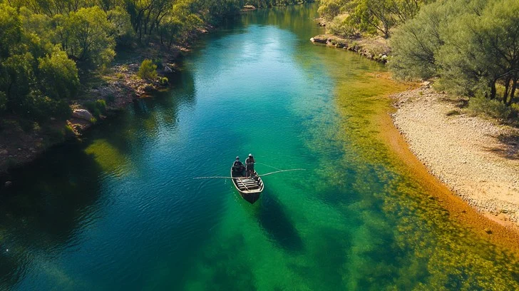
The Holographic 3D Tilt Card uses perspective, 3D rotation, and a holographic shine overlay effect. When hovered, the card tilts in space while a light reflection moves across the surface.
<div class="holo-card">
<img src="image.jpg">
</div>
.holo-card{
position:relative;
width:320px;
height:200px;
perspective:1000px;
}

.holo-card img{
width:100%;
height:100%;
object-fit:cover;
border-radius:14px;
transition:transform .4s ease;
}

.holo-card:hover img{
transform:rotateX(12deg) rotateY(-12deg) scale(1.05);
}
2. 3D Parallax Image Layers
The 3D Parallax Hover Effect uses multiple image layers that move at different depths during hover. Perspective creates a strong spatial effect that works well in galleries and portfolio layouts.
<div class="parallax2-card">
<img class="layer layer-back" src="boat.webp">
<img class="layer layer-mid" src="boat.webp">
<img class="layer layer-front" src="boat.webp">
</div>
.parallax2-card{
position:relative;
width:320px;
height:200px;
perspective:1200px;
}
.layer{
position:absolute;
inset:0;
width:100%;
height:100%;
object-fit:cover;
transition:transform .6s ease;
}
.layer-back{
opacity:.4;
transform:translateZ(-40px) scale(1.05);
}
.layer-mid{
opacity:.7;
}
.layer-front{
transform:translateZ(40px);
}
.parallax2-card:hover .layer-back{
transform:translateZ(-20px) scale(1.08);
}
.parallax2-card:hover .layer-mid{
transform:translateZ(40px) scale(1.04);
}
.parallax2-card:hover .layer-front{
transform:translateZ(80px) scale(1.1);
}
3. Depth Zoom With Perspective Warp
The Depth Zoom effect makes the image move toward the user on hover. A combination of perspective and scale creates a strong sense of depth.
<div class="depth-card">
<img src="image.jpg">
</div>
.depth-card{
width:320px;
height:200px;
overflow:hidden;
border-radius:14px;
perspective:900px;
}
.depth-card img{
width:100%;
height:100%;
object-fit:cover;
transition:transform .5s ease, filter .4s ease;
}
.depth-card:hover img{
transform:scale(1.3) rotateX(10deg);
filter:contrast(1.1);
}
4. 3D Flip Gallery Card
The 3D Flip Gallery Card flips the image on hover and reveals additional information on the back side.
Nature
<div class="flip-card">

<div class="flip-inner">

<div class="flip-front">
<img src="image.jpg">
</div>

<div class="flip-back">
<h3>Text</h3>
</div>

</div>

</div>
.flip-card{
width:320px;
height:200px;
perspective:1000px;
}

.flip-inner{
position:relative;
width:100%;
height:100%;
transform-style:preserve-3d;
transition:transform .6s;
}

.flip-card:hover .flip-inner{
transform:rotateY(180deg);
}

.flip-front,
.flip-back{
position:absolute;
width:100%;
height:100%;
backface-visibility:hidden;
border-radius:14px;
overflow:hidden;
}

.flip-front img{
width:100%;
height:100%;
object-fit:cover;
}

.flip-back{
background:#1e293b;
color:#fff;
display:flex;
justify-content:center;
align-items:center;
transform:rotateY(180deg);
}
5. Rotating Cube Image Reveal
The Rotating Cube Effect rotates the image as if it were attached to a cube panel.
<div class="cube-box">

<div class="cube-face front">
<img src="image.jpg">
</div>

<div class="cube-face top">
<img src="image.jpg">
</div>

</div>
.cube-box{
width:320px;
height:200px;
perspective:1000px;
position:relative;
}

.cube-face{
position:absolute;
width:100%;
height:100%;
transform-origin:center;
transition:transform .6s;
}

.cube-face img{
width:100%;
height:100%;
object-fit:cover;
border-radius:14px;
}

.front{
transform:rotateX(0);
}

.top{
transform:rotateX(90deg);
}

.cube-box:hover .front{
transform:rotateX(-90deg);
}

.cube-box:hover .top{
transform:rotateX(0);
}
6. Diagonal Mask Slice Reveal
The Diagonal Mask Slice Reveal splits the image into diagonal panels that slide in different directions during hover.
<div class="diag6-card">

<div class="diag6-slice diag6-s1"></div>
<div class="diag6-slice diag6-s2"></div>
<div class="diag6-slice diag6-s3"></div>
<div class="diag6-slice diag6-s4"></div>

</div>
.diag6-card{
position:relative;
width:320px;
height:200px;
overflow:hidden;
border-radius:14px;
}

.diag6-slice{
position:absolute;
inset:0;
background-image:url("boat.webp");
background-size:cover;
background-position:center;
transition:
transform .65s cubic-bezier(.22,1,.36,1),
filter .65s ease;
}

.diag6-s1{clip-path:polygon(0 0, 34% 0, 20% 100%, 0 100%)}
.diag6-s2{clip-path:polygon(24% 0, 58% 0, 44% 100%, 10% 100%)}
.diag6-s3{clip-path:polygon(48% 0, 82% 0, 68% 100%, 34% 100%)}
.diag6-s4{clip-path:polygon(72% 0, 100% 0, 100% 100%, 58% 100%)}

.diag6-card:hover .diag6-s1{
transform:translate(-30px,-18px) rotate(-4deg) scale(1.05);
}

.diag6-card:hover .diag6-s2{
transform:translate(-10px,18px) rotate(3deg) scale(1.05);
}

.diag6-card:hover .diag6-s3{
transform:translate(12px,-20px) rotate(-3deg) scale(1.05);
}

.diag6-card:hover .diag6-s4{
transform:translate(34px,16px) rotate(4deg) scale(1.05);
}
7. Spotlight Reveal Hover
The Spotlight Reveal Hover Effect uses a dark overlay layer with a circular light in the center. When hovered, the spotlight expands and reveals the image dramatically.
<div class="spot7-card">

<img src="boat.webp">

<div class="spot7-overlay"></div>

</div>
.spot7-card{
position:relative;
width:320px;
height:200px;
overflow:hidden;
border-radius:14px;
}

.spot7-card img{
position:absolute;
inset:0;
width:100%;
height:100%;
object-fit:cover;
}

.spot7-overlay{
position:absolute;
inset:0;
background:#000;

-webkit-mask-image:radial-gradient(circle at center, transparent 50px, black 120px);
mask-image:radial-gradient(circle at center, transparent 50px, black 120px);

transition:
-webkit-mask-image .5s ease,
mask-image .5s ease;
}

.spot7-card:hover .spot7-overlay{
-webkit-mask-image:radial-gradient(circle at center, transparent 120px, black 220px);
mask-image:radial-gradient(circle at center, transparent 120px, black 220px);
}
8. Shattered Glass Hover
The Shattered Glass Hover Effect breaks the image into fragments that scatter in different directions on hover, creating a dramatic glass-shattering animation.
Efekt kasutab mitut clip-path fragmenti, igaühel oma liikumine ja rotatsioon.
<div class="glass9-card">

<div class="glass9-piece g1"></div>
<div class="glass9-piece g2"></div>
<div class="glass9-piece g3"></div>
<div class="glass9-piece g4"></div>
<div class="glass9-piece g5"></div>
<div class="glass9-piece g6"></div>

</div>
.glass9-card{
position:relative;
width:320px;
height:200px;
overflow:hidden;
border-radius:14px;
}

.glass9-piece{
position:absolute;
inset:0;
background-image:url("boat.webp");
background-size:cover;
background-position:center;

transition:transform .75s ease;
}

.g1{clip-path:polygon(0 0, 32% 0, 18% 34%, 0 48%)}
.g2{clip-path:polygon(32% 0, 67% 0, 49% 34%, 18% 34%)}
.g3{clip-path:polygon(67% 0, 100% 0, 100% 38%, 49% 34%)}
.g4{clip-path:polygon(0 48%, 18% 34%, 43% 100%, 0 100%)}
.g5{clip-path:polygon(18% 34%, 49% 34%, 74% 100%, 43% 100%)}
.g6{clip-path:polygon(49% 34%, 100% 38%, 100% 100%, 74% 100%)}

.glass9-card:hover .g1{transform:translate(-50px,-26px) rotate(-8deg);}
.glass9-card:hover .g2{transform:translate(8px,-34px) rotate(5deg);}
.glass9-card:hover .g3{transform:translate(46px,-22px) rotate(9deg);}
.glass9-card:hover .g4{transform:translate(-56px,34px) rotate(-10deg);}
.glass9-card:hover .g5{transform:translate(0,28px) rotate(-4deg);}
.glass9-card:hover .g6{transform:translate(58px,30px) rotate(11deg);}
9. Glitch Distortion Hover
The Glitch Distortion Hover Effect creates a digital signal error effect. When hovered, RGB offsets and glitch slice animations appear.
<div class="glitch16-card">

<img src="boat.webp">

</div>
.glitch16-card{
position:relative;
width:320px;
height:200px;
overflow:hidden;
border-radius:14px;
}

.glitch16-card img{
position:absolute;
inset:0;
width:100%;
height:100%;
object-fit:cover;
}

.glitch16-card::before,
.glitch16-card::after{
content:"";
position:absolute;
inset:0;
background:url("boat.webp");
background-size:cover;
background-position:center;
mix-blend-mode:screen;
opacity:0;
}

.glitch16-card::before{
transform:translateX(-2px);
filter:drop-shadow(-3px 0 red);
}

.glitch16-card::after{
transform:translateX(2px);
filter:drop-shadow(3px 0 cyan);
}

.glitch16-card:hover::before{
opacity:.7;
animation:glitch16 .45s infinite;
}

.glitch16-card:hover::after{
opacity:.7;
animation:glitch16 .45s infinite reverse;
}

@keyframes glitch16{

0%{clip-path:inset(10% 0 80% 0);transform:translate(-4px);}
25%{clip-path:inset(40% 0 40% 0);transform:translate(4px);}
50%{clip-path:inset(80% 0 5% 0);transform:translate(-3px);}
75%{clip-path:inset(20% 0 60% 0);transform:translate(3px);}
100%{clip-path:inset(50% 0 30% 0);transform:translate(-2px);}

}
10. RGB Split Hover
The RGB Split Hover Effect separates the color channels of the image and shifts them in different directions during hover.
<div class="rgb12-card">

<img src="boat.webp">

</div>
.rgb12-card{
position:relative;
width:320px;
height:200px;
overflow:hidden;
border-radius:14px;
}

.rgb12-card img{
position:absolute;
inset:0;
width:100%;
height:100%;
object-fit:cover;
}

.rgb12-card::before,
.rgb12-card::after{
content:"";
position:absolute;
inset:0;
background:url("boat.webp");
background-size:cover;
background-position:center;
opacity:0;
}

.rgb12-card::before{
mix-blend-mode:screen;
filter:drop-shadow(-4px 0 red);
transform:translateX(-4px);
}

.rgb12-card::after{
mix-blend-mode:screen;
filter:drop-shadow(4px 0 cyan);
transform:translateX(4px);
}

.rgb12-card:hover::before{opacity:.75;}
.rgb12-card:hover::after{opacity:.75;}
11. Chromatic Aberration Hover
The Chromatic Aberration Effect simulates lens distortion. Hovering separates color channels to create a realistic optical aberration.
<div class="aberr13-card">

<img src="boat.webp">

</div>
.aberr13-card{
position:relative;
width:320px;
height:200px;
overflow:hidden;
border-radius:14px;
}

.aberr13-card img{
position:absolute;
inset:0;
width:100%;
height:100%;
object-fit:cover;
}

.aberr13-card::before,
.aberr13-card::after{
content:"";
position:absolute;
inset:0;
background:url("boat.webp");
background-size:cover;
background-position:center;
opacity:0;
}

.aberr13-card::before{
filter:blur(.5px) drop-shadow(-2px 0 red);
transform:translateX(-2px);
}

.aberr13-card::after{
filter:blur(.5px) drop-shadow(2px 0 blue);
transform:translateX(2px);
}

.aberr13-card:hover::before{
opacity:.7;
transform:translateX(-4px);
}

.aberr13-card:hover::after{
opacity:.7;
transform:translateX(4px);
}
12. Wave Distortion Hover
The Wave Distortion Hover Effect uses an animated SVG displacement filter to distort the image like waves on water.
<div class="wave14-card">

<img src="boat.webp">

</div>

<svg>
<filter id="wave14-filter">

<feTurbulence type="fractalNoise"></feTurbulence>

<feDisplacementMap in="SourceGraphic"></feDisplacementMap>

</filter>
</svg>
.wave14-card{
position:relative;
width:320px;
height:200px;
overflow:hidden;
border-radius:14px;
}

.wave14-card img{
position:absolute;
inset:0;
width:100%;
height:100%;
object-fit:cover;
transition:transform .45s ease;
}

.wave14-card:hover img{
transform:scale(1.04);
filter:url(#wave14-filter);
}
13. Heatmap Gradient Hover
The Heatmap Gradient Effect adds a thermal camera style overlay to the image with animated gradient layers.
<div class="heat15-card">
<img src="boat.webp" alt="">
<div class="heat15-overlay"></div>
</div>
.heat15-card{
position:relative;
width:320px;
height:200px;
overflow:hidden;
border-radius:14px;
}

.heat15-card img{
position:absolute;
inset:0;
width:100%;
height:100%;
object-fit:cover;
}

.heat15-overlay{
position:absolute;
inset:0;
background:
radial-gradient(circle at 30% 30%,red,transparent),
radial-gradient(circle at 70% 40%,yellow,transparent),
radial-gradient(circle at 50% 70%,cyan,transparent);
opacity:0;
transition:.4s;
}

.heat15-card:hover .heat15-overlay{
opacity:1;
}
14. Neural Network Hover Overlay
The Neural Network Hover Effect overlays an AI-style network visualization with glowing nodes and connections.
<div class="neural16-card">
<img src="boat.webp" alt="">
<div class="neural16-grid"></div>
</div>
.neural16-grid{
background:
radial-gradient(circle,cyan 1px,transparent 2px);
opacity:0;
}

.neural16-card:hover .neural16-grid{
opacity:1;
}
15. Digital Scan Hover
The Digital Scan Effect simulates a futuristic scanner with a moving scan beam and HUD grid overlay.
<div class="scan17-card">
<img src="boat.webp" alt="">
<div class="scan17-grid"></div>
</div>
.scan17-card{
position:relative;
width:320px;
height:200px;
overflow:hidden;
border-radius:14px;
}

.scan17-card img{
position:absolute;
inset:0;
width:100%;
height:100%;
object-fit:cover;
margin:0 !important;
transition:transform .5s ease, filter .5s ease;
}

.scan17-grid{
position:absolute;
inset:0;
background-image:
linear-gradient(rgba(0,255,255,.15) 1px, transparent 1px),
linear-gradient(90deg, rgba(0,255,255,.15) 1px, transparent 1px);
background-size:40px 40px;
opacity:0;
transition:opacity .4s ease;
}

.scan17-card::before{
content:"";
position:absolute;
inset:0;
background:linear-gradient(
to bottom,
transparent,
rgba(0,255,255,.45),
transparent
);
transform:translateY(-120%);
opacity:0;
}

.scan17-card::after{
content:"";
position:absolute;
inset:0;
background-image:
repeating-linear-gradient(
0deg,
rgba(255,255,255,.04) 0px,
rgba(255,255,255,.04) 2px,
transparent 4px
);
opacity:0;
mix-blend-mode:overlay;
}

.scan17-card:hover img{
transform:scale(1.05);
filter:brightness(.85) contrast(1.2);
}

.scan17-card:hover .scan17-grid{
opacity:1;
}

.scan17-card:hover::before{
opacity:1;
animation:scanBeam 2s linear infinite;
}

.scan17-card:hover::after{
opacity:1;
}

@keyframes scanBeam{
0%{
transform:translateY(-120%);
}
100%{
transform:translateY(120%);
}
}
16. Data Stream Hover Effect
The Data Stream Hover Effect displays vertical data lines flowing across the image like a digital data visualization.
<div class="stream16-card">
<img src="boat.webp" alt="">
<div class="stream16-overlay"></div>
</div>
.stream16-card{
position:relative;
width:320px;
height:200px;
overflow:hidden;
border-radius:14px;
}

.stream16-card img{
position:absolute;
inset:0;
width:100%;
height:100%;
object-fit:cover;
margin:0 !important;
transition:transform .5s ease, filter .5s ease;
}

.stream16-overlay{
position:absolute;
inset:0;
background-image:
repeating-linear-gradient(
to bottom,
rgba(0,255,255,.5) 0px,
rgba(0,255,255,.5) 2px,
transparent 4px
);
opacity:0;
transform:translateY(-100%);
}

.stream16-card:hover img{
transform:scale(1.05);
filter:brightness(.85);
}

.stream16-card:hover .stream16-overlay{
opacity:.8;
animation:dataStream16 1.6s linear infinite;
}

@keyframes dataStream16{
0%{
transform:translateY(-100%);
}
100%{
transform:translateY(100%);
}
}
17. Energy Field Hover
The Energy Field Hover Effect creates glowing rings around the image that pulse like a futuristic energy field.
<div class="energy17-card">
<img src="boat.webp" alt="">
<div class="energy17-rings"></div>
</div>
.energy17-card{
position:relative;
width:320px;
height:200px;
overflow:hidden;
border-radius:14px;
}

.energy17-card img{
position:absolute;
inset:0;
width:100%;
height:100%;
object-fit:cover;
}

.energy17-rings{
position:absolute;
inset:0;
background:
radial-gradient(circle, rgba(0,255,255,.9) 2px, transparent 4px) center/80px 80px;
opacity:0;
}

.energy17-card:hover .energy17-rings{
opacity:1;
animation:energyPulse17 2.5s infinite linear;
}

@keyframes energyPulse17{
0%{
transform:scale(1);
opacity:.3;
}
50%{
transform:scale(1.2);
opacity:.8;
}
100%{
transform:scale(1);
opacity:.3;
}
}
18. Cyberpunk Neon Grid Overlay
The Cyberpunk Neon Grid Effect overlays a glowing neon grid that creates a futuristic HUD interface look.
<div class="cyber18-card">
<img src="boat.webp" alt="">
<div class="cyber18-grid"></div>
</div>
.cyber18-card{
position:relative;
width:320px;
height:200px;
overflow:hidden;
border-radius:14px;
}

.cyber18-card img{
position:absolute;
inset:0;
width:100%;
height:100%;
object-fit:cover;
transition:transform .5s ease, filter .5s ease;
}

.cyber18-grid{
position:absolute;
inset:0;
background-image:
linear-gradient(rgba(255,0,255,.45) 1px, transparent 1px),
linear-gradient(90deg, rgba(0,255,255,.45) 1px, transparent 1px);
background-size:30px 30px;
opacity:0;
box-shadow:
0 0 12px rgba(0,255,255,.6),
0 0 24px rgba(255,0,255,.6);
}

.cyber18-card:hover img{
transform:scale(1.05);
filter:brightness(.85);
}

.cyber18-card:hover .cyber18-grid{
opacity:1;
}
19. Light Sweep Shine Hover
The Light Sweep Effect adds a glossy diagonal light sweep across the image.
<div class="sweep19-card">
<img src="boat.webp" alt="">
</div>
.sweep19-card{
position:relative;
width:320px;
height:200px;
overflow:hidden;
border-radius:14px;
}

.sweep19-card img{
position:absolute;
inset:0;
width:100%;
height:100%;
object-fit:cover;
margin:0 !important;
transition:transform .5s ease, filter .5s ease;
}

.sweep19-card::after{
content:"";
position:absolute;
inset:-120%;
background:linear-gradient(
120deg,
transparent,
rgba(255,255,255,.45),
transparent
);
transform:rotate(25deg);
opacity:0;
}

.sweep19-card:hover img{
transform:scale(1.05);
filter:brightness(.9);
}

.sweep19-card:hover::after{
opacity:1;
animation:sweep19 1.1s ease;
}

@keyframes sweep19{
0%{
transform:translateX(-100%) rotate(25deg);
}
100%{
transform:translateX(200%) rotate(25deg);
}
}
20. Lens Flare Hover
The Lens Flare Effect adds cinematic light reflections similar to a camera lens flare.
<div class="flare20-card">
<img src="boat.webp" alt="">
<div class="flare20-light"></div>
</div>
.flare20-card{
position:relative;
width:320px;
height:200px;
overflow:hidden;
border-radius:14px;
}

.flare20-card img{
position:absolute;
inset:0;
width:100%;
height:100%;
object-fit:cover;
margin:0 !important;
transition:transform .5s ease;
}

.flare20-light{
position:absolute;
inset:0;
background:
radial-gradient(circle at 20% 40%, rgba(255,255,255,.9), transparent 40%),
radial-gradient(circle at 35% 45%, rgba(255,200,100,.7), transparent 30%),
radial-gradient(circle at 60% 55%, rgba(255,255,255,.4), transparent 30%);
opacity:0;
}

.flare20-card:hover img{
transform:scale(1.05);
}

.flare20-card:hover .flare20-light{
opacity:.85;
}
21. Aurora Gradient Overlay
The Aurora Gradient Effect overlays animated colors similar to the northern lights.
<div class="aurora21-card">
<img src="boat.webp" alt="">
<div class="aurora21-overlay"></div>
</div>
.aurora21-card{
position:relative;
width:320px;
height:200px;
overflow:hidden;
border-radius:14px;
}

.aurora21-overlay{
position:absolute;
inset:0;
background:linear-gradient(
120deg,
rgba(0,255,200,.6),
rgba(0,150,255,.6),
rgba(180,0,255,.6)
);
mix-blend-mode:color;
opacity:0;
background-size:300% 300%;
}

.aurora21-card:hover .aurora21-overlay{
opacity:.75;
animation:auroraMove21 6s infinite linear;
}

@keyframes auroraMove21{
0%{background-position:0% 50%}
50%{background-position:100% 50%}
100%{background-position:0% 50%}
}
22. Prism Refraction Hover
The Prism Refraction Effect simulates light splitting through a prism with RGB spectrum overlays.
<div class="prism22-card">
<img src="boat.webp" alt="">
<div class="prism22-overlay"></div>
</div>
.prism22-card{
position:relative;
width:320px;
height:200px;
overflow:hidden;
border-radius:14px;
}

.prism22-card img{
position:absolute;
inset:0;
width:100%;
height:100%;
object-fit:cover;
margin:0 !important;
}

.prism22-overlay{
position:absolute;
inset:0;
background:linear-gradient(
90deg,
rgba(255,0,0,.4),
rgba(255,165,0,.4),
rgba(255,255,0,.4),
rgba(0,255,0,.4),
rgba(0,255,255,.4),
rgba(0,0,255,.4),
rgba(180,0,255,.4)
);
mix-blend-mode:screen;
opacity:0;
transform:skewX(-20deg) translateX(-100%);
}

.prism22-card:hover .prism22-overlay{
opacity:.85;
animation:prismMove22 1.6s ease;
}

@keyframes prismMove22{
0%{
transform:skewX(-20deg) translateX(-100%);
}
100%{
transform:skewX(-20deg) translateX(200%);
}
}
23. Magnetic Hover Lift
The Magnetic Hover Lift Effect makes the image lift slightly and respond to the cursor like a magnetic element.
<div class="magnetic23-card">
<img src="boat.webp" alt="">
</div>
.magnetic23-card{
position:relative;
width:320px;
height:200px;
overflow:hidden;
border-radius:14px;
transition:transform .25s ease;
}

.magnetic23-card img{
width:100%;
height:100%;
object-fit:cover;
margin:0 !important;
transition:transform .25s ease;
}

.magnetic23-card:hover{
transform:translateY(-10px) scale(1.04);
box-shadow:0 30px 60px rgba(0,0,0,.4);
}
24. Zoom Focus Hover
The Zoom Focus Effect highlights the center of the image while the background becomes slightly blurred.
<div class="zoom24-card">
<img src="boat.webp" alt="">
</div>
.zoom24-card{
position:relative;
width:320px;
height:200px;
overflow:hidden;
border-radius:14px;
}

.zoom24-card img{
position:absolute;
inset:0;
width:100%;
height:100%;
object-fit:cover;
margin:0 !important;
transition:transform .5s ease, filter .5s ease;
}

.zoom24-card:hover img{
transform:scale(1.25);
filter:blur(2px) brightness(.8);
}
25. Image Pan Hover
The Image Pan Effect slowly moves the image horizontally within the container to create a cinematic camera pan.
<div class="pan25-card">
<img src="boat.webp" alt="">
</div>
.pan25-card{
position:relative;
width:320px;
height:200px;
overflow:hidden;
border-radius:14px;
}

.pan25-card img{
position:absolute;
width:120%;
height:100%;
object-fit:cover;
margin:0 !important;
left:0;
transition:transform 4s linear;
}

.pan25-card:hover img{
transform:translateX(-20%);
}
26. Caption Slide Reveal
The Caption Slide Reveal Effect slides a text panel upward from the bottom of the image to reveal a description.
Ocean View
Discover cinematic landscapes.
<div class="caption26-card">
<img src="boat.webp" alt="">

<div class="caption26-text">
<h3>Ocean View</h3>
<p>Discover cinematic landscapes.</p>
</div>

</div>
.caption26-card{
position:relative;
width:320px;
height:200px;
overflow:hidden;
border-radius:14px;
}

.caption26-card img{
position:absolute;
inset:0;
width:100%;
height:100%;
object-fit:cover;
margin:0 !important;
}

.caption26-text{
position:absolute;
left:0;
right:0;
bottom:-100%;
padding:20px;
background:linear-gradient(
to top,
rgba(0,0,0,.85),
rgba(0,0,0,0)
);
color:#ffffff;
transition:bottom .4s ease;
}

.caption26-text h3{
margin:0 0 6px 0;
color:#ffffff;
font-size:20px;
font-weight:700;
text-shadow:0 2px 8px rgba(0,0,0,.6);
}

.caption26-text p{
margin:0;
color:#ffffff;
font-size:14px;
text-shadow:0 2px 8px rgba(0,0,0,.6);
}

.caption26-card:hover .caption26-text{
bottom:0;
}
27. Split Panel Hover Reveal
The Split Panel Hover Effect divides the image into two panels that slide apart during hover.
<div class="split27-card">

<img src="boat.webp" alt="">

<div class="split27-left"></div>
<div class="split27-right"></div>

</div>
.split27-card{
position:relative;
width:320px;
height:200px;
overflow:hidden;
border-radius:14px;
}

.split27-card img{
position:absolute;
inset:0;
width:100%;
height:100%;
object-fit:cover;
margin:0 !important;
}

.split27-left,
.split27-right{
position:absolute;
top:0;
bottom:0;
width:50%;
background:rgba(0,0,0,.65);
transition:transform .4s ease;
}

.split27-left{
left:0;
}

.split27-right{
right:0;
}

.split27-card:hover .split27-left{
transform:translateX(-100%);
}

.split27-card:hover .split27-right{
transform:translateX(100%);
}
28. Border Draw Hover
The Border Draw Effect animates a frame around the image that appears to be drawn from the corners.
<div class="border28-card">

<img src="boat.webp" alt="">

</div>
.border28-card{
position:relative;
width:320px;
height:200px;
overflow:hidden;
border-radius:14px;
}

.border28-card img{
position:absolute;
inset:0;
width:100%;
height:100%;
object-fit:cover;
margin:0 !important;
}

.border28-card::before,
.border28-card::after{
content:"";
position:absolute;
inset:0;
border:2px solid #00ffff;
transform:scaleX(0);
transition:transform .35s ease;
}

.border28-card::after{
transform:scaleY(0);
}

.border28-card:hover::before{
transform:scaleX(1);
}

.border28-card:hover::after{
transform:scaleY(1);
}
29. Particle Burst Hover
The Particle Burst Effect creates an explosion of glowing particles around the image.
<div class="particle29-card">
<img src="boat.webp" alt="">

<div class="particle29-particles">
<span></span><span></span><span></span><span></span>
<span></span><span></span><span></span><span></span>
</div>

</div>
.particle29-card{
position:relative;
width:320px;
height:200px;
overflow:hidden;
border-radius:14px;
}

.particle29-card img{
position:absolute;
inset:0;
width:100%;
height:100%;
object-fit:cover;
margin:0 !important;
transition:transform .4s ease;
}

.particle29-particles{
position:absolute;
inset:0;
pointer-events:none;
}

.particle29-particles span{
position:absolute;
width:6px;
height:6px;
background:#00ffff;
border-radius:50%;
opacity:0;
}

.particle29-particles span:nth-child(1){top:50%;left:50%;}
.particle29-particles span:nth-child(2){top:50%;left:50%;}
.particle29-particles span:nth-child(3){top:50%;left:50%;}
.particle29-particles span:nth-child(4){top:50%;left:50%;}
.particle29-particles span:nth-child(5){top:50%;left:50%;}
.particle29-particles span:nth-child(6){top:50%;left:50%;}
.particle29-particles span:nth-child(7){top:50%;left:50%;}
.particle29-particles span:nth-child(8){top:50%;left:50%;}

.particle29-card:hover img{
transform:scale(1.05);
}

.particle29-card:hover span{
animation:particleBurst 0.8s ease forwards;
}

.particle29-card:hover span:nth-child(1){transform:translate(-120px,-60px);}
.particle29-card:hover span:nth-child(2){transform:translate(120px,-60px);}
.particle29-card:hover span:nth-child(3){transform:translate(-100px,80px);}
.particle29-card:hover span:nth-child(4){transform:translate(100px,80px);}
.particle29-card:hover span:nth-child(5){transform:translate(-140px,0);}
.particle29-card:hover span:nth-child(6){transform:translate(140px,0);}
.particle29-card:hover span:nth-child(7){transform:translate(0,-100px);}
.particle29-card:hover span:nth-child(8){transform:translate(0,100px);}

@keyframes particleBurst{
0%{
opacity:1;
transform:translate(0,0);
}
100%{
opacity:0;
}
}
30. Glitch Signal Interference Hover
The Glitch Signal Effect simulates digital interference with RGB channel separation and glitch animations.
<div class="glitch30-card">
<img src="boat.webp" alt="">
<div class="glitch30-r"></div>
<div class="glitch30-b"></div>
<div class="glitch30-slices"></div>
</div>
.glitch30-card{
position:relative;
width:320px;
height:200px;
overflow:hidden;
border-radius:14px;
}

.glitch30-card img{
position:absolute;
inset:0;
width:100%;
height:100%;
object-fit:cover;
margin:0 !important;
}

.glitch30-r,
.glitch30-b{
position:absolute;
inset:0;
background-image:url("boat.webp");
background-size:cover;
background-position:center;
opacity:0;
}

.glitch30-r{
mix-blend-mode:screen;
filter:drop-shadow(-4px 0 red);
}

.glitch30-b{
mix-blend-mode:screen;
filter:drop-shadow(4px 0 cyan);
}

.glitch30-slices{
position:absolute;
inset:0;
background-image:
repeating-linear-gradient(
0deg,
transparent 0px,
transparent 10px,
rgba(0,255,255,.15) 11px,
transparent 13px
);
opacity:0;
}

.glitch30-card:hover .glitch30-r,
.glitch30-card:hover .glitch30-b{
opacity:.9;
animation:glitchShift 0.6s infinite steps(2);
}

.glitch30-card:hover .glitch30-slices{
opacity:1;
animation:glitchLines 0.5s infinite linear;
}

@keyframes glitchShift{
0%{transform:translate(0);}
25%{transform:translate(-6px,0);}
50%{transform:translate(6px,0);}
75%{transform:translate(-4px,0);}
100%{transform:translate(0);}
}

@keyframes glitchLines{
0%{transform:translateY(0);}
100%{transform:translateY(12px);}
}
If you’re interested in more CSS animations and UI effects, also check out:
- 30 CSS Loading Animations
- 20 Modern CSS Buttons
- 25 Modern CSS Cards
- 10 Modern CSS Hamburger Menu Buttons
- 20 Modern CSS Link Effects
Want These Hover Effects on Your Website?
If you would like to add modern CSS hover animations, interactive galleries, or visual UI effects to your website, we can implement them for you.
View our website update serviceBest Practices for Using Image Hover Effects
Although image hover effects can make a website visually appealing, they should be used thoughtfully. Too many animations or overly aggressive effects can actually harm the user experience.
A good hover effect should feel smooth, fast, and consistent with the overall design of the website. When animations feel natural and intuitive, they help users understand which elements are interactive.
When using CSS image hover effects, follow these guidelines:
- use hover effects only on clickable elements
- avoid overly long animations
- keep animations smooth and fast
- choose effects that match your website design
- test hover animations in different browsers
- avoid excessive visual noise
When designed well, hover effects can turn a simple image gallery into a professional and modern UI element.
FAQ – Image Hover Effects
What are CSS image hover effects?
CSS image hover effects are visual animations or changes that activate when a user moves the mouse cursor over an image. Hover effects can scale images, display overlay text, reveal buttons, or trigger animations. They are widely used in galleries, e-commerce websites, portfolios, and blogs to make images more interactive.
Do image hover effects require JavaScript?
Most image hover effects can be created using only HTML and CSS. CSS transitions, transforms, and opacity animations allow developers to create smooth visual effects without JavaScript.
What CSS techniques are used to create hover effects?
Common techniques include transform: scale, opacity animations, CSS transitions, clip-path, gradient overlays, and pseudo elements (::before and ::after).
Do hover effects work on mobile devices?
Mobile devices do not have a traditional hover state because they use touch screens. However, many browsers simulate hover styles on tap. Important content should always remain visible without requiring hover interaction.
What are the most popular image hover effects?
Popular hover effects include: zoom animations, overlay text effects, sliding captions, gradient overlays, 3D tilt effects. These are widely used in e-commerce product images and portfolio galleries.
Do CSS hover effects affect website performance?
Well-optimized CSS hover animations are lightweight and have minimal impact on performance. It is recommended to use GPU-optimized properties such as transform and opacity.
Where are image hover effects used most often?
Image hover effects are commonly used in: e-commerce product galleries, portfolio project showcases, blog featured images, service cards, team member sections.
How to choose the right hover effect for your website?
The best hover effect depends on the style and purpose of your website. Minimalist websites often benefit from simple zoom or fade effects, while portfolio and technology sites may use more advanced 3D or futuristic animations. The key is to keep CSS image hover effects smooth, fast, and user-friendly.
Conclusion
Image hover effects are an important part of modern web design. They help transform static images into interactive elements and improve the overall user experience.
In this article, we explored 30 modern CSS hover effects that can be created using HTML and CSS. Because all examples use pure CSS, they are easy to customize and integrate into different projects.
If you want to build a professional and visually engaging website, well-designed hover animations can significantly improve your interface.
Experiment with different hover effects and choose the ones that best match your website style and user experience.
Developer note
Need a faster WordPress setup for design and development work?
For agencies, freelancers, and developers working on performance-focused WordPress projects, Kinsta is worth a look.
View Kinsta Hosting