


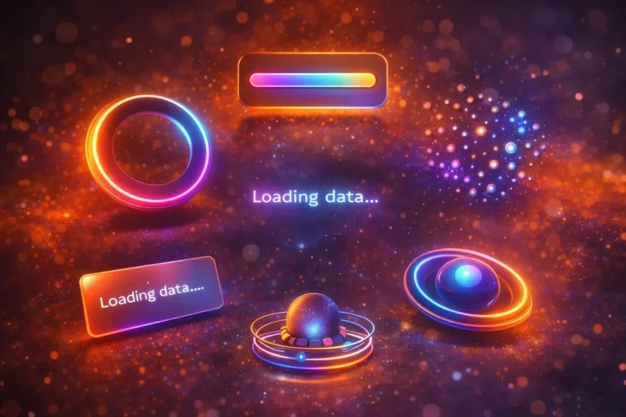
A CSS loading animation, also known as a loader, is a visual element that indicates to users that a website or application is processing data and content is currently loading. These animations are commonly used in web applications, online stores, API requests, or whenever the server needs time to process data.
A loader can be a simple spinning indicator, but modern web design often uses more visually impressive solutions. Examples include pulse animations, gradient loaders, skeleton content loading, and futuristic glow effects.
These animations help reduce the perceived waiting time and make the overall browsing experience smoother for users.
Article Contents

What is a CSS loading animation?
A CSS loading animation is a visual indicator that informs users that content is currently loading or a process is running in the background. Instead of showing a blank screen, the interface displays an animated element such as a spinner, progress bar, or animated placeholder while the system retrieves data from a server or API.
These animations are commonly used in modern web applications, SaaS dashboards, mobile interfaces, and e-commerce websites. CSS loaders help communicate that the page is working properly and prevent users from thinking that the website has frozen or stopped responding.
Most loading animations today are created using pure CSS techniques such as keyframe animations, CSS transforms, and gradient effects. Because they do not require JavaScript, CSS loaders are lightweight, fast, and compatible with all modern browsers.
Common types of CSS loading animations include spinning indicators, pulse animations, skeleton loaders, and animated progress bars. These visual elements significantly improve user experience by reducing perceived waiting time and providing clear feedback that content will appear shortly.
Why use modern CSS loading animations?
Modern websites and applications often load data from servers or APIs. Without visual feedback, users may think that the page is broken or loading too slowly.
Modern CSS loading animations improve user experience by clearly indicating that the system is working and content will appear soon.
- better user experience
- reduced perceived waiting time
- visually engaging interface
- more professional web design
- smoother content loading
A well-designed loader helps users understand that content is about to appear and improves the overall usability of the website.
CSS techniques used to create modern loaders
In modern web design, CSS loading animations are created using several techniques that allow developers to build dynamic and futuristic effects.
The most commonly used techniques include:
- CSS keyframe animations
- CSS transforms
- gradient animations
- pseudo-elements (::before and ::after)
- glow effects and box-shadow
- blur and glassmorphism effects
All loading animations shown in this article use these techniques and work in all modern browsers.
Testing CSS effects on a live WordPress site?
Kinsta is a managed WordPress hosting platform built for performance, staging workflows, and developer-friendly site management. It can be a strong fit for designers, developers, and agencies working on modern WordPress projects.
30 Modern CSS Loading Animations – Examples
Below you will find 30 modern CSS loading animations with code examples. Each loader includes a demo, HTML code, and CSS styles that you can use in your own projects.
All examples use pure HTML and CSS only and do not require JavaScript.
1. Glassmorphism Loader
The glassmorphism loader uses a glass-like effect combined with a blurred background and a gradient border. This type of loader is commonly used in modern SaaS dashboards and admin interfaces.
The effect is created using a combination of backdrop blur, a gradient border, and a soft glow, resulting in a very elegant and futuristic loading animation.
<div class="glass-loader"></div>
.glass-loader{
width:70px;
height:70px;
border-radius:50%;
border:4px solid transparent;

background:
linear-gradient(#0f172a,#0f172a) padding-box,
linear-gradient(45deg,#38bdf8,#a855f7) border-box;

backdrop-filter:blur(8px);

animation:spin 1.2s linear infinite;
}
2. Skeleton Content Loader
The skeleton loader is one of the most popular loading animations in modern web applications. Instead of showing a blank screen, it displays a temporary content layout that resembles the final content, such as an avatar, title, and text blocks.
The CSS shimmer animation creates the illusion that content is dynamically loading. It is commonly used in e-commerce websites, SaaS dashboards, and API-driven applications.
<div class="card">
<div class="avatar"></div>
<div class="line"></div>
<div class="line short"></div>
</div>
.avatar{
width:50px;
height:50px;
border-radius:50%;
background:#e5e7eb;
animation:shimmer 1.4s infinite;
}

.line{
height:12px;
background:#e5e7eb;
border-radius:6px;
animation:shimmer 1.4s infinite;
}
3. AI Pulse Loader
The AI Pulse loader is inspired by chatbot and artificial intelligence user interfaces. A glowing orb in the center pulses and emits a soft neon glow.
The neon glow effect combined with a pulse animation creates a futuristic look that is often used in AI tools, chat interfaces, and modern web applications.
<div class="ai-loader"></div>
.ai-loader{
width:20px;
height:20px;
border-radius:50%;
background:#38bdf8;
animation:pulse 1.2s infinite;
}
4. Orbit Loader
The orbit loader creates the effect of multiple elements orbiting around a central point, similar to planets orbiting a star. This animation style is popular in futuristic UI designs.
Gradient colors and subtle glow effects make the loader visually dynamic and highly eye-catching.
<div class="orbit">
<div class="planet"></div>
</div>
.orbit{
width:80px;
height:80px;
border-radius:50%;
animation:rotate 2s linear infinite;
}

.planet{
width:14px;
height:14px;
background:linear-gradient(45deg,#38bdf8,#a855f7);
}
5. Liquid Blob Loader
The liquid blob loader uses a border-radius animation that continuously morphs the shape of the element, creating a fluid organic effect.
The gradient color and smooth transformation create a modern and dynamic loading animation that works well in modern UI designs.
<div class="blob-loader"></div>
.blob-loader{
width:70px;
height:70px;
background:linear-gradient(45deg,#38bdf8,#a855f7);
animation:blob 3s infinite;
}
6. Gradient Progress Bar
The gradient progress bar loader uses a moving gradient background that creates a smooth loading animation. This type of loader is commonly used in SaaS dashboards and modern web applications.
A linear gradient combined with an infinite animation creates the impression that the progress is continuously moving forward, even when the actual loading process happens in the background.
<div class="progress-loader">
<div class="progress-bar"></div>
</div>
.progress-loader{
width:260px;
height:10px;
background:#e5e7eb;
overflow:hidden;
}

.progress-bar{
background:linear-gradient(90deg,#38bdf8,#6366f1,#a855f7);
animation:move 1.2s infinite linear;
}
7. Floating Dots Loader
The floating dots loader is not a traditional three-dot loading animation. Instead, the dots move in a circular motion, creating a dynamic and futuristic animation.
This effect works well in modern applications where a visually elegant loading animation is desired.
<div class="dots-loader">
<div></div>
<div></div>
<div></div>
<div></div>
</div>
.dots-loader{
width:60px;
height:60px;
animation:spin 2s linear infinite;
}

.dots-loader div{
width:10px;
height:10px;
background:#6366f1;
border-radius:50%;
}
8. Neon Ring Loader
The neon ring loader is inspired by cyberpunk design. A glowing ring rotates continuously and creates a strong neon glow effect on a dark background.
This loader works especially well in futuristic user interfaces, technology-focused websites, and modern UI designs.
<div class="neon-loader"></div>
.neon-loader{
border-top-color:#22d3ee;
border-bottom-color:#a855f7;
animation:spin 1s linear infinite;
box-shadow:0 0 20px #22d3ee;
}
9. Shimmer Text Loader
The shimmer text loader creates an animation where a gradient moves across the text, giving the impression that the text is loading or processing data.
This effect is often used in modern applications with messages such as “Loading data…” or “Processing request…”.
<div class="shimmer-text">
Loading data...
</div>
.shimmer-text{
background:linear-gradient(90deg,#e5e7eb,#6366f1,#e5e7eb);
background-size:200%;
-webkit-background-clip:text;
color:transparent;
animation:shine 1.5s infinite linear;
}
10. Morphing Square Loader
The morphing square loader changes its shape during the animation. The square transforms into a diamond and then smoothly morphs back into a square.
The transform animation creates smooth movement that looks very elegant in modern user interfaces.
<div class="morph-loader"></div>
.morph-loader{
width:50px;
height:50px;
background:#6366f1;
animation:morph 1.5s infinite;
}
11. Radar Scanner Loader
The radar scanner loader simulates a radar-style scanning animation. A rotating beam moves in a circular motion while small dots appear like signals on a radar screen.
This type of animation is commonly used in futuristic user interfaces and technology or security-related applications.
<div class="radar">
<div class="beam"></div>
<span class="dot"></span>
<span class="dot"></span>
</div>
.beam{
background:conic-gradient(
rgba(34,211,238,.4),
transparent 70%
);
animation:spin 2s linear infinite;
}
12. Particle Loader
The particle loader creates the effect of small particles moving toward a central point. The animation visually resembles data processing or an AI computation process.
This loader works particularly well in technology and AI-related user interfaces.
<div class="particle-loader">
<span></span>
<span></span>
<span></span>
<span></span>
</div>
.particle-loader span{
width:8px;
height:8px;
background:#38bdf8;
border-radius:50%;
animation:moveParticle 1.5s infinite;
}
13. DNA Loader
The DNA loader consists of two animated vertical lines that move in a wave-like motion, visually resembling the structure of DNA.
This loader is elegant and works well on science, technology, and AI-related websites.
<div class="dna">
<span></span>
<span></span>
</div>
.dna span{
width:6px;
height:100%;
background:#6366f1;
animation:dnaMove 1.2s infinite;
}
14. Rotating Glass Card Loader
The rotating glass card loader uses a glassmorphism-style card that rotates in 3D space. This creates a modern loading widget effect.
This loader style is commonly used in dashboards and modern web applications.
<div class="glass-card"></div>
.glass-card{
backdrop-filter:blur(8px);
animation:flip 1.4s infinite;
}
15. Pulse Wave Loader
The pulse wave loader creates an animation where circles expand outward from the center, similar to waves spreading across water.
This effect works well in modern user interfaces, especially for visualizing signals, loading processes, or search activity.
<div class="wave-loader"></div>
.wave-loader::before{
animation:wave 1.5s infinite;
}

.wave-loader::after{
animation-delay:.6s;
}
16. Gradient Orb Loader
The gradient orb loader represents a glowing sphere with a rotating gradient swirl inside. The effect resembles an energy sphere or a futuristic AI processing animation.
The glow effect combined with the rotating gradient creates a very dynamic and modern loading animation.
<div class="orb-loader"></div>
.orb-loader{
border-radius:50%;
background:conic-gradient(
#38bdf8,
#6366f1,
#a855f7
);
animation:spin 1.6s linear infinite;
}
17. Hexagon Loader
The hexagon loader uses a hexagonal shape where segments rotate during the animation. This type of loader works well in technology interfaces and UI dashboards.
The hexagonal geometry gives the animation a modern and minimalist appearance.
<div class="hex-loader"></div>
.hex-loader{
clip-path:polygon(
25% 5%,75% 5%,
100% 50%,
75% 95%,
25% 95%,
0 50%
);

animation:spin 1.4s linear infinite;
}
18. AI Thinking Loader
The AI thinking loader displays a typical chatbot “thinking” animation. The dots move in a wave-like pattern, creating the impression that the system is processing data.
This loader is commonly used in AI chatbots and modern applications.
<div class="ai-thinking">
<span></span>
<span></span>
<span></span>
</div>
.ai-thinking span{
width:10px;
height:10px;
background:#6366f1;
animation:waveDots 1.2s infinite;
}
19. 3D Flip Loader
The 3D flip loader uses the rotateY transform to rotate a card in three-dimensional space. The effect resembles a rotating UI widget.
The 3D animation gives the loader a very modern and interactive appearance.
<div class="flip-loader"></div>
.flip-loader{
animation:flip3d 1.6s infinite;
}

@keyframes flip3d{
0%{transform:rotateY(0);}
50%{transform:rotateY(180deg);}
100%{transform:rotateY(360deg);}
}
20. Infinite Line Loader
The infinite line loader is a minimalist loading animation where a line continuously moves forward.
This type of loader works well in modern user interfaces and for displaying progress without creating visual noise.
<div class="line-loader"></div>
.line-loader::before{
animation:lineMove 1.2s infinite linear;
}
21. Magnetic Field Loader
The magnetic field loader displays an animation where particles move along circular trajectories, similar to particles in a magnetic field.
The glow effect and movement create a futuristic appearance similar to an AI or physics simulation.
<div class="magnetic-loader">
<span></span>
<span></span>
<span></span>
</div>
.magnetic-loader span{
transform-origin:-30px;
animation:magneticSpin 2s linear infinite;
}
22. Neural Network Loader
The neural network loader visually represents an AI neuron network. Dots pulse while connections appear to glow like an active neural system.
This animation works especially well for AI tools, machine learning dashboards, and technology-focused interfaces.
<div class="neural-loader">
<span></span>
<span></span>
<span></span>
</div>
.neural-loader span{
animation:neuralPulse 1.4s infinite;
}
23. Liquid Metal Loader
The liquid metal loader looks like flowing molten metal that continuously morphs and changes shape.
The metallic gradient combined with smooth shape morphing creates a premium technology-style animation.
<div class="metal-loader"></div>
.metal-loader{
animation:metalMorph 3s infinite;
}
24. Portal Loader
The portal loader creates an animation that resembles an energy portal. Multiple rings rotate at different speeds.
The glow effect and depth illusion make this animation very cinematic.
<div class="portal-loader"></div>
.portal-loader{
border-top-color:#38bdf8;
border-right-color:#a855f7;
animation:spin 1s linear infinite;
}
25. Digital Scan Loader
The digital scan loader simulates a data scanning effect. A moving light beam sweeps across the area like a scanner.
This animation is often used in futuristic UI designs and technology applications.
<div class="scan-loader"></div>
.scan-loader::before{
animation:scanMove 1.6s infinite;
}
26. Holographic Cube Loader
The holographic cube loader displays a rotating cube that resembles a futuristic hologram. The wireframe structure combined with a glow effect creates a technology-style UI animation.
This type of loader is often used in technology and AI themed applications.
<div class="cube">
<div></div>
<div></div>
<div></div>
<div></div>
</div>
.cube{
transform-style:preserve-3d;
animation:cubeRotate 2s infinite linear;
}
27. Energy Rings Loader
The energy rings loader shows multiple pulsing rings expanding outward from the center like energy waves.
The glow effect makes the animation look very futuristic and dynamic.
<div class="energy"></div>
.energy::before{
animation:energyPulse 1.6s infinite;
}

.energy::after{
animation-delay:.8s;
}
28. Data Stream Loader
The data stream loader displays a sequence of moving dots that flow like a stream of data.
The animation resembles server communication or AI data processing activity.
<div class="stream">
<span></span>
<span></span>
<span></span>
<span></span>
<span></span>
</div>
.stream span{
animation:stream 1s infinite;
}
29. Prism Loader
The prism loader creates a rotating prism effect where colors circulate like refracted light.
The gradient and rotation produce a visually striking and modern loading animation.
<div class="prism"></div>
.prism{
background:conic-gradient(
red,
orange,
yellow,
green,
blue,
purple
);
animation:spin 1.4s linear infinite;
}
30. Infinity Orb Loader
The infinity orb loader shows energy moving in an infinity-shaped loop. Two streams move in opposite directions creating a continuous animation cycle.
This loader fits perfectly into minimalist and modern user interfaces.
<div class="infinity">
<span></span>
<span></span>
</div>
.infinity span{
animation:infinity 1.6s infinite linear;
}
If you’re interested in more CSS animations and UI effects, also check out:
- 30 CSS Image Hover Effects
- 20 Modern CSS Buttons
- 25 Modern CSS Cards
- 10 Modern CSS Hamburger Menu Buttons
- 20 Modern CSS Link Effects
Want these kinds of website updates on your site?
If you would like to add modern effects, animations, and new functionality to your website, we can implement all the necessary updates for you professionally.
View our website update servicesBest Practices for Using CSS Loading Animations
When using modern CSS loading animations, it is important to follow certain principles so that the loader improves the user experience instead of becoming distracting.
First, the loader should visually match the rest of the user interface design. If a website uses a minimalist design, the loading animation should also remain simple and clean.
Second, the animation speed should be carefully considered. An animation that is too slow can make the system appear sluggish, while one that is too fast may become visually distracting.
Third, it is important that the loader does not completely block all content. Many modern web applications use skeleton loading techniques where the layout structure is displayed before the full data has finished loading.
Finally, when creating loaders it is recommended to prefer pure CSS solutions. CSS animations are lightweight and work reliably in all modern browsers.
FAQ – CSS Loading Animations
Do CSS loading animations require JavaScript?
No. Most CSS loading animations can be created using only HTML and CSS. CSS keyframe animations allow developers to build very dynamic effects without relying on JavaScript.
Which CSS loader is the most popular?
Some of the most popular loaders include skeleton loaders, gradient progress bar animations, and pulse effects. These are commonly used in SaaS dashboards and modern web applications.
Do CSS loaders work on mobile devices?
Yes. CSS loading animations work very well on mobile devices. The main consideration is ensuring that animations remain lightweight and do not consume excessive device resources.
Which CSS loading animations are popular in 2026?
In 2026 web design, futuristic loaders are trending, including glassmorphism loaders, gradient animations, AI-style pulse effects, and holographic UI animations.
Conclusion
CSS loading animations are an important part of modern web design. A well-designed loader helps users understand that the system is working and that content is currently loading.
In this article we explored 30 modern CSS loading animations together with HTML and CSS code examples. Because all loaders use pure CSS, they can be easily customized and implemented in any web project.
If you want to build a professional user interface, micro animations like these can significantly improve the user experience and make a website visually more engaging.
Developer note
Need a faster WordPress setup for design and development work?
For agencies, freelancers, and developers working on performance-focused WordPress projects, Kinsta is worth a look.
View Kinsta Hosting