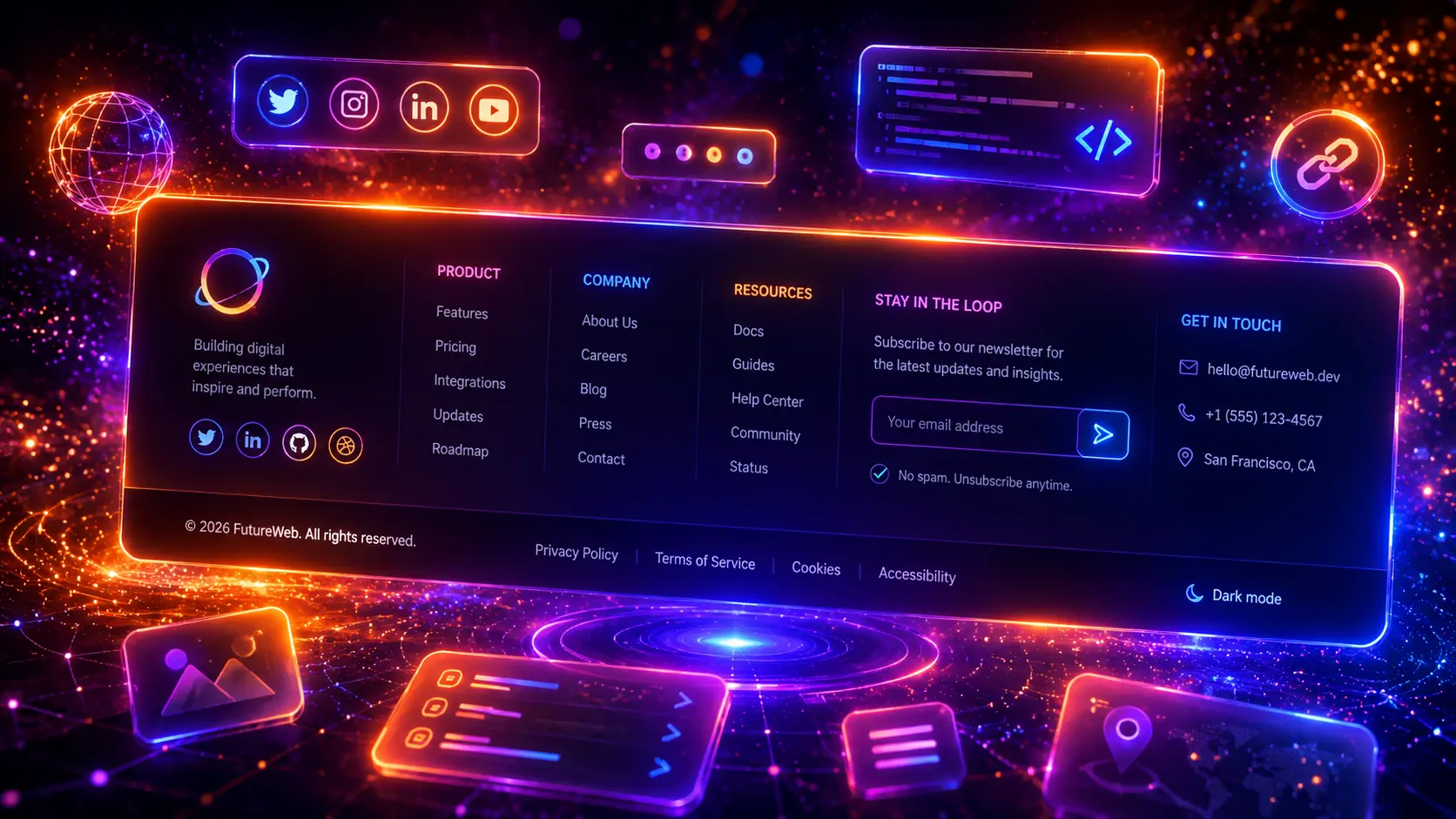
Footers are one of the most important parts of a modern website, but they are often treated as an afterthought. A good footer can help visitors find important links, understand your brand, contact your business, join your newsletter, view legal pages, follow social channels, or take one final action before leaving the page.
In this guide, you will find 30 modern CSS footers for websites, including responsive footer layouts, newsletter footers, ecommerce footers, SaaS footers, agency footers, portfolio footers, sticky footer layouts, mobile accordion footers, CTA footers, and complete HTML and CSS footer section examples you can customize for your own projects.

What Is a CSS Footer?
A CSS footer is the bottom section of a website styled with HTML and CSS. It usually contains important navigation links, contact details, company information, social media links, newsletter signup forms, legal pages, copyright text, trust badges, payment icons, or a final call-to-action.
Modern CSS footers are not just decoration. They help visitors move through a website, find useful pages, understand the business, and take the next step. A footer can be simple and minimal, or it can be a large multi-column layout for bigger websites with many pages, categories, services, resources, and support links.
The best footer design depends on the website type. A portfolio may only need a name, contact button, and social links. An ecommerce website may need product categories, customer service links, payment methods, and trust badges. A SaaS website may need product links, documentation, status pages, login links, and legal information.
Why Website Footers Matter
Website footers matter because many visitors use them as a final navigation area. When someone reaches the end of a page, the footer can guide them to products, services, pricing, contact information, support pages, blog categories, legal pages, or newsletter signup forms.
- They improve navigation by giving visitors quick access to important pages.
- They support trust by showing contact details, legal links, payment badges, certifications, or company information.
- They help conversions when the footer includes a newsletter form, quote request, app download button, or final CTA.
- They improve mobile usability because users often scroll to the bottom when looking for contact, support, or policy links.
- They support internal linking by connecting important sections, categories, guides, and landing pages.
If you are building a full website layout, footers work especially well together with modern CSS navigation menus, modern website hero sections, modern CSS layouts, modern CSS forms, and modern CSS buttons.
What Should a Modern Footer Include?
A modern footer should include the information visitors expect to find at the bottom of a website, but it should not become a messy link dump. The best footer layouts group related links clearly, use readable typography, provide enough spacing, and stay easy to use on both desktop and mobile screens.
Before designing a footer, think about what the visitor needs at the end of the page. A business website may need contact details and service links. A blog may need categories and popular guides. A store may need support links, delivery information, payment icons, and product categories. A SaaS website may need documentation, pricing, status, login, security, and legal links.
- Use clear column headings so visitors can scan footer links quickly.
- Keep link groups organized by topic, such as Company, Product, Resources, Support, and Legal.
- Make the footer responsive so columns stack cleanly on smaller screens.
- Use enough contrast for footer links, headings, newsletter forms, and copyright text.
- Avoid overcrowding the footer with too many links, badges, icons, and paragraphs.
- Add legal links such as Privacy Policy, Terms, and Cookie Policy where needed.
- Use useful internal links to help users discover important pages and related content.
You can also combine footer sections with other UI patterns. A newsletter footer can reuse ideas from modern CSS forms, a mobile footer can use CSS accordions, a resources footer can include CSS tabs, and a card-based footer layout can be designed with ideas from modern CSS cards.
30 Modern CSS Footer Examples
Now let’s look at 30 modern CSS footer examples for real website projects. Each example uses a different layout approach, so you can use them for business websites, blogs, portfolios, ecommerce stores, SaaS landing pages, agency websites, app pages, dashboards, and complete responsive website layouts.
1. Modern Website Footer
A modern website footer is a strong starting point for almost any business website, landing page, SaaS page, portfolio, or service website. It gives visitors clear navigation links, short brand context, a newsletter signup area, contact details, and a clean bottom bar for legal links.
The example below uses a polished multi-column footer layout with a large brand area, organized link groups, a newsletter form, social links, and a responsive structure that stacks cleanly on smaller screens.
- Great starting point for modern CSS footers
- Includes brand text, navigation columns, newsletter form, and bottom bar
- Works well for business websites, SaaS pages, portfolios, and agencies
- Uses a responsive CSS grid layout
- Clean HTML and CSS footer structure with no JavaScript required
HTML
<footer class="modern-website-footer">

  <div class="modern-website-footer-top">

    <div class="modern-website-footer-brand">
      <a class="modern-website-footer-logo" href="#">
        <span class="modern-website-footer-logo-icon">F</span>
        <span>
          <strong>FooterFlow</strong>
          <span>Modern website sections</span>
        </span>
      </a>

      <p class="modern-website-footer-text">Build a cleaner website footer with organized links, helpful contact details, a strong newsletter area, and a responsive layout that works across devices.</p>

      <div class="modern-website-footer-socials" aria-label="Social links">
        <a href="#">X</a>
        <a href="#">in</a>
        <a href="#">Dr</a>
        <a href="#">Be</a>
      </div>
    </div>

    <div class="modern-website-footer-newsletter">
      <h3>Get useful design tips</h3>
      <p>Join our newsletter for practical website layout ideas, CSS examples, and conversion-focused UI patterns.</p>

      <form class="modern-website-footer-form">
        <input type="email" placeholder="Enter your email">
        <button type="submit">Subscribe</button>
      </form>
    </div>

  </div>

  <div class="modern-website-footer-links">

    <div class="modern-website-footer-column">
      <h3>Product</h3>
      <ul>
        <li><a href="#">Website Builder</a></li>
        <li><a href="#">Templates</a></li>
        <li><a href="#">Components</a></li>
        <li><a href="#">Pricing</a></li>
      </ul>
    </div>

    <div class="modern-website-footer-column">
      <h3>Company</h3>
      <ul>
        <li><a href="#">About</a></li>
        <li><a href="#">Work</a></li>
        <li><a href="#">Careers</a></li>
        <li><a href="#">Contact</a></li>
      </ul>
    </div>

    <div class="modern-website-footer-column">
      <h3>Resources</h3>
      <ul>
        <li><a href="#">Blog</a></li>
        <li><a href="#">Guides</a></li>
        <li><a href="#">Documentation</a></li>
        <li><a href="#">Support Center</a></li>
      </ul>
    </div>

    <div class="modern-website-footer-column">
      <h3>Contact</h3>
      <ul>
        <li><span>hello@example.com</span></li>
        <li><span>+1 555 0123</span></li>
        <li><span>Mon-Fri, 9:00-17:00</span></li>
        <li><a href="#">Request a quote</a></li>
      </ul>
    </div>

  </div>

  <div class="modern-website-footer-bottom">
    <p>© 2026 FooterFlow. All rights reserved.</p>

    <div class="modern-website-footer-legal">
      <a href="#">Privacy Policy</a>
      <a href="#">Terms</a>
      <a href="#">Cookies</a>
    </div>
  </div>

</footer>
CSS
.modern-website-footer{
width:min(100%,1080px);
overflow:hidden;
border-radius:34px;
background:#0f172a;
border:1px solid rgba(255,255,255,.10);
box-shadow:0 30px 90px rgba(15,23,42,.32);
}

.modern-website-footer-top{
display:grid;
grid-template-columns:minmax(0,1.25fr) minmax(280px,.75fr);
gap:22px;
padding:34px;
background:
radial-gradient(circle at 15% 15%,rgba(6,182,212,.22),transparent 34%),
radial-gradient(circle at 92% 10%,rgba(124,58,237,.22),transparent 32%),
linear-gradient(135deg,#0f172a,#111827);
}

.modern-website-footer-brand{
display:flex;
flex-direction:column;
align-items:flex-start;
gap:18px;
}

.modern-website-footer-logo{
display:inline-flex;
align-items:center;
gap:12px;
color:#ffffff;
text-decoration:none;
}

.modern-website-footer-logo-icon{
display:inline-flex;
align-items:center;
justify-content:center;
width:46px;
height:46px;
border-radius:16px;
background:linear-gradient(135deg,#06b6d4,#7c3aed);
color:#ffffff;
font-size:18px;
font-weight:950;
box-shadow:0 16px 34px rgba(6,182,212,.24);
}

.modern-website-footer-logo strong{
display:block;
color:#ffffff;
font-size:21px;
line-height:1.1;
font-weight:950;
letter-spacing:-.04em;
}

.modern-website-footer-logo span{
display:block;
margin-top:3px;
color:#94a3b8;
font-size:13px;
line-height:1.2;
font-weight:700;
}

.modern-website-footer-text{
max-width:560px;
margin:0;
color:#cbd5e1;
font-size:16px;
line-height:1.75;
font-weight:600;
}

.modern-website-footer-socials{
display:flex;
flex-wrap:wrap;
gap:10px;
}

.modern-website-footer-socials a{
display:inline-flex;
align-items:center;
justify-content:center;
width:38px;
height:38px;
border-radius:999px;
background:rgba(255,255,255,.08);
border:1px solid rgba(148,163,184,.20);
color:#e5e7eb !important;
-webkit-text-fill-color:#e5e7eb !important;
font-size:13px;
font-weight:900;
text-decoration:none !important;
transition:transform .2s ease,background .2s ease,border-color .2s ease;
}

.modern-website-footer-socials a:hover{
transform:translateY(-3px);
background:rgba(6,182,212,.18);
border-color:rgba(6,182,212,.48);
color:#ffffff !important;
-webkit-text-fill-color:#ffffff !important;
}

.modern-website-footer-newsletter{
padding:24px;
border-radius:26px;
background:rgba(255,255,255,.08);
border:1px solid rgba(255,255,255,.12);
box-shadow:inset 0 1px 0 rgba(255,255,255,.06);
}

.modern-website-footer-newsletter h3{
margin:0 0 10px;
color:#ffffff !important;
-webkit-text-fill-color:#ffffff !important;
font-size:24px;
line-height:1.15;
font-weight:950;
letter-spacing:-.04em;
}

.modern-website-footer-newsletter p{
margin:0 0 18px;
color:#cbd5e1;
font-size:14px;
line-height:1.65;
font-weight:600;
}

.modern-website-footer-form{
display:flex;
gap:10px;
padding:6px;
border-radius:18px;
background:#ffffff;
box-shadow:0 18px 42px rgba(0,0,0,.18);
}

.modern-website-footer-form input{
min-width:0;
flex:1;
border:0;
outline:0;
padding:13px 12px;
border-radius:14px;
background:transparent;
color:#0f172a;
font-size:14px;
font-weight:650;
}

.modern-website-footer-form input::placeholder{
color:#64748b;
}

.modern-website-footer-form button{
border:0;
cursor:pointer;
padding:13px 16px;
border-radius:14px;
background:linear-gradient(135deg,#06b6d4,#2563eb);
color:#ffffff;
font-size:14px;
font-weight:900;
white-space:nowrap;
box-shadow:0 12px 26px rgba(37,99,235,.25);
transition:transform .2s ease,filter .2s ease;
}

.modern-website-footer-form button:hover{
transform:translateY(-1px);
filter:saturate(1.1);
}

.modern-website-footer-links{
display:grid;
grid-template-columns:repeat(4,minmax(0,1fr));
gap:22px;
padding:34px;
background:#ffffff;
}

.modern-website-footer-column h3{
margin:0 0 14px;
color:#0f172a !important;
-webkit-text-fill-color:#0f172a !important;
font-size:14px;
line-height:1.2;
font-weight:950;
letter-spacing:.04em;
text-transform:uppercase;
}

.modern-website-footer-column ul{
display:grid;
gap:10px;
margin:0;
padding:0;
list-style:none;
}

.modern-website-footer-column li{
margin:0;
padding:0;
list-style:none;
}

.modern-website-footer-column a,
.modern-website-footer-column span{
display:inline-flex;
color:#475569 !important;
-webkit-text-fill-color:#475569 !important;
font-size:14px;
line-height:1.45;
font-weight:650;
text-decoration:none !important;
transition:color .2s ease,transform .2s ease;
}

.modern-website-footer-column a:hover{
transform:translateX(3px);
color:#2563eb !important;
-webkit-text-fill-color:#2563eb !important;
}

.modern-website-footer-bottom{
display:flex;
align-items:center;
justify-content:space-between;
gap:18px;
padding:20px 34px;
background:#f8fafc;
border-top:1px solid rgba(15,23,42,.08);
}

.modern-website-footer-bottom p{
margin:0;
color:#64748b;
font-size:13px;
line-height:1.5;
font-weight:650;
}

.modern-website-footer-legal{
display:flex;
flex-wrap:wrap;
gap:14px;
}

.modern-website-footer-legal a{
color:#475569 !important;
-webkit-text-fill-color:#475569 !important;
font-size:13px;
font-weight:750;
text-decoration:none !important;
}

.modern-website-footer-legal a:hover{
color:#2563eb !important;
-webkit-text-fill-color:#2563eb !important;
}

@media (max-width:900px){
.modern-website-footer-top{
grid-template-columns:1fr;
}

.modern-website-footer-links{
grid-template-columns:repeat(2,minmax(0,1fr));
}

.modern-website-footer-bottom{
align-items:flex-start;
flex-direction:column;
}
}

@media (max-width:640px){
.modern-website-footer-top,
.modern-website-footer-links{
padding:24px;
}

.modern-website-footer{
border-radius:26px;
}

.modern-website-footer-links{
grid-template-columns:1fr;
gap:20px;
}

.modern-website-footer-form{
flex-direction:column;
}

.modern-website-footer-form button{
width:100%;
}

.modern-website-footer-bottom{
padding:20px 24px;
}
}
This modern website footer is a flexible base for many projects. You can replace the demo brand, link groups, newsletter text, and contact details with your own content, then use the same responsive structure for business websites, SaaS pages, portfolios, blogs, or landing pages.
2. Responsive Footer Layout
A responsive footer layout focuses on structure first. Instead of creating a complex decorative footer, this example shows how to organize footer content into clean columns that adapt from desktop to tablet and mobile screens.
The example below uses a wide responsive footer with a clear top section, four organized columns, compact link lists, contact details, and a bottom utility row. It is useful when you want a practical HTML and CSS footer layout that can work across many website types.
- Responsive footer layout with desktop, tablet, and mobile structure
- Uses CSS Grid for clean column alignment
- Good for business websites, blogs, agencies, and service pages
- Includes link columns, contact details, and legal links
- Simple footer structure that is easy to customize
HTML
<footer class="responsive-footer-layout">

  <div class="responsive-footer-layout-main">

    <div class="responsive-footer-layout-brand">
      <a class="responsive-footer-layout-logo" href="#">
        <span class="responsive-footer-layout-logo-mark">R</span>
        <span class="responsive-footer-layout-logo-text">
          <strong>ResponsiveHub</strong>
          <span>Flexible footer layout</span>
        </span>
      </a>

      <p class="responsive-footer-layout-description">A practical responsive footer layout for websites that need clear navigation, helpful company information, and clean mobile behavior.</p>

      <span class="responsive-footer-layout-status">Available for new projects</span>
    </div>

    <div class="responsive-footer-layout-column">
      <h3>Explore</h3>
      <ul>
        <li><a href="#">Home</a></li>
        <li><a href="#">Services</a></li>
        <li><a href="#">Portfolio</a></li>
        <li><a href="#">Pricing</a></li>
        <li><a href="#">Contact</a></li>
      </ul>
    </div>

    <div class="responsive-footer-layout-column">
      <h3>Resources</h3>
      <ul>
        <li><a href="#">CSS Guides</a></li>
        <li><a href="#">Layout Examples</a></li>
        <li><a href="#">Footer Patterns</a></li>
        <li><a href="#">Design Tips</a></li>
        <li><a href="#">Support</a></li>
      </ul>
    </div>

    <div class="responsive-footer-layout-column">
      <h3>Contact</h3>
      <ul class="responsive-footer-layout-contact-list">
        <li><span>hello@example.com</span></li>
        <li><span>+1 555 0199</span></li>
        <li><span>New York, United States</span></li>
        <li><span>Monday to Friday</span></li>
      </ul>
    </div>

  </div>

  <div class="responsive-footer-layout-bottom">
    <p>© 2026 ResponsiveHub. Built with HTML and CSS.</p>

    <div class="responsive-footer-layout-bottom-links">
      <a href="#">Privacy</a>
      <a href="#">Terms</a>
      <a href="#">Accessibility</a>
      <a href="#">Cookies</a>
    </div>
  </div>

</footer>
CSS
.responsive-footer-layout{
width:min(100%,1100px);
border-radius:32px;
background:#ffffff;
border:1px solid rgba(15,23,42,.09);
box-shadow:0 28px 80px rgba(15,23,42,.14);
overflow:hidden;
}

.responsive-footer-layout-main{
display:grid;
grid-template-columns:1.2fr repeat(3,1fr);
gap:28px;
padding:42px;
}

.responsive-footer-layout-brand{
display:flex;
flex-direction:column;
align-items:flex-start;
gap:16px;
}

.responsive-footer-layout-logo{
display:inline-flex;
align-items:center;
gap:12px;
text-decoration:none;
}

.responsive-footer-layout-logo-mark{
display:inline-flex;
align-items:center;
justify-content:center;
width:44px;
height:44px;
border-radius:15px;
background:#111827;
color:#ffffff;
font-size:17px;
font-weight:950;
box-shadow:0 16px 32px rgba(15,23,42,.18);
}

.responsive-footer-layout-logo-text{
display:grid;
gap:3px;
}

.responsive-footer-layout-logo-text strong{
display:block;
color:#111827;
font-size:20px;
line-height:1.1;
font-weight:950;
letter-spacing:-.04em;
}

.responsive-footer-layout-logo-text span{
display:block;
color:#64748b;
font-size:13px;
font-weight:700;
line-height:1.2;
}

.responsive-footer-layout-description{
max-width:330px;
margin:0;
color:#475569;
font-size:15px;
line-height:1.75;
font-weight:600;
}

.responsive-footer-layout-status{
display:inline-flex;
align-items:center;
gap:8px;
padding:8px 11px;
border-radius:999px;
background:#ecfeff;
border:1px solid rgba(6,182,212,.24);
color:#0e7490;
font-size:12px;
font-weight:900;
line-height:1;
}

.responsive-footer-layout-status::before{
content:"";
width:8px;
height:8px;
border-radius:999px;
background:#06b6d4;
box-shadow:0 0 0 4px rgba(6,182,212,.12);
}

.responsive-footer-layout-column h3{
margin:0 0 15px;
color:#111827 !important;
-webkit-text-fill-color:#111827 !important;
font-size:14px;
line-height:1.2;
font-weight:950;
letter-spacing:.04em;
text-transform:uppercase;
}

.responsive-footer-layout-column ul{
display:grid;
gap:11px;
margin:0;
padding:0;
list-style:none;
}

.responsive-footer-layout-column li{
margin:0;
padding:0;
list-style:none;
}

.responsive-footer-layout-column a,
.responsive-footer-layout-column span{
display:inline-flex;
color:#475569 !important;
-webkit-text-fill-color:#475569 !important;
font-size:14px;
line-height:1.45;
font-weight:650;
text-decoration:none !important;
}

.responsive-footer-layout-column a{
transition:color .2s ease,transform .2s ease;
}

.responsive-footer-layout-column a:hover{
transform:translateX(3px);
color:#4f46e5 !important;
-webkit-text-fill-color:#4f46e5 !important;
}

.responsive-footer-layout-contact-list span{
display:flex;
align-items:flex-start;
gap:8px;
}

.responsive-footer-layout-contact-list span::before{
content:"•";
color:#4f46e5;
font-weight:950;
}

.responsive-footer-layout-bottom{
display:flex;
align-items:center;
justify-content:space-between;
gap:20px;
padding:20px 42px;
background:#f8fafc;
border-top:1px solid rgba(15,23,42,.08);
}

.responsive-footer-layout-bottom p{
margin:0;
color:#64748b;
font-size:13px;
line-height:1.5;
font-weight:650;
}

.responsive-footer-layout-bottom-links{
display:flex;
flex-wrap:wrap;
gap:14px;
}

.responsive-footer-layout-bottom-links a{
color:#475569 !important;
-webkit-text-fill-color:#475569 !important;
font-size:13px;
font-weight:750;
text-decoration:none !important;
transition:color .2s ease;
}

.responsive-footer-layout-bottom-links a:hover{
color:#4f46e5 !important;
-webkit-text-fill-color:#4f46e5 !important;
}

@media (max-width:980px){
.responsive-footer-layout-main{
grid-template-columns:repeat(2,minmax(0,1fr));
}
}

@media (max-width:720px){
.responsive-footer-layout{
border-radius:26px;
}

.responsive-footer-layout-main{
grid-template-columns:1fr;
padding:28px;
gap:24px;
}

.responsive-footer-layout-description{
max-width:none;
}

.responsive-footer-layout-bottom{
align-items:flex-start;
flex-direction:column;
padding:20px 28px;
}

.responsive-footer-layout-bottom-links{
gap:12px 16px;
}
}
This responsive footer layout is useful when you need a clean, practical footer that works across many website types. The structure is simple enough to customize quickly, but still polished enough for modern business websites, blogs, landing pages, and service websites.
3. Minimal Footer Design
A minimal footer design is perfect when you want the bottom of the website to feel clean, calm, and professional. Instead of using many columns, badges, forms, and decorative elements, this footer focuses on a simple brand line, a small navigation menu, social links, and legal text.
The example below uses a refined minimal layout with soft borders, balanced spacing, small typography, and a clean horizontal structure. It works especially well for portfolios, personal websites, consultants, studios, modern blogs, and simple landing pages.
- Clean minimal CSS footer layout
- Great for portfolios, blogs, consultants, and personal websites
- Uses simple navigation and social links
- Lightweight HTML and CSS with no JavaScript
- Responsive layout that stacks neatly on mobile screens
HTML
<footer class="minimal-footer-design">

  <div class="minimal-footer-design-top">

    <a class="minimal-footer-design-brand" href="#">
      <span class="minimal-footer-design-mark">M</span>
      <span class="minimal-footer-design-name">
        <strong>Minimal Studio</strong>
        <span>Clean web design</span>
      </span>
    </a>

    <nav class="minimal-footer-design-nav" aria-label="Footer navigation">
      <a href="#">Work</a>
      <a href="#">Services</a>
      <a href="#">Journal</a>
      <a href="#">About</a>
      <a href="#">Contact</a>
    </nav>

  </div>

  <div class="minimal-footer-design-middle">

    <p class="minimal-footer-design-text">A minimal footer keeps the bottom of a website focused, readable, and elegant. Use this layout when you only need essential links, a short brand message, and simple social proof.</p>

    <div class="minimal-footer-design-socials" aria-label="Social links">
      <a href="#">X</a>
      <a href="#">in</a>
      <a href="#">Dr</a>
      <a href="#">Be</a>
    </div>

  </div>

  <div class="minimal-footer-design-bottom">

    <p>© 2026 Minimal Studio. All rights reserved.</p>

    <div class="minimal-footer-design-legal">
      <a href="#">Privacy</a>
      <a href="#">Terms</a>
      <a href="#">Cookies</a>
    </div>

  </div>

</footer>
CSS
.minimal-footer-design{
width:min(100%,1040px);
padding:34px;
border-radius:30px;
background:#ffffff;
border:1px solid rgba(15,23,42,.10);
box-shadow:0 24px 70px rgba(15,23,42,.08);
}

.minimal-footer-design-top{
display:flex;
align-items:center;
justify-content:space-between;
gap:24px;
padding-bottom:24px;
border-bottom:1px solid rgba(15,23,42,.08);
}

.minimal-footer-design-brand{
display:flex;
align-items:center;
gap:13px;
text-decoration:none;
}

.minimal-footer-design-mark{
display:inline-flex;
align-items:center;
justify-content:center;
width:42px;
height:42px;
border-radius:14px;
background:#0f172a;
color:#ffffff;
font-size:16px;
font-weight:950;
letter-spacing:-.02em;
box-shadow:0 14px 28px rgba(15,23,42,.16);
}

.minimal-footer-design-name{
display:grid;
gap:3px;
}

.minimal-footer-design-name strong{
display:block;
color:#0f172a;
font-size:20px;
line-height:1.1;
font-weight:950;
letter-spacing:-.04em;
}

.minimal-footer-design-name span{
display:block;
color:#64748b;
font-size:13px;
line-height:1.25;
font-weight:700;
}

.minimal-footer-design-nav{
display:flex;
align-items:center;
flex-wrap:wrap;
justify-content:flex-end;
gap:18px;
}

.minimal-footer-design-nav a{
color:#475569 !important;
-webkit-text-fill-color:#475569 !important;
font-size:14px;
line-height:1.2;
font-weight:750;
text-decoration:none !important;
transition:color .2s ease;
}

.minimal-footer-design-nav a:hover{
color:#0f172a !important;
-webkit-text-fill-color:#0f172a !important;
}

.minimal-footer-design-middle{
display:flex;
align-items:flex-start;
justify-content:space-between;
gap:26px;
padding:26px 0;
}

.minimal-footer-design-text{
max-width:560px;
margin:0;
color:#475569;
font-size:15px;
line-height:1.75;
font-weight:600;
}

.minimal-footer-design-socials{
display:flex;
align-items:center;
justify-content:flex-end;
flex-wrap:wrap;
gap:10px;
}

.minimal-footer-design-socials a{
display:inline-flex;
align-items:center;
justify-content:center;
width:38px;
height:38px;
border-radius:999px;
background:#f8fafc;
border:1px solid rgba(15,23,42,.10);
color:#334155 !important;
-webkit-text-fill-color:#334155 !important;
font-size:13px;
font-weight:900;
line-height:1;
text-decoration:none !important;
transition:transform .2s ease,background .2s ease,border-color .2s ease,color .2s ease;
}

.minimal-footer-design-socials a:hover{
transform:translateY(-3px);
background:#0f172a;
border-color:#0f172a;
color:#ffffff !important;
-webkit-text-fill-color:#ffffff !important;
}

.minimal-footer-design-bottom{
display:flex;
align-items:center;
justify-content:space-between;
gap:18px;
padding-top:22px;
border-top:1px solid rgba(15,23,42,.08);
}

.minimal-footer-design-bottom p{
margin:0;
color:#64748b;
font-size:13px;
line-height:1.5;
font-weight:650;
}

.minimal-footer-design-legal{
display:flex;
align-items:center;
justify-content:flex-end;
flex-wrap:wrap;
gap:14px;
}

.minimal-footer-design-legal a{
color:#64748b !important;
-webkit-text-fill-color:#64748b !important;
font-size:13px;
font-weight:700;
text-decoration:none !important;
transition:color .2s ease;
}

.minimal-footer-design-legal a:hover{
color:#0f172a !important;
-webkit-text-fill-color:#0f172a !important;
}

@media (max-width:760px){
.minimal-footer-design{
padding:26px;
border-radius:24px;
}

.minimal-footer-design-top,
.minimal-footer-design-middle,
.minimal-footer-design-bottom{
align-items:flex-start;
flex-direction:column;
}

.minimal-footer-design-nav,
.minimal-footer-design-socials,
.minimal-footer-design-legal{
justify-content:flex-start;
}

.minimal-footer-design-nav{
gap:12px 16px;
}
}
This minimal footer design is a good choice when the website does not need a large footer with many columns. It keeps the layout simple, professional, and easy to scan, while still including the most important navigation, social, and legal links.
4. Dark Mode Footer
A dark mode footer gives the bottom of a website a premium and modern look. It works especially well for SaaS websites, tech companies, creative agencies, AI tools, product landing pages, and modern business websites that use a darker visual style.
The example below uses a dark layered footer with glowing accent backgrounds, a strong CTA area, structured navigation columns, contact details, and a clean bottom row. It feels more dramatic than a minimal footer while still staying readable and responsive.
- Premium dark mode footer design
- Includes CTA, link columns, contact information, and legal links
- Works well for SaaS, AI, agency, tech, and landing page websites
- Uses gradients, soft borders, and subtle glow effects
- Fully responsive HTML and CSS footer section
HTML
<footer class="dark-mode-footer">

  <div class="dark-mode-footer-cta">

    <div>
      <div class="dark-mode-footer-kicker">Dark footer section</div>
      <h3>Build a stronger final section for your <span>modern website</span></h3>
    </div>

    <div class="dark-mode-footer-cta-actions">
      <a class="dark-mode-footer-button" href="#">Start Project</a>
      <a class="dark-mode-footer-button is-secondary" href="#">View Work</a>
    </div>

  </div>

  <div class="dark-mode-footer-main">

    <div class="dark-mode-footer-brand">

      <a class="dark-mode-footer-logo" href="#">
        <span class="dark-mode-footer-logo-mark">D</span>
        <span class="dark-mode-footer-logo-text">
          <strong>DarkLayer</strong>
          <span>Premium web systems</span>
        </span>
      </a>

      <p class="dark-mode-footer-description">A dark mode footer can make your website ending feel more premium, structured, and conversion-focused while keeping all important links easy to find.</p>

      <div class="dark-mode-footer-badges">
        <span>Fast</span>
        <span>Responsive</span>
        <span>Accessible</span>
      </div>

    </div>

    <div class="dark-mode-footer-column">
      <h3>Product</h3>
      <ul>
        <li><a href="#">Features</a></li>
        <li><a href="#">Use Cases</a></li>
        <li><a href="#">Integrations</a></li>
        <li><a href="#">Pricing</a></li>
      </ul>
    </div>

    <div class="dark-mode-footer-column">
      <h3>Company</h3>
      <ul>
        <li><a href="#">About</a></li>
        <li><a href="#">Customers</a></li>
        <li><a href="#">Careers</a></li>
        <li><a href="#">Contact</a></li>
      </ul>
    </div>

    <div class="dark-mode-footer-column">
      <h3>Support</h3>
      <ul>
        <li><a href="#">Help Center</a></li>
        <li><a href="#">Documentation</a></li>
        <li><a href="#">System Status</a></li>
        <li><span>support@example.com</span></li>
      </ul>
    </div>

  </div>

  <div class="dark-mode-footer-bottom">

    <p>© 2026 DarkLayer. All rights reserved.</p>

    <div class="dark-mode-footer-legal">
      <a href="#">Privacy</a>
      <a href="#">Terms</a>
      <a href="#">Security</a>
      <a href="#">Cookies</a>
    </div>

  </div>

</footer>
CSS
.dark-mode-footer{
position:relative;
width:min(100%,1100px);
overflow:hidden;
border-radius:34px;
background:
radial-gradient(circle at 10% 0%,rgba(6,182,212,.18),transparent 34%),
radial-gradient(circle at 90% 0%,rgba(124,58,237,.18),transparent 30%),
linear-gradient(135deg,#0f172a,#020617);
border:1px solid rgba(148,163,184,.18);
box-shadow:0 34px 100px rgba(0,0,0,.46);
}

.dark-mode-footer::before{
content:"";
position:absolute;
inset:0;
background:
linear-gradient(135deg,rgba(255,255,255,.06),transparent 38%),
linear-gradient(to bottom,transparent,rgba(2,6,23,.72));
pointer-events:none;
}

.dark-mode-footer-cta{
position:relative;
z-index:2;
display:grid;
grid-template-columns:minmax(0,1fr) auto;
gap:24px;
align-items:center;
padding:36px;
border-bottom:1px solid rgba(148,163,184,.16);
}

.dark-mode-footer-kicker{
display:inline-flex;
width:max-content;
align-items:center;
justify-content:center;
margin-bottom:12px;
padding:8px 12px;
border-radius:999px;
background:rgba(6,182,212,.13);
border:1px solid rgba(6,182,212,.24);
color:#a5f3fc;
font-size:12px;
font-weight:900;
letter-spacing:.09em;
text-transform:uppercase;
}

.dark-mode-footer-cta h3{
max-width:720px;
margin:0;
color:#ffffff !important;
-webkit-text-fill-color:#ffffff !important;
font-size:clamp(30px,4vw,52px);
line-height:1.05;
font-weight:950;
letter-spacing:-.06em;
}

.dark-mode-footer-cta h3 span{
background:linear-gradient(90deg,#22d3ee,#a78bfa,#60a5fa);
-webkit-background-clip:text;
background-clip:text;
color:transparent;
-webkit-text-fill-color:transparent;
}

.dark-mode-footer-cta-actions{
display:flex;
align-items:center;
justify-content:flex-end;
flex-wrap:wrap;
gap:12px;
}

.dark-mode-footer-button{
display:inline-flex;
align-items:center;
justify-content:center;
min-height:46px;
padding:13px 17px;
border-radius:999px;
background:linear-gradient(135deg,#06b6d4,#2563eb);
color:#ffffff !important;
-webkit-text-fill-color:#ffffff !important;
font-size:14px;
font-weight:900;
line-height:1;
text-decoration:none !important;
box-shadow:0 18px 40px rgba(37,99,235,.28);
transition:transform .2s ease,filter .2s ease;
}

.dark-mode-footer-button:hover{
transform:translateY(-2px);
filter:saturate(1.1);
}

.dark-mode-footer-button.is-secondary{
background:rgba(255,255,255,.08);
border:1px solid rgba(148,163,184,.22);
box-shadow:none;
}

.dark-mode-footer-main{
position:relative;
z-index:2;
display:grid;
grid-template-columns:1.25fr repeat(3,minmax(0,1fr));
gap:26px;
padding:36px;
}

.dark-mode-footer-brand{
display:flex;
flex-direction:column;
align-items:flex-start;
gap:16px;
}

.dark-mode-footer-logo{
display:inline-flex;
align-items:center;
gap:12px;
text-decoration:none;
}

.dark-mode-footer-logo-mark{
display:inline-flex;
align-items:center;
justify-content:center;
width:46px;
height:46px;
border-radius:16px;
background:linear-gradient(135deg,#22d3ee,#7c3aed);
color:#ffffff;
font-size:17px;
font-weight:950;
box-shadow:0 16px 34px rgba(124,58,237,.26);
}

.dark-mode-footer-logo-text{
display:grid;
gap:3px;
}

.dark-mode-footer-logo-text strong{
display:block;
color:#ffffff;
font-size:20px;
line-height:1.1;
font-weight:950;
letter-spacing:-.04em;
}

.dark-mode-footer-logo-text span{
display:block;
color:#94a3b8;
font-size:13px;
font-weight:700;
line-height:1.2;
}

.dark-mode-footer-description{
max-width:360px;
margin:0;
color:#cbd5e1;
font-size:15px;
line-height:1.75;
font-weight:600;
}

.dark-mode-footer-badges{
display:flex;
flex-wrap:wrap;
gap:8px;
}

.dark-mode-footer-badges span{
display:inline-flex;
align-items:center;
justify-content:center;
padding:7px 10px;
border-radius:999px;
background:rgba(255,255,255,.07);
border:1px solid rgba(148,163,184,.18);
color:#e5e7eb;
font-size:12px;
font-weight:850;
line-height:1;
}

.dark-mode-footer-column h3{
margin:0 0 15px;
color:#ffffff !important;
-webkit-text-fill-color:#ffffff !important;
font-size:14px;
line-height:1.2;
font-weight:950;
letter-spacing:.05em;
text-transform:uppercase;
}

.dark-mode-footer-column ul{
display:grid;
gap:11px;
margin:0;
padding:0;
list-style:none;
}

.dark-mode-footer-column li{
margin:0;
padding:0;
list-style:none;
}

.dark-mode-footer-column a,
.dark-mode-footer-column span{
display:inline-flex;
color:#cbd5e1 !important;
-webkit-text-fill-color:#cbd5e1 !important;
font-size:14px;
line-height:1.45;
font-weight:650;
text-decoration:none !important;
}

.dark-mode-footer-column a{
transition:color .2s ease,transform .2s ease;
}

.dark-mode-footer-column a:hover{
transform:translateX(3px);
color:#67e8f9 !important;
-webkit-text-fill-color:#67e8f9 !important;
}

.dark-mode-footer-bottom{
position:relative;
z-index:2;
display:flex;
align-items:center;
justify-content:space-between;
gap:20px;
padding:22px 36px;
background:rgba(2,6,23,.62);
border-top:1px solid rgba(148,163,184,.14);
}

.dark-mode-footer-bottom p{
margin:0;
color:#94a3b8;
font-size:13px;
line-height:1.5;
font-weight:650;
}

.dark-mode-footer-legal{
display:flex;
align-items:center;
justify-content:flex-end;
flex-wrap:wrap;
gap:14px;
}

.dark-mode-footer-legal a{
color:#cbd5e1 !important;
-webkit-text-fill-color:#cbd5e1 !important;
font-size:13px;
font-weight:750;
text-decoration:none !important;
transition:color .2s ease;
}

.dark-mode-footer-legal a:hover{
color:#67e8f9 !important;
-webkit-text-fill-color:#67e8f9 !important;
}

@media (max-width:980px){
.dark-mode-footer-cta{
grid-template-columns:1fr;
}

.dark-mode-footer-cta-actions{
justify-content:flex-start;
}

.dark-mode-footer-main{
grid-template-columns:repeat(2,minmax(0,1fr));
}
}

@media (max-width:640px){
.dark-mode-footer{
border-radius:26px;
}

.dark-mode-footer-cta,
.dark-mode-footer-main{
padding:26px;
}

.dark-mode-footer-main{
grid-template-columns:1fr;
gap:24px;
}

.dark-mode-footer-cta h3{
font-size:32px;
}

.dark-mode-footer-button{
width:100%;
}

.dark-mode-footer-bottom{
align-items:flex-start;
flex-direction:column;
padding:22px 26px;
}

.dark-mode-footer-legal{
justify-content:flex-start;
}
}
This dark mode footer is ideal when the website needs a stronger and more premium ending section. The CTA area gives the footer a conversion-focused purpose, while the link columns and legal row keep the footer practical and easy to navigate.
5. Gradient Footer Section
A gradient footer section works well when you want the bottom of a website to feel energetic, modern, and visually memorable. Instead of using a plain dark or white background, this footer uses a bold gradient surface, floating cards, bright link groups, and a strong final brand message.
The example below is designed for landing pages, creative websites, startup websites, SaaS pages, and modern product websites where the footer should feel like a real design section, not just a basic list of links.
- Colorful gradient footer for modern websites
- Great for startups, SaaS pages, agencies, and product landing pages
- Includes brand message, link cards, CTA button, and legal links
- Uses layered gradients and clean contrast
- Responsive HTML and CSS footer layout with no JavaScript
HTML
<footer class="gradient-footer-section">

  <div class="gradient-footer-section-main">

    <div class="gradient-footer-section-brand">

      <div>
        <div class="gradient-footer-section-kicker">Gradient Footer</div>
        <h3 class="gradient-footer-section-title">End your website with color, clarity, and action</h3>
        <p class="gradient-footer-section-text">Use this footer when your landing page needs a final section that feels modern, bright, and conversion-focused without losing important navigation links.</p>
      </div>

      <div class="gradient-footer-section-actions">
        <a class="gradient-footer-section-button" href="#">Start Building</a>
        <a class="gradient-footer-section-button is-outline" href="#">View Templates</a>
      </div>

    </div>

    <div class="gradient-footer-section-card-grid">

      <div class="gradient-footer-section-card">
        <h3>Platform</h3>
        <ul>
          <li><a href="#">Landing Pages</a></li>
          <li><a href="#">UI Sections</a></li>
          <li><a href="#">Design System</a></li>
          <li><a href="#">Templates</a></li>
        </ul>
      </div>

      <div class="gradient-footer-section-card">
        <h3>Resources</h3>
        <ul>
          <li><a href="#">CSS Examples</a></li>
          <li><a href="#">Web Design Guide</a></li>
          <li><a href="#">Responsive Tips</a></li>
          <li><a href="#">Documentation</a></li>
        </ul>
      </div>

      <div class="gradient-footer-section-card">
        <h3>Company</h3>
        <ul>
          <li><a href="#">About</a></li>
          <li><a href="#">Work</a></li>
          <li><a href="#">Customers</a></li>
          <li><a href="#">Contact</a></li>
        </ul>
      </div>

      <div class="gradient-footer-section-card">
        <h3>Connect</h3>
        <ul>
          <li><a href="#">Newsletter</a></li>
          <li><a href="#">LinkedIn</a></li>
          <li><a href="#">Dribbble</a></li>
          <li><a href="#">Support</a></li>
        </ul>
      </div>

    </div>

  </div>

  <div class="gradient-footer-section-bottom">
    <p>© 2026 Gradient Footer. All rights reserved.</p>

    <div class="gradient-footer-section-legal">
      <a href="#">Privacy</a>
      <a href="#">Terms</a>
      <a href="#">Cookies</a>
    </div>
  </div>

</footer>
CSS
.gradient-footer-section{
position:relative;
width:min(100%,1100px);
overflow:hidden;
border-radius:36px;
background:
radial-gradient(circle at 12% 0%,rgba(255,255,255,.34),transparent 34%),
radial-gradient(circle at 88% 8%,rgba(255,255,255,.22),transparent 30%),
linear-gradient(135deg,#f97316 0%,#ec4899 38%,#7c3aed 68%,#2563eb 100%);
box-shadow:0 34px 100px rgba(124,58,237,.32);
}

.gradient-footer-section::before{
content:"";
position:absolute;
inset:1px;
border-radius:35px;
border:1px solid rgba(255,255,255,.26);
pointer-events:none;
}

.gradient-footer-section-main{
position:relative;
z-index:2;
display:grid;
grid-template-columns:minmax(0,1.15fr) minmax(0,1fr);
gap:26px;
padding:38px;
}

.gradient-footer-section-brand{
display:flex;
flex-direction:column;
align-items:flex-start;
justify-content:space-between;
gap:28px;
min-height:310px;
}

.gradient-footer-section-kicker{
display:inline-flex;
align-items:center;
justify-content:center;
margin-bottom:14px;
padding:8px 12px;
border-radius:999px;
background:rgba(255,255,255,.18);
border:1px solid rgba(255,255,255,.26);
color:#ffffff;
font-size:12px;
font-weight:900;
letter-spacing:.09em;
text-transform:uppercase;
}

.gradient-footer-section-title{
max-width:620px;
margin:0;
color:#ffffff !important;
-webkit-text-fill-color:#ffffff !important;
font-size:clamp(34px,5vw,60px);
line-height:1.02;
font-weight:950;
letter-spacing:-.07em;
}

.gradient-footer-section-text{
max-width:560px;
margin:16px 0 0;
color:rgba(255,255,255,.86);
font-size:16px;
line-height:1.75;
font-weight:650;
}

.gradient-footer-section-actions{
display:flex;
align-items:center;
flex-wrap:wrap;
gap:12px;
}

.gradient-footer-section-button{
display:inline-flex;
align-items:center;
justify-content:center;
min-height:46px;
padding:13px 18px;
border-radius:999px;
background:#ffffff;
color:#4c1d95 !important;
-webkit-text-fill-color:#4c1d95 !important;
font-size:14px;
font-weight:950;
line-height:1;
text-decoration:none !important;
box-shadow:0 18px 42px rgba(0,0,0,.20);
transition:transform .2s ease,box-shadow .2s ease;
}

.gradient-footer-section-button:hover{
transform:translateY(-2px);
box-shadow:0 22px 50px rgba(0,0,0,.24);
}

.gradient-footer-section-button.is-outline{
background:rgba(255,255,255,.12);
border:1px solid rgba(255,255,255,.28);
color:#ffffff !important;
-webkit-text-fill-color:#ffffff !important;
box-shadow:none;
}

.gradient-footer-section-card-grid{
display:grid;
grid-template-columns:repeat(2,minmax(0,1fr));
gap:14px;
}

.gradient-footer-section-card{
padding:22px;
border-radius:26px;
background:rgba(255,255,255,.16);
border:1px solid rgba(255,255,255,.24);
box-shadow:inset 0 1px 0 rgba(255,255,255,.16);
backdrop-filter:blur(16px);
}

.gradient-footer-section-card h3{
margin:0 0 14px;
color:#ffffff !important;
-webkit-text-fill-color:#ffffff !important;
font-size:14px;
line-height:1.2;
font-weight:950;
letter-spacing:.06em;
text-transform:uppercase;
}

.gradient-footer-section-card ul{
display:grid;
gap:10px;
margin:0;
padding:0;
list-style:none;
}

.gradient-footer-section-card li{
margin:0;
padding:0;
list-style:none;
}

.gradient-footer-section-card a{
display:inline-flex;
color:rgba(255,255,255,.86) !important;
-webkit-text-fill-color:rgba(255,255,255,.86) !important;
font-size:14px;
line-height:1.4;
font-weight:700;
text-decoration:none !important;
transition:color .2s ease,transform .2s ease;
}

.gradient-footer-section-card a:hover{
transform:translateX(3px);
color:#ffffff !important;
-webkit-text-fill-color:#ffffff !important;
}

.gradient-footer-section-bottom{
position:relative;
z-index:2;
display:flex;
align-items:center;
justify-content:space-between;
gap:18px;
padding:22px 38px;
background:rgba(15,23,42,.18);
border-top:1px solid rgba(255,255,255,.18);
}

.gradient-footer-section-bottom p{
margin:0;
color:rgba(255,255,255,.82);
font-size:13px;
line-height:1.5;
font-weight:700;
}

.gradient-footer-section-legal{
display:flex;
align-items:center;
justify-content:flex-end;
flex-wrap:wrap;
gap:14px;
}

.gradient-footer-section-legal a{
color:rgba(255,255,255,.84) !important;
-webkit-text-fill-color:rgba(255,255,255,.84) !important;
font-size:13px;
font-weight:800;
text-decoration:none !important;
}

.gradient-footer-section-legal a:hover{
color:#ffffff !important;
-webkit-text-fill-color:#ffffff !important;
}

@media (max-width:940px){
.gradient-footer-section-main{
grid-template-columns:1fr;
}

.gradient-footer-section-brand{
min-height:auto;
}
}

@media (max-width:640px){
.gradient-footer-section{
border-radius:28px;
}

.gradient-footer-section::before{
border-radius:27px;
}

.gradient-footer-section-main{
padding:26px;
}

.gradient-footer-section-title{
font-size:34px;
}

.gradient-footer-section-card-grid{
grid-template-columns:1fr;
}

.gradient-footer-section-actions{
width:100%;
}

.gradient-footer-section-button{
width:100%;
}

.gradient-footer-section-bottom{
align-items:flex-start;
flex-direction:column;
padding:22px 26px;
}

.gradient-footer-section-legal{
justify-content:flex-start;
}
}
This gradient footer section is a strong choice when the website needs a more expressive ending. It keeps the footer practical with link groups and legal links, but the large gradient surface makes it feel more like a designed landing page section.
6. Glassmorphism Footer
A glassmorphism footer uses transparent panels, soft blur effects, glowing borders, and layered backgrounds to create a futuristic website footer. This design style works especially well for AI tools, SaaS websites, portfolios, dashboards, crypto projects, creative studios, and technology landing pages.
The example below uses a dark atmospheric background with translucent footer cards, blurred surfaces, structured link groups, a newsletter box, and a clean bottom row. It is more decorative than a standard footer but still keeps the content readable and organized.
- Futuristic glassmorphism footer design
- Uses translucent cards, soft blur, borders, and glowing gradients
- Great for AI, SaaS, tech, dashboard, and portfolio websites
- Includes brand area, link groups, newsletter card, and legal row
- Responsive CSS footer with no JavaScript required
HTML
<footer class="glassmorphism-footer">

  <div class="glassmorphism-footer-grid">

    <div class="glassmorphism-footer-panel glassmorphism-footer-brand-panel">

      <div>
        <a class="glassmorphism-footer-logo" href="#">
          <span class="glassmorphism-footer-mark">G</span>
          <span class="glassmorphism-footer-logo-text">
            <strong>GlassGrid</strong>
            <span>Futuristic website UI</span>
          </span>
        </a>

        <h3 class="glassmorphism-footer-title">A glass footer for <span>next-generation</span> websites</h3>
        <p class="glassmorphism-footer-text">Use this glassmorphism footer when your website needs a more immersive, futuristic, and premium final section with modern visual depth.</p>
      </div>

      <div class="glassmorphism-footer-socials" aria-label="Social links">
        <a href="#">X</a>
        <a href="#">in</a>
        <a href="#">Gh</a>
        <a href="#">Dr</a>
      </div>

    </div>

    <div class="glassmorphism-footer-side">

      <div class="glassmorphism-footer-panel glassmorphism-footer-newsletter">
        <h3>Join the interface lab</h3>
        <p>Get UI patterns, CSS layout ideas, and responsive section examples directly in your inbox.</p>

        <form class="glassmorphism-footer-form">
          <input type="email" placeholder="Email address">
          <button type="submit">Join</button>
        </form>
      </div>

      <div class="glassmorphism-footer-links">

        <div class="glassmorphism-footer-panel glassmorphism-footer-link-card">
          <h3>Build</h3>
          <ul>
            <li><a href="#">Components</a></li>
            <li><a href="#">Layouts</a></li>
            <li><a href="#">Templates</a></li>
            <li><a href="#">Design Systems</a></li>
          </ul>
        </div>

        <div class="glassmorphism-footer-panel glassmorphism-footer-link-card">
          <h3>Learn</h3>
          <ul>
            <li><a href="#">CSS Guides</a></li>
            <li><a href="#">Responsive UI</a></li>
            <li><a href="#">Best Practices</a></li>
            <li><a href="#">Documentation</a></li>
          </ul>
        </div>

      </div>

    </div>

  </div>

  <div class="glassmorphism-footer-bottom">
    <p>© 2026 GlassGrid. All rights reserved.</p>

    <div class="glassmorphism-footer-legal">
      <a href="#">Privacy</a>
      <a href="#">Terms</a>
      <a href="#">Security</a>
    </div>
  </div>

</footer>
CSS
.glassmorphism-footer{
position:relative;
width:min(100%,1100px);
overflow:hidden;
border-radius:36px;
background:
radial-gradient(circle at 18% 0%,rgba(34,211,238,.18),transparent 34%),
radial-gradient(circle at 92% 8%,rgba(168,85,247,.18),transparent 30%),
rgba(15,23,42,.58);
border:1px solid rgba(255,255,255,.16);
box-shadow:0 34px 100px rgba(0,0,0,.45);
backdrop-filter:blur(22px);
}

.glassmorphism-footer::before{
content:"";
position:absolute;
inset:0;
background:
linear-gradient(135deg,rgba(255,255,255,.10),transparent 42%),
linear-gradient(to bottom,transparent,rgba(2,6,23,.64));
pointer-events:none;
}

.glassmorphism-footer-grid{
position:relative;
z-index:2;
display:grid;
grid-template-columns:1.15fr minmax(0,1fr);
gap:16px;
padding:18px;
}

.glassmorphism-footer-panel{
border-radius:28px;
background:rgba(255,255,255,.08);
border:1px solid rgba(255,255,255,.14);
box-shadow:inset 0 1px 0 rgba(255,255,255,.08);
backdrop-filter:blur(18px);
}

.glassmorphism-footer-brand-panel{
display:flex;
flex-direction:column;
justify-content:space-between;
gap:28px;
min-height:360px;
padding:28px;
}

.glassmorphism-footer-logo{
display:inline-flex;
align-items:center;
gap:12px;
text-decoration:none;
}

.glassmorphism-footer-mark{
display:inline-flex;
align-items:center;
justify-content:center;
width:48px;
height:48px;
border-radius:18px;
background:linear-gradient(135deg,rgba(34,211,238,.95),rgba(168,85,247,.95));
color:#ffffff;
font-size:18px;
font-weight:950;
box-shadow:0 18px 40px rgba(168,85,247,.28);
}

.glassmorphism-footer-logo-text{
display:grid;
gap:3px;
}

.glassmorphism-footer-logo-text strong{
display:block;
color:#ffffff;
font-size:21px;
line-height:1.1;
font-weight:950;
letter-spacing:-.04em;
}

.glassmorphism-footer-logo-text span{
display:block;
color:#cbd5e1;
font-size:13px;
line-height:1.2;
font-weight:700;
}

.glassmorphism-footer-title{
max-width:640px;
margin:24px 0 0;
color:#ffffff !important;
-webkit-text-fill-color:#ffffff !important;
font-size:clamp(32px,5vw,56px);
line-height:1.04;
font-weight:950;
letter-spacing:-.07em;
}

.glassmorphism-footer-title span{
background:linear-gradient(90deg,#67e8f9,#c4b5fd,#60a5fa);
-webkit-background-clip:text;
background-clip:text;
color:transparent;
-webkit-text-fill-color:transparent;
}

.glassmorphism-footer-text{
max-width:560px;
margin:14px 0 0;
color:#cbd5e1;
font-size:15px;
line-height:1.75;
font-weight:650;
}

.glassmorphism-footer-socials{
display:flex;
flex-wrap:wrap;
gap:10px;
}

.glassmorphism-footer-socials a{
display:inline-flex;
align-items:center;
justify-content:center;
width:38px;
height:38px;
border-radius:999px;
background:rgba(255,255,255,.08);
border:1px solid rgba(255,255,255,.14);
color:#ffffff !important;
-webkit-text-fill-color:#ffffff !important;
font-size:13px;
font-weight:900;
text-decoration:none !important;
transition:transform .2s ease,background .2s ease,border-color .2s ease;
}

.glassmorphism-footer-socials a:hover{
transform:translateY(-3px);
background:rgba(34,211,238,.16);
border-color:rgba(103,232,249,.42);
}

.glassmorphism-footer-side{
display:grid;
grid-template-rows:auto 1fr;
gap:16px;
}

.glassmorphism-footer-newsletter{
padding:24px;
}

.glassmorphism-footer-newsletter h3{
margin:0 0 9px;
color:#ffffff !important;
-webkit-text-fill-color:#ffffff !important;
font-size:23px;
line-height:1.15;
font-weight:950;
letter-spacing:-.04em;
}

.glassmorphism-footer-newsletter p{
margin:0 0 18px;
color:#cbd5e1;
font-size:14px;
line-height:1.6;
font-weight:600;
}

.glassmorphism-footer-form{
display:flex;
gap:8px;
padding:6px;
border-radius:18px;
background:rgba(255,255,255,.10);
border:1px solid rgba(255,255,255,.13);
}

.glassmorphism-footer-form input{
min-width:0;
flex:1;
border:0;
outline:0;
padding:13px 12px;
border-radius:14px;
background:rgba(255,255,255,.10);
color:#ffffff;
font-size:14px;
font-weight:650;
}

.glassmorphism-footer-form input::placeholder{
color:#cbd5e1;
}

.glassmorphism-footer-form button{
border:0;
cursor:pointer;
padding:13px 15px;
border-radius:14px;
background:linear-gradient(135deg,#22d3ee,#7c3aed);
color:#ffffff;
font-size:14px;
font-weight:900;
white-space:nowrap;
}

.glassmorphism-footer-links{
display:grid;
grid-template-columns:repeat(2,minmax(0,1fr));
gap:16px;
}

.glassmorphism-footer-link-card{
padding:22px;
}

.glassmorphism-footer-link-card h3{
margin:0 0 14px;
color:#ffffff !important;
-webkit-text-fill-color:#ffffff !important;
font-size:14px;
line-height:1.2;
font-weight:950;
letter-spacing:.06em;
text-transform:uppercase;
}

.glassmorphism-footer-link-card ul{
display:grid;
gap:10px;
margin:0;
padding:0;
list-style:none;
}

.glassmorphism-footer-link-card li{
margin:0;
padding:0;
list-style:none;
}

.glassmorphism-footer-link-card a{
display:inline-flex;
color:#cbd5e1 !important;
-webkit-text-fill-color:#cbd5e1 !important;
font-size:14px;
line-height:1.4;
font-weight:650;
text-decoration:none !important;
transition:color .2s ease,transform .2s ease;
}

.glassmorphism-footer-link-card a:hover{
transform:translateX(3px);
color:#67e8f9 !important;
-webkit-text-fill-color:#67e8f9 !important;
}

.glassmorphism-footer-bottom{
position:relative;
z-index:2;
display:flex;
align-items:center;
justify-content:space-between;
gap:18px;
padding:22px 28px;
border-top:1px solid rgba(255,255,255,.12);
background:rgba(2,6,23,.32);
}

.glassmorphism-footer-bottom p{
margin:0;
color:#94a3b8;
font-size:13px;
line-height:1.5;
font-weight:650;
}

.glassmorphism-footer-legal{
display:flex;
align-items:center;
justify-content:flex-end;
flex-wrap:wrap;
gap:14px;
}

.glassmorphism-footer-legal a{
color:#cbd5e1 !important;
-webkit-text-fill-color:#cbd5e1 !important;
font-size:13px;
font-weight:750;
text-decoration:none !important;
}

.glassmorphism-footer-legal a:hover{
color:#67e8f9 !important;
-webkit-text-fill-color:#67e8f9 !important;
}

@media (max-width:980px){
.glassmorphism-footer-grid{
grid-template-columns:1fr;
}

.glassmorphism-footer-brand-panel{
min-height:auto;
}
}

@media (max-width:640px){
.glassmorphism-footer{
border-radius:28px;
}

.glassmorphism-footer-grid{
padding:12px;
}

.glassmorphism-footer-brand-panel,
.glassmorphism-footer-newsletter,
.glassmorphism-footer-link-card{
padding:22px;
border-radius:22px;
}

.glassmorphism-footer-title{
font-size:34px;
}

.glassmorphism-footer-form{
flex-direction:column;
}

.glassmorphism-footer-form button{
width:100%;
}

.glassmorphism-footer-links{
grid-template-columns:1fr;
}

.glassmorphism-footer-bottom{
align-items:flex-start;
flex-direction:column;
padding:22px;
}

.glassmorphism-footer-legal{
justify-content:flex-start;
}
}
This glassmorphism footer is best for websites that need a futuristic and premium visual style. The translucent panels create depth, while the organized link cards, newsletter form, and legal row keep the footer useful and easy to navigate.
7. Newsletter Footer
A newsletter footer is useful when email subscribers are important for your website, blog, ecommerce store, SaaS product, or personal brand. Instead of hiding the signup form in a small column, this footer makes the newsletter area the main feature of the bottom section.
The example below uses a large newsletter signup panel, a short value-focused message, a clean email form, link columns, social links, and a simple legal row. It is designed to feel conversion-focused without making the footer look crowded.
- Newsletter-focused footer design
- Great for blogs, SaaS websites, ecommerce stores, and personal brands
- Includes a large signup panel and supporting footer links
- Uses a responsive layout that stacks cleanly on mobile
- Clean HTML and CSS with no JavaScript required
HTML
<footer class="newsletter-footer">

  <div class="newsletter-footer-signup">
    <div class="newsletter-footer-signup-inner">

      <div>
        <div class="newsletter-footer-kicker">Weekly newsletter</div>
        <h3 class="newsletter-footer-title">Get better website ideas in your <span>inbox every week</span></h3>
        <p class="newsletter-footer-text">Use this footer when your blog, product, store, or service website needs a strong email signup area before the final navigation links.</p>
      </div>

      <div class="newsletter-footer-form-card">
        <h3>Join 12,000 readers</h3>
        <p>Receive practical CSS examples, layout ideas, and conversion-focused design tips.</p>

        <form class="newsletter-footer-form">
          <input type="email" placeholder="Enter your email address">
          <button type="submit">Subscribe Now</button>
        </form>

        <span class="newsletter-footer-note">No spam. Unsubscribe anytime.</span>
      </div>

    </div>
  </div>

  <div class="newsletter-footer-main">

    <div class="newsletter-footer-brand">

      <a class="newsletter-footer-logo" href="#">
        <span class="newsletter-footer-logo-mark">N</span>
        <span class="newsletter-footer-logo-text">
          <strong>NewsletterLab</strong>
          <span>Design notes for builders</span>
        </span>
      </a>

      <p>Practical website design tips, CSS layouts, and responsive UI examples for modern creators.</p>

      <div class="newsletter-footer-socials" aria-label="Social links">
        <a href="#">X</a>
        <a href="#">in</a>
        <a href="#">YT</a>
      </div>

    </div>

    <div class="newsletter-footer-column">
      <h3>Explore</h3>
      <ul>
        <li><a href="#">Latest Articles</a></li>
        <li><a href="#">CSS Examples</a></li>
        <li><a href="#">UI Patterns</a></li>
        <li><a href="#">Free Templates</a></li>
      </ul>
    </div>

    <div class="newsletter-footer-column">
      <h3>Topics</h3>
      <ul>
        <li><a href="#">Layouts</a></li>
        <li><a href="#">Forms</a></li>
        <li><a href="#">Navigation</a></li>
        <li><a href="#">Footers</a></li>
      </ul>
    </div>

    <div class="newsletter-footer-column">
      <h3>Company</h3>
      <ul>
        <li><a href="#">About</a></li>
        <li><a href="#">Advertise</a></li>
        <li><a href="#">Contact</a></li>
        <li><a href="#">Support</a></li>
      </ul>
    </div>

  </div>

  <div class="newsletter-footer-bottom">
    <p>© 2026 NewsletterLab. All rights reserved.</p>

    <div class="newsletter-footer-legal">
      <a href="#">Privacy</a>
      <a href="#">Terms</a>
      <a href="#">Cookies</a>
    </div>
  </div>

</footer>
CSS
.newsletter-footer{
width:min(100%,1100px);
overflow:hidden;
border-radius:36px;
background:#ffffff;
border:1px solid rgba(15,23,42,.09);
box-shadow:0 30px 90px rgba(15,23,42,.14);
}

.newsletter-footer-signup{
position:relative;
overflow:hidden;
padding:38px;
background:
radial-gradient(circle at 12% 0%,rgba(16,185,129,.24),transparent 32%),
radial-gradient(circle at 92% 12%,rgba(37,99,235,.20),transparent 30%),
linear-gradient(135deg,#052e2b,#0f172a);
}

.newsletter-footer-signup::before{
content:"";
position:absolute;
inset:0;
background:
linear-gradient(135deg,rgba(255,255,255,.08),transparent 42%),
linear-gradient(to bottom,transparent,rgba(2,6,23,.36));
pointer-events:none;
}

.newsletter-footer-signup-inner{
position:relative;
z-index:2;
display:grid;
grid-template-columns:minmax(0,1fr) minmax(300px,.72fr);
gap:28px;
align-items:center;
}

.newsletter-footer-kicker{
display:inline-flex;
width:max-content;
align-items:center;
justify-content:center;
margin-bottom:14px;
padding:8px 12px;
border-radius:999px;
background:rgba(16,185,129,.16);
border:1px solid rgba(110,231,183,.26);
color:#a7f3d0;
font-size:12px;
font-weight:900;
letter-spacing:.09em;
text-transform:uppercase;
}

.newsletter-footer-title{
max-width:680px;
margin:0;
color:#ffffff !important;
-webkit-text-fill-color:#ffffff !important;
font-size:clamp(32px,5vw,58px);
line-height:1.04;
font-weight:950;
letter-spacing:-.07em;
}

.newsletter-footer-title span{
background:linear-gradient(90deg,#6ee7b7,#93c5fd,#c4b5fd);
-webkit-background-clip:text;
background-clip:text;
color:transparent;
-webkit-text-fill-color:transparent;
}

.newsletter-footer-text{
max-width:620px;
margin:16px 0 0;
color:#cbd5e1;
font-size:16px;
line-height:1.75;
font-weight:650;
}

.newsletter-footer-form-card{
padding:22px;
border-radius:28px;
background:rgba(255,255,255,.10);
border:1px solid rgba(255,255,255,.14);
box-shadow:inset 0 1px 0 rgba(255,255,255,.08);
}

.newsletter-footer-form-card h3{
margin:0 0 9px;
color:#ffffff !important;
-webkit-text-fill-color:#ffffff !important;
font-size:22px;
line-height:1.15;
font-weight:950;
letter-spacing:-.04em;
}

.newsletter-footer-form-card p{
margin:0 0 18px;
color:#cbd5e1;
font-size:14px;
line-height:1.6;
font-weight:600;
}

.newsletter-footer-form{
display:grid;
gap:10px;
}

.newsletter-footer-form input{
width:100%;
box-sizing:border-box;
border:1px solid rgba(255,255,255,.14);
outline:0;
padding:15px 15px;
border-radius:16px;
background:rgba(255,255,255,.94);
color:#0f172a;
font-size:14px;
font-weight:650;
box-shadow:0 14px 30px rgba(0,0,0,.14);
}

.newsletter-footer-form input::placeholder{
color:#64748b;
}

.newsletter-footer-form button{
border:0;
cursor:pointer;
width:100%;
padding:15px 18px;
border-radius:16px;
background:linear-gradient(135deg,#10b981,#2563eb);
color:#ffffff;
font-size:14px;
font-weight:950;
box-shadow:0 16px 34px rgba(16,185,129,.24);
transition:transform .2s ease,filter .2s ease;
}

.newsletter-footer-form button:hover{
transform:translateY(-2px);
filter:saturate(1.08);
}

.newsletter-footer-note{
display:block;
margin-top:12px;
color:#94a3b8;
font-size:12px;
line-height:1.5;
font-weight:650;
}

.newsletter-footer-main{
display:grid;
grid-template-columns:1.2fr repeat(3,minmax(0,1fr));
gap:26px;
padding:34px 38px;
}

.newsletter-footer-brand{
display:flex;
flex-direction:column;
gap:14px;
}

.newsletter-footer-logo{
display:inline-flex;
align-items:center;
gap:12px;
text-decoration:none;
}

.newsletter-footer-logo-mark{
display:inline-flex;
align-items:center;
justify-content:center;
width:44px;
height:44px;
border-radius:15px;
background:linear-gradient(135deg,#10b981,#2563eb);
color:#ffffff;
font-size:17px;
font-weight:950;
box-shadow:0 16px 32px rgba(16,185,129,.20);
}

.newsletter-footer-logo-text{
display:grid;
gap:3px;
}

.newsletter-footer-logo-text strong{
display:block;
color:#0f172a;
font-size:20px;
line-height:1.1;
font-weight:950;
letter-spacing:-.04em;
}

.newsletter-footer-logo-text span{
display:block;
color:#64748b;
font-size:13px;
line-height:1.2;
font-weight:700;
}

.newsletter-footer-brand p{
max-width:330px;
margin:0;
color:#475569;
font-size:14px;
line-height:1.7;
font-weight:600;
}

.newsletter-footer-socials{
display:flex;
flex-wrap:wrap;
gap:9px;
}

.newsletter-footer-socials a{
display:inline-flex;
align-items:center;
justify-content:center;
width:36px;
height:36px;
border-radius:999px;
background:#f8fafc;
border:1px solid rgba(15,23,42,.10);
color:#334155 !important;
-webkit-text-fill-color:#334155 !important;
font-size:12px;
font-weight:900;
text-decoration:none !important;
transition:transform .2s ease,background .2s ease,color .2s ease;
}

.newsletter-footer-socials a:hover{
transform:translateY(-3px);
background:#0f172a;
color:#ffffff !important;
-webkit-text-fill-color:#ffffff !important;
}

.newsletter-footer-column h3{
margin:0 0 14px;
color:#0f172a !important;
-webkit-text-fill-color:#0f172a !important;
font-size:14px;
line-height:1.2;
font-weight:950;
letter-spacing:.05em;
text-transform:uppercase;
}

.newsletter-footer-column ul{
display:grid;
gap:10px;
margin:0;
padding:0;
list-style:none;
}

.newsletter-footer-column li{
margin:0;
padding:0;
list-style:none;
}

.newsletter-footer-column a{
display:inline-flex;
color:#475569 !important;
-webkit-text-fill-color:#475569 !important;
font-size:14px;
line-height:1.45;
font-weight:650;
text-decoration:none !important;
transition:color .2s ease,transform .2s ease;
}

.newsletter-footer-column a:hover{
transform:translateX(3px);
color:#059669 !important;
-webkit-text-fill-color:#059669 !important;
}

.newsletter-footer-bottom{
display:flex;
align-items:center;
justify-content:space-between;
gap:18px;
padding:20px 38px;
background:#f8fafc;
border-top:1px solid rgba(15,23,42,.08);
}

.newsletter-footer-bottom p{
margin:0;
color:#64748b;
font-size:13px;
line-height:1.5;
font-weight:650;
}

.newsletter-footer-legal{
display:flex;
align-items:center;
justify-content:flex-end;
flex-wrap:wrap;
gap:14px;
}

.newsletter-footer-legal a{
color:#475569 !important;
-webkit-text-fill-color:#475569 !important;
font-size:13px;
font-weight:750;
text-decoration:none !important;
}

.newsletter-footer-legal a:hover{
color:#059669 !important;
-webkit-text-fill-color:#059669 !important;
}

@media (max-width:980px){
.newsletter-footer-signup-inner,
.newsletter-footer-main{
grid-template-columns:1fr;
}

.newsletter-footer-brand p{
max-width:none;
}
}

@media (max-width:640px){
.newsletter-footer{
border-radius:28px;
}

.newsletter-footer-signup,
.newsletter-footer-main{
padding:26px;
}

.newsletter-footer-title{
font-size:34px;
}

.newsletter-footer-bottom{
align-items:flex-start;
flex-direction:column;
padding:20px 26px;
}

.newsletter-footer-legal{
justify-content:flex-start;
}
}
This newsletter footer works best when the email signup is one of the most important actions on the page. The large signup area draws attention, while the link columns and legal row still make the footer useful for navigation and trust.
8. CTA Footer
A CTA footer turns the bottom of a website into a final conversion section. Instead of ending the page with only navigation links, this layout gives visitors a strong next step such as starting a project, requesting a quote, booking a call, downloading an app, or viewing pricing.
The example below uses a large call-to-action panel above a compact footer navigation area. It is ideal for landing pages, service websites, SaaS pages, agencies, portfolios, and product websites where the footer should help visitors take action.
- Conversion-focused footer with a strong CTA area
- Great for landing pages, agencies, SaaS websites, and service businesses
- Includes CTA buttons, benefits, footer links, and legal links
- Responsive design with stacked mobile layout
- Pure HTML and CSS with no JavaScript required
HTML
<footer class="cta-footer">

  <div class="cta-footer-hero">

    <div class="cta-footer-hero-inner">

      <div>
        <div class="cta-footer-kicker">Final call to action</div>
        <h3 class="cta-footer-title">Ready to build a better <span>website footer?</span></h3>
        <p class="cta-footer-text">Use this CTA footer when the bottom of your landing page needs to guide visitors toward a clear next step instead of ending with only passive links.</p>
      </div>

      <div class="cta-footer-actions">
        <a class="cta-footer-button" href="#">Start a Project</a>
        <a class="cta-footer-button is-secondary" href="#">View Pricing</a>
      </div>

    </div>

    <div class="cta-footer-benefits">
      <div class="cta-footer-benefit">
        <strong>Fast setup</strong>
        <span>Clean HTML and CSS structure.</span>
      </div>
      <div class="cta-footer-benefit">
        <strong>Responsive</strong>
        <span>Stacks neatly on mobile screens.</span>
      </div>
      <div class="cta-footer-benefit">
        <strong>Conversion-ready</strong>
        <span>Designed around a clear next action.</span>
      </div>
    </div>

  </div>

  <div class="cta-footer-main">

    <div class="cta-footer-brand">
      <a class="cta-footer-logo" href="#">
        <span class="cta-footer-logo-mark">C</span>
        <span class="cta-footer-logo-text">
          <strong>CTAFooter</strong>
          <span>Conversion footer layout</span>
        </span>
      </a>

      <p>A CTA-focused footer helps visitors take action after they finish reading your page.</p>
    </div>

    <div class="cta-footer-column">
      <h3>Services</h3>
      <ul>
        <li><a href="#">Web Design</a></li>
        <li><a href="#">Landing Pages</a></li>
        <li><a href="#">UI Systems</a></li>
        <li><a href="#">Optimization</a></li>
      </ul>
    </div>

    <div class="cta-footer-column">
      <h3>Resources</h3>
      <ul>
        <li><a href="#">CSS Examples</a></li>
        <li><a href="#">Footer Guide</a></li>
        <li><a href="#">Design Tips</a></li>
        <li><a href="#">Case Studies</a></li>
      </ul>
    </div>

    <div class="cta-footer-column">
      <h3>Contact</h3>
      <ul>
        <li><span>hello@example.com</span></li>
        <li><span>+1 555 0155</span></li>
        <li><a href="#">Book a call</a></li>
        <li><a href="#">Support</a></li>
      </ul>
    </div>

  </div>

  <div class="cta-footer-bottom">
    <p>© 2026 CTAFooter. All rights reserved.</p>

    <div class="cta-footer-legal">
      <a href="#">Privacy</a>
      <a href="#">Terms</a>
      <a href="#">Cookies</a>
    </div>
  </div>

</footer>
CSS
.cta-footer{
width:min(100%,1100px);
overflow:hidden;
border-radius:36px;
background:#111827;
border:1px solid rgba(15,23,42,.12);
box-shadow:0 30px 90px rgba(15,23,42,.22);
}

.cta-footer-hero{
position:relative;
overflow:hidden;
padding:42px;
background:
radial-gradient(circle at 12% 0%,rgba(249,115,22,.26),transparent 32%),
radial-gradient(circle at 92% 10%,rgba(124,58,237,.24),transparent 32%),
linear-gradient(135deg,#1e1b4b,#111827 56%,#7c2d12);
}

.cta-footer-hero::before{
content:"";
position:absolute;
inset:0;
background:
linear-gradient(135deg,rgba(255,255,255,.08),transparent 42%),
linear-gradient(to bottom,transparent,rgba(17,24,39,.58));
pointer-events:none;
}

.cta-footer-hero-inner{
position:relative;
z-index:2;
display:grid;
grid-template-columns:minmax(0,1fr) auto;
gap:28px;
align-items:center;
}

.cta-footer-kicker{
display:inline-flex;
width:max-content;
align-items:center;
justify-content:center;
margin-bottom:14px;
padding:8px 12px;
border-radius:999px;
background:rgba(249,115,22,.16);
border:1px solid rgba(251,146,60,.26);
color:#fed7aa;
font-size:12px;
font-weight:900;
letter-spacing:.09em;
text-transform:uppercase;
}

.cta-footer-title{
max-width:760px;
margin:0;
color:#ffffff !important;
-webkit-text-fill-color:#ffffff !important;
font-size:clamp(34px,5vw,62px);
line-height:1.02;
font-weight:950;
letter-spacing:-.07em;
}

.cta-footer-title span{
background:linear-gradient(90deg,#fb923c,#c4b5fd,#60a5fa);
-webkit-background-clip:text;
background-clip:text;
color:transparent;
-webkit-text-fill-color:transparent;
}

.cta-footer-text{
max-width:650px;
margin:16px 0 0;
color:#d1d5db;
font-size:16px;
line-height:1.75;
font-weight:650;
}

.cta-footer-actions{
display:grid;
gap:12px;
min-width:230px;
}

.cta-footer-button{
display:inline-flex;
align-items:center;
justify-content:center;
min-height:48px;
padding:14px 18px;
border-radius:999px;
background:#ffffff;
color:#4c1d95 !important;
-webkit-text-fill-color:#4c1d95 !important;
font-size:14px;
font-weight:950;
line-height:1;
text-decoration:none !important;
box-shadow:0 18px 42px rgba(0,0,0,.22);
transition:transform .2s ease,box-shadow .2s ease;
}

.cta-footer-button:hover{
transform:translateY(-2px);
box-shadow:0 22px 50px rgba(0,0,0,.28);
}

.cta-footer-button.is-secondary{
background:rgba(255,255,255,.10);
border:1px solid rgba(255,255,255,.22);
color:#ffffff !important;
-webkit-text-fill-color:#ffffff !important;
box-shadow:none;
}

.cta-footer-benefits{
position:relative;
z-index:2;
display:grid;
grid-template-columns:repeat(3,minmax(0,1fr));
gap:14px;
margin-top:28px;
}

.cta-footer-benefit{
padding:16px;
border-radius:20px;
background:rgba(255,255,255,.09);
border:1px solid rgba(255,255,255,.14);
}

.cta-footer-benefit strong{
display:block;
margin-bottom:5px;
color:#ffffff;
font-size:14px;
line-height:1.2;
font-weight:950;
}

.cta-footer-benefit span{
display:block;
color:#cbd5e1;
font-size:13px;
line-height:1.45;
font-weight:650;
}

.cta-footer-main{
display:grid;
grid-template-columns:1.1fr repeat(3,minmax(0,1fr));
gap:26px;
padding:34px 42px;
background:#ffffff;
}

.cta-footer-brand{
display:grid;
gap:14px;
}

.cta-footer-logo{
display:inline-flex;
align-items:center;
gap:12px;
text-decoration:none;
}

.cta-footer-logo-mark{
display:inline-flex;
align-items:center;
justify-content:center;
width:44px;
height:44px;
border-radius:15px;
background:linear-gradient(135deg,#f97316,#7c3aed);
color:#ffffff;
font-size:17px;
font-weight:950;
box-shadow:0 16px 32px rgba(124,58,237,.20);
}

.cta-footer-logo-text{
display:grid;
gap:3px;
}

.cta-footer-logo-text strong{
display:block;
color:#111827;
font-size:20px;
line-height:1.1;
font-weight:950;
letter-spacing:-.04em;
}

.cta-footer-logo-text span{
display:block;
color:#64748b;
font-size:13px;
line-height:1.2;
font-weight:700;
}

.cta-footer-brand p{
max-width:330px;
margin:0;
color:#475569;
font-size:14px;
line-height:1.7;
font-weight:600;
}

.cta-footer-column h3{
margin:0 0 14px;
color:#111827 !important;
-webkit-text-fill-color:#111827 !important;
font-size:14px;
line-height:1.2;
font-weight:950;
letter-spacing:.05em;
text-transform:uppercase;
}

.cta-footer-column ul{
display:grid;
gap:10px;
margin:0;
padding:0;
list-style:none;
}

.cta-footer-column li{
margin:0;
padding:0;
list-style:none;
}

.cta-footer-column a,
.cta-footer-column span{
display:inline-flex;
color:#475569 !important;
-webkit-text-fill-color:#475569 !important;
font-size:14px;
line-height:1.45;
font-weight:650;
text-decoration:none !important;
}

.cta-footer-column a{
transition:color .2s ease,transform .2s ease;
}

.cta-footer-column a:hover{
transform:translateX(3px);
color:#7c3aed !important;
-webkit-text-fill-color:#7c3aed !important;
}

.cta-footer-bottom{
display:flex;
align-items:center;
justify-content:space-between;
gap:18px;
padding:20px 42px;
background:#f8fafc;
border-top:1px solid rgba(15,23,42,.08);
}

.cta-footer-bottom p{
margin:0;
color:#64748b;
font-size:13px;
line-height:1.5;
font-weight:650;
}

.cta-footer-legal{
display:flex;
align-items:center;
justify-content:flex-end;
flex-wrap:wrap;
gap:14px;
}

.cta-footer-legal a{
color:#475569 !important;
-webkit-text-fill-color:#475569 !important;
font-size:13px;
font-weight:750;
text-decoration:none !important;
}

.cta-footer-legal a:hover{
color:#7c3aed !important;
-webkit-text-fill-color:#7c3aed !important;
}

@media (max-width:980px){
.cta-footer-hero-inner{
grid-template-columns:1fr;
}

.cta-footer-actions{
display:flex;
flex-wrap:wrap;
min-width:0;
}

.cta-footer-main{
grid-template-columns:repeat(2,minmax(0,1fr));
}
}

@media (max-width:720px){
.cta-footer{
border-radius:28px;
}

.cta-footer-hero,
.cta-footer-main{
padding:26px;
}

.cta-footer-title{
font-size:34px;
}

.cta-footer-actions{
display:grid;
width:100%;
}

.cta-footer-benefits{
grid-template-columns:1fr;
}

.cta-footer-main{
grid-template-columns:1fr;
}

.cta-footer-bottom{
align-items:flex-start;
flex-direction:column;
padding:20px 26px;
}

.cta-footer-legal{
justify-content:flex-start;
}
}
This CTA footer is a strong option for pages where the footer should support conversions. It gives visitors a final clear action before the standard navigation and legal links, making it useful for landing pages, service websites, and product-focused pages.
9. Ecommerce Footer
An ecommerce footer needs to do more than show basic links. Online stores often use footers for product categories, customer service links, delivery information, returns, payment methods, trust badges, newsletter signup, and legal pages.
The example below is designed for ecommerce websites, WooCommerce stores, product catalogs, fashion shops, home decor stores, and online marketplaces. It combines shopping links, customer support, payment-style badges, a newsletter form, and a clean bottom bar.
- Modern ecommerce footer layout for online stores
- Includes shop categories, customer service links, and trust badges
- Good for WooCommerce, product catalogs, and retail websites
- Includes newsletter signup and payment-style visual badges
- Responsive HTML and CSS footer section with no JavaScript
HTML
<footer class="ecommerce-footer">

  <div class="ecommerce-footer-promo">

    <div class="ecommerce-footer-promo-content">
      <div class="ecommerce-footer-promo-icon">%</div>
      <div>
        <h3>Get 10% off your first order</h3>
        <p>Join the store newsletter for product updates, seasonal offers, and exclusive discounts.</p>
      </div>
    </div>

    <a href="#">Shop Deals</a>

  </div>

  <div class="ecommerce-footer-main">

    <div class="ecommerce-footer-brand">

      <a class="ecommerce-footer-logo" href="#">
        <span class="ecommerce-footer-logo-mark">S</span>
        <span class="ecommerce-footer-logo-text">
          <strong>ShopBase</strong>
          <span>Modern online store</span>
        </span>
      </a>

      <p>A clean ecommerce footer helps shoppers find categories, support pages, delivery information, and trust signals before they buy.</p>

      <form class="ecommerce-footer-newsletter">
        <input type="email" placeholder="Email address">
        <button type="submit">Join</button>
      </form>

    </div>

    <div class="ecommerce-footer-column">
      <h3>Shop</h3>
      <ul>
        <li><a href="#">New Arrivals</a></li>
        <li><a href="#">Best Sellers</a></li>
        <li><a href="#">Gift Cards</a></li>
        <li><a href="#">Sale</a></li>
      </ul>
    </div>

    <div class="ecommerce-footer-column">
      <h3>Categories</h3>
      <ul>
        <li><a href="#">Home Decor</a></li>
        <li><a href="#">Outdoor</a></li>
        <li><a href="#">Accessories</a></li>
        <li><a href="#">Collections</a></li>
      </ul>
    </div>

    <div class="ecommerce-footer-column">
      <h3>Customer Care</h3>
      <ul>
        <li><a href="#">Shipping</a></li>
        <li><a href="#">Returns</a></li>
        <li><a href="#">Order Tracking</a></li>
        <li><a href="#">Help Center</a></li>
      </ul>
    </div>

    <div class="ecommerce-footer-column">
      <h3>Store Info</h3>
      <ul>
        <li><span>support@example.com</span></li>
        <li><span>Mon-Fri, 9:00-17:00</span></li>
        <li><a href="#">Contact Store</a></li>
        <li><a href="#">Size Guide</a></li>
      </ul>
    </div>

  </div>

  <div class="ecommerce-footer-trust">
    <div class="ecommerce-footer-trust-card">
      <strong>Secure checkout</strong>
      <span>Encrypted payment process.</span>
    </div>
    <div class="ecommerce-footer-trust-card">
      <strong>Fast delivery</strong>
      <span>Tracked shipping options.</span>
    </div>
    <div class="ecommerce-footer-trust-card">
      <strong>Easy returns</strong>
      <span>Simple 30-day return policy.</span>
    </div>
    <div class="ecommerce-footer-trust-card">
      <strong>Support</strong>
      <span>Helpful customer care team.</span>
    </div>
  </div>

  <div class="ecommerce-footer-bottom">

    <p>© 2026 ShopBase. All rights reserved.</p>

    <div class="ecommerce-footer-payments" aria-label="Payment methods">
      <span>VISA</span>
      <span>MC</span>
      <span>PAY</span>
    </div>

    <div class="ecommerce-footer-legal">
      <a href="#">Privacy</a>
      <a href="#">Terms</a>
      <a href="#">Cookies</a>
    </div>

  </div>

</footer>
CSS
.ecommerce-footer{
width:min(100%,1120px);
overflow:hidden;
border-radius:36px;
background:#ffffff;
border:1px solid rgba(15,23,42,.09);
box-shadow:0 30px 90px rgba(15,23,42,.14);
}

.ecommerce-footer-promo{
display:grid;
grid-template-columns:minmax(0,1fr) auto;
gap:24px;
align-items:center;
padding:28px 34px;
background:
radial-gradient(circle at 10% 0%,rgba(245,158,11,.24),transparent 34%),
linear-gradient(135deg,#111827,#1f2937);
}

.ecommerce-footer-promo-content{
display:flex;
align-items:center;
gap:16px;
}

.ecommerce-footer-promo-icon{
display:inline-flex;
align-items:center;
justify-content:center;
width:52px;
height:52px;
border-radius:18px;
background:linear-gradient(135deg,#f59e0b,#f97316);
color:#ffffff;
font-size:20px;
font-weight:950;
box-shadow:0 16px 34px rgba(245,158,11,.24);
}

.ecommerce-footer-promo h3{
margin:0 0 5px;
color:#ffffff !important;
-webkit-text-fill-color:#ffffff !important;
font-size:24px;
line-height:1.15;
font-weight:950;
letter-spacing:-.04em;
}

.ecommerce-footer-promo p{
margin:0;
color:#d1d5db;
font-size:14px;
line-height:1.55;
font-weight:650;
}

.ecommerce-footer-promo a{
display:inline-flex;
align-items:center;
justify-content:center;
min-height:44px;
padding:12px 17px;
border-radius:999px;
background:#ffffff;
color:#92400e !important;
-webkit-text-fill-color:#92400e !important;
font-size:14px;
font-weight:950;
line-height:1;
text-decoration:none !important;
box-shadow:0 16px 34px rgba(0,0,0,.18);
transition:transform .2s ease,box-shadow .2s ease;
}

.ecommerce-footer-promo a:hover{
transform:translateY(-2px);
box-shadow:0 20px 44px rgba(0,0,0,.24);
}

.ecommerce-footer-main{
display:grid;
grid-template-columns:1.15fr repeat(4,minmax(0,1fr));
gap:24px;
padding:36px 34px;
}

.ecommerce-footer-brand{
display:flex;
flex-direction:column;
gap:15px;
}

.ecommerce-footer-logo{
display:inline-flex;
align-items:center;
gap:12px;
text-decoration:none;
}

.ecommerce-footer-logo-mark{
display:inline-flex;
align-items:center;
justify-content:center;
width:46px;
height:46px;
border-radius:16px;
background:#111827;
color:#ffffff;
font-size:17px;
font-weight:950;
box-shadow:0 16px 32px rgba(15,23,42,.18);
}

.ecommerce-footer-logo-text{
display:grid;
gap:3px;
}

.ecommerce-footer-logo-text strong{
display:block;
color:#111827;
font-size:21px;
line-height:1.1;
font-weight:950;
letter-spacing:-.04em;
}

.ecommerce-footer-logo-text span{
display:block;
color:#64748b;
font-size:13px;
line-height:1.2;
font-weight:700;
}

.ecommerce-footer-brand p{
max-width:320px;
margin:0;
color:#475569;
font-size:14px;
line-height:1.7;
font-weight:600;
}

.ecommerce-footer-newsletter{
display:flex;
gap:8px;
padding:6px;
border-radius:17px;
background:#f8fafc;
border:1px solid rgba(15,23,42,.08);
}

.ecommerce-footer-newsletter input{
min-width:0;
flex:1;
border:0;
outline:0;
padding:12px 10px;
border-radius:13px;
background:transparent;
color:#111827;
font-size:13px;
font-weight:650;
}

.ecommerce-footer-newsletter input::placeholder{
color:#64748b;
}

.ecommerce-footer-newsletter button{
border:0;
cursor:pointer;
padding:12px 13px;
border-radius:13px;
background:#111827;
color:#ffffff;
font-size:13px;
font-weight:900;
white-space:nowrap;
}

.ecommerce-footer-column h3{
margin:0 0 14px;
color:#111827 !important;
-webkit-text-fill-color:#111827 !important;
font-size:14px;
line-height:1.2;
font-weight:950;
letter-spacing:.05em;
text-transform:uppercase;
}

.ecommerce-footer-column ul{
display:grid;
gap:10px;
margin:0;
padding:0;
list-style:none;
}

.ecommerce-footer-column li{
margin:0;
padding:0;
list-style:none;
}

.ecommerce-footer-column a,
.ecommerce-footer-column span{
display:inline-flex;
color:#475569 !important;
-webkit-text-fill-color:#475569 !important;
font-size:14px;
line-height:1.45;
font-weight:650;
text-decoration:none !important;
}

.ecommerce-footer-column a{
transition:color .2s ease,transform .2s ease;
}

.ecommerce-footer-column a:hover{
transform:translateX(3px);
color:#d97706 !important;
-webkit-text-fill-color:#d97706 !important;
}

.ecommerce-footer-trust{
display:grid;
grid-template-columns:repeat(4,minmax(0,1fr));
gap:12px;
padding:0 34px 34px;
}

.ecommerce-footer-trust-card{
padding:16px;
border-radius:20px;
background:#f8fafc;
border:1px solid rgba(15,23,42,.08);
}

.ecommerce-footer-trust-card strong{
display:block;
margin-bottom:5px;
color:#111827;
font-size:14px;
line-height:1.2;
font-weight:950;
}

.ecommerce-footer-trust-card span{
display:block;
color:#64748b;
font-size:13px;
line-height:1.45;
font-weight:650;
}

.ecommerce-footer-bottom{
display:flex;
align-items:center;
justify-content:space-between;
gap:18px;
padding:20px 34px;
background:#111827;
}

.ecommerce-footer-bottom p{
margin:0;
color:#d1d5db;
font-size:13px;
line-height:1.5;
font-weight:650;
}

.ecommerce-footer-payments{
display:flex;
align-items:center;
justify-content:flex-end;
flex-wrap:wrap;
gap:8px;
}

.ecommerce-footer-payments span{
display:inline-flex;
align-items:center;
justify-content:center;
min-width:46px;
height:28px;
padding:0 10px;
border-radius:9px;
background:rgba(255,255,255,.10);
border:1px solid rgba(255,255,255,.14);
color:#ffffff;
font-size:11px;
font-weight:950;
letter-spacing:.04em;
}

.ecommerce-footer-legal{
display:flex;
align-items:center;
justify-content:flex-end;
flex-wrap:wrap;
gap:14px;
}

.ecommerce-footer-legal a{
color:#d1d5db !important;
-webkit-text-fill-color:#d1d5db !important;
font-size:13px;
font-weight:750;
text-decoration:none !important;
}

.ecommerce-footer-legal a:hover{
color:#ffffff !important;
-webkit-text-fill-color:#ffffff !important;
}

@media (max-width:1080px){
.ecommerce-footer-main{
grid-template-columns:repeat(3,minmax(0,1fr));
}

.ecommerce-footer-brand{
grid-column:span 3;
}

.ecommerce-footer-brand p{
max-width:none;
}
}

@media (max-width:760px){
.ecommerce-footer{
border-radius:28px;
}

.ecommerce-footer-promo{
grid-template-columns:1fr;
padding:26px;
}

.ecommerce-footer-promo-content{
align-items:flex-start;
flex-direction:column;
}

.ecommerce-footer-main{
grid-template-columns:1fr;
padding:26px;
}

.ecommerce-footer-brand{
grid-column:auto;
}

.ecommerce-footer-newsletter{
flex-direction:column;
}

.ecommerce-footer-newsletter button{
width:100%;
}

.ecommerce-footer-trust{
grid-template-columns:1fr;
padding:0 26px 26px;
}

.ecommerce-footer-bottom{
align-items:flex-start;
flex-direction:column;
padding:20px 26px;
}

.ecommerce-footer-payments,
.ecommerce-footer-legal{
justify-content:flex-start;
}
}
This ecommerce footer is useful for online stores that need more than basic navigation. It gives shoppers category links, support links, delivery and return signals, newsletter signup, payment-style badges, and legal links in one organized responsive footer section.
10. SaaS Footer
A SaaS footer should make it easy for users to find product information, pricing, documentation, integrations, support pages, company details, and legal links. SaaS websites often need more structure than a simple portfolio footer because visitors may be comparing features, checking trust signals, or looking for technical resources.
The example below uses a clean software-style footer with product navigation, resources, company links, a status pill, login/signup buttons, and a compact bottom bar. It is designed for SaaS products, AI tools, apps, dashboards, and B2B software websites.
- Modern SaaS footer for software and app websites
- Includes product links, resources, company links, and legal links
- Good for AI tools, dashboards, apps, and B2B SaaS websites
- Includes status badge and account action buttons
- Responsive HTML and CSS with no JavaScript required
HTML
<footer class="saas-footer">

  <div class="saas-footer-top">

    <div class="saas-footer-brand-row">

      <a class="saas-footer-logo" href="#">
        <span class="saas-footer-logo-mark">S</span>
        <span class="saas-footer-logo-text">
          <strong>ScaleKit</strong>
          <span>AI workflow platform</span>
        </span>
      </a>

      <span class="saas-footer-status">All systems operational</span>

    </div>

    <div class="saas-footer-actions">
      <a class="saas-footer-login" href="#">Log in</a>
      <a class="saas-footer-signup" href="#">Start free trial</a>
    </div>

  </div>

  <div class="saas-footer-main">

    <div class="saas-footer-about">
      <p>ScaleKit helps teams automate workflows, organize customer data, and build smarter product experiences from one modern SaaS platform.</p>

      <div class="saas-footer-metrics">
        <div class="saas-footer-metric">
          <strong>99.9%</strong>
          <span>Uptime</span>
        </div>
        <div class="saas-footer-metric">
          <strong>24/7</strong>
          <span>Support</span>
        </div>
      </div>
    </div>

    <div class="saas-footer-column">
      <h3>Product</h3>
      <ul>
        <li><a href="#">Features</a></li>
        <li><a href="#">Automation</a></li>
        <li><a href="#">Integrations</a></li>
        <li><a href="#">Pricing</a></li>
      </ul>
    </div>

    <div class="saas-footer-column">
      <h3>Resources</h3>
      <ul>
        <li><a href="#">Documentation</a></li>
        <li><a href="#">API Reference</a></li>
        <li><a href="#">Guides</a></li>
        <li><a href="#">Changelog</a></li>
      </ul>
    </div>

    <div class="saas-footer-column">
      <h3>Company</h3>
      <ul>
        <li><a href="#">About</a></li>
        <li><a href="#">Customers</a></li>
        <li><a href="#">Careers</a></li>
        <li><a href="#">Contact</a></li>
      </ul>
    </div>

    <div class="saas-footer-column">
      <h3>Trust</h3>
      <ul>
        <li><a href="#">Security</a></li>
        <li><a href="#">Status</a></li>
        <li><a href="#">Privacy</a></li>
        <li><a href="#">Compliance</a></li>
      </ul>
    </div>

  </div>

  <div class="saas-footer-bottom">
    <p>© 2026 ScaleKit. Built for modern software teams.</p>

    <div class="saas-footer-legal">
      <a href="#">Terms</a>
      <a href="#">Privacy</a>
      <a href="#">DPA</a>
      <a href="#">Cookies</a>
    </div>
  </div>

</footer>
CSS
.saas-footer{
width:min(100%,1120px);
overflow:hidden;
border-radius:36px;
background:#ffffff;
border:1px solid rgba(15,23,42,.09);
box-shadow:0 30px 90px rgba(15,23,42,.14);
}

.saas-footer-top{
display:grid;
grid-template-columns:minmax(0,1fr) auto;
gap:22px;
align-items:center;
padding:34px 38px;
background:
radial-gradient(circle at 12% 0%,rgba(59,130,246,.18),transparent 34%),
radial-gradient(circle at 88% 0%,rgba(124,58,237,.16),transparent 32%),
linear-gradient(135deg,#0f172a,#111827);
}

.saas-footer-brand-row{
display:flex;
align-items:center;
gap:16px;
}

.saas-footer-logo{
display:inline-flex;
align-items:center;
gap:12px;
text-decoration:none;
}

.saas-footer-logo-mark{
display:inline-flex;
align-items:center;
justify-content:center;
width:48px;
height:48px;
border-radius:17px;
background:linear-gradient(135deg,#3b82f6,#7c3aed);
color:#ffffff;
font-size:18px;
font-weight:950;
box-shadow:0 16px 34px rgba(59,130,246,.24);
}

.saas-footer-logo-text{
display:grid;
gap:3px;
}

.saas-footer-logo-text strong{
display:block;
color:#ffffff;
font-size:22px;
line-height:1.1;
font-weight:950;
letter-spacing:-.04em;
}

.saas-footer-logo-text span{
display:block;
color:#cbd5e1;
font-size:13px;
line-height:1.2;
font-weight:700;
}

.saas-footer-status{
display:inline-flex;
align-items:center;
gap:8px;
width:max-content;
padding:8px 11px;
border-radius:999px;
background:rgba(34,197,94,.12);
border:1px solid rgba(74,222,128,.24);
color:#bbf7d0;
font-size:12px;
font-weight:900;
line-height:1;
}

.saas-footer-status::before{
content:"";
width:8px;
height:8px;
border-radius:999px;
background:#22c55e;
box-shadow:0 0 0 4px rgba(34,197,94,.14);
}

.saas-footer-actions{
display:flex;
align-items:center;
justify-content:flex-end;
flex-wrap:wrap;
gap:10px;
}

.saas-footer-actions a{
display:inline-flex;
align-items:center;
justify-content:center;
min-height:42px;
padding:12px 16px;
border-radius:999px;
font-size:14px;
font-weight:900;
line-height:1;
text-decoration:none !important;
transition:transform .2s ease,background .2s ease;
}

.saas-footer-login{
background:rgba(255,255,255,.08);
border:1px solid rgba(255,255,255,.14);
color:#ffffff !important;
-webkit-text-fill-color:#ffffff !important;
}

.saas-footer-signup{
background:#ffffff;
color:#1d4ed8 !important;
-webkit-text-fill-color:#1d4ed8 !important;
box-shadow:0 16px 34px rgba(0,0,0,.18);
}

.saas-footer-actions a:hover{
transform:translateY(-2px);
}

.saas-footer-main{
display:grid;
grid-template-columns:1.25fr repeat(4,minmax(0,1fr));
gap:26px;
padding:38px;
}

.saas-footer-about{
display:flex;
flex-direction:column;
gap:18px;
}

.saas-footer-about p{
max-width:340px;
margin:0;
color:#475569;
font-size:15px;
line-height:1.75;
font-weight:600;
}

.saas-footer-metrics{
display:grid;
grid-template-columns:repeat(2,minmax(0,1fr));
gap:10px;
max-width:330px;
}

.saas-footer-metric{
padding:14px;
border-radius:18px;
background:#f8fafc;
border:1px solid rgba(15,23,42,.08);
}

.saas-footer-metric strong{
display:block;
margin-bottom:4px;
color:#111827;
font-size:22px;
line-height:1;
font-weight:950;
letter-spacing:-.04em;
}

.saas-footer-metric span{
display:block;
color:#64748b;
font-size:12px;
line-height:1.35;
font-weight:750;
}

.saas-footer-column h3{
margin:0 0 14px;
color:#111827 !important;
-webkit-text-fill-color:#111827 !important;
font-size:14px;
line-height:1.2;
font-weight:950;
letter-spacing:.05em;
text-transform:uppercase;
}

.saas-footer-column ul{
display:grid;
gap:10px;
margin:0;
padding:0;
list-style:none;
}

.saas-footer-column li{
margin:0;
padding:0;
list-style:none;
}

.saas-footer-column a,
.saas-footer-column span{
display:inline-flex;
color:#475569 !important;
-webkit-text-fill-color:#475569 !important;
font-size:14px;
line-height:1.45;
font-weight:650;
text-decoration:none !important;
}

.saas-footer-column a{
transition:color .2s ease,transform .2s ease;
}

.saas-footer-column a:hover{
transform:translateX(3px);
color:#2563eb !important;
-webkit-text-fill-color:#2563eb !important;
}

.saas-footer-bottom{
display:flex;
align-items:center;
justify-content:space-between;
gap:18px;
padding:20px 38px;
background:#f8fafc;
border-top:1px solid rgba(15,23,42,.08);
}

.saas-footer-bottom p{
margin:0;
color:#64748b;
font-size:13px;
line-height:1.5;
font-weight:650;
}

.saas-footer-legal{
display:flex;
align-items:center;
justify-content:flex-end;
flex-wrap:wrap;
gap:14px;
}

.saas-footer-legal a{
color:#475569 !important;
-webkit-text-fill-color:#475569 !important;
font-size:13px;
font-weight:750;
text-decoration:none !important;
transition:color .2s ease;
}

.saas-footer-legal a:hover{
color:#2563eb !important;
-webkit-text-fill-color:#2563eb !important;
}

@media (max-width:1080px){
.saas-footer-main{
grid-template-columns:repeat(3,minmax(0,1fr));
}

.saas-footer-about{
grid-column:span 3;
}

.saas-footer-about p,
.saas-footer-metrics{
max-width:none;
}
}

@media (max-width:760px){
.saas-footer{
border-radius:28px;
}

.saas-footer-top{
grid-template-columns:1fr;
padding:26px;
}

.saas-footer-brand-row{
align-items:flex-start;
flex-direction:column;
}

.saas-footer-actions{
justify-content:flex-start;
}

.saas-footer-actions a{
width:100%;
}

.saas-footer-main{
grid-template-columns:1fr;
padding:26px;
}

.saas-footer-about{
grid-column:auto;
}

.saas-footer-metrics{
grid-template-columns:1fr;
}

.saas-footer-bottom{
align-items:flex-start;
flex-direction:column;
padding:20px 26px;
}

.saas-footer-legal{
justify-content:flex-start;
}
}
This SaaS footer is designed for software websites that need clear product navigation, support resources, trust links, and account actions. It gives users an organized way to continue exploring the product after they reach the bottom of the page.
11. Agency Footer
An agency footer should feel more creative than a standard website footer. Agencies, studios, and creative teams often use the footer as a final brand statement, combining a bold headline, project CTA, selected links, social proof, contact details, and a memorable visual layout.
The example below uses a large editorial footer with oversized typography, a diagonal link rail, service tags, a contact card, and a rotating-style circular CTA element. It is designed to feel more like a creative closing section than a traditional column-based footer.
- Creative agency footer with bold editorial layout
- Uses oversized typography and a diagonal visual rhythm
- Includes services, contact details, social links, and project CTA
- Great for studios, agencies, portfolios, and creative brands
- Responsive HTML and CSS footer with no JavaScript required
HTML
<footer class="agency-footer">

  <div class="agency-footer-inner">

    <div class="agency-footer-topline">

      <a class="agency-footer-logo" href="#">
        <span class="agency-footer-logo-mark">A</span>
        <span class="agency-footer-logo-text">
          <strong>Arc Studio</strong>
          <span>Digital design agency</span>
        </span>
      </a>

      <span class="agency-footer-status">Open for Q2 projects</span>

    </div>

    <div class="agency-footer-hero">

      <h3 class="agency-footer-title">Let’s shape your next <span>digital move.</span></h3>

      <div class="agency-footer-orbit">
        <a href="#">Start<br>Project</a>
      </div>

    </div>

    <div class="agency-footer-content">

      <div class="agency-footer-left">

        <div class="agency-footer-intro">
          <p>We design brand systems, landing pages, ecommerce experiences, and custom website interfaces for ambitious companies that want to look sharper online.</p>
        </div>

        <div class="agency-footer-tags">
          <span>Branding</span>
          <span>Web Design</span>
          <span>UI Systems</span>
          <span>Conversion</span>
        </div>

        <div class="agency-footer-contact">
          <h3>Contact the studio</h3>

          <ul class="agency-footer-contact-list">
            <li><a href="#"><small>Email</small> hello@example.com</a></li>
            <li><a href="#"><small>Book</small> Schedule a call</a></li>
            <li><span><small>Location</small> Tallinn / Remote</span></li>
          </ul>
        </div>

      </div>

      <div class="agency-footer-links">

        <a class="agency-footer-link-card" href="#">
          <strong>Selected Work</strong>
          <span>View →</span>
        </a>

        <a class="agency-footer-link-card" href="#">
          <strong>Services</strong>
          <span>Explore →</span>
        </a>

        <a class="agency-footer-link-card" href="#">
          <strong>Process</strong>
          <span>Learn →</span>
        </a>

        <a class="agency-footer-link-card" href="#">
          <strong>Pricing</strong>
          <span>Start →</span>
        </a>

      </div>

    </div>

    <div class="agency-footer-bottom">

      <p>© 2026 Arc Studio. Creative website design and digital systems.</p>

      <div class="agency-footer-social">
        <a href="#">Instagram</a>
        <a href="#">Dribbble</a>
        <a href="#">LinkedIn</a>
      </div>

    </div>

  </div>

</footer>
CSS
.agency-footer{
position:relative;
width:min(100%,1120px);
overflow:hidden;
border-radius:38px;
background:#111111;
color:#ffffff;
box-shadow:0 34px 100px rgba(17,17,17,.32);
}

.agency-footer::before{
content:"";
position:absolute;
inset:-120px;
background:
radial-gradient(circle at 12% 12%,rgba(244,63,94,.32),transparent 32%),
radial-gradient(circle at 86% 20%,rgba(250,204,21,.18),transparent 28%),
radial-gradient(circle at 60% 100%,rgba(255,255,255,.08),transparent 34%);
pointer-events:none;
}

.agency-footer::after{
content:"";
position:absolute;
inset:0;
background:
linear-gradient(135deg,rgba(255,255,255,.06),transparent 40%),
repeating-linear-gradient(135deg,rgba(255,255,255,.035) 0 1px,transparent 1px 18px);
pointer-events:none;
}

.agency-footer-inner{
position:relative;
z-index:2;
padding:38px;
}

.agency-footer-topline{
display:flex;
align-items:center;
justify-content:space-between;
gap:20px;
margin-bottom:54px;
}

.agency-footer-logo{
display:inline-flex;
align-items:center;
gap:12px;
text-decoration:none;
color:#ffffff;
}

.agency-footer-logo-mark{
display:inline-flex;
align-items:center;
justify-content:center;
width:48px;
height:48px;
border-radius:18px;
background:#ffffff;
color:#111111;
font-size:18px;
font-weight:950;
letter-spacing:-.04em;
}

.agency-footer-logo-text{
display:grid;
gap:3px;
}

.agency-footer-logo-text strong{
display:block;
color:#ffffff;
font-size:21px;
line-height:1.1;
font-weight:950;
letter-spacing:-.04em;
}

.agency-footer-logo-text span{
display:block;
color:#d4d4d4;
font-size:13px;
line-height:1.2;
font-weight:700;
}

.agency-footer-status{
display:inline-flex;
align-items:center;
gap:8px;
padding:9px 12px;
border-radius:999px;
background:rgba(255,255,255,.08);
border:1px solid rgba(255,255,255,.14);
color:#fef3c7;
font-size:12px;
font-weight:900;
line-height:1;
text-transform:uppercase;
letter-spacing:.08em;
}

.agency-footer-status::before{
content:"";
width:8px;
height:8px;
border-radius:50%;
background:#facc15;
box-shadow:0 0 0 4px rgba(250,204,21,.12);
}

.agency-footer-hero{
display:grid;
grid-template-columns:minmax(0,1fr) 220px;
gap:32px;
align-items:end;
margin-bottom:42px;
}

.agency-footer-title{
margin:0;
max-width:820px;
color:#ffffff !important;
-webkit-text-fill-color:#ffffff !important;
font-size:clamp(48px,8vw,112px);
line-height:.88;
font-weight:950;
letter-spacing:-.095em;
}

.agency-footer-title span{
display:block;
color:#facc15 !important;
-webkit-text-fill-color:#facc15 !important;
}

.agency-footer-orbit{
position:relative;
display:grid;
place-items:center;
width:190px;
height:190px;
justify-self:end;
border-radius:50%;
background:
radial-gradient(circle,rgba(255,255,255,.16),rgba(255,255,255,.06));
border:1px solid rgba(255,255,255,.18);
box-shadow:inset 0 1px 0 rgba(255,255,255,.12);
}

.agency-footer-orbit::before{
content:"Start Project • Start Project •";
position:absolute;
inset:15px;
display:grid;
place-items:center;
border:1px dashed rgba(255,255,255,.26);
border-radius:50%;
color:#fef3c7;
font-size:11px;
font-weight:950;
letter-spacing:.1em;
text-align:center;
text-transform:uppercase;
}

.agency-footer-orbit a{
position:relative;
z-index:2;
display:inline-flex;
align-items:center;
justify-content:center;
width:94px;
height:94px;
border-radius:50%;
background:#f43f5e;
color:#ffffff !important;
-webkit-text-fill-color:#ffffff !important;
font-size:14px;
font-weight:950;
line-height:1.15;
text-align:center;
text-decoration:none !important;
box-shadow:0 18px 40px rgba(244,63,94,.36);
transition:transform .22s ease,box-shadow .22s ease;
}

.agency-footer-orbit a:hover{
transform:scale(1.06);
box-shadow:0 24px 54px rgba(244,63,94,.46);
}

.agency-footer-content{
display:grid;
grid-template-columns:minmax(0,.95fr) minmax(0,1.05fr);
gap:22px;
align-items:stretch;
}

.agency-footer-left{
display:grid;
gap:18px;
}

.agency-footer-intro{
padding:24px;
border-radius:28px;
background:rgba(255,255,255,.08);
border:1px solid rgba(255,255,255,.13);
}

.agency-footer-intro p{
margin:0;
color:#e5e5e5;
font-size:16px;
line-height:1.75;
font-weight:650;
}

.agency-footer-tags{
display:flex;
flex-wrap:wrap;
gap:10px;
}

.agency-footer-tags span{
display:inline-flex;
align-items:center;
justify-content:center;
padding:10px 12px;
border-radius:999px;
background:rgba(250,204,21,.12);
border:1px solid rgba(250,204,21,.20);
color:#fef3c7;
font-size:12px;
font-weight:900;
line-height:1;
text-transform:uppercase;
letter-spacing:.06em;
}

.agency-footer-links{
display:grid;
grid-template-columns:repeat(2,minmax(0,1fr));
gap:14px;
}

.agency-footer-link-card{
position:relative;
min-height:132px;
padding:20px;
border-radius:26px;
background:#ffffff;
overflow:hidden;
text-decoration:none !important;
box-shadow:0 18px 50px rgba(0,0,0,.18);
transition:transform .22s ease,box-shadow .22s ease;
}

.agency-footer-link-card:hover{
transform:translateY(-5px) rotate(-1deg);
box-shadow:0 24px 64px rgba(0,0,0,.24);
}

.agency-footer-link-card:nth-child(even):hover{
transform:translateY(-5px) rotate(1deg);
}

.agency-footer-link-card strong{
position:relative;
z-index:2;
display:block;
max-width:150px;
color:#111111;
font-size:22px;
line-height:1.05;
font-weight:950;
letter-spacing:-.05em;
}

.agency-footer-link-card span{
position:absolute;
right:18px;
bottom:16px;
z-index:2;
color:#f43f5e;
font-size:13px;
font-weight:950;
}

.agency-footer-link-card::after{
content:"";
position:absolute;
right:-22px;
top:-22px;
width:88px;
height:88px;
border-radius:50%;
background:rgba(244,63,94,.14);
}

.agency-footer-contact{
padding:24px;
border-radius:28px;
background:rgba(255,255,255,.08);
border:1px solid rgba(255,255,255,.13);
}

.agency-footer-contact h3{
margin:0 0 16px;
color:#ffffff !important;
-webkit-text-fill-color:#ffffff !important;
font-size:18px;
line-height:1.2;
font-weight:950;
letter-spacing:-.03em;
}

.agency-footer-contact-list{
display:grid;
gap:12px;
margin:0;
padding:0;
list-style:none;
}

.agency-footer-contact-list li{
margin:0;
padding:0;
list-style:none;
}

.agency-footer-contact-list a,
.agency-footer-contact-list span{
display:flex;
align-items:center;
justify-content:space-between;
gap:14px;
padding:13px 0;
border-bottom:1px solid rgba(255,255,255,.10);
color:#e5e5e5 !important;
-webkit-text-fill-color:#e5e5e5 !important;
font-size:14px;
font-weight:700;
text-decoration:none !important;
}

.agency-footer-contact-list small{
color:#a3a3a3;
font-size:12px;
font-weight:800;
text-transform:uppercase;
letter-spacing:.06em;
}

.agency-footer-contact-list a:hover{
color:#fef3c7 !important;
-webkit-text-fill-color:#fef3c7 !important;
}

.agency-footer-bottom{
position:relative;
z-index:2;
display:flex;
align-items:center;
justify-content:space-between;
gap:18px;
margin-top:30px;
padding-top:24px;
border-top:1px solid rgba(255,255,255,.12);
}

.agency-footer-bottom p{
margin:0;
color:#a3a3a3;
font-size:13px;
line-height:1.5;
font-weight:700;
}

.agency-footer-social{
display:flex;
align-items:center;
justify-content:flex-end;
flex-wrap:wrap;
gap:14px;
}

.agency-footer-social a{
color:#ffffff !important;
-webkit-text-fill-color:#ffffff !important;
font-size:13px;
font-weight:900;
text-decoration:none !important;
text-transform:uppercase;
letter-spacing:.05em;
}

.agency-footer-social a:hover{
color:#facc15 !important;
-webkit-text-fill-color:#facc15 !important;
}

@media (max-width:940px){
.agency-footer-hero{
grid-template-columns:1fr;
}

.agency-footer-orbit{
justify-self:start;
}

.agency-footer-content{
grid-template-columns:1fr;
}
}

@media (max-width:640px){
.agency-footer{
border-radius:28px;
}

.agency-footer-inner{
padding:26px;
}

.agency-footer-topline,
.agency-footer-bottom{
align-items:flex-start;
flex-direction:column;
}

.agency-footer-title{
font-size:52px;
}

.agency-footer-orbit{
width:160px;
height:160px;
}

.agency-footer-orbit a{
width:82px;
height:82px;
font-size:13px;
}

.agency-footer-links{
grid-template-columns:1fr;
}

.agency-footer-social{
justify-content:flex-start;
}
}
This agency footer is a strong option when the footer needs to feel like a creative brand statement. It avoids the standard column-only structure and uses oversized typography, service tags, card links, and a circular CTA to create a more memorable ending.
12. Portfolio Footer
A portfolio footer should help visitors understand who you are, what you do, and how to contact you quickly. For designers, developers, freelancers, photographers, writers, and personal brands, the footer can work like a small profile card at the end of the website.
The example below uses a personal profile-card footer with an availability badge, skill chips, selected links, contact buttons, and a soft animated-looking background effect created with CSS gradients. It is compact, personal, and different from a typical multi-column footer.
- Personal portfolio footer with profile-card layout
- Includes availability badge, skills, contact links, and social links
- Great for freelancers, designers, developers, and personal brands
- Uses layered CSS gradients and soft card effects
- Responsive footer layout with no JavaScript required
HTML
<footer class="portfolio-footer">

  <div class="portfolio-footer-inner">

    <div class="portfolio-footer-profile-card">

      <div class="portfolio-footer-profile-top">
        <div class="portfolio-footer-avatar">JS</div>
        <h3 class="portfolio-footer-name">Jamie Stone</h3>
        <p class="portfolio-footer-role">Independent designer and front-end developer building fast, polished websites for modern brands.</p>
        <span class="portfolio-footer-availability">Available for freelance work</span>
      </div>

      <div class="portfolio-footer-profile-bottom">

        <div class="portfolio-footer-contact-buttons">
          <a href="#">Email Me</a>
          <a href="#">Book Call</a>
        </div>

        <div class="portfolio-footer-socials" aria-label="Social links">
          <a href="#">X</a>
          <a href="#">in</a>
          <a href="#">Gh</a>
          <a href="#">Dr</a>
        </div>

      </div>

    </div>

    <div class="portfolio-footer-content">

      <div class="portfolio-footer-statement">
        <div class="portfolio-footer-kicker">Portfolio Footer</div>
        <h3 class="portfolio-footer-title">Let’s create a website that feels <span>sharp and memorable.</span></h3>
      </div>

      <div class="portfolio-footer-links-grid">

        <a class="portfolio-footer-mini-card" href="#">
          <small>01</small>
          <strong>Selected Work</strong>
        </a>

        <a class="portfolio-footer-mini-card" href="#">
          <small>02</small>
          <strong>Services</strong>
        </a>

        <a class="portfolio-footer-mini-card" href="#">
          <small>03</small>
          <strong>About Me</strong>
        </a>

      </div>

      <div class="portfolio-footer-skills">
        <span>UI Design</span>
        <span>Front-End</span>
        <span>WordPress</span>
        <span>Landing Pages</span>
        <span>CSS Systems</span>
        <span>Responsive Design</span>
      </div>

    </div>

  </div>

  <div class="portfolio-footer-bottom">
    <p>© 2026 Jamie Stone. Portfolio and freelance design work.</p>

    <div class="portfolio-footer-bottom-links">
      <a href="#">Privacy</a>
      <a href="#">Resume</a>
      <a href="#">Contact</a>
    </div>
  </div>

</footer>
CSS
.portfolio-footer{
position:relative;
width:min(100%,1060px);
overflow:hidden;
border-radius:38px;
background:#ffffff;
border:1px solid rgba(15,23,42,.09);
box-shadow:0 34px 100px rgba(15,23,42,.14);
}

.portfolio-footer::before{
content:"";
position:absolute;
inset:-160px;
background:
radial-gradient(circle at 12% 16%,rgba(14,165,233,.24),transparent 30%),
radial-gradient(circle at 86% 24%,rgba(236,72,153,.20),transparent 32%),
radial-gradient(circle at 50% 100%,rgba(99,102,241,.16),transparent 34%);
pointer-events:none;
}

.portfolio-footer-inner{
position:relative;
z-index:2;
display:grid;
grid-template-columns:360px minmax(0,1fr);
gap:22px;
padding:24px;
}

.portfolio-footer-profile-card{
position:relative;
overflow:hidden;
padding:26px;
border-radius:30px;
background:#0f172a;
color:#ffffff;
min-height:430px;
display:flex;
flex-direction:column;
justify-content:space-between;
box-shadow:0 22px 70px rgba(15,23,42,.28);
}

.portfolio-footer-profile-card::before{
content:"";
position:absolute;
inset:-90px;
background:
radial-gradient(circle at 20% 0%,rgba(14,165,233,.34),transparent 34%),
radial-gradient(circle at 100% 20%,rgba(236,72,153,.26),transparent 32%),
linear-gradient(135deg,rgba(255,255,255,.08),transparent 42%);
pointer-events:none;
}

.portfolio-footer-profile-top{
position:relative;
z-index:2;
}

.portfolio-footer-avatar{
display:inline-flex;
align-items:center;
justify-content:center;
width:74px;
height:74px;
margin-bottom:20px;
border-radius:26px;
background:linear-gradient(135deg,#0ea5e9,#ec4899);
color:#ffffff;
font-size:24px;
font-weight:950;
letter-spacing:-.04em;
box-shadow:0 18px 40px rgba(14,165,233,.30);
}

.portfolio-footer-name{
margin:0 0 8px;
color:#ffffff !important;
-webkit-text-fill-color:#ffffff !important;
font-size:34px;
line-height:1.02;
font-weight:950;
letter-spacing:-.06em;
}

.portfolio-footer-role{
margin:0;
color:#cbd5e1;
font-size:15px;
line-height:1.6;
font-weight:650;
}

.portfolio-footer-availability{
position:relative;
z-index:2;
display:inline-flex;
align-items:center;
gap:8px;
width:max-content;
margin-top:20px;
padding:9px 12px;
border-radius:999px;
background:rgba(34,197,94,.12);
border:1px solid rgba(74,222,128,.22);
color:#bbf7d0;
font-size:12px;
font-weight:900;
text-transform:uppercase;
letter-spacing:.07em;
}

.portfolio-footer-availability::before{
content:"";
width:8px;
height:8px;
border-radius:50%;
background:#22c55e;
box-shadow:0 0 0 4px rgba(34,197,94,.14);
}

.portfolio-footer-profile-bottom{
position:relative;
z-index:2;
display:grid;
gap:14px;
}

.portfolio-footer-contact-buttons{
display:grid;
grid-template-columns:1fr 1fr;
gap:10px;
}

.portfolio-footer-contact-buttons a{
display:inline-flex;
align-items:center;
justify-content:center;
min-height:44px;
padding:12px 14px;
border-radius:16px;
font-size:14px;
font-weight:900;
line-height:1;
text-decoration:none !important;
transition:transform .2s ease,background .2s ease;
}

.portfolio-footer-contact-buttons a:first-child{
background:#ffffff;
color:#0f172a !important;
-webkit-text-fill-color:#0f172a !important;
}

.portfolio-footer-contact-buttons a:last-child{
background:rgba(255,255,255,.10);
border:1px solid rgba(255,255,255,.14);
color:#ffffff !important;
-webkit-text-fill-color:#ffffff !important;
}

.portfolio-footer-contact-buttons a:hover{
transform:translateY(-2px);
}

.portfolio-footer-socials{
display:flex;
flex-wrap:wrap;
gap:10px;
}

.portfolio-footer-socials a{
display:inline-flex;
align-items:center;
justify-content:center;
width:38px;
height:38px;
border-radius:999px;
background:rgba(255,255,255,.08);
border:1px solid rgba(255,255,255,.13);
color:#ffffff !important;
-webkit-text-fill-color:#ffffff !important;
font-size:13px;
font-weight:900;
text-decoration:none !important;
transition:transform .2s ease,background .2s ease;
}

.portfolio-footer-socials a:hover{
transform:translateY(-3px);
background:rgba(255,255,255,.16);
}

.portfolio-footer-content{
display:grid;
grid-template-rows:auto 1fr auto;
gap:18px;
}

.portfolio-footer-statement{
padding:30px;
border-radius:30px;
background:rgba(255,255,255,.78);
border:1px solid rgba(15,23,42,.09);
box-shadow:0 18px 54px rgba(15,23,42,.08);
backdrop-filter:blur(14px);
}

.portfolio-footer-kicker{
display:inline-flex;
align-items:center;
justify-content:center;
margin-bottom:14px;
padding:8px 11px;
border-radius:999px;
background:#e0f2fe;
color:#0369a1;
font-size:12px;
font-weight:900;
letter-spacing:.08em;
text-transform:uppercase;
}

.portfolio-footer-title{
margin:0;
max-width:720px;
color:#0f172a !important;
-webkit-text-fill-color:#0f172a !important;
font-size:clamp(34px,5vw,64px);
line-height:.98;
font-weight:950;
letter-spacing:-.075em;
}

.portfolio-footer-title span{
background:linear-gradient(135deg,#0ea5e9,#ec4899);
-webkit-background-clip:text;
background-clip:text;
color:transparent;
-webkit-text-fill-color:transparent;
}

.portfolio-footer-links-grid{
display:grid;
grid-template-columns:repeat(3,minmax(0,1fr));
gap:14px;
}

.portfolio-footer-mini-card{
display:flex;
flex-direction:column;
justify-content:space-between;
min-height:138px;
padding:20px;
border-radius:24px;
background:#ffffff;
border:1px solid rgba(15,23,42,.09);
box-shadow:0 16px 42px rgba(15,23,42,.08);
text-decoration:none !important;
transition:transform .22s ease,box-shadow .22s ease,border-color .22s ease;
}

.portfolio-footer-mini-card:hover{
transform:translateY(-5px);
border-color:rgba(14,165,233,.28);
box-shadow:0 22px 56px rgba(15,23,42,.12);
}

.portfolio-footer-mini-card small{
display:block;
color:#64748b;
font-size:12px;
font-weight:900;
letter-spacing:.08em;
text-transform:uppercase;
}

.portfolio-footer-mini-card strong{
display:block;
margin-top:18px;
color:#0f172a;
font-size:21px;
line-height:1.05;
font-weight:950;
letter-spacing:-.05em;
}

.portfolio-footer-skills{
display:flex;
flex-wrap:wrap;
gap:10px;
padding:22px;
border-radius:26px;
background:#ffffff;
border:1px solid rgba(15,23,42,.09);
box-shadow:0 16px 42px rgba(15,23,42,.07);
}

.portfolio-footer-skills span{
display:inline-flex;
align-items:center;
justify-content:center;
padding:9px 11px;
border-radius:999px;
background:#f8fafc;
border:1px solid rgba(15,23,42,.08);
color:#334155;
font-size:12px;
font-weight:900;
line-height:1;
}

.portfolio-footer-bottom{
position:relative;
z-index:2;
display:flex;
align-items:center;
justify-content:space-between;
gap:18px;
padding:0 24px 24px;
}

.portfolio-footer-bottom p{
margin:0;
color:#64748b;
font-size:13px;
line-height:1.5;
font-weight:650;
}

.portfolio-footer-bottom-links{
display:flex;
align-items:center;
justify-content:flex-end;
flex-wrap:wrap;
gap:14px;
}

.portfolio-footer-bottom-links a{
color:#475569 !important;
-webkit-text-fill-color:#475569 !important;
font-size:13px;
font-weight:750;
text-decoration:none !important;
}

.portfolio-footer-bottom-links a:hover{
color:#0ea5e9 !important;
-webkit-text-fill-color:#0ea5e9 !important;
}

@media (max-width:980px){
.portfolio-footer-inner{
grid-template-columns:1fr;
}

.portfolio-footer-profile-card{
min-height:auto;
gap:42px;
}
}

@media (max-width:640px){
.portfolio-footer{
border-radius:28px;
}

.portfolio-footer-inner{
padding:14px;
}

.portfolio-footer-profile-card,
.portfolio-footer-statement{
padding:22px;
border-radius:24px;
}

.portfolio-footer-title{
font-size:36px;
}

.portfolio-footer-contact-buttons{
grid-template-columns:1fr;
}

.portfolio-footer-links-grid{
grid-template-columns:1fr;
}

.portfolio-footer-bottom{
align-items:flex-start;
flex-direction:column;
padding:0 14px 18px;
}

.portfolio-footer-bottom-links{
justify-content:flex-start;
}
}
This portfolio footer is designed for personal websites where the footer should feel more human and direct. Instead of using many standard columns, it works like a compact profile section with a clear contact path, selected links, and skill tags.
13. Blog Footer
A blog footer should help readers continue exploring after they finish an article. Instead of only showing basic pages, a good blog footer can highlight categories, popular guides, newsletter signup, author information, social links, and related content areas.
The example below uses an editorial blog footer layout with a featured newsletter strip, a large “read next” card, category pills, popular article links, and a clean legal row. It works well for SEO blogs, magazines, tutorial websites, creator blogs, and content-heavy websites.
- Editorial blog footer for content-heavy websites
- Includes newsletter signup, read-next card, categories, and popular links
- Great for SEO blogs, magazines, tutorials, and creator websites
- Uses a different layout from standard multi-column footers
- Responsive HTML and CSS footer with no JavaScript required
HTML
<footer class="blog-footer">

  <div class="blog-footer-newsletter">
    <div class="blog-footer-newsletter-inner">

      <div>
        <div class="blog-footer-kicker">From the journal</div>
        <h3 class="blog-footer-title">Get new guides before they hit the <span>front page</span></h3>
      </div>

      <form class="blog-footer-form">
        <input type="email" placeholder="Email address">
        <button type="submit">Join the List</button>
      </form>

    </div>
  </div>

  <div class="blog-footer-main">

    <article class="blog-footer-featured">
      <div class="blog-footer-featured-content">

        <span class="blog-footer-featured-label">Read next</span>

        <h3>Designing better website sections with clean HTML and CSS</h3>

        <div class="blog-footer-featured-bottom">
          <p>A practical guide to building reusable layouts, cards, forms, navigation blocks, and footer sections for modern websites.</p>
          <a href="#">Read Guide</a>
        </div>

      </div>
    </article>

    <div class="blog-footer-sidebar">

      <div class="blog-footer-card">
        <h3>Browse Categories</h3>

        <div class="blog-footer-categories">
          <a href="#">CSS</a>
          <a href="#">Layouts</a>
          <a href="#">WordPress</a>
          <a href="#">UI Design</a>
          <a href="#">SEO</a>
          <a href="#">Frontend</a>
        </div>
      </div>

      <div class="blog-footer-card">
        <h3>Popular Articles</h3>

        <ul class="blog-footer-popular">
          <li>
            <a href="#">
              <span>1</span>
              <div>
                <strong>Modern CSS layouts for responsive websites</strong>
                <small>12 min read</small>
              </div>
            </a>
          </li>
          <li>
            <a href="#">
              <span>2</span>
              <div>
                <strong>How to build better landing page sections</strong>
                <small>9 min read</small>
              </div>
            </a>
          </li>
          <li>
            <a href="#">
              <span>3</span>
              <div>
                <strong>HTML and CSS patterns every beginner should know</strong>
                <small>15 min read</small>
              </div>
            </a>
          </li>
        </ul>
      </div>

    </div>

  </div>

  <div class="blog-footer-bottom">

    <div class="blog-footer-brandline">
      <span class="blog-footer-logo-mark">B</span>
      <p>© 2026 BlogCraft. Practical guides for designers, developers, and website builders.</p>
    </div>

    <div class="blog-footer-links">
      <a href="#">About</a>
      <a href="#">Advertise</a>
      <a href="#">Privacy</a>
      <a href="#">Contact</a>
    </div>

  </div>

</footer>
CSS
.blog-footer{
width:min(100%,1120px);
overflow:hidden;
border-radius:38px;
background:#ffffff;
border:1px solid rgba(15,23,42,.09);
box-shadow:0 34px 100px rgba(15,23,42,.14);
}

.blog-footer-newsletter{
position:relative;
overflow:hidden;
padding:34px;
background:
radial-gradient(circle at 12% 0%,rgba(245,158,11,.26),transparent 32%),
radial-gradient(circle at 90% 10%,rgba(79,70,229,.24),transparent 32%),
linear-gradient(135deg,#111827,#312e81);
}

.blog-footer-newsletter::before{
content:"";
position:absolute;
inset:0;
background:
linear-gradient(135deg,rgba(255,255,255,.08),transparent 44%),
repeating-linear-gradient(90deg,rgba(255,255,255,.035) 0 1px,transparent 1px 24px);
pointer-events:none;
}

.blog-footer-newsletter-inner{
position:relative;
z-index:2;
display:grid;
grid-template-columns:minmax(0,1fr) minmax(280px,.55fr);
gap:28px;
align-items:end;
}

.blog-footer-kicker{
display:inline-flex;
align-items:center;
justify-content:center;
width:max-content;
margin-bottom:12px;
padding:8px 12px;
border-radius:999px;
background:rgba(245,158,11,.16);
border:1px solid rgba(251,191,36,.28);
color:#fde68a;
font-size:12px;
font-weight:900;
letter-spacing:.09em;
text-transform:uppercase;
}

.blog-footer-title{
max-width:760px;
margin:0;
color:#ffffff !important;
-webkit-text-fill-color:#ffffff !important;
font-size:clamp(34px,5vw,62px);
line-height:1.02;
font-weight:950;
letter-spacing:-.07em;
}

.blog-footer-title span{
background:linear-gradient(90deg,#fbbf24,#c4b5fd,#93c5fd);
-webkit-background-clip:text;
background-clip:text;
color:transparent;
-webkit-text-fill-color:transparent;
}

.blog-footer-form{
display:grid;
gap:10px;
padding:8px;
border-radius:22px;
background:rgba(255,255,255,.10);
border:1px solid rgba(255,255,255,.14);
}

.blog-footer-form input{
width:100%;
box-sizing:border-box;
border:0;
outline:0;
padding:15px 15px;
border-radius:16px;
background:#ffffff;
color:#111827;
font-size:14px;
font-weight:650;
}

.blog-footer-form input::placeholder{
color:#64748b;
}

.blog-footer-form button{
border:0;
cursor:pointer;
width:100%;
padding:15px 18px;
border-radius:16px;
background:linear-gradient(135deg,#f59e0b,#4f46e5);
color:#ffffff;
font-size:14px;
font-weight:950;
box-shadow:0 16px 34px rgba(79,70,229,.25);
transition:transform .2s ease,filter .2s ease;
}

.blog-footer-form button:hover{
transform:translateY(-2px);
filter:saturate(1.08);
}

.blog-footer-main{
display:grid;
grid-template-columns:minmax(0,1fr) 360px;
gap:26px;
padding:34px;
}

.blog-footer-featured{
position:relative;
overflow:hidden;
min-height:300px;
padding:28px;
border-radius:30px;
background:#111827;
color:#ffffff;
box-shadow:0 22px 70px rgba(15,23,42,.20);
}

.blog-footer-featured::before{
content:"";
position:absolute;
inset:-100px;
background:
radial-gradient(circle at 10% 10%,rgba(245,158,11,.26),transparent 32%),
radial-gradient(circle at 90% 15%,rgba(79,70,229,.30),transparent 34%);
pointer-events:none;
}

.blog-footer-featured-content{
position:relative;
z-index:2;
display:flex;
height:100%;
flex-direction:column;
justify-content:space-between;
gap:28px;
}

.blog-footer-featured-label{
display:inline-flex;
width:max-content;
align-items:center;
justify-content:center;
padding:8px 11px;
border-radius:999px;
background:rgba(255,255,255,.09);
border:1px solid rgba(255,255,255,.14);
color:#fde68a;
font-size:12px;
font-weight:900;
text-transform:uppercase;
letter-spacing:.08em;
}

.blog-footer-featured h3{
max-width:600px;
margin:0;
color:#ffffff !important;
-webkit-text-fill-color:#ffffff !important;
font-size:clamp(30px,4vw,52px);
line-height:1.02;
font-weight:950;
letter-spacing:-.065em;
}

.blog-footer-featured-bottom{
display:flex;
align-items:center;
justify-content:space-between;
gap:18px;
}

.blog-footer-featured-bottom p{
max-width:420px;
margin:0;
color:#cbd5e1;
font-size:15px;
line-height:1.65;
font-weight:650;
}

.blog-footer-featured-bottom a{
display:inline-flex;
align-items:center;
justify-content:center;
min-height:44px;
padding:12px 16px;
border-radius:999px;
background:#ffffff;
color:#312e81 !important;
-webkit-text-fill-color:#312e81 !important;
font-size:14px;
font-weight:950;
text-decoration:none !important;
white-space:nowrap;
transition:transform .2s ease;
}

.blog-footer-featured-bottom a:hover{
transform:translateY(-2px);
}

.blog-footer-sidebar{
display:grid;
gap:16px;
}

.blog-footer-card{
padding:22px;
border-radius:26px;
background:#f8fafc;
border:1px solid rgba(15,23,42,.08);
}

.blog-footer-card h3{
margin:0 0 14px;
color:#111827 !important;
-webkit-text-fill-color:#111827 !important;
font-size:16px;
line-height:1.2;
font-weight:950;
letter-spacing:-.02em;
}

.blog-footer-categories{
display:flex;
flex-wrap:wrap;
gap:9px;
}

.blog-footer-categories a{
display:inline-flex;
align-items:center;
justify-content:center;
padding:9px 11px;
border-radius:999px;
background:#ffffff;
border:1px solid rgba(15,23,42,.08);
color:#334155 !important;
-webkit-text-fill-color:#334155 !important;
font-size:12px;
font-weight:850;
line-height:1;
text-decoration:none !important;
transition:transform .2s ease,background .2s ease,color .2s ease;
}

.blog-footer-categories a:hover{
transform:translateY(-2px);
background:#4f46e5;
color:#ffffff !important;
-webkit-text-fill-color:#ffffff !important;
}

.blog-footer-popular{
display:grid;
gap:12px;
margin:0;
padding:0;
list-style:none;
}

.blog-footer-popular li{
margin:0;
padding:0;
list-style:none;
}

.blog-footer-popular a{
display:grid;
grid-template-columns:auto minmax(0,1fr);
gap:12px;
align-items:start;
text-decoration:none !important;
}

.blog-footer-popular span{
display:inline-flex;
align-items:center;
justify-content:center;
width:34px;
height:34px;
border-radius:12px;
background:#ffffff;
border:1px solid rgba(15,23,42,.08);
color:#4f46e5;
font-size:13px;
font-weight:950;
}

.blog-footer-popular strong{
display:block;
color:#111827;
font-size:14px;
line-height:1.35;
font-weight:850;
letter-spacing:-.02em;
}

.blog-footer-popular small{
display:block;
margin-top:3px;
color:#64748b;
font-size:12px;
line-height:1.35;
font-weight:700;
}

.blog-footer-bottom{
display:grid;
grid-template-columns:1fr auto;
gap:20px;
align-items:center;
padding:22px 34px;
background:#f8fafc;
border-top:1px solid rgba(15,23,42,.08);
}

.blog-footer-brandline{
display:flex;
align-items:center;
gap:12px;
}

.blog-footer-logo-mark{
display:inline-flex;
align-items:center;
justify-content:center;
width:40px;
height:40px;
border-radius:14px;
background:#111827;
color:#ffffff;
font-size:15px;
font-weight:950;
}

.blog-footer-brandline p{
margin:0;
color:#64748b;
font-size:13px;
line-height:1.5;
font-weight:650;
}

.blog-footer-links{
display:flex;
align-items:center;
justify-content:flex-end;
flex-wrap:wrap;
gap:14px;
}

.blog-footer-links a{
color:#475569 !important;
-webkit-text-fill-color:#475569 !important;
font-size:13px;
font-weight:750;
text-decoration:none !important;
}

.blog-footer-links a:hover{
color:#4f46e5 !important;
-webkit-text-fill-color:#4f46e5 !important;
}

@media (max-width:940px){
.blog-footer-newsletter-inner,
.blog-footer-main{
grid-template-columns:1fr;
}

.blog-footer-featured-bottom{
align-items:flex-start;
flex-direction:column;
}

.blog-footer-bottom{
grid-template-columns:1fr;
}
.blog-footer-links{
justify-content:flex-start;
}
}

@media (max-width:640px){
.blog-footer{
border-radius:28px;
}

.blog-footer-newsletter,
.blog-footer-main{
padding:26px;
}

.blog-footer-title{
font-size:34px;
}

.blog-footer-featured,
.blog-footer-card{
border-radius:24px;
}

.blog-footer-featured{
padding:24px;
}

.blog-footer-featured h3{
font-size:32px;
}

.blog-footer-featured-bottom a{
width:100%;
}

.blog-footer-bottom{
padding:20px 26px;
}
}
This blog footer gives readers a clear next step after finishing a post. Instead of a generic footer, it highlights the newsletter, a recommended article, categories, and popular content so readers can continue exploring the website.
14. Corporate Footer
A corporate footer should feel structured, reliable, and easy to navigate. Larger companies, B2B websites, service providers, finance brands, legal firms, and enterprise websites often need a footer that includes company information, office details, departments, compliance links, investor links, and legal information.
The example below uses a corporate dashboard-style layout with a company information panel, office cards, department links, compliance links, and a structured legal bottom row. It is more formal than a creative agency footer and is built for clarity and trust.
- Professional corporate footer for larger business websites
- Includes office cards, department links, compliance links, and legal information
- Good for B2B, enterprise, finance, consulting, and service companies
- Uses structured panels instead of a decorative landing page layout
- Responsive HTML and CSS footer with no JavaScript required
HTML
<footer class="corporate-footer">

  <div class="corporate-footer-header">

    <div class="corporate-footer-brand">
      <span class="corporate-footer-mark">C</span>
      <span class="corporate-footer-brand-text">
        <strong>CoreBridge Group</strong>
        <span>Enterprise consulting and operations</span>
      </span>
    </div>

    <div class="corporate-footer-header-actions">
      <a class="corporate-footer-secondary" href="#">Investor Relations</a>
      <a class="corporate-footer-primary" href="#">Contact Sales</a>
    </div>

  </div>

  <div class="corporate-footer-main">

    <aside class="corporate-footer-info-panel">
      <h3>Built for long-term business growth</h3>
      <p>CoreBridge Group supports enterprise teams with strategy, digital operations, compliance workflows, and scalable business systems.</p>

      <ul class="corporate-footer-contact-list">
        <li>
          <small>Head Office</small>
          <span>100 Market Street, New York</span>
        </li>
        <li>
          <small>Email</small>
          <a href="#">contact@example.com</a>
        </li>
        <li>
          <small>Phone</small>
          <span>+1 555 0188</span>
        </li>
      </ul>

      <div class="corporate-footer-certificates">
        <span>ISO 27001</span>
        <span>SOC 2</span>
        <span>GDPR</span>
        <span>WCAG</span>
      </div>
    </aside>

    <div class="corporate-footer-content">

      <div class="corporate-footer-offices">
        <div class="corporate-footer-office-card">
          <h3>New York</h3>
          <p>Corporate headquarters and executive operations.</p>
        </div>
        <div class="corporate-footer-office-card">
          <h3>London</h3>
          <p>European client services and consulting teams.</p>
        </div>
        <div class="corporate-footer-office-card">
          <h3>Singapore</h3>
          <p>APAC partnerships and enterprise support.</p>
        </div>
      </div>

      <div class="corporate-footer-link-panels">

        <div class="corporate-footer-column">
          <h3>Company</h3>
          <ul>
            <li><a href="#">About</a></li>
            <li><a href="#">Leadership</a></li>
            <li><a href="#">Careers</a></li>
            <li><a href="#">Newsroom</a></li>
          </ul>
        </div>

        <div class="corporate-footer-column">
          <h3>Solutions</h3>
          <ul>
            <li><a href="#">Consulting</a></li>
            <li><a href="#">Operations</a></li>
            <li><a href="#">Digital Systems</a></li>
            <li><a href="#">Risk Advisory</a></li>
          </ul>
        </div>

        <div class="corporate-footer-column">
          <h3>Resources</h3>
          <ul>
            <li><a href="#">Reports</a></li>
            <li><a href="#">Case Studies</a></li>
            <li><a href="#">Insights</a></li>
            <li><a href="#">Events</a></li>
          </ul>
        </div>

        <div class="corporate-footer-column">
          <h3>Compliance</h3>
          <ul>
            <li><a href="#">Security</a></li>
            <li><a href="#">Privacy Center</a></li>
            <li><a href="#">Accessibility</a></li>
            <li><a href="#">Ethics Line</a></li>
          </ul>
        </div>

      </div>

      <div class="corporate-footer-alert">
        <p>Need enterprise support? Our corporate response team can help route your request.</p>
        <a href="#">Open Support Request</a>
      </div>

    </div>

  </div>

  <div class="corporate-footer-bottom">
    <p>© 2026 CoreBridge Group. All rights reserved.</p>

    <div class="corporate-footer-legal">
      <a href="#">Privacy</a>
      <a href="#">Terms</a>
      <a href="#">Compliance</a>
      <a href="#">Cookies</a>
    </div>
  </div>

</footer>
CSS
.corporate-footer{
width:min(100%,1120px);
overflow:hidden;
border-radius:32px;
background:#ffffff;
border:1px solid rgba(15,23,42,.10);
box-shadow:0 34px 100px rgba(15,23,42,.14);
}

.corporate-footer-header{
display:grid;
grid-template-columns:minmax(0,1fr) auto;
gap:24px;
align-items:center;
padding:30px 34px;
background:#0f172a;
border-bottom:4px solid #1d4ed8;
}

.corporate-footer-brand{
display:flex;
align-items:center;
gap:14px;
}

.corporate-footer-mark{
display:inline-flex;
align-items:center;
justify-content:center;
width:48px;
height:48px;
border-radius:10px;
background:#ffffff;
color:#0f172a;
font-size:18px;
font-weight:950;
}

.corporate-footer-brand-text{
display:grid;
gap:3px;
}

.corporate-footer-brand-text strong{
display:block;
color:#ffffff;
font-size:22px;
line-height:1.1;
font-weight:950;
letter-spacing:-.03em;
}

.corporate-footer-brand-text span{
display:block;
color:#cbd5e1;
font-size:13px;
line-height:1.2;
font-weight:700;
}

.corporate-footer-header-actions{
display:flex;
align-items:center;
justify-content:flex-end;
flex-wrap:wrap;
gap:10px;
}

.corporate-footer-header-actions a{
display:inline-flex;
align-items:center;
justify-content:center;
min-height:42px;
padding:12px 15px;
border-radius:10px;
font-size:13px;
font-weight:900;
line-height:1;
text-decoration:none !important;
}

.corporate-footer-primary{
background:#ffffff;
color:#0f172a !important;
-webkit-text-fill-color:#0f172a !important;
}

.corporate-footer-secondary{
background:rgba(255,255,255,.08);
border:1px solid rgba(255,255,255,.14);
color:#ffffff !important;
-webkit-text-fill-color:#ffffff !important;
}

.corporate-footer-main{
display:grid;
grid-template-columns:330px minmax(0,1fr);
gap:24px;
padding:28px 34px 34px;
background:#f8fafc;
}

.corporate-footer-info-panel{
padding:24px;
border-radius:22px;
background:#ffffff;
border:1px solid rgba(15,23,42,.09);
box-shadow:0 16px 42px rgba(15,23,42,.07);
}

.corporate-footer-info-panel h3{
margin:0 0 12px;
color:#0f172a !important;
-webkit-text-fill-color:#0f172a !important;
font-size:20px;
line-height:1.2;
font-weight:950;
letter-spacing:-.03em;
}

.corporate-footer-info-panel p{
margin:0;
color:#475569;
font-size:14px;
line-height:1.7;
font-weight:600;
}

.corporate-footer-contact-list{
display:grid;
gap:11px;
margin:22px 0 0;
padding:0;
list-style:none;
}

.corporate-footer-contact-list li{
display:grid;
gap:4px;
margin:0;
padding:0;
list-style:none;
}

.corporate-footer-contact-list small{
color:#64748b;
font-size:11px;
font-weight:900;
letter-spacing:.08em;
text-transform:uppercase;
}

.corporate-footer-contact-list span,
.corporate-footer-contact-list a{
color:#0f172a !important;
-webkit-text-fill-color:#0f172a !important;
font-size:14px;
font-weight:800;
line-height:1.4;
text-decoration:none !important;
}

.corporate-footer-certificates{
display:grid;
grid-template-columns:repeat(2,minmax(0,1fr));
gap:10px;
margin-top:22px;
}

.corporate-footer-certificates span{
display:inline-flex;
align-items:center;
justify-content:center;
min-height:38px;
padding:8px 10px;
border-radius:10px;
background:#eff6ff;
border:1px solid rgba(29,78,216,.12);
color:#1d4ed8;
font-size:12px;
font-weight:900;
line-height:1;
}

.corporate-footer-content{
display:grid;
gap:18px;
}

.corporate-footer-offices{
display:grid;
grid-template-columns:repeat(3,minmax(0,1fr));
gap:14px;
}

.corporate-footer-office-card{
padding:18px;
border-radius:18px;
background:#ffffff;
border:1px solid rgba(15,23,42,.09);
box-shadow:0 14px 34px rgba(15,23,42,.06);
}

.corporate-footer-office-card h3{
margin:0 0 8px;
color:#0f172a !important;
-webkit-text-fill-color:#0f172a !important;
font-size:16px;
line-height:1.2;
font-weight:950;
}

.corporate-footer-office-card p{
margin:0;
color:#475569;
font-size:13px;
line-height:1.55;
font-weight:650;
}

.corporate-footer-link-panels{
display:grid;
grid-template-columns:repeat(4,minmax(0,1fr));
gap:14px;
}

.corporate-footer-column{
padding:20px;
border-radius:18px;
background:#ffffff;
border:1px solid rgba(15,23,42,.09);
box-shadow:0 14px 34px rgba(15,23,42,.06);
}

.corporate-footer-column h3{
margin:0 0 14px;
color:#0f172a !important;
-webkit-text-fill-color:#0f172a !important;
font-size:13px;
line-height:1.2;
font-weight:950;
letter-spacing:.06em;
text-transform:uppercase;
}

.corporate-footer-column ul{
display:grid;
gap:10px;
margin:0;
padding:0;
list-style:none;
}

.corporate-footer-column li{
margin:0;
padding:0;
list-style:none;
}

.corporate-footer-column a{
display:inline-flex;
color:#475569 !important;
-webkit-text-fill-color:#475569 !important;
font-size:13px;
line-height:1.4;
font-weight:700;
text-decoration:none !important;
transition:color .2s ease,transform .2s ease;
}

.corporate-footer-column a:hover{
transform:translateX(3px);
color:#1d4ed8 !important;
-webkit-text-fill-color:#1d4ed8 !important;
}

.corporate-footer-alert{
display:flex;
align-items:center;
justify-content:space-between;
gap:18px;
padding:18px 20px;
border-radius:18px;
background:#0f172a;
}

.corporate-footer-alert p{
margin:0;
color:#e5e7eb;
font-size:14px;
line-height:1.5;
font-weight:650;
}

.corporate-footer-alert a{
display:inline-flex;
align-items:center;
justify-content:center;
min-height:38px;
padding:10px 14px;
border-radius:10px;
background:#1d4ed8;
color:#ffffff !important;
-webkit-text-fill-color:#ffffff !important;
font-size:13px;
font-weight:900;
text-decoration:none !important;
white-space:nowrap;
}

.corporate-footer-bottom{
display:grid;
grid-template-columns:1fr auto;
gap:20px;
align-items:center;
padding:20px 34px;
background:#ffffff;
border-top:1px solid rgba(15,23,42,.08);
}

.corporate-footer-bottom p{
margin:0;
color:#64748b;
font-size:13px;
line-height:1.5;
font-weight:650;
}

.corporate-footer-legal{
display:flex;
align-items:center;
justify-content:flex-end;
flex-wrap:wrap;
gap:14px;
}

.corporate-footer-legal a{
color:#475569 !important;
-webkit-text-fill-color:#475569 !important;
font-size:13px;
font-weight:750;
text-decoration:none !important;
}

.corporate-footer-legal a:hover{
color:#1d4ed8 !important;
-webkit-text-fill-color:#1d4ed8 !important;
}

@media (max-width:1080px){
.corporate-footer-main{
grid-template-columns:1fr;
}

.corporate-footer-link-panels{
grid-template-columns:repeat(2,minmax(0,1fr));
}
}

@media (max-width:760px){
.corporate-footer{
border-radius:26px;
}

.corporate-footer-header{
grid-template-columns:1fr;
padding:26px;
}

.corporate-footer-header-actions{
justify-content:flex-start;
}

.corporate-footer-header-actions a{
width:100%;
}

.corporate-footer-main{
padding:24px;
}

.corporate-footer-offices,
.corporate-footer-link-panels,
.corporate-footer-certificates{
grid-template-columns:1fr;
}

.corporate-footer-alert{
align-items:flex-start;
flex-direction:column;
}

.corporate-footer-alert a{
width:100%;
}

.corporate-footer-bottom{
grid-template-columns:1fr;
padding:20px 24px;
}

.corporate-footer-legal{
justify-content:flex-start;
}
}
This corporate footer is useful for larger websites that need to show trust, structure, and business information clearly. The office cards, compliance links, department links, and support alert make the footer feel more professional and enterprise-ready.
15. Contact Footer
A contact footer is useful when visitors often reach the bottom of the page because they want to call, email, visit, request a quote, or get support. This type of footer works well for local businesses, service companies, agencies, clinics, consultants, restaurants, real estate websites, and B2B service providers.
The example below uses a contact-first layout with a large contact card, opening hours, quick action buttons, a map-style placeholder, and essential footer links. It is intentionally different from a standard link-column footer because contact information is the main focus.
- Contact-focused footer for service and local business websites
- Includes phone, email, address, opening hours, and quick actions
- Uses a map-style visual panel built with CSS
- Good for businesses where contact information is important
- Responsive HTML and CSS footer with no JavaScript required
HTML
<footer class="contact-footer">

  <div class="contact-footer-main">

    <section class="contact-footer-info">
      <div class="contact-footer-info-inner">

        <div>
          <div class="contact-footer-kicker">Contact Footer</div>
          <h3 class="contact-footer-title">Need help? <span>Reach us today.</span></h3>
          <p class="contact-footer-text">Use this footer when contact information is one of the most important parts of the website experience.</p>
        </div>

        <div class="contact-footer-actions">

          <a class="contact-footer-action" href="#">
            <span class="contact-footer-action-icon">☎</span>
            <span>
              <strong>Call us</strong>
              <span>+1 555 0148</span>
            </span>
          </a>

          <a class="contact-footer-action" href="#">
            <span class="contact-footer-action-icon">@</span>
            <span>
              <strong>Email</strong>
              <span>hello@example.com</span>
            </span>
          </a>

        </div>

        <div class="contact-footer-details">

          <div class="contact-footer-detail-box">
            <small>Opening hours</small>
            <span>Mon-Fri<br>9:00-17:00</span>
          </div>

          <div class="contact-footer-detail-box">
            <small>Address</small>
            <span>120 Market Street<br>New York, NY</span>
          </div>

        </div>

      </div>
    </section>

    <section class="contact-footer-map-panel">

      <div class="contact-footer-map">

        <div class="contact-footer-pin-card">
          <div class="contact-footer-pin">⌖</div>
          <h3>Visit our office</h3>
          <p>Book a meeting or send us a message before stopping by.</p>
          <a href="#">Get Directions</a>
        </div>

      </div>

    </section>

  </div>

  <div class="contact-footer-bottom">
    <p>© 2026 ContactWorks. Local business footer layout.</p>

    <div class="contact-footer-links">
      <a href="#">Services</a>
      <a href="#">Support</a>
      <a href="#">Privacy</a>
      <a href="#">Terms</a>
    </div>
  </div>

</footer>
CSS
.contact-footer{
width:min(100%,1120px);
overflow:hidden;
border-radius:38px;
background:#ffffff;
border:1px solid rgba(15,23,42,.09);
box-shadow:0 34px 100px rgba(15,23,42,.14);
}

.contact-footer-main{
display:grid;
grid-template-columns:minmax(0,.95fr) minmax(0,1.05fr);
gap:0;
min-height:520px;
}

.contact-footer-info{
position:relative;
overflow:hidden;
padding:38px;
background:
radial-gradient(circle at 10% 8%,rgba(20,184,166,.26),transparent 34%),
radial-gradient(circle at 90% 20%,rgba(249,115,22,.20),transparent 32%),
linear-gradient(135deg,#042f2e,#111827);
color:#ffffff;
}

.contact-footer-info::before{
content:"";
position:absolute;
inset:0;
background:
linear-gradient(135deg,rgba(255,255,255,.08),transparent 42%),
repeating-linear-gradient(0deg,rgba(255,255,255,.032) 0 1px,transparent 1px 22px);
pointer-events:none;
}

.contact-footer-info-inner{
position:relative;
z-index:2;
display:flex;
height:100%;
flex-direction:column;
justify-content:space-between;
gap:34px;
}

.contact-footer-kicker{
display:inline-flex;
align-items:center;
justify-content:center;
width:max-content;
margin-bottom:14px;
padding:8px 12px;
border-radius:999px;
background:rgba(20,184,166,.16);
border:1px solid rgba(94,234,212,.24);
color:#99f6e4;
font-size:12px;
font-weight:900;
letter-spacing:.09em;
text-transform:uppercase;
}

.contact-footer-title{
max-width:620px;
margin:0;
color:#ffffff !important;
-webkit-text-fill-color:#ffffff !important;
font-size:clamp(36px,5vw,66px);
line-height:.98;
font-weight:950;
letter-spacing:-.075em;
}

.contact-footer-title span{
color:#fdba74 !important;
-webkit-text-fill-color:#fdba74 !important;
}

.contact-footer-text{
max-width:540px;
margin:16px 0 0;
color:#cbd5e1;
font-size:16px;
line-height:1.75;
font-weight:650;
}

.contact-footer-actions{
display:grid;
grid-template-columns:repeat(2,minmax(0,1fr));
gap:12px;
}

.contact-footer-action{
display:flex;
align-items:flex-start;
gap:13px;
padding:16px;
border-radius:20px;
background:rgba(255,255,255,.09);
border:1px solid rgba(255,255,255,.14);
text-decoration:none !important;
transition:transform .2s ease,background .2s ease;
}

.contact-footer-action:hover{
transform:translateY(-3px);
background:rgba(255,255,255,.13);
}

.contact-footer-action-icon{
display:inline-flex;
align-items:center;
justify-content:center;
width:38px;
height:38px;
flex:0 0 38px;
border-radius:14px;
background:rgba(255,255,255,.14);
color:#ffffff;
font-size:16px;
font-weight:950;
}

.contact-footer-action strong{
display:block;
margin-bottom:4px;
color:#ffffff;
font-size:14px;
line-height:1.2;
font-weight:950;
}

.contact-footer-action span{
display:block;
color:#cbd5e1;
font-size:13px;
line-height:1.45;
font-weight:650;
}

.contact-footer-details{
display:grid;
grid-template-columns:repeat(2,minmax(0,1fr));
gap:14px;
}

.contact-footer-detail-box{
padding:16px;
border-radius:20px;
background:#ffffff;
border:1px solid rgba(15,23,42,.08);
}

.contact-footer-detail-box small{
display:block;
margin-bottom:7px;
color:#0f766e;
font-size:11px;
font-weight:950;
letter-spacing:.08em;
text-transform:uppercase;
}

.contact-footer-detail-box span{
display:block;
color:#111827;
font-size:14px;
line-height:1.5;
font-weight:800;
}

.contact-footer-map-panel{
position:relative;
overflow:hidden;
padding:28px;
background:#ecfeff;
}

.contact-footer-map{
position:relative;
height:100%;
min-height:520px;
overflow:hidden;
border-radius:30px;
background:
linear-gradient(90deg,rgba(15,23,42,.07) 1px,transparent 1px),
linear-gradient(0deg,rgba(15,23,42,.07) 1px,transparent 1px),
linear-gradient(135deg,#ccfbf1,#ffffff 48%,#ffedd5);
background-size:42px 42px,42px 42px,auto;
border:1px solid rgba(15,23,42,.10);
box-shadow:0 24px 70px rgba(15,23,42,.12);
}

.contact-footer-map::before{
content:"";
position:absolute;
left:-10%;
top:46%;
width:120%;
height:46px;
background:rgba(15,23,42,.08);
transform:rotate(-16deg);
border-radius:999px;
}

.contact-footer-map::after{
content:"";
position:absolute;
left:38%;
top:-10%;
width:52px;
height:120%;
background:rgba(20,184,166,.16);
transform:rotate(18deg);
border-radius:999px;
}

.contact-footer-pin-card{
position:absolute;
left:50%;
top:50%;
z-index:3;
width:min(300px,calc(100% - 36px));
padding:20px;
border-radius:24px;
background:#ffffff;
border:1px solid rgba(15,23,42,.10);
box-shadow:0 24px 70px rgba(15,23,42,.18);
transform:translate(-50%,-50%);
}

.contact-footer-pin{
display:inline-flex;
align-items:center;
justify-content:center;
width:48px;
height:48px;
margin-bottom:14px;
border-radius:18px;
background:linear-gradient(135deg,#14b8a6,#f97316);
color:#ffffff;
font-size:22px;
font-weight:950;
box-shadow:0 16px 34px rgba(20,184,166,.25);
}

.contact-footer-pin-card h3{
margin:0 0 8px;
color:#111827 !important;
-webkit-text-fill-color:#111827 !important;
font-size:22px;
line-height:1.15;
font-weight:950;
letter-spacing:-.04em;
}

.contact-footer-pin-card p{
margin:0 0 16px;
color:#475569;
font-size:14px;
line-height:1.6;
font-weight:650;
}

.contact-footer-pin-card a{
display:inline-flex;
align-items:center;
justify-content:center;
width:100%;
min-height:42px;
border-radius:14px;
background:#111827;
color:#ffffff !important;
-webkit-text-fill-color:#ffffff !important;
font-size:14px;
font-weight:900;
text-decoration:none !important;
}

.contact-footer-bottom{
display:flex;
align-items:center;
justify-content:space-between;
gap:18px;
padding:20px 28px;
background:#ffffff;
border-top:1px solid rgba(15,23,42,.08);
}

.contact-footer-bottom p{
margin:0;
color:#64748b;
font-size:13px;
line-height:1.5;
font-weight:650;
}

.contact-footer-links{
display:flex;
align-items:center;
justify-content:flex-end;
flex-wrap:wrap;
gap:14px;
}

.contact-footer-links a{
color:#475569 !important;
-webkit-text-fill-color:#475569 !important;
font-size:13px;
font-weight:750;
text-decoration:none !important;
}

.contact-footer-links a:hover{
color:#0f766e !important;
-webkit-text-fill-color:#0f766e !important;
}

@media (max-width:980px){
.contact-footer-main{
grid-template-columns:1fr;
}

.contact-footer-map{
min-height:420px;
}
}

@media (max-width:640px){
.contact-footer{
border-radius:28px;
}

.contact-footer-info,
.contact-footer-map-panel{
padding:24px;
}

.contact-footer-title{
font-size:38px;
}

.contact-footer-actions,
.contact-footer-details{
grid-template-columns:1fr;
}

.contact-footer-map{
min-height:420px;
border-radius:24px;
}

.contact-footer-bottom{
align-items:flex-start;
flex-direction:column;
padding:20px 24px;
}

.contact-footer-links{
justify-content:flex-start;
}
}
This contact footer is ideal for websites where the visitor’s next step is likely to be a phone call, email, visit, or booking request. The map-style panel and quick contact cards make the footer more useful than a simple set of links.
16. Footer with Social Media Links
A footer with social media links is useful for brands, creators, agencies, restaurants, communities, events, and personal websites where social channels are important. Instead of hiding small icons in a corner, this footer makes social links the main visual element.
The example below uses a social-first footer with large horizontal social cards, hover movement, bold typography, a short brand statement, and a compact legal row. It feels more interactive and modern than a basic footer with tiny social icons.
- Social-first footer layout with large social link cards
- Great for creators, agencies, communities, restaurants, and brands
- Uses hover movement and bold link panels
- Includes a brand statement, social links, and legal links
- Responsive HTML and CSS footer with no JavaScript required
HTML
<footer class="social-footer">

  <div class="social-footer-inner">

    <div class="social-footer-top">

      <div>
        <div class="social-footer-kicker">Follow the brand</div>
        <h3 class="social-footer-title">Find us where the <span>conversation happens.</span></h3>
      </div>

      <a class="social-footer-logo" href="#">
        <span class="social-footer-logo-mark">S</span>
        <span class="social-footer-logo-text">
          <strong>SocialWave</strong>
          <span>Community-first brand</span>
        </span>
      </a>

    </div>

    <div class="social-footer-grid">

      <a class="social-footer-card" href="#">
        <span class="social-footer-card-top">
          <span class="social-footer-network">in</span>
          <span class="social-footer-arrow">↗</span>
        </span>
        <span class="social-footer-card-bottom">
          <strong>LinkedIn</strong>
          <span>Company updates and industry insights.</span>
        </span>
      </a>

      <a class="social-footer-card" href="#">
        <span class="social-footer-card-top">
          <span class="social-footer-network">IG</span>
          <span class="social-footer-arrow">↗</span>
        </span>
        <span class="social-footer-card-bottom">
          <strong>Instagram</strong>
          <span>Behind the scenes and visual stories.</span>
        </span>
      </a>

      <a class="social-footer-card" href="#">
        <span class="social-footer-card-top">
          <span class="social-footer-network">YT</span>
          <span class="social-footer-arrow">↗</span>
        </span>
        <span class="social-footer-card-bottom">
          <strong>YouTube</strong>
          <span>Tutorials, videos, and product demos.</span>
        </span>
      </a>

      <a class="social-footer-card" href="#">
        <span class="social-footer-card-top">
          <span class="social-footer-network">X</span>
          <span class="social-footer-arrow">↗</span>
        </span>
        <span class="social-footer-card-bottom">
          <strong>Updates</strong>
          <span>Short notes, launches, and quick ideas.</span>
        </span>
      </a>

    </div>

    <div class="social-footer-mid">
      <p>A social-first footer is useful when community, content, and conversation are part of your brand experience.</p>

      <div class="social-footer-mini-links">
        <a href="#">Newsletter</a>
        <a href="#">Press Kit</a>
        <a href="#">Contact</a>
      </div>
    </div>

    <div class="social-footer-bottom">
      <p>© 2026 SocialWave. All rights reserved.</p>

      <div class="social-footer-legal">
        <a href="#">Privacy</a>
        <a href="#">Terms</a>
        <a href="#">Cookies</a>
      </div>
    </div>

  </div>

</footer>
CSS
.social-footer{
position:relative;
width:min(100%,1120px);
overflow:hidden;
border-radius:38px;
background:#0f172a;
box-shadow:0 34px 100px rgba(15,23,42,.28);
}

.social-footer::before{
content:"";
position:absolute;
inset:-140px;
background:
radial-gradient(circle at 12% 10%,rgba(236,72,153,.26),transparent 34%),
radial-gradient(circle at 88% 10%,rgba(6,182,212,.24),transparent 34%),
radial-gradient(circle at 50% 100%,rgba(124,58,237,.20),transparent 36%);
pointer-events:none;
}

.social-footer-inner{
position:relative;
z-index:2;
padding:36px;
}

.social-footer-top{
display:grid;
grid-template-columns:minmax(0,1fr) auto;
gap:24px;
align-items:start;
margin-bottom:34px;
}

.social-footer-kicker{
display:inline-flex;
align-items:center;
justify-content:center;
width:max-content;
margin-bottom:14px;
padding:8px 12px;
border-radius:999px;
background:rgba(236,72,153,.14);
border:1px solid rgba(244,114,182,.24);
color:#fbcfe8;
font-size:12px;
font-weight:900;
letter-spacing:.09em;
text-transform:uppercase;
}

.social-footer-title{
max-width:780px;
margin:0;
color:#ffffff !important;
-webkit-text-fill-color:#ffffff !important;
font-size:clamp(42px,7vw,90px);
line-height:.9;
font-weight:950;
letter-spacing:-.085em;
}

.social-footer-title span{
background:linear-gradient(90deg,#f472b6,#67e8f9,#c4b5fd);
-webkit-background-clip:text;
background-clip:text;
color:transparent;
-webkit-text-fill-color:transparent;
}

.social-footer-logo{
display:inline-flex;
align-items:center;
gap:12px;
padding:12px;
border-radius:22px;
background:rgba(255,255,255,.08);
border:1px solid rgba(255,255,255,.13);
text-decoration:none;
}

.social-footer-logo-mark{
display:inline-flex;
align-items:center;
justify-content:center;
width:44px;
height:44px;
border-radius:16px;
background:#ffffff;
color:#0f172a;
font-size:17px;
font-weight:950;
}

.social-footer-logo-text{
display:grid;
gap:3px;
}

.social-footer-logo-text strong{
display:block;
color:#ffffff;
font-size:17px;
line-height:1.1;
font-weight:950;
letter-spacing:-.03em;
}

.social-footer-logo-text span{
display:block;
color:#cbd5e1;
font-size:12px;
line-height:1.2;
font-weight:700;
}

.social-footer-grid{
display:grid;
grid-template-columns:repeat(4,minmax(0,1fr));
gap:14px;
margin-bottom:30px;
}

.social-footer-card{
position:relative;
overflow:hidden;
min-height:180px;
display:flex;
flex-direction:column;
justify-content:space-between;
padding:20px;
border-radius:28px;
background:rgba(255,255,255,.08);
border:1px solid rgba(255,255,255,.13);
text-decoration:none !important;
box-shadow:inset 0 1px 0 rgba(255,255,255,.08);
transition:transform .22s ease,background .22s ease,border-color .22s ease;
}

.social-footer-card::before{
content:"";
position:absolute;
right:-34px;
top:-34px;
width:110px;
height:110px;
border-radius:50%;
background:rgba(255,255,255,.12);
transition:transform .22s ease;
}

.social-footer-card:hover{
transform:translateY(-8px);
background:rgba(255,255,255,.13);
border-color:rgba(255,255,255,.24);
}

.social-footer-card:hover::before{
transform:scale(1.28);
}

.social-footer-card:nth-child(1){
background:linear-gradient(135deg,rgba(29,78,216,.56),rgba(255,255,255,.08));
}

.social-footer-card:nth-child(2){
background:linear-gradient(135deg,rgba(236,72,153,.56),rgba(255,255,255,.08));
}

.social-footer-card:nth-child(3){
background:linear-gradient(135deg,rgba(6,182,212,.50),rgba(255,255,255,.08));
}

.social-footer-card:nth-child(4){
background:linear-gradient(135deg,rgba(124,58,237,.56),rgba(255,255,255,.08));
}

.social-footer-card-top{
position:relative;
z-index:2;
display:flex;
align-items:center;
justify-content:space-between;
gap:14px;
}

.social-footer-network{
display:inline-flex;
align-items:center;
justify-content:center;
width:48px;
height:48px;
border-radius:18px;
background:rgba(255,255,255,.16);
border:1px solid rgba(255,255,255,.14);
color:#ffffff;
font-size:15px;
font-weight:950;
}

.social-footer-arrow{
color:#ffffff;
font-size:24px;
font-weight:950;
line-height:1;
}

.social-footer-card-bottom{
position:relative;
z-index:2;
}

.social-footer-card strong{
display:block;
color:#ffffff;
font-size:24px;
line-height:1.05;
font-weight:950;
letter-spacing:-.05em;
}

.social-footer-card span{
display:block;
margin-top:7px;
color:#e5e7eb;
font-size:13px;
line-height:1.4;
font-weight:650;
}

.social-footer-mid{
display:grid;
grid-template-columns:minmax(0,1fr) auto;
gap:24px;
align-items:center;
padding:22px;
border-radius:28px;
background:rgba(255,255,255,.08);
border:1px solid rgba(255,255,255,.13);
}

.social-footer-mid p{
max-width:720px;
margin:0;
color:#d1d5db;
font-size:15px;
line-height:1.7;
font-weight:650;
}

.social-footer-mini-links{
display:flex;
align-items:center;
justify-content:flex-end;
flex-wrap:wrap;
gap:10px;
}

.social-footer-mini-links a{
display:inline-flex;
align-items:center;
justify-content:center;
min-height:38px;
padding:10px 12px;
border-radius:999px;
background:rgba(255,255,255,.08);
border:1px solid rgba(255,255,255,.13);
color:#ffffff !important;
-webkit-text-fill-color:#ffffff !important;
font-size:12px;
font-weight:900;
text-decoration:none !important;
}

.social-footer-mini-links a:hover{
background:rgba(255,255,255,.14);
}

.social-footer-bottom{
display:flex;
align-items:center;
justify-content:space-between;
gap:18px;
margin-top:24px;
padding-top:24px;
border-top:1px solid rgba(255,255,255,.12);
}

.social-footer-bottom p{
margin:0;
color:#94a3b8;
font-size:13px;
line-height:1.5;
font-weight:650;
}

.social-footer-legal{
display:flex;
align-items:center;
justify-content:flex-end;
flex-wrap:wrap;
gap:14px;
}

.social-footer-legal a{
color:#cbd5e1 !important;
-webkit-text-fill-color:#cbd5e1 !important;
font-size:13px;
font-weight:750;
text-decoration:none !important;
}

.social-footer-legal a:hover{
color:#ffffff !important;
-webkit-text-fill-color:#ffffff !important;
}

@media (max-width:980px){
.social-footer-top,
.social-footer-mid{
grid-template-columns:1fr;
}

.social-footer-logo{
width:max-content;
}

.social-footer-grid{
grid-template-columns:repeat(2,minmax(0,1fr));
}

.social-footer-mini-links{
justify-content:flex-start;
}
}

@media (max-width:640px){
.social-footer{
border-radius:28px;
}

.social-footer-inner{
padding:26px;
}

.social-footer-title{
font-size:48px;
}

.social-footer-grid{
grid-template-columns:1fr;
}

.social-footer-card{
min-height:150px;
}

.social-footer-bottom{
align-items:flex-start;
flex-direction:column;
}

.social-footer-legal{
justify-content:flex-start;
}
}
This social media footer is best when social channels are part of the brand experience. Large social link cards make the footer feel interactive and intentional, while the legal links and brand message keep the section practical.
17. Footer with App Download Buttons
A footer with app download buttons is useful for mobile apps, SaaS products, fitness apps, finance apps, delivery apps, productivity tools, and startup landing pages. Instead of using a basic link footer, this layout helps visitors download the app directly from the bottom of the page.
The example below uses a mobile app landing-page style footer with a large phone mockup, download buttons, feature highlights, QR-style block, and compact footer navigation. It is designed to feel different from a standard multi-column footer and works well when app installs are the main goal.
- App-focused footer with large download buttons
- Includes phone mockup, feature highlights, and QR-style block
- Great for mobile apps, SaaS tools, startups, and product landing pages
- Uses CSS-only mockup and button styling
- Responsive HTML and CSS footer with no JavaScript required
HTML
<footer class="app-download-footer">

  <div class="app-download-footer-main">

    <div class="app-download-footer-content">

      <a class="app-download-footer-logo" href="#">
        <span class="app-download-footer-logo-mark">A</span>
        <span class="app-download-footer-logo-text">
          <strong>AppFlow</strong>
          <span>Productivity on mobile</span>
        </span>
      </a>

      <h3 class="app-download-footer-title">Take your workflow <span>anywhere.</span></h3>

      <p class="app-download-footer-text">Use this footer when the main goal is to guide visitors toward downloading your app from the final section of a landing page.</p>

      <div class="app-download-footer-buttons">
        <a class="app-download-footer-store" href="#">
          <span class="app-download-footer-store-icon">A</span>
          <span>
            <small>Download on the</small>
            <strong>App Store</strong>
          </span>
        </a>

        <a class="app-download-footer-store" href="#">
          <span class="app-download-footer-store-icon">G</span>
          <span>
            <small>Get it on</small>
            <strong>Google Play</strong>
          </span>
        </a>
      </div>

      <div class="app-download-footer-features">
        <div class="app-download-footer-feature">
          <strong>Fast sync</strong>
          <span>Keep your tasks updated.</span>
        </div>
        <div class="app-download-footer-feature">
          <strong>Offline mode</strong>
          <span>Work without connection.</span>
        </div>
        <div class="app-download-footer-feature">
          <strong>Smart alerts</strong>
          <span>Never miss important work.</span>
        </div>
      </div>

    </div>

    <div class="app-download-footer-visual">

      <div class="app-download-footer-phone">
        <div class="app-download-footer-screen">
          <h3>Your day, organized.</h3>
          <div class="app-download-footer-screen-card">
            <div class="app-download-footer-screen-row"></div>
            <div class="app-download-footer-screen-row"></div>
            <div class="app-download-footer-screen-row"></div>
          </div>
        </div>
      </div>

      <div class="app-download-footer-qr">
        <div class="app-download-footer-qr-grid">
          <span></span><span></span><span></span><span></span><span></span>
          <span></span><span></span><span></span><span></span><span></span>
          <span></span><span></span><span></span><span></span><span></span>
          <span></span><span></span><span></span><span></span><span></span>
          <span></span><span></span><span></span><span></span><span></span>
        </div>
        <small>Scan to download</small>
      </div>

    </div>

  </div>

  <div class="app-download-footer-bottom">
    <p>© 2026 AppFlow. Mobile productivity footer example.</p>

    <div class="app-download-footer-links">
      <a href="#">Features</a>
      <a href="#">Security</a>
      <a href="#">Privacy</a>
      <a href="#">Support</a>
    </div>
  </div>

</footer>
CSS
.app-download-footer{
position:relative;
width:min(100%,1120px);
overflow:hidden;
border-radius:40px;
background:
radial-gradient(circle at 12% 0%,rgba(59,130,246,.26),transparent 32%),
radial-gradient(circle at 90% 10%,rgba(34,197,94,.20),transparent 32%),
linear-gradient(135deg,#0f172a,#111827);
box-shadow:0 34px 100px rgba(15,23,42,.32);
}

.app-download-footer::before{
content:"";
position:absolute;
inset:0;
background:
linear-gradient(135deg,rgba(255,255,255,.08),transparent 42%),
repeating-linear-gradient(90deg,rgba(255,255,255,.035) 0 1px,transparent 1px 26px);
pointer-events:none;
}

.app-download-footer-main{
position:relative;
z-index:2;
display:grid;
grid-template-columns:minmax(0,1fr) 340px;
gap:34px;
align-items:center;
padding:40px 40px 24px;
}

.app-download-footer-content{
display:flex;
flex-direction:column;
align-items:flex-start;
gap:24px;
}

.app-download-footer-logo{
display:inline-flex;
align-items:center;
gap:12px;
text-decoration:none;
}

.app-download-footer-logo-mark{
display:inline-flex;
align-items:center;
justify-content:center;
width:48px;
height:48px;
border-radius:18px;
background:linear-gradient(135deg,#3b82f6,#22c55e);
color:#ffffff;
font-size:18px;
font-weight:950;
box-shadow:0 18px 38px rgba(59,130,246,.28);
}

.app-download-footer-logo-text{
display:grid;
gap:3px;
}

.app-download-footer-logo-text strong{
display:block;
color:#ffffff;
font-size:21px;
line-height:1.1;
font-weight:950;
letter-spacing:-.04em;
}

.app-download-footer-logo-text span{
display:block;
color:#cbd5e1;
font-size:13px;
line-height:1.2;
font-weight:700;
}

.app-download-footer-title{
max-width:720px;
margin:0;
color:#ffffff !important;
-webkit-text-fill-color:#ffffff !important;
font-size:clamp(38px,6vw,76px);
line-height:.96;
font-weight:950;
letter-spacing:-.085em;
}

.app-download-footer-title span{
background:linear-gradient(90deg,#93c5fd,#86efac,#c4b5fd);
-webkit-background-clip:text;
background-clip:text;
color:transparent;
-webkit-text-fill-color:transparent;
}

.app-download-footer-text{
max-width:620px;
margin:0;
color:#cbd5e1;
font-size:16px;
line-height:1.75;
font-weight:650;
}

.app-download-footer-buttons{
display:flex;
flex-wrap:wrap;
gap:12px;
}

.app-download-footer-store{
display:flex;
align-items:center;
gap:12px;
min-width:170px;
padding:12px 15px;
border-radius:18px;
background:#ffffff;
color:#0f172a !important;
-webkit-text-fill-color:#0f172a !important;
text-decoration:none !important;
box-shadow:0 18px 42px rgba(0,0,0,.20);
transition:transform .2s ease,box-shadow .2s ease;
}

.app-download-footer-store:hover{
transform:translateY(-3px);
box-shadow:0 24px 54px rgba(0,0,0,.26);
}

.app-download-footer-store-icon{
display:inline-flex;
align-items:center;
justify-content:center;
width:38px;
height:38px;
border-radius:13px;
background:#0f172a;
color:#ffffff;
font-size:15px;
font-weight:950;
}

.app-download-footer-store small{
display:block;
color:#64748b;
font-size:11px;
font-weight:800;
line-height:1.1;
}

.app-download-footer-store strong{
display:block;
margin-top:3px;
color:#0f172a;
font-size:16px;
font-weight:950;
line-height:1.1;
letter-spacing:-.03em;
}

.app-download-footer-features{
display:grid;
grid-template-columns:repeat(3,minmax(0,1fr));
gap:12px;
width:100%;
max-width:720px;
}

.app-download-footer-feature{
padding:16px;
border-radius:20px;
background:rgba(255,255,255,.08);
border:1px solid rgba(255,255,255,.14);
}

.app-download-footer-feature strong{
display:block;
margin-bottom:5px;
color:#ffffff;
font-size:14px;
line-height:1.2;
font-weight:950;
}

.app-download-footer-feature span{
display:block;
color:#cbd5e1;
font-size:13px;
line-height:1.45;
font-weight:650;
}

.app-download-footer-visual{
position:relative;
display:grid;
place-items:center;
min-height:440px;
}

.app-download-footer-phone{
position:relative;
width:250px;
height:430px;
border-radius:38px;
background:#020617;
border:10px solid rgba(255,255,255,.88);
box-shadow:0 34px 90px rgba(0,0,0,.44);
overflow:hidden;
transform:rotate(4deg);
}

.app-download-footer-phone::before{
content:"";
position:absolute;
left:50%;
top:10px;
width:76px;
height:18px;
border-radius:999px;
background:#020617;
transform:translateX(-50%);
z-index:4;
}

.app-download-footer-screen{
position:absolute;
inset:0;
padding:38px 18px 18px;
background:
radial-gradient(circle at 30% 10%,rgba(59,130,246,.32),transparent 35%),
radial-gradient(circle at 80% 20%,rgba(34,197,94,.26),transparent 32%),
linear-gradient(135deg,#172554,#020617);
}

.app-download-footer-screen h3{
margin:0 0 16px;
color:#ffffff !important;
-webkit-text-fill-color:#ffffff !important;
font-size:24px;
line-height:1.05;
font-weight:950;
letter-spacing:-.055em;
}

.app-download-footer-screen-card{
display:grid;
gap:10px;
margin-top:18px;
}

.app-download-footer-screen-row{
height:54px;
border-radius:18px;
background:rgba(255,255,255,.10);
border:1px solid rgba(255,255,255,.12);
}

.app-download-footer-qr{
position:absolute;
left:0;
bottom:36px;
z-index:5;
width:126px;
padding:14px;
border-radius:24px;
background:#ffffff;
box-shadow:0 24px 60px rgba(0,0,0,.24);
transform:rotate(-7deg);
}

.app-download-footer-qr-grid{
display:grid;
grid-template-columns:repeat(5,1fr);
gap:4px;
margin-bottom:10px;
}

.app-download-footer-qr-grid span{
aspect-ratio:1;
border-radius:4px;
background:#0f172a;
}

.app-download-footer-qr-grid span:nth-child(2n){
background:#d1d5db;
}

.app-download-footer-qr small{
display:block;
color:#475569;
font-size:11px;
font-weight:900;
line-height:1.25;
text-align:center;
}

.app-download-footer-bottom{
position:relative;
z-index:2;
display:grid;
grid-template-columns:1fr auto;
gap:18px;
align-items:center;
padding:22px 40px;
border-top:1px solid rgba(255,255,255,.12);
background:rgba(2,6,23,.26);
}

.app-download-footer-bottom p{
margin:0;
color:#94a3b8;
font-size:13px;
line-height:1.5;
font-weight:650;
}

.app-download-footer-links{
display:flex;
align-items:center;
justify-content:flex-end;
flex-wrap:wrap;
gap:14px;
}

.app-download-footer-links a{
color:#cbd5e1 !important;
-webkit-text-fill-color:#cbd5e1 !important;
font-size:13px;
font-weight:750;
text-decoration:none !important;
}

.app-download-footer-links a:hover{
color:#ffffff !important;
-webkit-text-fill-color:#ffffff !important;
}

@media (max-width:980px){
.app-download-footer-main{
grid-template-columns:1fr;
}

.app-download-footer-visual{
min-height:430px;
}
}

@media (max-width:640px){
.app-download-footer{
border-radius:30px;
}

.app-download-footer-main{
padding:28px 24px 20px;
}

.app-download-footer-title{
font-size:42px;
}

.app-download-footer-buttons{
width:100%;
}

.app-download-footer-store{
width:100%;
}

.app-download-footer-features{
grid-template-columns:1fr;
}

.app-download-footer-phone{
width:220px;
height:390px;
}

.app-download-footer-qr{
left:8px;
bottom:20px;
}

.app-download-footer-bottom{
grid-template-columns:1fr;
padding:22px 24px;
}

.app-download-footer-links{
justify-content:flex-start;
}
}
This app download footer is a good choice when mobile app installs are a key conversion goal. The phone mockup, app store buttons, QR-style block, and feature highlights make the footer feel like a product-focused closing section instead of a simple navigation area.
18. Footer with Trust Badges
A footer with trust badges is useful when visitors need reassurance before they buy, sign up, request a quote, or contact a business. Ecommerce stores, SaaS websites, service businesses, hosting companies, financial websites, and checkout flows often use trust badges to highlight security, reviews, guarantees, support, and payment confidence.
The example below uses a trust-first layout with a large rating card, security badges, guarantee blocks, review signals, and a compact footer navigation area. It is built to make the bottom of the website feel safer and more credible.
- Trust-focused footer with rating, security, and guarantee badges
- Great for ecommerce, SaaS, service websites, and checkout pages
- Uses badge cards instead of a standard link-column layout
- Includes review score, support signal, payment-style labels, and legal links
- Responsive HTML and CSS footer with no JavaScript required
HTML
<footer class="trust-badges-footer">

  <div class="trust-badges-footer-hero">
    <div class="trust-badges-footer-hero-inner">

      <div>
        <div class="trust-badges-footer-kicker">Trusted checkout</div>
        <h3 class="trust-badges-footer-title">Confidence signals for the final <span>decision moment.</span></h3>
        <p class="trust-badges-footer-text">Use this footer when trust badges, security, support, payment methods, and guarantees matter near the end of the page.</p>
      </div>

      <div class="trust-badges-footer-score">
        <strong>4.9</strong>
        <span class="trust-badges-footer-stars">★★★★★</span>
        <span>Average customer rating from verified buyers.</span>
      </div>

    </div>
  </div>

  <div class="trust-badges-footer-main">

    <div class="trust-badges-footer-grid">

      <div class="trust-badges-footer-badge">
        <div class="trust-badges-footer-icon">✓</div>
        <h3>Secure payment</h3>
        <p>Encrypted checkout and protected customer information.</p>
      </div>

      <div class="trust-badges-footer-badge">
        <div class="trust-badges-footer-icon">↺</div>
        <h3>Easy returns</h3>
        <p>Simple return process with clear customer support.</p>
      </div>

      <div class="trust-badges-footer-badge">
        <div class="trust-badges-footer-icon">★</div>
        <h3>Verified reviews</h3>
        <p>Real feedback from customers and product users.</p>
      </div>

      <div class="trust-badges-footer-badge">
        <div class="trust-badges-footer-icon">⚡</div>
        <h3>Fast delivery</h3>
        <p>Tracked delivery options and clear shipping updates.</p>
      </div>

      <div class="trust-badges-footer-badge">
        <div class="trust-badges-footer-icon">24</div>
        <h3>Support team</h3>
        <p>Helpful customer support for questions and issues.</p>
      </div>

      <div class="trust-badges-footer-badge">
        <div class="trust-badges-footer-icon">G</div>
        <h3>Guarantee</h3>
        <p>Clear satisfaction guarantee and transparent policies.</p>
      </div>

    </div>

    <div class="trust-badges-footer-sidebar">

      <div class="trust-badges-footer-payment-card">
        <h3>Accepted payments</h3>
        <div class="trust-badges-footer-payments">
          <span>VISA</span>
          <span>MC</span>
          <span>PAY</span>
          <span>ACH</span>
        </div>
      </div>

      <div class="trust-badges-footer-support-card">
        <h3>Need help before buying?</h3>
        <p>Talk to support before placing your order or starting your subscription.</p>
        <a href="#">Contact Support</a>
      </div>

    </div>

  </div>

  <div class="trust-badges-footer-links">

    <div class="trust-badges-footer-link-col">
      <h3>Shop</h3>
      <ul>
        <li><a href="#">Products</a></li>
        <li><a href="#">Best Sellers</a></li>
        <li><a href="#">New Arrivals</a></li>
      </ul>
    </div>

    <div class="trust-badges-footer-link-col">
      <h3>Support</h3>
      <ul>
        <li><a href="#">Help Center</a></li>
        <li><a href="#">Shipping</a></li>
        <li><a href="#">Returns</a></li>
      </ul>
    </div>

    <div class="trust-badges-footer-link-col">
      <h3>Trust</h3>
      <ul>
        <li><a href="#">Security</a></li>
        <li><a href="#">Reviews</a></li>
        <li><a href="#">Guarantee</a></li>
      </ul>
    </div>

    <div class="trust-badges-footer-link-col">
      <h3>Company</h3>
      <ul>
        <li><a href="#">About</a></li>
        <li><a href="#">Contact</a></li>
        <li><a href="#">Policies</a></li>
      </ul>
    </div>

  </div>

  <div class="trust-badges-footer-bottom">
    <p>© 2026 TrustBase. Secure footer badge example.</p>

    <div class="trust-badges-footer-legal">
      <a href="#">Privacy</a>
      <a href="#">Terms</a>
      <a href="#">Cookies</a>
    </div>
  </div>

</footer>
CSS
.trust-badges-footer{
width:min(100%,1120px);
overflow:hidden;
border-radius:38px;
background:#ffffff;
border:1px solid rgba(15,23,42,.09);
box-shadow:0 34px 100px rgba(15,23,42,.14);
}

.trust-badges-footer-hero{
position:relative;
overflow:hidden;
padding:36px;
background:
radial-gradient(circle at 12% 0%,rgba(16,185,129,.24),transparent 34%),
radial-gradient(circle at 90% 8%,rgba(245,158,11,.20),transparent 32%),
linear-gradient(135deg,#064e3b,#111827);
}

.trust-badges-footer-hero::before{
content:"";
position:absolute;
inset:0;
background:
linear-gradient(135deg,rgba(255,255,255,.08),transparent 44%),
repeating-linear-gradient(135deg,rgba(255,255,255,.035) 0 1px,transparent 1px 20px);
pointer-events:none;
}

.trust-badges-footer-hero-inner{
position:relative;
z-index:2;
display:grid;
grid-template-columns:minmax(0,1fr) 260px;
gap:26px;
align-items:center;
}

.trust-badges-footer-kicker{
display:inline-flex;
width:max-content;
align-items:center;
justify-content:center;
margin-bottom:14px;
padding:8px 12px;
border-radius:999px;
background:rgba(16,185,129,.16);
border:1px solid rgba(110,231,183,.24);
color:#a7f3d0;
font-size:12px;
font-weight:900;
letter-spacing:.09em;
text-transform:uppercase;
}

.trust-badges-footer-title{
max-width:740px;
margin:0;
color:#ffffff !important;
-webkit-text-fill-color:#ffffff !important;
font-size:clamp(34px,5vw,64px);
line-height:1;
font-weight:950;
letter-spacing:-.075em;
}

.trust-badges-footer-title span{
color:#fcd34d !important;
-webkit-text-fill-color:#fcd34d !important;
}

.trust-badges-footer-text{
max-width:640px;
margin:16px 0 0;
color:#cbd5e1;
font-size:16px;
line-height:1.75;
font-weight:650;
}

.trust-badges-footer-score{
padding:24px;
border-radius:28px;
background:#ffffff;
box-shadow:0 24px 60px rgba(0,0,0,.20);
}

.trust-badges-footer-score strong{
display:block;
color:#0f172a;
font-size:62px;
line-height:.9;
font-weight:950;
letter-spacing:-.08em;
}

.trust-badges-footer-stars{
display:block;
margin:10px 0 8px;
color:#f59e0b;
font-size:18px;
letter-spacing:.03em;
}

.trust-badges-footer-score span{
display:block;
color:#475569;
font-size:13px;
line-height:1.45;
font-weight:750;
}

.trust-badges-footer-main{
display:grid;
grid-template-columns:1fr 320px;
gap:22px;
padding:30px 36px;
background:#f8fafc;
}

.trust-badges-footer-grid{
display:grid;
grid-template-columns:repeat(3,minmax(0,1fr));
gap:14px;
}

.trust-badges-footer-badge{
position:relative;
overflow:hidden;
padding:20px;
border-radius:24px;
background:#ffffff;
border:1px solid rgba(15,23,42,.08);
box-shadow:0 16px 42px rgba(15,23,42,.07);
}

.trust-badges-footer-badge::after{
content:"";
position:absolute;
right:-24px;
top:-24px;
width:78px;
height:78px;
border-radius:50%;
background:rgba(16,185,129,.10);
}

.trust-badges-footer-icon{
position:relative;
z-index:2;
display:inline-flex;
align-items:center;
justify-content:center;
width:44px;
height:44px;
margin-bottom:16px;
border-radius:16px;
background:#ecfdf5;
color:#047857;
font-size:18px;
font-weight:950;
}

.trust-badges-footer-badge h3{
position:relative;
z-index:2;
margin:0 0 7px;
color:#0f172a !important;
-webkit-text-fill-color:#0f172a !important;
font-size:18px;
line-height:1.15;
font-weight:950;
letter-spacing:-.035em;
}

.trust-badges-footer-badge p{
position:relative;
z-index:2;
margin:0;
color:#475569;
font-size:13px;
line-height:1.55;
font-weight:650;
}

.trust-badges-footer-sidebar{
display:grid;
gap:14px;
}

.trust-badges-footer-payment-card,
.trust-badges-footer-support-card{
padding:22px;
border-radius:24px;
background:#ffffff;
border:1px solid rgba(15,23,42,.08);
box-shadow:0 16px 42px rgba(15,23,42,.07);
}

.trust-badges-footer-payment-card h3,
.trust-badges-footer-support-card h3{
margin:0 0 14px;
color:#0f172a !important;
-webkit-text-fill-color:#0f172a !important;
font-size:17px;
line-height:1.2;
font-weight:950;
letter-spacing:-.03em;
}

.trust-badges-footer-payments{
display:flex;
flex-wrap:wrap;
gap:8px;
}

.trust-badges-footer-payments span{
display:inline-flex;
align-items:center;
justify-content:center;
min-width:52px;
height:34px;
padding:0 10px;
border-radius:11px;
background:#0f172a;
color:#ffffff;
font-size:12px;
font-weight:950;
letter-spacing:.04em;
}

.trust-badges-footer-support-card p{
margin:0 0 14px;
color:#475569;
font-size:14px;
line-height:1.6;
font-weight:650;
}

.trust-badges-footer-support-card a{
display:inline-flex;
align-items:center;
justify-content:center;
width:100%;
min-height:42px;
border-radius:14px;
background:#10b981;
color:#ffffff !important;
-webkit-text-fill-color:#ffffff !important;
font-size:14px;
font-weight:900;
text-decoration:none !important;
}

.trust-badges-footer-links{
display:grid;
grid-template-columns:repeat(4,minmax(0,1fr));
gap:14px;
padding:0 36px 30px;
background:#f8fafc;
}

.trust-badges-footer-link-col h3{
margin:0 0 12px;
color:#0f172a !important;
-webkit-text-fill-color:#0f172a !important;
font-size:13px;
line-height:1.2;
font-weight:950;
letter-spacing:.06em;
text-transform:uppercase;
}

.trust-badges-footer-link-col ul{
display:grid;
gap:9px;
margin:0;
padding:0;
list-style:none;
}

.trust-badges-footer-link-col li{
margin:0;
padding:0;
list-style:none;
}

.trust-badges-footer-link-col a{
display:inline-flex;
color:#475569 !important;
-webkit-text-fill-color:#475569 !important;
font-size:13px;
line-height:1.4;
font-weight:700;
text-decoration:none !important;
}

.trust-badges-footer-link-col a:hover{
color:#059669 !important;
-webkit-text-fill-color:#059669 !important;
}

.trust-badges-footer-bottom{
display:flex;
align-items:center;
justify-content:space-between;
gap:18px;
padding:20px 36px;
background:#ffffff;
border-top:1px solid rgba(15,23,42,.08);
}

.trust-badges-footer-bottom p{
margin:0;
color:#64748b;
font-size:13px;
line-height:1.5;
font-weight:650;
}

.trust-badges-footer-legal{
display:flex;
align-items:center;
justify-content:flex-end;
flex-wrap:wrap;
gap:14px;
}

.trust-badges-footer-legal a{
color:#475569 !important;
-webkit-text-fill-color:#475569 !important;
font-size:13px;
font-weight:750;
text-decoration:none !important;
}

.trust-badges-footer-legal a:hover{
color:#059669 !important;
-webkit-text-fill-color:#059669 !important;
}

@media (max-width:1040px){
.trust-badges-footer-hero-inner,
.trust-badges-footer-main{
grid-template-columns:1fr;
}

.trust-badges-footer-grid{
grid-template-columns:repeat(2,minmax(0,1fr));
}
}

@media (max-width:700px){
.trust-badges-footer{
border-radius:28px;
}

.trust-badges-footer-hero,
.trust-badges-footer-main{
padding:26px;
}

.trust-badges-footer-title{
font-size:36px;
}

.trust-badges-footer-grid,
.trust-badges-footer-links{
grid-template-columns:1fr;
}

.trust-badges-footer-links{
padding:0 26px 26px;
}

.trust-badges-footer-bottom{
align-items:flex-start;
flex-direction:column;
padding:20px 26px;
}

.trust-badges-footer-legal{
justify-content:flex-start;
}
}
This trust badges footer is useful when confidence matters near the end of a page. It turns the footer into a reassurance section with rating signals, security messages, guarantees, payment labels, and support access before the final legal links.
19. Footer with Mega Links
A footer with mega links is useful for larger websites that need to organize many pages, categories, resources, products, support links, and legal pages in one structured footer. Instead of using only three or four columns, a mega footer works more like a compact sitemap at the bottom of the website.
The example below uses a large mega-footer layout with grouped navigation blocks, category labels, featured resource cards, a quick search-style input, and a structured bottom row. It is useful for large blogs, ecommerce websites, SaaS platforms, documentation sites, marketplaces, and corporate websites.
- Large mega footer for websites with many links
- Includes grouped link sections, resource cards, and quick navigation
- Great for ecommerce, SaaS, documentation, marketplaces, and corporate websites
- Uses a structured sitemap-style layout
- Responsive HTML and CSS footer with no JavaScript required
HTML
<footer class="mega-links-footer">

  <div class="mega-links-footer-top">

    <div class="mega-links-footer-brand">
      <span class="mega-links-footer-logo">M</span>
      <div class="mega-links-footer-heading">
        <h3>Find every important page from one organized footer.</h3>
        <p>Use a mega footer when your website has many categories, resources, products, support pages, and legal links that need clear structure.</p>
      </div>
    </div>

    <form class="mega-links-footer-search">
      <label>Quick find</label>
      <div class="mega-links-footer-search-row">
        <input type="search" placeholder="Search resources">
        <button type="submit">Search</button>
      </div>
    </form>

  </div>

  <div class="mega-links-footer-body">

    <div class="mega-links-footer-directory">

      <div class="mega-links-footer-group">
        <h3>Products</h3>
        <ul>
          <li><a href="#">Website Builder</a></li>
          <li><a href="#">Templates</a></li>
          <li><a href="#">Components</a></li>
          <li><a href="#">Integrations</a></li>
          <li><a href="#">Pricing</a></li>
        </ul>
      </div>

      <div class="mega-links-footer-group">
        <h3>Solutions</h3>
        <ul>
          <li><a href="#">For Agencies</a></li>
          <li><a href="#">For Ecommerce</a></li>
          <li><a href="#">For SaaS</a></li>
          <li><a href="#">For Blogs</a></li>
          <li><a href="#">For Teams</a></li>
        </ul>
      </div>

      <div class="mega-links-footer-group">
        <h3>Resources</h3>
        <ul>
          <li><a href="#">CSS Guides</a></li>
          <li><a href="#">Documentation</a></li>
          <li><a href="#">Tutorials</a></li>
          <li><a href="#">Case Studies</a></li>
          <li><a href="#">Blog</a></li>
        </ul>
      </div>

      <div class="mega-links-footer-group">
        <h3>Support</h3>
        <ul>
          <li><a href="#">Help Center</a></li>
          <li><a href="#">Contact Support</a></li>
          <li><a href="#">System Status</a></li>
          <li><a href="#">Security</a></li>
          <li><a href="#">Community</a></li>
        </ul>
      </div>

      <div class="mega-links-footer-group">
        <h3>Company</h3>
        <ul>
          <li><a href="#">About</a></li>
          <li><a href="#">Careers</a></li>
          <li><a href="#">Press</a></li>
          <li><a href="#">Partners</a></li>
          <li><a href="#">Contact</a></li>
        </ul>
      </div>

      <div class="mega-links-footer-group">
        <h3>Developers</h3>
        <ul>
          <li><a href="#">API</a></li>
          <li><a href="#">Changelog</a></li>
          <li><a href="#">GitHub</a></li>
          <li><a href="#">CLI Tools</a></li>
          <li><a href="#">Releases</a></li>
        </ul>
      </div>

      <div class="mega-links-footer-group">
        <h3>Learn</h3>
        <ul>
          <li><a href="#">Web Design</a></li>
          <li><a href="#">Frontend CSS</a></li>
          <li><a href="#">WordPress</a></li>
          <li><a href="#">SEO Basics</a></li>
          <li><a href="#">Accessibility</a></li>
        </ul>
      </div>

      <div class="mega-links-footer-group">
        <h3>Legal</h3>
        <ul>
          <li><a href="#">Privacy</a></li>
          <li><a href="#">Terms</a></li>
          <li><a href="#">Cookies</a></li>
          <li><a href="#">DPA</a></li>
          <li><a href="#">Licenses</a></li>
        </ul>
      </div>

    </div>

    <aside class="mega-links-footer-side">

      <a class="mega-links-footer-resource" href="#">
        <small>Featured guide</small>
        <strong>How to organize a large website footer</strong>
        <span>Learn how to group footer links without making the design feel crowded.</span>
      </a>

      <div class="mega-links-footer-stats">
        <div class="mega-links-footer-stat">
          <strong>120+</strong>
          <span>Useful pages</span>
        </div>
        <div class="mega-links-footer-stat">
          <strong>8</strong>
          <span>Main groups</span>
        </div>
      </div>

    </aside>

  </div>

  <div class="mega-links-footer-bottom">
    <p>© 2026 MegaDirectory. Large website footer example.</p>

    <div class="mega-links-footer-legal">
      <a href="#">Privacy</a>
      <a href="#">Terms</a>
      <a href="#">Cookies</a>
      <a href="#">Sitemap</a>
    </div>
  </div>

</footer>
CSS
.mega-links-footer{
width:min(100%,1140px);
overflow:hidden;
border-radius:38px;
background:#ffffff;
border:1px solid rgba(15,23,42,.09);
box-shadow:0 34px 100px rgba(15,23,42,.14);
}

.mega-links-footer-top{
display:grid;
grid-template-columns:minmax(0,1fr) 340px;
gap:26px;
align-items:center;
padding:34px;
background:
radial-gradient(circle at 12% 0%,rgba(37,99,235,.22),transparent 34%),
radial-gradient(circle at 88% 8%,rgba(14,165,233,.16),transparent 32%),
linear-gradient(135deg,#0f172a,#1e293b);
}

.mega-links-footer-brand{
display:flex;
align-items:flex-start;
gap:16px;
}

.mega-links-footer-logo{
display:inline-flex;
align-items:center;
justify-content:center;
width:54px;
height:54px;
flex:0 0 54px;
border-radius:18px;
background:linear-gradient(135deg,#2563eb,#06b6d4);
color:#ffffff;
font-size:19px;
font-weight:950;
box-shadow:0 18px 38px rgba(37,99,235,.26);
}

.mega-links-footer-heading h3{
margin:0 0 8px;
color:#ffffff !important;
-webkit-text-fill-color:#ffffff !important;
font-size:clamp(28px,4vw,46px);
line-height:1.04;
font-weight:950;
letter-spacing:-.06em;
}

.mega-links-footer-heading p{
max-width:680px;
margin:0;
color:#cbd5e1;
font-size:15px;
line-height:1.7;
font-weight:650;
}

.mega-links-footer-search{
padding:8px;
border-radius:22px;
background:rgba(255,255,255,.10);
border:1px solid rgba(255,255,255,.14);
}

.mega-links-footer-search label{
display:block;
margin:0 0 8px;
padding:0 4px;
color:#cbd5e1;
font-size:12px;
font-weight:900;
letter-spacing:.08em;
text-transform:uppercase;
}

.mega-links-footer-search-row{
display:flex;
gap:8px;
}

.mega-links-footer-search-row input{
min-width:0;
flex:1;
border:0;
outline:0;
padding:14px 14px;
border-radius:16px;
background:#ffffff;
color:#0f172a;
font-size:14px;
font-weight:650;
}

.mega-links-footer-search-row input::placeholder{
color:#64748b;
}

.mega-links-footer-search-row button{
border:0;
cursor:pointer;
padding:14px 16px;
border-radius:16px;
background:linear-gradient(135deg,#2563eb,#06b6d4);
color:#ffffff;
font-size:14px;
font-weight:950;
white-space:nowrap;
}

.mega-links-footer-body{
display:grid;
grid-template-columns:minmax(0,1fr) 300px;
gap:24px;
padding:30px 34px;
background:#f8fafc;
}

.mega-links-footer-directory{
display:grid;
grid-template-columns:repeat(4,minmax(0,1fr));
gap:14px;
}

.mega-links-footer-group{
padding:20px;
border-radius:24px;
background:#ffffff;
border:1px solid rgba(15,23,42,.08);
box-shadow:0 14px 36px rgba(15,23,42,.06);
}

.mega-links-footer-group h3{
margin:0 0 14px;
color:#0f172a !important;
-webkit-text-fill-color:#0f172a !important;
font-size:13px;
line-height:1.2;
font-weight:950;
letter-spacing:.06em;
text-transform:uppercase;
}

.mega-links-footer-group ul{
display:grid;
gap:9px;
margin:0;
padding:0;
list-style:none;
}

.mega-links-footer-group li{
margin:0;
padding:0;
list-style:none;
}

.mega-links-footer-group a{
display:flex;
align-items:center;
justify-content:space-between;
gap:10px;
color:#475569 !important;
-webkit-text-fill-color:#475569 !important;
font-size:13px;
line-height:1.4;
font-weight:700;
text-decoration:none !important;
transition:color .2s ease,transform .2s ease;
}

.mega-links-footer-group a::after{
content:"→";
opacity:.35;
font-weight:950;
transition:opacity .2s ease,transform .2s ease;
}

.mega-links-footer-group a:hover{
transform:translateX(3px);
color:#2563eb !important;
-webkit-text-fill-color:#2563eb !important;
}

.mega-links-footer-group a:hover::after{
opacity:1;
transform:translateX(2px);
}

.mega-links-footer-side{
display:grid;
gap:14px;
align-content:start;
}

.mega-links-footer-resource{
position:relative;
overflow:hidden;
padding:22px;
border-radius:24px;
background:#0f172a;
border:1px solid rgba(15,23,42,.10);
box-shadow:0 18px 46px rgba(15,23,42,.18);
text-decoration:none !important;
}

.mega-links-footer-resource::before{
content:"";
position:absolute;
inset:-80px;
background:
radial-gradient(circle at 18% 0%,rgba(37,99,235,.32),transparent 34%),
radial-gradient(circle at 90% 20%,rgba(14,165,233,.22),transparent 32%);
pointer-events:none;
}

.mega-links-footer-resource small,
.mega-links-footer-resource strong,
.mega-links-footer-resource span{
position:relative;
z-index:2;
display:block;
}

.mega-links-footer-resource small{
margin-bottom:12px;
color:#93c5fd;
font-size:11px;
font-weight:950;
letter-spacing:.08em;
text-transform:uppercase;
}

.mega-links-footer-resource strong{
color:#ffffff;
font-size:22px;
line-height:1.08;
font-weight:950;
letter-spacing:-.045em;
}

.mega-links-footer-resource span{
margin-top:14px;
color:#cbd5e1;
font-size:13px;
line-height:1.5;
font-weight:650;
}

.mega-links-footer-stats{
display:grid;
grid-template-columns:repeat(2,minmax(0,1fr));
gap:12px;
}

.mega-links-footer-stat{
padding:18px;
border-radius:22px;
background:#ffffff;
border:1px solid rgba(15,23,42,.08);
box-shadow:0 14px 36px rgba(15,23,42,.06);
}

.mega-links-footer-stat strong{
display:block;
margin-bottom:5px;
color:#0f172a;
font-size:26px;
line-height:1;
font-weight:950;
letter-spacing:-.06em;
}

.mega-links-footer-stat span{
display:block;
color:#64748b;
font-size:12px;
line-height:1.4;
font-weight:800;
}

.mega-links-footer-bottom{
display:grid;
grid-template-columns:1fr auto;
gap:20px;
align-items:center;
padding:22px 34px;
background:#ffffff;
border-top:1px solid rgba(15,23,42,.08);
}

.mega-links-footer-bottom p{
margin:0;
color:#64748b;
font-size:13px;
line-height:1.5;
font-weight:650;
}

.mega-links-footer-legal{
display:flex;
align-items:center;
justify-content:flex-end;
flex-wrap:wrap;
gap:14px;
}

.mega-links-footer-legal a{
color:#475569 !important;
-webkit-text-fill-color:#475569 !important;
font-size:13px;
font-weight:750;
text-decoration:none !important;
}

.mega-links-footer-legal a:hover{
color:#2563eb !important;
-webkit-text-fill-color:#2563eb !important;
}

@media (max-width:1080px){
.mega-links-footer-top,
.mega-links-footer-body{
grid-template-columns:1fr;
}

.mega-links-footer-directory{
grid-template-columns:repeat(2,minmax(0,1fr));
}
}

@media (max-width:700px){
.mega-links-footer{
border-radius:28px;
}

.mega-links-footer-top,
.mega-links-footer-body{
padding:26px;
}

.mega-links-footer-brand{
flex-direction:column;
}

.mega-links-footer-search-row{
flex-direction:column;
}

.mega-links-footer-search-row button{
width:100%;
}

.mega-links-footer-directory,
.mega-links-footer-stats{
grid-template-columns:1fr;
}

.mega-links-footer-bottom{
grid-template-columns:1fr;
padding:20px 26px;
}

.mega-links-footer-legal{
justify-content:flex-start;
}
}
This mega links footer is useful when a website has too much important content for a small footer. The grouped sitemap structure helps users scan many links quickly while the featured resource and search-style area make the footer feel more useful and organized.
20. Compact Footer
A compact footer is best when the website does not need a large closing section. Landing pages, small portfolios, one-page websites, app pages, startup microsites, and simple business pages often need a footer that is clean, short, and easy to scan.
The example below uses a single-row compact footer with a brand mark, short legal text, navigation links, and social buttons. The hover effects are subtle, and the footer becomes stacked on small screens so it remains readable and touch-friendly.
- Small compact footer for simple websites and landing pages
- Uses a single-row desktop layout
- Includes brand, navigation links, social buttons, and legal text
- Great for one-page websites, portfolios, and product landing pages
- Responsive HTML and CSS footer with no JavaScript required
HTML
<footer class="compact-footer">

  <a class="compact-footer-brand" href="#">
    <span class="compact-footer-mark">C</span>
    <span>
      <strong>Compactly</strong>
      <span>Small website footer</span>
    </span>
  </a>

  <nav class="compact-footer-nav" aria-label="Footer navigation">
    <a href="#">Work</a>
    <a href="#">About</a>
    <a href="#">Pricing</a>
    <a href="#">Contact</a>
    <a href="#">Privacy</a>
  </nav>

  <div class="compact-footer-right">
    <p class="compact-footer-copy">© 2026 Compactly</p>

    <div class="compact-footer-socials" aria-label="Social links">
      <a href="#">X</a>
      <a href="#">in</a>
      <a href="#">Gh</a>
    </div>
  </div>

</footer>
CSS
.compact-footer{
width:min(100%,1080px);
display:grid;
grid-template-columns:auto minmax(0,1fr) auto;
gap:20px;
align-items:center;
padding:18px;
border-radius:999px;
background:rgba(255,255,255,.82);
border:1px solid rgba(15,23,42,.10);
box-shadow:0 24px 70px rgba(15,23,42,.12);
backdrop-filter:blur(14px);
}

.compact-footer-brand{
display:inline-flex;
align-items:center;
gap:11px;
text-decoration:none;
min-width:max-content;
}

.compact-footer-mark{
display:inline-flex;
align-items:center;
justify-content:center;
width:42px;
height:42px;
border-radius:999px;
background:#0f172a;
color:#ffffff;
font-size:15px;
font-weight:950;
box-shadow:0 14px 30px rgba(15,23,42,.18);
}

.compact-footer-brand strong{
display:block;
color:#0f172a;
font-size:15px;
line-height:1.1;
font-weight:950;
letter-spacing:-.03em;
}

.compact-footer-brand span{
display:block;
margin-top:2px;
color:#64748b;
font-size:12px;
line-height:1.2;
font-weight:700;
}

.compact-footer-nav{
display:flex;
align-items:center;
justify-content:center;
flex-wrap:wrap;
gap:8px;
}

.compact-footer-nav a{
display:inline-flex;
align-items:center;
justify-content:center;
min-height:36px;
padding:9px 12px;
border-radius:999px;
color:#475569 !important;
-webkit-text-fill-color:#475569 !important;
font-size:13px;
font-weight:800;
line-height:1;
text-decoration:none !important;
transition:background .2s ease,color .2s ease,transform .2s ease;
}

.compact-footer-nav a:hover{
transform:translateY(-2px);
background:#0f172a;
color:#ffffff !important;
-webkit-text-fill-color:#ffffff !important;
}

.compact-footer-right{
display:flex;
align-items:center;
justify-content:flex-end;
gap:12px;
}

.compact-footer-copy{
margin:0;
color:#64748b;
font-size:12px;
line-height:1.4;
font-weight:700;
white-space:nowrap;
}

.compact-footer-socials{
display:flex;
align-items:center;
gap:6px;
}

.compact-footer-socials a{
display:inline-flex;
align-items:center;
justify-content:center;
width:36px;
height:36px;
border-radius:999px;
background:#f8fafc;
border:1px solid rgba(15,23,42,.08);
color:#334155 !important;
-webkit-text-fill-color:#334155 !important;
font-size:12px;
font-weight:900;
text-decoration:none !important;
transition:background .2s ease,color .2s ease,transform .2s ease;
}

.compact-footer-socials a:hover{
transform:translateY(-2px);
background:#6366f1;
color:#ffffff !important;
-webkit-text-fill-color:#ffffff !important;
}

@media (max-width:880px){
.compact-footer{
grid-template-columns:1fr;
border-radius:28px;
padding:22px;
}

.compact-footer-brand,
.compact-footer-nav,
.compact-footer-right{
justify-content:center;
}

.compact-footer-right{
flex-direction:column;
}
}

@media (max-width:560px){
.compact-footer{
align-items:flex-start;
}

.compact-footer-brand,
.compact-footer-nav,
.compact-footer-right{
justify-content:flex-start;
width:100%;
}

.compact-footer-nav{
justify-content:flex-start;
}

.compact-footer-copy{
white-space:normal;
}
}
This compact footer is best when the website needs a clean ending without a large navigation structure. It keeps the footer lightweight, readable, and easy to use while still including the essentials: brand, navigation, copyright, and social links.
21. Sticky Footer Layout
A sticky footer layout keeps the footer at the bottom of the viewport when the page content is short, but still allows it to move naturally below the content when the page is longer. This is useful for dashboards, simple landing pages, login pages, app layouts, documentation pages, and websites with variable content length.
The example below shows a full-page layout inside the preview box. The page wrapper uses min-height, flexbox, and margin-top:auto so the footer stays at the bottom when there is not much content. The preview itself is scrollable, so the full visual layout remains usable inside the article.
- Sticky footer layout using modern CSS flexbox
- Footer stays at the bottom on short pages
- Works well for dashboards, login pages, app shells, and simple websites
- Includes content area, CTA card, and bottom footer navigation
- Scrollable preview box for taller visual examples
HTML
<div class="sticky-footer-layout-page">

  <header class="sticky-footer-layout-header">

    <a class="sticky-footer-layout-brand" href="#">
      <span class="sticky-footer-layout-mark">S</span>
      <span>
        <strong>StickyBase</strong>
        <span>Flex footer layout</span>
      </span>
    </a>

    <nav class="sticky-footer-layout-nav" aria-label="Page navigation">
      <a href="#">Home</a>
      <a href="#">Features</a>
      <a href="#">Docs</a>
      <a href="#">Contact</a>
    </nav>

  </header>

  <main class="sticky-footer-layout-content">

    <section class="sticky-footer-layout-card">
      <div class="sticky-footer-layout-kicker">Sticky footer layout</div>
      <h3>Keep the footer at the <span>bottom of short pages.</span></h3>
      <p>This layout uses a page wrapper with flexbox so the footer stays at the bottom when content is short, but still flows normally when the page becomes longer.</p>

      <div class="sticky-footer-layout-actions">
        <a class="sticky-footer-layout-button" href="#">View Layout</a>
        <a class="sticky-footer-layout-button is-light" href="#">Learn CSS</a>
      </div>
    </section>

  </main>

  <footer class="sticky-footer-layout-footer">

    <div class="sticky-footer-layout-footer-inner">
      <p>© 2026 StickyBase. Sticky footer layout example.</p>

      <div class="sticky-footer-layout-footer-links">
        <a href="#">Privacy</a>
        <a href="#">Terms</a>
        <a href="#">Support</a>
      </div>
    </div>

  </footer>

</div>
CSS
.sticky-footer-layout-page{
min-height:680px;
display:flex;
flex-direction:column;
overflow:hidden;
border-radius:32px;
background:#ffffff;
border:1px solid rgba(15,23,42,.09);
box-shadow:0 28px 80px rgba(15,23,42,.14);
}

.sticky-footer-layout-header{
display:flex;
align-items:center;
justify-content:space-between;
gap:18px;
padding:22px 26px;
background:#ffffff;
border-bottom:1px solid rgba(15,23,42,.08);
}

.sticky-footer-layout-brand{
display:inline-flex;
align-items:center;
gap:12px;
text-decoration:none;
}

.sticky-footer-layout-mark{
display:inline-flex;
align-items:center;
justify-content:center;
width:44px;
height:44px;
border-radius:16px;
background:linear-gradient(135deg,#6366f1,#06b6d4);
color:#ffffff;
font-size:16px;
font-weight:950;
box-shadow:0 16px 34px rgba(99,102,241,.22);
}

.sticky-footer-layout-brand strong{
display:block;
color:#0f172a;
font-size:18px;
line-height:1.1;
font-weight:950;
letter-spacing:-.035em;
}

.sticky-footer-layout-brand span{
display:block;
margin-top:3px;
color:#64748b;
font-size:12px;
line-height:1.2;
font-weight:750;
}

.sticky-footer-layout-nav{
display:flex;
align-items:center;
justify-content:flex-end;
flex-wrap:wrap;
gap:8px;
}

.sticky-footer-layout-nav a{
display:inline-flex;
align-items:center;
justify-content:center;
min-height:36px;
padding:9px 12px;
border-radius:999px;
color:#475569 !important;
-webkit-text-fill-color:#475569 !important;
font-size:13px;
font-weight:800;
line-height:1;
text-decoration:none !important;
transition:background .2s ease,color .2s ease,transform .2s ease;
}

.sticky-footer-layout-nav a:hover{
transform:translateY(-2px);
background:#0f172a;
color:#ffffff !important;
-webkit-text-fill-color:#ffffff !important;
}

.sticky-footer-layout-content{
flex:1;
display:grid;
place-items:center;
padding:42px 28px;
background:
radial-gradient(circle at 20% 20%,rgba(99,102,241,.10),transparent 32%),
linear-gradient(135deg,#ffffff,#f8fafc);
}

.sticky-footer-layout-card{
width:min(100%,740px);
text-align:center;
padding:38px;
border-radius:32px;
background:#ffffff;
border:1px solid rgba(15,23,42,.09);
box-shadow:0 22px 60px rgba(15,23,42,.10);
}

.sticky-footer-layout-kicker{
display:inline-flex;
align-items:center;
justify-content:center;
margin-bottom:14px;
padding:8px 12px;
border-radius:999px;
background:#eef2ff;
color:#4338ca;
font-size:12px;
font-weight:900;
letter-spacing:.08em;
text-transform:uppercase;
}

.sticky-footer-layout-card h3{
max-width:620px;
margin:0 auto 14px;
color:#0f172a !important;
-webkit-text-fill-color:#0f172a !important;
font-size:clamp(34px,5vw,58px);
line-height:1;
font-weight:950;
letter-spacing:-.075em;
}

.sticky-footer-layout-card h3 span{
background:linear-gradient(135deg,#6366f1,#06b6d4);
-webkit-background-clip:text;
background-clip:text;
color:transparent;
-webkit-text-fill-color:transparent;
}

.sticky-footer-layout-card p{
max-width:620px;
margin:0 auto 24px;
color:#475569;
font-size:16px;
line-height:1.75;
font-weight:650;
}

.sticky-footer-layout-actions{
display:flex;
align-items:center;
justify-content:center;
flex-wrap:wrap;
gap:12px;
}

.sticky-footer-layout-button{
display:inline-flex;
align-items:center;
justify-content:center;
min-height:46px;
padding:13px 17px;
border-radius:999px;
background:#0f172a;
color:#ffffff !important;
-webkit-text-fill-color:#ffffff !important;
font-size:14px;
font-weight:900;
line-height:1;
text-decoration:none !important;
box-shadow:0 18px 42px rgba(15,23,42,.20);
transition:transform .2s ease,box-shadow .2s ease;
}

.sticky-footer-layout-button:hover{
transform:translateY(-2px);
box-shadow:0 22px 52px rgba(15,23,42,.26);
}

.sticky-footer-layout-button.is-light{
background:#ffffff;
border:1px solid rgba(15,23,42,.10);
color:#334155 !important;
-webkit-text-fill-color:#334155 !important;
box-shadow:none;
}

.sticky-footer-layout-footer{
margin-top:auto;
padding:24px 26px;
background:#0f172a;
}

.sticky-footer-layout-footer-inner{
display:grid;
grid-template-columns:minmax(0,1fr) auto;
gap:20px;
align-items:center;
}

.sticky-footer-layout-footer p{
margin:0;
color:#94a3b8;
font-size:13px;
line-height:1.5;
font-weight:650;
}

.sticky-footer-layout-footer-links{
display:flex;
align-items:center;
justify-content:flex-end;
flex-wrap:wrap;
gap:14px;
}

.sticky-footer-layout-footer-links a{
color:#cbd5e1 !important;
-webkit-text-fill-color:#cbd5e1 !important;
font-size:13px;
font-weight:750;
text-decoration:none !important;
}

.sticky-footer-layout-footer-links a:hover{
color:#ffffff !important;
-webkit-text-fill-color:#ffffff !important;
}

@media (max-width:720px){
.sticky-footer-layout-page{
min-height:700px;
border-radius:26px;
}

.sticky-footer-layout-header{
align-items:flex-start;
flex-direction:column;
padding:22px;
}

.sticky-footer-layout-nav{
justify-content:flex-start;
}

.sticky-footer-layout-content{
padding:30px 18px;
}

.sticky-footer-layout-card{
padding:26px;
border-radius:26px;
}

.sticky-footer-layout-card h3{
font-size:36px;
}

.sticky-footer-layout-actions{
width:100%;
}

.sticky-footer-layout-button{
width:100%;
}

.sticky-footer-layout-footer{
padding:22px;
}

.sticky-footer-layout-footer-inner{
grid-template-columns:1fr;
}

.sticky-footer-layout-footer-links{
justify-content:flex-start;
}
}
This sticky footer layout is useful when page content can be short. The page wrapper uses flexbox so the footer is pushed to the bottom of the layout, while the footer still behaves naturally when there is more content above it.
22. Split Footer Layout
A split footer layout divides the footer into two visually different sides. This is useful when one side needs to communicate a strong brand message or call-to-action while the other side holds navigation, contact details, newsletter signup, or legal links.
The example below uses a dramatic left panel with large typography and a lighter right panel with organized actions and links. It creates a strong contrast and works well for agencies, landing pages, SaaS products, service websites, portfolios, and modern business websites.
- Split footer layout with two different visual panels
- Large brand message on the left and navigation/actions on the right
- Great for agencies, SaaS pages, service websites, and portfolios
- Uses CSS Grid, hover effects, and responsive stacking
- Scrollable visual preview box for taller footer examples
HTML
<footer class="split-footer-layout">

  <section class="split-footer-layout-left">

    <div class="split-footer-layout-left-content">

      <a class="split-footer-layout-logo" href="#">
        <span class="split-footer-layout-mark">S</span>
        <span>
          <strong>SplitStudio</strong>
          <span>Creative footer layout</span>
        </span>
      </a>

      <div class="split-footer-layout-kicker">Split footer layout</div>
      <h3 class="split-footer-layout-title">A stronger ending for <span>modern websites.</span></h3>

    </div>

    <div class="split-footer-layout-left-bottom">
      <p>Use a split footer when you want one side to feel like a bold campaign message and the other side to hold practical links, contact paths, and signup actions.</p>

      <div class="split-footer-layout-tags">
        <span>Brand</span>
        <span>Links</span>
        <span>Contact</span>
        <span>Newsletter</span>
      </div>
    </div>

  </section>

  <section class="split-footer-layout-right">

    <div class="split-footer-layout-cta">
      <h3>Ready to build something better?</h3>
      <p>Start with a strong closing section that combines conversion and navigation.</p>

      <div class="split-footer-layout-buttons">
        <a class="split-footer-layout-button is-primary" href="#">Start Project</a>
        <a class="split-footer-layout-button is-secondary" href="#">View Work</a>
      </div>
    </div>

    <div class="split-footer-layout-links">

      <div class="split-footer-layout-column">
        <h3>Explore</h3>
        <ul>
          <li><a href="#">Services</a></li>
          <li><a href="#">Case Studies</a></li>
          <li><a href="#">Pricing</a></li>
          <li><a href="#">Process</a></li>
        </ul>
      </div>

      <div class="split-footer-layout-column">
        <h3>Contact</h3>
        <ul>
          <li><span>hello@example.com</span></li>
          <li><span>+1 555 0144</span></li>
          <li><a href="#">Book a call</a></li>
          <li><a href="#">Support</a></li>
        </ul>
      </div>

    </div>

    <div class="split-footer-layout-newsletter">
      <h3>Get layout ideas</h3>
      <p>Subscribe for useful CSS examples and website section inspiration.</p>

      <form class="split-footer-layout-form">
        <input type="email" placeholder="Email address">
        <button type="submit">Join</button>
      </form>
    </div>

    <div class="split-footer-layout-bottom">
      <p>© 2026 SplitStudio.</p>

      <div class="split-footer-layout-socials" aria-label="Social links">
        <a href="#">X</a>
        <a href="#">in</a>
        <a href="#">Dr</a>
      </div>
    </div>

  </section>

</footer>
CSS
.split-footer-layout{
width:min(100%,1120px);
overflow:hidden;
display:grid;
grid-template-columns:minmax(0,1fr) minmax(0,.92fr);
border-radius:40px;
background:#ffffff;
border:1px solid rgba(15,23,42,.09);
box-shadow:0 34px 100px rgba(15,23,42,.16);
}

.split-footer-layout-left{
position:relative;
overflow:hidden;
min-height:560px;
padding:38px;
display:flex;
flex-direction:column;
justify-content:space-between;
gap:34px;
background:
radial-gradient(circle at 12% 8%,rgba(244,63,94,.28),transparent 34%),
radial-gradient(circle at 90% 18%,rgba(37,99,235,.20),transparent 32%),
linear-gradient(135deg,#111827,#1f2937);
}

.split-footer-layout-left::before{
content:"";
position:absolute;
inset:0;
background:
linear-gradient(135deg,rgba(255,255,255,.08),transparent 42%),
repeating-linear-gradient(135deg,rgba(255,255,255,.035) 0 1px,transparent 1px 22px);
pointer-events:none;
}

.split-footer-layout-left-content,
.split-footer-layout-left-bottom{
position:relative;
z-index:2;
}

.split-footer-layout-logo{
display:inline-flex;
align-items:center;
gap:12px;
margin-bottom:42px;
text-decoration:none;
}

.split-footer-layout-mark{
display:inline-flex;
align-items:center;
justify-content:center;
width:50px;
height:50px;
border-radius:18px;
background:#ffffff;
color:#111827;
font-size:18px;
font-weight:950;
box-shadow:0 18px 42px rgba(0,0,0,.22);
}

.split-footer-layout-logo strong{
display:block;
color:#ffffff;
font-size:21px;
line-height:1.1;
font-weight:950;
letter-spacing:-.04em;
}

.split-footer-layout-logo span{
display:block;
margin-top:3px;
color:#cbd5e1;
font-size:13px;
line-height:1.2;
font-weight:700;
}

.split-footer-layout-kicker{
display:inline-flex;
align-items:center;
justify-content:center;
margin-bottom:14px;
padding:8px 12px;
border-radius:999px;
background:rgba(244,63,94,.14);
border:1px solid rgba(251,113,133,.24);
color:#fecdd3;
font-size:12px;
font-weight:900;
letter-spacing:.09em;
text-transform:uppercase;
}

.split-footer-layout-title{
max-width:620px;
margin:0;
color:#ffffff !important;
-webkit-text-fill-color:#ffffff !important;
font-size:clamp(42px,7vw,88px);
line-height:.92;
font-weight:950;
letter-spacing:-.09em;
}

.split-footer-layout-title span{
background:linear-gradient(90deg,#fb7185,#93c5fd,#c4b5fd);
-webkit-background-clip:text;
background-clip:text;
color:transparent;
-webkit-text-fill-color:transparent;
}

.split-footer-layout-left-bottom{
display:grid;
gap:18px;
}

.split-footer-layout-left-bottom p{
max-width:560px;
margin:0;
color:#d1d5db;
font-size:16px;
line-height:1.7;
font-weight:650;
}

.split-footer-layout-tags{
display:flex;
flex-wrap:wrap;
gap:9px;
}

.split-footer-layout-tags span{
display:inline-flex;
align-items:center;
justify-content:center;
padding:9px 11px;
border-radius:999px;
background:rgba(255,255,255,.09);
border:1px solid rgba(255,255,255,.14);
color:#ffffff;
font-size:12px;
font-weight:900;
line-height:1;
}

.split-footer-layout-right{
padding:26px;
background:#ffffff;
display:grid;
gap:18px;
align-content:stretch;
}

.split-footer-layout-cta{
padding:26px;
border-radius:30px;
background:#f8fafc;
border:1px solid rgba(15,23,42,.08);
}

.split-footer-layout-cta h3{
margin:0 0 10px;
color:#0f172a !important;
-webkit-text-fill-color:#0f172a !important;
font-size:30px;
line-height:1.05;
font-weight:950;
letter-spacing:-.06em;
}

.split-footer-layout-cta p{
margin:0 0 20px;
color:#475569;
font-size:15px;
line-height:1.65;
font-weight:650;
}

.split-footer-layout-buttons{
display:grid;
grid-template-columns:1fr 1fr;
gap:10px;
}

.split-footer-layout-button{
display:inline-flex;
align-items:center;
justify-content:center;
min-height:44px;
padding:12px 14px;
border-radius:999px;
font-size:14px;
font-weight:900;
line-height:1;
text-decoration:none !important;
transition:transform .2s ease,box-shadow .2s ease;
}

.split-footer-layout-button:hover{
transform:translateY(-2px);
}

.split-footer-layout-button.is-primary{
background:#0f172a;
color:#ffffff !important;
-webkit-text-fill-color:#ffffff !important;
box-shadow:0 16px 36px rgba(15,23,42,.18);
}

.split-footer-layout-button.is-secondary{
background:#ffffff;
border:1px solid rgba(15,23,42,.10);
color:#334155 !important;
-webkit-text-fill-color:#334155 !important;
}

.split-footer-layout-links{
display:grid;
grid-template-columns:repeat(2,minmax(0,1fr));
gap:14px;
}

.split-footer-layout-column{
padding:22px;
border-radius:24px;
background:#ffffff;
border:1px solid rgba(15,23,42,.08);
box-shadow:0 14px 36px rgba(15,23,42,.06);
}

.split-footer-layout-column h3{
margin:0 0 14px;
color:#0f172a !important;
-webkit-text-fill-color:#0f172a !important;
font-size:13px;
line-height:1.2;
font-weight:950;
letter-spacing:.06em;
text-transform:uppercase;
}

.split-footer-layout-column ul{
display:grid;
gap:10px;
margin:0;
padding:0;
list-style:none;
}

.split-footer-layout-column li{
margin:0;
padding:0;
list-style:none;
}

.split-footer-layout-column a,
.split-footer-layout-column span{
display:inline-flex;
color:#475569 !important;
-webkit-text-fill-color:#475569 !important;
font-size:14px;
line-height:1.4;
font-weight:700;
text-decoration:none !important;
}

.split-footer-layout-column a{
transition:color .2s ease,transform .2s ease;
}

.split-footer-layout-column a:hover{
transform:translateX(3px);
color:#e11d48 !important;
-webkit-text-fill-color:#e11d48 !important;
}

.split-footer-layout-newsletter{
padding:22px;
border-radius:24px;
background:
radial-gradient(circle at 20% 0%,rgba(244,63,94,.12),transparent 34%),
linear-gradient(135deg,#fff1f2,#ffffff);
border:1px solid rgba(244,63,94,.14);
}

.split-footer-layout-newsletter h3{
margin:0 0 8px;
color:#0f172a !important;
-webkit-text-fill-color:#0f172a !important;
font-size:22px;
line-height:1.12;
font-weight:950;
letter-spacing:-.04em;
}

.split-footer-layout-newsletter p{
margin:0 0 16px;
color:#475569;
font-size:14px;
line-height:1.6;
font-weight:650;
}

.split-footer-layout-form{
display:flex;
gap:8px;
padding:6px;
border-radius:18px;
background:#ffffff;
border:1px solid rgba(15,23,42,.08);
}

.split-footer-layout-form input{
min-width:0;
flex:1;
border:0;
outline:0;
padding:12px 10px;
border-radius:14px;
background:transparent;
color:#0f172a;
font-size:14px;
font-weight:650;
}

.split-footer-layout-form input::placeholder{
color:#64748b;
}

.split-footer-layout-form button{
border:0;
cursor:pointer;
padding:12px 14px;
border-radius:14px;
background:#e11d48;
color:#ffffff;
font-size:13px;
font-weight:950;
white-space:nowrap;
}

.split-footer-layout-bottom{
display:flex;
align-items:center;
justify-content:space-between;
gap:14px;
padding-top:12px;
}

.split-footer-layout-bottom p{
margin:0;
color:#64748b;
font-size:13px;
line-height:1.5;
font-weight:650;
}

.split-footer-layout-socials{
display:flex;
align-items:center;
justify-content:flex-end;
gap:8px;
}

.split-footer-layout-socials a{
display:inline-flex;
align-items:center;
justify-content:center;
width:36px;
height:36px;
border-radius:999px;
background:#f8fafc;
border:1px solid rgba(15,23,42,.08);
color:#334155 !important;
-webkit-text-fill-color:#334155 !important;
font-size:12px;
font-weight:900;
text-decoration:none !important;
transition:background .2s ease,color .2s ease,transform .2s ease;
}

.split-footer-layout-socials a:hover{
transform:translateY(-2px);
background:#0f172a;
color:#ffffff !important;
-webkit-text-fill-color:#ffffff !important;
}

@media (max-width:980px){
.split-footer-layout{
grid-template-columns:1fr;
}

.split-footer-layout-left{
min-height:460px;
}
}

@media (max-width:640px){
.split-footer-layout{
border-radius:30px;
}

.split-footer-layout-left{
min-height:520px;
padding:28px 24px;
}

.split-footer-layout-title{
font-size:48px;
}

.split-footer-layout-right{
padding:18px;
}

.split-footer-layout-cta,
.split-footer-layout-column,
.split-footer-layout-newsletter{
border-radius:24px;
}

.split-footer-layout-buttons,
.split-footer-layout-links{
grid-template-columns:1fr;
}

.split-footer-layout-form{
flex-direction:column;
}

.split-footer-layout-form button{
width:100%;
}

.split-footer-layout-bottom{
align-items:flex-start;
flex-direction:column;
}

.split-footer-layout-socials{
justify-content:flex-start;
}
}
This split footer layout is useful when you want the footer to feel more like a strong closing section. The left side delivers the brand message, while the right side keeps the practical actions, links, newsletter form, and social links organized.
23. Footer with Background Image
A footer with a background image can make the end of a website feel more emotional, visual, and brand-focused. This type of footer works well for travel websites, restaurants, hotels, real estate websites, outdoor brands, creative agencies, event pages, and premium landing pages.
The example below uses a CSS background image effect with layered gradients, dark overlay, floating content cards, and a strong call-to-action. The preview box is scrollable, so the full visual footer remains usable even when the design is tall.
- Visual footer layout with background image effect
- Uses overlay gradients for readable text
- Great for travel, hospitality, events, real estate, and lifestyle brands
- Includes CTA, link cards, contact information, and legal links
- Scrollable preview box for taller footer examples
HTML
<footer class="background-image-footer">

  <div class="background-image-footer-inner">

    <div class="background-image-footer-top">

      <a class="background-image-footer-logo" href="#">
        <span class="background-image-footer-mark">V</span>
        <span>
          <strong>VistaTravel</strong>
          <span>Visual footer design</span>
        </span>
      </a>

      <div class="background-image-footer-weather">
        <small>Next escape</small>
        <strong>Summer 2026</strong>
      </div>

    </div>

    <div class="background-image-footer-hero">
      <div class="background-image-footer-kicker">Background image footer</div>
      <h3 class="background-image-footer-title">End the page with a <span>visual destination.</span></h3>
      <p class="background-image-footer-text">Use this footer when the final section should feel atmospheric, emotional, and connected to the brand story.</p>
    </div>

    <div class="background-image-footer-content">

      <div class="background-image-footer-card-grid">

        <div class="background-image-footer-card">
          <h3>Destinations</h3>
          <p>Show key travel, property, or event categories.</p>
        </div>

        <div class="background-image-footer-card">
          <h3>Experiences</h3>
          <p>Highlight the emotional value of the brand.</p>
        </div>

        <div class="background-image-footer-card">
          <h3>Support</h3>
          <p>Give visitors a clear contact path.</p>
        </div>

      </div>

      <div class="background-image-footer-cta">
        <h3>Ready to plan the next trip?</h3>
        <p>Use a strong CTA card over the visual background to keep the footer conversion-focused.</p>
        <a href="#">Start Planning</a>
      </div>

    </div>

    <div class="background-image-footer-bottom">
      <p>© 2026 VistaTravel. Background image footer example.</p>

      <div class="background-image-footer-links">
        <a href="#">About</a>
        <a href="#">Contact</a>
        <a href="#">Privacy</a>
        <a href="#">Terms</a>
      </div>
    </div>

  </div>

</footer>
CSS
.background-image-footer{
position:relative;
width:min(100%,1120px);
overflow:hidden;
border-radius:40px;
min-height:620px;
background:
linear-gradient(135deg,rgba(2,6,23,.78),rgba(2,6,23,.34) 48%,rgba(124,45,18,.72)),
radial-gradient(circle at 20% 16%,rgba(14,165,233,.34),transparent 30%),
radial-gradient(circle at 80% 18%,rgba(249,115,22,.28),transparent 32%),
linear-gradient(135deg,#0f172a,#164e63 45%,#7c2d12);
box-shadow:0 34px 100px rgba(15,23,42,.28);
}

.background-image-footer::before{
content:"";
position:absolute;
inset:0;
background:
linear-gradient(90deg,rgba(255,255,255,.045) 1px,transparent 1px),
linear-gradient(0deg,rgba(255,255,255,.035) 1px,transparent 1px);
background-size:46px 46px;
opacity:.55;
pointer-events:none;
}

.background-image-footer::after{
content:"";
position:absolute;
inset:0;
background:
linear-gradient(to top,rgba(2,6,23,.88),transparent 56%),
linear-gradient(135deg,rgba(255,255,255,.08),transparent 42%);
pointer-events:none;
}

.background-image-footer-inner{
position:relative;
z-index:2;
display:flex;
min-height:620px;
flex-direction:column;
justify-content:space-between;
gap:36px;
padding:38px;
}

.background-image-footer-top{
display:flex;
align-items:flex-start;
justify-content:space-between;
gap:24px;
}

.background-image-footer-logo{
display:inline-flex;
align-items:center;
gap:12px;
padding:12px;
border-radius:22px;
background:rgba(255,255,255,.10);
border:1px solid rgba(255,255,255,.16);
backdrop-filter:blur(14px);
text-decoration:none;
}

.background-image-footer-mark{
display:inline-flex;
align-items:center;
justify-content:center;
width:46px;
height:46px;
border-radius:16px;
background:#ffffff;
color:#0f172a;
font-size:17px;
font-weight:950;
box-shadow:0 16px 34px rgba(0,0,0,.20);
}

.background-image-footer-logo strong{
display:block;
color:#ffffff;
font-size:18px;
line-height:1.1;
font-weight:950;
letter-spacing:-.035em;
}

.background-image-footer-logo span{
display:block;
margin-top:3px;
color:#cbd5e1;
font-size:12px;
line-height:1.2;
font-weight:700;
}

.background-image-footer-weather{
display:grid;
gap:4px;
padding:14px 16px;
border-radius:22px;
background:rgba(255,255,255,.10);
border:1px solid rgba(255,255,255,.16);
backdrop-filter:blur(14px);
text-align:right;
}

.background-image-footer-weather small{
color:#bae6fd;
font-size:11px;
font-weight:950;
letter-spacing:.08em;
text-transform:uppercase;
}

.background-image-footer-weather strong{
color:#ffffff;
font-size:22px;
line-height:1;
font-weight:950;
letter-spacing:-.04em;
}

.background-image-footer-hero{
max-width:760px;
}

.background-image-footer-kicker{
display:inline-flex;
align-items:center;
justify-content:center;
margin-bottom:14px;
padding:8px 12px;
border-radius:999px;
background:rgba(14,165,233,.16);
border:1px solid rgba(125,211,252,.24);
color:#bae6fd;
font-size:12px;
font-weight:900;
letter-spacing:.09em;
text-transform:uppercase;
}

.background-image-footer-title{
margin:0;
color:#ffffff !important;
-webkit-text-fill-color:#ffffff !important;
font-size:clamp(42px,7vw,88px);
line-height:.94;
font-weight:950;
letter-spacing:-.09em;
}

.background-image-footer-title span{
color:#fed7aa !important;
-webkit-text-fill-color:#fed7aa !important;
}

.background-image-footer-text{
max-width:620px;
margin:18px 0 0;
color:#e5e7eb;
font-size:16px;
line-height:1.75;
font-weight:650;
}

.background-image-footer-content{
display:grid;
grid-template-columns:minmax(0,1fr) 360px;
gap:18px;
align-items:end;
}

.background-image-footer-card-grid{
display:grid;
grid-template-columns:repeat(3,minmax(0,1fr));
gap:14px;
}

.background-image-footer-card{
padding:20px;
border-radius:26px;
background:rgba(255,255,255,.12);
border:1px solid rgba(255,255,255,.16);
backdrop-filter:blur(16px);
transition:transform .22s ease,background .22s ease;
}

.background-image-footer-card:hover{
transform:translateY(-5px);
background:rgba(255,255,255,.16);
}

.background-image-footer-card h3{
margin:0 0 8px;
color:#ffffff !important;
-webkit-text-fill-color:#ffffff !important;
font-size:18px;
line-height:1.15;
font-weight:950;
letter-spacing:-.035em;
}

.background-image-footer-card p{
margin:0;
color:#d1d5db;
font-size:13px;
line-height:1.55;
font-weight:650;
}

.background-image-footer-cta{
padding:24px;
border-radius:30px;
background:#ffffff;
box-shadow:0 24px 70px rgba(0,0,0,.24);
}

.background-image-footer-cta h3{
margin:0 0 10px;
color:#0f172a !important;
-webkit-text-fill-color:#0f172a !important;
font-size:27px;
line-height:1.05;
font-weight:950;
letter-spacing:-.055em;
}

.background-image-footer-cta p{
margin:0 0 18px;
color:#475569;
font-size:14px;
line-height:1.6;
font-weight:650;
}

.background-image-footer-cta a{
display:inline-flex;
align-items:center;
justify-content:center;
width:100%;
min-height:46px;
border-radius:999px;
background:linear-gradient(135deg,#0ea5e9,#f97316);
color:#ffffff !important;
-webkit-text-fill-color:#ffffff !important;
font-size:14px;
font-weight:950;
text-decoration:none !important;
box-shadow:0 16px 34px rgba(14,165,233,.22);
transition:transform .2s ease,box-shadow .2s ease;
}

.background-image-footer-cta a:hover{
transform:translateY(-2px);
box-shadow:0 20px 44px rgba(14,165,233,.30);
}

.background-image-footer-bottom{
display:flex;
align-items:center;
justify-content:space-between;
gap:18px;
padding-top:24px;
border-top:1px solid rgba(255,255,255,.14);
}

.background-image-footer-bottom p{
margin:0;
color:#cbd5e1;
font-size:13px;
line-height:1.5;
font-weight:650;
}

.background-image-footer-links{
display:flex;
align-items:center;
justify-content:flex-end;
flex-wrap:wrap;
gap:14px;
}

.background-image-footer-links a{
color:#ffffff !important;
-webkit-text-fill-color:#ffffff !important;
font-size:13px;
font-weight:800;
text-decoration:none !important;
}

.background-image-footer-links a:hover{
color:#fed7aa !important;
-webkit-text-fill-color:#fed7aa !important;
}

@media (max-width:980px){
.background-image-footer-content{
grid-template-columns:1fr;
}

.background-image-footer-card-grid{
grid-template-columns:1fr;
}

.background-image-footer-cta{
max-width:420px;
}
}

@media (max-width:640px){
.background-image-footer{
border-radius:30px;
min-height:760px;
}

.background-image-footer-inner{
min-height:760px;
padding:26px;
}

.background-image-footer-top,
.background-image-footer-bottom{
align-items:flex-start;
flex-direction:column;
}

.background-image-footer-weather{
text-align:left;
}

.background-image-footer-title{
font-size:48px;
}

.background-image-footer-cta{
max-width:none;
}

.background-image-footer-links{
justify-content:flex-start;
}
}
This background image footer is best when the final section should feel more atmospheric and visual. The layered background, overlay, floating cards, and CTA panel make the footer feel like a branded closing scene instead of a basic navigation block.
24. Footer with Logo and Navigation
A footer with logo and navigation is one of the most practical footer patterns. It works well when a website needs a clean branded ending with a visible logo, simple navigation links, social links, and legal text without making the footer too large or complex.
The example below uses a centered logo-first layout with animated navigation pills, a soft layered background, and a balanced bottom row. It is cleaner and lighter than a mega footer, making it useful for business websites, portfolios, SaaS landing pages, and small brand websites.
- Clean logo and navigation footer layout
- Great for business websites, portfolios, SaaS pages, and small brands
- Includes logo, navigation pills, social links, and legal row
- Uses subtle hover effects and soft background layers
- Scrollable visual preview box for consistent article layout
HTML
<footer class="logo-navigation-footer">

  <div class="logo-navigation-footer-inner">

    <div class="logo-navigation-footer-main">

      <a class="logo-navigation-footer-brand" href="#">
        <span class="logo-navigation-footer-logo">L</span>
        <span>
          <strong>LogoNav</strong>
          <span>A clean footer with a strong logo, simple navigation, social links, and legal information.</span>
        </span>
      </a>

      <nav class="logo-navigation-footer-nav" aria-label="Footer navigation">
        <a href="#">Home</a>
        <a href="#">Services</a>
        <a href="#">Work</a>
        <a href="#">Resources</a>
        <a href="#">Pricing</a>
        <a href="#">Contact</a>
      </nav>

      <div class="logo-navigation-footer-divider"></div>

      <div class="logo-navigation-footer-socials" aria-label="Social links">
        <a href="#">X</a>
        <a href="#">in</a>
        <a href="#">Gh</a>
        <a href="#">Dr</a>
      </div>

    </div>

    <div class="logo-navigation-footer-bottom">
      <p>© 2026 LogoNav. Logo and navigation footer example.</p>

      <div class="logo-navigation-footer-legal">
        <a href="#">Privacy</a>
        <a href="#">Terms</a>
        <a href="#">Cookies</a>
      </div>
    </div>

  </div>

</footer>
CSS
.logo-navigation-footer{
position:relative;
width:min(100%,1080px);
overflow:hidden;
border-radius:38px;
background:#ffffff;
border:1px solid rgba(15,23,42,.09);
box-shadow:0 34px 100px rgba(15,23,42,.14);
}

.logo-navigation-footer::before{
content:"";
position:absolute;
inset:-120px;
background:
radial-gradient(circle at 20% 12%,rgba(99,102,241,.20),transparent 34%),
radial-gradient(circle at 82% 20%,rgba(16,185,129,.18),transparent 32%),
radial-gradient(circle at 50% 100%,rgba(14,165,233,.12),transparent 34%);
pointer-events:none;
}

.logo-navigation-footer-inner{
position:relative;
z-index:2;
padding:38px;
}

.logo-navigation-footer-main{
display:grid;
justify-items:center;
text-align:center;
gap:24px;
padding:34px;
border-radius:32px;
background:rgba(248,250,252,.76);
border:1px solid rgba(15,23,42,.08);
backdrop-filter:blur(14px);
}

.logo-navigation-footer-brand{
display:grid;
justify-items:center;
gap:14px;
text-decoration:none;
}

.logo-navigation-footer-logo{
display:inline-flex;
align-items:center;
justify-content:center;
width:72px;
height:72px;
border-radius:26px;
background:
linear-gradient(135deg,#6366f1,#10b981);
color:#ffffff;
font-size:26px;
font-weight:950;
letter-spacing:-.05em;
box-shadow:0 20px 48px rgba(99,102,241,.24);
transition:transform .24s ease,box-shadow .24s ease;
}

.logo-navigation-footer-brand:hover .logo-navigation-footer-logo{
transform:translateY(-4px) rotate(-3deg);
box-shadow:0 26px 58px rgba(99,102,241,.32);
}

.logo-navigation-footer-brand strong{
display:block;
color:#0f172a;
font-size:clamp(30px,4vw,48px);
line-height:1;
font-weight:950;
letter-spacing:-.07em;
}

.logo-navigation-footer-brand span{
display:block;
max-width:560px;
color:#64748b;
font-size:15px;
line-height:1.6;
font-weight:650;
}

.logo-navigation-footer-nav{
display:flex;
align-items:center;
justify-content:center;
flex-wrap:wrap;
gap:9px;
}

.logo-navigation-footer-nav a{
position:relative;
display:inline-flex;
align-items:center;
justify-content:center;
min-height:42px;
padding:12px 15px;
border-radius:999px;
background:#ffffff;
border:1px solid rgba(15,23,42,.08);
color:#334155 !important;
-webkit-text-fill-color:#334155 !important;
font-size:14px;
font-weight:850;
line-height:1;
text-decoration:none !important;
box-shadow:0 12px 28px rgba(15,23,42,.05);
overflow:hidden;
transition:transform .2s ease,color .2s ease,border-color .2s ease;
}

.logo-navigation-footer-nav a::before{
content:"";
position:absolute;
left:50%;
bottom:-18px;
width:52px;
height:52px;
border-radius:50%;
background:rgba(99,102,241,.12);
transform:translateX(-50%) scale(.2);
opacity:0;
transition:transform .24s ease,opacity .24s ease;
}

.logo-navigation-footer-nav a:hover{
transform:translateY(-3px);
border-color:rgba(99,102,241,.20);
color:#4f46e5 !important;
-webkit-text-fill-color:#4f46e5 !important;
}

.logo-navigation-footer-nav a:hover::before{
opacity:1;
transform:translateX(-50%) scale(1);
}

.logo-navigation-footer-socials{
display:flex;
align-items:center;
justify-content:center;
flex-wrap:wrap;
gap:10px;
}

.logo-navigation-footer-socials a{
display:inline-flex;
align-items:center;
justify-content:center;
width:42px;
height:42px;
border-radius:999px;
background:#0f172a;
color:#ffffff !important;
-webkit-text-fill-color:#ffffff !important;
font-size:13px;
font-weight:900;
text-decoration:none !important;
box-shadow:0 14px 30px rgba(15,23,42,.14);
transition:transform .2s ease,background .2s ease;
}

.logo-navigation-footer-socials a:hover{
transform:translateY(-3px);
background:#4f46e5;
}

.logo-navigation-footer-divider{
width:100%;
height:1px;
background:linear-gradient(90deg,transparent,rgba(15,23,42,.12),transparent);
}

.logo-navigation-footer-bottom{
display:flex;
align-items:center;
justify-content:space-between;
gap:18px;
padding-top:24px;
margin-top:24px;
border-top:1px solid rgba(15,23,42,.08);
}

.logo-navigation-footer-bottom p{
margin:0;
color:#64748b;
font-size:13px;
line-height:1.5;
font-weight:650;
}

.logo-navigation-footer-legal{
display:flex;
align-items:center;
justify-content:flex-end;
flex-wrap:wrap;
gap:14px;
}

.logo-navigation-footer-legal a{
color:#475569 !important;
-webkit-text-fill-color:#475569 !important;
font-size:13px;
font-weight:750;
text-decoration:none !important;
}

.logo-navigation-footer-legal a:hover{
color:#4f46e5 !important;
-webkit-text-fill-color:#4f46e5 !important;
}

@media (max-width:640px){
.logo-navigation-footer{
border-radius:30px;
}

.logo-navigation-footer-inner{
padding:22px;
}

.logo-navigation-footer-main{
padding:26px 18px;
border-radius:26px;
}

.logo-navigation-footer-brand strong{
font-size:34px;
}

.logo-navigation-footer-nav{
align-items:stretch;
width:100%;
}

.logo-navigation-footer-nav a{
width:100%;
}

.logo-navigation-footer-bottom{
align-items:flex-start;
flex-direction:column;
}

.logo-navigation-footer-legal{
justify-content:flex-start;
}
}
This logo and navigation footer is useful when the website needs a clean branded ending without a heavy layout. The centered logo, navigation pills, social buttons, and legal row keep the footer simple, professional, and easy to scan.
25. Footer with Newsletter and Links
A footer with newsletter and links is a practical pattern for websites that want to collect subscribers while still giving users clear navigation. It works well for blogs, SaaS websites, ecommerce stores, agencies, creators, and product websites.
The example below uses a large newsletter card on the left and organized link groups on the right. The visual preview box is scrollable, so the full footer can be viewed inside the article without breaking the page layout.
- Newsletter-focused footer with useful navigation links
- Great for blogs, SaaS products, ecommerce stores, and agencies
- Includes subscribe form, link groups, social links, and legal links
- Uses a split card layout with soft gradients
- Scrollable preview box for taller footer examples
HTML
<footer class="newsletter-links-footer">

  <div class="newsletter-links-footer-inner">

    <div class="newsletter-links-footer-grid">

      <section class="newsletter-links-footer-signup">

        <div class="newsletter-links-footer-signup-content">
          <div class="newsletter-links-footer-kicker">Newsletter and links</div>
          <h3 class="newsletter-links-footer-title">Get useful ideas before everyone <span>else does.</span></h3>
          <p class="newsletter-links-footer-text">Use this footer when newsletter signup and navigation links are both important parts of the final website section.</p>
        </div>

        <div class="newsletter-links-footer-form-wrap">
          <div class="newsletter-links-footer-form-card">
            <h3>Join the weekly list</h3>
            <p>Receive practical CSS layouts, UI patterns, and website section ideas.</p>

            <form class="newsletter-links-footer-form">
              <input type="email" placeholder="Email address">
              <button type="submit">Subscribe</button>
            </form>

            <span class="newsletter-links-footer-note">No spam. Only useful design and development ideas.</span>
          </div>
        </div>

      </section>

      <section class="newsletter-links-footer-right">

        <div class="newsletter-links-footer-topbar">

          <a class="newsletter-links-footer-logo" href="#">
            <span class="newsletter-links-footer-mark">N</span>
            <span>
              <strong>NewsletterKit</strong>
              <span>Footer with links</span>
            </span>
          </a>

          <div class="newsletter-links-footer-socials" aria-label="Social links">
            <a href="#">X</a>
            <a href="#">in</a>
            <a href="#">YT</a>
          </div>

        </div>

        <div class="newsletter-links-footer-link-grid">

          <div class="newsletter-links-footer-column">
            <h3>Explore</h3>
            <ul>
              <li><a href="#">Latest Articles</a></li>
              <li><a href="#">CSS Examples</a></li>
              <li><a href="#">UI Patterns</a></li>
              <li><a href="#">Templates</a></li>
            </ul>
          </div>

          <div class="newsletter-links-footer-column">
            <h3>Company</h3>
            <ul>
              <li><a href="#">About</a></li>
              <li><a href="#">Advertise</a></li>
              <li><a href="#">Contact</a></li>
              <li><a href="#">Partners</a></li>
            </ul>
          </div>

          <div class="newsletter-links-footer-column">
            <h3>Resources</h3>
            <ul>
              <li><a href="#">Guides</a></li>
              <li><a href="#">Free Tools</a></li>
              <li><a href="#">Newsletter Archive</a></li>
              <li><a href="#">Design Notes</a></li>
            </ul>
          </div>

          <div class="newsletter-links-footer-column">
            <h3>Support</h3>
            <ul>
              <li><a href="#">Help Center</a></li>
              <li><a href="#">Privacy</a></li>
              <li><a href="#">Terms</a></li>
              <li><a href="#">Cookies</a></li>
            </ul>
          </div>

        </div>

      </section>

    </div>

    <div class="newsletter-links-footer-bottom">
      <p>© 2026 NewsletterKit. Newsletter and links footer example.</p>

      <div class="newsletter-links-footer-legal">
        <a href="#">Privacy</a>
        <a href="#">Terms</a>
        <a href="#">Cookies</a>
      </div>
    </div>

  </div>

</footer>
CSS
.newsletter-links-footer{
position:relative;
width:min(100%,1120px);
overflow:hidden;
border-radius:38px;
background:#ffffff;
border:1px solid rgba(15,23,42,.09);
box-shadow:0 34px 100px rgba(15,23,42,.14);
}

.newsletter-links-footer::before{
content:"";
position:absolute;
inset:-140px;
background:
radial-gradient(circle at 16% 12%,rgba(168,85,247,.18),transparent 34%),
radial-gradient(circle at 86% 18%,rgba(34,197,94,.16),transparent 32%),
radial-gradient(circle at 50% 100%,rgba(14,165,233,.12),transparent 34%);
pointer-events:none;
}

.newsletter-links-footer-inner{
position:relative;
z-index:2;
padding:28px;
}

.newsletter-links-footer-grid{
display:grid;
grid-template-columns:minmax(0,.95fr) minmax(0,1.05fr);
gap:18px;
align-items:stretch;
}

.newsletter-links-footer-signup{
position:relative;
overflow:hidden;
min-height:500px;
display:flex;
flex-direction:column;
justify-content:space-between;
gap:34px;
padding:34px;
border-radius:32px;
background:
radial-gradient(circle at 12% 0%,rgba(255,255,255,.18),transparent 34%),
linear-gradient(135deg,#581c87,#111827 68%);
box-shadow:0 24px 70px rgba(88,28,135,.22);
}

.newsletter-links-footer-signup::before{
content:"";
position:absolute;
inset:0;
background:
linear-gradient(135deg,rgba(255,255,255,.08),transparent 42%),
repeating-linear-gradient(135deg,rgba(255,255,255,.035) 0 1px,transparent 1px 22px);
pointer-events:none;
}

.newsletter-links-footer-signup-content,
.newsletter-links-footer-form-wrap{
position:relative;
z-index:2;
}

.newsletter-links-footer-kicker{
display:inline-flex;
align-items:center;
justify-content:center;
width:max-content;
margin-bottom:14px;
padding:8px 12px;
border-radius:999px;
background:rgba(255,255,255,.12);
border:1px solid rgba(255,255,255,.18);
color:#e9d5ff;
font-size:12px;
font-weight:900;
letter-spacing:.09em;
text-transform:uppercase;
}

.newsletter-links-footer-title{
max-width:620px;
margin:0;
color:#ffffff !important;
-webkit-text-fill-color:#ffffff !important;
font-size:clamp(38px,6vw,72px);
line-height:.96;
font-weight:950;
letter-spacing:-.085em;
}

.newsletter-links-footer-title span{
background:linear-gradient(90deg,#e9d5ff,#86efac,#93c5fd);
-webkit-background-clip:text;
background-clip:text;
color:transparent;
-webkit-text-fill-color:transparent;
}

.newsletter-links-footer-text{
max-width:540px;
margin:18px 0 0;
color:#d1d5db;
font-size:16px;
line-height:1.75;
font-weight:650;
}

.newsletter-links-footer-form-card{
padding:18px;
border-radius:26px;
background:rgba(255,255,255,.12);
border:1px solid rgba(255,255,255,.16);
backdrop-filter:blur(14px);
}

.newsletter-links-footer-form-card h3{
margin:0 0 8px;
color:#ffffff !important;
-webkit-text-fill-color:#ffffff !important;
font-size:22px;
line-height:1.15;
font-weight:950;
letter-spacing:-.04em;
}

.newsletter-links-footer-form-card p{
margin:0 0 16px;
color:#cbd5e1;
font-size:14px;
line-height:1.6;
font-weight:650;
}

.newsletter-links-footer-form{
display:flex;
gap:8px;
padding:6px;
border-radius:18px;
background:#ffffff;
}

.newsletter-links-footer-form input{
min-width:0;
flex:1;
border:0;
outline:0;
padding:13px 12px;
border-radius:14px;
background:transparent;
color:#111827;
font-size:14px;
font-weight:650;
}

.newsletter-links-footer-form input::placeholder{
color:#64748b;
}

.newsletter-links-footer-form button{
border:0;
cursor:pointer;
padding:13px 15px;
border-radius:14px;
background:linear-gradient(135deg,#7c3aed,#10b981);
color:#ffffff;
font-size:14px;
font-weight:950;
white-space:nowrap;
}

.newsletter-links-footer-note{
display:block;
margin-top:12px;
color:#cbd5e1;
font-size:12px;
line-height:1.5;
font-weight:700;
}

.newsletter-links-footer-right{
display:grid;
gap:18px;
align-content:stretch;
}

.newsletter-links-footer-topbar{
display:flex;
align-items:center;
justify-content:space-between;
gap:18px;
padding:22px;
border-radius:28px;
background:#ffffff;
border:1px solid rgba(15,23,42,.08);
box-shadow:0 16px 42px rgba(15,23,42,.07);
}

.newsletter-links-footer-logo{
display:inline-flex;
align-items:center;
gap:12px;
text-decoration:none;
}

.newsletter-links-footer-mark{
display:inline-flex;
align-items:center;
justify-content:center;
width:44px;
height:44px;
border-radius:16px;
background:linear-gradient(135deg,#7c3aed,#10b981);
color:#ffffff;
font-size:17px;
font-weight:950;
box-shadow:0 16px 34px rgba(124,58,237,.20);
}

.newsletter-links-footer-logo strong{
display:block;
color:#0f172a;
font-size:19px;
line-height:1.1;
font-weight:950;
letter-spacing:-.04em;
}

.newsletter-links-footer-logo span{
display:block;
margin-top:3px;
color:#64748b;
font-size:12px;
line-height:1.2;
font-weight:700;
}

.newsletter-links-footer-socials{
display:flex;
align-items:center;
justify-content:flex-end;
gap:8px;
}

.newsletter-links-footer-socials a{
display:inline-flex;
align-items:center;
justify-content:center;
width:38px;
height:38px;
border-radius:999px;
background:#f8fafc;
border:1px solid rgba(15,23,42,.08);
color:#334155 !important;
-webkit-text-fill-color:#334155 !important;
font-size:12px;
font-weight:900;
text-decoration:none !important;
transition:transform .2s ease,background .2s ease,color .2s ease;
}

.newsletter-links-footer-socials a:hover{
transform:translateY(-3px);
background:#0f172a;
color:#ffffff !important;
-webkit-text-fill-color:#ffffff !important;
}

.newsletter-links-footer-link-grid{
display:grid;
grid-template-columns:repeat(2,minmax(0,1fr));
gap:14px;
}

.newsletter-links-footer-column{
padding:22px;
border-radius:24px;
background:#ffffff;
border:1px solid rgba(15,23,42,.08);
box-shadow:0 16px 42px rgba(15,23,42,.06);
}

.newsletter-links-footer-column h3{
margin:0 0 14px;
color:#0f172a !important;
-webkit-text-fill-color:#0f172a !important;
font-size:13px;
line-height:1.2;
font-weight:950;
letter-spacing:.06em;
text-transform:uppercase;
}

.newsletter-links-footer-column ul{
display:grid;
gap:10px;
margin:0;
padding:0;
list-style:none;
}

.newsletter-links-footer-column li{
margin:0;
padding:0;
list-style:none;
}

.newsletter-links-footer-column a{
display:inline-flex;
color:#475569 !important;
-webkit-text-fill-color:#475569 !important;
font-size:14px;
line-height:1.4;
font-weight:700;
text-decoration:none !important;
transition:color .2s ease,transform .2s ease;
}

.newsletter-links-footer-column a:hover{
transform:translateX(3px);
color:#7c3aed !important;
-webkit-text-fill-color:#7c3aed !important;
}

.newsletter-links-footer-bottom{
display:flex;
align-items:center;
justify-content:space-between;
gap:18px;
padding-top:22px;
margin-top:22px;
border-top:1px solid rgba(15,23,42,.08);
}

.newsletter-links-footer-bottom p{
margin:0;
color:#64748b;
font-size:13px;
line-height:1.5;
font-weight:650;
}

.newsletter-links-footer-legal{
display:flex;
align-items:center;
justify-content:flex-end;
flex-wrap:wrap;
gap:14px;
}

.newsletter-links-footer-legal a{
color:#475569 !important;
-webkit-text-fill-color:#475569 !important;
font-size:13px;
font-weight:750;
text-decoration:none !important;
}

.newsletter-links-footer-legal a:hover{
color:#7c3aed !important;
-webkit-text-fill-color:#7c3aed !important;
}

@media (max-width:980px){
.newsletter-links-footer-grid{
grid-template-columns:1fr;
}

.newsletter-links-footer-signup{
min-height:420px;
}
}

@media (max-width:640px){
.newsletter-links-footer{
border-radius:30px;
}

.newsletter-links-footer-inner{
padding:18px;
}

.newsletter-links-footer-signup{
min-height:520px;
padding:26px;
border-radius:26px;
}

.newsletter-links-footer-title{
font-size:42px;
}

.newsletter-links-footer-form{
flex-direction:column;
}

.newsletter-links-footer-form button{
width:100%;
}

.newsletter-links-footer-topbar{
align-items:flex-start;
flex-direction:column;
}

.newsletter-links-footer-socials{
justify-content:flex-start;
}

.newsletter-links-footer-link-grid{
grid-template-columns:1fr;
}

.newsletter-links-footer-bottom{
align-items:flex-start;
flex-direction:column;
}

.newsletter-links-footer-legal{
justify-content:flex-start;
}
}
This newsletter and links footer is a strong choice when the website needs both conversion and navigation. The large signup card draws attention, while the right-side link groups keep important pages easy to find.
26. Footer with Accordion Links
A footer with accordion links is useful when a website has many footer links but needs to stay compact on mobile. Accordions let users open only the link group they need, which is especially helpful for ecommerce stores, SaaS websites, documentation websites, and content-heavy blogs.
The example below uses native HTML <details> and <summary> elements, so it works without JavaScript. On desktop, the accordion blocks look like organized cards. On mobile, they remain easy to tap and scan.
- Footer with accordion link groups
- Uses native HTML details and summary elements
- Works without JavaScript
- Great for mobile-friendly ecommerce, SaaS, blog, and support footers
- Scrollable preview box for taller footer examples
HTML
<footer class="accordion-links-footer">

  <div class="accordion-links-footer-hero">

    <div class="accordion-links-footer-hero-inner">

      <div>
        <div class="accordion-links-footer-kicker">Accordion links</div>
        <h3 class="accordion-links-footer-title">Organize many footer links without <span>visual clutter.</span></h3>
        <p class="accordion-links-footer-text">Use native accordion sections when your footer has many pages but still needs to stay mobile-friendly.</p>
      </div>

      <a class="accordion-links-footer-logo" href="#">
        <span class="accordion-links-footer-mark">A</span>
        <span>
          <strong>AccordionBase</strong>
          <small>Native details footer</small>
        </span>
      </a>

    </div>

  </div>

  <div class="accordion-links-footer-body">

    <aside class="accordion-links-footer-info">
      <h3>Tap, scan, and find faster.</h3>
      <p>This footer uses native HTML accordion elements, so users can open only the section they need.</p>
      <a href="#">View All Resources</a>
    </aside>

    <div class="accordion-links-footer-accordion">

      <details class="accordion-links-footer-item" open>
        <summary>Products</summary>
        <div class="accordion-links-footer-panel">
          <a href="#">Website Builder</a>
          <a href="#">Templates</a>
          <a href="#">Components</a>
          <a href="#">Pricing</a>
        </div>
      </details>

      <details class="accordion-links-footer-item">
        <summary>Resources</summary>
        <div class="accordion-links-footer-panel">
          <a href="#">Documentation</a>
          <a href="#">CSS Guides</a>
          <a href="#">Tutorials</a>
          <a href="#">Blog</a>
        </div>
      </details>

      <details class="accordion-links-footer-item">
        <summary>Company</summary>
        <div class="accordion-links-footer-panel">
          <a href="#">About</a>
          <a href="#">Careers</a>
          <a href="#">Contact</a>
          <a href="#">Press</a>
        </div>
      </details>

      <details class="accordion-links-footer-item">
        <summary>Support</summary>
        <div class="accordion-links-footer-panel">
          <a href="#">Help Center</a>
          <a href="#">System Status</a>
          <a href="#">Security</a>
          <a href="#">Community</a>
        </div>
      </details>

    </div>

  </div>

  <div class="accordion-links-footer-bottom">
    <p>© 2026 AccordionBase. Accordion footer links example.</p>

    <div class="accordion-links-footer-legal">
      <a href="#">Privacy</a>
      <a href="#">Terms</a>
      <a href="#">Cookies</a>
    </div>
  </div>

</footer>
CSS
.accordion-links-footer{
width:min(100%,1120px);
overflow:hidden;
border-radius:38px;
background:#ffffff;
border:1px solid rgba(15,23,42,.09);
box-shadow:0 34px 100px rgba(15,23,42,.14);
}

.accordion-links-footer-hero{
position:relative;
overflow:hidden;
padding:36px;
background:
radial-gradient(circle at 12% 0%,rgba(14,165,233,.26),transparent 34%),
radial-gradient(circle at 90% 12%,rgba(245,158,11,.20),transparent 32%),
linear-gradient(135deg,#0f172a,#164e63);
}

.accordion-links-footer-hero::before{
content:"";
position:absolute;
inset:0;
background:
linear-gradient(135deg,rgba(255,255,255,.08),transparent 42%),
repeating-linear-gradient(90deg,rgba(255,255,255,.035) 0 1px,transparent 1px 26px);
pointer-events:none;
}

.accordion-links-footer-hero-inner{
position:relative;
z-index:2;
display:grid;
grid-template-columns:minmax(0,1fr) auto;
gap:24px;
align-items:end;
}

.accordion-links-footer-kicker{
display:inline-flex;
align-items:center;
justify-content:center;
width:max-content;
margin-bottom:14px;
padding:8px 12px;
border-radius:999px;
background:rgba(14,165,233,.16);
border:1px solid rgba(125,211,252,.24);
color:#bae6fd;
font-size:12px;
font-weight:900;
letter-spacing:.09em;
text-transform:uppercase;
}

.accordion-links-footer-title{
max-width:760px;
margin:0;
color:#ffffff !important;
-webkit-text-fill-color:#ffffff !important;
font-size:clamp(34px,5vw,64px);
line-height:1;
font-weight:950;
letter-spacing:-.075em;
}

.accordion-links-footer-title span{
color:#fcd34d !important;
-webkit-text-fill-color:#fcd34d !important;
}

.accordion-links-footer-text{
max-width:620px;
margin:16px 0 0;
color:#cbd5e1;
font-size:16px;
line-height:1.75;
font-weight:650;
}

.accordion-links-footer-logo{
display:inline-flex;
align-items:center;
gap:12px;
padding:12px;
border-radius:22px;
background:rgba(255,255,255,.10);
border:1px solid rgba(255,255,255,.16);
text-decoration:none;
}

.accordion-links-footer-mark{
display:inline-flex;
align-items:center;
justify-content:center;
width:44px;
height:44px;
border-radius:16px;
background:#ffffff;
color:#0f172a;
font-size:17px;
font-weight:950;
}

.accordion-links-footer-logo strong{
display:block;
color:#ffffff;
font-size:17px;
line-height:1.1;
font-weight:950;
letter-spacing:-.03em;
}

.accordion-links-footer-logo small{
display:block;
margin-top:3px;
color:#cbd5e1;
font-size:12px;
line-height:1.2;
font-weight:700;
}

.accordion-links-footer-body{
display:grid;
grid-template-columns:330px minmax(0,1fr);
gap:22px;
padding:30px 36px;
background:#f8fafc;
}

.accordion-links-footer-info{
padding:24px;
border-radius:28px;
background:#ffffff;
border:1px solid rgba(15,23,42,.08);
box-shadow:0 16px 42px rgba(15,23,42,.07);
}

.accordion-links-footer-info h3{
margin:0 0 10px;
color:#0f172a !important;
-webkit-text-fill-color:#0f172a !important;
font-size:26px;
line-height:1.05;
font-weight:950;
letter-spacing:-.055em;
}

.accordion-links-footer-info p{
margin:0 0 18px;
color:#475569;
font-size:14px;
line-height:1.65;
font-weight:650;
}

.accordion-links-footer-info a{
display:inline-flex;
align-items:center;
justify-content:center;
width:100%;
min-height:44px;
border-radius:999px;
background:#0f172a;
color:#ffffff !important;
-webkit-text-fill-color:#ffffff !important;
font-size:14px;
font-weight:900;
text-decoration:none !important;
}

.accordion-links-footer-accordion{
display:grid;
grid-template-columns:repeat(2,minmax(0,1fr));
gap:14px;
align-content:start;
}

.accordion-links-footer-item{
border-radius:24px;
background:#ffffff;
border:1px solid rgba(15,23,42,.08);
box-shadow:0 16px 42px rgba(15,23,42,.06);
overflow:hidden;
}

.accordion-links-footer-item summary{
cursor:pointer;
list-style:none;
display:flex;
align-items:center;
justify-content:space-between;
gap:16px;
padding:20px;
color:#0f172a;
font-size:14px;
line-height:1.2;
font-weight:950;
letter-spacing:.05em;
text-transform:uppercase;
user-select:none;
}

.accordion-links-footer-item summary::-webkit-details-marker{
display:none;
}

.accordion-links-footer-item summary::after{
content:"+";
display:inline-flex;
align-items:center;
justify-content:center;
width:30px;
height:30px;
flex:0 0 30px;
border-radius:999px;
background:#f8fafc;
border:1px solid rgba(15,23,42,.08);
color:#0f172a;
font-size:18px;
font-weight:900;
line-height:1;
transition:transform .2s ease,background .2s ease,color .2s ease;
}

.accordion-links-footer-item[open] summary::after{
content:"−";
background:#0ea5e9;
color:#ffffff;
border-color:#0ea5e9;
}

.accordion-links-footer-panel{
display:grid;
gap:10px;
padding:0 20px 20px;
}

.accordion-links-footer-panel a{
display:flex;
align-items:center;
justify-content:space-between;
gap:12px;
padding:12px 0;
border-top:1px solid rgba(15,23,42,.08);
color:#475569 !important;
-webkit-text-fill-color:#475569 !important;
font-size:14px;
line-height:1.4;
font-weight:700;
text-decoration:none !important;
transition:color .2s ease,transform .2s ease;
}

.accordion-links-footer-panel a::after{
content:"→";
opacity:.35;
font-weight:950;
}

.accordion-links-footer-panel a:hover{
transform:translateX(3px);
color:#0ea5e9 !important;
-webkit-text-fill-color:#0ea5e9 !important;
}

.accordion-links-footer-panel a:hover::after{
opacity:1;
}

.accordion-links-footer-bottom{
display:flex;
align-items:center;
justify-content:space-between;
gap:18px;
padding:20px 36px;
background:#ffffff;
border-top:1px solid rgba(15,23,42,.08);
}

.accordion-links-footer-bottom p{
margin:0;
color:#64748b;
font-size:13px;
line-height:1.5;
font-weight:650;
}

.accordion-links-footer-legal{
display:flex;
align-items:center;
justify-content:flex-end;
flex-wrap:wrap;
gap:14px;
}

.accordion-links-footer-legal a{
color:#475569 !important;
-webkit-text-fill-color:#475569 !important;
font-size:13px;
font-weight:750;
text-decoration:none !important;
}

.accordion-links-footer-legal a:hover{
color:#0ea5e9 !important;
-webkit-text-fill-color:#0ea5e9 !important;
}

@media (max-width:980px){
.accordion-links-footer-hero-inner,
.accordion-links-footer-body{
grid-template-columns:1fr;
}

.accordion-links-footer-logo{
width:max-content;
}
}

@media (max-width:700px){
.accordion-links-footer{
border-radius:30px;
}

.accordion-links-footer-hero,
.accordion-links-footer-body{
padding:26px;
}

.accordion-links-footer-title{
font-size:36px;
}

.accordion-links-footer-accordion{
grid-template-columns:1fr;
}

.accordion-links-footer-bottom{
align-items:flex-start;
flex-direction:column;
padding:20px 26px;
}

.accordion-links-footer-legal{
justify-content:flex-start;
}
}
This accordion links footer is useful when the footer has many sections but should stay clean and mobile-friendly. Native details and summary elements keep the layout functional without requiring JavaScript.
27. Footer with Tabs
A footer with tabs is useful when you want to show different footer content groups without making the footer extremely tall. Instead of displaying every link, feature, resource, and contact block at once, visitors can switch between focused sections.
The example below uses a tabbed footer with sections for product links, resources, company information, and support. It includes a small JavaScript snippet to switch active panels. The preview box is scrollable, so the visual example stays contained inside the article layout.
- Tabbed footer layout for organized footer content
- Good for SaaS, apps, documentation websites, and larger business sites
- Includes product, resources, company, and support panels
- Uses accessible tab buttons with simple JavaScript
- Scrollable preview box for taller visual examples
HTML
<footer class="tabs-footer">

  <div class="tabs-footer-hero">
    <div class="tabs-footer-hero-inner">

      <div>
        <div class="tabs-footer-kicker">Tabbed footer</div>
        <h3 class="tabs-footer-title">Switch between footer sections without <span>adding clutter.</span></h3>
        <p class="tabs-footer-text">Use footer tabs when you need to show several groups of content but want the design to stay focused and easy to scan.</p>
      </div>

      <div class="tabs-footer-newsletter">
        <h3>Get product updates</h3>
        <p>Subscribe for new features, guides, and useful resources.</p>

        <form class="tabs-footer-form">
          <input type="email" placeholder="Email address">
          <button type="submit">Subscribe</button>
        </form>
      </div>

    </div>
  </div>

  <div class="tabs-footer-body">

    <div class="tabs-footer-tablist" role="tablist" aria-label="Footer tabs">
      <button class="tabs-footer-tab is-active" type="button" data-tabs-footer-target="tabs-footer-product">Product</button>
      <button class="tabs-footer-tab" type="button" data-tabs-footer-target="tabs-footer-resources">Resources</button>
      <button class="tabs-footer-tab" type="button" data-tabs-footer-target="tabs-footer-company">Company</button>
      <button class="tabs-footer-tab" type="button" data-tabs-footer-target="tabs-footer-support">Support</button>
    </div>

    <div class="tabs-footer-panel is-active" id="tabs-footer-product">

      <div class="tabs-footer-panel-main">
        <div class="tabs-footer-link-card">
          <h3>Features</h3>
          <ul>
            <li><a href="#">Automation</a></li>
            <li><a href="#">Analytics</a></li>
            <li><a href="#">Integrations</a></li>
          </ul>
        </div>

        <div class="tabs-footer-link-card">
          <h3>Plans</h3>
          <ul>
            <li><a href="#">Free Plan</a></li>
            <li><a href="#">Pro Plan</a></li>
            <li><a href="#">Enterprise</a></li>
          </ul>
        </div>

        <div class="tabs-footer-link-card">
          <h3>Use Cases</h3>
          <ul>
            <li><a href="#">Marketing Teams</a></li>
            <li><a href="#">Agencies</a></li>
            <li><a href="#">SaaS Teams</a></li>
          </ul>
        </div>
      </div>

      <div class="tabs-footer-feature">
        <small>Product highlight</small>
        <h3>Build faster with one organized system.</h3>
        <p>Show the most important product CTA inside the active footer tab.</p>
        <a href="#">Explore Product</a>
      </div>

    </div>

    <div class="tabs-footer-panel" id="tabs-footer-resources">
      <!-- Same structure as the first panel, but with resource links. -->
    </div>

    <div class="tabs-footer-panel" id="tabs-footer-company">
      <!-- Same structure as the first panel, but with company links. -->
    </div>

    <div class="tabs-footer-panel" id="tabs-footer-support">
      <!-- Same structure as the first panel, but with support links. -->
    </div>

  </div>

  <div class="tabs-footer-bottom">
    <p>© 2026 TabFooter. Tabbed footer example.</p>

    <div class="tabs-footer-legal">
      <a href="#">Privacy</a>
      <a href="#">Terms</a>
      <a href="#">Cookies</a>
    </div>
  </div>

</footer>
CSS
.tabs-footer{
width:min(100%,1120px);
overflow:hidden;
border-radius:38px;
background:#ffffff;
border:1px solid rgba(15,23,42,.09);
box-shadow:0 34px 100px rgba(15,23,42,.14);
}

.tabs-footer-hero{
position:relative;
overflow:hidden;
padding:36px;
background:
radial-gradient(circle at 12% 0%,rgba(59,130,246,.26),transparent 34%),
radial-gradient(circle at 90% 10%,rgba(168,85,247,.22),transparent 32%),
linear-gradient(135deg,#0f172a,#312e81);
}

.tabs-footer-hero::before{
content:"";
position:absolute;
inset:0;
background:
linear-gradient(135deg,rgba(255,255,255,.08),transparent 42%),
repeating-linear-gradient(90deg,rgba(255,255,255,.035) 0 1px,transparent 1px 26px);
pointer-events:none;
}

.tabs-footer-hero-inner{
position:relative;
z-index:2;
display:grid;
grid-template-columns:minmax(0,1fr) 300px;
gap:28px;
align-items:end;
}

.tabs-footer-kicker{
display:inline-flex;
align-items:center;
justify-content:center;
width:max-content;
margin-bottom:14px;
padding:8px 12px;
border-radius:999px;
background:rgba(59,130,246,.16);
border:1px solid rgba(147,197,253,.24);
color:#bfdbfe;
font-size:12px;
font-weight:900;
letter-spacing:.09em;
text-transform:uppercase;
}

.tabs-footer-title{
max-width:760px;
margin:0;
color:#ffffff !important;
-webkit-text-fill-color:#ffffff !important;
font-size:clamp(34px,5vw,64px);
line-height:1;
font-weight:950;
letter-spacing:-.075em;
}

.tabs-footer-title span{
background:linear-gradient(90deg,#93c5fd,#c4b5fd,#86efac);
-webkit-background-clip:text;
background-clip:text;
color:transparent;
-webkit-text-fill-color:transparent;
}

.tabs-footer-text{
max-width:620px;
margin:16px 0 0;
color:#cbd5e1;
font-size:16px;
line-height:1.75;
font-weight:650;
}

.tabs-footer-newsletter{
padding:18px;
border-radius:26px;
background:rgba(255,255,255,.10);
border:1px solid rgba(255,255,255,.14);
}

.tabs-footer-newsletter h3{
margin:0 0 8px;
color:#ffffff !important;
-webkit-text-fill-color:#ffffff !important;
font-size:20px;
line-height:1.15;
font-weight:950;
letter-spacing:-.04em;
}

.tabs-footer-newsletter p{
margin:0 0 14px;
color:#cbd5e1;
font-size:13px;
line-height:1.5;
font-weight:650;
}

.tabs-footer-form{
display:grid;
gap:8px;
}

.tabs-footer-form input{
width:100%;
box-sizing:border-box;
border:0;
outline:0;
padding:13px 14px;
border-radius:14px;
background:#ffffff;
color:#0f172a;
font-size:14px;
font-weight:650;
}

.tabs-footer-form button{
border:0;
cursor:pointer;
padding:13px 14px;
border-radius:14px;
background:linear-gradient(135deg,#3b82f6,#8b5cf6);
color:#ffffff;
font-size:14px;
font-weight:950;
}

.tabs-footer-body{
padding:30px 36px;
background:#f8fafc;
}

.tabs-footer-tablist{
display:flex;
align-items:center;
flex-wrap:wrap;
gap:10px;
margin-bottom:18px;
}

.tabs-footer-tab{
border:0;
cursor:pointer;
display:inline-flex;
align-items:center;
justify-content:center;
min-height:42px;
padding:12px 16px;
border-radius:999px;
background:#ffffff;
border:1px solid rgba(15,23,42,.08);
color:#475569;
font-size:14px;
font-weight:900;
line-height:1;
box-shadow:0 12px 28px rgba(15,23,42,.05);
transition:transform .2s ease,background .2s ease,color .2s ease;
}

.tabs-footer-tab:hover{
transform:translateY(-2px);
}

.tabs-footer-tab.is-active{
background:#0f172a;
color:#ffffff;
}

.tabs-footer-panel{
display:none;
grid-template-columns:minmax(0,1fr) 300px;
gap:18px;
align-items:stretch;
}

.tabs-footer-panel.is-active{
display:grid;
}

.tabs-footer-panel-main{
display:grid;
grid-template-columns:repeat(3,minmax(0,1fr));
gap:14px;
}

.tabs-footer-link-card{
padding:22px;
border-radius:24px;
background:#ffffff;
border:1px solid rgba(15,23,42,.08);
box-shadow:0 16px 42px rgba(15,23,42,.06);
}

.tabs-footer-link-card h3{
margin:0 0 14px;
color:#0f172a !important;
-webkit-text-fill-color:#0f172a !important;
font-size:17px;
line-height:1.15;
font-weight:950;
letter-spacing:-.035em;
}

.tabs-footer-link-card ul{
display:grid;
gap:10px;
margin:0;
padding:0;
list-style:none;
}

.tabs-footer-link-card li{
margin:0;
padding:0;
list-style:none;
}

.tabs-footer-link-card a{
display:flex;
align-items:center;
justify-content:space-between;
gap:12px;
color:#475569 !important;
-webkit-text-fill-color:#475569 !important;
font-size:14px;
line-height:1.4;
font-weight:700;
text-decoration:none !important;
transition:transform .2s ease,color .2s ease;
}

.tabs-footer-link-card a::after{
content:"→";
opacity:.35;
font-weight:950;
}

.tabs-footer-link-card a:hover{
transform:translateX(3px);
color:#2563eb !important;
-webkit-text-fill-color:#2563eb !important;
}

.tabs-footer-feature{
position:relative;
overflow:hidden;
padding:24px;
border-radius:26px;
background:#0f172a;
box-shadow:0 18px 48px rgba(15,23,42,.18);
}

.tabs-footer-feature::before{
content:"";
position:absolute;
inset:-80px;
background:
radial-gradient(circle at 20% 0%,rgba(59,130,246,.32),transparent 34%),
radial-gradient(circle at 88% 18%,rgba(168,85,247,.24),transparent 32%);
pointer-events:none;
}

.tabs-footer-feature small,
.tabs-footer-feature h3,
.tabs-footer-feature p,
.tabs-footer-feature a{
position:relative;
z-index:2;
}

.tabs-footer-feature small{
display:block;
margin-bottom:12px;
color:#bfdbfe;
font-size:11px;
font-weight:950;
letter-spacing:.08em;
text-transform:uppercase;
}

.tabs-footer-feature h3{
margin:0 0 10px;
color:#ffffff !important;
-webkit-text-fill-color:#ffffff !important;
font-size:25px;
line-height:1.08;
font-weight:950;
letter-spacing:-.05em;
}

.tabs-footer-feature p{
margin:0 0 18px;
color:#cbd5e1;
font-size:14px;
line-height:1.6;
font-weight:650;
}

.tabs-footer-feature a{
display:inline-flex;
align-items:center;
justify-content:center;
width:100%;
min-height:42px;
border-radius:999px;
background:#ffffff;
color:#1d4ed8 !important;
-webkit-text-fill-color:#1d4ed8 !important;
font-size:14px;
font-weight:950;
text-decoration:none !important;
}

.tabs-footer-bottom{
display:flex;
align-items:center;
justify-content:space-between;
gap:18px;
padding:20px 36px;
background:#ffffff;
border-top:1px solid rgba(15,23,42,.08);
}

.tabs-footer-bottom p{
margin:0;
color:#64748b;
font-size:13px;
line-height:1.5;
font-weight:650;
}

.tabs-footer-legal{
display:flex;
align-items:center;
justify-content:flex-end;
flex-wrap:wrap;
gap:14px;
}

.tabs-footer-legal a{
color:#475569 !important;
-webkit-text-fill-color:#475569 !important;
font-size:13px;
font-weight:750;
text-decoration:none !important;
}

.tabs-footer-legal a:hover{
color:#2563eb !important;
-webkit-text-fill-color:#2563eb !important;
}

@media (max-width:980px){
.tabs-footer-hero-inner,
.tabs-footer-panel{
grid-template-columns:1fr;
}

.tabs-footer-panel-main{
grid-template-columns:1fr;
}
}

@media (max-width:700px){
.tabs-footer{
border-radius:30px;
}

.tabs-footer-hero,
.tabs-footer-body{
padding:26px;
}

.tabs-footer-title{
font-size:36px;
}

.tabs-footer-tablist{
display:grid;
grid-template-columns:1fr;
}

.tabs-footer-tab{
width:100%;
}

.tabs-footer-bottom{
align-items:flex-start;
flex-direction:column;
padding:20px 26px;
}

.tabs-footer-legal{
justify-content:flex-start;
}
}
JavaScript
document.querySelectorAll(".tabs-footer").forEach(function(footer){
  const tabs = footer.querySelectorAll(".tabs-footer-tab");
  const panels = footer.querySelectorAll(".tabs-footer-panel");

  tabs.forEach(function(tab){
    tab.addEventListener("click", function(){
      const targetId = tab.getAttribute("data-tabs-footer-target");

      tabs.forEach(function(item){
        item.classList.remove("is-active");
      });

      panels.forEach(function(panel){
        panel.classList.remove("is-active");
      });

      tab.classList.add("is-active");

      const targetPanel = footer.querySelector("#" + targetId);
      if(targetPanel){
        targetPanel.classList.add("is-active");
      }
    });
  });
});
This tabbed footer is useful when a website has many footer sections but should not show everything at once. It keeps the footer focused, interactive, and easier to scan than a very long static link list.
28. Dashboard Footer
A dashboard footer is designed for admin panels, SaaS dashboards, web apps, client portals, analytics tools, and internal systems. It usually needs to be compact, informative, and practical rather than decorative.
The example below uses an app-style footer with system status, version number, quick utility links, documentation links, and support access. It looks different from marketing footers because it is built for logged-in product interfaces.
- Dashboard-style footer for SaaS apps and admin interfaces
- Includes system status, version number, utility links, and support
- Good for dashboards, portals, admin panels, and web applications
- Compact structure with practical UI details
- Scrollable preview box for consistent article layout
HTML
<div class="dashboard-footer-app">

  <header class="dashboard-footer-topbar">

    <a class="dashboard-footer-brand" href="#">
      <span class="dashboard-footer-mark">D</span>
      <span>
        <strong>DashCore</strong>
        <span>Admin dashboard UI</span>
      </span>
    </a>

    <div class="dashboard-footer-user">
      <span class="dashboard-footer-user-avatar">MH</span>
      <span>Admin User</span>
    </div>

  </header>

  <div class="dashboard-footer-content">

    <aside class="dashboard-footer-sidebar">
      <nav aria-label="Dashboard navigation">
        <a class="is-active" href="#">Overview</a>
        <a href="#">Reports</a>
        <a href="#">Projects</a>
        <a href="#">Settings</a>
      </nav>
    </aside>

    <main class="dashboard-footer-main">

      <section class="dashboard-footer-welcome">
        <div>
          <h3>Dashboard footer for app interfaces</h3>
          <p>This layout shows how a footer can work inside a SaaS dashboard, admin panel, portal, or logged-in product interface.</p>
        </div>

        <span class="dashboard-footer-status-pill">System online</span>
      </section>

      <section class="dashboard-footer-cards">

        <div class="dashboard-footer-card">
          <small>Active projects</small>
          <strong>24</strong>
          <span>Projects currently being tracked.</span>
        </div>

        <div class="dashboard-footer-card">
          <small>API usage</small>
          <strong>82%</strong>
          <span>Monthly usage across integrations.</span>
        </div>

        <div class="dashboard-footer-card">
          <small>Open tickets</small>
          <strong>6</strong>
          <span>Support requests waiting for review.</span>
        </div>

      </section>

    </main>

  </div>

  <footer class="dashboard-footer">

    <div class="dashboard-footer-mainbar">

      <div class="dashboard-footer-system">
        <span class="is-online">All systems operational</span>
        <span>Version 2.8.4</span>
        <span>Last sync: 2 min ago</span>
      </div>

      <div class="dashboard-footer-links">
        <a href="#">Docs</a>
        <a href="#">API</a>
        <a href="#">Status</a>
        <a href="#">Changelog</a>
      </div>

      <a class="dashboard-footer-support" href="#">Contact Support</a>

    </div>

    <div class="dashboard-footer-subbar">
      <p>© 2026 DashCore. Dashboard footer example.</p>

      <div class="dashboard-footer-subbar-links">
        <a href="#">Privacy</a>
        <a href="#">Terms</a>
        <a href="#">Security</a>
      </div>
    </div>

  </footer>

</div>
CSS
.dashboard-footer-app{
min-height:700px;
display:flex;
flex-direction:column;
overflow:hidden;
border-radius:32px;
background:#f8fafc;
border:1px solid rgba(15,23,42,.09);
box-shadow:0 28px 80px rgba(15,23,42,.14);
}

.dashboard-footer-topbar{
display:flex;
align-items:center;
justify-content:space-between;
gap:18px;
padding:18px 22px;
background:#ffffff;
border-bottom:1px solid rgba(15,23,42,.08);
}

.dashboard-footer-brand{
display:inline-flex;
align-items:center;
gap:11px;
text-decoration:none;
}

.dashboard-footer-mark{
display:inline-flex;
align-items:center;
justify-content:center;
width:40px;
height:40px;
border-radius:14px;
background:linear-gradient(135deg,#10b981,#3b82f6);
color:#ffffff;
font-size:15px;
font-weight:950;
box-shadow:0 14px 30px rgba(16,185,129,.20);
}

.dashboard-footer-brand strong{
display:block;
color:#0f172a;
font-size:17px;
line-height:1.1;
font-weight:950;
letter-spacing:-.035em;
}

.dashboard-footer-brand span{
display:block;
margin-top:3px;
color:#64748b;
font-size:12px;
line-height:1.2;
font-weight:750;
}

.dashboard-footer-user{
display:flex;
align-items:center;
gap:10px;
padding:8px 10px;
border-radius:999px;
background:#f8fafc;
border:1px solid rgba(15,23,42,.08);
}

.dashboard-footer-user-avatar{
display:inline-flex;
align-items:center;
justify-content:center;
width:30px;
height:30px;
border-radius:999px;
background:#0f172a;
color:#ffffff;
font-size:12px;
font-weight:950;
}

.dashboard-footer-user span{
color:#475569;
font-size:13px;
font-weight:800;
}

.dashboard-footer-content{
flex:1;
display:grid;
grid-template-columns:220px minmax(0,1fr);
gap:0;
}

.dashboard-footer-sidebar{
padding:18px;
background:#ffffff;
border-right:1px solid rgba(15,23,42,.08);
}

.dashboard-footer-sidebar nav{
display:grid;
gap:8px;
}

.dashboard-footer-sidebar a{
display:flex;
align-items:center;
gap:10px;
padding:11px 12px;
border-radius:14px;
color:#475569 !important;
-webkit-text-fill-color:#475569 !important;
font-size:13px;
font-weight:800;
line-height:1;
text-decoration:none !important;
transition:background .2s ease,color .2s ease,transform .2s ease;
}

.dashboard-footer-sidebar a:hover,
.dashboard-footer-sidebar a.is-active{
background:#ecfdf5;
color:#047857 !important;
-webkit-text-fill-color:#047857 !important;
}

.dashboard-footer-main{
padding:28px;
display:grid;
align-content:start;
gap:18px;
}

.dashboard-footer-welcome{
display:grid;
grid-template-columns:minmax(0,1fr) auto;
gap:18px;
align-items:center;
padding:26px;
border-radius:26px;
background:
radial-gradient(circle at 10% 0%,rgba(16,185,129,.16),transparent 34%),
linear-gradient(135deg,#ffffff,#f8fafc);
border:1px solid rgba(15,23,42,.08);
box-shadow:0 16px 42px rgba(15,23,42,.06);
}

.dashboard-footer-welcome h3{
margin:0 0 8px;
color:#0f172a !important;
-webkit-text-fill-color:#0f172a !important;
font-size:32px;
line-height:1.05;
font-weight:950;
letter-spacing:-.065em;
}

.dashboard-footer-welcome p{
max-width:620px;
margin:0;
color:#475569;
font-size:14px;
line-height:1.65;
font-weight:650;
}

.dashboard-footer-status-pill{
display:inline-flex;
align-items:center;
gap:8px;
padding:10px 12px;
border-radius:999px;
background:#ecfdf5;
border:1px solid rgba(16,185,129,.14);
color:#047857;
font-size:12px;
font-weight:950;
line-height:1;
text-transform:uppercase;
letter-spacing:.06em;
}

.dashboard-footer-status-pill::before{
content:"";
width:8px;
height:8px;
border-radius:999px;
background:#22c55e;
box-shadow:0 0 0 4px rgba(34,197,94,.14);
}

.dashboard-footer-cards{
display:grid;
grid-template-columns:repeat(3,minmax(0,1fr));
gap:14px;
}

.dashboard-footer-card{
padding:20px;
border-radius:22px;
background:#ffffff;
border:1px solid rgba(15,23,42,.08);
box-shadow:0 14px 36px rgba(15,23,42,.06);
}

.dashboard-footer-card small{
display:block;
margin-bottom:8px;
color:#64748b;
font-size:11px;
font-weight:950;
letter-spacing:.08em;
text-transform:uppercase;
}

.dashboard-footer-card strong{
display:block;
color:#0f172a;
font-size:28px;
line-height:1;
font-weight:950;
letter-spacing:-.06em;
}

.dashboard-footer-card span{
display:block;
margin-top:7px;
color:#64748b;
font-size:13px;
line-height:1.4;
font-weight:650;
}

.dashboard-footer{
margin-top:auto;
background:#ffffff;
border-top:1px solid rgba(15,23,42,.08);
}

.dashboard-footer-mainbar{
display:grid;
grid-template-columns:1fr auto auto;
gap:18px;
align-items:center;
padding:18px 22px;
}

.dashboard-footer-system{
display:flex;
align-items:center;
flex-wrap:wrap;
gap:10px;
}

.dashboard-footer-system span{
display:inline-flex;
align-items:center;
gap:7px;
min-height:34px;
padding:8px 10px;
border-radius:999px;
background:#f8fafc;
border:1px solid rgba(15,23,42,.08);
color:#475569;
font-size:12px;
font-weight:850;
line-height:1;
}

.dashboard-footer-system span.is-online::before{
content:"";
width:7px;
height:7px;
border-radius:999px;
background:#22c55e;
}

.dashboard-footer-links{
display:flex;
align-items:center;
justify-content:center;
flex-wrap:wrap;
gap:12px;
}

.dashboard-footer-links a{
color:#475569 !important;
-webkit-text-fill-color:#475569 !important;
font-size:13px;
font-weight:800;
text-decoration:none !important;
}

.dashboard-footer-links a:hover{
color:#047857 !important;
-webkit-text-fill-color:#047857 !important;
}

.dashboard-footer-support{
display:inline-flex;
align-items:center;
justify-content:center;
min-height:38px;
padding:10px 14px;
border-radius:999px;
background:#0f172a;
color:#ffffff !important;
-webkit-text-fill-color:#ffffff !important;
font-size:13px;
font-weight:900;
line-height:1;
text-decoration:none !important;
box-shadow:0 14px 30px rgba(15,23,42,.16);
transition:transform .2s ease;
}

.dashboard-footer-support:hover{
transform:translateY(-2px);
}

.dashboard-footer-subbar{
display:flex;
align-items:center;
justify-content:space-between;
gap:18px;
padding:14px 22px;
background:#f8fafc;
border-top:1px solid rgba(15,23,42,.08);
}

.dashboard-footer-subbar p{
margin:0;
color:#64748b;
font-size:12px;
line-height:1.5;
font-weight:700;
}

.dashboard-footer-subbar-links{
display:flex;
align-items:center;
justify-content:flex-end;
flex-wrap:wrap;
gap:12px;
}

.dashboard-footer-subbar-links a{
color:#64748b !important;
-webkit-text-fill-color:#64748b !important;
font-size:12px;
font-weight:800;
text-decoration:none !important;
}

.dashboard-footer-subbar-links a:hover{
color:#047857 !important;
-webkit-text-fill-color:#047857 !important;
}

@media (max-width:920px){
.dashboard-footer-content{
grid-template-columns:1fr;
}

.dashboard-footer-sidebar{
border-right:0;
border-bottom:1px solid rgba(15,23,42,.08);
}

.dashboard-footer-sidebar nav{
grid-template-columns:repeat(4,minmax(0,1fr));
}

.dashboard-footer-welcome{
grid-template-columns:1fr;
}

.dashboard-footer-cards{
grid-template-columns:1fr;
}

.dashboard-footer-mainbar{
grid-template-columns:1fr;
}
}

@media (max-width:640px){
.dashboard-footer-app{
border-radius:26px;
}

.dashboard-footer-topbar{
align-items:flex-start;
flex-direction:column;
}

.dashboard-footer-sidebar nav{
grid-template-columns:1fr;
}

.dashboard-footer-main{
padding:20px;
}

.dashboard-footer-welcome h3{
font-size:28px;
}

.dashboard-footer-mainbar,
.dashboard-footer-subbar{
align-items:flex-start;
flex-direction:column;
}

.dashboard-footer-links,
.dashboard-footer-subbar-links{
justify-content:flex-start;
}

.dashboard-footer-support{
width:100%;
}
}
This dashboard footer is best for logged-in interfaces where users need status, documentation, support, version details, and legal links. It is more compact and practical than a marketing footer, making it suitable for admin panels and SaaS dashboards.
29. Landing Page Footer
A landing page footer should not feel like an afterthought. On a conversion-focused page, the footer can repeat the main CTA, answer last-minute objections, show trust signals, and give visitors a clean way to continue without distracting them from the primary goal.
The example below uses a landing page style footer with a bold CTA, benefit cards, guarantee strip, minimal navigation, and strong button placement. The preview box is scrollable, so the full visual footer stays contained inside the article layout.
- Conversion-focused landing page footer
- Includes final CTA, benefits, guarantee message, and minimal links
- Great for SaaS landing pages, product pages, lead generation pages, and startup websites
- Uses bold gradients, benefit cards, and a clean legal row
- Scrollable preview box for taller footer examples
HTML
<footer class="landing-page-footer">

  <div class="landing-page-footer-inner">

    <div class="landing-page-footer-top">

      <a class="landing-page-footer-logo" href="#">
        <span class="landing-page-footer-mark">L</span>
        <span>
          <strong>LaunchPage</strong>
          <span>Conversion footer</span>
        </span>
      </a>

      <span class="landing-page-footer-badge">14-day free trial</span>

    </div>

    <div class="landing-page-footer-hero">

      <div>
        <div class="landing-page-footer-kicker">Final call to action</div>
        <h3 class="landing-page-footer-title">Ready to launch a page that <span>converts better?</span></h3>
        <p class="landing-page-footer-text">Use this footer when the final section should repeat the main landing page offer, reduce hesitation, and guide visitors toward one clear action.</p>
      </div>

      <div class="landing-page-footer-cta-card">
        <h3>Start building today</h3>
        <p>No credit card required. Cancel anytime. Launch your first page faster.</p>
        <a href="#">Start Free Trial</a>
      </div>

    </div>

    <div class="landing-page-footer-benefits">

      <div class="landing-page-footer-benefit">
        <strong>Fast setup</strong>
        <span>Get started without a long onboarding process.</span>
      </div>

      <div class="landing-page-footer-benefit">
        <strong>No-code edits</strong>
        <span>Update copy, links, and sections quickly.</span>
      </div>

      <div class="landing-page-footer-benefit">
        <strong>Mobile ready</strong>
        <span>Designed to work across screen sizes.</span>
      </div>

      <div class="landing-page-footer-benefit">
        <strong>Support included</strong>
        <span>Help is available when you need it.</span>
      </div>

    </div>

    <div class="landing-page-footer-guarantee">
      <p><strong>Simple guarantee:</strong> Try the product risk-free and upgrade only when it fits your workflow.</p>

      <div class="landing-page-footer-mini-nav">
        <a href="#">Features</a>
        <a href="#">Pricing</a>
        <a href="#">FAQ</a>
        <a href="#">Contact</a>
      </div>
    </div>

    <div class="landing-page-footer-bottom">
      <p>© 2026 LaunchPage. Landing page footer example.</p>

      <div class="landing-page-footer-legal">
        <a href="#">Privacy</a>
        <a href="#">Terms</a>
        <a href="#">Cookies</a>
      </div>
    </div>

  </div>

</footer>
CSS
.landing-page-footer{
position:relative;
width:min(100%,1120px);
overflow:hidden;
border-radius:42px;
background:#0f172a;
box-shadow:0 34px 100px rgba(15,23,42,.30);
}

.landing-page-footer::before{
content:"";
position:absolute;
inset:-140px;
background:
radial-gradient(circle at 14% 8%,rgba(244,63,94,.34),transparent 34%),
radial-gradient(circle at 86% 16%,rgba(59,130,246,.28),transparent 34%),
radial-gradient(circle at 50% 100%,rgba(168,85,247,.20),transparent 36%);
pointer-events:none;
}

.landing-page-footer::after{
content:"";
position:absolute;
inset:0;
background:
linear-gradient(135deg,rgba(255,255,255,.08),transparent 42%),
repeating-linear-gradient(90deg,rgba(255,255,255,.035) 0 1px,transparent 1px 28px);
pointer-events:none;
}

.landing-page-footer-inner{
position:relative;
z-index:2;
padding:40px;
}

.landing-page-footer-top{
display:flex;
align-items:center;
justify-content:space-between;
gap:20px;
margin-bottom:46px;
}

.landing-page-footer-logo{
display:inline-flex;
align-items:center;
gap:12px;
text-decoration:none;
}

.landing-page-footer-mark{
display:inline-flex;
align-items:center;
justify-content:center;
width:50px;
height:50px;
border-radius:18px;
background:#ffffff;
color:#0f172a;
font-size:18px;
font-weight:950;
box-shadow:0 18px 42px rgba(0,0,0,.22);
}

.landing-page-footer-logo strong{
display:block;
color:#ffffff;
font-size:21px;
line-height:1.1;
font-weight:950;
letter-spacing:-.04em;
}

.landing-page-footer-logo span{
display:block;
margin-top:3px;
color:#cbd5e1;
font-size:13px;
line-height:1.2;
font-weight:700;
}

.landing-page-footer-badge{
display:inline-flex;
align-items:center;
gap:8px;
padding:10px 13px;
border-radius:999px;
background:rgba(34,197,94,.12);
border:1px solid rgba(74,222,128,.24);
color:#bbf7d0;
font-size:12px;
font-weight:950;
line-height:1;
letter-spacing:.06em;
text-transform:uppercase;
}

.landing-page-footer-badge::before{
content:"";
width:8px;
height:8px;
border-radius:999px;
background:#22c55e;
box-shadow:0 0 0 4px rgba(34,197,94,.14);
}

.landing-page-footer-hero{
display:grid;
grid-template-columns:minmax(0,1fr) 300px;
gap:30px;
align-items:end;
margin-bottom:30px;
}

.landing-page-footer-kicker{
display:inline-flex;
align-items:center;
justify-content:center;
width:max-content;
margin-bottom:14px;
padding:8px 12px;
border-radius:999px;
background:rgba(244,63,94,.16);
border:1px solid rgba(251,113,133,.24);
color:#fecdd3;
font-size:12px;
font-weight:900;
letter-spacing:.09em;
text-transform:uppercase;
}

.landing-page-footer-title{
max-width:780px;
margin:0;
color:#ffffff !important;
-webkit-text-fill-color:#ffffff !important;
font-size:clamp(42px,7vw,86px);
line-height:.93;
font-weight:950;
letter-spacing:-.09em;
}

.landing-page-footer-title span{
background:linear-gradient(90deg,#fb7185,#93c5fd,#c4b5fd);
-webkit-background-clip:text;
background-clip:text;
color:transparent;
-webkit-text-fill-color:transparent;
}

.landing-page-footer-text{
max-width:660px;
margin:18px 0 0;
color:#d1d5db;
font-size:16px;
line-height:1.75;
font-weight:650;
}

.landing-page-footer-cta-card{
padding:22px;
border-radius:30px;
background:#ffffff;
box-shadow:0 24px 70px rgba(0,0,0,.24);
}

.landing-page-footer-cta-card h3{
margin:0 0 8px;
color:#0f172a !important;
-webkit-text-fill-color:#0f172a !important;
font-size:24px;
line-height:1.08;
font-weight:950;
letter-spacing:-.05em;
}

.landing-page-footer-cta-card p{
margin:0 0 16px;
color:#475569;
font-size:14px;
line-height:1.6;
font-weight:650;
}

.landing-page-footer-cta-card a{
display:inline-flex;
align-items:center;
justify-content:center;
width:100%;
min-height:48px;
border-radius:999px;
background:linear-gradient(135deg,#f43f5e,#3b82f6);
color:#ffffff !important;
-webkit-text-fill-color:#ffffff !important;
font-size:14px;
font-weight:950;
text-decoration:none !important;
box-shadow:0 16px 34px rgba(244,63,94,.24);
transition:transform .2s ease,box-shadow .2s ease;
}

.landing-page-footer-cta-card a:hover{
transform:translateY(-2px);
box-shadow:0 20px 44px rgba(244,63,94,.32);
}

.landing-page-footer-benefits{
display:grid;
grid-template-columns:repeat(4,minmax(0,1fr));
gap:14px;
margin-bottom:28px;
}

.landing-page-footer-benefit{
padding:18px;
border-radius:24px;
background:rgba(255,255,255,.09);
border:1px solid rgba(255,255,255,.14);
backdrop-filter:blur(14px);
transition:transform .22s ease,background .22s ease;
}

.landing-page-footer-benefit:hover{
transform:translateY(-4px);
background:rgba(255,255,255,.13);
}

.landing-page-footer-benefit strong{
display:block;
margin-bottom:7px;
color:#ffffff;
font-size:16px;
line-height:1.15;
font-weight:950;
letter-spacing:-.035em;
}

.landing-page-footer-benefit span{
display:block;
color:#cbd5e1;
font-size:13px;
line-height:1.5;
font-weight:650;
}

.landing-page-footer-guarantee{
display:flex;
align-items:center;
justify-content:space-between;
gap:18px;
padding:18px 20px;
border-radius:26px;
background:rgba(255,255,255,.09);
border:1px solid rgba(255,255,255,.14);
margin-bottom:28px;
}

.landing-page-footer-guarantee p{
margin:0;
color:#e5e7eb;
font-size:14px;
line-height:1.6;
font-weight:650;
}

.landing-page-footer-guarantee strong{
color:#ffffff;
font-weight:950;
}

.landing-page-footer-mini-nav{
display:flex;
align-items:center;
justify-content:flex-end;
flex-wrap:wrap;
gap:10px;
}

.landing-page-footer-mini-nav a{
display:inline-flex;
align-items:center;
justify-content:center;
min-height:36px;
padding:10px 12px;
border-radius:999px;
background:rgba(255,255,255,.08);
border:1px solid rgba(255,255,255,.12);
color:#ffffff !important;
-webkit-text-fill-color:#ffffff !important;
font-size:12px;
font-weight:900;
line-height:1;
text-decoration:none !important;
}

.landing-page-footer-mini-nav a:hover{
background:rgba(255,255,255,.14);
}

.landing-page-footer-bottom{
display:flex;
align-items:center;
justify-content:space-between;
gap:18px;
padding-top:24px;
border-top:1px solid rgba(255,255,255,.14);
}

.landing-page-footer-bottom p{
margin:0;
color:#94a3b8;
font-size:13px;
line-height:1.5;
font-weight:650;
}

.landing-page-footer-legal{
display:flex;
align-items:center;
justify-content:flex-end;
flex-wrap:wrap;
gap:14px;
}

.landing-page-footer-legal a{
color:#cbd5e1 !important;
-webkit-text-fill-color:#cbd5e1 !important;
font-size:13px;
font-weight:750;
text-decoration:none !important;
}

.landing-page-footer-legal a:hover{
color:#ffffff !important;
-webkit-text-fill-color:#ffffff !important;
}

@media (max-width:980px){
.landing-page-footer-hero{
grid-template-columns:1fr;
}

.landing-page-footer-benefits{
grid-template-columns:repeat(2,minmax(0,1fr));
}

.landing-page-footer-cta-card{
max-width:420px;
}
}

@media (max-width:640px){
.landing-page-footer{
border-radius:30px;
}

.landing-page-footer-inner{
padding:26px;
}

.landing-page-footer-top,
.landing-page-footer-guarantee,
.landing-page-footer-bottom{
align-items:flex-start;
flex-direction:column;
}

.landing-page-footer-title{
font-size:46px;
}

.landing-page-footer-benefits{
grid-template-columns:1fr;
}

.landing-page-footer-cta-card{
max-width:none;
}

.landing-page-footer-mini-nav,
.landing-page-footer-legal{
justify-content:flex-start;
}
}
This landing page footer is best when the footer should support conversion instead of simply ending the page. The CTA card, benefit blocks, guarantee message, and minimal links help visitors make a final decision without creating unnecessary distractions.
30. Complete Responsive Footer Section
A complete responsive footer section combines the most common footer elements into one polished layout: brand message, newsletter signup, navigation columns, contact details, trust signals, social links, and legal links. This type of footer is useful when you want one reusable footer design that works for many website types.
The example below is a complete footer section with a top CTA area, brand block, newsletter form, link columns, contact card, social links, trust badges, and bottom legal row. It is designed to be a practical starting point for real websites.
- Complete responsive footer section for modern websites
- Includes CTA, newsletter, links, contact, trust badges, social links, and legal row
- Good for business websites, SaaS pages, agencies, blogs, and ecommerce sites
- Responsive CSS Grid and Flexbox layout
- Scrollable preview box for taller footer examples
HTML
<footer class="complete-responsive-footer">

  <div class="complete-responsive-footer-inner">

    <section class="complete-responsive-footer-cta">

      <div class="complete-responsive-footer-cta-content">
        <div class="complete-responsive-footer-kicker">Complete footer section</div>
        <h3>Build a footer that works across <span>real website projects.</span></h3>
        <p>This complete responsive footer combines brand messaging, conversion, navigation, newsletter signup, contact details, trust signals, and legal links.</p>
      </div>

      <div class="complete-responsive-footer-cta-actions">
        <a class="complete-responsive-footer-button is-primary" href="#">Start Project</a>
        <a class="complete-responsive-footer-button is-secondary" href="#">View Services</a>
      </div>

    </section>

    <div class="complete-responsive-footer-main">

      <section class="complete-responsive-footer-brand-card">

        <a class="complete-responsive-footer-logo" href="#">
          <span class="complete-responsive-footer-mark">R</span>
          <span>
            <strong>ResponsiveBase</strong>
            <span>Complete footer section</span>
          </span>
        </a>

        <p>A reusable footer layout for modern websites that need navigation, newsletter signup, contact details, social links, and trust signals in one section.</p>

        <div class="complete-responsive-footer-socials" aria-label="Social links">
          <a href="#">X</a>
          <a href="#">in</a>
          <a href="#">YT</a>
          <a href="#">Gh</a>
        </div>

        <form class="complete-responsive-footer-newsletter">
          <input type="email" placeholder="Email address">
          <button type="submit">Join</button>
        </form>

      </section>

      <section class="complete-responsive-footer-links-card">

        <div class="complete-responsive-footer-links-grid">

          <div class="complete-responsive-footer-column">
            <h3>Company</h3>
            <ul>
              <li><a href="#">About</a></li>
              <li><a href="#">Work</a></li>
              <li><a href="#">Careers</a></li>
              <li><a href="#">Contact</a></li>
            </ul>
          </div>

          <div class="complete-responsive-footer-column">
            <h3>Services</h3>
            <ul>
              <li><a href="#">Web Design</a></li>
              <li><a href="#">Development</a></li>
              <li><a href="#">SEO</a></li>
              <li><a href="#">Branding</a></li>
            </ul>
          </div>

          <div class="complete-responsive-footer-column">
            <h3>Resources</h3>
            <ul>
              <li><a href="#">Blog</a></li>
              <li><a href="#">Guides</a></li>
              <li><a href="#">Examples</a></li>
              <li><a href="#">Support</a></li>
            </ul>
          </div>

        </div>

      </section>

      <aside class="complete-responsive-footer-contact-card">

        <h3>Need help choosing the right layout?</h3>
        <p>Use this footer when a website needs a complete, polished, responsive ending section.</p>

        <ul class="complete-responsive-footer-contact-list">
          <li>
            <small>Email</small>
            <a href="#">hello@example.com</a>
          </li>
          <li>
            <small>Phone</small>
            <span>+1 555 0199</span>
          </li>
          <li>
            <small>Location</small>
            <span>New York / Remote</span>
          </li>
        </ul>

        <div class="complete-responsive-footer-trust">
          <span>Secure</span>
          <span>Fast</span>
          <span>Responsive</span>
          <span>SEO-ready</span>
        </div>

      </aside>

    </div>

    <div class="complete-responsive-footer-bottom">
      <p>© 2026 ResponsiveBase. Complete responsive footer example.</p>

      <div class="complete-responsive-footer-legal">
        <a href="#">Privacy</a>
        <a href="#">Terms</a>
        <a href="#">Cookies</a>
        <a href="#">Accessibility</a>
      </div>
    </div>

  </div>

</footer>
CSS
.complete-responsive-footer{
position:relative;
width:min(100%,1140px);
overflow:hidden;
border-radius:42px;
background:#ffffff;
border:1px solid rgba(15,23,42,.09);
box-shadow:0 34px 100px rgba(15,23,42,.16);
}

.complete-responsive-footer::before{
content:"";
position:absolute;
inset:-150px;
background:
radial-gradient(circle at 15% 8%,rgba(37,99,235,.18),transparent 34%),
radial-gradient(circle at 88% 14%,rgba(16,185,129,.16),transparent 34%),
radial-gradient(circle at 50% 100%,rgba(168,85,247,.12),transparent 36%);
pointer-events:none;
}

.complete-responsive-footer-inner{
position:relative;
z-index:2;
padding:28px;
}

.complete-responsive-footer-cta{
position:relative;
overflow:hidden;
display:grid;
grid-template-columns:minmax(0,1fr) auto;
gap:24px;
align-items:center;
padding:32px;
border-radius:34px;
background:
radial-gradient(circle at 12% 0%,rgba(37,99,235,.28),transparent 34%),
radial-gradient(circle at 90% 10%,rgba(16,185,129,.20),transparent 32%),
linear-gradient(135deg,#0f172a,#1e293b);
box-shadow:0 24px 70px rgba(15,23,42,.18);
margin-bottom:24px;
}

.complete-responsive-footer-cta::before{
content:"";
position:absolute;
inset:0;
background:
linear-gradient(135deg,rgba(255,255,255,.08),transparent 42%),
repeating-linear-gradient(90deg,rgba(255,255,255,.035) 0 1px,transparent 1px 26px);
pointer-events:none;
}

.complete-responsive-footer-cta-content,
.complete-responsive-footer-cta-actions{
position:relative;
z-index:2;
}

.complete-responsive-footer-kicker{
display:inline-flex;
align-items:center;
justify-content:center;
width:max-content;
margin-bottom:12px;
padding:8px 12px;
border-radius:999px;
background:rgba(59,130,246,.16);
border:1px solid rgba(147,197,253,.24);
color:#bfdbfe;
font-size:12px;
font-weight:900;
letter-spacing:.09em;
text-transform:uppercase;
}

.complete-responsive-footer-cta h3{
max-width:760px;
margin:0;
color:#ffffff !important;
-webkit-text-fill-color:#ffffff !important;
font-size:clamp(32px,5vw,58px);
line-height:1;
font-weight:950;
letter-spacing:-.075em;
}

.complete-responsive-footer-cta h3 span{
color:#86efac !important;
-webkit-text-fill-color:#86efac !important;
}

.complete-responsive-footer-cta p{
max-width:680px;
margin:14px 0 0;
color:#cbd5e1;
font-size:15px;
line-height:1.7;
font-weight:650;
}

.complete-responsive-footer-cta-actions{
display:flex;
align-items:center;
justify-content:flex-end;
flex-wrap:wrap;
gap:10px;
}

.complete-responsive-footer-button{
display:inline-flex;
align-items:center;
justify-content:center;
min-height:46px;
padding:13px 17px;
border-radius:999px;
font-size:14px;
font-weight:950;
line-height:1;
text-decoration:none !important;
transition:transform .2s ease,box-shadow .2s ease;
}

.complete-responsive-footer-button:hover{
transform:translateY(-2px);
}

.complete-responsive-footer-button.is-primary{
background:#ffffff;
color:#0f172a !important;
-webkit-text-fill-color:#0f172a !important;
box-shadow:0 16px 34px rgba(0,0,0,.18);
}

.complete-responsive-footer-button.is-secondary{
background:rgba(255,255,255,.08);
border:1px solid rgba(255,255,255,.14);
color:#ffffff !important;
-webkit-text-fill-color:#ffffff !important;
}

.complete-responsive-footer-main{
display:grid;
grid-template-columns:1.1fr 1.4fr 320px;
gap:20px;
align-items:start;
}

.complete-responsive-footer-brand-card,
.complete-responsive-footer-links-card,
.complete-responsive-footer-contact-card{
padding:24px;
border-radius:30px;
background:rgba(248,250,252,.84);
border:1px solid rgba(15,23,42,.08);
box-shadow:0 16px 42px rgba(15,23,42,.06);
backdrop-filter:blur(14px);
}

.complete-responsive-footer-logo{
display:inline-flex;
align-items:center;
gap:12px;
margin-bottom:16px;
text-decoration:none;
}

.complete-responsive-footer-mark{
display:inline-flex;
align-items:center;
justify-content:center;
width:48px;
height:48px;
border-radius:18px;
background:linear-gradient(135deg,#2563eb,#10b981);
color:#ffffff;
font-size:18px;
font-weight:950;
box-shadow:0 16px 34px rgba(37,99,235,.22);
}

.complete-responsive-footer-logo strong{
display:block;
color:#0f172a;
font-size:21px;
line-height:1.1;
font-weight:950;
letter-spacing:-.04em;
}

.complete-responsive-footer-logo span{
display:block;
margin-top:3px;
color:#64748b;
font-size:12px;
line-height:1.2;
font-weight:750;
}

.complete-responsive-footer-brand-card p{
margin:0 0 18px;
color:#475569;
font-size:14px;
line-height:1.7;
font-weight:650;
}

.complete-responsive-footer-socials{
display:flex;
flex-wrap:wrap;
gap:8px;
margin-bottom:18px;
}

.complete-responsive-footer-socials a{
display:inline-flex;
align-items:center;
justify-content:center;
width:38px;
height:38px;
border-radius:999px;
background:#ffffff;
border:1px solid rgba(15,23,42,.08);
color:#334155 !important;
-webkit-text-fill-color:#334155 !important;
font-size:12px;
font-weight:900;
text-decoration:none !important;
transition:transform .2s ease,background .2s ease,color .2s ease;
}

.complete-responsive-footer-socials a:hover{
transform:translateY(-3px);
background:#0f172a;
color:#ffffff !important;
-webkit-text-fill-color:#ffffff !important;
}

.complete-responsive-footer-newsletter{
padding:7px;
border-radius:18px;
background:#ffffff;
border:1px solid rgba(15,23,42,.08);
display:flex;
gap:8px;
}

.complete-responsive-footer-newsletter input{
min-width:0;
flex:1;
border:0;
outline:0;
padding:12px 10px;
border-radius:14px;
background:transparent;
color:#0f172a;
font-size:14px;
font-weight:650;
}

.complete-responsive-footer-newsletter input::placeholder{
color:#64748b;
}

.complete-responsive-footer-newsletter button{
border:0;
cursor:pointer;
padding:12px 14px;
border-radius:14px;
background:#0f172a;
color:#ffffff;
font-size:13px;
font-weight:950;
white-space:nowrap;
}

.complete-responsive-footer-links-grid{
display:grid;
grid-template-columns:repeat(3,minmax(0,1fr));
gap:18px;
}

.complete-responsive-footer-column h3{
margin:0 0 14px;
color:#0f172a !important;
-webkit-text-fill-color:#0f172a !important;
font-size:13px;
line-height:1.2;
font-weight:950;
letter-spacing:.06em;
text-transform:uppercase;
}

.complete-responsive-footer-column ul{
display:grid;
gap:10px;
margin:0;
padding:0;
list-style:none;
}

.complete-responsive-footer-column li{
margin:0;
padding:0;
list-style:none;
}

.complete-responsive-footer-column a{
display:inline-flex;
color:#475569 !important;
-webkit-text-fill-color:#475569 !important;
font-size:14px;
line-height:1.4;
font-weight:700;
text-decoration:none !important;
transition:transform .2s ease,color .2s ease;
}

.complete-responsive-footer-column a:hover{
transform:translateX(3px);
color:#2563eb !important;
-webkit-text-fill-color:#2563eb !important;
}

.complete-responsive-footer-contact-card h3{
margin:0 0 10px;
color:#0f172a !important;
-webkit-text-fill-color:#0f172a !important;
font-size:24px;
line-height:1.08;
font-weight:950;
letter-spacing:-.05em;
}

.complete-responsive-footer-contact-card p{
margin:0 0 16px;
color:#475569;
font-size:14px;
line-height:1.65;
font-weight:650;
}

.complete-responsive-footer-contact-list{
display:grid;
gap:11px;
margin:0 0 18px;
padding:0;
list-style:none;
}

.complete-responsive-footer-contact-list li{
display:grid;
gap:4px;
margin:0;
padding:0;
list-style:none;
}

.complete-responsive-footer-contact-list small{
color:#64748b;
font-size:11px;
font-weight:950;
letter-spacing:.08em;
text-transform:uppercase;
}

.complete-responsive-footer-contact-list span,
.complete-responsive-footer-contact-list a{
color:#0f172a !important;
-webkit-text-fill-color:#0f172a !important;
font-size:14px;
font-weight:800;
line-height:1.4;
text-decoration:none !important;
}

.complete-responsive-footer-trust{
display:grid;
grid-template-columns:repeat(2,minmax(0,1fr));
gap:9px;
}

.complete-responsive-footer-trust span{
display:inline-flex;
align-items:center;
justify-content:center;
min-height:34px;
padding:8px 10px;
border-radius:999px;
background:#ecfdf5;
border:1px solid rgba(16,185,129,.14);
color:#047857;
font-size:12px;
font-weight:900;
line-height:1;
}

.complete-responsive-footer-bottom{
display:flex;
align-items:center;
justify-content:space-between;
gap:18px;
padding-top:24px;
margin-top:24px;
border-top:1px solid rgba(15,23,42,.08);
}

.complete-responsive-footer-bottom p{
margin:0;
color:#64748b;
font-size:13px;
line-height:1.5;
font-weight:650;
}

.complete-responsive-footer-legal{
display:flex;
align-items:center;
justify-content:flex-end;
flex-wrap:wrap;
gap:14px;
}

.complete-responsive-footer-legal a{
color:#475569 !important;
-webkit-text-fill-color:#475569 !important;
font-size:13px;
font-weight:750;
text-decoration:none !important;
}

.complete-responsive-footer-legal a:hover{
color:#2563eb !important;
-webkit-text-fill-color:#2563eb !important;
}

@media (max-width:1080px){
.complete-responsive-footer-cta,
.complete-responsive-footer-main{
grid-template-columns:1fr;
}

.complete-responsive-footer-cta-actions{
justify-content:flex-start;
}
}

@media (max-width:760px){
.complete-responsive-footer{
border-radius:30px;
}

.complete-responsive-footer-inner{
padding:18px;
}

.complete-responsive-footer-cta{
padding:26px;
border-radius:26px;
}

.complete-responsive-footer-cta h3{
font-size:36px;
}

.complete-responsive-footer-cta-actions,
.complete-responsive-footer-button{
width:100%;
}

.complete-responsive-footer-brand-card,
.complete-responsive-footer-links-card,
.complete-responsive-footer-contact-card{
padding:22px;
border-radius:24px;
}

.complete-responsive-footer-newsletter{
flex-direction:column;
}

.complete-responsive-footer-newsletter button{
width:100%;
}

.complete-responsive-footer-links-grid,
.complete-responsive-footer-trust{
grid-template-columns:1fr;
}

.complete-responsive-footer-bottom{
align-items:flex-start;
flex-direction:column;
}

.complete-responsive-footer-legal{
justify-content:flex-start;
}
}
This complete responsive footer section is a strong reusable option for real website projects. It includes the essential footer elements most modern websites need while staying responsive, organized, and easy to adapt.
CSS Footer Best Practices
A good CSS footer should do more than look nice. It should help visitors find important information, understand where to go next, and trust the website. The best modern footers are structured, readable, responsive, and intentionally designed around the website’s goals.
Before choosing a footer layout, think about what the footer must achieve. A portfolio footer may only need a short contact CTA and social links. An ecommerce footer may need product categories, delivery links, return policy, payment badges, and support information. A SaaS footer may need pricing, documentation, integrations, login links, status, legal pages, and security information.
Footer design is also a good place to support internal linking. Link to important service pages, product categories, help pages, guides, or high-value blog posts. For example, a web design blog can connect footer-related content with modern CSS navigation menus, modern CSS layouts, modern CSS forms, and modern CSS buttons.
Do not overload the footer with every page on the website. A footer should make navigation easier, not more confusing. If you need many links, use a mega footer, grouped columns, accordion links on mobile, or a dedicated sitemap page.
Responsive Footer Design Tips
Responsive footer design is important because footers often contain many different content types: columns, forms, social links, contact details, badges, buttons, and legal links. A desktop footer can use a wide grid, but mobile screens need a simpler vertical flow.
Start with the most important footer content first. On mobile, visitors should not have to scroll through a long list of low-priority links before finding contact, support, privacy policy, or the main call-to-action.
If your footer has many sections, consider using a mobile accordion pattern. This keeps the page shorter and makes it easier for users to open only the section they need. You can also use ideas from modern CSS accordions and modern CSS tabs when building more advanced footer navigation.
Common Footer Design Mistakes
Footer design mistakes usually happen when the footer is treated as a place to put everything that did not fit elsewhere. A footer should be useful, but it should not become a crowded collection of unrelated links, icons, badges, forms, and long paragraphs.
Another common mistake is designing the footer separately from the rest of the website. A footer should match the brand, typography, button style, spacing, border radius, and overall UI direction. If the rest of the website uses modern cards, gradients, soft shadows, and rounded buttons, the footer should feel like part of the same system.
CSS Footers FAQ
What is a website footer?
A website footer is the bottom section of a page. It often includes navigation links, contact details, social links, copyright text, legal links, newsletter signup, support links, trust badges, payment methods, or a final call-to-action.
What should I include in a modern footer?
A modern footer should include the most useful information for visitors at the end of the page. Common elements include brand text, navigation columns, contact details, newsletter signup, social media links, legal pages, privacy policy, terms, cookie policy, support links, and trust signals.
How do I make a footer responsive with CSS?
You can make a footer responsive by using CSS Grid or Flexbox, avoiding fixed widths, using media queries, stacking columns on smaller screens, increasing tap target spacing, and making forms stack vertically on mobile. For larger footers, accordion link groups can also improve mobile usability.
Should a footer be simple or detailed?
It depends on the website. A portfolio or landing page may only need a simple footer with a few links. An ecommerce site, SaaS product, documentation website, or large blog may need a more detailed footer with multiple link groups, support links, resources, legal pages, and trust signals.
Are footer links important for SEO?
Footer links can support internal linking and help users discover important pages, but they should be used naturally. Do not overload the footer with keyword-stuffed links. Use footer links for genuinely useful pages such as services, categories, guides, contact, support, privacy policy, and terms.
Can I use these CSS footer examples in WordPress?
Yes. These HTML and CSS footer examples can be adapted for WordPress blocks, custom themes, page builders, or template files. If you use WordPress, you can place the HTML in a Custom HTML block and move the CSS into your theme, child theme, customizer, or a custom CSS plugin.
Conclusion
A modern CSS footer is not just the end of a page. It is a navigation area, trust section, conversion opportunity, contact point, and brand detail all in one. A well-designed footer can help users find important pages, understand your website, contact your business, subscribe to updates, or take one final action before leaving.
The best footer layout depends on the website type. A minimal footer works well for portfolios and simple landing pages. A newsletter footer is useful for blogs and content websites. A mega footer is better for large websites with many pages. A trust badge footer can help ecommerce and service websites. A complete responsive footer section is a good starting point when you need one flexible footer design for many projects.
Use the examples in this guide as starting points. Replace the demo text, links, forms, badges, and colors with your own content, then test the footer on desktop, tablet, and mobile. Keep the layout clean, the links organized, the text readable, and the final action clear.
Related CSS Guides
If you are building full website sections, these related CSS guides can help you create a more complete design system with matching navigation, buttons, forms, cards, layouts, hero sections, tabs, accordions, and pricing sections.