Modern Product
A clean product card for featured store items.
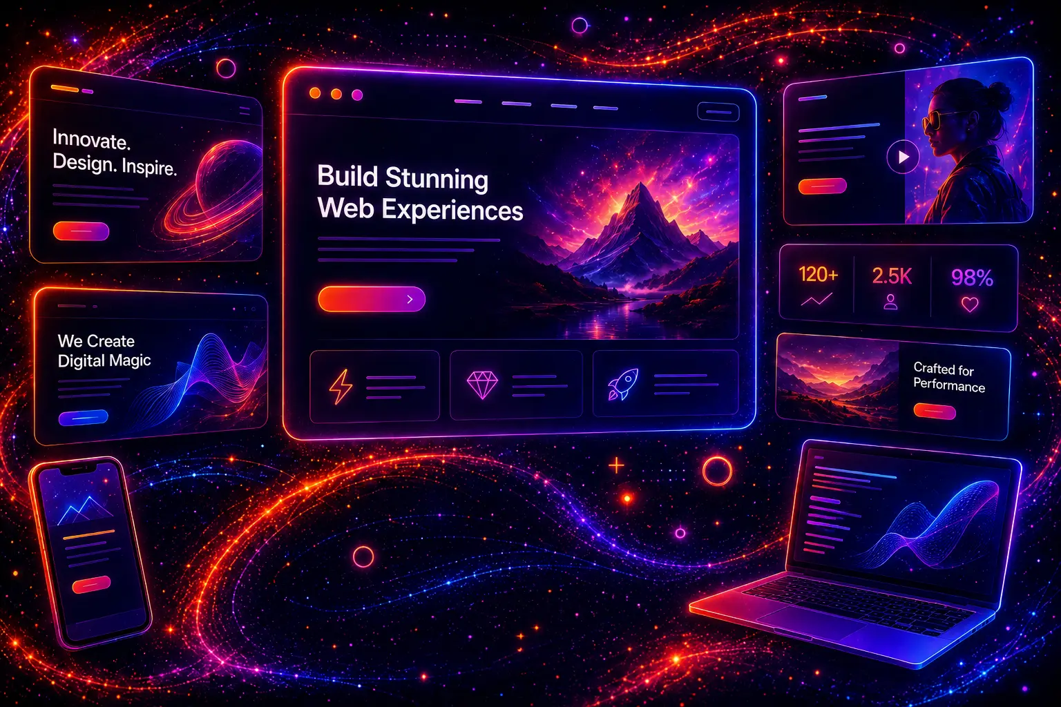
Modern website hero sections are one of the most important parts of a professional website. The hero section is usually the first large area visitors see, and it helps them understand what the website offers, why it matters, and what action they should take next.
A strong hero section can make a homepage, landing page, product page, SaaS website, portfolio, agency website, or online store feel more polished and easier to understand. It can guide visitors toward a call-to-action, explain the main value proposition, show a product preview, build trust, and create a strong first impression within seconds.
Modern hero section design is not only about adding a large image, background video, gradient, or button. A good hero layout should combine a clear headline, helpful supporting text, strong visual hierarchy, readable contrast, responsive spacing, mobile-friendly structure, and a focused call-to-action that matches the user’s goal.
In this guide, we showcase 30 modern website hero sections built with HTML and CSS. These examples include business hero sections, SaaS product heroes, app landing page heroes, startup heroes, agency heroes, portfolio heroes, eCommerce heroes, product launch heroes, video background heroes, split screen heroes, dark mode heroes, minimal heroes, trust badge heroes, and complete responsive hero layouts.
Each example includes a live preview and visible code blocks, so you can see exactly how the hero section is built. Most examples use HTML and CSS only, while a few interactive patterns may include a small JavaScript snippet where it improves the user experience.
You can copy, customize, and reuse these hero section examples in real projects, including WordPress themes, business websites, landing pages, SaaS websites, product websites, portfolios, blogs, eCommerce stores, and client websites.

A website hero section is the main visual and content area at the top of a web page. It usually appears directly below the navigation menu and is designed to introduce the page, explain the main message, and guide visitors toward the next action.
A hero section can be simple or highly visual. Some hero sections use a clean text-and-button layout, while others include product mockups, background images, videos, gradients, trust badges, statistics, lead forms, app screenshots, or animated UI elements.
The most important job of a hero section is clarity. A visitor should quickly understand what the website or page is about, who it is for, and what they can do next. If the hero section is confusing, crowded, slow, or visually weak, users may leave before exploring the rest of the page.
A modern hero section often includes:
The best hero sections are not just decorative. They combine design, messaging, layout, and conversion strategy into one focused above-the-fold section.
Hero sections matter because they shape the first impression of a website. When someone lands on a page, the hero section is often the first thing they see. It can make the website feel professional, trustworthy, modern, and easy to understand — or it can make the page feel unclear and unfinished.
A strong hero section helps visitors quickly answer three important questions: what is this website about, why should I care, and what should I do next? If those answers are clear, users are more likely to keep reading, click a button, browse a product, request a quote, sign up, or explore the rest of the website.
For business websites, the hero section can introduce the main service and encourage quote requests. For SaaS websites, it can explain the product and show a dashboard preview. For eCommerce websites, it can promote a collection or product category. For portfolios, it can present the creator’s style and expertise. For landing pages, it can focus attention on one specific conversion goal.
Good hero section design helps with:
A hero section should not try to say everything. It should communicate the most important message and make the next step obvious.
Modern hero section design should balance visual impact with clarity. A hero can use bold typography, video, gradients, animations, or large images, but the main message still needs to be readable and easy to understand.
Use these principles when designing hero sections for real websites:
The headline is usually the most important part of a hero section. It should explain the main value of the page in a direct and simple way. A clever headline can work, but clarity should come first.
For most websites, the headline should tell users what the product, service, or page helps them do. Avoid vague phrases that sound impressive but do not explain the actual offer.
A hero section should usually have one primary action. Examples include Get Started, Request a Quote, Book a Demo, Shop Now, View Portfolio, or Start Free Trial.
You can add a secondary link, but the main action should remain visually stronger. Too many buttons can make the hero section feel unfocused.
The image, video, mockup, or illustration should support the main message. A SaaS hero may show a dashboard screenshot. A product hero may show the product. A service business hero may show the result or the type of customer experience the business provides.
A beautiful visual is not enough if it does not help users understand the website. Choose visuals that make the offer clearer.
Hero sections often use large typography, wide spacing, two-column layouts, background images, or product mockups. These elements need to adapt properly on tablets and phones. A hero that looks good on desktop can easily become too tall, crowded, or hard to read on mobile.
On smaller screens, hero sections often work better as a single-column layout with a shorter headline, clear CTA, and simplified visual area.
The hero section should not contain every detail about the website. Too much text, too many buttons, too many badges, or too many visual elements can make the first screen feel heavy and confusing.
Use the hero section to introduce the main message. Additional details can appear in the sections below.
If the hero section uses a background image, video, dark gradient, or colorful design, make sure the text remains readable. Low contrast can make even a beautiful hero section difficult to use.
Use overlays, stronger text colors, darker cards, lighter surfaces, shadows, or background blur when needed. The headline and CTA should always be easy to see.
Trust signals can make a hero section more convincing. These can include client logos, ratings, review snippets, customer counts, years of experience, security badges, awards, or simple statistics.
Do not overload the hero with trust elements. Add only the signals that support the main message and help users feel more confident.
Mobile users see less content at once. A hero section that takes up too much vertical space can delay access to the rest of the page. On mobile, reduce unnecessary decoration, shorten supporting text, stack columns, and keep the main CTA easy to tap.
A mobile hero should still feel visually strong, but it should not block the user from moving forward.
Different websites need different hero section layouts. A SaaS product may need a dashboard preview, while an agency website may need a bold headline and service-focused CTA. An eCommerce website may highlight a product collection, while a portfolio may focus on personal style and selected work.
Before choosing a hero layout, think about the page goal. The design should support the main action you want users to take.
Business hero sections introduce a company, service, or offer. They often include a clear headline, service description, CTA button, trust elements, and a professional visual. These work well for local businesses, service companies, consultants, and B2B websites.
SaaS hero sections usually explain a software product and encourage users to start a trial, book a demo, or view features. They often include product screenshots, dashboard mockups, ratings, integration logos, and short benefit-focused copy.
eCommerce hero sections promote a product, collection, category, seasonal offer, or sale campaign. They should make the product or offer visually clear and include a strong shopping-focused CTA such as Shop Now, View Collection, or Explore Deals.
Portfolio hero sections introduce a designer, developer, photographer, studio, or creative professional. They often use bold typography, personal branding, selected work previews, and CTA links to view projects or contact the creator.
Agency hero sections should communicate expertise, style, and results. They often include strong headlines, service positioning, client logos, case study links, and CTAs for booking a call or requesting a proposal.
App hero sections focus on app benefits, screenshots, download buttons, device mockups, and social proof. They should quickly explain what the app does and why users should install or try it.
Blog hero sections can introduce the main topic, highlight featured articles, show newsletter CTAs, or guide users into categories. They should make the content purpose clear and encourage visitors to start reading.
Video hero sections can create strong visual impact, but they need to be optimized carefully. Large background videos can slow down a page, especially on mobile. Use compressed video files, poster images, readable overlays, and simple controls when needed.
Lead generation hero sections include a form, email signup, quote request block, or booking field directly inside the hero area. This layout can work well when the page has a focused conversion goal and users already understand the offer.
The following examples show practical hero section patterns for modern websites. Each example includes a live preview and visible HTML/CSS code, so you can copy the structure, adjust the styling, and reuse the pattern in your own website, WordPress theme, landing page, product page, portfolio, or client project.
Most hero sections use only HTML and CSS. If an example needs extra interaction, such as video controls or dynamic behavior, it can include a small JavaScript snippet, but the main focus stays on clean responsive structure and practical design.
A modern homepage hero section is the main introduction area for a website. It should explain the main value of the website, guide visitors toward the next action, and create a strong first impression with clean layout, strong typography, and a clear call-to-action.
This example uses a two-column hero layout with a bold headline, supporting text, CTA buttons, trust indicators, and a modern visual card. It works well for business websites, product websites, SaaS homepages, personal brands, and modern landing pages.
Use this homepage hero layout to introduce your main offer, explain the value quickly, and guide visitors toward the most important action.
<section class="hero-home-section">

  <div class="hero-home-content">

    <div class="hero-home-kicker">Modern Homepage Hero</div>

    <h3 class="hero-home-title">Build a website that feels <span>clear, modern and fast</span></h3>

    <p class="hero-home-text">Use this homepage hero layout to introduce your main offer, explain the value quickly, and guide visitors toward the most important action.</p>

    <div class="hero-home-actions">
      <a class="hero-home-button-primary" href="#">Start Your Project</a>
      <a class="hero-home-button-secondary" href="#">View Examples</a>
    </div>

    <div class="hero-home-stats">

      <div class="hero-home-stat">
        <strong>30+</strong>
        <span>Reusable sections</span>
      </div>

      <div class="hero-home-stat">
        <strong>100%</strong>
        <span>Responsive layout</span>
      </div>

      <div class="hero-home-stat">
        <strong>HTML</strong>
        <span>CSS-only structure</span>
      </div>

    </div>

  </div>

  <div class="hero-home-visual">

    <div class="hero-home-visual-card">

      <div class="hero-home-browser">

        <div class="hero-home-browser-top">
          <div class="hero-home-dots">
            <span></span>
            <span></span>
            <span></span>
          </div>
          <div class="hero-home-url"></div>
        </div>

        <div class="hero-home-browser-body">

          <div class="hero-home-ui-hero">
            <div class="hero-home-ui-label">Homepage</div>
            <div class="hero-home-ui-title"></div>
            <div class="hero-home-ui-title"></div>
            <div class="hero-home-ui-text"></div>
            <div class="hero-home-ui-buttons">
              <div class="hero-home-ui-button"></div>
              <div class="hero-home-ui-button"></div>
            </div>
          </div>

          <div class="hero-home-ui-grid">
            <div class="hero-home-ui-card"></div>
            <div class="hero-home-ui-card"></div>
          </div>

        </div>

      </div>

    </div>

  </div>

</section>
.hero-home-section{
width:min(100%,1080px);
display:grid;
grid-template-columns:minmax(0,1fr) minmax(320px,.92fr);
gap:42px;
align-items:center;
}

.hero-home-content{
min-width:0;
}

.hero-home-kicker{
display:inline-flex;
align-items:center;
gap:8px;
margin-bottom:16px;
padding:8px 12px;
border-radius:999px;
background:#dbeafe;
color:#1d4ed8;
font-size:13px;
font-weight:900;
letter-spacing:.05em;
text-transform:uppercase;
}

.hero-home-title{
margin:0 0 18px;
font-size:clamp(42px,6vw,72px);
line-height:.98;
font-weight:950;
letter-spacing:-.07em;
color:#0f172a;
}

.hero-home-title span{
background:linear-gradient(90deg,#2563eb,#7c3aed,#ec4899);
-webkit-background-clip:text;
background-clip:text;
color:transparent;
-webkit-text-fill-color:transparent;
}

.hero-home-text{
margin:0 0 26px;
max-width:620px;
font-size:17px;
line-height:1.8;
color:#475569;
}

.hero-home-actions{
display:flex;
align-items:center;
flex-wrap:wrap;
gap:12px;
margin-bottom:28px;
}

.hero-home-button-primary,
.hero-home-button-secondary{
display:inline-flex;
align-items:center;
justify-content:center;
min-height:52px;
padding:0 20px;
border-radius:999px;
font-size:15px;
font-weight:950;
text-decoration:none;
transition:transform .22s ease,box-shadow .22s ease,background .22s ease,border-color .22s ease;
}

.hero-home-button-primary{
background:linear-gradient(135deg,#2563eb,#7c3aed);
color:#ffffff;
box-shadow:0 18px 42px rgba(37,99,235,.24);
}

.hero-home-button-primary:hover,
.hero-home-button-primary:focus{
transform:translateY(-2px);
box-shadow:0 24px 52px rgba(124,58,237,.26);
outline:none;
}

.hero-home-button-secondary{
background:#ffffff;
border:1px solid #dbe3ef;
color:#0f172a;
box-shadow:0 14px 34px rgba(15,23,42,.08);
}

.hero-home-button-secondary:hover,
.hero-home-button-secondary:focus{
transform:translateY(-2px);
background:#f8fafc;
border-color:#cbd5e1;
outline:none;
}

.hero-home-stats{
display:grid;
grid-template-columns:repeat(3,minmax(0,1fr));
gap:14px;
max-width:580px;
}

.hero-home-stat{
padding:16px;
border-radius:20px;
background:rgba(255,255,255,.86);
border:1px solid rgba(15,23,42,.08);
box-shadow:0 18px 42px rgba(15,23,42,.08);
}

.hero-home-stat strong{
display:block;
margin-bottom:4px;
font-size:24px;
line-height:1;
font-weight:950;
color:#0f172a;
}

.hero-home-stat span{
display:block;
font-size:13px;
line-height:1.45;
font-weight:750;
color:#64748b;
}

.hero-home-visual{
position:relative;
min-width:0;
}

.hero-home-visual::before{
content:"";
position:absolute;
width:260px;
height:260px;
right:-52px;
top:-52px;
border-radius:999px;
background:linear-gradient(135deg,rgba(37,99,235,.26),rgba(236,72,153,.22));
filter:blur(4px);
}

.hero-home-visual-card{
position:relative;
z-index:2;
padding:20px;
border-radius:32px;
background:rgba(255,255,255,.82);
border:1px solid rgba(15,23,42,.08);
box-shadow:0 32px 90px rgba(15,23,42,.16);
backdrop-filter:blur(18px);
}

.hero-home-browser{
overflow:hidden;
border-radius:24px;
background:#0f172a;
border:1px solid rgba(255,255,255,.10);
box-shadow:0 24px 70px rgba(15,23,42,.22);
}

.hero-home-browser-top{
display:flex;
align-items:center;
justify-content:space-between;
gap:16px;
padding:14px 16px;
border-bottom:1px solid rgba(255,255,255,.10);
}

.hero-home-dots{
display:flex;
gap:7px;
}

.hero-home-dots span{
width:10px;
height:10px;
border-radius:999px;
background:#64748b;
}

.hero-home-dots span:nth-child(1){
background:#f87171;
}

.hero-home-dots span:nth-child(2){
background:#facc15;
}

.hero-home-dots span:nth-child(3){
background:#22c55e;
}

.hero-home-url{
height:28px;
flex:1;
border-radius:999px;
background:rgba(255,255,255,.08);
}

.hero-home-browser-body{
padding:22px;
display:grid;
gap:18px;
}

.hero-home-ui-hero{
padding:22px;
border-radius:22px;
background:
radial-gradient(circle at 20% 20%,rgba(96,165,250,.28),transparent 32%),
linear-gradient(135deg,#1e293b,#020617);
border:1px solid rgba(255,255,255,.10);
}

.hero-home-ui-label{
display:inline-flex;
margin-bottom:14px;
padding:6px 10px;
border-radius:999px;
background:rgba(59,130,246,.18);
color:#bfdbfe;
font-size:11px;
font-weight:900;
letter-spacing:.05em;
text-transform:uppercase;
}

.hero-home-ui-title{
height:20px;
width:82%;
border-radius:999px;
background:#ffffff;
margin-bottom:10px;
}

.hero-home-ui-title:nth-of-type(2){
width:58%;
}

.hero-home-ui-text{
height:10px;
width:72%;
border-radius:999px;
background:rgba(226,232,240,.55);
margin-bottom:18px;
}

.hero-home-ui-buttons{
display:flex;
gap:10px;
}

.hero-home-ui-button{
height:36px;
width:118px;
border-radius:999px;
background:linear-gradient(135deg,#2563eb,#7c3aed);
}

.hero-home-ui-button:nth-child(2){
width:94px;
background:rgba(255,255,255,.12);
border:1px solid rgba(255,255,255,.14);
}

.hero-home-ui-grid{
display:grid;
grid-template-columns:1fr 1fr;
gap:14px;
}

.hero-home-ui-card{
min-height:104px;
border-radius:20px;
background:rgba(255,255,255,.08);
border:1px solid rgba(255,255,255,.10);
padding:14px;
}

.hero-home-ui-card::before{
content:"";
display:block;
width:44px;
height:44px;
border-radius:16px;
background:linear-gradient(135deg,#22c55e,#0ea5e9);
margin-bottom:14px;
}

.hero-home-ui-card::after{
content:"";
display:block;
height:10px;
width:72%;
border-radius:999px;
background:rgba(226,232,240,.50);
}

@media (max-width: 920px){
.hero-home-section{
grid-template-columns:1fr;
}

.hero-home-content{
text-align:left;
}

.hero-home-visual{
max-width:640px;
width:100%;
margin:0 auto;
}
}

@media (max-width: 640px){
.hero-home-title{
font-size:40px;
}

.hero-home-text{
font-size:16px;
}

.hero-home-actions{
align-items:stretch;
flex-direction:column;
}

.hero-home-button-primary,
.hero-home-button-secondary{
width:100%;
}

.hero-home-stats{
grid-template-columns:1fr;
}

.hero-home-visual-card{
padding:14px;
border-radius:24px;
}

.hero-home-browser{
border-radius:20px;
}

.hero-home-ui-grid{
grid-template-columns:1fr;
}
}
This modern homepage hero section is useful when you need a flexible opening layout for many types of websites. The text area explains the offer, the buttons guide visitors toward action, and the visual card makes the section feel more complete without depending on external images.
Use this pattern for homepages, landing pages, product websites, SaaS websites, business websites, portfolio homepages, and WordPress front pages.
A responsive business hero section is designed for companies, consultants, agencies, local services, B2B websites, and professional service pages. It should communicate trust, explain the main service, and make it easy for visitors to request a quote, book a call, or learn more.
This example uses a professional business layout with a strong headline, service-focused text, CTA buttons, trust badges, review score, and a clean business card visual. It is built to feel polished, credible, and practical for real service websites.
Use this professional hero section to introduce your service, build trust quickly, and guide visitors toward a quote request or consultation.
Professional service, clear process, and reliable communication from first contact to final delivery.
<section class="hero-business-section">

  <div class="hero-business-content">

    <div class="hero-business-kicker">Business Hero Section</div>

    <h3 class="hero-business-title">Grow your business with a <span>clear digital presence</span></h3>

    <p class="hero-business-text">Use this professional hero section to introduce your service, build trust quickly, and guide visitors toward a quote request or consultation.</p>

    <div class="hero-business-actions">
      <a class="hero-business-button-primary" href="#">Request a Quote</a>
      <a class="hero-business-button-secondary" href="#">View Services</a>
    </div>

    <div class="hero-business-trust">

      <div class="hero-business-trust-item">
        <span class="hero-business-trust-dot"></span>
        20+ years experience
      </div>

      <div class="hero-business-trust-item">
        <span class="hero-business-trust-dot"></span>
        Trusted by local clients
      </div>

      <div class="hero-business-trust-item">
        <span class="hero-business-trust-dot"></span>
        Fast project response
      </div>

    </div>

  </div>

  <div class="hero-business-visual">

    <div class="hero-business-card">

      <div class="hero-business-image">

        <div class="hero-business-floating">

          <div class="hero-business-floating-top">
            <div class="hero-business-rating">4.9</div>
            <div class="hero-business-stars">★★★★★</div>
          </div>

          <p>Professional service, clear process, and reliable communication from first contact to final delivery.</p>

        </div>

      </div>

      <div class="hero-business-feature-grid">

        <div class="hero-business-feature">
          <strong>250+</strong>
          <span>Projects completed</span>
        </div>

        <div class="hero-business-feature">
          <strong>98%</strong>
          <span>Client satisfaction</span>
        </div>

      </div>

    </div>

  </div>

</section>
.hero-business-section{
width:min(100%,1080px);
display:grid;
grid-template-columns:minmax(0,1.02fr) minmax(320px,.98fr);
gap:42px;
align-items:center;
}

.hero-business-content{
min-width:0;
}

.hero-business-kicker{
display:inline-flex;
align-items:center;
gap:8px;
margin-bottom:16px;
padding:8px 12px;
border-radius:999px;
background:#dcfce7;
color:#15803d;
font-size:13px;
font-weight:900;
letter-spacing:.05em;
text-transform:uppercase;
}

.hero-business-title{
margin:0 0 18px;
font-size:clamp(40px,5.8vw,68px);
line-height:1;
font-weight:950;
letter-spacing:-.065em;
color:#0f172a;
}

.hero-business-title span{
color:#15803d;
}

.hero-business-text{
margin:0 0 26px;
max-width:620px;
font-size:17px;
line-height:1.8;
color:#475569;
}

.hero-business-actions{
display:flex;
align-items:center;
flex-wrap:wrap;
gap:12px;
margin-bottom:26px;
}

.hero-business-button-primary,
.hero-business-button-secondary{
display:inline-flex;
align-items:center;
justify-content:center;
min-height:52px;
padding:0 20px;
border-radius:999px;
font-size:15px;
font-weight:950;
text-decoration:none;
transition:transform .22s ease,box-shadow .22s ease,background .22s ease,border-color .22s ease;
}

.hero-business-button-primary{
background:linear-gradient(135deg,#15803d,#22c55e);
color:#ffffff;
box-shadow:0 18px 42px rgba(21,128,61,.22);
}

.hero-business-button-primary:hover,
.hero-business-button-primary:focus{
transform:translateY(-2px);
box-shadow:0 24px 52px rgba(34,197,94,.25);
outline:none;
}

.hero-business-button-secondary{
background:#ffffff;
border:1px solid #dbe3ef;
color:#0f172a;
box-shadow:0 14px 34px rgba(15,23,42,.08);
}

.hero-business-button-secondary:hover,
.hero-business-button-secondary:focus{
transform:translateY(-2px);
background:#f8fafc;
border-color:#cbd5e1;
outline:none;
}

.hero-business-trust{
display:flex;
align-items:center;
flex-wrap:wrap;
gap:10px;
}

.hero-business-trust-item{
display:inline-flex;
align-items:center;
gap:8px;
min-height:38px;
padding:0 12px;
border-radius:999px;
background:#ffffff;
border:1px solid #e2e8f0;
box-shadow:0 12px 30px rgba(15,23,42,.06);
color:#475569;
font-size:13px;
font-weight:850;
}

.hero-business-trust-dot{
width:9px;
height:9px;
border-radius:999px;
background:#22c55e;
box-shadow:0 0 0 4px rgba(34,197,94,.14);
}

.hero-business-visual{
position:relative;
min-width:0;
}

.hero-business-visual::before{
content:"";
position:absolute;
width:280px;
height:280px;
left:-60px;
bottom:-55px;
border-radius:999px;
background:linear-gradient(135deg,rgba(34,197,94,.20),rgba(37,99,235,.18));
filter:blur(4px);
}

.hero-business-card{
position:relative;
z-index:2;
display:grid;
gap:16px;
padding:22px;
border-radius:32px;
background:rgba(255,255,255,.92);
border:1px solid rgba(15,23,42,.08);
box-shadow:0 32px 90px rgba(15,23,42,.16);
backdrop-filter:blur(18px);
}

.hero-business-image{
position:relative;
min-height:260px;
overflow:hidden;
border-radius:24px;
background:
radial-gradient(circle at 18% 20%,rgba(255,255,255,.55),transparent 28%),
linear-gradient(135deg,#14532d,#15803d 48%,#0f172a);
}

.hero-business-image::before{
content:"";
position:absolute;
width:180px;
height:180px;
right:26px;
top:34px;
border-radius:40px;
background:rgba(255,255,255,.10);
border:1px solid rgba(255,255,255,.16);
transform:rotate(8deg);
}

.hero-business-image::after{
content:"";
position:absolute;
left:28px;
bottom:28px;
width:72%;
height:78px;
border-radius:22px;
background:rgba(255,255,255,.14);
border:1px solid rgba(255,255,255,.18);
backdrop-filter:blur(12px);
}

.hero-business-floating{
position:absolute;
right:18px;
bottom:18px;
z-index:3;
width:min(230px,70%);
padding:16px;
border-radius:22px;
background:#ffffff;
border:1px solid rgba(15,23,42,.08);
box-shadow:0 22px 48px rgba(15,23,42,.18);
}

.hero-business-floating-top{
display:flex;
align-items:center;
justify-content:space-between;
gap:12px;
margin-bottom:12px;
}

.hero-business-rating{
display:flex;
align-items:center;
gap:5px;
font-size:14px;
font-weight:950;
color:#0f172a;
}

.hero-business-stars{
color:#f59e0b;
letter-spacing:1px;
}

.hero-business-floating p{
margin:0;
font-size:13px;
line-height:1.55;
color:#64748b;
}

.hero-business-feature-grid{
display:grid;
grid-template-columns:1fr 1fr;
gap:12px;
}

.hero-business-feature{
padding:16px;
border-radius:20px;
background:#f8fafc;
border:1px solid #e2e8f0;
}

.hero-business-feature strong{
display:block;
margin-bottom:5px;
font-size:18px;
line-height:1.1;
font-weight:950;
color:#0f172a;
}

.hero-business-feature span{
display:block;
font-size:13px;
line-height:1.45;
font-weight:750;
color:#64748b;
}

@media (max-width: 920px){
.hero-business-section{
grid-template-columns:1fr;
}

.hero-business-visual{
max-width:640px;
width:100%;
margin:0 auto;
}
}

@media (max-width: 640px){
.hero-business-title{
font-size:38px;
}

.hero-business-text{
font-size:16px;
}

.hero-business-actions{
align-items:stretch;
flex-direction:column;
}

.hero-business-button-primary,
.hero-business-button-secondary{
width:100%;
}

.hero-business-card{
padding:16px;
border-radius:24px;
}

.hero-business-image{
min-height:230px;
border-radius:20px;
}

.hero-business-floating{
position:relative;
right:auto;
bottom:auto;
width:auto;
margin-top:-44px;
}

.hero-business-feature-grid{
grid-template-columns:1fr;
}
}
This responsive business hero section is useful for websites where trust, clarity, and service positioning are important. The trust badges, rating card, and project statistics help the section feel more credible without making the layout too heavy.
Use this pattern for business websites, local service websites, consulting pages, agency homepages, quote request pages, B2B websites, and professional service landing pages.
A SaaS product hero section should quickly explain what the software does, who it helps, and why users should try it. This type of hero section often includes a clear product headline, trial CTA, trust indicators, dashboard preview, and a short list of product benefits.
This example uses a modern SaaS layout with a dark background, gradient headline text, product CTA buttons, feature pills, and a large dashboard-style mockup. It works well for software websites, AI tools, analytics platforms, productivity apps, CRM tools, and startup landing pages.
Use this SaaS hero section to explain your software product, show a dashboard preview, and guide users toward a trial or product demo.
<section class="hero-saas-section">

  <div class="hero-saas-content">

    <div class="hero-saas-kicker">SaaS Product Hero</div>

    <h3 class="hero-saas-title">Turn product data into <span>clear growth decisions</span></h3>

    <p class="hero-saas-text">Use this SaaS hero section to explain your software product, show a dashboard preview, and guide users toward a trial or product demo.</p>

    <div class="hero-saas-actions">
      <a class="hero-saas-button-primary" href="#">Start Free Trial</a>
      <a class="hero-saas-button-secondary" href="#">Book a Demo</a>
    </div>

    <div class="hero-saas-pills">

      <div class="hero-saas-pill">
        <span class="hero-saas-pill-dot"></span>
        No credit card required
      </div>

      <div class="hero-saas-pill">
        <span class="hero-saas-pill-dot"></span>
        Setup in minutes
      </div>

      <div class="hero-saas-pill">
        <span class="hero-saas-pill-dot"></span>
        Real-time reports
      </div>

    </div>

  </div>

  <div class="hero-saas-dashboard-wrap">

    <div class="hero-saas-dashboard">

      <div class="hero-saas-dashboard-top">

        <div class="hero-saas-window-dots">
          <span></span>
          <span></span>
          <span></span>
        </div>

        <div class="hero-saas-dashboard-search"></div>

      </div>

      <div class="hero-saas-dashboard-body">

        <div class="hero-saas-sidebar">

          <div class="hero-saas-logo-row">
            <div class="hero-saas-logo"></div>
            <div class="hero-saas-logo-text"></div>
          </div>

          <div class="hero-saas-menu">
            <span></span>
            <span></span>
            <span></span>
            <span></span>
          </div>

        </div>

        <div class="hero-saas-main">

          <div class="hero-saas-metrics">
            <div class="hero-saas-metric"></div>
            <div class="hero-saas-metric"></div>
            <div class="hero-saas-metric"></div>
          </div>

          <div class="hero-saas-chart"></div>

          <div class="hero-saas-table">
            <span></span>
            <span></span>
          </div>

        </div>

      </div>

    </div>

  </div>

</section>
.hero-saas-section{
width:min(100%,1120px);
display:grid;
gap:34px;
}

.hero-saas-content{
max-width:820px;
margin:0 auto;
text-align:center;
}

.hero-saas-kicker{
display:inline-flex;
align-items:center;
gap:8px;
margin-bottom:16px;
padding:8px 12px;
border-radius:999px;
background:rgba(37,99,235,.16);
border:1px solid rgba(147,197,253,.22);
color:#bfdbfe;
font-size:13px;
font-weight:900;
letter-spacing:.05em;
text-transform:uppercase;
}

.hero-saas-title{
margin:0 0 18px;
font-size:clamp(42px,7vw,78px);
line-height:.98;
font-weight:950;
letter-spacing:-.075em;
color:#ffffff !important;
-webkit-text-fill-color:#ffffff !important;
}

.hero-saas-title span{
background:linear-gradient(90deg,#93c5fd,#d8b4fe,#86efac) !important;
-webkit-background-clip:text !important;
background-clip:text !important;
color:transparent !important;
-webkit-text-fill-color:transparent !important;
}

.hero-saas-text{
margin:0 auto 26px;
max-width:700px;
font-size:17px;
line-height:1.8;
color:#cbd5e1;
}

.hero-saas-actions{
display:flex;
align-items:center;
justify-content:center;
flex-wrap:wrap;
gap:12px;
margin-bottom:24px;
}

.hero-saas-button-primary,
.hero-saas-button-secondary{
display:inline-flex;
align-items:center;
justify-content:center;
min-height:52px;
padding:0 20px;
border-radius:999px;
font-size:15px;
font-weight:950;
text-decoration:none;
transition:transform .22s ease,box-shadow .22s ease,background .22s ease,border-color .22s ease;
}

.hero-saas-button-primary{
background:linear-gradient(135deg,#2563eb,#a855f7);
color:#ffffff;
box-shadow:0 18px 42px rgba(37,99,235,.26);
}

.hero-saas-button-primary:hover,
.hero-saas-button-primary:focus{
transform:translateY(-2px);
box-shadow:0 24px 52px rgba(168,85,247,.28);
outline:none;
}

.hero-saas-button-secondary{
background:rgba(255,255,255,.07);
border:1px solid rgba(255,255,255,.12);
color:#ffffff;
}

.hero-saas-button-secondary:hover,
.hero-saas-button-secondary:focus{
transform:translateY(-2px);
background:rgba(255,255,255,.11);
outline:none;
}

.hero-saas-pills{
display:flex;
align-items:center;
justify-content:center;
flex-wrap:wrap;
gap:10px;
}

.hero-saas-pill{
display:inline-flex;
align-items:center;
gap:8px;
min-height:38px;
padding:0 12px;
border-radius:999px;
background:rgba(255,255,255,.07);
border:1px solid rgba(255,255,255,.10);
color:#cbd5e1;
font-size:13px;
font-weight:850;
}

.hero-saas-pill-dot{
width:8px;
height:8px;
border-radius:999px;
background:#22c55e;
box-shadow:0 0 0 4px rgba(34,197,94,.13);
}

.hero-saas-dashboard-wrap{
position:relative;
}

.hero-saas-dashboard-wrap::before{
content:"";
position:absolute;
width:420px;
height:260px;
left:50%;
top:20px;
transform:translateX(-50%);
border-radius:999px;
background:linear-gradient(135deg,rgba(37,99,235,.28),rgba(168,85,247,.20),rgba(34,197,94,.16));
filter:blur(12px);
}

.hero-saas-dashboard{
position:relative;
z-index:2;
overflow:hidden;
border-radius:30px;
background:#0f172a;
border:1px solid rgba(255,255,255,.12);
box-shadow:0 36px 110px rgba(0,0,0,.42);
}

.hero-saas-dashboard-top{
display:flex;
align-items:center;
justify-content:space-between;
gap:16px;
padding:16px 18px;
border-bottom:1px solid rgba(255,255,255,.10);
}

.hero-saas-window-dots{
display:flex;
gap:7px;
}

.hero-saas-window-dots span{
width:10px;
height:10px;
border-radius:999px;
background:#64748b;
}

.hero-saas-window-dots span:nth-child(1){
background:#f87171;
}

.hero-saas-window-dots span:nth-child(2){
background:#facc15;
}

.hero-saas-window-dots span:nth-child(3){
background:#22c55e;
}

.hero-saas-dashboard-search{
height:30px;
width:min(100%,420px);
border-radius:999px;
background:rgba(255,255,255,.08);
}

.hero-saas-dashboard-body{
display:grid;
grid-template-columns:220px minmax(0,1fr);
min-height:410px;
}

.hero-saas-sidebar{
padding:18px;
border-right:1px solid rgba(255,255,255,.10);
background:rgba(15,23,42,.66);
}

.hero-saas-logo-row{
display:flex;
align-items:center;
gap:10px;
margin-bottom:22px;
}

.hero-saas-logo{
width:38px;
height:38px;
border-radius:14px;
background:linear-gradient(135deg,#2563eb,#a855f7);
}

.hero-saas-logo-text{
height:13px;
width:110px;
border-radius:999px;
background:rgba(255,255,255,.18);
}

.hero-saas-menu{
display:grid;
gap:10px;
}

.hero-saas-menu span{
height:38px;
border-radius:14px;
background:rgba(255,255,255,.07);
border:1px solid rgba(255,255,255,.08);
}

.hero-saas-menu span:first-child{
background:rgba(37,99,235,.20);
border-color:rgba(147,197,253,.20);
}

.hero-saas-main{
padding:20px;
display:grid;
gap:16px;
}

.hero-saas-metrics{
display:grid;
grid-template-columns:repeat(3,minmax(0,1fr));
gap:14px;
}

.hero-saas-metric{
min-height:116px;
padding:16px;
border-radius:20px;
background:rgba(255,255,255,.07);
border:1px solid rgba(255,255,255,.10);
}

.hero-saas-metric::before{
content:"";
display:block;
width:46px;
height:46px;
border-radius:16px;
background:linear-gradient(135deg,#22c55e,#0ea5e9);
margin-bottom:16px;
}

.hero-saas-metric::after{
content:"";
display:block;
height:12px;
width:70%;
border-radius:999px;
background:rgba(226,232,240,.48);
}

.hero-saas-chart{
min-height:190px;
border-radius:22px;
background:
linear-gradient(180deg,rgba(37,99,235,.20),transparent),
rgba(255,255,255,.07);
border:1px solid rgba(255,255,255,.10);
position:relative;
overflow:hidden;
}

.hero-saas-chart::before{
content:"";
position:absolute;
left:22px;
right:22px;
bottom:32px;
height:90px;
background:
linear-gradient(135deg,transparent 8%,rgba(96,165,250,.80) 9%,rgba(96,165,250,.80) 12%,transparent 13%),
linear-gradient(45deg,transparent 18%,rgba(168,85,247,.82) 19%,rgba(168,85,247,.82) 22%,transparent 23%);
border-radius:18px;
opacity:.95;
}

.hero-saas-table{
display:grid;
gap:10px;
}

.hero-saas-table span{
height:42px;
border-radius:16px;
background:rgba(255,255,255,.07);
border:1px solid rgba(255,255,255,.08);
}

@media (max-width: 860px){
.hero-saas-dashboard-body{
grid-template-columns:1fr;
}

.hero-saas-sidebar{
border-right:0;
border-bottom:1px solid rgba(255,255,255,.10);
}

.hero-saas-menu{
grid-template-columns:repeat(3,minmax(0,1fr));
}

.hero-saas-metrics{
grid-template-columns:1fr;
}
}

@media (max-width: 640px){
.hero-saas-title{
font-size:40px;
}

.hero-saas-text{
font-size:16px;
}

.hero-saas-actions{
align-items:stretch;
flex-direction:column;
}

.hero-saas-button-primary,
.hero-saas-button-secondary{
width:100%;
}

.hero-saas-dashboard{
border-radius:22px;
}

.hero-saas-dashboard-top{
align-items:flex-start;
flex-direction:column;
}

.hero-saas-dashboard-search{
width:100%;
}

.hero-saas-menu{
grid-template-columns:1fr;
}
}
This SaaS product hero section is useful when you want to show the product interface directly in the hero area. The dashboard mockup gives visitors a quick visual idea of the software, while the CTA buttons focus attention on trial and demo actions.
Use this pattern for SaaS websites, AI tools, analytics platforms, project management software, CRM products, productivity apps, and startup landing pages.
An app landing page hero section is designed to introduce a mobile app, explain its main benefit, and encourage users to download or try it. This type of hero section often includes app store buttons, phone mockups, feature highlights, and social proof.
This example uses a colorful split layout with a clean app pitch on the left and layered phone-style UI mockups on the right. It is suitable for mobile apps, productivity tools, wellness apps, finance apps, learning apps, and app launch pages.
Use this app hero section to introduce a mobile product, highlight the main benefit, and guide visitors toward downloading or trying the app.
<section class="hero-app-section">

  <div class="hero-app-content">

    <div class="hero-app-kicker">App Landing Page Hero</div>

    <h3 class="hero-app-title">Plan your day with a <span>smarter mobile app</span></h3>

    <p class="hero-app-text">Use this app hero section to introduce a mobile product, highlight the main benefit, and guide visitors toward downloading or trying the app.</p>

    <div class="hero-app-actions">
      <a class="hero-app-store" href="#">
        <span class="hero-app-store-icon">A</span>
        Download App
      </a>
      <a class="hero-app-demo-button" href="#">View App Demo</a>
    </div>

    <div class="hero-app-features">

      <div class="hero-app-feature">
        <strong>4.9</strong>
        <span>App rating</span>
      </div>

      <div class="hero-app-feature">
        <strong>50K+</strong>
        <span>Active users</span>
      </div>

      <div class="hero-app-feature">
        <strong>24/7</strong>
        <span>Smart reminders</span>
      </div>

    </div>

  </div>

  <div class="hero-app-visual">

    <div class="hero-app-phone hero-app-phone-secondary">
      <div class="hero-app-phone-screen">
        <div class="hero-app-phone-top">
          <div class="hero-app-avatar"></div>
          <div class="hero-app-phone-line"></div>
        </div>
        <div class="hero-app-phone-body">
          <div class="hero-app-phone-card hero-app-phone-card-large"></div>
          <div class="hero-app-phone-list">
            <span></span>
            <span></span>
            <span></span>
          </div>
        </div>
      </div>
    </div>

    <div class="hero-app-phone hero-app-phone-primary">
      <div class="hero-app-phone-screen">
        <div class="hero-app-phone-top">
          <div class="hero-app-avatar"></div>
          <div class="hero-app-phone-line"></div>
        </div>
        <div class="hero-app-phone-body">
          <div class="hero-app-phone-card hero-app-phone-card-large"></div>
          <div class="hero-app-phone-list">
            <span></span>
            <span></span>
            <span></span>
          </div>
        </div>
      </div>
    </div>

    <div class="hero-app-floating-badge">
      <strong>Smart daily flow</strong>
      <span>Organize tasks, habits, and reminders in one simple mobile dashboard.</span>
    </div>

  </div>

</section>
.hero-app-section{
position:relative;
z-index:2;
width:min(100%,1080px);
display:grid;
grid-template-columns:minmax(0,1fr) minmax(320px,.88fr);
gap:42px;
align-items:center;
}

.hero-app-content{
min-width:0;
color:#ffffff;
}

.hero-app-kicker{
display:inline-flex;
align-items:center;
gap:8px;
margin-bottom:16px;
padding:8px 12px;
border-radius:999px;
background:rgba(255,255,255,.16);
border:1px solid rgba(255,255,255,.24);
color:#ffffff;
font-size:13px;
font-weight:900;
letter-spacing:.05em;
text-transform:uppercase;
backdrop-filter:blur(12px);
}

.hero-app-title{
margin:0 0 18px;
font-size:clamp(42px,6vw,72px);
line-height:.98;
font-weight:950;
letter-spacing:-.07em;
color:#ffffff !important;
-webkit-text-fill-color:#ffffff !important;
}

.hero-app-title span{
background:linear-gradient(90deg,#fde68a,#ffffff,#bfdbfe) !important;
-webkit-background-clip:text !important;
background-clip:text !important;
color:transparent !important;
-webkit-text-fill-color:transparent !important;
}

.hero-app-text{
margin:0 0 26px;
max-width:620px;
font-size:17px;
line-height:1.8;
color:rgba(255,255,255,.88);
}

.hero-app-actions{
display:flex;
align-items:center;
flex-wrap:wrap;
gap:12px;
margin-bottom:26px;
}

.hero-app-store,
.hero-app-demo-button{
display:inline-flex;
align-items:center;
justify-content:center;
min-height:54px;
padding:0 18px;
border-radius:18px;
font-size:14px;
font-weight:950;
text-decoration:none;
transition:transform .22s ease,box-shadow .22s ease,background .22s ease,border-color .22s ease;
}

.hero-app-store{
gap:10px;
background:#ffffff;
color:#0f172a;
box-shadow:0 18px 42px rgba(15,23,42,.20);
}

.hero-app-store-icon{
width:28px;
height:28px;
display:grid;
place-items:center;
border-radius:10px;
background:linear-gradient(135deg,#2563eb,#ec4899);
color:#ffffff;
font-size:13px;
font-weight:950;
}

.hero-app-store:hover,
.hero-app-store:focus,
.hero-app-demo-button:hover,
.hero-app-demo-button:focus{
transform:translateY(-2px);
outline:none;
}

.hero-app-demo-button{
background:rgba(255,255,255,.12);
border:1px solid rgba(255,255,255,.20);
color:#ffffff;
backdrop-filter:blur(12px);
}

.hero-app-demo-button:hover,
.hero-app-demo-button:focus{
background:rgba(255,255,255,.18);
}

.hero-app-features{
display:grid;
grid-template-columns:repeat(3,minmax(0,1fr));
gap:12px;
max-width:620px;
}

.hero-app-feature{
padding:14px;
border-radius:18px;
background:rgba(255,255,255,.12);
border:1px solid rgba(255,255,255,.18);
backdrop-filter:blur(14px);
}

.hero-app-feature strong{
display:block;
margin-bottom:4px;
font-size:18px;
line-height:1.1;
font-weight:950;
color:#ffffff;
}

.hero-app-feature span{
display:block;
font-size:13px;
line-height:1.45;
font-weight:750;
color:rgba(255,255,255,.78);
}

.hero-app-visual{
position:relative;
min-height:520px;
}

.hero-app-phone{
position:absolute;
width:250px;
min-height:500px;
padding:14px;
border-radius:38px;
background:#0f172a;
border:1px solid rgba(255,255,255,.18);
box-shadow:0 34px 90px rgba(15,23,42,.34);
}

.hero-app-phone-primary{
right:88px;
top:0;
z-index:3;
transform:rotate(5deg);
}

.hero-app-phone-secondary{
right:0;
top:54px;
z-index:2;
opacity:.78;
transform:rotate(-8deg) scale(.92);
}

.hero-app-phone-screen{
min-height:472px;
overflow:hidden;
border-radius:28px;
background:
radial-gradient(circle at 20% 18%,rgba(255,255,255,.22),transparent 30%),
linear-gradient(180deg,#1e293b,#020617);
border:1px solid rgba(255,255,255,.10);
}

.hero-app-phone-top{
height:74px;
padding:18px;
display:flex;
align-items:center;
justify-content:space-between;
gap:12px;
background:rgba(255,255,255,.06);
border-bottom:1px solid rgba(255,255,255,.08);
}

.hero-app-avatar{
width:38px;
height:38px;
border-radius:14px;
background:linear-gradient(135deg,#facc15,#ec4899);
}

.hero-app-phone-line{
height:12px;
width:96px;
border-radius:999px;
background:rgba(255,255,255,.22);
}

.hero-app-phone-body{
padding:18px;
display:grid;
gap:14px;
}

.hero-app-phone-card{
padding:16px;
border-radius:22px;
background:rgba(255,255,255,.08);
border:1px solid rgba(255,255,255,.10);
}

.hero-app-phone-card-large{
min-height:150px;
background:
radial-gradient(circle at 22% 20%,rgba(96,165,250,.28),transparent 32%),
rgba(255,255,255,.08);
}

.hero-app-phone-card::before{
content:"";
display:block;
width:48px;
height:48px;
border-radius:16px;
background:linear-gradient(135deg,#22c55e,#0ea5e9);
margin-bottom:14px;
}

.hero-app-phone-card::after{
content:"";
display:block;
height:10px;
width:75%;
border-radius:999px;
background:rgba(226,232,240,.50);
}

.hero-app-phone-list{
display:grid;
gap:10px;
}

.hero-app-phone-list span{
height:44px;
border-radius:16px;
background:rgba(255,255,255,.07);
border:1px solid rgba(255,255,255,.08);
}

.hero-app-floating-badge{
position:absolute;
left:0;
bottom:56px;
z-index:4;
width:210px;
padding:16px;
border-radius:22px;
background:#ffffff;
box-shadow:0 24px 56px rgba(15,23,42,.24);
}

.hero-app-floating-badge strong{
display:block;
margin-bottom:5px;
font-size:17px;
line-height:1.2;
font-weight:950;
color:#0f172a;
}

.hero-app-floating-badge span{
display:block;
font-size:13px;
line-height:1.5;
font-weight:750;
color:#64748b;
}

@media (max-width: 920px){
.hero-app-section{
grid-template-columns:1fr;
}

.hero-app-visual{
max-width:560px;
width:100%;
margin:0 auto;
}
}

@media (max-width: 640px){
.hero-app-title{
font-size:40px;
}

.hero-app-text{
font-size:16px;
}

.hero-app-actions{
align-items:stretch;
flex-direction:column;
}

.hero-app-store,
.hero-app-demo-button{
width:100%;
}

.hero-app-features{
grid-template-columns:1fr;
}

.hero-app-visual{
min-height:560px;
}

.hero-app-phone{
width:220px;
min-height:450px;
}

.hero-app-phone-screen{
min-height:422px;
}

.hero-app-phone-primary{
right:72px;
}

.hero-app-phone-secondary{
right:-12px;
}

.hero-app-floating-badge{
left:0;
right:0;
bottom:0;
width:auto;
}
}
This app landing page hero section is useful when the product experience is visual and mobile-first. The phone mockups help visitors imagine the app interface, while the CTA buttons keep the focus on download or demo actions.
Use this pattern for mobile apps, app launch pages, productivity apps, finance apps, wellness apps, learning apps, startup products, and software landing pages.
A startup hero section should make a new product, service, or company feel exciting, clear, and trustworthy. Startups often need a hero section that explains the idea quickly, communicates momentum, and encourages visitors to join early, request access, or explore the product.
This example uses a bold dark hero layout with a startup-style headline, CTA buttons, launch metrics, product cards, and a modern floating interface preview. It is useful for early-stage startups, AI products, beta launches, waiting lists, and product validation pages.
Use this startup hero section to introduce a new product, collect early interest, and make a beta launch feel modern, focused, and trustworthy.
<section class="hero-startup-section">

  <div class="hero-startup-content">

    <div class="hero-startup-kicker">Startup Hero Section</div>

    <h3 class="hero-startup-title">Launch your next idea with <span>early user momentum</span></h3>

    <p class="hero-startup-text">Use this startup hero section to introduce a new product, collect early interest, and make a beta launch feel modern, focused, and trustworthy.</p>

    <div class="hero-startup-actions">
      <a class="hero-startup-button-primary" href="#">Join the Waitlist</a>
      <a class="hero-startup-button-secondary" href="#">See Product Preview</a>
    </div>

    <div class="hero-startup-metrics">

      <div class="hero-startup-metric">
        <strong>2.4K</strong>
        <span>Early signups</span>
      </div>

      <div class="hero-startup-metric">
        <strong>14</strong>
        <span>Beta partners</span>
      </div>

      <div class="hero-startup-metric">
        <strong>Q2</strong>
        <span>Launch window</span>
      </div>

    </div>

  </div>

  <div class="hero-startup-visual">

    <div class="hero-startup-orbit"></div>

    <div class="hero-startup-product-card">

      <div class="hero-startup-card-top">
        <div class="hero-startup-logo"></div>
        <div class="hero-startup-status">
          <span class="hero-startup-status-dot"></span>
          Live beta
        </div>
      </div>

      <div class="hero-startup-product-title"></div>
      <div class="hero-startup-product-text"></div>
      <div class="hero-startup-product-text"></div>

      <div class="hero-startup-progress">
        <span></span>
      </div>

    </div>

    <div class="hero-startup-float hero-startup-float-one">
      <strong>Fast validation</strong>
      <span>Collect interest before the full product launch.</span>
      <div class="hero-startup-mini-dots">
        <i></i>
        <i></i>
        <i></i>
      </div>
    </div>

    <div class="hero-startup-float hero-startup-float-two">
      <strong>Product signal</strong>
      <span>Show momentum, clarity, and early traction.</span>
    </div>

  </div>

</section>
.hero-startup-section{
width:min(100%,1100px);
display:grid;
grid-template-columns:minmax(0,1fr) minmax(320px,.92fr);
gap:42px;
align-items:center;
}

.hero-startup-content{
min-width:0;
}

.hero-startup-kicker{
display:inline-flex;
align-items:center;
gap:8px;
margin-bottom:16px;
padding:8px 12px;
border-radius:999px;
background:rgba(236,72,153,.14);
border:1px solid rgba(244,114,182,.24);
color:#f9a8d4;
font-size:13px;
font-weight:900;
letter-spacing:.05em;
text-transform:uppercase;
}

.hero-startup-title{
margin:0 0 18px;
font-size:clamp(42px,6vw,74px);
line-height:.98;
font-weight:950;
letter-spacing:-.075em;
color:#ffffff !important;
-webkit-text-fill-color:#ffffff !important;
}

.hero-startup-title span{
background:linear-gradient(90deg,#f9a8d4,#93c5fd,#86efac) !important;
-webkit-background-clip:text !important;
background-clip:text !important;
color:transparent !important;
-webkit-text-fill-color:transparent !important;
}

.hero-startup-text{
margin:0 0 26px;
max-width:640px;
font-size:17px;
line-height:1.8;
color:#cbd5e1;
}

.hero-startup-actions{
display:flex;
align-items:center;
flex-wrap:wrap;
gap:12px;
margin-bottom:28px;
}

.hero-startup-button-primary,
.hero-startup-button-secondary{
display:inline-flex;
align-items:center;
justify-content:center;
min-height:52px;
padding:0 20px;
border-radius:999px;
font-size:15px;
font-weight:950;
text-decoration:none;
transition:transform .22s ease,box-shadow .22s ease,background .22s ease,border-color .22s ease;
}

.hero-startup-button-primary{
background:linear-gradient(135deg,#ec4899,#2563eb);
color:#ffffff;
box-shadow:0 18px 42px rgba(236,72,153,.24);
}

.hero-startup-button-primary:hover,
.hero-startup-button-primary:focus{
transform:translateY(-2px);
box-shadow:0 24px 52px rgba(37,99,235,.28);
outline:none;
}

.hero-startup-button-secondary{
background:rgba(255,255,255,.07);
border:1px solid rgba(255,255,255,.12);
color:#ffffff;
}

.hero-startup-button-secondary:hover,
.hero-startup-button-secondary:focus{
transform:translateY(-2px);
background:rgba(255,255,255,.11);
outline:none;
}

.hero-startup-metrics{
display:grid;
grid-template-columns:repeat(3,minmax(0,1fr));
gap:14px;
max-width:620px;
}

.hero-startup-metric{
padding:16px;
border-radius:20px;
background:rgba(255,255,255,.07);
border:1px solid rgba(255,255,255,.10);
box-shadow:0 18px 42px rgba(0,0,0,.18);
}

.hero-startup-metric strong{
display:block;
margin-bottom:4px;
font-size:24px;
line-height:1;
font-weight:950;
color:#ffffff;
}

.hero-startup-metric span{
display:block;
font-size:13px;
line-height:1.45;
font-weight:750;
color:#94a3b8;
}

.hero-startup-visual{
position:relative;
min-height:520px;
}

.hero-startup-orbit{
position:absolute;
inset:20px;
border-radius:999px;
border:1px solid rgba(255,255,255,.10);
background:
radial-gradient(circle at 50% 50%,rgba(37,99,235,.16),transparent 45%);
}

.hero-startup-orbit::before,
.hero-startup-orbit::after{
content:"";
position:absolute;
border-radius:999px;
border:1px solid rgba(255,255,255,.10);
}

.hero-startup-orbit::before{
inset:46px;
}

.hero-startup-orbit::after{
inset:92px;
}

.hero-startup-product-card{
position:absolute;
z-index:3;
left:50%;
top:50%;
width:min(360px,80%);
padding:22px;
border-radius:30px;
background:rgba(255,255,255,.10);
border:1px solid rgba(255,255,255,.14);
box-shadow:0 32px 90px rgba(0,0,0,.32);
backdrop-filter:blur(18px);
transform:translate(-50%,-50%);
}

.hero-startup-card-top{
display:flex;
align-items:center;
justify-content:space-between;
gap:14px;
margin-bottom:18px;
}

.hero-startup-logo{
width:48px;
height:48px;
border-radius:18px;
background:linear-gradient(135deg,#ec4899,#2563eb);
box-shadow:0 18px 38px rgba(236,72,153,.24);
}

.hero-startup-status{
display:inline-flex;
align-items:center;
gap:8px;
min-height:34px;
padding:0 12px;
border-radius:999px;
background:rgba(34,197,94,.14);
border:1px solid rgba(34,197,94,.24);
color:#bbf7d0;
font-size:12px;
font-weight:900;
}

.hero-startup-status-dot{
width:8px;
height:8px;
border-radius:999px;
background:#22c55e;
box-shadow:0 0 0 4px rgba(34,197,94,.14);
}

.hero-startup-product-title{
height:18px;
width:78%;
border-radius:999px;
background:#ffffff;
margin-bottom:10px;
}

.hero-startup-product-text{
height:10px;
width:92%;
border-radius:999px;
background:rgba(226,232,240,.55);
margin-bottom:8px;
}

.hero-startup-product-text:nth-of-type(3){
width:70%;
margin-bottom:18px;
}

.hero-startup-progress{
height:12px;
overflow:hidden;
border-radius:999px;
background:rgba(255,255,255,.10);
border:1px solid rgba(255,255,255,.08);
}

.hero-startup-progress span{
display:block;
width:74%;
height:100%;
border-radius:999px;
background:linear-gradient(90deg,#ec4899,#2563eb,#22c55e);
}

.hero-startup-float{
position:absolute;
z-index:4;
padding:16px;
border-radius:22px;
background:#ffffff;
border:1px solid rgba(15,23,42,.08);
box-shadow:0 24px 58px rgba(0,0,0,.24);
}

.hero-startup-float strong{
display:block;
margin-bottom:5px;
font-size:17px;
line-height:1.2;
font-weight:950;
color:#0f172a;
}

.hero-startup-float span{
display:block;
font-size:13px;
line-height:1.5;
font-weight:750;
color:#64748b;
}

.hero-startup-float-one{
left:0;
top:78px;
width:190px;
}

.hero-startup-float-two{
right:0;
bottom:86px;
width:200px;
}

.hero-startup-mini-dots{
display:flex;
gap:8px;
margin-top:14px;
}

.hero-startup-mini-dots i{
width:28px;
height:28px;
display:block;
border-radius:999px;
background:linear-gradient(135deg,#93c5fd,#a855f7);
}

.hero-startup-mini-dots i:nth-child(2){
background:linear-gradient(135deg,#f9a8d4,#fb7185);
}

.hero-startup-mini-dots i:nth-child(3){
background:linear-gradient(135deg,#86efac,#22c55e);
}

@media (max-width: 920px){
.hero-startup-section{
grid-template-columns:1fr;
}

.hero-startup-visual{
max-width:620px;
width:100%;
margin:0 auto;
}
}

@media (max-width: 640px){
.hero-startup-title{
font-size:40px;
}

.hero-startup-text{
font-size:16px;
}

.hero-startup-actions{
align-items:stretch;
flex-direction:column;
}

.hero-startup-button-primary,
.hero-startup-button-secondary{
width:100%;
}

.hero-startup-metrics{
grid-template-columns:1fr;
}

.hero-startup-visual{
min-height:600px;
}

.hero-startup-product-card{
width:82%;
}

.hero-startup-float-one{
left:0;
top:26px;
}

.hero-startup-float-two{
right:0;
bottom:28px;
}
}
This startup hero section is useful when the goal is to create interest before a full product launch. The layout combines a strong headline, waitlist CTA, launch metrics, and visual product signals that make an early-stage idea feel more credible.
Use this pattern for startup websites, beta product launches, AI tools, waitlist pages, product validation pages, early-access campaigns, and new SaaS products.
An agency hero section should show creativity, confidence, and business value at the same time. Agencies often need a hero layout that communicates expertise, showcases style, highlights results, and encourages visitors to book a call or view case studies.
This example uses a bold creative layout with large typography, CTA buttons, service tags, selected project cards, and a visual portfolio-style grid. It works well for design agencies, marketing agencies, web studios, branding studios, creative teams, and digital service companies.
Use this agency hero section to present your creative direction, service value, and selected project style with a strong visual first impression.
<section class="hero-agency-section">

  <div class="hero-agency-content">

    <div class="hero-agency-kicker">Agency Hero Section</div>

    <h3 class="hero-agency-title">Creative websites built for <span>brands that want to grow</span></h3>

    <p class="hero-agency-text">Use this agency hero section to present your creative direction, service value, and selected project style with a strong visual first impression.</p>

    <div class="hero-agency-actions">
      <a class="hero-agency-button-primary" href="#">Book a Strategy Call</a>
      <a class="hero-agency-button-secondary" href="#">View Case Studies</a>
    </div>

    <div class="hero-agency-tags">
      <span class="hero-agency-tag">Web Design</span>
      <span class="hero-agency-tag">Branding</span>
      <span class="hero-agency-tag">Landing Pages</span>
      <span class="hero-agency-tag">Conversion UI</span>
    </div>

  </div>

  <div class="hero-agency-visual">

    <div class="hero-agency-floating">
      <strong>Featured work</strong>
      <span>Showcase visual direction and selected project outcomes.</span>
    </div>

    <div class="hero-agency-grid">

      <div class="hero-agency-project hero-agency-project-large">
        <div class="hero-agency-shape hero-agency-shape-one"></div>
        <div class="hero-agency-shape hero-agency-shape-two"></div>
        <div class="hero-agency-project-content">
          <strong>Brand website</strong>
          <span>Premium visual direction and conversion-focused layout.</span>
        </div>
      </div>

      <div class="hero-agency-project hero-agency-project-small-one">
        <div class="hero-agency-project-content">
          <strong>Landing page</strong>
          <span>Campaign-focused UI.</span>
        </div>
      </div>

      <div class="hero-agency-project hero-agency-project-small-two">
        <div class="hero-agency-project-content">
          <strong>Product UI</strong>
          <span>Modern interface system.</span>
        </div>
      </div>

    </div>

  </div>

</section>
.hero-agency-section{
width:min(100%,1100px);
display:grid;
grid-template-columns:minmax(0,1fr) minmax(330px,.94fr);
gap:42px;
align-items:center;
}

.hero-agency-content{
min-width:0;
}

.hero-agency-kicker{
display:inline-flex;
align-items:center;
gap:8px;
margin-bottom:16px;
padding:8px 12px;
border-radius:999px;
background:#ffedd5;
color:#c2410c;
font-size:13px;
font-weight:900;
letter-spacing:.05em;
text-transform:uppercase;
}

.hero-agency-title{
margin:0 0 18px;
font-size:clamp(42px,6vw,76px);
line-height:.96;
font-weight:950;
letter-spacing:-.078em;
color:#0f172a;
}

.hero-agency-title span{
background:linear-gradient(90deg,#f97316,#ec4899,#2563eb);
-webkit-background-clip:text;
background-clip:text;
color:transparent;
-webkit-text-fill-color:transparent;
}

.hero-agency-text{
margin:0 0 26px;
max-width:620px;
font-size:17px;
line-height:1.8;
color:#475569;
}

.hero-agency-actions{
display:flex;
align-items:center;
flex-wrap:wrap;
gap:12px;
margin-bottom:26px;
}

.hero-agency-button-primary,
.hero-agency-button-secondary{
display:inline-flex;
align-items:center;
justify-content:center;
min-height:52px;
padding:0 20px;
border-radius:999px;
font-size:15px;
font-weight:950;
text-decoration:none;
transition:transform .22s ease,box-shadow .22s ease,background .22s ease,border-color .22s ease;
}

.hero-agency-button-primary{
background:linear-gradient(135deg,#f97316,#ec4899);
color:#ffffff;
box-shadow:0 18px 42px rgba(249,115,22,.22);
}

.hero-agency-button-primary:hover,
.hero-agency-button-primary:focus{
transform:translateY(-2px);
box-shadow:0 24px 52px rgba(236,72,153,.25);
outline:none;
}

.hero-agency-button-secondary{
background:#ffffff;
border:1px solid #dbe3ef;
color:#0f172a;
box-shadow:0 14px 34px rgba(15,23,42,.08);
}

.hero-agency-button-secondary:hover,
.hero-agency-button-secondary:focus{
transform:translateY(-2px);
background:#f8fafc;
border-color:#cbd5e1;
outline:none;
}

.hero-agency-tags{
display:flex;
align-items:center;
flex-wrap:wrap;
gap:10px;
}

.hero-agency-tag{
display:inline-flex;
align-items:center;
min-height:38px;
padding:0 12px;
border-radius:999px;
background:#ffffff;
border:1px solid #e2e8f0;
box-shadow:0 12px 30px rgba(15,23,42,.06);
color:#475569;
font-size:13px;
font-weight:850;
}

.hero-agency-visual{
position:relative;
min-height:540px;
}

.hero-agency-visual::before{
content:"";
position:absolute;
width:320px;
height:320px;
right:-60px;
top:20px;
border-radius:999px;
background:linear-gradient(135deg,rgba(249,115,22,.20),rgba(37,99,235,.18));
filter:blur(6px);
}

.hero-agency-grid{
position:relative;
z-index:2;
display:grid;
grid-template-columns:1fr 1fr;
grid-template-rows:1fr 1fr;
gap:16px;
height:100%;
}

.hero-agency-project{
position:relative;
overflow:hidden;
border-radius:28px;
background:#ffffff;
border:1px solid rgba(15,23,42,.08);
box-shadow:0 28px 80px rgba(15,23,42,.14);
}

.hero-agency-project-large{
grid-row:span 2;
min-height:520px;
background:
radial-gradient(circle at 24% 22%,rgba(255,255,255,.46),transparent 28%),
linear-gradient(135deg,#0f172a,#1e293b);
}

.hero-agency-project-small-one{
background:
radial-gradient(circle at 24% 22%,rgba(255,255,255,.54),transparent 28%),
linear-gradient(135deg,#f97316,#ec4899);
}

.hero-agency-project-small-two{
background:
radial-gradient(circle at 24% 22%,rgba(255,255,255,.54),transparent 28%),
linear-gradient(135deg,#2563eb,#0ea5e9);
}

.hero-agency-project-content{
position:absolute;
left:18px;
right:18px;
bottom:18px;
padding:16px;
border-radius:20px;
background:rgba(255,255,255,.14);
border:1px solid rgba(255,255,255,.18);
backdrop-filter:blur(16px);
}

.hero-agency-project-large .hero-agency-project-content{
background:rgba(255,255,255,.10);
}

.hero-agency-project-content strong{
display:block;
margin-bottom:6px;
font-size:18px;
line-height:1.25;
font-weight:950;
color:#ffffff;
}

.hero-agency-project-content span{
display:block;
font-size:13px;
line-height:1.5;
font-weight:750;
color:rgba(255,255,255,.78);
}

.hero-agency-shape{
position:absolute;
border-radius:999px;
background:rgba(255,255,255,.16);
border:1px solid rgba(255,255,255,.18);
}

.hero-agency-shape-one{
width:150px;
height:150px;
right:28px;
top:30px;
}

.hero-agency-shape-two{
width:88px;
height:88px;
left:28px;
top:100px;
}

.hero-agency-floating{
position:absolute;
left:-14px;
top:34px;
z-index:4;
width:220px;
padding:16px;
border-radius:22px;
background:#ffffff;
border:1px solid rgba(15,23,42,.08);
box-shadow:0 24px 56px rgba(15,23,42,.20);
}

.hero-agency-floating strong{
display:block;
margin-bottom:5px;
font-size:17px;
line-height:1.2;
font-weight:950;
color:#0f172a;
}

.hero-agency-floating span{
display:block;
font-size:13px;
line-height:1.5;
font-weight:750;
color:#64748b;
}

@media (max-width: 920px){
.hero-agency-section{
grid-template-columns:1fr;
}

.hero-agency-visual{
max-width:660px;
width:100%;
margin:0 auto;
}
}

@media (max-width: 640px){
.hero-agency-title{
font-size:40px;
}

.hero-agency-text{
font-size:16px;
}

.hero-agency-actions{
align-items:stretch;
flex-direction:column;
}

.hero-agency-button-primary,
.hero-agency-button-secondary{
width:100%;
}

.hero-agency-visual{
min-height:auto;
}

.hero-agency-grid{
grid-template-columns:1fr;
height:auto;
}

.hero-agency-project,
.hero-agency-project-large{
min-height:260px;
}

.hero-agency-project-large{
grid-row:auto;
}

.hero-agency-floating{
position:relative;
left:auto;
top:auto;
width:auto;
margin-bottom:16px;
}
}
This agency hero section is useful when the hero needs to communicate both creativity and business value. The visual grid gives the section a portfolio-style feel, while the CTA buttons guide visitors toward booking a call or viewing case studies.
Use this pattern for creative agencies, web design studios, branding agencies, marketing teams, portfolio agencies, digital studios, and service-based landing pages.
A portfolio hero section introduces a designer, developer, photographer, studio, or creative professional. It should quickly show the creator’s style, explain what they do, and guide visitors toward selected work or contact.
This example uses a modern portfolio layout with bold typography, a short professional intro, CTA buttons, project categories, and a visual project gallery. It is useful for personal portfolios, design portfolios, developer portfolios, photography websites, and creative studio homepages.
Use this portfolio hero section to introduce your creative work, show selected project style, and guide visitors toward your case studies or contact page.
<section class="hero-portfolio-section">

  <div class="hero-portfolio-content">

    <div class="hero-portfolio-kicker">Portfolio Hero Section</div>

    <h3 class="hero-portfolio-title">Designing digital work with <span>clarity and character</span></h3>

    <p class="hero-portfolio-text">Use this portfolio hero section to introduce your creative work, show selected project style, and guide visitors toward your case studies or contact page.</p>

    <div class="hero-portfolio-actions">
      <a class="hero-portfolio-button-primary" href="#">View Portfolio</a>
      <a class="hero-portfolio-button-secondary" href="#">Contact Me</a>
    </div>

    <div class="hero-portfolio-meta">
      <span class="hero-portfolio-meta-item"><span class="hero-portfolio-meta-dot"></span> UI Design</span>
      <span class="hero-portfolio-meta-item"><span class="hero-portfolio-meta-dot"></span> Web Projects</span>
      <span class="hero-portfolio-meta-item"><span class="hero-portfolio-meta-dot"></span> Creative Direction</span>
    </div>

  </div>

  <div class="hero-portfolio-visual">

    <div class="hero-portfolio-floating">
      <strong>Selected work</strong>
      <span>Show your strongest projects directly in the first screen.</span>
    </div>

    <div class="hero-portfolio-gallery">

      <div class="hero-portfolio-card hero-portfolio-card-large">
        <div class="hero-portfolio-card-content">
          <strong>Product Website</strong>
          <span>Visual identity and responsive website design.</span>
        </div>
      </div>

      <div class="hero-portfolio-card hero-portfolio-card-small-one">
        <div class="hero-portfolio-card-content">
          <strong>App UI</strong>
          <span>Mobile product interface.</span>
        </div>
      </div>

      <div class="hero-portfolio-card hero-portfolio-card-small-two">
        <div class="hero-portfolio-card-content">
          <strong>Campaign</strong>
          <span>Landing page system.</span>
        </div>
      </div>

    </div>

  </div>

</section>
.hero-portfolio-section{
width:min(100%,1100px);
display:grid;
grid-template-columns:minmax(0,.92fr) minmax(340px,1.08fr);
gap:42px;
align-items:center;
}

.hero-portfolio-content{
min-width:0;
}

.hero-portfolio-kicker{
display:inline-flex;
align-items:center;
gap:8px;
margin-bottom:16px;
padding:8px 12px;
border-radius:999px;
background:#f3e8ff;
color:#7e22ce;
font-size:13px;
font-weight:900;
letter-spacing:.05em;
text-transform:uppercase;
}

.hero-portfolio-title{
margin:0 0 18px;
font-size:clamp(42px,6vw,76px);
line-height:.96;
font-weight:950;
letter-spacing:-.078em;
color:#0f172a;
}

.hero-portfolio-title span{
background:linear-gradient(90deg,#7c3aed,#0ea5e9,#22c55e);
-webkit-background-clip:text;
background-clip:text;
color:transparent;
-webkit-text-fill-color:transparent;
}

.hero-portfolio-text{
margin:0 0 26px;
max-width:620px;
font-size:17px;
line-height:1.8;
color:#475569;
}

.hero-portfolio-actions{
display:flex;
align-items:center;
flex-wrap:wrap;
gap:12px;
margin-bottom:26px;
}

.hero-portfolio-button-primary,
.hero-portfolio-button-secondary{
display:inline-flex;
align-items:center;
justify-content:center;
min-height:52px;
padding:0 20px;
border-radius:999px;
font-size:15px;
font-weight:950;
text-decoration:none;
transition:transform .22s ease,box-shadow .22s ease,background .22s ease,border-color .22s ease;
}

.hero-portfolio-button-primary{
background:linear-gradient(135deg,#7c3aed,#0ea5e9);
color:#ffffff;
box-shadow:0 18px 42px rgba(124,58,237,.24);
}

.hero-portfolio-button-primary:hover,
.hero-portfolio-button-primary:focus{
transform:translateY(-2px);
box-shadow:0 24px 52px rgba(14,165,233,.25);
outline:none;
}

.hero-portfolio-button-secondary{
background:#ffffff;
border:1px solid #dbe3ef;
color:#0f172a;
box-shadow:0 14px 34px rgba(15,23,42,.08);
}

.hero-portfolio-button-secondary:hover,
.hero-portfolio-button-secondary:focus{
transform:translateY(-2px);
background:#f8fafc;
border-color:#cbd5e1;
outline:none;
}

.hero-portfolio-meta{
display:flex;
align-items:center;
flex-wrap:wrap;
gap:10px;
}

.hero-portfolio-meta-item{
display:inline-flex;
align-items:center;
gap:8px;
min-height:38px;
padding:0 12px;
border-radius:999px;
background:#ffffff;
border:1px solid #e2e8f0;
box-shadow:0 12px 30px rgba(15,23,42,.06);
color:#475569;
font-size:13px;
font-weight:850;
}

.hero-portfolio-meta-dot{
width:9px;
height:9px;
border-radius:999px;
background:#7c3aed;
box-shadow:0 0 0 4px rgba(124,58,237,.13);
}

.hero-portfolio-visual{
position:relative;
min-height:540px;
}

.hero-portfolio-visual::before{
content:"";
position:absolute;
width:320px;
height:320px;
right:-70px;
top:10px;
border-radius:999px;
background:linear-gradient(135deg,rgba(124,58,237,.20),rgba(14,165,233,.18));
filter:blur(6px);
}

.hero-portfolio-gallery{
position:relative;
z-index:2;
height:100%;
display:grid;
grid-template-columns:1fr 1fr;
grid-template-rows:1fr 1fr;
gap:16px;
}

.hero-portfolio-card{
position:relative;
overflow:hidden;
border-radius:28px;
background:#ffffff;
border:1px solid rgba(15,23,42,.08);
box-shadow:0 28px 80px rgba(15,23,42,.14);
}

.hero-portfolio-card-large{
grid-row:span 2;
min-height:520px;
background:
radial-gradient(circle at 25% 20%,rgba(255,255,255,.52),transparent 30%),
linear-gradient(135deg,#111827,#7c3aed);
}

.hero-portfolio-card-small-one{
background:
radial-gradient(circle at 25% 20%,rgba(255,255,255,.58),transparent 30%),
linear-gradient(135deg,#0ea5e9,#22c55e);
}

.hero-portfolio-card-small-two{
background:
radial-gradient(circle at 25% 20%,rgba(255,255,255,.58),transparent 30%),
linear-gradient(135deg,#f97316,#ec4899);
}

.hero-portfolio-card::before{
content:"";
position:absolute;
width:140px;
height:140px;
right:24px;
top:28px;
border-radius:40px;
background:rgba(255,255,255,.14);
border:1px solid rgba(255,255,255,.20);
transform:rotate(10deg);
}

.hero-portfolio-card::after{
content:"";
position:absolute;
left:24px;
right:24px;
bottom:94px;
height:14px;
border-radius:999px;
background:rgba(255,255,255,.34);
}

.hero-portfolio-card-content{
position:absolute;
left:18px;
right:18px;
bottom:18px;
padding:16px;
border-radius:20px;
background:rgba(255,255,255,.14);
border:1px solid rgba(255,255,255,.18);
backdrop-filter:blur(16px);
}

.hero-portfolio-card-content strong{
display:block;
margin-bottom:6px;
font-size:18px;
line-height:1.25;
font-weight:950;
color:#ffffff;
}

.hero-portfolio-card-content span{
display:block;
font-size:13px;
line-height:1.5;
font-weight:750;
color:rgba(255,255,255,.78);
}

.hero-portfolio-floating{
position:absolute;
left:-18px;
bottom:72px;
z-index:4;
width:220px;
padding:16px;
border-radius:22px;
background:#ffffff;
border:1px solid rgba(15,23,42,.08);
box-shadow:0 24px 56px rgba(15,23,42,.20);
}

.hero-portfolio-floating strong{
display:block;
margin-bottom:5px;
font-size:17px;
line-height:1.2;
font-weight:950;
color:#0f172a;
}

.hero-portfolio-floating span{
display:block;
font-size:13px;
line-height:1.5;
font-weight:750;
color:#64748b;
}

@media (max-width: 920px){
.hero-portfolio-section{
grid-template-columns:1fr;
}

.hero-portfolio-visual{
max-width:660px;
width:100%;
margin:0 auto;
}
}

@media (max-width: 640px){
.hero-portfolio-title{
font-size:40px;
}

.hero-portfolio-text{
font-size:16px;
}

.hero-portfolio-actions{
align-items:stretch;
flex-direction:column;
}

.hero-portfolio-button-primary,
.hero-portfolio-button-secondary{
width:100%;
}

.hero-portfolio-visual{
min-height:auto;
}

.hero-portfolio-gallery{
grid-template-columns:1fr;
height:auto;
}

.hero-portfolio-card,
.hero-portfolio-card-large{
min-height:280px;
}

.hero-portfolio-card-large{
grid-row:auto;
}

.hero-portfolio-floating{
position:relative;
left:auto;
bottom:auto;
width:auto;
margin-bottom:16px;
}
}
This portfolio hero section is useful when visual work is the main selling point. The project gallery gives visitors a fast impression of your style, while the content area explains who you are and where visitors should go next.
Use this pattern for design portfolios, developer portfolios, photography websites, creative studios, personal websites, freelancer homepages, and selected work pages.
A personal brand hero section introduces a person, their expertise, and the value they offer. It works well for consultants, creators, coaches, freelancers, authors, speakers, course creators, and professionals who want to build trust around their name.
This example uses a clean personal brand layout with a professional intro, CTA buttons, credibility highlights, social proof, and a profile-style visual card. It is designed to feel approachable, credible, and conversion-focused.
Use this personal brand hero section to introduce your expertise, build trust around your name, and guide visitors toward booking, reading, or working with you.
Product strategist, designer, and consultant helping teams turn ideas into clear digital experiences.
<section class="hero-personal-section">

  <div class="hero-personal-content">

    <div class="hero-personal-kicker">Personal Brand Hero</div>

    <h3 class="hero-personal-title">Helping founders build <span>better digital products</span></h3>

    <p class="hero-personal-text">Use this personal brand hero section to introduce your expertise, build trust around your name, and guide visitors toward booking, reading, or working with you.</p>

    <div class="hero-personal-actions">
      <a class="hero-personal-button-primary" href="#">Book a Call</a>
      <a class="hero-personal-button-secondary" href="#">Read My Work</a>
    </div>

    <div class="hero-personal-proof">

      <div class="hero-personal-proof-item">
        <strong>12+</strong>
        <span>Years experience</span>
      </div>

      <div class="hero-personal-proof-item">
        <strong>80+</strong>
        <span>Projects shipped</span>
      </div>

      <div class="hero-personal-proof-item">
        <strong>4.9</strong>
        <span>Client rating</span>
      </div>

    </div>

  </div>

  <div class="hero-personal-visual">

    <div class="hero-personal-floating">
      <strong>Trusted advisor</strong>
      <span>Position your personal expertise with strong social proof.</span>
    </div>

    <div class="hero-personal-card">

      <div class="hero-personal-photo"></div>

      <div class="hero-personal-card-body">
        <h3>Alex Morgan</h3>
        <p>Product strategist, designer, and consultant helping teams turn ideas into clear digital experiences.</p>

        <div class="hero-personal-tags">
          <span class="hero-personal-tag">Strategy</span>
          <span class="hero-personal-tag">UX</span>
          <span class="hero-personal-tag">Web Design</span>
        </div>

      </div>

    </div>

  </div>

</section>
.hero-personal-section{
width:min(100%,1080px);
display:grid;
grid-template-columns:minmax(0,1fr) minmax(320px,.88fr);
gap:42px;
align-items:center;
}

.hero-personal-content{
min-width:0;
}

.hero-personal-kicker{
display:inline-flex;
align-items:center;
gap:8px;
margin-bottom:16px;
padding:8px 12px;
border-radius:999px;
background:#fef3c7;
color:#b45309;
font-size:13px;
font-weight:900;
letter-spacing:.05em;
text-transform:uppercase;
}

.hero-personal-title{
margin:0 0 18px;
font-size:clamp(42px,6vw,72px);
line-height:.98;
font-weight:950;
letter-spacing:-.075em;
color:#0f172a;
}

.hero-personal-title span{
background:linear-gradient(90deg,#f59e0b,#2563eb,#7c3aed);
-webkit-background-clip:text;
background-clip:text;
color:transparent;
-webkit-text-fill-color:transparent;
}

.hero-personal-text{
margin:0 0 26px;
max-width:620px;
font-size:17px;
line-height:1.8;
color:#475569;
}

.hero-personal-actions{
display:flex;
align-items:center;
flex-wrap:wrap;
gap:12px;
margin-bottom:28px;
}

.hero-personal-button-primary,
.hero-personal-button-secondary{
display:inline-flex;
align-items:center;
justify-content:center;
min-height:52px;
padding:0 20px;
border-radius:999px;
font-size:15px;
font-weight:950;
text-decoration:none;
transition:transform .22s ease,box-shadow .22s ease,background .22s ease,border-color .22s ease;
}

.hero-personal-button-primary{
background:linear-gradient(135deg,#f59e0b,#2563eb);
color:#ffffff;
box-shadow:0 18px 42px rgba(245,158,11,.22);
}

.hero-personal-button-primary:hover,
.hero-personal-button-primary:focus{
transform:translateY(-2px);
box-shadow:0 24px 52px rgba(37,99,235,.25);
outline:none;
}

.hero-personal-button-secondary{
background:#ffffff;
border:1px solid #dbe3ef;
color:#0f172a;
box-shadow:0 14px 34px rgba(15,23,42,.08);
}

.hero-personal-button-secondary:hover,
.hero-personal-button-secondary:focus{
transform:translateY(-2px);
background:#f8fafc;
border-color:#cbd5e1;
outline:none;
}

.hero-personal-proof{
display:grid;
grid-template-columns:repeat(3,minmax(0,1fr));
gap:14px;
max-width:620px;
}

.hero-personal-proof-item{
padding:16px;
border-radius:20px;
background:#ffffff;
border:1px solid #e2e8f0;
box-shadow:0 18px 42px rgba(15,23,42,.08);
}

.hero-personal-proof-item strong{
display:block;
margin-bottom:4px;
font-size:24px;
line-height:1;
font-weight:950;
color:#0f172a;
}

.hero-personal-proof-item span{
display:block;
font-size:13px;
line-height:1.45;
font-weight:750;
color:#64748b;
}

.hero-personal-visual{
position:relative;
min-height:520px;
}

.hero-personal-visual::before{
content:"";
position:absolute;
width:330px;
height:330px;
right:10px;
top:40px;
border-radius:999px;
background:linear-gradient(135deg,rgba(245,158,11,.22),rgba(37,99,235,.18));
filter:blur(6px);
}

.hero-personal-card{
position:relative;
z-index:2;
width:min(100%,420px);
margin-left:auto;
padding:22px;
border-radius:34px;
background:#ffffff;
border:1px solid rgba(15,23,42,.08);
box-shadow:0 32px 90px rgba(15,23,42,.16);
}

.hero-personal-photo{
position:relative;
min-height:350px;
overflow:hidden;
border-radius:28px;
background:
radial-gradient(circle at 28% 20%,rgba(255,255,255,.58),transparent 30%),
linear-gradient(135deg,#f59e0b,#2563eb 58%,#111827);
}

.hero-personal-photo::before{
content:"";
position:absolute;
left:50%;
bottom:-38px;
width:190px;
height:300px;
border-radius:999px 999px 70px 70px;
background:rgba(255,255,255,.18);
border:1px solid rgba(255,255,255,.22);
transform:translateX(-50%);
}

.hero-personal-photo::after{
content:"";
position:absolute;
left:50%;
top:72px;
width:92px;
height:92px;
border-radius:999px;
background:rgba(255,255,255,.24);
border:1px solid rgba(255,255,255,.28);
transform:translateX(-50%);
}

.hero-personal-card-body{
padding:18px 4px 4px;
}

.hero-personal-card-body h3{
margin:0 0 6px;
font-size:24px;
line-height:1.16;
font-weight:950;
letter-spacing:-.04em;
color:#0f172a;
}

.hero-personal-card-body p{
margin:0;
font-size:14px;
line-height:1.65;
color:#64748b;
}

.hero-personal-tags{
display:flex;
flex-wrap:wrap;
gap:8px;
margin-top:14px;
}

.hero-personal-tag{
display:inline-flex;
align-items:center;
min-height:30px;
padding:0 10px;
border-radius:999px;
background:#eff6ff;
color:#1d4ed8;
font-size:12px;
font-weight:900;
}

.hero-personal-floating{
position:absolute;
left:0;
bottom:92px;
z-index:4;
width:220px;
padding:16px;
border-radius:22px;
background:#0f172a;
border:1px solid rgba(255,255,255,.10);
box-shadow:0 24px 56px rgba(15,23,42,.24);
}

.hero-personal-floating strong{
display:block;
margin-bottom:5px;
font-size:17px;
line-height:1.2;
font-weight:950;
color:#ffffff;
}

.hero-personal-floating span{
display:block;
font-size:13px;
line-height:1.5;
font-weight:750;
color:#cbd5e1;
}

@media (max-width: 920px){
.hero-personal-section{
grid-template-columns:1fr;
}

.hero-personal-visual{
max-width:560px;
width:100%;
margin:0 auto;
}
}

@media (max-width: 640px){
.hero-personal-title{
font-size:40px;
}

.hero-personal-text{
font-size:16px;
}

.hero-personal-actions{
align-items:stretch;
flex-direction:column;
}

.hero-personal-button-primary,
.hero-personal-button-secondary{
width:100%;
}

.hero-personal-proof{
grid-template-columns:1fr;
}

.hero-personal-visual{
min-height:auto;
}

.hero-personal-card{
width:100%;
margin:0;
padding:16px;
border-radius:26px;
}

.hero-personal-photo{
min-height:300px;
border-radius:22px;
}

.hero-personal-floating{
position:relative;
left:auto;
bottom:auto;
width:auto;
margin-bottom:16px;
}
}
This personal brand hero section is useful when the person is the brand. The layout combines a clear expert positioning statement, strong CTA buttons, credibility numbers, and a profile-style visual that helps visitors connect with the person behind the website.
Use this pattern for consultants, freelancers, coaches, creators, authors, speakers, course creators, expert websites, and personal brand landing pages.
An eCommerce hero section should highlight a product, collection, category, offer, or seasonal campaign in a clear and visually attractive way. The goal is to help visitors understand what is being promoted and move them toward shopping quickly.
This example uses a modern online store hero layout with a product-focused headline, shopping CTA buttons, offer badge, feature highlights, and a product card grid. It works well for fashion stores, home products, digital products, garden products, beauty brands, and product collection pages.
Use this eCommerce hero section to promote a collection, highlight seasonal products, and guide shoppers toward your best offers.
A clean product card for featured store items.
Show a highlighted product with sale messaging.
Use product cards to preview key collections.
Promote bundles or product categories.
<section class="hero-ecommerce-section">

  <div class="hero-ecommerce-content">

    <div class="hero-ecommerce-kicker">eCommerce Hero Section</div>

    <h3 class="hero-ecommerce-title">Discover products made for <span>modern everyday living</span></h3>

    <p class="hero-ecommerce-text">Use this eCommerce hero section to promote a collection, highlight seasonal products, and guide shoppers toward your best offers.</p>

    <div class="hero-ecommerce-actions">
      <a class="hero-ecommerce-button-primary" href="#">Shop Collection</a>
      <a class="hero-ecommerce-button-secondary" href="#">View Deals</a>
    </div>

    <div class="hero-ecommerce-benefits">

      <div class="hero-ecommerce-benefit">
        <strong>Free</strong>
        <span>Shipping options</span>
      </div>

      <div class="hero-ecommerce-benefit">
        <strong>New</strong>
        <span>Seasonal arrivals</span>
      </div>

      <div class="hero-ecommerce-benefit">
        <strong>Easy</strong>
        <span>Returns available</span>
      </div>

    </div>

  </div>

  <div class="hero-ecommerce-visual">

    <div class="hero-ecommerce-sale-badge">Spring Sale</div>

    <div class="hero-ecommerce-product-grid">

      <article class="hero-ecommerce-product-card">
        <div class="hero-ecommerce-image"></div>
        <h3>Modern Product</h3>
        <p>A clean product card for featured store items.</p>
        <div class="hero-ecommerce-product-footer">
          <span class="hero-ecommerce-price">$89</span>
          <span class="hero-ecommerce-tag">New</span>
        </div>
      </article>

      <article class="hero-ecommerce-product-card">
        <div class="hero-ecommerce-image"></div>
        <h3>Premium Item</h3>
        <p>Show a highlighted product with sale messaging.</p>
        <div class="hero-ecommerce-product-footer">
          <span class="hero-ecommerce-price">$129</span>
          <span class="hero-ecommerce-tag">Sale</span>
        </div>
      </article>

      <article class="hero-ecommerce-product-card">
        <div class="hero-ecommerce-image"></div>
        <h3>Starter Kit</h3>
        <p>Use product cards to preview key collections.</p>
        <div class="hero-ecommerce-product-footer">
          <span class="hero-ecommerce-price">$59</span>
          <span class="hero-ecommerce-tag">Popular</span>
        </div>
      </article>

      <article class="hero-ecommerce-product-card">
        <div class="hero-ecommerce-image"></div>
        <h3>Gift Bundle</h3>
        <p>Promote bundles or product categories.</p>
        <div class="hero-ecommerce-product-footer">
          <span class="hero-ecommerce-price">$99</span>
          <span class="hero-ecommerce-tag">Bundle</span>
        </div>
      </article>

    </div>

  </div>

</section>
.hero-ecommerce-section{
width:min(100%,1100px);
display:grid;
grid-template-columns:minmax(0,1fr) minmax(340px,.96fr);
gap:42px;
align-items:center;
}

.hero-ecommerce-content{
min-width:0;
}

.hero-ecommerce-kicker{
display:inline-flex;
align-items:center;
gap:8px;
margin-bottom:16px;
padding:8px 12px;
border-radius:999px;
background:#dcfce7;
color:#15803d;
font-size:13px;
font-weight:900;
letter-spacing:.05em;
text-transform:uppercase;
}

.hero-ecommerce-title{
margin:0 0 18px;
font-size:clamp(42px,6vw,74px);
line-height:.98;
font-weight:950;
letter-spacing:-.075em;
color:#0f172a;
}

.hero-ecommerce-title span{
background:linear-gradient(90deg,#16a34a,#f97316,#2563eb);
-webkit-background-clip:text;
background-clip:text;
color:transparent;
-webkit-text-fill-color:transparent;
}

.hero-ecommerce-text{
margin:0 0 26px;
max-width:620px;
font-size:17px;
line-height:1.8;
color:#475569;
}

.hero-ecommerce-actions{
display:flex;
align-items:center;
flex-wrap:wrap;
gap:12px;
margin-bottom:26px;
}

.hero-ecommerce-button-primary,
.hero-ecommerce-button-secondary{
display:inline-flex;
align-items:center;
justify-content:center;
min-height:52px;
padding:0 20px;
border-radius:999px;
font-size:15px;
font-weight:950;
text-decoration:none;
transition:transform .22s ease,box-shadow .22s ease,background .22s ease,border-color .22s ease;
}

.hero-ecommerce-button-primary{
background:linear-gradient(135deg,#16a34a,#f97316);
color:#ffffff;
box-shadow:0 18px 42px rgba(22,163,74,.22);
}

.hero-ecommerce-button-primary:hover,
.hero-ecommerce-button-primary:focus{
transform:translateY(-2px);
box-shadow:0 24px 52px rgba(249,115,22,.25);
outline:none;
}

.hero-ecommerce-button-secondary{
background:#ffffff;
border:1px solid #dbe3ef;
color:#0f172a;
box-shadow:0 14px 34px rgba(15,23,42,.08);
}

.hero-ecommerce-button-secondary:hover,
.hero-ecommerce-button-secondary:focus{
transform:translateY(-2px);
background:#f8fafc;
border-color:#cbd5e1;
outline:none;
}

.hero-ecommerce-benefits{
display:grid;
grid-template-columns:repeat(3,minmax(0,1fr));
gap:14px;
max-width:620px;
}

.hero-ecommerce-benefit{
padding:15px;
border-radius:20px;
background:#ffffff;
border:1px solid #e2e8f0;
box-shadow:0 18px 42px rgba(15,23,42,.08);
}

.hero-ecommerce-benefit strong{
display:block;
margin-bottom:4px;
font-size:18px;
line-height:1.1;
font-weight:950;
color:#0f172a;
}

.hero-ecommerce-benefit span{
display:block;
font-size:13px;
line-height:1.45;
font-weight:750;
color:#64748b;
}

.hero-ecommerce-visual{
position:relative;
min-height:540px;
}

.hero-ecommerce-visual::before{
content:"";
position:absolute;
width:330px;
height:330px;
right:-60px;
top:44px;
border-radius:999px;
background:linear-gradient(135deg,rgba(34,197,94,.20),rgba(249,115,22,.18));
filter:blur(6px);
}

.hero-ecommerce-product-grid{
position:relative;
z-index:2;
display:grid;
grid-template-columns:1fr 1fr;
gap:16px;
align-items:start;
}

.hero-ecommerce-product-card{
position:relative;
overflow:hidden;
padding:16px;
border-radius:28px;
background:#ffffff;
border:1px solid rgba(15,23,42,.08);
box-shadow:0 28px 80px rgba(15,23,42,.14);
}

.hero-ecommerce-product-card:nth-child(2){
margin-top:62px;
}

.hero-ecommerce-product-card:nth-child(3){
margin-top:-28px;
}

.hero-ecommerce-image{
height:190px;
border-radius:22px;
margin-bottom:14px;
background:
radial-gradient(circle at 25% 20%,rgba(255,255,255,.60),transparent 30%),
linear-gradient(135deg,#16a34a,#84cc16);
position:relative;
overflow:hidden;
}

.hero-ecommerce-product-card:nth-child(2) .hero-ecommerce-image{
background:
radial-gradient(circle at 25% 20%,rgba(255,255,255,.60),transparent 30%),
linear-gradient(135deg,#f97316,#ec4899);
}

.hero-ecommerce-product-card:nth-child(3) .hero-ecommerce-image{
background:
radial-gradient(circle at 25% 20%,rgba(255,255,255,.60),transparent 30%),
linear-gradient(135deg,#2563eb,#0ea5e9);
}

.hero-ecommerce-product-card:nth-child(4) .hero-ecommerce-image{
background:
radial-gradient(circle at 25% 20%,rgba(255,255,255,.60),transparent 30%),
linear-gradient(135deg,#7c3aed,#ec4899);
}

.hero-ecommerce-image::before{
content:"";
position:absolute;
left:50%;
top:50%;
width:92px;
height:120px;
border-radius:28px;
background:rgba(255,255,255,.20);
border:1px solid rgba(255,255,255,.24);
transform:translate(-50%,-50%) rotate(10deg);
}

.hero-ecommerce-product-card h3{
margin:0 0 6px;
font-size:17px;
line-height:1.3;
font-weight:950;
letter-spacing:-.03em;
color:#0f172a;
}

.hero-ecommerce-product-card p{
margin:0 0 12px;
font-size:13px;
line-height:1.55;
color:#64748b;
}

.hero-ecommerce-product-footer{
display:flex;
align-items:center;
justify-content:space-between;
gap:12px;
}

.hero-ecommerce-price{
font-size:18px;
font-weight:950;
color:#15803d;
}

.hero-ecommerce-tag{
display:inline-flex;
align-items:center;
justify-content:center;
min-height:28px;
padding:0 10px;
border-radius:999px;
background:#dcfce7;
color:#15803d;
font-size:12px;
font-weight:900;
}

.hero-ecommerce-sale-badge{
position:absolute;
right:22px;
top:22px;
z-index:4;
display:inline-flex;
align-items:center;
justify-content:center;
min-height:36px;
padding:0 12px;
border-radius:999px;
background:#0f172a;
color:#ffffff;
font-size:13px;
font-weight:950;
box-shadow:0 16px 34px rgba(15,23,42,.22);
}

@media (max-width: 920px){
.hero-ecommerce-section{
grid-template-columns:1fr;
}

.hero-ecommerce-visual{
max-width:640px;
width:100%;
margin:0 auto;
}
}

@media (max-width: 640px){
.hero-ecommerce-title{
font-size:40px;
}

.hero-ecommerce-text{
font-size:16px;
}

.hero-ecommerce-actions{
align-items:stretch;
flex-direction:column;
}

.hero-ecommerce-button-primary,
.hero-ecommerce-button-secondary{
width:100%;
}

.hero-ecommerce-benefits{
grid-template-columns:1fr;
}

.hero-ecommerce-visual{
min-height:auto;
}

.hero-ecommerce-product-grid{
grid-template-columns:1fr;
}

.hero-ecommerce-product-card:nth-child(2),
.hero-ecommerce-product-card:nth-child(3){
margin-top:0;
}
}
This eCommerce hero section is useful when you want the first screen to feel like a shopping experience. The product cards make the offer visual, while the headline, CTA buttons, and benefit cards help visitors understand why they should explore the collection.
Use this pattern for online stores, WooCommerce homepages, product category pages, seasonal sales, product collections, shop landing pages, and promotional campaigns.
A product launch hero section is built to create excitement around a new product, feature, collection, or service. It should make the launch feel important, explain the main benefit, and guide visitors toward early access, pre-order, signup, or product details.
This example uses a dark launch-style layout with a strong headline, countdown-style cards, product preview, CTA buttons, and a highlighted availability badge. It works well for product launches, SaaS feature releases, app launches, digital product releases, and new collection announcements.
Use this product launch hero section to create excitement, announce availability, and guide visitors toward early access, pre-orders, or launch details.
Showcase the new product, feature, or collection with a focused launch card.
<section class="hero-launch-section">

  <div class="hero-launch-content">

    <div class="hero-launch-kicker">Product Launch Hero</div>

    <h3 class="hero-launch-title">A new product built for <span>faster creative workflows</span></h3>

    <p class="hero-launch-text">Use this product launch hero section to create excitement, announce availability, and guide visitors toward early access, pre-orders, or launch details.</p>

    <div class="hero-launch-actions">
      <a class="hero-launch-button-primary" href="#">Get Early Access</a>
      <a class="hero-launch-button-secondary" href="#">View Launch Details</a>
    </div>

    <div class="hero-launch-countdown">

      <div class="hero-launch-time">
        <strong>12</strong>
        <span>Days</span>
      </div>

      <div class="hero-launch-time">
        <strong>08</strong>
        <span>Hours</span>
      </div>

      <div class="hero-launch-time">
        <strong>44</strong>
        <span>Minutes</span>
      </div>

      <div class="hero-launch-time">
        <strong>29</strong>
        <span>Seconds</span>
      </div>

    </div>

  </div>

  <div class="hero-launch-visual">

    <div class="hero-launch-ring"></div>

    <div class="hero-launch-badge">Launching soon</div>

    <div class="hero-launch-product">
      <div class="hero-launch-product-image"></div>
      <h3>Launch Product</h3>
      <p>Showcase the new product, feature, or collection with a focused launch card.</p>
    </div>

    <div class="hero-launch-note">
      <strong>Early access</strong>
      <span>Invite visitors to join before the full release.</span>
    </div>

  </div>

</section>
.hero-launch-section{
width:min(100%,1100px);
display:grid;
grid-template-columns:minmax(0,1fr) minmax(330px,.92fr);
gap:42px;
align-items:center;
}

.hero-launch-content{
min-width:0;
}

.hero-launch-kicker{
display:inline-flex;
align-items:center;
gap:8px;
margin-bottom:16px;
padding:8px 12px;
border-radius:999px;
background:rgba(249,115,22,.14);
border:1px solid rgba(251,146,60,.24);
color:#fed7aa;
font-size:13px;
font-weight:900;
letter-spacing:.05em;
text-transform:uppercase;
}

.hero-launch-title{
margin:0 0 18px;
font-size:clamp(42px,6vw,74px);
line-height:.98;
font-weight:950;
letter-spacing:-.075em;
color:#ffffff !important;
-webkit-text-fill-color:#ffffff !important;
}

.hero-launch-title span{
background:linear-gradient(90deg,#fdba74,#f9a8d4,#93c5fd) !important;
-webkit-background-clip:text !important;
background-clip:text !important;
color:transparent !important;
-webkit-text-fill-color:transparent !important;
}

.hero-launch-text{
margin:0 0 26px;
max-width:640px;
font-size:17px;
line-height:1.8;
color:#cbd5e1;
}

.hero-launch-actions{
display:flex;
align-items:center;
flex-wrap:wrap;
gap:12px;
margin-bottom:28px;
}

.hero-launch-button-primary,
.hero-launch-button-secondary{
display:inline-flex;
align-items:center;
justify-content:center;
min-height:52px;
padding:0 20px;
border-radius:999px;
font-size:15px;
font-weight:950;
text-decoration:none;
transition:transform .22s ease,box-shadow .22s ease,background .22s ease,border-color .22s ease;
}

.hero-launch-button-primary{
background:linear-gradient(135deg,#f97316,#ec4899);
color:#ffffff;
box-shadow:0 18px 42px rgba(249,115,22,.24);
}

.hero-launch-button-primary:hover,
.hero-launch-button-primary:focus{
transform:translateY(-2px);
box-shadow:0 24px 52px rgba(236,72,153,.28);
outline:none;
}

.hero-launch-button-secondary{
background:rgba(255,255,255,.07);
border:1px solid rgba(255,255,255,.12);
color:#ffffff;
}

.hero-launch-button-secondary:hover,
.hero-launch-button-secondary:focus{
transform:translateY(-2px);
background:rgba(255,255,255,.11);
outline:none;
}

.hero-launch-countdown{
display:grid;
grid-template-columns:repeat(4,minmax(0,1fr));
gap:12px;
max-width:620px;
}

.hero-launch-time{
padding:16px;
border-radius:20px;
background:rgba(255,255,255,.07);
border:1px solid rgba(255,255,255,.10);
box-shadow:0 18px 42px rgba(0,0,0,.18);
text-align:center;
}

.hero-launch-time strong{
display:block;
margin-bottom:4px;
font-size:26px;
line-height:1;
font-weight:950;
color:#ffffff;
}

.hero-launch-time span{
display:block;
font-size:12px;
line-height:1.45;
font-weight:850;
color:#94a3b8;
text-transform:uppercase;
letter-spacing:.06em;
}

.hero-launch-visual{
position:relative;
min-height:540px;
}

.hero-launch-ring{
position:absolute;
inset:30px;
border-radius:999px;
background:
radial-gradient(circle at 50% 50%,rgba(249,115,22,.18),transparent 48%);
border:1px solid rgba(255,255,255,.10);
}

.hero-launch-ring::before,
.hero-launch-ring::after{
content:"";
position:absolute;
border-radius:999px;
border:1px solid rgba(255,255,255,.10);
}

.hero-launch-ring::before{
inset:46px;
}

.hero-launch-ring::after{
inset:92px;
}

.hero-launch-product{
position:absolute;
z-index:3;
left:50%;
top:50%;
width:min(360px,78%);
padding:22px;
border-radius:34px;
background:rgba(255,255,255,.10);
border:1px solid rgba(255,255,255,.14);
box-shadow:0 34px 100px rgba(0,0,0,.38);
backdrop-filter:blur(18px);
transform:translate(-50%,-50%);
}

.hero-launch-product-image{
height:260px;
border-radius:26px;
margin-bottom:18px;
background:
radial-gradient(circle at 25% 20%,rgba(255,255,255,.28),transparent 30%),
linear-gradient(135deg,#f97316,#ec4899 52%,#2563eb);
position:relative;
overflow:hidden;
}

.hero-launch-product-image::before{
content:"";
position:absolute;
left:50%;
top:50%;
width:150px;
height:180px;
border-radius:42px;
background:rgba(255,255,255,.18);
border:1px solid rgba(255,255,255,.22);
transform:translate(-50%,-50%) rotate(8deg);
}

.hero-launch-product-image::after{
content:"";
position:absolute;
left:34px;
right:34px;
bottom:34px;
height:18px;
border-radius:999px;
background:rgba(255,255,255,.28);
}

.hero-launch-product h3{
margin:0 0 7px;
font-size:24px;
line-height:1.16;
font-weight:950;
letter-spacing:-.04em;
color:#ffffff;
}

.hero-launch-product p{
margin:0;
font-size:14px;
line-height:1.65;
color:#cbd5e1;
}

.hero-launch-badge{
position:absolute;
right:4px;
top:70px;
z-index:4;
display:inline-flex;
align-items:center;
justify-content:center;
min-height:40px;
padding:0 14px;
border-radius:999px;
background:#ffffff;
color:#0f172a;
font-size:13px;
font-weight:950;
box-shadow:0 18px 42px rgba(0,0,0,.28);
}

.hero-launch-note{
position:absolute;
left:0;
bottom:78px;
z-index:4;
width:220px;
padding:16px;
border-radius:22px;
background:#ffffff;
border:1px solid rgba(15,23,42,.08);
box-shadow:0 24px 56px rgba(0,0,0,.24);
}

.hero-launch-note strong{
display:block;
margin-bottom:5px;
font-size:17px;
line-height:1.2;
font-weight:950;
color:#0f172a;
}

.hero-launch-note span{
display:block;
font-size:13px;
line-height:1.5;
font-weight:750;
color:#64748b;
}

@media (max-width: 920px){
.hero-launch-section{
grid-template-columns:1fr;
}

.hero-launch-visual{
max-width:640px;
width:100%;
margin:0 auto;
}
}

@media (max-width: 640px){
.hero-launch-title{
font-size:40px;
}

.hero-launch-text{
font-size:16px;
}

.hero-launch-actions{
align-items:stretch;
flex-direction:column;
}

.hero-launch-button-primary,
.hero-launch-button-secondary{
width:100%;
}

.hero-launch-countdown{
grid-template-columns:1fr 1fr;
}

.hero-launch-visual{
min-height:620px;
}

.hero-launch-product{
width:82%;
}

.hero-launch-badge{
right:0;
top:24px;
}

.hero-launch-note{
left:0;
right:0;
bottom:24px;
width:auto;
}
}
This product launch hero section is useful when a page needs to create urgency and anticipation. The countdown-style cards, launch badge, and product preview help visitors understand that something new is coming and encourage them to take action early.
Use this pattern for product launch pages, pre-order pages, SaaS feature releases, app launches, digital product releases, collection announcements, and early access campaigns.
A service business hero section should explain what the company does, who it helps, and how visitors can request help. This type of hero section is useful for local service providers, contractors, repair companies, consultants, agencies, home services, construction businesses, and professional service websites.
This example uses a clear service-focused layout with a strong headline, short value statement, quote CTA, service cards, trust badges, and a visual project panel. It is designed to help visitors understand the offer quickly and take action.
Use this service business hero section to explain your offer, build trust, and guide visitors toward requesting a quote or booking a consultation.
<section class="hero-service-section">

  <div class="hero-service-content">

    <div class="hero-service-kicker">Service Business Hero</div>

    <h3 class="hero-service-title">Reliable service for <span>projects that need expert care</span></h3>

    <p class="hero-service-text">Use this service business hero section to explain your offer, build trust, and guide visitors toward requesting a quote or booking a consultation.</p>

    <div class="hero-service-actions">
      <a class="hero-service-button-primary" href="#">Request a Quote</a>
      <a class="hero-service-button-secondary" href="#">Explore Services</a>
    </div>

    <div class="hero-service-trust">

      <div class="hero-service-trust-item">
        <span class="hero-service-trust-dot"></span>
        Licensed professionals
      </div>

      <div class="hero-service-trust-item">
        <span class="hero-service-trust-dot"></span>
        Clear project process
      </div>

      <div class="hero-service-trust-item">
        <span class="hero-service-trust-dot"></span>
        Fast response
      </div>

    </div>

  </div>

  <div class="hero-service-visual">

    <div class="hero-service-floating">
      <strong>Quote ready</strong>
      <span>Help visitors understand what to do next with a clear CTA.</span>
    </div>

    <div class="hero-service-card">

      <div class="hero-service-image"></div>

      <div class="hero-service-grid">

        <div class="hero-service-item">
          <div class="hero-service-icon">01</div>
          <strong>Consultation</strong>
          <span>Start with a clear service request.</span>
        </div>

        <div class="hero-service-item">
          <div class="hero-service-icon">02</div>
          <strong>Delivery</strong>
          <span>Show a simple and reliable process.</span>
        </div>

      </div>

    </div>

  </div>

</section>
.hero-service-section{
width:min(100%,1100px);
display:grid;
grid-template-columns:minmax(0,1fr) minmax(330px,.92fr);
gap:42px;
align-items:center;
}

.hero-service-content{
min-width:0;
}

.hero-service-kicker{
display:inline-flex;
align-items:center;
gap:8px;
margin-bottom:16px;
padding:8px 12px;
border-radius:999px;
background:#dbeafe;
color:#1d4ed8;
font-size:13px;
font-weight:900;
letter-spacing:.05em;
text-transform:uppercase;
}

.hero-service-title{
margin:0 0 18px;
font-size:clamp(42px,6vw,72px);
line-height:.98;
font-weight:950;
letter-spacing:-.075em;
color:#0f172a;
}

.hero-service-title span{
background:linear-gradient(90deg,#2563eb,#16a34a,#0ea5e9);
-webkit-background-clip:text;
background-clip:text;
color:transparent;
-webkit-text-fill-color:transparent;
}

.hero-service-text{
margin:0 0 26px;
max-width:620px;
font-size:17px;
line-height:1.8;
color:#475569;
}

.hero-service-actions{
display:flex;
align-items:center;
flex-wrap:wrap;
gap:12px;
margin-bottom:26px;
}

.hero-service-button-primary,
.hero-service-button-secondary{
display:inline-flex;
align-items:center;
justify-content:center;
min-height:52px;
padding:0 20px;
border-radius:999px;
font-size:15px;
font-weight:950;
text-decoration:none;
transition:transform .22s ease,box-shadow .22s ease,background .22s ease,border-color .22s ease;
}

.hero-service-button-primary{
background:linear-gradient(135deg,#2563eb,#16a34a);
color:#ffffff;
box-shadow:0 18px 42px rgba(37,99,235,.22);
}

.hero-service-button-primary:hover,
.hero-service-button-primary:focus{
transform:translateY(-2px);
box-shadow:0 24px 52px rgba(22,163,74,.25);
outline:none;
}

.hero-service-button-secondary{
background:#ffffff;
border:1px solid #dbe3ef;
color:#0f172a;
box-shadow:0 14px 34px rgba(15,23,42,.08);
}

.hero-service-button-secondary:hover,
.hero-service-button-secondary:focus{
transform:translateY(-2px);
background:#f8fafc;
border-color:#cbd5e1;
outline:none;
}

.hero-service-trust{
display:flex;
align-items:center;
flex-wrap:wrap;
gap:10px;
}

.hero-service-trust-item{
display:inline-flex;
align-items:center;
gap:8px;
min-height:38px;
padding:0 12px;
border-radius:999px;
background:#ffffff;
border:1px solid #e2e8f0;
box-shadow:0 12px 30px rgba(15,23,42,.06);
color:#475569;
font-size:13px;
font-weight:850;
}

.hero-service-trust-dot{
width:9px;
height:9px;
border-radius:999px;
background:#16a34a;
box-shadow:0 0 0 4px rgba(22,163,74,.13);
}

.hero-service-visual{
position:relative;
min-height:540px;
}

.hero-service-visual::before{
content:"";
position:absolute;
width:340px;
height:340px;
right:-60px;
top:44px;
border-radius:999px;
background:linear-gradient(135deg,rgba(37,99,235,.20),rgba(34,197,94,.18));
filter:blur(6px);
}

.hero-service-card{
position:relative;
z-index:2;
display:grid;
gap:16px;
padding:22px;
border-radius:34px;
background:#ffffff;
border:1px solid rgba(15,23,42,.08);
box-shadow:0 32px 90px rgba(15,23,42,.16);
}

.hero-service-image{
position:relative;
min-height:300px;
overflow:hidden;
border-radius:26px;
background:
radial-gradient(circle at 20% 20%,rgba(255,255,255,.55),transparent 30%),
linear-gradient(135deg,#1d4ed8,#16a34a);
}

.hero-service-image::before{
content:"";
position:absolute;
left:34px;
right:34px;
bottom:34px;
height:86px;
border-radius:24px;
background:rgba(255,255,255,.16);
border:1px solid rgba(255,255,255,.22);
backdrop-filter:blur(14px);
}

.hero-service-image::after{
content:"";
position:absolute;
right:38px;
top:42px;
width:170px;
height:170px;
border-radius:46px;
background:rgba(255,255,255,.14);
border:1px solid rgba(255,255,255,.20);
transform:rotate(8deg);
}

.hero-service-floating{
position:absolute;
left:-8px;
top:64px;
z-index:4;
width:220px;
padding:16px;
border-radius:22px;
background:#0f172a;
border:1px solid rgba(255,255,255,.10);
box-shadow:0 24px 56px rgba(15,23,42,.24);
}

.hero-service-floating strong{
display:block;
margin-bottom:5px;
font-size:17px;
line-height:1.2;
font-weight:950;
color:#ffffff;
}

.hero-service-floating span{
display:block;
font-size:13px;
line-height:1.5;
font-weight:750;
color:#cbd5e1;
}

.hero-service-grid{
display:grid;
grid-template-columns:1fr 1fr;
gap:12px;
}

.hero-service-item{
padding:16px;
border-radius:20px;
background:#f8fafc;
border:1px solid #e2e8f0;
}

.hero-service-icon{
width:42px;
height:42px;
display:grid;
place-items:center;
margin-bottom:12px;
border-radius:15px;
background:linear-gradient(135deg,#2563eb,#16a34a);
color:#ffffff;
font-size:14px;
font-weight:950;
}

.hero-service-item strong{
display:block;
margin-bottom:5px;
font-size:16px;
line-height:1.25;
font-weight:950;
color:#0f172a;
}

.hero-service-item span{
display:block;
font-size:13px;
line-height:1.5;
font-weight:750;
color:#64748b;
}

@media (max-width: 920px){
.hero-service-section{
grid-template-columns:1fr;
}

.hero-service-visual{
max-width:640px;
width:100%;
margin:0 auto;
}
}

@media (max-width: 640px){
.hero-service-title{
font-size:40px;
}

.hero-service-text{
font-size:16px;
}

.hero-service-actions{
align-items:stretch;
flex-direction:column;
}

.hero-service-button-primary,
.hero-service-button-secondary{
width:100%;
}

.hero-service-card{
padding:16px;
border-radius:26px;
}

.hero-service-image{
min-height:250px;
border-radius:22px;
}

.hero-service-floating{
position:relative;
left:auto;
top:auto;
width:auto;
margin-bottom:16px;
}

.hero-service-grid{
grid-template-columns:1fr;
}
}
This service business hero section is useful when the website needs to create trust and encourage quote requests. The service cards, trust badges, and clear CTA buttons help visitors understand the process and take the next step.
Use this pattern for local service websites, contractors, consultants, repair services, agencies, construction companies, home service businesses, and professional service pages.
A real estate hero section should help visitors start searching, understand the property offer, and trust the agent or platform. It often includes a property search form, location field, price range, featured listing, agent trust signals, and a strong visual background.
This example uses a premium real estate layout with a large property-style visual panel, search form, listing card, CTA button, and trust statistics. It works well for real estate agencies, property listing websites, rental platforms, agents, brokers, and property landing pages.
Use this real estate hero section to help visitors search properties, understand your offer, and explore featured listings quickly.
A clean listing preview with location, price, and key property details.
<section class="hero-realestate-section">

  <div class="hero-realestate-content">

    <div class="hero-realestate-kicker">Real Estate Hero</div>

    <h3 class="hero-realestate-title">Find a home that fits your <span>next chapter</span></h3>

    <p class="hero-realestate-text">Use this real estate hero section to help visitors search properties, understand your offer, and explore featured listings quickly.</p>

    <form class="hero-realestate-search" action="#" method="get">

      <div class="hero-realestate-field">
        <label class="hero-realestate-label" for="realestate-location">Location</label>
        <input class="hero-realestate-input" id="realestate-location" type="text" name="location" placeholder="City or neighborhood">
      </div>

      <div class="hero-realestate-field">
        <label class="hero-realestate-label" for="realestate-type">Property Type</label>
        <select class="hero-realestate-select" id="realestate-type" name="type">
          <option>Any property</option>
          <option>House</option>
          <option>Apartment</option>
          <option>Condo</option>
        </select>
      </div>

      <button class="hero-realestate-button" type="submit">Search Properties</button>

    </form>

    <div class="hero-realestate-stats">

      <div class="hero-realestate-stat">
        <strong>1.2K</strong>
        <span>Active listings</span>
      </div>

      <div class="hero-realestate-stat">
        <strong>320+</strong>
        <span>Homes sold</span>
      </div>

      <div class="hero-realestate-stat">
        <strong>4.9</strong>
        <span>Agent rating</span>
      </div>

    </div>

  </div>

  <div class="hero-realestate-visual">

    <div class="hero-realestate-badge">
      <strong>Featured listing</strong>
      <span>Show a premium property directly in the hero area.</span>
    </div>

    <div class="hero-realestate-card">

      <div class="hero-realestate-image"></div>

      <div class="hero-realestate-listing">

        <div class="hero-realestate-listing-top">
          <h3>Modern Family Home</h3>
          <span class="hero-realestate-price">$820K</span>
        </div>

        <p>A clean listing preview with location, price, and key property details.</p>

        <div class="hero-realestate-features">

          <div class="hero-realestate-feature">
            <strong>4</strong>
            <span>Beds</span>
          </div>

          <div class="hero-realestate-feature">
            <strong>3</strong>
            <span>Baths</span>
          </div>

          <div class="hero-realestate-feature">
            <strong>2,400</strong>
            <span>Sq ft</span>
          </div>

        </div>

      </div>

    </div>

  </div>

</section>
.hero-realestate-section{
width:min(100%,1100px);
display:grid;
grid-template-columns:minmax(0,1fr) minmax(340px,.96fr);
gap:42px;
align-items:center;
}

.hero-realestate-content{
min-width:0;
}

.hero-realestate-kicker{
display:inline-flex;
align-items:center;
gap:8px;
margin-bottom:16px;
padding:8px 12px;
border-radius:999px;
background:#ecfccb;
color:#3f6212;
font-size:13px;
font-weight:900;
letter-spacing:.05em;
text-transform:uppercase;
}

.hero-realestate-title{
margin:0 0 18px;
font-size:clamp(42px,6vw,72px);
line-height:.98;
font-weight:950;
letter-spacing:-.075em;
color:#0f172a;
}

.hero-realestate-title span{
background:linear-gradient(90deg,#3f6212,#b45309,#2563eb);
-webkit-background-clip:text;
background-clip:text;
color:transparent;
-webkit-text-fill-color:transparent;
}

.hero-realestate-text{
margin:0 0 26px;
max-width:620px;
font-size:17px;
line-height:1.8;
color:#475569;
}

.hero-realestate-search{
display:grid;
grid-template-columns:1fr 1fr;
gap:12px;
max-width:680px;
padding:16px;
margin-bottom:24px;
border-radius:24px;
background:#ffffff;
border:1px solid #e2e8f0;
box-shadow:0 22px 58px rgba(15,23,42,.12);
}

.hero-realestate-field{
display:grid;
gap:7px;
}

.hero-realestate-label{
font-size:12px;
font-weight:900;
letter-spacing:.04em;
text-transform:uppercase;
color:#64748b;
}

.hero-realestate-input,
.hero-realestate-select{
width:100%;
min-height:48px;
padding:0 14px;
border:1px solid #dbe3ef;
border-radius:15px;
background:#f8fafc;
color:#0f172a;
font-size:14px;
font-weight:750;
outline:none;
box-sizing:border-box;
}

.hero-realestate-select{
appearance:none;
background-image:linear-gradient(45deg,transparent 50%,#64748b 50%),linear-gradient(135deg,#64748b 50%,transparent 50%);
background-position:calc(100% - 18px) 20px,calc(100% - 13px) 20px;
background-size:5px 5px,5px 5px;
background-repeat:no-repeat;
padding-right:38px;
}

.hero-realestate-button{
grid-column:1 / -1;
display:inline-flex;
align-items:center;
justify-content:center;
min-height:52px;
border:0;
border-radius:16px;
background:linear-gradient(135deg,#3f6212,#b45309);
color:#ffffff;
font-size:15px;
font-weight:950;
cursor:pointer;
box-shadow:0 18px 42px rgba(63,98,18,.20);
transition:transform .22s ease,box-shadow .22s ease;
}

.hero-realestate-button:hover,
.hero-realestate-button:focus{
transform:translateY(-2px);
box-shadow:0 24px 52px rgba(180,83,9,.24);
outline:none;
}

.hero-realestate-stats{
display:grid;
grid-template-columns:repeat(3,minmax(0,1fr));
gap:14px;
max-width:620px;
}

.hero-realestate-stat{
padding:15px;
border-radius:20px;
background:rgba(255,255,255,.86);
border:1px solid rgba(15,23,42,.08);
box-shadow:0 18px 42px rgba(15,23,42,.08);
}

.hero-realestate-stat strong{
display:block;
margin-bottom:4px;
font-size:24px;
line-height:1;
font-weight:950;
color:#0f172a;
}

.hero-realestate-stat span{
display:block;
font-size:13px;
line-height:1.45;
font-weight:750;
color:#64748b;
}

.hero-realestate-visual{
position:relative;
min-height:540px;
}

.hero-realestate-visual::before{
content:"";
position:absolute;
width:340px;
height:340px;
right:-60px;
top:44px;
border-radius:999px;
background:linear-gradient(135deg,rgba(63,98,18,.20),rgba(180,83,9,.18));
filter:blur(6px);
}

.hero-realestate-card{
position:relative;
z-index:2;
overflow:hidden;
border-radius:34px;
background:#ffffff;
border:1px solid rgba(15,23,42,.08);
box-shadow:0 32px 90px rgba(15,23,42,.16);
}

.hero-realestate-image{
position:relative;
min-height:360px;
background:
radial-gradient(circle at 25% 20%,rgba(255,255,255,.55),transparent 30%),
linear-gradient(135deg,#365314,#854d0e);
overflow:hidden;
}

.hero-realestate-image::before{
content:"";
position:absolute;
left:50%;
bottom:50px;
width:310px;
height:190px;
border-radius:38px 38px 18px 18px;
background:rgba(255,255,255,.18);
border:1px solid rgba(255,255,255,.24);
transform:translateX(-50%);
}

.hero-realestate-image::after{
content:"";
position:absolute;
left:50%;
bottom:206px;
width:230px;
height:150px;
clip-path:polygon(50% 0,100% 100%,0 100%);
background:rgba(255,255,255,.16);
border:1px solid rgba(255,255,255,.24);
transform:translateX(-50%);
}

.hero-realestate-listing{
padding:22px;
}

.hero-realestate-listing-top{
display:flex;
align-items:flex-start;
justify-content:space-between;
gap:16px;
margin-bottom:12px;
}

.hero-realestate-listing h3{
margin:0;
font-size:24px;
line-height:1.18;
font-weight:950;
letter-spacing:-.04em;
color:#0f172a;
}

.hero-realestate-price{
display:inline-flex;
align-items:center;
justify-content:center;
min-height:36px;
padding:0 12px;
border-radius:999px;
background:#ecfccb;
color:#3f6212;
font-size:14px;
font-weight:950;
white-space:nowrap;
}

.hero-realestate-listing p{
margin:0 0 16px;
font-size:14px;
line-height:1.65;
color:#64748b;
}

.hero-realestate-features{
display:grid;
grid-template-columns:repeat(3,minmax(0,1fr));
gap:10px;
}

.hero-realestate-feature{
padding:12px;
border-radius:16px;
background:#f8fafc;
border:1px solid #e2e8f0;
text-align:center;
}

.hero-realestate-feature strong{
display:block;
font-size:16px;
line-height:1.2;
font-weight:950;
color:#0f172a;
}

.hero-realestate-feature span{
display:block;
margin-top:3px;
font-size:12px;
line-height:1.35;
font-weight:750;
color:#64748b;
}

.hero-realestate-badge{
position:absolute;
left:-8px;
top:70px;
z-index:4;
width:220px;
padding:16px;
border-radius:22px;
background:#0f172a;
border:1px solid rgba(255,255,255,.10);
box-shadow:0 24px 56px rgba(15,23,42,.24);
}

.hero-realestate-badge strong{
display:block;
margin-bottom:5px;
font-size:17px;
line-height:1.2;
font-weight:950;
color:#ffffff;
}

.hero-realestate-badge span{
display:block;
font-size:13px;
line-height:1.5;
font-weight:750;
color:#cbd5e1;
}

@media (max-width: 920px){
.hero-realestate-section{
grid-template-columns:1fr;
}

.hero-realestate-visual{
max-width:640px;
width:100%;
margin:0 auto;
}
}

@media (max-width: 640px){
.hero-realestate-title{
font-size:40px;
}

.hero-realestate-text{
font-size:16px;
}

.hero-realestate-search,
.hero-realestate-stats,
.hero-realestate-features{
grid-template-columns:1fr;
}

.hero-realestate-card{
border-radius:26px;
}

.hero-realestate-image{
min-height:300px;
}

.hero-realestate-listing-top{
flex-direction:column;
}

.hero-realestate-badge{
position:relative;
left:auto;
top:auto;
width:auto;
margin-bottom:16px;
}
}
This real estate hero section is useful when users need to search quickly and see a featured listing immediately. The search form makes the section functional, while the property preview card gives the page a premium real estate feel.
Use this pattern for real estate agencies, property listing websites, rental platforms, agents, brokers, property landing pages, and neighborhood-focused real estate websites.
A restaurant hero section should make visitors feel the atmosphere of the restaurant, understand the food style, and take action quickly. It often includes a strong food-focused headline, reservation button, menu link, opening hours, review rating, and a visual dish or dining card.
This example uses a warm restaurant layout with a bold headline, booking CTA, menu button, review badge, opening hours, and a featured dish visual. It works well for restaurants, cafes, bistros, food delivery brands, bakeries, bars, and hospitality websites.
Use this restaurant hero section to introduce your food style, highlight a featured dish, and guide visitors toward reservations or your menu.
A featured dish card helps make the restaurant hero more visual and appetizing.
<section class="hero-restaurant-section">

  <div class="hero-restaurant-content">

    <div class="hero-restaurant-kicker">Restaurant Hero Section</div>

    <h3 class="hero-restaurant-title">Fresh flavors served with <span>warm modern style</span></h3>

    <p class="hero-restaurant-text">Use this restaurant hero section to introduce your food style, highlight a featured dish, and guide visitors toward reservations or your menu.</p>

    <div class="hero-restaurant-actions">
      <a class="hero-restaurant-button-primary" href="#">Reserve a Table</a>
      <a class="hero-restaurant-button-secondary" href="#">View Menu</a>
    </div>

    <div class="hero-restaurant-info">

      <div class="hero-restaurant-info-item">
        <strong>4.8</strong>
        <span>Guest rating</span>
      </div>

      <div class="hero-restaurant-info-item">
        <strong>Open</strong>
        <span>Today until 10 PM</span>
      </div>

      <div class="hero-restaurant-info-item">
        <strong>Fresh</strong>
        <span>Seasonal menu</span>
      </div>

    </div>

  </div>

  <div class="hero-restaurant-visual">

    <div class="hero-restaurant-badge">
      <strong>Guest favorite</strong>
      <span>Highlight a popular dish, special menu, or chef recommendation.</span>
      <div class="hero-restaurant-stars">★★★★★</div>
    </div>

    <div class="hero-restaurant-card">

      <div class="hero-restaurant-dish">
        <div class="hero-restaurant-plate"></div>
        <div class="hero-restaurant-food"></div>
      </div>

      <div class="hero-restaurant-card-body">

        <div>
          <h3>Signature Plate</h3>
          <p>A featured dish card helps make the restaurant hero more visual and appetizing.</p>
        </div>

        <span class="hero-restaurant-price">$24</span>

      </div>

    </div>

  </div>

</section>
.hero-restaurant-section{
width:min(100%,1100px);
display:grid;
grid-template-columns:minmax(0,1fr) minmax(340px,.92fr);
gap:42px;
align-items:center;
}

.hero-restaurant-content{
min-width:0;
}

.hero-restaurant-kicker{
display:inline-flex;
align-items:center;
gap:8px;
margin-bottom:16px;
padding:8px 12px;
border-radius:999px;
background:#fef3c7;
color:#b45309;
font-size:13px;
font-weight:900;
letter-spacing:.05em;
text-transform:uppercase;
}

.hero-restaurant-title{
margin:0 0 18px;
font-size:clamp(42px,6vw,74px);
line-height:.98;
font-weight:950;
letter-spacing:-.075em;
color:#0f172a;
}

.hero-restaurant-title span{
background:linear-gradient(90deg,#d97706,#dc2626,#7c2d12);
-webkit-background-clip:text;
background-clip:text;
color:transparent;
-webkit-text-fill-color:transparent;
}

.hero-restaurant-text{
margin:0 0 26px;
max-width:620px;
font-size:17px;
line-height:1.8;
color:#475569;
}

.hero-restaurant-actions{
display:flex;
align-items:center;
flex-wrap:wrap;
gap:12px;
margin-bottom:26px;
}

.hero-restaurant-button-primary,
.hero-restaurant-button-secondary{
display:inline-flex;
align-items:center;
justify-content:center;
min-height:52px;
padding:0 20px;
border-radius:999px;
font-size:15px;
font-weight:950;
text-decoration:none;
transition:transform .22s ease,box-shadow .22s ease,background .22s ease,border-color .22s ease;
}

.hero-restaurant-button-primary{
background:linear-gradient(135deg,#d97706,#dc2626);
color:#ffffff;
box-shadow:0 18px 42px rgba(217,119,6,.22);
}

.hero-restaurant-button-primary:hover,
.hero-restaurant-button-primary:focus{
transform:translateY(-2px);
box-shadow:0 24px 52px rgba(220,38,38,.24);
outline:none;
}

.hero-restaurant-button-secondary{
background:#ffffff;
border:1px solid #dbe3ef;
color:#0f172a;
box-shadow:0 14px 34px rgba(15,23,42,.08);
}

.hero-restaurant-button-secondary:hover,
.hero-restaurant-button-secondary:focus{
transform:translateY(-2px);
background:#f8fafc;
border-color:#cbd5e1;
outline:none;
}

.hero-restaurant-info{
display:grid;
grid-template-columns:repeat(3,minmax(0,1fr));
gap:14px;
max-width:620px;
}

.hero-restaurant-info-item{
padding:16px;
border-radius:20px;
background:#ffffff;
border:1px solid #e2e8f0;
box-shadow:0 18px 42px rgba(15,23,42,.08);
}

.hero-restaurant-info-item strong{
display:block;
margin-bottom:4px;
font-size:20px;
line-height:1.1;
font-weight:950;
color:#0f172a;
}

.hero-restaurant-info-item span{
display:block;
font-size:13px;
line-height:1.45;
font-weight:750;
color:#64748b;
}

.hero-restaurant-visual{
position:relative;
min-height:540px;
}

.hero-restaurant-visual::before{
content:"";
position:absolute;
width:340px;
height:340px;
right:-60px;
top:44px;
border-radius:999px;
background:linear-gradient(135deg,rgba(245,158,11,.24),rgba(220,38,38,.18));
filter:blur(6px);
}

.hero-restaurant-card{
position:relative;
z-index:2;
padding:22px;
border-radius:34px;
background:#ffffff;
border:1px solid rgba(15,23,42,.08);
box-shadow:0 32px 90px rgba(15,23,42,.16);
}

.hero-restaurant-dish{
position:relative;
min-height:360px;
overflow:hidden;
border-radius:28px;
background:
radial-gradient(circle at 50% 48%,rgba(255,255,255,.26),transparent 35%),
linear-gradient(135deg,#7c2d12,#d97706 52%,#dc2626);
}

.hero-restaurant-plate{
position:absolute;
left:50%;
top:50%;
width:250px;
height:250px;
border-radius:999px;
background:
radial-gradient(circle at 50% 50%,rgba(255,255,255,.88) 0 34%,rgba(255,255,255,.28) 35% 53%,rgba(255,255,255,.16) 54% 100%);
border:1px solid rgba(255,255,255,.40);
box-shadow:0 28px 70px rgba(0,0,0,.20);
transform:translate(-50%,-50%);
}

.hero-restaurant-food{
position:absolute;
left:50%;
top:50%;
width:128px;
height:128px;
border-radius:999px;
background:
radial-gradient(circle at 35% 30%,#fde68a 0 16%,transparent 17%),
radial-gradient(circle at 68% 58%,#ef4444 0 14%,transparent 15%),
radial-gradient(circle at 52% 46%,#22c55e 0 11%,transparent 12%),
linear-gradient(135deg,#f97316,#7c2d12);
transform:translate(-50%,-50%);
}

.hero-restaurant-card-body{
padding:18px 4px 4px;
display:grid;
grid-template-columns:minmax(0,1fr) auto;
gap:16px;
align-items:center;
}

.hero-restaurant-card-body h3{
margin:0 0 6px;
font-size:24px;
line-height:1.16;
font-weight:950;
letter-spacing:-.04em;
color:#0f172a;
}

.hero-restaurant-card-body p{
margin:0;
font-size:14px;
line-height:1.65;
color:#64748b;
}

.hero-restaurant-price{
display:inline-flex;
align-items:center;
justify-content:center;
min-width:72px;
min-height:44px;
border-radius:999px;
background:#fef3c7;
color:#b45309;
font-size:16px;
font-weight:950;
}

.hero-restaurant-badge{
position:absolute;
left:-8px;
top:70px;
z-index:4;
width:220px;
padding:16px;
border-radius:22px;
background:#0f172a;
border:1px solid rgba(255,255,255,.10);
box-shadow:0 24px 56px rgba(15,23,42,.24);
}

.hero-restaurant-badge strong{
display:block;
margin-bottom:5px;
font-size:17px;
line-height:1.2;
font-weight:950;
color:#ffffff;
}

.hero-restaurant-badge span{
display:block;
font-size:13px;
line-height:1.5;
font-weight:750;
color:#cbd5e1;
}

.hero-restaurant-stars{
display:flex;
gap:2px;
margin-top:12px;
color:#fbbf24;
font-size:14px;
letter-spacing:1px;
}

@media (max-width: 920px){
.hero-restaurant-section{
grid-template-columns:1fr;
}

.hero-restaurant-visual{
max-width:640px;
width:100%;
margin:0 auto;
}
}

@media (max-width: 640px){
.hero-restaurant-title{
font-size:40px;
}

.hero-restaurant-text{
font-size:16px;
}

.hero-restaurant-actions{
align-items:stretch;
flex-direction:column;
}

.hero-restaurant-button-primary,
.hero-restaurant-button-secondary{
width:100%;
}

.hero-restaurant-info{
grid-template-columns:1fr;
}

.hero-restaurant-card{
padding:16px;
border-radius:26px;
}

.hero-restaurant-dish{
min-height:300px;
border-radius:22px;
}

.hero-restaurant-plate{
width:210px;
height:210px;
}

.hero-restaurant-card-body{
grid-template-columns:1fr;
}

.hero-restaurant-badge{
position:relative;
left:auto;
top:auto;
width:auto;
margin-bottom:16px;
}
}
This restaurant hero section is useful when the website needs to create appetite and trust quickly. The warm color palette, reservation CTA, review badge, and featured dish card help make the first screen feel inviting and action-focused.
Use this pattern for restaurants, cafes, bistros, bakeries, bars, food delivery brands, chef websites, hospitality pages, and local dining websites.
A travel website hero section should inspire visitors while helping them start planning. It often includes a destination-focused headline, search form, trip categories, travel highlights, featured destination card, and a strong call-to-action.
This example uses a bright travel layout with a destination search form, CTA button, trip statistics, and layered destination cards. It works well for travel agencies, tour companies, booking websites, destination guides, travel blogs, and vacation landing pages.
Use this travel hero section to inspire visitors, help them search destinations, and guide them toward booking or exploring trips.
Feature a destination, travel package, or seasonal trip directly in the hero area.
Show smaller trip cards for extra inspiration.
<section class="hero-travel-section">

  <div class="hero-travel-content">

    <div class="hero-travel-kicker">Travel Website Hero</div>

    <h3 class="hero-travel-title">Plan your next escape to <span>beautiful destinations</span></h3>

    <p class="hero-travel-text">Use this travel hero section to inspire visitors, help them search destinations, and guide them toward booking or exploring trips.</p>

    <form class="hero-travel-search" action="#" method="get">

      <div class="hero-travel-field">
        <label class="hero-travel-label" for="travel-destination">Destination</label>
        <input class="hero-travel-input" id="travel-destination" type="text" name="destination" placeholder="Where do you want to go?">
      </div>

      <div class="hero-travel-field">
        <label class="hero-travel-label" for="travel-type">Trip Type</label>
        <select class="hero-travel-select" id="travel-type" name="type">
          <option>Adventure</option>
          <option>Beach holiday</option>
          <option>City break</option>
          <option>Family trip</option>
        </select>
      </div>

      <button class="hero-travel-button" type="submit">Search Trips</button>

    </form>

    <div class="hero-travel-stats">

      <div class="hero-travel-stat">
        <strong>120+</strong>
        <span>Destinations</span>
      </div>

      <div class="hero-travel-stat">
        <strong>4.9</strong>
        <span>Traveler rating</span>
      </div>

      <div class="hero-travel-stat">
        <strong>24/7</strong>
        <span>Trip support</span>
      </div>

    </div>

  </div>

  <div class="hero-travel-visual">

    <div class="hero-travel-card-stack">

      <div class="hero-travel-card hero-travel-card-main">

        <div class="hero-travel-image"></div>

        <div class="hero-travel-card-body">
          <h3>Mountain Retreat</h3>
          <p>Feature a destination, travel package, or seasonal trip directly in the hero area.</p>

          <div class="hero-travel-card-meta">
            <span class="hero-travel-price">$890</span>
            <span class="hero-travel-tag">7 days</span>
          </div>

        </div>

      </div>

      <div class="hero-travel-card hero-travel-card-secondary">

        <div class="hero-travel-image"></div>

        <div class="hero-travel-card-body">
          <h3>City Weekend</h3>
          <p>Show smaller trip cards for extra inspiration.</p>
        </div>

      </div>

      <div class="hero-travel-floating">
        <strong>Featured trips</strong>
        <span>Combine inspiration with search to help users start planning faster.</span>
      </div>

    </div>

  </div>

</section>
.hero-travel-section{
width:min(100%,1100px);
display:grid;
grid-template-columns:minmax(0,1fr) minmax(340px,.96fr);
gap:42px;
align-items:center;
}

.hero-travel-content{
min-width:0;
}

.hero-travel-kicker{
display:inline-flex;
align-items:center;
gap:8px;
margin-bottom:16px;
padding:8px 12px;
border-radius:999px;
background:#e0f2fe;
color:#0369a1;
font-size:13px;
font-weight:900;
letter-spacing:.05em;
text-transform:uppercase;
}

.hero-travel-title{
margin:0 0 18px;
font-size:clamp(42px,6vw,74px);
line-height:.98;
font-weight:950;
letter-spacing:-.075em;
color:#0f172a;
}

.hero-travel-title span{
background:linear-gradient(90deg,#0284c7,#16a34a,#f59e0b);
-webkit-background-clip:text;
background-clip:text;
color:transparent;
-webkit-text-fill-color:transparent;
}

.hero-travel-text{
margin:0 0 26px;
max-width:620px;
font-size:17px;
line-height:1.8;
color:#475569;
}

.hero-travel-search{
display:grid;
grid-template-columns:1fr 1fr;
gap:12px;
max-width:680px;
padding:16px;
margin-bottom:24px;
border-radius:24px;
background:#ffffff;
border:1px solid #e2e8f0;
box-shadow:0 22px 58px rgba(15,23,42,.12);
}

.hero-travel-field{
display:grid;
gap:7px;
}

.hero-travel-label{
font-size:12px;
font-weight:900;
letter-spacing:.04em;
text-transform:uppercase;
color:#64748b;
}

.hero-travel-input,
.hero-travel-select{
width:100%;
min-height:48px;
padding:0 14px;
border:1px solid #dbe3ef;
border-radius:15px;
background:#f8fafc;
color:#0f172a;
font-size:14px;
font-weight:750;
outline:none;
box-sizing:border-box;
}

.hero-travel-select{
appearance:none;
background-image:linear-gradient(45deg,transparent 50%,#64748b 50%),linear-gradient(135deg,#64748b 50%,transparent 50%);
background-position:calc(100% - 18px) 20px,calc(100% - 13px) 20px;
background-size:5px 5px,5px 5px;
background-repeat:no-repeat;
padding-right:38px;
}

.hero-travel-button{
grid-column:1 / -1;
display:inline-flex;
align-items:center;
justify-content:center;
min-height:52px;
border:0;
border-radius:16px;
background:linear-gradient(135deg,#0284c7,#16a34a);
color:#ffffff;
font-size:15px;
font-weight:950;
cursor:pointer;
box-shadow:0 18px 42px rgba(2,132,199,.20);
transition:transform .22s ease,box-shadow .22s ease;
}

.hero-travel-button:hover,
.hero-travel-button:focus{
transform:translateY(-2px);
box-shadow:0 24px 52px rgba(22,163,74,.24);
outline:none;
}

.hero-travel-stats{
display:grid;
grid-template-columns:repeat(3,minmax(0,1fr));
gap:14px;
max-width:620px;
}

.hero-travel-stat{
padding:15px;
border-radius:20px;
background:#ffffff;
border:1px solid #e2e8f0;
box-shadow:0 18px 42px rgba(15,23,42,.08);
}

.hero-travel-stat strong{
display:block;
margin-bottom:4px;
font-size:24px;
line-height:1;
font-weight:950;
color:#0f172a;
}

.hero-travel-stat span{
display:block;
font-size:13px;
line-height:1.45;
font-weight:750;
color:#64748b;
}

.hero-travel-visual{
position:relative;
min-height:540px;
}

.hero-travel-visual::before{
content:"";
position:absolute;
width:360px;
height:360px;
right:-70px;
top:36px;
border-radius:999px;
background:linear-gradient(135deg,rgba(14,165,233,.24),rgba(34,197,94,.18));
filter:blur(6px);
}

.hero-travel-card-stack{
position:relative;
z-index:2;
height:100%;
}

.hero-travel-card{
position:absolute;
overflow:hidden;
border-radius:32px;
background:#ffffff;
border:1px solid rgba(15,23,42,.08);
box-shadow:0 32px 90px rgba(15,23,42,.16);
}

.hero-travel-card-main{
right:0;
top:0;
width:min(420px,88%);
min-height:500px;
}

.hero-travel-card-secondary{
left:0;
bottom:42px;
width:250px;
min-height:270px;
z-index:3;
}

.hero-travel-image{
position:relative;
min-height:310px;
background:
radial-gradient(circle at 25% 18%,rgba(255,255,255,.58),transparent 30%),
linear-gradient(135deg,#0284c7,#16a34a 62%,#f59e0b);
overflow:hidden;
}

.hero-travel-card-secondary .hero-travel-image{
min-height:170px;
background:
radial-gradient(circle at 25% 18%,rgba(255,255,255,.58),transparent 30%),
linear-gradient(135deg,#7c3aed,#0ea5e9);
}

.hero-travel-image::before{
content:"";
position:absolute;
left:-20px;
right:-20px;
bottom:-40px;
height:150px;
border-radius:50% 50% 0 0;
background:rgba(255,255,255,.22);
}

.hero-travel-image::after{
content:"";
position:absolute;
left:70px;
bottom:62px;
width:160px;
height:120px;
clip-path:polygon(50% 0,100% 100%,0 100%);
background:rgba(255,255,255,.20);
}

.hero-travel-card-body{
padding:22px;
}

.hero-travel-card-body h3{
margin:0 0 8px;
font-size:24px;
line-height:1.16;
font-weight:950;
letter-spacing:-.04em;
color:#0f172a;
}

.hero-travel-card-secondary .hero-travel-card-body h3{
font-size:18px;
}

.hero-travel-card-body p{
margin:0 0 14px;
font-size:14px;
line-height:1.65;
color:#64748b;
}

.hero-travel-card-meta{
display:flex;
align-items:center;
justify-content:space-between;
gap:12px;
}

.hero-travel-price{
font-size:18px;
font-weight:950;
color:#0284c7;
}

.hero-travel-tag{
display:inline-flex;
align-items:center;
justify-content:center;
min-height:30px;
padding:0 10px;
border-radius:999px;
background:#e0f2fe;
color:#0369a1;
font-size:12px;
font-weight:900;
}

.hero-travel-floating{
position:absolute;
right:18px;
bottom:22px;
z-index:4;
width:220px;
padding:16px;
border-radius:22px;
background:#0f172a;
border:1px solid rgba(255,255,255,.10);
box-shadow:0 24px 56px rgba(15,23,42,.24);
}

.hero-travel-floating strong{
display:block;
margin-bottom:5px;
font-size:17px;
line-height:1.2;
font-weight:950;
color:#ffffff;
}

.hero-travel-floating span{
display:block;
font-size:13px;
line-height:1.5;
font-weight:750;
color:#cbd5e1;
}

@media (max-width: 920px){
.hero-travel-section{
grid-template-columns:1fr;
}

.hero-travel-visual{
max-width:640px;
width:100%;
margin:0 auto;
}
}

@media (max-width: 640px){
.hero-travel-title{
font-size:40px;
}

.hero-travel-text{
font-size:16px;
}

.hero-travel-search,
.hero-travel-stats{
grid-template-columns:1fr;
}

.hero-travel-visual{
min-height:auto;
}

.hero-travel-card-stack{
display:grid;
gap:16px;
height:auto;
}

.hero-travel-card,
.hero-travel-card-main,
.hero-travel-card-secondary{
position:relative;
left:auto;
right:auto;
top:auto;
bottom:auto;
width:100%;
min-height:auto;
}

.hero-travel-floating{
position:relative;
right:auto;
bottom:auto;
width:auto;
}
}
This travel website hero section is useful when a website needs to combine inspiration with practical search. The destination cards create visual interest, while the form helps users start planning immediately.
Use this pattern for travel agencies, tour companies, booking websites, destination guides, travel blogs, vacation landing pages, and experience-based websites.
A fitness website hero section should create energy, motivation, and trust quickly. It can introduce a gym, personal trainer, fitness app, workout program, coaching offer, or online training plan while guiding visitors toward joining, booking, or starting a program.
This example uses a bold fitness layout with a strong headline, CTA buttons, program highlights, progress cards, and a dynamic workout-style visual. It works well for gyms, personal trainers, fitness coaches, online workout platforms, wellness brands, and sports websites.
Use this fitness hero section to promote a gym, trainer, coaching program, or workout platform with a strong motivational first impression.
A focused workout card helps visitors understand the main program offer.
<section class="hero-fitness-section">

  <div class="hero-fitness-content">

    <div class="hero-fitness-kicker">Fitness Website Hero</div>

    <h3 class="hero-fitness-title">Build strength with a <span>smarter training plan</span></h3>

    <p class="hero-fitness-text">Use this fitness hero section to promote a gym, trainer, coaching program, or workout platform with a strong motivational first impression.</p>

    <div class="hero-fitness-actions">
      <a class="hero-fitness-button-primary" href="#">Start Training</a>
      <a class="hero-fitness-button-secondary" href="#">View Programs</a>
    </div>

    <div class="hero-fitness-stats">

      <div class="hero-fitness-stat">
        <strong>12</strong>
        <span>Week programs</span>
      </div>

      <div class="hero-fitness-stat">
        <strong>4.9</strong>
        <span>Member rating</span>
      </div>

      <div class="hero-fitness-stat">
        <strong>24/7</strong>
        <span>Workout access</span>
      </div>

    </div>

  </div>

  <div class="hero-fitness-visual">

    <div class="hero-fitness-ring"></div>

    <div class="hero-fitness-floating hero-fitness-floating-one">
      <strong>Personal goals</strong>
      <span>Show progress and motivation directly in the hero layout.</span>
    </div>

    <div class="hero-fitness-card">

      <div class="hero-fitness-card-visual">
        <div class="hero-fitness-bar"></div>
        <div class="hero-fitness-person"></div>
      </div>

      <div class="hero-fitness-card-body">
        <h3>Strength Program</h3>
        <p>A focused workout card helps visitors understand the main program offer.</p>

        <div class="hero-fitness-progress">
          <div class="hero-fitness-progress-top">
            <span>Weekly progress</span>
            <span>78%</span>
          </div>
          <div class="hero-fitness-progress-track">
            <span></span>
          </div>
        </div>

      </div>

    </div>

    <div class="hero-fitness-floating hero-fitness-floating-two">
      <strong>Coach support</strong>
      <span>Highlight guidance, programs, and results.</span>
    </div>

  </div>

</section>
.hero-fitness-section{
width:min(100%,1100px);
display:grid;
grid-template-columns:minmax(0,1fr) minmax(330px,.92fr);
gap:42px;
align-items:center;
}

.hero-fitness-content{
min-width:0;
}

.hero-fitness-kicker{
display:inline-flex;
align-items:center;
gap:8px;
margin-bottom:16px;
padding:8px 12px;
border-radius:999px;
background:rgba(239,68,68,.14);
border:1px solid rgba(248,113,113,.24);
color:#fecaca;
font-size:13px;
font-weight:900;
letter-spacing:.05em;
text-transform:uppercase;
}

.hero-fitness-title{
margin:0 0 18px;
font-size:clamp(42px,6vw,76px);
line-height:.96;
font-weight:950;
letter-spacing:-.078em;
color:#ffffff !important;
-webkit-text-fill-color:#ffffff !important;
}

.hero-fitness-title span{
background:linear-gradient(90deg,#fca5a5,#fdba74,#86efac) !important;
-webkit-background-clip:text !important;
background-clip:text !important;
color:transparent !important;
-webkit-text-fill-color:transparent !important;
}

.hero-fitness-text{
margin:0 0 26px;
max-width:640px;
font-size:17px;
line-height:1.8;
color:#cbd5e1;
}

.hero-fitness-actions{
display:flex;
align-items:center;
flex-wrap:wrap;
gap:12px;
margin-bottom:28px;
}

.hero-fitness-button-primary,
.hero-fitness-button-secondary{
display:inline-flex;
align-items:center;
justify-content:center;
min-height:52px;
padding:0 20px;
border-radius:999px;
font-size:15px;
font-weight:950;
text-decoration:none;
transition:transform .22s ease,box-shadow .22s ease,background .22s ease,border-color .22s ease;
}

.hero-fitness-button-primary{
background:linear-gradient(135deg,#ef4444,#f97316);
color:#ffffff;
box-shadow:0 18px 42px rgba(239,68,68,.24);
}

.hero-fitness-button-primary:hover,
.hero-fitness-button-primary:focus{
transform:translateY(-2px);
box-shadow:0 24px 52px rgba(249,115,22,.28);
outline:none;
}

.hero-fitness-button-secondary{
background:rgba(255,255,255,.07);
border:1px solid rgba(255,255,255,.12);
color:#ffffff;
}

.hero-fitness-button-secondary:hover,
.hero-fitness-button-secondary:focus{
transform:translateY(-2px);
background:rgba(255,255,255,.11);
outline:none;
}

.hero-fitness-stats{
display:grid;
grid-template-columns:repeat(3,minmax(0,1fr));
gap:14px;
max-width:620px;
}

.hero-fitness-stat{
padding:16px;
border-radius:20px;
background:rgba(255,255,255,.07);
border:1px solid rgba(255,255,255,.10);
box-shadow:0 18px 42px rgba(0,0,0,.18);
}

.hero-fitness-stat strong{
display:block;
margin-bottom:4px;
font-size:24px;
line-height:1;
font-weight:950;
color:#ffffff;
}

.hero-fitness-stat span{
display:block;
font-size:13px;
line-height:1.45;
font-weight:750;
color:#94a3b8;
}

.hero-fitness-visual{
position:relative;
min-height:540px;
}

.hero-fitness-ring{
position:absolute;
inset:32px;
border-radius:999px;
background:
radial-gradient(circle at 50% 50%,rgba(239,68,68,.18),transparent 48%);
border:1px solid rgba(255,255,255,.10);
}

.hero-fitness-ring::before,
.hero-fitness-ring::after{
content:"";
position:absolute;
border-radius:999px;
border:1px solid rgba(255,255,255,.10);
}

.hero-fitness-ring::before{
inset:48px;
}

.hero-fitness-ring::after{
inset:96px;
}

.hero-fitness-card{
position:absolute;
z-index:3;
left:50%;
top:50%;
width:min(380px,82%);
padding:22px;
border-radius:34px;
background:rgba(255,255,255,.10);
border:1px solid rgba(255,255,255,.14);
box-shadow:0 34px 100px rgba(0,0,0,.38);
backdrop-filter:blur(18px);
transform:translate(-50%,-50%);
}

.hero-fitness-card-visual{
position:relative;
min-height:280px;
overflow:hidden;
border-radius:28px;
margin-bottom:18px;
background:
radial-gradient(circle at 25% 20%,rgba(255,255,255,.26),transparent 30%),
linear-gradient(135deg,#7f1d1d,#ef4444 52%,#f97316);
}

.hero-fitness-person{
position:absolute;
left:50%;
bottom:28px;
width:130px;
height:230px;
transform:translateX(-50%);
}

.hero-fitness-person::before{
content:"";
position:absolute;
left:50%;
top:0;
width:66px;
height:66px;
border-radius:999px;
background:rgba(255,255,255,.26);
border:1px solid rgba(255,255,255,.28);
transform:translateX(-50%);
}

.hero-fitness-person::after{
content:"";
position:absolute;
left:50%;
bottom:0;
width:110px;
height:160px;
border-radius:70px 70px 32px 32px;
background:rgba(255,255,255,.18);
border:1px solid rgba(255,255,255,.24);
transform:translateX(-50%);
}

.hero-fitness-bar{
position:absolute;
left:50%;
top:92px;
width:230px;
height:12px;
border-radius:999px;
background:rgba(255,255,255,.32);
transform:translateX(-50%) rotate(-8deg);
}

.hero-fitness-bar::before,
.hero-fitness-bar::after{
content:"";
position:absolute;
top:50%;
width:34px;
height:58px;
border-radius:12px;
background:rgba(255,255,255,.24);
border:1px solid rgba(255,255,255,.28);
transform:translateY(-50%);
}

.hero-fitness-bar::before{
left:-34px;
}

.hero-fitness-bar::after{
right:-34px;
}

.hero-fitness-card-body h3{
margin:0 0 7px;
font-size:24px;
line-height:1.16;
font-weight:950;
letter-spacing:-.04em;
color:#ffffff;
}

.hero-fitness-card-body p{
margin:0 0 16px;
font-size:14px;
line-height:1.65;
color:#cbd5e1;
}

.hero-fitness-progress{
display:grid;
gap:8px;
}

.hero-fitness-progress-top{
display:flex;
align-items:center;
justify-content:space-between;
gap:12px;
font-size:13px;
font-weight:900;
color:#ffffff;
}

.hero-fitness-progress-track{
height:12px;
overflow:hidden;
border-radius:999px;
background:rgba(255,255,255,.10);
border:1px solid rgba(255,255,255,.08);
}

.hero-fitness-progress-track span{
display:block;
width:78%;
height:100%;
border-radius:999px;
background:linear-gradient(90deg,#ef4444,#f97316,#22c55e);
}

.hero-fitness-floating{
position:absolute;
z-index:4;
width:220px;
padding:16px;
border-radius:22px;
background:#ffffff;
border:1px solid rgba(15,23,42,.08);
box-shadow:0 24px 56px rgba(0,0,0,.24);
}

.hero-fitness-floating strong{
display:block;
margin-bottom:5px;
font-size:17px;
line-height:1.2;
font-weight:950;
color:#0f172a;
}

.hero-fitness-floating span{
display:block;
font-size:13px;
line-height:1.5;
font-weight:750;
color:#64748b;
}

.hero-fitness-floating-one{
left:0;
top:78px;
}

.hero-fitness-floating-two{
right:0;
bottom:78px;
}

@media (max-width: 920px){
.hero-fitness-section{
grid-template-columns:1fr;
}

.hero-fitness-visual{
max-width:640px;
width:100%;
margin:0 auto;
}
}

@media (max-width: 640px){
.hero-fitness-title{
font-size:40px;
}

.hero-fitness-text{
font-size:16px;
}

.hero-fitness-actions{
align-items:stretch;
flex-direction:column;
}

.hero-fitness-button-primary,
.hero-fitness-button-secondary{
width:100%;
}

.hero-fitness-stats{
grid-template-columns:1fr;
}

.hero-fitness-visual{
min-height:650px;
}

.hero-fitness-card{
width:84%;
}

.hero-fitness-card-visual{
min-height:250px;
}

.hero-fitness-floating-one{
left:0;
top:22px;
}

.hero-fitness-floating-two{
right:0;
bottom:22px;
}
}
This fitness website hero section is useful when a brand needs to create motivation immediately. The dark background, strong CTA buttons, training stats, and workout card make the first screen feel energetic and goal-focused.
Use this pattern for gyms, personal trainers, online workout programs, fitness apps, sports coaches, wellness brands, and training-focused landing pages.
An online course hero section should explain what students will learn, why the course is valuable, and what action they should take next. It often includes a course headline, instructor trust signals, lesson count, student rating, enrollment CTA, and a course preview card.
This example uses a polished education layout with course details, CTA buttons, learning outcomes, rating card, and a lesson preview mockup. It works well for online courses, coaching programs, learning platforms, membership lessons, workshops, and digital education products.
Use this online course hero section to promote a course, explain the learning outcome, and guide visitors toward enrolling or previewing lessons.
A visual lesson preview helps students understand the course format before enrolling.
<section class="hero-course-section">

  <div class="hero-course-content">

    <div class="hero-course-kicker">Online Course Hero</div>

    <h3 class="hero-course-title">Learn practical skills with a <span>clear step-by-step course</span></h3>

    <p class="hero-course-text">Use this online course hero section to promote a course, explain the learning outcome, and guide visitors toward enrolling or previewing lessons.</p>

    <div class="hero-course-actions">
      <a class="hero-course-button-primary" href="#">Enroll Now</a>
      <a class="hero-course-button-secondary" href="#">Preview Lessons</a>
    </div>

    <div class="hero-course-outcomes">

      <div class="hero-course-outcome">
        <strong>32</strong>
        <span>Video lessons</span>
      </div>

      <div class="hero-course-outcome">
        <strong>4.9</strong>
        <span>Student rating</span>
      </div>

      <div class="hero-course-outcome">
        <strong>6h</strong>
        <span>Course content</span>
      </div>

    </div>

  </div>

  <div class="hero-course-visual">

    <div class="hero-course-floating">
      <strong>Top rated</strong>
      <span>Show course credibility and student trust in the hero area.</span>
      <div class="hero-course-stars">★★★★★</div>
    </div>

    <div class="hero-course-card">

      <div class="hero-course-video"></div>

      <div class="hero-course-card-body">
        <h3>Complete Course Preview</h3>
        <p>A visual lesson preview helps students understand the course format before enrolling.</p>

        <div class="hero-course-modules">

          <div class="hero-course-module">
            <span>Module 01: Foundations</span>
            <strong>12 min</strong>
          </div>

          <div class="hero-course-module">
            <span>Module 02: Practical Workflow</span>
            <strong>18 min</strong>
          </div>

          <div class="hero-course-module">
            <span>Module 03: Final Project</span>
            <strong>24 min</strong>
          </div>

        </div>

      </div>

    </div>

  </div>

</section>
.hero-course-section{
width:min(100%,1100px);
display:grid;
grid-template-columns:minmax(0,1fr) minmax(340px,.94fr);
gap:42px;
align-items:center;
}

.hero-course-content{
min-width:0;
}

.hero-course-kicker{
display:inline-flex;
align-items:center;
gap:8px;
margin-bottom:16px;
padding:8px 12px;
border-radius:999px;
background:#f3e8ff;
color:#7e22ce;
font-size:13px;
font-weight:900;
letter-spacing:.05em;
text-transform:uppercase;
}

.hero-course-title{
margin:0 0 18px;
font-size:clamp(42px,6vw,74px);
line-height:.98;
font-weight:950;
letter-spacing:-.075em;
color:#0f172a;
}

.hero-course-title span{
background:linear-gradient(90deg,#7c3aed,#0ea5e9,#16a34a);
-webkit-background-clip:text;
background-clip:text;
color:transparent;
-webkit-text-fill-color:transparent;
}

.hero-course-text{
margin:0 0 26px;
max-width:620px;
font-size:17px;
line-height:1.8;
color:#475569;
}

.hero-course-actions{
display:flex;
align-items:center;
flex-wrap:wrap;
gap:12px;
margin-bottom:26px;
}

.hero-course-button-primary,
.hero-course-button-secondary{
display:inline-flex;
align-items:center;
justify-content:center;
min-height:52px;
padding:0 20px;
border-radius:999px;
font-size:15px;
font-weight:950;
text-decoration:none;
transition:transform .22s ease,box-shadow .22s ease,background .22s ease,border-color .22s ease;
}

.hero-course-button-primary{
background:linear-gradient(135deg,#7c3aed,#0ea5e9);
color:#ffffff;
box-shadow:0 18px 42px rgba(124,58,237,.22);
}

.hero-course-button-primary:hover,
.hero-course-button-primary:focus{
transform:translateY(-2px);
box-shadow:0 24px 52px rgba(14,165,233,.25);
outline:none;
}

.hero-course-button-secondary{
background:#ffffff;
border:1px solid #dbe3ef;
color:#0f172a;
box-shadow:0 14px 34px rgba(15,23,42,.08);
}

.hero-course-button-secondary:hover,
.hero-course-button-secondary:focus{
transform:translateY(-2px);
background:#f8fafc;
border-color:#cbd5e1;
outline:none;
}

.hero-course-outcomes{
display:grid;
grid-template-columns:repeat(3,minmax(0,1fr));
gap:14px;
max-width:620px;
}

.hero-course-outcome{
padding:16px;
border-radius:20px;
background:#ffffff;
border:1px solid #e2e8f0;
box-shadow:0 18px 42px rgba(15,23,42,.08);
}

.hero-course-outcome strong{
display:block;
margin-bottom:4px;
font-size:20px;
line-height:1.1;
font-weight:950;
color:#0f172a;
}

.hero-course-outcome span{
display:block;
font-size:13px;
line-height:1.45;
font-weight:750;
color:#64748b;
}

.hero-course-visual{
position:relative;
min-height:540px;
}

.hero-course-visual::before{
content:"";
position:absolute;
width:350px;
height:350px;
right:-60px;
top:44px;
border-radius:999px;
background:linear-gradient(135deg,rgba(124,58,237,.20),rgba(14,165,233,.18));
filter:blur(6px);
}

.hero-course-card{
position:relative;
z-index:2;
padding:22px;
border-radius:34px;
background:#ffffff;
border:1px solid rgba(15,23,42,.08);
box-shadow:0 32px 90px rgba(15,23,42,.16);
}

.hero-course-video{
position:relative;
min-height:280px;
overflow:hidden;
border-radius:28px;
margin-bottom:18px;
background:
radial-gradient(circle at 25% 20%,rgba(255,255,255,.50),transparent 30%),
linear-gradient(135deg,#4c1d95,#7c3aed 52%,#0ea5e9);
}

.hero-course-video::before{
content:"";
position:absolute;
left:50%;
top:50%;
width:86px;
height:86px;
border-radius:999px;
background:rgba(255,255,255,.22);
border:1px solid rgba(255,255,255,.28);
box-shadow:0 22px 54px rgba(15,23,42,.20);
transform:translate(-50%,-50%);
}

.hero-course-video::after{
content:"";
position:absolute;
left:50%;
top:50%;
width:0;
height:0;
border-top:16px solid transparent;
border-bottom:16px solid transparent;
border-left:24px solid #ffffff;
transform:translate(-38%,-50%);
}

.hero-course-card-body h3{
margin:0 0 7px;
font-size:24px;
line-height:1.16;
font-weight:950;
letter-spacing:-.04em;
color:#0f172a;
}

.hero-course-card-body p{
margin:0 0 16px;
font-size:14px;
line-height:1.65;
color:#64748b;
}

.hero-course-modules{
display:grid;
gap:10px;
}

.hero-course-module{
display:flex;
align-items:center;
justify-content:space-between;
gap:12px;
padding:12px;
border-radius:16px;
background:#f8fafc;
border:1px solid #e2e8f0;
}

.hero-course-module span{
font-size:13px;
line-height:1.4;
font-weight:850;
color:#475569;
}

.hero-course-module strong{
font-size:13px;
font-weight:950;
color:#7c3aed;
}

.hero-course-floating{
position:absolute;
left:-8px;
top:70px;
z-index:4;
width:220px;
padding:16px;
border-radius:22px;
background:#0f172a;
border:1px solid rgba(255,255,255,.10);
box-shadow:0 24px 56px rgba(15,23,42,.24);
}

.hero-course-floating strong{
display:block;
margin-bottom:5px;
font-size:17px;
line-height:1.2;
font-weight:950;
color:#ffffff;
}

.hero-course-floating span{
display:block;
font-size:13px;
line-height:1.5;
font-weight:750;
color:#cbd5e1;
}

.hero-course-stars{
display:flex;
gap:2px;
margin-top:12px;
color:#fbbf24;
font-size:14px;
letter-spacing:1px;
}

@media (max-width: 920px){
.hero-course-section{
grid-template-columns:1fr;
}

.hero-course-visual{
max-width:640px;
width:100%;
margin:0 auto;
}
}

@media (max-width: 640px){
.hero-course-title{
font-size:40px;
}

.hero-course-text{
font-size:16px;
}

.hero-course-actions{
align-items:stretch;
flex-direction:column;
}

.hero-course-button-primary,
.hero-course-button-secondary{
width:100%;
}

.hero-course-outcomes{
grid-template-columns:1fr;
}

.hero-course-card{
padding:16px;
border-radius:26px;
}

.hero-course-video{
min-height:240px;
border-radius:22px;
}

.hero-course-floating{
position:relative;
left:auto;
top:auto;
width:auto;
margin-bottom:16px;
}
}
This online course hero section is useful when the page needs to explain the learning outcome and create trust before enrollment. The lesson preview, rating badge, course stats, and CTA buttons help visitors understand the course structure quickly.
Use this pattern for online courses, coaching programs, workshops, learning platforms, membership lessons, paid tutorials, education websites, and digital product pages.
A blog homepage hero section should introduce the main topic of the blog, highlight featured content, and help visitors start reading quickly. It can include a strong headline, short description, category links, featured article card, newsletter CTA, and recent post previews.
This example uses a modern editorial blog layout with a large content headline, category pills, featured article preview, author-style meta, and supporting post cards. It works well for personal blogs, business blogs, SEO blogs, magazine websites, tutorial sites, and content-heavy WordPress websites.
Use this blog homepage hero section to introduce a content hub, highlight featured articles, and guide visitors into your most important categories.
A featured article card helps visitors start reading immediately from the hero area.
<section class="hero-blog-section">

  <div class="hero-blog-content">

    <div class="hero-blog-kicker">Blog Homepage Hero</div>

    <h3 class="hero-blog-title">Ideas, guides and tutorials for <span>better website design</span></h3>

    <p class="hero-blog-text">Use this blog homepage hero section to introduce a content hub, highlight featured articles, and guide visitors into your most important categories.</p>

    <div class="hero-blog-actions">
      <a class="hero-blog-button-primary" href="#">Read Latest Posts</a>
      <a class="hero-blog-button-secondary" href="#">Browse Categories</a>
    </div>

    <div class="hero-blog-categories">
      <span class="hero-blog-category">CSS</span>
      <span class="hero-blog-category">UI Design</span>
      <span class="hero-blog-category">WordPress</span>
      <span class="hero-blog-category">Frontend</span>
    </div>

  </div>

  <div class="hero-blog-visual">

    <div class="hero-blog-side-card">
      <strong>Popular topics</strong>
      <span>Guide readers toward the categories that matter most.</span>
      <div class="hero-blog-mini-list">
        <i></i>
        <i></i>
        <i></i>
      </div>
    </div>

    <article class="hero-blog-featured-card">

      <div class="hero-blog-featured-image"></div>

      <div class="hero-blog-featured-meta">
        <span class="hero-blog-featured-tag">Featured Guide</span>
        <span class="hero-blog-featured-date">8 min read</span>
      </div>

      <h3>How to Build Modern Website Sections</h3>

      <p>A featured article card helps visitors start reading immediately from the hero area.</p>

      <div class="hero-blog-author">
        <div class="hero-blog-avatar"></div>
        <div>
          <strong>Alex Morgan</strong>
          <span>Web design editor</span>
        </div>
      </div>

    </article>

  </div>

</section>
.hero-blog-section{
width:min(100%,1100px);
display:grid;
grid-template-columns:minmax(0,1fr) minmax(340px,.96fr);
gap:42px;
align-items:center;
}

.hero-blog-content{
min-width:0;
}

.hero-blog-kicker{
display:inline-flex;
align-items:center;
gap:8px;
margin-bottom:16px;
padding:8px 12px;
border-radius:999px;
background:#dbeafe;
color:#1d4ed8;
font-size:13px;
font-weight:900;
letter-spacing:.05em;
text-transform:uppercase;
}

.hero-blog-title{
margin:0 0 18px;
font-size:clamp(42px,6vw,74px);
line-height:.98;
font-weight:950;
letter-spacing:-.075em;
color:#0f172a;
}

.hero-blog-title span{
background:linear-gradient(90deg,#2563eb,#7c3aed,#ec4899);
-webkit-background-clip:text;
background-clip:text;
color:transparent;
-webkit-text-fill-color:transparent;
}

.hero-blog-text{
margin:0 0 26px;
max-width:620px;
font-size:17px;
line-height:1.8;
color:#475569;
}

.hero-blog-actions{
display:flex;
align-items:center;
flex-wrap:wrap;
gap:12px;
margin-bottom:26px;
}

.hero-blog-button-primary,
.hero-blog-button-secondary{
display:inline-flex;
align-items:center;
justify-content:center;
min-height:52px;
padding:0 20px;
border-radius:999px;
font-size:15px;
font-weight:950;
text-decoration:none;
transition:transform .22s ease,box-shadow .22s ease,background .22s ease,border-color .22s ease;
}

.hero-blog-button-primary{
background:linear-gradient(135deg,#2563eb,#7c3aed);
color:#ffffff;
box-shadow:0 18px 42px rgba(37,99,235,.22);
}

.hero-blog-button-primary:hover,
.hero-blog-button-primary:focus{
transform:translateY(-2px);
box-shadow:0 24px 52px rgba(124,58,237,.25);
outline:none;
}

.hero-blog-button-secondary{
background:#ffffff;
border:1px solid #dbe3ef;
color:#0f172a;
box-shadow:0 14px 34px rgba(15,23,42,.08);
}

.hero-blog-button-secondary:hover,
.hero-blog-button-secondary:focus{
transform:translateY(-2px);
background:#f8fafc;
border-color:#cbd5e1;
outline:none;
}

.hero-blog-categories{
display:flex;
align-items:center;
flex-wrap:wrap;
gap:10px;
}

.hero-blog-category{
display:inline-flex;
align-items:center;
min-height:38px;
padding:0 12px;
border-radius:999px;
background:#ffffff;
border:1px solid #e2e8f0;
box-shadow:0 12px 30px rgba(15,23,42,.06);
color:#475569;
font-size:13px;
font-weight:850;
}

.hero-blog-visual{
position:relative;
min-height:540px;
}

.hero-blog-visual::before{
content:"";
position:absolute;
width:350px;
height:350px;
right:-60px;
top:44px;
border-radius:999px;
background:linear-gradient(135deg,rgba(37,99,235,.20),rgba(168,85,247,.18));
filter:blur(6px);
}

.hero-blog-featured-card{
position:relative;
z-index:2;
padding:22px;
border-radius:34px;
background:#ffffff;
border:1px solid rgba(15,23,42,.08);
box-shadow:0 32px 90px rgba(15,23,42,.16);
}

.hero-blog-featured-image{
position:relative;
min-height:280px;
overflow:hidden;
border-radius:28px;
margin-bottom:18px;
background:
radial-gradient(circle at 25% 20%,rgba(255,255,255,.52),transparent 30%),
linear-gradient(135deg,#1e3a8a,#7c3aed 54%,#ec4899);
}

.hero-blog-featured-image::before{
content:"";
position:absolute;
left:34px;
right:34px;
bottom:34px;
height:78px;
border-radius:24px;
background:rgba(255,255,255,.16);
border:1px solid rgba(255,255,255,.22);
backdrop-filter:blur(14px);
}

.hero-blog-featured-image::after{
content:"";
position:absolute;
right:42px;
top:42px;
width:156px;
height:156px;
border-radius:42px;
background:rgba(255,255,255,.14);
border:1px solid rgba(255,255,255,.20);
transform:rotate(8deg);
}

.hero-blog-featured-meta{
display:flex;
align-items:center;
flex-wrap:wrap;
gap:10px;
margin-bottom:12px;
}

.hero-blog-featured-tag{
display:inline-flex;
align-items:center;
min-height:30px;
padding:0 10px;
border-radius:999px;
background:#eff6ff;
color:#1d4ed8;
font-size:12px;
font-weight:900;
}

.hero-blog-featured-date{
font-size:13px;
font-weight:800;
color:#64748b;
}

.hero-blog-featured-card h3{
margin:0 0 10px;
font-size:28px;
line-height:1.12;
font-weight:950;
letter-spacing:-.04em;
color:#0f172a;
}

.hero-blog-featured-card p{
margin:0 0 16px;
font-size:14px;
line-height:1.7;
color:#64748b;
}

.hero-blog-author{
display:flex;
align-items:center;
gap:12px;
padding-top:16px;
border-top:1px solid #e2e8f0;
}

.hero-blog-avatar{
width:44px;
height:44px;
border-radius:999px;
background:linear-gradient(135deg,#2563eb,#ec4899);
}

.hero-blog-author strong{
display:block;
font-size:14px;
line-height:1.25;
font-weight:950;
color:#0f172a;
}

.hero-blog-author span{
display:block;
margin-top:2px;
font-size:13px;
line-height:1.35;
font-weight:750;
color:#64748b;
}

.hero-blog-side-card{
position:absolute;
z-index:4;
right:-8px;
bottom:52px;
width:250px;
padding:16px;
border-radius:22px;
background:#0f172a;
border:1px solid rgba(255,255,255,.10);
box-shadow:0 24px 56px rgba(15,23,42,.24);
}

.hero-blog-side-card strong{
display:block;
margin-bottom:5px;
font-size:17px;
line-height:1.2;
font-weight:950;
color:#ffffff;
}

.hero-blog-side-card span{
display:block;
font-size:13px;
line-height:1.5;
font-weight:750;
color:#cbd5e1;
}

.hero-blog-mini-list{
display:grid;
gap:10px;
margin-top:14px;
}

.hero-blog-mini-list i{
display:block;
height:10px;
border-radius:999px;
background:rgba(255,255,255,.16);
}

.hero-blog-mini-list i:nth-child(1){
width:92%;
}

.hero-blog-mini-list i:nth-child(2){
width:74%;
}

.hero-blog-mini-list i:nth-child(3){
width:58%;
}

@media (max-width: 920px){
.hero-blog-section{
grid-template-columns:1fr;
}

.hero-blog-visual{
max-width:640px;
width:100%;
margin:0 auto;
}
}

@media (max-width: 640px){
.hero-blog-title{
font-size:40px;
}

.hero-blog-text{
font-size:16px;
}

.hero-blog-actions{
align-items:stretch;
flex-direction:column;
}

.hero-blog-button-primary,
.hero-blog-button-secondary{
width:100%;
}

.hero-blog-featured-card{
padding:16px;
border-radius:26px;
}

.hero-blog-featured-image{
min-height:240px;
border-radius:22px;
}

.hero-blog-featured-card h3{
font-size:24px;
}

.hero-blog-side-card{
position:relative;
right:auto;
bottom:auto;
width:auto;
margin-bottom:16px;
}
}
This blog homepage hero section is useful when the website needs to present content as the main product. The featured article card, category pills, and popular topic panel make it easier for visitors to understand what they can read next.
Use this pattern for personal blogs, company blogs, tutorial websites, SEO blogs, WordPress blogs, magazines, newsletters, content hubs, and resource libraries.
A newsletter signup hero section is designed to turn visitors into subscribers. It should clearly explain what readers will receive, why the newsletter is useful, and make the email signup form easy to complete.
This example uses a clean newsletter-focused hero layout with a strong headline, subscriber benefits, email signup form, trust stats, and a preview of newsletter cards. It works well for creators, blogs, media brands, SaaS newsletters, course creators, consultants, and content marketing websites.
<section class="hero-newsletter-section">

  <div class="hero-newsletter-content">

    <div class="hero-newsletter-kicker">Newsletter Signup Hero</div>

    <h3 class="hero-newsletter-title">Get useful web design ideas in your <span>inbox every week</span></h3>

    <p class="hero-newsletter-text">Use this newsletter signup hero section to explain the value of subscribing and collect email signups directly from the first screen.</p>

    <form class="hero-newsletter-form" action="#" method="post">
      <input class="hero-newsletter-input" type="email" name="email" placeholder="Enter your email address">
      <button class="hero-newsletter-button" type="submit">Subscribe Free</button>
    </form>

    <div class="hero-newsletter-benefits">

      <div class="hero-newsletter-benefit">
        <strong>Weekly</strong>
        <span>Practical tips</span>
      </div>

      <div class="hero-newsletter-benefit">
        <strong>12K+</strong>
        <span>Subscribers</span>
      </div>

      <div class="hero-newsletter-benefit">
        <strong>No</strong>
        <span>Spam ever</span>
      </div>

    </div>

  </div>

  <div class="hero-newsletter-visual">

    <div class="hero-newsletter-stack">

      <div class="hero-newsletter-card hero-newsletter-card-main">

        <div class="hero-newsletter-card-top">
          <div class="hero-newsletter-logo"></div>
          <span class="hero-newsletter-send">Weekly issue</span>
        </div>

        <div class="hero-newsletter-preview-title"></div>
        <div class="hero-newsletter-preview-title"></div>
        <div class="hero-newsletter-preview-line"></div>
        <div class="hero-newsletter-preview-line"></div>

        <div class="hero-newsletter-preview-image"></div>

        <div class="hero-newsletter-topic-grid">
          <div class="hero-newsletter-topic"></div>
          <div class="hero-newsletter-topic"></div>
        </div>

      </div>

      <div class="hero-newsletter-card hero-newsletter-card-secondary">
        <strong>Join readers</strong>
        <p>Show trust with subscriber numbers, topics, or reader profiles.</p>

        <div class="hero-newsletter-mini-readers">
          <span class="hero-newsletter-mini-reader"></span>
          <span class="hero-newsletter-mini-reader"></span>
          <span class="hero-newsletter-mini-reader"></span>
          <span class="hero-newsletter-mini-reader"></span>
        </div>
      </div>

      <div class="hero-newsletter-floating">
        <strong>Content preview</strong>
        <span>Preview the type of value users will get after subscribing.</span>
      </div>

    </div>

  </div>

</section>
.hero-newsletter-section{
width:min(100%,1100px);
display:grid;
grid-template-columns:minmax(0,1fr) minmax(340px,.92fr);
gap:42px;
align-items:center;
}

.hero-newsletter-content{
min-width:0;
}

.hero-newsletter-kicker{
display:inline-flex;
align-items:center;
gap:8px;
margin-bottom:16px;
padding:8px 12px;
border-radius:999px;
background:#fce7f3;
color:#be185d;
font-size:13px;
font-weight:900;
letter-spacing:.05em;
text-transform:uppercase;
}

.hero-newsletter-title{
margin:0 0 18px;
font-size:clamp(42px,6vw,74px);
line-height:.98;
font-weight:950;
letter-spacing:-.075em;
color:#0f172a;
}

.hero-newsletter-title span{
background:linear-gradient(90deg,#db2777,#2563eb,#7c3aed);
-webkit-background-clip:text;
background-clip:text;
color:transparent;
-webkit-text-fill-color:transparent;
}

.hero-newsletter-text{
margin:0 0 26px;
max-width:620px;
font-size:17px;
line-height:1.8;
color:#475569;
}

.hero-newsletter-form{
display:flex;
align-items:center;
gap:10px;
max-width:620px;
padding:10px;
margin-bottom:24px;
border-radius:24px;
background:#ffffff;
border:1px solid #e2e8f0;
box-shadow:0 22px 58px rgba(15,23,42,.12);
}

.hero-newsletter-input{
flex:1;
min-width:0;
height:52px;
padding:0 16px;
border:0;
border-radius:16px;
background:#f8fafc;
color:#0f172a;
font-size:15px;
font-weight:750;
outline:none;
box-sizing:border-box;
}

.hero-newsletter-input::placeholder{
color:#94a3b8;
}

.hero-newsletter-button{
display:inline-flex;
align-items:center;
justify-content:center;
min-height:52px;
padding:0 20px;
border:0;
border-radius:16px;
background:linear-gradient(135deg,#db2777,#2563eb);
color:#ffffff;
font-size:15px;
font-weight:950;
cursor:pointer;
box-shadow:0 16px 36px rgba(219,39,119,.22);
transition:transform .22s ease,box-shadow .22s ease;
white-space:nowrap;
}

.hero-newsletter-button:hover,
.hero-newsletter-button:focus{
transform:translateY(-2px);
box-shadow:0 22px 46px rgba(37,99,235,.25);
outline:none;
}

.hero-newsletter-benefits{
display:grid;
grid-template-columns:repeat(3,minmax(0,1fr));
gap:14px;
max-width:620px;
}

.hero-newsletter-benefit{
padding:15px;
border-radius:20px;
background:#ffffff;
border:1px solid #e2e8f0;
box-shadow:0 18px 42px rgba(15,23,42,.08);
}

.hero-newsletter-benefit strong{
display:block;
margin-bottom:4px;
font-size:18px;
line-height:1.1;
font-weight:950;
color:#0f172a;
}

.hero-newsletter-benefit span{
display:block;
font-size:13px;
line-height:1.45;
font-weight:750;
color:#64748b;
}

.hero-newsletter-visual{
position:relative;
min-height:540px;
}

.hero-newsletter-visual::before{
content:"";
position:absolute;
width:350px;
height:350px;
right:-60px;
top:44px;
border-radius:999px;
background:linear-gradient(135deg,rgba(236,72,153,.20),rgba(37,99,235,.18));
filter:blur(6px);
}

.hero-newsletter-stack{
position:relative;
z-index:2;
height:100%;
}

.hero-newsletter-card{
position:absolute;
overflow:hidden;
border-radius:30px;
background:#ffffff;
border:1px solid rgba(15,23,42,.08);
box-shadow:0 32px 90px rgba(15,23,42,.16);
}

.hero-newsletter-card-main{
right:0;
top:0;
width:min(420px,88%);
padding:22px;
}

.hero-newsletter-card-secondary{
left:0;
bottom:60px;
width:260px;
padding:18px;
z-index:3;
}

.hero-newsletter-card-top{
display:flex;
align-items:center;
justify-content:space-between;
gap:14px;
padding-bottom:16px;
margin-bottom:16px;
border-bottom:1px solid #e2e8f0;
}

.hero-newsletter-logo{
width:46px;
height:46px;
border-radius:16px;
background:linear-gradient(135deg,#db2777,#2563eb);
}

.hero-newsletter-send{
display:inline-flex;
align-items:center;
justify-content:center;
min-height:32px;
padding:0 10px;
border-radius:999px;
background:#eff6ff;
color:#1d4ed8;
font-size:12px;
font-weight:900;
}

.hero-newsletter-preview-title{
height:20px;
width:82%;
border-radius:999px;
background:#0f172a;
margin-bottom:12px;
}

.hero-newsletter-preview-title:nth-of-type(2){
width:62%;
}

.hero-newsletter-preview-line{
height:10px;
width:94%;
border-radius:999px;
background:#cbd5e1;
margin-bottom:9px;
}

.hero-newsletter-preview-line:nth-of-type(4){
width:76%;
}

.hero-newsletter-preview-image{
height:180px;
margin:18px 0;
border-radius:24px;
background:
radial-gradient(circle at 25% 20%,rgba(255,255,255,.46),transparent 30%),
linear-gradient(135deg,#db2777,#7c3aed 56%,#2563eb);
}

.hero-newsletter-topic-grid{
display:grid;
grid-template-columns:1fr 1fr;
gap:10px;
}

.hero-newsletter-topic{
height:44px;
border-radius:16px;
background:#f8fafc;
border:1px solid #e2e8f0;
}

.hero-newsletter-card-secondary strong{
display:block;
margin-bottom:7px;
font-size:20px;
line-height:1.2;
font-weight:950;
letter-spacing:-.035em;
color:#0f172a;
}

.hero-newsletter-card-secondary p{
margin:0 0 14px;
font-size:13px;
line-height:1.6;
color:#64748b;
}

.hero-newsletter-mini-readers{
display:flex;
align-items:center;
}

.hero-newsletter-mini-reader{
width:34px;
height:34px;
border-radius:999px;
background:linear-gradient(135deg,#db2777,#2563eb);
border:2px solid #ffffff;
box-shadow:0 8px 20px rgba(15,23,42,.12);
}

.hero-newsletter-mini-reader + .hero-newsletter-mini-reader{
margin-left:-10px;
}

.hero-newsletter-floating{
position:absolute;
right:20px;
bottom:30px;
z-index:4;
width:230px;
padding:16px;
border-radius:22px;
background:#0f172a;
border:1px solid rgba(255,255,255,.10);
box-shadow:0 24px 56px rgba(15,23,42,.24);
}

.hero-newsletter-floating strong{
display:block;
margin-bottom:5px;
font-size:17px;
line-height:1.2;
font-weight:950;
color:#ffffff;
}

.hero-newsletter-floating span{
display:block;
font-size:13px;
line-height:1.5;
font-weight:750;
color:#cbd5e1;
}

@media (max-width: 920px){
.hero-newsletter-section{
grid-template-columns:1fr;
}

.hero-newsletter-visual{
max-width:640px;
width:100%;
margin:0 auto;
}
}

@media (max-width: 640px){
.hero-newsletter-title{
font-size:40px;
}

.hero-newsletter-text{
font-size:16px;
}

.hero-newsletter-form{
align-items:stretch;
flex-direction:column;
}

.hero-newsletter-input,
.hero-newsletter-button{
width:100%;
}

.hero-newsletter-benefits{
grid-template-columns:1fr;
}

.hero-newsletter-visual{
min-height:auto;
}

.hero-newsletter-stack{
display:grid;
gap:16px;
height:auto;
}

.hero-newsletter-card,
.hero-newsletter-card-main,
.hero-newsletter-card-secondary,
.hero-newsletter-floating{
position:relative;
left:auto;
right:auto;
top:auto;
bottom:auto;
width:100%;
}

.hero-newsletter-card-main{
box-sizing:border-box;
}

.hero-newsletter-topic-grid{
grid-template-columns:1fr;
}
}
This newsletter signup hero section is useful when the main conversion goal is email subscription. The form is visible immediately, while the benefit cards and newsletter preview explain why visitors should join.
Use this pattern for newsletter landing pages, creator websites, blogs, content marketing websites, SaaS newsletters, course creators, media brands, and personal websites.
A lead generation hero section is designed to collect inquiries, quote requests, demo bookings, or consultation requests directly from the first screen. Instead of sending visitors to another page, the form is placed inside the hero layout so users can take action immediately.
This example uses a conversion-focused layout with a compact content column, benefit checklist, trust strip, and a large form card on the right. The structure is different from a standard visual hero because the form is the main conversion element.
Use this lead generation hero section when the main goal is to collect quote requests, consultation bookings, project inquiries, or demo requests directly from the first screen.
Tell us what you need and we will reply with the next steps.
<section class="hero-lead-section">

  <div class="hero-lead-content">

    <div class="hero-lead-kicker">Lead Generation Hero</div>

    <h3 class="hero-lead-title">Get more qualified leads with a <span>clear request form</span></h3>

    <p class="hero-lead-text">Use this lead generation hero section when the main goal is to collect quote requests, consultation bookings, project inquiries, or demo requests directly from the first screen.</p>

    <ul class="hero-lead-list">
      <li><span class="hero-lead-check">✓</span>Capture visitor details before they leave the page</li>
      <li><span class="hero-lead-check">✓</span>Explain your value and next step in one focused section</li>
      <li><span class="hero-lead-check">✓</span>Use the form for quotes, calls, demos, or service requests</li>
    </ul>

    <div class="hero-lead-trust">

      <div class="hero-lead-trust-item">
        <strong>24h</strong>
        <span>Average reply</span>
      </div>

      <div class="hero-lead-trust-item">
        <strong>4.9</strong>
        <span>Client rating</span>
      </div>

      <div class="hero-lead-trust-item">
        <strong>300+</strong>
        <span>Requests handled</span>
      </div>

    </div>

  </div>

  <div class="hero-lead-form-wrap">

    <div class="hero-lead-form-card">

      <div class="hero-lead-form-head">
        <h3>Request a free consultation</h3>
        <p>Tell us what you need and we will reply with the next steps.</p>
      </div>

      <form class="hero-lead-form" action="#" method="post">

        <div class="hero-lead-form-row">

          <div class="hero-lead-field">
            <label class="hero-lead-label" for="lead-name">Name</label>
            <input class="hero-lead-input" id="lead-name" type="text" name="name" placeholder="Your name">
          </div>

          <div class="hero-lead-field">
            <label class="hero-lead-label" for="lead-email">Email</label>
            <input class="hero-lead-input" id="lead-email" type="email" name="email" placeholder="you@example.com">
          </div>

        </div>

        <div class="hero-lead-field">
          <label class="hero-lead-label" for="lead-service">Service</label>
          <select class="hero-lead-select" id="lead-service" name="service">
            <option>Website design</option>
            <option>Landing page</option>
            <option>SEO content</option>
            <option>Custom development</option>
          </select>
        </div>

        <div class="hero-lead-field">
          <label class="hero-lead-label" for="lead-message">Project details</label>
          <textarea class="hero-lead-textarea" id="lead-message" name="message" placeholder="Briefly describe your project"></textarea>
        </div>

        <button class="hero-lead-submit" type="submit">Send Request</button>

        <p class="hero-lead-privacy">No spam. Your details are only used to reply to your request.</p>

      </form>

    </div>

  </div>

</section>
.hero-lead-section{
position:relative;
z-index:2;
width:min(100%,1080px);
display:grid;
grid-template-columns:minmax(0,.92fr) minmax(360px,.82fr);
gap:34px;
align-items:center;
}

.hero-lead-content{
min-width:0;
}

.hero-lead-kicker{
display:inline-flex;
align-items:center;
gap:8px;
margin-bottom:16px;
padding:8px 12px;
border-radius:999px;
background:rgba(34,197,94,.14);
border:1px solid rgba(34,197,94,.24);
color:#bbf7d0;
font-size:13px;
font-weight:900;
letter-spacing:.05em;
text-transform:uppercase;
}

.hero-lead-title{
margin:0 0 18px;
font-size:clamp(42px,6vw,72px);
line-height:.98;
font-weight:950;
letter-spacing:-.075em;
color:#ffffff !important;
-webkit-text-fill-color:#ffffff !important;
}

.hero-lead-title span{
background:linear-gradient(90deg,#86efac,#93c5fd,#d8b4fe) !important;
-webkit-background-clip:text !important;
background-clip:text !important;
color:transparent !important;
-webkit-text-fill-color:transparent !important;
}

.hero-lead-text{
margin:0 0 26px;
max-width:640px;
font-size:17px;
line-height:1.8;
color:#cbd5e1;
}

.hero-lead-list{
display:grid;
gap:12px;
margin:0 0 28px;
padding:0;
list-style:none;
}

.hero-lead-list li{
display:flex;
align-items:flex-start;
gap:10px;
font-size:15px;
line-height:1.6;
font-weight:800;
color:#e2e8f0;
}

.hero-lead-check{
flex:0 0 auto;
display:grid;
place-items:center;
width:24px;
height:24px;
margin-top:1px;
border-radius:999px;
background:rgba(34,197,94,.16);
border:1px solid rgba(34,197,94,.26);
color:#86efac;
font-size:13px;
font-weight:950;
}

.hero-lead-trust{
display:grid;
grid-template-columns:repeat(3,minmax(0,1fr));
gap:12px;
max-width:620px;
}

.hero-lead-trust-item{
padding:15px;
border-radius:20px;
background:rgba(255,255,255,.07);
border:1px solid rgba(255,255,255,.10);
box-shadow:0 18px 42px rgba(0,0,0,.16);
}

.hero-lead-trust-item strong{
display:block;
margin-bottom:4px;
font-size:22px;
line-height:1;
font-weight:950;
color:#ffffff;
}

.hero-lead-trust-item span{
display:block;
font-size:13px;
line-height:1.45;
font-weight:750;
color:#94a3b8;
}

.hero-lead-form-wrap{
position:relative;
}

.hero-lead-form-wrap::before{
content:"";
position:absolute;
inset:24px -18px -18px 24px;
border-radius:34px;
background:linear-gradient(135deg,rgba(34,197,94,.34),rgba(37,99,235,.26));
filter:blur(2px);
}

.hero-lead-form-card{
position:relative;
z-index:2;
padding:24px;
border-radius:34px;
background:#ffffff;
border:1px solid rgba(15,23,42,.10);
box-shadow:0 34px 100px rgba(0,0,0,.34);
}

.hero-lead-form-head{
margin-bottom:20px;
padding-bottom:18px;
border-bottom:1px solid #e2e8f0;
}

.hero-lead-form-head h3{
margin:0 0 8px;
font-size:28px;
line-height:1.14;
font-weight:950;
letter-spacing:-.04em;
color:#0f172a;
}

.hero-lead-form-head p{
margin:0;
font-size:14px;
line-height:1.65;
color:#64748b;
}

.hero-lead-form{
display:grid;
gap:14px;
}

.hero-lead-field{
display:grid;
gap:7px;
}

.hero-lead-label{
font-size:12px;
font-weight:900;
letter-spacing:.04em;
text-transform:uppercase;
color:#64748b;
}

.hero-lead-input,
.hero-lead-select,
.hero-lead-textarea{
width:100%;
border:1px solid #dbe3ef;
border-radius:16px;
background:#f8fafc;
color:#0f172a;
font-size:14px;
font-weight:750;
outline:none;
box-sizing:border-box;
transition:border-color .22s ease,box-shadow .22s ease,background .22s ease;
}

.hero-lead-input,
.hero-lead-select{
min-height:50px;
padding:0 14px;
}

.hero-lead-textarea{
min-height:112px;
padding:14px;
resize:vertical;
}

.hero-lead-input:focus,
.hero-lead-select:focus,
.hero-lead-textarea:focus{
border-color:#22c55e;
background:#ffffff;
box-shadow:0 0 0 4px rgba(34,197,94,.14);
}

.hero-lead-select{
appearance:none;
background-image:linear-gradient(45deg,transparent 50%,#64748b 50%),linear-gradient(135deg,#64748b 50%,transparent 50%);
background-position:calc(100% - 18px) 21px,calc(100% - 13px) 21px;
background-size:5px 5px,5px 5px;
background-repeat:no-repeat;
padding-right:38px;
}

.hero-lead-form-row{
display:grid;
grid-template-columns:1fr 1fr;
gap:14px;
}

.hero-lead-submit{
display:inline-flex;
align-items:center;
justify-content:center;
min-height:54px;
border:0;
border-radius:17px;
background:linear-gradient(135deg,#16a34a,#2563eb);
color:#ffffff;
font-size:15px;
font-weight:950;
cursor:pointer;
box-shadow:0 18px 42px rgba(34,197,94,.22);
transition:transform .22s ease,box-shadow .22s ease;
}

.hero-lead-submit:hover,
.hero-lead-submit:focus{
transform:translateY(-2px);
box-shadow:0 24px 52px rgba(37,99,235,.25);
outline:none;
}

.hero-lead-privacy{
margin:0;
font-size:12px;
line-height:1.55;
font-weight:700;
color:#64748b;
}

@media (max-width: 920px){
.hero-lead-section{
grid-template-columns:1fr;
}

.hero-lead-form-wrap{
max-width:620px;
width:100%;
margin:0 auto;
}
}

@media (max-width: 640px){
.hero-lead-title{
font-size:40px;
}

.hero-lead-text{
font-size:16px;
}

.hero-lead-trust{
grid-template-columns:1fr;
}

.hero-lead-form-card{
padding:18px;
border-radius:26px;
}

.hero-lead-form-row{
grid-template-columns:1fr;
}
}
This lead generation hero section is useful when the form is more important than a large decorative image. The layout gives visitors enough context to trust the offer, then places the request form directly beside the message for faster conversion.
Use this pattern for quote request pages, consultation pages, SaaS demo pages, agency landing pages, service websites, contractor websites, and B2B lead generation campaigns.
A video background hero section can create a strong first impression when the video supports the message and loads quickly. This type of hero section works best when the text remains readable, the video is subtle, and users can pause the motion if needed.
This example uses a cinematic full-width hero layout with a simulated video background, dark overlay, centered headline, CTA buttons, and a small play/pause control. The structure is intentionally different from the card-based examples because it focuses on a full-screen background experience.
Use this video-style hero section when a visual background can support the message, build atmosphere, and make a landing page feel more immersive.
<section class="hero-video-section" id="hero-video-demo-section">

  <div class="hero-video-bg"></div>
  <div class="hero-video-noise"></div>

  <div class="hero-video-content">

    <div class="hero-video-kicker">Video Background Hero</div>

    <h3 class="hero-video-title">Create a cinematic first impression with a <span>motion hero section</span></h3>

    <p class="hero-video-text">Use this video-style hero section when a visual background can support the message, build atmosphere, and make a landing page feel more immersive.</p>

    <div class="hero-video-actions">
      <a class="hero-video-button-primary" href="#">Explore the Story</a>
      <a class="hero-video-button-secondary" href="#">View Case Study</a>
    </div>

    <div class="hero-video-meta">
      <span class="hero-video-meta-item"><span class="hero-video-meta-dot"></span> Optimized background</span>
      <span class="hero-video-meta-item"><span class="hero-video-meta-dot"></span> Strong overlay contrast</span>
      <span class="hero-video-meta-item"><span class="hero-video-meta-dot"></span> Pause control included</span>
    </div>

  </div>

  <button class="hero-video-control" type="button" aria-pressed="false" aria-label="Pause background motion">
    <span class="hero-video-control-icon"></span>
    <span class="hero-video-control-text">Pause motion</span>
  </button>

</section>
.hero-video-section{
position:relative;
width:100%;
min-height:720px;
display:grid;
place-items:center;
overflow:hidden;
isolation:isolate;
}

.hero-video-bg{
position:absolute;
inset:0;
z-index:-3;
overflow:hidden;
background:
radial-gradient(circle at 22% 24%,rgba(59,130,246,.58),transparent 26%),
radial-gradient(circle at 76% 34%,rgba(236,72,153,.44),transparent 30%),
radial-gradient(circle at 50% 88%,rgba(34,197,94,.30),transparent 34%),
linear-gradient(135deg,#020617,#111827 46%,#312e81);
}

.hero-video-bg::before{
content:"";
position:absolute;
inset:-20%;
background:
linear-gradient(115deg,transparent 0 32%,rgba(255,255,255,.14) 33%,transparent 42%),
linear-gradient(35deg,transparent 0 52%,rgba(255,255,255,.08) 53%,transparent 62%);
animation:heroVideoMove 12s linear infinite;
}

.hero-video-bg::after{
content:"";
position:absolute;
inset:0;
background:
linear-gradient(180deg,rgba(2,6,23,.42),rgba(2,6,23,.72)),
radial-gradient(circle at 50% 50%,transparent 0 26%,rgba(2,6,23,.36) 70%);
}

.hero-video-section.is-paused .hero-video-bg::before{
animation-play-state:paused;
}

@keyframes heroVideoMove{
0%{
transform:translate3d(-3%,0,0) rotate(0deg) scale(1.02);
}
50%{
transform:translate3d(3%,2%,0) rotate(4deg) scale(1.08);
}
100%{
transform:translate3d(-3%,0,0) rotate(0deg) scale(1.02);
}
}

.hero-video-noise{
position:absolute;
inset:0;
z-index:-1;
opacity:.28;
background-image:
linear-gradient(rgba(255,255,255,.05) 1px,transparent 1px),
linear-gradient(90deg,rgba(255,255,255,.05) 1px,transparent 1px);
background-size:48px 48px;
mask-image:linear-gradient(180deg,transparent,black 18%,black 82%,transparent);
}

.hero-video-content{
width:min(100%,900px);
padding:42px 24px;
text-align:center;
}

.hero-video-kicker{
display:inline-flex;
align-items:center;
gap:8px;
margin-bottom:18px;
padding:8px 12px;
border-radius:999px;
background:rgba(255,255,255,.12);
border:1px solid rgba(255,255,255,.20);
color:#ffffff;
font-size:13px;
font-weight:900;
letter-spacing:.05em;
text-transform:uppercase;
backdrop-filter:blur(14px);
}

.hero-video-title{
margin:0 auto 20px;
max-width:860px;
font-size:clamp(44px,7vw,86px);
line-height:.94;
font-weight:950;
letter-spacing:-.085em;
color:#ffffff !important;
-webkit-text-fill-color:#ffffff !important;
text-shadow:0 20px 70px rgba(0,0,0,.42);
}

.hero-video-title span{
background:linear-gradient(90deg,#93c5fd,#ffffff,#f9a8d4) !important;
-webkit-background-clip:text !important;
background-clip:text !important;
color:transparent !important;
-webkit-text-fill-color:transparent !important;
}

.hero-video-text{
margin:0 auto 28px;
max-width:700px;
font-size:18px;
line-height:1.8;
color:rgba(255,255,255,.86);
text-shadow:0 12px 36px rgba(0,0,0,.36);
}

.hero-video-actions{
display:flex;
align-items:center;
justify-content:center;
flex-wrap:wrap;
gap:12px;
margin-bottom:34px;
}

.hero-video-button-primary,
.hero-video-button-secondary{
display:inline-flex;
align-items:center;
justify-content:center;
min-height:54px;
padding:0 22px;
border-radius:999px;
font-size:15px;
font-weight:950;
text-decoration:none;
transition:transform .22s ease,box-shadow .22s ease,background .22s ease,border-color .22s ease;
}

.hero-video-button-primary{
background:#ffffff;
color:#0f172a;
box-shadow:0 18px 48px rgba(0,0,0,.28);
}

.hero-video-button-primary:hover,
.hero-video-button-primary:focus{
transform:translateY(-2px);
box-shadow:0 24px 58px rgba(0,0,0,.34);
outline:none;
}

.hero-video-button-secondary{
background:rgba(255,255,255,.10);
border:1px solid rgba(255,255,255,.20);
color:#ffffff;
backdrop-filter:blur(14px);
}

.hero-video-button-secondary:hover,
.hero-video-button-secondary:focus{
transform:translateY(-2px);
background:rgba(255,255,255,.15);
outline:none;
}

.hero-video-meta{
display:flex;
align-items:center;
justify-content:center;
flex-wrap:wrap;
gap:10px;
}

.hero-video-meta-item{
display:inline-flex;
align-items:center;
gap:8px;
min-height:38px;
padding:0 12px;
border-radius:999px;
background:rgba(255,255,255,.10);
border:1px solid rgba(255,255,255,.16);
color:rgba(255,255,255,.82);
font-size:13px;
font-weight:850;
backdrop-filter:blur(14px);
}

.hero-video-meta-dot{
width:9px;
height:9px;
border-radius:999px;
background:#22c55e;
box-shadow:0 0 0 4px rgba(34,197,94,.16);
}

.hero-video-control{
position:absolute;
right:24px;
bottom:24px;
z-index:5;
display:inline-flex;
align-items:center;
gap:10px;
min-height:44px;
padding:0 14px;
border:1px solid rgba(255,255,255,.18);
border-radius:999px;
background:rgba(2,6,23,.44);
color:#ffffff;
font-size:13px;
font-weight:900;
cursor:pointer;
backdrop-filter:blur(16px);
transition:transform .22s ease,background .22s ease,border-color .22s ease;
}

.hero-video-control:hover,
.hero-video-control:focus{
transform:translateY(-2px);
background:rgba(2,6,23,.62);
border-color:rgba(255,255,255,.28);
outline:none;
}

.hero-video-control-icon{
display:grid;
place-items:center;
width:24px;
height:24px;
border-radius:999px;
background:rgba(255,255,255,.14);
}

.hero-video-section.is-paused .hero-video-control-icon::before{
content:"▶";
font-size:11px;
line-height:1;
}

.hero-video-control-icon::before{
content:"Ⅱ";
font-size:12px;
line-height:1;
font-weight:950;
}

@media (max-width: 760px){
.hero-video-section{
min-height:660px;
}

.hero-video-content{
padding:34px 16px;
}

.hero-video-title{
font-size:42px;
}

.hero-video-text{
font-size:16px;
}

.hero-video-actions{
align-items:stretch;
flex-direction:column;
}

.hero-video-button-primary,
.hero-video-button-secondary{
width:100%;
}

.hero-video-control{
left:18px;
right:auto;
bottom:18px;
}
}
document.addEventListener("DOMContentLoaded", function(){
  var heroVideoSection = document.getElementById("hero-video-demo-section");

  if(!heroVideoSection){
    return;
  }

  var heroVideoButton = heroVideoSection.querySelector(".hero-video-control");
  var heroVideoText = heroVideoSection.querySelector(".hero-video-control-text");

  if(!heroVideoButton || !heroVideoText){
    return;
  }

  heroVideoButton.addEventListener("click", function(){
    var isPaused = heroVideoSection.classList.toggle("is-paused");

    heroVideoButton.setAttribute("aria-pressed", isPaused ? "true" : "false");
    heroVideoButton.setAttribute("aria-label", isPaused ? "Play background motion" : "Pause background motion");
    heroVideoText.textContent = isPaused ? "Play motion" : "Pause motion";
  });
});
This video background hero section is useful when the website needs atmosphere and visual energy. The centered content, strong overlay, and pause control keep the design impressive while still remaining readable and more user-friendly.
Use this pattern for landing pages, brand websites, hotels, events, campaign pages, portfolios, product storytelling pages, and websites where motion supports the main message.
A split screen hero section divides the first screen into two strong visual areas. This layout works well when you want one side to focus on the main message and the other side to show a product, brand story, portfolio preview, service category, or campaign visual.
This example uses a bold split-screen structure with a dark content panel on the left and a bright visual panel on the right. It feels different from a standard card-based hero because the entire section is built around two equal visual halves.
Use this split screen hero section when your page needs a strong message on one side and a bold visual area on the other side.
<section class="hero-split-section">

  <div class="hero-split-content-panel">

    <div class="hero-split-content">

      <div class="hero-split-kicker">Split Screen Hero</div>

      <h3 class="hero-split-title">One screen. Two strong sides. <span>Clear visual balance.</span></h3>

      <p class="hero-split-text">Use this split screen hero section when your page needs a strong message on one side and a bold visual area on the other side.</p>

      <div class="hero-split-actions">
        <a class="hero-split-button-primary" href="#">Start Building</a>
        <a class="hero-split-button-secondary" href="#">View Layout</a>
      </div>

      <ul class="hero-split-points">
        <li><span class="hero-split-point-icon">✓</span>Great for product stories and landing pages</li>
        <li><span class="hero-split-point-icon">✓</span>Creates a strong editorial first impression</li>
        <li><span class="hero-split-point-icon">✓</span>Stacks cleanly on smaller screens</li>
      </ul>

    </div>

  </div>

  <div class="hero-split-visual-panel">

    <div class="hero-split-visual">

      <div class="hero-split-float-card hero-split-float-one">
        <strong>Content side</strong>
        <span>Use one panel for message and action.</span>
      </div>

      <div class="hero-split-main-card">

        <div class="hero-split-screen">

          <div class="hero-split-screen-top">
            <div class="hero-split-screen-dots">
              <span></span>
              <span></span>
              <span></span>
            </div>
            <div class="hero-split-screen-line"></div>
          </div>

          <div class="hero-split-screen-hero"></div>

          <div class="hero-split-screen-grid">
            <div class="hero-split-mini-card"></div>
            <div class="hero-split-mini-card"></div>
          </div>

        </div>

      </div>

      <div class="hero-split-float-card hero-split-float-two">
        <strong>Visual side</strong>
        <span>Use the other panel for impact and context.</span>
      </div>

    </div>

  </div>

</section>
.hero-split-section{
min-height:720px;
display:grid;
grid-template-columns:1fr 1fr;
}

.hero-split-content-panel{
position:relative;
display:flex;
align-items:center;
padding:54px;
overflow:hidden;
background:
radial-gradient(circle at 18% 18%,rgba(37,99,235,.24),transparent 34%),
linear-gradient(135deg,#020617,#111827);
}

.hero-split-content-panel::before{
content:"";
position:absolute;
width:340px;
height:340px;
left:-150px;
bottom:-150px;
border-radius:999px;
background:rgba(124,58,237,.20);
filter:blur(10px);
}

.hero-split-content{
position:relative;
z-index:2;
max-width:560px;
}

.hero-split-kicker{
display:inline-flex;
align-items:center;
gap:8px;
margin-bottom:16px;
padding:8px 12px;
border-radius:999px;
background:rgba(37,99,235,.16);
border:1px solid rgba(147,197,253,.22);
color:#bfdbfe;
font-size:13px;
font-weight:900;
letter-spacing:.05em;
text-transform:uppercase;
}

.hero-split-title{
margin:0 0 18px;
font-size:clamp(42px,6vw,76px);
line-height:.96;
font-weight:950;
letter-spacing:-.08em;
color:#ffffff !important;
-webkit-text-fill-color:#ffffff !important;
}

.hero-split-title span{
background:linear-gradient(90deg,#93c5fd,#d8b4fe,#f9a8d4) !important;
-webkit-background-clip:text !important;
background-clip:text !important;
color:transparent !important;
-webkit-text-fill-color:transparent !important;
}

.hero-split-text{
margin:0 0 28px;
font-size:17px;
line-height:1.8;
color:#cbd5e1;
}

.hero-split-actions{
display:flex;
align-items:center;
flex-wrap:wrap;
gap:12px;
margin-bottom:30px;
}

.hero-split-button-primary,
.hero-split-button-secondary{
display:inline-flex;
align-items:center;
justify-content:center;
min-height:52px;
padding:0 20px;
border-radius:999px;
font-size:15px;
font-weight:950;
text-decoration:none;
transition:transform .22s ease,box-shadow .22s ease,background .22s ease,border-color .22s ease;
}

.hero-split-button-primary{
background:#ffffff;
color:#0f172a;
box-shadow:0 18px 42px rgba(0,0,0,.24);
}

.hero-split-button-primary:hover,
.hero-split-button-primary:focus{
transform:translateY(-2px);
box-shadow:0 24px 52px rgba(0,0,0,.30);
outline:none;
}

.hero-split-button-secondary{
background:rgba(255,255,255,.08);
border:1px solid rgba(255,255,255,.14);
color:#ffffff;
}

.hero-split-button-secondary:hover,
.hero-split-button-secondary:focus{
transform:translateY(-2px);
background:rgba(255,255,255,.12);
outline:none;
}

.hero-split-points{
display:grid;
gap:12px;
margin:0;
padding:0;
list-style:none;
}

.hero-split-points li{
display:flex;
align-items:center;
gap:10px;
font-size:14px;
line-height:1.5;
font-weight:850;
color:#e2e8f0;
}

.hero-split-point-icon{
display:grid;
place-items:center;
width:26px;
height:26px;
border-radius:999px;
background:rgba(147,197,253,.14);
border:1px solid rgba(147,197,253,.22);
color:#93c5fd;
font-size:13px;
font-weight:950;
}

.hero-split-visual-panel{
position:relative;
display:grid;
place-items:center;
padding:44px;
overflow:hidden;
background:
radial-gradient(circle at 30% 24%,rgba(255,255,255,.36),transparent 30%),
linear-gradient(135deg,#60a5fa,#a855f7 52%,#ec4899);
}

.hero-split-visual-panel::before{
content:"";
position:absolute;
inset:0;
background-image:
linear-gradient(rgba(255,255,255,.10) 1px,transparent 1px),
linear-gradient(90deg,rgba(255,255,255,.10) 1px,transparent 1px);
background-size:44px 44px;
opacity:.34;
mask-image:linear-gradient(180deg,transparent,black 18%,black 82%,transparent);
}

.hero-split-visual{
position:relative;
z-index:2;
width:min(100%,430px);
min-height:540px;
}

.hero-split-main-card{
position:absolute;
left:50%;
top:50%;
width:330px;
padding:20px;
border-radius:34px;
background:rgba(255,255,255,.18);
border:1px solid rgba(255,255,255,.24);
box-shadow:0 34px 100px rgba(15,23,42,.28);
backdrop-filter:blur(18px);
transform:translate(-50%,-50%) rotate(-4deg);
}

.hero-split-screen{
min-height:360px;
border-radius:26px;
padding:18px;
background:rgba(15,23,42,.86);
border:1px solid rgba(255,255,255,.12);
}

.hero-split-screen-top{
display:flex;
align-items:center;
justify-content:space-between;
gap:14px;
margin-bottom:18px;
}

.hero-split-screen-dots{
display:flex;
gap:7px;
}

.hero-split-screen-dots span{
width:10px;
height:10px;
border-radius:999px;
background:rgba(255,255,255,.30);
}

.hero-split-screen-line{
height:12px;
width:120px;
border-radius:999px;
background:rgba(255,255,255,.18);
}

.hero-split-screen-hero{
min-height:126px;
padding:16px;
border-radius:22px;
background:
radial-gradient(circle at 24% 24%,rgba(96,165,250,.30),transparent 32%),
linear-gradient(135deg,#1e293b,#020617);
border:1px solid rgba(255,255,255,.10);
margin-bottom:14px;
}

.hero-split-screen-hero::before{
content:"";
display:block;
width:72%;
height:16px;
border-radius:999px;
background:#ffffff;
margin-bottom:10px;
}

.hero-split-screen-hero::after{
content:"";
display:block;
width:52%;
height:10px;
border-radius:999px;
background:rgba(226,232,240,.55);
}

.hero-split-screen-grid{
display:grid;
grid-template-columns:1fr 1fr;
gap:12px;
}

.hero-split-mini-card{
min-height:94px;
border-radius:18px;
background:rgba(255,255,255,.08);
border:1px solid rgba(255,255,255,.10);
}

.hero-split-float-card{
position:absolute;
z-index:4;
padding:16px;
border-radius:22px;
background:#ffffff;
border:1px solid rgba(15,23,42,.08);
box-shadow:0 24px 56px rgba(15,23,42,.22);
}

.hero-split-float-card strong{
display:block;
margin-bottom:5px;
font-size:17px;
line-height:1.2;
font-weight:950;
color:#0f172a;
}

.hero-split-float-card span{
display:block;
font-size:13px;
line-height:1.5;
font-weight:750;
color:#64748b;
}

.hero-split-float-one{
left:0;
top:52px;
width:190px;
}

.hero-split-float-two{
right:0;
bottom:48px;
width:210px;
}

@media (max-width: 920px){
.hero-split-section{
grid-template-columns:1fr;
}

.hero-split-content-panel{
padding:42px 28px;
}

.hero-split-visual-panel{
padding:34px 20px;
}

.hero-split-visual{
min-height:560px;
}
}

@media (max-width: 640px){
.hero-split-section{
min-height:auto;
}

.hero-split-content-panel{
padding:34px 18px;
}

.hero-split-title{
font-size:40px;
}

.hero-split-text{
font-size:16px;
}

.hero-split-actions{
align-items:stretch;
flex-direction:column;
}

.hero-split-button-primary,
.hero-split-button-secondary{
width:100%;
}

.hero-split-visual-panel{
padding:28px 14px;
}

.hero-split-visual{
min-height:620px;
}

.hero-split-main-card{
width:280px;
}

.hero-split-float-one{
left:0;
top:18px;
}

.hero-split-float-two{
right:0;
bottom:18px;
}
}
This split screen hero section is useful when you want a dramatic two-part layout instead of a normal text-and-card hero. It works especially well when the visual side deserves as much space as the content side.
Use this pattern for product stories, landing pages, creative agencies, portfolio pages, SaaS pages, campaign pages, and homepage hero sections with strong visual direction.
A fullscreen image hero section uses one large visual as the main background and places the message directly on top of it. This layout is effective when the image carries emotional value, atmosphere, product context, or brand identity.
This example uses a full-bleed hero layout with a background-style visual, dark overlay, bottom-left content block, CTA buttons, and a compact info card. It is different from previous examples because it uses a strong image-first composition instead of a centered card or two-column mockup.
Use this fullscreen image hero section when the background visual is the main emotional hook and the content needs to sit clearly on top.
<section class="hero-fullscreen-section">

  <div class="hero-fullscreen-bg"></div>
  <div class="hero-fullscreen-shape-one"></div>
  <div class="hero-fullscreen-shape-two"></div>
  <div class="hero-fullscreen-shape-three"></div>

  <div class="hero-fullscreen-content">

    <div class="hero-fullscreen-copy">

      <div class="hero-fullscreen-kicker">Fullscreen Image Hero</div>

      <h3 class="hero-fullscreen-title">A visual first screen with <span>strong atmosphere</span></h3>

      <p class="hero-fullscreen-text">Use this fullscreen image hero section when the background visual is the main emotional hook and the content needs to sit clearly on top.</p>

      <div class="hero-fullscreen-actions">
        <a class="hero-fullscreen-button-primary" href="#">Explore More</a>
        <a class="hero-fullscreen-button-secondary" href="#">See Details</a>
      </div>

    </div>

    <aside class="hero-fullscreen-info">

      <div class="hero-fullscreen-info-top">
        <span class="hero-fullscreen-info-badge">Featured</span>
        <span class="hero-fullscreen-info-rating">★★★★★</span>
      </div>

      <h3>Image-led hero layout</h3>

      <p>A supporting card can add context without blocking the main fullscreen visual.</p>

      <div class="hero-fullscreen-info-grid">

        <div class="hero-fullscreen-info-item">
          <strong>100%</strong>
          <span>Visual impact</span>
        </div>

        <div class="hero-fullscreen-info-item">
          <strong>Clear</strong>
          <span>Overlay text</span>
        </div>

      </div>

    </aside>

  </div>

</section>
.hero-fullscreen-section{
position:relative;
min-height:720px;
display:flex;
align-items:flex-end;
overflow:hidden;
isolation:isolate;
}

.hero-fullscreen-bg{
position:absolute;
inset:0;
z-index:-3;
background:
radial-gradient(circle at 18% 24%,rgba(255,255,255,.22),transparent 28%),
linear-gradient(135deg,#0f766e,#2563eb 45%,#111827);
}

.hero-fullscreen-bg::before{
content:"";
position:absolute;
inset:0;
background:
linear-gradient(180deg,rgba(2,6,23,.16),rgba(2,6,23,.74)),
linear-gradient(90deg,rgba(2,6,23,.78),rgba(2,6,23,.18) 58%,rgba(2,6,23,.54));
}

.hero-fullscreen-bg::after{
content:"";
position:absolute;
left:-8%;
right:-8%;
bottom:-16%;
height:44%;
border-radius:50% 50% 0 0;
background:
radial-gradient(circle at 24% 18%,rgba(255,255,255,.22),transparent 22%),
linear-gradient(135deg,rgba(255,255,255,.18),rgba(255,255,255,.04));
border-top:1px solid rgba(255,255,255,.18);
}

.hero-fullscreen-shape-one,
.hero-fullscreen-shape-two,
.hero-fullscreen-shape-three{
position:absolute;
z-index:-1;
border:1px solid rgba(255,255,255,.18);
background:rgba(255,255,255,.10);
backdrop-filter:blur(8px);
}

.hero-fullscreen-shape-one{
width:250px;
height:250px;
right:12%;
top:14%;
border-radius:56px;
transform:rotate(12deg);
}

.hero-fullscreen-shape-two{
width:150px;
height:150px;
right:26%;
top:42%;
border-radius:42px;
transform:rotate(-18deg);
}

.hero-fullscreen-shape-three{
width:110px;
height:110px;
right:8%;
bottom:22%;
border-radius:999px;
}

.hero-fullscreen-content{
width:min(100%,1120px);
margin:0 auto;
padding:54px 34px;
display:grid;
grid-template-columns:minmax(0,1fr) minmax(280px,360px);
gap:26px;
align-items:end;
}

.hero-fullscreen-copy{
max-width:760px;
}

.hero-fullscreen-kicker{
display:inline-flex;
align-items:center;
gap:8px;
margin-bottom:16px;
padding:8px 12px;
border-radius:999px;
background:rgba(255,255,255,.12);
border:1px solid rgba(255,255,255,.20);
color:#ffffff;
font-size:13px;
font-weight:900;
letter-spacing:.05em;
text-transform:uppercase;
backdrop-filter:blur(14px);
}

.hero-fullscreen-title{
margin:0 0 18px;
font-size:clamp(44px,7vw,88px);
line-height:.93;
font-weight:950;
letter-spacing:-.09em;
color:#ffffff !important;
-webkit-text-fill-color:#ffffff !important;
text-shadow:0 24px 70px rgba(0,0,0,.42);
}

.hero-fullscreen-title span{
background:linear-gradient(90deg,#ffffff,#99f6e4,#bfdbfe) !important;
-webkit-background-clip:text !important;
background-clip:text !important;
color:transparent !important;
-webkit-text-fill-color:transparent !important;
}

.hero-fullscreen-text{
margin:0 0 28px;
max-width:680px;
font-size:18px;
line-height:1.8;
color:rgba(255,255,255,.86);
text-shadow:0 14px 38px rgba(0,0,0,.36);
}

.hero-fullscreen-actions{
display:flex;
align-items:center;
flex-wrap:wrap;
gap:12px;
}

.hero-fullscreen-button-primary,
.hero-fullscreen-button-secondary{
display:inline-flex;
align-items:center;
justify-content:center;
min-height:54px;
padding:0 22px;
border-radius:999px;
font-size:15px;
font-weight:950;
text-decoration:none;
transition:transform .22s ease,box-shadow .22s ease,background .22s ease,border-color .22s ease;
}

.hero-fullscreen-button-primary{
background:#ffffff;
color:#0f172a;
box-shadow:0 18px 48px rgba(0,0,0,.28);
}

.hero-fullscreen-button-primary:hover,
.hero-fullscreen-button-primary:focus{
transform:translateY(-2px);
box-shadow:0 24px 58px rgba(0,0,0,.34);
outline:none;
}

.hero-fullscreen-button-secondary{
background:rgba(255,255,255,.10);
border:1px solid rgba(255,255,255,.20);
color:#ffffff;
backdrop-filter:blur(14px);
}

.hero-fullscreen-button-secondary:hover,
.hero-fullscreen-button-secondary:focus{
transform:translateY(-2px);
background:rgba(255,255,255,.15);
outline:none;
}

.hero-fullscreen-info{
padding:18px;
border-radius:26px;
background:rgba(255,255,255,.12);
border:1px solid rgba(255,255,255,.20);
box-shadow:0 24px 60px rgba(0,0,0,.24);
backdrop-filter:blur(18px);
}

.hero-fullscreen-info-top{
display:flex;
align-items:center;
justify-content:space-between;
gap:12px;
margin-bottom:14px;
}

.hero-fullscreen-info-badge{
display:inline-flex;
align-items:center;
justify-content:center;
min-height:30px;
padding:0 10px;
border-radius:999px;
background:rgba(255,255,255,.16);
color:#ffffff;
font-size:12px;
font-weight:900;
}

.hero-fullscreen-info-rating{
font-size:13px;
font-weight:950;
color:#fde68a;
letter-spacing:1px;
}

.hero-fullscreen-info h3{
margin:0 0 8px;
font-size:22px;
line-height:1.18;
font-weight:950;
letter-spacing:-.04em;
color:#ffffff;
}

.hero-fullscreen-info p{
margin:0 0 16px;
font-size:13px;
line-height:1.6;
font-weight:700;
color:rgba(255,255,255,.78);
}

.hero-fullscreen-info-grid{
display:grid;
grid-template-columns:1fr 1fr;
gap:10px;
}

.hero-fullscreen-info-item{
padding:12px;
border-radius:16px;
background:rgba(255,255,255,.10);
border:1px solid rgba(255,255,255,.12);
}

.hero-fullscreen-info-item strong{
display:block;
font-size:16px;
line-height:1.2;
font-weight:950;
color:#ffffff;
}

.hero-fullscreen-info-item span{
display:block;
margin-top:3px;
font-size:12px;
line-height:1.35;
font-weight:750;
color:rgba(255,255,255,.70);
}

@media (max-width: 920px){
.hero-fullscreen-content{
grid-template-columns:1fr;
padding:44px 24px;
}

.hero-fullscreen-info{
max-width:460px;
}
}

@media (max-width: 640px){
.hero-fullscreen-section{
min-height:680px;
}

.hero-fullscreen-content{
padding:34px 18px;
}

.hero-fullscreen-title{
font-size:42px;
}

.hero-fullscreen-text{
font-size:16px;
}

.hero-fullscreen-actions{
align-items:stretch;
flex-direction:column;
}

.hero-fullscreen-button-primary,
.hero-fullscreen-button-secondary{
width:100%;
}

.hero-fullscreen-info-grid{
grid-template-columns:1fr;
}

.hero-fullscreen-shape-one{
width:180px;
height:180px;
right:-30px;
top:70px;
}

.hero-fullscreen-shape-two{
display:none;
}
}
This fullscreen image hero section is useful when the background visual is the most important part of the first impression. The overlay keeps the text readable, while the supporting info card adds context without taking over the design.
Use this pattern for travel websites, hotel websites, product campaigns, portfolio websites, brand pages, event pages, landing pages, and visual storytelling pages.
A gradient hero section uses color, depth, and soft transitions to create a modern first impression without relying on photos or external images. This layout works well when you want a clean, flexible, and fast-loading hero section that still feels visually strong.
This example uses a large animated-style gradient background, centered content, CTA buttons, floating feature pills, and a bottom preview strip. It is useful for SaaS websites, creative landing pages, AI tools, product websites, app launches, and modern homepage designs.
Use this gradient hero section when you want a colorful, flexible, and lightweight layout that still feels premium and visually memorable.
<section class="hero-gradient-section">

  <div class="hero-gradient-bg"></div>
  <div class="hero-gradient-grid"></div>

  <div class="hero-gradient-floating-pills">
    <div class="hero-gradient-pill hero-gradient-pill-one">Fast loading</div>
    <div class="hero-gradient-pill hero-gradient-pill-two">No image needed</div>
    <div class="hero-gradient-pill hero-gradient-pill-three">Modern visual depth</div>
  </div>

  <div class="hero-gradient-content">

    <div class="hero-gradient-kicker">Gradient Hero Section</div>

    <h3 class="hero-gradient-title">Design a bold first screen with <span>modern gradient energy</span></h3>

    <p class="hero-gradient-text">Use this gradient hero section when you want a colorful, flexible, and lightweight layout that still feels premium and visually memorable.</p>

    <div class="hero-gradient-actions">
      <a class="hero-gradient-button-primary" href="#">Get Started</a>
      <a class="hero-gradient-button-secondary" href="#">View Components</a>
    </div>

  </div>

  <div class="hero-gradient-preview-strip">

    <div class="hero-gradient-strip-inner">

      <div class="hero-gradient-strip-card">
        <strong>Visual hero system</strong>
        <span>Create a strong design without depending on image assets.</span>
        <div class="hero-gradient-strip-bars">
          <i></i>
          <i></i>
        </div>
      </div>

      <div class="hero-gradient-strip-card">
        <strong>Responsive</strong>
        <span>Works across desktop and mobile layouts.</span>
      </div>

      <div class="hero-gradient-strip-card">
        <strong>Flexible</strong>
        <span>Easy to adjust colors and content.</span>
      </div>

    </div>

  </div>

</section>
.hero-gradient-section{
position:relative;
min-height:720px;
display:grid;
place-items:center;
overflow:hidden;
isolation:isolate;
}

.hero-gradient-bg{
position:absolute;
inset:0;
z-index:-4;
background:
radial-gradient(circle at 18% 20%,rgba(59,130,246,.72),transparent 28%),
radial-gradient(circle at 80% 18%,rgba(236,72,153,.64),transparent 30%),
radial-gradient(circle at 52% 84%,rgba(34,197,94,.38),transparent 34%),
linear-gradient(135deg,#020617,#312e81 48%,#831843);
}

.hero-gradient-bg::before{
content:"";
position:absolute;
inset:-25%;
background:
conic-gradient(from 180deg at 50% 50%,rgba(37,99,235,.26),rgba(236,72,153,.28),rgba(34,197,94,.20),rgba(249,115,22,.20),rgba(37,99,235,.26));
filter:blur(28px);
opacity:.82;
}

.hero-gradient-bg::after{
content:"";
position:absolute;
inset:0;
background:
linear-gradient(180deg,rgba(2,6,23,.22),rgba(2,6,23,.72)),
radial-gradient(circle at 50% 50%,transparent 0 32%,rgba(2,6,23,.32) 72%);
}

.hero-gradient-grid{
position:absolute;
inset:0;
z-index:-2;
background-image:
linear-gradient(rgba(255,255,255,.08) 1px,transparent 1px),
linear-gradient(90deg,rgba(255,255,255,.08) 1px,transparent 1px);
background-size:54px 54px;
mask-image:linear-gradient(180deg,transparent,black 18%,black 82%,transparent);
opacity:.38;
}

.hero-gradient-content{
position:relative;
z-index:3;
width:min(100%,980px);
padding:54px 24px 170px;
text-align:center;
}

.hero-gradient-kicker{
display:inline-flex;
align-items:center;
gap:8px;
margin-bottom:18px;
padding:8px 12px;
border-radius:999px;
background:rgba(255,255,255,.12);
border:1px solid rgba(255,255,255,.20);
color:#ffffff;
font-size:13px;
font-weight:900;
letter-spacing:.05em;
text-transform:uppercase;
backdrop-filter:blur(14px);
}

.hero-gradient-title{
margin:0 auto 20px;
max-width:880px;
font-size:clamp(44px,7vw,86px);
line-height:.94;
font-weight:950;
letter-spacing:-.085em;
color:#ffffff !important;
-webkit-text-fill-color:#ffffff !important;
text-shadow:0 20px 70px rgba(0,0,0,.42);
}

.hero-gradient-title span{
background:linear-gradient(90deg,#ffffff,#bfdbfe,#f9a8d4,#bbf7d0) !important;
-webkit-background-clip:text !important;
background-clip:text !important;
color:transparent !important;
-webkit-text-fill-color:transparent !important;
}

.hero-gradient-text{
margin:0 auto 30px;
max-width:700px;
font-size:18px;
line-height:1.8;
color:rgba(255,255,255,.86);
text-shadow:0 12px 36px rgba(0,0,0,.34);
}

.hero-gradient-actions{
display:flex;
align-items:center;
justify-content:center;
flex-wrap:wrap;
gap:12px;
}

.hero-gradient-button-primary,
.hero-gradient-button-secondary{
display:inline-flex;
align-items:center;
justify-content:center;
min-height:54px;
padding:0 22px;
border-radius:999px;
font-size:15px;
font-weight:950;
text-decoration:none;
transition:transform .22s ease,box-shadow .22s ease,background .22s ease,border-color .22s ease;
}

.hero-gradient-button-primary{
background:#ffffff;
color:#0f172a;
box-shadow:0 18px 48px rgba(0,0,0,.28);
}

.hero-gradient-button-primary:hover,
.hero-gradient-button-primary:focus{
transform:translateY(-2px);
box-shadow:0 24px 58px rgba(0,0,0,.34);
outline:none;
}

.hero-gradient-button-secondary{
background:rgba(255,255,255,.10);
border:1px solid rgba(255,255,255,.20);
color:#ffffff;
backdrop-filter:blur(14px);
}

.hero-gradient-button-secondary:hover,
.hero-gradient-button-secondary:focus{
transform:translateY(-2px);
background:rgba(255,255,255,.15);
outline:none;
}

.hero-gradient-pill{
position:absolute;
z-index:4;
display:inline-flex;
align-items:center;
gap:8px;
min-height:42px;
padding:0 14px;
border-radius:999px;
background:rgba(255,255,255,.12);
border:1px solid rgba(255,255,255,.20);
box-shadow:0 20px 56px rgba(0,0,0,.24);
backdrop-filter:blur(16px);
color:#ffffff;
font-size:13px;
font-weight:900;
}

.hero-gradient-pill::before{
content:"";
width:9px;
height:9px;
border-radius:999px;
background:#22c55e;
box-shadow:0 0 0 4px rgba(34,197,94,.16);
}

.hero-gradient-pill-one{
left:7%;
top:22%;
}

.hero-gradient-pill-two{
right:8%;
top:28%;
}

.hero-gradient-pill-three{
left:12%;
bottom:30%;
}

.hero-gradient-preview-strip{
position:absolute;
left:50%;
bottom:30px;
z-index:5;
width:min(920px,calc(100% - 48px));
padding:14px;
border-radius:30px;
background:rgba(255,255,255,.12);
border:1px solid rgba(255,255,255,.20);
box-shadow:0 28px 80px rgba(0,0,0,.30);
backdrop-filter:blur(18px);
transform:translateX(-50%);
}

.hero-gradient-strip-inner{
display:grid;
grid-template-columns:1.2fr .8fr .8fr;
gap:12px;
}

.hero-gradient-strip-card{
min-height:118px;
padding:16px;
border-radius:22px;
background:rgba(255,255,255,.12);
border:1px solid rgba(255,255,255,.14);
}

.hero-gradient-strip-card strong{
display:block;
margin-bottom:6px;
font-size:18px;
line-height:1.2;
font-weight:950;
color:#ffffff;
}

.hero-gradient-strip-card span{
display:block;
font-size:13px;
line-height:1.5;
font-weight:750;
color:rgba(255,255,255,.76);
}

.hero-gradient-strip-bars{
display:grid;
gap:8px;
margin-top:14px;
}

.hero-gradient-strip-bars i{
display:block;
height:9px;
border-radius:999px;
background:rgba(255,255,255,.24);
}

.hero-gradient-strip-bars i:nth-child(1){
width:90%;
}

.hero-gradient-strip-bars i:nth-child(2){
width:66%;
}

@media (max-width: 820px){
.hero-gradient-section{
min-height:760px;
}

.hero-gradient-content{
padding:42px 18px 240px;
}

.hero-gradient-pill{
position:relative;
left:auto;
right:auto;
top:auto;
bottom:auto;
margin:5px;
}

.hero-gradient-floating-pills{
position:absolute;
left:18px;
right:18px;
top:auto;
bottom:186px;
z-index:6;
display:flex;
justify-content:center;
flex-wrap:wrap;
gap:8px;
}

.hero-gradient-strip-inner{
grid-template-columns:1fr;
}
}

@media (max-width: 640px){
.hero-gradient-title{
font-size:42px;
}

.hero-gradient-text{
font-size:16px;
}

.hero-gradient-actions{
align-items:stretch;
flex-direction:column;
}

.hero-gradient-button-primary,
.hero-gradient-button-secondary{
width:100%;
}

.hero-gradient-preview-strip{
width:calc(100% - 28px);
bottom:16px;
}
}
This gradient hero section is useful when you want a strong visual style without using images, videos, or product mockups. The gradient background, floating pills, and preview strip create depth while keeping the structure lightweight and flexible.
Use this pattern for SaaS websites, AI tools, startup pages, creative landing pages, app launches, digital products, personal websites, and modern homepage hero sections.
A glassmorphism hero section uses translucent cards, blurred backgrounds, soft borders, and layered depth to create a modern interface-style design. It works best when the background has enough color and contrast to make the glass panels visible.
This example uses a layered glass layout with a translucent content card, floating UI widgets, soft gradient background, and a compact stats panel. It feels more like a premium app interface than a traditional landing page hero.
Use this glassmorphism hero section when you want a modern app-style layout with translucent panels, blurred backgrounds, and layered visual depth.
<section class="hero-glass-section">

  <div class="hero-glass-bg"></div>
  <div class="hero-glass-orb hero-glass-orb-one"></div>
  <div class="hero-glass-orb hero-glass-orb-two"></div>
  <div class="hero-glass-orb hero-glass-orb-three"></div>

  <div class="hero-glass-layout">

    <div class="hero-glass-main-card">

      <div class="hero-glass-kicker">Glassmorphism Hero</div>

      <h3 class="hero-glass-title">Create a premium interface feel with <span>soft glass layers</span></h3>

      <p class="hero-glass-text">Use this glassmorphism hero section when you want a modern app-style layout with translucent panels, blurred backgrounds, and layered visual depth.</p>

      <div class="hero-glass-actions">
        <a class="hero-glass-button-primary" href="#">Launch Product</a>
        <a class="hero-glass-button-secondary" href="#">View Dashboard</a>
      </div>

      <div class="hero-glass-stats">

        <div class="hero-glass-stat">
          <strong>UI</strong>
          <span>App-style layout</span>
        </div>

        <div class="hero-glass-stat">
          <strong>Blur</strong>
          <span>Glass effects</span>
        </div>

        <div class="hero-glass-stat">
          <strong>Fast</strong>
          <span>No image assets</span>
        </div>

      </div>

    </div>

    <div class="hero-glass-widgets">

      <div class="hero-glass-widget hero-glass-widget-small-one">
        <strong>Live metrics</strong>
        <span>Use floating panels for quick feature highlights.</span>
        <div class="hero-glass-mini-bars">
          <i></i>
          <i></i>
        </div>
      </div>

      <div class="hero-glass-widget hero-glass-widget-primary">

        <div class="hero-glass-widget-top">
          <div class="hero-glass-widget-icon"></div>
          <span class="hero-glass-widget-badge">Dashboard</span>
        </div>

        <div class="hero-glass-chart"></div>

        <div class="hero-glass-widget-title"></div>
        <div class="hero-glass-widget-line"></div>
        <div class="hero-glass-widget-line"></div>

      </div>

      <div class="hero-glass-widget hero-glass-widget-small-two">
        <strong>Modern depth</strong>
        <span>Layered glass cards make the hero feel like a real interface.</span>
      </div>

    </div>

  </div>

</section>
.hero-glass-section{
position:relative;
min-height:720px;
display:grid;
place-items:center;
overflow:hidden;
isolation:isolate;
padding:44px 24px;
}

.hero-glass-bg{
position:absolute;
inset:0;
z-index:-4;
background:
radial-gradient(circle at 16% 18%,rgba(14,165,233,.54),transparent 30%),
radial-gradient(circle at 82% 16%,rgba(236,72,153,.46),transparent 31%),
radial-gradient(circle at 52% 86%,rgba(124,58,237,.42),transparent 34%),
linear-gradient(135deg,#020617,#111827 52%,#1e1b4b);
}

.hero-glass-bg::before{
content:"";
position:absolute;
left:8%;
top:12%;
width:260px;
height:260px;
border-radius:999px;
background:rgba(34,197,94,.22);
filter:blur(18px);
}

.hero-glass-bg::after{
content:"";
position:absolute;
right:10%;
bottom:12%;
width:320px;
height:320px;
border-radius:999px;
background:rgba(249,115,22,.18);
filter:blur(18px);
}

.hero-glass-orb{
position:absolute;
z-index:-1;
border-radius:999px;
background:rgba(255,255,255,.12);
border:1px solid rgba(255,255,255,.18);
backdrop-filter:blur(8px);
}

.hero-glass-orb-one{
width:160px;
height:160px;
left:8%;
bottom:18%;
}

.hero-glass-orb-two{
width:92px;
height:92px;
right:11%;
top:18%;
}

.hero-glass-orb-three{
width:120px;
height:120px;
left:48%;
top:8%;
}

.hero-glass-layout{
position:relative;
z-index:2;
width:min(100%,1080px);
display:grid;
grid-template-columns:minmax(0,1fr) minmax(320px,.86fr);
gap:26px;
align-items:center;
}

.hero-glass-main-card{
padding:34px;
border-radius:36px;
background:rgba(255,255,255,.12);
border:1px solid rgba(255,255,255,.20);
box-shadow:0 34px 100px rgba(0,0,0,.30);
backdrop-filter:blur(22px);
}

.hero-glass-kicker{
display:inline-flex;
align-items:center;
gap:8px;
margin-bottom:18px;
padding:8px 12px;
border-radius:999px;
background:rgba(255,255,255,.12);
border:1px solid rgba(255,255,255,.20);
color:#ffffff;
font-size:13px;
font-weight:900;
letter-spacing:.05em;
text-transform:uppercase;
}

.hero-glass-title{
margin:0 0 20px;
font-size:clamp(42px,6vw,76px);
line-height:.96;
font-weight:950;
letter-spacing:-.08em;
color:#ffffff !important;
-webkit-text-fill-color:#ffffff !important;
text-shadow:0 20px 70px rgba(0,0,0,.34);
}

.hero-glass-title span{
background:linear-gradient(90deg,#ffffff,#bfdbfe,#f9a8d4) !important;
-webkit-background-clip:text !important;
background-clip:text !important;
color:transparent !important;
-webkit-text-fill-color:transparent !important;
}

.hero-glass-text{
margin:0 0 28px;
max-width:660px;
font-size:17px;
line-height:1.8;
color:rgba(255,255,255,.82);
}

.hero-glass-actions{
display:flex;
align-items:center;
flex-wrap:wrap;
gap:12px;
margin-bottom:28px;
}

.hero-glass-button-primary,
.hero-glass-button-secondary{
display:inline-flex;
align-items:center;
justify-content:center;
min-height:52px;
padding:0 20px;
border-radius:999px;
font-size:15px;
font-weight:950;
text-decoration:none;
transition:transform .22s ease,box-shadow .22s ease,background .22s ease,border-color .22s ease;
}

.hero-glass-button-primary{
background:#ffffff;
color:#0f172a;
box-shadow:0 18px 48px rgba(0,0,0,.26);
}

.hero-glass-button-primary:hover,
.hero-glass-button-primary:focus{
transform:translateY(-2px);
box-shadow:0 24px 58px rgba(0,0,0,.32);
outline:none;
}

.hero-glass-button-secondary{
background:rgba(255,255,255,.10);
border:1px solid rgba(255,255,255,.20);
color:#ffffff;
}

.hero-glass-button-secondary:hover,
.hero-glass-button-secondary:focus{
transform:translateY(-2px);
background:rgba(255,255,255,.15);
outline:none;
}

.hero-glass-stats{
display:grid;
grid-template-columns:repeat(3,minmax(0,1fr));
gap:12px;
}

.hero-glass-stat{
padding:15px;
border-radius:20px;
background:rgba(255,255,255,.10);
border:1px solid rgba(255,255,255,.14);
}

.hero-glass-stat strong{
display:block;
margin-bottom:4px;
font-size:22px;
line-height:1;
font-weight:950;
color:#ffffff;
}

.hero-glass-stat span{
display:block;
font-size:13px;
line-height:1.45;
font-weight:750;
color:rgba(255,255,255,.68);
}

.hero-glass-widgets{
position:relative;
min-height:560px;
}

.hero-glass-widget{
position:absolute;
padding:18px;
border-radius:28px;
background:rgba(255,255,255,.14);
border:1px solid rgba(255,255,255,.22);
box-shadow:0 28px 80px rgba(0,0,0,.26);
backdrop-filter:blur(22px);
}

.hero-glass-widget-primary{
left:50%;
top:50%;
width:min(360px,82%);
min-height:360px;
transform:translate(-50%,-50%);
}

.hero-glass-widget-small-one{
left:0;
top:48px;
width:210px;
z-index:3;
}

.hero-glass-widget-small-two{
right:0;
bottom:58px;
width:230px;
z-index:3;
}

.hero-glass-widget-top{
display:flex;
align-items:center;
justify-content:space-between;
gap:14px;
margin-bottom:18px;
}

.hero-glass-widget-icon{
width:46px;
height:46px;
border-radius:16px;
background:linear-gradient(135deg,#0ea5e9,#ec4899);
box-shadow:0 16px 36px rgba(14,165,233,.22);
}

.hero-glass-widget-badge{
display:inline-flex;
align-items:center;
justify-content:center;
min-height:30px;
padding:0 10px;
border-radius:999px;
background:rgba(255,255,255,.12);
border:1px solid rgba(255,255,255,.16);
color:#ffffff;
font-size:12px;
font-weight:900;
}

.hero-glass-chart{
height:170px;
border-radius:24px;
background:
linear-gradient(180deg,rgba(255,255,255,.18),rgba(255,255,255,.06));
border:1px solid rgba(255,255,255,.12);
position:relative;
overflow:hidden;
margin-bottom:16px;
}

.hero-glass-chart::before{
content:"";
position:absolute;
left:18px;
right:18px;
bottom:28px;
height:92px;
border-radius:22px;
background:
linear-gradient(135deg,transparent 10%,rgba(147,197,253,.80) 11%,rgba(147,197,253,.80) 14%,transparent 15%),
linear-gradient(45deg,transparent 24%,rgba(244,114,182,.82) 25%,rgba(244,114,182,.82) 28%,transparent 29%);
opacity:.95;
}

.hero-glass-widget-title{
height:16px;
width:78%;
border-radius:999px;
background:#ffffff;
margin-bottom:10px;
}

.hero-glass-widget-line{
height:10px;
width:92%;
border-radius:999px;
background:rgba(255,255,255,.30);
margin-bottom:8px;
}

.hero-glass-widget-line:nth-of-type(3){
width:62%;
}

.hero-glass-widget-small-one strong,
.hero-glass-widget-small-two strong{
display:block;
margin-bottom:6px;
font-size:18px;
line-height:1.2;
font-weight:950;
color:#ffffff;
}

.hero-glass-widget-small-one span,
.hero-glass-widget-small-two span{
display:block;
font-size:13px;
line-height:1.5;
font-weight:750;
color:rgba(255,255,255,.72);
}

.hero-glass-mini-bars{
display:grid;
gap:8px;
margin-top:14px;
}

.hero-glass-mini-bars i{
display:block;
height:10px;
border-radius:999px;
background:rgba(255,255,255,.24);
}

.hero-glass-mini-bars i:nth-child(1){
width:86%;
}

.hero-glass-mini-bars i:nth-child(2){
width:64%;
}

@media (max-width: 920px){
.hero-glass-section{
padding:34px 16px;
}

.hero-glass-layout{
grid-template-columns:1fr;
}

.hero-glass-widgets{
max-width:640px;
width:100%;
margin:0 auto;
}
}

@media (max-width: 640px){
.hero-glass-section{
padding:28px 14px;
}

.hero-glass-main-card{
padding:22px;
border-radius:28px;
}

.hero-glass-title{
font-size:40px;
}

.hero-glass-text{
font-size:16px;
}

.hero-glass-actions{
align-items:stretch;
flex-direction:column;
}

.hero-glass-button-primary,
.hero-glass-button-secondary{
width:100%;
}

.hero-glass-stats{
grid-template-columns:1fr;
}

.hero-glass-widgets{
min-height:auto;
display:grid;
gap:14px;
}

.hero-glass-widget,
.hero-glass-widget-primary,
.hero-glass-widget-small-one,
.hero-glass-widget-small-two{
position:relative;
left:auto;
right:auto;
top:auto;
bottom:auto;
width:100%;
min-height:auto;
box-sizing:border-box;
transform:none;
}
}
This glassmorphism hero section is useful when you want the hero to feel like a modern software interface. The blurred glass cards, layered widgets, and colorful background create depth without using external images.
Use this pattern for SaaS products, fintech websites, AI dashboards, productivity apps, analytics tools, modern portfolios, product pages, and premium landing pages.
A dark mode hero section is useful when you want a premium, focused, and high-contrast first impression. Dark hero layouts work especially well for SaaS products, AI tools, developer tools, fintech products, dashboards, cybersecurity websites, and modern app landing pages.
This example uses a dark product-style layout with a strong headline, glowing accent, CTA buttons, feature cards, and a dashboard-inspired visual panel. The design is different from the earlier glassmorphism and gradient examples because it uses a cleaner dark interface style with sharper contrast.
Use this dark mode hero section when your website needs a modern, high-contrast, and product-focused first impression.
<section class="hero-dark-section">

  <div class="hero-dark-content">

    <div class="hero-dark-kicker">
      <span class="hero-dark-kicker-dot"></span>
      Dark Mode Hero
    </div>

    <h3 class="hero-dark-title">Build a focused product page with <span>premium dark UI</span></h3>

    <p class="hero-dark-text">Use this dark mode hero section when your website needs a modern, high-contrast, and product-focused first impression.</p>

    <div class="hero-dark-actions">
      <a class="hero-dark-button-primary" href="#">Start Free Trial</a>
      <a class="hero-dark-button-secondary" href="#">View Demo</a>
    </div>

    <div class="hero-dark-features">

      <div class="hero-dark-feature">
        <div class="hero-dark-feature-icon">01</div>
        <strong>High contrast</strong>
        <span>Keep important content readable and sharp.</span>
      </div>

      <div class="hero-dark-feature">
        <div class="hero-dark-feature-icon">02</div>
        <strong>Product focus</strong>
        <span>Use dark UI to make the interface stand out.</span>
      </div>

      <div class="hero-dark-feature">
        <div class="hero-dark-feature-icon">03</div>
        <strong>Modern feel</strong>
        <span>Create a premium first impression.</span>
      </div>

    </div>

  </div>

  <div class="hero-dark-visual">

    <div class="hero-dark-floating">
      <strong>Live dashboard</strong>
      <span>Show product context with a dark interface preview.</span>
    </div>

    <div class="hero-dark-dashboard">

      <div class="hero-dark-dashboard-top">

        <div class="hero-dark-window-dots">
          <span></span>
          <span></span>
          <span></span>
        </div>

        <div class="hero-dark-dashboard-label"></div>

      </div>

      <div class="hero-dark-dashboard-body">

        <div class="hero-dark-sidebar">

          <div class="hero-dark-sidebar-logo"></div>

          <div class="hero-dark-sidebar-menu">
            <span></span>
            <span></span>
            <span></span>
            <span></span>
          </div>

        </div>

        <div class="hero-dark-main">

          <div class="hero-dark-metrics">
            <div class="hero-dark-metric"></div>
            <div class="hero-dark-metric"></div>
          </div>

          <div class="hero-dark-chart"></div>

          <div class="hero-dark-activity">
            <span></span>
            <span></span>
          </div>

        </div>

      </div>

    </div>

  </div>

</section>
.hero-dark-section{
position:relative;
z-index:2;
width:min(100%,1100px);
display:grid;
grid-template-columns:minmax(0,1fr) minmax(340px,.94fr);
gap:42px;
align-items:center;
}

.hero-dark-content{
min-width:0;
}

.hero-dark-kicker{
display:inline-flex;
align-items:center;
gap:8px;
margin-bottom:16px;
padding:8px 12px;
border-radius:999px;
background:rgba(37,99,235,.14);
border:1px solid rgba(147,197,253,.22);
color:#bfdbfe;
font-size:13px;
font-weight:900;
letter-spacing:.05em;
text-transform:uppercase;
}

.hero-dark-kicker-dot{
width:8px;
height:8px;
border-radius:999px;
background:#38bdf8;
box-shadow:0 0 0 4px rgba(56,189,248,.14);
}

.hero-dark-title{
margin:0 0 18px;
font-size:clamp(42px,6vw,76px);
line-height:.96;
font-weight:950;
letter-spacing:-.08em;
color:#ffffff !important;
-webkit-text-fill-color:#ffffff !important;
}

.hero-dark-title span{
background:linear-gradient(90deg,#93c5fd,#67e8f9,#ffffff) !important;
-webkit-background-clip:text !important;
background-clip:text !important;
color:transparent !important;
-webkit-text-fill-color:transparent !important;
}

.hero-dark-text{
margin:0 0 28px;
max-width:640px;
font-size:17px;
line-height:1.8;
color:#cbd5e1;
}

.hero-dark-actions{
display:flex;
align-items:center;
flex-wrap:wrap;
gap:12px;
margin-bottom:28px;
}

.hero-dark-button-primary,
.hero-dark-button-secondary{
display:inline-flex;
align-items:center;
justify-content:center;
min-height:52px;
padding:0 20px;
border-radius:999px;
font-size:15px;
font-weight:950;
text-decoration:none;
transition:transform .22s ease,box-shadow .22s ease,background .22s ease,border-color .22s ease;
}

.hero-dark-button-primary{
background:linear-gradient(135deg,#2563eb,#0ea5e9);
color:#ffffff;
box-shadow:0 18px 42px rgba(37,99,235,.26);
}

.hero-dark-button-primary:hover,
.hero-dark-button-primary:focus{
transform:translateY(-2px);
box-shadow:0 24px 52px rgba(14,165,233,.28);
outline:none;
}

.hero-dark-button-secondary{
background:rgba(255,255,255,.07);
border:1px solid rgba(255,255,255,.12);
color:#ffffff;
}

.hero-dark-button-secondary:hover,
.hero-dark-button-secondary:focus{
transform:translateY(-2px);
background:rgba(255,255,255,.11);
outline:none;
}

.hero-dark-features{
display:grid;
grid-template-columns:repeat(3,minmax(0,1fr));
gap:12px;
max-width:640px;
}

.hero-dark-feature{
padding:15px;
border-radius:20px;
background:rgba(255,255,255,.06);
border:1px solid rgba(255,255,255,.10);
box-shadow:0 18px 42px rgba(0,0,0,.16);
}

.hero-dark-feature-icon{
width:38px;
height:38px;
display:grid;
place-items:center;
margin-bottom:12px;
border-radius:14px;
background:rgba(37,99,235,.18);
border:1px solid rgba(147,197,253,.18);
color:#93c5fd;
font-size:13px;
font-weight:950;
}

.hero-dark-feature strong{
display:block;
margin-bottom:4px;
font-size:16px;
line-height:1.2;
font-weight:950;
color:#ffffff;
}

.hero-dark-feature span{
display:block;
font-size:13px;
line-height:1.45;
font-weight:750;
color:#94a3b8;
}

.hero-dark-visual{
position:relative;
min-height:540px;
}

.hero-dark-visual::before{
content:"";
position:absolute;
width:340px;
height:340px;
right:-60px;
top:44px;
border-radius:999px;
background:linear-gradient(135deg,rgba(37,99,235,.26),rgba(14,165,233,.16));
filter:blur(10px);
}

.hero-dark-dashboard{
position:relative;
z-index:2;
overflow:hidden;
border-radius:34px;
background:#020617;
border:1px solid rgba(255,255,255,.12);
box-shadow:0 34px 100px rgba(0,0,0,.42);
}

.hero-dark-dashboard-top{
display:flex;
align-items:center;
justify-content:space-between;
gap:16px;
padding:16px 18px;
border-bottom:1px solid rgba(255,255,255,.10);
background:rgba(15,23,42,.86);
}

.hero-dark-window-dots{
display:flex;
gap:7px;
}

.hero-dark-window-dots span{
width:10px;
height:10px;
border-radius:999px;
background:#64748b;
}

.hero-dark-window-dots span:nth-child(1){
background:#ef4444;
}

.hero-dark-window-dots span:nth-child(2){
background:#f59e0b;
}

.hero-dark-window-dots span:nth-child(3){
background:#22c55e;
}

.hero-dark-dashboard-label{
height:12px;
width:160px;
border-radius:999px;
background:rgba(255,255,255,.16);
}

.hero-dark-dashboard-body{
display:grid;
grid-template-columns:190px minmax(0,1fr);
min-height:440px;
}

.hero-dark-sidebar{
padding:18px;
border-right:1px solid rgba(255,255,255,.10);
background:rgba(15,23,42,.66);
}

.hero-dark-sidebar-logo{
width:42px;
height:42px;
border-radius:16px;
margin-bottom:20px;
background:linear-gradient(135deg,#2563eb,#0ea5e9);
box-shadow:0 18px 38px rgba(37,99,235,.24);
}

.hero-dark-sidebar-menu{
display:grid;
gap:10px;
}

.hero-dark-sidebar-menu span{
height:36px;
border-radius:14px;
background:rgba(255,255,255,.06);
border:1px solid rgba(255,255,255,.08);
}

.hero-dark-sidebar-menu span:first-child{
background:rgba(37,99,235,.18);
border-color:rgba(147,197,253,.20);
}

.hero-dark-main{
padding:20px;
display:grid;
gap:16px;
}

.hero-dark-metrics{
display:grid;
grid-template-columns:repeat(2,minmax(0,1fr));
gap:14px;
}

.hero-dark-metric{
padding:16px;
min-height:112px;
border-radius:20px;
background:rgba(255,255,255,.06);
border:1px solid rgba(255,255,255,.10);
}

.hero-dark-metric::before{
content:"";
display:block;
width:44px;
height:44px;
border-radius:16px;
background:linear-gradient(135deg,#2563eb,#38bdf8);
margin-bottom:14px;
}

.hero-dark-metric::after{
content:"";
display:block;
height:12px;
width:74%;
border-radius:999px;
background:rgba(226,232,240,.44);
}

.hero-dark-chart{
position:relative;
min-height:190px;
overflow:hidden;
border-radius:22px;
background:
linear-gradient(180deg,rgba(37,99,235,.20),transparent),
rgba(255,255,255,.06);
border:1px solid rgba(255,255,255,.10);
}

.hero-dark-chart::before{
content:"";
position:absolute;
left:22px;
right:22px;
bottom:34px;
height:86px;
border-radius:22px;
background:
linear-gradient(135deg,transparent 8%,rgba(96,165,250,.88) 9%,rgba(96,165,250,.88) 12%,transparent 13%),
linear-gradient(45deg,transparent 28%,rgba(56,189,248,.82) 29%,rgba(56,189,248,.82) 32%,transparent 33%);
}

.hero-dark-activity{
display:grid;
gap:10px;
}

.hero-dark-activity span{
height:40px;
border-radius:16px;
background:rgba(255,255,255,.06);
border:1px solid rgba(255,255,255,.08);
}

.hero-dark-floating{
position:absolute;
right:0;
bottom:58px;
z-index:4;
width:230px;
padding:16px;
border-radius:22px;
background:#ffffff;
box-shadow:0 24px 56px rgba(0,0,0,.28);
}

.hero-dark-floating strong{
display:block;
margin-bottom:5px;
font-size:17px;
line-height:1.2;
font-weight:950;
color:#0f172a;
}

.hero-dark-floating span{
display:block;
font-size:13px;
line-height:1.5;
font-weight:750;
color:#64748b;
}

@media (max-width: 920px){
.hero-dark-section{
grid-template-columns:1fr;
}

.hero-dark-visual{
max-width:640px;
width:100%;
margin:0 auto;
}
}

@media (max-width: 640px){
.hero-dark-title{
font-size:40px;
}

.hero-dark-text{
font-size:16px;
}

.hero-dark-actions{
align-items:stretch;
flex-direction:column;
}

.hero-dark-button-primary,
.hero-dark-button-secondary{
width:100%;
}

.hero-dark-features{
grid-template-columns:1fr;
}

.hero-dark-dashboard{
border-radius:26px;
}

.hero-dark-dashboard-body{
grid-template-columns:1fr;
}

.hero-dark-sidebar{
border-right:0;
border-bottom:1px solid rgba(255,255,255,.10);
}

.hero-dark-sidebar-menu{
grid-template-columns:repeat(2,minmax(0,1fr));
}

.hero-dark-metrics{
grid-template-columns:1fr;
}

.hero-dark-floating{
position:relative;
right:auto;
bottom:auto;
width:auto;
margin-bottom:16px;
}
}
This dark mode hero section is useful when the design needs to feel premium, focused, and technical. The dark dashboard preview supports product storytelling, while the feature cards explain why the layout works.
Use this pattern for SaaS websites, AI tools, fintech products, developer tools, cybersecurity websites, dashboard products, analytics tools, and premium app landing pages.
A minimal hero section uses fewer visual elements and puts most of the focus on the message, spacing, and typography. This type of hero works well when you want the website to feel calm, premium, editorial, and easy to understand.
This example uses a clean centered layout with a subtle background, simple CTA buttons, a short proof line, and a minimal content preview below the main headline. It is different from the more visual examples because it avoids heavy mockups and relies on clarity instead.
Use this minimal hero section when your message should feel clear, calm, premium, and easy to understand without heavy visual effects.
Trusted by modern teams Fast loading Responsive design Clean layout
Minimal hero sections work best when the message is simple and the page needs a calm, professional tone.
Strong typography and spacing do most of the work.
Fewer elements can make the call-to-action clearer.
<section class="hero-minimal-section">

  <div class="hero-minimal-content">

    <div class="hero-minimal-kicker">
      <span class="hero-minimal-kicker-dot"></span>
      Minimal Hero Section
    </div>

    <h3 class="hero-minimal-title">A clean first impression with <span>less visual noise</span></h3>

    <p class="hero-minimal-text">Use this minimal hero section when your message should feel clear, calm, premium, and easy to understand without heavy visual effects.</p>

    <div class="hero-minimal-actions">
      <a class="hero-minimal-button-primary" href="#">Start Project</a>
      <a class="hero-minimal-button-secondary" href="#">View Examples</a>
    </div>

    <p class="hero-minimal-proof">
      <strong>Trusted by modern teams</strong>
      <span class="hero-minimal-proof-separator"></span>
      Fast loading
      <span class="hero-minimal-proof-separator"></span>
      Responsive design
      <span class="hero-minimal-proof-separator"></span>
      Clean layout
    </p>

  </div>

  <div class="hero-minimal-preview-row">

    <div class="hero-minimal-card hero-minimal-card-large">
      <span class="hero-minimal-card-label">Featured</span>
      <h3>Clear content structure</h3>
      <p>Minimal hero sections work best when the message is simple and the page needs a calm, professional tone.</p>
      <div class="hero-minimal-lines">
        <span></span>
        <span></span>
        <span></span>
      </div>
    </div>

    <div class="hero-minimal-card">
      <span class="hero-minimal-metric">01</span>
      <h3>Simple</h3>
      <p>Strong typography and spacing do most of the work.</p>
    </div>

    <div class="hero-minimal-card">
      <span class="hero-minimal-metric">02</span>
      <h3>Focused</h3>
      <p>Fewer elements can make the call-to-action clearer.</p>
    </div>

  </div>

</section>
.hero-minimal-section{
width:min(100%,1040px);
display:grid;
gap:42px;
text-align:center;
}

.hero-minimal-content{
max-width:860px;
margin:0 auto;
}

.hero-minimal-kicker{
display:inline-flex;
align-items:center;
gap:8px;
margin-bottom:18px;
padding:8px 12px;
border-radius:999px;
background:#f8fafc;
border:1px solid #e2e8f0;
color:#475569;
font-size:13px;
font-weight:900;
letter-spacing:.05em;
text-transform:uppercase;
box-shadow:0 12px 30px rgba(15,23,42,.05);
}

.hero-minimal-kicker-dot{
width:8px;
height:8px;
border-radius:999px;
background:#2563eb;
box-shadow:0 0 0 4px rgba(37,99,235,.12);
}

.hero-minimal-title{
margin:0 auto 20px;
max-width:880px;
font-size:clamp(42px,7vw,84px);
line-height:.94;
font-weight:950;
letter-spacing:-.09em;
color:#0f172a;
}

.hero-minimal-title span{
background:linear-gradient(90deg,#2563eb,#7c3aed,#0f172a);
-webkit-background-clip:text;
background-clip:text;
color:transparent;
-webkit-text-fill-color:transparent;
}

.hero-minimal-text{
margin:0 auto 28px;
max-width:680px;
font-size:18px;
line-height:1.8;
color:#475569;
}

.hero-minimal-actions{
display:flex;
align-items:center;
justify-content:center;
flex-wrap:wrap;
gap:12px;
margin-bottom:24px;
}

.hero-minimal-button-primary,
.hero-minimal-button-secondary{
display:inline-flex;
align-items:center;
justify-content:center;
min-height:52px;
padding:0 20px;
border-radius:999px;
font-size:15px;
font-weight:950;
text-decoration:none;
transition:transform .22s ease,box-shadow .22s ease,background .22s ease,border-color .22s ease;
}

.hero-minimal-button-primary{
background:#0f172a;
color:#ffffff;
box-shadow:0 18px 42px rgba(15,23,42,.18);
}

.hero-minimal-button-primary:hover,
.hero-minimal-button-primary:focus{
transform:translateY(-2px);
box-shadow:0 24px 52px rgba(15,23,42,.24);
outline:none;
}

.hero-minimal-button-secondary{
background:#ffffff;
border:1px solid #dbe3ef;
color:#0f172a;
box-shadow:0 14px 34px rgba(15,23,42,.07);
}

.hero-minimal-button-secondary:hover,
.hero-minimal-button-secondary:focus{
transform:translateY(-2px);
background:#f8fafc;
border-color:#cbd5e1;
outline:none;
}

.hero-minimal-proof{
display:flex;
align-items:center;
justify-content:center;
flex-wrap:wrap;
gap:10px;
margin:0;
font-size:13px;
line-height:1.5;
font-weight:800;
color:#64748b;
}

.hero-minimal-proof strong{
color:#0f172a;
font-weight:950;
}

.hero-minimal-proof-separator{
width:5px;
height:5px;
border-radius:999px;
background:#cbd5e1;
}

.hero-minimal-preview-row{
display:grid;
grid-template-columns:1.2fr .8fr .8fr;
gap:16px;
}

.hero-minimal-card{
position:relative;
min-height:180px;
padding:20px;
border-radius:28px;
background:#ffffff;
border:1px solid #e2e8f0;
box-shadow:0 24px 60px rgba(15,23,42,.08);
text-align:left;
overflow:hidden;
}

.hero-minimal-card::before{
content:"";
position:absolute;
right:-60px;
top:-60px;
width:160px;
height:160px;
border-radius:999px;
background:rgba(37,99,235,.07);
}

.hero-minimal-card-large{
min-height:220px;
}

.hero-minimal-card-label{
display:inline-flex;
align-items:center;
min-height:30px;
padding:0 10px;
border-radius:999px;
background:#eff6ff;
color:#1d4ed8;
font-size:12px;
font-weight:900;
margin-bottom:16px;
}

.hero-minimal-card h3{
position:relative;
z-index:2;
margin:0 0 8px;
font-size:22px;
line-height:1.18;
font-weight:950;
letter-spacing:-.04em;
color:#0f172a;
}

.hero-minimal-card p{
position:relative;
z-index:2;
margin:0;
font-size:14px;
line-height:1.65;
color:#64748b;
}

.hero-minimal-lines{
position:relative;
z-index:2;
display:grid;
gap:9px;
margin-top:18px;
}

.hero-minimal-lines span{
display:block;
height:10px;
border-radius:999px;
background:#e2e8f0;
}

.hero-minimal-lines span:nth-child(1){
width:92%;
}

.hero-minimal-lines span:nth-child(2){
width:68%;
}

.hero-minimal-lines span:nth-child(3){
width:46%;
}

.hero-minimal-metric{
position:relative;
z-index:2;
display:block;
margin-bottom:8px;
font-size:34px;
line-height:1;
font-weight:950;
letter-spacing:-.05em;
color:#0f172a;
}

@media (max-width: 820px){
.hero-minimal-preview-row{
grid-template-columns:1fr;
}
}

@media (max-width: 640px){
.hero-minimal-title{
font-size:42px;
}

.hero-minimal-text{
font-size:16px;
}

.hero-minimal-actions{
align-items:stretch;
flex-direction:column;
}

.hero-minimal-button-primary,
.hero-minimal-button-secondary{
width:100%;
}

.hero-minimal-proof{
flex-direction:column;
}

.hero-minimal-proof-separator{
display:none;
}

.hero-minimal-card{
min-height:auto;
}
}
This minimal hero section is useful when the goal is clarity instead of visual complexity. The headline, short text, simple buttons, and clean preview cards create a calm professional layout that loads quickly and stays easy to scan.
Use this pattern for personal websites, consultants, SaaS homepages, agency websites, editorial brands, portfolios, product pages, and websites that need a premium but simple first impression.
A hero section with stats is useful when numbers can make the message stronger. Instead of relying only on a headline and image, this layout uses metrics such as customers, projects, results, rating, speed, revenue, or growth to create trust quickly.
This example uses a strong content-first layout with a large headline, CTA buttons, a wide statistics bar, and a visual analytics panel. It works well for SaaS websites, agencies, business services, startup websites, case study pages, and landing pages where measurable results matter.
Use this stats-based hero section when your business, product, or service can prove value with clear metrics, growth numbers, customer results, or performance data.
Use a visual analytics block to support the statistics in the hero section.
<section class="hero-stats-section">

  <div class="hero-stats-top">

    <div class="hero-stats-content">

      <div class="hero-stats-kicker">Hero Section with Stats</div>

      <h3 class="hero-stats-title">Show measurable value with <span>numbers that build trust</span></h3>

      <p class="hero-stats-text">Use this stats-based hero section when your business, product, or service can prove value with clear metrics, growth numbers, customer results, or performance data.</p>

    </div>

    <div class="hero-stats-actions">
      <a class="hero-stats-button-primary" href="#">View Results</a>
      <a class="hero-stats-button-secondary" href="#">Book a Demo</a>
    </div>

  </div>

  <div class="hero-stats-bar">

    <div class="hero-stats-item">
      <span class="hero-stats-number">240%</span>
      <span class="hero-stats-label">Average growth after optimization</span>
    </div>

    <div class="hero-stats-item">
      <span class="hero-stats-number">18K+</span>
      <span class="hero-stats-label">Monthly visitors reached</span>
    </div>

    <div class="hero-stats-item">
      <span class="hero-stats-number">4.9</span>
      <span class="hero-stats-label">Average customer rating</span>
    </div>

    <div class="hero-stats-item">
      <span class="hero-stats-number">72h</span>
      <span class="hero-stats-label">Typical setup time</span>
    </div>

  </div>

  <div class="hero-stats-visual">

    <div class="hero-stats-panel">

      <div class="hero-stats-panel-head">

        <div>
          <h3>Performance dashboard</h3>
          <p>Use a visual analytics block to support the statistics in the hero section.</p>
        </div>

        <span class="hero-stats-panel-badge">Live growth</span>

      </div>

      <div class="hero-stats-chart">
        <span class="hero-stats-chart-bar"></span>
        <span class="hero-stats-chart-bar"></span>
        <span class="hero-stats-chart-bar"></span>
        <span class="hero-stats-chart-bar"></span>
        <span class="hero-stats-chart-bar"></span>
        <span class="hero-stats-chart-bar"></span>
      </div>

    </div>

    <div class="hero-stats-side">

      <div class="hero-stats-side-card">
        <strong>Clear proof</strong>
        <span>Statistics make the hero section stronger when the numbers are specific and believable.</span>
        <div class="hero-stats-progress">
          <i></i>
        </div>
      </div>

      <div class="hero-stats-side-card">
        <strong>Fast scanning</strong>
        <span>Visitors can understand the value before reading the full page.</span>
      </div>

    </div>

  </div>

</section>
.hero-stats-section{
width:min(100%,1120px);
display:grid;
gap:34px;
}

.hero-stats-top{
display:grid;
grid-template-columns:minmax(0,1fr) minmax(320px,.78fr);
gap:38px;
align-items:end;
}

.hero-stats-content{
min-width:0;
}

.hero-stats-kicker{
display:inline-flex;
align-items:center;
gap:8px;
margin-bottom:16px;
padding:8px 12px;
border-radius:999px;
background:#dbeafe;
color:#1d4ed8;
font-size:13px;
font-weight:900;
letter-spacing:.05em;
text-transform:uppercase;
}

.hero-stats-title{
margin:0 0 18px;
font-size:clamp(42px,6vw,78px);
line-height:.96;
font-weight:950;
letter-spacing:-.08em;
color:#0f172a;
}

.hero-stats-title span{
background:linear-gradient(90deg,#2563eb,#16a34a,#0f172a);
-webkit-background-clip:text;
background-clip:text;
color:transparent;
-webkit-text-fill-color:transparent;
}

.hero-stats-text{
margin:0;
max-width:680px;
font-size:17px;
line-height:1.8;
color:#475569;
}

.hero-stats-actions{
display:flex;
align-items:center;
justify-content:flex-end;
flex-wrap:wrap;
gap:12px;
}

.hero-stats-button-primary,
.hero-stats-button-secondary{
display:inline-flex;
align-items:center;
justify-content:center;
min-height:52px;
padding:0 20px;
border-radius:999px;
font-size:15px;
font-weight:950;
text-decoration:none;
transition:transform .22s ease,box-shadow .22s ease,background .22s ease,border-color .22s ease;
}

.hero-stats-button-primary{
background:linear-gradient(135deg,#2563eb,#16a34a);
color:#ffffff;
box-shadow:0 18px 42px rgba(37,99,235,.20);
}

.hero-stats-button-primary:hover,
.hero-stats-button-primary:focus{
transform:translateY(-2px);
box-shadow:0 24px 52px rgba(22,163,74,.23);
outline:none;
}

.hero-stats-button-secondary{
background:#ffffff;
border:1px solid #dbe3ef;
color:#0f172a;
box-shadow:0 14px 34px rgba(15,23,42,.07);
}

.hero-stats-button-secondary:hover,
.hero-stats-button-secondary:focus{
transform:translateY(-2px);
background:#f8fafc;
border-color:#cbd5e1;
outline:none;
}

.hero-stats-bar{
display:grid;
grid-template-columns:repeat(4,minmax(0,1fr));
gap:14px;
}

.hero-stats-item{
position:relative;
padding:22px;
border-radius:26px;
background:#ffffff;
border:1px solid #e2e8f0;
box-shadow:0 24px 60px rgba(15,23,42,.09);
overflow:hidden;
}

.hero-stats-item::before{
content:"";
position:absolute;
right:-44px;
top:-44px;
width:120px;
height:120px;
border-radius:999px;
background:rgba(37,99,235,.08);
}

.hero-stats-item:nth-child(2)::before{
background:rgba(22,163,74,.08);
}

.hero-stats-item:nth-child(3)::before{
background:rgba(124,58,237,.08);
}

.hero-stats-item:nth-child(4)::before{
background:rgba(249,115,22,.08);
}

.hero-stats-number{
position:relative;
z-index:2;
display:block;
margin-bottom:8px;
font-size:clamp(32px,4vw,48px);
line-height:1;
font-weight:950;
letter-spacing:-.06em;
color:#0f172a;
}

.hero-stats-label{
position:relative;
z-index:2;
display:block;
font-size:14px;
line-height:1.5;
font-weight:800;
color:#64748b;
}

.hero-stats-visual{
position:relative;
display:grid;
grid-template-columns:minmax(0,1fr) minmax(280px,.54fr);
gap:18px;
align-items:stretch;
}

.hero-stats-panel{
position:relative;
overflow:hidden;
padding:22px;
border-radius:34px;
background:#0f172a;
border:1px solid rgba(255,255,255,.10);
box-shadow:0 34px 100px rgba(15,23,42,.22);
}

.hero-stats-panel::before{
content:"";
position:absolute;
width:300px;
height:300px;
right:-120px;
top:-120px;
border-radius:999px;
background:rgba(37,99,235,.24);
filter:blur(10px);
}

.hero-stats-panel-head{
position:relative;
z-index:2;
display:flex;
align-items:flex-start;
justify-content:space-between;
gap:16px;
margin-bottom:18px;
}

.hero-stats-panel-head h3{
margin:0;
font-size:24px;
line-height:1.16;
font-weight:950;
letter-spacing:-.04em;
color:#ffffff;
}

.hero-stats-panel-head p{
margin:6px 0 0;
font-size:13px;
line-height:1.55;
font-weight:750;
color:#94a3b8;
}

.hero-stats-panel-badge{
display:inline-flex;
align-items:center;
justify-content:center;
min-height:32px;
padding:0 10px;
border-radius:999px;
background:rgba(34,197,94,.14);
border:1px solid rgba(34,197,94,.22);
color:#bbf7d0;
font-size:12px;
font-weight:900;
white-space:nowrap;
}

.hero-stats-chart{
position:relative;
z-index:2;
min-height:250px;
display:flex;
align-items:end;
gap:12px;
padding:18px;
border-radius:24px;
background:rgba(255,255,255,.06);
border:1px solid rgba(255,255,255,.10);
}

.hero-stats-chart-bar{
flex:1;
min-width:24px;
border-radius:14px 14px 8px 8px;
background:linear-gradient(180deg,#60a5fa,#2563eb);
box-shadow:0 18px 34px rgba(37,99,235,.22);
}

.hero-stats-chart-bar:nth-child(1){
height:34%;
}

.hero-stats-chart-bar:nth-child(2){
height:52%;
}

.hero-stats-chart-bar:nth-child(3){
height:44%;
}

.hero-stats-chart-bar:nth-child(4){
height:72%;
}

.hero-stats-chart-bar:nth-child(5){
height:62%;
}

.hero-stats-chart-bar:nth-child(6){
height:88%;
background:linear-gradient(180deg,#86efac,#16a34a);
box-shadow:0 18px 34px rgba(22,163,74,.22);
}

.hero-stats-side{
display:grid;
gap:18px;
}

.hero-stats-side-card{
padding:20px;
border-radius:28px;
background:#ffffff;
border:1px solid #e2e8f0;
box-shadow:0 24px 60px rgba(15,23,42,.09);
}

.hero-stats-side-card strong{
display:block;
margin-bottom:8px;
font-size:22px;
line-height:1.15;
font-weight:950;
letter-spacing:-.04em;
color:#0f172a;
}

.hero-stats-side-card span{
display:block;
font-size:14px;
line-height:1.6;
font-weight:750;
color:#64748b;
}

.hero-stats-progress{
height:12px;
margin-top:16px;
overflow:hidden;
border-radius:999px;
background:#e2e8f0;
}

.hero-stats-progress i{
display:block;
width:82%;
height:100%;
border-radius:999px;
background:linear-gradient(90deg,#2563eb,#16a34a);
}

@media (max-width: 920px){
.hero-stats-top,
.hero-stats-visual{
grid-template-columns:1fr;
}

.hero-stats-actions{
justify-content:flex-start;
}

.hero-stats-bar{
grid-template-columns:repeat(2,minmax(0,1fr));
}
}

@media (max-width: 640px){
.hero-stats-title{
font-size:40px;
}

.hero-stats-text{
font-size:16px;
}

.hero-stats-actions{
align-items:stretch;
flex-direction:column;
}

.hero-stats-button-primary,
.hero-stats-button-secondary{
width:100%;
}

.hero-stats-bar{
grid-template-columns:1fr;
}

.hero-stats-panel{
padding:18px;
border-radius:26px;
}

.hero-stats-panel-head{
flex-direction:column;
}

.hero-stats-chart{
min-height:220px;
gap:8px;
padding:14px;
}
}
This hero section with stats is useful when credibility depends on measurable results. The large numbers make the value easy to scan, while the analytics panel supports the same message visually.
Use this pattern for SaaS homepages, agency landing pages, business service websites, startup pages, case study pages, B2B websites, and performance-focused product pages.
A hero section with trust badges is designed to reduce doubt and make visitors feel safer before they click, sign up, request a quote, or buy. Trust badges can include customer logos, ratings, guarantees, secure checkout messages, certifications, awards, or review highlights.
This example uses a trust-first layout with a clean headline, CTA buttons, rating card, logo-style badge row, guarantee cards, and a testimonial panel. It works well for service businesses, SaaS, eCommerce, agencies, consultants, financial websites, and any landing page where trust affects conversion.
Use this trust-focused hero section when reviews, guarantees, security, awards, customer logos, or proof points can help visitors feel safer before converting.
“The trust signals made the offer feel clear, safe, and easy to understand before we even booked a call.”
<section class="hero-trust-section">

  <div class="hero-trust-main">

    <div class="hero-trust-content">

      <div class="hero-trust-kicker">Hero Section with Trust Badges</div>

      <h3 class="hero-trust-title">Build confidence before visitors <span>take the next step</span></h3>

      <p class="hero-trust-text">Use this trust-focused hero section when reviews, guarantees, security, awards, customer logos, or proof points can help visitors feel safer before converting.</p>

      <div class="hero-trust-actions">
        <a class="hero-trust-button-primary" href="#">Get Started</a>
        <a class="hero-trust-button-secondary" href="#">Read Reviews</a>
      </div>

      <div class="hero-trust-mini-proof">
        <span>Secure process</span>
        <span>Verified reviews</span>
        <span>No hidden fees</span>
      </div>

    </div>

    <div class="hero-trust-card">

      <div class="hero-trust-rating">

        <div class="hero-trust-score">
          <strong>4.9</strong>
          <span>Average customer rating</span>
        </div>

        <div class="hero-trust-stars">★★★★★</div>

      </div>

      <p class="hero-trust-quote">“The trust signals made the offer feel clear, safe, and easy to understand before we even booked a call.”</p>

      <div class="hero-trust-person">
        <div class="hero-trust-avatar"></div>
        <div>
          <strong>Jordan Lee</strong>
          <span>Verified customer</span>
        </div>
      </div>

    </div>

  </div>

  <div class="hero-trust-badges">

    <div class="hero-trust-badge">
      <div class="hero-trust-badge-icon">01</div>
      <strong>Secure checkout</strong>
    </div>

    <div class="hero-trust-badge">
      <div class="hero-trust-badge-icon">02</div>
      <strong>Verified reviews</strong>
    </div>

    <div class="hero-trust-badge">
      <div class="hero-trust-badge-icon">03</div>
      <strong>Money-back guarantee</strong>
    </div>

    <div class="hero-trust-badge">
      <div class="hero-trust-badge-icon">04</div>
      <strong>Award-winning support</strong>
    </div>

    <div class="hero-trust-badge">
      <div class="hero-trust-badge-icon">05</div>
      <strong>Trusted by teams</strong>
    </div>

  </div>

  <div class="hero-trust-bottom">

    <div class="hero-trust-guarantee">
      <strong>Reduce friction</strong>
      <span>Trust badges help visitors feel more confident before they click or submit a form.</span>
    </div>

    <div class="hero-trust-guarantee">
      <strong>Show proof early</strong>
      <span>Place ratings, reviews, guarantees, and credibility signals directly in the hero.</span>
    </div>

    <div class="hero-trust-guarantee">
      <strong>Support conversion</strong>
      <span>Trust-focused layouts are especially useful for offers that need confidence.</span>
    </div>

  </div>

</section>
.hero-trust-section{
width:min(100%,1120px);
display:grid;
gap:34px;
}

.hero-trust-main{
display:grid;
grid-template-columns:minmax(0,1fr) minmax(330px,.82fr);
gap:42px;
align-items:center;
}

.hero-trust-content{
min-width:0;
}

.hero-trust-kicker{
display:inline-flex;
align-items:center;
gap:8px;
margin-bottom:16px;
padding:8px 12px;
border-radius:999px;
background:#fef3c7;
color:#b45309;
font-size:13px;
font-weight:900;
letter-spacing:.05em;
text-transform:uppercase;
}

.hero-trust-title{
margin:0 0 18px;
font-size:clamp(42px,6vw,76px);
line-height:.96;
font-weight:950;
letter-spacing:-.08em;
color:#0f172a;
}

.hero-trust-title span{
background:linear-gradient(90deg,#b45309,#2563eb,#16a34a);
-webkit-background-clip:text;
background-clip:text;
color:transparent;
-webkit-text-fill-color:transparent;
}

.hero-trust-text{
margin:0 0 28px;
max-width:680px;
font-size:17px;
line-height:1.8;
color:#475569;
}

.hero-trust-actions{
display:flex;
align-items:center;
flex-wrap:wrap;
gap:12px;
margin-bottom:26px;
}

.hero-trust-button-primary,
.hero-trust-button-secondary{
display:inline-flex;
align-items:center;
justify-content:center;
min-height:52px;
padding:0 20px;
border-radius:999px;
font-size:15px;
font-weight:950;
text-decoration:none;
transition:transform .22s ease,box-shadow .22s ease,background .22s ease,border-color .22s ease;
}

.hero-trust-button-primary{
background:#0f172a;
color:#ffffff;
box-shadow:0 18px 42px rgba(15,23,42,.18);
}

.hero-trust-button-primary:hover,
.hero-trust-button-primary:focus{
transform:translateY(-2px);
box-shadow:0 24px 52px rgba(15,23,42,.24);
outline:none;
}

.hero-trust-button-secondary{
background:#ffffff;
border:1px solid #dbe3ef;
color:#0f172a;
box-shadow:0 14px 34px rgba(15,23,42,.07);
}

.hero-trust-button-secondary:hover,
.hero-trust-button-secondary:focus{
transform:translateY(-2px);
background:#f8fafc;
border-color:#cbd5e1;
outline:none;
}

.hero-trust-mini-proof{
display:flex;
align-items:center;
flex-wrap:wrap;
gap:10px;
}

.hero-trust-mini-proof span{
display:inline-flex;
align-items:center;
gap:8px;
min-height:38px;
padding:0 12px;
border-radius:999px;
background:#ffffff;
border:1px solid #e2e8f0;
box-shadow:0 12px 30px rgba(15,23,42,.06);
color:#475569;
font-size:13px;
font-weight:850;
}

.hero-trust-mini-proof span::before{
content:"";
width:8px;
height:8px;
border-radius:999px;
background:#22c55e;
box-shadow:0 0 0 4px rgba(34,197,94,.12);
}

.hero-trust-card{
position:relative;
padding:24px;
border-radius:34px;
background:#ffffff;
border:1px solid rgba(15,23,42,.08);
box-shadow:0 32px 90px rgba(15,23,42,.14);
overflow:hidden;
}

.hero-trust-card::before{
content:"";
position:absolute;
right:-80px;
top:-80px;
width:220px;
height:220px;
border-radius:999px;
background:rgba(245,158,11,.10);
}

.hero-trust-rating{
position:relative;
z-index:2;
display:flex;
align-items:center;
justify-content:space-between;
gap:16px;
padding-bottom:18px;
margin-bottom:18px;
border-bottom:1px solid #e2e8f0;
}

.hero-trust-score{
display:grid;
gap:4px;
}

.hero-trust-score strong{
font-size:48px;
line-height:1;
font-weight:950;
letter-spacing:-.06em;
color:#0f172a;
}

.hero-trust-score span{
font-size:13px;
line-height:1.4;
font-weight:800;
color:#64748b;
}

.hero-trust-stars{
font-size:18px;
letter-spacing:2px;
color:#f59e0b;
white-space:nowrap;
}

.hero-trust-quote{
position:relative;
z-index:2;
margin:0 0 18px;
font-size:18px;
line-height:1.7;
font-weight:800;
color:#0f172a;
}

.hero-trust-person{
position:relative;
z-index:2;
display:flex;
align-items:center;
gap:12px;
}

.hero-trust-avatar{
width:48px;
height:48px;
border-radius:999px;
background:linear-gradient(135deg,#f59e0b,#2563eb);
}

.hero-trust-person strong{
display:block;
font-size:14px;
line-height:1.25;
font-weight:950;
color:#0f172a;
}

.hero-trust-person span{
display:block;
margin-top:2px;
font-size:13px;
line-height:1.35;
font-weight:750;
color:#64748b;
}

.hero-trust-badges{
display:grid;
grid-template-columns:repeat(5,minmax(0,1fr));
gap:14px;
}

.hero-trust-badge{
min-height:98px;
display:grid;
place-items:center;
padding:16px;
border-radius:24px;
background:#ffffff;
border:1px solid #e2e8f0;
box-shadow:0 20px 46px rgba(15,23,42,.07);
text-align:center;
}

.hero-trust-badge-icon{
width:42px;
height:42px;
display:grid;
place-items:center;
margin-bottom:10px;
border-radius:16px;
background:#f8fafc;
border:1px solid #e2e8f0;
color:#2563eb;
font-size:13px;
font-weight:950;
}

.hero-trust-badge strong{
display:block;
font-size:13px;
line-height:1.35;
font-weight:950;
color:#0f172a;
}

.hero-trust-bottom{
display:grid;
grid-template-columns:repeat(3,minmax(0,1fr));
gap:14px;
}

.hero-trust-guarantee{
padding:20px;
border-radius:26px;
background:#0f172a;
border:1px solid rgba(255,255,255,.10);
box-shadow:0 24px 60px rgba(15,23,42,.16);
}

.hero-trust-guarantee:nth-child(2){
background:#ffffff;
border-color:#e2e8f0;
}

.hero-trust-guarantee:nth-child(3){
background:#ffffff;
border-color:#e2e8f0;
}

.hero-trust-guarantee strong{
display:block;
margin-bottom:8px;
font-size:20px;
line-height:1.2;
font-weight:950;
letter-spacing:-.035em;
color:#ffffff;
}

.hero-trust-guarantee:nth-child(2) strong,
.hero-trust-guarantee:nth-child(3) strong{
color:#0f172a;
}

.hero-trust-guarantee span{
display:block;
font-size:14px;
line-height:1.6;
font-weight:750;
color:#cbd5e1;
}

.hero-trust-guarantee:nth-child(2) span,
.hero-trust-guarantee:nth-child(3) span{
color:#64748b;
}

@media (max-width: 920px){
.hero-trust-main{
grid-template-columns:1fr;
}

.hero-trust-badges{
grid-template-columns:repeat(3,minmax(0,1fr));
}

.hero-trust-bottom{
grid-template-columns:1fr;
}
}

@media (max-width: 640px){
.hero-trust-title{
font-size:40px;
}

.hero-trust-text{
font-size:16px;
}

.hero-trust-actions{
align-items:stretch;
flex-direction:column;
}

.hero-trust-button-primary,
.hero-trust-button-secondary{
width:100%;
}

.hero-trust-card{
padding:18px;
border-radius:26px;
}

.hero-trust-rating{
align-items:flex-start;
flex-direction:column;
}

.hero-trust-badges{
grid-template-columns:1fr;
}
}
This hero section with trust badges is useful when visitors need reassurance before taking action. The rating card, trust badges, guarantee cards, and proof points all support the main CTA without making the layout feel too sales-heavy.
Use this pattern for service websites, SaaS landing pages, eCommerce homepages, consultant pages, agency websites, financial websites, quote request pages, and any page where credibility affects conversion.
A hero section with a product mockup is one of the most useful layouts for SaaS websites, apps, dashboards, digital products, and software landing pages. It shows the product context immediately and helps visitors understand what they are being asked to try, buy, or explore.
This example uses a product-first layout with a clean content column, CTA buttons, feature chips, and a large layered product mockup. The mockup is built with pure HTML and CSS, so it can be replaced with a real screenshot, app preview, dashboard image, or product UI later.
Use this product mockup hero section when the visitor should immediately understand what the app, dashboard, SaaS product, or digital tool looks like.
<section class="hero-mockup-section">

  <div class="hero-mockup-content">

    <div class="hero-mockup-kicker">Hero Section with Product Mockup</div>

    <h3 class="hero-mockup-title">Show your product clearly with a <span>large interface preview</span></h3>

    <p class="hero-mockup-text">Use this product mockup hero section when the visitor should immediately understand what the app, dashboard, SaaS product, or digital tool looks like.</p>

    <div class="hero-mockup-actions">
      <a class="hero-mockup-button-primary" href="#">Start Free Trial</a>
      <a class="hero-mockup-button-secondary" href="#">Watch Demo</a>
    </div>

    <div class="hero-mockup-chips">
      <span class="hero-mockup-chip">Dashboard preview</span>
      <span class="hero-mockup-chip">Fast onboarding</span>
      <span class="hero-mockup-chip">No credit card</span>
    </div>

  </div>

  <div class="hero-mockup-visual">

    <div class="hero-mockup-floating hero-mockup-floating-one">
      <strong>Product context</strong>
      <span>Use a mockup to show what users will get.</span>
    </div>

    <div class="hero-mockup-browser">

      <div class="hero-mockup-browser-top">

        <div class="hero-mockup-dots">
          <span></span>
          <span></span>
          <span></span>
        </div>

        <div class="hero-mockup-address"></div>

      </div>

      <div class="hero-mockup-browser-body">

        <div class="hero-mockup-sidebar">

          <div class="hero-mockup-logo"></div>

          <div class="hero-mockup-menu">
            <span></span>
            <span></span>
            <span></span>
            <span></span>
          </div>

        </div>

        <div class="hero-mockup-app">

          <div class="hero-mockup-app-head">

            <div class="hero-mockup-app-title">
              <span></span>
              <span></span>
            </div>

            <div class="hero-mockup-app-button"></div>

          </div>

          <div class="hero-mockup-metrics">
            <div class="hero-mockup-metric"></div>
            <div class="hero-mockup-metric"></div>
            <div class="hero-mockup-metric"></div>
          </div>

          <div class="hero-mockup-chart"></div>

          <div class="hero-mockup-list">
            <span></span>
            <span></span>
          </div>

        </div>

      </div>

    </div>

    <div class="hero-mockup-floating hero-mockup-floating-two">
      <strong>Replace later</strong>
      <span>You can replace the CSS mockup with a real screenshot.</span>
    </div>

  </div>

</section>
.hero-mockup-section{
width:min(100%,1120px);
display:grid;
grid-template-columns:minmax(0,.92fr) minmax(360px,1.08fr);
gap:42px;
align-items:center;
}

.hero-mockup-content{
min-width:0;
}

.hero-mockup-kicker{
display:inline-flex;
align-items:center;
gap:8px;
margin-bottom:16px;
padding:8px 12px;
border-radius:999px;
background:#dbeafe;
color:#1d4ed8;
font-size:13px;
font-weight:900;
letter-spacing:.05em;
text-transform:uppercase;
}

.hero-mockup-title{
margin:0 0 18px;
font-size:clamp(42px,6vw,76px);
line-height:.96;
font-weight:950;
letter-spacing:-.08em;
color:#0f172a;
}

.hero-mockup-title span{
background:linear-gradient(90deg,#2563eb,#7c3aed,#0ea5e9);
-webkit-background-clip:text;
background-clip:text;
color:transparent;
-webkit-text-fill-color:transparent;
}

.hero-mockup-text{
margin:0 0 28px;
max-width:650px;
font-size:17px;
line-height:1.8;
color:#475569;
}

.hero-mockup-actions{
display:flex;
align-items:center;
flex-wrap:wrap;
gap:12px;
margin-bottom:26px;
}

.hero-mockup-button-primary,
.hero-mockup-button-secondary{
display:inline-flex;
align-items:center;
justify-content:center;
min-height:52px;
padding:0 20px;
border-radius:999px;
font-size:15px;
font-weight:950;
text-decoration:none;
transition:transform .22s ease,box-shadow .22s ease,background .22s ease,border-color .22s ease;
}

.hero-mockup-button-primary{
background:linear-gradient(135deg,#2563eb,#7c3aed);
color:#ffffff;
box-shadow:0 18px 42px rgba(37,99,235,.22);
}

.hero-mockup-button-primary:hover,
.hero-mockup-button-primary:focus{
transform:translateY(-2px);
box-shadow:0 24px 52px rgba(124,58,237,.25);
outline:none;
}

.hero-mockup-button-secondary{
background:#ffffff;
border:1px solid #dbe3ef;
color:#0f172a;
box-shadow:0 14px 34px rgba(15,23,42,.07);
}

.hero-mockup-button-secondary:hover,
.hero-mockup-button-secondary:focus{
transform:translateY(-2px);
background:#f8fafc;
border-color:#cbd5e1;
outline:none;
}

.hero-mockup-chips{
display:flex;
align-items:center;
flex-wrap:wrap;
gap:10px;
}

.hero-mockup-chip{
display:inline-flex;
align-items:center;
gap:8px;
min-height:38px;
padding:0 12px;
border-radius:999px;
background:#ffffff;
border:1px solid #e2e8f0;
box-shadow:0 12px 30px rgba(15,23,42,.06);
color:#475569;
font-size:13px;
font-weight:850;
}

.hero-mockup-chip::before{
content:"";
width:8px;
height:8px;
border-radius:999px;
background:#2563eb;
box-shadow:0 0 0 4px rgba(37,99,235,.12);
}

.hero-mockup-visual{
position:relative;
min-height:560px;
}

.hero-mockup-visual::before{
content:"";
position:absolute;
width:380px;
height:380px;
right:-70px;
top:40px;
border-radius:999px;
background:linear-gradient(135deg,rgba(37,99,235,.20),rgba(124,58,237,.18));
filter:blur(8px);
}

.hero-mockup-browser{
position:absolute;
z-index:2;
right:0;
top:50%;
width:min(620px,100%);
overflow:hidden;
border-radius:34px;
background:#0f172a;
border:1px solid rgba(15,23,42,.16);
box-shadow:0 34px 100px rgba(15,23,42,.24);
transform:translateY(-50%);
}

.hero-mockup-browser-top{
display:flex;
align-items:center;
justify-content:space-between;
gap:16px;
padding:16px 18px;
background:#111827;
border-bottom:1px solid rgba(255,255,255,.10);
}

.hero-mockup-dots{
display:flex;
gap:7px;
}

.hero-mockup-dots span{
width:10px;
height:10px;
border-radius:999px;
background:#64748b;
}

.hero-mockup-dots span:nth-child(1){
background:#ef4444;
}

.hero-mockup-dots span:nth-child(2){
background:#f59e0b;
}

.hero-mockup-dots span:nth-child(3){
background:#22c55e;
}

.hero-mockup-address{
height:14px;
width:220px;
border-radius:999px;
background:rgba(255,255,255,.14);
}

.hero-mockup-browser-body{
display:grid;
grid-template-columns:190px minmax(0,1fr);
min-height:430px;
background:#020617;
}

.hero-mockup-sidebar{
padding:18px;
border-right:1px solid rgba(255,255,255,.10);
background:#0f172a;
}

.hero-mockup-logo{
width:44px;
height:44px;
border-radius:16px;
margin-bottom:20px;
background:linear-gradient(135deg,#2563eb,#7c3aed);
box-shadow:0 16px 34px rgba(37,99,235,.24);
}

.hero-mockup-menu{
display:grid;
gap:10px;
}

.hero-mockup-menu span{
height:36px;
border-radius:14px;
background:rgba(255,255,255,.07);
border:1px solid rgba(255,255,255,.08);
}

.hero-mockup-menu span:first-child{
background:rgba(37,99,235,.20);
border-color:rgba(147,197,253,.24);
}

.hero-mockup-app{
padding:20px;
display:grid;
gap:16px;
}

.hero-mockup-app-head{
display:flex;
align-items:center;
justify-content:space-between;
gap:16px;
}

.hero-mockup-app-title{
display:grid;
gap:9px;
}

.hero-mockup-app-title span{
display:block;
height:12px;
border-radius:999px;
background:rgba(255,255,255,.20);
}

.hero-mockup-app-title span:nth-child(1){
width:190px;
}

.hero-mockup-app-title span:nth-child(2){
width:130px;
background:rgba(255,255,255,.12);
}

.hero-mockup-app-button{
width:118px;
height:38px;
border-radius:999px;
background:linear-gradient(135deg,#2563eb,#7c3aed);
box-shadow:0 16px 34px rgba(37,99,235,.24);
}

.hero-mockup-metrics{
display:grid;
grid-template-columns:repeat(3,minmax(0,1fr));
gap:12px;
}

.hero-mockup-metric{
min-height:108px;
padding:14px;
border-radius:20px;
background:rgba(255,255,255,.07);
border:1px solid rgba(255,255,255,.10);
}

.hero-mockup-metric::before{
content:"";
display:block;
width:38px;
height:38px;
border-radius:14px;
background:linear-gradient(135deg,#38bdf8,#2563eb);
margin-bottom:14px;
}

.hero-mockup-metric::after{
content:"";
display:block;
height:10px;
width:70%;
border-radius:999px;
background:rgba(255,255,255,.28);
}

.hero-mockup-chart{
position:relative;
min-height:180px;
overflow:hidden;
border-radius:22px;
background:
linear-gradient(180deg,rgba(37,99,235,.20),transparent),
rgba(255,255,255,.07);
border:1px solid rgba(255,255,255,.10);
}

.hero-mockup-chart::before{
content:"";
position:absolute;
left:22px;
right:22px;
bottom:34px;
height:84px;
border-radius:24px;
background:
linear-gradient(135deg,transparent 8%,rgba(96,165,250,.88) 9%,rgba(96,165,250,.88) 12%,transparent 13%),
linear-gradient(45deg,transparent 30%,rgba(168,85,247,.82) 31%,rgba(168,85,247,.82) 34%,transparent 35%);
}

.hero-mockup-list{
display:grid;
gap:10px;
}

.hero-mockup-list span{
height:40px;
border-radius:16px;
background:rgba(255,255,255,.07);
border:1px solid rgba(255,255,255,.08);
}

.hero-mockup-floating{
position:absolute;
z-index:4;
padding:16px;
border-radius:22px;
background:#ffffff;
border:1px solid rgba(15,23,42,.08);
box-shadow:0 24px 56px rgba(15,23,42,.20);
}

.hero-mockup-floating strong{
display:block;
margin-bottom:5px;
font-size:17px;
line-height:1.2;
font-weight:950;
color:#0f172a;
}

.hero-mockup-floating span{
display:block;
font-size:13px;
line-height:1.5;
font-weight:750;
color:#64748b;
}

.hero-mockup-floating-one{
left:0;
top:70px;
width:210px;
}

.hero-mockup-floating-two{
left:36px;
bottom:64px;
width:230px;
}

@media (max-width: 980px){
.hero-mockup-section{
grid-template-columns:1fr;
}

.hero-mockup-visual{
max-width:720px;
width:100%;
margin:0 auto;
}
}

@media (max-width: 640px){
.hero-mockup-title{
font-size:40px;
}

.hero-mockup-text{
font-size:16px;
}

.hero-mockup-actions{
align-items:stretch;
flex-direction:column;
}

.hero-mockup-button-primary,
.hero-mockup-button-secondary{
width:100%;
}

.hero-mockup-visual{
min-height:auto;
display:grid;
gap:16px;
}

.hero-mockup-browser,
.hero-mockup-floating,
.hero-mockup-floating-one,
.hero-mockup-floating-two{
position:relative;
left:auto;
right:auto;
top:auto;
bottom:auto;
width:100%;
box-sizing:border-box;
transform:none;
}

.hero-mockup-browser{
border-radius:26px;
}

.hero-mockup-browser-body{
grid-template-columns:1fr;
}

.hero-mockup-sidebar{
border-right:0;
border-bottom:1px solid rgba(255,255,255,.10);
}

.hero-mockup-menu{
grid-template-columns:repeat(2,minmax(0,1fr));
}

.hero-mockup-app-head{
align-items:flex-start;
flex-direction:column;
}

.hero-mockup-metrics{
grid-template-columns:1fr;
}
}
This hero section with product mockup is useful when the product interface is one of the strongest selling points. Visitors can see the product context immediately, while the text and CTA buttons explain what action to take next.
Use this pattern for SaaS websites, app landing pages, dashboard tools, AI tools, analytics platforms, digital products, software homepages, and product launch pages.
A complete responsive hero layout combines the most useful hero section elements into one flexible pattern: clear headline, short supporting text, CTA buttons, trust signals, feature highlights, visual preview, and mobile-friendly structure.
This final example is designed as a complete all-purpose hero section that can be adapted for SaaS, agency websites, service businesses, product pages, portfolios, and modern homepages. It uses a balanced layout with content, proof, cards, and a visual dashboard area.
Use this complete responsive hero layout as a reusable starting point for homepages, SaaS pages, agencies, service businesses, portfolios, and product landing pages.
<section class="hero-complete-section">

  <div class="hero-complete-top">

    <div class="hero-complete-content">

      <div class="hero-complete-kicker">
        <span class="hero-complete-kicker-dot"></span>
        Complete Responsive Hero Layout
      </div>

      <h3 class="hero-complete-title">A complete hero layout for <span>modern responsive websites</span></h3>

      <p class="hero-complete-text">Use this complete responsive hero layout as a reusable starting point for homepages, SaaS pages, agencies, service businesses, portfolios, and product landing pages.</p>

      <div class="hero-complete-actions">
        <a class="hero-complete-button-primary" href="#">Start Building</a>
        <a class="hero-complete-button-secondary" href="#">View Full Layout</a>
      </div>

      <div class="hero-complete-proof">
        <span class="hero-complete-proof-item">Responsive structure</span>
        <span class="hero-complete-proof-item">Conversion focused</span>
        <span class="hero-complete-proof-item">Reusable design</span>
      </div>

    </div>

    <div class="hero-complete-visual">

      <div class="hero-complete-floating">
        <strong>All-in-one layout</strong>
        <span>Combine headline, proof, CTA, features, and visual context.</span>
      </div>

      <div class="hero-complete-dashboard">

        <div class="hero-complete-dashboard-head">

          <div class="hero-complete-dashboard-brand">
            <div class="hero-complete-dashboard-logo"></div>
            <div>
              <strong>Website System</strong>
              <span>Responsive hero preview</span>
            </div>
          </div>

          <span class="hero-complete-dashboard-pill">Live layout</span>

        </div>

        <div class="hero-complete-dashboard-body">

          <div class="hero-complete-dashboard-hero">

            <div class="hero-complete-dashboard-card hero-complete-dashboard-card-dark">
              <span class="hero-complete-card-label">Main section</span>
              <div class="hero-complete-card-title"></div>
              <div class="hero-complete-card-line"></div>
              <div class="hero-complete-card-line"></div>
            </div>

            <div class="hero-complete-dashboard-card">
              <span class="hero-complete-card-label">Growth</span>
              <div class="hero-complete-card-title"></div>
              <div class="hero-complete-card-line"></div>
              <div class="hero-complete-card-line"></div>
            </div>

          </div>

          <div class="hero-complete-dashboard-card">
            <span class="hero-complete-card-label">Performance</span>
            <div class="hero-complete-chart">
              <span></span>
              <span></span>
              <span></span>
              <span></span>
            </div>
          </div>

          <div class="hero-complete-metrics">

            <div class="hero-complete-metric">
              <strong>100%</strong>
              <span>Responsive</span>
            </div>

            <div class="hero-complete-metric">
              <strong>3</strong>
              <span>CTA areas</span>
            </div>

            <div class="hero-complete-metric">
              <strong>Fast</strong>
              <span>HTML and CSS</span>
            </div>

          </div>

        </div>

      </div>

    </div>

  </div>

  <div class="hero-complete-bottom">

    <div class="hero-complete-feature">
      <div class="hero-complete-feature-icon">01</div>
      <strong>Clear hierarchy</strong>
      <span>The headline, text, CTA buttons, and proof elements are easy to scan.</span>
    </div>

    <div class="hero-complete-feature">
      <div class="hero-complete-feature-icon">02</div>
      <strong>Visual context</strong>
      <span>The dashboard-style preview gives the hero section a clear product or service feeling.</span>
    </div>

    <div class="hero-complete-feature">
      <div class="hero-complete-feature-icon">03</div>
      <strong>Mobile ready</strong>
      <span>The layout stacks cleanly so visitors can understand the message on any screen.</span>
    </div>

  </div>

</section>
.hero-complete-section{
width:min(100%,1120px);
display:grid;
gap:28px;
}

.hero-complete-top{
display:grid;
grid-template-columns:minmax(0,.94fr) minmax(360px,1.06fr);
gap:42px;
align-items:center;
}

.hero-complete-content{
min-width:0;
}

.hero-complete-kicker{
display:inline-flex;
align-items:center;
gap:8px;
margin-bottom:16px;
padding:8px 12px;
border-radius:999px;
background:#ecfdf5;
color:#047857;
font-size:13px;
font-weight:900;
letter-spacing:.05em;
text-transform:uppercase;
}

.hero-complete-kicker-dot{
width:8px;
height:8px;
border-radius:999px;
background:#22c55e;
box-shadow:0 0 0 4px rgba(34,197,94,.12);
}

.hero-complete-title{
margin:0 0 18px;
font-size:clamp(42px,6vw,76px);
line-height:.96;
font-weight:950;
letter-spacing:-.08em;
color:#0f172a;
}

.hero-complete-title span{
background:linear-gradient(90deg,#2563eb,#16a34a,#7c3aed);
-webkit-background-clip:text;
background-clip:text;
color:transparent;
-webkit-text-fill-color:transparent;
}

.hero-complete-text{
margin:0 0 28px;
max-width:660px;
font-size:17px;
line-height:1.8;
color:#475569;
}

.hero-complete-actions{
display:flex;
align-items:center;
flex-wrap:wrap;
gap:12px;
margin-bottom:26px;
}

.hero-complete-button-primary,
.hero-complete-button-secondary{
display:inline-flex;
align-items:center;
justify-content:center;
min-height:52px;
padding:0 20px;
border-radius:999px;
font-size:15px;
font-weight:950;
text-decoration:none;
transition:transform .22s ease,box-shadow .22s ease,background .22s ease,border-color .22s ease;
}

.hero-complete-button-primary{
background:linear-gradient(135deg,#2563eb,#16a34a);
color:#ffffff;
box-shadow:0 18px 42px rgba(37,99,235,.20);
}

.hero-complete-button-primary:hover,
.hero-complete-button-primary:focus{
transform:translateY(-2px);
box-shadow:0 24px 52px rgba(22,163,74,.23);
outline:none;
}

.hero-complete-button-secondary{
background:#ffffff;
border:1px solid #dbe3ef;
color:#0f172a;
box-shadow:0 14px 34px rgba(15,23,42,.07);
}

.hero-complete-button-secondary:hover,
.hero-complete-button-secondary:focus{
transform:translateY(-2px);
background:#f8fafc;
border-color:#cbd5e1;
outline:none;
}

.hero-complete-proof{
display:flex;
align-items:center;
flex-wrap:wrap;
gap:10px;
}

.hero-complete-proof-item{
display:inline-flex;
align-items:center;
gap:8px;
min-height:38px;
padding:0 12px;
border-radius:999px;
background:#ffffff;
border:1px solid #e2e8f0;
box-shadow:0 12px 30px rgba(15,23,42,.06);
color:#475569;
font-size:13px;
font-weight:850;
}

.hero-complete-proof-item::before{
content:"";
width:8px;
height:8px;
border-radius:999px;
background:#22c55e;
box-shadow:0 0 0 4px rgba(34,197,94,.12);
}

.hero-complete-visual{
position:relative;
min-height:560px;
}

.hero-complete-visual::before{
content:"";
position:absolute;
width:380px;
height:380px;
right:-70px;
top:48px;
border-radius:999px;
background:linear-gradient(135deg,rgba(37,99,235,.18),rgba(34,197,94,.14));
filter:blur(8px);
}

.hero-complete-dashboard{
position:relative;
z-index:2;
overflow:hidden;
border-radius:34px;
background:#ffffff;
border:1px solid rgba(15,23,42,.08);
box-shadow:0 34px 100px rgba(15,23,42,.16);
}

.hero-complete-dashboard-head{
display:flex;
align-items:center;
justify-content:space-between;
gap:16px;
padding:18px;
border-bottom:1px solid #e2e8f0;
background:#ffffff;
}

.hero-complete-dashboard-brand{
display:flex;
align-items:center;
gap:12px;
}

.hero-complete-dashboard-logo{
width:42px;
height:42px;
border-radius:16px;
background:linear-gradient(135deg,#2563eb,#16a34a);
}

.hero-complete-dashboard-brand strong{
display:block;
font-size:14px;
line-height:1.25;
font-weight:950;
color:#0f172a;
}

.hero-complete-dashboard-brand span{
display:block;
margin-top:2px;
font-size:12px;
line-height:1.35;
font-weight:750;
color:#64748b;
}

.hero-complete-dashboard-pill{
display:inline-flex;
align-items:center;
justify-content:center;
min-height:34px;
padding:0 12px;
border-radius:999px;
background:#ecfdf5;
color:#047857;
font-size:12px;
font-weight:900;
}

.hero-complete-dashboard-body{
padding:20px;
display:grid;
gap:16px;
background:#f8fafc;
}

.hero-complete-dashboard-hero{
display:grid;
grid-template-columns:1fr .72fr;
gap:16px;
}

.hero-complete-dashboard-card{
padding:18px;
border-radius:24px;
background:#ffffff;
border:1px solid #e2e8f0;
box-shadow:0 18px 42px rgba(15,23,42,.06);
}

.hero-complete-dashboard-card-dark{
background:#0f172a;
border-color:rgba(255,255,255,.10);
}

.hero-complete-card-label{
display:inline-flex;
align-items:center;
min-height:28px;
padding:0 10px;
border-radius:999px;
background:#eff6ff;
color:#1d4ed8;
font-size:12px;
font-weight:900;
margin-bottom:14px;
}

.hero-complete-dashboard-card-dark .hero-complete-card-label{
background:rgba(37,99,235,.18);
color:#bfdbfe;
}

.hero-complete-card-title{
height:18px;
width:78%;
border-radius:999px;
background:#0f172a;
margin-bottom:10px;
}

.hero-complete-dashboard-card-dark .hero-complete-card-title{
background:#ffffff;
}

.hero-complete-card-line{
height:10px;
width:92%;
border-radius:999px;
background:#cbd5e1;
margin-bottom:8px;
}

.hero-complete-dashboard-card-dark .hero-complete-card-line{
background:rgba(255,255,255,.24);
}

.hero-complete-card-line:nth-of-type(3){
width:62%;
}

.hero-complete-chart{
height:150px;
display:flex;
align-items:end;
gap:10px;
padding:14px;
border-radius:20px;
background:#f8fafc;
border:1px solid #e2e8f0;
margin-top:16px;
}

.hero-complete-chart span{
flex:1;
border-radius:12px 12px 7px 7px;
background:linear-gradient(180deg,#60a5fa,#2563eb);
}

.hero-complete-chart span:nth-child(1){
height:38%;
}

.hero-complete-chart span:nth-child(2){
height:58%;
}

.hero-complete-chart span:nth-child(3){
height:46%;
}

.hero-complete-chart span:nth-child(4){
height:82%;
background:linear-gradient(180deg,#86efac,#16a34a);
}

.hero-complete-metrics{
display:grid;
grid-template-columns:repeat(3,minmax(0,1fr));
gap:12px;
}

.hero-complete-metric{
padding:16px;
border-radius:22px;
background:#ffffff;
border:1px solid #e2e8f0;
box-shadow:0 18px 42px rgba(15,23,42,.06);
}

.hero-complete-metric strong{
display:block;
margin-bottom:4px;
font-size:24px;
line-height:1;
font-weight:950;
letter-spacing:-.04em;
color:#0f172a;
}

.hero-complete-metric span{
display:block;
font-size:13px;
line-height:1.45;
font-weight:750;
color:#64748b;
}

.hero-complete-floating{
position:absolute;
left:0;
bottom:58px;
z-index:4;
width:230px;
padding:16px;
border-radius:22px;
background:#0f172a;
box-shadow:0 24px 56px rgba(15,23,42,.22);
}

.hero-complete-floating strong{
display:block;
margin-bottom:5px;
font-size:17px;
line-height:1.2;
font-weight:950;
color:#ffffff;
}

.hero-complete-floating span{
display:block;
font-size:13px;
line-height:1.5;
font-weight:750;
color:#cbd5e1;
}

.hero-complete-bottom{
display:grid;
grid-template-columns:repeat(3,minmax(0,1fr));
gap:14px;
}

.hero-complete-feature{
padding:20px;
border-radius:26px;
background:#ffffff;
border:1px solid #e2e8f0;
box-shadow:0 24px 60px rgba(15,23,42,.07);
}

.hero-complete-feature-icon{
width:42px;
height:42px;
display:grid;
place-items:center;
margin-bottom:14px;
border-radius:16px;
background:#eff6ff;
color:#1d4ed8;
font-size:13px;
font-weight:950;
}

.hero-complete-feature strong{
display:block;
margin-bottom:7px;
font-size:19px;
line-height:1.2;
font-weight:950;
letter-spacing:-.035em;
color:#0f172a;
}

.hero-complete-feature span{
display:block;
font-size:14px;
line-height:1.6;
font-weight:750;
color:#64748b;
}

@media (max-width: 980px){
.hero-complete-top{
grid-template-columns:1fr;
}

.hero-complete-visual{
max-width:720px;
width:100%;
margin:0 auto;
}

.hero-complete-bottom{
grid-template-columns:1fr;
}
}

@media (max-width: 640px){
.hero-complete-title{
font-size:40px;
}

.hero-complete-text{
font-size:16px;
}

.hero-complete-actions{
align-items:stretch;
flex-direction:column;
}

.hero-complete-button-primary,
.hero-complete-button-secondary{
width:100%;
}

.hero-complete-visual{
min-height:auto;
display:grid;
gap:16px;
}

.hero-complete-dashboard{
border-radius:26px;
}

.hero-complete-dashboard-head{
align-items:flex-start;
flex-direction:column;
}

.hero-complete-dashboard-hero,
.hero-complete-metrics{
grid-template-columns:1fr;
}

.hero-complete-floating{
position:relative;
left:auto;
bottom:auto;
width:auto;
box-sizing:border-box;
}

.hero-complete-chart{
height:130px;
}
}
This complete responsive hero layout is useful as a final reusable pattern because it combines the most important hero section elements: clear headline, short explanation, CTA buttons, proof signals, visual context, and feature cards.
Use this pattern for modern homepages, SaaS landing pages, service business websites, agency websites, product pages, portfolio websites, startup pages, and reusable website section libraries.
A modern hero section should do more than look attractive. It should help visitors understand the page quickly, trust the website, and know what to do next. The best hero sections combine strong visual design with clear messaging, responsive structure, fast loading, and a focused call-to-action.
Use these best practices when adapting the hero section examples from this guide into real websites, WordPress themes, landing pages, SaaS pages, portfolios, service websites, and client projects.
The headline should explain the main value of the page as quickly as possible. A hero section has only a few seconds to make sense, so avoid vague headlines that sound stylish but do not tell visitors what the website actually offers.
A strong hero headline usually answers one of these questions:
For example, a SaaS hero section should explain the software benefit, a business hero section should explain the service, and an eCommerce hero section should make the product or offer clear.
Most hero sections should have one primary call-to-action. This button should be visually stronger than secondary links and should match the main goal of the page.
Good hero section CTA examples include Start Free Trial, Request a Quote, Book a Demo, Shop Collection, View Portfolio, Read Latest Posts, or Get Started.
A secondary button can be useful, but it should support the main action. For example, a SaaS hero may use Start Free Trial as the main button and Watch Demo as the secondary button.
The hero visual should support the message. A beautiful design is helpful, but the image, mockup, video, illustration, card layout, or background should also make the page easier to understand.
For example, a dashboard product can use a product mockup, a travel website can use an inspiring destination-style visual, a restaurant can show food or atmosphere, and a lead generation page can put the form directly inside the hero section.
If the visual does not support the message, the hero section may look polished but still feel confusing.
Trust signals can make a hero section more convincing, especially on service pages, SaaS landing pages, product pages, quote request pages, and eCommerce websites. These signals can include ratings, customer counts, review snippets, guarantees, secure checkout badges, years of experience, client logos, or performance numbers.
However, trust signals should not overload the hero. Add only the proof points that help visitors feel more confident. A small rating card, short review line, or compact badge row is often enough.
Hero sections often look impressive on desktop, but mobile is where many problems appear. Large headings, big images, mockups, videos, floating cards, and wide two-column layouts can become too tall or crowded on smaller screens.
On mobile, hero sections usually work better when:
A mobile hero section should still feel modern, but it should not block users from reaching the rest of the page.
Hero sections often contain the largest visual elements on a page. If the hero uses large images, background videos, animation libraries, heavy fonts, or unoptimized assets, it can slow down the first screen.
For faster hero sections, compress images, use modern formats like WebP where possible, avoid unnecessary JavaScript, keep video backgrounds short and optimized, and avoid loading huge design assets above the fold.
Many of the examples in this guide use CSS-based visuals so the layout can feel modern without depending on large image files.
Text contrast is one of the most important hero section details. If visitors cannot read the headline and CTA clearly, the hero section fails even if the design looks beautiful.
When using image backgrounds, video backgrounds, gradients, or dark layouts, add overlays, shadows, cards, blur layers, or stronger text colors. The headline, supporting text, and main button should always be easy to read.
A homepage hero, SaaS hero, portfolio hero, product hero, blog hero, and lead generation hero should not all use the same structure. The layout should match the goal of the page.
If the goal is email signup, place the signup form in the hero. If the goal is product understanding, show a product mockup. If the goal is trust, use ratings and badges. If the goal is reading content, highlight the main article or categories.
Even a small hero section mistake can make a website feel less professional or harder to understand. The hero area is often the first impression, so clarity, spacing, performance, and responsive behavior matter a lot.
Here are common mistakes to avoid when designing modern website hero sections.
A vague headline may look stylish, but it can leave visitors confused. Phrases like “Build the Future” or “Experience Innovation” may sound modern, but they do not explain what the website offers.
Instead, write a headline that clearly explains the benefit, service, product, or outcome. Visitors should not need to scroll to understand what the page is about.
Too many buttons can make a hero section feel unfocused. If every button looks important, users may not know what to click first.
Use one primary CTA and one optional secondary action. Make the main button visually stronger and keep the secondary button quieter.
Hero sections with large images, video backgrounds, and colorful gradients can look impressive, but they often create contrast problems. If the text blends into the background, visitors may skip the message.
Use overlays, dark gradients, light cards, text shadows, or stronger color contrast to keep the headline readable.
A desktop hero can be large and spacious, but on mobile it should not become a long wall of content. If visitors need to scroll too much before they see the next section, the page can feel slow and heavy.
Reduce decorative elements on mobile, stack columns cleanly, make buttons easier to tap, and keep the first screen focused.
Video background hero sections can create atmosphere, but they can also slow down the page. Large videos are especially risky on mobile connections.
If you use video, keep it short, compressed, muted, and subtle. Add a poster image, make sure text remains readable, and consider disabling or replacing video on mobile if performance becomes a problem.
The hero section should introduce the page, not explain everything. Too many badges, cards, paragraphs, stats, icons, and buttons can make the first screen feel crowded.
Move detailed explanations, feature lists, FAQs, testimonials, and comparisons into sections below the hero. Keep the hero focused on the main message and next action.
A hero section should be usable by keyboard users, screen reader users, mobile users, and people with low vision. Use readable contrast, proper heading structure, accessible button labels, and avoid motion that cannot be paused when it may distract users.
If the hero includes a video or animated background, a pause control can make the section more user-friendly.
A hero section is the main top area of a web page, usually placed below the navigation menu. It introduces the page, explains the main message, and guides visitors toward an action such as signing up, requesting a quote, shopping, reading, or exploring more content.
A strong hero section usually includes a clear headline, short supporting text, one primary CTA button, an optional secondary link, and a visual element such as an image, product mockup, illustration, background video, gradient, or card layout. Depending on the page, it can also include trust badges, ratings, statistics, or a form.
There is no single correct height for every hero section. Many desktop hero sections use a large first screen, while mobile hero sections should often be shorter and more focused. The hero should be tall enough to create impact, but not so tall that it hides the rest of the page or makes users scroll unnecessarily.
Video background hero sections can work well when the video supports the message, loads quickly, and does not make the text hard to read. They are best for brands, hotels, portfolios, events, campaigns, and storytelling pages. Use compressed video, a poster image, a readable overlay, and a pause option when possible.
Most hero sections work best with one primary button and one optional secondary button. The primary button should match the most important page goal, while the secondary button can support users who need more information before taking action.
SaaS hero sections often work well with a clear product headline, trial or demo CTA, short benefit-focused text, trust signals, and a dashboard or product mockup. The visual should help users understand what the software does before they scroll further.
Business websites usually need a clear service headline, trust-building text, a quote or consultation CTA, and credibility signals such as years of experience, customer reviews, project numbers, or service highlights. The layout should feel professional and easy to understand.
Yes. These hero section examples can be adapted for WordPress themes, custom blocks, Gutenberg HTML blocks, page templates, landing pages, and client websites. You can copy the HTML and CSS, then adjust the class names, colors, spacing, content, images, and CTA links to match your website.
Use flexible layouts, CSS Grid or Flexbox, fluid widths, media queries, readable font sizes, and mobile-friendly button sizes. On smaller screens, two-column hero sections should usually stack into one column, and large visual elements should be simplified or resized.
A hero section can support SEO indirectly by improving clarity, user experience, engagement, and page structure. The main SEO value comes from a clear H1, relevant page copy, fast loading, internal links, readable content, and a page that satisfies the search intent. A visually strong hero should support the content, not replace it.
Modern website hero sections are one of the most important parts of a professional web page. They shape the first impression, introduce the main message, guide users toward the next action, and help the website feel more polished and trustworthy.
In this guide, we covered 30 practical hero section examples, including homepage heroes, business heroes, SaaS product heroes, app landing page heroes, startup heroes, agency heroes, portfolio heroes, eCommerce heroes, restaurant heroes, travel heroes, lead generation heroes, video background heroes, split screen heroes, fullscreen image heroes, gradient heroes, glassmorphism heroes, dark mode heroes, minimal heroes, stats heroes, trust badge heroes, product mockup heroes, and a complete responsive hero layout.
You can use these examples as starting points for real projects. Copy the structure, adjust the text, replace the visual elements, change the colors, connect the CTA buttons, and adapt the layout to your own website, WordPress theme, landing page, product page, service page, portfolio, or client project.
The most important thing is not to make the hero section complicated. A strong hero section should be clear, fast, responsive, readable, and connected to the goal of the page. When the headline, supporting text, visual, trust signals, and CTA all work together, the first screen becomes much more effective.
For best results, combine these hero section examples with reusable navigation menus, modern CSS forms, layout patterns, and other website UI components. That way, the hero section becomes part of a complete and consistent website design system.
Modern hero sections often use large visuals, CSS effects, responsive layouts, and many code examples. If you build WordPress websites, client projects, landing pages, or content-heavy blogs, fast managed hosting can help improve performance, security, and long-term maintenance.
Explore Kinsta Hosting