Featured
Modern Layout Systems for Responsive Websites
Learn how CSS Grid, Flexbox, and modern spacing patterns help create cleaner website structures.
Read article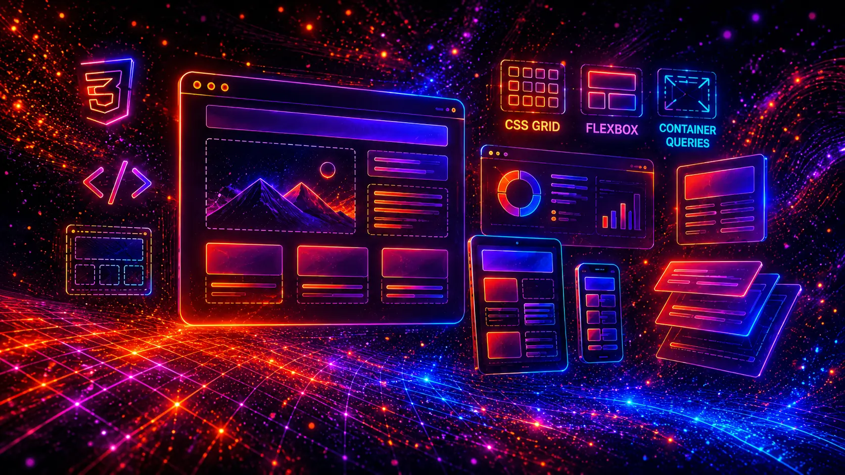
Modern CSS layouts are the foundation of every professional website. Before animations, hover effects, buttons, cards, and micro-interactions can work well, the page structure itself needs to be clean, responsive, flexible, and easy to maintain.
In modern web design, layout is no longer just about placing boxes on a page. A good CSS layout controls how users read content, how sections adapt to different screen sizes, how product cards behave inside grids, how sidebars respond on mobile, and how entire landing pages feel across devices.
In 2026, developers have more powerful layout tools than ever before. CSS Grid makes it easier to build complex two-dimensional structures, Flexbox remains perfect for alignment and one-directional layouts, and container queries allow components to respond to the size of their own container instead of only the browser viewport.
This means modern websites can be built with fewer hacks, fewer unnecessary wrappers, less JavaScript, and more reusable layout patterns. Whether you are building a landing page, blog, SaaS website, portfolio, WordPress theme, eCommerce store, or agency website, strong layout patterns make the entire project easier to scale.
In this guide, we showcase 25 modern CSS layouts for websites. These layouts include hero sections, split screens, feature grids, product grids, pricing tables, sidebars, dashboards, bento grids, footers, CTA sections, container query cards, and more.
Each layout is designed as a practical pattern that can be used in real-world projects. Instead of showing full websites, the examples focus on clean, reusable layout structures that you can copy, customize, and combine inside your own pages.
All examples are built with HTML and CSS, with a strong focus on responsive design, modern spacing, reusable structure, and clean code.

CSS layouts define how content is arranged on a webpage. They control the position, size, spacing, alignment, order, and responsiveness of page elements such as headers, hero sections, cards, sidebars, product grids, blog previews, forms, and footers.
A layout is not only a visual structure. It directly affects how users move through a website, how easily they understand the content, and how professional the page feels. A beautiful button or animation cannot fix a page that has poor spacing, broken alignment, confusing hierarchy, or bad mobile behavior.
Modern CSS layouts are usually built using a combination of CSS Grid, Flexbox, responsive units, media queries, container queries, and fluid spacing. These tools allow developers to build layouts that adapt naturally across desktop, tablet, and mobile screens.
Common CSS layout patterns include:
The goal of a strong layout is to make content easy to scan, visually balanced, and responsive without requiring excessive custom code for every screen size.
Modern websites need to work across many different screen sizes, devices, browsers, and content types. A layout that looks good only on a large desktop screen is no longer enough. Users expect a website to feel polished on mobile, tablet, laptop, and wide desktop screens.
This is why modern CSS layouts are so important. They provide the structure behind the entire user experience. When a layout is well designed, the page feels easier to read, easier to navigate, and more trustworthy.
Good layouts also help developers work faster. Instead of rebuilding every section from scratch, you can create reusable layout patterns: a hero layout, a feature grid, a product grid, a pricing layout, a CTA section, and a footer layout. These patterns can then be reused across different pages and projects.
Modern CSS layouts help with:
For blogs, layout affects how articles are discovered. For eCommerce websites, layout affects how products are compared and selected. For landing pages, layout affects how quickly visitors understand the offer and take action.
In short, layout is not just design. It is the system that holds the entire website together.
CSS Grid and Flexbox are the two most important layout systems in modern CSS. They are often used together, but they solve different problems.
CSS Grid is best for two-dimensional layouts. This means layouts that need to control both rows and columns at the same time. It is ideal for larger page structures such as product grids, blog grids, dashboard layouts, galleries, bento grids, and magazine-style layouts.
Flexbox is best for one-dimensional layouts. This means layouts that mainly flow in one direction: row or column. It is excellent for navigation menus, buttons, form groups, card content alignment, icon rows, pricing card actions, and small UI groups.
| Feature | CSS Grid | Flexbox |
|---|---|---|
| Main purpose | Two-dimensional layouts | One-dimensional alignment |
| Best for | Page sections, grids, dashboards, galleries | Navigation, buttons, card content, small UI groups |
| Controls | Rows and columns | Row or column flow |
| Common use | Product grid, blog grid, bento layout | Navbar, button group, vertical card content |
| Responsive strength | Excellent with minmax() and auto-fit | Excellent for flexible alignment |
A good rule is simple: use Grid for the larger structure and Flexbox for alignment inside components. For example, a product listing page may use CSS Grid to arrange product cards, while each product card uses Flexbox to align the title, price, rating, and button.
This combination gives you the best of both worlds: powerful page structure and clean component alignment.
Container queries allow elements to respond to the size of their parent container instead of only responding to the full browser viewport. This is one of the most important modern CSS features for reusable components.
Traditional responsive design relies heavily on media queries. Media queries check the width of the browser window. This works well for page-level changes, but it can be limiting when the same component appears in different places.
For example, a card may appear in a wide content area on one page and inside a narrow sidebar on another page. With only media queries, the card responds to the viewport width, not the actual space it has available. With container queries, the card can change based on its own container size.
This makes components more flexible and easier to reuse. A card can switch from a horizontal layout to a vertical layout when its container becomes narrow. A product block can adjust its image size, text spacing, or button placement based on the available space inside its parent section.
Container queries are especially useful for:
In this guide, one of the layout examples is dedicated specifically to a container query card layout, showing how a component can adapt based on the space around it.
Before looking at the layout examples, it is important to understand a few core responsive design principles. These principles make modern CSS layouts more reliable, easier to maintain, and better across different devices.
A mobile-first approach means designing the simplest layout first, then adding more complex structures for larger screens. This usually results in cleaner CSS and better mobile experiences.
For example, a three-column feature grid should usually start as a single column on mobile. Then it can become two columns on tablet and three columns on desktop.
Modern layouts should avoid too many fixed widths. Instead of forcing sections to be exactly 1200px or cards to be exactly 300px, use flexible values such as percentages, minmax(), max-width, and responsive units.
This helps layouts adapt naturally instead of breaking when content changes or screen sizes become smaller.
The gap property is one of the cleanest ways to control spacing inside Grid and Flexbox layouts. It keeps spacing consistent without requiring extra margin rules on every child element.
This is especially useful for card grids, navigation groups, form layouts, feature sections, and footer columns.
The clamp() function allows values to scale between a minimum and maximum size. This is useful for responsive headings, section spacing, card padding, and layout gaps.
Instead of creating many breakpoints, you can let spacing and font sizes scale smoothly between mobile and desktop sizes.
Most modern layouts can be built with CSS alone. JavaScript should usually be reserved for interaction, dynamic content, sliders, modals, tabs, filters, or behavior that CSS cannot handle cleanly.
Using CSS for layout keeps pages faster, simpler, and easier to maintain.
A layout may look perfect with short demo titles, but break when real content is added. Always test layouts with longer titles, different image ratios, longer descriptions, multiple buttons, and missing images.
This is especially important for WordPress, WooCommerce, blogs, and content-heavy websites where editors may add different types of content over time.
The following examples show practical layout patterns that can be used in real websites. Each layout is designed as a compact demo, but the structure can be expanded into a full website section.
These layouts are not just small visual effects. They are reusable building blocks for modern web pages, including landing pages, blogs, portfolios, dashboards, eCommerce stores, SaaS websites, and WordPress themes.
A responsive hero layout is one of the most common and important CSS layout patterns. It usually appears at the top of a landing page, homepage, SaaS website, product page, portfolio, or agency website.
This layout uses a two-column structure on larger screens: text content on one side and a visual element on the other. On smaller screens, the columns stack vertically so the content stays readable and mobile-friendly.
Create a flexible hero section with CSS Grid, fluid typography, strong spacing, and a mobile-first structure that adapts naturally across screen sizes.
<section class="layout-hero">

  <div class="layout-hero-inner">

    <div class="layout-hero-content">

      <div class="layout-hero-badge">Modern CSS Layout</div>

      <h1 class="layout-hero-title">
        Build cleaner <span>responsive websites</span>
      </h1>

      <p class="layout-hero-text">
        Create a flexible hero section with CSS Grid, fluid typography,
        strong spacing, and a mobile-first structure.
      </p>

      <div class="layout-hero-actions">
        <a href="#" class="layout-hero-btn layout-hero-btn-primary">Get Started</a>
        <a href="#" class="layout-hero-btn layout-hero-btn-secondary">View Examples</a>
      </div>

    </div>

    <div class="layout-hero-visual">

      <div class="layout-hero-card">

        <div class="layout-hero-card-top">
          <span class="layout-hero-dot"></span>
          <span class="layout-hero-dot"></span>
          <span class="layout-hero-dot"></span>
        </div>

        <div class="layout-hero-ui">
          <div class="layout-hero-ui-main"></div>
          <div class="layout-hero-ui-box"></div>
          <div class="layout-hero-ui-box"></div>
        </div>

      </div>

      <div class="layout-hero-float">Responsive Grid</div>

    </div>

  </div>

</section>
.layout-hero{
background:#020617;
border-radius:18px;
padding:28px;
overflow:hidden;
position:relative;
border:1px solid rgba(255,255,255,.08);
box-shadow:0 24px 70px rgba(15,23,42,.45);
}

.layout-hero::before{
content:"";
position:absolute;
inset:-120px;
background:
radial-gradient(circle at 20% 20%,rgba(34,211,238,.18),transparent 32%),
radial-gradient(circle at 80% 30%,rgba(168,85,247,.20),transparent 34%),
radial-gradient(circle at 50% 90%,rgba(99,102,241,.18),transparent 38%);
pointer-events:none;
}

.layout-hero-inner{
position:relative;
z-index:2;
display:grid;
grid-template-columns:minmax(0,1.05fr) minmax(280px,.95fr);
align-items:center;
gap:34px;
min-height:420px;
}

.layout-hero-content{
max-width:560px;
}

.layout-hero-badge{
display:inline-flex;
align-items:center;
gap:8px;
padding:8px 12px;
border-radius:999px;
background:rgba(34,211,238,.10);
border:1px solid rgba(34,211,238,.24);
color:#67e8f9;
font-size:13px;
font-weight:700;
letter-spacing:.03em;
text-transform:uppercase;
margin-bottom:18px;
}

.layout-hero-title{
margin:0 0 16px;
font-size:clamp(32px,5vw,58px);
line-height:1.02;
font-weight:900;
letter-spacing:-.04em;
color:#ffffff !important;
}

.layout-hero-title span{
background:linear-gradient(90deg,#22d3ee,#818cf8,#c084fc);
-webkit-background-clip:text;
background-clip:text;
color:transparent;
}

.layout-hero-text{
margin:0 0 24px;
font-size:17px;
line-height:1.7;
color:#cbd5e1;
max-width:520px;
}

.layout-hero-actions{
display:flex;
flex-wrap:wrap;
gap:12px;
align-items:center;
}

.layout-hero-btn{
display:inline-flex;
align-items:center;
justify-content:center;
min-height:46px;
padding:0 18px;
border-radius:12px;
font-size:15px;
font-weight:800;
text-decoration:none;
transition:transform .2s ease,box-shadow .2s ease,background .2s ease;
}

.layout-hero-btn-primary{
color:#020617;
background:linear-gradient(135deg,#22d3ee,#a78bfa);
box-shadow:0 14px 34px rgba(34,211,238,.24);
}

.layout-hero-btn-secondary{
color:#e2e8f0;
background:rgba(255,255,255,.07);
border:1px solid rgba(255,255,255,.12);
}

.layout-hero-btn:hover{
transform:translateY(-2px);
}

.layout-hero-visual{
position:relative;
min-height:330px;
display:flex;
align-items:center;
justify-content:center;
}

.layout-hero-card{
width:min(100%,430px);
border-radius:24px;
background:linear-gradient(180deg,rgba(255,255,255,.12),rgba(255,255,255,.05));
border:1px solid rgba(255,255,255,.12);
box-shadow:0 28px 80px rgba(0,0,0,.45);
padding:18px;
backdrop-filter:blur(14px);
}

.layout-hero-card-top{
display:flex;
gap:8px;
margin-bottom:18px;
}

.layout-hero-dot{
width:11px;
height:11px;
border-radius:999px;
background:#64748b;
}

.layout-hero-dot:nth-child(1){background:#ef4444;}
.layout-hero-dot:nth-child(2){background:#f59e0b;}
.layout-hero-dot:nth-child(3){background:#22c55e;}

.layout-hero-ui{
display:grid;
grid-template-columns:1fr 1fr;
gap:14px;
}

.layout-hero-ui-main{
grid-column:1 / -1;
height:120px;
border-radius:18px;
background:
linear-gradient(135deg,rgba(34,211,238,.22),rgba(99,102,241,.18)),
linear-gradient(180deg,rgba(255,255,255,.08),rgba(255,255,255,.03));
border:1px solid rgba(255,255,255,.10);
position:relative;
overflow:hidden;
}

.layout-hero-ui-main::after{
content:"";
position:absolute;
left:20px;
right:20px;
bottom:20px;
height:12px;
border-radius:999px;
background:linear-gradient(90deg,#22d3ee,#818cf8,#c084fc);
box-shadow:0 0 24px rgba(34,211,238,.45);
}

.layout-hero-ui-box{
height:92px;
border-radius:16px;
background:rgba(255,255,255,.07);
border:1px solid rgba(255,255,255,.09);
position:relative;
overflow:hidden;
}

.layout-hero-ui-box::before{
content:"";
position:absolute;
left:16px;
top:16px;
width:52%;
height:10px;
border-radius:999px;
background:rgba(255,255,255,.28);
}

.layout-hero-ui-box::after{
content:"";
position:absolute;
left:16px;
top:38px;
width:74%;
height:8px;
border-radius:999px;
background:rgba(148,163,184,.28);
}

.layout-hero-float{
position:absolute;
right:6px;
bottom:18px;
width:118px;
padding:14px;
border-radius:18px;
background:linear-gradient(135deg,rgba(34,211,238,.95),rgba(99,102,241,.95));
box-shadow:0 18px 50px rgba(34,211,238,.25);
color:#fff;
font-size:13px;
font-weight:800;
text-align:center;
}

@media (max-width: 760px){
.layout-hero{
padding:20px;
}

.layout-hero-inner{
grid-template-columns:1fr;
gap:26px;
min-height:auto;
}

.layout-hero-title{
font-size:36px;
}

.layout-hero-text{
font-size:16px;
}

.layout-hero-actions{
align-items:stretch;
}

.layout-hero-btn{
width:100%;
}

.layout-hero-visual{
min-height:280px;
}

.layout-hero-card{
border-radius:20px;
}

.layout-hero-float{
right:14px;
bottom:4px;
}
}
This hero layout is a strong starting point for modern websites because it creates a clear visual hierarchy immediately. The text explains the offer, the buttons guide the user toward action, and the visual column adds depth without making the layout too complex.
Use this layout for homepages, product landing pages, service pages, SaaS websites, portfolio intros, or any page where the first screen needs to communicate value quickly.
A split screen layout divides a section into two strong visual areas. It is a modern CSS layout pattern often used for landing pages, product introductions, portfolio sections, service pages, app showcases, and high-impact homepage sections.
The main advantage of a split screen layout is balance. One side can focus on strong messaging, while the other side can show an image, product preview, feature card, video placeholder, or visual design element. On mobile screens, the two sides stack vertically so the layout remains readable and easy to use.
Use a split screen layout to balance strong copy with a visual preview, product mockup, image, or feature card. The structure stays clear on desktop and stacks naturally on mobile.
<section class="layout-split">

  <div class="layout-split-inner">

    <div class="layout-split-panel layout-split-left">

      <div class="layout-split-kicker">Split Screen</div>

      <h2 class="layout-split-title">
        Design bold <span>two-column sections</span>
      </h2>

      <p class="layout-split-text">
        Use a split screen layout to balance strong copy with a visual preview,
        product mockup, image, or feature card.
      </p>

      <div class="layout-split-actions">
        <a href="#" class="layout-split-btn layout-split-btn-primary">Explore Layout</a>
        <a href="#" class="layout-split-btn layout-split-btn-secondary">View Code</a>
      </div>

    </div>

    <div class="layout-split-panel layout-split-right">

      <div class="layout-split-visual">

        <div class="layout-split-orbit"></div>

        <div class="layout-split-device">

          <div class="layout-split-device-header">
            <span class="layout-split-dot"></span>
            <span class="layout-split-dot"></span>
            <span class="layout-split-dot"></span>
          </div>

          <div class="layout-split-screen">

            <div class="layout-split-screen-main"></div>

            <div class="layout-split-mini-grid">
              <div class="layout-split-mini"></div>
              <div class="layout-split-mini"></div>
            </div>

          </div>

        </div>

        <div class="layout-split-label">50 / 50 Layout</div>

      </div>

    </div>

  </div>

</section>
.layout-split{
background:#020617;
border-radius:18px;
padding:28px;
overflow:hidden;
position:relative;
border:1px solid rgba(255,255,255,.08);
box-shadow:0 24px 70px rgba(15,23,42,.45);
}

.layout-split::before{
content:"";
position:absolute;
inset:-120px;
background:
radial-gradient(circle at 12% 30%,rgba(34,211,238,.20),transparent 34%),
radial-gradient(circle at 88% 28%,rgba(249,115,22,.18),transparent 32%),
radial-gradient(circle at 70% 92%,rgba(168,85,247,.18),transparent 38%);
pointer-events:none;
}

.layout-split-inner{
position:relative;
z-index:2;
display:grid;
grid-template-columns:1fr 1fr;
min-height:430px;
border-radius:22px;
overflow:hidden;
border:1px solid rgba(255,255,255,.10);
background:rgba(255,255,255,.04);
}

.layout-split-panel{
position:relative;
padding:clamp(28px,5vw,56px);
display:flex;
flex-direction:column;
justify-content:center;
overflow:hidden;
}

.layout-split-left{
background:
linear-gradient(135deg,rgba(15,23,42,.96),rgba(30,41,59,.88));
}

.layout-split-right{
background:
linear-gradient(135deg,rgba(34,211,238,.16),rgba(99,102,241,.14),rgba(168,85,247,.18));
align-items:center;
text-align:center;
}

.layout-split-kicker{
display:inline-flex;
align-items:center;
width:max-content;
padding:8px 12px;
border-radius:999px;
background:rgba(249,115,22,.12);
border:1px solid rgba(249,115,22,.28);
color:#fdba74;
font-size:13px;
font-weight:800;
letter-spacing:.04em;
text-transform:uppercase;
margin-bottom:18px;
}

.layout-split-title{
margin:0 0 16px;
font-size:clamp(32px,5vw,56px);
line-height:1.03;
font-weight:900;
letter-spacing:-.04em;
color:#ffffff !important;
-webkit-text-fill-color:#ffffff !important;
}

.layout-split-title span{
background:linear-gradient(90deg,#fb923c,#22d3ee,#a78bfa) !important;
-webkit-background-clip:text !important;
background-clip:text !important;
color:transparent !important;
-webkit-text-fill-color:transparent !important;
}

.layout-split-text{
margin:0 0 26px;
font-size:17px;
line-height:1.7;
color:#cbd5e1;
max-width:520px;
}

.layout-split-actions{
display:flex;
flex-wrap:wrap;
gap:12px;
}

.layout-split-btn{
display:inline-flex;
align-items:center;
justify-content:center;
min-height:46px;
padding:0 18px;
border-radius:12px;
font-size:15px;
font-weight:800;
text-decoration:none;
transition:transform .2s ease,box-shadow .2s ease;
}

.layout-split-btn-primary{
color:#020617;
background:linear-gradient(135deg,#fb923c,#22d3ee);
box-shadow:0 14px 34px rgba(251,146,60,.22);
}

.layout-split-btn-secondary{
color:#e2e8f0;
background:rgba(255,255,255,.07);
border:1px solid rgba(255,255,255,.12);
}

.layout-split-btn:hover{
transform:translateY(-2px);
}

.layout-split-visual{
width:min(100%,360px);
position:relative;
}

.layout-split-orbit{
position:absolute;
inset:-36px;
border-radius:999px;
background:
radial-gradient(circle,rgba(34,211,238,.22),transparent 58%);
filter:blur(2px);
}

.layout-split-device{
position:relative;
z-index:2;
padding:18px;
border-radius:30px;
background:linear-gradient(180deg,rgba(255,255,255,.14),rgba(255,255,255,.05));
border:1px solid rgba(255,255,255,.14);
box-shadow:0 30px 90px rgba(0,0,0,.42);
backdrop-filter:blur(16px);
}

.layout-split-device-header{
height:38px;
border-radius:16px;
background:rgba(2,6,23,.72);
border:1px solid rgba(255,255,255,.08);
margin-bottom:14px;
display:flex;
align-items:center;
gap:7px;
padding:0 12px;
}

.layout-split-dot{
width:9px;
height:9px;
border-radius:999px;
background:#64748b;
}

.layout-split-dot:nth-child(1){background:#ef4444;}
.layout-split-dot:nth-child(2){background:#f59e0b;}
.layout-split-dot:nth-child(3){background:#22c55e;}

.layout-split-screen{
display:grid;
gap:12px;
}

.layout-split-screen-main{
height:150px;
border-radius:20px;
background:
linear-gradient(135deg,rgba(34,211,238,.28),rgba(168,85,247,.24)),
linear-gradient(180deg,rgba(255,255,255,.09),rgba(255,255,255,.04));
border:1px solid rgba(255,255,255,.12);
position:relative;
overflow:hidden;
}

.layout-split-screen-main::before{
content:"";
position:absolute;
width:120px;
height:120px;
border-radius:999px;
right:-28px;
top:-28px;
background:rgba(251,146,60,.28);
}

.layout-split-screen-main::after{
content:"";
position:absolute;
left:18px;
right:18px;
bottom:18px;
height:12px;
border-radius:999px;
background:linear-gradient(90deg,#fb923c,#22d3ee,#a78bfa);
box-shadow:0 0 24px rgba(34,211,238,.45);
}

.layout-split-mini-grid{
display:grid;
grid-template-columns:1fr 1fr;
gap:12px;
}

.layout-split-mini{
height:82px;
border-radius:16px;
background:rgba(255,255,255,.08);
border:1px solid rgba(255,255,255,.10);
position:relative;
overflow:hidden;
}

.layout-split-mini::before{
content:"";
position:absolute;
left:14px;
top:16px;
width:56%;
height:9px;
border-radius:999px;
background:rgba(255,255,255,.30);
}

.layout-split-mini::after{
content:"";
position:absolute;
left:14px;
top:38px;
width:76%;
height:8px;
border-radius:999px;
background:rgba(148,163,184,.30);
}

.layout-split-label{
position:absolute;
right:-8px;
top:34px;
z-index:4;
padding:12px 14px;
border-radius:16px;
background:linear-gradient(135deg,#fb923c,#a855f7);
box-shadow:0 18px 50px rgba(168,85,247,.28);
color:#ffffff;
font-size:13px;
font-weight:900;
}

@media (max-width: 800px){
.layout-split{
padding:20px;
}

.layout-split-inner{
grid-template-columns:1fr;
}

.layout-split-panel{
padding:28px;
}

.layout-split-title{
font-size:36px;
}

.layout-split-text{
font-size:16px;
}

.layout-split-actions{
align-items:stretch;
}

.layout-split-btn{
width:100%;
}

.layout-split-right{
min-height:330px;
}

.layout-split-label{
right:10px;
top:22px;
}
}
This split screen layout is useful when you want to create a strong visual contrast between content and design. It keeps the message focused on one side while the other side supports the page with a visual element, product preview, illustration, or UI mockup.
Use this layout for modern landing pages, product introductions, portfolio sections, service pages, SaaS websites, app showcases, and campaign pages where the first impression needs to feel bold and structured.
A feature grid layout is one of the most useful CSS layout patterns for modern websites. It allows you to present services, product benefits, app features, process steps, or key selling points in a clean and scannable grid.
This layout uses CSS Grid to create responsive feature cards that automatically adapt across screen sizes. On desktop, the cards appear in a balanced multi-column layout. On mobile, they stack vertically for better readability and touch-friendly spacing.
Use a feature grid layout to organize important benefits, services, or product features into clean cards that are easy to scan on every screen size.
Build clean sections with CSS Grid and reusable card structures.
Cards adapt from three columns to two columns and finally one column.
Consistent gaps and padding create a balanced, professional layout.
The same layout can be used for services, features, steps, or benefits.
The full layout is handled with HTML and CSS only.
Subtle gradients, borders, and hover effects create a premium visual feel.
<section class="layout-feature">

  <div class="layout-feature-inner">

    <div class="layout-feature-header">

      <div class="layout-feature-kicker">Feature Grid</div>

      <h2 class="layout-feature-title">
        Show key benefits in a <span>responsive grid</span>
      </h2>

      <p class="layout-feature-text">
        Use a feature grid layout to organize important benefits,
        services, or product features into clean cards.
      </p>

    </div>

    <div class="layout-feature-grid">

      <div class="layout-feature-card">
        <div class="layout-feature-icon">01</div>
        <h3>Fast Layout</h3>
        <p>Build clean sections with CSS Grid and reusable card structures.</p>
        <div class="layout-feature-number">01</div>
      </div>

      <div class="layout-feature-card">
        <div class="layout-feature-icon">02</div>
        <h3>Responsive Cards</h3>
        <p>Cards adapt from three columns to two columns and finally one column.</p>
        <div class="layout-feature-number">02</div>
      </div>

      <div class="layout-feature-card">
        <div class="layout-feature-icon">03</div>
        <h3>Clean Spacing</h3>
        <p>Consistent gaps and padding create a balanced, professional layout.</p>
        <div class="layout-feature-number">03</div>
      </div>

      <div class="layout-feature-card">
        <div class="layout-feature-icon">04</div>
        <h3>Reusable Design</h3>
        <p>The same layout can be used for services, features, steps, or benefits.</p>
        <div class="layout-feature-number">04</div>
      </div>

      <div class="layout-feature-card">
        <div class="layout-feature-icon">05</div>
        <h3>No JavaScript</h3>
        <p>The full layout is handled with HTML and CSS only.</p>
        <div class="layout-feature-number">05</div>
      </div>

      <div class="layout-feature-card">
        <div class="layout-feature-icon">06</div>
        <h3>Modern UI</h3>
        <p>Subtle gradients, borders, and hover effects create a premium visual feel.</p>
        <div class="layout-feature-number">06</div>
      </div>

    </div>

  </div>

</section>
.layout-feature{
background:#020617;
border-radius:18px;
padding:28px;
overflow:hidden;
position:relative;
border:1px solid rgba(255,255,255,.08);
box-shadow:0 24px 70px rgba(15,23,42,.45);
}

.layout-feature::before{
content:"";
position:absolute;
inset:-120px;
background:
radial-gradient(circle at 20% 15%,rgba(34,211,238,.18),transparent 34%),
radial-gradient(circle at 82% 20%,rgba(168,85,247,.20),transparent 35%),
radial-gradient(circle at 50% 100%,rgba(34,197,94,.14),transparent 38%);
pointer-events:none;
}

.layout-feature-inner{
position:relative;
z-index:2;
}

.layout-feature-header{
max-width:760px;
margin:0 auto 34px;
text-align:center;
}

.layout-feature-kicker{
display:inline-flex;
align-items:center;
justify-content:center;
padding:8px 12px;
border-radius:999px;
background:rgba(34,197,94,.10);
border:1px solid rgba(34,197,94,.26);
color:#86efac;
font-size:13px;
font-weight:800;
letter-spacing:.04em;
text-transform:uppercase;
margin-bottom:18px;
}

.layout-feature-title{
margin:0 0 16px;
font-size:clamp(32px,5vw,54px);
line-height:1.05;
font-weight:900;
letter-spacing:-.04em;
color:#ffffff !important;
-webkit-text-fill-color:#ffffff !important;
}

.layout-feature-title span{
background:linear-gradient(90deg,#22c55e,#22d3ee,#a78bfa) !important;
-webkit-background-clip:text !important;
background-clip:text !important;
color:transparent !important;
-webkit-text-fill-color:transparent !important;
}

.layout-feature-text{
margin:0 auto;
font-size:17px;
line-height:1.7;
color:#cbd5e1;
max-width:680px;
}

.layout-feature-grid{
display:grid;
grid-template-columns:repeat(3,minmax(0,1fr));
gap:18px;
}

.layout-feature-card{
position:relative;
min-height:220px;
padding:24px;
border-radius:22px;
background:linear-gradient(180deg,rgba(255,255,255,.10),rgba(255,255,255,.04));
border:1px solid rgba(255,255,255,.11);
box-shadow:0 24px 70px rgba(0,0,0,.32);
overflow:hidden;
transition:transform .25s ease,border-color .25s ease,background .25s ease;
}

.layout-feature-card::before{
content:"";
position:absolute;
right:-40px;
top:-40px;
width:130px;
height:130px;
border-radius:999px;
background:rgba(34,211,238,.14);
filter:blur(2px);
}

.layout-feature-card:nth-child(2)::before{
background:rgba(168,85,247,.16);
}

.layout-feature-card:nth-child(3)::before{
background:rgba(34,197,94,.14);
}

.layout-feature-card:nth-child(4)::before{
background:rgba(251,146,60,.15);
}

.layout-feature-card:nth-child(5)::before{
background:rgba(99,102,241,.18);
}

.layout-feature-card:nth-child(6)::before{
background:rgba(236,72,153,.14);
}

.layout-feature-card:hover{
transform:translateY(-5px);
border-color:rgba(34,211,238,.26);
background:linear-gradient(180deg,rgba(255,255,255,.13),rgba(255,255,255,.055));
}

.layout-feature-icon{
position:relative;
z-index:2;
width:48px;
height:48px;
border-radius:16px;
display:flex;
align-items:center;
justify-content:center;
margin-bottom:18px;
background:linear-gradient(135deg,#22d3ee,#6366f1);
box-shadow:0 16px 36px rgba(34,211,238,.22);
color:#ffffff;
font-size:22px;
font-weight:900;
}

.layout-feature-card:nth-child(2) .layout-feature-icon{
background:linear-gradient(135deg,#a855f7,#6366f1);
}

.layout-feature-card:nth-child(3) .layout-feature-icon{
background:linear-gradient(135deg,#22c55e,#22d3ee);
}

.layout-feature-card:nth-child(4) .layout-feature-icon{
background:linear-gradient(135deg,#fb923c,#ef4444);
}

.layout-feature-card:nth-child(5) .layout-feature-icon{
background:linear-gradient(135deg,#818cf8,#22d3ee);
}

.layout-feature-card:nth-child(6) .layout-feature-icon{
background:linear-gradient(135deg,#ec4899,#a855f7);
}

.layout-feature-card h3{
position:relative;
z-index:2;
margin:0 0 10px;
font-size:21px;
line-height:1.25;
font-weight:900;
letter-spacing:-.02em;
color:#ffffff !important;
-webkit-text-fill-color:#ffffff !important;
}

.layout-feature-card p{
position:relative;
z-index:2;
margin:0;
font-size:15px;
line-height:1.7;
color:#cbd5e1;
}

.layout-feature-number{
position:absolute;
right:18px;
bottom:12px;
font-size:54px;
line-height:1;
font-weight:900;
letter-spacing:-.08em;
color:rgba(255,255,255,.045);
}

@media (max-width: 900px){
.layout-feature-grid{
grid-template-columns:repeat(2,minmax(0,1fr));
}

.layout-feature-title{
font-size:38px;
}
}

@media (max-width: 620px){
.layout-feature{
padding:20px;
}

.layout-feature-header{
text-align:left;
margin-bottom:24px;
}

.layout-feature-grid{
grid-template-columns:1fr;
gap:14px;
}

.layout-feature-card{
min-height:auto;
padding:22px;
}

.layout-feature-title{
font-size:34px;
}

.layout-feature-text{
font-size:16px;
}
}
This feature grid layout is useful when you need to present multiple benefits or content blocks without overwhelming the visitor. The grid gives every item equal visual importance, while the card styling keeps the section modern and easy to scan.
Use this layout for service sections, SaaS feature lists, product benefits, WordPress theme sections, agency websites, onboarding steps, homepage blocks, and any page where multiple key points need to be displayed clearly.
An auto-fit card grid is one of the most practical modern CSS layout patterns. It allows cards to automatically resize and wrap based on the available space, without writing many custom breakpoints.
This layout uses repeat(auto-fit, minmax()) to create a flexible grid that works well for service cards, blog cards, product cards, portfolio items, feature blocks, and reusable WordPress sections. The browser decides how many cards can fit in each row, making the layout clean and responsive by default.
repeat(auto-fit, minmax()) for responsive behaviorUse an auto-fit card grid when you want responsive cards that fill available space naturally without writing many custom breakpoints.
The grid automatically creates as many columns as can fit inside the available width.
You can create responsive card layouts without writing breakpoints for every screen size.
The same grid works for services, posts, products, features, portfolios, and resources.
Cards grow and shrink naturally while maintaining a readable minimum width.
On smaller screens, cards wrap into fewer columns and eventually a single-column layout.
This is one of the most useful layout techniques for modern responsive websites.
<section class="layout-autofit">

  <div class="layout-autofit-inner">

    <div class="layout-autofit-header">

      <div class="layout-autofit-heading">

        <div class="layout-autofit-kicker">Auto-Fit Grid</div>

        <h2 class="layout-autofit-title">
          Cards that <span>adapt automatically</span>
        </h2>

        <p class="layout-autofit-text">
          Use an auto-fit card grid when you want responsive cards that fill
          available space naturally without writing many custom breakpoints.
        </p>

      </div>

      <div class="layout-autofit-pill">repeat(auto-fit, minmax())</div>

    </div>

    <div class="layout-autofit-grid">

      <div class="layout-autofit-card">
        <div class="layout-autofit-icon">01</div>
        <h3>Flexible Columns</h3>
        <p>The grid automatically creates as many columns as can fit inside the available width.</p>
        <div class="layout-autofit-tag">Grid</div>
      </div>

      <div class="layout-autofit-card">
        <div class="layout-autofit-icon">02</div>
        <h3>Less CSS</h3>
        <p>You can create responsive card layouts without writing breakpoints for every screen size.</p>
        <div class="layout-autofit-tag">Clean</div>
      </div>

      <div class="layout-autofit-card">
        <div class="layout-autofit-icon">03</div>
        <h3>Reusable Cards</h3>
        <p>The same grid works for services, posts, products, features, portfolios, and resources.</p>
        <div class="layout-autofit-tag">Reusable</div>
      </div>

      <div class="layout-autofit-card">
        <div class="layout-autofit-icon">04</div>
        <h3>Fluid Layout</h3>
        <p>Cards grow and shrink naturally while maintaining a readable minimum width.</p>
        <div class="layout-autofit-tag">Fluid</div>
      </div>

      <div class="layout-autofit-card">
        <div class="layout-autofit-icon">05</div>
        <h3>Mobile Friendly</h3>
        <p>On smaller screens, cards wrap into fewer columns and eventually a single-column layout.</p>
        <div class="layout-autofit-tag">Mobile</div>
      </div>

      <div class="layout-autofit-card">
        <div class="layout-autofit-icon">06</div>
        <h3>Modern Pattern</h3>
        <p>This is one of the most useful layout techniques for modern responsive websites.</p>
        <div class="layout-autofit-tag">2026</div>
      </div>

    </div>

  </div>

</section>
.layout-autofit{
background:#020617;
border-radius:18px;
padding:28px;
overflow:hidden;
position:relative;
border:1px solid rgba(255,255,255,.08);
box-shadow:0 24px 70px rgba(15,23,42,.45);
}

.layout-autofit::before{
content:"";
position:absolute;
inset:-120px;
background:
radial-gradient(circle at 16% 18%,rgba(14,165,233,.20),transparent 34%),
radial-gradient(circle at 84% 24%,rgba(168,85,247,.18),transparent 34%),
radial-gradient(circle at 52% 100%,rgba(245,158,11,.14),transparent 38%);
pointer-events:none;
}

.layout-autofit-inner{
position:relative;
z-index:2;
}

.layout-autofit-header{
display:flex;
align-items:flex-end;
justify-content:space-between;
gap:24px;
margin-bottom:28px;
}

.layout-autofit-heading{
max-width:720px;
}

.layout-autofit-kicker{
display:inline-flex;
align-items:center;
justify-content:center;
padding:8px 12px;
border-radius:999px;
background:rgba(14,165,233,.11);
border:1px solid rgba(14,165,233,.28);
color:#7dd3fc;
font-size:13px;
font-weight:800;
letter-spacing:.04em;
text-transform:uppercase;
margin-bottom:18px;
}

.layout-autofit-title{
margin:0 0 14px;
font-size:clamp(32px,5vw,54px);
line-height:1.05;
font-weight:900;
letter-spacing:-.04em;
color:#ffffff !important;
-webkit-text-fill-color:#ffffff !important;
}

.layout-autofit-title span{
background:linear-gradient(90deg,#38bdf8,#a78bfa,#fbbf24) !important;
-webkit-background-clip:text !important;
background-clip:text !important;
color:transparent !important;
-webkit-text-fill-color:transparent !important;
}

.layout-autofit-text{
margin:0;
font-size:17px;
line-height:1.7;
color:#cbd5e1;
max-width:680px;
}

.layout-autofit-pill{
flex:0 0 auto;
display:inline-flex;
align-items:center;
justify-content:center;
padding:12px 14px;
border-radius:16px;
background:rgba(255,255,255,.07);
border:1px solid rgba(255,255,255,.12);
color:#e2e8f0;
font-size:13px;
font-weight:900;
box-shadow:0 16px 40px rgba(0,0,0,.25);
}

.layout-autofit-grid{
display:grid;
grid-template-columns:repeat(auto-fit,minmax(190px,1fr));
gap:16px;
}

.layout-autofit-card{
position:relative;
min-height:190px;
padding:22px;
border-radius:22px;
background:linear-gradient(180deg,rgba(255,255,255,.10),rgba(255,255,255,.04));
border:1px solid rgba(255,255,255,.11);
box-shadow:0 22px 60px rgba(0,0,0,.30);
overflow:hidden;
transition:transform .25s ease,border-color .25s ease,background .25s ease;
}

.layout-autofit-card::before{
content:"";
position:absolute;
right:-36px;
top:-36px;
width:118px;
height:118px;
border-radius:999px;
background:rgba(56,189,248,.16);
filter:blur(2px);
}

.layout-autofit-card:nth-child(2)::before{
background:rgba(168,85,247,.17);
}

.layout-autofit-card:nth-child(3)::before{
background:rgba(245,158,11,.16);
}

.layout-autofit-card:nth-child(4)::before{
background:rgba(34,197,94,.15);
}

.layout-autofit-card:nth-child(5)::before{
background:rgba(236,72,153,.15);
}

.layout-autofit-card:nth-child(6)::before{
background:rgba(99,102,241,.18);
}

.layout-autofit-card:hover{
transform:translateY(-5px);
border-color:rgba(56,189,248,.28);
background:linear-gradient(180deg,rgba(255,255,255,.13),rgba(255,255,255,.055));
}

.layout-autofit-icon{
position:relative;
z-index:2;
width:46px;
height:46px;
border-radius:16px;
display:flex;
align-items:center;
justify-content:center;
margin-bottom:18px;
background:linear-gradient(135deg,#38bdf8,#6366f1);
box-shadow:0 16px 36px rgba(56,189,248,.22);
color:#ffffff;
font-size:20px;
font-weight:900;
}

.layout-autofit-card:nth-child(2) .layout-autofit-icon{
background:linear-gradient(135deg,#a855f7,#6366f1);
}

.layout-autofit-card:nth-child(3) .layout-autofit-icon{
background:linear-gradient(135deg,#f59e0b,#fb7185);
}

.layout-autofit-card:nth-child(4) .layout-autofit-icon{
background:linear-gradient(135deg,#22c55e,#14b8a6);
}

.layout-autofit-card:nth-child(5) .layout-autofit-icon{
background:linear-gradient(135deg,#ec4899,#a855f7);
}

.layout-autofit-card:nth-child(6) .layout-autofit-icon{
background:linear-gradient(135deg,#818cf8,#38bdf8);
}

.layout-autofit-card h3{
position:relative;
z-index:2;
margin:0 0 10px;
font-size:20px;
line-height:1.25;
font-weight:900;
letter-spacing:-.02em;
color:#ffffff !important;
-webkit-text-fill-color:#ffffff !important;
}

.layout-autofit-card p{
position:relative;
z-index:2;
margin:0;
font-size:15px;
line-height:1.65;
color:#cbd5e1;
}

.layout-autofit-tag{
position:absolute;
right:16px;
bottom:14px;
z-index:2;
padding:7px 9px;
border-radius:999px;
background:rgba(255,255,255,.07);
border:1px solid rgba(255,255,255,.10);
color:#94a3b8;
font-size:11px;
font-weight:900;
letter-spacing:.04em;
text-transform:uppercase;
}

@media (max-width: 760px){
.layout-autofit{
padding:20px;
}

.layout-autofit-header{
display:block;
margin-bottom:24px;
}

.layout-autofit-title{
font-size:34px;
}

.layout-autofit-text{
font-size:16px;
}

.layout-autofit-pill{
margin-top:18px;
width:100%;
box-sizing:border-box;
}

.layout-autofit-grid{
grid-template-columns:repeat(auto-fit,minmax(220px,1fr));
gap:14px;
}

.layout-autofit-card{
min-height:auto;
padding:22px;
}
}
This auto-fit card grid is one of the most reusable CSS layout patterns because it adapts to the available space automatically. Instead of defining exact columns for every screen size, the grid uses a minimum card width and lets the browser calculate how many cards fit in each row.
Use this layout for service cards, blog previews, product cards, feature sections, portfolio items, resource grids, WordPress blocks, and any content section where the number of cards may change over time.
A blog post grid layout is a clean and practical CSS layout pattern for displaying articles, tutorials, news posts, guides, or resources. It helps visitors scan multiple posts quickly while keeping each article preview visually balanced.
This layout uses CSS Grid to place blog cards in a responsive structure. Each card includes a visual thumbnail area, category label, title, short excerpt, meta information, and a read more link. On smaller screens, the grid automatically stacks into a single column for better readability.
Use a blog post grid layout to organize articles, tutorials, guides, or resources into readable cards with strong hierarchy and responsive spacing.
Learn how CSS Grid, Flexbox, and modern spacing patterns help create cleaner website structures.
Read articleCreate flexible article cards that stay readable across different devices and screen sizes.
Read articleUse consistent gaps, readable line lengths, and clear visual hierarchy for content-heavy pages.
Read articleUse Flexbox to align category labels, dates, reading time, and small article details.
Read article<section class="layout-bloggrid">
<div class="layout-bloggrid-inner">
<div class="layout-bloggrid-header">
<div>
<div class="layout-bloggrid-kicker">Blog Grid</div>
<h2 class="layout-bloggrid-title">
Display articles in a <span>clean content grid</span>
</h2>
<p class="layout-bloggrid-text">
Use a blog post grid layout to organize articles, tutorials,
guides, or resources into readable cards.
</p>
</div>
<div class="layout-bloggrid-filter">
<span>All</span>
<span>CSS</span>
<span>UI</span>
<span>Guides</span>
</div>
</div>
<div class="layout-bloggrid-grid">
<article class="layout-bloggrid-card layout-bloggrid-featured">
<div class="layout-bloggrid-thumb">
<div class="layout-bloggrid-category">Featured</div>
</div>
<div class="layout-bloggrid-content">
<div class="layout-bloggrid-meta">
<span>CSS</span>
<span>8 min read</span>
</div>
<h3>Modern Layout Systems for Responsive Websites</h3>
<p>
Learn how CSS Grid, Flexbox, and modern spacing patterns help
create cleaner website structures.
</p>
<a href="#" class="layout-bloggrid-link">Read article</a>
</div>
</article>
<article class="layout-bloggrid-card">
<div class="layout-bloggrid-thumb">
<div class="layout-bloggrid-category">Tutorial</div>
</div>
<div class="layout-bloggrid-content">
<div class="layout-bloggrid-meta">
<span>Grid</span>
<span>5 min read</span>
</div>
<h3>Build Better Card Layouts</h3>
<p>
Create flexible article cards that stay readable across different
devices and screen sizes.
</p>
<a href="#" class="layout-bloggrid-link">Read article</a>
</div>
</article>
<article class="layout-bloggrid-card">
<div class="layout-bloggrid-thumb">
<div class="layout-bloggrid-category">Design</div>
</div>
<div class="layout-bloggrid-content">
<div class="layout-bloggrid-meta">
<span>UX</span>
<span>6 min read</span>
</div>
<h3>Spacing Rules for Blog Pages</h3>
<p>
Use consistent gaps, readable line lengths, and clear visual
hierarchy for content-heavy pages.
</p>
<a href="#" class="layout-bloggrid-link">Read article</a>
</div>
</article>
<article class="layout-bloggrid-card">
<div class="layout-bloggrid-thumb">
<div class="layout-bloggrid-category">CSS</div>
</div>
<div class="layout-bloggrid-content">
<div class="layout-bloggrid-meta">
<span>Flexbox</span>
<span>4 min read</span>
</div>
<h3>Responsive Meta Rows</h3>
<p>
Use Flexbox to align category labels, dates, reading time,
and small article details.
</p>
<a href="#" class="layout-bloggrid-link">Read article</a>
</div>
</article>
</div>
</div>
</section>
.layout-bloggrid{
background:#020617;
border-radius:18px;
padding:28px;
overflow:hidden;
position:relative;
border:1px solid rgba(255,255,255,.08);
box-shadow:0 24px 70px rgba(15,23,42,.45);
}

.layout-bloggrid::before{
content:"";
position:absolute;
inset:-120px;
background:
radial-gradient(circle at 18% 18%,rgba(59,130,246,.18),transparent 34%),
radial-gradient(circle at 84% 22%,rgba(236,72,153,.18),transparent 34%),
radial-gradient(circle at 52% 100%,rgba(34,211,238,.14),transparent 38%);
pointer-events:none;
}

.layout-bloggrid-inner{
position:relative;
z-index:2;
}

.layout-bloggrid-header{
display:grid;
grid-template-columns:minmax(0,1fr) auto;
align-items:end;
gap:24px;
margin-bottom:28px;
}

.layout-bloggrid-kicker{
display:inline-flex;
align-items:center;
justify-content:center;
padding:8px 12px;
border-radius:999px;
background:rgba(236,72,153,.10);
border:1px solid rgba(236,72,153,.28);
color:#f9a8d4;
font-size:13px;
font-weight:800;
letter-spacing:.04em;
text-transform:uppercase;
margin-bottom:18px;
}

.layout-bloggrid-title{
margin:0 0 14px;
font-size:clamp(32px,5vw,54px);
line-height:1.05;
font-weight:900;
letter-spacing:-.04em;
color:#ffffff !important;
-webkit-text-fill-color:#ffffff !important;
}

.layout-bloggrid-title span{
background:linear-gradient(90deg,#60a5fa,#f472b6,#22d3ee) !important;
-webkit-background-clip:text !important;
background-clip:text !important;
color:transparent !important;
-webkit-text-fill-color:transparent !important;
}

.layout-bloggrid-text{
margin:0;
font-size:17px;
line-height:1.7;
color:#cbd5e1;
max-width:720px;
}

.layout-bloggrid-filter{
display:flex;
align-items:center;
gap:8px;
padding:10px;
border-radius:18px;
background:rgba(255,255,255,.06);
border:1px solid rgba(255,255,255,.10);
box-shadow:0 16px 40px rgba(0,0,0,.24);
}

.layout-bloggrid-filter span{
display:inline-flex;
align-items:center;
justify-content:center;
height:34px;
padding:0 12px;
border-radius:999px;
font-size:12px;
font-weight:900;
color:#cbd5e1;
background:rgba(255,255,255,.06);
}

.layout-bloggrid-filter span:first-child{
color:#020617;
background:linear-gradient(135deg,#60a5fa,#f472b6);
}

.layout-bloggrid-grid{
display:grid;
grid-template-columns:repeat(3,minmax(0,1fr));
gap:18px;
}

.layout-bloggrid-card{
position:relative;
border-radius:24px;
background:linear-gradient(180deg,rgba(255,255,255,.10),rgba(255,255,255,.04));
border:1px solid rgba(255,255,255,.11);
box-shadow:0 24px 70px rgba(0,0,0,.32);
overflow:hidden;
transition:transform .25s ease,border-color .25s ease,background .25s ease;
}

.layout-bloggrid-card:hover{
transform:translateY(-5px);
border-color:rgba(96,165,250,.30);
background:linear-gradient(180deg,rgba(255,255,255,.13),rgba(255,255,255,.055));
}

.layout-bloggrid-thumb{
height:170px;
position:relative;
overflow:hidden;
background:
linear-gradient(135deg,rgba(96,165,250,.26),rgba(236,72,153,.18)),
linear-gradient(180deg,rgba(255,255,255,.08),rgba(255,255,255,.03));
}

.layout-bloggrid-card:nth-child(2) .layout-bloggrid-thumb{
background:
linear-gradient(135deg,rgba(34,211,238,.24),rgba(99,102,241,.20)),
linear-gradient(180deg,rgba(255,255,255,.08),rgba(255,255,255,.03));
}

.layout-bloggrid-card:nth-child(3) .layout-bloggrid-thumb{
background:
linear-gradient(135deg,rgba(245,158,11,.23),rgba(236,72,153,.20)),
linear-gradient(180deg,rgba(255,255,255,.08),rgba(255,255,255,.03));
}

.layout-bloggrid-thumb::before{
content:"";
position:absolute;
width:180px;
height:180px;
border-radius:999px;
right:-48px;
top:-54px;
background:rgba(255,255,255,.15);
}

.layout-bloggrid-thumb::after{
content:"";
position:absolute;
left:22px;
right:22px;
bottom:22px;
height:14px;
border-radius:999px;
background:linear-gradient(90deg,#60a5fa,#f472b6,#22d3ee);
box-shadow:0 0 24px rgba(96,165,250,.45);
}

.layout-bloggrid-category{
position:absolute;
left:18px;
top:18px;
z-index:2;
display:inline-flex;
align-items:center;
justify-content:center;
padding:7px 10px;
border-radius:999px;
background:rgba(2,6,23,.72);
border:1px solid rgba(255,255,255,.12);
color:#e2e8f0;
font-size:11px;
font-weight:900;
letter-spacing:.04em;
text-transform:uppercase;
backdrop-filter:blur(10px);
}

.layout-bloggrid-content{
padding:22px;
}

.layout-bloggrid-meta{
display:flex;
flex-wrap:wrap;
gap:8px;
align-items:center;
margin-bottom:12px;
color:#94a3b8;
font-size:12px;
font-weight:800;
letter-spacing:.02em;
text-transform:uppercase;
}

.layout-bloggrid-meta span{
display:inline-flex;
align-items:center;
gap:6px;
}

.layout-bloggrid-card h3{
margin:0 0 10px;
font-size:21px;
line-height:1.25;
font-weight:900;
letter-spacing:-.02em;
color:#ffffff !important;
-webkit-text-fill-color:#ffffff !important;
}

.layout-bloggrid-card p{
margin:0 0 18px;
font-size:15px;
line-height:1.65;
color:#cbd5e1;
}

.layout-bloggrid-link{
display:inline-flex;
align-items:center;
gap:8px;
color:#93c5fd;
font-size:14px;
font-weight:900;
text-decoration:none;
}

.layout-bloggrid-link::after{
content:"→";
transition:transform .2s ease;
}

.layout-bloggrid-link:hover::after{
transform:translateX(4px);
}

.layout-bloggrid-featured{
grid-column:span 2;
display:grid;
grid-template-columns:minmax(0,.9fr) minmax(0,1.1fr);
}

.layout-bloggrid-featured .layout-bloggrid-thumb{
height:auto;
min-height:100%;
}

.layout-bloggrid-featured .layout-bloggrid-content{
padding:28px;
display:flex;
flex-direction:column;
justify-content:center;
}

.layout-bloggrid-featured h3{
font-size:clamp(24px,3vw,34px);
}

@media (max-width: 980px){
.layout-bloggrid-header{
grid-template-columns:1fr;
}

.layout-bloggrid-filter{
width:max-content;
}

.layout-bloggrid-grid{
grid-template-columns:repeat(2,minmax(0,1fr));
}

.layout-bloggrid-featured{
grid-column:span 2;
}
}

@media (max-width: 680px){
.layout-bloggrid{
padding:20px;
}

.layout-bloggrid-title{
font-size:34px;
}

.layout-bloggrid-text{
font-size:16px;
}

.layout-bloggrid-filter{
width:100%;
box-sizing:border-box;
overflow-x:auto;
}

.layout-bloggrid-grid{
grid-template-columns:1fr;
gap:14px;
}

.layout-bloggrid-featured{
grid-column:auto;
display:block;
}

.layout-bloggrid-featured .layout-bloggrid-thumb{
height:170px;
}

.layout-bloggrid-content,
.layout-bloggrid-featured .layout-bloggrid-content{
padding:22px;
}
}
This blog post grid layout is useful when you want to show multiple articles while still giving one important post more attention. The featured card creates visual hierarchy, while the smaller cards keep the section balanced and easy to scan.
Use this layout for WordPress blog homepages, category archives, tutorial lists, resource libraries, magazine-style sections, documentation hubs, and content marketing pages where articles need to be organized clearly.
A product grid layout is one of the most important CSS layouts for eCommerce websites, WooCommerce stores, Shopify shops, affiliate pages, product catalogs, and landing pages that display multiple products.
This layout uses CSS Grid to display product cards in a clean, responsive structure. Each product card includes a visual product area, badge, category, product title, rating, price, and call-to-action button. On smaller screens, the grid adapts into fewer columns and finally stacks into a single-column layout.
Use a responsive product grid layout to display products with clear visuals, sale badges, pricing, ratings, and call-to-action buttons.
<section class="layout-productgrid">

  <div class="layout-productgrid-inner">

    <div class="layout-productgrid-header">

      <div class="layout-productgrid-heading">

        <div class="layout-productgrid-kicker">Product Grid</div>

        <h2 class="layout-productgrid-title">
          Create modern <span>eCommerce product cards</span>
        </h2>

        <p class="layout-productgrid-text">
          Use a responsive product grid layout to display products with clear
          visuals, sale badges, pricing, ratings, and call-to-action buttons.
        </p>

      </div>

      <div class="layout-productgrid-tools">
        <span>All</span>
        <span>Popular</span>
        <span>Sale</span>
        <span>New</span>
      </div>

    </div>

    <div class="layout-productgrid-grid">

      <article class="layout-productgrid-card">

        <div class="layout-productgrid-media">
          <div class="layout-productgrid-badge">Sale</div>
          <div class="layout-productgrid-wishlist">♡</div>
          <div class="layout-productgrid-product-shape"></div>
        </div>

        <div class="layout-productgrid-content">

          <div class="layout-productgrid-category">Greenhouse</div>

          <h3>Premium Garden Kit</h3>

          <div class="layout-productgrid-rating">
            ★★★★★ <span>(128)</span>
          </div>

          <div class="layout-productgrid-bottom">

            <div class="layout-productgrid-price">
              <del>$249</del>
              <strong>$199</strong>
            </div>

            <a href="#" class="layout-productgrid-btn">View</a>

          </div>

        </div>

      </article>

      <article class="layout-productgrid-card">

        <div class="layout-productgrid-media">
          <div class="layout-productgrid-badge">New</div>
          <div class="layout-productgrid-wishlist">♡</div>
          <div class="layout-productgrid-product-shape"></div>
        </div>

        <div class="layout-productgrid-content">

          <div class="layout-productgrid-category">Outdoor</div>

          <h3>Modern Plant House</h3>

          <div class="layout-productgrid-rating">
            ★★★★★ <span>(94)</span>
          </div>

          <div class="layout-productgrid-bottom">

            <div class="layout-productgrid-price">
              <del>$329</del>
              <strong>$279</strong>
            </div>

            <a href="#" class="layout-productgrid-btn">View</a>

          </div>

        </div>

      </article>

      <article class="layout-productgrid-card">

        <div class="layout-productgrid-media">
          <div class="layout-productgrid-badge">Hot</div>
          <div class="layout-productgrid-wishlist">♡</div>
          <div class="layout-productgrid-product-shape"></div>
        </div>

        <div class="layout-productgrid-content">

          <div class="layout-productgrid-category">Accessories</div>

          <h3>Smart Grow Shelf</h3>

          <div class="layout-productgrid-rating">
            ★★★★☆ <span>(76)</span>
          </div>

          <div class="layout-productgrid-bottom">

            <div class="layout-productgrid-price">
              <del>$119</del>
              <strong>$89</strong>
            </div>

            <a href="#" class="layout-productgrid-btn">View</a>

          </div>

        </div>

      </article>

      <article class="layout-productgrid-card">

        <div class="layout-productgrid-media">
          <div class="layout-productgrid-badge">Top</div>
          <div class="layout-productgrid-wishlist">♡</div>
          <div class="layout-productgrid-product-shape"></div>
        </div>

        <div class="layout-productgrid-content">

          <div class="layout-productgrid-category">Storage</div>

          <h3>Compact Garden Box</h3>

          <div class="layout-productgrid-rating">
            ★★★★★ <span>(142)</span>
          </div>

          <div class="layout-productgrid-bottom">

            <div class="layout-productgrid-price">
              <del>$189</del>
              <strong>$149</strong>
            </div>

            <a href="#" class="layout-productgrid-btn">View</a>

          </div>

        </div>

      </article>

    </div>

  </div>

</section>
.layout-productgrid{
background:#020617;
border-radius:18px;
padding:28px;
overflow:hidden;
position:relative;
border:1px solid rgba(255,255,255,.08);
box-shadow:0 24px 70px rgba(15,23,42,.45);
}

.layout-productgrid::before{
content:"";
position:absolute;
inset:-120px;
background:
radial-gradient(circle at 18% 18%,rgba(34,197,94,.18),transparent 34%),
radial-gradient(circle at 84% 22%,rgba(34,211,238,.18),transparent 34%),
radial-gradient(circle at 52% 100%,rgba(249,115,22,.14),transparent 38%);
pointer-events:none;
}

.layout-productgrid-inner{
position:relative;
z-index:2;
}

.layout-productgrid-header{
display:flex;
align-items:flex-end;
justify-content:space-between;
gap:24px;
margin-bottom:28px;
}

.layout-productgrid-heading{
max-width:760px;
}

.layout-productgrid-kicker{
display:inline-flex;
align-items:center;
justify-content:center;
padding:8px 12px;
border-radius:999px;
background:rgba(34,197,94,.10);
border:1px solid rgba(34,197,94,.28);
color:#86efac;
font-size:13px;
font-weight:800;
letter-spacing:.04em;
text-transform:uppercase;
margin-bottom:18px;
}

.layout-productgrid-title{
margin:0 0 14px;
font-size:clamp(32px,5vw,54px);
line-height:1.05;
font-weight:900;
letter-spacing:-.04em;
color:#ffffff !important;
-webkit-text-fill-color:#ffffff !important;
}

.layout-productgrid-title span{
background:linear-gradient(90deg,#22c55e,#22d3ee,#fb923c) !important;
-webkit-background-clip:text !important;
background-clip:text !important;
color:transparent !important;
-webkit-text-fill-color:transparent !important;
}

.layout-productgrid-text{
margin:0;
font-size:17px;
line-height:1.7;
color:#cbd5e1;
max-width:720px;
}

.layout-productgrid-tools{
display:flex;
align-items:center;
gap:10px;
padding:10px;
border-radius:18px;
background:rgba(255,255,255,.06);
border:1px solid rgba(255,255,255,.10);
box-shadow:0 16px 40px rgba(0,0,0,.24);
}

.layout-productgrid-tools span{
display:inline-flex;
align-items:center;
justify-content:center;
height:34px;
padding:0 12px;
border-radius:999px;
font-size:12px;
font-weight:900;
color:#cbd5e1;
background:rgba(255,255,255,.06);
white-space:nowrap;
}

.layout-productgrid-tools span:first-child{
color:#020617;
background:linear-gradient(135deg,#22c55e,#22d3ee);
}

.layout-productgrid-grid{
display:grid;
grid-template-columns:repeat(4,minmax(0,1fr));
gap:18px;
}

.layout-productgrid-card{
position:relative;
border-radius:24px;
background:linear-gradient(180deg,rgba(255,255,255,.10),rgba(255,255,255,.04));
border:1px solid rgba(255,255,255,.11);
box-shadow:0 24px 70px rgba(0,0,0,.32);
overflow:hidden;
transition:transform .25s ease,border-color .25s ease,background .25s ease;
}

.layout-productgrid-card:hover{
transform:translateY(-5px);
border-color:rgba(34,197,94,.30);
background:linear-gradient(180deg,rgba(255,255,255,.13),rgba(255,255,255,.055));
}

.layout-productgrid-media{
height:190px;
position:relative;
display:flex;
align-items:center;
justify-content:center;
overflow:hidden;
background:
linear-gradient(135deg,rgba(34,197,94,.22),rgba(34,211,238,.16)),
linear-gradient(180deg,rgba(255,255,255,.08),rgba(255,255,255,.03));
}

.layout-productgrid-card:nth-child(2) .layout-productgrid-media{
background:
linear-gradient(135deg,rgba(34,211,238,.22),rgba(99,102,241,.18)),
linear-gradient(180deg,rgba(255,255,255,.08),rgba(255,255,255,.03));
}

.layout-productgrid-card:nth-child(3) .layout-productgrid-media{
background:
linear-gradient(135deg,rgba(249,115,22,.22),rgba(236,72,153,.17)),
linear-gradient(180deg,rgba(255,255,255,.08),rgba(255,255,255,.03));
}

.layout-productgrid-card:nth-child(4) .layout-productgrid-media{
background:
linear-gradient(135deg,rgba(168,85,247,.22),rgba(59,130,246,.17)),
linear-gradient(180deg,rgba(255,255,255,.08),rgba(255,255,255,.03));
}

.layout-productgrid-media::before{
content:"";
position:absolute;
width:180px;
height:180px;
border-radius:999px;
background:rgba(255,255,255,.12);
right:-54px;
top:-58px;
}

.layout-productgrid-media::after{
content:"";
position:absolute;
width:120px;
height:120px;
border-radius:28px;
background:linear-gradient(135deg,rgba(255,255,255,.22),rgba(255,255,255,.07));
border:1px solid rgba(255,255,255,.14);
box-shadow:0 22px 60px rgba(0,0,0,.25);
transform:rotate(-8deg);
}

.layout-productgrid-product-shape{
position:relative;
z-index:2;
width:94px;
height:126px;
border-radius:24px 24px 18px 18px;
background:linear-gradient(180deg,rgba(255,255,255,.86),rgba(226,232,240,.42));
box-shadow:0 24px 60px rgba(0,0,0,.28);
}

.layout-productgrid-product-shape::before{
content:"";
position:absolute;
left:18px;
right:18px;
top:20px;
height:12px;
border-radius:999px;
background:rgba(2,6,23,.22);
}

.layout-productgrid-product-shape::after{
content:"";
position:absolute;
left:20px;
right:20px;
bottom:22px;
height:38px;
border-radius:14px;
background:linear-gradient(135deg,#22c55e,#22d3ee);
}

.layout-productgrid-badge{
position:absolute;
top:16px;
left:16px;
z-index:4;
display:inline-flex;
align-items:center;
justify-content:center;
padding:7px 10px;
border-radius:999px;
background:linear-gradient(135deg,#fb923c,#ef4444);
box-shadow:0 12px 28px rgba(239,68,68,.24);
color:#ffffff;
font-size:11px;
font-weight:900;
letter-spacing:.04em;
text-transform:uppercase;
}

.layout-productgrid-wishlist{
position:absolute;
top:14px;
right:14px;
z-index:4;
width:36px;
height:36px;
border-radius:999px;
display:flex;
align-items:center;
justify-content:center;
background:rgba(2,6,23,.65);
border:1px solid rgba(255,255,255,.12);
color:#ffffff;
font-size:17px;
font-weight:900;
backdrop-filter:blur(10px);
}

.layout-productgrid-content{
padding:20px;
}

.layout-productgrid-category{
margin:0 0 8px;
color:#94a3b8;
font-size:12px;
font-weight:900;
letter-spacing:.06em;
text-transform:uppercase;
}

.layout-productgrid-card h3{
margin:0 0 10px;
font-size:19px;
line-height:1.25;
font-weight:900;
letter-spacing:-.02em;
color:#ffffff !important;
-webkit-text-fill-color:#ffffff !important;
}

.layout-productgrid-rating{
display:flex;
align-items:center;
gap:8px;
margin-bottom:12px;
font-size:13px;
font-weight:800;
color:#facc15;
}

.layout-productgrid-rating span{
color:#94a3b8;
font-size:12px;
font-weight:800;
}

.layout-productgrid-bottom{
display:flex;
align-items:center;
justify-content:space-between;
gap:12px;
margin-top:16px;
}

.layout-productgrid-price{
display:flex;
flex-direction:column;
gap:2px;
}

.layout-productgrid-price strong{
font-size:20px;
line-height:1;
font-weight:900;
color:#ffffff;
}

.layout-productgrid-price del{
font-size:12px;
font-weight:800;
color:#64748b;
}

.layout-productgrid-btn{
display:inline-flex;
align-items:center;
justify-content:center;
min-height:40px;
padding:0 13px;
border-radius:12px;
background:linear-gradient(135deg,#22c55e,#22d3ee);
color:#020617;
font-size:13px;
font-weight:900;
text-decoration:none;
box-shadow:0 14px 32px rgba(34,197,94,.20);
transition:transform .2s ease,box-shadow .2s ease;
white-space:nowrap;
}

.layout-productgrid-btn:hover{
transform:translateY(-2px);
box-shadow:0 18px 42px rgba(34,211,238,.24);
}

@media (max-width: 1060px){
.layout-productgrid-grid{
grid-template-columns:repeat(2,minmax(0,1fr));
}

.layout-productgrid-header{
display:block;
}

.layout-productgrid-tools{
width:max-content;
margin-top:18px;
}
}

@media (max-width: 620px){
.layout-productgrid{
padding:20px;
}

.layout-productgrid-title{
font-size:34px;
}

.layout-productgrid-text{
font-size:16px;
}

.layout-productgrid-tools{
width:100%;
box-sizing:border-box;
overflow-x:auto;
}

.layout-productgrid-grid{
grid-template-columns:1fr;
gap:14px;
}

.layout-productgrid-media{
height:180px;
}

.layout-productgrid-bottom{
align-items:flex-start;
flex-direction:column;
}

.layout-productgrid-btn{
width:100%;
box-sizing:border-box;
}
}
This product grid layout is useful when visitors need to compare multiple products quickly. The product image area gives each item visual weight, while the badge, rating, price, and button make the card practical for real eCommerce and affiliate websites.
Use this layout for WooCommerce shop sections, Shopify collections, product category previews, affiliate product roundups, homepage product blocks, landing pages, and any page where products need to be displayed in a clear responsive grid.
A pricing table layout is a high-conversion CSS layout pattern used on SaaS websites, hosting companies, service pages, membership platforms, digital product websites, and agency websites.
This layout helps users compare plans quickly. A good pricing table should make the differences between packages clear, highlight the recommended option, and provide strong call-to-action buttons. On mobile screens, the pricing cards stack vertically so each plan remains easy to read.
Use a pricing table layout to present packages clearly, highlight the recommended plan, and guide visitors toward the best option.
Best for small websites, personal projects, and simple landing pages.
Perfect for growing businesses, SaaS websites, and modern service pages.
Built for teams, agencies, and larger websites that need more flexibility.
<section class="layout-pricing">

  <div class="layout-pricing-inner">

    <div class="layout-pricing-header">

      <div class="layout-pricing-kicker">Pricing Table</div>

      <h2 class="layout-pricing-title">
        Compare plans with a <span>modern pricing layout</span>
      </h2>

      <p class="layout-pricing-text">
        Use a pricing table layout to present packages clearly,
        highlight the recommended plan, and guide visitors toward the best option.
      </p>

      <div class="layout-pricing-toggle">
        <span>Monthly</span>
        <span>Yearly</span>
      </div>

    </div>

    <div class="layout-pricing-grid">

      <div class="layout-pricing-card">

        <h3 class="layout-pricing-plan">Starter</h3>

        <p class="layout-pricing-description">
          Best for small websites, personal projects, and simple landing pages.
        </p>

        <div class="layout-pricing-price">
          <strong>$19</strong>
          <span>/mo</span>
        </div>

        <ul class="layout-pricing-features">
          <li>1 website project</li>
          <li>Basic layout sections</li>
          <li>Responsive design system</li>
          <li>Email support</li>
        </ul>

        <a href="#" class="layout-pricing-btn">Choose Starter</a>

      </div>

      <div class="layout-pricing-card layout-pricing-popular">

        <div class="layout-pricing-badge">Popular</div>

        <h3 class="layout-pricing-plan">Professional</h3>

        <p class="layout-pricing-description">
          Perfect for growing businesses, SaaS websites, and modern service pages.
        </p>

        <div class="layout-pricing-price">
          <strong>$49</strong>
          <span>/mo</span>
        </div>

        <ul class="layout-pricing-features">
          <li>Unlimited page sections</li>
          <li>Advanced CSS layouts</li>
          <li>Reusable component system</li>
          <li>Priority support</li>
        </ul>

        <a href="#" class="layout-pricing-btn layout-pricing-btn-primary">Choose Pro</a>

      </div>

      <div class="layout-pricing-card">

        <h3 class="layout-pricing-plan">Business</h3>

        <p class="layout-pricing-description">
          Built for teams, agencies, and larger websites that need more flexibility.
        </p>

        <div class="layout-pricing-price">
          <strong>$99</strong>
          <span>/mo</span>
        </div>

        <ul class="layout-pricing-features">
          <li>Team-ready layout system</li>
          <li>Custom landing sections</li>
          <li>Advanced responsive patterns</li>
          <li>Dedicated support</li>
        </ul>

        <a href="#" class="layout-pricing-btn">Choose Business</a>

      </div>

    </div>

  </div>

</section>
.layout-pricing{
background:#020617;
border-radius:18px;
padding:28px;
overflow:hidden;
position:relative;
border:1px solid rgba(255,255,255,.08);
box-shadow:0 24px 70px rgba(15,23,42,.45);
}

.layout-pricing::before{
content:"";
position:absolute;
inset:-120px;
background:
radial-gradient(circle at 18% 18%,rgba(168,85,247,.20),transparent 34%),
radial-gradient(circle at 84% 24%,rgba(34,211,238,.18),transparent 34%),
radial-gradient(circle at 52% 100%,rgba(245,158,11,.14),transparent 38%);
pointer-events:none;
}

.layout-pricing-inner{
position:relative;
z-index:2;
}

.layout-pricing-header{
max-width:780px;
margin:0 auto 34px;
text-align:center;
}

.layout-pricing-kicker{
display:inline-flex;
align-items:center;
justify-content:center;
padding:8px 12px;
border-radius:999px;
background:rgba(168,85,247,.12);
border:1px solid rgba(168,85,247,.30);
color:#d8b4fe;
font-size:13px;
font-weight:800;
letter-spacing:.04em;
text-transform:uppercase;
margin-bottom:18px;
}

.layout-pricing-title{
margin:0 0 14px;
font-size:clamp(32px,5vw,54px);
line-height:1.05;
font-weight:900;
letter-spacing:-.04em;
color:#ffffff !important;
-webkit-text-fill-color:#ffffff !important;
}

.layout-pricing-title span{
background:linear-gradient(90deg,#a78bfa,#22d3ee,#fbbf24) !important;
-webkit-background-clip:text !important;
background-clip:text !important;
color:transparent !important;
-webkit-text-fill-color:transparent !important;
}

.layout-pricing-text{
margin:0 auto;
font-size:17px;
line-height:1.7;
color:#cbd5e1;
max-width:700px;
}

.layout-pricing-toggle{
display:inline-flex;
align-items:center;
gap:8px;
margin-top:20px;
padding:8px;
border-radius:999px;
background:rgba(255,255,255,.06);
border:1px solid rgba(255,255,255,.10);
box-shadow:0 16px 40px rgba(0,0,0,.24);
}

.layout-pricing-toggle span{
display:inline-flex;
align-items:center;
justify-content:center;
height:34px;
padding:0 14px;
border-radius:999px;
font-size:12px;
font-weight:900;
color:#cbd5e1;
background:rgba(255,255,255,.05);
}

.layout-pricing-toggle span:first-child{
color:#020617;
background:linear-gradient(135deg,#a78bfa,#22d3ee);
}

.layout-pricing-grid{
display:grid;
grid-template-columns:repeat(3,minmax(0,1fr));
gap:18px;
align-items:stretch;
}

.layout-pricing-card{
position:relative;
padding:24px;
border-radius:24px;
background:linear-gradient(180deg,rgba(255,255,255,.10),rgba(255,255,255,.04));
border:1px solid rgba(255,255,255,.11);
box-shadow:0 24px 70px rgba(0,0,0,.32);
overflow:hidden;
display:flex;
flex-direction:column;
transition:transform .25s ease,border-color .25s ease,background .25s ease;
}

.layout-pricing-card::before{
content:"";
position:absolute;
right:-44px;
top:-44px;
width:140px;
height:140px;
border-radius:999px;
background:rgba(168,85,247,.14);
filter:blur(2px);
}

.layout-pricing-card:nth-child(1)::before{
background:rgba(34,211,238,.14);
}

.layout-pricing-card:nth-child(3)::before{
background:rgba(245,158,11,.15);
}

.layout-pricing-card:hover{
transform:translateY(-5px);
border-color:rgba(167,139,250,.28);
background:linear-gradient(180deg,rgba(255,255,255,.13),rgba(255,255,255,.055));
}

.layout-pricing-popular{
border-color:rgba(34,211,238,.32);
background:
linear-gradient(180deg,rgba(34,211,238,.12),rgba(255,255,255,.05));
box-shadow:
0 24px 70px rgba(0,0,0,.34),
0 0 0 1px rgba(34,211,238,.10),
0 0 60px rgba(34,211,238,.12);
transform:translateY(-10px);
}

.layout-pricing-popular:hover{
transform:translateY(-15px);
}

.layout-pricing-badge{
position:absolute;
top:18px;
right:18px;
z-index:4;
padding:7px 10px;
border-radius:999px;
background:linear-gradient(135deg,#22d3ee,#a78bfa);
box-shadow:0 12px 28px rgba(34,211,238,.24);
color:#020617;
font-size:11px;
font-weight:900;
letter-spacing:.04em;
text-transform:uppercase;
}

.layout-pricing-plan{
position:relative;
z-index:2;
margin:0 0 8px;
font-size:21px;
line-height:1.25;
font-weight:900;
letter-spacing:-.02em;
color:#ffffff !important;
-webkit-text-fill-color:#ffffff !important;
}

.layout-pricing-description{
position:relative;
z-index:2;
margin:0 0 22px;
font-size:15px;
line-height:1.65;
color:#cbd5e1;
}

.layout-pricing-price{
position:relative;
z-index:2;
display:flex;
align-items:flex-end;
gap:7px;
margin-bottom:22px;
}

.layout-pricing-price strong{
font-size:46px;
line-height:.95;
font-weight:950;
letter-spacing:-.06em;
color:#ffffff;
}

.layout-pricing-price span{
padding-bottom:5px;
font-size:14px;
font-weight:800;
color:#94a3b8;
}

.layout-pricing-features{
position:relative;
z-index:2;
display:grid;
gap:12px;
margin:0 0 24px;
padding:0;
list-style:none;
}

.layout-pricing-features li{
display:flex;
align-items:flex-start;
gap:10px;
font-size:14px;
line-height:1.45;
color:#dbeafe;
}

.layout-pricing-features li::before{
content:"✓";
flex:0 0 auto;
width:20px;
height:20px;
border-radius:999px;
display:flex;
align-items:center;
justify-content:center;
background:rgba(34,211,238,.14);
border:1px solid rgba(34,211,238,.22);
color:#67e8f9;
font-size:12px;
font-weight:900;
}

.layout-pricing-btn{
position:relative;
z-index:2;
margin-top:auto;
display:inline-flex;
align-items:center;
justify-content:center;
min-height:46px;
width:100%;
border-radius:14px;
background:rgba(255,255,255,.07);
border:1px solid rgba(255,255,255,.12);
color:#e2e8f0;
font-size:14px;
font-weight:900;
text-decoration:none;
transition:transform .2s ease,box-shadow .2s ease,background .2s ease;
}

.layout-pricing-btn-primary{
color:#020617;
background:linear-gradient(135deg,#22d3ee,#a78bfa);
border-color:transparent;
box-shadow:0 16px 38px rgba(34,211,238,.22);
}

.layout-pricing-btn:hover{
transform:translateY(-2px);
}

@media (max-width: 920px){
.layout-pricing-grid{
grid-template-columns:1fr;
}

.layout-pricing-popular{
transform:none;
}

.layout-pricing-popular:hover{
transform:translateY(-5px);
}
}

@media (max-width: 620px){
.layout-pricing{
padding:20px;
}

.layout-pricing-header{
text-align:left;
margin-bottom:24px;
}

.layout-pricing-title{
font-size:34px;
}

.layout-pricing-text{
font-size:16px;
}

.layout-pricing-toggle{
width:100%;
box-sizing:border-box;
justify-content:center;
}

.layout-pricing-card{
padding:22px;
}

.layout-pricing-price strong{
font-size:40px;
}
}
This pricing table layout is useful because it makes plan comparison simple. The center card is visually highlighted as the recommended option, while the surrounding plans remain easy to compare. This helps users understand the difference between packages without reading long paragraphs.
Use this layout for SaaS pricing pages, hosting packages, digital products, service plans, agency packages, subscriptions, memberships, and any website where users need to compare multiple offers before taking action.
A comparison table layout helps users compare products, services, plans, tools, features, or packages in a clear visual structure. It is especially useful when visitors need to make a decision quickly.
Instead of using a plain HTML table only, this modern comparison layout combines a responsive grid structure, feature rows, highlight states, badges, and strong call-to-action buttons. On mobile screens, the layout stacks into card-style comparison blocks for better readability.
Use a comparison table layout when users need to compare plans, products, tools, or services before making a decision.
Simple option for small projects.
$19Best value for growing websites.
$49Advanced option for teams.
$99<section class="layout-comparison">
<div class="layout-comparison-inner">
<div class="layout-comparison-header">
<div class="layout-comparison-kicker">Comparison Layout</div>
<h2 class="layout-comparison-title">
Compare options with a <span>modern table layout</span>
</h2>
<p class="layout-comparison-text">
Use a comparison table layout when users need to compare plans,
products, tools, or services before making a decision.
</p>
</div>
<div class="layout-comparison-table">
<div class="layout-comparison-row layout-comparison-head">
<div class="layout-comparison-cell layout-comparison-feature">Features</div>
<div class="layout-comparison-cell">
<div class="layout-comparison-plan">
<div class="layout-comparison-plan-name">Basic</div>
<p class="layout-comparison-plan-desc">Simple option for small projects.</p>
<span class="layout-comparison-plan-price">$19</span>
</div>
</div>
<div class="layout-comparison-cell layout-comparison-highlight">
<div class="layout-comparison-plan">
<div class="layout-comparison-plan-name">
Pro <span class="layout-comparison-badge">Best</span>
</div>
<p class="layout-comparison-plan-desc">Best value for growing websites.</p>
<span class="layout-comparison-plan-price">$49</span>
</div>
</div>
<div class="layout-comparison-cell">
<div class="layout-comparison-plan">
<div class="layout-comparison-plan-name">Business</div>
<p class="layout-comparison-plan-desc">Advanced option for teams.</p>
<span class="layout-comparison-plan-price">$99</span>
</div>
</div>
</div>
<div class="layout-comparison-row">
<div class="layout-comparison-cell layout-comparison-feature">Responsive layouts</div>
<div class="layout-comparison-cell" data-label="Basic">
<div class="layout-comparison-value"><span class="layout-comparison-check">✓</span>Included</div>
</div>
<div class="layout-comparison-cell layout-comparison-highlight" data-label="Pro">
<div class="layout-comparison-value"><span class="layout-comparison-check">✓</span>Included</div>
</div>
<div class="layout-comparison-cell" data-label="Business">
<div class="layout-comparison-value"><span class="layout-comparison-check">✓</span>Included</div>
</div>
</div>
<div class="layout-comparison-row">
<div class="layout-comparison-cell layout-comparison-feature">Reusable components</div>
<div class="layout-comparison-cell" data-label="Basic">
<div class="layout-comparison-value"><span class="layout-comparison-minus">–</span>Limited</div>
</div>
<div class="layout-comparison-cell layout-comparison-highlight" data-label="Pro">
<div class="layout-comparison-value"><span class="layout-comparison-check">✓</span>Included</div>
</div>
<div class="layout-comparison-cell" data-label="Business">
<div class="layout-comparison-value"><span class="layout-comparison-check">✓</span>Included</div>
</div>
</div>
<div class="layout-comparison-row">
<div class="layout-comparison-cell layout-comparison-feature">Advanced grid systems</div>
<div class="layout-comparison-cell" data-label="Basic">
<div class="layout-comparison-value"><span class="layout-comparison-minus">–</span>No</div>
</div>
<div class="layout-comparison-cell layout-comparison-highlight" data-label="Pro">
<div class="layout-comparison-value"><span class="layout-comparison-check">✓</span>Included</div>
</div>
<div class="layout-comparison-cell" data-label="Business">
<div class="layout-comparison-value"><span class="layout-comparison-check">✓</span>Included</div>
</div>
</div>
<div class="layout-comparison-row">
<div class="layout-comparison-cell layout-comparison-feature">Priority support</div>
<div class="layout-comparison-cell" data-label="Basic">
<div class="layout-comparison-value"><span class="layout-comparison-minus">–</span>No</div>
</div>
<div class="layout-comparison-cell layout-comparison-highlight" data-label="Pro">
<div class="layout-comparison-value"><span class="layout-comparison-check">✓</span>Email</div>
</div>
<div class="layout-comparison-cell" data-label="Business">
<div class="layout-comparison-value"><span class="layout-comparison-check">✓</span>Dedicated</div>
</div>
</div>
<div class="layout-comparison-row layout-comparison-footer">
<div class="layout-comparison-cell layout-comparison-feature">Choose plan</div>
<div class="layout-comparison-cell">
<a href="#" class="layout-comparison-btn">Choose Basic</a>
</div>
<div class="layout-comparison-cell layout-comparison-highlight">
<a href="#" class="layout-comparison-btn layout-comparison-btn-primary">Choose Pro</a>
</div>
<div class="layout-comparison-cell">
<a href="#" class="layout-comparison-btn">Choose Business</a>
</div>
</div>
</div>
</div>
</section>
.layout-comparison{
background:#020617;
border-radius:18px;
padding:28px;
overflow:hidden;
position:relative;
border:1px solid rgba(255,255,255,.08);
box-shadow:0 24px 70px rgba(15,23,42,.45);
}

.layout-comparison::before{
content:"";
position:absolute;
inset:-120px;
background:
radial-gradient(circle at 18% 18%,rgba(34,211,238,.18),transparent 34%),
radial-gradient(circle at 84% 24%,rgba(245,158,11,.16),transparent 34%),
radial-gradient(circle at 52% 100%,rgba(168,85,247,.16),transparent 38%);
pointer-events:none;
}

.layout-comparison-inner{
position:relative;
z-index:2;
}

.layout-comparison-header{
max-width:820px;
margin:0 auto 32px;
text-align:center;
}

.layout-comparison-kicker{
display:inline-flex;
align-items:center;
justify-content:center;
padding:8px 12px;
border-radius:999px;
background:rgba(245,158,11,.11);
border:1px solid rgba(245,158,11,.28);
color:#fcd34d;
font-size:13px;
font-weight:800;
letter-spacing:.04em;
text-transform:uppercase;
margin-bottom:18px;
}

.layout-comparison-title{
margin:0 0 14px;
font-size:clamp(32px,5vw,54px);
line-height:1.05;
font-weight:900;
letter-spacing:-.04em;
color:#ffffff !important;
-webkit-text-fill-color:#ffffff !important;
}

.layout-comparison-title span{
background:linear-gradient(90deg,#fbbf24,#22d3ee,#a78bfa) !important;
-webkit-background-clip:text !important;
background-clip:text !important;
color:transparent !important;
-webkit-text-fill-color:transparent !important;
}

.layout-comparison-text{
margin:0 auto;
font-size:17px;
line-height:1.7;
color:#cbd5e1;
max-width:720px;
}

.layout-comparison-table{
border-radius:24px;
overflow:hidden;
background:linear-gradient(180deg,rgba(255,255,255,.10),rgba(255,255,255,.04));
border:1px solid rgba(255,255,255,.11);
box-shadow:0 24px 70px rgba(0,0,0,.32);
}

.layout-comparison-row{
display:grid;
grid-template-columns:minmax(170px,1.15fr) repeat(3,minmax(0,1fr));
border-bottom:1px solid rgba(255,255,255,.09);
}

.layout-comparison-row:last-child{
border-bottom:0;
}

.layout-comparison-cell{
position:relative;
padding:18px;
display:flex;
align-items:center;
min-height:64px;
color:#cbd5e1;
font-size:14px;
line-height:1.45;
border-right:1px solid rgba(255,255,255,.08);
}

.layout-comparison-cell:last-child{
border-right:0;
}

.layout-comparison-head{
background:rgba(255,255,255,.055);
}

.layout-comparison-head .layout-comparison-cell{
align-items:flex-start;
min-height:150px;
padding:22px 18px;
}

.layout-comparison-feature{
font-weight:900;
color:#ffffff !important;
-webkit-text-fill-color:#ffffff !important;
}

.layout-comparison-plan{
width:100%;
}

.layout-comparison-plan-name{
display:flex;
align-items:center;
justify-content:space-between;
gap:10px;
margin-bottom:10px;
font-size:18px;
font-weight:950;
letter-spacing:-.03em;
color:#ffffff !important;
-webkit-text-fill-color:#ffffff !important;
}

.layout-comparison-plan-desc{
margin:0;
font-size:13px;
line-height:1.55;
color:#94a3b8;
}

.layout-comparison-plan-price{
display:block;
margin-top:14px;
font-size:24px;
line-height:1;
font-weight:950;
letter-spacing:-.04em;
color:#ffffff;
}

.layout-comparison-badge{
display:inline-flex;
align-items:center;
justify-content:center;
padding:6px 8px;
border-radius:999px;
background:linear-gradient(135deg,#22d3ee,#a78bfa);
color:#020617;
font-size:10px;
font-weight:950;
letter-spacing:.04em;
text-transform:uppercase;
white-space:nowrap;
}

.layout-comparison-highlight{
background:linear-gradient(180deg,rgba(34,211,238,.12),rgba(255,255,255,.035));
box-shadow:inset 0 0 0 1px rgba(34,211,238,.12);
}

.layout-comparison-value{
display:flex;
align-items:center;
gap:9px;
font-weight:800;
color:#e2e8f0;
}

.layout-comparison-check,
.layout-comparison-minus{
width:22px;
height:22px;
border-radius:999px;
display:inline-flex;
align-items:center;
justify-content:center;
flex:0 0 auto;
font-size:13px;
font-weight:950;
}

.layout-comparison-check{
background:rgba(34,211,238,.14);
border:1px solid rgba(34,211,238,.28);
color:#67e8f9;
}

.layout-comparison-minus{
background:rgba(148,163,184,.10);
border:1px solid rgba(148,163,184,.18);
color:#94a3b8;
}

.layout-comparison-footer .layout-comparison-cell{
min-height:76px;
}

.layout-comparison-btn{
display:inline-flex;
align-items:center;
justify-content:center;
min-height:42px;
width:100%;
border-radius:13px;
background:rgba(255,255,255,.07);
border:1px solid rgba(255,255,255,.12);
color:#e2e8f0;
font-size:13px;
font-weight:900;
text-decoration:none;
transition:transform .2s ease,box-shadow .2s ease;
}

.layout-comparison-btn-primary{
color:#020617;
background:linear-gradient(135deg,#fbbf24,#22d3ee);
border-color:transparent;
box-shadow:0 16px 38px rgba(34,211,238,.20);
}

.layout-comparison-btn:hover{
transform:translateY(-2px);
}

@media (max-width: 860px){
.layout-comparison-header{
text-align:left;
margin-bottom:24px;
}

.layout-comparison-row{
grid-template-columns:1fr;
border-bottom:1px solid rgba(255,255,255,.14);
padding:14px;
gap:10px;
}

.layout-comparison-head{
display:none;
}

.layout-comparison-cell{
border-right:0;
border-bottom:0;
min-height:auto;
padding:14px;
border-radius:16px;
background:rgba(255,255,255,.045);
}

.layout-comparison-feature{
background:rgba(255,255,255,.08);
}

.layout-comparison-cell::before{
content:attr(data-label);
display:block;
margin-bottom:6px;
font-size:11px;
font-weight:900;
letter-spacing:.06em;
text-transform:uppercase;
color:#94a3b8;
}

.layout-comparison-feature::before{
display:none;
}

.layout-comparison-highlight{
background:linear-gradient(180deg,rgba(34,211,238,.12),rgba(255,255,255,.05));
}

.layout-comparison-footer{
display:none;
}
}

@media (max-width: 620px){
.layout-comparison{
padding:20px;
}

.layout-comparison-title{
font-size:34px;
}

.layout-comparison-text{
font-size:16px;
}

.layout-comparison-row{
padding:12px;
}
}
This comparison table layout is useful because it helps visitors understand differences between options without reading long sections of text. The highlighted column draws attention to the recommended option, while the feature rows keep the comparison structured and easy to scan.
Use this layout for product comparisons, pricing plan comparisons, SaaS feature tables, hosting packages, service packages, plugin free/pro comparisons, affiliate roundups, and any page where users need to compare options before making a decision.
A sidebar content layout is a classic but still very useful CSS layout pattern for blogs, documentation pages, resource hubs, product category pages, dashboards, and content-heavy websites.
This layout places supporting navigation, filters, categories, links, or summary content in a sidebar, while the main content area remains focused on the primary article or page content. On mobile screens, the sidebar stacks above or below the main content to keep the layout readable.
<section class="layout-sidebar">

  <div class="layout-sidebar-inner">

    <div class="layout-sidebar-header">

      <div class="layout-sidebar-kicker">Sidebar Layout</div>

      <h2 class="layout-sidebar-title">
        Organize content with a <span>sidebar structure</span>
      </h2>

      <p class="layout-sidebar-text">
        Use a sidebar content layout when the page needs supporting navigation,
        categories, filters, links, or summary content next to the main article.
      </p>

    </div>

    <div class="layout-sidebar-grid">

      <aside class="layout-sidebar-aside">

        <div class="layout-sidebar-search">
          <span></span>
          Search topics
        </div>

        <nav class="layout-sidebar-nav">
          <a href="#">Getting Started <span>12</span></a>
          <a href="#">CSS Grid <span>8</span></a>
          <a href="#">Flexbox <span>6</span></a>
          <a href="#">Responsive UI <span>15</span></a>
          <a href="#">Components <span>9</span></a>
        </nav>

        <div class="layout-sidebar-card">
          <h3>Need a layout?</h3>
          <p>
            Use sidebar sections for guides, documentation, filters,
            and content-heavy pages.
          </p>
          <a href="#">View Guide</a>
        </div>

      </aside>

      <main class="layout-sidebar-main">

        <article class="layout-sidebar-article">

          <div class="layout-sidebar-label">Main Content</div>

          <h3>Build readable pages with supporting navigation</h3>

          <p>
            A sidebar layout keeps secondary content close to the main article
            without mixing everything together.
          </p>

          <p>
            The main content area can contain articles, product listings,
            documentation, forms, tutorials, or any content that needs more space.
          </p>

          <div class="layout-sidebar-content-grid">

            <div class="layout-sidebar-mini">
              <strong>Clear hierarchy</strong>
              <span>The sidebar supports the main content without competing with it.</span>
            </div>

            <div class="layout-sidebar-mini">
              <strong>Better navigation</strong>
              <span>Users can jump between categories, sections, filters, or resources.</span>
            </div>

          </div>

        </article>

      </main>

    </div>

  </div>

</section>
.layout-sidebar{
background:#020617;
border-radius:18px;
padding:28px;
overflow:hidden;
position:relative;
border:1px solid rgba(255,255,255,.08);
box-shadow:0 24px 70px rgba(15,23,42,.45);
}

.layout-sidebar::before{
content:"";
position:absolute;
inset:-120px;
background:
radial-gradient(circle at 18% 18%,rgba(99,102,241,.18),transparent 34%),
radial-gradient(circle at 84% 24%,rgba(34,211,238,.16),transparent 34%),
radial-gradient(circle at 52% 100%,rgba(34,197,94,.13),transparent 38%);
pointer-events:none;
}

.layout-sidebar-inner{
position:relative;
z-index:2;
}

.layout-sidebar-header{
max-width:820px;
margin:0 0 30px;
}

.layout-sidebar-kicker{
display:inline-flex;
align-items:center;
justify-content:center;
padding:8px 12px;
border-radius:999px;
background:rgba(99,102,241,.12);
border:1px solid rgba(99,102,241,.30);
color:#c4b5fd;
font-size:13px;
font-weight:800;
letter-spacing:.04em;
text-transform:uppercase;
margin-bottom:18px;
}

.layout-sidebar-title{
margin:0 0 14px;
font-size:clamp(32px,5vw,54px);
line-height:1.05;
font-weight:900;
letter-spacing:-.04em;
color:#ffffff !important;
-webkit-text-fill-color:#ffffff !important;
}

.layout-sidebar-title span{
background:linear-gradient(90deg,#818cf8,#22d3ee,#22c55e) !important;
-webkit-background-clip:text !important;
background-clip:text !important;
color:transparent !important;
-webkit-text-fill-color:transparent !important;
}

.layout-sidebar-text{
margin:0;
font-size:17px;
line-height:1.7;
color:#cbd5e1;
max-width:760px;
}

.layout-sidebar-grid{
display:grid;
grid-template-columns:280px minmax(0,1fr);
gap:20px;
align-items:start;
}

.layout-sidebar-aside,
.layout-sidebar-main{
border-radius:24px;
background:linear-gradient(180deg,rgba(255,255,255,.10),rgba(255,255,255,.04));
border:1px solid rgba(255,255,255,.11);
box-shadow:0 24px 70px rgba(0,0,0,.32);
overflow:hidden;
}

.layout-sidebar-aside{
padding:20px;
}

.layout-sidebar-search{
height:46px;
border-radius:14px;
background:rgba(2,6,23,.55);
border:1px solid rgba(255,255,255,.10);
display:flex;
align-items:center;
padding:0 14px;
gap:10px;
margin-bottom:18px;
color:#94a3b8;
font-size:14px;
font-weight:800;
}

.layout-sidebar-search span{
width:14px;
height:14px;
border-radius:999px;
border:2px solid rgba(148,163,184,.70);
position:relative;
flex:0 0 auto;
}

.layout-sidebar-search span::after{
content:"";
position:absolute;
width:7px;
height:2px;
border-radius:999px;
background:rgba(148,163,184,.70);
right:-6px;
bottom:-3px;
transform:rotate(45deg);
}

.layout-sidebar-nav{
display:grid;
gap:10px;
margin-bottom:22px;
}

.layout-sidebar-nav a{
display:flex;
align-items:center;
justify-content:space-between;
gap:10px;
padding:12px 13px;
border-radius:14px;
background:rgba(255,255,255,.055);
border:1px solid rgba(255,255,255,.08);
color:#cbd5e1;
font-size:14px;
font-weight:850;
text-decoration:none;
transition:background .2s ease,border-color .2s ease,transform .2s ease;
}

.layout-sidebar-nav a:hover,
.layout-sidebar-nav a:first-child{
background:linear-gradient(135deg,rgba(129,140,248,.24),rgba(34,211,238,.13));
border-color:rgba(129,140,248,.28);
transform:translateX(3px);
}

.layout-sidebar-nav a span{
color:#94a3b8;
font-size:12px;
font-weight:900;
}

.layout-sidebar-card{
padding:18px;
border-radius:18px;
background:
linear-gradient(135deg,rgba(34,211,238,.13),rgba(129,140,248,.10));
border:1px solid rgba(34,211,238,.16);
}

.layout-sidebar-card h3{
margin:0 0 8px;
font-size:18px;
line-height:1.25;
font-weight:900;
color:#ffffff !important;
-webkit-text-fill-color:#ffffff !important;
}

.layout-sidebar-card p{
margin:0 0 14px;
font-size:14px;
line-height:1.6;
color:#cbd5e1;
}

.layout-sidebar-card a{
display:inline-flex;
align-items:center;
justify-content:center;
min-height:38px;
padding:0 13px;
border-radius:12px;
background:linear-gradient(135deg,#818cf8,#22d3ee);
color:#020617;
font-size:13px;
font-weight:900;
text-decoration:none;
}

.layout-sidebar-main{
padding:26px;
position:relative;
}

.layout-sidebar-main::before{
content:"";
position:absolute;
right:-44px;
top:-44px;
width:150px;
height:150px;
border-radius:999px;
background:rgba(34,211,238,.12);
pointer-events:none;
}

.layout-sidebar-article{
position:relative;
z-index:2;
}

.layout-sidebar-label{
display:inline-flex;
align-items:center;
justify-content:center;
padding:7px 10px;
border-radius:999px;
background:rgba(34,197,94,.10);
border:1px solid rgba(34,197,94,.22);
color:#86efac;
font-size:11px;
font-weight:900;
letter-spacing:.05em;
text-transform:uppercase;
margin-bottom:16px;
}

.layout-sidebar-article h3{
margin:0 0 14px;
font-size:clamp(26px,4vw,42px);
line-height:1.08;
font-weight:950;
letter-spacing:-.04em;
color:#ffffff !important;
-webkit-text-fill-color:#ffffff !important;
}

.layout-sidebar-article p{
margin:0 0 18px;
font-size:16px;
line-height:1.75;
color:#cbd5e1;
max-width:760px;
}

.layout-sidebar-content-grid{
display:grid;
grid-template-columns:repeat(2,minmax(0,1fr));
gap:14px;
margin-top:22px;
}

.layout-sidebar-mini{
padding:18px;
border-radius:18px;
background:rgba(255,255,255,.055);
border:1px solid rgba(255,255,255,.09);
}

.layout-sidebar-mini strong{
display:block;
margin-bottom:8px;
font-size:15px;
line-height:1.25;
font-weight:900;
color:#ffffff;
}

.layout-sidebar-mini span{
display:block;
font-size:14px;
line-height:1.6;
color:#94a3b8;
}

@media (max-width: 900px){
.layout-sidebar-grid{
grid-template-columns:1fr;
}

.layout-sidebar-aside{
order:2;
}

.layout-sidebar-main{
order:1;
}
}

@media (max-width: 620px){
.layout-sidebar{
padding:20px;
}

.layout-sidebar-title{
font-size:34px;
}

.layout-sidebar-text{
font-size:16px;
}

.layout-sidebar-aside,
.layout-sidebar-main{
border-radius:20px;
}

.layout-sidebar-main{
padding:22px;
}

.layout-sidebar-content-grid{
grid-template-columns:1fr;
}

.layout-sidebar-article h3{
font-size:30px;
}
}
This sidebar content layout is useful because it keeps supporting navigation separate from the main content. The sidebar can contain search, categories, filters, links, a table of contents, related resources, or promotional blocks while the main area stays focused on the primary content.
Use this layout for blog articles, documentation pages, learning hubs, WooCommerce category filters, product guides, resource libraries, dashboard pages, and any content-heavy website where users need both navigation and readable content.
A sticky sidebar layout is a useful CSS layout pattern for long-form content, documentation pages, blog guides, product filters, course pages, and resource hubs. The sidebar stays visible while the main content scrolls, making navigation easier for users.
This layout uses CSS Grid for the main structure and position: sticky for the sidebar. On desktop, the sidebar remains visible beside the content. On mobile screens, the layout becomes a simple stacked structure so the content remains easy to read.
position: sticky to keep the sidebar visible while scrollingUse a sticky sidebar layout when long content needs a visible table of contents, filters, page navigation, or supporting links while the user scrolls.
A sticky sidebar keeps important links or filters visible while users move through a longer content area. This pattern is useful for guides, documentation, tutorials, and large product category pages.
The main page is built with CSS Grid. The sidebar uses position: sticky so it remains visible inside the scrolling container while the main content continues normally.
On mobile, sticky sidebars are usually less useful because screen space is limited. The sidebar should become a normal stacked section so users can read the content comfortably.
A sticky sidebar should help users, not distract them. Keep the content short, useful, and focused on navigation, filters, or important actions.
<section class="layout-sticky">

  <div class="layout-sticky-inner">

    <div class="layout-sticky-header">

      <div class="layout-sticky-kicker">Sticky Sidebar</div>

      <h2 class="layout-sticky-title">
        Keep navigation visible with a <span>sticky sidebar layout</span>
      </h2>

      <p class="layout-sticky-text">
        Use a sticky sidebar layout when long content needs a visible table of contents,
        filters, page navigation, or supporting links while the user scrolls.
      </p>

    </div>

    <div class="layout-sticky-scrollbox">

      <div class="layout-sticky-grid">

        <aside class="layout-sticky-sidebar">

          <h3>Page Sections</h3>

          <nav class="layout-sticky-nav">
            <a href="#">Overview <span>01</span></a>
            <a href="#">Layout Setup <span>02</span></a>
            <a href="#">Responsive Rules <span>03</span></a>
            <a href="#">Best Practice <span>04</span></a>
          </nav>

          <div class="layout-sticky-progress">

            <div class="layout-sticky-progress-label">
              <span>Progress</span>
              <span>68%</span>
            </div>

            <div class="layout-sticky-progress-bar">
              <div class="layout-sticky-progress-fill"></div>
            </div>

          </div>

        </aside>

        <main class="layout-sticky-content">

          <section class="layout-sticky-section">

            <div class="layout-sticky-label">Overview</div>

            <h3>Sticky sidebars improve long-page navigation</h3>

            <p>
              A sticky sidebar keeps important links or filters visible while users
              move through a longer content area.
            </p>

            <div class="layout-sticky-info-grid">

              <div class="layout-sticky-info">
                <strong>Better scanning</strong>
                <span>Users can understand the page structure without scrolling back to the top.</span>
              </div>

              <div class="layout-sticky-info">
                <strong>Clear navigation</strong>
                <span>The sidebar gives users quick access to important sections.</span>
              </div>

            </div>

          </section>

          <section class="layout-sticky-section">

            <div class="layout-sticky-label">Layout Setup</div>

            <h3>Use Grid for structure and sticky for behavior</h3>

            <p>
              The main page is built with CSS Grid. The sidebar uses position sticky
              so it remains visible inside the scrolling container.
            </p>

            <div class="layout-sticky-info-grid">

              <div class="layout-sticky-info">
                <strong>CSS Grid</strong>
                <span>Creates the two-column content structure.</span>
              </div>

              <div class="layout-sticky-info">
                <strong>Position Sticky</strong>
                <span>Keeps the sidebar fixed inside its parent area.</span>
              </div>

            </div>

          </section>

          <section class="layout-sticky-section">

            <div class="layout-sticky-label">Responsive</div>

            <h3>Stack the layout on smaller screens</h3>

            <p>
              On mobile, sticky sidebars are usually less useful because screen
              space is limited. The sidebar should become a normal stacked section.
            </p>

            <div class="layout-sticky-info-grid">

              <div class="layout-sticky-info">
                <strong>Desktop</strong>
                <span>Sidebar and content appear side by side.</span>
              </div>

              <div class="layout-sticky-info">
                <strong>Mobile</strong>
                <span>Sidebar stacks above the main content.</span>
              </div>

            </div>

          </section>

          <section class="layout-sticky-section">

            <div class="layout-sticky-label">Best Practice</div>

            <h3>Keep sticky sidebars useful and simple</h3>

            <p>
              A sticky sidebar should help users, not distract them. Keep the content
              short, useful, and focused on navigation, filters, or important actions.
            </p>

          </section>

        </main>

      </div>

    </div>

  </div>

</section>
.layout-sticky{
background:#020617;
border-radius:18px;
padding:28px;
overflow:hidden;
position:relative;
border:1px solid rgba(255,255,255,.08);
box-shadow:0 24px 70px rgba(15,23,42,.45);
}

.layout-sticky::before{
content:"";
position:absolute;
inset:-120px;
background:
radial-gradient(circle at 18% 18%,rgba(34,211,238,.18),transparent 34%),
radial-gradient(circle at 84% 24%,rgba(168,85,247,.18),transparent 34%),
radial-gradient(circle at 52% 100%,rgba(245,158,11,.13),transparent 38%);
pointer-events:none;
}

.layout-sticky-inner{
position:relative;
z-index:2;
}

.layout-sticky-header{
max-width:820px;
margin:0 0 30px;
}

.layout-sticky-kicker{
display:inline-flex;
align-items:center;
justify-content:center;
padding:8px 12px;
border-radius:999px;
background:rgba(34,211,238,.11);
border:1px solid rgba(34,211,238,.28);
color:#67e8f9;
font-size:13px;
font-weight:800;
letter-spacing:.04em;
text-transform:uppercase;
margin-bottom:18px;
}

.layout-sticky-title{
margin:0 0 14px;
font-size:clamp(32px,5vw,54px);
line-height:1.05;
font-weight:900;
letter-spacing:-.04em;
color:#ffffff !important;
-webkit-text-fill-color:#ffffff !important;
}

.layout-sticky-title span{
background:linear-gradient(90deg,#22d3ee,#a78bfa,#fbbf24) !important;
-webkit-background-clip:text !important;
background-clip:text !important;
color:transparent !important;
-webkit-text-fill-color:transparent !important;
}

.layout-sticky-text{
margin:0;
font-size:17px;
line-height:1.7;
color:#cbd5e1;
max-width:760px;
}

.layout-sticky-scrollbox{
height:560px;
overflow-y:auto;
border-radius:24px;
background:linear-gradient(180deg,rgba(255,255,255,.08),rgba(255,255,255,.035));
border:1px solid rgba(255,255,255,.10);
box-shadow:0 24px 70px rgba(0,0,0,.32);
padding:20px;
}

.layout-sticky-grid{
display:grid;
grid-template-columns:270px minmax(0,1fr);
gap:20px;
align-items:start;
min-height:980px;
}

.layout-sticky-sidebar{
position:sticky;
top:20px;
border-radius:22px;
background:linear-gradient(180deg,rgba(255,255,255,.11),rgba(255,255,255,.045));
border:1px solid rgba(255,255,255,.12);
box-shadow:0 24px 60px rgba(0,0,0,.26);
padding:20px;
overflow:hidden;
}

.layout-sticky-sidebar::before{
content:"";
position:absolute;
right:-40px;
top:-40px;
width:130px;
height:130px;
border-radius:999px;
background:rgba(34,211,238,.14);
pointer-events:none;
}

.layout-sticky-sidebar h3{
position:relative;
z-index:2;
margin:0 0 14px;
font-size:20px;
line-height:1.25;
font-weight:900;
color:#ffffff !important;
-webkit-text-fill-color:#ffffff !important;
}

.layout-sticky-nav{
position:relative;
z-index:2;
display:grid;
gap:10px;
margin-bottom:20px;
}

.layout-sticky-nav a{
display:flex;
align-items:center;
justify-content:space-between;
gap:12px;
padding:12px 13px;
border-radius:14px;
background:rgba(255,255,255,.055);
border:1px solid rgba(255,255,255,.08);
color:#cbd5e1;
font-size:14px;
font-weight:850;
text-decoration:none;
transition:background .2s ease,border-color .2s ease,transform .2s ease;
}

.layout-sticky-nav a:hover,
.layout-sticky-nav a:first-child{
background:linear-gradient(135deg,rgba(34,211,238,.20),rgba(168,85,247,.13));
border-color:rgba(34,211,238,.28);
transform:translateX(3px);
}

.layout-sticky-nav a span{
color:#94a3b8;
font-size:12px;
font-weight:900;
}

.layout-sticky-progress{
position:relative;
z-index:2;
padding:16px;
border-radius:18px;
background:rgba(2,6,23,.42);
border:1px solid rgba(255,255,255,.09);
}

.layout-sticky-progress-label{
display:flex;
align-items:center;
justify-content:space-between;
gap:10px;
margin-bottom:10px;
font-size:12px;
font-weight:900;
text-transform:uppercase;
letter-spacing:.05em;
color:#94a3b8;
}

.layout-sticky-progress-bar{
height:9px;
border-radius:999px;
background:rgba(255,255,255,.08);
overflow:hidden;
}

.layout-sticky-progress-fill{
height:100%;
width:68%;
border-radius:999px;
background:linear-gradient(90deg,#22d3ee,#a78bfa,#fbbf24);
box-shadow:0 0 22px rgba(34,211,238,.38);
}

.layout-sticky-content{
display:grid;
gap:16px;
}

.layout-sticky-section{
position:relative;
padding:26px;
border-radius:22px;
background:linear-gradient(180deg,rgba(255,255,255,.10),rgba(255,255,255,.04));
border:1px solid rgba(255,255,255,.11);
box-shadow:0 24px 60px rgba(0,0,0,.26);
overflow:hidden;
}

.layout-sticky-section::before{
content:"";
position:absolute;
right:-45px;
top:-45px;
width:130px;
height:130px;
border-radius:999px;
background:rgba(168,85,247,.11);
pointer-events:none;
}

.layout-sticky-section:nth-child(2)::before{
background:rgba(34,211,238,.12);
}

.layout-sticky-section:nth-child(3)::before{
background:rgba(34,197,94,.11);
}

.layout-sticky-section:nth-child(4)::before{
background:rgba(245,158,11,.12);
}

.layout-sticky-label{
position:relative;
z-index:2;
display:inline-flex;
align-items:center;
justify-content:center;
padding:7px 10px;
border-radius:999px;
background:rgba(168,85,247,.11);
border:1px solid rgba(168,85,247,.22);
color:#d8b4fe;
font-size:11px;
font-weight:900;
letter-spacing:.05em;
text-transform:uppercase;
margin-bottom:14px;
}

.layout-sticky-section h3{
position:relative;
z-index:2;
margin:0 0 12px;
font-size:clamp(24px,3vw,34px);
line-height:1.12;
font-weight:950;
letter-spacing:-.04em;
color:#ffffff !important;
-webkit-text-fill-color:#ffffff !important;
}

.layout-sticky-section p{
position:relative;
z-index:2;
margin:0 0 16px;
font-size:16px;
line-height:1.75;
color:#cbd5e1;
max-width:760px;
}

.layout-sticky-info-grid{
position:relative;
z-index:2;
display:grid;
grid-template-columns:repeat(2,minmax(0,1fr));
gap:12px;
margin-top:20px;
}

.layout-sticky-info{
padding:16px;
border-radius:16px;
background:rgba(255,255,255,.055);
border:1px solid rgba(255,255,255,.09);
}

.layout-sticky-info strong{
display:block;
margin-bottom:7px;
font-size:14px;
font-weight:900;
color:#ffffff;
}

.layout-sticky-info span{
display:block;
font-size:13px;
line-height:1.55;
color:#94a3b8;
}

@media (max-width: 900px){
.layout-sticky-scrollbox{
height:auto;
overflow:visible;
}

.layout-sticky-grid{
grid-template-columns:1fr;
min-height:auto;
}

.layout-sticky-sidebar{
position:relative;
top:auto;
}

.layout-sticky-content{
gap:14px;
}
}

@media (max-width: 620px){
.layout-sticky{
padding:20px;
}

.layout-sticky-title{
font-size:34px;
}

.layout-sticky-text{
font-size:16px;
}

.layout-sticky-scrollbox{
padding:14px;
border-radius:20px;
}

.layout-sticky-sidebar,
.layout-sticky-section{
border-radius:20px;
padding:20px;
}

.layout-sticky-info-grid{
grid-template-columns:1fr;
}

.layout-sticky-section h3{
font-size:28px;
}
}
This sticky sidebar layout is useful when users need quick access to navigation while reading or browsing longer content. The sidebar can contain a table of contents, category links, filters, related resources, progress indicators, or important actions.
Use this layout for long-form blog posts, documentation pages, online courses, resource hubs, WooCommerce filters, product guides, help centers, and any content-heavy page where navigation should remain close to the user.
A magazine layout is a modern CSS layout pattern for content-heavy websites that need to show one featured story and several smaller posts in the same section. It is commonly used on blogs, news websites, editorial pages, resource hubs, and online magazines.
This layout uses CSS Grid to create a strong editorial structure. The main article receives more visual space, while smaller articles are arranged beside it. On mobile screens, everything stacks into a clean single-column layout for better readability.
Use a magazine layout to combine one large featured article with smaller supporting stories in a structured content section.
Editorial layouts help content-heavy websites create hierarchy, guide attention, and make articles easier to discover.
<section class="layout-magazine">

  <div class="layout-magazine-inner">

    <div class="layout-magazine-header">

      <div class="layout-magazine-heading">

        <div class="layout-magazine-kicker">Magazine Layout</div>

        <h2 class="layout-magazine-title">
          Create editorial pages with a <span>featured story grid</span>
        </h2>

        <p class="layout-magazine-text">
          Use a magazine layout to combine one large featured article with
          smaller supporting stories in a structured content section.
        </p>

      </div>

      <div class="layout-magazine-date">Latest issue · 2026</div>

    </div>

    <div class="layout-magazine-grid">

      <article class="layout-magazine-featured">

        <div class="layout-magazine-featured-content">

          <div class="layout-magazine-category">Featured</div>

          <h3>Modern CSS layouts are changing how websites are built</h3>

          <p>
            Editorial layouts help content-heavy websites create hierarchy,
            guide attention, and make articles easier to discover.
          </p>

          <div class="layout-magazine-meta">
            <span>Design</span>
            <span>10 min read</span>
            <span>Updated today</span>
          </div>

        </div>

      </article>

      <div class="layout-magazine-side">

        <article class="layout-magazine-card">

          <div class="layout-magazine-thumb"></div>

          <div class="layout-magazine-card-content">
            <div class="layout-magazine-category">CSS Grid</div>
            <h3>Build stronger article sections</h3>
            <p>Use grid placement to highlight important content.</p>
            <a href="#" class="layout-magazine-link">Read more</a>
          </div>

        </article>

        <article class="layout-magazine-card">

          <div class="layout-magazine-thumb"></div>

          <div class="layout-magazine-card-content">
            <div class="layout-magazine-category">UI Design</div>
            <h3>Improve visual hierarchy</h3>
            <p>Make featured stories stand out from regular posts.</p>
            <a href="#" class="layout-magazine-link">Read more</a>
          </div>

        </article>

        <article class="layout-magazine-card">

          <div class="layout-magazine-thumb"></div>

          <div class="layout-magazine-card-content">
            <div class="layout-magazine-category">Responsive</div>
            <h3>Stack cleanly on mobile</h3>
            <p>Turn complex editorial grids into readable mobile cards.</p>
            <a href="#" class="layout-magazine-link">Read more</a>
          </div>

        </article>

      </div>

    </div>

  </div>

</section>
.layout-magazine{
background:#020617;
border-radius:18px;
padding:28px;
overflow:hidden;
position:relative;
border:1px solid rgba(255,255,255,.08);
box-shadow:0 24px 70px rgba(15,23,42,.45);
}

.layout-magazine::before{
content:"";
position:absolute;
inset:-120px;
background:
radial-gradient(circle at 18% 18%,rgba(236,72,153,.18),transparent 34%),
radial-gradient(circle at 84% 24%,rgba(34,211,238,.17),transparent 34%),
radial-gradient(circle at 52% 100%,rgba(245,158,11,.14),transparent 38%);
pointer-events:none;
}

.layout-magazine-inner{
position:relative;
z-index:2;
}

.layout-magazine-header{
display:flex;
align-items:flex-end;
justify-content:space-between;
gap:24px;
margin-bottom:28px;
}

.layout-magazine-heading{
max-width:760px;
}

.layout-magazine-kicker{
display:inline-flex;
align-items:center;
justify-content:center;
padding:8px 12px;
border-radius:999px;
background:rgba(236,72,153,.11);
border:1px solid rgba(236,72,153,.28);
color:#f9a8d4;
font-size:13px;
font-weight:800;
letter-spacing:.04em;
text-transform:uppercase;
margin-bottom:18px;
}

.layout-magazine-title{
margin:0 0 14px;
font-size:clamp(32px,5vw,54px);
line-height:1.05;
font-weight:900;
letter-spacing:-.04em;
color:#ffffff !important;
-webkit-text-fill-color:#ffffff !important;
}

.layout-magazine-title span{
background:linear-gradient(90deg,#f472b6,#22d3ee,#fbbf24) !important;
-webkit-background-clip:text !important;
background-clip:text !important;
color:transparent !important;
-webkit-text-fill-color:transparent !important;
}

.layout-magazine-text{
margin:0;
font-size:17px;
line-height:1.7;
color:#cbd5e1;
max-width:720px;
}

.layout-magazine-date{
display:inline-flex;
align-items:center;
justify-content:center;
padding:12px 14px;
border-radius:16px;
background:rgba(255,255,255,.06);
border:1px solid rgba(255,255,255,.10);
box-shadow:0 16px 40px rgba(0,0,0,.24);
color:#e2e8f0;
font-size:13px;
font-weight:900;
white-space:nowrap;
}

.layout-magazine-grid{
display:grid;
grid-template-columns:minmax(0,1.35fr) minmax(280px,.85fr);
gap:18px;
align-items:stretch;
}

.layout-magazine-featured,
.layout-magazine-card{
position:relative;
border-radius:24px;
background:linear-gradient(180deg,rgba(255,255,255,.10),rgba(255,255,255,.04));
border:1px solid rgba(255,255,255,.11);
box-shadow:0 24px 70px rgba(0,0,0,.32);
overflow:hidden;
transition:transform .25s ease,border-color .25s ease,background .25s ease;
}

.layout-magazine-featured:hover,
.layout-magazine-card:hover{
transform:translateY(-5px);
border-color:rgba(244,114,182,.30);
background:linear-gradient(180deg,rgba(255,255,255,.13),rgba(255,255,255,.055));
}

.layout-magazine-featured{
min-height:560px;
display:flex;
flex-direction:column;
justify-content:flex-end;
}

.layout-magazine-featured::before,
.layout-magazine-thumb::before{
content:"";
position:absolute;
inset:0;
background:
linear-gradient(135deg,rgba(244,114,182,.22),rgba(34,211,238,.16)),
linear-gradient(180deg,rgba(255,255,255,.08),rgba(2,6,23,.32));
}

.layout-magazine-featured::after{
content:"";
position:absolute;
width:280px;
height:280px;
border-radius:999px;
right:-90px;
top:-90px;
background:rgba(255,255,255,.13);
}

.layout-magazine-featured-content{
position:relative;
z-index:2;
padding:30px;
background:linear-gradient(180deg,transparent,rgba(2,6,23,.78));
}

.layout-magazine-category{
display:inline-flex;
align-items:center;
justify-content:center;
padding:7px 10px;
border-radius:999px;
background:rgba(2,6,23,.70);
border:1px solid rgba(255,255,255,.12);
color:#e2e8f0;
font-size:11px;
font-weight:900;
letter-spacing:.05em;
text-transform:uppercase;
backdrop-filter:blur(10px);
margin-bottom:14px;
}

.layout-magazine-featured h3{
margin:0 0 12px;
font-size:clamp(30px,4.5vw,52px);
line-height:1.02;
font-weight:950;
letter-spacing:-.05em;
color:#ffffff !important;
-webkit-text-fill-color:#ffffff !important;
max-width:700px;
}

.layout-magazine-featured p{
margin:0 0 18px;
font-size:16px;
line-height:1.7;
color:#dbeafe;
max-width:640px;
}

.layout-magazine-meta{
display:flex;
flex-wrap:wrap;
gap:10px;
align-items:center;
color:#94a3b8;
font-size:12px;
font-weight:900;
letter-spacing:.04em;
text-transform:uppercase;
}

.layout-magazine-side{
display:grid;
grid-template-rows:1fr 1fr 1fr;
gap:18px;
}

.layout-magazine-card{
display:grid;
grid-template-columns:130px minmax(0,1fr);
min-height:170px;
}

.layout-magazine-thumb{
position:relative;
overflow:hidden;
background:
linear-gradient(135deg,rgba(34,211,238,.20),rgba(99,102,241,.16));
}

.layout-magazine-card:nth-child(2) .layout-magazine-thumb{
background:
linear-gradient(135deg,rgba(245,158,11,.20),rgba(236,72,153,.16));
}

.layout-magazine-card:nth-child(3) .layout-magazine-thumb{
background:
linear-gradient(135deg,rgba(34,197,94,.19),rgba(34,211,238,.16));
}

.layout-magazine-thumb::after{
content:"";
position:absolute;
width:105px;
height:105px;
border-radius:28px;
left:50%;
top:50%;
transform:translate(-50%,-50%) rotate(-10deg);
background:linear-gradient(135deg,rgba(255,255,255,.22),rgba(255,255,255,.07));
border:1px solid rgba(255,255,255,.14);
box-shadow:0 20px 50px rgba(0,0,0,.22);
}

.layout-magazine-card-content{
padding:18px;
display:flex;
flex-direction:column;
justify-content:center;
}

.layout-magazine-card h3{
margin:0 0 9px;
font-size:19px;
line-height:1.22;
font-weight:900;
letter-spacing:-.025em;
color:#ffffff !important;
-webkit-text-fill-color:#ffffff !important;
}

.layout-magazine-card p{
margin:0 0 12px;
font-size:14px;
line-height:1.55;
color:#cbd5e1;
}

.layout-magazine-link{
display:inline-flex;
align-items:center;
gap:8px;
color:#93c5fd;
font-size:13px;
font-weight:900;
text-decoration:none;
}

.layout-magazine-link::after{
content:"→";
transition:transform .2s ease;
}

.layout-magazine-link:hover::after{
transform:translateX(4px);
}

@media (max-width: 980px){
.layout-magazine-header{
display:block;
}

.layout-magazine-date{
margin-top:18px;
}

.layout-magazine-grid{
grid-template-columns:1fr;
}

.layout-magazine-featured{
min-height:430px;
}

.layout-magazine-side{
grid-template-rows:auto;
}
}

@media (max-width: 680px){
.layout-magazine{
padding:20px;
}

.layout-magazine-title{
font-size:34px;
}

.layout-magazine-text{
font-size:16px;
}

.layout-magazine-featured{
min-height:390px;
}

.layout-magazine-featured-content{
padding:24px;
}

.layout-magazine-featured h3{
font-size:32px;
}

.layout-magazine-card{
grid-template-columns:1fr;
}

.layout-magazine-thumb{
height:160px;
}

.layout-magazine-card-content{
padding:20px;
}
}
This magazine layout is useful when a content section needs a clear editorial hierarchy. The large featured card draws attention to the most important story, while the smaller cards allow visitors to discover related articles, tutorials, or resources without overwhelming the page.
Use this layout for blog homepages, news sections, online magazines, resource libraries, article roundups, tutorial websites, editorial landing pages, and content-heavy WordPress websites that need a stronger visual structure.
A masonry-style grid layout is a modern CSS layout pattern used to display cards with different heights in a visually interesting structure. It is commonly used for portfolios, image galleries, inspiration boards, blog snippets, case studies, resources, and creative websites.
Traditional equal-height grids are clean, but masonry-style layouts feel more dynamic because each card can have a different height. This example uses CSS columns to create a masonry-like layout without JavaScript. On smaller screens, the layout automatically reduces the number of columns and becomes easier to read.
Use a masonry-style layout when your cards have different heights and you want a more creative, editorial, or gallery-like visual structure.
Showcase visual work with cards that do not need to have equal height.
Masonry-style layouts work well when one item has more text, a taller image, or a larger preview than the others.
Shorter items fit naturally into the column flow.
This layout is useful for inspiration pages, design collections, resources, and image-heavy content.
Cards remain clean and readable.
Different content lengths can create a natural, magazine-like rhythm instead of forcing every card to match the same height.
<section class="layout-masonry">

  <div class="layout-masonry-inner">

    <div class="layout-masonry-header">

      <div class="layout-masonry-heading">

        <div class="layout-masonry-kicker">Masonry Grid</div>

        <h2 class="layout-masonry-title">
          Create dynamic cards with a <span>masonry-style layout</span>
        </h2>

        <p class="layout-masonry-text">
          Use a masonry-style layout when your cards have different heights and
          you want a more creative, editorial, or gallery-like visual structure.
        </p>

      </div>

      <div class="layout-masonry-pill">CSS columns · no JavaScript</div>

    </div>

    <div class="layout-masonry-grid">

      <article class="layout-masonry-card">
        <div class="layout-masonry-visual"></div>
        <div class="layout-masonry-content">
          <div class="layout-masonry-category">Gallery</div>
          <h3>Creative project grid</h3>
          <p>Showcase visual work with cards that do not need to have equal height.</p>
          <div class="layout-masonry-meta">
            <span>Portfolio</span>
            <a href="#" class="layout-masonry-link">View</a>
          </div>
        </div>
      </article>

      <article class="layout-masonry-card">
        <div class="layout-masonry-visual"></div>
        <div class="layout-masonry-content">
          <div class="layout-masonry-category">Case Study</div>
          <h3>Longer content card</h3>
          <p>
            Masonry-style layouts work well when one item has more text,
            a taller image, or a larger preview than the others.
          </p>
          <div class="layout-masonry-meta">
            <span>Design</span>
            <a href="#" class="layout-masonry-link">View</a>
          </div>
        </div>
      </article>

      <article class="layout-masonry-card">
        <div class="layout-masonry-visual"></div>
        <div class="layout-masonry-content">
          <div class="layout-masonry-category">UI</div>
          <h3>Compact card</h3>
          <p>Shorter items fit naturally into the column flow.</p>
          <div class="layout-masonry-meta">
            <span>CSS</span>
            <a href="#" class="layout-masonry-link">View</a>
          </div>
        </div>
      </article>

      <article class="layout-masonry-card">
        <div class="layout-masonry-visual"></div>
        <div class="layout-masonry-content">
          <div class="layout-masonry-category">Inspiration</div>
          <h3>Visual inspiration board</h3>
          <p>
            This layout is useful for inspiration pages, design collections,
            resources, and image-heavy content.
          </p>
          <div class="layout-masonry-meta">
            <span>Grid</span>
            <a href="#" class="layout-masonry-link">View</a>
          </div>
        </div>
      </article>

      <article class="layout-masonry-card">
        <div class="layout-masonry-visual"></div>
        <div class="layout-masonry-content">
          <div class="layout-masonry-category">Resource</div>
          <h3>Useful resource card</h3>
          <p>Cards remain clean and readable.</p>
          <div class="layout-masonry-meta">
            <span>Guide</span>
            <a href="#" class="layout-masonry-link">View</a>
          </div>
        </div>
      </article>

      <article class="layout-masonry-card">
        <div class="layout-masonry-visual"></div>
        <div class="layout-masonry-content">
          <div class="layout-masonry-category">Layout</div>
          <h3>Flexible content height</h3>
          <p>
            Different content lengths can create a natural, magazine-like rhythm
            instead of forcing every card to match the same height.
          </p>
          <div class="layout-masonry-meta">
            <span>Modern</span>
            <a href="#" class="layout-masonry-link">View</a>
          </div>
        </div>
      </article>

    </div>

  </div>

</section>
.layout-masonry{
background:#020617;
border-radius:18px;
padding:28px;
overflow:hidden;
position:relative;
border:1px solid rgba(255,255,255,.08);
box-shadow:0 24px 70px rgba(15,23,42,.45);
}

.layout-masonry::before{
content:"";
position:absolute;
inset:-120px;
background:
radial-gradient(circle at 18% 18%,rgba(34,211,238,.18),transparent 34%),
radial-gradient(circle at 84% 24%,rgba(236,72,153,.17),transparent 34%),
radial-gradient(circle at 52% 100%,rgba(34,197,94,.13),transparent 38%);
pointer-events:none;
}

.layout-masonry-inner{
position:relative;
z-index:2;
}

.layout-masonry-header{
display:flex;
align-items:flex-end;
justify-content:space-between;
gap:24px;
margin-bottom:28px;
}

.layout-masonry-heading{
max-width:780px;
}

.layout-masonry-kicker{
display:inline-flex;
align-items:center;
justify-content:center;
padding:8px 12px;
border-radius:999px;
background:rgba(34,211,238,.11);
border:1px solid rgba(34,211,238,.28);
color:#67e8f9;
font-size:13px;
font-weight:800;
letter-spacing:.04em;
text-transform:uppercase;
margin-bottom:18px;
}

.layout-masonry-title{
margin:0 0 14px;
font-size:clamp(32px,5vw,54px);
line-height:1.05;
font-weight:900;
letter-spacing:-.04em;
color:#ffffff !important;
-webkit-text-fill-color:#ffffff !important;
}

.layout-masonry-title span{
background:linear-gradient(90deg,#22d3ee,#f472b6,#22c55e) !important;
-webkit-background-clip:text !important;
background-clip:text !important;
color:transparent !important;
-webkit-text-fill-color:transparent !important;
}

.layout-masonry-text{
margin:0;
font-size:17px;
line-height:1.7;
color:#cbd5e1;
max-width:720px;
}

.layout-masonry-pill{
display:inline-flex;
align-items:center;
justify-content:center;
padding:12px 14px;
border-radius:16px;
background:rgba(255,255,255,.06);
border:1px solid rgba(255,255,255,.10);
box-shadow:0 16px 40px rgba(0,0,0,.24);
color:#e2e8f0;
font-size:13px;
font-weight:900;
white-space:nowrap;
}

.layout-masonry-grid{
columns:3 230px;
column-gap:18px;
}

.layout-masonry-card{
position:relative;
display:inline-block;
width:100%;
margin:0 0 18px;
border-radius:24px;
background:linear-gradient(180deg,rgba(255,255,255,.10),rgba(255,255,255,.04));
border:1px solid rgba(255,255,255,.11);
box-shadow:0 24px 70px rgba(0,0,0,.30);
overflow:hidden;
break-inside:avoid;
transition:transform .25s ease,border-color .25s ease,background .25s ease;
}

.layout-masonry-card:hover{
transform:translateY(-5px);
border-color:rgba(34,211,238,.30);
background:linear-gradient(180deg,rgba(255,255,255,.13),rgba(255,255,255,.055));
}

.layout-masonry-visual{
position:relative;
height:180px;
overflow:hidden;
background:
linear-gradient(135deg,rgba(34,211,238,.22),rgba(236,72,153,.16)),
linear-gradient(180deg,rgba(255,255,255,.08),rgba(255,255,255,.03));
}

.layout-masonry-card:nth-child(2) .layout-masonry-visual{
height:260px;
background:
linear-gradient(135deg,rgba(236,72,153,.22),rgba(168,85,247,.17)),
linear-gradient(180deg,rgba(255,255,255,.08),rgba(255,255,255,.03));
}

.layout-masonry-card:nth-child(3) .layout-masonry-visual{
height:140px;
background:
linear-gradient(135deg,rgba(34,197,94,.20),rgba(34,211,238,.16)),
linear-gradient(180deg,rgba(255,255,255,.08),rgba(255,255,255,.03));
}

.layout-masonry-card:nth-child(4) .layout-masonry-visual{
height:220px;
background:
linear-gradient(135deg,rgba(245,158,11,.22),rgba(236,72,153,.16)),
linear-gradient(180deg,rgba(255,255,255,.08),rgba(255,255,255,.03));
}

.layout-masonry-card:nth-child(5) .layout-masonry-visual{
height:165px;
background:
linear-gradient(135deg,rgba(99,102,241,.22),rgba(34,211,238,.16)),
linear-gradient(180deg,rgba(255,255,255,.08),rgba(255,255,255,.03));
}

.layout-masonry-card:nth-child(6) .layout-masonry-visual{
height:245px;
background:
linear-gradient(135deg,rgba(244,114,182,.22),rgba(251,191,36,.15)),
linear-gradient(180deg,rgba(255,255,255,.08),rgba(255,255,255,.03));
}

.layout-masonry-visual::before{
content:"";
position:absolute;
width:180px;
height:180px;
border-radius:999px;
right:-58px;
top:-58px;
background:rgba(255,255,255,.14);
}

.layout-masonry-visual::after{
content:"";
position:absolute;
left:50%;
top:50%;
width:110px;
height:110px;
border-radius:28px;
transform:translate(-50%,-50%) rotate(-10deg);
background:linear-gradient(135deg,rgba(255,255,255,.22),rgba(255,255,255,.07));
border:1px solid rgba(255,255,255,.14);
box-shadow:0 20px 50px rgba(0,0,0,.22);
}

.layout-masonry-content{
padding:20px;
}

.layout-masonry-category{
display:inline-flex;
align-items:center;
justify-content:center;
padding:7px 10px;
border-radius:999px;
background:rgba(255,255,255,.07);
border:1px solid rgba(255,255,255,.10);
color:#94a3b8;
font-size:11px;
font-weight:900;
letter-spacing:.05em;
text-transform:uppercase;
margin-bottom:12px;
}

.layout-masonry-card h3{
margin:0 0 10px;
font-size:20px;
line-height:1.25;
font-weight:900;
letter-spacing:-.025em;
color:#ffffff !important;
-webkit-text-fill-color:#ffffff !important;
}

.layout-masonry-card p{
margin:0 0 16px;
font-size:14px;
line-height:1.65;
color:#cbd5e1;
}

.layout-masonry-meta{
display:flex;
align-items:center;
justify-content:space-between;
gap:10px;
padding-top:14px;
border-top:1px solid rgba(255,255,255,.08);
color:#94a3b8;
font-size:12px;
font-weight:850;
}

.layout-masonry-link{
color:#67e8f9;
font-size:13px;
font-weight:900;
text-decoration:none;
}

@media (max-width: 880px){
.layout-masonry-header{
display:block;
}

.layout-masonry-pill{
margin-top:18px;
}

.layout-masonry-grid{
columns:2 240px;
}
}

@media (max-width: 620px){
.layout-masonry{
padding:20px;
}

.layout-masonry-title{
font-size:34px;
}

.layout-masonry-text{
font-size:16px;
}

.layout-masonry-pill{
width:100%;
box-sizing:border-box;
}

.layout-masonry-grid{
columns:1;
}

.layout-masonry-card{
margin-bottom:14px;
}

.layout-masonry-visual,
.layout-masonry-card:nth-child(2) .layout-masonry-visual,
.layout-masonry-card:nth-child(3) .layout-masonry-visual,
.layout-masonry-card:nth-child(4) .layout-masonry-visual,
.layout-masonry-card:nth-child(5) .layout-masonry-visual,
.layout-masonry-card:nth-child(6) .layout-masonry-visual{
height:190px;
}
}
This masonry-style grid layout is useful when content items have different heights and should not be forced into a strict equal-card structure. The layout creates a more natural, editorial, and creative rhythm while still keeping each card readable.
Use this layout for portfolio galleries, design inspiration boards, image collections, resource grids, case studies, blog snippets, creative websites, and any section where varied content height makes the page feel more dynamic.
A dashboard layout is a modern CSS layout pattern used for admin panels, analytics pages, SaaS products, client portals, CRM systems, reporting tools, and web apps. It usually combines a sidebar, top bar, statistic cards, charts, tables, and content panels.
This layout uses CSS Grid to create a structured dashboard interface with a sidebar on the left and a main content area on the right. The content area includes a top bar, metric cards, a large chart panel, and smaller activity panels. On mobile screens, the dashboard stacks into a clean single-column layout.
Use a dashboard layout to organize navigation, statistics, charts, and activity panels inside a clean web app interface.
<section class="layout-dashboard">

  <div class="layout-dashboard-inner">

    <div class="layout-dashboard-header">

      <div class="layout-dashboard-kicker">Dashboard Layout</div>

      <h2 class="layout-dashboard-title">
        Build modern admin screens with a <span>dashboard layout</span>
      </h2>

      <p class="layout-dashboard-text">
        Use a dashboard layout to organize navigation, statistics,
        charts, and activity panels inside a clean web app interface.
      </p>

    </div>

    <div class="layout-dashboard-shell">

      <aside class="layout-dashboard-sidebar">

        <div class="layout-dashboard-brand">
          <div class="layout-dashboard-logo"></div>
          <div>
            <strong>DashFlow</strong>
            <span>Admin UI</span>
          </div>
        </div>

        <nav class="layout-dashboard-nav">
          <a href="#"><span class="layout-dashboard-nav-icon">01</span>Overview</a>
          <a href="#"><span class="layout-dashboard-nav-icon">02</span>Analytics</a>
          <a href="#"><span class="layout-dashboard-nav-icon">03</span>Customers</a>
          <a href="#"><span class="layout-dashboard-nav-icon">04</span>Reports</a>
        </nav>

        <div class="layout-dashboard-upgrade">
          <strong>Upgrade dashboard</strong>
          <p>Add advanced reports, custom widgets, and team analytics.</p>
          <a href="#">Upgrade</a>
        </div>

      </aside>

      <main class="layout-dashboard-main">

        <div class="layout-dashboard-topbar">

          <div>
            <h3>Analytics Overview</h3>
            <p>Track performance, revenue, traffic, and active users.</p>
          </div>

          <div class="layout-dashboard-actions">
            <div class="layout-dashboard-search">Search reports</div>
            <div class="layout-dashboard-avatar"></div>
          </div>

        </div>

        <div class="layout-dashboard-stats">

          <div class="layout-dashboard-stat">
            <span>Revenue</span>
            <strong>$42.8k</strong>
            <em>+18.4%</em>
          </div>

          <div class="layout-dashboard-stat">
            <span>Users</span>
            <strong>18.2k</strong>
            <em>+12.1%</em>
          </div>

          <div class="layout-dashboard-stat">
            <span>Orders</span>
            <strong>1,284</strong>
            <em>+9.7%</em>
          </div>

          <div class="layout-dashboard-stat">
            <span>Growth</span>
            <strong>24%</strong>
            <em>+4.3%</em>
          </div>

        </div>

        <div class="layout-dashboard-panels">

          <section class="layout-dashboard-panel">

            <h3>Performance chart</h3>

            <div class="layout-dashboard-chart">
              <div class="layout-dashboard-bar"></div>
              <div class="layout-dashboard-bar"></div>
              <div class="layout-dashboard-bar"></div>
              <div class="layout-dashboard-bar"></div>
              <div class="layout-dashboard-bar"></div>
              <div class="layout-dashboard-bar"></div>
              <div class="layout-dashboard-bar"></div>
              <div class="layout-dashboard-bar"></div>
            </div>

          </section>

          <section class="layout-dashboard-panel">

            <h3>Recent activity</h3>

            <div class="layout-dashboard-activity">

              <div class="layout-dashboard-item">
                <div class="layout-dashboard-item-icon">A</div>
                <div>
                  <strong>New report generated</strong>
                  <span>Analytics report was updated.</span>
                </div>
              </div>

              <div class="layout-dashboard-item">
                <div class="layout-dashboard-item-icon">B</div>
                <div>
                  <strong>Customer added</strong>
                  <span>A new customer joined today.</span>
                </div>
              </div>

              <div class="layout-dashboard-item">
                <div class="layout-dashboard-item-icon">C</div>
                <div>
                  <strong>Goal completed</strong>
                  <span>Monthly traffic goal reached.</span>
                </div>
              </div>

            </div>

          </section>

        </div>

      </main>

    </div>

  </div>

</section>
.layout-dashboard{
background:#020617;
border-radius:18px;
padding:28px;
overflow:hidden;
position:relative;
border:1px solid rgba(255,255,255,.08);
box-shadow:0 24px 70px rgba(15,23,42,.45);
}

.layout-dashboard::before{
content:"";
position:absolute;
inset:-120px;
background:
radial-gradient(circle at 18% 18%,rgba(99,102,241,.20),transparent 34%),
radial-gradient(circle at 84% 24%,rgba(34,211,238,.18),transparent 34%),
radial-gradient(circle at 52% 100%,rgba(34,197,94,.13),transparent 38%);
pointer-events:none;
}

.layout-dashboard-inner{
position:relative;
z-index:2;
}

.layout-dashboard-header{
max-width:820px;
margin:0 0 30px;
}

.layout-dashboard-kicker{
display:inline-flex;
align-items:center;
justify-content:center;
padding:8px 12px;
border-radius:999px;
background:rgba(99,102,241,.12);
border:1px solid rgba(99,102,241,.30);
color:#c4b5fd;
font-size:13px;
font-weight:800;
letter-spacing:.04em;
text-transform:uppercase;
margin-bottom:18px;
}

.layout-dashboard-title{
margin:0 0 14px;
font-size:clamp(32px,5vw,54px);
line-height:1.05;
font-weight:900;
letter-spacing:-.04em;
color:#ffffff !important;
-webkit-text-fill-color:#ffffff !important;
}

.layout-dashboard-title span{
background:linear-gradient(90deg,#818cf8,#22d3ee,#22c55e) !important;
-webkit-background-clip:text !important;
background-clip:text !important;
color:transparent !important;
-webkit-text-fill-color:transparent !important;
}

.layout-dashboard-text{
margin:0;
font-size:17px;
line-height:1.7;
color:#cbd5e1;
max-width:760px;
}

.layout-dashboard-shell{
display:grid;
grid-template-columns:250px minmax(0,1fr);
gap:18px;
min-height:620px;
border-radius:26px;
background:linear-gradient(180deg,rgba(255,255,255,.09),rgba(255,255,255,.035));
border:1px solid rgba(255,255,255,.10);
box-shadow:0 24px 70px rgba(0,0,0,.32);
padding:18px;
overflow:hidden;
}

.layout-dashboard-sidebar{
border-radius:22px;
background:linear-gradient(180deg,rgba(15,23,42,.88),rgba(15,23,42,.56));
border:1px solid rgba(255,255,255,.10);
padding:18px;
display:flex;
flex-direction:column;
gap:18px;
}

.layout-dashboard-brand{
display:flex;
align-items:center;
gap:12px;
padding-bottom:18px;
border-bottom:1px solid rgba(255,255,255,.08);
}

.layout-dashboard-logo{
width:42px;
height:42px;
border-radius:14px;
background:linear-gradient(135deg,#818cf8,#22d3ee);
box-shadow:0 16px 34px rgba(34,211,238,.22);
}

.layout-dashboard-brand strong{
display:block;
font-size:15px;
font-weight:950;
color:#ffffff;
line-height:1.2;
}

.layout-dashboard-brand span{
display:block;
font-size:12px;
font-weight:800;
color:#94a3b8;
margin-top:3px;
}

.layout-dashboard-nav{
display:grid;
gap:10px;
}

.layout-dashboard-nav a{
display:flex;
align-items:center;
gap:10px;
padding:12px;
border-radius:14px;
background:rgba(255,255,255,.045);
border:1px solid rgba(255,255,255,.07);
color:#cbd5e1;
font-size:14px;
font-weight:850;
text-decoration:none;
transition:background .2s ease,border-color .2s ease,transform .2s ease;
}

.layout-dashboard-nav a:hover,
.layout-dashboard-nav a:first-child{
background:linear-gradient(135deg,rgba(129,140,248,.22),rgba(34,211,238,.12));
border-color:rgba(129,140,248,.28);
transform:translateX(3px);
}

.layout-dashboard-nav-icon{
width:28px;
height:28px;
border-radius:10px;
display:inline-flex;
align-items:center;
justify-content:center;
background:rgba(255,255,255,.07);
color:#67e8f9;
font-size:13px;
font-weight:900;
}

.layout-dashboard-upgrade{
margin-top:auto;
padding:18px;
border-radius:18px;
background:
linear-gradient(135deg,rgba(34,211,238,.15),rgba(129,140,248,.12));
border:1px solid rgba(34,211,238,.18);
}

.layout-dashboard-upgrade strong{
display:block;
margin-bottom:8px;
font-size:15px;
font-weight:950;
color:#ffffff;
}

.layout-dashboard-upgrade p{
margin:0 0 14px;
font-size:13px;
line-height:1.55;
color:#cbd5e1;
}

.layout-dashboard-upgrade a{
display:inline-flex;
align-items:center;
justify-content:center;
min-height:36px;
padding:0 12px;
border-radius:12px;
background:linear-gradient(135deg,#818cf8,#22d3ee);
color:#020617;
font-size:12px;
font-weight:900;
text-decoration:none;
}

.layout-dashboard-main{
display:grid;
grid-template-rows:auto auto minmax(0,1fr);
gap:18px;
min-width:0;
}

.layout-dashboard-topbar{
display:flex;
align-items:center;
justify-content:space-between;
gap:16px;
border-radius:22px;
background:linear-gradient(180deg,rgba(255,255,255,.10),rgba(255,255,255,.04));
border:1px solid rgba(255,255,255,.10);
padding:18px;
}

.layout-dashboard-topbar h3{
margin:0;
font-size:24px;
line-height:1.15;
font-weight:950;
letter-spacing:-.035em;
color:#ffffff !important;
-webkit-text-fill-color:#ffffff !important;
}

.layout-dashboard-topbar p{
margin:4px 0 0;
font-size:13px;
line-height:1.5;
font-weight:750;
color:#94a3b8;
}

.layout-dashboard-actions{
display:flex;
align-items:center;
gap:10px;
}

.layout-dashboard-search{
height:42px;
min-width:190px;
border-radius:14px;
display:flex;
align-items:center;
padding:0 13px;
background:rgba(2,6,23,.42);
border:1px solid rgba(255,255,255,.09);
color:#94a3b8;
font-size:13px;
font-weight:800;
}

.layout-dashboard-avatar{
width:42px;
height:42px;
border-radius:999px;
background:linear-gradient(135deg,#22c55e,#22d3ee);
box-shadow:0 14px 34px rgba(34,197,94,.20);
}

.layout-dashboard-stats{
display:grid;
grid-template-columns:repeat(4,minmax(0,1fr));
gap:14px;
}

.layout-dashboard-stat{
position:relative;
padding:18px;
border-radius:20px;
background:linear-gradient(180deg,rgba(255,255,255,.10),rgba(255,255,255,.04));
border:1px solid rgba(255,255,255,.10);
box-shadow:0 20px 50px rgba(0,0,0,.24);
overflow:hidden;
}

.layout-dashboard-stat::before{
content:"";
position:absolute;
right:-34px;
top:-34px;
width:105px;
height:105px;
border-radius:999px;
background:rgba(34,211,238,.12);
}

.layout-dashboard-stat:nth-child(2)::before{
background:rgba(129,140,248,.14);
}

.layout-dashboard-stat:nth-child(3)::before{
background:rgba(34,197,94,.13);
}

.layout-dashboard-stat:nth-child(4)::before{
background:rgba(245,158,11,.14);
}

.layout-dashboard-stat span{
position:relative;
z-index:2;
display:block;
margin-bottom:8px;
font-size:12px;
font-weight:900;
letter-spacing:.06em;
text-transform:uppercase;
color:#94a3b8;
}

.layout-dashboard-stat strong{
position:relative;
z-index:2;
display:block;
font-size:26px;
line-height:1;
font-weight:950;
letter-spacing:-.045em;
color:#ffffff;
}

.layout-dashboard-stat em{
position:relative;
z-index:2;
display:block;
margin-top:10px;
font-style:normal;
font-size:12px;
font-weight:850;
color:#86efac;
}

.layout-dashboard-panels{
display:grid;
grid-template-columns:minmax(0,1.5fr) minmax(260px,.8fr);
gap:18px;
min-width:0;
}

.layout-dashboard-panel{
position:relative;
border-radius:22px;
background:linear-gradient(180deg,rgba(255,255,255,.10),rgba(255,255,255,.04));
border:1px solid rgba(255,255,255,.10);
box-shadow:0 24px 70px rgba(0,0,0,.28);
overflow:hidden;
padding:20px;
}

.layout-dashboard-panel h3{
margin:0 0 18px;
font-size:19px;
line-height:1.25;
font-weight:950;
letter-spacing:-.025em;
color:#ffffff !important;
-webkit-text-fill-color:#ffffff !important;
}

.layout-dashboard-chart{
height:260px;
display:flex;
align-items:flex-end;
gap:12px;
padding:18px;
border-radius:18px;
background:rgba(2,6,23,.38);
border:1px solid rgba(255,255,255,.08);
}

.layout-dashboard-bar{
flex:1;
min-width:18px;
border-radius:999px 999px 8px 8px;
background:linear-gradient(180deg,#22d3ee,#818cf8);
box-shadow:0 0 24px rgba(34,211,238,.20);
}

.layout-dashboard-bar:nth-child(1){height:42%;}
.layout-dashboard-bar:nth-child(2){height:66%;}
.layout-dashboard-bar:nth-child(3){height:50%;}
.layout-dashboard-bar:nth-child(4){height:82%;}
.layout-dashboard-bar:nth-child(5){height:58%;}
.layout-dashboard-bar:nth-child(6){height:74%;}
.layout-dashboard-bar:nth-child(7){height:92%;}
.layout-dashboard-bar:nth-child(8){height:68%;}

.layout-dashboard-activity{
display:grid;
gap:12px;
}

.layout-dashboard-item{
display:flex;
align-items:center;
gap:12px;
padding:13px;
border-radius:16px;
background:rgba(255,255,255,.055);
border:1px solid rgba(255,255,255,.08);
}

.layout-dashboard-item-icon{
width:36px;
height:36px;
border-radius:13px;
display:flex;
align-items:center;
justify-content:center;
background:linear-gradient(135deg,#22d3ee,#818cf8);
color:#ffffff;
font-size:13px;
font-weight:950;
flex:0 0 auto;
}

.layout-dashboard-item strong{
display:block;
font-size:13px;
line-height:1.25;
font-weight:900;
color:#ffffff;
}

.layout-dashboard-item span{
display:block;
margin-top:3px;
font-size:12px;
line-height:1.35;
color:#94a3b8;
}

@media (max-width: 1060px){
.layout-dashboard-shell{
grid-template-columns:1fr;
}

.layout-dashboard-sidebar{
display:grid;
grid-template-columns:1fr;
}

.layout-dashboard-upgrade{
display:none;
}

.layout-dashboard-stats{
grid-template-columns:repeat(2,minmax(0,1fr));
}

.layout-dashboard-panels{
grid-template-columns:1fr;
}
}

@media (max-width: 680px){
.layout-dashboard{
padding:20px;
}

.layout-dashboard-title{
font-size:34px;
}

.layout-dashboard-text{
font-size:16px;
}

.layout-dashboard-shell{
padding:14px;
border-radius:22px;
}

.layout-dashboard-topbar{
display:block;
}

.layout-dashboard-actions{
margin-top:14px;
}

.layout-dashboard-search{
min-width:0;
width:100%;
}

.layout-dashboard-stats{
grid-template-columns:1fr;
}

.layout-dashboard-chart{
height:220px;
gap:8px;
padding:14px;
}

.layout-dashboard-sidebar,
.layout-dashboard-topbar,
.layout-dashboard-panel{
border-radius:20px;
}
}
This dashboard layout is useful because it organizes a lot of information into a clear interface. The sidebar handles navigation, the top bar gives context, the stat cards summarize key metrics, and the panels provide deeper information such as charts or activity logs.
Use this layout for SaaS dashboards, admin panels, CRM systems, analytics pages, client portals, reporting tools, web apps, internal tools, and any interface where users need to monitor data and navigate between sections.
A bento grid layout is a modern CSS layout pattern inspired by modular dashboard cards and Japanese bento boxes. It is commonly used on SaaS websites, startup landing pages, product pages, AI tool websites, portfolio pages, and modern feature sections.
This layout uses CSS Grid to create cards of different sizes inside one structured section. Some cards are large and visually dominant, while smaller cards support the main message. On mobile screens, the bento grid stacks into a clean single-column layout.
Use a bento grid layout to combine large feature cards, compact stats, mini charts, and supporting content into one visually rich section.
A bento layout gives important content more space while still keeping smaller details visible in a clean modular structure.
Use reusable cards and simple CSS rules to build polished sections faster.
Small charts and metrics fit naturally into bento cards.
Bento layouts are useful when a landing page needs to show many product benefits without turning into a boring card grid.
Different card sizes create rhythm, depth, and a stronger visual presentation.
<section class="layout-bento">

  <div class="layout-bento-inner">

    <div class="layout-bento-header">

      <div class="layout-bento-kicker">Bento Grid</div>

      <h2 class="layout-bento-title">
        Present features with a <span>modern bento layout</span>
      </h2>

      <p class="layout-bento-text">
        Use a bento grid layout to combine large feature cards, compact stats,
        mini charts, and supporting content into one visually rich section.
      </p>

    </div>

    <div class="layout-bento-grid">

      <div class="layout-bento-card layout-bento-large layout-bento-glow-card">

        <div class="layout-bento-label">Main Feature</div>

        <h3>Build flexible website sections with modern CSS Grid</h3>

        <p>
          A bento layout gives important content more space while still keeping
          smaller details visible in a clean modular structure.
        </p>

        <div class="layout-bento-visual"></div>

      </div>

      <div class="layout-bento-card">

        <div class="layout-bento-label">Speed</div>

        <h3>Fast UI</h3>

        <p>Use reusable cards and simple CSS rules to build polished sections faster.</p>

        <div class="layout-bento-stat">
          <strong>3x</strong>
          <span>faster</span>
        </div>

      </div>

      <div class="layout-bento-card layout-bento-tall">

        <div class="layout-bento-label">Insights</div>

        <h3>Visual data</h3>

        <p>Small charts and metrics fit naturally into bento cards.</p>

        <div class="layout-bento-mini-chart">
          <div class="layout-bento-bar"></div>
          <div class="layout-bento-bar"></div>
          <div class="layout-bento-bar"></div>
          <div class="layout-bento-bar"></div>
          <div class="layout-bento-bar"></div>
        </div>

      </div>

      <div class="layout-bento-card layout-bento-wide">

        <div class="layout-bento-label">Workflow</div>

        <h3>Organize multiple benefits in one section</h3>

        <p>
          Bento layouts are useful when a landing page needs to show many
          product benefits without turning into a boring card grid.
        </p>

        <div class="layout-bento-chip-row">
          <span class="layout-bento-chip">Grid</span>
          <span class="layout-bento-chip">Responsive</span>
          <span class="layout-bento-chip">Reusable</span>
          <span class="layout-bento-chip">Modern UI</span>
        </div>

      </div>

      <div class="layout-bento-card">

        <div class="layout-bento-label">Tasks</div>

        <h3>Clean structure</h3>

        <div class="layout-bento-list">

          <div class="layout-bento-list-item">
            <div class="layout-bento-list-icon">✓</div>
            <span>Responsive cards</span>
          </div>

          <div class="layout-bento-list-item">
            <div class="layout-bento-list-icon">✓</div>
            <span>Flexible columns</span>
          </div>

          <div class="layout-bento-list-item">
            <div class="layout-bento-list-icon">✓</div>
            <span>Strong hierarchy</span>
          </div>

        </div>

      </div>

      <div class="layout-bento-card">

        <div class="layout-bento-label">Design</div>

        <h3>Premium feel</h3>

        <p>
          Different card sizes create rhythm, depth, and a stronger visual presentation.
        </p>

        <div class="layout-bento-stat">
          <strong>24</strong>
          <span>blocks</span>
        </div>

      </div>

    </div>

  </div>

</section>
.layout-bento{
background:#020617;
border-radius:18px;
padding:28px;
overflow:hidden;
position:relative;
border:1px solid rgba(255,255,255,.08);
box-shadow:0 24px 70px rgba(15,23,42,.45);
}

.layout-bento::before{
content:"";
position:absolute;
inset:-120px;
background:
radial-gradient(circle at 18% 18%,rgba(34,211,238,.18),transparent 34%),
radial-gradient(circle at 84% 24%,rgba(168,85,247,.20),transparent 34%),
radial-gradient(circle at 52% 100%,rgba(34,197,94,.13),transparent 38%);
pointer-events:none;
}

.layout-bento-inner{
position:relative;
z-index:2;
}

.layout-bento-header{
max-width:820px;
margin:0 auto 32px;
text-align:center;
}

.layout-bento-kicker{
display:inline-flex;
align-items:center;
justify-content:center;
padding:8px 12px;
border-radius:999px;
background:rgba(34,211,238,.11);
border:1px solid rgba(34,211,238,.28);
color:#67e8f9;
font-size:13px;
font-weight:800;
letter-spacing:.04em;
text-transform:uppercase;
margin-bottom:18px;
}

.layout-bento-title{
margin:0 0 14px;
font-size:clamp(32px,5vw,54px);
line-height:1.05;
font-weight:900;
letter-spacing:-.04em;
color:#ffffff !important;
-webkit-text-fill-color:#ffffff !important;
}

.layout-bento-title span{
background:linear-gradient(90deg,#22d3ee,#a78bfa,#22c55e) !important;
-webkit-background-clip:text !important;
background-clip:text !important;
color:transparent !important;
-webkit-text-fill-color:transparent !important;
}

.layout-bento-text{
margin:0 auto;
font-size:17px;
line-height:1.7;
color:#cbd5e1;
max-width:720px;
}

.layout-bento-grid{
display:grid;
grid-template-columns:repeat(4,minmax(0,1fr));
grid-auto-rows:minmax(180px,auto);
gap:18px;
}

.layout-bento-card{
position:relative;
padding:24px;
border-radius:24px;
background:linear-gradient(180deg,rgba(255,255,255,.10),rgba(255,255,255,.04));
border:1px solid rgba(255,255,255,.11);
box-shadow:0 24px 70px rgba(0,0,0,.32);
overflow:hidden;
transition:transform .25s ease,border-color .25s ease,background .25s ease;
}

.layout-bento-card::before{
content:"";
position:absolute;
right:-48px;
top:-48px;
width:150px;
height:150px;
border-radius:999px;
background:rgba(34,211,238,.13);
filter:blur(2px);
pointer-events:none;
}

.layout-bento-card:hover{
transform:translateY(-5px);
border-color:rgba(34,211,238,.30);
background:linear-gradient(180deg,rgba(255,255,255,.13),rgba(255,255,255,.055));
}

.layout-bento-large{
grid-column:span 2;
grid-row:span 2;
min-height:380px;
}

.layout-bento-wide{
grid-column:span 2;
}

.layout-bento-tall{
grid-row:span 2;
}

.layout-bento-card:nth-child(2)::before{
background:rgba(168,85,247,.15);
}

.layout-bento-card:nth-child(3)::before{
background:rgba(34,197,94,.13);
}

.layout-bento-card:nth-child(4)::before{
background:rgba(245,158,11,.15);
}

.layout-bento-card:nth-child(5)::before{
background:rgba(236,72,153,.14);
}

.layout-bento-card:nth-child(6)::before{
background:rgba(99,102,241,.16);
}

.layout-bento-label{
position:relative;
z-index:2;
display:inline-flex;
align-items:center;
justify-content:center;
padding:7px 10px;
border-radius:999px;
background:rgba(255,255,255,.07);
border:1px solid rgba(255,255,255,.10);
color:#94a3b8;
font-size:11px;
font-weight:900;
letter-spacing:.05em;
text-transform:uppercase;
margin-bottom:16px;
}

.layout-bento-card h3{
position:relative;
z-index:2;
margin:0 0 10px;
font-size:22px;
line-height:1.2;
font-weight:950;
letter-spacing:-.03em;
color:#ffffff !important;
-webkit-text-fill-color:#ffffff !important;
}

.layout-bento-large h3{
font-size:clamp(30px,4vw,46px);
line-height:1.05;
letter-spacing:-.05em;
max-width:560px;
}

.layout-bento-card p{
position:relative;
z-index:2;
margin:0;
font-size:15px;
line-height:1.65;
color:#cbd5e1;
max-width:560px;
}

.layout-bento-visual{
position:relative;
z-index:2;
margin-top:24px;
height:170px;
border-radius:22px;
background:
linear-gradient(135deg,rgba(34,211,238,.20),rgba(168,85,247,.18)),
linear-gradient(180deg,rgba(255,255,255,.08),rgba(255,255,255,.03));
border:1px solid rgba(255,255,255,.11);
overflow:hidden;
}

.layout-bento-visual::before{
content:"";
position:absolute;
left:24px;
top:24px;
width:130px;
height:92px;
border-radius:20px;
background:linear-gradient(135deg,rgba(255,255,255,.22),rgba(255,255,255,.07));
border:1px solid rgba(255,255,255,.14);
box-shadow:0 22px 50px rgba(0,0,0,.22);
}

.layout-bento-visual::after{
content:"";
position:absolute;
right:24px;
bottom:24px;
width:46%;
height:12px;
border-radius:999px;
background:linear-gradient(90deg,#22d3ee,#a78bfa,#22c55e);
box-shadow:0 0 24px rgba(34,211,238,.38);
}

.layout-bento-mini-chart{
position:relative;
z-index:2;
display:flex;
align-items:flex-end;
gap:8px;
height:118px;
margin-top:20px;
padding:14px;
border-radius:18px;
background:rgba(2,6,23,.35);
border:1px solid rgba(255,255,255,.08);
}

.layout-bento-bar{
flex:1;
border-radius:999px 999px 8px 8px;
background:linear-gradient(180deg,#22d3ee,#818cf8);
box-shadow:0 0 18px rgba(34,211,238,.18);
}

.layout-bento-bar:nth-child(1){height:40%;}
.layout-bento-bar:nth-child(2){height:72%;}
.layout-bento-bar:nth-child(3){height:54%;}
.layout-bento-bar:nth-child(4){height:88%;}
.layout-bento-bar:nth-child(5){height:62%;}

.layout-bento-stat{
position:relative;
z-index:2;
display:flex;
align-items:flex-end;
gap:8px;
margin-top:18px;
}

.layout-bento-stat strong{
font-size:42px;
line-height:.95;
font-weight:950;
letter-spacing:-.06em;
color:#ffffff;
}

.layout-bento-stat span{
padding-bottom:5px;
font-size:13px;
font-weight:900;
color:#86efac;
}

.layout-bento-list{
position:relative;
z-index:2;
display:grid;
gap:10px;
margin-top:18px;
}

.layout-bento-list-item{
display:flex;
align-items:center;
gap:10px;
padding:12px;
border-radius:14px;
background:rgba(255,255,255,.055);
border:1px solid rgba(255,255,255,.08);
}

.layout-bento-list-icon{
width:26px;
height:26px;
border-radius:10px;
display:flex;
align-items:center;
justify-content:center;
background:linear-gradient(135deg,#22d3ee,#a78bfa);
color:#ffffff;
font-size:12px;
font-weight:900;
flex:0 0 auto;
}

.layout-bento-list-item span{
font-size:13px;
line-height:1.3;
font-weight:850;
color:#cbd5e1;
}

.layout-bento-chip-row{
position:relative;
z-index:2;
display:flex;
flex-wrap:wrap;
gap:9px;
margin-top:20px;
}

.layout-bento-chip{
display:inline-flex;
align-items:center;
justify-content:center;
height:34px;
padding:0 12px;
border-radius:999px;
background:rgba(255,255,255,.07);
border:1px solid rgba(255,255,255,.10);
color:#cbd5e1;
font-size:12px;
font-weight:900;
}

.layout-bento-glow-card{
background:
linear-gradient(135deg,rgba(34,211,238,.16),rgba(168,85,247,.12)),
linear-gradient(180deg,rgba(255,255,255,.10),rgba(255,255,255,.04));
}

@media (max-width: 1000px){
.layout-bento-grid{
grid-template-columns:repeat(2,minmax(0,1fr));
}

.layout-bento-large,
.layout-bento-wide{
grid-column:span 2;
}

.layout-bento-tall{
grid-row:auto;
}
}

@media (max-width: 640px){
.layout-bento{
padding:20px;
}

.layout-bento-header{
text-align:left;
margin-bottom:24px;
}

.layout-bento-title{
font-size:34px;
}

.layout-bento-text{
font-size:16px;
}

.layout-bento-grid{
grid-template-columns:1fr;
gap:14px;
}

.layout-bento-large,
.layout-bento-wide{
grid-column:auto;
}

.layout-bento-large{
min-height:auto;
}

.layout-bento-card{
padding:22px;
border-radius:20px;
}

.layout-bento-large h3{
font-size:32px;
}

.layout-bento-visual{
height:150px;
}
}
This bento grid layout is useful when a page needs to present several benefits, stats, visuals, and feature highlights inside one compact section. The different card sizes create visual hierarchy and make the section feel more premium than a standard equal-card grid.
Use this layout for SaaS websites, AI tool landing pages, startup websites, product pages, feature sections, portfolio pages, dashboard previews, and modern homepage sections where you want to combine multiple content types in one polished grid.
A portfolio gallery layout is a modern CSS layout pattern used to showcase projects, case studies, design work, photography, website builds, branding projects, and creative services. It helps visitors browse visual work quickly while still giving each project enough context.
This layout uses CSS Grid to create a responsive project gallery. The featured project card is larger, while smaller project cards create a balanced visual rhythm. Each card includes a visual preview, category label, project title, short description, and a link. On mobile screens, all cards stack into a clean single-column layout.
Use a portfolio gallery layout to present selected work, case studies, websites, visual projects, or creative services with strong visual hierarchy.
A large featured portfolio card gives the most important project more visual weight and helps guide attention.
Clean structure for service websites.
Project card with strong image focus.
Wide portfolio cards are useful for larger case studies and more detailed project previews.
Compact project preview.
<section class="layout-portfolio">

  <div class="layout-portfolio-inner">

    <div class="layout-portfolio-header">

      <div class="layout-portfolio-heading">

        <div class="layout-portfolio-kicker">Portfolio Gallery</div>

        <h2 class="layout-portfolio-title">
          Showcase projects with a <span>modern gallery layout</span>
        </h2>

        <p class="layout-portfolio-text">
          Use a portfolio gallery layout to present selected work, case studies,
          websites, visual projects, or creative services with strong visual hierarchy.
        </p>

      </div>

      <div class="layout-portfolio-filters">
        <span>All</span>
        <span>Websites</span>
        <span>Branding</span>
        <span>UI Design</span>
      </div>

    </div>

    <div class="layout-portfolio-grid">

      <article class="layout-portfolio-card layout-portfolio-featured">

        <div class="layout-portfolio-visual"></div>

        <div class="layout-portfolio-content">

          <div class="layout-portfolio-category">Featured Project</div>

          <h3>Premium landing page redesign for a modern SaaS product</h3>

          <p>
            A large featured portfolio card gives the most important project more
            visual weight and helps guide attention.
          </p>

          <div class="layout-portfolio-meta">

            <div class="layout-portfolio-tags">
              <span>UI</span>
              <span>CSS Grid</span>
              <span>Landing Page</span>
            </div>

            <a href="#" class="layout-portfolio-link">→</a>

          </div>

        </div>

      </article>

      <article class="layout-portfolio-card">

        <div class="layout-portfolio-visual"></div>

        <div class="layout-portfolio-content">

          <div class="layout-portfolio-category">Website</div>

          <h3>Agency homepage</h3>

          <p>Clean structure for service websites.</p>

          <div class="layout-portfolio-meta">
            <div class="layout-portfolio-tags">
              <span>Web</span>
            </div>
            <a href="#" class="layout-portfolio-link">→</a>
          </div>

        </div>

      </article>

      <article class="layout-portfolio-card">

        <div class="layout-portfolio-visual"></div>

        <div class="layout-portfolio-content">

          <div class="layout-portfolio-category">Branding</div>

          <h3>Visual identity system</h3>

          <p>Project card with strong image focus.</p>

          <div class="layout-portfolio-meta">
            <div class="layout-portfolio-tags">
              <span>Brand</span>
            </div>
            <a href="#" class="layout-portfolio-link">→</a>
          </div>

        </div>

      </article>

      <article class="layout-portfolio-card layout-portfolio-wide">

        <div class="layout-portfolio-visual"></div>

        <div class="layout-portfolio-content">

          <div class="layout-portfolio-category">Case Study</div>

          <h3>eCommerce product page experience</h3>

          <p>
            Wide portfolio cards are useful for larger case studies and more
            detailed project previews.
          </p>

          <div class="layout-portfolio-meta">
            <div class="layout-portfolio-tags">
              <span>Shop</span>
              <span>UX</span>
            </div>
            <a href="#" class="layout-portfolio-link">→</a>
          </div>

        </div>

      </article>

      <article class="layout-portfolio-card">

        <div class="layout-portfolio-visual"></div>

        <div class="layout-portfolio-content">

          <div class="layout-portfolio-category">App UI</div>

          <h3>Dashboard design</h3>

          <p>Compact project preview.</p>

          <div class="layout-portfolio-meta">
            <div class="layout-portfolio-tags">
              <span>App</span>
            </div>
            <a href="#" class="layout-portfolio-link">→</a>
          </div>

        </div>

      </article>

    </div>

  </div>

</section>
.layout-portfolio{
background:#020617;
border-radius:18px;
padding:28px;
overflow:hidden;
position:relative;
border:1px solid rgba(255,255,255,.08);
box-shadow:0 24px 70px rgba(15,23,42,.45);
}

.layout-portfolio::before{
content:"";
position:absolute;
inset:-120px;
background:
radial-gradient(circle at 18% 18%,rgba(34,211,238,.18),transparent 34%),
radial-gradient(circle at 84% 24%,rgba(245,158,11,.16),transparent 34%),
radial-gradient(circle at 52% 100%,rgba(168,85,247,.18),transparent 38%);
pointer-events:none;
}

.layout-portfolio-inner{
position:relative;
z-index:2;
}

.layout-portfolio-header{
display:flex;
align-items:flex-end;
justify-content:space-between;
gap:24px;
margin-bottom:28px;
}

.layout-portfolio-heading{
max-width:780px;
}

.layout-portfolio-kicker{
display:inline-flex;
align-items:center;
justify-content:center;
padding:8px 12px;
border-radius:999px;
background:rgba(34,211,238,.11);
border:1px solid rgba(34,211,238,.28);
color:#67e8f9;
font-size:13px;
font-weight:800;
letter-spacing:.04em;
text-transform:uppercase;
margin-bottom:18px;
}

.layout-portfolio-title{
margin:0 0 14px;
font-size:clamp(32px,5vw,54px);
line-height:1.05;
font-weight:900;
letter-spacing:-.04em;
color:#ffffff !important;
-webkit-text-fill-color:#ffffff !important;
}

.layout-portfolio-title span{
background:linear-gradient(90deg,#22d3ee,#fbbf24,#a78bfa) !important;
-webkit-background-clip:text !important;
background-clip:text !important;
color:transparent !important;
-webkit-text-fill-color:transparent !important;
}

.layout-portfolio-text{
margin:0;
font-size:17px;
line-height:1.7;
color:#cbd5e1;
max-width:720px;
}

.layout-portfolio-filters{
display:flex;
align-items:center;
gap:8px;
padding:10px;
border-radius:18px;
background:rgba(255,255,255,.06);
border:1px solid rgba(255,255,255,.10);
box-shadow:0 16px 40px rgba(0,0,0,.24);
}

.layout-portfolio-filters span{
display:inline-flex;
align-items:center;
justify-content:center;
height:34px;
padding:0 12px;
border-radius:999px;
font-size:12px;
font-weight:900;
color:#cbd5e1;
background:rgba(255,255,255,.06);
white-space:nowrap;
}

.layout-portfolio-filters span:first-child{
color:#020617;
background:linear-gradient(135deg,#22d3ee,#fbbf24);
}

.layout-portfolio-grid{
display:grid;
grid-template-columns:repeat(4,minmax(0,1fr));
grid-auto-rows:240px;
gap:18px;
}

.layout-portfolio-card{
position:relative;
border-radius:24px;
background:linear-gradient(180deg,rgba(255,255,255,.10),rgba(255,255,255,.04));
border:1px solid rgba(255,255,255,.11);
box-shadow:0 24px 70px rgba(0,0,0,.32);
overflow:hidden;
transition:transform .25s ease,border-color .25s ease,background .25s ease;
}

.layout-portfolio-card:hover{
transform:translateY(-5px);
border-color:rgba(34,211,238,.30);
background:linear-gradient(180deg,rgba(255,255,255,.13),rgba(255,255,255,.055));
}

.layout-portfolio-featured{
grid-column:span 2;
grid-row:span 2;
}

.layout-portfolio-wide{
grid-column:span 2;
}

.layout-portfolio-visual{
position:absolute;
inset:0;
background:
linear-gradient(135deg,rgba(34,211,238,.22),rgba(168,85,247,.18)),
linear-gradient(180deg,rgba(255,255,255,.08),rgba(2,6,23,.34));
overflow:hidden;
}

.layout-portfolio-card:nth-child(2) .layout-portfolio-visual{
background:
linear-gradient(135deg,rgba(245,158,11,.22),rgba(236,72,153,.17)),
linear-gradient(180deg,rgba(255,255,255,.08),rgba(2,6,23,.34));
}

.layout-portfolio-card:nth-child(3) .layout-portfolio-visual{
background:
linear-gradient(135deg,rgba(34,197,94,.20),rgba(34,211,238,.16)),
linear-gradient(180deg,rgba(255,255,255,.08),rgba(2,6,23,.34));
}

.layout-portfolio-card:nth-child(4) .layout-portfolio-visual{
background:
linear-gradient(135deg,rgba(99,102,241,.23),rgba(34,211,238,.16)),
linear-gradient(180deg,rgba(255,255,255,.08),rgba(2,6,23,.34));
}

.layout-portfolio-card:nth-child(5) .layout-portfolio-visual{
background:
linear-gradient(135deg,rgba(236,72,153,.20),rgba(168,85,247,.18)),
linear-gradient(180deg,rgba(255,255,255,.08),rgba(2,6,23,.34));
}

.layout-portfolio-card:nth-child(6) .layout-portfolio-visual{
background:
linear-gradient(135deg,rgba(251,191,36,.21),rgba(34,211,238,.15)),
linear-gradient(180deg,rgba(255,255,255,.08),rgba(2,6,23,.34));
}

.layout-portfolio-visual::before{
content:"";
position:absolute;
right:-70px;
top:-70px;
width:220px;
height:220px;
border-radius:999px;
background:rgba(255,255,255,.14);
}

.layout-portfolio-visual::after{
content:"";
position:absolute;
left:50%;
top:50%;
width:150px;
height:120px;
border-radius:28px;
transform:translate(-50%,-50%) rotate(-8deg);
background:linear-gradient(135deg,rgba(255,255,255,.24),rgba(255,255,255,.07));
border:1px solid rgba(255,255,255,.14);
box-shadow:0 22px 55px rgba(0,0,0,.24);
}

.layout-portfolio-content{
position:absolute;
left:0;
right:0;
bottom:0;
z-index:3;
padding:22px;
background:linear-gradient(180deg,transparent,rgba(2,6,23,.86));
}

.layout-portfolio-featured .layout-portfolio-content{
padding:30px;
}

.layout-portfolio-category{
display:inline-flex;
align-items:center;
justify-content:center;
padding:7px 10px;
border-radius:999px;
background:rgba(2,6,23,.70);
border:1px solid rgba(255,255,255,.12);
color:#e2e8f0;
font-size:11px;
font-weight:900;
letter-spacing:.05em;
text-transform:uppercase;
backdrop-filter:blur(10px);
margin-bottom:12px;
}

.layout-portfolio-card h3{
margin:0 0 8px;
font-size:21px;
line-height:1.2;
font-weight:950;
letter-spacing:-.03em;
color:#ffffff !important;
-webkit-text-fill-color:#ffffff !important;
}

.layout-portfolio-featured h3{
font-size:clamp(30px,4vw,46px);
line-height:1.04;
letter-spacing:-.05em;
max-width:620px;
}

.layout-portfolio-card p{
margin:0 0 14px;
font-size:14px;
line-height:1.55;
color:#cbd5e1;
max-width:520px;
}

.layout-portfolio-featured p{
font-size:16px;
line-height:1.7;
max-width:620px;
}

.layout-portfolio-meta{
display:flex;
align-items:center;
justify-content:space-between;
gap:12px;
margin-top:12px;
}

.layout-portfolio-tags{
display:flex;
flex-wrap:wrap;
gap:8px;
}

.layout-portfolio-tags span{
display:inline-flex;
align-items:center;
justify-content:center;
height:28px;
padding:0 9px;
border-radius:999px;
background:rgba(255,255,255,.08);
border:1px solid rgba(255,255,255,.10);
color:#cbd5e1;
font-size:11px;
font-weight:900;
}

.layout-portfolio-link{
display:inline-flex;
align-items:center;
justify-content:center;
width:38px;
height:38px;
border-radius:999px;
background:linear-gradient(135deg,#22d3ee,#fbbf24);
box-shadow:0 14px 34px rgba(34,211,238,.20);
color:#020617;
font-size:18px;
font-weight:950;
text-decoration:none;
flex:0 0 auto;
transition:transform .2s ease;
}

.layout-portfolio-link:hover{
transform:translateX(3px);
}

@media (max-width: 1000px){
.layout-portfolio-header{
display:block;
}

.layout-portfolio-filters{
width:max-content;
margin-top:18px;
}

.layout-portfolio-grid{
grid-template-columns:repeat(2,minmax(0,1fr));
grid-auto-rows:240px;
}

.layout-portfolio-featured,
.layout-portfolio-wide{
grid-column:span 2;
}
}

@media (max-width: 640px){
.layout-portfolio{
padding:20px;
}

.layout-portfolio-title{
font-size:34px;
}

.layout-portfolio-text{
font-size:16px;
}

.layout-portfolio-filters{
width:100%;
box-sizing:border-box;
overflow-x:auto;
}

.layout-portfolio-grid{
grid-template-columns:1fr;
grid-auto-rows:300px;
gap:14px;
}

.layout-portfolio-featured,
.layout-portfolio-wide{
grid-column:auto;
grid-row:auto;
}

.layout-portfolio-featured{
min-height:380px;
}

.layout-portfolio-content,
.layout-portfolio-featured .layout-portfolio-content{
padding:22px;
}

.layout-portfolio-featured h3{
font-size:32px;
}

.layout-portfolio-meta{
align-items:flex-start;
flex-direction:column;
}
}
This portfolio gallery layout is useful because it gives selected work a stronger visual presentation than a standard equal-card grid. The featured project creates hierarchy, while the smaller cards allow visitors to browse additional work quickly.
Use this layout for designer portfolios, web developer portfolios, agency case studies, photography galleries, branding projects, UI design showcases, creative studios, and any website where visual work needs to be presented professionally.
A testimonial layout is a trust-building CSS layout pattern used on landing pages, service websites, SaaS pages, agency websites, product pages, and portfolio websites. It helps present customer feedback, reviews, client quotes, and social proof in a professional way.
This layout uses CSS Grid to combine one large featured testimonial with several smaller review cards. The featured testimonial gives extra emphasis to the strongest quote, while the smaller cards support it with additional trust signals. On mobile screens, the layout stacks into a simple single-column structure.
Use a testimonial layout to highlight customer feedback, client results, review scores, and social proof in a clean responsive structure.
“The new website layout made our service pages easier to understand and helped visitors find the right offer faster.”
Combine review scores with testimonials to make the section more trustworthy.
“The design feels modern, clean, and much easier to scan on mobile.”
“The layout structure gave our landing page a much more professional first impression.”
<section class="layout-testimonial">

  <div class="layout-testimonial-inner">

    <div class="layout-testimonial-header">

      <div class="layout-testimonial-kicker">Testimonial Layout</div>

      <h2 class="layout-testimonial-title">
        Build trust with a <span>modern review section</span>
      </h2>

      <p class="layout-testimonial-text">
        Use a testimonial layout to highlight customer feedback, client results,
        review scores, and social proof in a clean responsive structure.
      </p>

    </div>

    <div class="layout-testimonial-grid">

      <article class="layout-testimonial-featured">

        <div>

          <div class="layout-testimonial-stars">★★★★★</div>

          <p class="layout-testimonial-quote">
            “The new website layout made our service pages easier to understand
            and helped visitors find the right offer faster.”
          </p>

        </div>

        <div class="layout-testimonial-author">
          <div class="layout-testimonial-avatar"></div>
          <div>
            <strong>Sarah Mitchell</strong>
            <span>Founder, Bright Studio</span>
          </div>
        </div>

      </article>

      <div class="layout-testimonial-side">

        <div class="layout-testimonial-score">

          <div class="layout-testimonial-score-number">4.9</div>

          <div>
            <h3>Average client rating</h3>
            <p>Combine review scores with testimonials to make the section more trustworthy.</p>
          </div>

        </div>

        <article class="layout-testimonial-card">

          <div>
            <div class="layout-testimonial-small-stars">★★★★★</div>
            <p>“The design feels modern, clean, and much easier to scan on mobile.”</p>
          </div>

          <div class="layout-testimonial-card-author">
            <div class="layout-testimonial-small-avatar"></div>
            <div>
              <strong>James Carter</strong>
              <span>Marketing Lead</span>
            </div>
          </div>

        </article>

        <article class="layout-testimonial-card">

          <div>
            <div class="layout-testimonial-small-stars">★★★★★</div>
            <p>“The layout structure gave our landing page a much more professional first impression.”</p>
          </div>

          <div class="layout-testimonial-card-author">
            <div class="layout-testimonial-small-avatar"></div>
            <div>
              <strong>Emma Wilson</strong>
              <span>SaaS Product Manager</span>
            </div>
          </div>

        </article>

      </div>

    </div>

  </div>

</section>
.layout-testimonial{
background:#020617;
border-radius:18px;
padding:28px;
overflow:hidden;
position:relative;
border:1px solid rgba(255,255,255,.08);
box-shadow:0 24px 70px rgba(15,23,42,.45);
}

.layout-testimonial::before{
content:"";
position:absolute;
inset:-120px;
background:
radial-gradient(circle at 18% 18%,rgba(34,211,238,.18),transparent 34%),
radial-gradient(circle at 84% 24%,rgba(236,72,153,.17),transparent 34%),
radial-gradient(circle at 52% 100%,rgba(245,158,11,.13),transparent 38%);
pointer-events:none;
}

.layout-testimonial-inner{
position:relative;
z-index:2;
}

.layout-testimonial-header{
max-width:820px;
margin:0 auto 32px;
text-align:center;
}

.layout-testimonial-kicker{
display:inline-flex;
align-items:center;
justify-content:center;
padding:8px 12px;
border-radius:999px;
background:rgba(236,72,153,.11);
border:1px solid rgba(236,72,153,.28);
color:#f9a8d4;
font-size:13px;
font-weight:800;
letter-spacing:.04em;
text-transform:uppercase;
margin-bottom:18px;
}

.layout-testimonial-title{
margin:0 0 14px;
font-size:clamp(32px,5vw,54px);
line-height:1.05;
font-weight:900;
letter-spacing:-.04em;
color:#ffffff !important;
-webkit-text-fill-color:#ffffff !important;
}

.layout-testimonial-title span{
background:linear-gradient(90deg,#f472b6,#22d3ee,#fbbf24) !important;
-webkit-background-clip:text !important;
background-clip:text !important;
color:transparent !important;
-webkit-text-fill-color:transparent !important;
}

.layout-testimonial-text{
margin:0 auto;
font-size:17px;
line-height:1.7;
color:#cbd5e1;
max-width:720px;
}

.layout-testimonial-grid{
display:grid;
grid-template-columns:minmax(0,1.15fr) minmax(320px,.85fr);
gap:18px;
align-items:stretch;
}

.layout-testimonial-featured,
.layout-testimonial-card,
.layout-testimonial-score{
position:relative;
border-radius:24px;
background:linear-gradient(180deg,rgba(255,255,255,.10),rgba(255,255,255,.04));
border:1px solid rgba(255,255,255,.11);
box-shadow:0 24px 70px rgba(0,0,0,.32);
overflow:hidden;
}

.layout-testimonial-featured{
padding:30px;
min-height:440px;
display:flex;
flex-direction:column;
justify-content:space-between;
}

.layout-testimonial-featured::before,
.layout-testimonial-card::before,
.layout-testimonial-score::before{
content:"";
position:absolute;
right:-52px;
top:-52px;
width:170px;
height:170px;
border-radius:999px;
background:rgba(34,211,238,.13);
filter:blur(2px);
pointer-events:none;
}

.layout-testimonial-featured::after{
content:"“";
position:absolute;
right:26px;
bottom:-24px;
font-size:170px;
line-height:1;
font-weight:950;
color:rgba(255,255,255,.055);
pointer-events:none;
}

.layout-testimonial-stars{
position:relative;
z-index:2;
display:flex;
gap:4px;
margin-bottom:20px;
color:#facc15;
font-size:18px;
letter-spacing:.05em;
}

.layout-testimonial-quote{
position:relative;
z-index:2;
margin:0 0 26px;
font-size:clamp(26px,3.5vw,42px);
line-height:1.18;
font-weight:900;
letter-spacing:-.04em;
color:#ffffff !important;
-webkit-text-fill-color:#ffffff !important;
}

.layout-testimonial-author{
position:relative;
z-index:2;
display:flex;
align-items:center;
gap:14px;
}

.layout-testimonial-avatar{
width:54px;
height:54px;
border-radius:999px;
background:linear-gradient(135deg,#22d3ee,#f472b6);
box-shadow:0 16px 36px rgba(34,211,238,.20);
flex:0 0 auto;
position:relative;
}

.layout-testimonial-avatar::before{
content:"";
position:absolute;
inset:13px;
border-radius:999px;
background:rgba(255,255,255,.35);
}

.layout-testimonial-author strong{
display:block;
font-size:16px;
line-height:1.25;
font-weight:950;
color:#ffffff;
}

.layout-testimonial-author span{
display:block;
margin-top:3px;
font-size:13px;
line-height:1.35;
font-weight:800;
color:#94a3b8;
}

.layout-testimonial-side{
display:grid;
grid-template-rows:auto 1fr 1fr;
gap:18px;
}

.layout-testimonial-score{
padding:24px;
display:grid;
grid-template-columns:auto 1fr;
gap:18px;
align-items:center;
}

.layout-testimonial-score-number{
position:relative;
z-index:2;
width:88px;
height:88px;
border-radius:24px;
display:flex;
align-items:center;
justify-content:center;
background:linear-gradient(135deg,#f472b6,#22d3ee);
box-shadow:0 18px 42px rgba(244,114,182,.22);
color:#020617;
font-size:30px;
font-weight:950;
letter-spacing:-.05em;
}

.layout-testimonial-score h3{
position:relative;
z-index:2;
margin:0 0 6px;
font-size:20px;
line-height:1.2;
font-weight:950;
color:#ffffff !important;
-webkit-text-fill-color:#ffffff !important;
}

.layout-testimonial-score p{
position:relative;
z-index:2;
margin:0;
font-size:14px;
line-height:1.55;
color:#cbd5e1;
}

.layout-testimonial-card{
padding:22px;
display:flex;
flex-direction:column;
justify-content:space-between;
transition:transform .25s ease,border-color .25s ease,background .25s ease;
}

.layout-testimonial-card:hover{
transform:translateY(-5px);
border-color:rgba(244,114,182,.30);
background:linear-gradient(180deg,rgba(255,255,255,.13),rgba(255,255,255,.055));
}

.layout-testimonial-card:nth-child(2)::before{
background:rgba(168,85,247,.14);
}

.layout-testimonial-card:nth-child(3)::before{
background:rgba(245,158,11,.14);
}

.layout-testimonial-small-stars{
position:relative;
z-index:2;
color:#facc15;
font-size:14px;
letter-spacing:.04em;
margin-bottom:14px;
}

.layout-testimonial-card p{
position:relative;
z-index:2;
margin:0 0 20px;
font-size:15px;
line-height:1.65;
color:#dbeafe;
}

.layout-testimonial-card-author{
position:relative;
z-index:2;
display:flex;
align-items:center;
gap:12px;
}

.layout-testimonial-small-avatar{
width:42px;
height:42px;
border-radius:999px;
background:linear-gradient(135deg,#818cf8,#22d3ee);
box-shadow:0 14px 30px rgba(129,140,248,.18);
flex:0 0 auto;
}

.layout-testimonial-card-author strong{
display:block;
font-size:14px;
line-height:1.25;
font-weight:950;
color:#ffffff;
}

.layout-testimonial-card-author span{
display:block;
margin-top:2px;
font-size:12px;
font-weight:800;
color:#94a3b8;
}

@media (max-width: 980px){
.layout-testimonial-grid{
grid-template-columns:1fr;
}

.layout-testimonial-featured{
min-height:auto;
}
}

@media (max-width: 640px){
.layout-testimonial{
padding:20px;
}

.layout-testimonial-header{
text-align:left;
margin-bottom:24px;
}

.layout-testimonial-title{
font-size:34px;
}

.layout-testimonial-text{
font-size:16px;
}

.layout-testimonial-featured,
.layout-testimonial-card,
.layout-testimonial-score{
border-radius:20px;
}

.layout-testimonial-featured{
padding:24px;
}

.layout-testimonial-quote{
font-size:28px;
}

.layout-testimonial-score{
grid-template-columns:1fr;
}

.layout-testimonial-score-number{
width:78px;
height:78px;
}
}
This testimonial layout is useful because it combines emotional proof with structured social proof. The large quote gives one customer story more impact, while the smaller review cards and rating block support the section with additional credibility.
Use this layout for landing pages, service websites, SaaS product pages, agency websites, product pages, portfolio websites, client result sections, and any page where trust and credibility are important for conversions.
A FAQ two-column layout is a practical CSS layout pattern for answering common questions while keeping the section visually balanced. It is commonly used on landing pages, product pages, SaaS websites, service pages, pricing pages, and SEO-focused content pages.
This layout places the FAQ introduction, short explanation, and call-to-action on one side, while the actual questions are displayed on the other side. This structure keeps the section easier to scan than a long single-column FAQ list. On mobile screens, the layout stacks into one column.
Use this layout when you want to explain common questions while keeping a strong introduction and call-to-action visible beside the FAQ list.
Use it when your FAQ section needs more context than a simple list. The left column can explain the topic, show trust signals, or include a call-to-action while the right column answers specific questions.
Yes. FAQ sections are useful for SEO-focused pages because they answer common search questions directly and make long pages easier to scan.
Yes. This structure can be used inside a WordPress page, custom theme section, Gutenberg HTML block, landing page template, or reusable pattern.
This demo is a static layout and does not require JavaScript. If you want collapsible accordion behavior, you can add JavaScript or use the native HTML details element.
<section class="layout-faq">

  <div class="layout-faq-inner">

    <div class="layout-faq-left">

      <div class="layout-faq-kicker">FAQ Layout</div>

      <h2 class="layout-faq-title">
        Answer questions with a <span>two-column FAQ section</span>
      </h2>

      <p class="layout-faq-text">
        Use this layout when you want to explain common questions while keeping
        a strong introduction and call-to-action visible beside the FAQ list.
      </p>

      <div class="layout-faq-stats">

        <div class="layout-faq-stat">
          <strong>12+</strong>
          <span>Common questions answered</span>
        </div>

        <div class="layout-faq-stat">
          <strong>0 JS</strong>
          <span>Layout built with CSS only</span>
        </div>

      </div>

      <a href="#" class="layout-faq-cta">Ask a Question</a>

    </div>

    <div class="layout-faq-right">

      <div class="layout-faq-item layout-faq-highlight">

        <div class="layout-faq-question">
          <h3>When should I use a two-column FAQ layout?</h3>
          <div class="layout-faq-icon">+</div>
        </div>

        <div class="layout-faq-answer">
          <p>
            Use it when your FAQ section needs more context than a simple list.
            The left column can explain the topic, show trust signals, or include a CTA.
          </p>

          <div class="layout-faq-tag-row">
            <span class="layout-faq-tag">Landing page</span>
            <span class="layout-faq-tag">SEO</span>
          </div>
        </div>

      </div>

      <div class="layout-faq-item">

        <div class="layout-faq-question">
          <h3>Is this layout good for SEO pages?</h3>
          <div class="layout-faq-icon">+</div>
        </div>

        <div class="layout-faq-answer">
          <p>
            Yes. FAQ sections are useful for SEO-focused pages because they answer
            common search questions directly and make long pages easier to scan.
          </p>

          <div class="layout-faq-tag-row">
            <span class="layout-faq-tag">Content</span>
            <span class="layout-faq-tag">Search intent</span>
          </div>
        </div>

      </div>

      <div class="layout-faq-item">

        <div class="layout-faq-question">
          <h3>Can this layout be used in WordPress?</h3>
          <div class="layout-faq-icon">+</div>
        </div>

        <div class="layout-faq-answer">
          <p>
            Yes. This structure can be used inside a WordPress page, custom theme
            section, Gutenberg HTML block, landing page template, or reusable pattern.
          </p>

          <div class="layout-faq-tag-row">
            <span class="layout-faq-tag">WordPress</span>
            <span class="layout-faq-tag">Gutenberg</span>
          </div>
        </div>

      </div>

      <div class="layout-faq-item">

        <div class="layout-faq-question">
          <h3>Does it need JavaScript?</h3>
          <div class="layout-faq-icon">+</div>
        </div>

        <div class="layout-faq-answer">
          <p>
            This demo is a static layout and does not require JavaScript. If you want
            collapsible accordion behavior, you can add JavaScript or use details.
          </p>

          <div class="layout-faq-tag-row">
            <span class="layout-faq-tag">CSS only</span>
            <span class="layout-faq-tag">Optional JS</span>
          </div>
        </div>

      </div>

    </div>

  </div>

</section>
.layout-faq{
background:#020617;
border-radius:18px;
padding:28px;
overflow:hidden;
position:relative;
border:1px solid rgba(255,255,255,.08);
box-shadow:0 24px 70px rgba(15,23,42,.45);
}

.layout-faq::before{
content:"";
position:absolute;
inset:-120px;
background:
radial-gradient(circle at 18% 18%,rgba(34,211,238,.18),transparent 34%),
radial-gradient(circle at 84% 24%,rgba(34,197,94,.16),transparent 34%),
radial-gradient(circle at 52% 100%,rgba(168,85,247,.16),transparent 38%);
pointer-events:none;
}

.layout-faq-inner{
position:relative;
z-index:2;
display:grid;
grid-template-columns:minmax(280px,.85fr) minmax(0,1.15fr);
gap:24px;
align-items:start;
}

.layout-faq-left{
position:sticky;
top:20px;
border-radius:24px;
background:linear-gradient(180deg,rgba(255,255,255,.10),rgba(255,255,255,.04));
border:1px solid rgba(255,255,255,.11);
box-shadow:0 24px 70px rgba(0,0,0,.32);
padding:28px;
overflow:hidden;
}

.layout-faq-left::before{
content:"";
position:absolute;
right:-56px;
top:-56px;
width:170px;
height:170px;
border-radius:999px;
background:rgba(34,211,238,.14);
filter:blur(2px);
pointer-events:none;
}

.layout-faq-kicker{
position:relative;
z-index:2;
display:inline-flex;
align-items:center;
justify-content:center;
padding:8px 12px;
border-radius:999px;
background:rgba(34,211,238,.11);
border:1px solid rgba(34,211,238,.28);
color:#67e8f9;
font-size:13px;
font-weight:800;
letter-spacing:.04em;
text-transform:uppercase;
margin-bottom:18px;
}

.layout-faq-title{
position:relative;
z-index:2;
margin:0 0 16px;
font-size:clamp(32px,5vw,52px);
line-height:1.05;
font-weight:900;
letter-spacing:-.04em;
color:#ffffff !important;
-webkit-text-fill-color:#ffffff !important;
}

.layout-faq-title span{
background:linear-gradient(90deg,#22d3ee,#22c55e,#a78bfa) !important;
-webkit-background-clip:text !important;
background-clip:text !important;
color:transparent !important;
-webkit-text-fill-color:transparent !important;
}

.layout-faq-text{
position:relative;
z-index:2;
margin:0 0 24px;
font-size:16px;
line-height:1.7;
color:#cbd5e1;
}

.layout-faq-stats{
position:relative;
z-index:2;
display:grid;
grid-template-columns:repeat(2,minmax(0,1fr));
gap:12px;
margin-bottom:24px;
}

.layout-faq-stat{
padding:16px;
border-radius:18px;
background:rgba(2,6,23,.38);
border:1px solid rgba(255,255,255,.09);
}

.layout-faq-stat strong{
display:block;
font-size:26px;
line-height:1;
font-weight:950;
letter-spacing:-.04em;
color:#ffffff;
margin-bottom:6px;
}

.layout-faq-stat span{
display:block;
font-size:12px;
line-height:1.4;
font-weight:850;
color:#94a3b8;
}

.layout-faq-cta{
position:relative;
z-index:2;
display:inline-flex;
align-items:center;
justify-content:center;
min-height:46px;
width:100%;
border-radius:14px;
background:linear-gradient(135deg,#22d3ee,#22c55e);
box-shadow:0 16px 38px rgba(34,211,238,.22);
color:#020617;
font-size:14px;
font-weight:900;
text-decoration:none;
transition:transform .2s ease,box-shadow .2s ease;
}

.layout-faq-cta:hover{
transform:translateY(-2px);
box-shadow:0 20px 46px rgba(34,197,94,.24);
}

.layout-faq-right{
display:grid;
gap:14px;
}

.layout-faq-item{
position:relative;
border-radius:22px;
background:linear-gradient(180deg,rgba(255,255,255,.10),rgba(255,255,255,.04));
border:1px solid rgba(255,255,255,.11);
box-shadow:0 20px 55px rgba(0,0,0,.26);
overflow:hidden;
transition:transform .25s ease,border-color .25s ease,background .25s ease;
}

.layout-faq-item:hover{
transform:translateY(-3px);
border-color:rgba(34,211,238,.28);
background:linear-gradient(180deg,rgba(255,255,255,.13),rgba(255,255,255,.055));
}

.layout-faq-question{
display:flex;
align-items:flex-start;
justify-content:space-between;
gap:16px;
padding:22px 22px 14px;
}

.layout-faq-question h3{
margin:0;
font-size:20px;
line-height:1.3;
font-weight:950;
letter-spacing:-.025em;
color:#ffffff !important;
-webkit-text-fill-color:#ffffff !important;
}

.layout-faq-icon{
width:34px;
height:34px;
border-radius:999px;
display:flex;
align-items:center;
justify-content:center;
flex:0 0 auto;
background:rgba(34,211,238,.12);
border:1px solid rgba(34,211,238,.24);
color:#67e8f9;
font-size:22px;
font-weight:800;
line-height:1;
}

.layout-faq-answer{
padding:0 22px 22px;
}

.layout-faq-answer p{
margin:0;
font-size:15px;
line-height:1.7;
color:#cbd5e1;
}

.layout-faq-tag-row{
display:flex;
flex-wrap:wrap;
gap:8px;
margin-top:16px;
}

.layout-faq-tag{
display:inline-flex;
align-items:center;
justify-content:center;
height:28px;
padding:0 10px;
border-radius:999px;
background:rgba(255,255,255,.07);
border:1px solid rgba(255,255,255,.10);
color:#94a3b8;
font-size:11px;
font-weight:900;
letter-spacing:.04em;
text-transform:uppercase;
}

.layout-faq-highlight{
border-color:rgba(34,197,94,.24);
background:
linear-gradient(135deg,rgba(34,197,94,.10),rgba(34,211,238,.06)),
linear-gradient(180deg,rgba(255,255,255,.10),rgba(255,255,255,.04));
}

.layout-faq-highlight .layout-faq-icon{
background:rgba(34,197,94,.13);
border-color:rgba(34,197,94,.24);
color:#86efac;
}

@media (max-width: 920px){
.layout-faq-inner{
grid-template-columns:1fr;
}

.layout-faq-left{
position:relative;
top:auto;
}
}

@media (max-width: 620px){
.layout-faq{
padding:20px;
}

.layout-faq-left{
padding:24px;
border-radius:20px;
}

.layout-faq-title{
font-size:34px;
}

.layout-faq-text{
font-size:16px;
}

.layout-faq-stats{
grid-template-columns:1fr;
}

.layout-faq-question{
padding:20px 20px 12px;
}

.layout-faq-answer{
padding:0 20px 20px;
}

.layout-faq-question h3{
font-size:18px;
}

.layout-faq-item{
border-radius:20px;
}
}
This FAQ two-column layout is useful because it gives the FAQ section more structure than a basic list. The left column introduces the topic and provides a call-to-action, while the right column answers specific questions in a clean and scannable format.
Use this layout for landing pages, pricing pages, product pages, SaaS websites, service pages, WordPress pages, SEO guides, and any page where answering common questions can improve clarity, trust, and conversions.
A contact section layout is a practical CSS layout pattern used on contact pages, landing pages, service websites, agency websites, portfolios, SaaS websites, and product pages. It helps visitors quickly understand how to contact the business and submit a message.
This layout uses a two-column structure: contact information and trust details on one side, and a clean contact form on the other side. The section creates a professional contact area that works well as a full contact page or as a conversion block near the end of a landing page. On mobile screens, the layout stacks into one column.
Use a contact section layout to combine business details, trust signals, and a user-friendly contact form inside one responsive section.
<section class="layout-contact">

  <div class="layout-contact-inner">

    <div class="layout-contact-info">

      <div>

        <div class="layout-contact-kicker">Contact Layout</div>

        <h2 class="layout-contact-title">
          Make it easy to <span>contact your business</span>
        </h2>

        <p class="layout-contact-text">
          Use a contact section layout to combine business details, trust signals,
          and a user-friendly contact form inside one responsive section.
        </p>

      </div>

      <div class="layout-contact-methods">

        <div class="layout-contact-method">
          <div class="layout-contact-icon">✉</div>
          <div>
            <strong>Email support</strong>
            <span>hello@example.com</span>
          </div>
        </div>

        <div class="layout-contact-method">
          <div class="layout-contact-icon">☎</div>
          <div>
            <strong>Phone number</strong>
            <span>+1 555 240 8800</span>
          </div>
        </div>

        <div class="layout-contact-method">
          <div class="layout-contact-icon">⌖</div>
          <div>
            <strong>Office location</strong>
            <span>New York, United States</span>
          </div>
        </div>

      </div>

      <div class="layout-contact-trust">

        <div class="layout-contact-trust-item">
          <strong>24h</strong>
          <span>Average response time</span>
        </div>

        <div class="layout-contact-trust-item">
          <strong>500+</strong>
          <span>Projects completed</span>
        </div>

      </div>

    </div>

    <div class="layout-contact-form-wrap">

      <form class="layout-contact-form">

        <div class="layout-contact-form-header">
          <h3>Send a message</h3>
          <p>
            Use a clean form layout with clear labels, enough spacing,
            and a strong submit button.
          </p>
        </div>

        <div class="layout-contact-row">

          <div class="layout-contact-field">
            <label for="contact-name">Name</label>
            <input id="contact-name" type="text" placeholder="Your name">
          </div>

          <div class="layout-contact-field">
            <label for="contact-email">Email</label>
            <input id="contact-email" type="email" placeholder="you@example.com">
          </div>

        </div>

        <div class="layout-contact-field">
          <label for="contact-topic">Topic</label>
          <select id="contact-topic">
            <option>Website project</option>
            <option>Support request</option>
            <option>Partnership</option>
          </select>
        </div>

        <div class="layout-contact-field">
          <label for="contact-message">Message</label>
          <textarea id="contact-message" placeholder="Tell us about your project..."></textarea>
        </div>

        <button class="layout-contact-submit" type="button">Send Message</button>

        <div class="layout-contact-note">
          <span>✓</span>
          <div>
            Your message section should feel simple, trustworthy,
            and easy to complete on both desktop and mobile.
          </div>
        </div>

      </form>

    </div>

  </div>

</section>
.layout-contact{
background:#020617;
border-radius:18px;
padding:28px;
overflow:hidden;
position:relative;
border:1px solid rgba(255,255,255,.08);
box-shadow:0 24px 70px rgba(15,23,42,.45);
}

.layout-contact::before{
content:"";
position:absolute;
inset:-120px;
background:
radial-gradient(circle at 18% 18%,rgba(34,211,238,.18),transparent 34%),
radial-gradient(circle at 84% 24%,rgba(168,85,247,.17),transparent 34%),
radial-gradient(circle at 52% 100%,rgba(34,197,94,.14),transparent 38%);
pointer-events:none;
}

.layout-contact-inner{
position:relative;
z-index:2;
display:grid;
grid-template-columns:minmax(280px,.9fr) minmax(0,1.1fr);
gap:24px;
align-items:stretch;
}

.layout-contact-info,
.layout-contact-form-wrap{
position:relative;
border-radius:24px;
background:linear-gradient(180deg,rgba(255,255,255,.10),rgba(255,255,255,.04));
border:1px solid rgba(255,255,255,.11);
box-shadow:0 24px 70px rgba(0,0,0,.32);
overflow:hidden;
}

.layout-contact-info{
padding:30px;
display:flex;
flex-direction:column;
justify-content:space-between;
gap:26px;
}

.layout-contact-info::before,
.layout-contact-form-wrap::before{
content:"";
position:absolute;
right:-56px;
top:-56px;
width:180px;
height:180px;
border-radius:999px;
background:rgba(34,211,238,.13);
filter:blur(2px);
pointer-events:none;
}

.layout-contact-form-wrap::before{
background:rgba(168,85,247,.14);
}

.layout-contact-kicker{
position:relative;
z-index:2;
display:inline-flex;
align-items:center;
justify-content:center;
padding:8px 12px;
border-radius:999px;
background:rgba(34,211,238,.11);
border:1px solid rgba(34,211,238,.28);
color:#67e8f9;
font-size:13px;
font-weight:800;
letter-spacing:.04em;
text-transform:uppercase;
margin-bottom:18px;
}

.layout-contact-title{
position:relative;
z-index:2;
margin:0 0 16px;
font-size:clamp(32px,5vw,54px);
line-height:1.05;
font-weight:900;
letter-spacing:-.04em;
color:#ffffff !important;
-webkit-text-fill-color:#ffffff !important;
}

.layout-contact-title span{
background:linear-gradient(90deg,#22d3ee,#a78bfa,#22c55e) !important;
-webkit-background-clip:text !important;
background-clip:text !important;
color:transparent !important;
-webkit-text-fill-color:transparent !important;
}

.layout-contact-text{
position:relative;
z-index:2;
margin:0;
font-size:16px;
line-height:1.7;
color:#cbd5e1;
max-width:520px;
}

.layout-contact-methods{
position:relative;
z-index:2;
display:grid;
gap:12px;
}

.layout-contact-method{
display:flex;
align-items:flex-start;
gap:14px;
padding:16px;
border-radius:18px;
background:rgba(2,6,23,.38);
border:1px solid rgba(255,255,255,.09);
}

.layout-contact-icon{
width:42px;
height:42px;
border-radius:14px;
display:flex;
align-items:center;
justify-content:center;
background:linear-gradient(135deg,#22d3ee,#a78bfa);
box-shadow:0 14px 34px rgba(34,211,238,.20);
color:#ffffff;
font-size:16px;
font-weight:950;
flex:0 0 auto;
}

.layout-contact-method strong{
display:block;
margin-bottom:4px;
font-size:15px;
line-height:1.25;
font-weight:950;
color:#ffffff;
}

.layout-contact-method span{
display:block;
font-size:14px;
line-height:1.5;
color:#94a3b8;
}

.layout-contact-trust{
position:relative;
z-index:2;
display:grid;
grid-template-columns:repeat(2,minmax(0,1fr));
gap:12px;
}

.layout-contact-trust-item{
padding:16px;
border-radius:18px;
background:rgba(255,255,255,.055);
border:1px solid rgba(255,255,255,.09);
}

.layout-contact-trust-item strong{
display:block;
font-size:24px;
line-height:1;
font-weight:950;
letter-spacing:-.04em;
color:#ffffff;
margin-bottom:6px;
}

.layout-contact-trust-item span{
display:block;
font-size:12px;
line-height:1.45;
font-weight:850;
color:#94a3b8;
}

.layout-contact-form-wrap{
padding:30px;
}

.layout-contact-form{
position:relative;
z-index:2;
display:grid;
gap:16px;
}

.layout-contact-form-header{
margin-bottom:4px;
}

.layout-contact-form-header h3{
margin:0 0 8px;
font-size:28px;
line-height:1.12;
font-weight:950;
letter-spacing:-.04em;
color:#ffffff !important;
-webkit-text-fill-color:#ffffff !important;
}

.layout-contact-form-header p{
margin:0;
font-size:15px;
line-height:1.65;
color:#cbd5e1;
}

.layout-contact-row{
display:grid;
grid-template-columns:repeat(2,minmax(0,1fr));
gap:14px;
}

.layout-contact-field{
display:grid;
gap:8px;
}

.layout-contact-field label{
font-size:13px;
font-weight:900;
letter-spacing:.04em;
text-transform:uppercase;
color:#94a3b8;
}

.layout-contact-field input,
.layout-contact-field textarea,
.layout-contact-field select{
width:100%;
box-sizing:border-box;
border:1px solid rgba(255,255,255,.10);
background:rgba(2,6,23,.42);
border-radius:14px;
min-height:48px;
padding:0 14px;
color:#ffffff;
font-size:15px;
font-weight:700;
outline:none;
transition:border-color .2s ease,box-shadow .2s ease,background .2s ease;
}

.layout-contact-field textarea{
min-height:132px;
padding:14px;
resize:vertical;
line-height:1.6;
}

.layout-contact-field input::placeholder,
.layout-contact-field textarea::placeholder{
color:#64748b;
}

.layout-contact-field input:focus,
.layout-contact-field textarea:focus,
.layout-contact-field select:focus{
border-color:rgba(34,211,238,.42);
box-shadow:0 0 0 4px rgba(34,211,238,.10);
background:rgba(2,6,23,.58);
}

.layout-contact-submit{
display:inline-flex;
align-items:center;
justify-content:center;
min-height:50px;
width:100%;
border:0;
border-radius:15px;
background:linear-gradient(135deg,#22d3ee,#a78bfa,#22c55e);
box-shadow:0 18px 42px rgba(34,211,238,.22);
color:#020617;
font-size:15px;
font-weight:950;
cursor:pointer;
transition:transform .2s ease,box-shadow .2s ease;
}

.layout-contact-submit:hover{
transform:translateY(-2px);
box-shadow:0 24px 54px rgba(34,197,94,.24);
}

.layout-contact-note{
display:flex;
align-items:flex-start;
gap:10px;
padding:14px;
border-radius:16px;
background:rgba(34,197,94,.08);
border:1px solid rgba(34,197,94,.16);
color:#cbd5e1;
font-size:13px;
line-height:1.55;
}

.layout-contact-note span{
width:22px;
height:22px;
border-radius:999px;
display:flex;
align-items:center;
justify-content:center;
background:rgba(34,197,94,.14);
border:1px solid rgba(34,197,94,.22);
color:#86efac;
font-size:12px;
font-weight:950;
flex:0 0 auto;
}

@media (max-width: 940px){
.layout-contact-inner{
grid-template-columns:1fr;
}

.layout-contact-info{
gap:24px;
}
}

@media (max-width: 640px){
.layout-contact{
padding:20px;
}

.layout-contact-info,
.layout-contact-form-wrap{
padding:24px;
border-radius:20px;
}

.layout-contact-title{
font-size:34px;
}

.layout-contact-text{
font-size:16px;
}

.layout-contact-row,
.layout-contact-trust{
grid-template-columns:1fr;
}

.layout-contact-form-header h3{
font-size:26px;
}
}
This contact section layout is useful because it makes the contact experience feel more complete than a simple form. Visitors can see contact methods, trust signals, and a clear form in one section, which helps reduce hesitation and improves the chance of receiving a message.
Use this layout for contact pages, agency websites, service pages, landing pages, quote request sections, SaaS support pages, portfolio websites, and any website where visitors need a simple and trustworthy way to get in touch.
A newsletter signup layout is a conversion-focused CSS layout pattern used on blogs, landing pages, SaaS websites, eCommerce stores, personal brands, agencies, and resource websites. It helps turn visitors into subscribers by presenting a clear value proposition and a simple email signup form.
This layout uses a modern two-column structure with the newsletter message on one side and a styled signup form on the other side. It includes trust indicators, subscriber count, topic chips, and a strong call-to-action. On mobile screens, the layout stacks into a single-column section with a full-width input and button.
<section class="layout-newsletter">

  <div class="layout-newsletter-inner">

    <div class="layout-newsletter-content">

      <div>

        <div class="layout-newsletter-kicker">Newsletter Layout</div>

        <h2 class="layout-newsletter-title">
          Grow your audience with a <span>modern signup section</span>
        </h2>

        <p class="layout-newsletter-text">
          Use a newsletter signup layout to collect emails, promote valuable content,
          and build a stronger connection with visitors who are not ready to buy yet.
        </p>

      </div>

      <div class="layout-newsletter-topics">
        <span class="layout-newsletter-topic">CSS Layouts</span>
        <span class="layout-newsletter-topic">Web Design</span>
        <span class="layout-newsletter-topic">UI Components</span>
        <span class="layout-newsletter-topic">Frontend Tips</span>
      </div>

      <div class="layout-newsletter-stats">

        <div class="layout-newsletter-stat">
          <strong>12k+</strong>
          <span>Subscribers</span>
        </div>

        <div class="layout-newsletter-stat">
          <strong>Weekly</strong>
          <span>Fresh tutorials</span>
        </div>

        <div class="layout-newsletter-stat">
          <strong>0 spam</strong>
          <span>Useful content only</span>
        </div>

      </div>

    </div>

    <div class="layout-newsletter-form-card">

      <form class="layout-newsletter-form">

        <div class="layout-newsletter-form-header">
          <h3>Join the newsletter</h3>
          <p>
            Get practical layout examples, CSS tips, and modern website design
            ideas directly in your inbox.
          </p>
        </div>

        <div class="layout-newsletter-input-wrap">
          <input class="layout-newsletter-input" type="email" placeholder="Enter your email">
          <button class="layout-newsletter-submit" type="button">Subscribe</button>
        </div>

        <div class="layout-newsletter-checks">

          <div class="layout-newsletter-check">
            <div class="layout-newsletter-check-icon">✓</div>
            <span>Receive new CSS layout examples and frontend guides.</span>
          </div>

          <div class="layout-newsletter-check">
            <div class="layout-newsletter-check-icon">✓</div>
            <span>Learn reusable patterns for blogs, landing pages, and eCommerce websites.</span>
          </div>

        </div>

        <div class="layout-newsletter-card-row">

          <div class="layout-newsletter-mini-card">
            <strong>Free examples</strong>
            <span>Copy-friendly HTML and CSS patterns.</span>
          </div>

          <div class="layout-newsletter-mini-card">
            <strong>Design ideas</strong>
            <span>Modern UI inspiration for real projects.</span>
          </div>

        </div>

        <p class="layout-newsletter-privacy">
          By subscribing, you agree to receive helpful emails.
          Read our <a href="#">privacy policy</a>.
        </p>

      </form>

    </div>

  </div>

</section>
.layout-newsletter{
background:#020617;
border-radius:18px;
padding:28px;
overflow:hidden;
position:relative;
border:1px solid rgba(255,255,255,.08);
box-shadow:0 24px 70px rgba(15,23,42,.45);
}

.layout-newsletter::before{
content:"";
position:absolute;
inset:-120px;
background:
radial-gradient(circle at 18% 18%,rgba(34,211,238,.19),transparent 34%),
radial-gradient(circle at 84% 24%,rgba(236,72,153,.17),transparent 34%),
radial-gradient(circle at 52% 100%,rgba(245,158,11,.14),transparent 38%);
pointer-events:none;
}

.layout-newsletter-inner{
position:relative;
z-index:2;
display:grid;
grid-template-columns:minmax(0,1.05fr) minmax(320px,.95fr);
gap:24px;
align-items:stretch;
}

.layout-newsletter-content,
.layout-newsletter-form-card{
position:relative;
border-radius:24px;
background:linear-gradient(180deg,rgba(255,255,255,.10),rgba(255,255,255,.04));
border:1px solid rgba(255,255,255,.11);
box-shadow:0 24px 70px rgba(0,0,0,.32);
overflow:hidden;
}

.layout-newsletter-content{
padding:30px;
display:flex;
flex-direction:column;
justify-content:space-between;
gap:30px;
min-height:430px;
}

.layout-newsletter-content::before,
.layout-newsletter-form-card::before{
content:"";
position:absolute;
right:-60px;
top:-60px;
width:190px;
height:190px;
border-radius:999px;
background:rgba(34,211,238,.14);
filter:blur(2px);
pointer-events:none;
}

.layout-newsletter-form-card::before{
background:rgba(236,72,153,.14);
}

.layout-newsletter-kicker{
position:relative;
z-index:2;
display:inline-flex;
align-items:center;
justify-content:center;
padding:8px 12px;
border-radius:999px;
background:rgba(34,211,238,.11);
border:1px solid rgba(34,211,238,.28);
color:#67e8f9;
font-size:13px;
font-weight:800;
letter-spacing:.04em;
text-transform:uppercase;
margin-bottom:18px;
}

.layout-newsletter-title{
position:relative;
z-index:2;
margin:0 0 16px;
font-size:clamp(32px,5vw,56px);
line-height:1.04;
font-weight:900;
letter-spacing:-.045em;
color:#ffffff !important;
-webkit-text-fill-color:#ffffff !important;
}

.layout-newsletter-title span{
background:linear-gradient(90deg,#22d3ee,#f472b6,#fbbf24) !important;
-webkit-background-clip:text !important;
background-clip:text !important;
color:transparent !important;
-webkit-text-fill-color:transparent !important;
}

.layout-newsletter-text{
position:relative;
z-index:2;
margin:0;
font-size:17px;
line-height:1.7;
color:#cbd5e1;
max-width:620px;
}

.layout-newsletter-topics{
position:relative;
z-index:2;
display:flex;
flex-wrap:wrap;
gap:10px;
}

.layout-newsletter-topic{
display:inline-flex;
align-items:center;
justify-content:center;
height:34px;
padding:0 12px;
border-radius:999px;
background:rgba(255,255,255,.07);
border:1px solid rgba(255,255,255,.10);
color:#cbd5e1;
font-size:12px;
font-weight:900;
letter-spacing:.02em;
}

.layout-newsletter-stats{
position:relative;
z-index:2;
display:grid;
grid-template-columns:repeat(3,minmax(0,1fr));
gap:12px;
}

.layout-newsletter-stat{
padding:16px;
border-radius:18px;
background:rgba(2,6,23,.38);
border:1px solid rgba(255,255,255,.09);
}

.layout-newsletter-stat strong{
display:block;
margin-bottom:6px;
font-size:24px;
line-height:1;
font-weight:950;
letter-spacing:-.04em;
color:#ffffff;
}

.layout-newsletter-stat span{
display:block;
font-size:12px;
line-height:1.45;
font-weight:850;
color:#94a3b8;
}

.layout-newsletter-form-card{
padding:30px;
display:flex;
align-items:center;
}

.layout-newsletter-form{
position:relative;
z-index:2;
width:100%;
display:grid;
gap:18px;
}

.layout-newsletter-form-header{
margin-bottom:4px;
}

.layout-newsletter-form-header h3{
margin:0 0 10px;
font-size:30px;
line-height:1.12;
font-weight:950;
letter-spacing:-.04em;
color:#ffffff !important;
-webkit-text-fill-color:#ffffff !important;
}

.layout-newsletter-form-header p{
margin:0;
font-size:15px;
line-height:1.65;
color:#cbd5e1;
}

.layout-newsletter-input-wrap{
display:flex;
gap:10px;
padding:8px;
border-radius:18px;
background:rgba(2,6,23,.48);
border:1px solid rgba(255,255,255,.10);
box-shadow:inset 0 0 0 1px rgba(255,255,255,.02);
}

.layout-newsletter-input{
flex:1;
min-width:0;
height:50px;
border:0;
outline:none;
background:transparent;
color:#ffffff;
font-size:15px;
font-weight:700;
padding:0 12px;
}

.layout-newsletter-input::placeholder{
color:#64748b;
}

.layout-newsletter-submit{
flex:0 0 auto;
display:inline-flex;
align-items:center;
justify-content:center;
min-height:50px;
padding:0 18px;
border:0;
border-radius:14px;
background:linear-gradient(135deg,#22d3ee,#f472b6,#fbbf24);
box-shadow:0 18px 42px rgba(244,114,182,.22);
color:#020617;
font-size:14px;
font-weight:950;
cursor:pointer;
transition:transform .2s ease,box-shadow .2s ease;
white-space:nowrap;
}

.layout-newsletter-submit:hover{
transform:translateY(-2px);
box-shadow:0 24px 54px rgba(34,211,238,.24);
}

.layout-newsletter-checks{
display:grid;
gap:10px;
}

.layout-newsletter-check{
display:flex;
align-items:flex-start;
gap:10px;
padding:13px;
border-radius:16px;
background:rgba(255,255,255,.055);
border:1px solid rgba(255,255,255,.09);
}

.layout-newsletter-check-icon{
width:22px;
height:22px;
border-radius:999px;
display:flex;
align-items:center;
justify-content:center;
background:rgba(34,211,238,.13);
border:1px solid rgba(34,211,238,.24);
color:#67e8f9;
font-size:12px;
font-weight:950;
flex:0 0 auto;
}

.layout-newsletter-check span{
font-size:13px;
line-height:1.5;
font-weight:800;
color:#cbd5e1;
}

.layout-newsletter-privacy{
margin:0;
font-size:12px;
line-height:1.6;
color:#94a3b8;
}

.layout-newsletter-privacy a{
color:#67e8f9;
font-weight:900;
text-decoration:none;
}

.layout-newsletter-card-row{
display:grid;
grid-template-columns:repeat(2,minmax(0,1fr));
gap:12px;
}

.layout-newsletter-mini-card{
position:relative;
padding:16px;
border-radius:18px;
background:rgba(255,255,255,.055);
border:1px solid rgba(255,255,255,.09);
overflow:hidden;
}

.layout-newsletter-mini-card::before{
content:"";
position:absolute;
right:-28px;
top:-28px;
width:90px;
height:90px;
border-radius:999px;
background:rgba(245,158,11,.12);
}

.layout-newsletter-mini-card strong{
position:relative;
z-index:2;
display:block;
margin-bottom:6px;
font-size:15px;
font-weight:950;
color:#ffffff;
}

.layout-newsletter-mini-card span{
position:relative;
z-index:2;
display:block;
font-size:12px;
line-height:1.45;
font-weight:800;
color:#94a3b8;
}

@media (max-width: 940px){
.layout-newsletter-inner{
grid-template-columns:1fr;
}

.layout-newsletter-content{
min-height:auto;
}
}

@media (max-width: 640px){
.layout-newsletter{
padding:20px;
}

.layout-newsletter-content,
.layout-newsletter-form-card{
padding:24px;
border-radius:20px;
}

.layout-newsletter-title{
font-size:34px;
}

.layout-newsletter-text{
font-size:16px;
}

.layout-newsletter-stats,
.layout-newsletter-card-row{
grid-template-columns:1fr;
}

.layout-newsletter-input-wrap{
display:grid;
gap:8px;
}

.layout-newsletter-submit{
width:100%;
}

.layout-newsletter-form-header h3{
font-size:26px;
}
}
This newsletter signup layout is useful because it gives visitors a clear reason to subscribe instead of showing only a basic email field. The value proposition, topic chips, trust indicators, and simple form work together to make the signup section feel more convincing.
Use this layout for blog posts, homepage sections, SaaS websites, resource libraries, eCommerce stores, footer newsletter blocks, creator websites, and any page where you want to build an email audience with a professional signup section.
A footer layout is an essential CSS layout pattern for every modern website. It usually contains the brand area, short description, navigation links, contact details, social links, newsletter signup, legal links, and copyright information.
A good footer is not just the end of a page. It helps users continue navigating, find important information, build trust, and access key links. This layout uses CSS Grid to create a modern multi-column footer with a large brand block, grouped link columns, newsletter card, and bottom bar. On mobile screens, the columns stack into a clean single-column layout.
<section class="layout-footer">

  <div class="layout-footer-inner">

    <div class="layout-footer-header">

      <div class="layout-footer-kicker">Footer Layout</div>

      <h2 class="layout-footer-title">
        Finish pages with a <span>modern footer structure</span>
      </h2>

      <p class="layout-footer-text">
        Use a footer layout to organize important links, brand information,
        newsletter signup, social buttons, and legal details at the end of a page.
      </p>

    </div>

    <footer class="layout-footer-box">

      <div class="layout-footer-top">

        <div class="layout-footer-brand">

          <div class="layout-footer-logo">
            <div class="layout-footer-logo-mark"></div>
            <div>
              <strong>LayoutBase</strong>
              <span>Modern CSS UI</span>
            </div>
          </div>

          <p>
            Build responsive website sections with clean HTML,
            modern CSS layouts, and reusable design patterns.
          </p>

          <div class="layout-footer-social">
            <a href="#">X</a>
            <a href="#">in</a>
            <a href="#">Dr</a>
            <a href="#">Gh</a>
          </div>

        </div>

        <div class="layout-footer-column">
          <h3>Product</h3>
          <div class="layout-footer-links">
            <a href="#">Features</a>
            <a href="#">Pricing</a>
            <a href="#">Templates</a>
            <a href="#">Components</a>
          </div>
        </div>

        <div class="layout-footer-column">
          <h3>Resources</h3>
          <div class="layout-footer-links">
            <a href="#">Blog</a>
            <a href="#">CSS Guides</a>
            <a href="#">Documentation</a>
            <a href="#">Examples</a>
          </div>
        </div>

        <div class="layout-footer-column">
          <h3>Company</h3>
          <div class="layout-footer-links">
            <a href="#">About</a>
            <a href="#">Contact</a>
            <a href="#">Support</a>
            <a href="#">Careers</a>
          </div>
        </div>

      </div>

      <div class="layout-footer-newsletter">

        <div>
          <h3>Get modern layout ideas</h3>
          <p>Subscribe for CSS layout examples, UI patterns, and frontend tips.</p>
        </div>

        <form class="layout-footer-form">
          <input class="layout-footer-input" type="email" placeholder="Enter your email">
          <button class="layout-footer-submit" type="button">Subscribe</button>
        </form>

      </div>

      <div class="layout-footer-bottom">

        <p class="layout-footer-copy">© 2026 LayoutBase. All rights reserved.</p>

        <div class="layout-footer-legal">
          <a href="#">Privacy Policy</a>
          <a href="#">Terms</a>
          <a href="#">Cookies</a>
        </div>

      </div>

    </footer>

  </div>

</section>
.layout-footer{
background:#020617;
border-radius:18px;
padding:28px;
overflow:hidden;
position:relative;
border:1px solid rgba(255,255,255,.08);
box-shadow:0 24px 70px rgba(15,23,42,.45);
}

.layout-footer::before{
content:"";
position:absolute;
inset:-120px;
background:
radial-gradient(circle at 18% 18%,rgba(34,211,238,.18),transparent 34%),
radial-gradient(circle at 84% 24%,rgba(168,85,247,.17),transparent 34%),
radial-gradient(circle at 52% 100%,rgba(245,158,11,.13),transparent 38%);
pointer-events:none;
}

.layout-footer-inner{
position:relative;
z-index:2;
}

.layout-footer-header{
max-width:820px;
margin:0 0 30px;
}

.layout-footer-kicker{
display:inline-flex;
align-items:center;
justify-content:center;
padding:8px 12px;
border-radius:999px;
background:rgba(34,211,238,.11);
border:1px solid rgba(34,211,238,.28);
color:#67e8f9;
font-size:13px;
font-weight:800;
letter-spacing:.04em;
text-transform:uppercase;
margin-bottom:18px;
}

.layout-footer-title{
margin:0 0 14px;
font-size:clamp(32px,5vw,54px);
line-height:1.05;
font-weight:900;
letter-spacing:-.04em;
color:#ffffff !important;
-webkit-text-fill-color:#ffffff !important;
}

.layout-footer-title span{
background:linear-gradient(90deg,#22d3ee,#a78bfa,#fbbf24) !important;
-webkit-background-clip:text !important;
background-clip:text !important;
color:transparent !important;
-webkit-text-fill-color:transparent !important;
}

.layout-footer-text{
margin:0;
font-size:17px;
line-height:1.7;
color:#cbd5e1;
max-width:760px;
}

.layout-footer-box{
position:relative;
border-radius:26px;
background:linear-gradient(180deg,rgba(255,255,255,.10),rgba(255,255,255,.04));
border:1px solid rgba(255,255,255,.11);
box-shadow:0 24px 70px rgba(0,0,0,.32);
overflow:hidden;
}

.layout-footer-box::before{
content:"";
position:absolute;
right:-70px;
top:-70px;
width:230px;
height:230px;
border-radius:999px;
background:rgba(34,211,238,.12);
filter:blur(2px);
pointer-events:none;
}

.layout-footer-top{
position:relative;
z-index:2;
display:grid;
grid-template-columns:minmax(260px,1.15fr) repeat(3,minmax(150px,.6fr));
gap:28px;
padding:30px;
border-bottom:1px solid rgba(255,255,255,.09);
}

.layout-footer-brand{
max-width:420px;
}

.layout-footer-logo{
display:flex;
align-items:center;
gap:12px;
margin-bottom:16px;
}

.layout-footer-logo-mark{
width:46px;
height:46px;
border-radius:16px;
background:linear-gradient(135deg,#22d3ee,#a78bfa);
box-shadow:0 16px 36px rgba(34,211,238,.22);
position:relative;
}

.layout-footer-logo-mark::before{
content:"";
position:absolute;
inset:13px;
border-radius:10px;
background:rgba(255,255,255,.35);
}

.layout-footer-logo strong{
font-size:20px;
line-height:1.1;
font-weight:950;
letter-spacing:-.03em;
color:#ffffff;
}

.layout-footer-logo span{
display:block;
margin-top:3px;
font-size:12px;
font-weight:800;
color:#94a3b8;
letter-spacing:.04em;
text-transform:uppercase;
}

.layout-footer-brand p{
margin:0 0 20px;
font-size:15px;
line-height:1.7;
color:#cbd5e1;
}

.layout-footer-social{
display:flex;
flex-wrap:wrap;
gap:10px;
}

.layout-footer-social a{
width:40px;
height:40px;
border-radius:999px;
display:inline-flex;
align-items:center;
justify-content:center;
background:rgba(255,255,255,.07);
border:1px solid rgba(255,255,255,.10);
color:#e2e8f0;
font-size:13px;
font-weight:950;
text-decoration:none;
transition:transform .2s ease,border-color .2s ease,background .2s ease;
}

.layout-footer-social a:hover{
transform:translateY(-2px);
border-color:rgba(34,211,238,.28);
background:rgba(34,211,238,.12);
}

.layout-footer-column h3{
margin:0 0 14px;
font-size:15px;
line-height:1.25;
font-weight:950;
letter-spacing:.02em;
color:#ffffff !important;
-webkit-text-fill-color:#ffffff !important;
}

.layout-footer-links{
display:grid;
gap:10px;
}

.layout-footer-links a{
color:#94a3b8;
font-size:14px;
line-height:1.45;
font-weight:800;
text-decoration:none;
transition:color .2s ease,transform .2s ease;
}

.layout-footer-links a:hover{
color:#67e8f9;
transform:translateX(3px);
}

.layout-footer-newsletter{
position:relative;
z-index:2;
display:grid;
grid-template-columns:minmax(0,1fr) minmax(320px,.75fr);
gap:20px;
align-items:center;
padding:24px 30px;
border-bottom:1px solid rgba(255,255,255,.09);
background:rgba(2,6,23,.20);
}

.layout-footer-newsletter h3{
margin:0 0 8px;
font-size:24px;
line-height:1.15;
font-weight:950;
letter-spacing:-.035em;
color:#ffffff !important;
-webkit-text-fill-color:#ffffff !important;
}

.layout-footer-newsletter p{
margin:0;
font-size:15px;
line-height:1.6;
color:#cbd5e1;
}

.layout-footer-form{
display:flex;
gap:10px;
padding:8px;
border-radius:18px;
background:rgba(2,6,23,.45);
border:1px solid rgba(255,255,255,.10);
}

.layout-footer-input{
flex:1;
min-width:0;
height:48px;
border:0;
outline:none;
background:transparent;
color:#ffffff;
font-size:14px;
font-weight:750;
padding:0 12px;
}

.layout-footer-input::placeholder{
color:#64748b;
}

.layout-footer-submit{
flex:0 0 auto;
border:0;
height:48px;
padding:0 16px;
border-radius:14px;
background:linear-gradient(135deg,#22d3ee,#a78bfa,#fbbf24);
box-shadow:0 16px 36px rgba(34,211,238,.20);
color:#020617;
font-size:13px;
font-weight:950;
cursor:pointer;
transition:transform .2s ease,box-shadow .2s ease;
}

.layout-footer-submit:hover{
transform:translateY(-2px);
box-shadow:0 20px 46px rgba(168,85,247,.24);
}

.layout-footer-bottom{
position:relative;
z-index:2;
display:flex;
align-items:center;
justify-content:space-between;
gap:18px;
padding:20px 30px;
}

.layout-footer-copy{
margin:0;
font-size:13px;
line-height:1.5;
font-weight:800;
color:#94a3b8;
}

.layout-footer-legal{
display:flex;
flex-wrap:wrap;
gap:14px;
}

.layout-footer-legal a{
color:#94a3b8;
font-size:13px;
font-weight:850;
text-decoration:none;
transition:color .2s ease;
}

.layout-footer-legal a:hover{
color:#67e8f9;
}

@media (max-width: 980px){
.layout-footer-top{
grid-template-columns:1fr 1fr;
}

.layout-footer-brand{
grid-column:1 / -1;
}

.layout-footer-newsletter{
grid-template-columns:1fr;
}
}

@media (max-width: 640px){
.layout-footer{
padding:20px;
}

.layout-footer-title{
font-size:34px;
}

.layout-footer-text{
font-size:16px;
}

.layout-footer-box{
border-radius:22px;
}

.layout-footer-top{
grid-template-columns:1fr;
gap:24px;
padding:24px;
}

.layout-footer-newsletter{
padding:24px;
}

.layout-footer-form{
display:grid;
gap:8px;
}

.layout-footer-submit{
width:100%;
}

.layout-footer-bottom{
align-items:flex-start;
flex-direction:column;
padding:20px 24px;
}

.layout-footer-legal{
display:grid;
gap:10px;
}
}
This footer layout is useful because it gives the bottom of the page a clear structure instead of treating it as an afterthought. The brand block explains the website, the link columns improve navigation, the newsletter form supports conversion, and the bottom bar handles legal information.
Use this layout for business websites, blogs, SaaS products, eCommerce stores, agency websites, portfolios, landing pages, and any website that needs a professional footer with useful navigation and conversion elements.
A full-width CTA layout is a conversion-focused CSS layout pattern used near the end of landing pages, service pages, SaaS websites, product pages, blogs, and homepage sections. It gives visitors a clear next step after they have read the main content.
This layout uses a full-width call-to-action block with strong typography, supporting text, trust indicators, and two buttons. The goal is to make the final action clear without making the section feel heavy or cluttered. On mobile screens, the buttons stack vertically and the content remains easy to read.
Use a full-width CTA layout when you want to guide visitors toward the next step after they have explored your content, product, or service.
A strong CTA layout helps visitors understand what to do next. Use clear messaging, focused buttons, and trust indicators to improve conversions.
<section class="layout-cta">

  <div class="layout-cta-inner">

    <div class="layout-cta-header">

      <div class="layout-cta-kicker">Full-Width CTA</div>

      <h2 class="layout-cta-title">
        Drive action with a <span>strong CTA section</span>
      </h2>

      <p class="layout-cta-text">
        Use a full-width CTA layout when you want to guide visitors toward
        the next step after they have explored your content, product, or service.
      </p>

    </div>

    <section class="layout-cta-box">

      <div class="layout-cta-content">

        <div class="layout-cta-main">

          <div class="layout-cta-badge">Ready to build better layouts?</div>

          <h3>Start creating <span>modern website sections</span> today</h3>

          <p>
            A strong CTA layout helps visitors understand what to do next.
            Use clear messaging, focused buttons, and trust indicators to improve conversions.
          </p>

          <div class="layout-cta-actions">
            <a href="#" class="layout-cta-btn layout-cta-btn-primary">Get Started</a>
            <a href="#" class="layout-cta-btn layout-cta-btn-secondary">View Examples</a>
          </div>

          <div class="layout-cta-trust">
            <span class="layout-cta-trust-item">No credit card required</span>
            <span class="layout-cta-trust-item">Responsive CSS</span>
            <span class="layout-cta-trust-item">Copy-friendly code</span>
          </div>

        </div>

        <div class="layout-cta-side">

          <div class="layout-cta-stat">
            <strong>25+</strong>
            <span>Reusable layout patterns for real website projects.</span>
          </div>

          <div class="layout-cta-checks">

            <div class="layout-cta-check">
              <span>✓</span>
              Clean HTML structure
            </div>

            <div class="layout-cta-check">
              <span>✓</span>
              Responsive CSS rules
            </div>

            <div class="layout-cta-check">
              <span>✓</span>
              Modern visual style
            </div>

          </div>

        </div>

      </div>

    </section>

  </div>

</section>
.layout-cta{
background:#020617;
border-radius:18px;
padding:28px;
overflow:hidden;
position:relative;
border:1px solid rgba(255,255,255,.08);
box-shadow:0 24px 70px rgba(15,23,42,.45);
}

.layout-cta::before{
content:"";
position:absolute;
inset:-120px;
background:
radial-gradient(circle at 18% 18%,rgba(34,211,238,.20),transparent 34%),
radial-gradient(circle at 84% 24%,rgba(168,85,247,.20),transparent 34%),
radial-gradient(circle at 52% 100%,rgba(34,197,94,.14),transparent 38%);
pointer-events:none;
}

.layout-cta-inner{
position:relative;
z-index:2;
}

.layout-cta-header{
max-width:820px;
margin:0 0 30px;
}

.layout-cta-kicker{
display:inline-flex;
align-items:center;
justify-content:center;
padding:8px 12px;
border-radius:999px;
background:rgba(34,211,238,.11);
border:1px solid rgba(34,211,238,.28);
color:#67e8f9;
font-size:13px;
font-weight:800;
letter-spacing:.04em;
text-transform:uppercase;
margin-bottom:18px;
}

.layout-cta-title{
margin:0 0 14px;
font-size:clamp(32px,5vw,54px);
line-height:1.05;
font-weight:900;
letter-spacing:-.04em;
color:#ffffff !important;
-webkit-text-fill-color:#ffffff !important;
}

.layout-cta-title span{
background:linear-gradient(90deg,#22d3ee,#a78bfa,#22c55e) !important;
-webkit-background-clip:text !important;
background-clip:text !important;
color:transparent !important;
-webkit-text-fill-color:transparent !important;
}

.layout-cta-text{
margin:0;
font-size:17px;
line-height:1.7;
color:#cbd5e1;
max-width:760px;
}

.layout-cta-box{
position:relative;
border-radius:28px;
padding:34px;
overflow:hidden;
background:
linear-gradient(135deg,rgba(34,211,238,.16),rgba(168,85,247,.14),rgba(34,197,94,.10)),
linear-gradient(180deg,rgba(255,255,255,.11),rgba(255,255,255,.045));
border:1px solid rgba(255,255,255,.12);
box-shadow:
0 28px 80px rgba(0,0,0,.36),
0 0 0 1px rgba(34,211,238,.06);
}

.layout-cta-box::before{
content:"";
position:absolute;
right:-110px;
top:-110px;
width:320px;
height:320px;
border-radius:999px;
background:rgba(255,255,255,.13);
filter:blur(2px);
pointer-events:none;
}

.layout-cta-box::after{
content:"";
position:absolute;
left:-90px;
bottom:-110px;
width:280px;
height:280px;
border-radius:999px;
background:rgba(34,211,238,.12);
filter:blur(4px);
pointer-events:none;
}

.layout-cta-content{
position:relative;
z-index:2;
display:grid;
grid-template-columns:minmax(0,1fr) minmax(280px,.45fr);
gap:28px;
align-items:center;
}

.layout-cta-main{
max-width:760px;
}

.layout-cta-badge{
display:inline-flex;
align-items:center;
gap:8px;
padding:8px 12px;
border-radius:999px;
background:rgba(2,6,23,.48);
border:1px solid rgba(255,255,255,.12);
color:#e2e8f0;
font-size:12px;
font-weight:900;
letter-spacing:.05em;
text-transform:uppercase;
margin-bottom:18px;
backdrop-filter:blur(10px);
}

.layout-cta-main h3{
margin:0 0 16px;
font-size:clamp(34px,5vw,62px);
line-height:1.02;
font-weight:950;
letter-spacing:-.055em;
color:#ffffff !important;
-webkit-text-fill-color:#ffffff !important;
}

.layout-cta-main h3 span{
background:linear-gradient(90deg,#ffffff,#67e8f9,#c4b5fd) !important;
-webkit-background-clip:text !important;
background-clip:text !important;
color:transparent !important;
-webkit-text-fill-color:transparent !important;
}

.layout-cta-main p{
margin:0 0 24px;
font-size:17px;
line-height:1.7;
color:#dbeafe;
max-width:680px;
}

.layout-cta-actions{
display:flex;
flex-wrap:wrap;
gap:12px;
align-items:center;
}

.layout-cta-btn{
display:inline-flex;
align-items:center;
justify-content:center;
min-height:50px;
padding:0 20px;
border-radius:14px;
font-size:15px;
font-weight:950;
text-decoration:none;
transition:transform .2s ease,box-shadow .2s ease,background .2s ease;
}

.layout-cta-btn-primary{
color:#020617;
background:linear-gradient(135deg,#22d3ee,#a78bfa,#22c55e);
box-shadow:0 18px 42px rgba(34,211,238,.24);
}

.layout-cta-btn-secondary{
color:#e2e8f0;
background:rgba(2,6,23,.44);
border:1px solid rgba(255,255,255,.14);
backdrop-filter:blur(10px);
}

.layout-cta-btn:hover{
transform:translateY(-2px);
}

.layout-cta-side{
display:grid;
gap:14px;
}

.layout-cta-stat{
position:relative;
padding:20px;
border-radius:22px;
background:rgba(2,6,23,.42);
border:1px solid rgba(255,255,255,.10);
box-shadow:0 18px 46px rgba(0,0,0,.22);
overflow:hidden;
}

.layout-cta-stat::before{
content:"";
position:absolute;
right:-35px;
top:-35px;
width:110px;
height:110px;
border-radius:999px;
background:rgba(34,211,238,.14);
pointer-events:none;
}

.layout-cta-stat strong{
position:relative;
z-index:2;
display:block;
margin-bottom:8px;
font-size:34px;
line-height:1;
font-weight:950;
letter-spacing:-.055em;
color:#ffffff;
}

.layout-cta-stat span{
position:relative;
z-index:2;
display:block;
font-size:13px;
line-height:1.45;
font-weight:850;
color:#cbd5e1;
}

.layout-cta-checks{
display:grid;
gap:10px;
}

.layout-cta-check{
display:flex;
align-items:center;
gap:10px;
padding:13px;
border-radius:16px;
background:rgba(255,255,255,.065);
border:1px solid rgba(255,255,255,.10);
color:#e2e8f0;
font-size:13px;
line-height:1.45;
font-weight:850;
}

.layout-cta-check span{
width:22px;
height:22px;
border-radius:999px;
display:flex;
align-items:center;
justify-content:center;
background:rgba(34,197,94,.15);
border:1px solid rgba(34,197,94,.24);
color:#86efac;
font-size:12px;
font-weight:950;
flex:0 0 auto;
}

.layout-cta-trust{
position:relative;
z-index:2;
display:flex;
flex-wrap:wrap;
gap:10px;
margin-top:24px;
padding-top:22px;
border-top:1px solid rgba(255,255,255,.10);
}

.layout-cta-trust-item{
display:inline-flex;
align-items:center;
justify-content:center;
height:34px;
padding:0 12px;
border-radius:999px;
background:rgba(255,255,255,.07);
border:1px solid rgba(255,255,255,.10);
color:#cbd5e1;
font-size:12px;
font-weight:900;
}

@media (max-width: 900px){
.layout-cta-content{
grid-template-columns:1fr;
}

.layout-cta-side{
grid-template-columns:repeat(2,minmax(0,1fr));
}
}

@media (max-width: 640px){
.layout-cta{
padding:20px;
}

.layout-cta-title{
font-size:34px;
}

.layout-cta-text{
font-size:16px;
}

.layout-cta-box{
padding:24px;
border-radius:22px;
}

.layout-cta-main h3{
font-size:34px;
}

.layout-cta-main p{
font-size:16px;
}

.layout-cta-actions{
align-items:stretch;
}

.layout-cta-btn{
width:100%;
box-sizing:border-box;
}

.layout-cta-side{
grid-template-columns:1fr;
}

.layout-cta-trust{
display:grid;
}
}
This full-width CTA layout is useful because it gives the page a clear conversion moment. After visitors read the content, compare options, or explore features, the CTA section tells them exactly what to do next with strong buttons and supporting trust signals.
Use this layout for landing pages, service pages, SaaS websites, product pages, blog posts, homepage sections, portfolio pages, quote request blocks, and any page where you want visitors to take a specific action.
An image and content alternating layout is a modern CSS layout pattern used to present multiple sections where text and visuals alternate from left to right. It is commonly used on landing pages, service pages, product pages, SaaS websites, feature explanations, and storytelling pages.
This layout helps avoid repetitive page structure. Instead of placing every image on the same side, each row alternates the visual and text position. This creates rhythm, improves scanning, and makes longer pages feel more engaging. On mobile screens, every row stacks into a single-column layout.
Use an alternating layout to explain features, services, or product benefits with visual rhythm instead of repeating the same section structure.
Place a strong image, mockup, illustration, or preview beside your content to explain the first benefit in a more memorable way.
Switching the image and content position makes longer pages feel less repetitive and helps users move through the page naturally.
On small screens, each row becomes a simple vertical section so the image and text remain easy to read and touch-friendly.
<section class="layout-alternating">

  <div class="layout-alternating-inner">

    <div class="layout-alternating-header">

      <div class="layout-alternating-kicker">Alternating Layout</div>

      <h2 class="layout-alternating-title">
        Tell a story with <span>image and content rows</span>
      </h2>

      <p class="layout-alternating-text">
        Use an alternating layout to explain features, services, or product benefits
        with visual rhythm instead of repeating the same section structure.
      </p>

    </div>

    <div class="layout-alternating-list">

      <section class="layout-alternating-row">

        <div class="layout-alternating-visual">
          <div class="layout-alternating-ui">
            <div class="layout-alternating-ui-card"></div>
            <div class="layout-alternating-ui-card"></div>
          </div>
        </div>

        <div class="layout-alternating-content">

          <div class="layout-alternating-label">Step 01</div>

          <h3>Start with a clear visual and message</h3>

          <p>
            Place a strong image, mockup, illustration, or preview beside your
            content to explain the first benefit in a more memorable way.
          </p>

          <div class="layout-alternating-points">

            <div class="layout-alternating-point">
              <span>✓</span>
              <strong>Use the visual side for screenshots, product previews, or illustrations.</strong>
            </div>

            <div class="layout-alternating-point">
              <span>✓</span>
              <strong>Keep the text side focused on one clear idea.</strong>
            </div>

          </div>

          <a href="#" class="layout-alternating-link">View section</a>

        </div>

      </section>

      <section class="layout-alternating-row">

        <div class="layout-alternating-visual">
          <div class="layout-alternating-ui">
            <div class="layout-alternating-ui-card"></div>
            <div class="layout-alternating-ui-card"></div>
          </div>
        </div>

        <div class="layout-alternating-content">

          <div class="layout-alternating-label">Step 02</div>

          <h3>Alternate direction to create page rhythm</h3>

          <p>
            Switching the image and content position makes longer pages feel less
            repetitive and helps users move through the page naturally.
          </p>

          <div class="layout-alternating-points">

            <div class="layout-alternating-point">
              <span>✓</span>
              <strong>Alternate rows when explaining multiple features or services.</strong>
            </div>

            <div class="layout-alternating-point">
              <span>✓</span>
              <strong>Keep spacing consistent so the page still feels structured.</strong>
            </div>

          </div>

          <a href="#" class="layout-alternating-link">View section</a>

        </div>

      </section>

      <section class="layout-alternating-row">

        <div class="layout-alternating-visual">
          <div class="layout-alternating-ui">
            <div class="layout-alternating-ui-card"></div>
            <div class="layout-alternating-ui-card"></div>
          </div>
        </div>

        <div class="layout-alternating-content">

          <div class="layout-alternating-label">Step 03</div>

          <h3>Stack the layout cleanly on mobile</h3>

          <p>
            On small screens, each row becomes a simple vertical section so the
            image and text remain easy to read and touch-friendly.
          </p>

          <div class="layout-alternating-points">

            <div class="layout-alternating-point">
              <span>✓</span>
              <strong>Use one column on mobile for better readability.</strong>
            </div>

            <div class="layout-alternating-point">
              <span>✓</span>
              <strong>Avoid forcing side-by-side content on narrow screens.</strong>
            </div>

          </div>

          <a href="#" class="layout-alternating-link">View section</a>

        </div>

      </section>

    </div>

  </div>

</section>
.layout-alternating{
background:#020617;
border-radius:18px;
padding:28px;
overflow:hidden;
position:relative;
border:1px solid rgba(255,255,255,.08);
box-shadow:0 24px 70px rgba(15,23,42,.45);
}

.layout-alternating::before{
content:"";
position:absolute;
inset:-120px;
background:
radial-gradient(circle at 18% 18%,rgba(34,211,238,.18),transparent 34%),
radial-gradient(circle at 84% 24%,rgba(245,158,11,.16),transparent 34%),
radial-gradient(circle at 52% 100%,rgba(168,85,247,.17),transparent 38%);
pointer-events:none;
}

.layout-alternating-inner{
position:relative;
z-index:2;
}

.layout-alternating-header{
max-width:840px;
margin:0 auto 34px;
text-align:center;
}

.layout-alternating-kicker{
display:inline-flex;
align-items:center;
justify-content:center;
padding:8px 12px;
border-radius:999px;
background:rgba(34,211,238,.11);
border:1px solid rgba(34,211,238,.28);
color:#67e8f9;
font-size:13px;
font-weight:800;
letter-spacing:.04em;
text-transform:uppercase;
margin-bottom:18px;
}

.layout-alternating-title{
margin:0 0 14px;
font-size:clamp(32px,5vw,54px);
line-height:1.05;
font-weight:900;
letter-spacing:-.04em;
color:#ffffff !important;
-webkit-text-fill-color:#ffffff !important;
}

.layout-alternating-title span{
background:linear-gradient(90deg,#22d3ee,#fbbf24,#a78bfa) !important;
-webkit-background-clip:text !important;
background-clip:text !important;
color:transparent !important;
-webkit-text-fill-color:transparent !important;
}

.layout-alternating-text{
margin:0 auto;
font-size:17px;
line-height:1.7;
color:#cbd5e1;
max-width:720px;
}

.layout-alternating-list{
display:grid;
gap:22px;
}

.layout-alternating-row{
position:relative;
display:grid;
grid-template-columns:minmax(0,1fr) minmax(0,1fr);
gap:24px;
align-items:center;
border-radius:26px;
background:linear-gradient(180deg,rgba(255,255,255,.10),rgba(255,255,255,.04));
border:1px solid rgba(255,255,255,.11);
box-shadow:0 24px 70px rgba(0,0,0,.32);
overflow:hidden;
padding:24px;
}

.layout-alternating-row::before{
content:"";
position:absolute;
right:-70px;
top:-70px;
width:220px;
height:220px;
border-radius:999px;
background:rgba(34,211,238,.12);
filter:blur(2px);
pointer-events:none;
}

.layout-alternating-row:nth-child(2)::before{
left:-70px;
right:auto;
background:rgba(245,158,11,.13);
}

.layout-alternating-row:nth-child(3)::before{
background:rgba(168,85,247,.14);
}

.layout-alternating-row:nth-child(even) .layout-alternating-visual{
order:2;
}

.layout-alternating-row:nth-child(even) .layout-alternating-content{
order:1;
}

.layout-alternating-visual{
position:relative;
z-index:2;
min-height:320px;
border-radius:24px;
overflow:hidden;
background:
linear-gradient(135deg,rgba(34,211,238,.22),rgba(168,85,247,.18)),
linear-gradient(180deg,rgba(255,255,255,.08),rgba(255,255,255,.03));
border:1px solid rgba(255,255,255,.12);
box-shadow:0 22px 60px rgba(0,0,0,.28);
}

.layout-alternating-row:nth-child(2) .layout-alternating-visual{
background:
linear-gradient(135deg,rgba(245,158,11,.22),rgba(236,72,153,.17)),
linear-gradient(180deg,rgba(255,255,255,.08),rgba(255,255,255,.03));
}

.layout-alternating-row:nth-child(3) .layout-alternating-visual{
background:
linear-gradient(135deg,rgba(34,197,94,.20),rgba(34,211,238,.16)),
linear-gradient(180deg,rgba(255,255,255,.08),rgba(255,255,255,.03));
}

.layout-alternating-visual::before{
content:"";
position:absolute;
right:-80px;
top:-80px;
width:240px;
height:240px;
border-radius:999px;
background:rgba(255,255,255,.14);
}

.layout-alternating-visual::after{
content:"";
position:absolute;
left:50%;
top:50%;
width:190px;
height:140px;
border-radius:30px;
transform:translate(-50%,-50%) rotate(-8deg);
background:linear-gradient(135deg,rgba(255,255,255,.24),rgba(255,255,255,.07));
border:1px solid rgba(255,255,255,.16);
box-shadow:0 24px 60px rgba(0,0,0,.25);
}

.layout-alternating-ui{
position:absolute;
left:28px;
right:28px;
bottom:28px;
z-index:3;
display:grid;
grid-template-columns:1.2fr .8fr;
gap:12px;
}

.layout-alternating-ui-card{
height:74px;
border-radius:18px;
background:rgba(2,6,23,.42);
border:1px solid rgba(255,255,255,.12);
backdrop-filter:blur(10px);
position:relative;
overflow:hidden;
}

.layout-alternating-ui-card::before{
content:"";
position:absolute;
left:14px;
top:16px;
width:54%;
height:9px;
border-radius:999px;
background:rgba(255,255,255,.32);
}

.layout-alternating-ui-card::after{
content:"";
position:absolute;
left:14px;
top:38px;
width:74%;
height:8px;
border-radius:999px;
background:rgba(148,163,184,.36);
}

.layout-alternating-content{
position:relative;
z-index:2;
padding:12px;
}

.layout-alternating-label{
display:inline-flex;
align-items:center;
justify-content:center;
padding:7px 10px;
border-radius:999px;
background:rgba(255,255,255,.07);
border:1px solid rgba(255,255,255,.10);
color:#94a3b8;
font-size:11px;
font-weight:900;
letter-spacing:.05em;
text-transform:uppercase;
margin-bottom:16px;
}

.layout-alternating-content h3{
margin:0 0 14px;
font-size:clamp(28px,4vw,44px);
line-height:1.08;
font-weight:950;
letter-spacing:-.045em;
color:#ffffff !important;
-webkit-text-fill-color:#ffffff !important;
}

.layout-alternating-content p{
margin:0 0 22px;
font-size:16px;
line-height:1.75;
color:#cbd5e1;
max-width:620px;
}

.layout-alternating-points{
display:grid;
gap:12px;
margin-bottom:24px;
}

.layout-alternating-point{
display:flex;
align-items:flex-start;
gap:10px;
padding:13px;
border-radius:16px;
background:rgba(255,255,255,.055);
border:1px solid rgba(255,255,255,.09);
}

.layout-alternating-point span{
width:22px;
height:22px;
border-radius:999px;
display:flex;
align-items:center;
justify-content:center;
background:rgba(34,211,238,.13);
border:1px solid rgba(34,211,238,.24);
color:#67e8f9;
font-size:12px;
font-weight:950;
flex:0 0 auto;
}

.layout-alternating-point strong{
display:block;
font-size:14px;
line-height:1.45;
font-weight:900;
color:#e2e8f0;
}

.layout-alternating-link{
display:inline-flex;
align-items:center;
gap:8px;
color:#67e8f9;
font-size:14px;
font-weight:950;
text-decoration:none;
}

.layout-alternating-link::after{
content:"→";
transition:transform .2s ease;
}

.layout-alternating-link:hover::after{
transform:translateX(4px);
}

@media (max-width: 900px){
.layout-alternating-row{
grid-template-columns:1fr;
}

.layout-alternating-row:nth-child(even) .layout-alternating-visual,
.layout-alternating-row:nth-child(even) .layout-alternating-content{
order:initial;
}
}

@media (max-width: 640px){
.layout-alternating{
padding:20px;
}

.layout-alternating-header{
text-align:left;
margin-bottom:24px;
}

.layout-alternating-title{
font-size:34px;
}

.layout-alternating-text{
font-size:16px;
}

.layout-alternating-row{
padding:18px;
border-radius:22px;
gap:18px;
}

.layout-alternating-visual{
min-height:260px;
border-radius:20px;
}

.layout-alternating-ui{
left:18px;
right:18px;
bottom:18px;
grid-template-columns:1fr;
}

.layout-alternating-ui-card{
height:62px;
}

.layout-alternating-content{
padding:4px;
}

.layout-alternating-content h3{
font-size:30px;
}
}
This image and content alternating layout is useful because it creates movement and rhythm across longer pages. Instead of repeating the same visual structure, each section alternates the content and image position, which makes the page feel more intentional and easier to scan.
Use this layout for product feature pages, SaaS landing pages, service explanations, agency websites, case study sections, storytelling pages, app feature pages, and any page where multiple benefits need to be explained with supporting visuals.
A mobile app showcase layout is a modern CSS layout pattern used to present mobile apps, SaaS tools, startup products, dashboards, AI apps, fitness apps, finance apps, productivity tools, and app landing pages.
This layout combines strong marketing text with a large mobile phone mockup and supporting feature cards. The goal is to make the app feel real, polished, and easy to understand. On mobile screens, the content stacks into one column and the app preview remains centered and readable.
Use a mobile app showcase layout to present app benefits, product features, screenshots, and calls to action in a polished landing page section.
A strong app showcase layout helps visitors quickly understand what the app does, why it matters, and how to get started.
<section class="layout-appshowcase">

  <div class="layout-appshowcase-inner">

    <div class="layout-appshowcase-header">

      <div class="layout-appshowcase-kicker">Mobile App Showcase</div>

      <h2 class="layout-appshowcase-title">
        Promote apps with a <span>modern phone preview layout</span>
      </h2>

      <p class="layout-appshowcase-text">
        Use a mobile app showcase layout to present app benefits, product features,
        screenshots, and calls to action in a polished landing page section.
      </p>

    </div>

    <section class="layout-appshowcase-hero">

      <div class="layout-appshowcase-content">

        <div class="layout-appshowcase-badge">New app experience</div>

        <h3>Manage everything from one <span>beautiful mobile app</span></h3>

        <p>
          A strong app showcase layout helps visitors quickly understand what the app does,
          why it matters, and how to get started.
        </p>

        <div class="layout-appshowcase-actions">
          <a href="#" class="layout-appshowcase-btn layout-appshowcase-btn-primary">Download App</a>
          <a href="#" class="layout-appshowcase-btn layout-appshowcase-btn-secondary">Watch Demo</a>
        </div>

        <div class="layout-appshowcase-features">

          <div class="layout-appshowcase-feature">
            <div class="layout-appshowcase-feature-icon">01</div>
            <strong>Live insights</strong>
            <span>Show important app data in real time.</span>
          </div>

          <div class="layout-appshowcase-feature">
            <div class="layout-appshowcase-feature-icon">02</div>
            <strong>Easy actions</strong>
            <span>Make common tasks fast and simple.</span>
          </div>

          <div class="layout-appshowcase-feature">
            <div class="layout-appshowcase-feature-icon">03</div>
            <strong>Clean UI</strong>
            <span>Use a focused and mobile-first interface.</span>
          </div>

        </div>

      </div>

      <div class="layout-appshowcase-device-area">

        <div class="layout-appshowcase-floating-card layout-appshowcase-floating-left">
          <strong>Real-time updates</strong>
          <span>Keep users informed with clear status cards.</span>
        </div>

        <div class="layout-appshowcase-phone">

          <div class="layout-appshowcase-screen">

            <div class="layout-appshowcase-app-top">

              <div class="layout-appshowcase-app-title">
                <strong>AppFlow</strong>
                <span>Today overview</span>
              </div>

              <div class="layout-appshowcase-app-avatar"></div>

            </div>

            <div class="layout-appshowcase-balance">
              <span>Total progress</span>
              <strong>84%</strong>
            </div>

            <div class="layout-appshowcase-chart">
              <div class="layout-appshowcase-bar"></div>
              <div class="layout-appshowcase-bar"></div>
              <div class="layout-appshowcase-bar"></div>
              <div class="layout-appshowcase-bar"></div>
              <div class="layout-appshowcase-bar"></div>
              <div class="layout-appshowcase-bar"></div>
            </div>

            <div class="layout-appshowcase-list">

              <div class="layout-appshowcase-list-item">
                <div class="layout-appshowcase-list-icon">✓</div>
                <div>
                  <strong>Task completed</strong>
                  <span>Updated 2 min ago</span>
                </div>
              </div>

              <div class="layout-appshowcase-list-item">
                <div class="layout-appshowcase-list-icon">↗</div>
                <div>
                  <strong>Growth increased</strong>
                  <span>Weekly report ready</span>
                </div>
              </div>

            </div>

          </div>

        </div>

        <div class="layout-appshowcase-floating-card layout-appshowcase-floating-right">
          <strong>Clean dashboard</strong>
          <span>Highlight app screens without using real screenshots.</span>
        </div>

      </div>

    </section>

  </div>

</section>
.layout-appshowcase{
background:#020617;
border-radius:18px;
padding:28px;
overflow:hidden;
position:relative;
border:1px solid rgba(255,255,255,.08);
box-shadow:0 24px 70px rgba(15,23,42,.45);
}

.layout-appshowcase::before{
content:"";
position:absolute;
inset:-120px;
background:
radial-gradient(circle at 18% 18%,rgba(34,211,238,.20),transparent 34%),
radial-gradient(circle at 84% 24%,rgba(168,85,247,.20),transparent 34%),
radial-gradient(circle at 52% 100%,rgba(34,197,94,.14),transparent 38%);
pointer-events:none;
}

.layout-appshowcase-inner{
position:relative;
z-index:2;
}

.layout-appshowcase-header{
max-width:820px;
margin:0 0 30px;
}

.layout-appshowcase-kicker{
display:inline-flex;
align-items:center;
justify-content:center;
padding:8px 12px;
border-radius:999px;
background:rgba(34,211,238,.11);
border:1px solid rgba(34,211,238,.28);
color:#67e8f9;
font-size:13px;
font-weight:800;
letter-spacing:.04em;
text-transform:uppercase;
margin-bottom:18px;
}

.layout-appshowcase-title{
margin:0 0 14px;
font-size:clamp(32px,5vw,54px);
line-height:1.05;
font-weight:900;
letter-spacing:-.04em;
color:#ffffff !important;
-webkit-text-fill-color:#ffffff !important;
}

.layout-appshowcase-title span{
background:linear-gradient(90deg,#22d3ee,#a78bfa,#22c55e) !important;
-webkit-background-clip:text !important;
background-clip:text !important;
color:transparent !important;
-webkit-text-fill-color:transparent !important;
}

.layout-appshowcase-text{
margin:0;
font-size:17px;
line-height:1.7;
color:#cbd5e1;
max-width:760px;
}

.layout-appshowcase-hero{
position:relative;
display:grid;
grid-template-columns:minmax(0,1fr) minmax(320px,.8fr);
gap:28px;
align-items:center;
border-radius:28px;
padding:34px;
overflow:hidden;
background:
linear-gradient(135deg,rgba(34,211,238,.15),rgba(168,85,247,.13),rgba(34,197,94,.08)),
linear-gradient(180deg,rgba(255,255,255,.10),rgba(255,255,255,.04));
border:1px solid rgba(255,255,255,.12);
box-shadow:0 28px 80px rgba(0,0,0,.36);
}

.layout-appshowcase-hero::before{
content:"";
position:absolute;
right:-120px;
top:-120px;
width:360px;
height:360px;
border-radius:999px;
background:rgba(255,255,255,.12);
filter:blur(2px);
pointer-events:none;
}

.layout-appshowcase-hero::after{
content:"";
position:absolute;
left:-90px;
bottom:-110px;
width:280px;
height:280px;
border-radius:999px;
background:rgba(34,211,238,.12);
filter:blur(4px);
pointer-events:none;
}

.layout-appshowcase-content{
position:relative;
z-index:2;
max-width:720px;
}

.layout-appshowcase-badge{
display:inline-flex;
align-items:center;
gap:8px;
padding:8px 12px;
border-radius:999px;
background:rgba(2,6,23,.48);
border:1px solid rgba(255,255,255,.12);
color:#e2e8f0;
font-size:12px;
font-weight:900;
letter-spacing:.05em;
text-transform:uppercase;
margin-bottom:18px;
backdrop-filter:blur(10px);
}

.layout-appshowcase-content h3{
margin:0 0 16px;
font-size:clamp(34px,5vw,62px);
line-height:1.02;
font-weight:950;
letter-spacing:-.055em;
color:#ffffff !important;
-webkit-text-fill-color:#ffffff !important;
}

.layout-appshowcase-content h3 span{
background:linear-gradient(90deg,#ffffff,#67e8f9,#c4b5fd) !important;
-webkit-background-clip:text !important;
background-clip:text !important;
color:transparent !important;
-webkit-text-fill-color:transparent !important;
}

.layout-appshowcase-content p{
margin:0 0 24px;
font-size:17px;
line-height:1.7;
color:#dbeafe;
max-width:650px;
}

.layout-appshowcase-actions{
display:flex;
flex-wrap:wrap;
gap:12px;
align-items:center;
margin-bottom:26px;
}

.layout-appshowcase-btn{
display:inline-flex;
align-items:center;
justify-content:center;
min-height:50px;
padding:0 20px;
border-radius:14px;
font-size:15px;
font-weight:950;
text-decoration:none;
transition:transform .2s ease,box-shadow .2s ease,background .2s ease;
}

.layout-appshowcase-btn-primary{
color:#020617;
background:linear-gradient(135deg,#22d3ee,#a78bfa,#22c55e);
box-shadow:0 18px 42px rgba(34,211,238,.24);
}

.layout-appshowcase-btn-secondary{
color:#e2e8f0;
background:rgba(2,6,23,.44);
border:1px solid rgba(255,255,255,.14);
backdrop-filter:blur(10px);
}

.layout-appshowcase-btn:hover{
transform:translateY(-2px);
}

.layout-appshowcase-features{
display:grid;
grid-template-columns:repeat(3,minmax(0,1fr));
gap:12px;
}

.layout-appshowcase-feature{
padding:16px;
border-radius:18px;
background:rgba(2,6,23,.38);
border:1px solid rgba(255,255,255,.10);
}

.layout-appshowcase-feature-icon{
width:34px;
height:34px;
border-radius:12px;
display:flex;
align-items:center;
justify-content:center;
background:linear-gradient(135deg,#22d3ee,#a78bfa);
box-shadow:0 12px 28px rgba(34,211,238,.20);
color:#ffffff;
font-size:13px;
font-weight:950;
margin-bottom:12px;
}

.layout-appshowcase-feature strong{
display:block;
margin-bottom:6px;
font-size:14px;
line-height:1.3;
font-weight:950;
color:#ffffff;
}

.layout-appshowcase-feature span{
display:block;
font-size:12px;
line-height:1.5;
font-weight:800;
color:#94a3b8;
}

.layout-appshowcase-device-area{
position:relative;
z-index:2;
display:flex;
align-items:center;
justify-content:center;
min-height:560px;
}

.layout-appshowcase-phone{
position:relative;
width:270px;
height:540px;
border-radius:42px;
padding:12px;
background:linear-gradient(180deg,#111827,#020617);
border:1px solid rgba(255,255,255,.18);
box-shadow:
0 34px 80px rgba(0,0,0,.46),
0 0 0 8px rgba(255,255,255,.035);
}

.layout-appshowcase-phone::before{
content:"";
position:absolute;
left:50%;
top:18px;
transform:translateX(-50%);
width:86px;
height:24px;
border-radius:999px;
background:#020617;
z-index:5;
}

.layout-appshowcase-screen{
position:relative;
height:100%;
border-radius:32px;
overflow:hidden;
background:
radial-gradient(circle at 30% 12%,rgba(34,211,238,.24),transparent 32%),
radial-gradient(circle at 90% 18%,rgba(168,85,247,.24),transparent 34%),
linear-gradient(180deg,#0f172a,#020617);
border:1px solid rgba(255,255,255,.10);
padding:46px 18px 18px;
box-sizing:border-box;
}

.layout-appshowcase-app-top{
display:flex;
align-items:center;
justify-content:space-between;
gap:12px;
margin-bottom:20px;
}

.layout-appshowcase-app-title strong{
display:block;
font-size:18px;
line-height:1.15;
font-weight:950;
letter-spacing:-.04em;
color:#ffffff;
}

.layout-appshowcase-app-title span{
display:block;
margin-top:3px;
font-size:11px;
font-weight:800;
color:#94a3b8;
}

.layout-appshowcase-app-avatar{
width:38px;
height:38px;
border-radius:14px;
background:linear-gradient(135deg,#22c55e,#22d3ee);
box-shadow:0 14px 30px rgba(34,197,94,.20);
}

.layout-appshowcase-balance{
padding:18px;
border-radius:22px;
background:linear-gradient(135deg,rgba(34,211,238,.18),rgba(168,85,247,.16));
border:1px solid rgba(255,255,255,.12);
box-shadow:0 18px 42px rgba(0,0,0,.22);
margin-bottom:14px;
}

.layout-appshowcase-balance span{
display:block;
margin-bottom:8px;
font-size:11px;
font-weight:900;
letter-spacing:.05em;
text-transform:uppercase;
color:#94a3b8;
}

.layout-appshowcase-balance strong{
display:block;
font-size:34px;
line-height:1;
font-weight:950;
letter-spacing:-.06em;
color:#ffffff;
}

.layout-appshowcase-chart{
height:120px;
display:flex;
align-items:flex-end;
gap:7px;
padding:14px;
border-radius:20px;
background:rgba(255,255,255,.055);
border:1px solid rgba(255,255,255,.08);
margin-bottom:14px;
}

.layout-appshowcase-bar{
flex:1;
border-radius:999px 999px 8px 8px;
background:linear-gradient(180deg,#22d3ee,#818cf8);
box-shadow:0 0 18px rgba(34,211,238,.18);
}

.layout-appshowcase-bar:nth-child(1){height:38%;}
.layout-appshowcase-bar:nth-child(2){height:62%;}
.layout-appshowcase-bar:nth-child(3){height:48%;}
.layout-appshowcase-bar:nth-child(4){height:78%;}
.layout-appshowcase-bar:nth-child(5){height:58%;}
.layout-appshowcase-bar:nth-child(6){height:90%;}

.layout-appshowcase-list{
display:grid;
gap:10px;
}

.layout-appshowcase-list-item{
display:flex;
align-items:center;
gap:10px;
padding:11px;
border-radius:16px;
background:rgba(255,255,255,.055);
border:1px solid rgba(255,255,255,.08);
}

.layout-appshowcase-list-icon{
width:28px;
height:28px;
border-radius:10px;
display:flex;
align-items:center;
justify-content:center;
background:linear-gradient(135deg,#22d3ee,#a78bfa);
color:#ffffff;
font-size:11px;
font-weight:950;
flex:0 0 auto;
}

.layout-appshowcase-list-item strong{
display:block;
font-size:12px;
line-height:1.25;
font-weight:950;
color:#ffffff;
}

.layout-appshowcase-list-item span{
display:block;
margin-top:2px;
font-size:10px;
font-weight:800;
color:#94a3b8;
}

.layout-appshowcase-floating-card{
position:absolute;
z-index:4;
width:180px;
padding:14px;
border-radius:18px;
background:rgba(2,6,23,.72);
border:1px solid rgba(255,255,255,.13);
box-shadow:0 20px 50px rgba(0,0,0,.32);
backdrop-filter:blur(14px);
}

.layout-appshowcase-floating-card strong{
display:block;
margin-bottom:5px;
font-size:13px;
line-height:1.25;
font-weight:950;
color:#ffffff;
}

.layout-appshowcase-floating-card span{
display:block;
font-size:12px;
line-height:1.45;
font-weight:800;
color:#94a3b8;
}

.layout-appshowcase-floating-left{
left:0;
top:120px;
}

.layout-appshowcase-floating-right{
right:0;
bottom:120px;
}

@media (max-width: 960px){
.layout-appshowcase-hero{
grid-template-columns:1fr;
}

.layout-appshowcase-device-area{
min-height:520px;
}

.layout-appshowcase-floating-left{
left:8%;
}

.layout-appshowcase-floating-right{
right:8%;
}
}

@media (max-width: 640px){
.layout-appshowcase{
padding:20px;
}

.layout-appshowcase-title{
font-size:34px;
}

.layout-appshowcase-text{
font-size:16px;
}

.layout-appshowcase-hero{
padding:24px;
border-radius:22px;
}

.layout-appshowcase-content h3{
font-size:34px;
}

.layout-appshowcase-content p{
font-size:16px;
}

.layout-appshowcase-actions{
align-items:stretch;
}

.layout-appshowcase-btn{
width:100%;
box-sizing:border-box;
}

.layout-appshowcase-features{
grid-template-columns:1fr;
}

.layout-appshowcase-device-area{
min-height:500px;
}

.layout-appshowcase-phone{
width:230px;
height:460px;
border-radius:36px;
}

.layout-appshowcase-screen{
border-radius:28px;
padding:42px 14px 14px;
}

.layout-appshowcase-balance strong{
font-size:28px;
}

.layout-appshowcase-chart{
height:90px;
}

.layout-appshowcase-floating-card{
display:none;
}
}
This mobile app showcase layout is useful because it combines product messaging with a visual app preview. The phone mockup makes the product feel more concrete, while the feature cards and CTA buttons explain why the app is valuable and what users should do next.
Use this layout for mobile app landing pages, SaaS tools, AI apps, finance apps, fitness apps, productivity apps, startup websites, product launch pages, and any page where a mobile product needs to be shown clearly and professionally.
A container query card layout is a modern CSS layout pattern that lets components respond to the size of their parent container instead of only the full browser viewport. This is especially useful for reusable cards, sidebars, dashboards, product blocks, blog cards, and component-based websites.
Unlike regular media queries, container queries allow the same card component to change layout depending on where it is placed. A card can appear horizontal in a wide container, compact in a sidebar, and stacked on smaller containers without writing separate page-specific CSS.
container-type to make the card respond to its parent widthUse container queries when a reusable component needs to adapt to the width of its parent container instead of only responding to the full viewport width.
This card becomes horizontal when its parent container is wide enough. The layout changes because of the container size, not because of the browser viewport alone.
<section class="layout-containerquery">

  <div class="layout-containerquery-inner">

    <div class="layout-containerquery-header">

      <div class="layout-containerquery-kicker">Container Query Layout</div>

      <h2 class="layout-containerquery-title">
        Build smarter cards with <span>container queries</span>
      </h2>

      <p class="layout-containerquery-text">
        Use container queries when a reusable component needs to adapt to the width
        of its parent container instead of only responding to the full viewport width.
      </p>

    </div>

    <div class="layout-containerquery-demo-grid">

      <div class="layout-containerquery-area">

        <div class="layout-containerquery-area-label">
          <strong>Wide content area</strong>
          <span>Container grows</span>
        </div>

        <article class="layout-containerquery-card">

          <div class="layout-containerquery-visual"></div>

          <div class="layout-containerquery-card-content">

            <div class="layout-containerquery-card-label">Responsive Component</div>

            <h3>One card, different layouts</h3>

            <p>
              This card becomes horizontal when its parent container is wide enough.
              The layout changes because of the container size, not because of the browser viewport alone.
            </p>

            <div class="layout-containerquery-meta">
              <span>Container Query</span>
              <span>Reusable CSS</span>
              <span>Modern Layout</span>
            </div>

            <div class="layout-containerquery-actions">
              <a href="#" class="layout-containerquery-btn layout-containerquery-btn-primary">View Example</a>
              <a href="#" class="layout-containerquery-btn layout-containerquery-btn-secondary">Learn More</a>
            </div>

          </div>

        </article>

        <div class="layout-containerquery-note">
          In this wider container, the same card has enough space to become a horizontal layout.
        </div>

      </div>

      <div class="layout-containerquery-area layout-containerquery-sidebar">

        <div class="layout-containerquery-area-label">
          <strong>Narrow sidebar area</strong>
          <span>Container shrinks</span>
        </div>

        <article class="layout-containerquery-card">

          <div class="layout-containerquery-visual"></div>

          <div class="layout-containerquery-card-content">

            <div class="layout-containerquery-card-label">Same Component</div>

            <h3>Compact version</h3>

            <p>
              The same card stays stacked because this parent container is narrower.
            </p>

            <div class="layout-containerquery-meta">
              <span>Card</span>
              <span>Sidebar</span>
            </div>

            <div class="layout-containerquery-actions">
              <a href="#" class="layout-containerquery-btn layout-containerquery-btn-primary">Open</a>
              <a href="#" class="layout-containerquery-btn layout-containerquery-btn-secondary">Details</a>
            </div>

          </div>

        </article>

        <div class="layout-containerquery-note">
          This sidebar version uses the same component class, but the parent container is smaller.
        </div>

      </div>

    </div>

  </div>

</section>
.layout-containerquery{
background:#020617;
border-radius:18px;
padding:28px;
overflow:hidden;
position:relative;
border:1px solid rgba(255,255,255,.08);
box-shadow:0 24px 70px rgba(15,23,42,.45);
}

.layout-containerquery::before{
content:"";
position:absolute;
inset:-120px;
background:
radial-gradient(circle at 18% 18%,rgba(34,211,238,.20),transparent 34%),
radial-gradient(circle at 84% 24%,rgba(34,197,94,.16),transparent 34%),
radial-gradient(circle at 52% 100%,rgba(168,85,247,.17),transparent 38%);
pointer-events:none;
}

.layout-containerquery-inner{
position:relative;
z-index:2;
}

.layout-containerquery-header{
max-width:840px;
margin:0 auto 34px;
text-align:center;
}

.layout-containerquery-kicker{
display:inline-flex;
align-items:center;
justify-content:center;
padding:8px 12px;
border-radius:999px;
background:rgba(34,211,238,.11);
border:1px solid rgba(34,211,238,.28);
color:#67e8f9;
font-size:13px;
font-weight:800;
letter-spacing:.04em;
text-transform:uppercase;
margin-bottom:18px;
}

.layout-containerquery-title{
margin:0 0 14px;
font-size:clamp(32px,5vw,54px);
line-height:1.05;
font-weight:900;
letter-spacing:-.04em;
color:#ffffff !important;
-webkit-text-fill-color:#ffffff !important;
}

.layout-containerquery-title span{
background:linear-gradient(90deg,#22d3ee,#22c55e,#a78bfa) !important;
-webkit-background-clip:text !important;
background-clip:text !important;
color:transparent !important;
-webkit-text-fill-color:transparent !important;
}

.layout-containerquery-text{
margin:0 auto;
font-size:17px;
line-height:1.7;
color:#cbd5e1;
max-width:720px;
}

.layout-containerquery-demo-grid{
display:grid;
grid-template-columns:minmax(0,1.3fr) minmax(260px,.7fr);
gap:20px;
align-items:start;
}

.layout-containerquery-area{
position:relative;
border-radius:26px;
background:linear-gradient(180deg,rgba(255,255,255,.10),rgba(255,255,255,.04));
border:1px solid rgba(255,255,255,.11);
box-shadow:0 24px 70px rgba(0,0,0,.32);
overflow:hidden;
padding:22px;
container-type:inline-size;
container-name:cardarea;
}

.layout-containerquery-area::before{
content:"";
position:absolute;
right:-64px;
top:-64px;
width:190px;
height:190px;
border-radius:999px;
background:rgba(34,211,238,.13);
filter:blur(2px);
pointer-events:none;
}

.layout-containerquery-area-label{
position:relative;
z-index:2;
display:flex;
align-items:center;
justify-content:space-between;
gap:14px;
margin-bottom:18px;
padding-bottom:16px;
border-bottom:1px solid rgba(255,255,255,.09);
}

.layout-containerquery-area-label strong{
font-size:15px;
line-height:1.25;
font-weight:950;
color:#ffffff;
}

.layout-containerquery-area-label span{
display:inline-flex;
align-items:center;
justify-content:center;
height:30px;
padding:0 10px;
border-radius:999px;
background:rgba(255,255,255,.07);
border:1px solid rgba(255,255,255,.10);
color:#94a3b8;
font-size:11px;
font-weight:900;
text-transform:uppercase;
letter-spacing:.04em;
}

.layout-containerquery-card{
position:relative;
z-index:2;
display:grid;
gap:18px;
padding:18px;
border-radius:22px;
background:rgba(2,6,23,.42);
border:1px solid rgba(255,255,255,.10);
box-shadow:0 20px 55px rgba(0,0,0,.24);
overflow:hidden;
}

.layout-containerquery-card::before{
content:"";
position:absolute;
right:-40px;
bottom:-40px;
width:130px;
height:130px;
border-radius:999px;
background:rgba(34,197,94,.12);
pointer-events:none;
}

.layout-containerquery-visual{
position:relative;
min-height:210px;
border-radius:20px;
overflow:hidden;
background:
linear-gradient(135deg,rgba(34,211,238,.24),rgba(168,85,247,.18)),
linear-gradient(180deg,rgba(255,255,255,.08),rgba(255,255,255,.03));
border:1px solid rgba(255,255,255,.12);
}

.layout-containerquery-visual::before{
content:"";
position:absolute;
right:-54px;
top:-54px;
width:170px;
height:170px;
border-radius:999px;
background:rgba(255,255,255,.14);
}

.layout-containerquery-visual::after{
content:"";
position:absolute;
left:50%;
top:50%;
width:140px;
height:110px;
border-radius:28px;
transform:translate(-50%,-50%) rotate(-8deg);
background:linear-gradient(135deg,rgba(255,255,255,.24),rgba(255,255,255,.07));
border:1px solid rgba(255,255,255,.15);
box-shadow:0 24px 60px rgba(0,0,0,.25);
}

.layout-containerquery-card-content{
position:relative;
z-index:2;
}

.layout-containerquery-card-label{
display:inline-flex;
align-items:center;
justify-content:center;
padding:7px 10px;
border-radius:999px;
background:rgba(34,211,238,.11);
border:1px solid rgba(34,211,238,.24);
color:#67e8f9;
font-size:11px;
font-weight:900;
letter-spacing:.05em;
text-transform:uppercase;
margin-bottom:14px;
}

.layout-containerquery-card-content h3{
margin:0 0 12px;
font-size:28px;
line-height:1.12;
font-weight:950;
letter-spacing:-.04em;
color:#ffffff !important;
-webkit-text-fill-color:#ffffff !important;
}

.layout-containerquery-card-content p{
margin:0 0 18px;
font-size:15px;
line-height:1.7;
color:#cbd5e1;
}

.layout-containerquery-meta{
display:flex;
flex-wrap:wrap;
gap:8px;
margin-bottom:20px;
}

.layout-containerquery-meta span{
display:inline-flex;
align-items:center;
justify-content:center;
height:30px;
padding:0 10px;
border-radius:999px;
background:rgba(255,255,255,.07);
border:1px solid rgba(255,255,255,.10);
color:#cbd5e1;
font-size:11px;
font-weight:900;
}

.layout-containerquery-actions{
display:flex;
flex-wrap:wrap;
gap:10px;
}

.layout-containerquery-btn{
display:inline-flex;
align-items:center;
justify-content:center;
min-height:42px;
padding:0 14px;
border-radius:13px;
font-size:13px;
font-weight:950;
text-decoration:none;
transition:transform .2s ease,box-shadow .2s ease;
}

.layout-containerquery-btn-primary{
color:#020617;
background:linear-gradient(135deg,#22d3ee,#22c55e);
box-shadow:0 16px 36px rgba(34,211,238,.20);
}

.layout-containerquery-btn-secondary{
color:#e2e8f0;
background:rgba(255,255,255,.07);
border:1px solid rgba(255,255,255,.12);
}

.layout-containerquery-btn:hover{
transform:translateY(-2px);
}

.layout-containerquery-note{
position:relative;
z-index:2;
margin-top:16px;
padding:14px;
border-radius:18px;
background:rgba(255,255,255,.055);
border:1px solid rgba(255,255,255,.09);
color:#94a3b8;
font-size:13px;
line-height:1.6;
font-weight:800;
}

.layout-containerquery-sidebar .layout-containerquery-visual{
min-height:150px;
}

.layout-containerquery-sidebar .layout-containerquery-card-content h3{
font-size:23px;
}

.layout-containerquery-sidebar .layout-containerquery-actions{
display:grid;
}

@container cardarea (min-width: 620px){
.layout-containerquery-card{
grid-template-columns:minmax(220px,.8fr) minmax(0,1.2fr);
align-items:center;
}

.layout-containerquery-visual{
min-height:280px;
}

.layout-containerquery-card-content h3{
font-size:clamp(30px,6cqw,46px);
}

.layout-containerquery-card-content p{
font-size:16px;
}

.layout-containerquery-actions{
align-items:center;
}
}

@media (max-width: 900px){
.layout-containerquery-demo-grid{
grid-template-columns:1fr;
}
}

@media (max-width: 640px){
.layout-containerquery{
padding:20px;
}

.layout-containerquery-header{
text-align:left;
margin-bottom:24px;
}

.layout-containerquery-title{
font-size:34px;
}

.layout-containerquery-text{
font-size:16px;
}

.layout-containerquery-area{
padding:18px;
border-radius:22px;
}

.layout-containerquery-card{
border-radius:20px;
}

.layout-containerquery-card-content h3{
font-size:26px;
}

.layout-containerquery-actions{
display:grid;
}

.layout-containerquery-btn{
width:100%;
box-sizing:border-box;
}
}
This container query card layout is useful because it makes components more reusable. Instead of writing separate CSS for every page area, the card responds to the space it receives from its parent container. This is especially powerful for modern design systems, dashboards, sidebar cards, product cards, and reusable WordPress blocks.
Use this layout for component libraries, blog cards, product cards, dashboard widgets, sidebar blocks, homepage sections, reusable Gutenberg patterns, SaaS interfaces, and any modern website where the same component may appear in different container sizes.
A complete landing page section layout combines several modern CSS layout ideas into one polished section. It can include a hero message, call-to-action buttons, feature cards, statistics, visual mockups, trust indicators, and responsive structure.
This layout is useful when you want to create a strong first section for a homepage, SaaS landing page, product page, agency website, app website, or digital product. It uses CSS Grid and Flexbox together to create a professional landing page section that adapts cleanly across desktop, tablet, and mobile screens.
Use a complete landing page section when you need a strong hero area with clear messaging, CTA buttons, trust signals, a visual preview, and supporting feature cards.
A complete landing page section brings together headline hierarchy, conversion buttons, product visuals, trust indicators, and feature cards in one professional responsive layout.
<section class="layout-landing">

  <div class="layout-landing-inner">

    <div class="layout-landing-header">

      <div class="layout-landing-kicker">Complete Landing Section</div>

      <h2 class="layout-landing-title">
        Combine layouts into a <span>complete landing page section</span>
      </h2>

      <p class="layout-landing-text">
        Use a complete landing page section when you need a strong hero area
        with clear messaging, CTA buttons, trust signals, a visual preview,
        and supporting feature cards.
      </p>

    </div>

    <section class="layout-landing-section">

      <div class="layout-landing-top">

        <div class="layout-landing-copy">

          <div class="layout-landing-badge">Modern website section</div>

          <h3>Launch a polished <span>landing page experience</span></h3>

          <p>
            A complete landing page section brings together headline hierarchy,
            conversion buttons, product visuals, trust indicators, and feature cards.
          </p>

          <div class="layout-landing-actions">
            <a href="#" class="layout-landing-btn layout-landing-btn-primary">Start Building</a>
            <a href="#" class="layout-landing-btn layout-landing-btn-secondary">View Demo</a>
          </div>

          <div class="layout-landing-trust">
            <span>Responsive CSS</span>
            <span>Copy-friendly HTML</span>
            <span>Modern layout system</span>
          </div>

        </div>

        <div class="layout-landing-preview">

          <div class="layout-landing-floating-card layout-landing-floating-left">
            <strong>Reusable sections</strong>
            <span>Combine cards, stats, visuals, and CTAs.</span>
          </div>

          <div class="layout-landing-browser">

            <div class="layout-landing-browser-top">
              <div class="layout-landing-dot"></div>
              <div class="layout-landing-dot"></div>
              <div class="layout-landing-dot"></div>
              <div class="layout-landing-url"></div>
            </div>

            <div class="layout-landing-browser-body">

              <div class="layout-landing-browser-hero"></div>

              <div class="layout-landing-browser-grid">
                <div class="layout-landing-browser-card"></div>
                <div class="layout-landing-browser-card"></div>
                <div class="layout-landing-browser-card"></div>
              </div>

              <div class="layout-landing-browser-chart">
                <div class="layout-landing-browser-bar"></div>
                <div class="layout-landing-browser-bar"></div>
                <div class="layout-landing-browser-bar"></div>
                <div class="layout-landing-browser-bar"></div>
                <div class="layout-landing-browser-bar"></div>
                <div class="layout-landing-browser-bar"></div>
              </div>

            </div>

          </div>

          <div class="layout-landing-floating-card layout-landing-floating-right">
            <strong>Conversion focus</strong>
            <span>Guide users toward one clear next step.</span>
          </div>

        </div>

      </div>

      <div class="layout-landing-bottom">

        <div class="layout-landing-card">
          <div class="layout-landing-card-icon">01</div>
          <strong>Hero message</strong>
          <span>Use a strong headline and short explanation to make the value clear.</span>
        </div>

        <div class="layout-landing-card">
          <div class="layout-landing-card-icon">02</div>
          <strong>CTA buttons</strong>
          <span>Give visitors clear actions such as start, view demo, or request a quote.</span>
        </div>

        <div class="layout-landing-card">
          <div class="layout-landing-card-icon">03</div>
          <strong>Visual preview</strong>
          <span>Show a mockup, screenshot, product card, app preview, or dashboard area.</span>
        </div>

        <div class="layout-landing-card">
          <div class="layout-landing-card-icon">04</div>
          <strong>Feature proof</strong>
          <span>Add supporting cards to explain benefits and improve trust.</span>
        </div>

      </div>

    </section>

  </div>

</section>
.layout-landing{
background:#020617;
border-radius:18px;
padding:28px;
overflow:hidden;
position:relative;
border:1px solid rgba(255,255,255,.08);
box-shadow:0 24px 70px rgba(15,23,42,.45);
}

.layout-landing::before{
content:"";
position:absolute;
inset:-120px;
background:
radial-gradient(circle at 18% 18%,rgba(34,211,238,.20),transparent 34%),
radial-gradient(circle at 84% 24%,rgba(168,85,247,.20),transparent 34%),
radial-gradient(circle at 52% 100%,rgba(34,197,94,.14),transparent 38%);
pointer-events:none;
}

.layout-landing-inner{
position:relative;
z-index:2;
}

.layout-landing-header{
max-width:840px;
margin:0 0 30px;
}

.layout-landing-kicker{
display:inline-flex;
align-items:center;
justify-content:center;
padding:8px 12px;
border-radius:999px;
background:rgba(34,211,238,.11);
border:1px solid rgba(34,211,238,.28);
color:#67e8f9;
font-size:13px;
font-weight:800;
letter-spacing:.04em;
text-transform:uppercase;
margin-bottom:18px;
}

.layout-landing-title{
margin:0 0 14px;
font-size:clamp(32px,5vw,54px);
line-height:1.05;
font-weight:900;
letter-spacing:-.04em;
color:#ffffff !important;
-webkit-text-fill-color:#ffffff !important;
}

.layout-landing-title span{
background:linear-gradient(90deg,#22d3ee,#a78bfa,#22c55e) !important;
-webkit-background-clip:text !important;
background-clip:text !important;
color:transparent !important;
-webkit-text-fill-color:transparent !important;
}

.layout-landing-text{
margin:0;
font-size:17px;
line-height:1.7;
color:#cbd5e1;
max-width:760px;
}

.layout-landing-section{
position:relative;
overflow:hidden;
border-radius:28px;
padding:34px;
background:
linear-gradient(135deg,rgba(34,211,238,.15),rgba(168,85,247,.13),rgba(34,197,94,.08)),
linear-gradient(180deg,rgba(255,255,255,.10),rgba(255,255,255,.04));
border:1px solid rgba(255,255,255,.12);
box-shadow:0 28px 80px rgba(0,0,0,.36);
}

.layout-landing-section::before{
content:"";
position:absolute;
right:-130px;
top:-130px;
width:390px;
height:390px;
border-radius:999px;
background:rgba(255,255,255,.12);
filter:blur(2px);
pointer-events:none;
}

.layout-landing-section::after{
content:"";
position:absolute;
left:-100px;
bottom:-120px;
width:310px;
height:310px;
border-radius:999px;
background:rgba(34,211,238,.12);
filter:blur(4px);
pointer-events:none;
}

.layout-landing-top{
position:relative;
z-index:2;
display:grid;
grid-template-columns:minmax(0,1fr) minmax(320px,.82fr);
gap:32px;
align-items:center;
margin-bottom:26px;
}

.layout-landing-copy{
max-width:760px;
}

.layout-landing-badge{
display:inline-flex;
align-items:center;
gap:8px;
padding:8px 12px;
border-radius:999px;
background:rgba(2,6,23,.48);
border:1px solid rgba(255,255,255,.12);
color:#e2e8f0;
font-size:12px;
font-weight:900;
letter-spacing:.05em;
text-transform:uppercase;
margin-bottom:18px;
backdrop-filter:blur(10px);
}

.layout-landing-copy h3{
margin:0 0 16px;
font-size:clamp(36px,5.5vw,66px);
line-height:1.01;
font-weight:950;
letter-spacing:-.06em;
color:#ffffff !important;
-webkit-text-fill-color:#ffffff !important;
}

.layout-landing-copy h3 span{
background:linear-gradient(90deg,#ffffff,#67e8f9,#c4b5fd) !important;
-webkit-background-clip:text !important;
background-clip:text !important;
color:transparent !important;
-webkit-text-fill-color:transparent !important;
}

.layout-landing-copy p{
margin:0 0 24px;
font-size:17px;
line-height:1.75;
color:#dbeafe;
max-width:660px;
}

.layout-landing-actions{
display:flex;
flex-wrap:wrap;
gap:12px;
align-items:center;
margin-bottom:24px;
}

.layout-landing-btn{
display:inline-flex;
align-items:center;
justify-content:center;
min-height:50px;
padding:0 20px;
border-radius:14px;
font-size:15px;
font-weight:950;
text-decoration:none;
transition:transform .2s ease,box-shadow .2s ease,background .2s ease;
}

.layout-landing-btn-primary{
color:#020617;
background:linear-gradient(135deg,#22d3ee,#a78bfa,#22c55e);
box-shadow:0 18px 42px rgba(34,211,238,.24);
}

.layout-landing-btn-secondary{
color:#e2e8f0;
background:rgba(2,6,23,.44);
border:1px solid rgba(255,255,255,.14);
backdrop-filter:blur(10px);
}

.layout-landing-btn:hover{
transform:translateY(-2px);
}

.layout-landing-trust{
display:flex;
flex-wrap:wrap;
gap:10px;
}

.layout-landing-trust span{
display:inline-flex;
align-items:center;
justify-content:center;
height:34px;
padding:0 12px;
border-radius:999px;
background:rgba(255,255,255,.07);
border:1px solid rgba(255,255,255,.10);
color:#cbd5e1;
font-size:12px;
font-weight:900;
}

.layout-landing-preview{
position:relative;
z-index:2;
min-height:430px;
border-radius:26px;
background:rgba(2,6,23,.45);
border:1px solid rgba(255,255,255,.12);
box-shadow:0 26px 70px rgba(0,0,0,.34);
overflow:hidden;
padding:18px;
}

.layout-landing-browser{
height:100%;
min-height:394px;
border-radius:22px;
background:
radial-gradient(circle at 30% 14%,rgba(34,211,238,.22),transparent 32%),
radial-gradient(circle at 86% 18%,rgba(168,85,247,.22),transparent 34%),
linear-gradient(180deg,#0f172a,#020617);
border:1px solid rgba(255,255,255,.10);
overflow:hidden;
}

.layout-landing-browser-top{
display:flex;
align-items:center;
gap:8px;
height:46px;
padding:0 16px;
border-bottom:1px solid rgba(255,255,255,.09);
background:rgba(255,255,255,.045);
}

.layout-landing-dot{
width:10px;
height:10px;
border-radius:999px;
background:rgba(255,255,255,.30);
}

.layout-landing-url{
margin-left:8px;
height:24px;
flex:1;
border-radius:999px;
background:rgba(2,6,23,.45);
border:1px solid rgba(255,255,255,.08);
}

.layout-landing-browser-body{
padding:18px;
display:grid;
gap:14px;
}

.layout-landing-browser-hero{
height:118px;
border-radius:20px;
background:
linear-gradient(135deg,rgba(34,211,238,.24),rgba(168,85,247,.18)),
linear-gradient(180deg,rgba(255,255,255,.08),rgba(255,255,255,.03));
border:1px solid rgba(255,255,255,.12);
position:relative;
overflow:hidden;
}

.layout-landing-browser-hero::before{
content:"";
position:absolute;
left:18px;
top:24px;
width:48%;
height:12px;
border-radius:999px;
background:rgba(255,255,255,.38);
box-shadow:0 22px 0 rgba(255,255,255,.16);
}

.layout-landing-browser-hero::after{
content:"";
position:absolute;
right:22px;
top:24px;
width:90px;
height:70px;
border-radius:22px;
background:linear-gradient(135deg,rgba(255,255,255,.24),rgba(255,255,255,.08));
border:1px solid rgba(255,255,255,.13);
}

.layout-landing-browser-grid{
display:grid;
grid-template-columns:repeat(3,minmax(0,1fr));
gap:12px;
}

.layout-landing-browser-card{
height:86px;
border-radius:18px;
background:rgba(255,255,255,.055);
border:1px solid rgba(255,255,255,.09);
position:relative;
overflow:hidden;
}

.layout-landing-browser-card::before{
content:"";
position:absolute;
left:14px;
top:16px;
width:34px;
height:34px;
border-radius:12px;
background:linear-gradient(135deg,#22d3ee,#a78bfa);
}

.layout-landing-browser-card::after{
content:"";
position:absolute;
left:14px;
right:14px;
bottom:18px;
height:8px;
border-radius:999px;
background:rgba(148,163,184,.32);
}

.layout-landing-browser-chart{
height:116px;
border-radius:20px;
display:flex;
align-items:flex-end;
gap:9px;
padding:16px;
background:rgba(255,255,255,.055);
border:1px solid rgba(255,255,255,.09);
}

.layout-landing-browser-bar{
flex:1;
border-radius:999px 999px 8px 8px;
background:linear-gradient(180deg,#22d3ee,#818cf8);
box-shadow:0 0 18px rgba(34,211,238,.18);
}

.layout-landing-browser-bar:nth-child(1){height:42%;}
.layout-landing-browser-bar:nth-child(2){height:64%;}
.layout-landing-browser-bar:nth-child(3){height:52%;}
.layout-landing-browser-bar:nth-child(4){height:82%;}
.layout-landing-browser-bar:nth-child(5){height:58%;}
.layout-landing-browser-bar:nth-child(6){height:74%;}

.layout-landing-floating-card{
position:absolute;
z-index:5;
width:180px;
padding:14px;
border-radius:18px;
background:rgba(2,6,23,.72);
border:1px solid rgba(255,255,255,.13);
box-shadow:0 20px 50px rgba(0,0,0,.32);
backdrop-filter:blur(14px);
}

.layout-landing-floating-card strong{
display:block;
margin-bottom:5px;
font-size:13px;
line-height:1.25;
font-weight:950;
color:#ffffff;
}

.layout-landing-floating-card span{
display:block;
font-size:12px;
line-height:1.45;
font-weight:800;
color:#94a3b8;
}

.layout-landing-floating-left{
left:-18px;
bottom:70px;
}

.layout-landing-floating-right{
right:-18px;
top:76px;
}

.layout-landing-bottom{
position:relative;
z-index:2;
display:grid;
grid-template-columns:repeat(4,minmax(0,1fr));
gap:14px;
}

.layout-landing-card{
position:relative;
padding:18px;
border-radius:20px;
background:rgba(2,6,23,.40);
border:1px solid rgba(255,255,255,.10);
box-shadow:0 18px 46px rgba(0,0,0,.22);
overflow:hidden;
}

.layout-landing-card::before{
content:"";
position:absolute;
right:-34px;
top:-34px;
width:110px;
height:110px;
border-radius:999px;
background:rgba(34,211,238,.12);
pointer-events:none;
}

.layout-landing-card:nth-child(2)::before{
background:rgba(168,85,247,.13);
}

.layout-landing-card:nth-child(3)::before{
background:rgba(34,197,94,.12);
}

.layout-landing-card:nth-child(4)::before{
background:rgba(245,158,11,.13);
}

.layout-landing-card-icon{
position:relative;
z-index:2;
width:38px;
height:38px;
border-radius:14px;
display:flex;
align-items:center;
justify-content:center;
background:linear-gradient(135deg,#22d3ee,#a78bfa);
box-shadow:0 14px 34px rgba(34,211,238,.20);
color:#ffffff;
font-size:13px;
font-weight:950;
margin-bottom:14px;
}

.layout-landing-card strong{
position:relative;
z-index:2;
display:block;
margin-bottom:8px;
font-size:15px;
line-height:1.3;
font-weight:950;
color:#ffffff;
}

.layout-landing-card span{
position:relative;
z-index:2;
display:block;
font-size:13px;
line-height:1.55;
font-weight:800;
color:#94a3b8;
}

@media (max-width: 1020px){
.layout-landing-top{
grid-template-columns:1fr;
}

.layout-landing-preview{
min-height:400px;
}

.layout-landing-bottom{
grid-template-columns:repeat(2,minmax(0,1fr));
}
}

@media (max-width: 640px){
.layout-landing{
padding:20px;
}

.layout-landing-title{
font-size:34px;
}

.layout-landing-text{
font-size:16px;
}

.layout-landing-section{
padding:24px;
border-radius:22px;
}

.layout-landing-copy h3{
font-size:36px;
}

.layout-landing-copy p{
font-size:16px;
}

.layout-landing-actions{
align-items:stretch;
}

.layout-landing-btn{
width:100%;
box-sizing:border-box;
}

.layout-landing-trust{
display:grid;
}

.layout-landing-preview{
min-height:auto;
padding:14px;
border-radius:22px;
}

.layout-landing-browser{
min-height:340px;
border-radius:18px;
}

.layout-landing-browser-grid{
grid-template-columns:1fr;
}

.layout-landing-browser-card{
height:68px;
}

.layout-landing-browser-chart{
height:92px;
}

.layout-landing-floating-card{
display:none;
}

.layout-landing-bottom{
grid-template-columns:1fr;
}
}
If you want to continue learning modern CSS after these layout examples, it is useful to explore related UI patterns as well. Layouts are the foundation of a website, but real projects also need buttons, cards, menus, animations, text effects, and responsive content sections.
The following guides can help you build more complete website sections using HTML and CSS:
If you want to implement modern CSS layouts, responsive sections, landing page blocks, product grids, dashboards, or custom WordPress layouts using HTML, CSS, Grid, Flexbox, and container queries, we can design, build, and integrate them for your website.
View our website update serviceModern CSS layouts can make a website look polished, structured, and professional, but they should always be built with usability, responsiveness, performance, and maintainability in mind. The goal is not to create complex layouts only because CSS allows it. The goal is to create sections that help visitors understand the content faster and move through the page more easily.
When building layouts with CSS Grid, Flexbox, and container queries, the best approach is to choose the right tool for each job. Grid works well for larger section structures, Flexbox is excellent for alignment inside smaller components, and container queries are useful when reusable cards or blocks need to adapt to the size of their parent container.
When implementing modern CSS layouts, follow these best practices:
In professional web design, the best layouts are usually not the most complicated ones. A clean structure, strong spacing, clear hierarchy, and responsive behavior matter more than decorative complexity.
To properly test CSS Grid layouts, responsive landing pages, product grids, dashboards, animations, and JavaScript interactions, you need fast hosting, staging environments, and reliable performance tools. This is especially important for modern WordPress websites and custom frontend projects.
Explore Kinsta HostingModern CSS layouts are responsive page and component structures built with current CSS techniques such as CSS Grid, Flexbox, container queries, fluid spacing, responsive typography, and flexible card systems. They are used to create layouts that work well across desktop, tablet, and mobile screens.
Use CSS Grid when you need to control rows and columns together, such as feature grids, dashboards, pricing tables, galleries, and landing page structures. Use Flexbox when you need one-direction alignment, such as buttons, navigation links, tags, form rows, icon lists, and small card content.
Container queries are not a full replacement for media queries. Media queries are still useful for page-level responsive design, while container queries are better for reusable components that need to change based on the size of their parent container.
Yes. These layouts can be used inside Gutenberg HTML blocks, custom WordPress themes, reusable patterns, landing page templates, or custom plugins. When adding layout demos inside WordPress, use unique CSS class names to avoid conflicts with your theme or other plugins.
Modern CSS layouts do not directly rank a page by themselves, but they can improve readability, mobile usability, user experience, visual structure, and conversions. These improvements can support better engagement and make the page more useful for visitors.
A strong landing page usually combines several layout patterns: a responsive hero layout, feature grid, comparison section, testimonials, FAQ section, CTA block, and footer. The best landing page layout depends on the product, offer, audience, and conversion goal.
Use flexible units, responsive grid columns, fluid typography, sensible breakpoints, and mobile-first thinking. On smaller screens, multi-column layouts should usually stack into one column, buttons should become easier to tap, and spacing should be adjusted carefully.
Most layout structures can be built with HTML and CSS only. JavaScript is only needed when the layout includes interactive behavior such as tabs, accordions, sliders, filters, dynamic dashboards, or scroll-based effects.
Modern CSS layouts are one of the most important parts of professional web design. They define how content is structured, how users move through a page, and how well a website adapts across different screen sizes.
In this guide, we explored 25 modern CSS layouts built with HTML and CSS. These examples include hero sections, split screens, feature grids, product grids, pricing tables, sidebars, dashboards, bento grids, portfolio galleries, testimonials, FAQ sections, contact layouts, newsletter sections, footer layouts, CTA blocks, app showcases, container query cards, and a complete landing page section.
The key is to use the right layout method for the right purpose. CSS Grid is excellent for larger section structures, Flexbox is perfect for alignment inside smaller UI elements, and container queries make reusable components much smarter and more flexible.
Whether you are building a blog, SaaS website, portfolio, eCommerce store, agency website, or WordPress landing page, these layout patterns can help you create sections that feel modern, responsive, and easier to maintain.
Experiment with the examples, customize the colors and spacing, replace placeholder content with real text, and use the patterns as a starting point for your own real-world website projects.
Developer note
These examples are designed as practical starting points. You can copy the HTML and CSS, replace the demo text, adjust the colors, and reuse the layout structure in WordPress, static websites, landing pages, SaaS websites, portfolios, and eCommerce projects.
Get help with your website layout